Ego

FINAL

1st

2nd

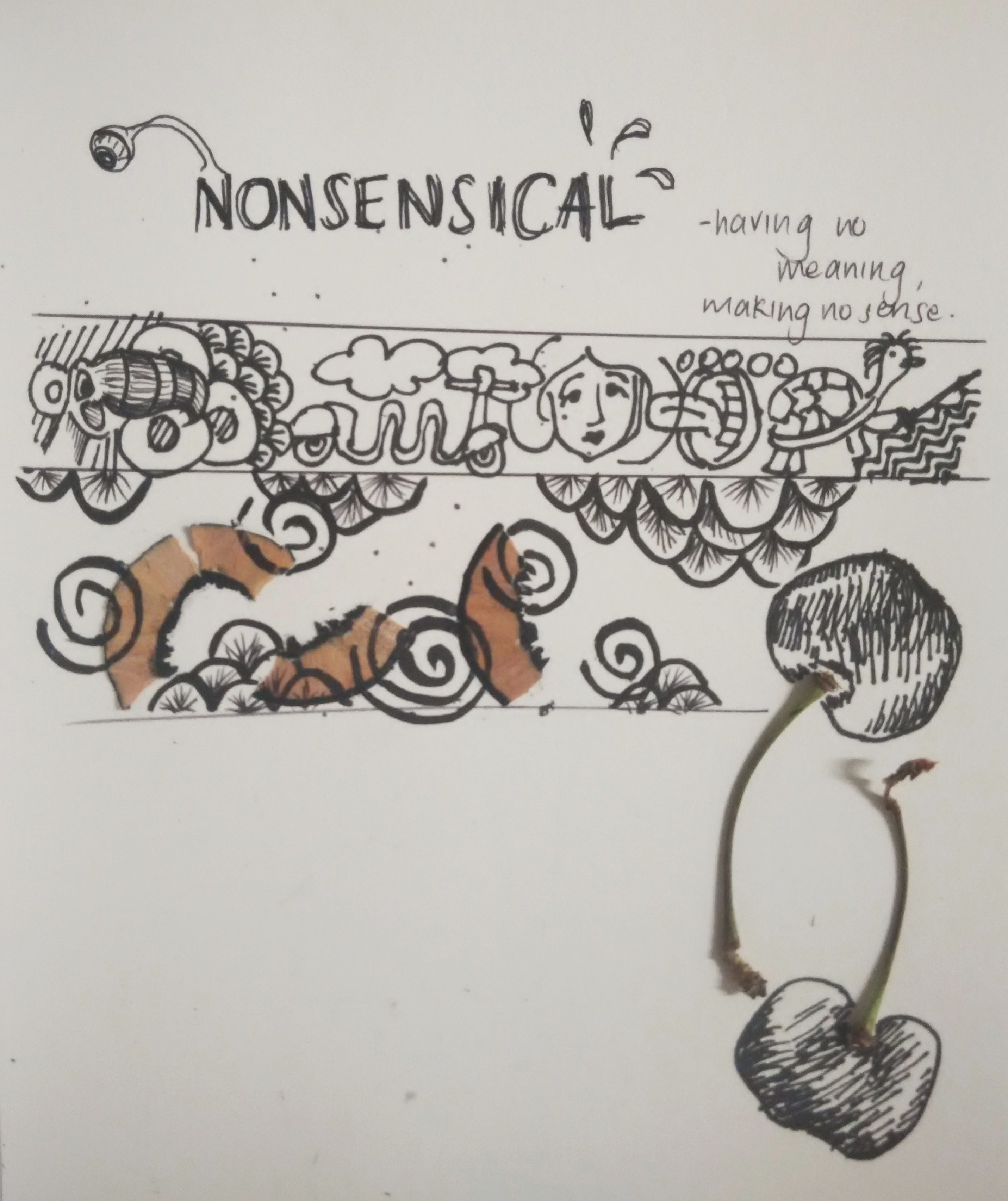
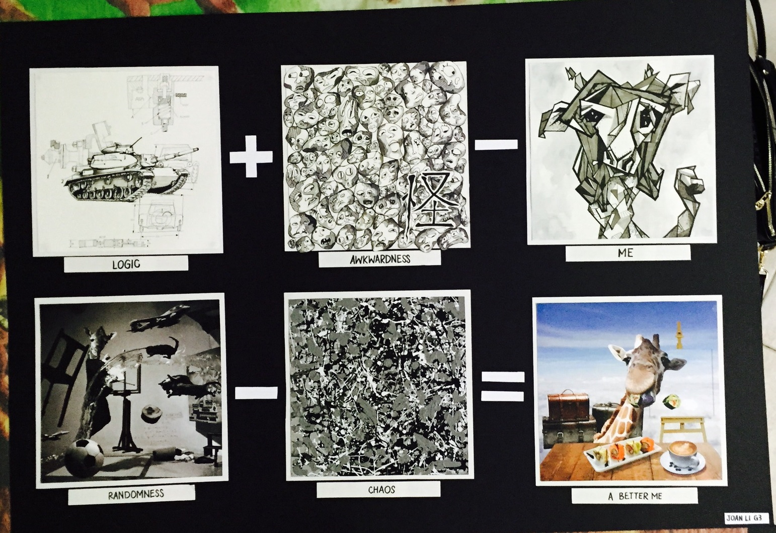
LOGIC + AWKWARDNESS = ME

IMG_20151027_001321

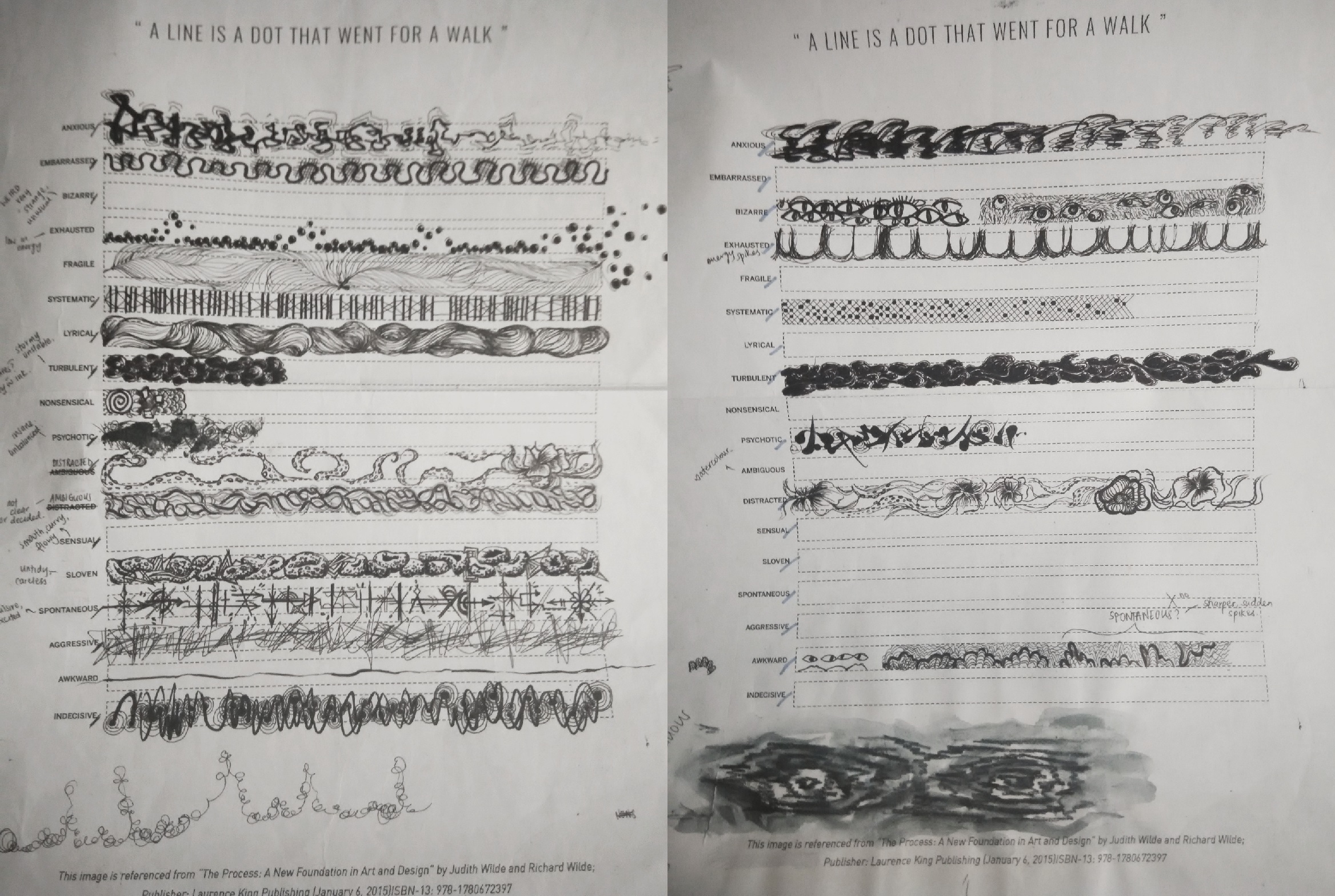
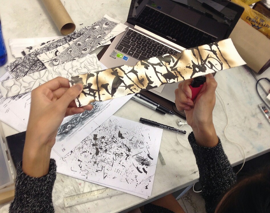
Logic: Besides the visual arts, I also like math and sciences (though I may not be good at it). I love geometric and mechanical diagrams, blue prints and especially the intricate parts of machineries. These are represent by a drawing of a tank, with its complex design at the wheels. There are also some labelled diagrams of some scientific equipment at the background to frame the tank.
Medium: Pen and marker

IMG_20151113_144030

Awkwardness: I can be uncomfortable and awkward in certain social situations, especially when meeting a big group of new people. Hence, I thought the multiplication of awkward faces and expressions throughout the square would accurately represent my insecurities, self consciousness and discomfort during these situations.
I had fun drawing all these faces. I could draw the facial features in any way I liked, and most of them turned out looking really peculiar and ‘derpy’!

IMG_20151113_144040

Me: For the past few years, my friends in school always said I looked like a giraffe – tall, elongated. Hence I used giraffe to symbolize myself. I also applied the cubist technique to represent the logical, technical aspect of me.

Colour scheme: Monotone
I am a person who prefers dull, cool and dark colours, and therefore I used a monotonous colour scheme to represent my avoidance of bright (neon?) colours.

Medium: Pen and marker


RANDOMNESS + CHAOS = A BETTER ME

????????????????????????????????????????????????????????????????????????????????????????????????????????????????????????????????????????????????????????????????????????????????????????????????????????????????????????????????????????????????????????????????????????????????????????????????????????????????????

????????????????????????????????????????????????????????????????????????????????????????????????????????????????????????????????????????????????????????????????????????????????????????????????????????????????????????????????????????????????????????????????????????????????????????????????????????????????????
????????????????????????????????????????????????????????????????????????????????????????????????????????????????????????????????????????????????????????????????????????????????????????????????????????????????????????????????????????????????????????????????????????????????????????????????????????????????????

Randomness: I often have random, bizarre thoughts and ideas floating around my head.
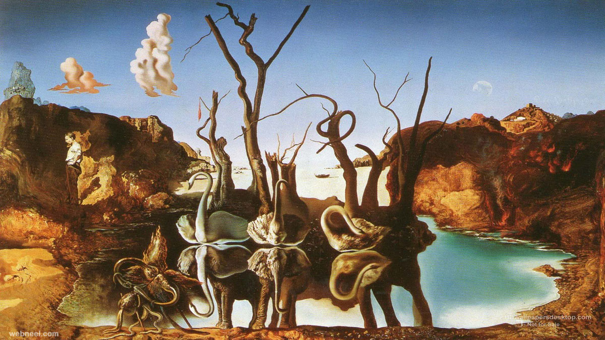
Reference to Dali Atomicus, a photograph by Salvador Dali. This work consists of both animate and inanimate object flying in mid-air. I added more objects into the composition to further emphasize its randomness, as well as the dynamics, movement and suspense.

***WARNING*** RESTRICTED USAGE --- Permission is needed for each use! Contact: fake --- Hold for story slugged please call nak x1138 - THIS IS A KNOEDLER FAKE *** This is a fake copy of Jackson Pollock, aka the green pollock, aka Jack Levy Pollock. NYTCREDIT: (no credit)
22222

Chaos: My workspace is always messy. This chaos is represented by Jackson Pollock’s Autumn Rhythm. The strokes of paint are placed close to one another and multiplied throughout for a messy feel. I also added acrylic paint in a random fashion to create some rough textures.


33333

A Better Me: Joan the Giraffe in paradise. In this square, I’m in my own comfy environment, in a sort of organised chaos. A very bright, unnatural lighting is applied to maintain the bizarre, imaginative feel, and the juxtaposition of objects and the clear blue sky contributes to the surreal effect of the picture.
Colour Scheme: Triadic


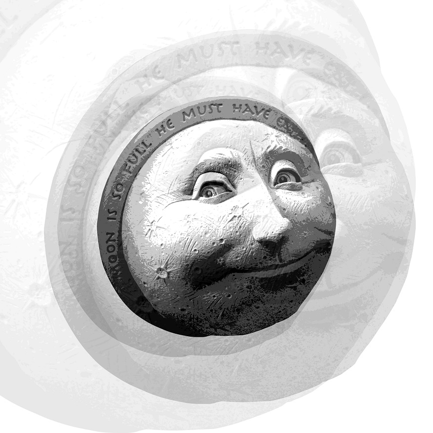
CURIOSITY + INSPIRATION = AN IDEAL ME

cat-face
444444

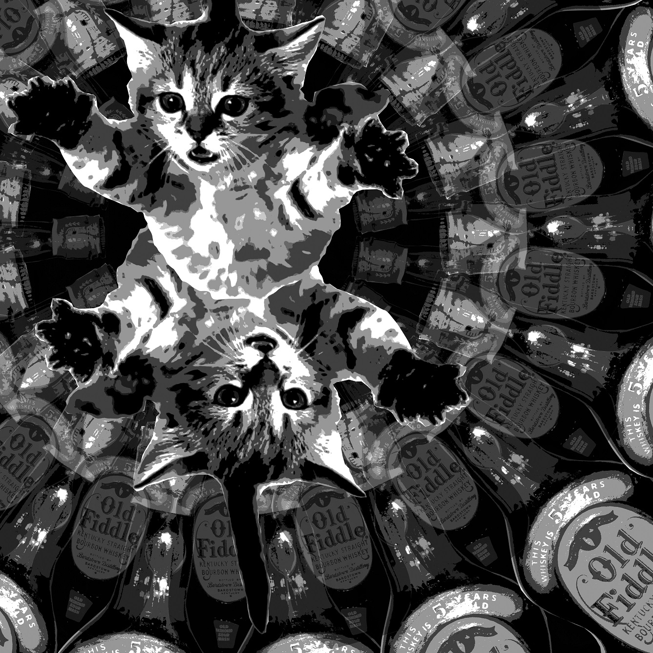
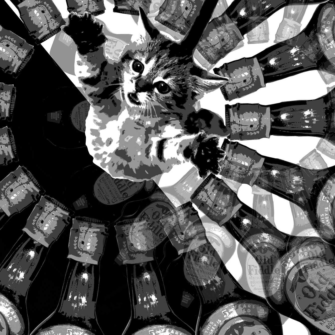
Curiosity: Curiosity kills the cat. A closed up fill frame of a cat’s face. To further emphasize my thirst for discovery, I photoshopped a portrait of Albert Einstein, an icon of invention, in the reflection of the cat’s eyes.


555555
Inspiration: My inspiration for my works come from other artists’ works. For this square, I combined the works of three of my favourite surrealists – Salvador Dali’s moustache, Rene Magritte’s man with an apple and MC Escher’s orb.

rene_magritte_son_of_man_1686x_2560x1600_wallpaperfo.com
Philippe Halsman (American, 1906-1979). Yes, but don’t try to uncover my secret (Dali’s Mustache), 1954. Silver gelatin print. © Philippe Halsman Archive

This composition is very balance as the orb is placed in the centre of the square. The colour scheme used is analogous (yellow and green) and the tones are soft and of low saturation.


imagine dragons
666666
An Ideal Me: The background of this image is the album cover of the Imagine Dragons’ Night Vision, which I found very suitable for my composition. The broken pieces of rock act as ascending platforms, suggesting an increase in knowledge and status towards success. An ideal me, would be to be a successful artist who is able to effectively connect with my viewers through my artwork. For example, I find an interactive piece of art or advertisement very engaging and as a viewer, I am able to effectively get the message and at the same time enjoy myself. An ideal version of me would be able to achieve something like that through years of hard work and a significant improvement in abilities.


SPONTANEITY – WORKLOAD = ME IN 5 YEARS

dsc00202777777

Spontaneity: Spontaneity is defined as the occurrence of an action or performance as a result of a sudden impulse. To me, spontaneity is a very intense, combustible emotion that is closely associated with passion and drive. Naturally the first colour that came into my mind was red, the colour of fire and blood.
This square is a collage of very bright, vibrant colours. The background was originally a silhouette of a tree, but photoshopped to for harsher lines and shapes.

Workload: In most stages of life, there will always be workload. Be it school assignments, projects, or office work, they will always be a source of stress.

The heavy rocks in this square are representative of these burdens.
Colour Scheme: Analogous (red, blue, purple background). These colours are quite intense on its own and hence when I try to blend them together using watercolour, there is a sense of force and pressure as the colours clash.
Medium: Pen, marker and watercolour

Me in 5 Years: In 5 years’ time, I would like to be a more spontaneous person. Without the stress of the workload that is pulling me down, I would like to have the freedom of exploring different parts of the world. Some of these places include Greece, Maldives, and the Bahamas. For this square I decided to portray myself as a combination of a giraffe and a mermaid (meraffe?), basking in the sunset in the Bahamas.

Medium: Pen and watercolour

Colour Research

Colour is a form of non verbal communication. Our preference of colours changes with our mood, experiences and our surroundings. Colours can also affect us in many ways, both mentally and physically. For example, red has been known to raise one’s blood pressure, while a forest of green soothes one’s eyes.

The primary colours are red, blue & yellow.
The secondary colours are green, orange & purple. (Combination of primary colours)

Warm and cool colors

The colour wheel or colour circle can also be divided into two portions – warm & cool colours.
Warm – red, orange, yellow (yellow being the warmest)
Cool – green, blue, purple (blue being the coolest)

Colour meaning


Red – The colour of fire and blood, often associated with energy, anger, war, danger, strength power, determination, passion and drive.
Red is a very emotionally and physically intense colour. It is accented, stimulating people to make quick decisions (hence frequently used in advertisements, promotions), raises one’s blood pressure and respiration rate.

Orange – A combination of the energy of red and the happiness of yellow. This tropical colour is the colour of happiness, joy, enthusiasm, fascination, creativity, attraction and success. It a very warm and hot colour, however, it is not as aggressive as red.

Yellow – Colour of sunshine and happiness. Associated with joy, positive energy and intellect.
As the warmest colour in the spectrum, it has a warming effect, stimulating comfort, cheerfulness and mental activity. Yellow is no doubt an attention getter, and hence most commonly used on cabs and in highlighters. It is also a childish colour often used in children’s toys and not in classy, high end products.

Green – The colour of nature and the most restful colour for the human eye. It is often used to symbolize growth, nurture, freshness and fertility. It also suggests stability, ambition, and peace.
As the complimentary of red, green represents safety and healing power. It can be seen on many medicine labels, fresh organic products, as well as to indicate a positive growth in the economy.

Blue – Coolest colour, the colour of the skies and the seas. Symbolizes truth, wisdom, loyalty, confidence, faith and the clarity of mind. Blue has a cooling effect on the body and mind, giving one a sense of tranquility. It is also a masculine colour that is associated with stability, depth and expertise and hence is highly accepted by males.

Purple – A combination of blue and red. This artificial colour represents royalty, pride, power, nobility, luxury. Purple and sometimes used to symbolize wisdom, extravagance, creativity and magic. It is an eye-catching colour that has proven to attract the attention of most children and hence is often used in the advertising of children’s toys, especially dolls.

White – Represents purity, innocence, goodness and cleanliness. As opposed to black, it usually has a slightly more positive connotation. Often associated with angels, heaven and light.  White is often used in the medical industry to represent sterility and cleanliness and in modern high technology devices to represent innovation and simplicity.

Black – Black symbolizes power, elegance, evil, mystery, strength and authority. It gives a sense of perception and depth. However, it can also be used to block out details of the background or surroundings to make the subject matter and its colours stand out. In art, black is also often used to create high contrast and distinction between objects.


The colour wheel is also the commonly used tool for colour mixing and combination of colours. Traditionally, there are a number of colour combinations that are considerably more pleasing to look at. These were obtained through the application of colour schemes – complimentary, analogous and triadic, split-complimentary, rectangle (tetradic) and square.

Complementary colour scheme:

complementarycomplementary scheme
Colours that are opposite each other in the colour wheel. For example: red and green, blue and orange, purple and yellow.
The high contrast of the opposite colours produces and very vibrant look, and could be jarring to the eyes if used in large amount and in high saturation.
Such a colour scheme can be challenging to strike a balance in colours, but is very effective in creating a focus and making one of the objects stand out from its background.

Analogous colour scheme:

analogous schemeanalogous

Colours that are next to each other in the colour wheel. For example: Red and orange and yellow, green and blue and purple.
This colour scheme is often found in nature as the colours match very well and are soothing, pleasing to the eye. The three colours support each other and create a serene, comfortable design. However, this colour scheme cannot be used to create high contrast.


Triadic colour scheme:
triad
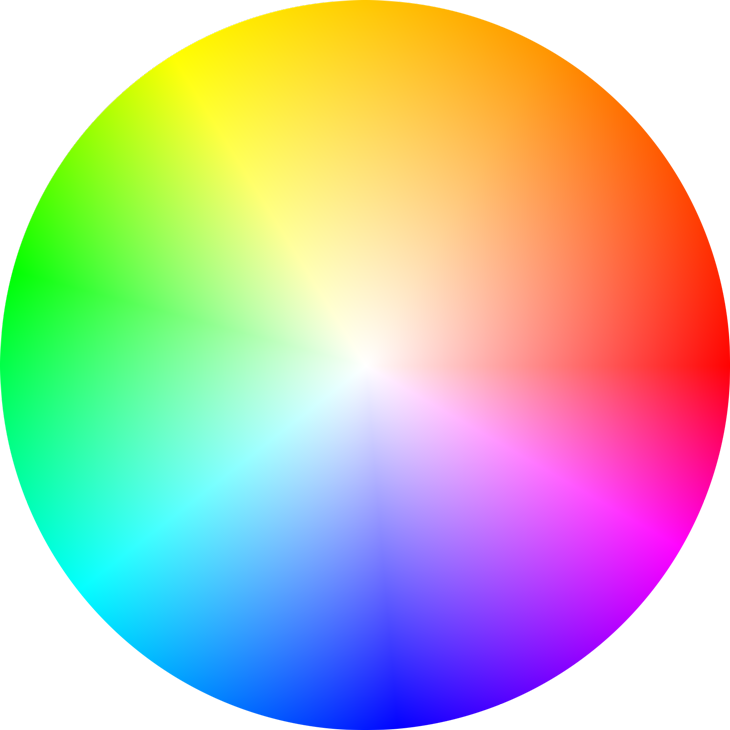
Colours form a triangle in the colour wheel. For example: orange and green and purple, red and yellow and blue.
Triadic colour schemes are vibrant and create a good contrast. When carefully balanced, the colours can be harmonized successfully, producing an attention catching work that is at the same time pleasing to the eye. triadic scheme


Split-complimentary colour scheme:
split-complementary
A variation of the complimentary colour scheme. In addition to the base colour, it uses the two colours adjacent to the complement. split-complementary scheme
This colour scheme has the same strong visual effect as the complimentary colour scheme, but has less tension and is less jarring. Similarly, a good balance of the three colours is required for an effective composition.
Rectangle (tetradic) colour scheme:
Uses four colours that form a rectangle in the colour wheel; consists of two pairs of complimentary colours. A rich colour scheme that allows plenty of room for variation. One can play around with all four colours, warm and cool. rectangle scheme

 
Square colour scheme:


square
This colour scheme is similar to the rectangle, but with all four colours equally spread out in the colour wheel. Similarly, this allows plenty of variations and possibilities in the arrangement of warm and cool colours. The square colour scheme works best if one colour is made dominant. square scheme

Principles of Design | PROCESS

Hey diddle diddle! The cat and the fiddle,
The cow jumped over the moon,
The little dog laughed to see such sport,
And the dish ran away with the spoon.


*underlined – subject matter
*italics – verbs


PRINCIPLES OF DESIGN

  1. UNITY – similarity, coherence, joined together as a whole
    common purpose of subject matter
    How? – use of colour (b/w, grayscale), focal point within composition,
    repetition, common direction of subject matter
  2. HARMONY synchronization, merged, gelled up into the environment,
    natural juxtaposition of subject matter
    How? – use of colours (b/w, grayscale), textures
    similar to unity?
  3. CONTRAST – state of being strikingly different from something else in juxtaposition,
    How? – jagged vs smooth lines, organic vs geometric, big vs small (variation in sizes)
    dark vs light, tonal contrast (grayscale)
  4. PATTERN – repetition, tessellation of subject matter,
    continuous, duplication, multiplication
    How? – use of colours, lines, sizes, duplicate layers!
    eg. Textiles, architecture, printsPattern_Contrast
  5. MOVEMENT – general motion of subject in a composition
    dynamism, flow of something, suggestion of speed
    How? – Duplication of subject + variations in opacity, close arrangement to suggest movement path, variation of space to suggest speed (closer = slower, further = faster)
    Blurring of subject, directional, towards a focal point, implied action
    Movement
  6. BALANCE – stability of composition, weight of each subject
    How? – arrangement of subject, variation of contrast throughout composition,
    net force and net momentum of composition -> implied movement (e.g toppling, sliding off)
  7. EMPHASIS – special importance or value of a subject, prominence given to something
    How? – Focus! Attention seeking,
    variation of sizes, contrast, clarity, placement of subject in the foreground
    Emphasis

Experimentation with compositions

Composition2(1)    Composition2(2)
HEY DIDDLE DIDDLE! THE CAT AND THE FIDDLE,

Left: Black background, more symmetrical due to mirror image of kitten and complete round of whisky bottles. Less exciting as compared to the composition on the right as it lacks contrast and interesting details.
Right: Diagonal black and white background gives the composition a sense of imbalance. However, the additional details of the whisky bottles on the white background stands out more due to the contrast, hence balancing the composition as a whole again. The weight of the kitten also lies mostly on the side of the white background. Furthermore, the intoxicated kitty flying through its whisky wonderland gives this composition a trippy, imaginary feel, Hence, I chose this as one of my final images.

Composition3(1)   Composition3(2)Composition9(1) HEY DIDDLE DIDDLE! THE CAT AND THE FIDDLE,

Top left: The majority of the weight lies at the top of the composition due to the multiplication of music scores. The grumpy cat that is emphasized at the bottom stands out, hence giving the image a top down balance. However, the composition is still slightly unbalanced horizontally.
Top right: This image is similar to the previous one except for the addition of fiddles amongst the music scores. The further repetition of the heavy contrasted fiddles gives the music cloud much more volume. By varying the opacity of the fiddles, I am also able to control the arrangement and solidity of the music cloud to create a sense of unity. Hence, I chose this as one of my final images.
Bottom: This composition is much simpler despite the cat wrecking havoc in the middle of an exploding town. Violence is conveyed through the swinging down of the fiddle. The sense of movement is created by a repetition of the same image with varying opacity, arranged along the path of movement. As this image is heavily emphasized in the center and definitely captures attention, it was among my top choices for the finalization. However, the previous composition was chosen due to its more complex juxtaposition of subject matter.

Composition4(2)    Composition4(1)Composition4(3)
THE COW JUMPED OVER THE MOON

Top left & right: Both compositions at the top looks similar. The three major subject matter – cow, moon, buildings, are of approximately the same size and hence there are no clear emphasis at any point within the images. Although I like the details of the moon face and the cow when they are enlarged, I feel that these two compositions are flat and uninteresting, hence ineffective.
Bottom: This composition is slightly more complex as compared to the two on top. The multiplication and rotation of the moon face adds dynamic to the picture. The arch arrangement of the moon faces is also inspired by the jumping motion of the cow over the moon. The movement of the moon face is also somewhat a pattern due to the circular rotation. This variation of the composition was one of my top choices for finalization, but was eventually discarded as I felt that the overlapping at the bottom made the composition look a little flat.

Composition5(1)Composition6(2)


THE DOG LAUGHED TO SEE SUCH SPORT,

Left: This composition is pretty strange. The placement of dogs is somewhat symmetrical, but there is a lack of depth (due to the absence of a background, similarity in sizes), and hence I feel that this image is flat and aesthetically less pleasing.
Right: At first, I liked the arrangement of subject matter in this composition. However, I felt that the nature of the subjects (probably due to the treatment of images – halftone vs posterize) is too contrasted such that the composition lacked unity and coherence. Furthermore, the tonal contrast is also not ideal as the largest Scooby Doo in the foreground is not emphasized enough. The image looked a little too dull overall and hence, it was not chosen as my final.

Composition8(1)  Composition8(2)
AND THE DISH RAN AWAY WITH THE SPOON.

Left: For this composition, I decided to put the subject matter – dish and spoon, in context. I felt that the humanized dishes fleeing from a kitchen war zone gave the image a sense of unity and coherence. However, this variation of the image was not chosen as the dishes were too similar in terms of shape and there is a lack of depth and hence is flat.
Right: I played around with the dimensions of the dishes in this composition, creating a sense of depth. The two dishes at the bottom of the pictures appear to be falling/have fallen onto the table top due to the sense of perspective. The addition of another humanize dish also adds to the dynamic of the composition as a whole. Hence, this image was chosen as one of my final.

A line is a dot that went for a walk…

 When I first encountered this project, I had no idea where or which one to begin with. In an attempt to clarify the jumbled emotions, I had broken down each of them based on both their definition & my own interpretation.
I recalled the times where I experienced each of the emotions, and translated them onto the paper. This led to an exploration of the use of dots, lines & shapes, and the manipulation of which to produce a sense of harmony, unity, movement, balance, etc.

IMG_20150907_193359

  1. ANXIOUS – adj. worry, nervous, uneasy, distressed, edgy, jumpy
    shaky lines; distortion of form; variation of intensity
    Reference: The Scream by Edvard Munch
  2. EMBARRASSED – adj. awkward, uncomfortable, blushing, shame
    wiggly lines to show act of avoiding/attempt to hide; hexing to show flush and shame
  3. AGGRESSIVE – adj. hostile, forceful, violent
    full of strength; full force -> slashing of paper with a penknife
    furious and quick application of pen strokes, repetition throughout to show intensityIMG_20150907_193659
  4. EXHAUSTED – adj. very tired, worn out, weary, low in energy
    energy level of molecules/energy diagram; decrease in fluctuation of energy to 0
  5. AWKWARD – adj. difficult situation, a little weird
    stretchy “hands” reaching into unfamiliar areas, sense of discomfort
  6. SLOVEN – adj. untidy, careless, messy
    newspaper as a symbol or messiness; overlapping of subject matter
    contrast drawn between curve and straight, organic and geometric
  7. FRAGILE – adj. easily broken or damaged, delicate, vulnerable
    use of thin, frail lines; feathers, thin glass, cracks
    soft/flimsy/fluffy texture of shredded tissues
  8. SENSUAL – adj. arousing gratification of the senses, physical pleasure
    smooth, curvy; gentle, soft touch
    use of graphite pencil for soft linesIMG_20150907_193752IMG_20150907_194043
  9. INDECISIVE – adj. contradictory, unable to decide
    neither here nor there, but wants both? (presence of >1 options)
    constant switch between different locations; circles to represent GPS signals
  10. NONSENSICAL – adj. having no meaning, making no sense, illogical
    use of random materials; juxtaposition of different random shapes and objects
    unpredictable, unexpected, mojojojoIMG_20150907_193824
  11. DISTRACTED – adj. unable to concentrate, attention diversion
    presence of a main focal point, amongst other focal points?
    vines and tentacles to allure
  12. BIZARRE – adj. very strange, unusual, peculiar, odd, unpredictable
    first thing that came to mind -> aliens
    eyes as most striking features of an alien; able to show direction, sense of frenzy/weirdnessIMG_20150907_193853
  13. SYSTEMATIC – adj. methodical, orderly, fixed
    rigid patterns; repetition, grids, geometric forms; very balanced
  14. LYRICAL – adj. expression of emotions in an imaginative, beautiful way
    associated with undisrupted flow; smooth and curvy linesIMG_20150907_193914
  15. PSYCHOTIC – adj. suffering from psychosis, unbalanced emotions, crazy
    a bit of aggression involved; unsettled, frenzied
    use of fire on paper + splattering of ink (dots) to show danger and mental instability
  16. TURBULENT – adj. conflict, disorder, unstable, full of ups and downs
    violent movements of water/air; stormy seas or airplane turbulenceIMG_20150907_194010
  17. SPONTANEOUS – adj. occurring as a result of sudden impulse, without thinking
    strong sense of movement, no hesitation
    fireworks and arrows; straight and directional/in all directions
  18. AMBIGUOUS – adj. not clear or decided representation of the ripple effect of water and empty eyes through ellipses
    blurry lines using water colourUntitled

    PROCESS
    Medium used: pen, marker, pencil, tissues, thread, water colour, newspaper, chinese ink, wood, fire

    IMG-20150901-WA0003_1441511520400IMG-20150901-WA0006_1441511649043