

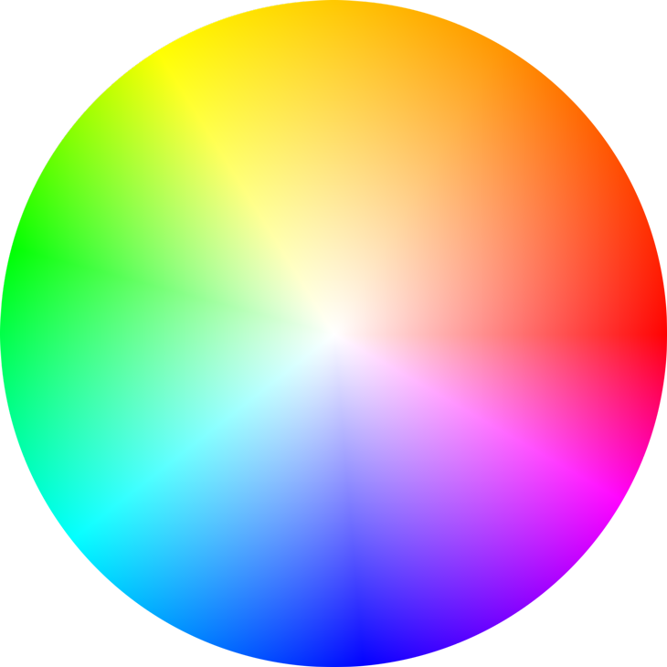
Colour is a form of non verbal communication. Our preference of colours changes with our mood, experiences and our surroundings. Colours can also affect us in many ways, both mentally and physically. For example, red has been known to raise one’s blood pressure, while a forest of green soothes one’s eyes.

The primary colours are red, blue & yellow.
The secondary colours are green, orange & purple. (Combination of primary colours)

The colour wheel or colour circle can also be divided into two portions – warm & cool colours.
Warm – red, orange, yellow (yellow being the warmest)
Cool – green, blue, purple (blue being the coolest)
Colour meaning

Red – The colour of fire and blood, often associated with energy, anger, war, danger, strength power, determination, passion and drive.
Red is a very emotionally and physically intense colour. It is accented, stimulating people to make quick decisions (hence frequently used in advertisements, promotions), raises one’s blood pressure and respiration rate.

Orange – A combination of the energy of red and the happiness of yellow. This tropical colour is the colour of happiness, joy, enthusiasm, fascination, creativity, attraction and success. It a very warm and hot colour, however, it is not as aggressive as red.
 Yellow – Colour of sunshine and happiness. Associated with joy, positive energy and intellect.
As the warmest colour in the spectrum, it has a warming effect, stimulating comfort, cheerfulness and mental activity. Yellow is no doubt an attention getter, and hence most commonly used on cabs and in highlighters. It is also a childish colour often used in children’s toys and not in classy, high end products.
 Green – The colour of nature and the most restful colour for the human eye. It is often used to symbolize growth, nurture, freshness and fertility. It also suggests stability, ambition, and peace.
As the complimentary of red, green represents safety and healing power. It can be seen on many medicine labels, fresh organic products, as well as to indicate a positive growth in the economy.
 Blue – Coolest colour, the colour of the skies and the seas. Symbolizes truth, wisdom, loyalty, confidence, faith and the clarity of mind. Blue has a cooling effect on the body and mind, giving one a sense of tranquility. It is also a masculine colour that is associated with stability, depth and expertise and hence is highly accepted by males.
 Purple – A combination of blue and red. This artificial colour represents royalty, pride, power, nobility, luxury. Purple and sometimes used to symbolize wisdom, extravagance, creativity and magic. It is an eye-catching colour that has proven to attract the attention of most children and hence is often used in the advertising of children’s toys, especially dolls.
 White – Represents purity, innocence, goodness and cleanliness. As opposed to black, it usually has a slightly more positive connotation. Often associated with angels, heaven and light. White is often used in the medical industry to represent sterility and cleanliness and in modern high technology devices to represent innovation and simplicity.
.svg/2000px-Flag_of_Afghanistan_(1880%E2%80%931901).svg.png) Black – Black symbolizes power, elegance, evil, mystery, strength and authority. It gives a sense of perception and depth. However, it can also be used to block out details of the background or surroundings to make the subject matter and its colours stand out. In art, black is also often used to create high contrast and distinction between objects.
Black – Black symbolizes power, elegance, evil, mystery, strength and authority. It gives a sense of perception and depth. However, it can also be used to block out details of the background or surroundings to make the subject matter and its colours stand out. In art, black is also often used to create high contrast and distinction between objects.
The colour wheel is also the commonly used tool for colour mixing and combination of colours. Traditionally, there are a number of colour combinations that are considerably more pleasing to look at. These were obtained through the application of colour schemes – complimentary, analogous and triadic, split-complimentary, rectangle (tetradic) and square.
Complementary colour scheme:


Colours that are opposite each other in the colour wheel. For example: red and green, blue and orange, purple and yellow.
The high contrast of the opposite colours produces and very vibrant look, and could be jarring to the eyes if used in large amount and in high saturation.
Such a colour scheme can be challenging to strike a balance in colours, but is very effective in creating a focus and making one of the objects stand out from its background.
Analogous colour scheme:


Colours that are next to each other in the colour wheel. For example: Red and orange and yellow, green and blue and purple.
This colour scheme is often found in nature as the colours match very well and are soothing, pleasing to the eye. The three colours support each other and create a serene, comfortable design. However, this colour scheme cannot be used to create high contrast.
Triadic colour scheme:
 Colours form a triangle in the colour wheel. For example: orange and green and purple, red and yellow and blue.
Triadic colour schemes are vibrant and create a good contrast. When carefully balanced, the colours can be harmonized successfully, producing an attention catching work that is at the same time pleasing to the eye. 
Split-complimentary colour scheme:
 A variation of the complimentary colour scheme. In addition to the base colour, it uses the two colours adjacent to the complement.
This colour scheme has the same strong visual effect as the complimentary colour scheme, but has less tension and is less jarring. Similarly, a good balance of the three colours is required for an effective composition.
Rectangle (tetradic) colour scheme:
 Uses four colours that form a rectangle in the colour wheel; consists of two pairs of complimentary colours. A rich colour scheme that allows plenty of room for variation. One can play around with all four colours, warm and cool.
Square colour scheme:
 This colour scheme is similar to the rectangle, but with all four colours equally spread out in the colour wheel. Similarly, this allows plenty of variations and possibilities in the arrangement of warm and cool colours. The square colour scheme works best if one colour is made dominant.
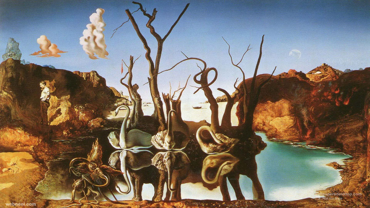
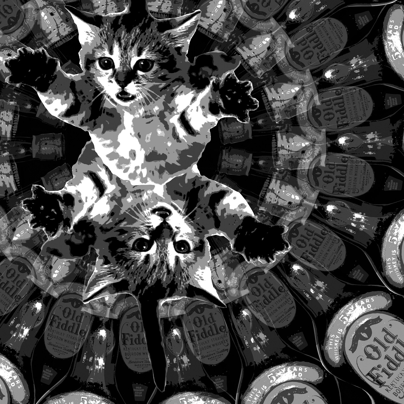
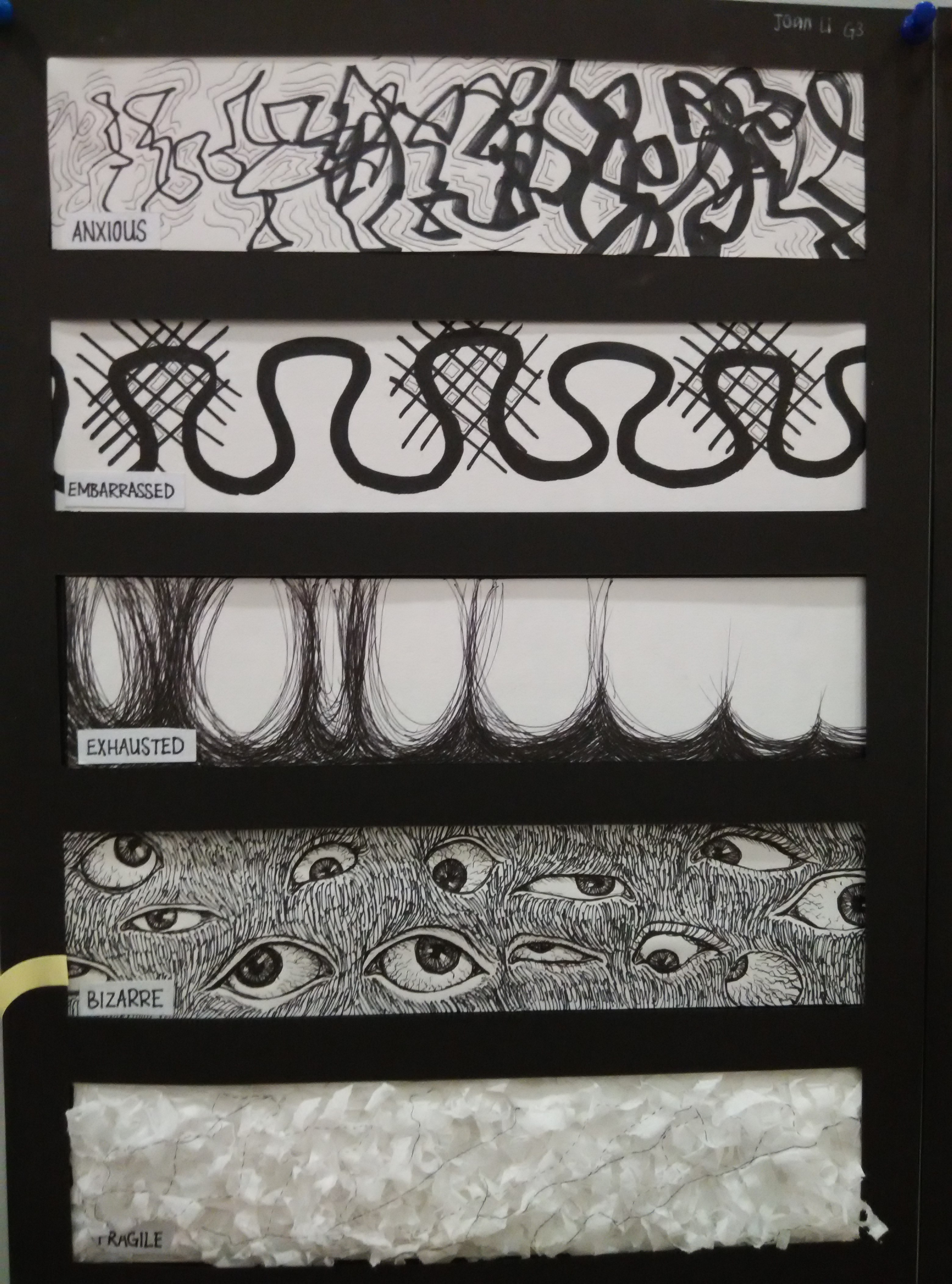
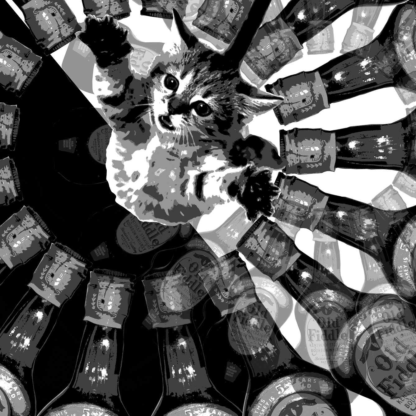 HEY DIDDLE DIDDLE! THE CAT AND THE FIDDLE,

 A
A


