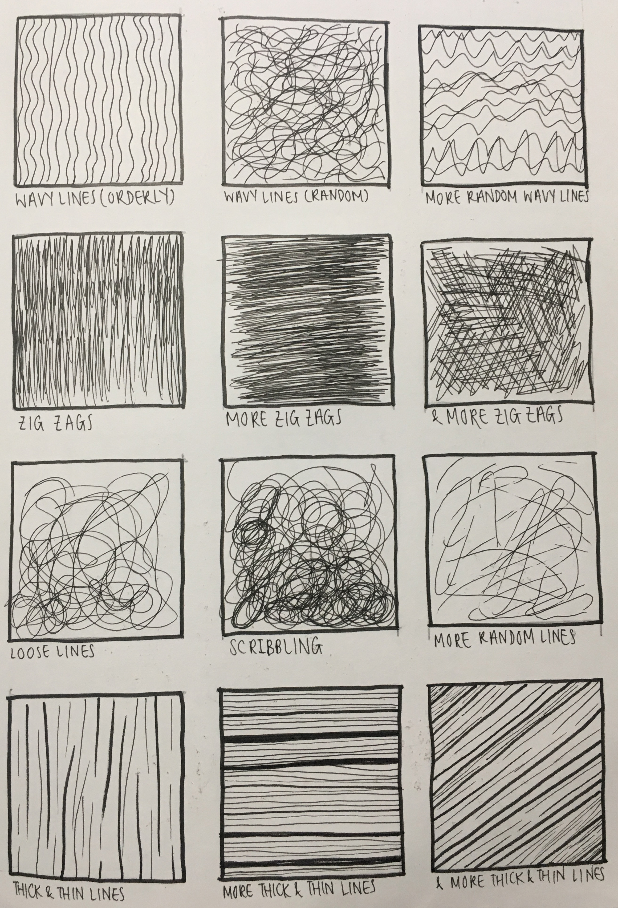

Paper Marbling
Paper marbling is a method of aqueous surface design, which can produce patterns similar to smooth marble or other kinds of stone. The patterns are the result of color floated on either plain water or a viscous solution known as size, and then carefully transferred to an absorbent surface, such as paper or fabric. Through several centuries, people have applied marbled materials to a variety of surfaces. It is often employed as a writing surface for calligraphy, and especially book covers and endpapers in bookbinding and stationery. Part of its appeal is that each print is a unique monotype.
I was interested in experimenting with Paper Marbling, as one of the mediums/technique to use for my lines. I did research online on the various techniques of paper marbling and there were several. From a website, https://www.homesciencetools.com/a/two-marble-paper-projects, there were 2 methods on how to do water marbling. The first method was to use shaving cream with food colouring/paint. The second method was a little more complicated, to use mainly cornstarch, water and paint. After researching online, I found that many artists use the second method more. A variety of colours was also used, and it looked very whimsical.
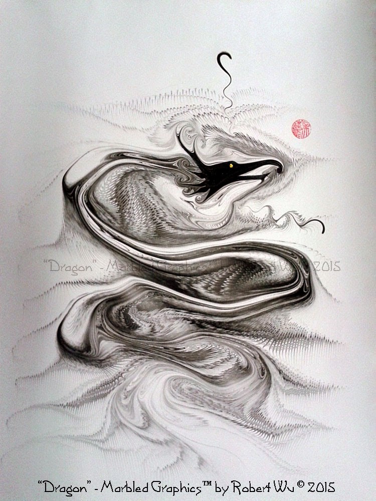
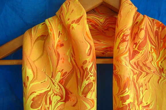
2 artists I found that did paper marbling was Heidi Finley & Robert Wu.
Robert Wu, is a paper marbling artist from Toronto whom used traditional techniques to create marbled paper. His prints are all one of a kind, and cannot be replicated. He manages a website, www.studiorobertwu.com, where he sells his prints.
Heidi Finley, from Sault Ste. Marie, sells marbling supplies on the Internet and also conducts workshops whereby she teaches paper marbling.

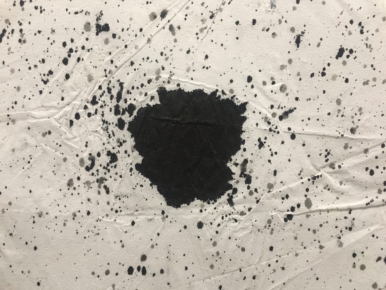
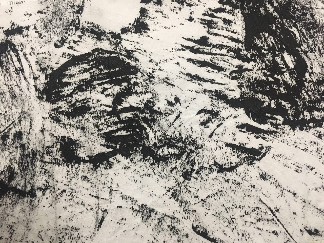
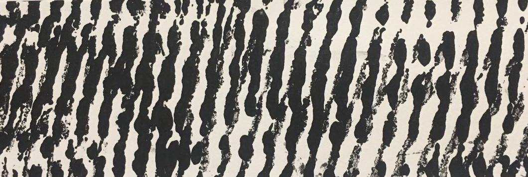
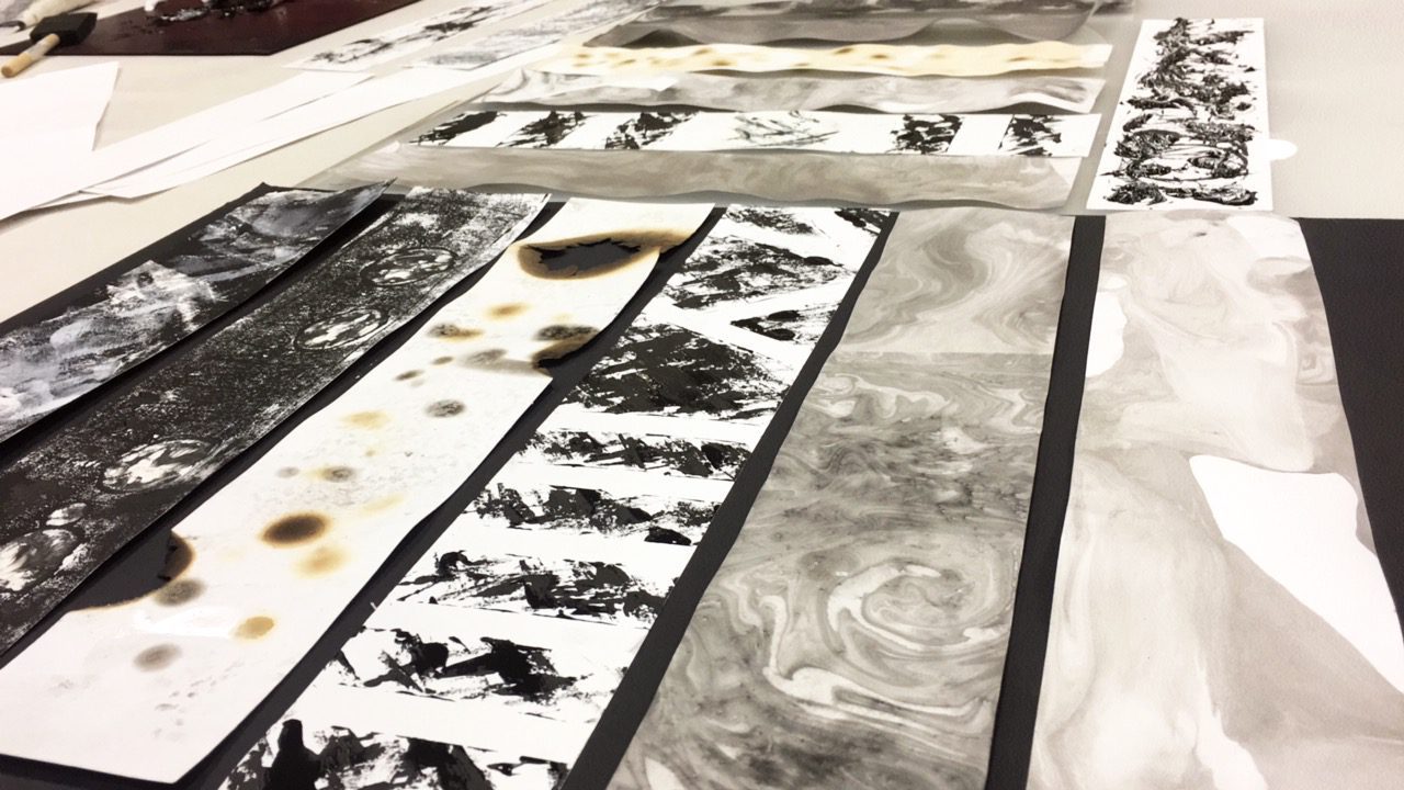
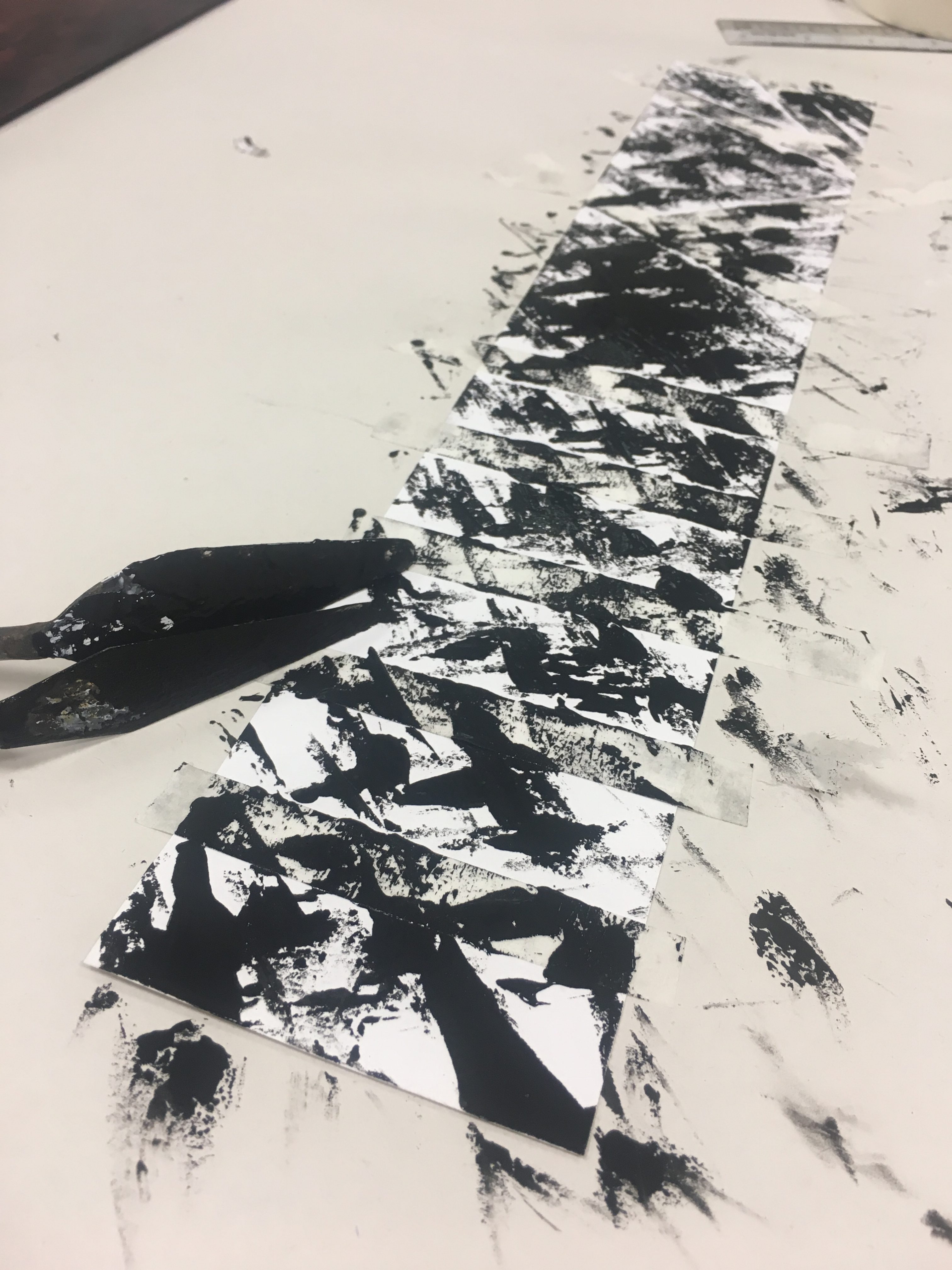
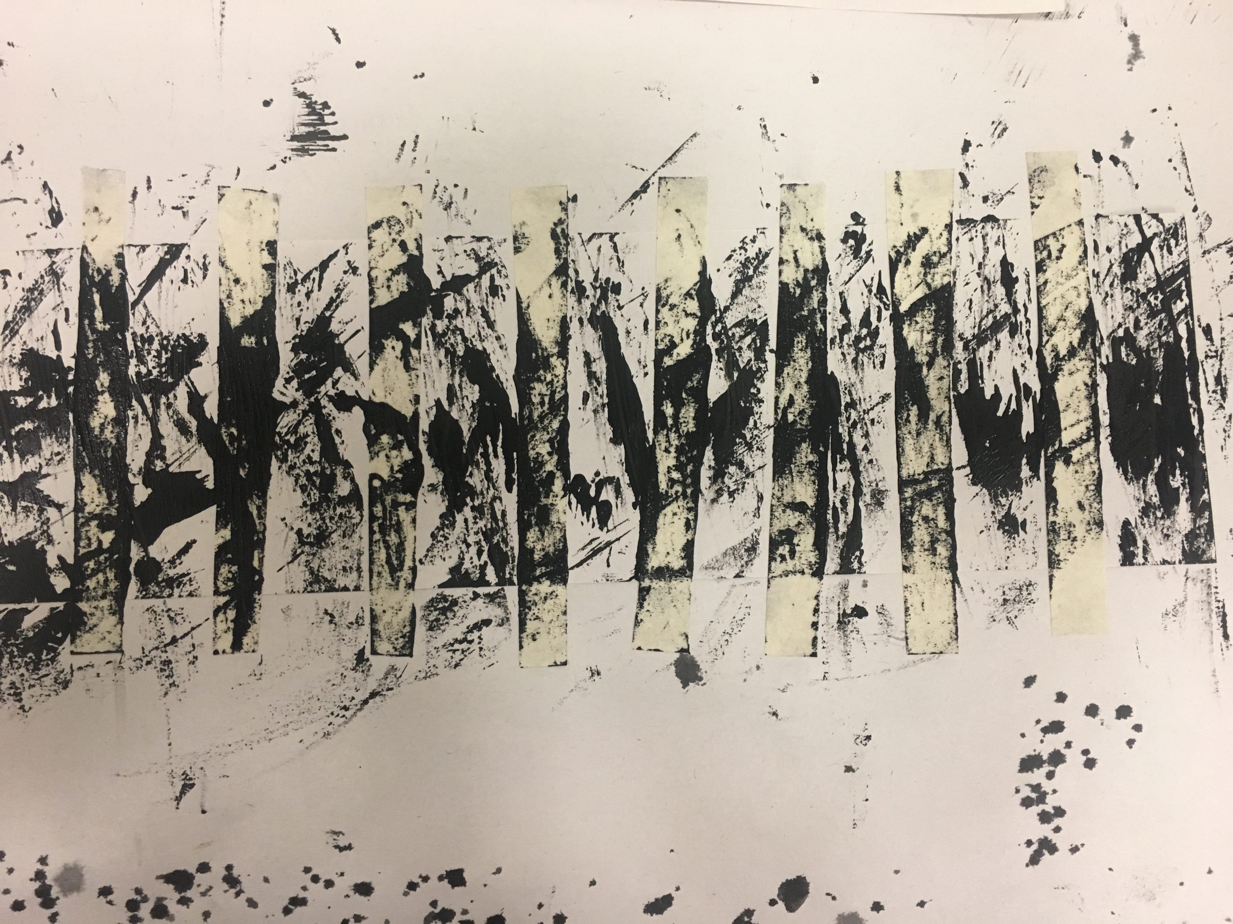
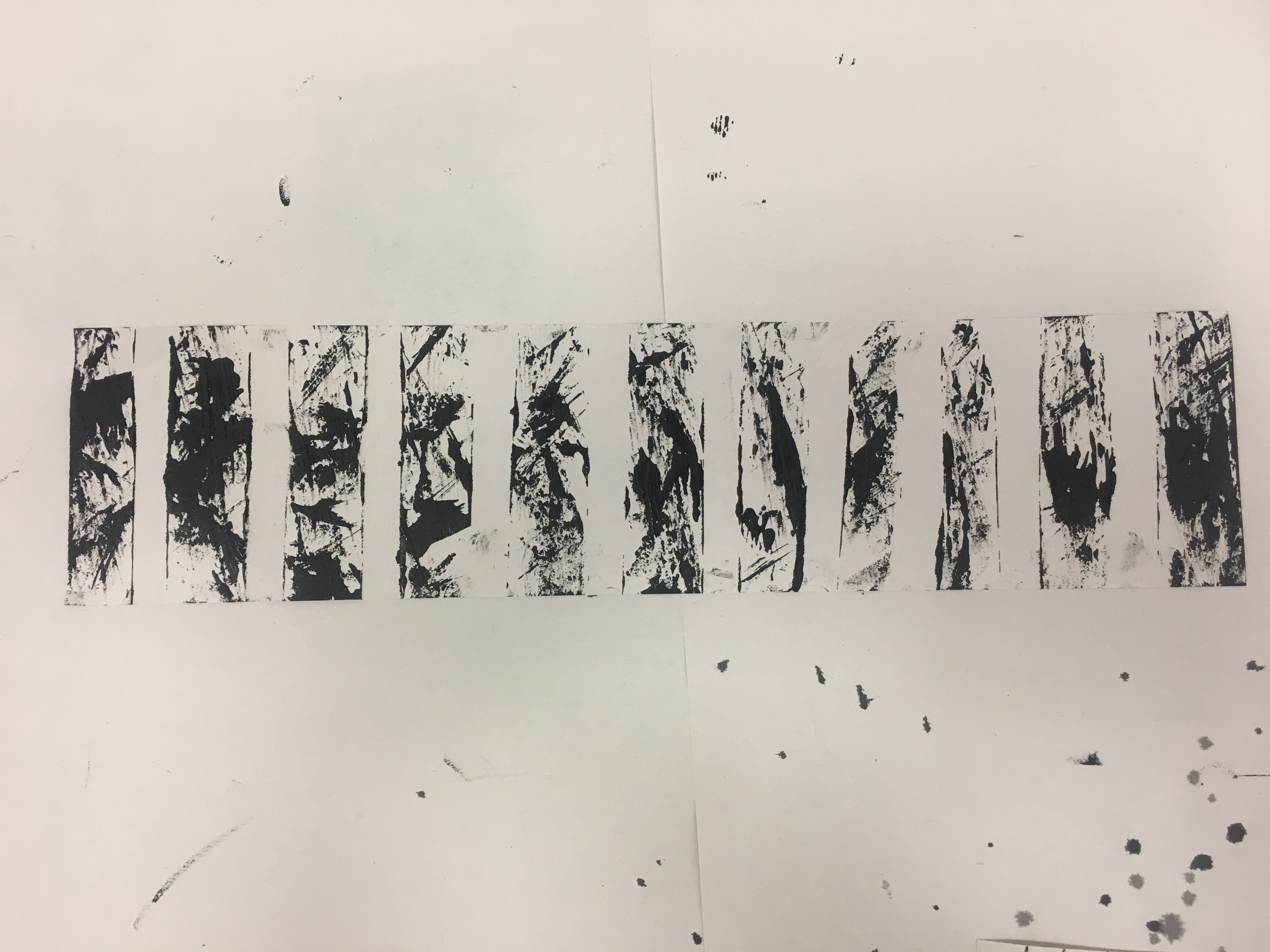
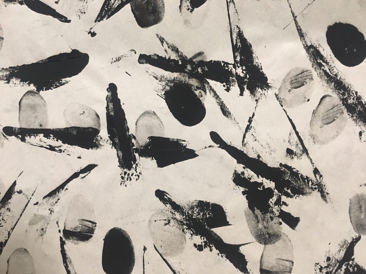
From the research, I realized many did paper marbling with a variety of colours, made the design on water and then dipped the paper in. I felt that the design of the usual marbling was too messy and complicate for the emotion I was going for, as I wanted to just experiment with black and white.
Thus, I decided to use only Chinese ink and water to create the design. I first dropped a few drops of Chinese ink into an aluminium tray of water, and it naturally formed a random marbled design.

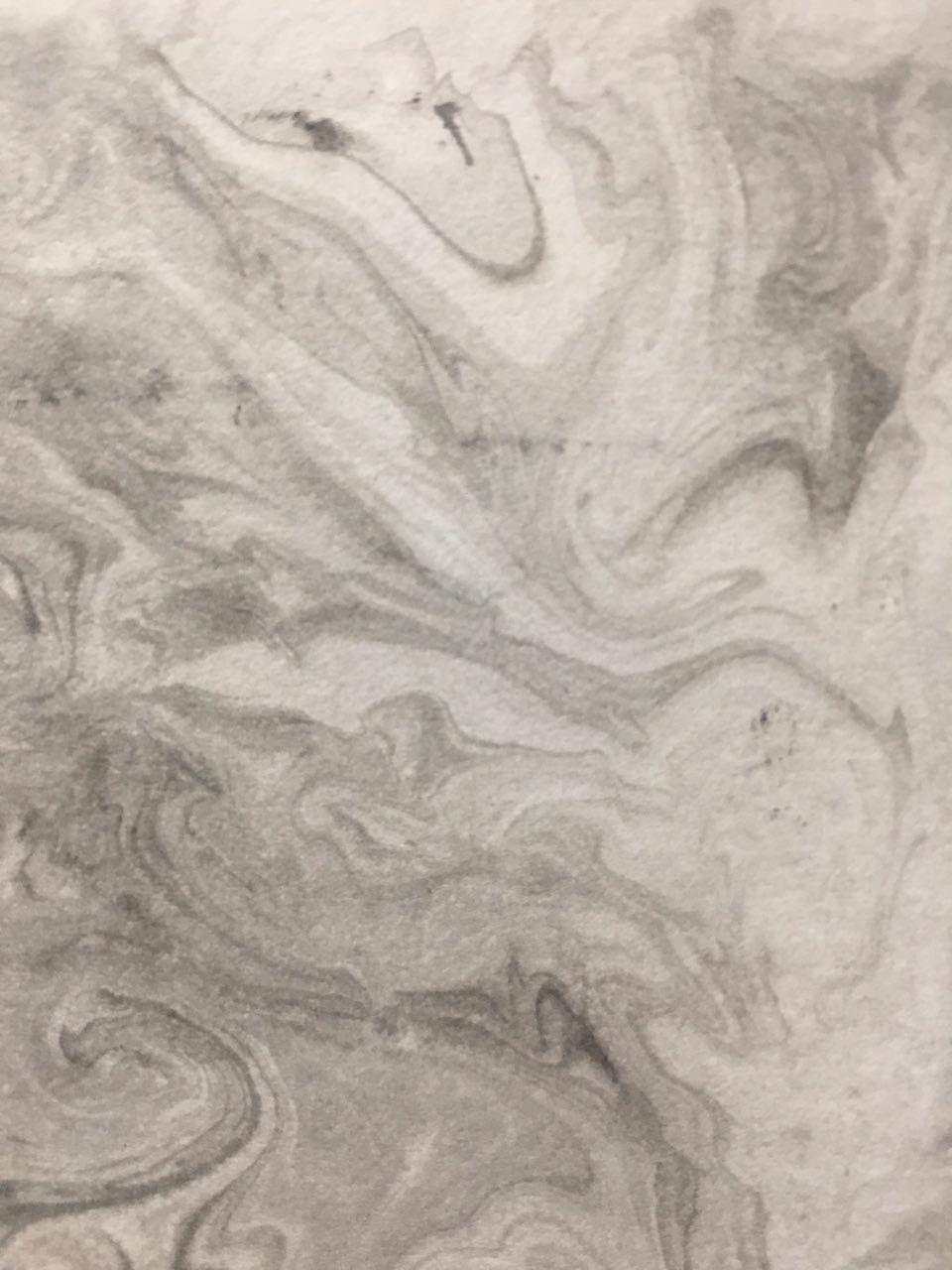
I then took a strip of paper and briefly slid through the water, just enough to get some marbled effect. The first few strips turned out surprisingly nice, but was very complicated as there was a lot of marbled details. I wanted to show ecstasy in paper marbling. After a few tries, I churned out the most suitable paper marbling emotion.
Till then,
xoxo,
jamz
 Leaves
 Cling Wrap Blade
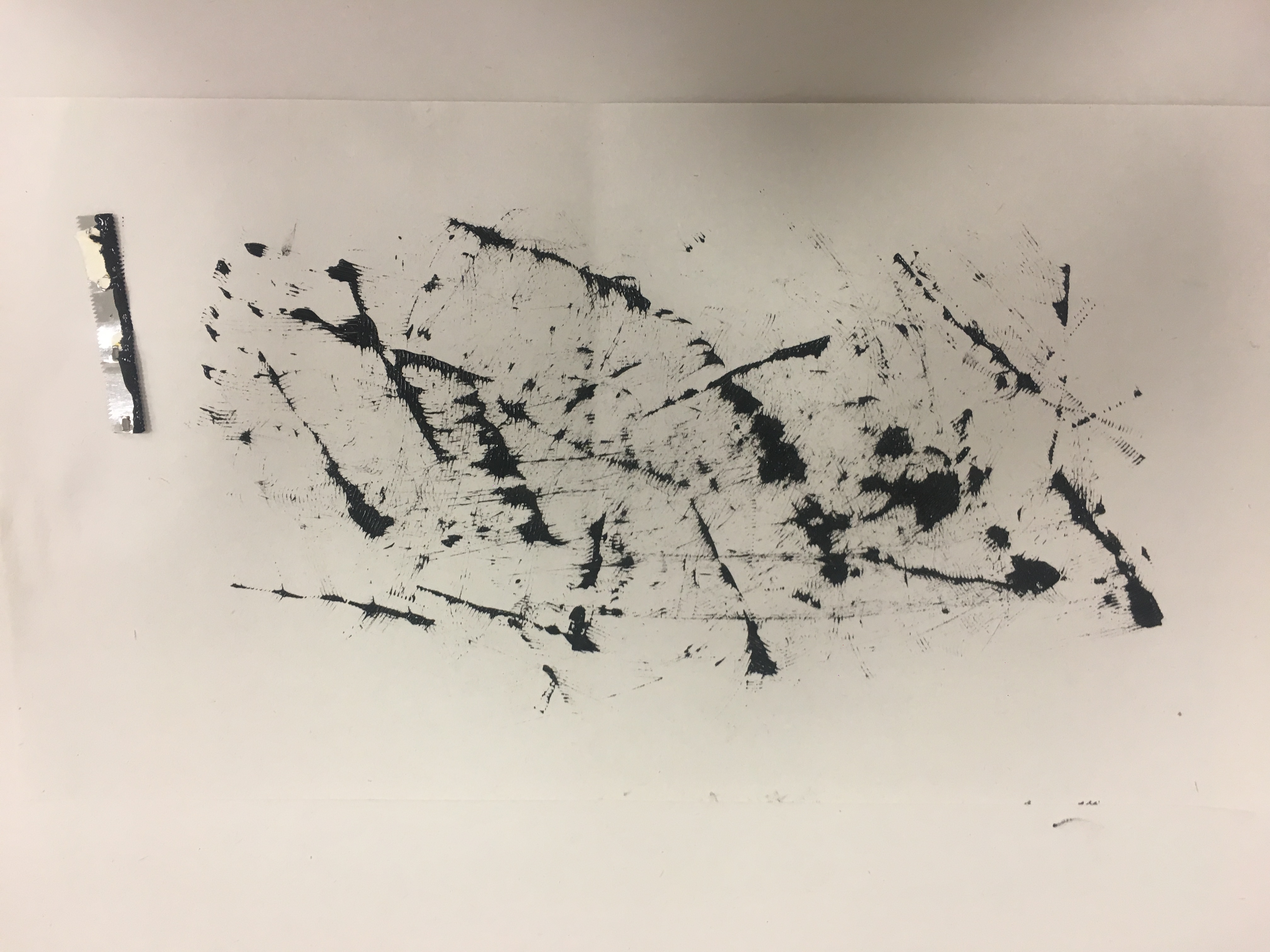
 Candle
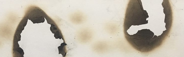
 Lighter
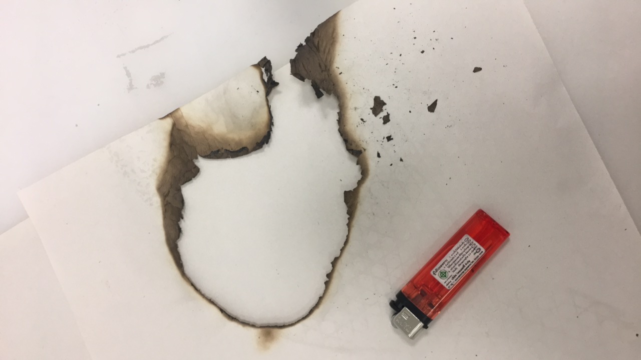
 Toothpick