AIM: Educating children on child sexual abuse
target audience: children aged 6 – 12 years old, and their parents
read more about the projects
That’s it for VC II!!!
Cya next semester folks hehehe
Till then,
Flazéda!
jamz
x

spongeycoconutz
That’s it for VC II!!!
Cya next semester folks hehehe
Till then,
Flazéda!
jamz
x
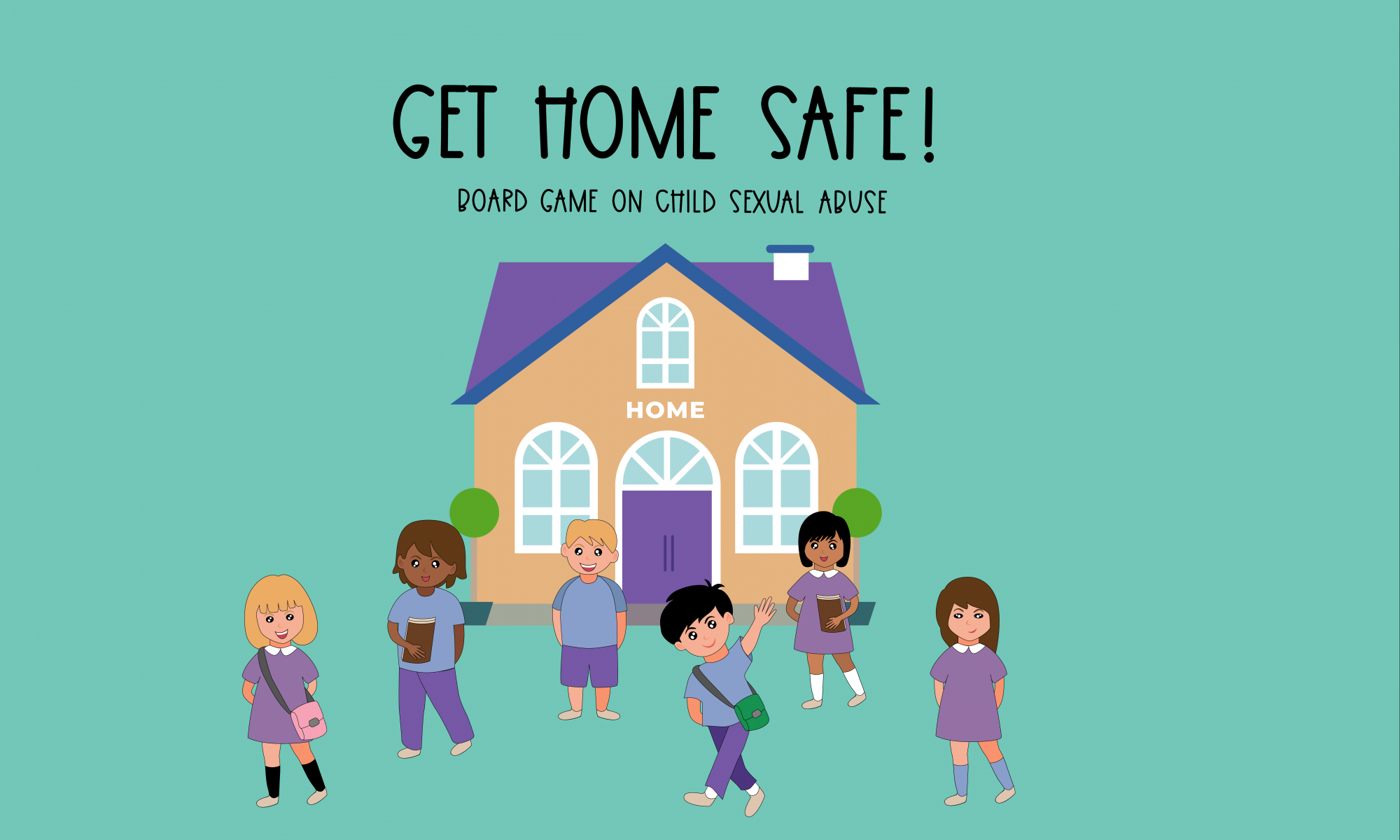
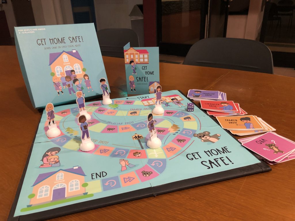
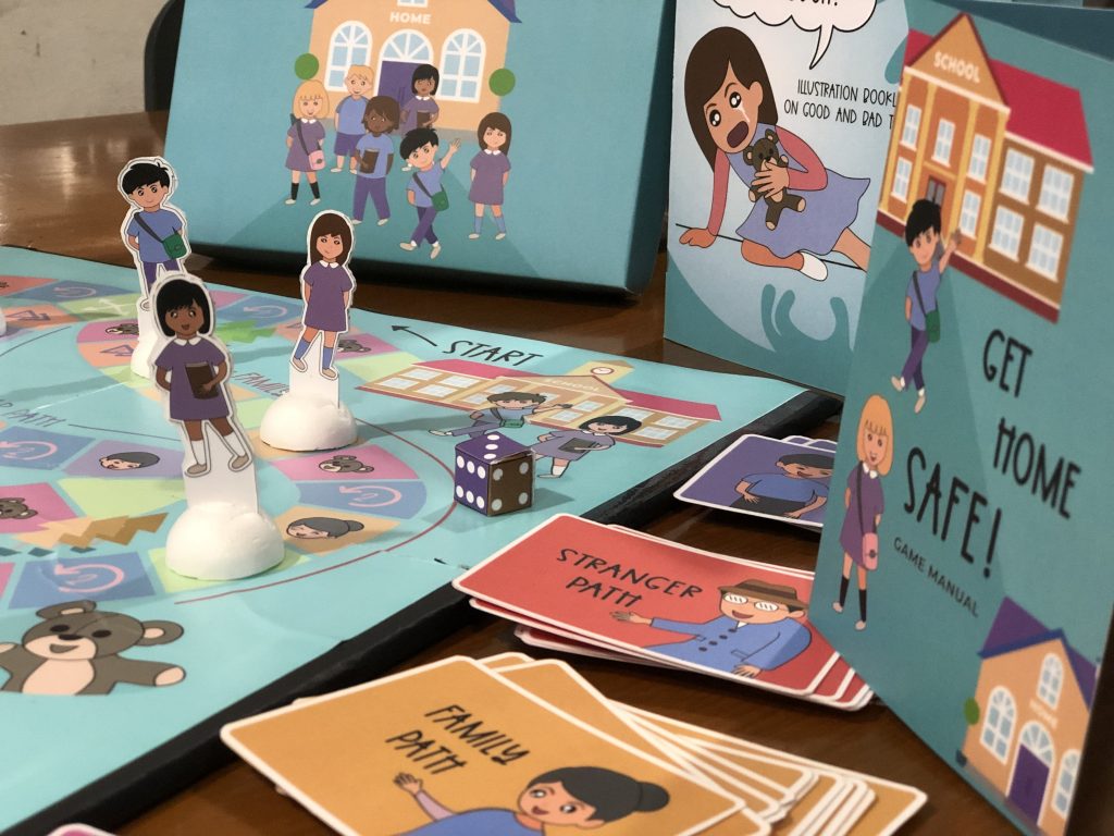
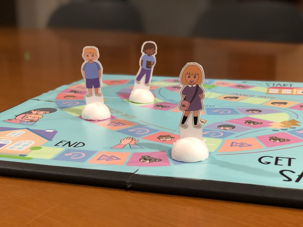
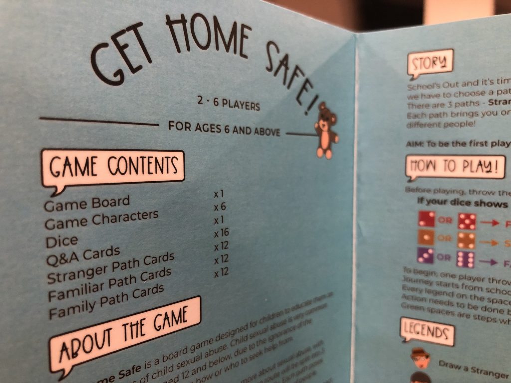
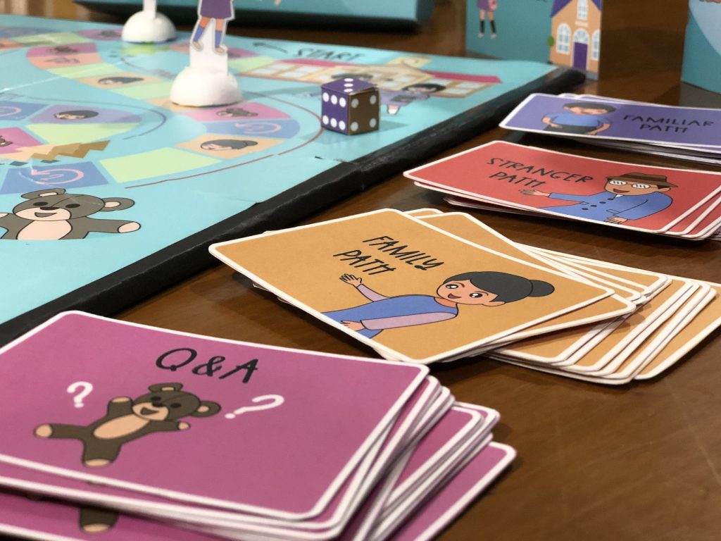
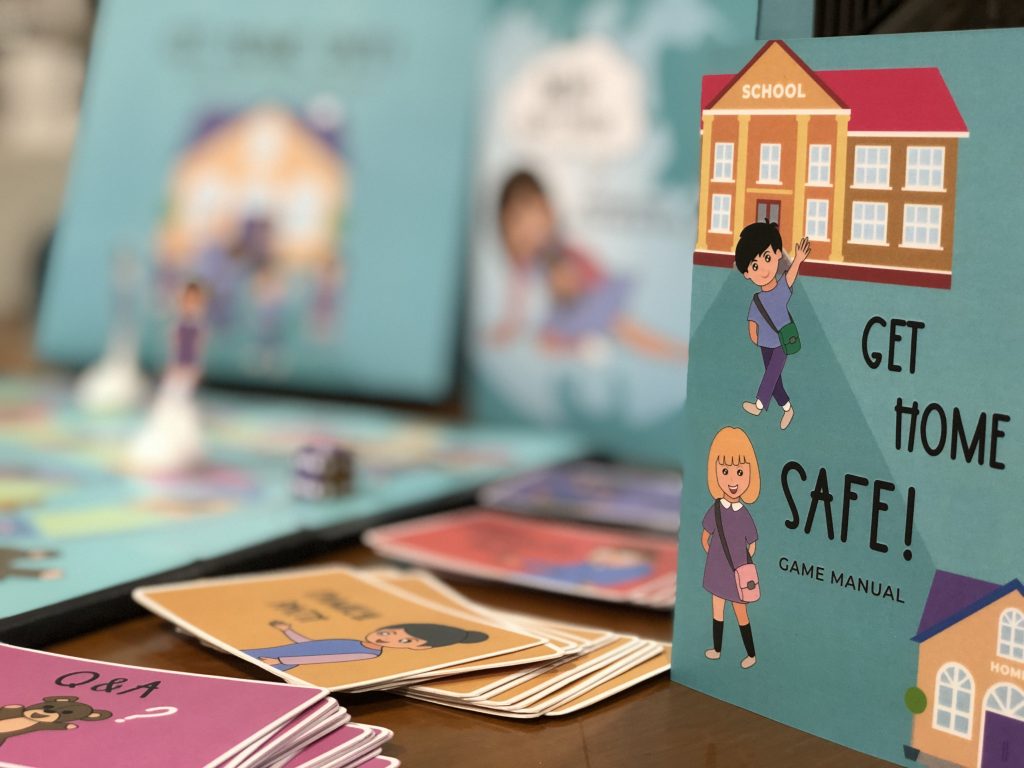
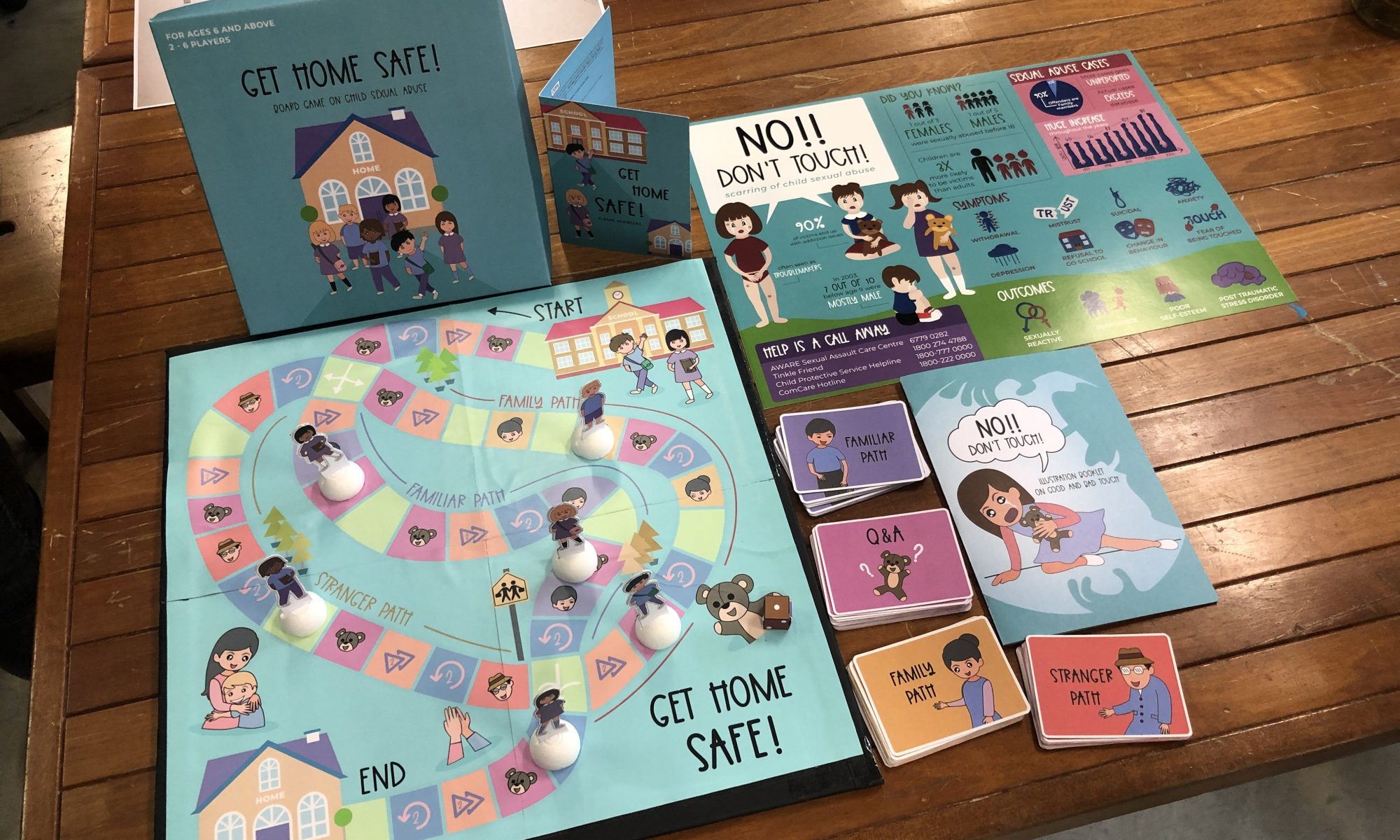
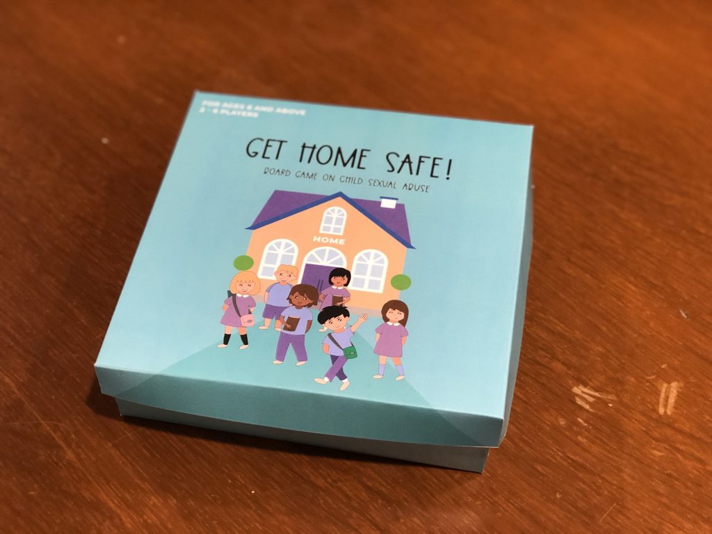
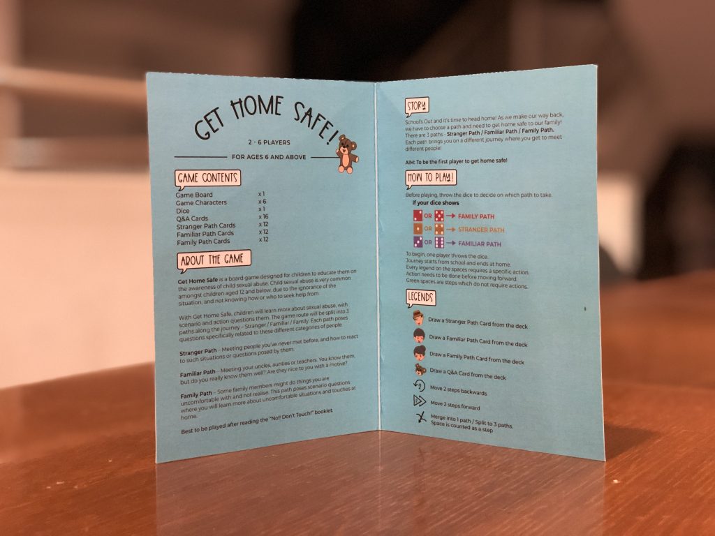
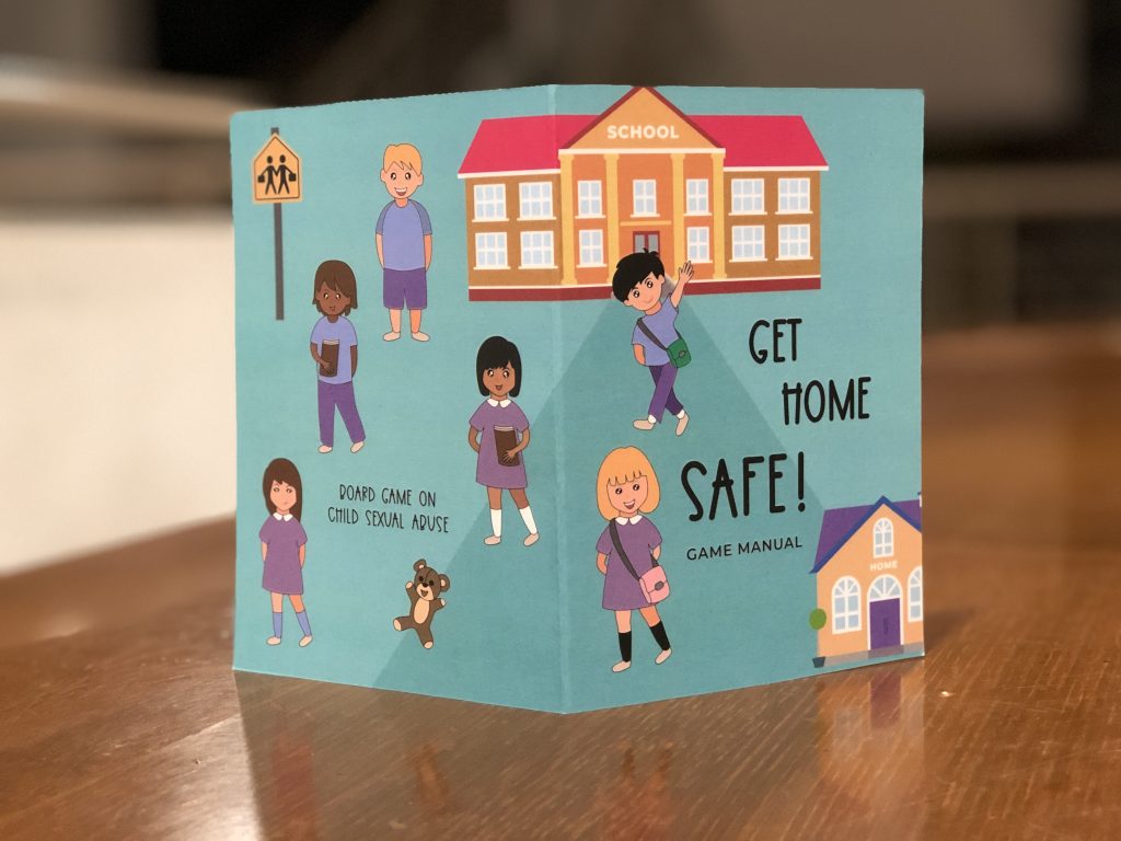
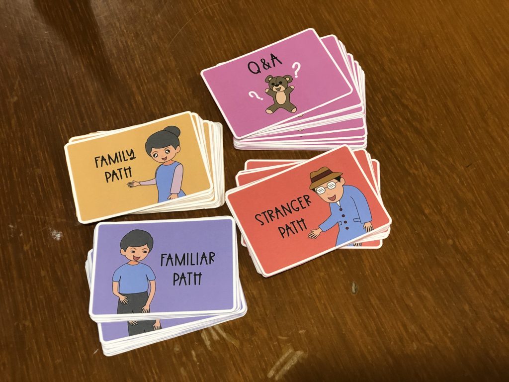
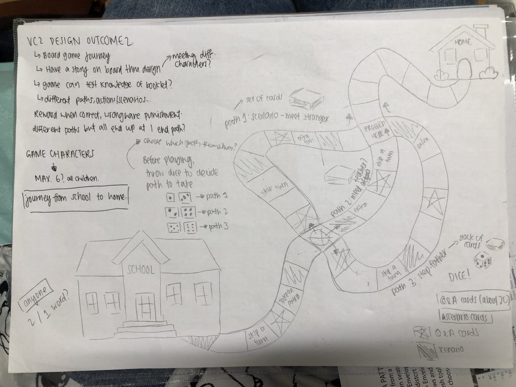
For design outcome 2 deliverable, it’s a sequel to design outcome 1’s booklet. I decided to do a board game, as an educational resource which I foresee can be played in school with fellow classmates, to learn about child sexual abuse.
Target Audience: Children aged 6 – 12 years old
As my target audience age range is relatively young, before adolescent age, I think board game will be a suitable way of engaging the children. By engaging them in an activity, they will be able to have fun and absorb information, as well as acting some actions out.
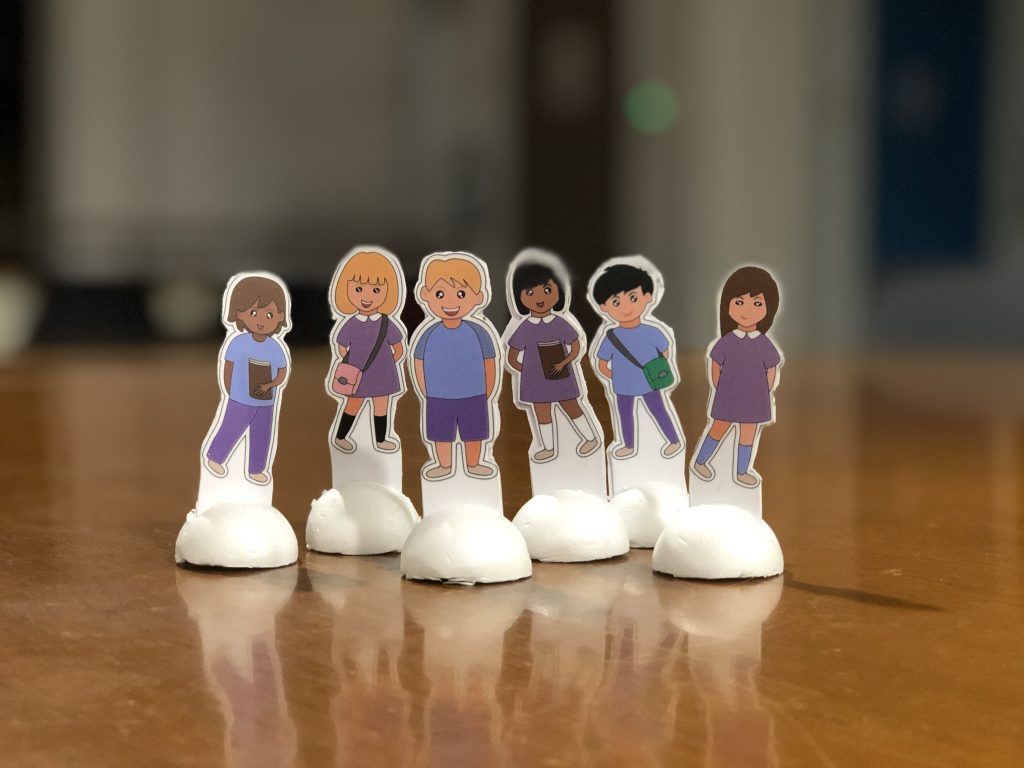
Within the game box, there are 6 characters – which means a maximum of 6 players, a dice, 4 set of cards and a game manual.
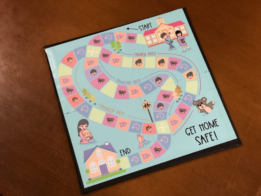
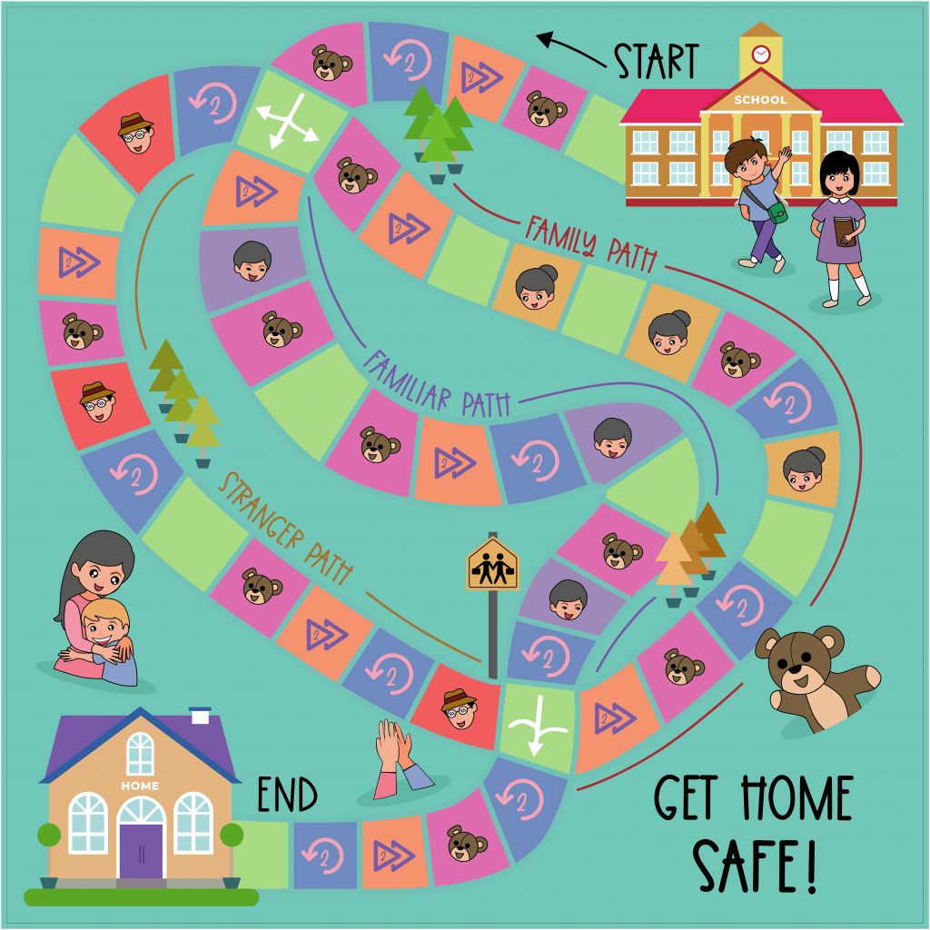
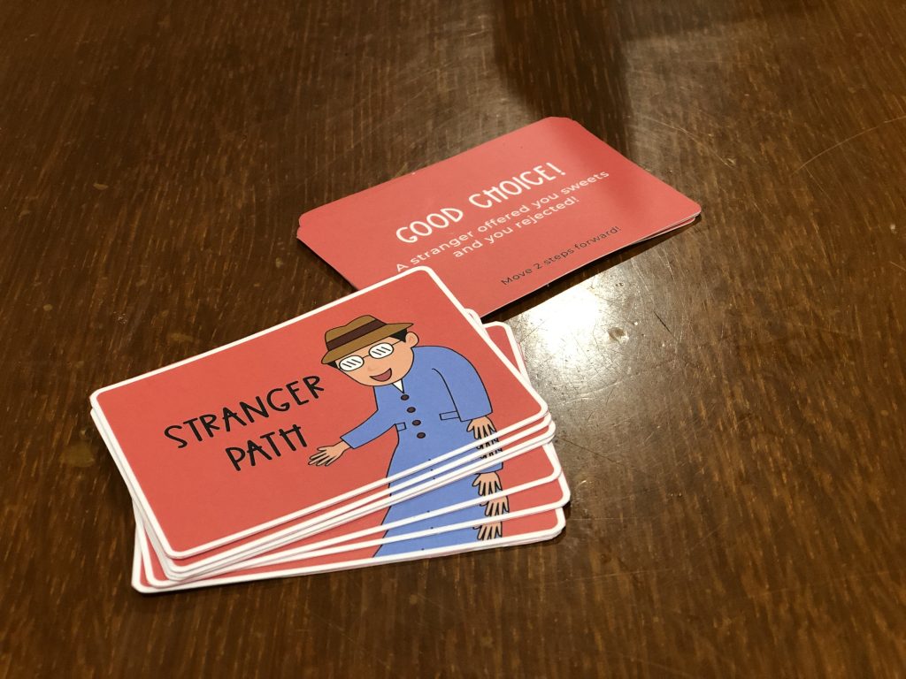
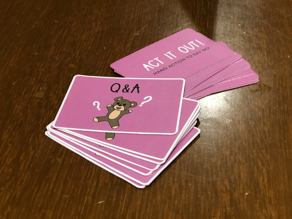
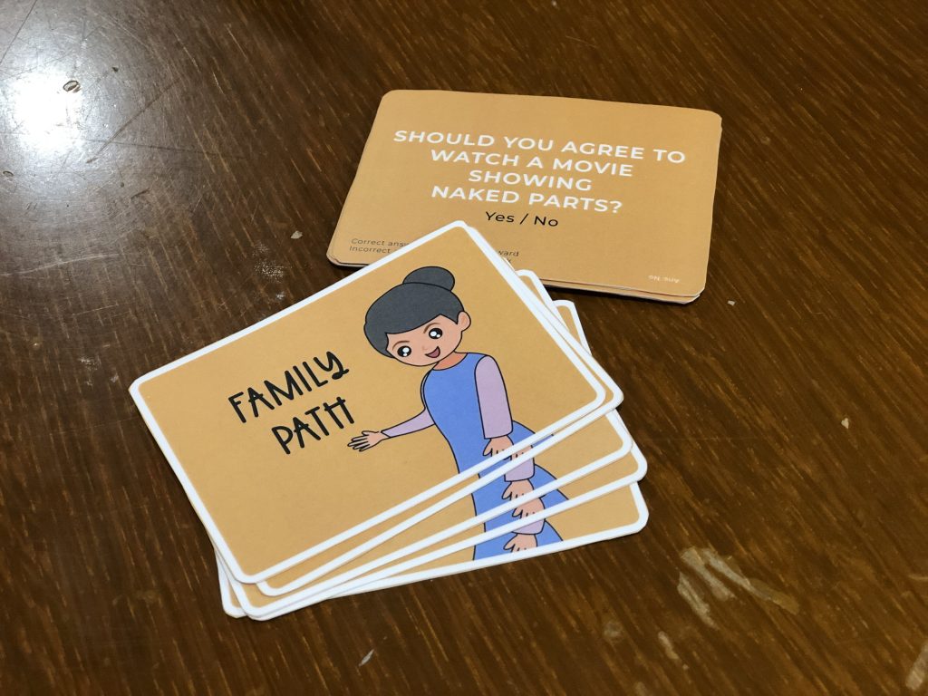
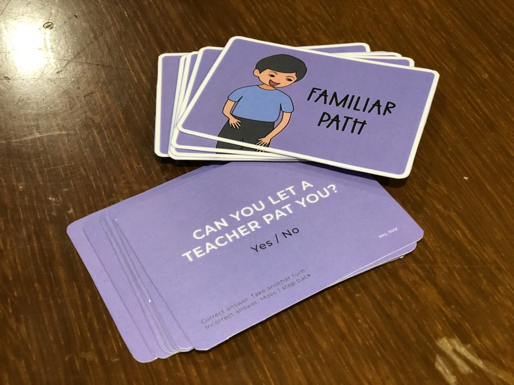

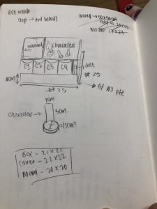
Classmates tried it and game was really successful! Game was engaging and educational, managed to solve the issue faced. However the craft work of the entire game was quite bad 🙁 Had to DIY the game board myself as it had folds to keep in the box, but I accidentally stuck the board sticker too fast, causing bubbles. The instructions on the cards were too small as well, tend to get overlooked. Perhaps can change the colour of the part, or make the font size bigger?
That’s it for the Design Outcome 2!
Till then,
Flazéda!
jamz
x
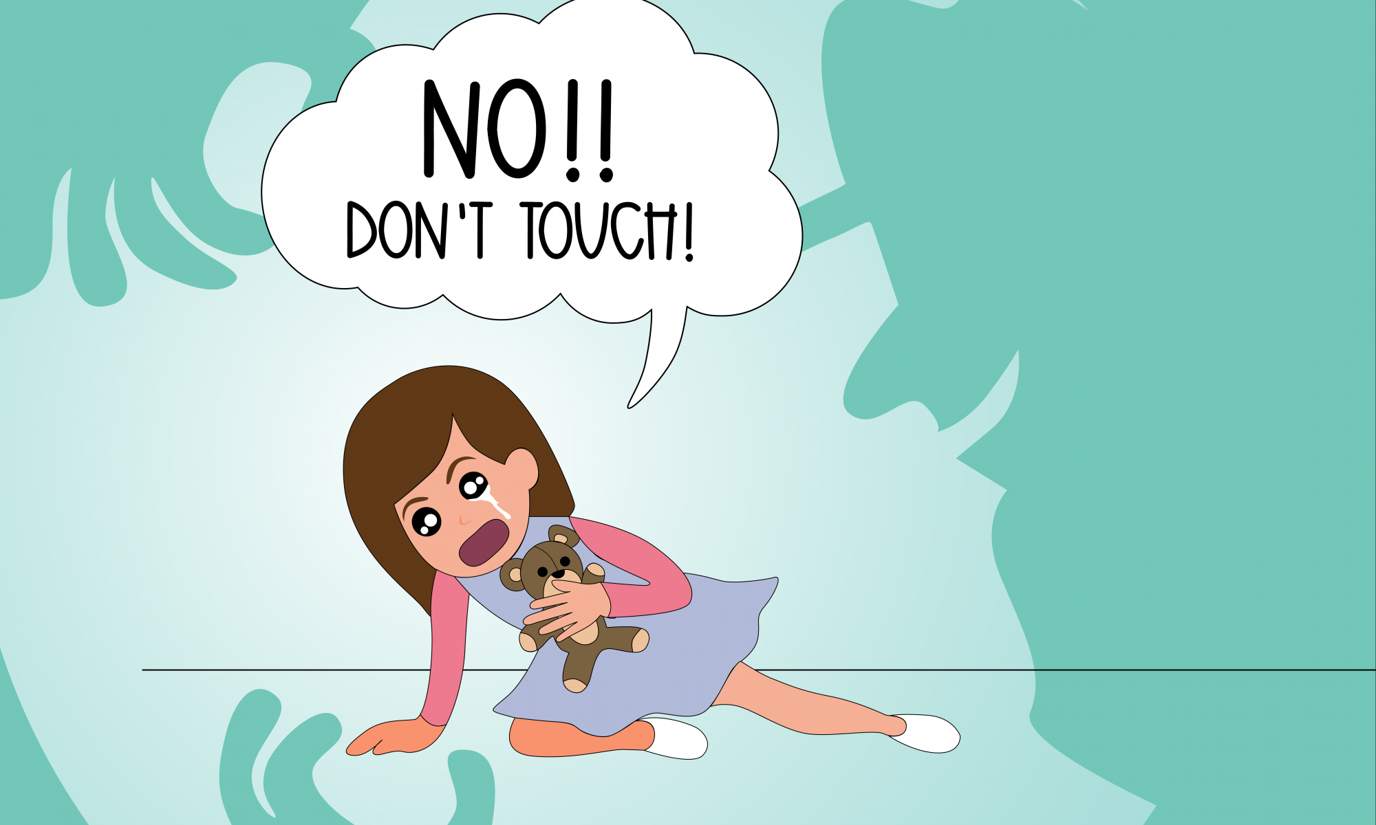
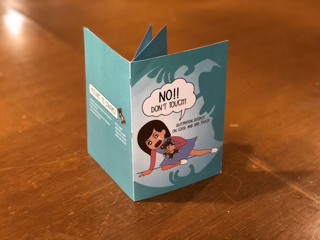
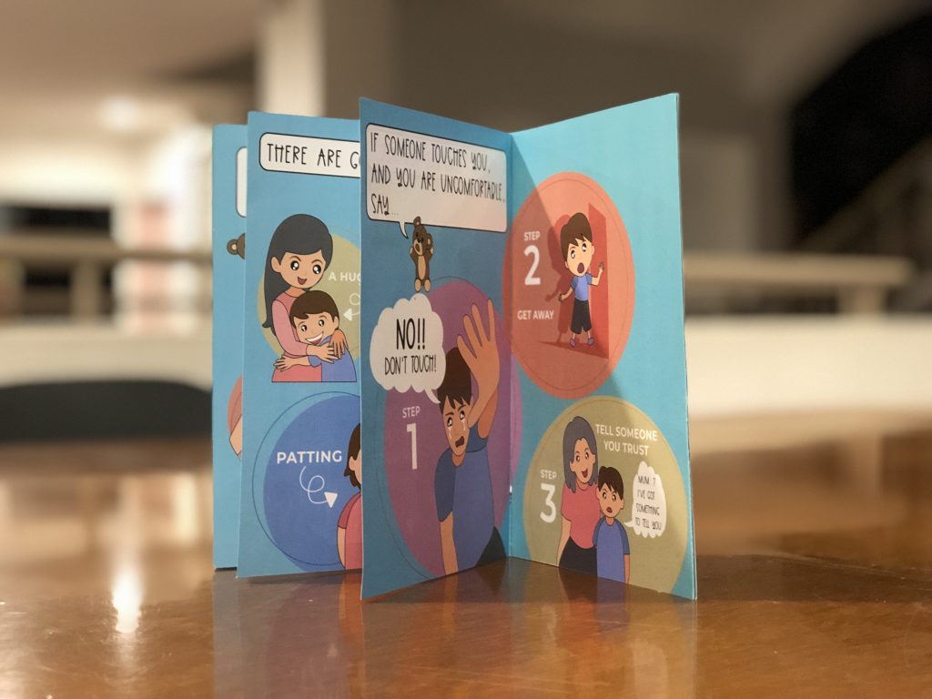
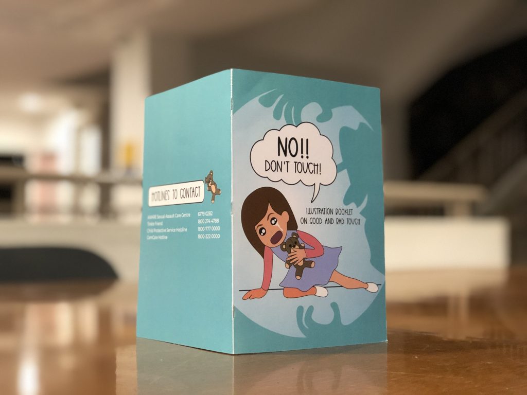
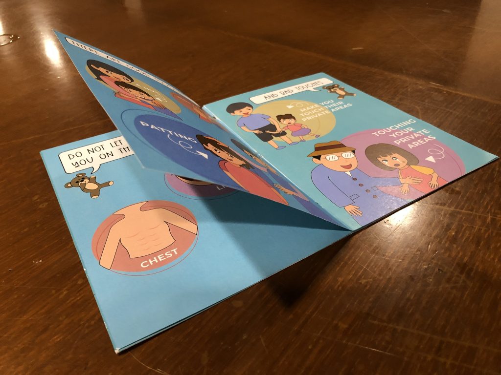
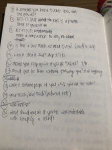
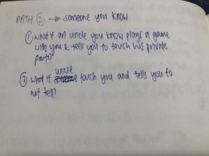
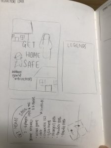
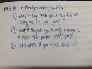
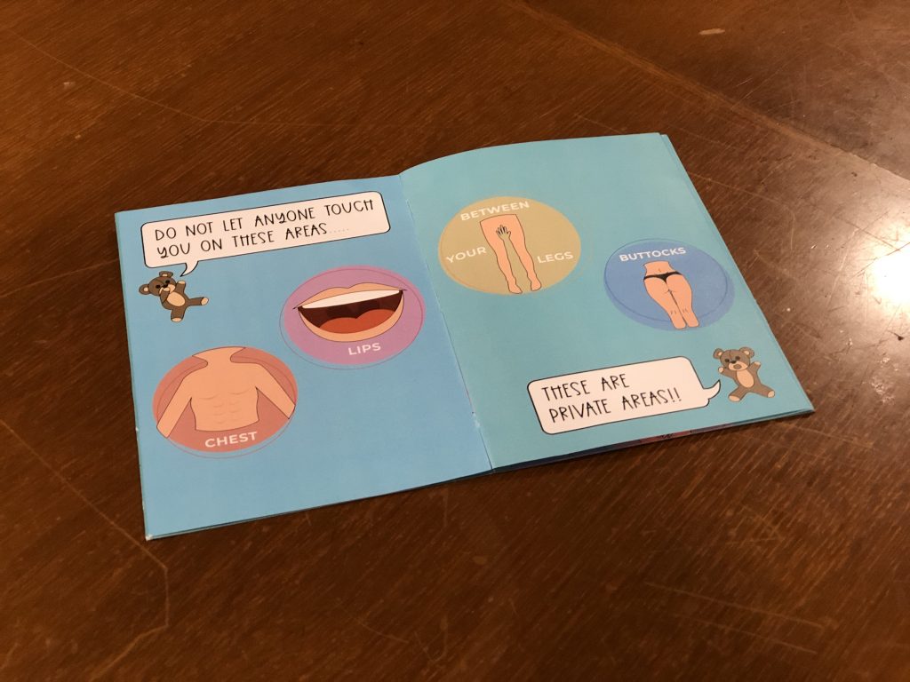
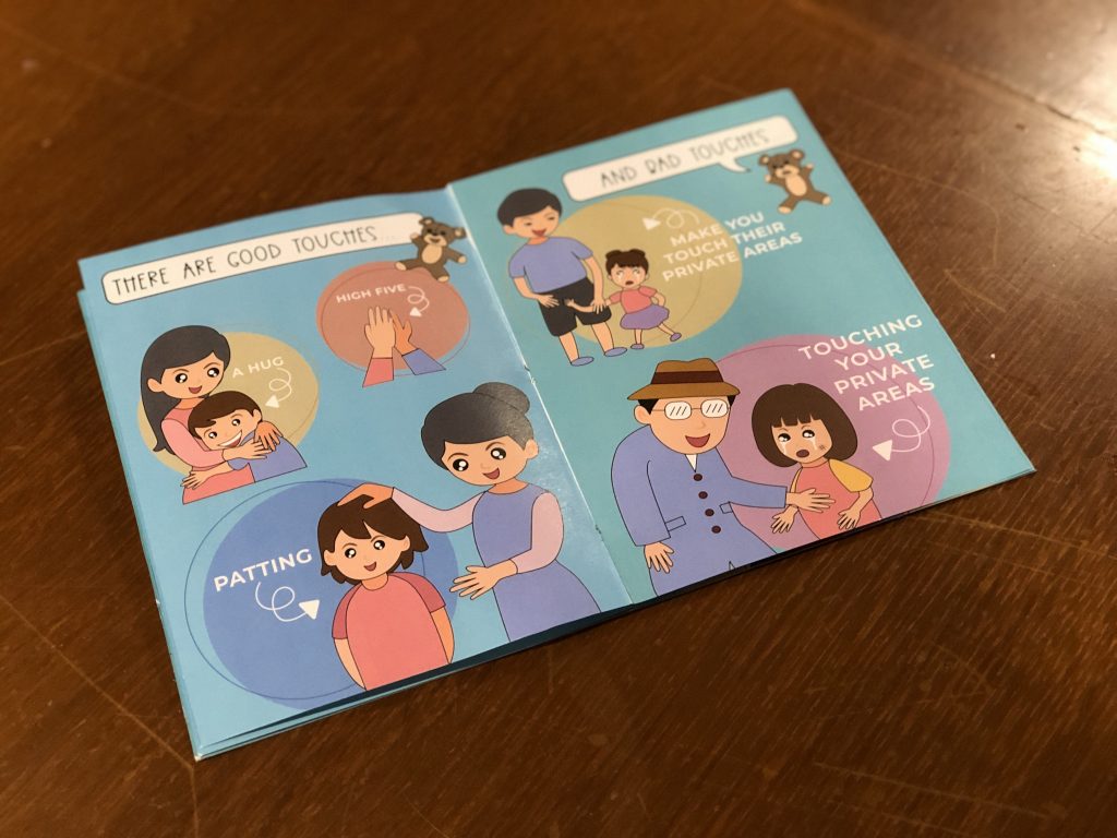
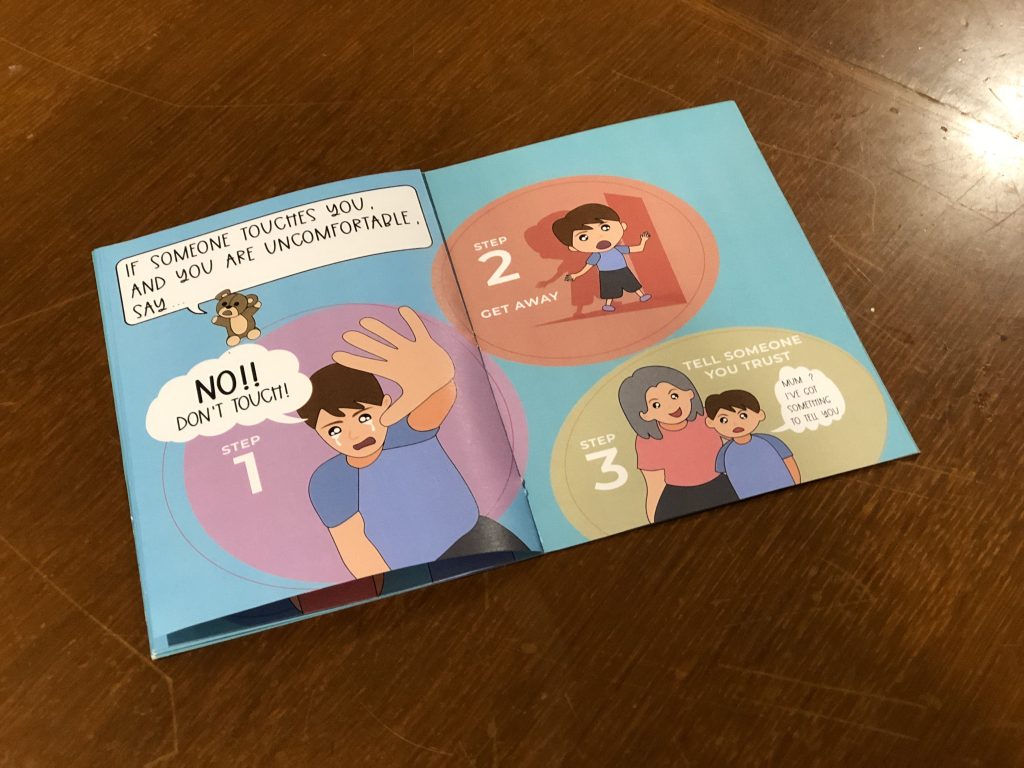
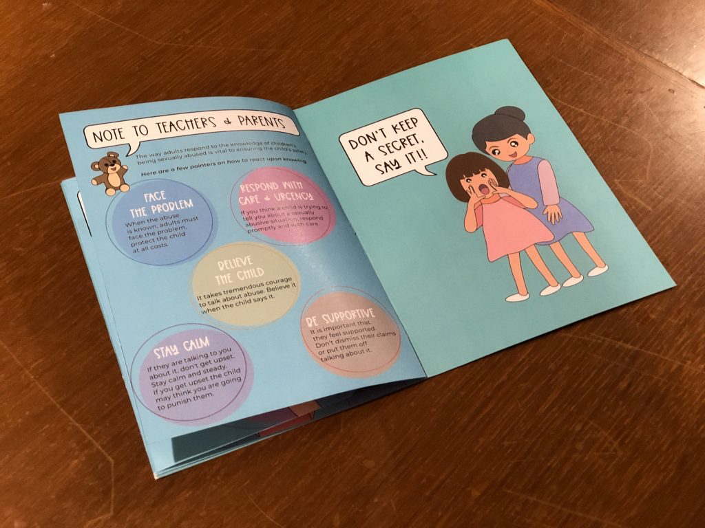
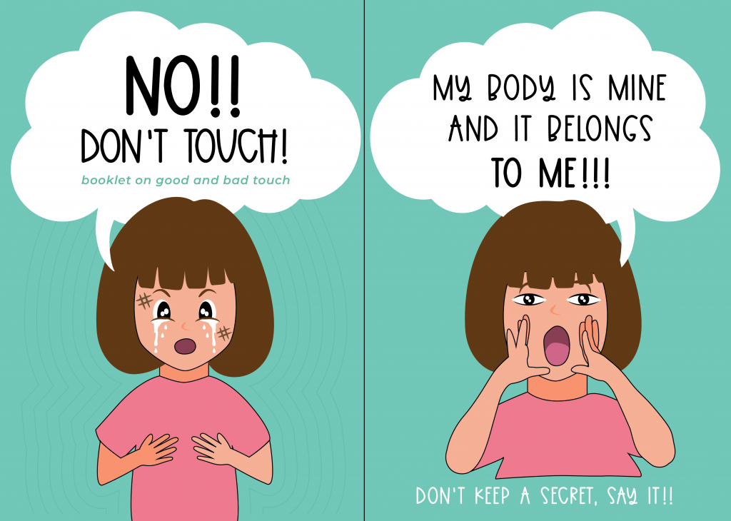
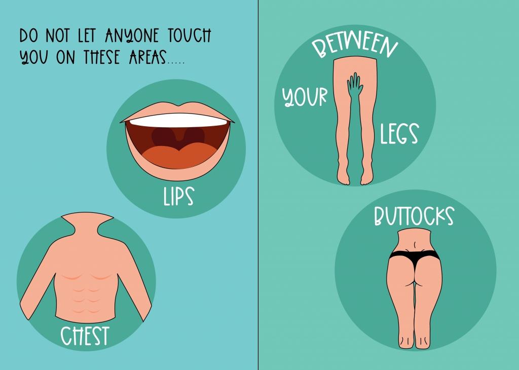
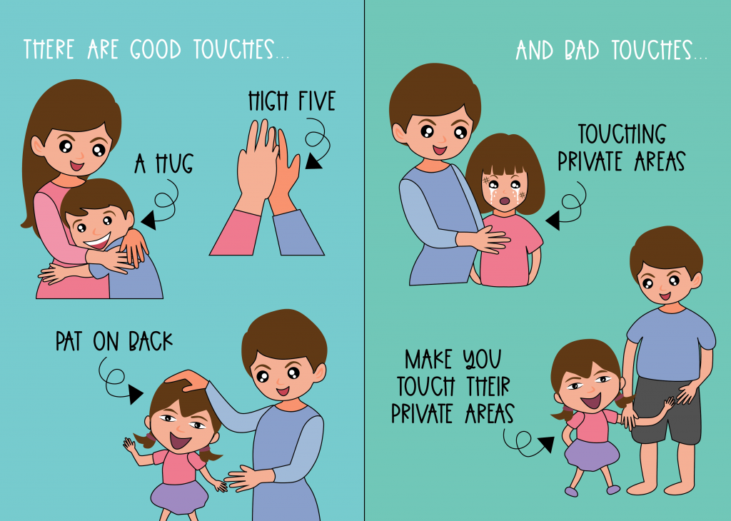
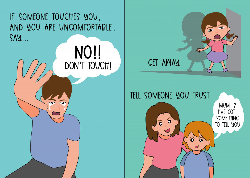
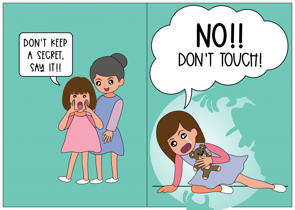
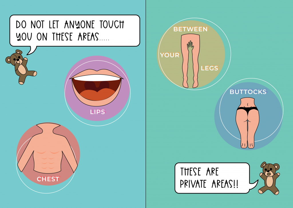
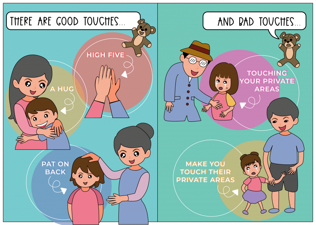
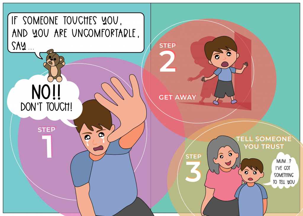
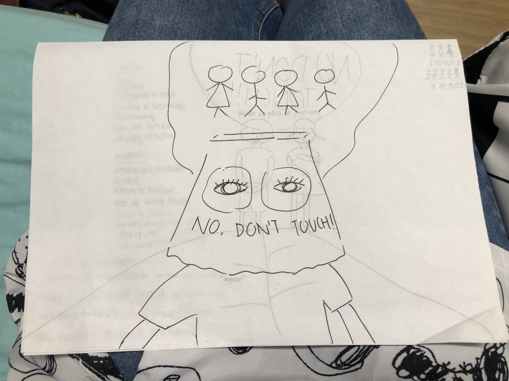
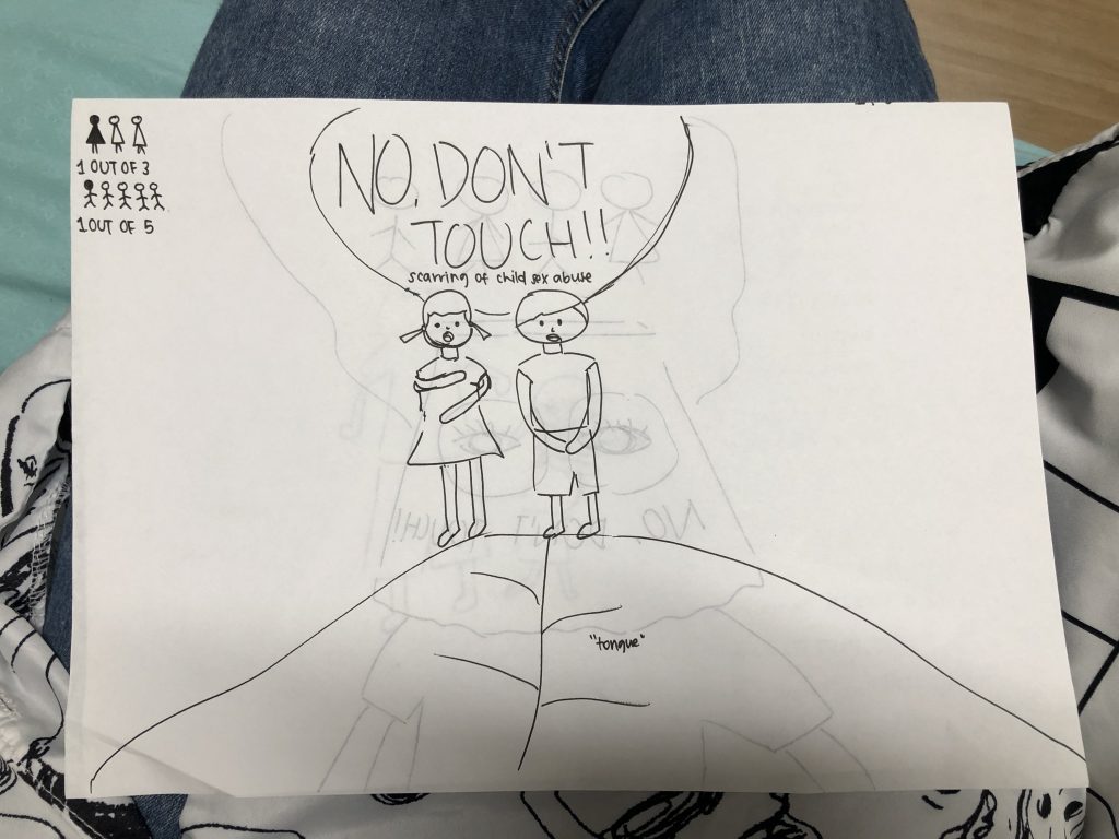
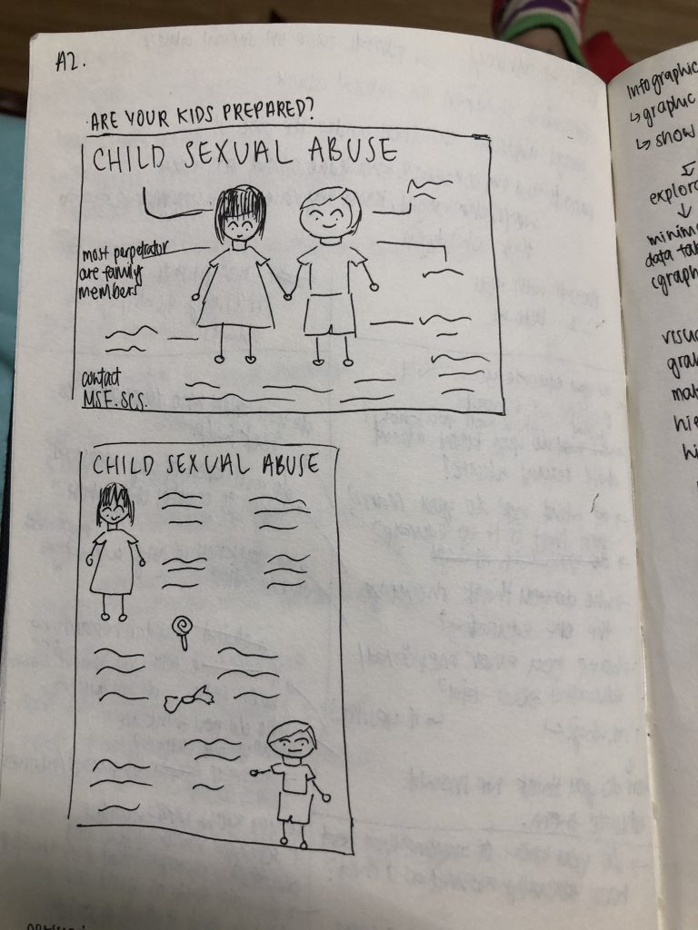
For my design outcome 1 deliverable, I wanted to do a booklet on child sexual abuse to educate children. Topics such as good and bad touch and private parts were to be mentioned in this booklet, alongside measures to take when they are uncomfortable / experiencing sexual abuse.
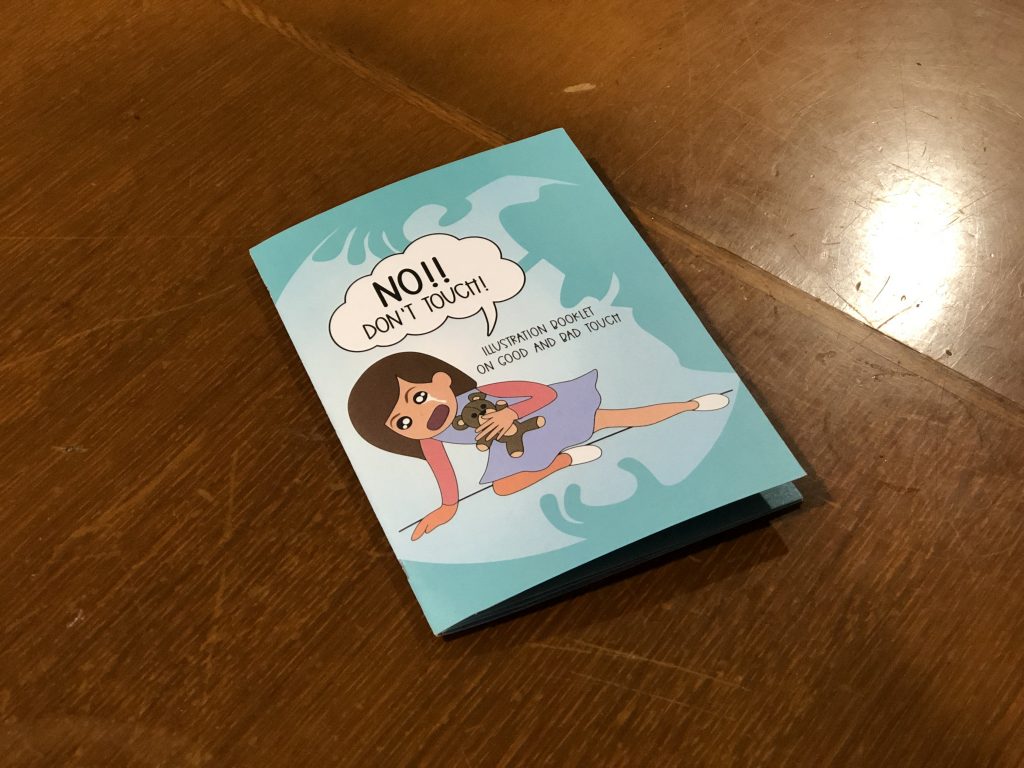

CLICK HERE FOR ONLINE VERSION OF BOOKLET – Vc2Booklet FINAL
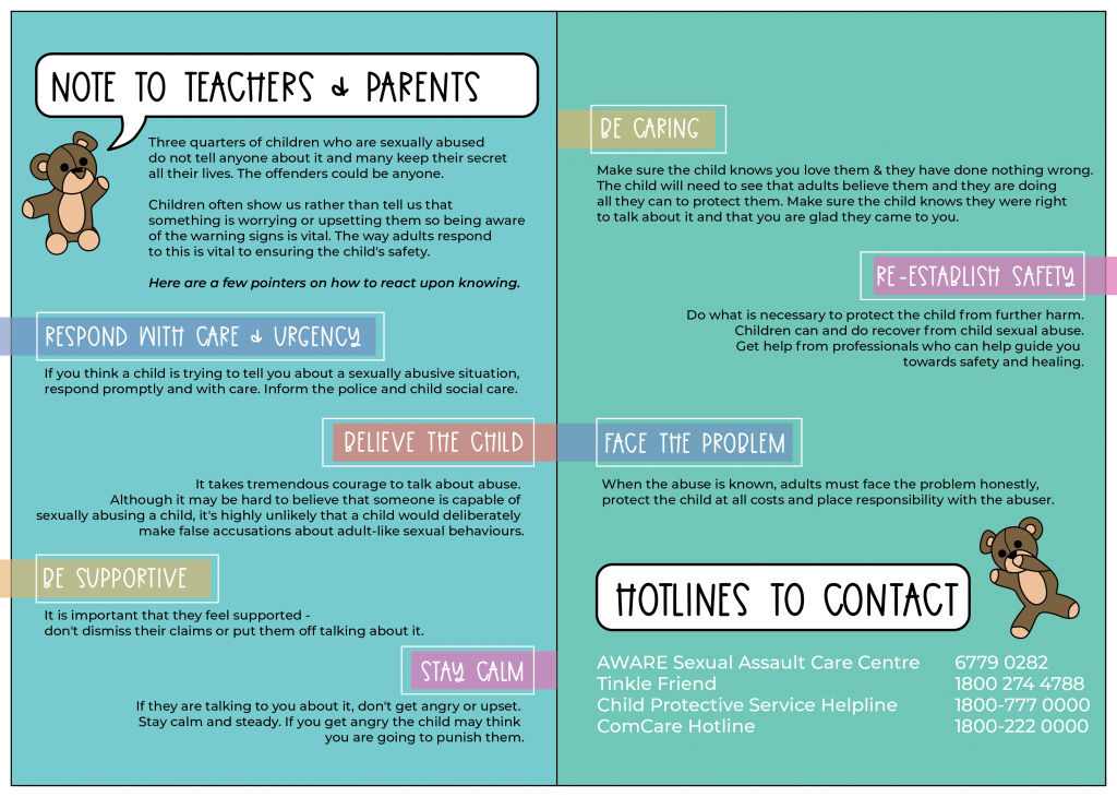
I initially only had 8 pages in this booklet as I wanted to print contents on the cover page as well. However, after consult with Michael, I decided to include more information and pages, as well as a page dedicated for parents & teachers. From there, I came up with a second draft of my booklet.
Feedback: The title page illustration did not really suit the booklet, and it looked like there are 2 cover pages. Thus the suggestion as to remove the illustration.
Feedback: Overlap lines or no overlap?
Feedback: Too wordy, should keep to the style of the circle graphic elements amongst the previous pages. Give more breathing space.
Overall, I’m very satisfied with the booklet and how it aimed what I set out to achieve. However for the design wise, the printed colours can go even lighter, and to take note of my margins as the feedback was that my designs always drop to the bottom. Best to have a 5mm margin!
That’s it for the Design Outcome 1!
Till then,
Flazéda!
jamz
x
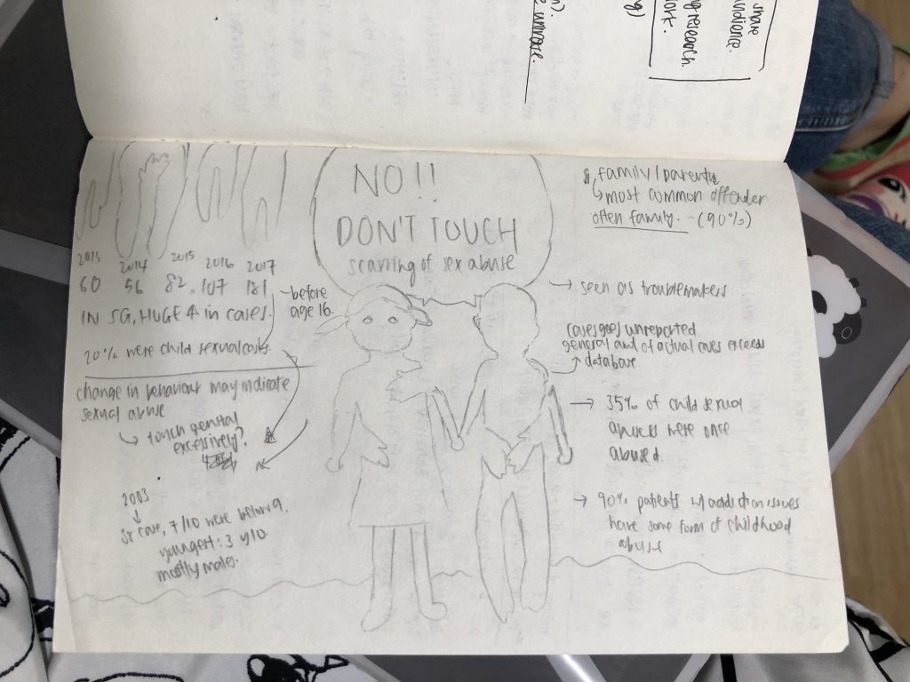
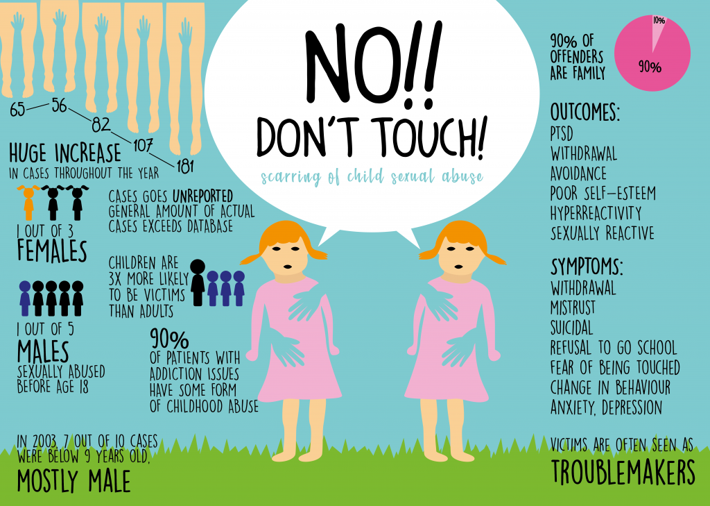
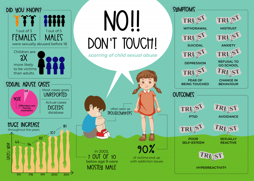
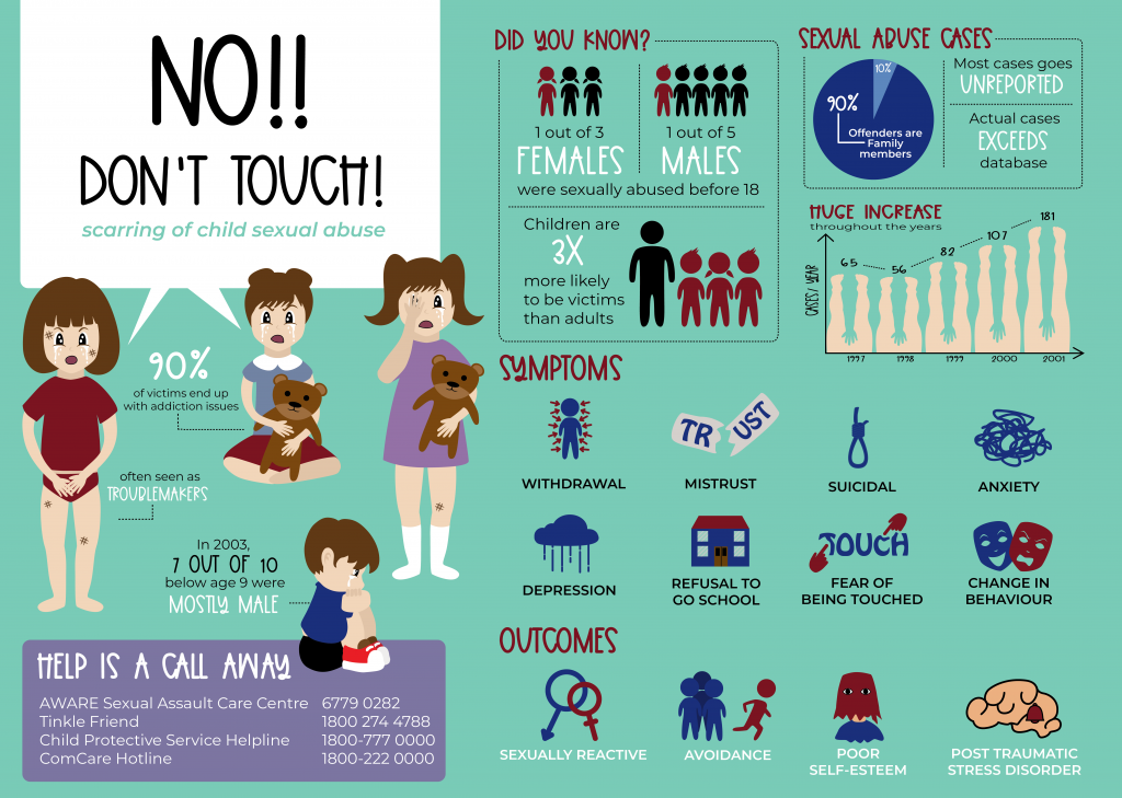
Child sexual abuse are more common amongst us than we know, but are usually unreported and not as known due to family reasons. Despite that, we should encourage victims to speak out, and educate their parents about these situations.
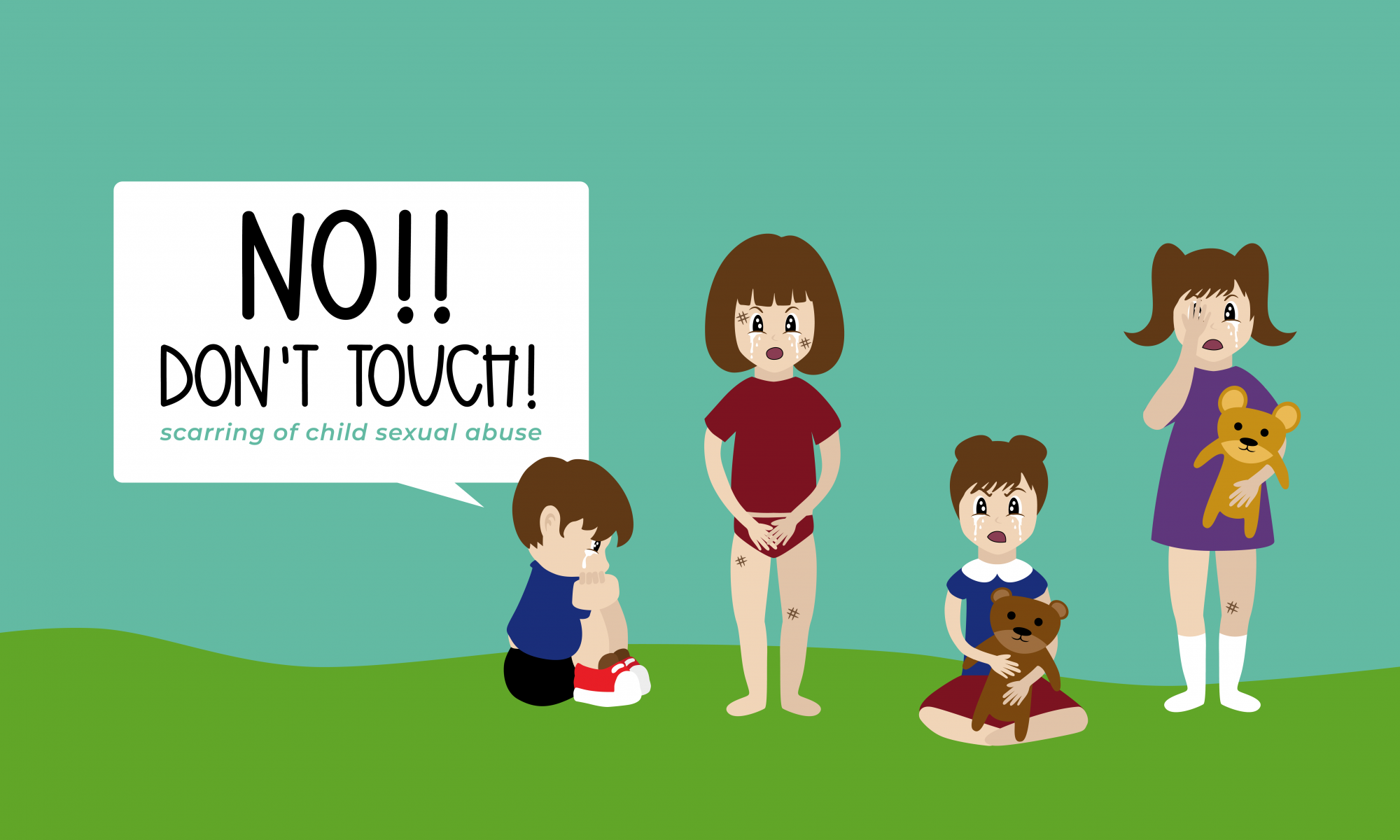
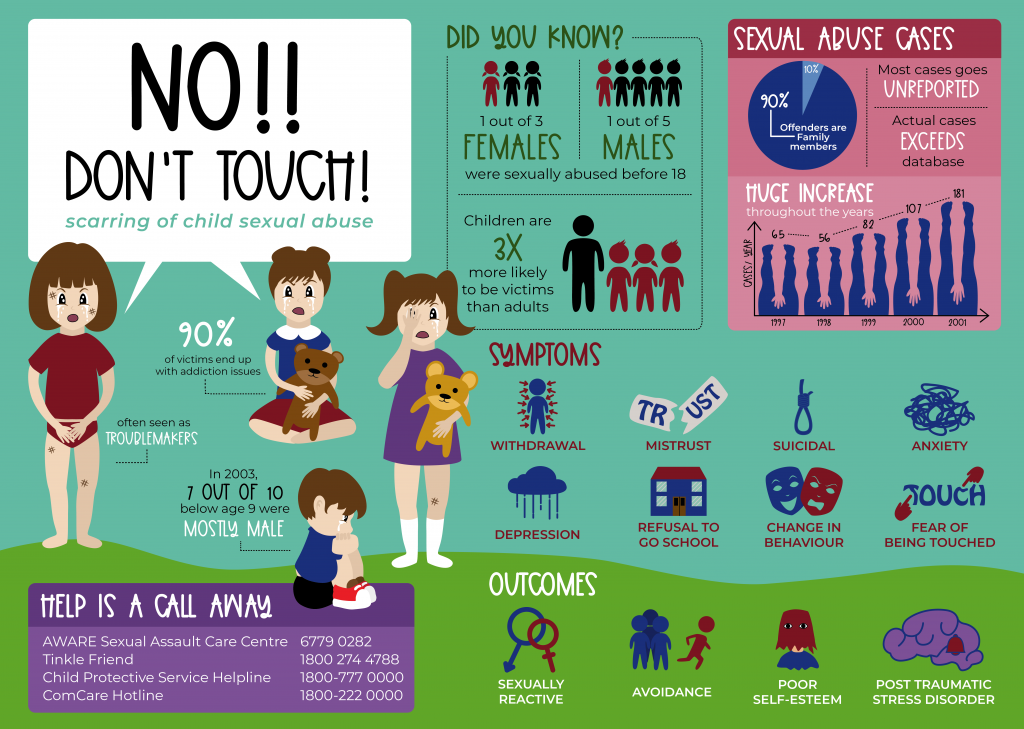
OBJECTIVES: The infographic aims to educate the audience on child sexual abuse, and the statistics of sexual abuse cases. It also shows the symptoms of child sexual abuse and the outcomes from the incidents.
TARGET AUDIENCE: Children aged 6 to 12 and their parents
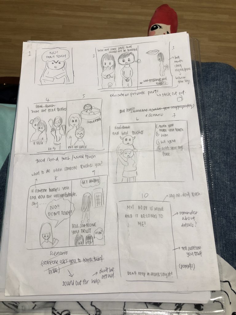
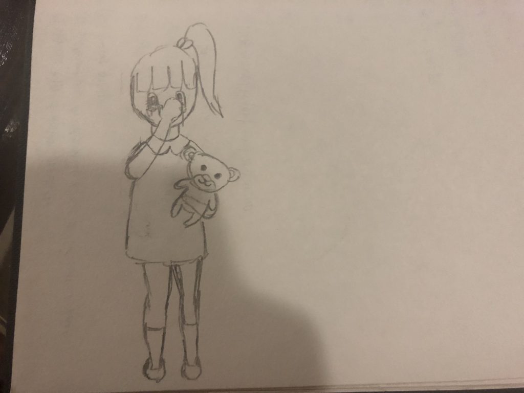
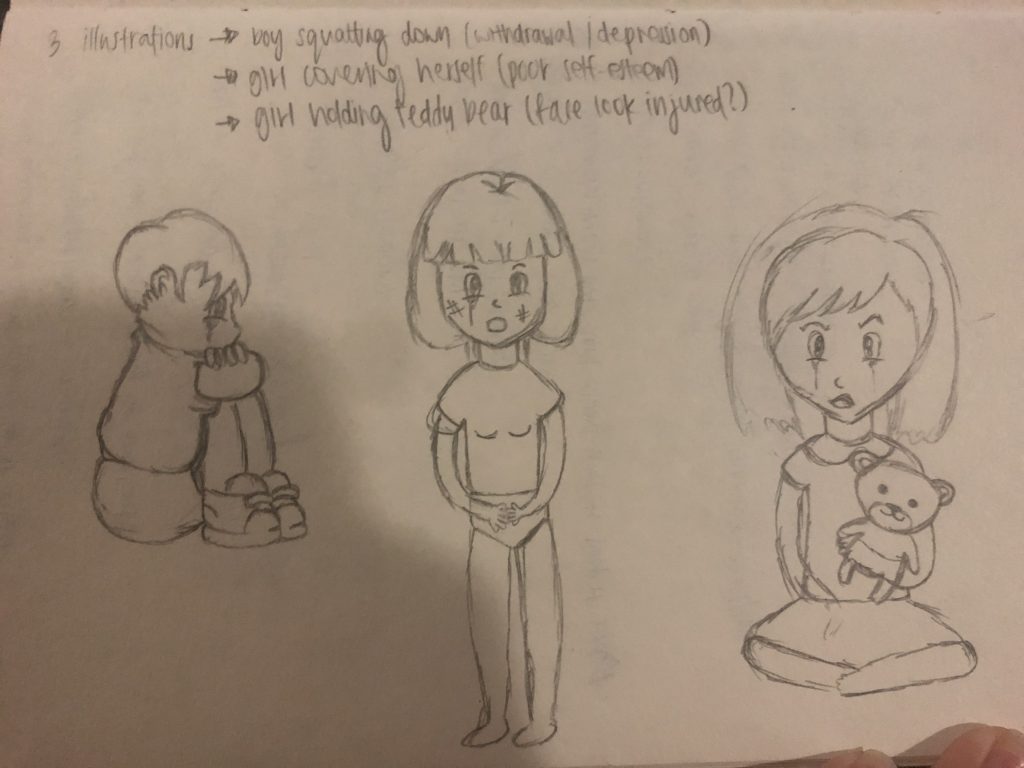
Rough sketches for my infographic layout!
I decided to go with a landscape layout for the infographic and started drawing out graphics to include.
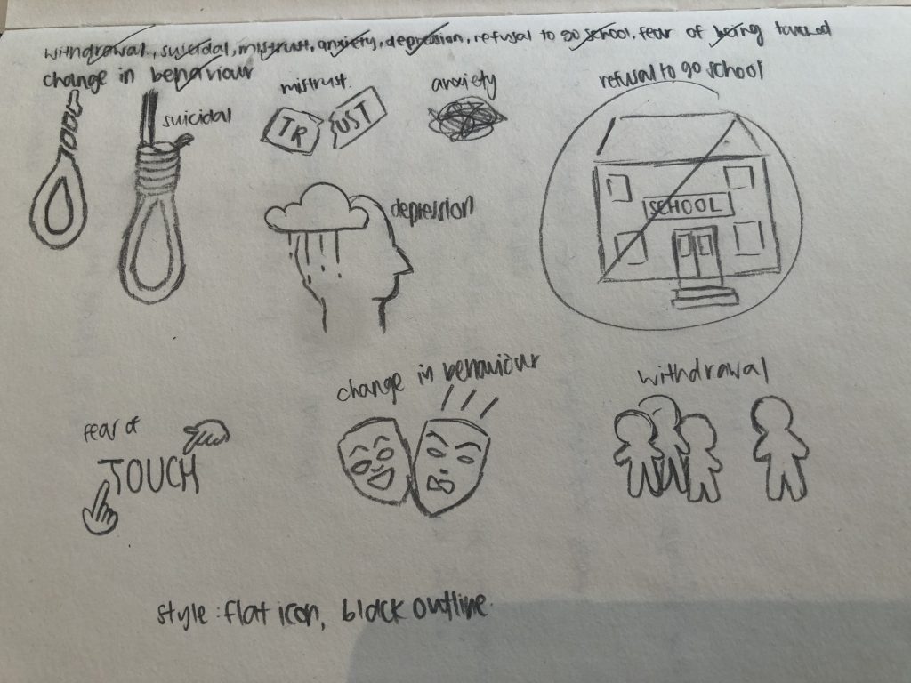

I started out with the information I wanted to put on the infographic, and played with the layout of it.
I proceeded to tidy up the poster and grouped them with line borders, and changed the graphics.

I came up with my own graphics and placed them in, with the usage of colour filled boxes as groups for different sections of information. I played around with the layout before reaching the final layout.
The overall print out colour of my infographic was darker than on screen, and the contrast was not as obvious, and the black text could not really be seen. Also, the characters had the same face which was a little weird!
That’s it for the infographic!
Till then,
Flazéda!
jamz
x

Come join while we celebrate the wonders of sex and they make us more physically active! Sex is a form of exercise, which allows us to stay active and feel pleasured!
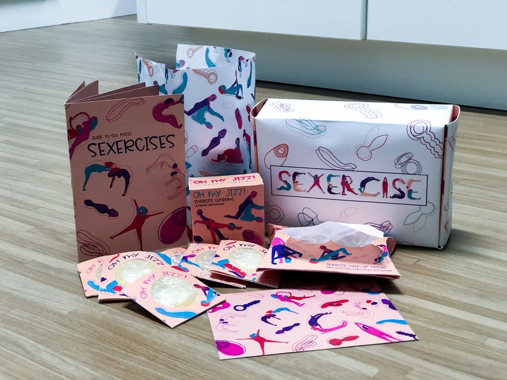
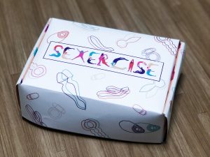
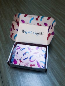
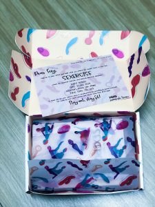
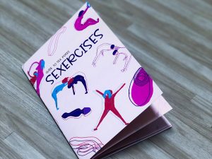
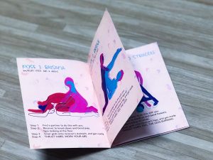
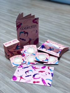
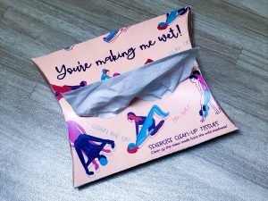
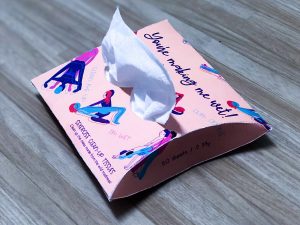

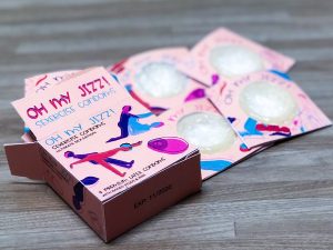
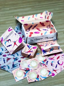
Needless to say, I HAD TONS OF FUN WORKING THIS ASSIGNMENT!! It was good to be able to come up with a concept that I want to work on, all with the aim of having fun! I wanted to work on a project that will definitely not be allowed in Singapore, and I thought that a sex festival will be pretty fun. If it’s ever allowed in Singapore it’ll be like a mass orgy so nope HAHAHA. I started by coming up with a Pinterest board and getting inspirations for the illustration styles I was going for, sex-related humour and some packaging designs. Initially I had some trouble with the illustration style I was going for, as I felt that it wasn’t similar to my references. However after some amendments and learning how to work photoshop, I managed to somewhat get it to look similar. From this project, I think my illustrating skills got better and I know how to use it in a design perspective!
I really enjoyed this module where I get free creative reign to illustrate whatever I want!
Till then,
Flazéda!
jamz
x