After so many long posts, let’s start off with my work process~ *Disclaimer: I started using colours that aren’t pastel yet, as I wanted to have a solid bold colour to see if the overall outlook matches, before making them pastel!*
Before I started doing it digitally, I conceptualized on a little notebook I had!
(Sorry for the really messy sketch)
I started out working on
Equation 1: Me, from a business background + Learning basic design skills = What I think
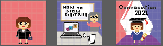
I placed me, wearing a business formal, with a red background. However, I felt that this square was too plain, and it might be better if I added more elements.
The next square, I used a scene whereby a teacher is having a class on “How to Draw Digitally”, something I expected to have during my journey in ADM.
Finally, the last square, it’s me, graduation in 4 years time (2021), in NTU!
The reason that I used these colours is because Red represents Passion, and design/drawing is my passion, which is why I ended up in ADM despite having done business in Poly!
Another reason – was because, NTU graduation ceremonies, has tons of reds and blues! I kept the colours for the last square to be aligned to the norm of NTU. Here’s a photo of the recent Convocation 2017!
But for the last square, I wanted to place purple as the ground colour, as Red + Blue = Purple. However, I felt that it doesn’t complement each other. I’ll work on it and hopefully come up with a better colour scheme!
For Equation 2:
Me, still a child to my parents + Receiving pocket money = What my parents think
Firstly, I started with the first 2 squares only.
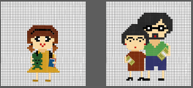
For square 1, It’s me as a child, with two pigtails, and a soft toy!
Square 2, it’s a mid-aged male and female, which is my parents, and they are both giving me cash (money), to fund my schooling and allowance!
To me, the colour scheme seems pretty off, and don’t suit the theme of me still being a kid to my parents.
*Note to self: Gotta work more on it!!*
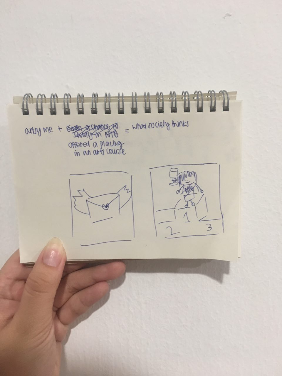
For Equation 3:
Artsy fartsy me + Doing well in an arts course = What society thinks
I did the last square of “What society thinks”, before doing the rest!
This panel was to portray me being an artist on the streets, selling my art commissions for a living. However, after a consultation process with Prof Mimi, I do agree that the colours I used were too dull, and the artworks looks like stamps instead. Thus, I suggested – why not use spray painting instead? It’s considered a kind of leisure street art!
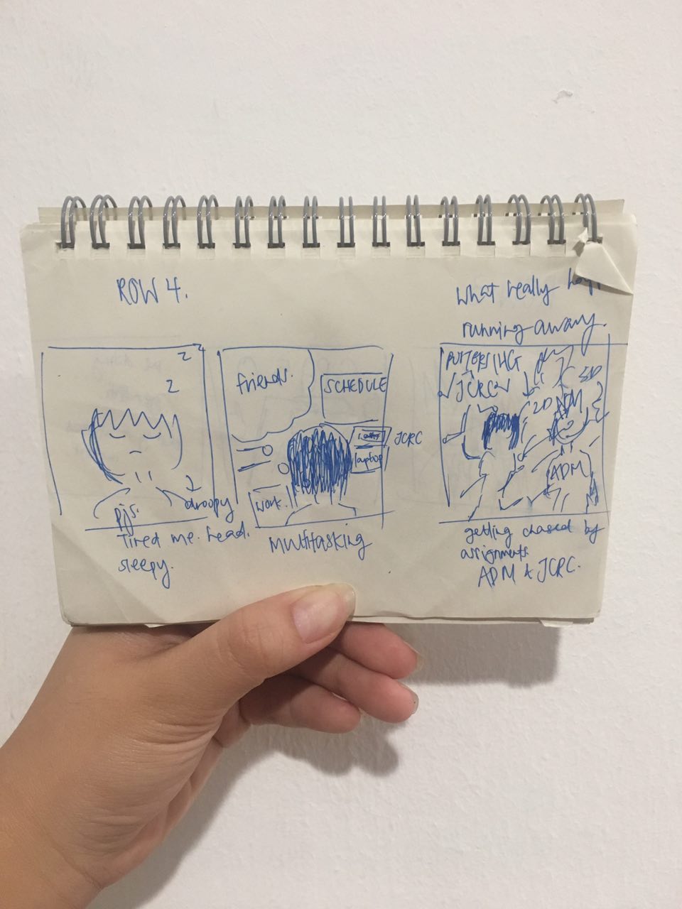
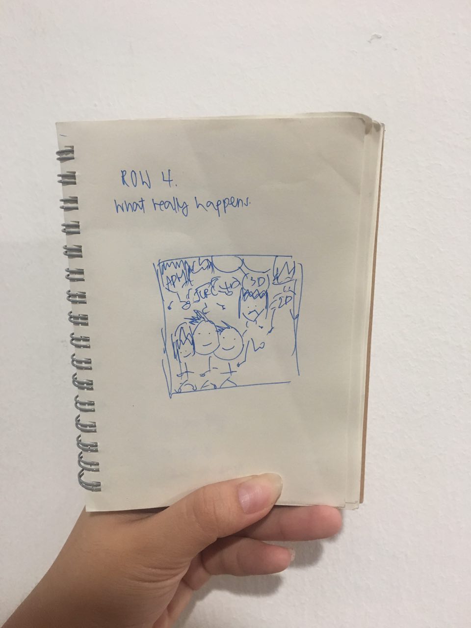
Lastly, for Equation 4:
Sleepyhead me + Deadlines = What actually happens
I only managed to come up with the sleepyhead me before the consultation, hahaha.
I really really like this as it looks like my face 24/7 HAHA.
But overall, I feel that this won’t suit the style of the 8-bit art I am going for, so I will be changing it!
Certain colours convey certain emotions and I wanted to use the colour to convey certain emotions for certain equations.
For example, for Blue, the negative emotions it has relates to fear/worry, and can also relate positively to love. For Red, it relates to passion, and so forth.
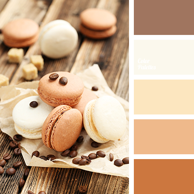
Next, I went to pick the colours I wanted to incorporate into my equations. I started using Adobe Color, a color wheel software that aids you in picking colours!
There are a variety of color rule options, such as complementary, triad, monochrome, analogous, etc, basically all the colour harmonies we can experiment with for Project Ego! However, as I wanted to have a more neutral and pastel color palette, I realised that Adobe Color wasn’t a good platform to use, as they are more of bright, bold colours.
Next, I went online to search on pastel colour palettes, and chanced upon this site , Colour Palettes, which shares tons of colour palettes for references for home decor and anything under the sun! I started browsing through, and decided to use the color palettes I found there as the color palettes for my equations!
Below are the colour palettes I selected!
Here comes the last 2D project for the semester! *YAS MAMA YAASSSSS*
The final assignment is a little different from the previous ones, as we have more artistic freedom, and not being limited to a certain medium, technique or style!!!
For this project, we have to create 12 20cmx20cm squares, 4 rows of 3 squares each. The first column is used to represent myself, second to represent a setting and third to represent an imagined outcome. A requirement we had was to include the usage of colour harmonies.
I was really really excited to work on this project, as I ACTUALLY REALLY REALLY LIKE 2D!! And being able to illustrate ourselves?! YAS.
Before I even started conceptualizing, I was deciding on the art style to go for first. (i don’t know why was I more excited about this)
Initially, I wanted to work on vector illustrations/line art styles – because I have been really into it!!
This is an example of an illustration I done up – for my Hall’s JCRC work.
But I scraped that idea off when Prof Mimi showed us some seniors’ past year works for inspiration and told us that for those that did digital art, many used vector illustrations.
Thus, I felt that if I were to do it, I might be at a losing end as firstly, I had no experience in illustration, and to create a work that stands out compared to my classmates/seniors – it will be really tough!
I went to put on my thinking cap again, and my thoughts started wandering everywhere. Traditional media? Painting? Paper cut? Digital art? Photo Collage?? Hmmm.
Traditonal media will probably take a toll on me as
1. not a fine arts background student = can’t draw/can’t paint
2. I WILL BE BROKE
3. I am super indecisive so I will probably keep changing my ideas
Traditional media? – Strike out!
And then I remembered.
8 bit. (also known as Pixel Art)
I feel that as a student still learning more about design, I should step out of my comfort zone and try something different. 8-bit style, might not be an art style that I will be venturing into in future during my career – so why not try it now?
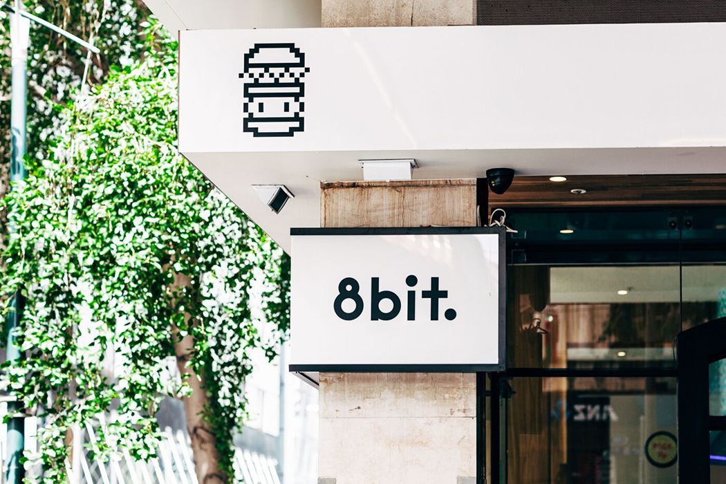
Ever since I went to Melbourne (before university life came in), I’ve wanted to do something 8 bit-ish, inspired from this burger bar I went to in Melbourne!
As original as it gets, the burger bar is called 8bit. hahahaha
Anyways, school is also about experimenting and learning from the process!
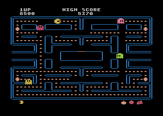
I started my research with just a simple Google Images search on “8 bit”, and the images that came up were mostly akin to games, such as Pac-Man, Minecraft.
I felt that it will be pretty interesting to work with 8bit art style, as it is a different way of illustration and considered quite a retro art style! (Will elaborate further on 8bit art style in my upcoming posts!)
After deciding on the art style I am going for, I started conceptualizing ideas!
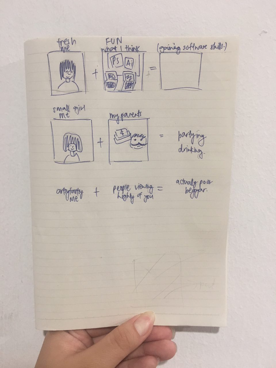
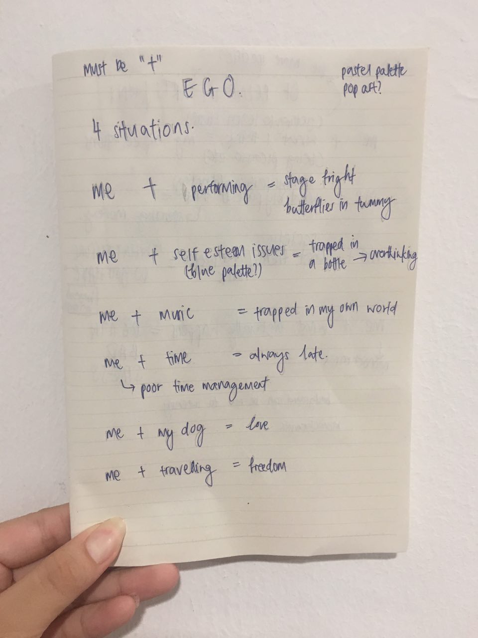
I started off penning down a few prominent situations I usually face and what always happens when I’m stuck in that situation. (Ignore the bad handwriting – I just really wanted to pen my overwhelming thoughts down)
For example, as a performer, performing on stage gives me really bad stage fright, and I always get butterflies in my tummy just the moment before I perform! & to manymanymany people, I am known for being late. Like seriously, I have no idea why am I always late.. My time management skills, practically doesn’t exist.
All these situations brings out who I am, but I wasn’t satisfied. I wanted to do something of a different concept, compared to what mostly had been done before. Thus, I started brainstorming for different concepts!
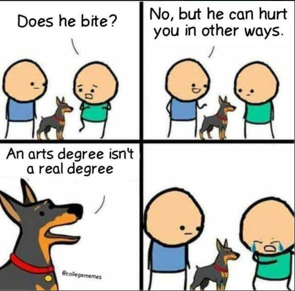
Just then, I remembered getting tagged on Facebook by my friend J, and it was a related to having a degree in arts.
Cerdits to @Collegememes https://www.facebook.com/College-Memes-265913313897422/
This sparked another concept that I had, and it was the entire setting I’m in now – me being in university and doing arts.
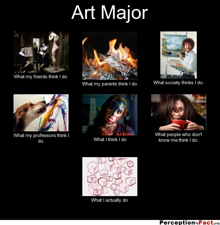
I had an idea of the usage of memes, huge thanks to social media and the Internet. Very often, I see a certain kind of meme, that talks about a main situation, and having it depicted in different perspectives!
Based on memes like this, I begun conceptualizing on the 4 possible different perspectives.
After conceptualizing, I got really excited about this idea and felt that it was more aligned to what I wanted, compared to my initial idea. This had more light-hearted vibes and I felt that it will suit the art style I was going for – 8 bit!
Thus, I decided to work on this “meme” concept!
I decided to work on the perspective of “What I think”, “What my parents think”, “What society thinks” and “What actually happens”
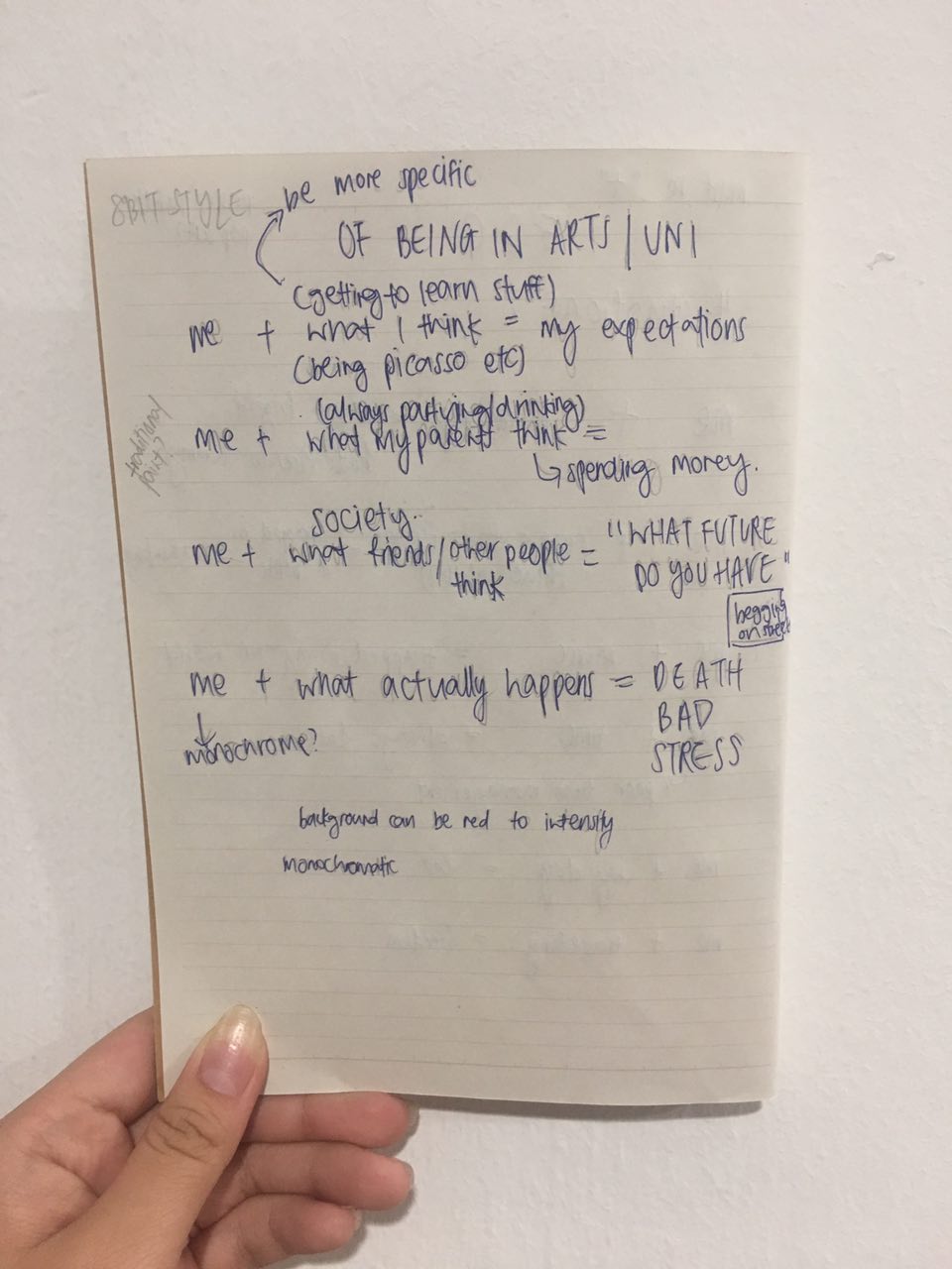
My first idea for the 4 rows are as follows:
Me + What I think (getting to learn stuff/being picasso) = My expectations
Me + What my parents thinks (always partying/drinking) = Spending money
Me + What society thinks = What future do you have (begging on the streets)
Me + What actually happens = DEATH/BAD/STRESS
But after a consultation with Prof Mimi about my idea, I realise that my content needs to be more specific and narrowed down, as they are pretty generic now. There should also be more play in Me, such as “Sad Me”, “Angry Me” and etc, as my idea originally was just to place an illustration of me, same throughout all 4 “Me”s. Also, I feel that my placing the panels is wrong. The perspectives should be placed in the last column of imagined outcome, instead of setting.
After more thought processes, I came up with my final settings!
Equation 1: Me, from a business background + Learning basic design skills = What I think
Equation 2:
Me, still a child to my parents + Receiving pocket money = What my parents think
Equation 3: Artsy fartsy me + Doing well in an arts course = What society thinks
Equation 4:
Sleepyhead me + Deadlines = What actually happens
I will be working on the illustrations now since I’ve settled my settings!
Stay tuned to my upcoming posts!
Till then,
Flazéda!
jamz
x