VC1 | poster design brainfarts

The Brief: Singapore’s design landscape is evolving. Over the past decades, the types of design practices have expanded and contributed to Singapore’s economy and nation development. The DesignSingapore Council and was set up in 2003 to support and grow the bubbling design sectors. To further celebrate the imagination of design practices, the Singapore Design Week was launched in 2013.

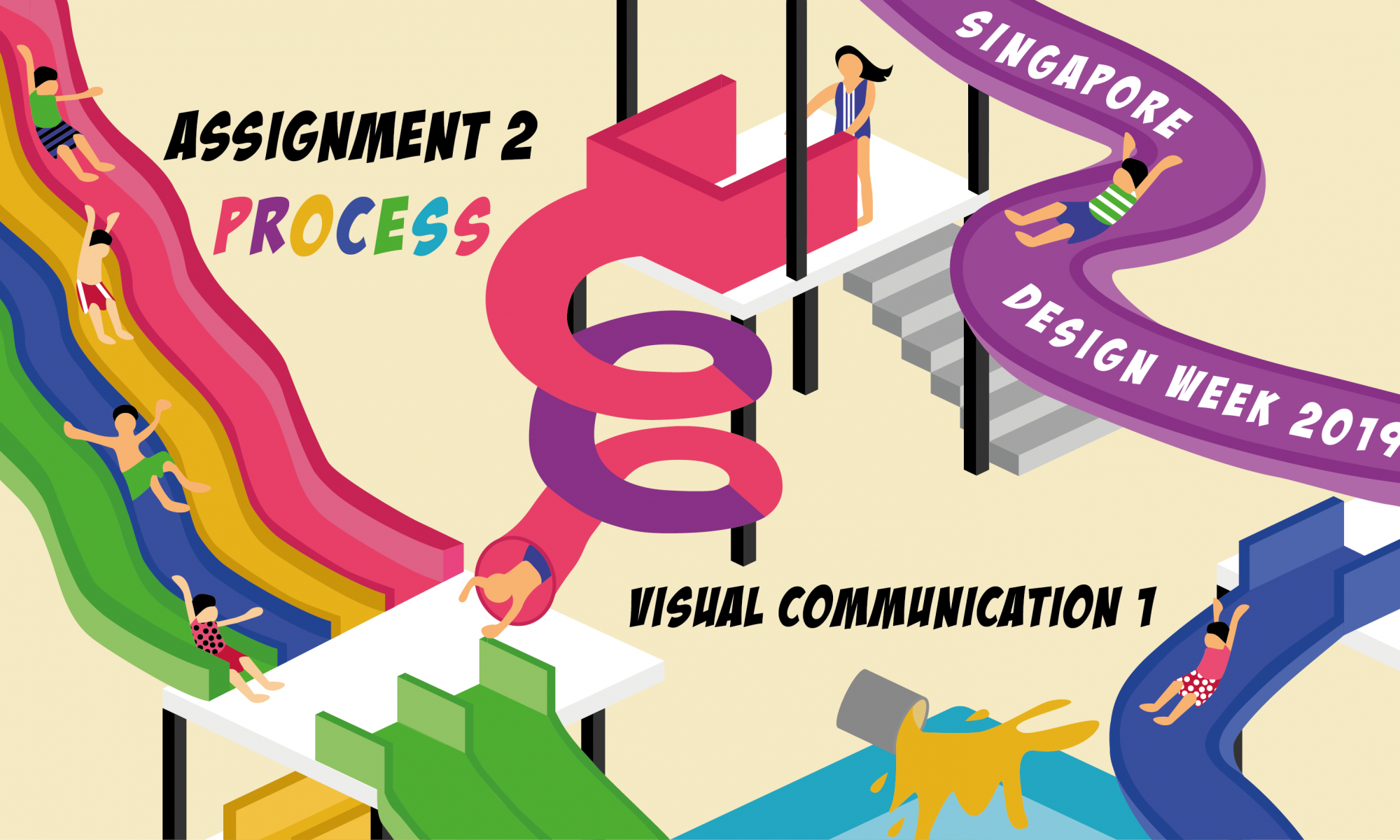
Task: To conceptualize and create a poster that’s appropriate for the Singapore Design Week 2019.

Your poster should include the following:

  • Singapore Design Week 2019;
  • A Slogan (of no more than five words) that captures and reflects the aims of the event.
  • 04-17 March 2019
  • Singapore Design Week champions design thought leadership by bringing the design, business, and public policy worlds together to answer how they can intersect better to bring about needed innovation and solutions to build businesses, engage communities and enrich people’s lives. Save the date!

Preliminary Design

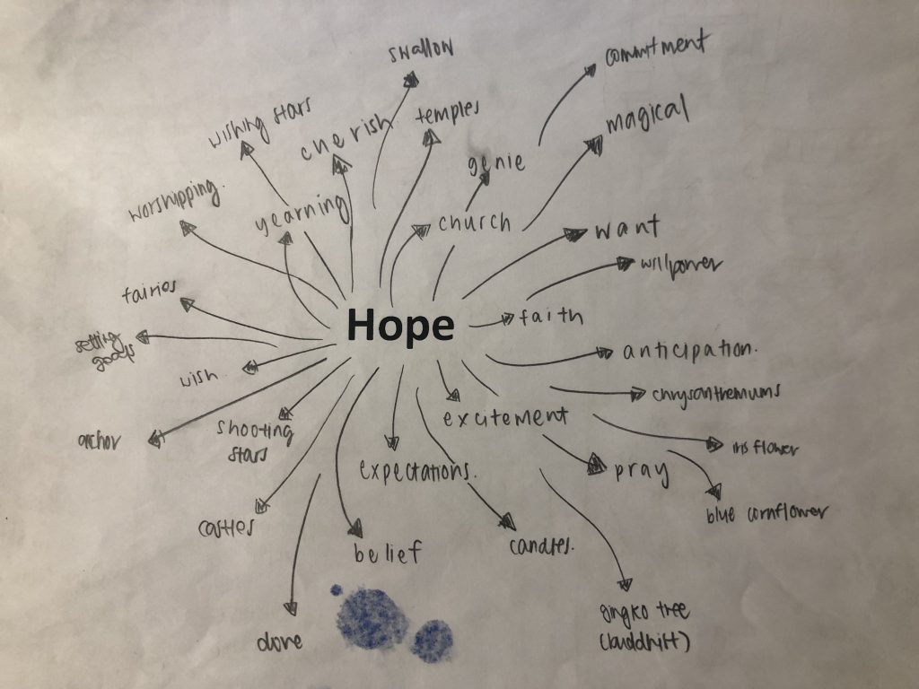
I first drafted out a mind-map and some ideas upon receiving the project brief.

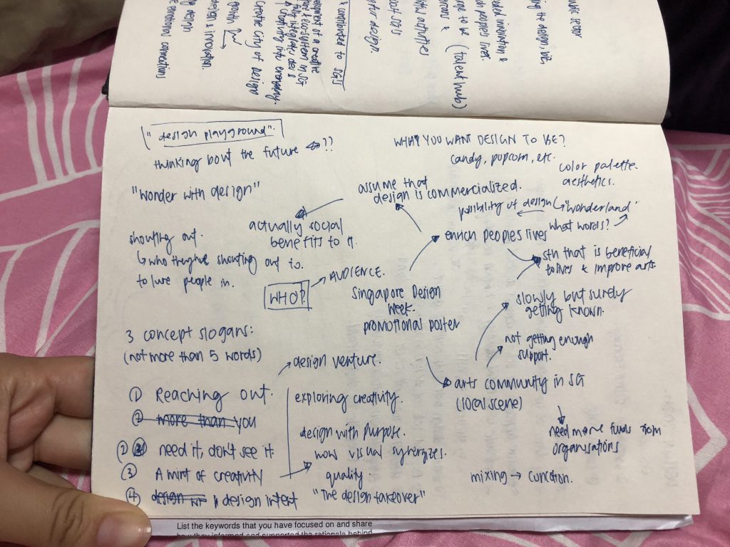
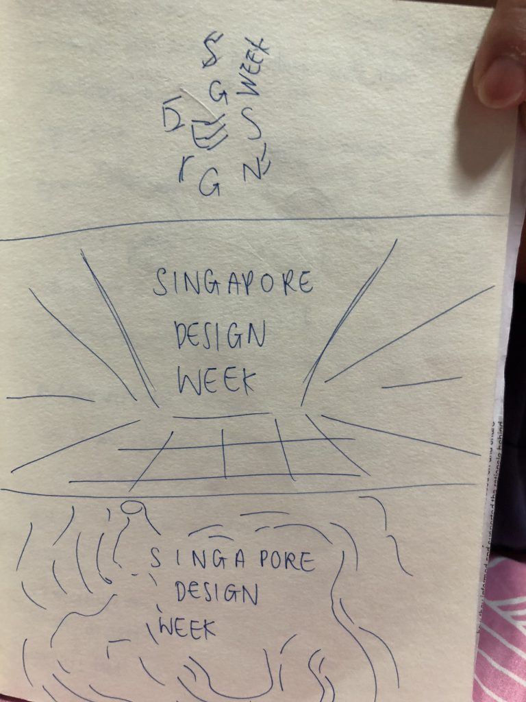
However, I felt that it was too simple and too little information, and I went to work more in-depth on it! I then came up with more detailed ones.

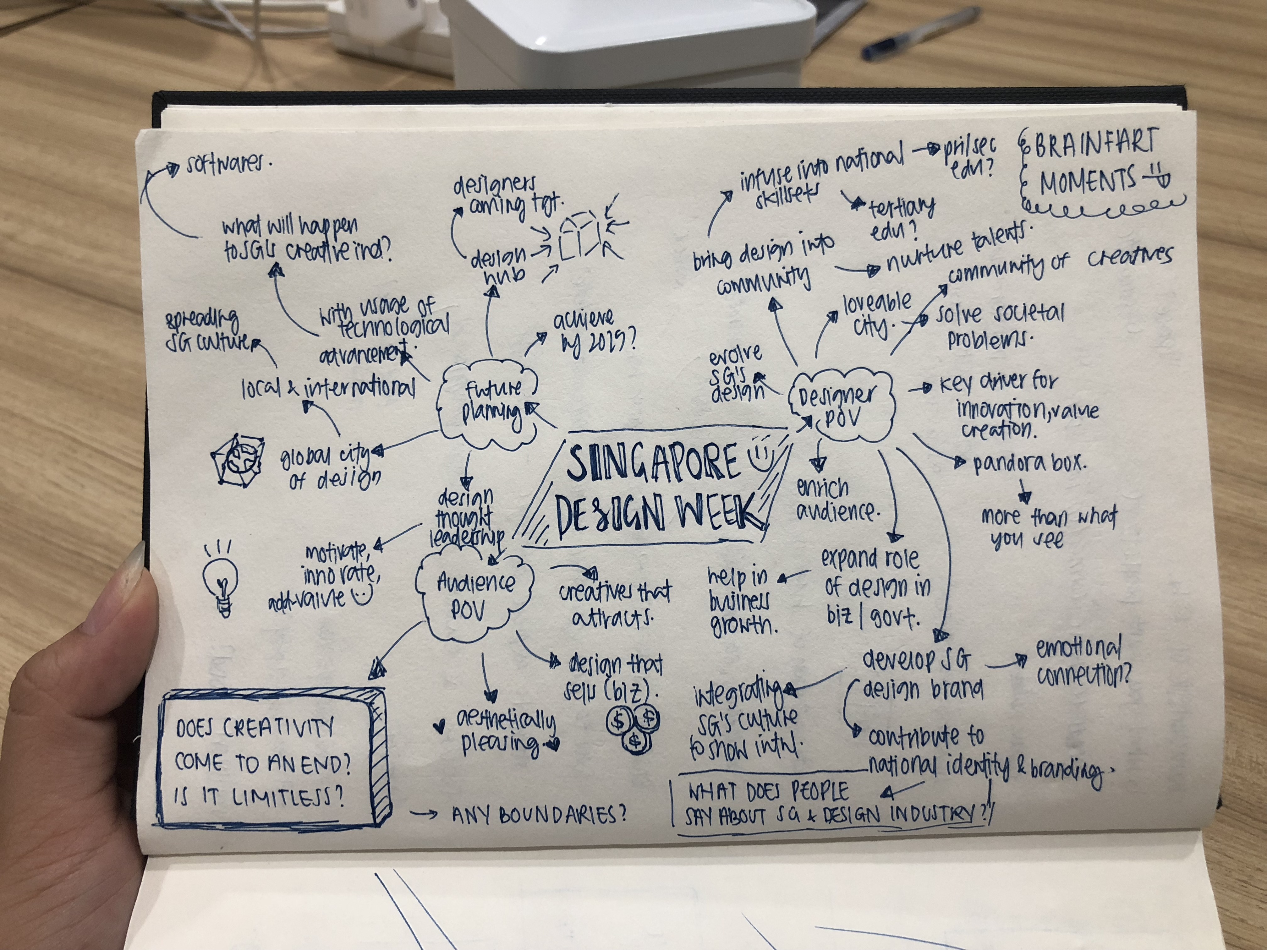
While doing the mind map, I kept my mind and thoughts games, penning down everything I thought of and researched on regarding Singapore Design Week.

But, there was a thought that kept popping up in my mind

does creativity ends? is there a limit to creativity?

And I decided to target on that question I asked myself, as I’m sure that many people ask / think that way too.

From my mind map, I came up with three concepts

I started working more on each individual concept to see what ideas / thoughts I want to direct each concept to.

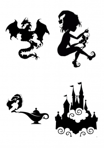
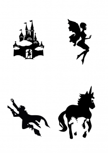
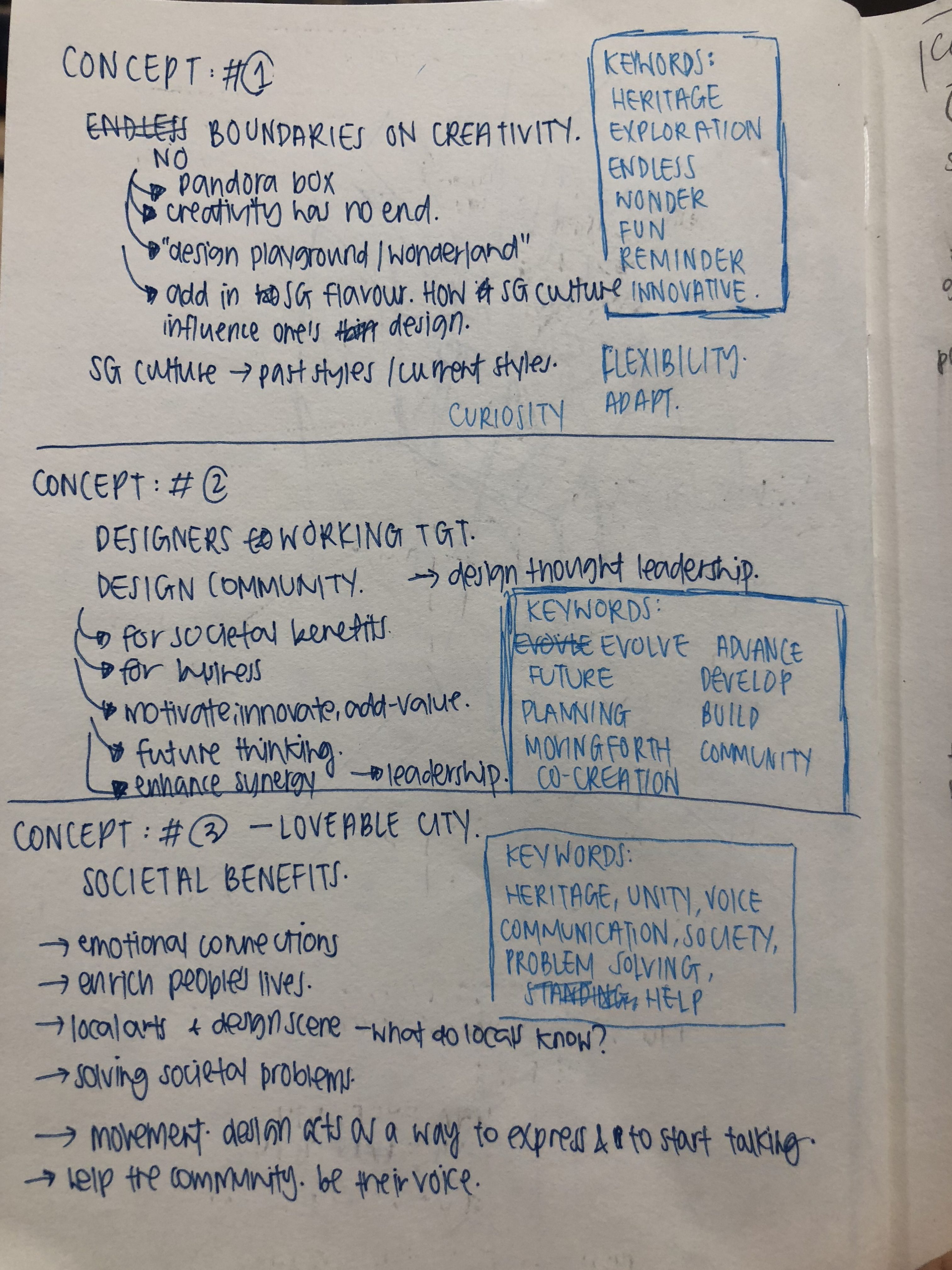
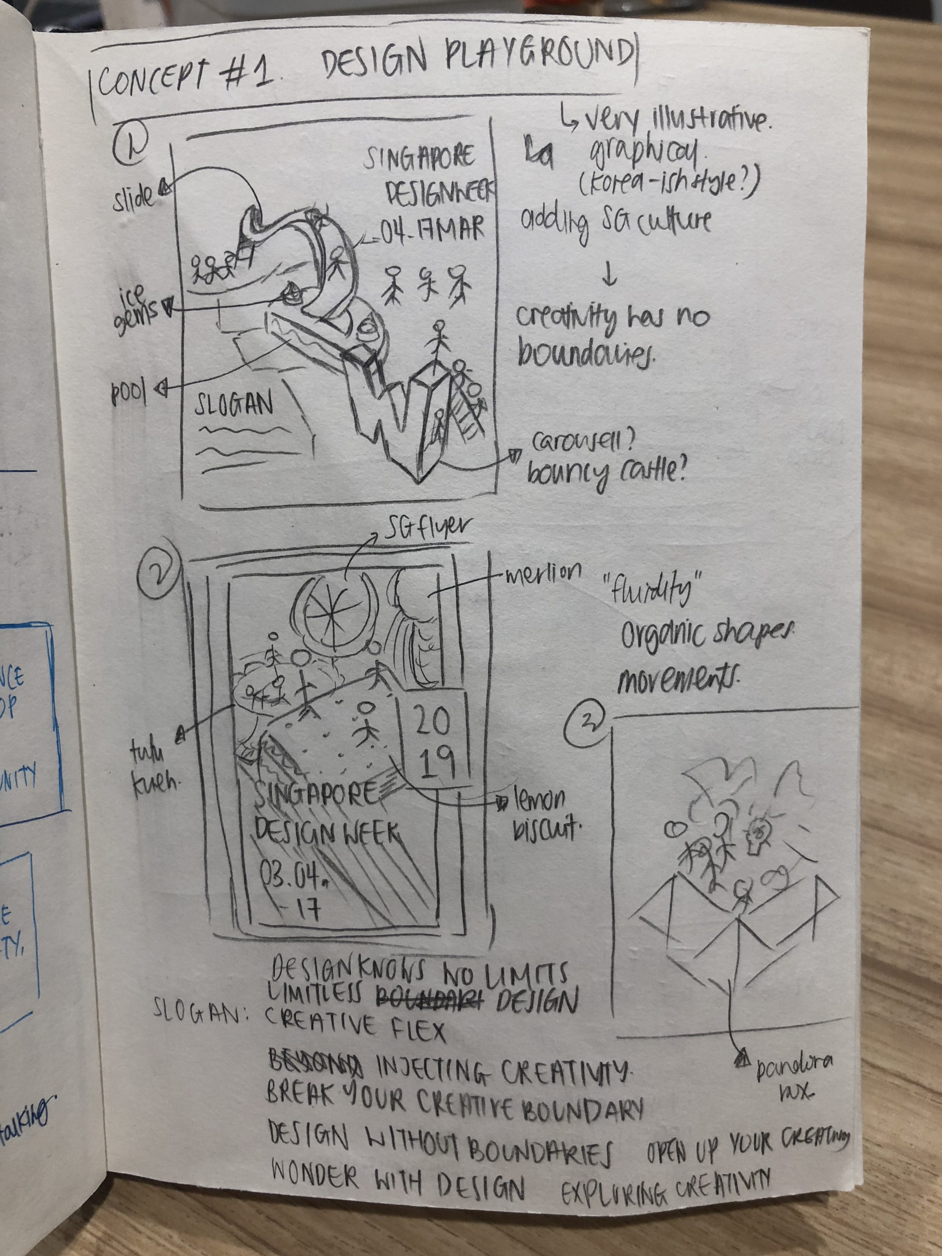
concept 1 : design playground

This concept is mostly targeted to question of having an end on creativity, and if creative boundaries can be pushed. I feel that this is very relevant to Singapore Design Week as every year, designers try to innovate and come up with fresh and creative concepts. But the audience does not really know the tough times behind the design they see.
Coming up with concepts and executing is not as easy as it seems. We need to constantly update and inspire ourselves to ensure that our creative minds are always working!!

Therefore, having the Singapore Design Week is a way for designers to work to push their creative boundaries to greater height – for their personal value, and also to help Singapore move up the ladder of being a design hub.

I wanted this to be more of an illustrative style and incorporating “SDW” the text if possible, but not in a direct manner.

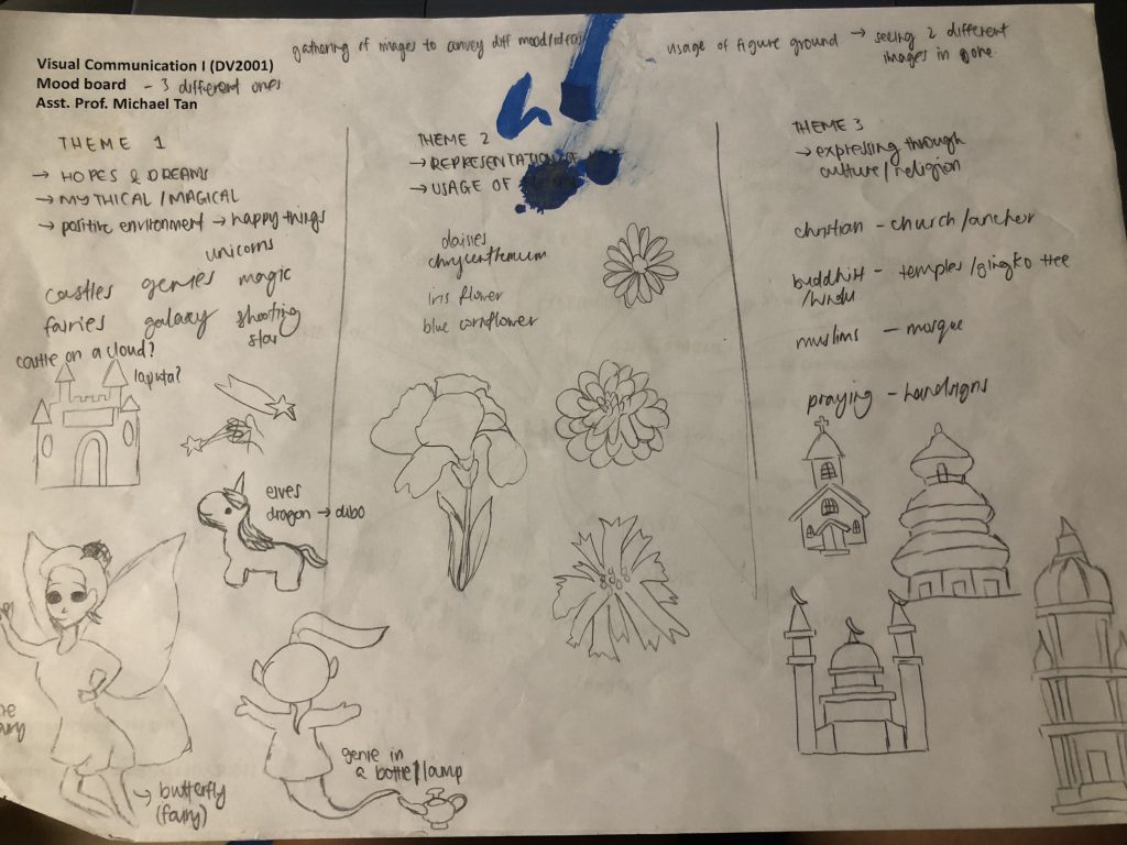
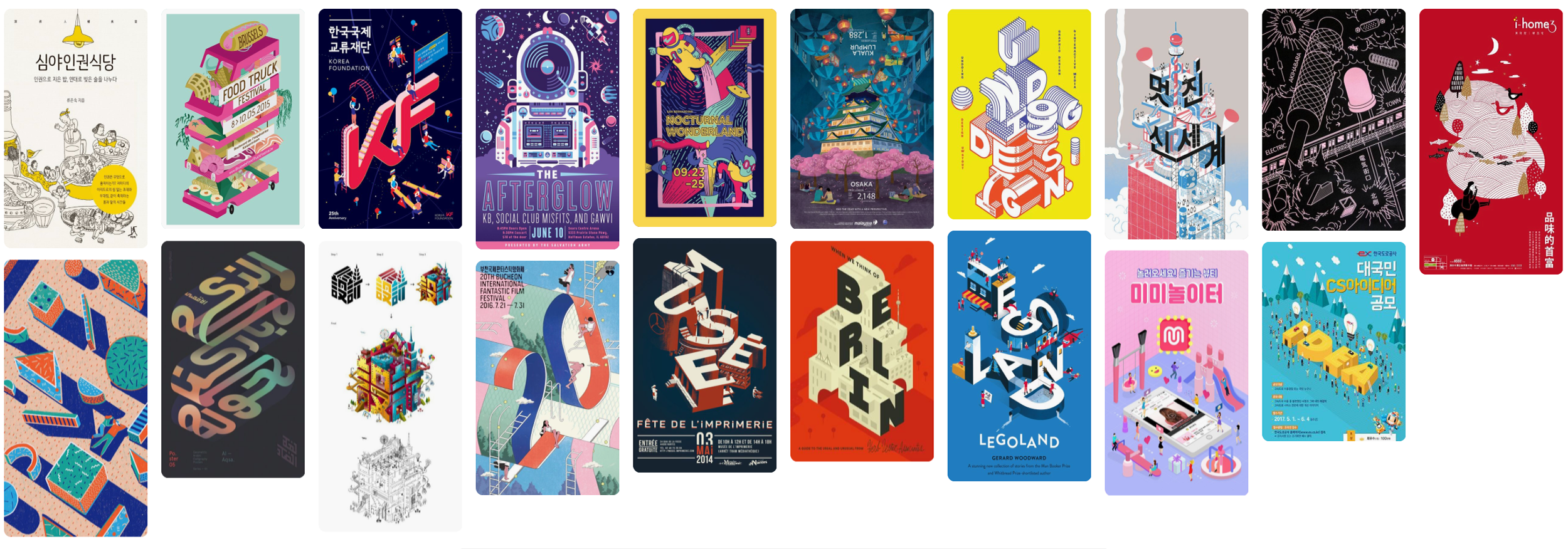
concept 1 – moodboard

concept 2: design community’s future

This concept is targeted towards the design community and working together for Singapore’s future. It’s a lot on evolving, technological advancement, development and planning.

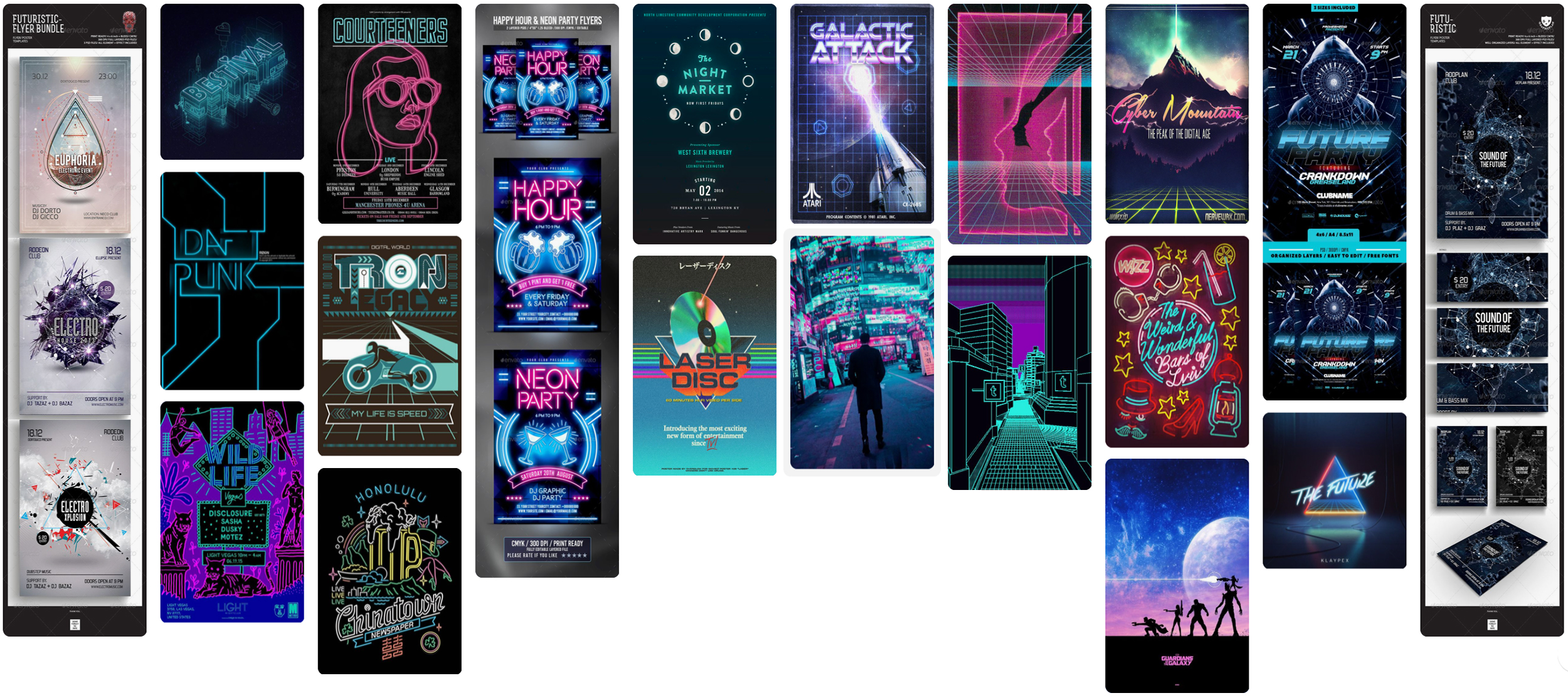
As it’s related to future, I wanted to work on a theme that is more futuristic – neons / cyberpunk / sci-fi kind of look.

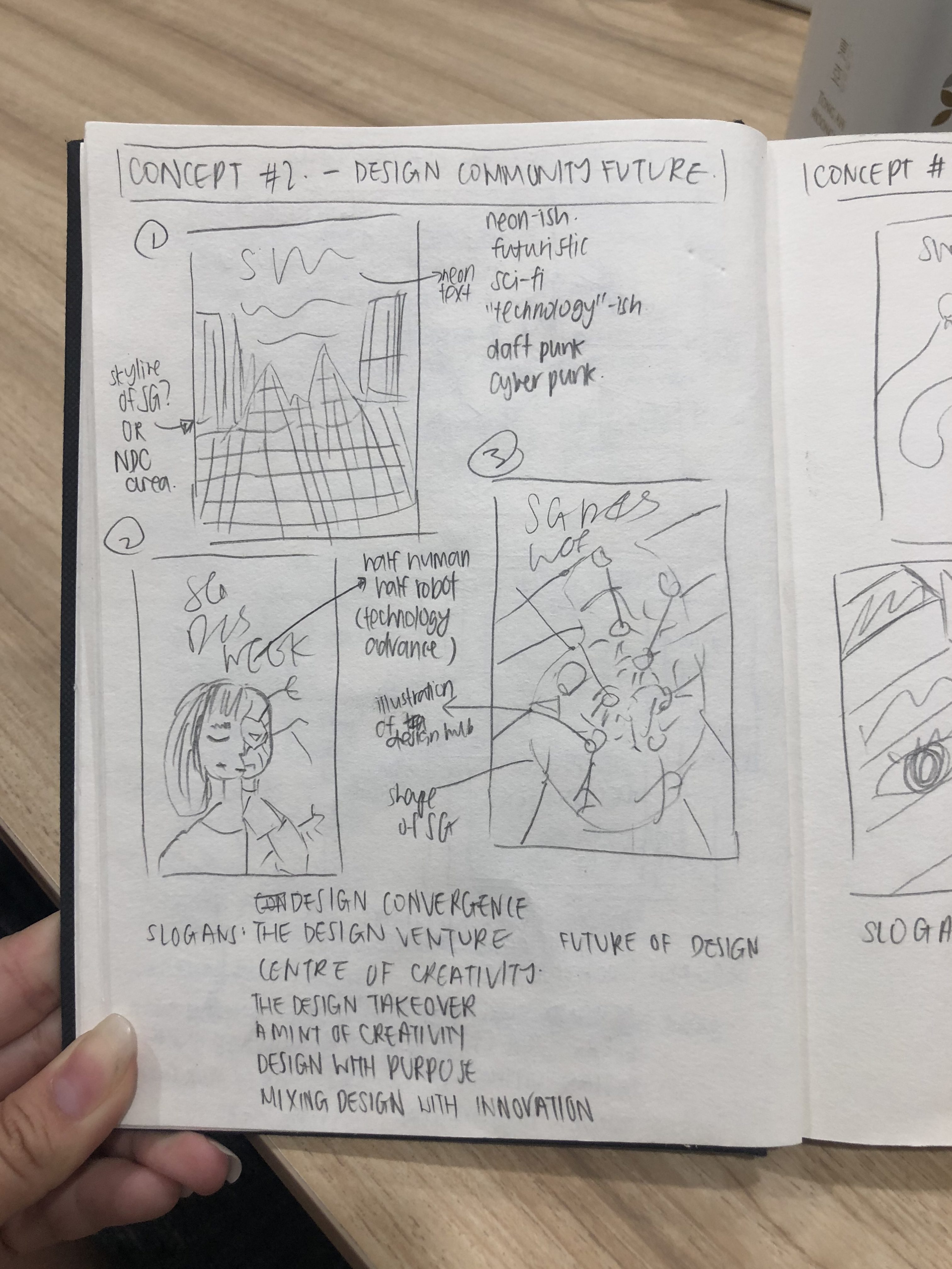
concept 2 – moodboard

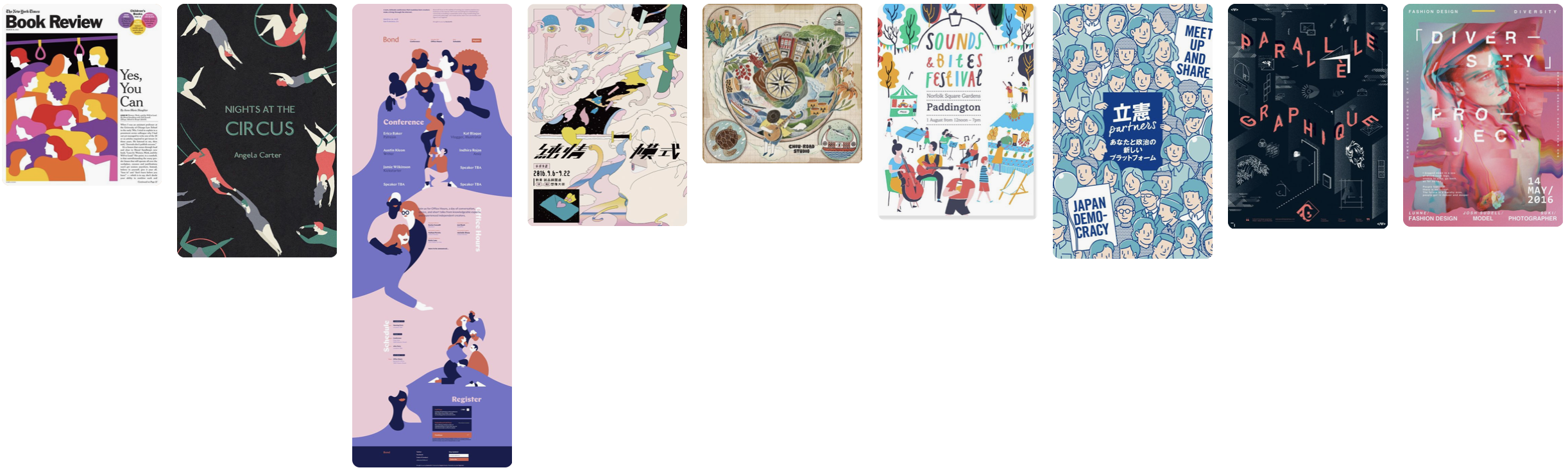
concept 3: loveable city

This concept focuses more on societal benefits and the public community of Singapore. Design is used as a movement to express thoughts freely and help with social issues. I want to focus on how design can help enrich people’s lives and gives them an emotional connection.

HOWEVER, I’m having a creative block with execution on this concept and what I have is pretty bad now, but I’m working on it!!!

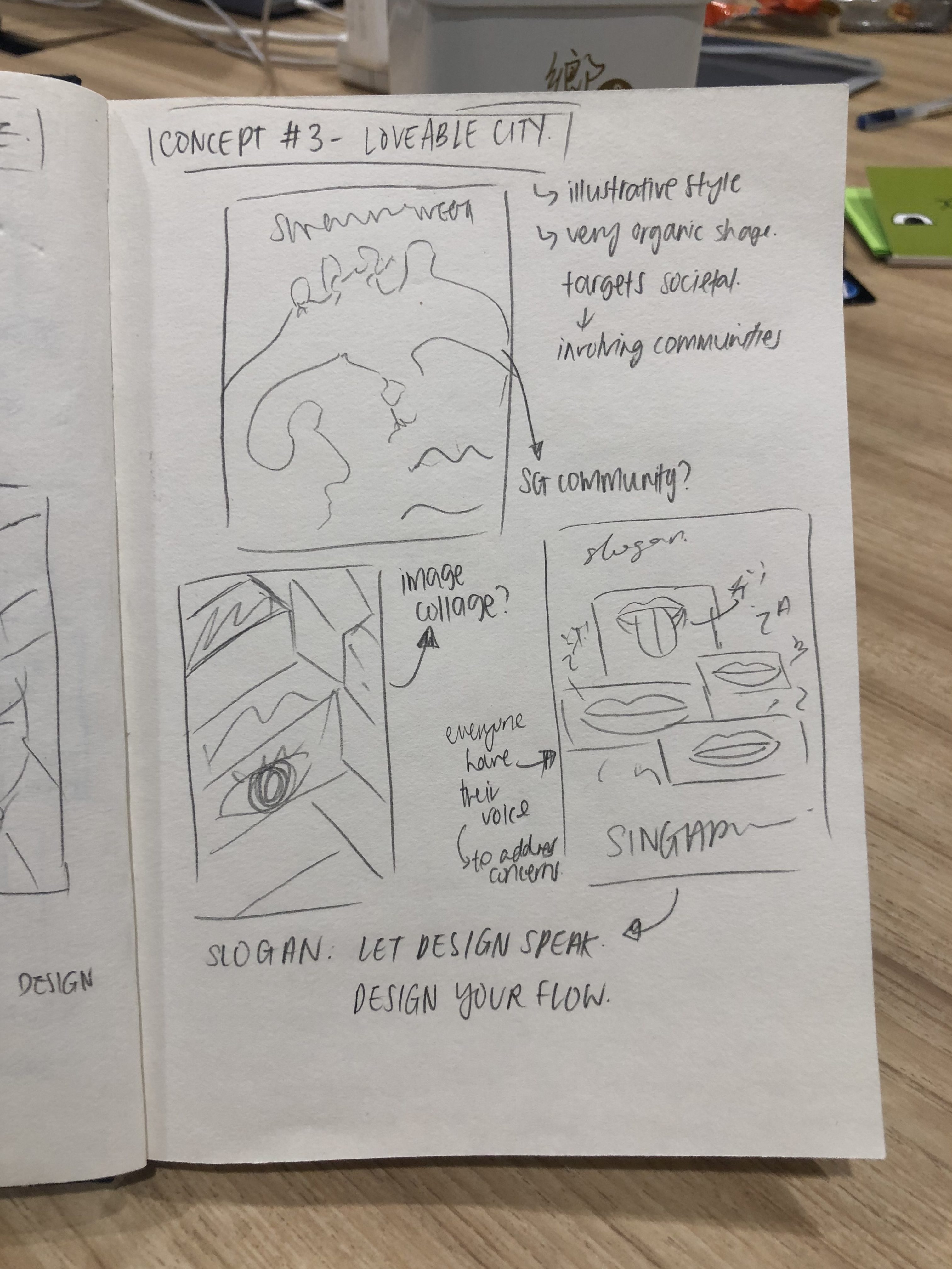
CONCEPT 3 – MOODBOARD

All these are just a basic summary of my ideas / thoughts and I will proceed to talk about my final concept soon!

Till then,
Flazéda!
jamz
x

VC1 | poster design research

There are so many different styles of posters that designers can do.
For me, I do not have a specific style of designing, and will always tryout different layouts and styles.

These are the few that caught my eye recently.

Image taken from https://i.pinimg.com/originals/f4/d2/da/f4d2da455695b83219026d9099f25e5b.jpg
Image taken from https://i.pinimg.com/564x/d0/96/b2/d096b270f42c088e65eafd03542c44df.jpg
Image taken from https://i.pinimg.com/564x/48/62/90/486290123486e238914ba0e33fda561f.jpg
Image taken from https://i.pinimg.com/564x/55/4f/29/554f29000376379112edbd1fb81086d3.jpg

I’m going to be talking more about ‘Nocturnal Wonderland’ poster.

The poster is communicating that there seems to be an event/show on interesting and weird creatures whom seem to only appear at night, hence the name nocturnal.

The emotion that the design elicit is a cute, weird, playful emotion.

The thing that makes this poster so captivating is their usage of colours. The poster uses very bright colours, especially with the yellow border. Furthermore, the variety of colours used complements each other. The characters also stand out due to the colours used, and them being bigger which separates the characters from the other elements.

The poster generates interest by the usage of illustrations. To facilitate readability and legibility, the designer used yellow for text, and making sure that the colours behind isn’t yellow, so that it will not be as confusing for readers. Furthermore, a black border of the words was also used to define the words.

I really like how this approach was done, as the illustrations ties in really well with the theme and words. For execution wise, I think there are more areas for improvements. The words aren’t very big, thus doesn’t pop out as much. For the background, there are too many lines and it might seem too messy. Viewers might also lose focus from that.

BUT ALL IN ALL,
it’s a really cool poster and I’m inspired by it!!!

Till then,
Flazéda!
jamz
x

VC1 | trip to national design centre

The various type of design practiced encountered are:

VC – Visual Communications
PI – Product & Industrial Design
FA – Fashion & Accessories
EN – Environmental Design

pi – product & INDUSTRIAL DESIGN

fa – fashion & accessories

en – environmental DESIGN
VC – Visual Communications

These are how Visual Communications Design has changed over the years. In the past, design works has a different style, in comparison to current years. The usage of colours seemed more dull, and have a retro towards it. The usage of typography also shows the difference as the fonts used in the past are fonts not as commonly used in current days.

Advertisements and posters are always designed with a tagline/slogan in mind, so that it helps capture the attention of the audience, and supporting the visual graphics.

I found this advertisement relatively interesting and a good way to show the advancement of Singapore. The text wrote “Keep Singapore Clean”, with the graphic of Phillips vacuum cleaner. In today’s context, this advertisement might not be as impactful as it was, due to the advancement of Singapore. Singapore used to be a country that was not very clean and sanitary, as they had tons of trash. However, with Singapore’s advancement, the sanitary and hygiene got better and Singapore is now classified as clean and green. Thus, the advertisement’s tagline of making Singaporean clean will not be as impactful.

future goals/key thrust for design in sg

Singapore might have a chance to be a leading influence on Asian and International Design. They have the potential base to be the base for strategic decision research and development to complement the manufacturing prowess and immense market potential of the Asian markets.

The role of design will be increasingly important and will move up the value chain.

IMPLICATIONS GOALS HAVE ON CURRENT PERCEPTION

It is good that design in Singapore is getting more recognition and value. Having support from Singaporeans is really a huge jump and change for Singapore, as they used to focus more on academics.

Till then,
Flazéda!
jamz
x

VC1 | mobile of hope final

Task: To develop graphic forms that convey the notion of hope.The graphics created will be assembled into a hanging mobile for application in a healthcare environment to lighten the atmosphere of the hospital.

Concept: Hope to me symbolizes a dream. I remember hoping for many things when I was young, such as being a Disney princess or be able to fly and etc, and that was the naïve fun young times!

To lighten up the serious and sad mood at the hospital, I wanted my mobile to be more lighthearted and remind them of younger days where we feel that anything could happen, and a magical place where its trouble free! Therefore I aligned my mobile along the theme of “where all magical things happens”

For each graphic form I’ve done up, there is a quote behind it.

  1. Castle on the Cloud
  2. Reaching for the Star
  3. Soaring into the skies

These are all hopeful quotes which I want to bring across my mobile, and I think it did! Here’s the graphic forms I’ve used in digital copy

This is the look of the final mobile! It looks way way way better than the previous one hahaha


Animated GIF - Find & Share on GIPHY

I shifted the placement of each wizard a little, to show them flying around the castle in different directions.

Catch it being hung up at the ADM Library too!

Animated GIF - Find & Share on GIPHY

Read Here for my design process!

VC 1 | Mobile of Hope – Process

Reflection on Assignment 1

I think this assignment was more of us trying to thing in graphic forms that’s not very illustrative, to prep us more for logo and branding design. I actually think the toughest part was co-ordinating the colours as it’s hard to keep colours consistent yet showing contrast. I also had a pretty tough time finalizing the graphic forms I want to use, and to make sure that it blended well together, while keeping in mind the positive and negative space. Overall, I had a pretty fun time doing this project!

Till then,
Flazéda!
jamz
x

VC1 | mobile of hope process

The Brief: Hospital can be a stressful environment. What roles can graphic artist and designer play to create a welcoming and soothing environment that can potentially promote healing?

Task: To develop graphic forms that convey the notion of hope. The graphics created will be assembled into a hanging mobile for application in a healthcare environment to lighten the atmosphere of the hospital.

Brainstorming and Preliminary Ideas

I’ve mind-mapped down my definition of hope in this picture below!

The 3 themes I’ve decided to come up with was:

  1. Castle / Fairyland
  2. Representation of Hope through flowers
  3. Representation of Hope through religious architecture

To me, hope was something that I dream of and envision it to be true. With that, I’ll try to think of ways to make it come true.

As the mobile was for a hospital environment, I wanted it to be something lighthearted and not serious, as I feel that the hospital itself has negative connotations to it. Thus I decided to narrow down to the theme of fairyland. It has a magical and positive feel to it, so that when patients see the mobile, it cheers them up because it reminds them of happier and younger days!

The theme revolves around the song Castle on the Cloud, from Les Miserables. The song was about a young girl Cosette, whom hopes to live in the castle on the cloud, where it’s all happiness and trouble free. With that, I went to come up with some graphics that you will see, once you stepped into the castle.

Design Development

I proceeded on to work on the graphic forms digitally and came up with a few forms.

I searched for magical / mythical elements which can help me to further explain Hope. These are the elements I’ve used:

  1. Dragon + Unicorns + Stars
  2. Elf + Pixie
  3. Genie + Lamp
  4. Castle + Clouds

Upon showing it to the class, many agreed that forms 1 & 3 don’t really work out, and form 4 was the best amongst all. From there, I worked further into exploring form 4 and to come up with forms that gives off a similar vibe and style to it!

Next, I came up with another set of graphic forms and consulted Michael via email to ask for his opinion about it!

For these 4, the elements I used are:

  1. Castle + Clouds + Rainbows (as windows) + Girl at the door welcoming visitors
  2. Pixie + Rabbit (at wings) + Girl’s upper body (as face mask)
  3. Flying Wizard + Cat at cape + Catching a star
  4. Unicorn + Dragon + Girl as mask

The feedback I got from Michael was that form 1 & 3 worked better than the rest! And all forms showed consistency in theme except for form 4, and form 4’s negative and positive play wasn’t as well shown as the rest.

The presence of the girl in every graphic form was questioned as well.

With that, I tried to create more graphic forms for individual consultation the following week regarding colour play!


I added 3 more graphic forms from the 4 I had prior to consultation.

The 3 I added are:

  1. Butterfly + Girl
  2. 2 flipped mermaids with the tails joining together
  3. Pixie grabbing a star from a crescent moon
Colour Scheme

I decided to go with pastel colours as it suits the theme that I was going for – young, magical, mythical and fairyland-ish!

From the consultation I had with Michael, I realized that I don’t actually need to have that many graphic forms and could’ve easily settled with 2, as there are more than 2 graphic forms in my final form (hahaha lol)

So from there, I decided to cut down to 3 final forms, and tweak them a little more.

I settled on these 3:

  1. Castle on Clouds
  2. Elf Picking out the star from the Moon
  3. Wizard Soaring into the sky with his Cat

Each final graphic form, I came up with a few variations!

Form 1:

I contemplated on the usage of rainbows for the castle’s windows or crescent moons. I felt that by using the rainbows it will add more mess to the current elements and the moon showed consistency.

My conclusion was to use the moon in the end!

Form 2:

I used 2 different stars one with just a star, and the other with a star inside the star. Feedback I got was that either or seems fine, but there might be too many stars right now! & the girl is very redundant.

So my conclusion was to remove some stars and remove the girl cos she wasn’t really needed to show consistency.

Form 3:

The main difference was the broom, one of thicker strokes and one of lesser! Feedback I got was that the broom seems to not show the flying movement, and in general the graphic form seems to show a static movement instead of intended – the flying wizard. Also the cat can be more incorporated into the cape!

Therefore, I concluded to use the broom with thicker strokes and try to show more flying movement of the wizard.

Final Draft

After making the changes, I added in colours and tweaked the colours around so that there’s differences in the forms.

I planned to hang my mobile with reference from this image below!


4 vertical lines were hung (to form an X) and there was a longer string in the middle of the X, which only hung the castle. For each vertical line, I used the same colour scheme (of 3 colours) along the same side of the form! I used quite a lot of colours as I think it suited my theme as people will associate it to being colourful and bright!

Here’s the colours and forms I used in digital copy!

I believe the wizard flying was my strongest form that shows the positive and negative as the cat was really incorporated pretty well!

I placed the forms in alternatives (Wizard > Elf or Elf > Wizard) at the 4 vertical lines. The castle which was hung in the middle was bigger than the rest. It was to show that the castle is the main element of this project, as all the other elements exist within the castle.

I placed the castle at the lowest point, without any other forms blocking it.


Animated GIF - Find & Share on GIPHY

But due to my very bad worksmanship, it turned out pretty bad! I didn’t know how to cut the forms out from the paper properly as I used scissors, but was then introduced by the class to X-acto knife!! The top was also pretty badly done as I didn’t buy a circle ring and used wire to form it instead.

I also felt that the forms I originally printed were a little too huge and should probably be smaller. Also, comments I got was one of the sides were black and black was totally misplaced with the rest of the pastel elements. The elements hung on the mobile didn’t move naturally as there were too much weight for the fishing line!

Overall, the bad worksmanship made the whole mobile look bad, and its tough to look at the graphic forms with all the mess.

But thankfully I was given the chance to redo the mobile!

After redo-ing, comments given by my classmates were that the workmanship was actually way better and they can focus on the graphic forms instead of the bad cutting 😡

I also edited my final graphic forms colors to show more consistency amongst all the forms, and switched up the black!

Next, I will be posting my final forms and mobile!

Till then,
Flazéda!
jamz
x