Task: To conceptualize and create a poster that’s appropriate for the Singapore Design Week 2019.
Your poster should include the following:
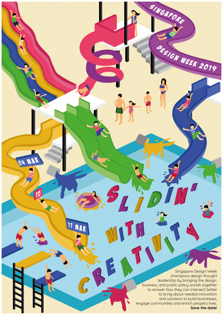
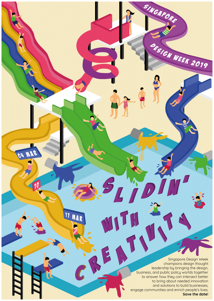
- Singapore Design Week 2019;
- A Slogan (of no more than five words) that captures and reflects the aims of the event.
- 04-17 March 2019
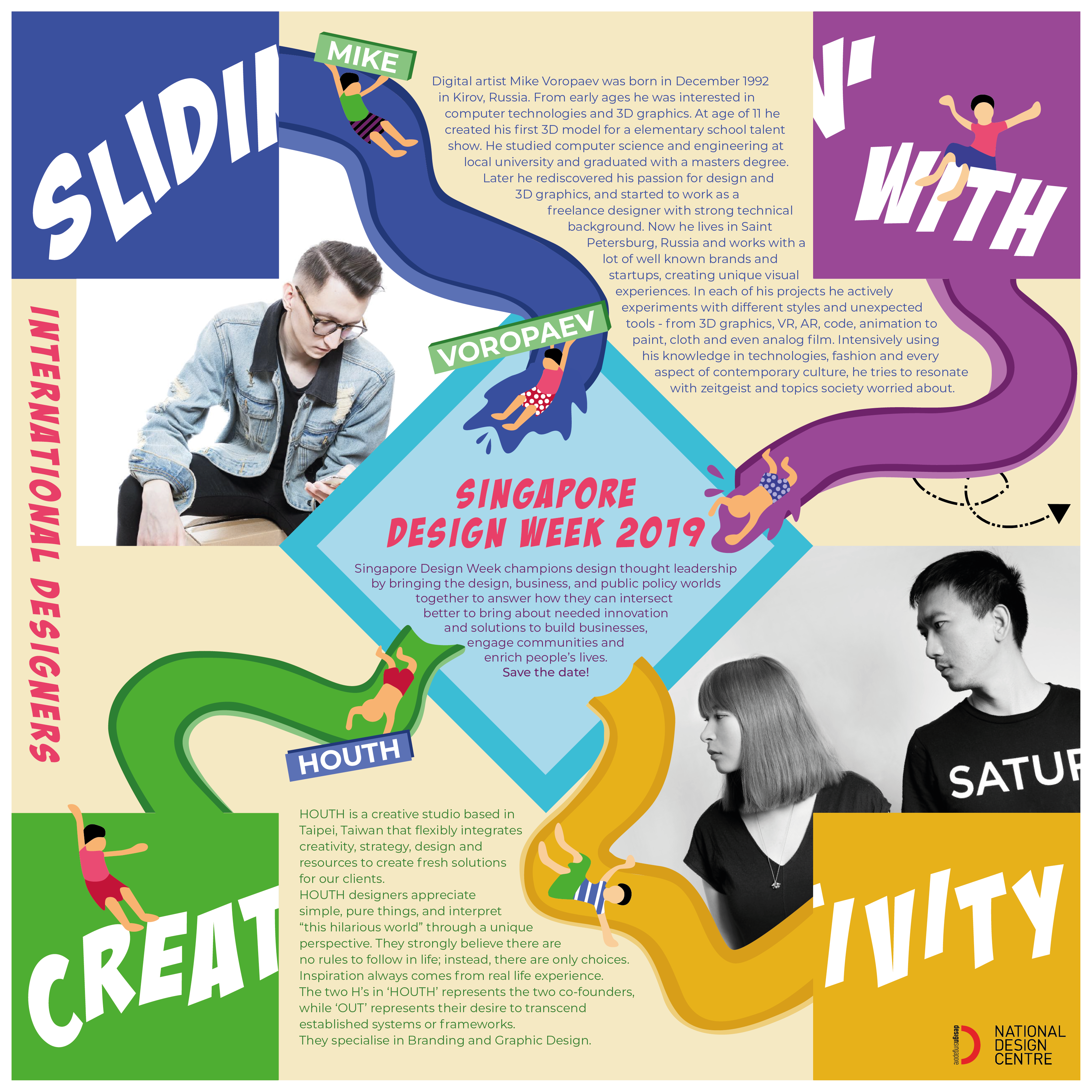
- Singapore Design Week champions design thought leadership by bringing the design, business, and public policy worlds together to answer how they can intersect better to bring about needed innovation and solutions to build businesses, engage communities and enrich people’s lives. Save the date!
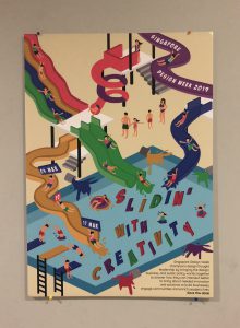
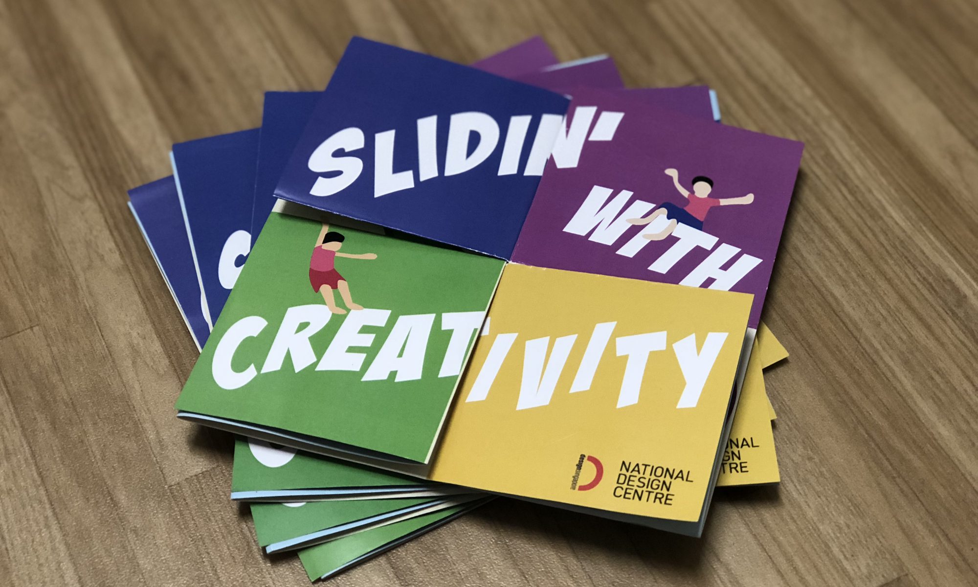
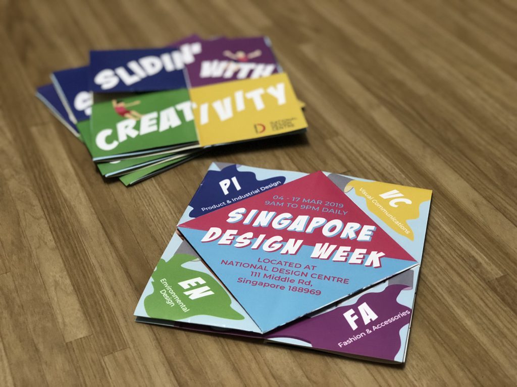
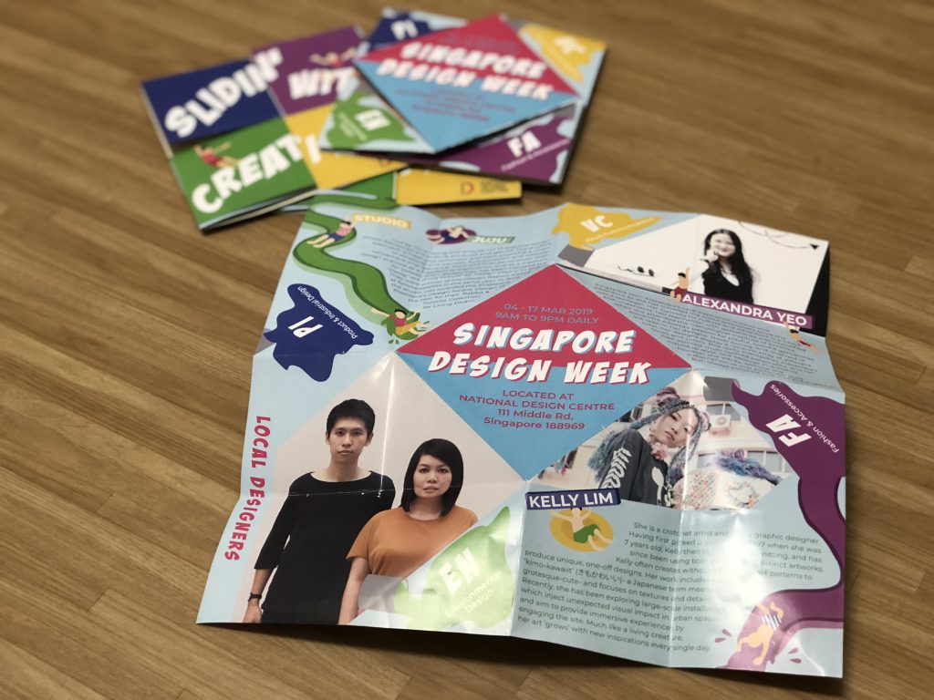
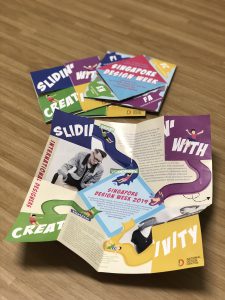
This is the look of it after being printed and filtered by apps .
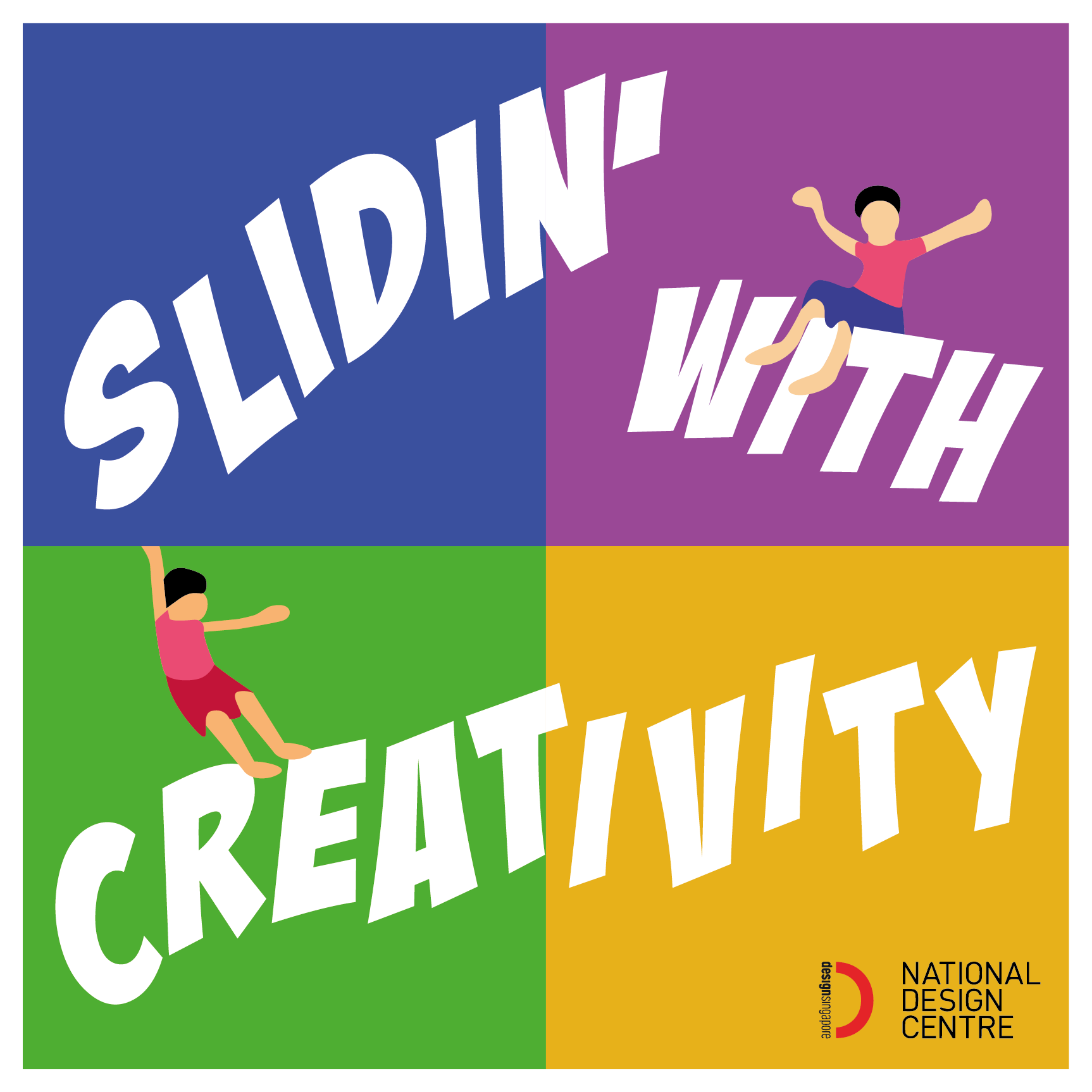
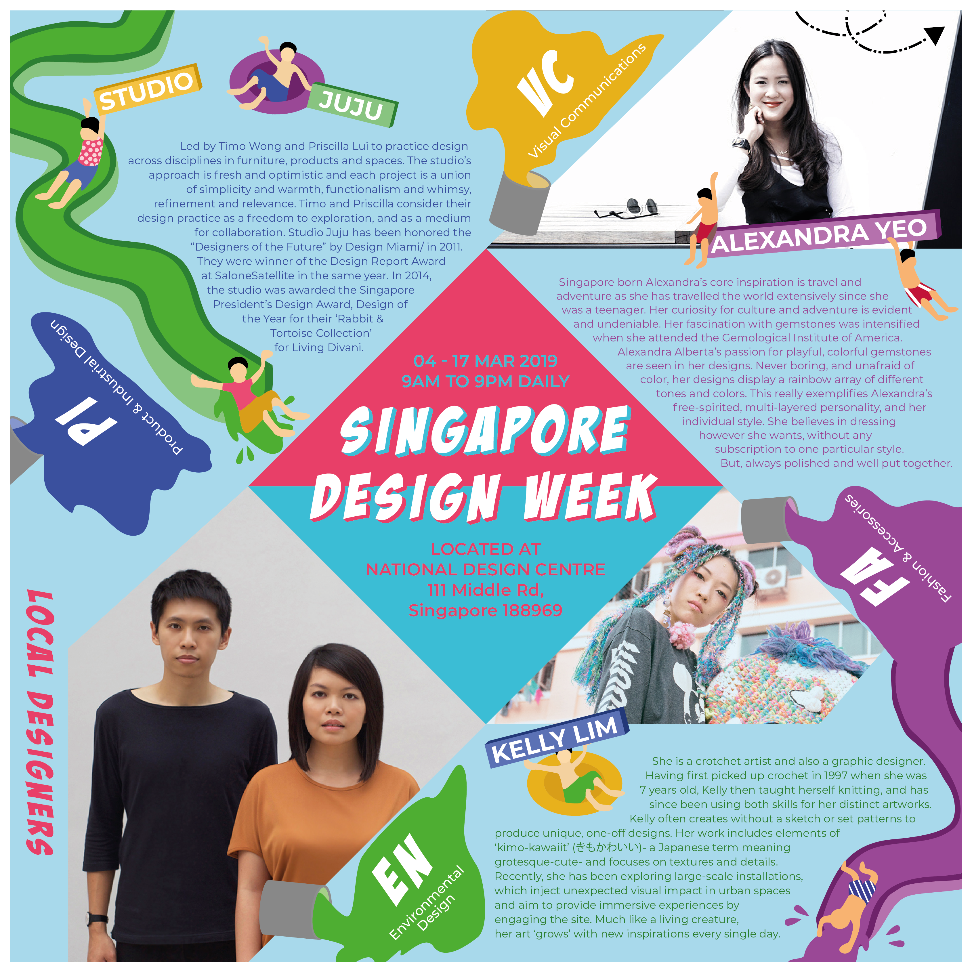
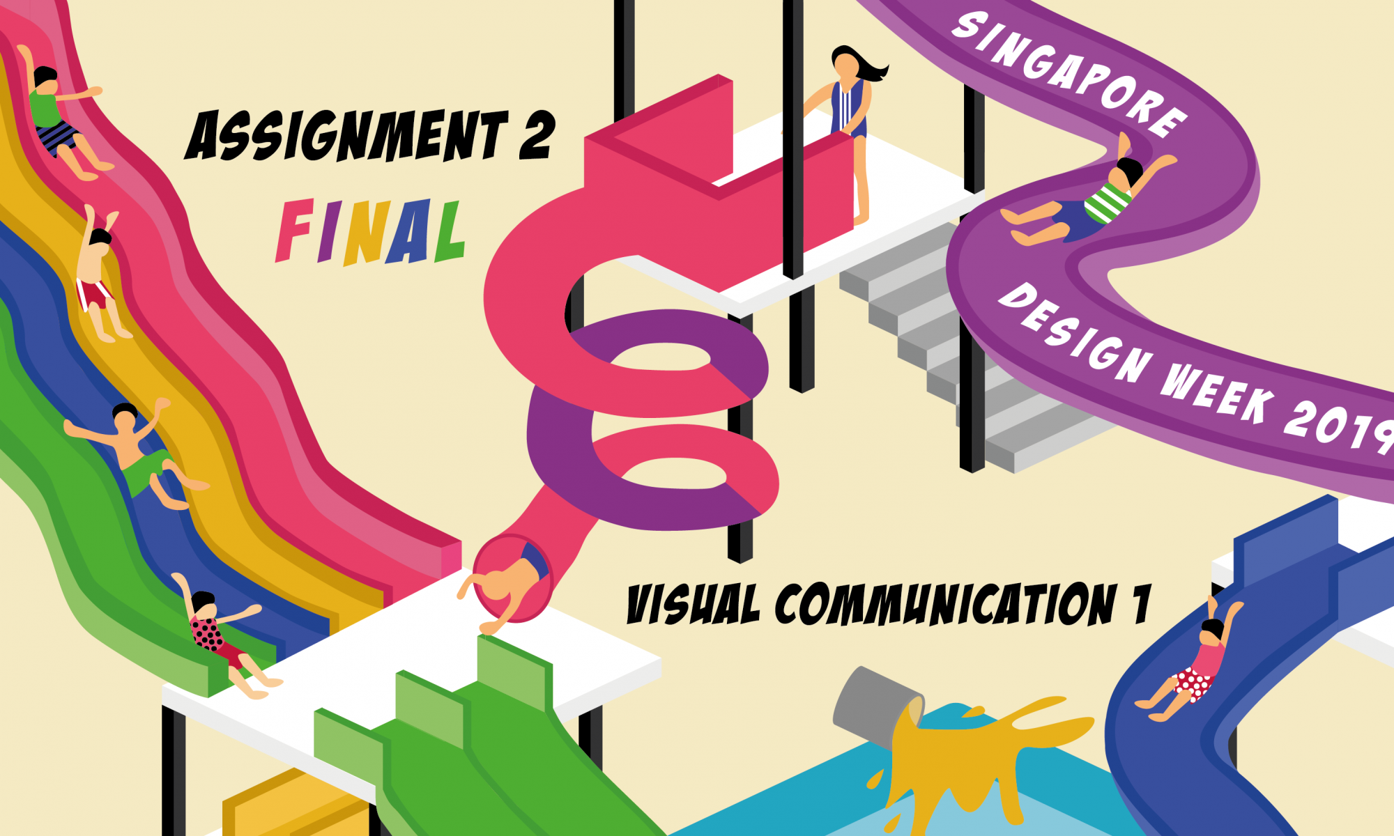
Concept: Design Playground
For my Singapore Design Week theme, I wanted to show that design and creativity is fun, playful and colourful. I decided to use a water playground, as playground shows the fun and playful element. By using water playground, I am able to show colourful as there are splashing going on, and it’s pretty similar to the colour run concept, when you go in clean and out filled with colours. I wanted to show that there’s no limit to how creative one can get, and if you’re in the water playground, you can keep hanging around there!
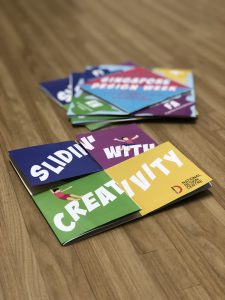
Slogan: Slidin’ with Creativity
I came up with this slogan to play around with the words of “working” with creativity. But instead of “working”, it’s to slide with creativity, as my work has many slides.
My concept is that the aim of Singapore Design week is to showcase designers and the endless boundary of creativity, there’s no limit to how creative one can get, and creativity is all about being fun and playful! This slogan helps to strengthen my concept as what my slogan means that at this water playground, you will slide with creativity, and the slides you take will eventually lead you to the common pool, where it’s filled with creativity juices / elements. It also enhances the point that creativity and design make life more fun for designers and audience!
We all need a little creativity and design in our life to brighten up our lives!
Read here on my design process and explorations!
VC1 | poster design brainfarts
VC1 | poster design explorations
Reflection on Assignment 2:
I never expected so much thought to be put into doing up a poster design, and that as a designer, there are so much more underlying meaning to everything we do, more than what the audience actually depicts. With the meanings we want to show to the audience, we try to make it into a creative, fun and visually engaging artwork. I think that I managed to hit that! However, I think doing up such an illustrative artwork was probably a risk I took, as I am not very well-skilled at illustrations and I was very afraid of it. There are still much more room for improvement for my illustration, and I need to pay a lot more attention to details, especially for artworks as complex as the one I did up. Doing up an illustration, there were many things I had to consider of, and one important one was perspective. I wanted to show a 3D water playground on a 2D platform, and perspective was very important which sometimes I overlooked. But from that, I learnt more about Illustrator functions and how it’s able to help my perspective issues!
Feedback I got from Michael was that my slogan doesn’t really pop up due to the colours I’ve used, and it seems to be fighting with attention with the rest of the elements. There can also be more breathing space for the graphics part, and for the body text, it’s a little too tight on space, compared to the rest of the part. The slides were also a little too big and can afford to be smaller. With that, I tried changing my slogan’s words all into one colour and I think it really stands out more!
Overall, I enjoyed doing this assignment and I’m glad I took the risk of doing an illustrative poster!
Till then,
Flazéda!
jamz
x