VC II | dialogue in the dark

Having been in dialogue in the dark once, I thought I will have the same experience and feeling after my visit. However, it never fails to surprise! Every visit there is a whole different experience and I still feel the jitters once everything turns pitch black.

Once we entered and we are unable to see, I felt very scared and insecure. Losing an important sense meant that we have to make sure of our other senses, and it was a tough deal. Sight is very important to a lot of us, and we might regard it as the most important sense. Without sight, I tried to use sense of touch and hearing to navigate within the space.

I felt quite reliant on others, and constantly wanted someone to guide me around. I used a lot of sense of touch, and kept touching things and making sure that the nearby surroundings was safe to walk before moving on. A weird statement, but I felt that the blind were the ones with sight inside the space. It was so dark but they managed to guide us through, and even helped my fellow group members that needed help.

It’s definitely not easy for them to move about, as they need to familiarise themselves with the surroundings and it takes time. Familiarising themselves takes a huge mind memory toll on them to remember so much, and it’s like they have a “mind map” inside of them.

Inside there, without my sight, I experienced daily life activities in a different way, with the usage of my other senses. I realised that sometimes just viewing isn’t everything, engaging all 5 senses is more important and sensual.

I also gained an insight on how one, not blinded by birth can adapt so well due to circumstances. I also realised that for the blind, audio is very important. We shouldn’t take the gift that we have for granted and instead, should appreciate.

Some benefits inherent in the design research technique is facilitate, empathise, opening to new opportunities and ideas, seeing from a different POV and cohesiveness.

Role playing can help designers discover solutions and methods that are in conjunction with the roles. Some examples are having solutions like the usage of textures, audio and visual tools.

That’s it from my dialogue in the dark reflection!

Till then,
Flazéda!
jamz
x

INT1 | singapore night festival

Having been to Singapore Night Festival for the past few years, I honestly felt that it was pretty underwhelming this year. I’ve been to the festival ever since 2016, and I felt that the previous years were better,

Nevertheless, I think the amount of effort and thought put into the artwork of the artists was still pretty commendable by all.

STORY OF THE FOREST BY TEAM LAB
Image taken from http://www.hypeandstuff.com/wp-content/uploads/2017/01/Story-of-the-forest-6_-Image-Courtesy-of-teamLab.jpg

This artwork isn’t exactly under Singapore Night Festival, but more of National Museum of Singapore.

As this installation is done in National Museum’s Rotunda, it fully utilises the shape of the space, the Dome and having participants walk around and down to the final view where they see the whole forest.

The entrance of the installation is at the top of the dome, and viewers see the dome ceiling with flowers blooming and changing over time. Crossing the bridge through the falling flowers of the dome, participants will descend down the passageway through a vast interactive forest inhabited by the animals of Singapore. As they walk down, the forest changes from morning to night, and with dry and wet seasons of Singapore. When they enter the base of the dome, they get a bigger view of the dome, with the flowers blooming at the top, and having animals and forest coming up when the participants move nearer to the wall. This artwork is very relevant to National Museum, where it talks about Singapore History – more heavily dedicated to William Farquhar Collection of Natural History Drawings.

Animated GIF - Find & Share on GIPHY

Animated GIF - Find & Share on GIPHY

The artwork is depicted in real time by a computer program, and offers interactivity to a certain level. The first part of interaction with the artwork is more passive, whereby we are just walking into the rotunda and looking at the flowers. The only interaction we had initially, was walking around the dome. But it became slightly more reactive, when we reached the base of the dome and we could see how having participant’s presence, how it could change the work.

I felt that this artwork was a very interesting way of depicting Singapore, as it’s seldom thought about singapore being related to animals and forest as it’s more of an urban city. It was also a learning journey for us, where we get to know more about species relevant to Singapore.

Animated GIF - Find & Share on GIPHY

This artwork spoke to me as it’s the artist’s take on Singapore on a different approach, and making it interactive for participants, so that they won’t just feel bored walking around the dome.

Image taken from http://cdn.luxuo.com/2017/02/16.jpg

Although it’s not officially under Singapore Night Festival, I think this artwork is an honourable mention as amazing artworks can be found within the interior of the museum, instead of just the outskirts surrounding!

Leap of Faith by Teng Kai Wei
The Leap of Faith
Image taken from https://www.nightfestival.sg/-/media/snf2018/night-lights-main-prog/10-the-leap-of-faith-1200×514.jpg?as=1

This is the second artwork I’d like to talk about from Singapore Night Festival.

Animated GIF - Find & Share on GIPHY

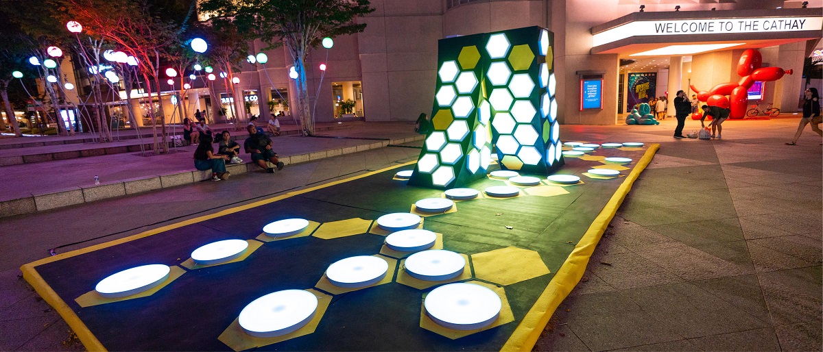
The intention created for the participants is for them to take a leap of faith and   jump from step to step, to signify literally jumping to take a leap of faith.

The intention of this interaction is for participants to take a “leap of faith”, by jumping from a step to the other. While participants jump, the lights of the step changes, and there are several variations on the lights. This artwork is reactive and has high interactivity level, as participants have to make an action for a reaction to the artwork. But that being said, in the middle of the interaction, there is a light sculpture whereby interactivity is not needed.

The anatomy of this interactive system was very simple, with steps that lights up whenever we step on it. There are several rims of colours on the step, and it lights up differently.

And that’s it for my trip to Singapore Night Festival 2018!

Till then,
Flazéda!
jamz
x

GRAPHICFORM | locale zine

ABOUT THE PROJECT:

To respond to a specific location in Singapore, expressing it’s uniqueness through an abstract graphic form.

Create an A5 Saddle Stitched zine with a maximum of 8 pages.

Let’s go on a journey to Hell!

CONCEPT

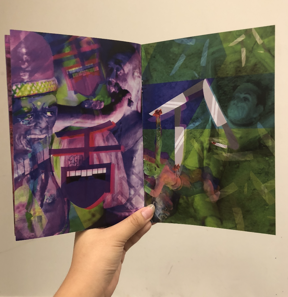
To focus on the effect that Ten Courts of Hell gives visitors, upon visiting that attraction. Tapping on to the creepy and scary vibe that Ten Courts give, to create an abstract zine that makes people hallucinate and trippy!

ART DIRECTION

I wanted to focus on the punishments without text, and mostly pictorial. However, I was afraid that just pictures will not reach out to viewers on the punishment, thus the addition of the Chinese words illustrations.

I consistently used a colour scheme for each page, and only at the back cover page, bringing them together. Trippy/hallucinating art style was also incorporated in the artwork.

Stone – Grey
Cold – Blue
Heart – Red
Boiling – Orange
Tongue – Purple
Knives – Green

LINKS TO:
RESEARCH

GRAPHIC FORM | LOCALE RESEARCH

INFOGRAPHICS

GRAPHIC FORM | LOCALE INFOGRAPHICS

PROCESS

GRAPHIC FORM | LOCALE – ZINE PROCESS

ARTIST REFERENCES

GRAPHIC FORM | LOCALE – ARTIST REFERENCES

Feedback from classmates:

Feedback from Joy:

It’ll be better to have consistency in the Chinese words illustration
Colours are working out better with one colour on each page, and it comes well together on the last page.
Strongest spread – cooking spread (spread 2), which incorporates the mural & words.

Personal Reflection:

Overall, I had really mixed feeling about the zine that I’ve created. I felt that I could’ve done way better than what was produced, but I couldn’t think of other ideas to make the zine abstract.  There were many ideas floating around in my head, but none of them seem to tick the checklist of “abstract”. But, thankfully I didn’t give up!! I decided to start working randomly till an idea got to me, which I stuck with it through! Making a zine sure isn’t easy, as there are many pages to take care of, and it is very important to be consistent – something I’m not very good at. After many trial and errors, I finally got my zine to come along together and I’m just glad that at the end, it all (kinda) worked out well! Super hyped that I managed to create something I can call my own, from scratch, and I got to learn more about zine-making!

About 60% happy with my zine :’)

Fun fact: showed my mum my zine and she had goosebumps viewing it halfway, and didn’t dare to finish it HAHAHA.

Assignment 2, Completed!!

Till then,
Flazéda!
jamz
x

GRAPHICFORM | locale artist references

I was greatly inspired by trippy art to create my zine, as I wanted to give people these reactions:

“what just happen”

“my mind got blown”

“so creepy”

thus I went to my trustworthy site – Pinterest to get some inspirations, and here’s what I got!

I realised they usually have very vibrant colours, and sparks at random places. Tons of overlay was used also to create the effect of messy, random.

pinterest : jvnxie ☹ ☻
Image taken from https://i.pinimg.com/564x/d7/e5/d9/d7e5d963de7f4aa413a1939cea1f4bcd.jpg
Image taken from https://i.pinimg.com/564x/b1/05/83/b10583c7f4f5ec3ad88bee638081847a.jpg

From this, I went ahead to experiment my own style of trippy art!

Chineasy is a publication that I saw on Ted Talk! The artist, ShaoLan Hsueh, a Taiwanese based in London, came up with easy pictorial way to teach children Chinese, in a visually engaging manner!

Home

She incorporated the Chinese words into the form itself and it was easier to learn those words, especially for kids and visual learners!

ohmyasian: “2114. Chineasy by Shao Lan Hsueh. Cute drawings to help you remember some easy chinese characters! ”
Image taken from https://i.pinimg.com/564x/a1/23/79/a123797751633f41a3c1f502d149173d.jpg

I was greatly inspired by her work to come up with mine as well, not to teach Chinese, but to inform my zine’s viewers about the punishments in Ten Courts.

I didn’t want to include chunky text as description, and just wanted something sweet, simple, yet have other meanings to it.

Chineasy-14
Image taken from https://i.pinimg.com/564x/3b/af/1e/3baf1ea48bb048e98216e703371f417d.jpg

Some illustrations done by her!

Therefore, I did up illustrations of a few Chinese words, and that really aided me a lot in my zine!

That’s it for my art references!

Till then,
Flazéda!
jamz
x

GRAPHICFORM | locale zine process

Upon the gathering of data, it was time to start on our zine!

Joy gave me a few ideas on how to proceed with my zine, after the presentation of my data.

I decided to focus on the effects of the Ten Courts of Hell, in an abstract manner, to illustrate what a viewer will feel upon visiting the attraction.

There are a total of 8 pages, 1 front cover page, 1 back cover page and 3 spreads (6 pages).

1. Spreads

As I was working on the Ten Courts of Hell, I decided to focus on six out of the ten main punishments.

There six that I sifted out was:
Crushed by Stones/Boulders
Freezing to Death
Heart Ripped Out
Tongue Cut
Boiling/Drowning in oil
Stabbed by knives

I begun my first spread with the intent of creating an artwork with the trippy/hallucinating effect. After playing with photoshop, I felt that the editing I’ve done to the images did give a trippy effect.
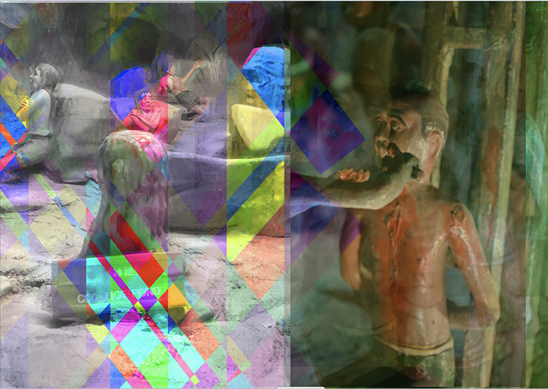
After the first consultation with Joy, she told me to continue working on the rest of my spreads, and developing it further. I wanted to add in text to briefly give an information of the punishments, but Joy mentioned that it’s best to have less text.

With the feedback I’ve gotten, I proceeded to further develop my idea, and came up with the thought of incorporating some Chinese text, in the form of its object. I was greatly inspired by Chineasy, whereby the artist used the word’s actual form and incorporated it together.

I came up with a few for mine,

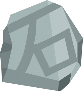
石 – Stone
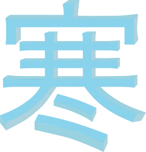
寒 – Cold
心 – Heart

舌 – Tongue

烹 – Cook

刀 – Knife
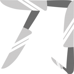
Next up, I tried incorporating it in my spreads.

In every spread, it contains a Chinese character, which is the punishment started.

Spread 1.

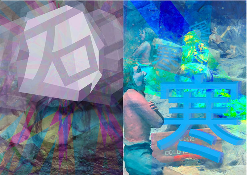
The first page shows a man getting crushed by boulders, with the 石 design on top of the human, signify that it’s the stone that is crushing them.

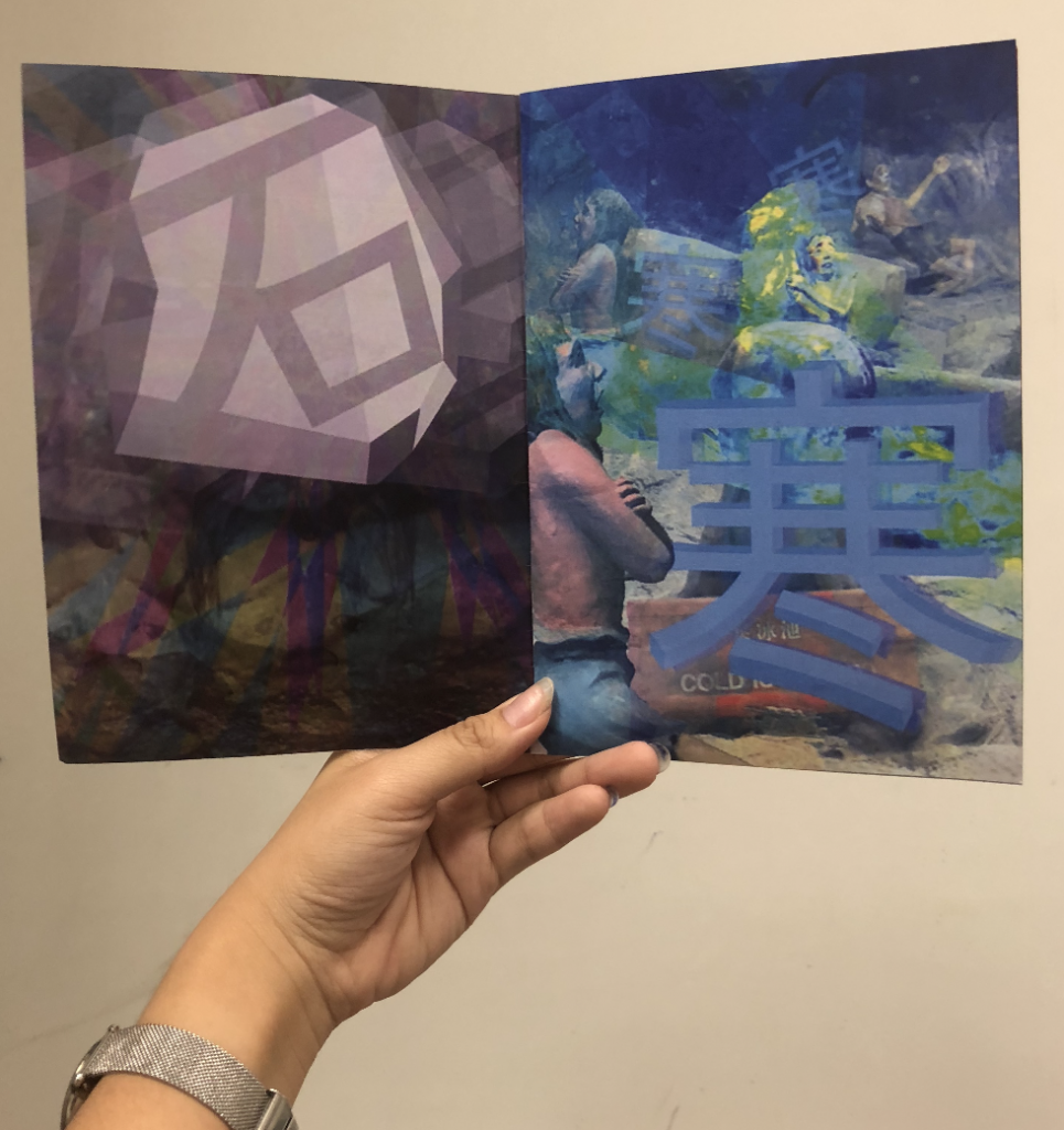
Next, 寒 was added into the punishment of people being frozen into ice cubes. The word is incorporated in the manner that they are the ice cubes of people that got frozen.
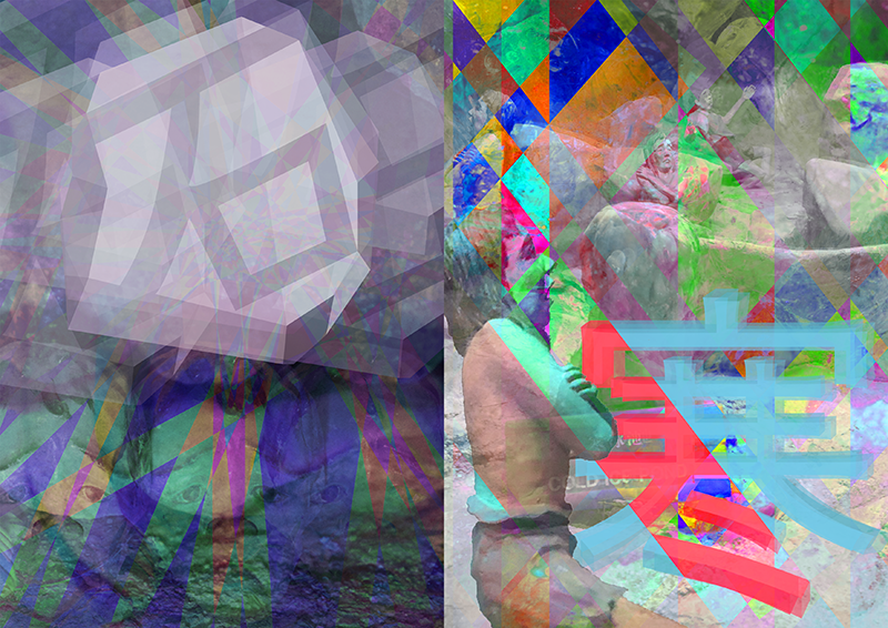
When doing up the spreads, I used tons of photo layover, reducing their opacity, and added saturations and highlights for different layers or places in the image.

Upon consultation with Joy, she mentioned that there seems to be a lack of focus in my spreads, and there should be a focal point. I decided to focus on the Chinese words illustration and make them more prominent. To make the spreads more consistent, I’ve also changed them to have one colour scheme per page.

For the first spread, I used grey as the overall colour, as grey is the colour for stones and boulders. For the “iced” punishment, I used blue, as blue is often a colour related to coldness.
Spread 2.

I’ve used the same concept in all my spreads, but I wanted this spread to have a little interaction between both pages, as they will be printed on one page together.

The initial design I had didn’t exactly work out, as they can be seen as very separate pages, and don’t seem to blend well.
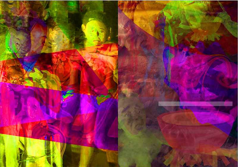
Joy gave me some suggestions, of incorporating elements from both pages together, such as maybe have the body part/heart of the “heart” page being on the “boiling” page.

I added in interaction between both pages, making it look like one spread instead of 2 pages.

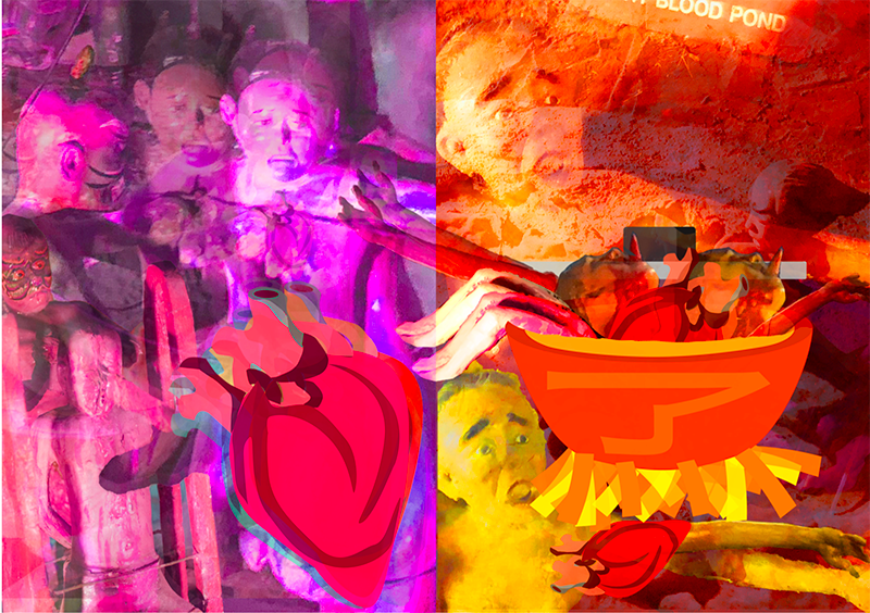
In “heart” page, I used an image of a men getting his heart ripped out, multiplied and overlay it on top of each other – to get the trippy effect. The heart on the image also got replaced by the heart word illustration. I also added in an image of a men’s head & body parts getting chopped off, as it is relevant to the heart and body.

In “boiling” page, I used an image of people drowning in the hot blood pond, as well as the boiling wok of oil. I used the same overlay style, to get the same effect.

Some elements from the “heart” page was added in “boiling” page, with a few elements crossing over both pages. – I felt that this created a link and made the spread more blended and cohesive.

After doing up the spread, I added in the play of colours. However, the saturation and colours I added did not help aid viewers to the focal point, but instead, added more mess and clutter.
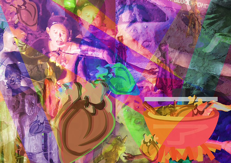
With the feedback I’ve gotten, I went ahead to change the colours and saturation. I used red for “heart”, as hearts are red. For “cooking”, I used orange and yellow tones, to show the cooking and fire is orange.

This is the final design of the spread, and I had the “cooking” pot be cooking with the body parts, heads, hearts taking from both spreads!
Spread 3.

Lastly, moving on to my third spread was “Tongue” and “Knives!

For “tongue”, I used as image of a guy’s tongue getting cut out, as well as a statue I found within Ten Courts, that had a really long tongue. The tongue word illustration was also randomly placed in the page, with a centre one, as the focal. I also used liquify to make the image messier and distorted – to have a stronger hallucinating effect.

For “knives”, images of people getting stabbed by knives were used. Images were taken from “tree of knives” – where people was thrown up and get stabbed, or “hill of knives” – where they were thrown upon and laid there to bleed to death. The knife Chinese word illustration was placed all over the page, with the tip of the knife stabbing some people.
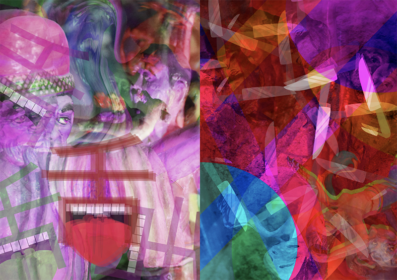
Initially I wanted my spreads to have a colour gradient – from not very saturated/colour, to becoming more vibrant and colourful at the end.
However, it did not work out very well, as the colours totally took away the focal point!!! The colours took over the Chinese words, and they seemed to be drowning.
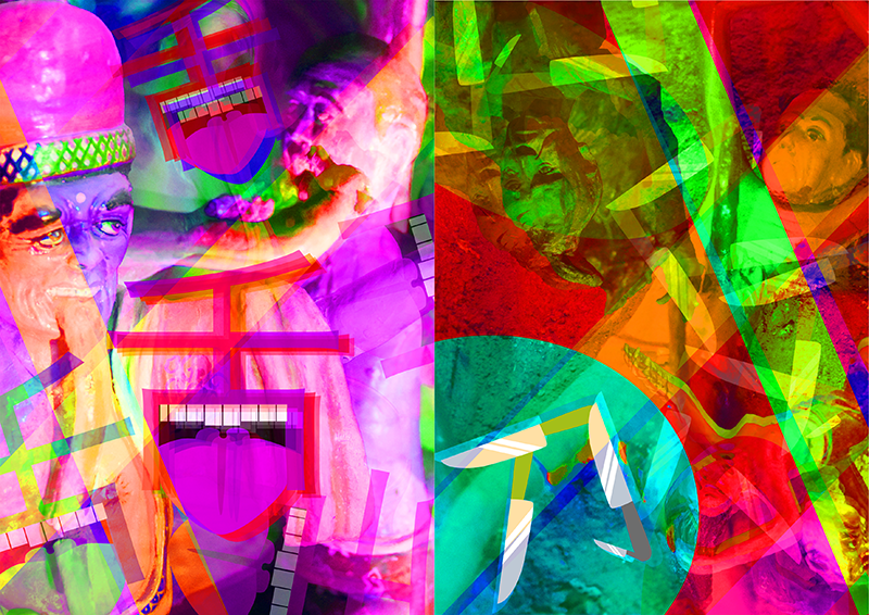
Thus I decided to forgo the many many saturation strips that I used, and focus on the one-colour-per-page, with purple for “tongue”, as when one consumes poison and die, their tongue and lips turns purple. Green is used for “knives”, as the knives in Ten Courts are found on Hills or Trees, which are green!
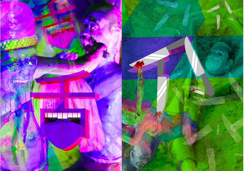
After this edit, I feel that the focal point is indeed more focused on the words and is more cohesive to the other spreads.

Back Cover Page.

For the Back Cover, I had the idea planned in already!

I wanted it to mark as the end of the journey in Ten Courts of Hell, and used the reincarnation wheel as the overall image. I zoomed in to the the wheel, and separated it into 6 different segments and coloured them accordingly to the past 6 pages. In the middle, 終 was added in, to signify “the end”. This shows after you receive your punishment for the sins you’ve done, your journey in hell is about to come to an end. And just like all good things, bad things come to an end too! I personally felt that this tied in very strongly with my concept, and was a very good way of putting all the pages of content together.
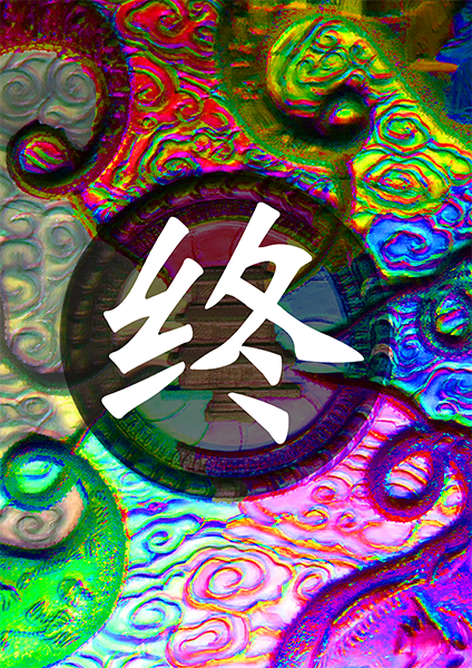
Front Cover Page

I designed my front cover page last, as I had absolutely no idea on what to do!! As I was focusing on a niche part of Haw Par Villa – the Ten Courts of Hell, I had a very tough time contemplating and thinking if I should used both locations or just one.

Originally, I had the idea of illustrating it, and putting an above/under-ground illustration of the place, but felt that the illustrations will not go well with my zine, as my zine was more pictorial.

Next, if I were to put Ten Courts of Hell as the cover page, it will be used as an introduction for viewers that my zine contents is related to Hell, which is not what I was going for. I wanted viewers to get shocked by the contents of the zine, as they did not expect it upon looking at the zine’s cover page – cos don’t judge a book by its cover!!!

However I was stuck on how to link the cover to my zine’s contents, and had a really tough time ideating. Randomly designing, I came up with a cover page, but felt that it didn’t tie in with my zine.
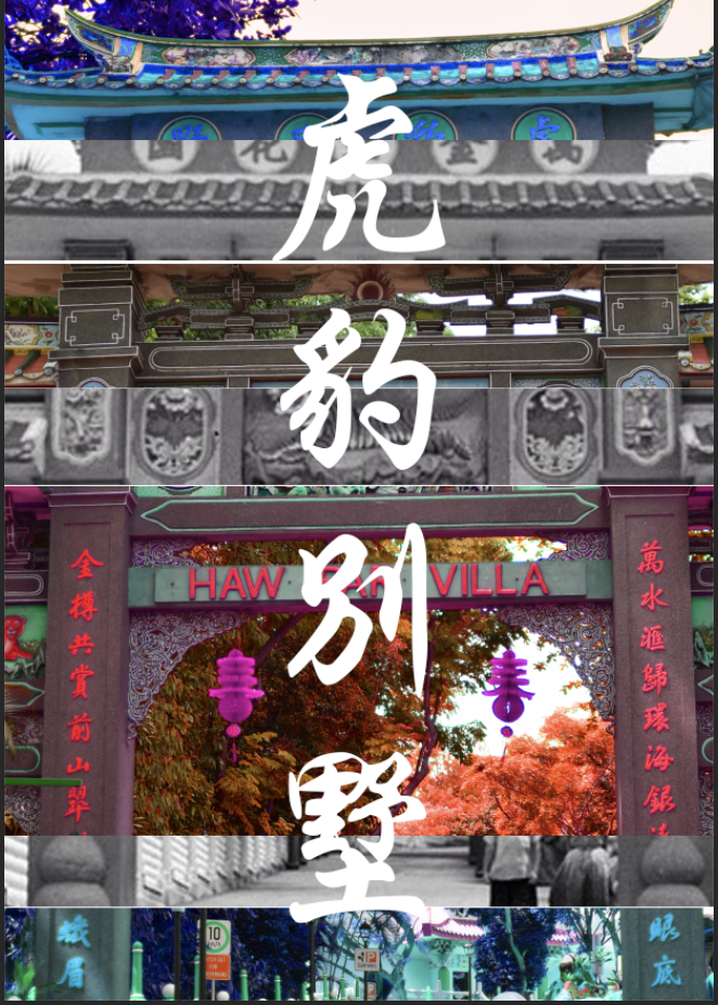
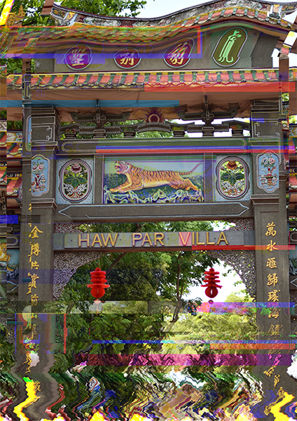
While ideating, I played around with photoshop and came up with the idea! I decided to glitch an image of Haw Par Villa – the bridge which many visitors will take photos there, as its a tourist attraction. The reason for using it is because I wanted to show that despite it being a tourist attraction in Singapore, there is more context and knowledge behind it, and it’s not like any other kind of tourist attraction. (It’s more creepy)

I glitched the image a little, and distorted the ends of the image, showing how it’s gonna go a little haywired, and with this place being abnormal! This gives a little anticipation and insight for the viewers, but they will definitely not expect the contents of the zine!
And that’s its for my process of coming up with the idea of my zine!

Till then,
Flazéda!
jamz
x