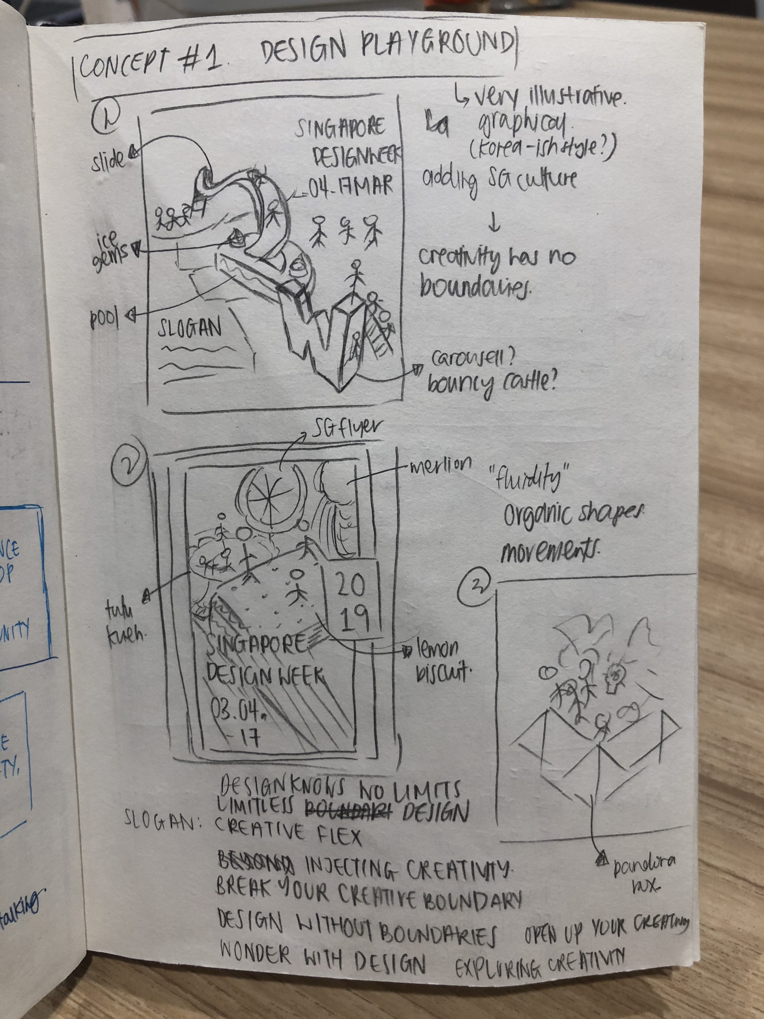
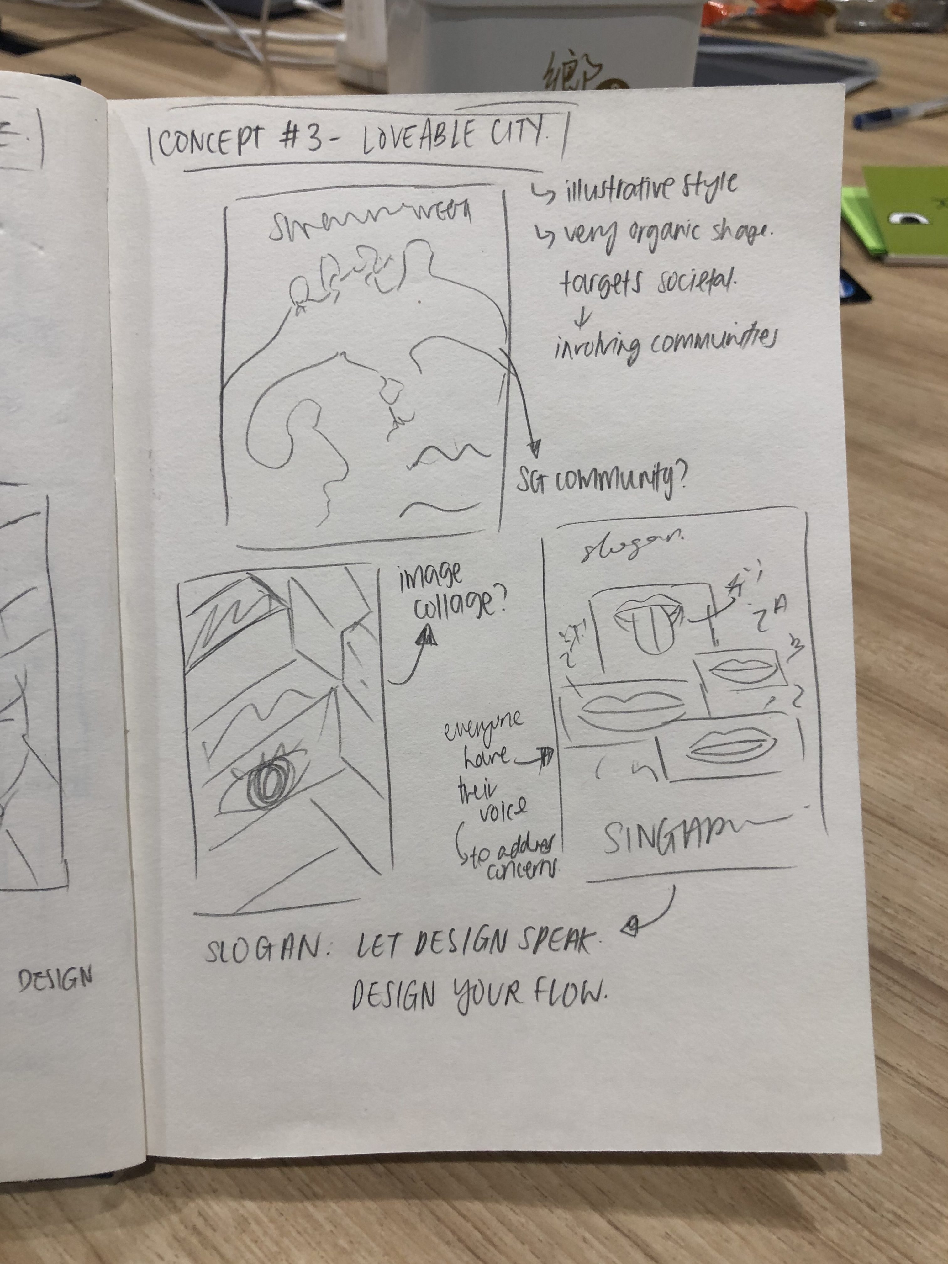
Upon the gathering of data, it was time to start on our zine!
Joy gave me a few ideas on how to proceed with my zine, after the presentation of my data.
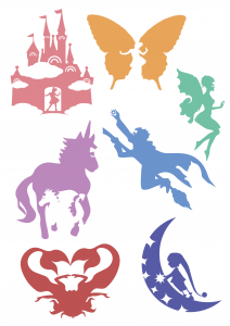
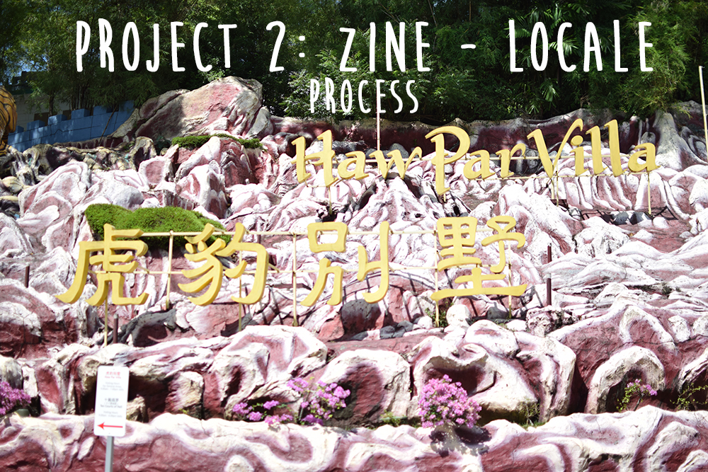
I decided to focus on the effects of the Ten Courts of Hell, in an abstract manner, to illustrate what a viewer will feel upon visiting the attraction.
There are a total of 8 pages, 1 front cover page, 1 back cover page and 3 spreads (6 pages).
1. Spreads
As I was working on the Ten Courts of Hell, I decided to focus on six out of the ten main punishments.
There six that I sifted out was:
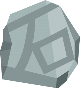
Crushed by Stones/Boulders
Freezing to Death
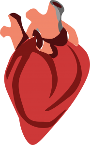
Heart Ripped Out
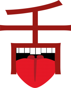
Tongue Cut
Boiling/Drowning in oil
Stabbed by knives
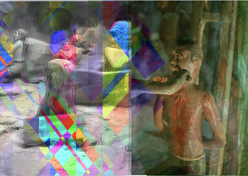
I begun my first spread with the intent of creating an artwork with the trippy/hallucinating effect. After playing with photoshop, I felt that the editing I’ve done to the images did give a trippy effect.
After the first consultation with Joy, she told me to continue working on the rest of my spreads, and developing it further. I wanted to add in text to briefly give an information of the punishments, but Joy mentioned that it’s best to have less text.
With the feedback I’ve gotten, I proceeded to further develop my idea, and came up with the thought of incorporating some Chinese text, in the form of its object. I was greatly inspired by Chineasy, whereby the artist used the word’s actual form and incorporated it together.
I came up with a few for mine,
石 – Stone
寒 – Cold

心 – Heart
舌 – Tongue
烹 – Cook

刀 – Knife
Next up, I tried incorporating it in my spreads.
In every spread, it contains a Chinese character, which is the punishment started.
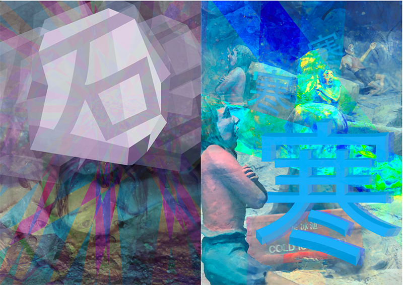
Spread 1.
The first page shows a man getting crushed by boulders, with the 石 design on top of the human, signify that it’s the stone that is crushing them.
Next, 寒 was added into the punishment of people being frozen into ice cubes. The word is incorporated in the manner that they are the ice cubes of people that got frozen.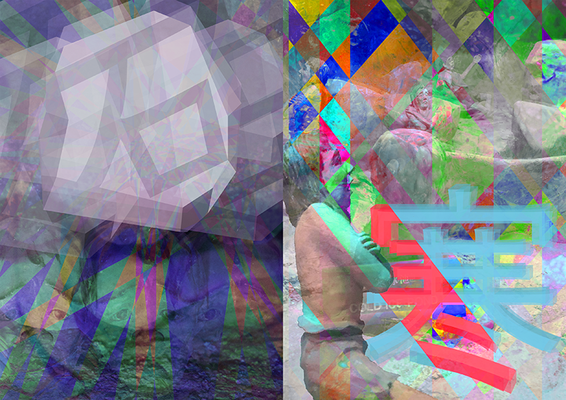
When doing up the spreads, I used tons of photo layover, reducing their opacity, and added saturations and highlights for different layers or places in the image.
Upon consultation with Joy, she mentioned that there seems to be a lack of focus in my spreads, and there should be a focal point. I decided to focus on the Chinese words illustration and make them more prominent. To make the spreads more consistent, I’ve also changed them to have one colour scheme per page.
For the first spread, I used grey as the overall colour, as grey is the colour for stones and boulders. For the “iced” punishment, I used blue, as blue is often a colour related to coldness.
Spread 2.
I’ve used the same concept in all my spreads, but I wanted this spread to have a little interaction between both pages, as they will be printed on one page together.
The initial design I had didn’t exactly work out, as they can be seen as very separate pages, and don’t seem to blend well.
Joy gave me some suggestions, of incorporating elements from both pages together, such as maybe have the body part/heart of the “heart” page being on the “boiling” page.
I added in interaction between both pages, making it look like one spread instead of 2 pages.
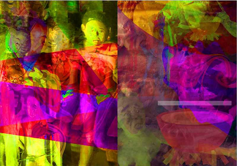
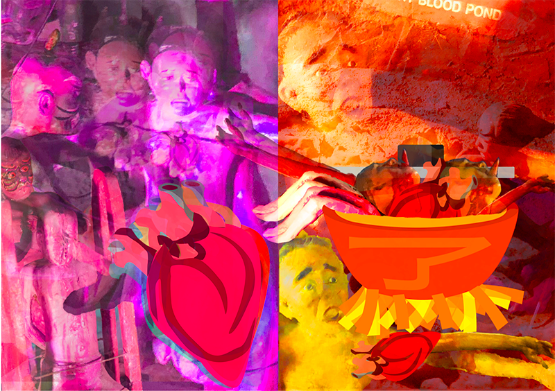
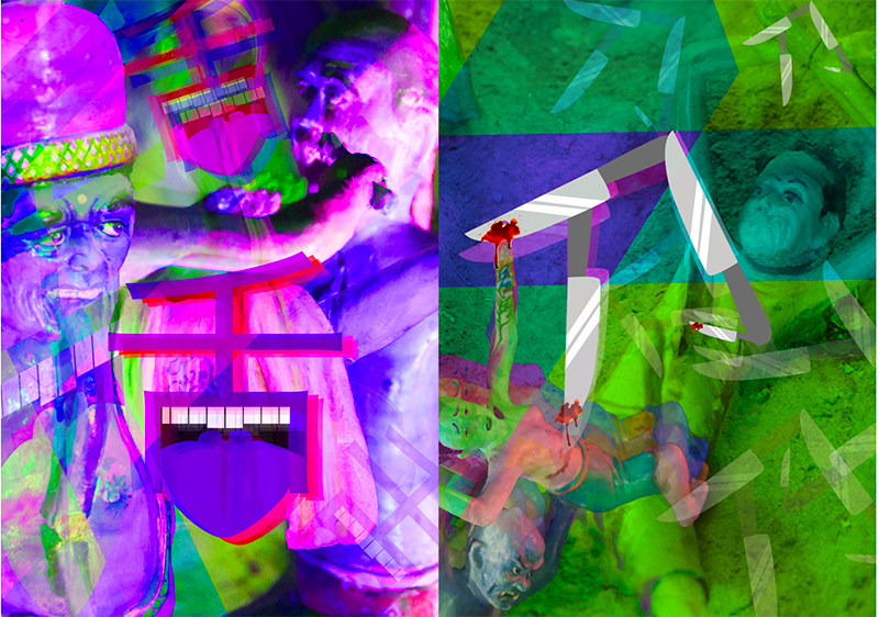
In “heart” page, I used an image of a men getting his heart ripped out, multiplied and overlay it on top of each other – to get the trippy effect. The heart on the image also got replaced by the heart word illustration. I also added in an image of a men’s head & body parts getting chopped off, as it is relevant to the heart and body.
In “boiling” page, I used an image of people drowning in the hot blood pond, as well as the boiling wok of oil. I used the same overlay style, to get the same effect.
Some elements from the “heart” page was added in “boiling” page, with a few elements crossing over both pages. – I felt that this created a link and made the spread more blended and cohesive.
After doing up the spread, I added in the play of colours. However, the saturation and colours I added did not help aid viewers to the focal point, but instead, added more mess and clutter.
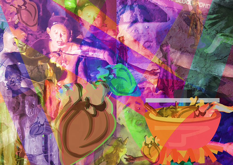
With the feedback I’ve gotten, I went ahead to change the colours and saturation. I used red for “heart”, as hearts are red. For “cooking”, I used orange and yellow tones, to show the cooking and fire is orange.
This is the final design of the spread, and I had the “cooking” pot be cooking with the body parts, heads, hearts taking from both spreads!
Spread 3.
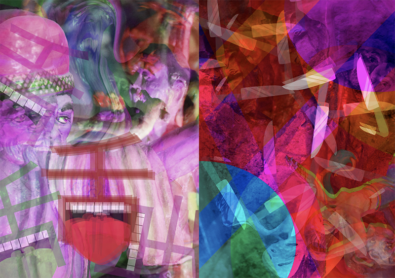
Lastly, moving on to my third spread was “Tongue” and “Knives!
For “tongue”, I used as image of a guy’s tongue getting cut out, as well as a statue I found within Ten Courts, that had a really long tongue. The tongue word illustration was also randomly placed in the page, with a centre one, as the focal. I also used liquify to make the image messier and distorted – to have a stronger hallucinating effect.
For “knives”, images of people getting stabbed by knives were used. Images were taken from “tree of knives” – where people was thrown up and get stabbed, or “hill of knives” – where they were thrown upon and laid there to bleed to death. The knife Chinese word illustration was placed all over the page, with the tip of the knife stabbing some people.
Initially I wanted my spreads to have a colour gradient – from not very saturated/colour, to becoming more vibrant and colourful at the end.
However, it did not work out very well, as the colours totally took away the focal point!!! The colours took over the Chinese words, and they seemed to be drowning.
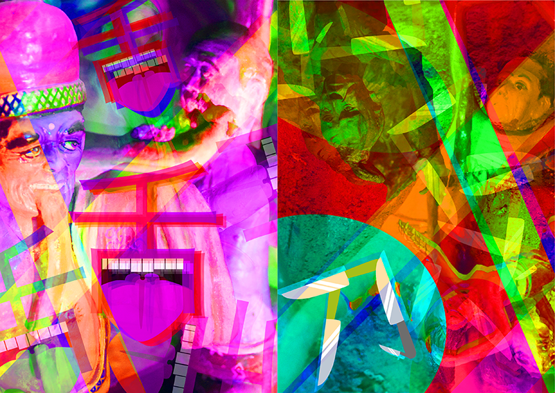
Thus I decided to forgo the many many saturation strips that I used, and focus on the one-colour-per-page, with purple for “tongue”, as when one consumes poison and die, their tongue and lips turns purple. Green is used for “knives”, as the knives in Ten Courts are found on Hills or Trees, which are green!
After this edit, I feel that the focal point is indeed more focused on the words and is more cohesive to the other spreads.
Back Cover Page.
For the Back Cover, I had the idea planned in already!
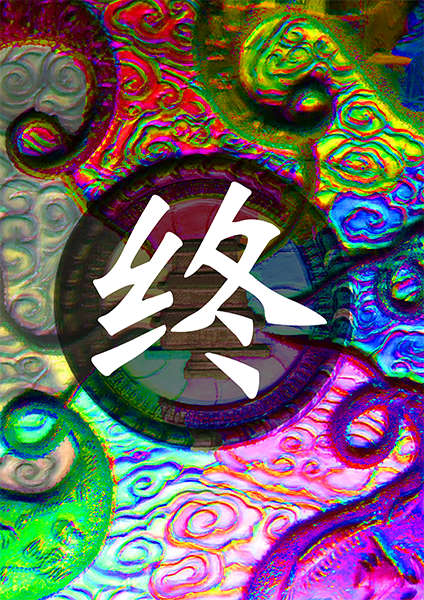
I wanted it to mark as the end of the journey in Ten Courts of Hell, and used the reincarnation wheel as the overall image. I zoomed in to the the wheel, and separated it into 6 different segments and coloured them accordingly to the past 6 pages. In the middle, 終 was added in, to signify “the end”. This shows after you receive your punishment for the sins you’ve done, your journey in hell is about to come to an end. And just like all good things, bad things come to an end too! I personally felt that this tied in very strongly with my concept, and was a very good way of putting all the pages of content together.
Front Cover Page
I designed my front cover page last, as I had absolutely no idea on what to do!! As I was focusing on a niche part of Haw Par Villa – the Ten Courts of Hell, I had a very tough time contemplating and thinking if I should used both locations or just one.
Originally, I had the idea of illustrating it, and putting an above/under-ground illustration of the place, but felt that the illustrations will not go well with my zine, as my zine was more pictorial.
Next, if I were to put Ten Courts of Hell as the cover page, it will be used as an introduction for viewers that my zine contents is related to Hell, which is not what I was going for. I wanted viewers to get shocked by the contents of the zine, as they did not expect it upon looking at the zine’s cover page – cos don’t judge a book by its cover!!!
However I was stuck on how to link the cover to my zine’s contents, and had a really tough time ideating. Randomly designing, I came up with a cover page, but felt that it didn’t tie in with my zine.
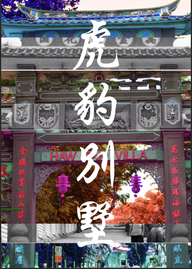
While ideating, I played around with photoshop and came up with the idea! I decided to glitch an image of Haw Par Villa – the bridge which many visitors will take photos there, as its a tourist attraction. The reason for using it is because I wanted to show that despite it being a tourist attraction in Singapore, there is more context and knowledge behind it, and it’s not like any other kind of tourist attraction. (It’s more creepy)
I glitched the image a little, and distorted the ends of the image, showing how it’s gonna go a little haywired, and with this place being abnormal! This gives a little anticipation and insight for the viewers, but they will definitely not expect the contents of the zine!
And that’s its for my process of coming up with the idea of my zine!
Till then,
Flazéda!
jamz
x