VC II | world issues research

Today, there are many issues that are arising within the world, and thanks to globalization and connecting via Internet, we are all aware of the world’s issues. Issues ranges from social, economic, to health and environmental issues, and they are always in the loop of being unable to resolve.

Some of the world issues that are of particular concern and interest to me are:

  1. Religious conflicts
  2. Economic / income inequality
  3. Obesity
  4. Sexual Abuse
Religious conflicts

Religious violence is a term that covers phenomena where religion is either the subject or the object of violent behaviour. Religious violence is, specifically, violence that is motivated by or in reaction to religious precepts, texts, or doctrines. This includes violence against religious institutions, people, objects, or events when the violence is motivated to some degree by some religious aspect of the target or by the precepts of the attacker. Religious violence does not refer exclusively to acts committed by religious groups, but includes acts committed by secular groups against religious groups.

https://www.telegraph.co.uk/news/worldnews/middleeast/10572342/Religious-conflict-in-global-rise-report.html

https://www.theguardian.com/commentisfree/2013/jul/02/religion-wars-conflict

Income Inequality

The rich will always get richer and the poor will always be poor. Income inequality is an extreme concentration of wealth of income in the hands of a small percentage of a population. It has been described as the gap between the richest and the rest.

https://www.straitstimes.com/opinion/why-spore-gives-top-priority-to-fighting-income-inequality

https://www.straitstimes.com/singapore/inequality-is-a-threat-name-it-and-face-it

Obesity

Obesity is a medical condition described as excess body weight in the form of fat. When accumulated, this fat can lead to severe health impairments. The prevalence of obesity across the world continues to rise, and this is now recognised as one of the most important public health problems facing the world today.

https://medium.com/thrive-global/obesity-is-rising-at-alarming-rates-around-the-world-c13ffd0552bb

Sexual Abuse

Sexual abuse is also referred to as molestation. It is usually undesired sexual behaviour by one person upon another. It is often perpetrated using force or by taking advantage of another. There are various acts which falls under this term, such as domestic violence, marital rape, child sexual abuse. It is also common between people with dementia, development disabilities and elders.

https://www.straitstimes.com/forum/letters-in-print/more-must-be-done-to-help-victims-of-child-sexual-abuse

https://www.theguardian.com/society/2018/dec/11/sexual-assault-counselling-victims-services-demand-unprecedented-funding

https://www.theguardian.com/australia-news/2019/jan/01/girl-attacked-in-horrendous-new-years-eve-sexual-assault-in-melbournes-cbd

Out of the various issues mentioned, sexual abuse is an issue which is of particular interest to me.

WHY IS THIS ISSUE IMPORTANT?

Sexual abuse is a very important issue to me as it is actually more common than it seems, but many do not dare to speak up about. It does happen more frequently in females, and they are often more than afraid to mention due to factors such as shame, embarrassment, laughed at, and not taken seriously. Even in males, they might seem to be on a losing end when they come up about being sexually abused by females, as people always assume men to be the “horny” one. Sexual abuse affects the emotional wellbeing and state of mind of the victim, which gets overlooked by others. I feel that even up till this date, people are still slightly insensitive when it comes to the topic of being sexually abused.

WHO DO YOU NEED TO COMMUNICATE TO

My target audience are people who had experienced any form of sexual abuse before. I hope that they will be able to share their story with others, in a way creating more awareness about the issue, and also by helping themselves mentally to feel more comfortable and start their healing process.

https://www.psychologytoday.com/us/blog/matter-personality/201210/why-dont-child-sex-abuse-victims-tell

https://www.theguardian.com/commentisfree/2018/sep/29/sexual-assault-survivors-what-to-say

HOW HAS VISUAL COMMUNICATION CONTRIBUTED

There are various organizations specifically for sexual abuse and they have created campaigns.

In Singapore, we have AWARE – Association of Women for Action and Research. Very often, they come up with campaigns to address sexual abuse issues.

Image result for aware singapore

The Truth Project, UK, where people share their experiences of child sexual abuse.

Image result for truth project UK

https://www.theguardian.com/uk-news/2018/oct/16/victims-of-child-sexual-abuse-detail-experiences-in-online-anthology

A Toronto artist, Hana Shafi, aka Frizz kid, works with art healing for sexual abuse.

close up of Hana Shafi's artwork inside the Lost Words artshow exhibit

https://www.psychologytoday.com/intl/blog/talking-about-trauma/201809/using-art-heal-sexual-assault

https://studentlife.ryerson.ca/art-heals-an-intervention-in-sexual-violence/

“I Don’t Owe You” – Avalon Sexual Assault Centre, Canada

I Don’t Owe You

Amongst all the visual research that I found, there is a very common aim amongst all of them – to address sexual abuse. The colours used are also very vibrant, which in a way gives off a positive vibe, letting viewers know that sexual abuse should be spoken about, not kept within. They also have very engaging text and information on it.
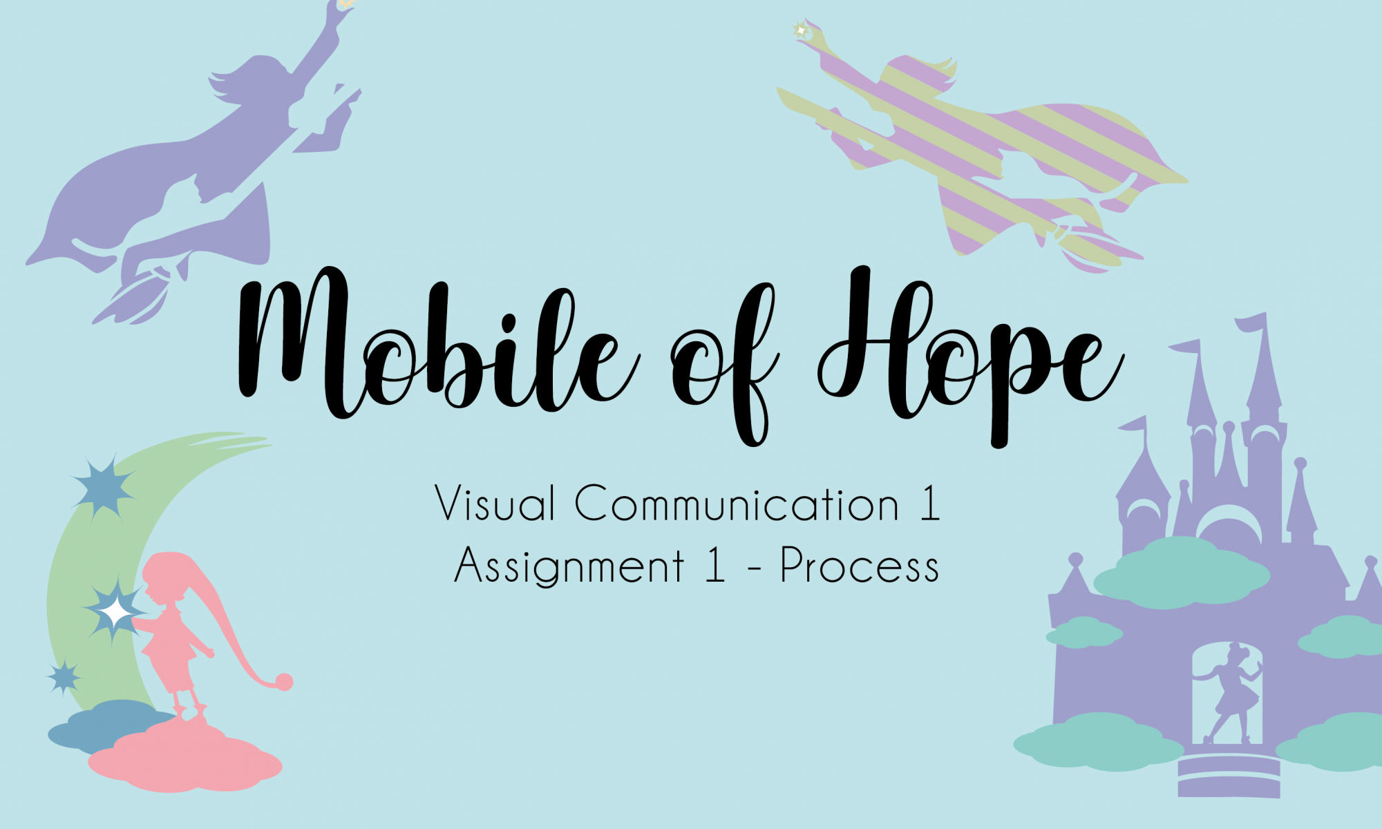
Till then,
Flazéda!
jamz
x

INT1 | principles of new media essay

For my short essay, I will be talking about the Principles of New Media in relevance to my Interactive I Installation Project – The Tree. I will referring to the notes mentioned in class, and also the reading from Lev Manovich, “The Language of New Media”.

Numerical Representation

From the reading, I understand that when new media are created from scratch or converted it’s composed of digital codes and are numerical representations.

There are 2 key consequence

  1. Can be described using a mathematical function
  2. Can undergo algorithmic manipulation and media becomes programmable.

It was created on computers and originate in numerical form, but were converted from various forms of old media. Digitization happened when converting continuous data into a numerical representation.

To make the tree function in a certain manner, tons of coding was done to set the movement of the tree. Our project definitely involves numerical representation as we have to key in specific numeric data while coding the movement of the servo motors, specifically the seconds and angle, and also the distance of ultrasonic sensors. Behind that, it involves a literal numerical representation whereby the information we typed on the front of the screen converts into binary data.

Modularity

It is the fractal structure of new media. New media objects are object-oriented, composed of parts made up of smaller parts reminiscent of a “fractal structure”. It consists of a number of separate objects. It is made from independent parts which retain a measure of autonomy even if embedded in another new media object.

Our Tree Project definitely has modularity, be it physically wise or coding. The tree is made up of many individual branches that comes together to form a whole, which shows the physical modularity. For coding wise, each branch is attached to a servo motor, and we have coded it into a manner where every servo motor moves at a different speed, time and angle, and will not be exactly the same or affects one another.

Automation

Numerical coding of media and the modular structure of a media object to allow for automation of many operations involved in media creation, manipulation, and access. Human intentionality can be removed from the creative process.

Our Tree Project definitely am able to run by itself without a user, once it’s being coded in. As it is set on loop, the project will keep on running and emits data when needed, until the power source is gone.

However, there is only a certain level of automation for our project as we do need human interaction to make the project work, else it will be static

Variability

A new media object is not something fixed once and for all, but something that can exist in different, potentially infinite versions. This means that each time an audience reacts to the interactive art, the output varies. Variability is a consequence of numerical representation and modularity combined and is closely connected to automation.

There is variability for our project as each audience will get a different experience from our interactive art depending on the location that they are standing. We coded our project to react in a different manner when at a different distance away from the tree. Furthermore, 360 degrees around the tree, the branches will react differently depending on which direction/angle the audience is coming from. Therefore, there is variability based on the distance of the audience and tree, and everyone will get a different experience.

Transcoding

It is the reconceptualization which occurs during computerization, the transformation of media into computer data. It creates a composite blend of human and computer meanings. It is also the most substantial consequence of media, which suggests that there are two distinct layer – the cultural layer and the computer layer. Both layers influence each other and are being composited together.

For our tree project, it was the theme ‘interstice’ that made us think of doing up an interactive tree, which signifies our cultural layer, whereby we talk about the interstice between people’s comfort zone with the usage of a non-human.

This influenced our computer layer which was when we started to work on how to make the interactive art work the way we want to and also portraying our message.

In conclusion, I believe that my group’s project does consist of the 5 principles of new media and I can’t wait to see it in full action! Now it’s time for me to go back to coding it to make it work!!

Till then,
Flazéda!
jamz
x

VC1 | poster design research

There are so many different styles of posters that designers can do.
For me, I do not have a specific style of designing, and will always tryout different layouts and styles.

These are the few that caught my eye recently.

Image taken from https://i.pinimg.com/originals/f4/d2/da/f4d2da455695b83219026d9099f25e5b.jpg
Image taken from https://i.pinimg.com/564x/d0/96/b2/d096b270f42c088e65eafd03542c44df.jpg
Image taken from https://i.pinimg.com/564x/48/62/90/486290123486e238914ba0e33fda561f.jpg
Image taken from https://i.pinimg.com/564x/55/4f/29/554f29000376379112edbd1fb81086d3.jpg

I’m going to be talking more about ‘Nocturnal Wonderland’ poster.

The poster is communicating that there seems to be an event/show on interesting and weird creatures whom seem to only appear at night, hence the name nocturnal.

The emotion that the design elicit is a cute, weird, playful emotion.

The thing that makes this poster so captivating is their usage of colours. The poster uses very bright colours, especially with the yellow border. Furthermore, the variety of colours used complements each other. The characters also stand out due to the colours used, and them being bigger which separates the characters from the other elements.

The poster generates interest by the usage of illustrations. To facilitate readability and legibility, the designer used yellow for text, and making sure that the colours behind isn’t yellow, so that it will not be as confusing for readers. Furthermore, a black border of the words was also used to define the words.

I really like how this approach was done, as the illustrations ties in really well with the theme and words. For execution wise, I think there are more areas for improvements. The words aren’t very big, thus doesn’t pop out as much. For the background, there are too many lines and it might seem too messy. Viewers might also lose focus from that.

BUT ALL IN ALL,
it’s a really cool poster and I’m inspired by it!!!

Till then,
Flazéda!
jamz
x

VC1 | trip to national design centre

The various type of design practiced encountered are:

VC – Visual Communications
PI – Product & Industrial Design
FA – Fashion & Accessories
EN – Environmental Design

pi – product & INDUSTRIAL DESIGN

fa – fashion & accessories

en – environmental DESIGN
VC – Visual Communications

These are how Visual Communications Design has changed over the years. In the past, design works has a different style, in comparison to current years. The usage of colours seemed more dull, and have a retro towards it. The usage of typography also shows the difference as the fonts used in the past are fonts not as commonly used in current days.

Advertisements and posters are always designed with a tagline/slogan in mind, so that it helps capture the attention of the audience, and supporting the visual graphics.

I found this advertisement relatively interesting and a good way to show the advancement of Singapore. The text wrote “Keep Singapore Clean”, with the graphic of Phillips vacuum cleaner. In today’s context, this advertisement might not be as impactful as it was, due to the advancement of Singapore. Singapore used to be a country that was not very clean and sanitary, as they had tons of trash. However, with Singapore’s advancement, the sanitary and hygiene got better and Singapore is now classified as clean and green. Thus, the advertisement’s tagline of making Singaporean clean will not be as impactful.

future goals/key thrust for design in sg

Singapore might have a chance to be a leading influence on Asian and International Design. They have the potential base to be the base for strategic decision research and development to complement the manufacturing prowess and immense market potential of the Asian markets.

The role of design will be increasingly important and will move up the value chain.

IMPLICATIONS GOALS HAVE ON CURRENT PERCEPTION

It is good that design in Singapore is getting more recognition and value. Having support from Singaporeans is really a huge jump and change for Singapore, as they used to focus more on academics.

Till then,
Flazéda!
jamz
x

VC1 | mobile of hope process

The Brief: Hospital can be a stressful environment. What roles can graphic artist and designer play to create a welcoming and soothing environment that can potentially promote healing?

Task: To develop graphic forms that convey the notion of hope. The graphics created will be assembled into a hanging mobile for application in a healthcare environment to lighten the atmosphere of the hospital.

Brainstorming and Preliminary Ideas

I’ve mind-mapped down my definition of hope in this picture below!

The 3 themes I’ve decided to come up with was:

  1. Castle / Fairyland
  2. Representation of Hope through flowers
  3. Representation of Hope through religious architecture

To me, hope was something that I dream of and envision it to be true. With that, I’ll try to think of ways to make it come true.

As the mobile was for a hospital environment, I wanted it to be something lighthearted and not serious, as I feel that the hospital itself has negative connotations to it. Thus I decided to narrow down to the theme of fairyland. It has a magical and positive feel to it, so that when patients see the mobile, it cheers them up because it reminds them of happier and younger days!

The theme revolves around the song Castle on the Cloud, from Les Miserables. The song was about a young girl Cosette, whom hopes to live in the castle on the cloud, where it’s all happiness and trouble free. With that, I went to come up with some graphics that you will see, once you stepped into the castle.

Design Development

I proceeded on to work on the graphic forms digitally and came up with a few forms.

I searched for magical / mythical elements which can help me to further explain Hope. These are the elements I’ve used:

  1. Dragon + Unicorns + Stars
  2. Elf + Pixie
  3. Genie + Lamp
  4. Castle + Clouds

Upon showing it to the class, many agreed that forms 1 & 3 don’t really work out, and form 4 was the best amongst all. From there, I worked further into exploring form 4 and to come up with forms that gives off a similar vibe and style to it!

Next, I came up with another set of graphic forms and consulted Michael via email to ask for his opinion about it!

For these 4, the elements I used are:

  1. Castle + Clouds + Rainbows (as windows) + Girl at the door welcoming visitors
  2. Pixie + Rabbit (at wings) + Girl’s upper body (as face mask)
  3. Flying Wizard + Cat at cape + Catching a star
  4. Unicorn + Dragon + Girl as mask

The feedback I got from Michael was that form 1 & 3 worked better than the rest! And all forms showed consistency in theme except for form 4, and form 4’s negative and positive play wasn’t as well shown as the rest.

The presence of the girl in every graphic form was questioned as well.

With that, I tried to create more graphic forms for individual consultation the following week regarding colour play!


I added 3 more graphic forms from the 4 I had prior to consultation.

The 3 I added are:

  1. Butterfly + Girl
  2. 2 flipped mermaids with the tails joining together
  3. Pixie grabbing a star from a crescent moon
Colour Scheme

I decided to go with pastel colours as it suits the theme that I was going for – young, magical, mythical and fairyland-ish!

From the consultation I had with Michael, I realized that I don’t actually need to have that many graphic forms and could’ve easily settled with 2, as there are more than 2 graphic forms in my final form (hahaha lol)

So from there, I decided to cut down to 3 final forms, and tweak them a little more.

I settled on these 3:

  1. Castle on Clouds
  2. Elf Picking out the star from the Moon
  3. Wizard Soaring into the sky with his Cat

Each final graphic form, I came up with a few variations!

Form 1:

I contemplated on the usage of rainbows for the castle’s windows or crescent moons. I felt that by using the rainbows it will add more mess to the current elements and the moon showed consistency.

My conclusion was to use the moon in the end!

Form 2:

I used 2 different stars one with just a star, and the other with a star inside the star. Feedback I got was that either or seems fine, but there might be too many stars right now! & the girl is very redundant.

So my conclusion was to remove some stars and remove the girl cos she wasn’t really needed to show consistency.

Form 3:

The main difference was the broom, one of thicker strokes and one of lesser! Feedback I got was that the broom seems to not show the flying movement, and in general the graphic form seems to show a static movement instead of intended – the flying wizard. Also the cat can be more incorporated into the cape!

Therefore, I concluded to use the broom with thicker strokes and try to show more flying movement of the wizard.

Final Draft

After making the changes, I added in colours and tweaked the colours around so that there’s differences in the forms.

I planned to hang my mobile with reference from this image below!


4 vertical lines were hung (to form an X) and there was a longer string in the middle of the X, which only hung the castle. For each vertical line, I used the same colour scheme (of 3 colours) along the same side of the form! I used quite a lot of colours as I think it suited my theme as people will associate it to being colourful and bright!

Here’s the colours and forms I used in digital copy!

I believe the wizard flying was my strongest form that shows the positive and negative as the cat was really incorporated pretty well!

I placed the forms in alternatives (Wizard > Elf or Elf > Wizard) at the 4 vertical lines. The castle which was hung in the middle was bigger than the rest. It was to show that the castle is the main element of this project, as all the other elements exist within the castle.

I placed the castle at the lowest point, without any other forms blocking it.


Animated GIF - Find & Share on GIPHY

But due to my very bad worksmanship, it turned out pretty bad! I didn’t know how to cut the forms out from the paper properly as I used scissors, but was then introduced by the class to X-acto knife!! The top was also pretty badly done as I didn’t buy a circle ring and used wire to form it instead.

I also felt that the forms I originally printed were a little too huge and should probably be smaller. Also, comments I got was one of the sides were black and black was totally misplaced with the rest of the pastel elements. The elements hung on the mobile didn’t move naturally as there were too much weight for the fishing line!

Overall, the bad worksmanship made the whole mobile look bad, and its tough to look at the graphic forms with all the mess.

But thankfully I was given the chance to redo the mobile!

After redo-ing, comments given by my classmates were that the workmanship was actually way better and they can focus on the graphic forms instead of the bad cutting 😡

I also edited my final graphic forms colors to show more consistency amongst all the forms, and switched up the black!

Next, I will be posting my final forms and mobile!

Till then,
Flazéda!
jamz
x