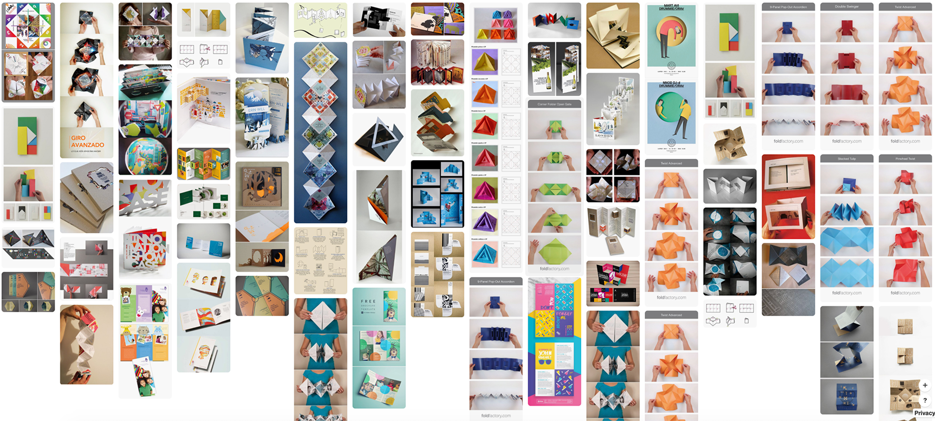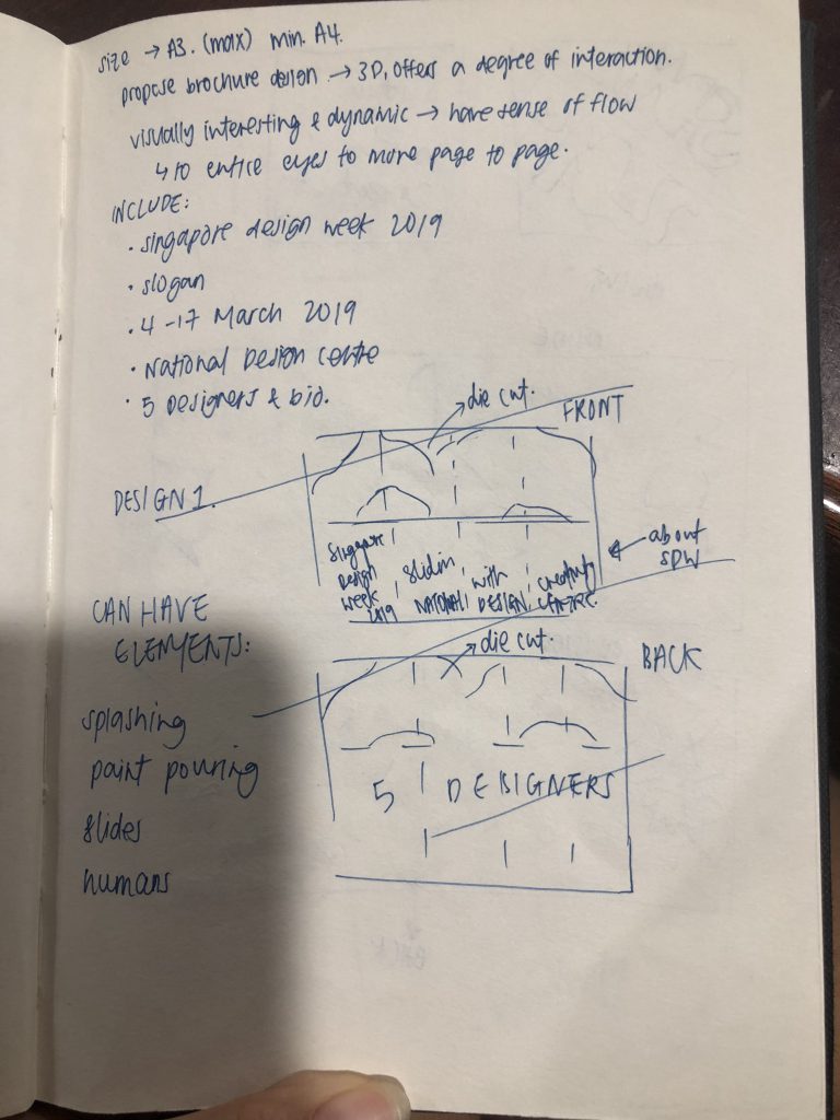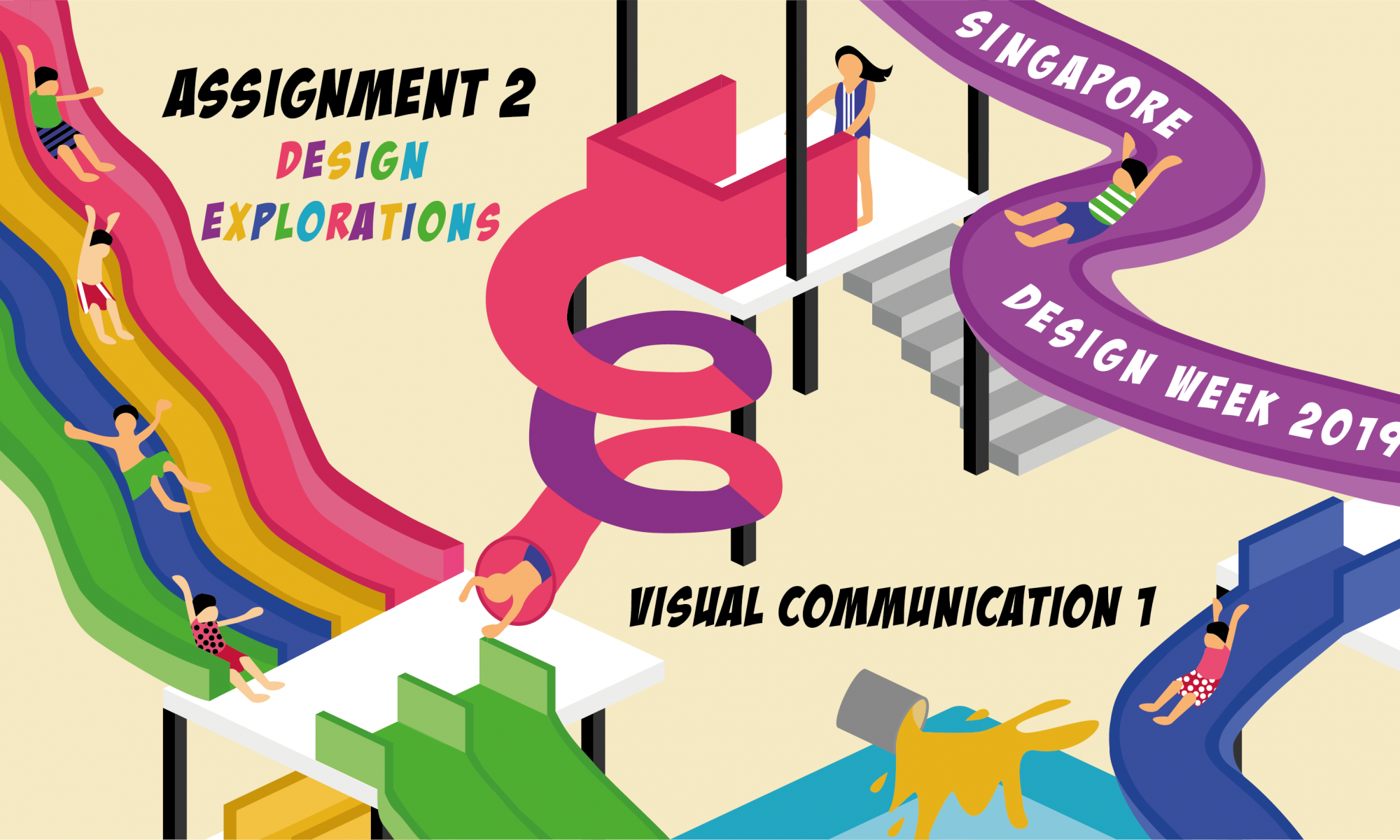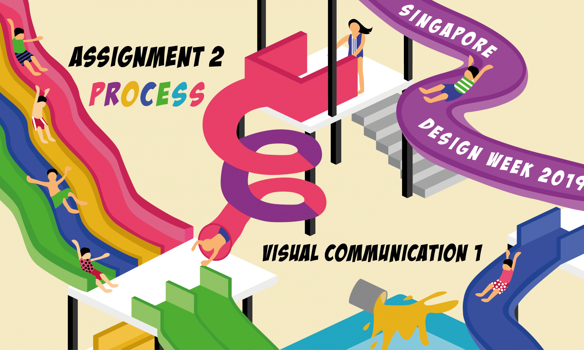
Task: To conceptualize and create a brochure that’s appropriate for the Singapore Design Week 2019.
Your poster should include the following:
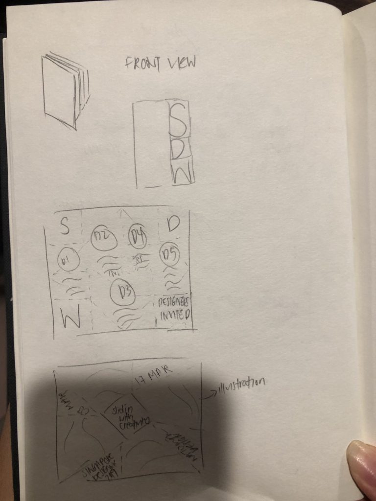
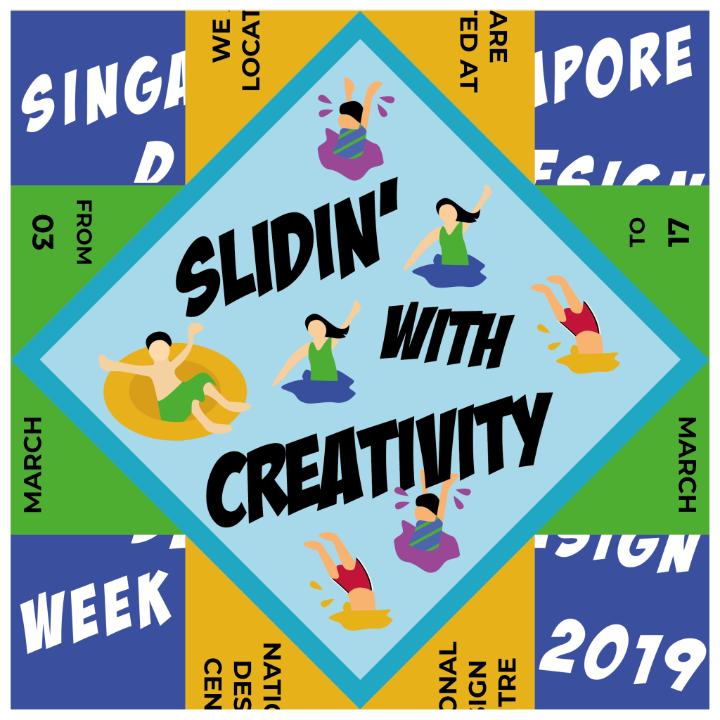
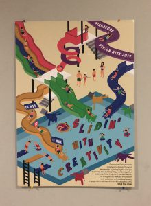
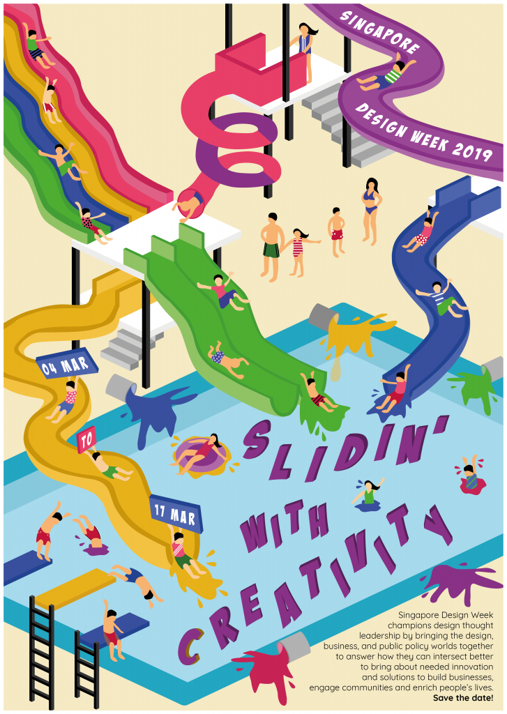
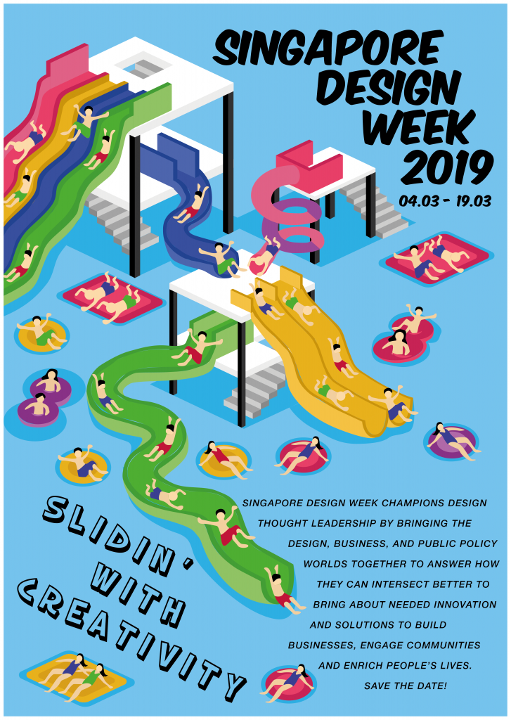
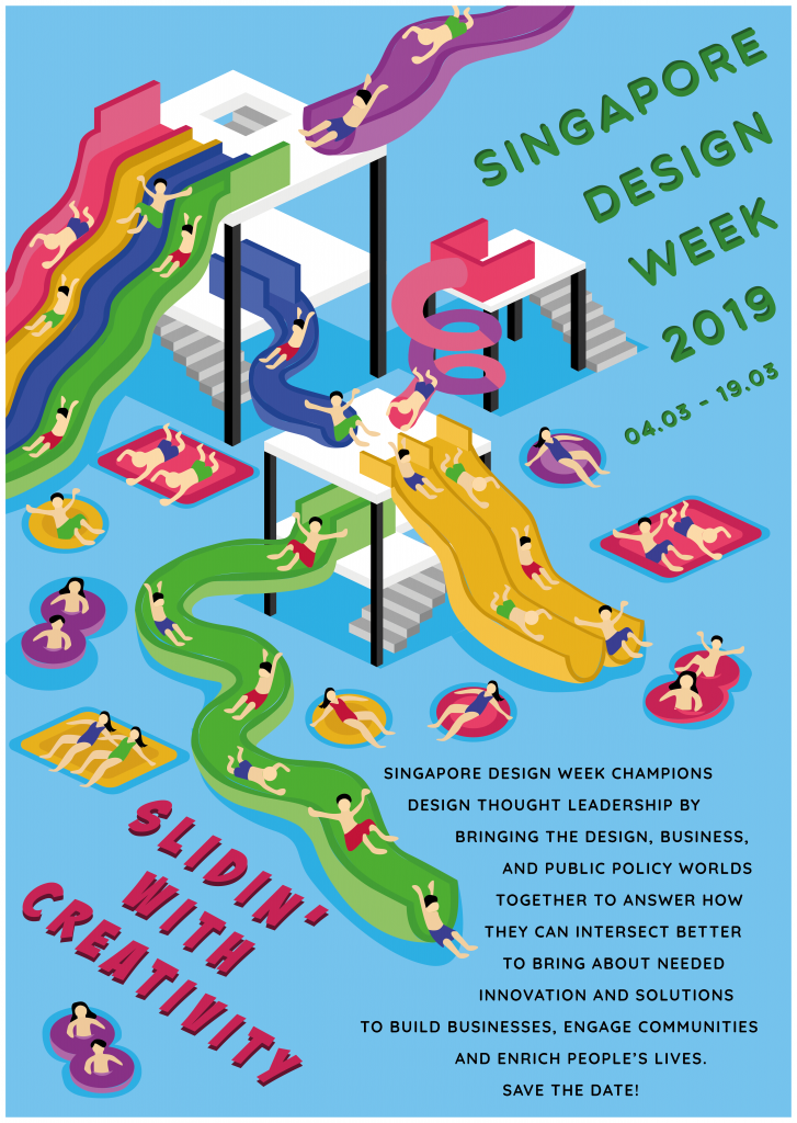
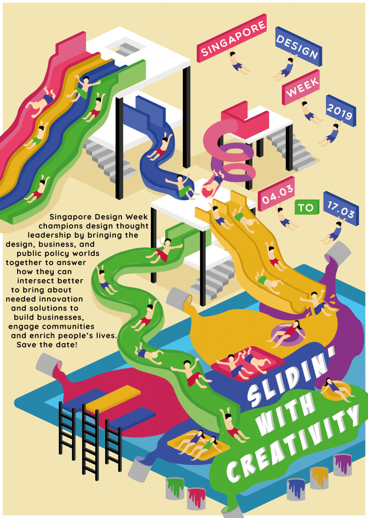
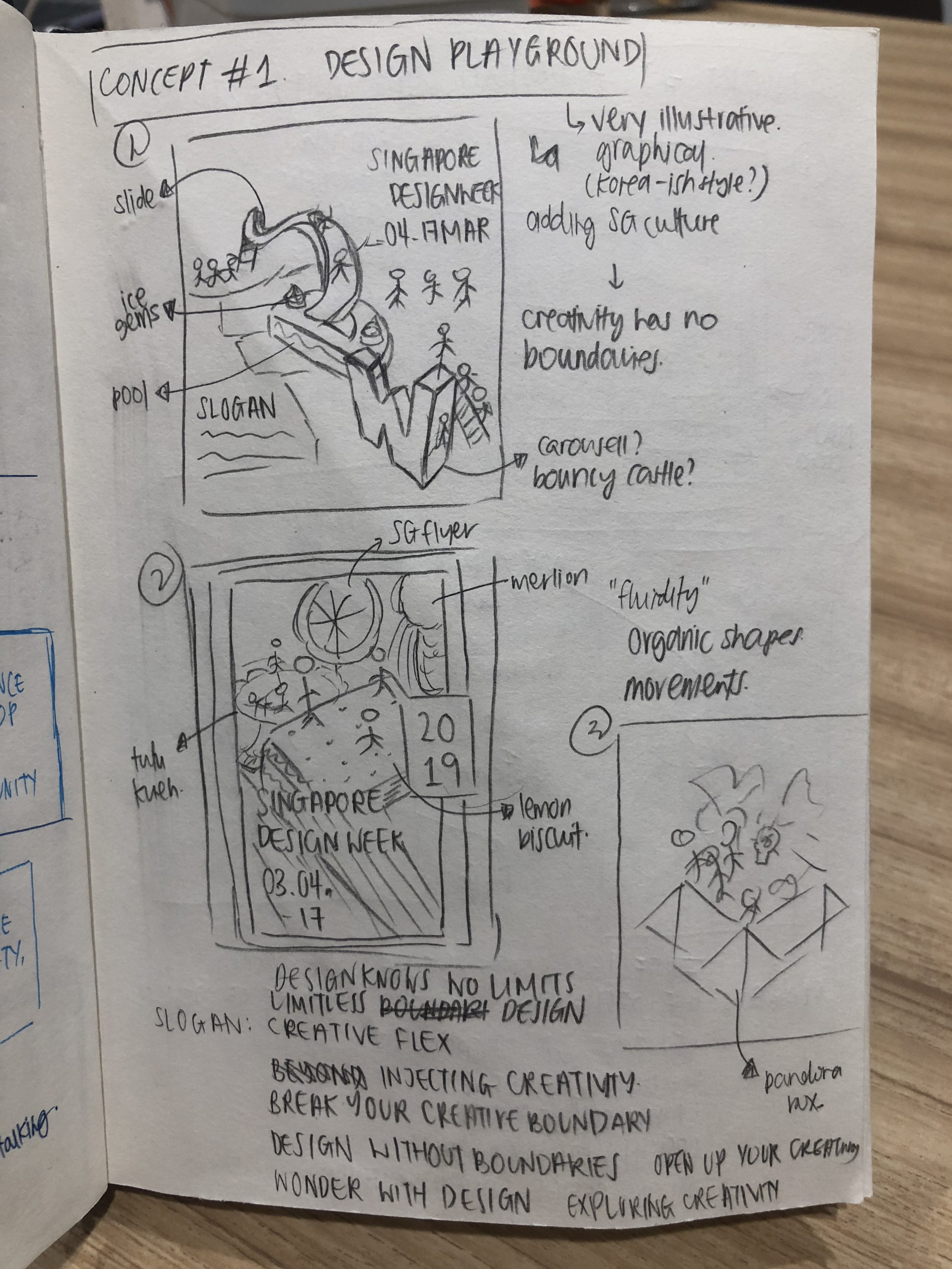
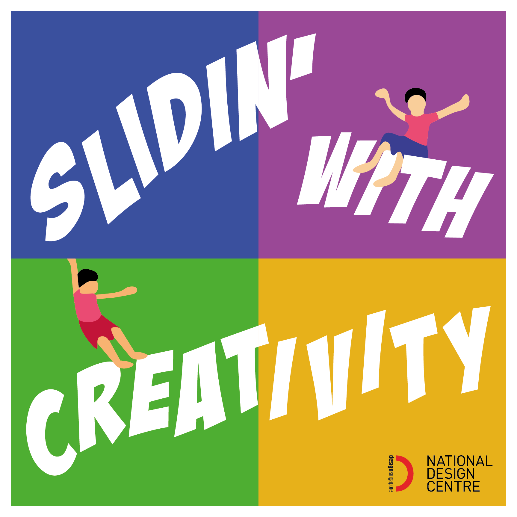
- Singapore Design Week 2019;
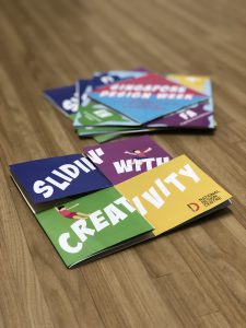
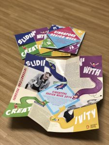
- A Slogan (of no more than five words) that captures and reflects the aims of the event.
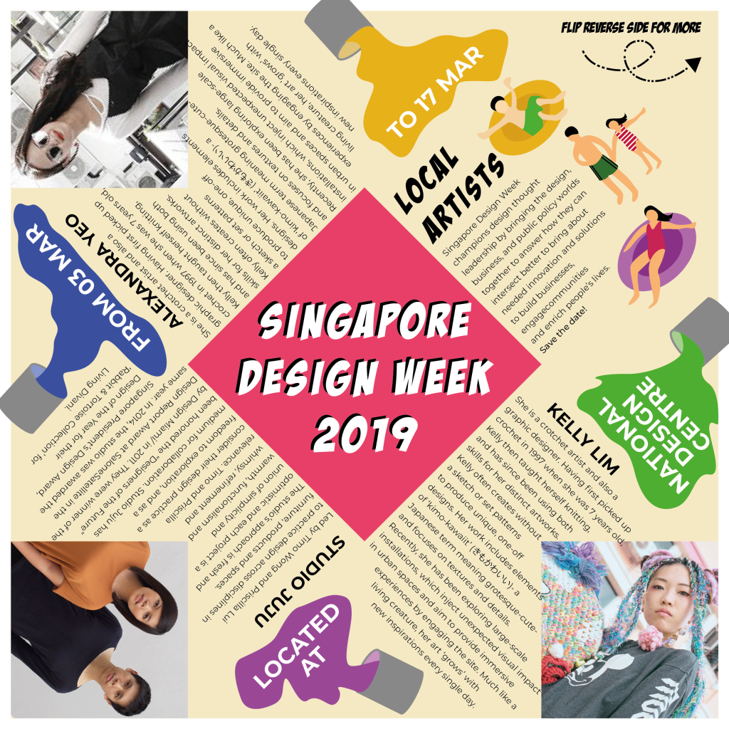
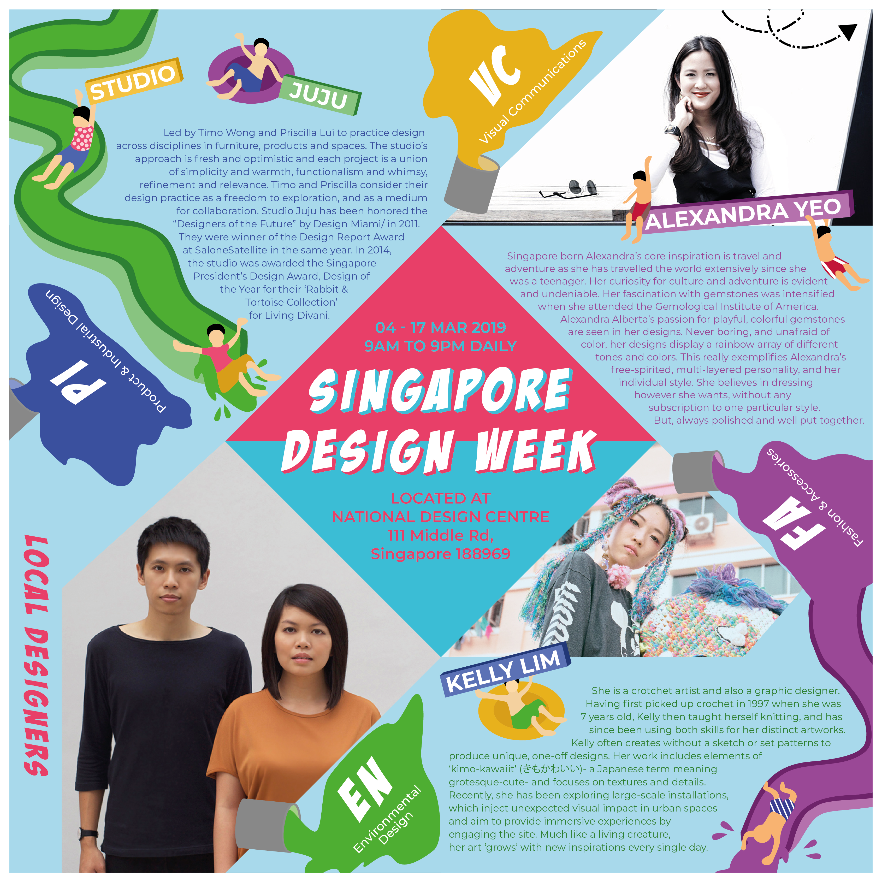
- 04-17 March 2019
- National Design Centre
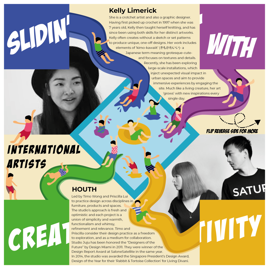
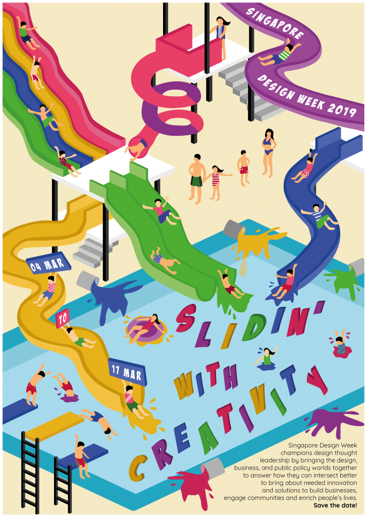
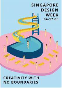
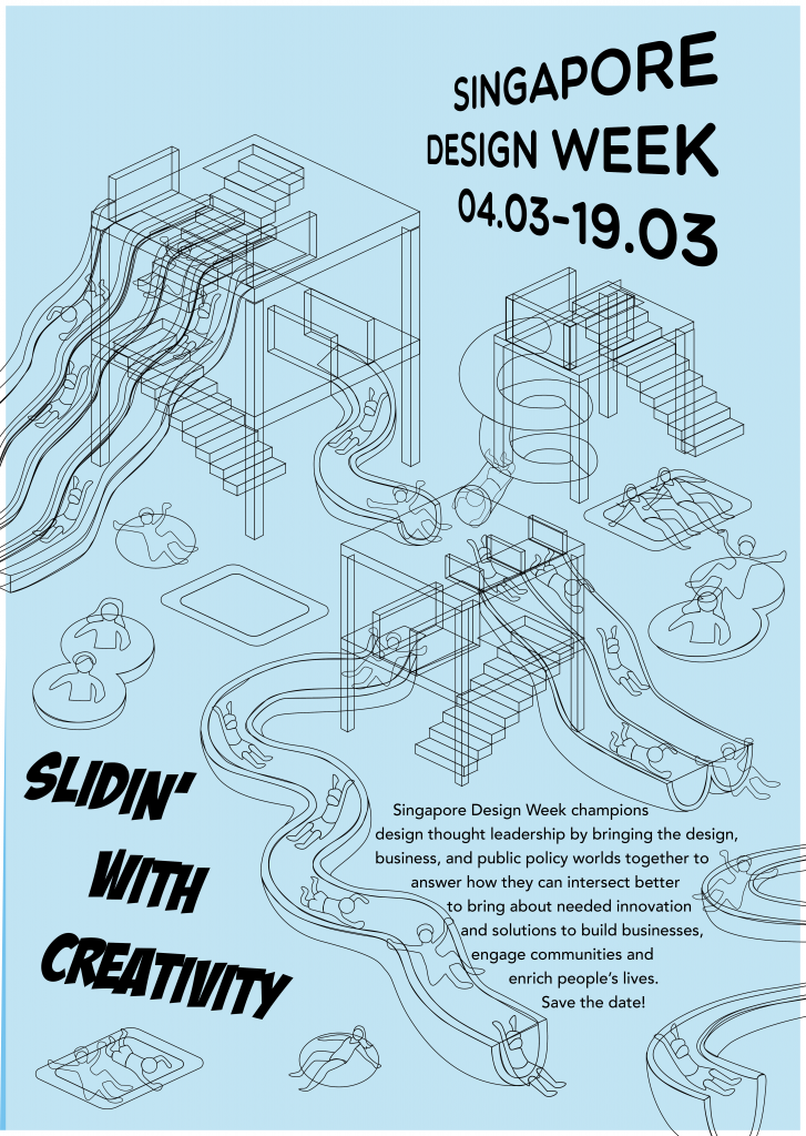
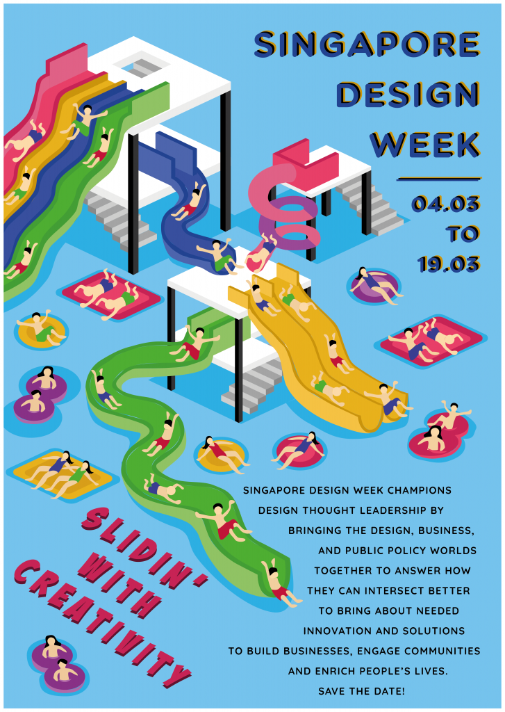
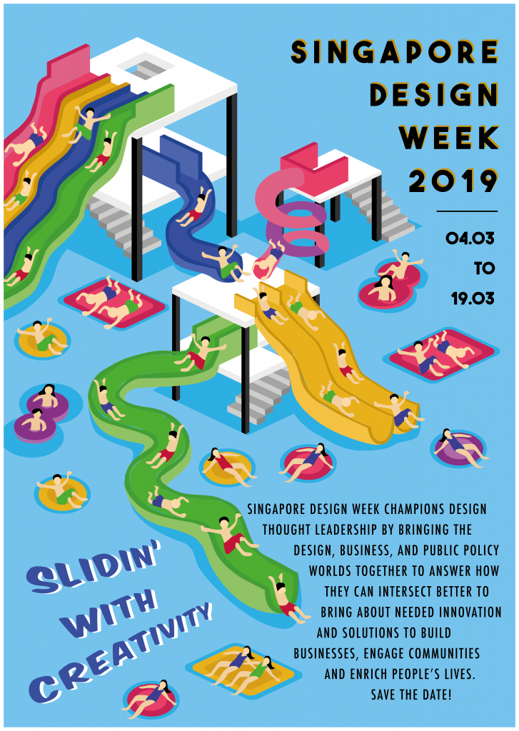
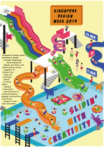
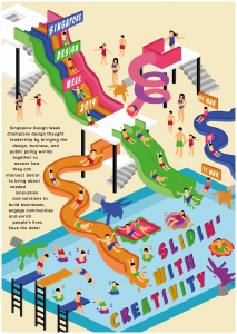
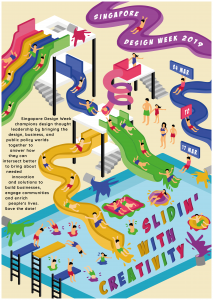
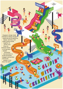
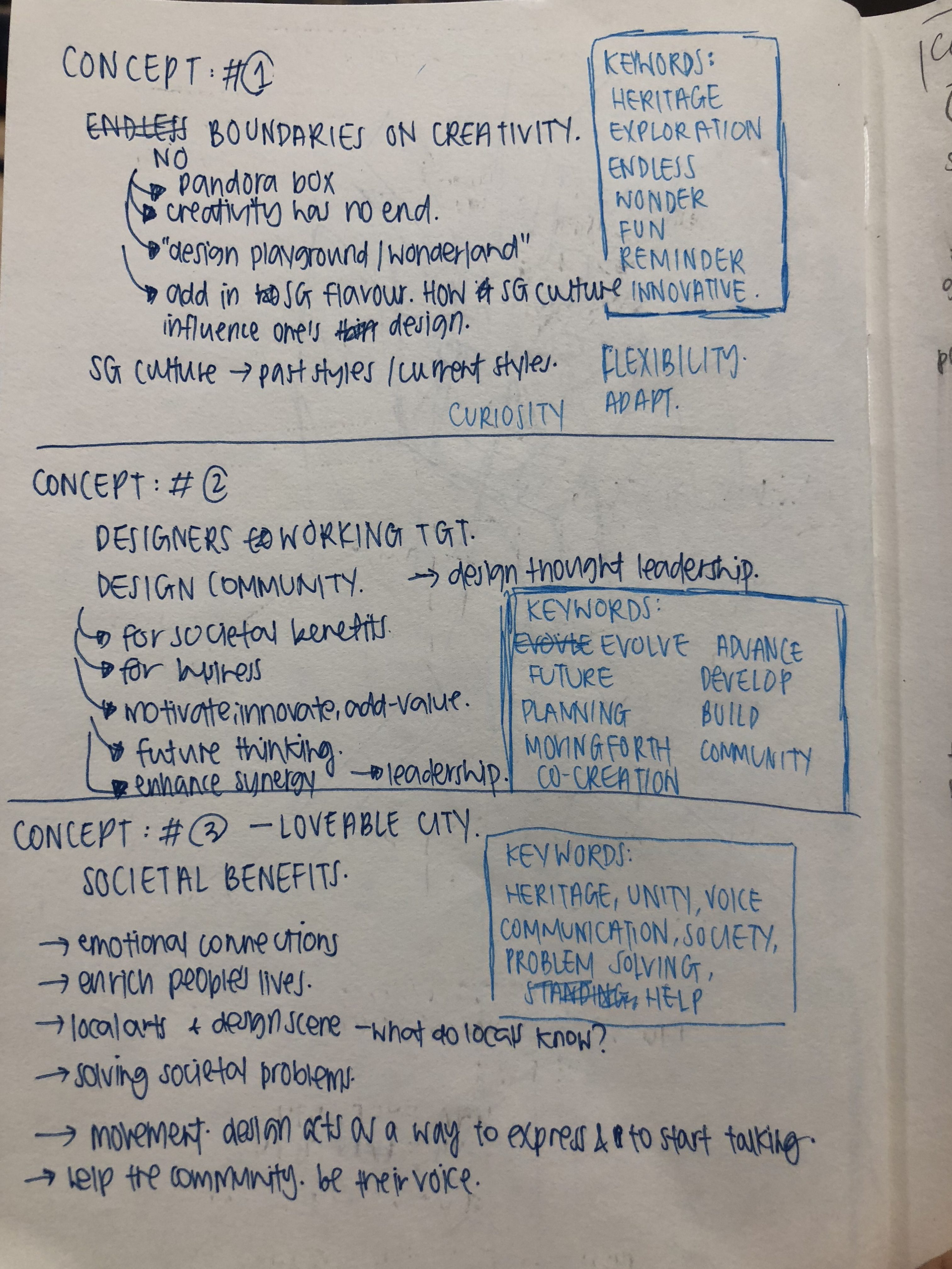
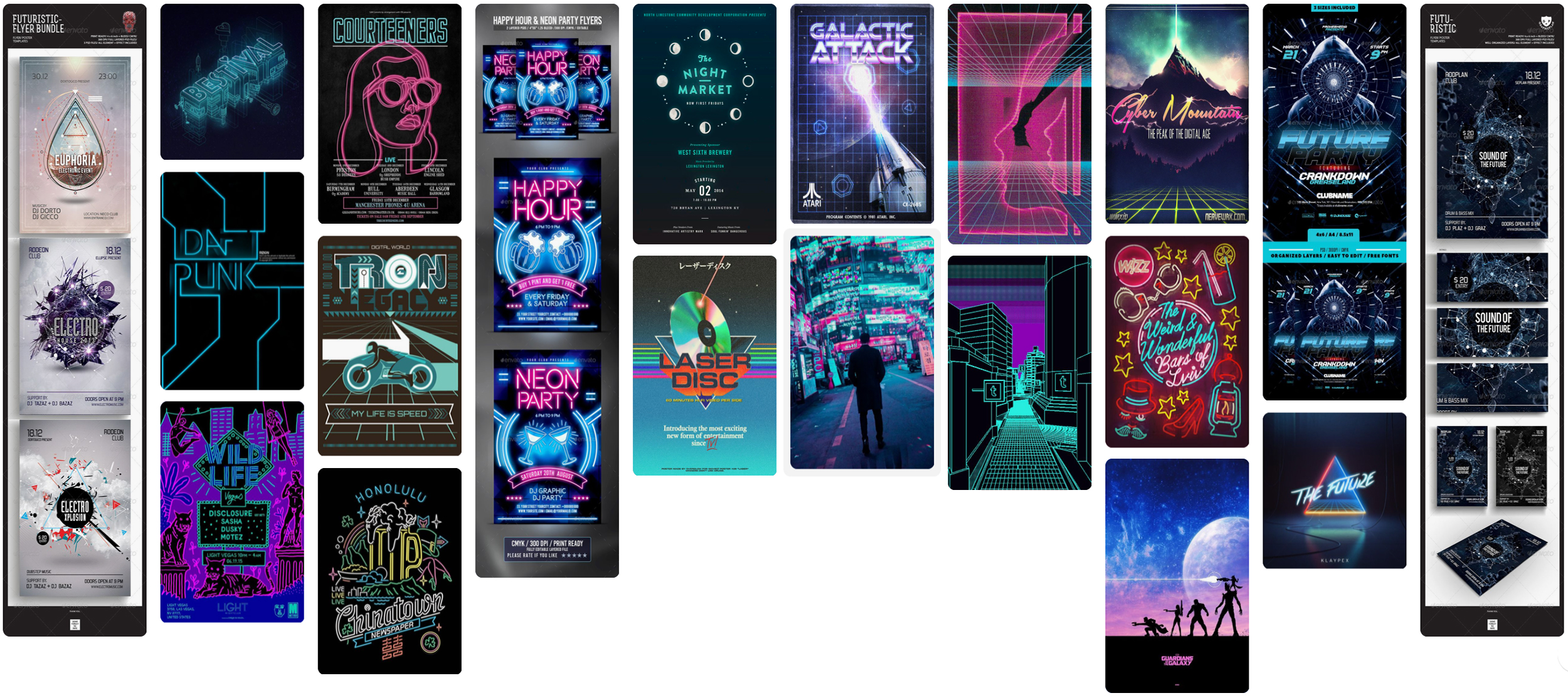
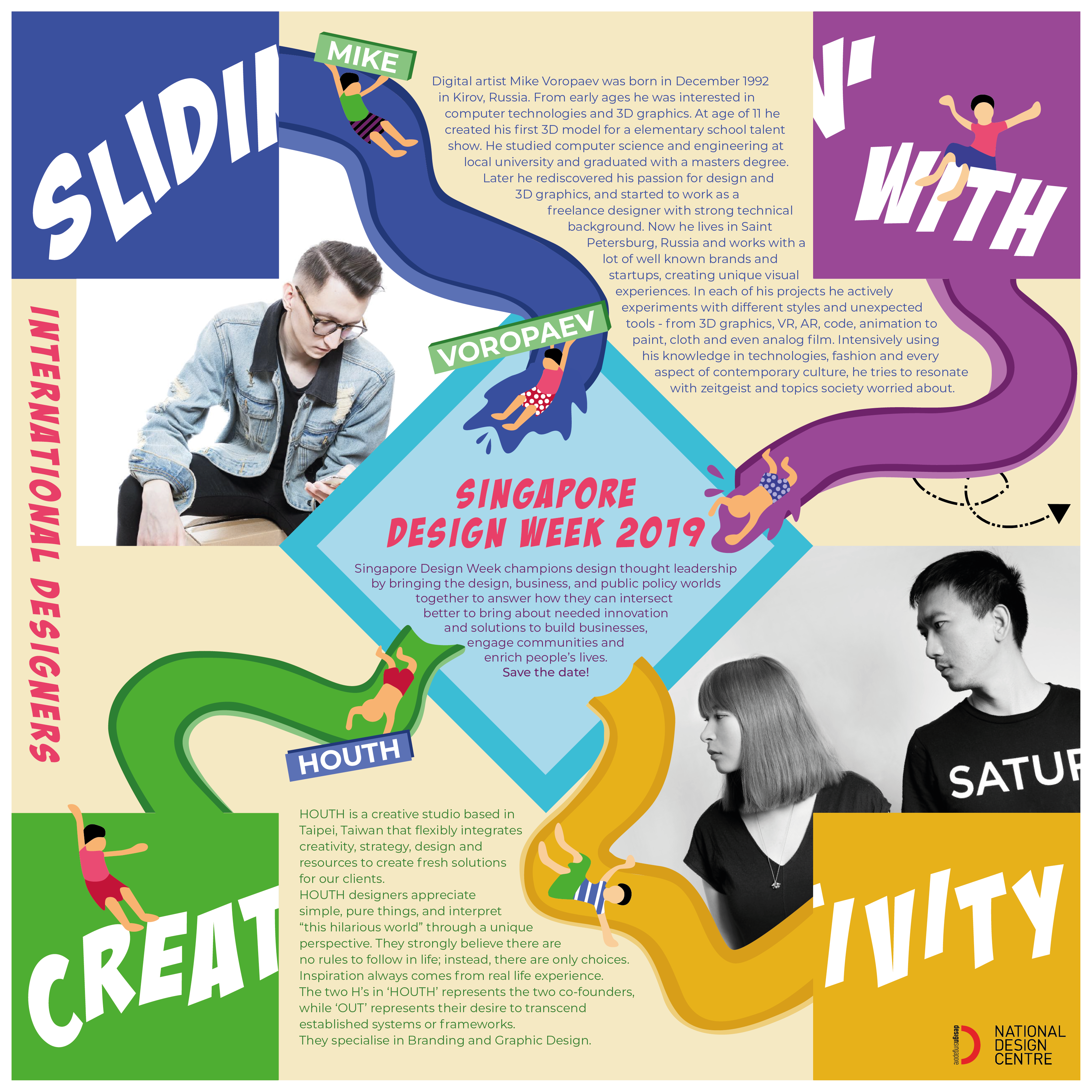
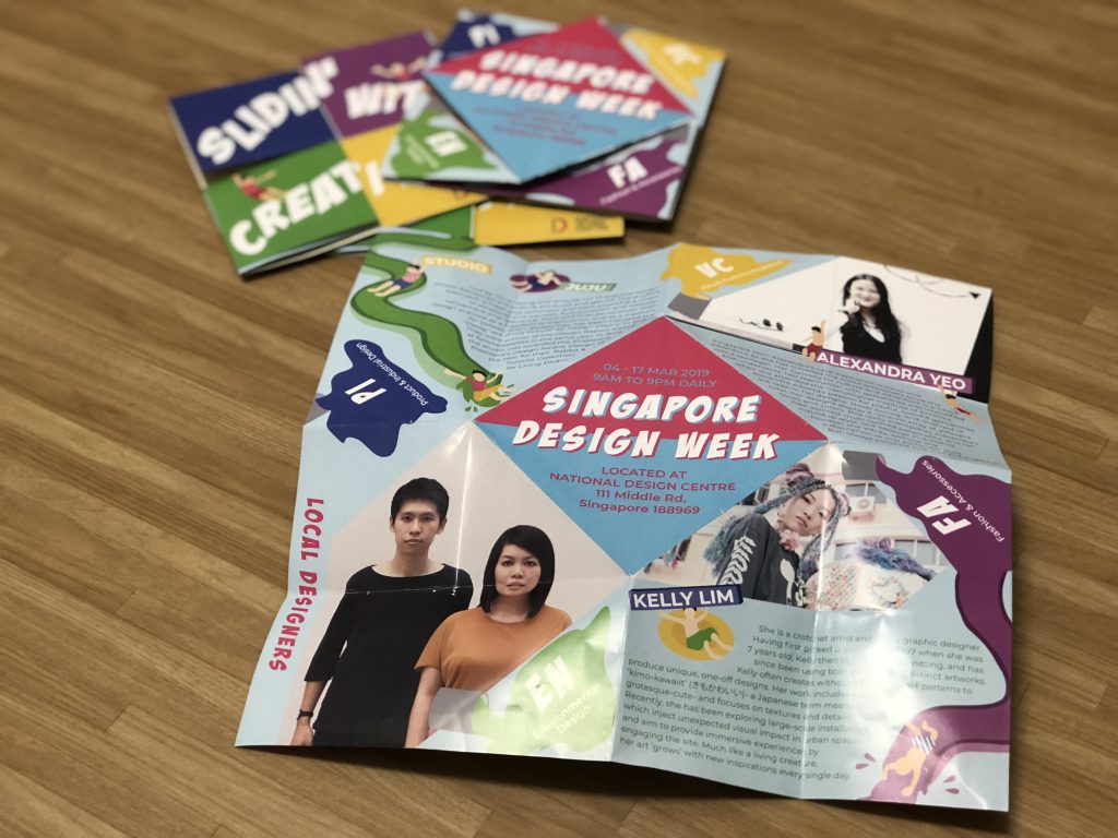
- Singapore Design Week champions design thought leadership by bringing the design, business, and public policy worlds together to answer how they can intersect better to bring about needed innovation and solutions to build businesses, engage communities and enrich people’s lives. Save the date!
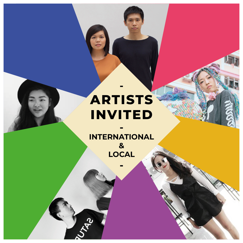
- 150 words write-up each of 5 designers, 2 international & 3 local.
Here’s the digitalised version of the brochure and a video format.
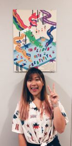
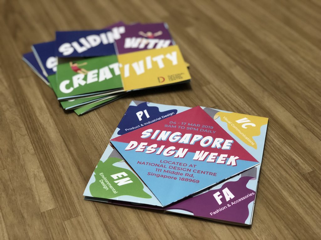
These are videos and pictures of the physical brochure.
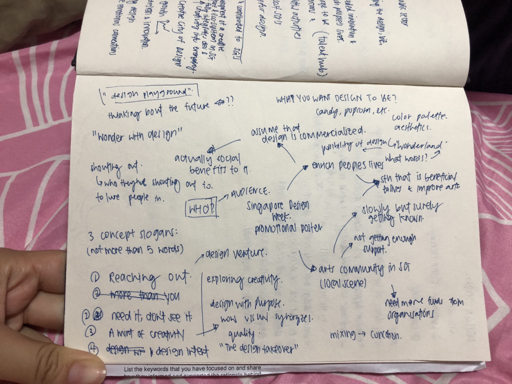
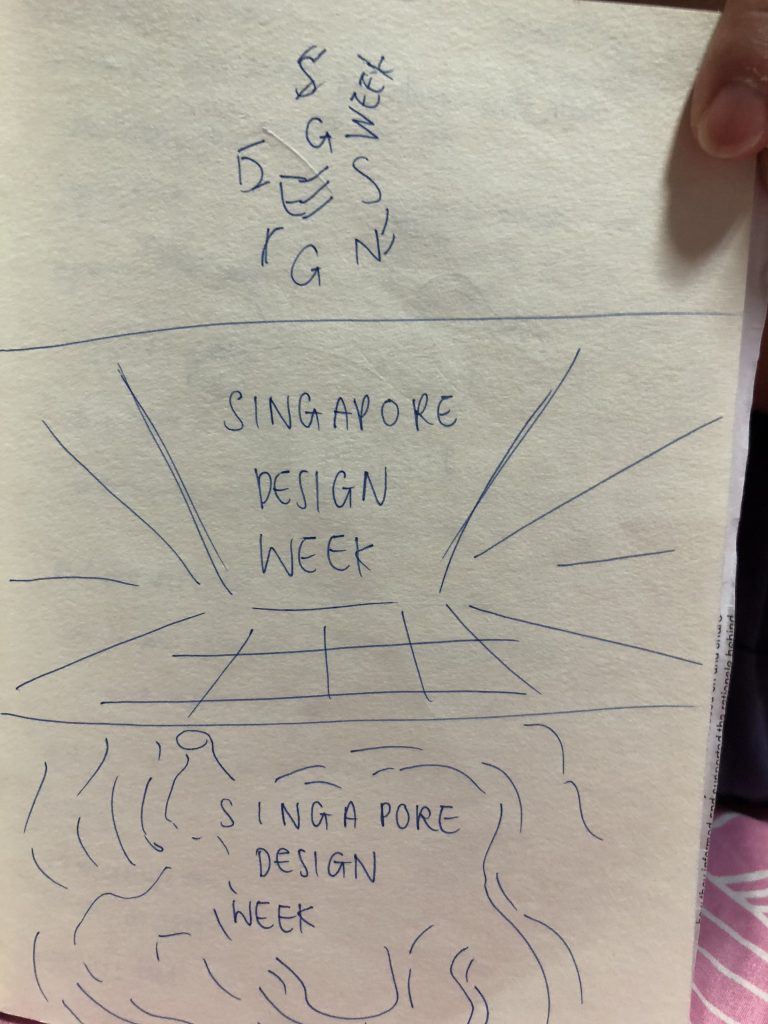
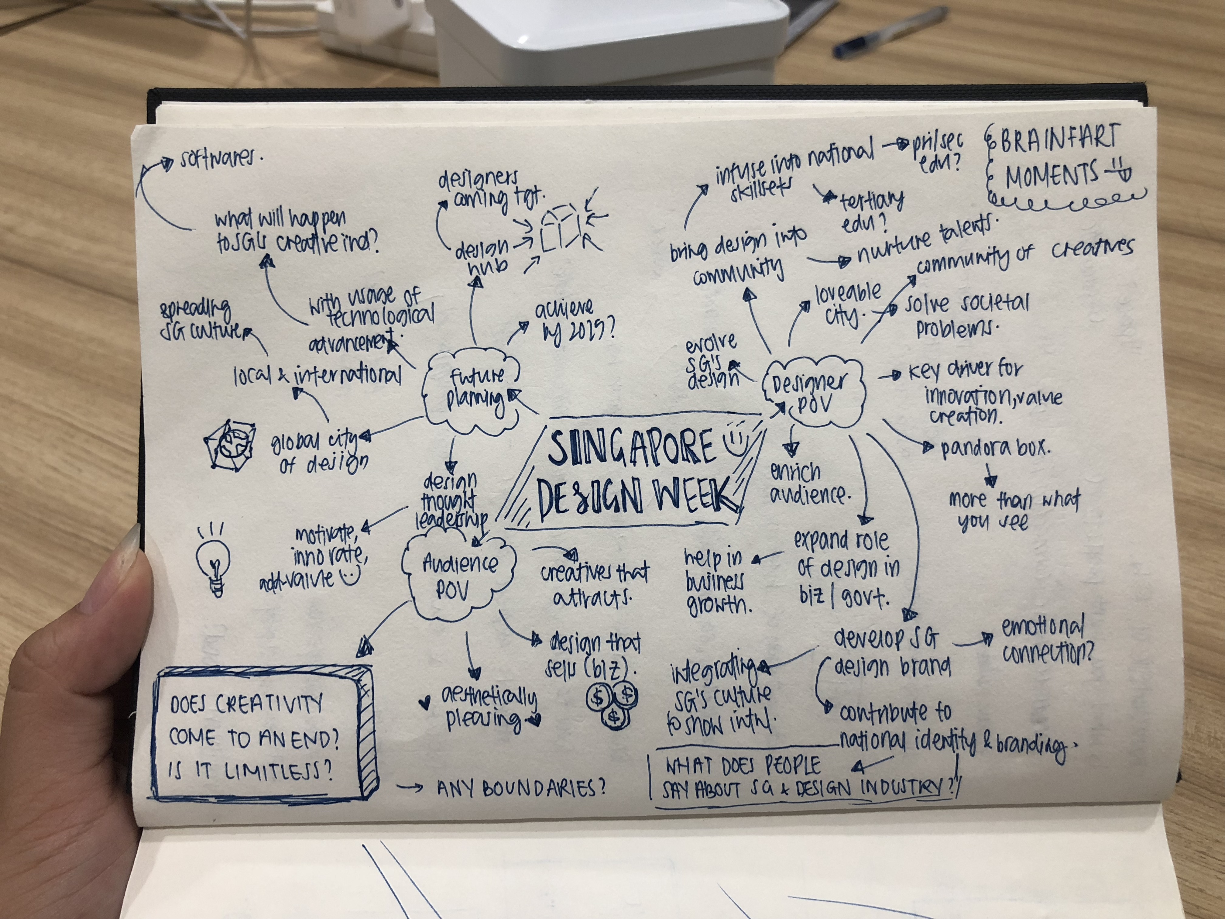
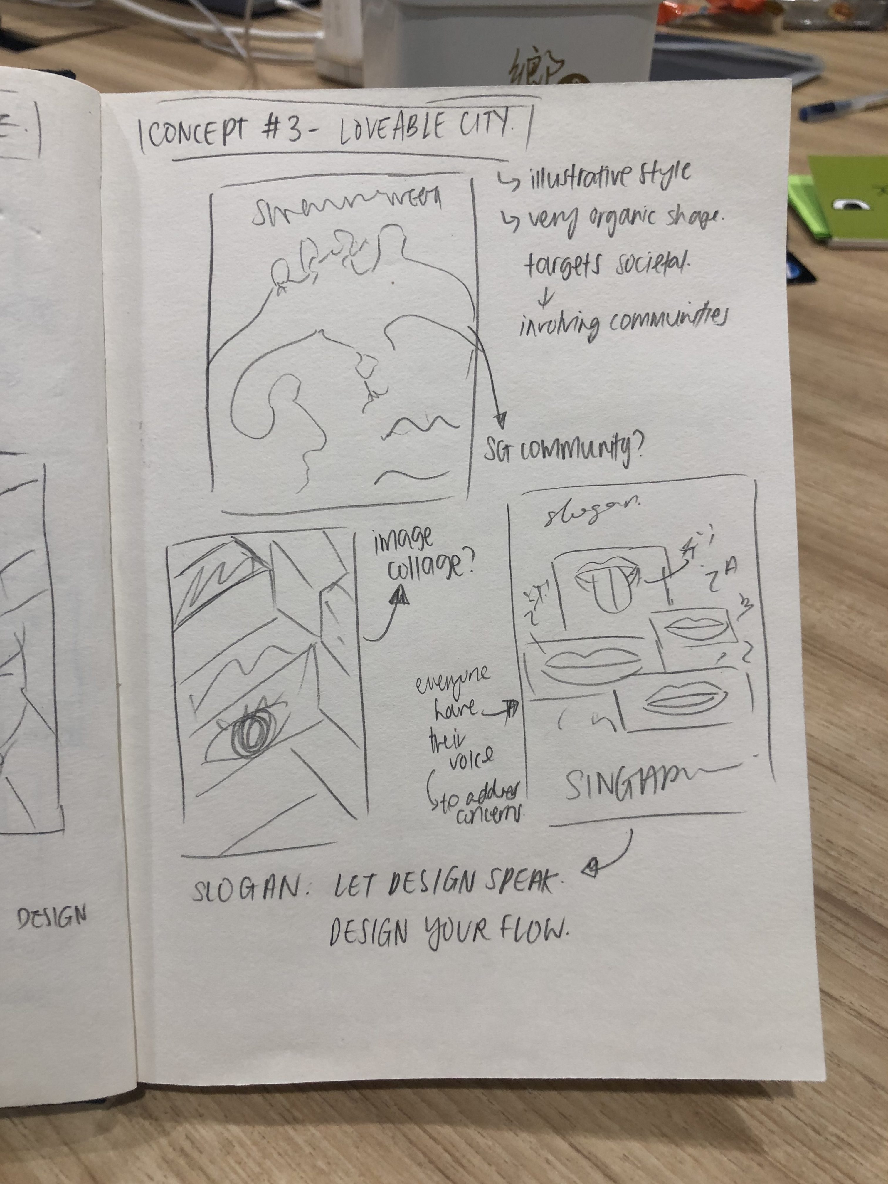
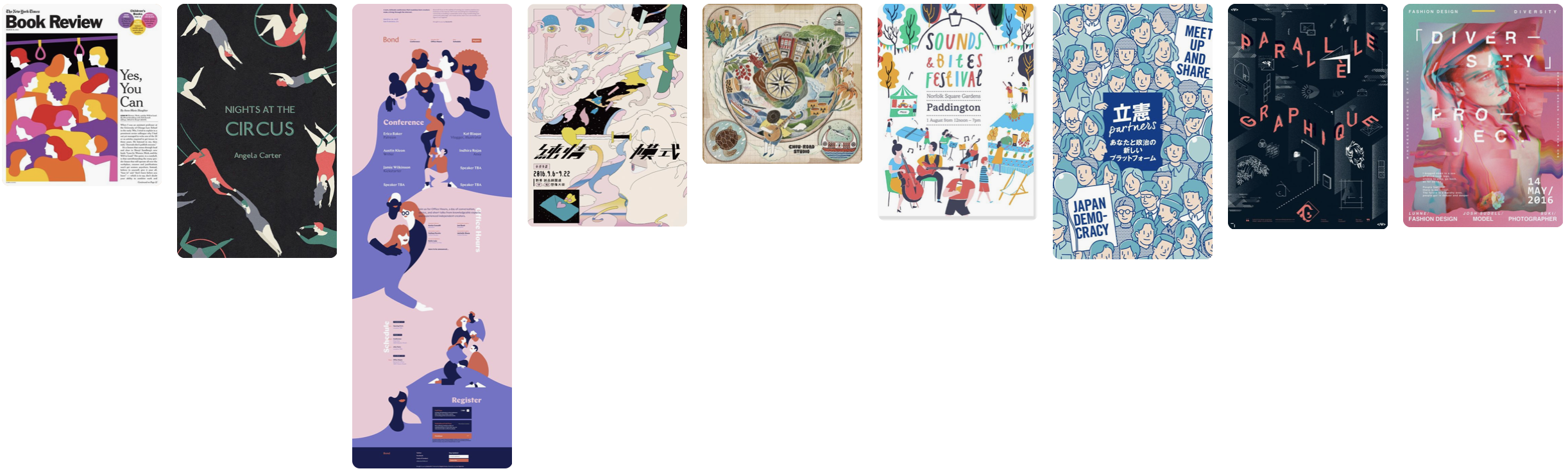
Read here on my design process and my write-up for the designers!

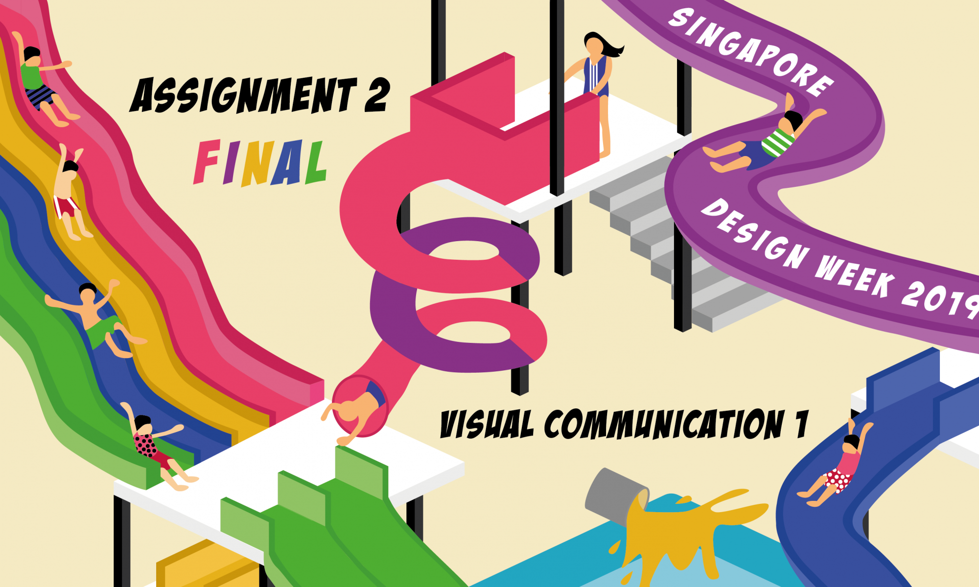
Reflection on Assignment 2
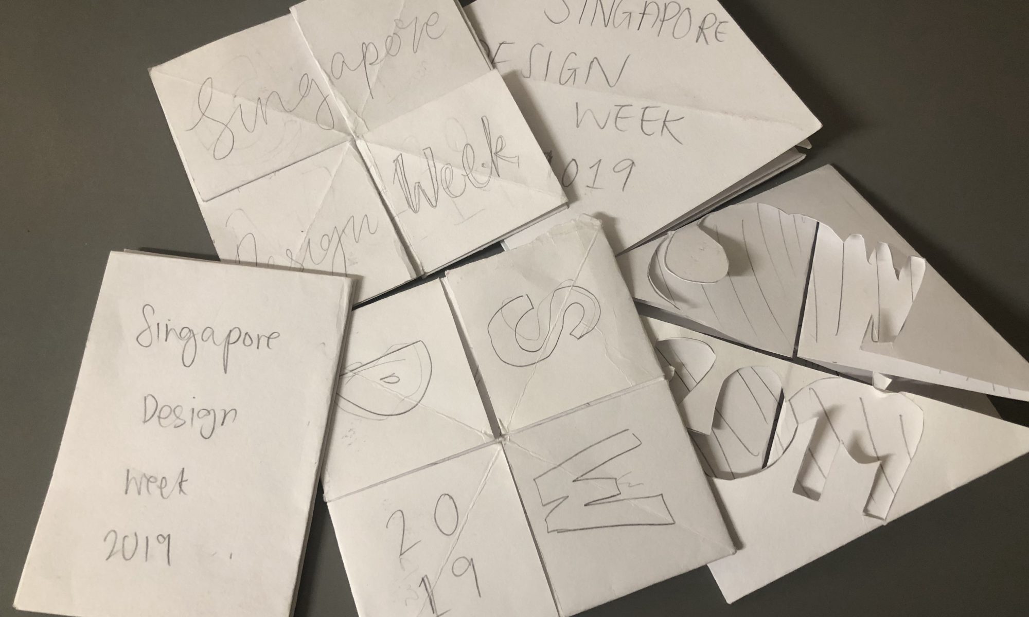
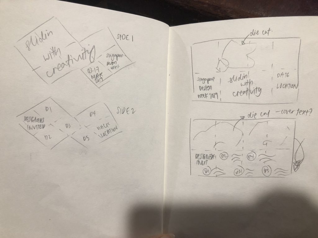
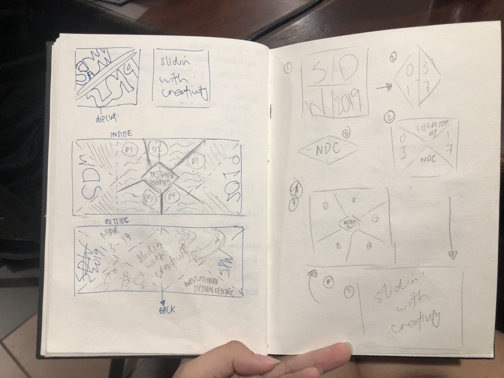
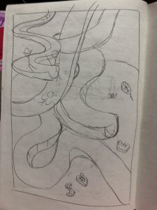
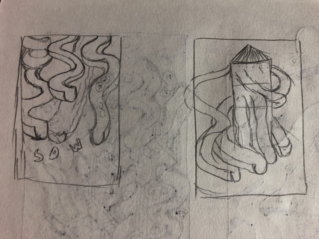
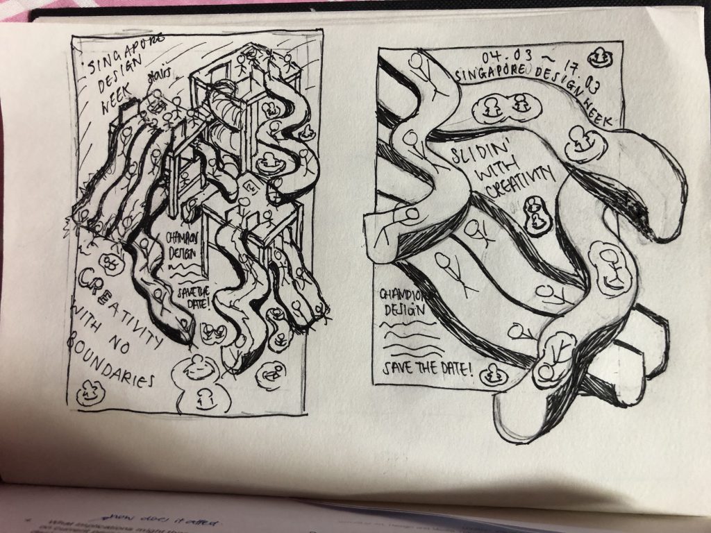
Prior to completion, I had a really tough time trying to break out of the grids and the straight lines. I wanted a more interesting fold as I feel that something visually engaging and playful will work really well with a fun fold as well. However the fold restricted me in a manner whereby there are fixed places for certain elements and that got me caught up on how to incorporate the stuff I had to put inside in a manner where it’s cohesive too.
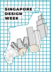
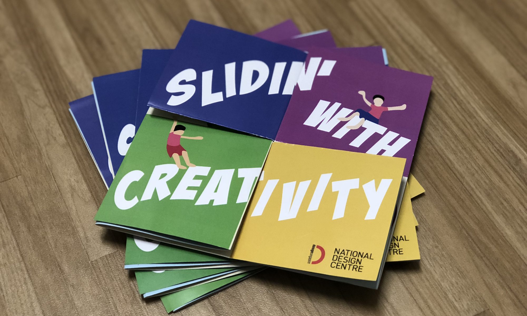
I tried to make sure of the 5 main colours to show cohesiveness between the 2 spreads – yellow, green, blue, purple and pink. By having 2 different background colours, I think that it brings out the contrast as well. I also unintentionally found out that there was another way to read the back spread (you don’t have to fully open the whole thing to read it’s damn sik!!!!)
ALSO, I realised that the fold might be a little hard for the audience to understand. While showing to the class, half my mind was afraid that people might not know how to fold it back!!! But thankfully most of them knew how to.
Feedback from classmates
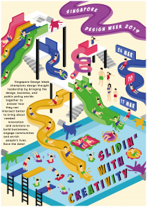
Visually engaging, front spread the 4 coloured squares opening up to the bigger square and having the slides shows continuity. Brings our eyes to the communal area (middle section which is like the pool)
Fun elements that helps to make it more visually engaging.
Too much text, alignment of the text can be better.
Fold might be a little too complicated.
Although the slogan at the cover breaks when open, it still shows continuity.
Feedback from Michael
Way better than the consultation, issue that I had was resolved. To push the design further, can explore in having Singapore Design Week in the front (beige side) to have more “play” around like Slidin’ with Creativity.
Slides can be more fun as well, as the variations of the slides seem quite similar.
Can have more different curves.
Maybe can have the same colour treatment for the designers’ name.
Overall, I enjoyed doing up the project and if given another week or so, I think it will be a better work!
Till then,
Flazéda!
jamz
x