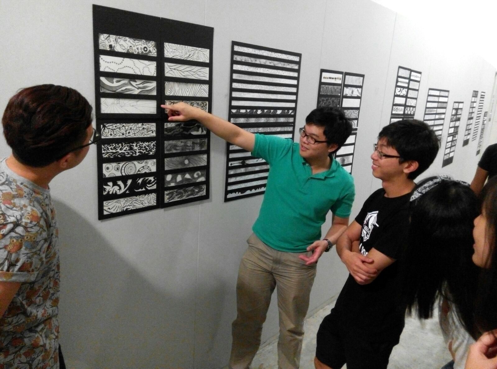
In this post, a follow-up to the article Assignment 1: Dots that went for an emotional walk, I will elaborate on how I arrived at the line images in the collection, as well as the thought process and methodology behind them.
Captions below each Line Drawing will describe the medium and method used to create it.
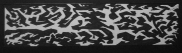
- Bizarre
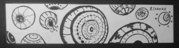
Bizarre, Various Ink Markers on Cartridge Paper

Hermaeus Mora as he appears in The Elder Scrolls: Skyrim – Dragonborn DLC.

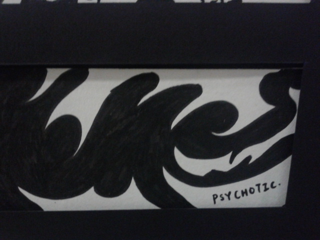
Psychotic, Various Ink Markers on Cartridge Paper
Psychosis is defined as “a severe mental disorder in which thought and emotions are so impaired that contact is lost with external reality”. Psychotic was one of the strongest images I had a clear concept of early in the thought process. For me, I wanted to capture as much of the madness, insanity and instability that psychotic individuals exhibit, as possible.
The first aspect of psychosis I wanted to show was the darkness and internal destructiveness of mental illness, and I felt that thick, twisty barbed tendrils would best symbolise this. The sharpness and murderous nature of these tendrils also is a reference to how psychosis is often an aspect of murderous killers and violent criminals in film and popular culture.
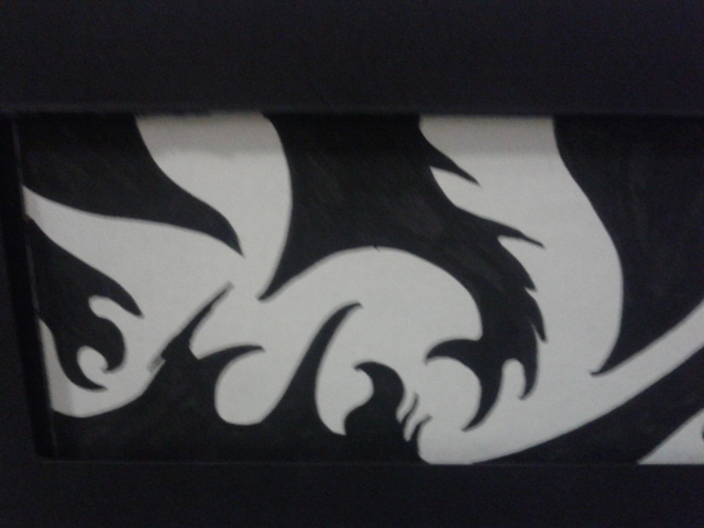
The second aspect of psychosis I wanted to exhibit was the bipolar / multiple personality characteristic that mentally ill individuals often have; as such, I split the image into two halves; the left half had black tendrils on white background, and on the right it was reversed. The division of the picture symbolises the division of the mind in mentally ill individuals.
3. Anxious

Anxious, Fine Ink Marker on Cartridge Paper
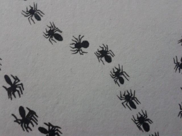
Close-up detail of individual spiders.
A closer inspection also reveals that each of the spider trails has an individual direction; none of the trails follow another. This was representative of the flustered state and lack of direction that an anxious individual would exhibit.

The Spiders are disorganized and have no direction, similar to a person who is jittery and anxious about something.
Spiders are also never seen together in the formation used in the image; ants are known to be the insects that use lines and a convoy formation to move around. Anxious subverts the order and discipline of the ant colony and throws it into disarray, similar to how ants scatter when a human stomps on them and causes panic.
4. Systematic
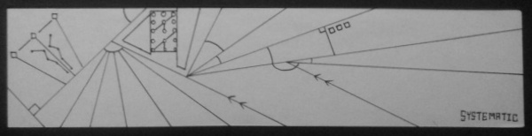
Systematic, Fine Ink Marker on Cartridge Paper


To add on to the feeling of planned and organised use of lines, I decided to take reference from the idea of civilization. I decided to reference the Egyptian Civilization, as they epitomized the use of mathematics and the primitive technology of the time to achieve incredible feats of architecture, such as the Pyramids of Giza:

The Pyramids of Giza, one of the ancient wonders of the world; also renowned as an architectural and mathematical marvel for the time they were built.

An Ancient Egyptian wall carving that alien conspiracists often cite as proof that the Egyptians had alien influence and aid to build and engineer their civilization.
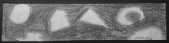
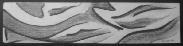
Ambiguous, Graphite Pencil on Cartridge Paper
The concept behind Ambiguous was to make a set of blurry and barely recognizable images, hence the use of graphite. Graphite is a medium that easily leads to smudging and blurring, and is often seen to be Gray. The use of this Gray colour was a reference to the concept of Moral Ambiguity, or “Gray Areas”, when things are not necessarily pure good or pure bad.
The rough shapes that one can make out against the gray backdrop are also purposely not made to be perfect circles, squares or triangles, to emphasize the uncertainty and multiple possible forms they could take.
6. Aggressive

Aggressive, Various Ink Markers on Cartridge Paper
For the idea of Aggressive, I wanted to convey a feeling of hostility, threatening, and something about to attack. Having served National Service and gone out into the harsh and uncompromising jungle many times before, I decided to use memories of threatening things to compose this image.

You meet a lot of wild animals out there, and they have one thing in common: Teeth and Fangs.
The first aspect I wanted to capture was my encounters with aggressively territorial wild animals out in the field. Be it wild boars, stray dogs, or snakes, almost everything in the wild had sharp teeth and tusks. hence, I chose to add teeth into mouth-like sections of the picture.
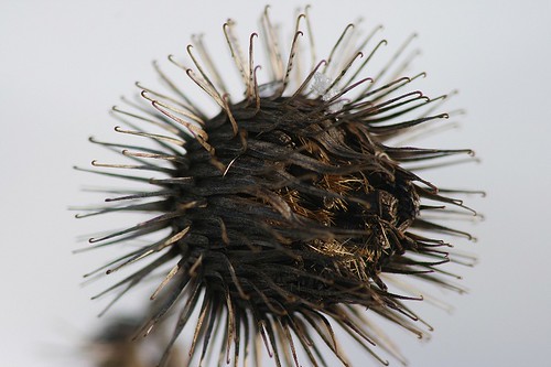
Hook seeds. Walk through the jungle grass long enough and you’ll have an army of these on your socks and boot fabric.
I also wanted to capture the aggressive nature of the jungle plants, and hence used the design of hooked seeds, which latch onto your socks, boots and pants in a very unsolicited manner to ensure their dispersal.

Concertina Wire, an advanced form of barbed wire meant to cause maximum entrapment and injury. Used in the army to cordon off defended areas.
Last but not least, I wanted to use the imagery of concertina wire, a key staple and sight in the army outfield, to symbolize aggressiveness. In the army, Concertina wire is used to fortify defended areas, as it prevents enemy soldiers from charging in. I wanted to capture that aggressive and sharp deterrent, as something you wouldn’t want to mess with.
7. Embarrassed
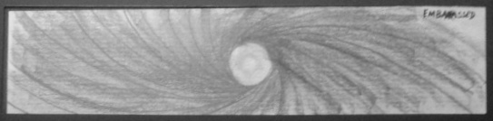
Embarrassed, Graphite Pencil on Cartridge Paper
For Embarrassed, I wanted to capture my personal feelings and sensations when I felt embarrassment; namely to hide in a hole or within myself, as well as a slight amount of panic and withdrawal into my own mind when I feel judged.
As such, I chose to create a vortex effect to symbolise the withdrawal into self. The visual appearance also resembled a typhoon, showing the internal turmoil that happens when, for example, I do something stupid in public.
The Eye of the “Storm”
I also used the centre, or “Eye of the Storm” to represent widening of my own eyes and pupil dilation due to embarrassment, for example when I realize I said something wrong.
8. Awkward

Awkward, Graphite Pencil, Ink Markers, Pastel and Charcoal on Cartridge Paper
For Awkward, due to concept groundwork being too similar to Embarrassed, I decided to create a sense of awkwardness and uneasiness through the raw mediums themselves. I used all the drawing media I had at my disposal and intentionally created a very haphazard and chaotic composition that made viewers feel uneasy.
The feeling that none of the mediums or shades were working in harmony with each other, being there just for the sake of being there, and empty spaces where something should have been, was all used with the intention of symbolising a group of people, like the mediums, working together for the first time.
Overall, the lack of communication and harmony between each medium created a very awkward feeling, and viewers’ discomfort with the image would also translate to awkwardness.
9. Distracted
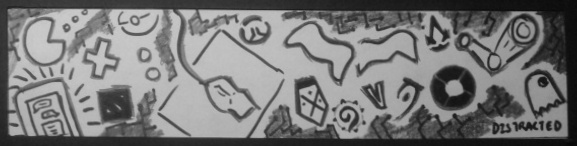
Distracted, Ink Markers and Graphite on Cartridge Paper
For Distracted, my original concept was to use multiple boxes and screens, to symbolise how nowadays we are very unfocused due to the huge multitude of media and visual noise we are exposed to, that leads to loss of concentration.

It’s true.
However, I felt that the pattern was overly monotonous and visually similar to some classmates’ existing ideas, and hence decided to do Distracted at a time when I was doing work in front of a computer. Being an avid gamer, the temptation to stop working and play something was something I wanted to capture.
As such, I chose to literally draw everything that symbolised or presented itself as a distraction at that moment. As such, I used game symbols, my constantly buzzing phone, my gaming mouse amongst other things to symbolize the raw power of the distractions. The chaotic and unfocused nature of the image also served to bring attention to how a distracted person’s eyes will flit from sight to sight, never being focused on one central image or topic.
10. Exhausted
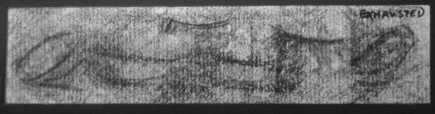
Exhausted, Black Pastel on Cartridge Paper
I deliberately chose to do this as the last of my images, at about 3am in the morning when I was very, very tired, as part of the methodology of getting the drained sensation. The slight sloven feeling also represents how one becomes slipshod as the day drags towards the end and one is still working when it is clearly past bedtime.

As they say in the Army, “Shag cannot think”
The use of pastel to colour the background black was to represent the darkness of night outside, and at the same time the feeling of a veil over one’s eyes when tired. I also used the pastel to make strong marks that appeared similar to closed eyes or closing eyes, echoing my state at the time.
11. Fragile
Fragile, Ink Marker on Cartridge Paper
The idea for Fragile was arguably one of the hardest to bring out, because the image of cracks was the only reliable way to bring out the feeling, and I had to achieve this in as non-cliche way as possible. In the end, I chose to use the Earth, and the dual theme of a fragile ground and sky.
The floor is lava. No, really.
I chose to create a texture that resembled the earth itself cracking asunder, as seen in apocalyptic movies. This was also a reference to the idea of the Earth, despite being a mighty object as a planet, being very fragile and prone to breaking from both man and itself.
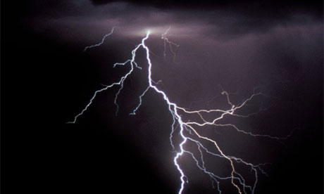
My lightning likes to “chut pattern”
On the other hand, its visual similarity to lightning was intended as a way to say that the Earth’s atmosphere is also very fragile, seeing how the El Nino and La Nina climate effects brought on by Global Warming have started multiple counts of freak weather across the globe. The volatile nature of the sky, represented by lightning, I felt, best showed this.
12. Indecisive
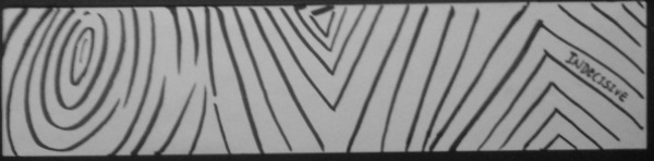
Indecisive, Ink Marker on Cartridge Paper
I decided to make the line itself indecisive and unable to put its own foot down on what it stood for, and hence I made the lines constantly morph to form different shapes and angles, as if it had no idea what exactly it wanted to be.
The broken lines and slightly disorganised nature of the lines was also intentional, symbolising hesitation and lack of coordination with oneself when being indecisive on a subject or action.
13. Lyrical
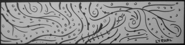
Lyrical, Ink Markers on Cartridge Paper
For Lyrical, the biggest challenge for me was to bring out the musical and beautiful aspects without directly using the universal musical symbols. I also didn’t want to use dancing figures because that was cliche.

I considered this style, and then realized it wasn’t abstract enough
In the end, I decided to use thick, main lines that symbolised the smooth and curvy motions in dance, and paired it with dots that symbolised the use of notes in music scores.
14. Nonsensical
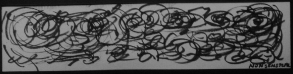
Nonsensical, Various Ink Markers on Cartridge Paper
For Nonsensical, I took inspiration from Jackson Pollock’s concept of “Action Painting”.

“1948” by Jackson Pollock. Without contextual knowledge of how he painted it and his emotional state at the time, the painting makes absolutely no sense to a layman.
As such, I chose to put myself in a very blank and daydreaming mood, not unlike a little child, and scribble with random strokes with marker on paper, and hence Nonsensical was born. Nonsensical is also a throwback to how as adults, when we look at scribbles made by little children, it may make no sense to us, even though the child knows what they were trying to draw or represent.
15. Sensual
Sensual, Ink Markers and Graphite on Cartridge Paper
Let’s just say when image searching “Sensual” on Google Images, NTU’s Internet Firewall did not approve.

“Sensual” is not safe for work. Silk, comparatively, is.
As such, to represent the kind of stimulation and smoothness that sexual pleasure is usually associated with, I chose to use the texture of silk, which is what most people compare their partners’ skin to during funmaking. Amongst other things.
16. Turbulent
Turbulent, Bold and Fine Ink Marker on Cartridge Paper
For Turbulent, I chose to create the feeling of a wind tunnel, or air flowing through a jet engine when one experiences turbulence on an airplane flight.
A snapshot from the puzzle video game, The Talos Principle (2014). Note how the use of the cloth strips create a very strong sense of turbulence and force of wind.
Turbulence also meant to me how the trees and grass would sway in very strong wind conditions, usually a typhoon or storm. As such, I wanted to capture both the feeling of the wind tunnel cloth strips and the feeling of branches being blown in one direction.
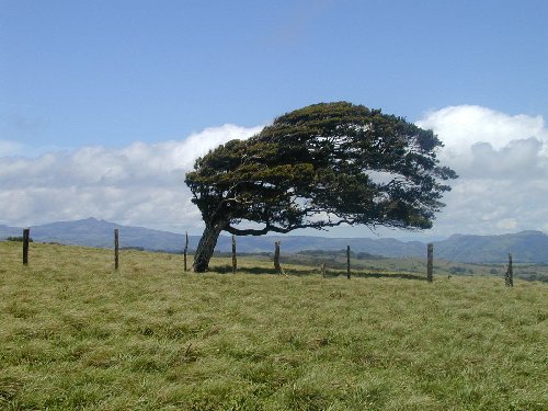
Some of these guys get blown all the time that it even affects how they grow. A moment of silence for them please.
Hence, the final product used the black framing of the box to create the feeling of a wind “tunnel”, while the thick black lines represented both the cloth strips and tree branches under heavy wind conditions. The fine black lines represented the flow of wind over the branches.
17. Spontaneous
spɒnˈteɪnɪəs
adjective
-performed or occurring as a result of a sudden impulse or inclination and without premeditation or external stimulus.
-archaic (of a plant) growing naturally and without being tended or cultivated.

Spontaneous, Various Ink Markers on Cartridge Paper
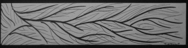
For Spontaneous, I didn’t want to go with the classical meaning of a person being very bursty and doing things on impulse etc. I wanted to capture the feeling of nature being spontaneous, unrestrained and if left unchecked, wild growth.

Sometimes nature just decides to take over your house walls.
As such, I chose to use wild creeping vines to symbolise spontaneity. If you walk near army camps, you’ll eventually find vines that have conquered metal fences or even concrete walls as their own. Give it a few years, and it will have grown all over. In the case of concrete walls, the vines sometimes literally eat into the rock and concrete. Nature is a powerful thing, but more importantly, it goes wherever it wants to, and I felt that best represented the meaning of the word and image.
18. Sloven
noun
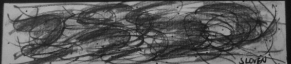
Sloven, Ink Markers and Graphite on Cartridge Paper

A.K.A. My face when someone asks me to take out the trash.