(Preface: I got added into the group late, sorry for the late upload)
For this assignment, we were tasked with creating 3 name tags with the title “HELLO MY NAME IS”, each stylised after one solution: Typography, Abstract Solution and Conceptual.
The goal was to use these solutions and elements of design to create a visual on the card that would express ourselves or a facet of who we wanted to introduce.
SOLUTION 1: Typhography
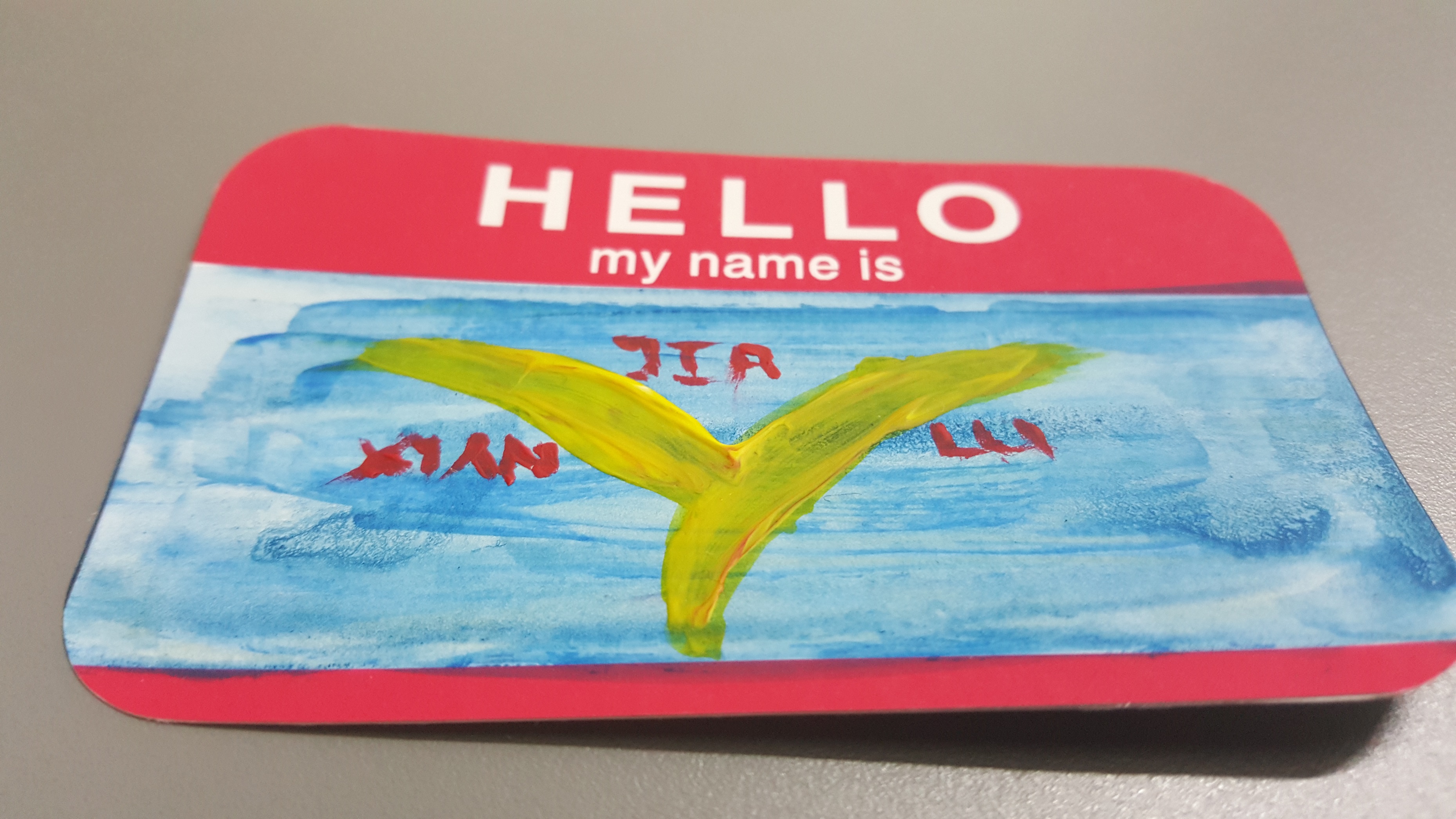
The Tree of Self.
For solution #1, I decided to make a typographic image stylized in both English and Chinese text. My name hangs from the tree from right to left, in traditional Chinese format.
The “Tree” is made from the Chinese Character for “Man / Human.”
I felt this solution was the best way to portray my identity as a bilingual Singaporean fluent in both English and Chinese, and a way to show how vastly differing parts of an identity (symbolised by red and yellow on a blue background), can still create a coherent, harmonious composition.
SOLUTION 2: 4BS7R4C7 S0LU710N
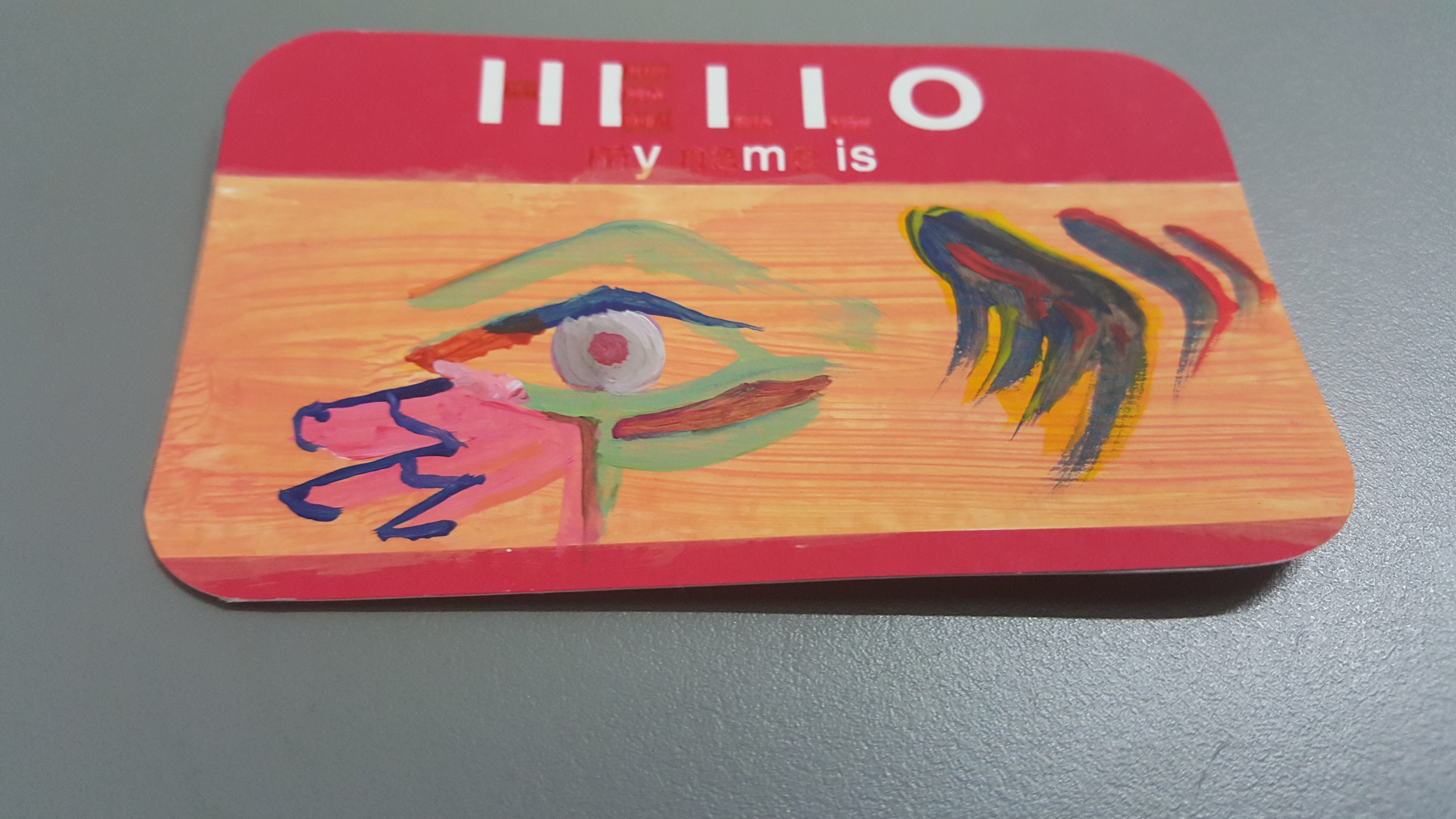
1 S33 Y0U.
For this solution, I decided to show my interest in religious iconography with an creatively interpreted Egyptian Eye, paired with layered paints on the side.
The Eye represents both my observant nature, as well as my habit of using iconography in most of my work.
The “Wings” to the right are very loosely stylized upon symbols from 3 different video games I used to play, and made with layers of Red, Yellow and Blue paint, intentionally not blended to create a sense of layering. This is to reflect how each game represented a different period of my life. It is also an abstract reference to my gaming-heavy lifestyle, as I run a Youtube Channel and used to play competitive-level Team Fortress 2 before entering university.
I also took liberties with the ‘HELLO MY NAME IS’ section of the card. I used a red pen to blot out sections of the words. What is left is 11110, which in binary translates to the symbol “>”. This aligns it with the arrows/wings on the right of the image. Below it (y-m-is) are the 3 aspects of life I value most: Y/Why: Questioning. M/Am: Self-awareness. Is: Awareness of others.
SOLUTION 3: Conceptual
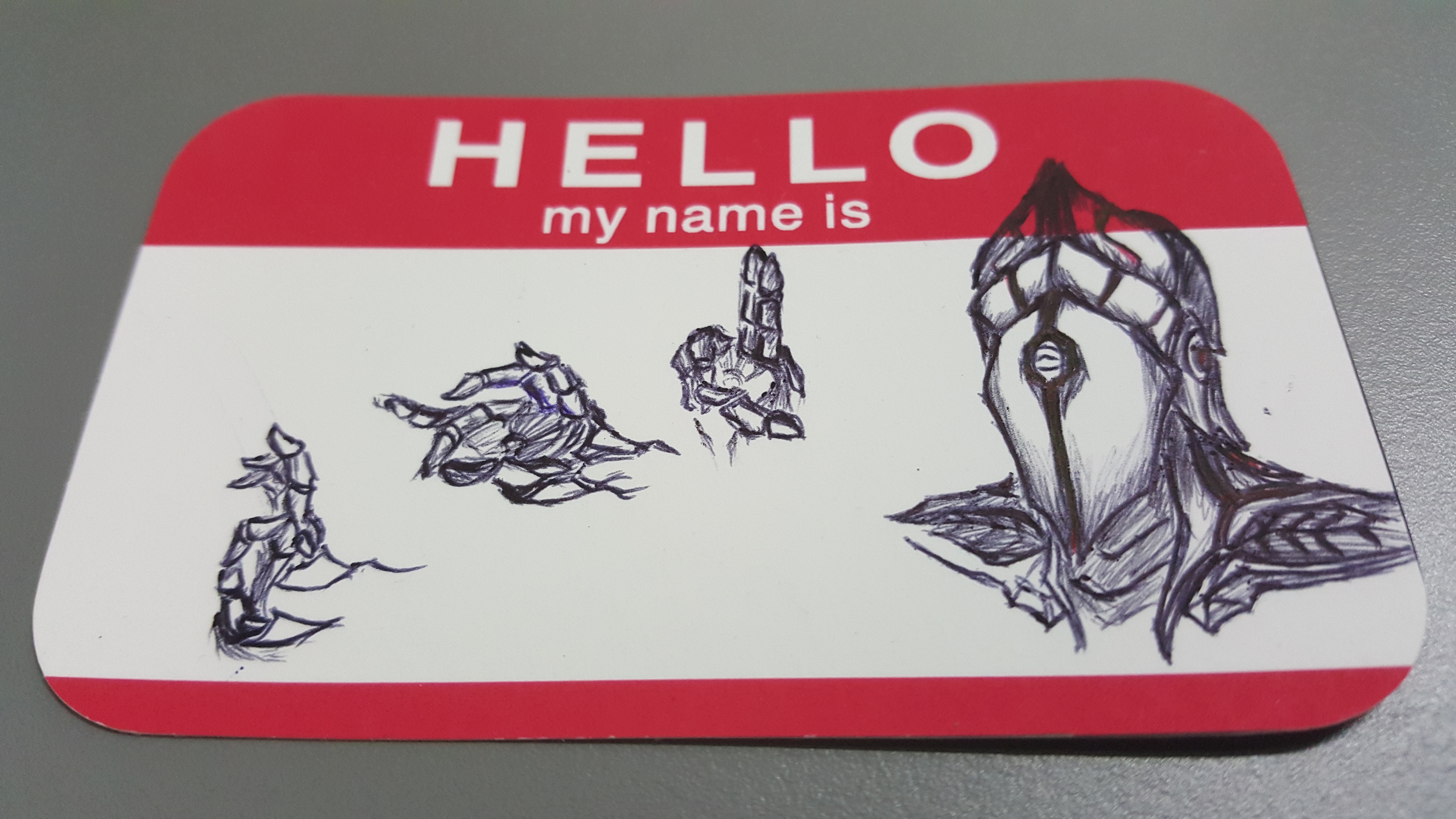
Hand it to Me.
For the last solution, I decided to use an avatar of myself from last Semester’s 2D: Mouseman.
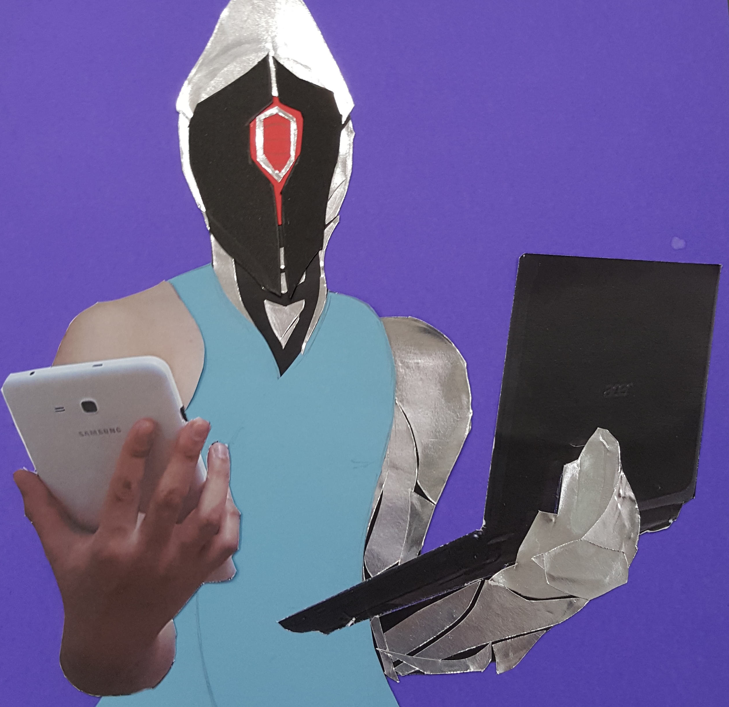
Mouseman says hi. From last Semester.
Mouseman is my preferred artist persona (as I don’t like to show my face). His mask/helmet is stylized after the LMB and RMB on a computer mouse, alluding to my affinity with the virtual world and my interest in digital media.
In solution 3, Mouseman occupies the right of the image, symbolizing my hobby of drawing cyborg characters; one of my key fascinations is transhumanism and the looming future of mankind-machine interfacing.
The hands on the left are mechanical as well, and though I admit I need a bit of practise drawing hands on such a small scale, they are each stylized after a hand symbol from religious iconography. From left to right:
1 – Buddhist Mudra – Vitarka.
Symbolises Intellectual Discussion and Argument.
2. Christian Hand symbol: ΙΗΣΟΥΣ ΧΡΙΣΤΟΣ
Used heavily in Christian Art. Done on the right hand, it actually symbolises the name of Jesus Christ in Greek. The more you know, amirite?
3. The two finger pose.
Almost every major religion with human art attributed to it uses this hand symbol. For example Christianity it represents Benediction, and in other religions such as Taoism, Buddhism and Hinduism it makes appearances on statues.
So yep, that’s all 3. Now go live your life and be free, my friend.
Oh, and uh, I looked in the mirror and I saw this:
I felt this exercise made me think of how to put as much content and symbolism into one small area of images as possible, and opened my eyes to how sometimes, simplicity can convey a lot.
That’s my reflection. ヽ(๏ ͜ʖ๏)ノ Now I’ll show myself out.