Preface: Apologies for late submission, also I really hate the 2MB upload limit on OSS because it screws uploads over like nobody’s business.
For this project, we were assigned the task of creating 4 typographic portraits with our names (or a fragment of it). Below, I will show my final 4 designs and some of the processes I took to reach them.
- Introversion
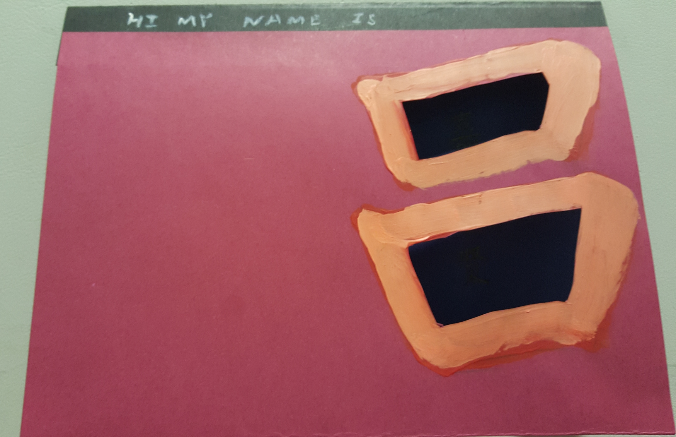
Hi my name is…
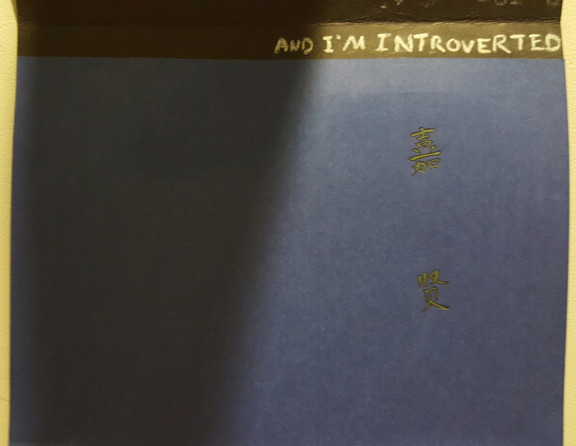
…And I’m Introverted
For this composition, I decided to play around with my chinese name as well as concepts of “being within myself”. Given that my chinese surname is two “squares”, I decided to put the remaining 2 characters within them to signify introversion.
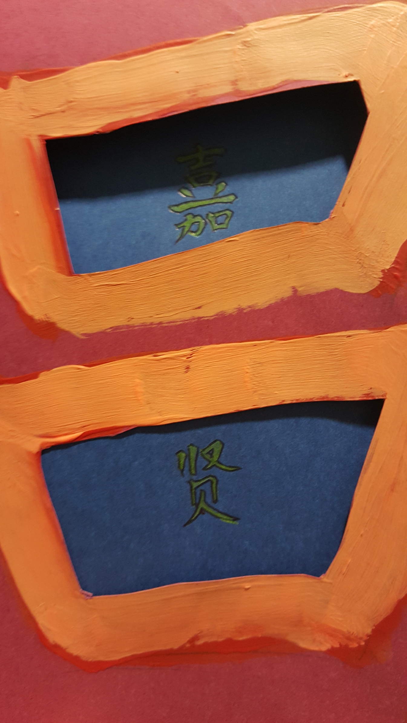
The words are mostly only visible when the overlay is above.
The composition is made from 2 sheets, with the top layer being warm colours, and the back layer being a blue background with my name barely noticeable. The concept being that beneath my public self, I usually get lost within myself when I’m alone.
The left of each sheet is left empty, to play around with negative space and keeping the compositions minimalistic.
2. Unhappiness

This composition mainly centred around the concept of putting the letters of my name into a face. Below are some of the early concepts I toyed with.
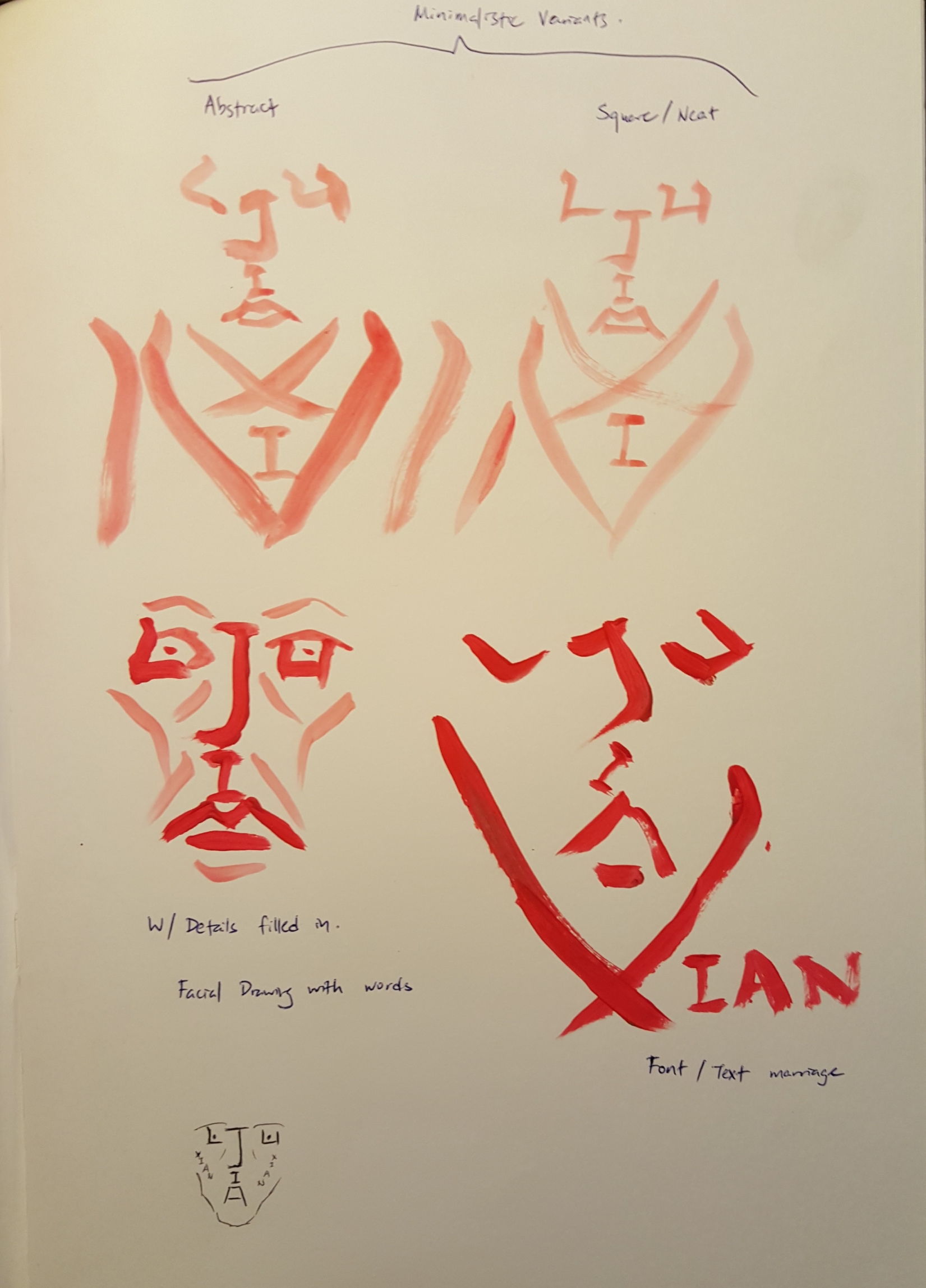
Sketchbook Concepts: toying with minimalistic to more complex concepts
3. Transhumanist
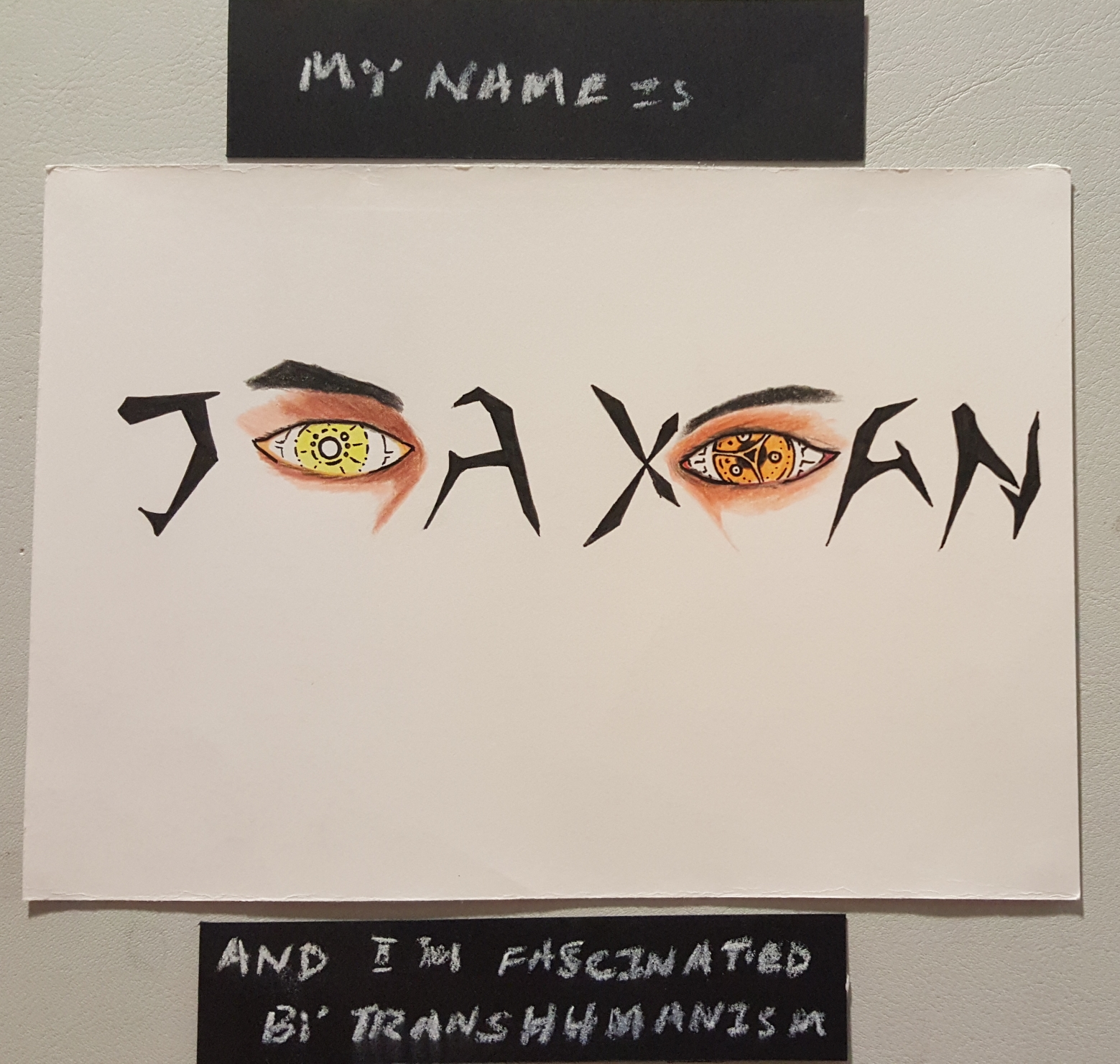
I see you.
For this composition, I decided to replace the “I”s in my name with, well, mechanical eyes. Transhumanism is the concept of being more than human, most often expressed through the concept of man-machine interfacing or gene therapy. In most sci-fi portrayals, transhumanism is represented via cyborgs.
Seeing that modern humans are already moving towards a future with mechanical augmentations, it only felt right that I addressed this in one of my works.
Given that eyes are the windows to the soul, I wanted to create a sense of discomfort yet fascination when you stared into them. The face was left unfinished as I wanted the viewer to imagine the rest of the face: is the rest human, or is it made of metal or something else? The font used is of my own creation, made largely to suggest the contours of facial features while being highly inorganic.
The mechanical eye concept was heavily inspired by Deus Ex: Human Revolution, a game about transhumanism in a dystopian future, with a protagonist (Adam Jensen), featuring a heavily augmented body. It may also be a coincidence that this game is my favourite.

One of Adam’s mechanical eyes.
Other concepts I toyed with during research are shown below:
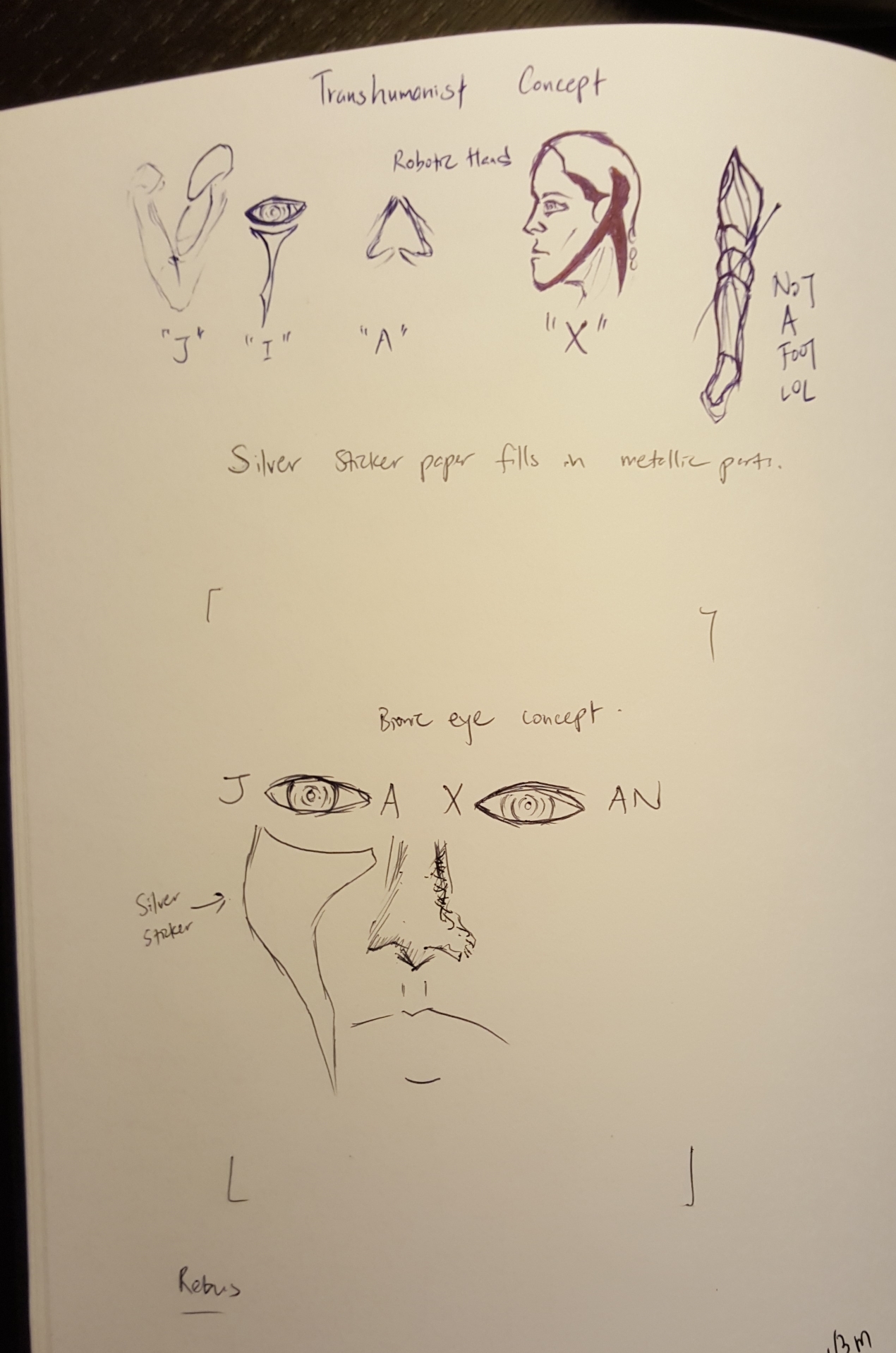
As you can see, having a full face may not have been the best idea.
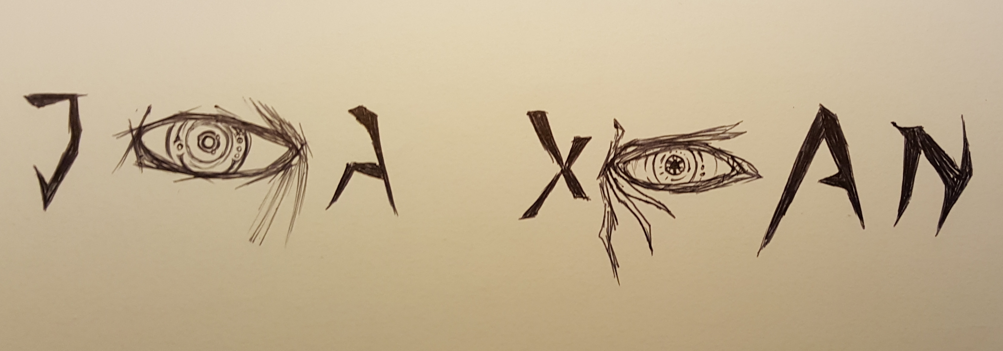
Sketch for what would be the final composition.
4. Youtuber
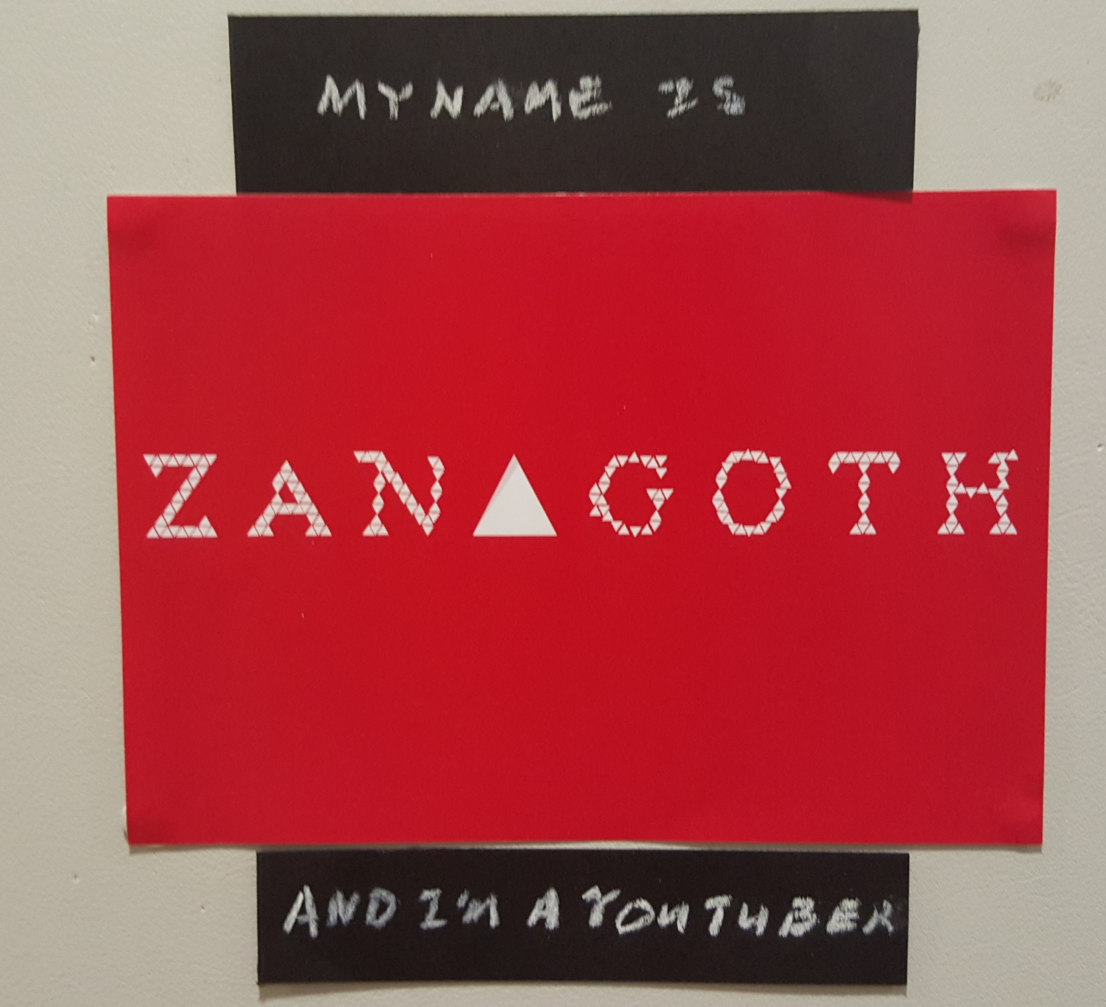
FYI, it spells Zanagoth. I might not have composited it comprehensively enough.
For this composition, I decided to stylise it after a youtube play button:

Zanagoth is the alias / handle name I use for my Youtube gaming channel, and my online gaming name. There is power in naming yourself, and don’t ask about the name because it’s a very long story.
The concept is very simple though. To represent my name against the red Youtube play button background, with the words written in the white play button. Below are some of the other variants I toyed with before reaching the version I presented:
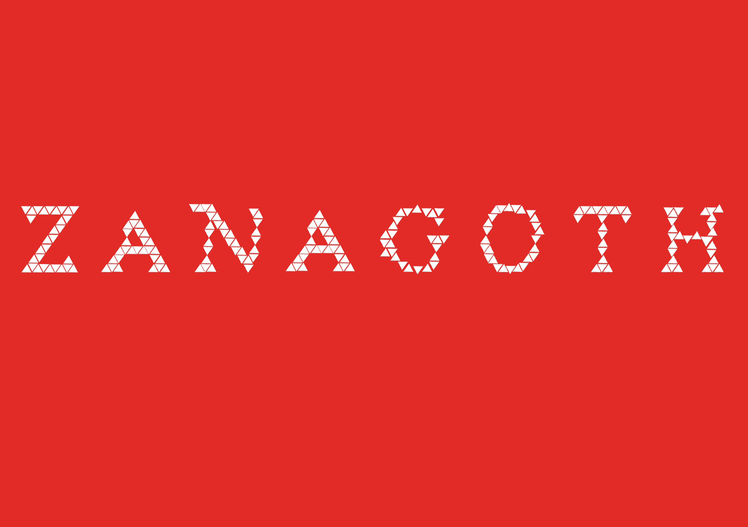
V1: Full text.
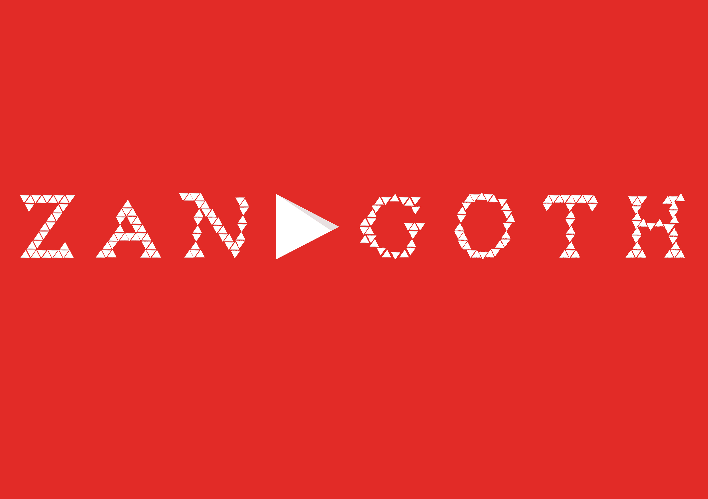
V2: Play button (Unrotated)
Reflections:
Overall I felt that this exercise was interesting to play around with, as I found myself challenged to make the name visible yet convey different messages.