Michelangelo Pistoletto

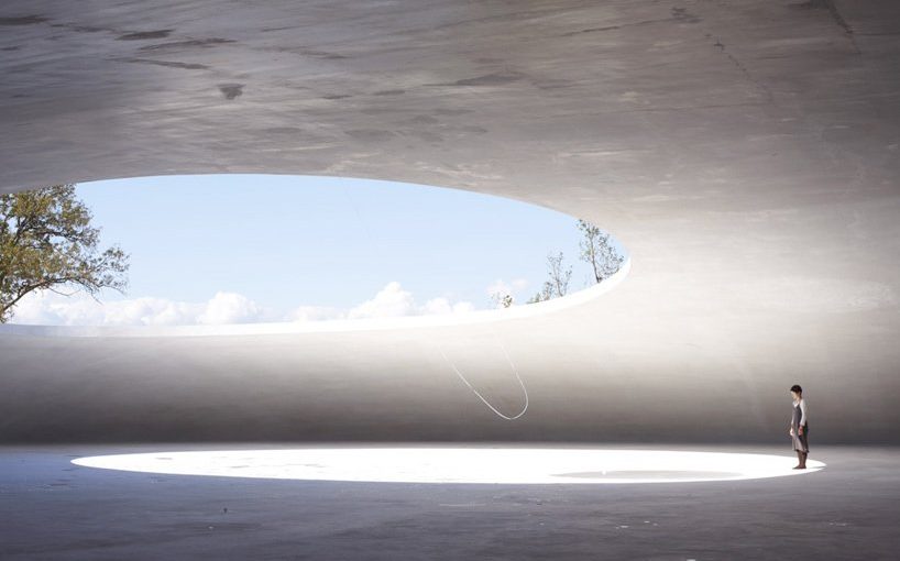
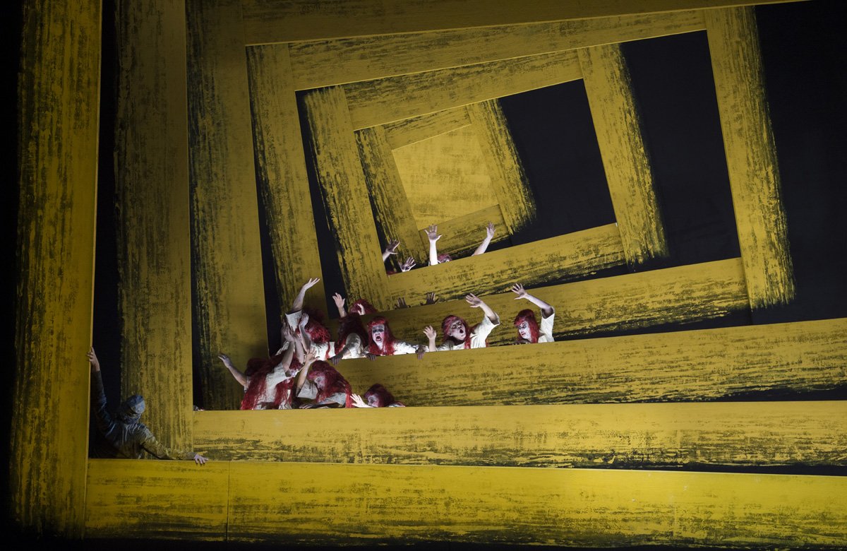
On the first day of school upon seeing the art installation on our grass roof, I was confused and bewildered as I wondered what is this? The closest I could think of was some alien invasion related things, like those that are on Youtube. *Sorry Maestro*

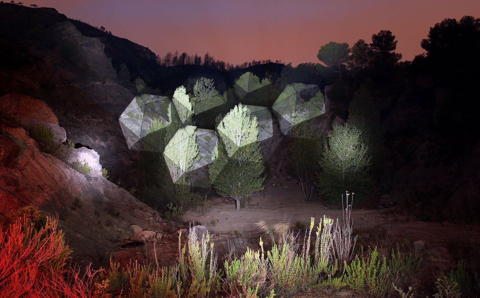
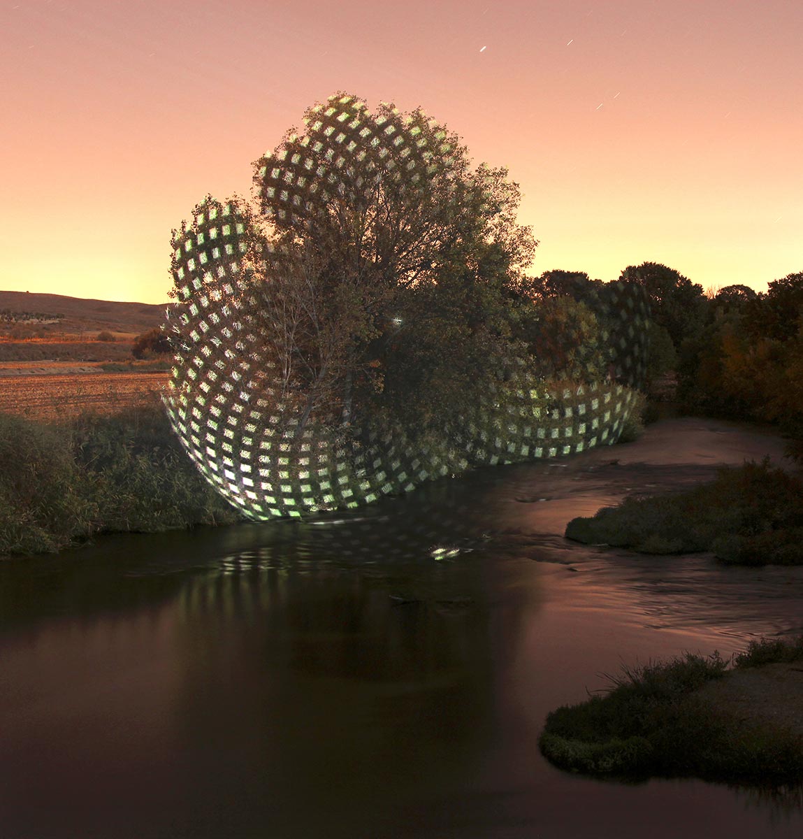
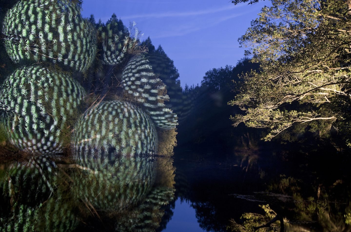
But after attending the talk, I finally understood the meaningful significance of the symbol – The Third Paradise. The Third Paradise is a reconfiguration of the mathematical infinity sign made of three consecutive circles. The first is a paradise in which humans were fully integrated into nature. The second, an artificial paradise, developed by human intelligence to globalising proportions through science and technology. While the central circle, The Third Paradise, third phase of humanity, a balanced connection between artifice and nature.

Pistoletto art is inevitable political. It involves the world in which we live in, how we relate to society around us, and the things we confront everyday. He started to develop the Third Paradise idea from the urgency in connecting the public with his work. The discovery in his art has brought him to integrate his vision into something larger – thus producing something for the society which evolved into The Third Paradise.

The Third Paradise today, is meaningful as it is about the interconnection between humans, nature, science and technology; a social movement on how we all can co-exist together to make a better world. We may not be able to back in the past, we should use technology as an advantage to go ahead without destroying ourselves. The symbol itself is symmetrical, balanced.  This also shows that as individuals, we will need to find a balance between necessary limitations and our need for interconnection. We will have to find a way to live as individuals but also as a cooperative system.

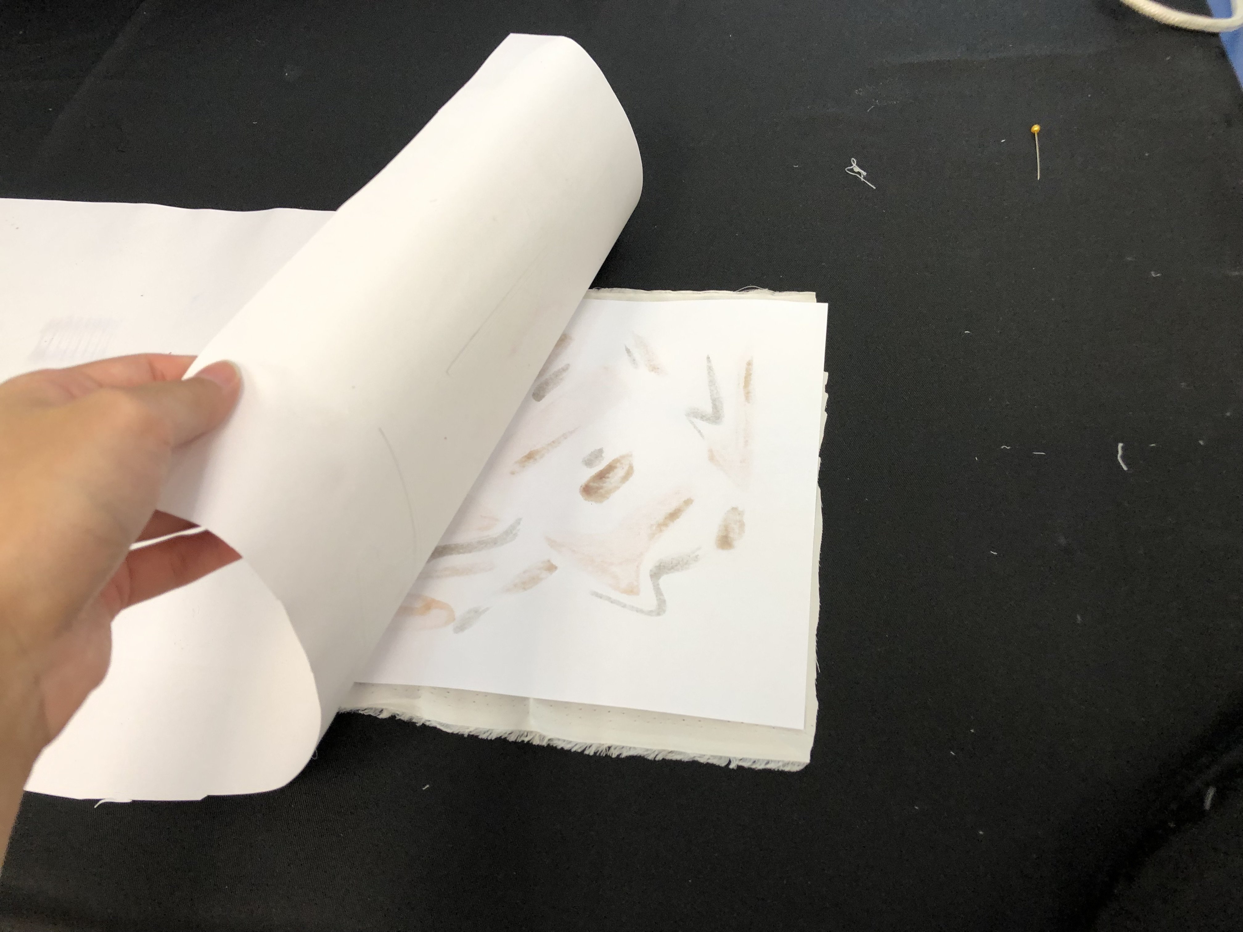
Pistoletto’s Mirror paintings are one of his works that intrigues me the most. He was first inspired from his father, who was a painter back in the days. But then, after looking at his first ever portrait that was painted in glossy paint, he realised – why not use a mirror instead of a canvas? Wouldn’t it be easier to paint a self portrait if you are looking at the mirror directly? What a brilliant and simple idea I thought, and this became a famous work of today. By using a mirror as his canvas, this allows the viewer to “enter” the work/painting, bringing it to a whole new personal experience. Through the polished metal, he puts the symbols of society, the world and the people in his work. The mirror reflects history, but at the same time creates a kind of friction that opens the future.

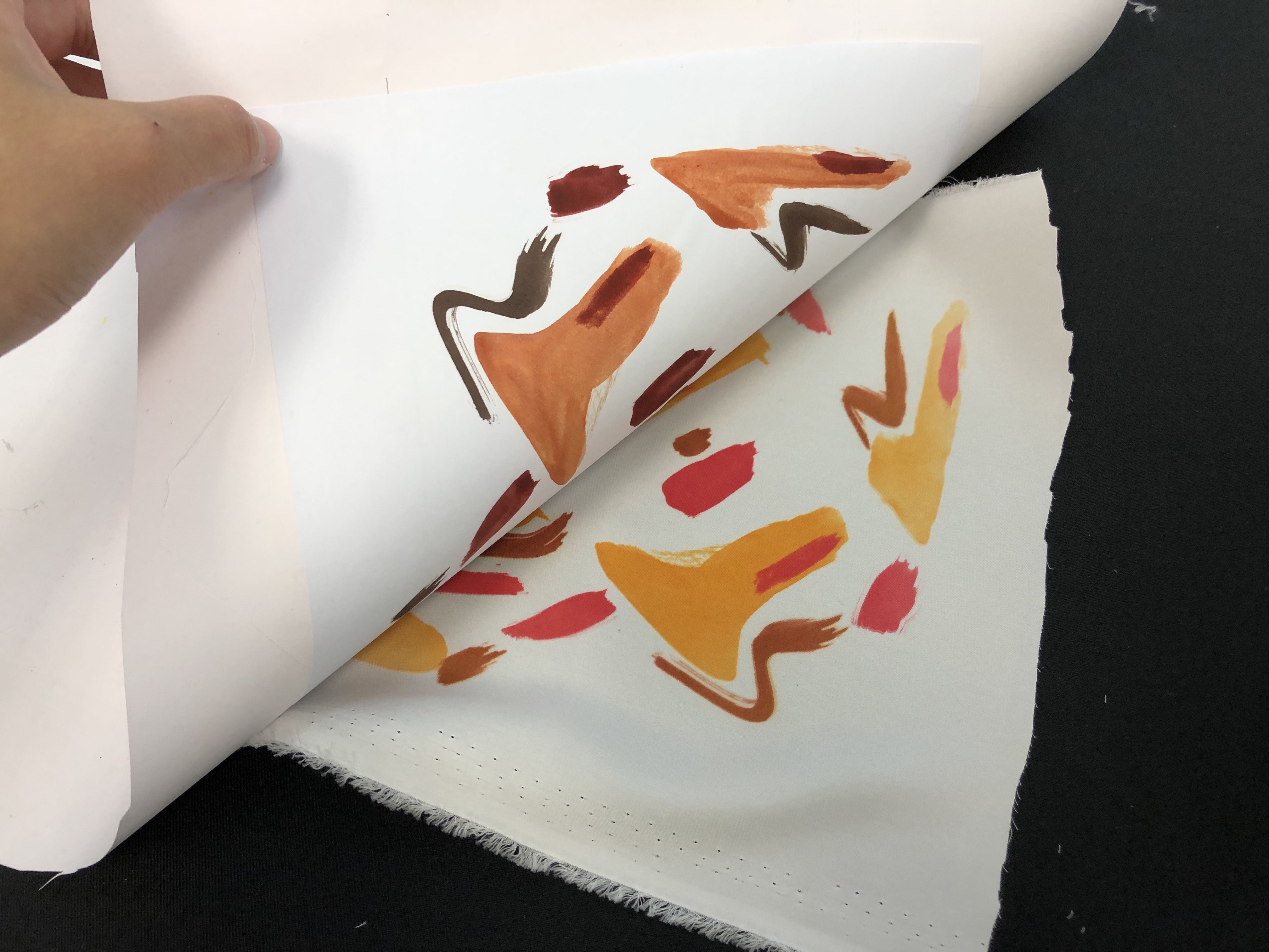
Additionally, he was one of the leading figures of Arte Povera. Arte Povera is about what is essential, it’s the basic concept of life. It is re-introducing a dynamic relationship with nature, bringing nature back into the world in reaction against the man-made manufacturing process. His work, Venus of Rags, 1967, contained a marbled goddess statue, holding onto a bunch of rags that were initially used by him for cleaning his mirror paintings. In the context of migration and consumer excess today, the piece feels increasingly relevant.

“You feel the language of the material itself. You need that material to express yourself. For me, there is no difference between gold and rags. They are both useful. Marble and textile. The simplicity of the materials is also very important. We want to talk about simple things, not only about powerful complexity.” 

And do you know, he established a holiday on 21 December 2012. It’s known to be the end of the world by the people he considers it to be the rebirth day. Therefore, making the symbolism of art comes to be a common element, a means of spreading an idea that should involve everybody.

Study of Spaces

M O V I N G  &  S T A T I C  I M A G E

01 Static Image
Vanity, 2017 by Murray Fredricks

Murray Fredricks’s Vanity sees the land as the medium, and introduces a mirror to an undisturbed landscape.  The photographer journeyed to the middle of the lake, where an inch of salt-laden water reflects the sky. ‘the mirror can be seen as emblematic of our obsession with ourselves, individually, and collectively,’ fredericks says. ‘in the ‘vanity’ series, rather than reflecting our own ‘surface’ image, the mirror is positioned to draw our gaze out and away from ourselves, into the environment, driving us towards an emotional engagement with light, colour and space.’

It’s interesting how he uses the mirror as another “dimension” of space to reflect the current space that he placed it in. It creates this certain distortion yet a seamless blend to it. The resulting images creates this sublimity to it, with infinite variations of color and clouds, sky and light and landscape, all of this comes together in one single frame. 

02 Theatre Set Design
Wozzeck, Zurich Opera by Michael Levine

It’s interesting and smart how Michael Levine used perspective and frames to change the viewers’ eyes. At first, it looks like a simple frame that is painted yellow, but as the show goes, more and more frames appear behind the first one, revealing up to six layers. The frames starts moving which creates a sense of depth and movement. Such simple technique of using a frame is able to achieve so much movements and change the space! 

03 Theatre Set Design
Don Giovanni – Vienna, 2006 by Es Devlin

Es Devlin sets looks like it was a film still. It gives me this sense of surrealism which I believe was caused by the perspective used and the colours. It looks like it was edited as no such space could be seen in real life. She was smart to play with different planes and depth, which creates “two sides” during the theatre play. It is as though we are watching a film, with both of the characters pov playing at the same time. Personally, I feel this execution of space is really smart as it gives the play so much more freedom in expressing the narrative simply by changing the planes in the set. 


P H Y S I C A L   S P A C E

01 Architecture
Teshima Art Museum, Japan by Ryue Nishizawa & Rei Naito

The museum resembles a droplet of water caught in the middle of gliding across the land. two large elliptical openings define and orient the space while letting the interior collect pieces of the elements: pools of water accumulate on the floor and freely shift and migrate according to the breeze’s direction; the sounds from the sea and foliage reverberate through the open space while the ambiance is in constant change according to the sun’s position and time of day. 

I love this architecture as though it is a block of concrete, it blends seamlessly with the natural surroundings due to its organic shape.  This setting, in which nature, art and architecture come together with such limitless harmony, conjures an infinite array of impressions with the passage of seasons and the flow of time. It is also really smart of the architect to make use of the voids and space in the architecture, to create natural soundscapes that travels through the entire space. 

02 Light Installation
Illuminated Landscapes by Javier Riera

Javier Riera work is interesting as he uses light to creates 3D geometrical shapes onto our landscapes. Simply by using light and projection, he makes the landscape much more playful and interesting without destroying anything. It is amazing how simply by changing something in what we see everyday, by adding 3D geometric shapes on trees, this could change the space.

01 Transfer Printing

Transfer Printing Technique

Transfer Printing is the transference of an image to fabric or other materials via a substrate. The image is transferred via heat and pressure. Due to the dyes in the substrate – sublime, it creates an imprint. This technique is thus known as sublimation printing. 

Three types of transfer printing:
Dry transfer, 
wet transfer and digital transfer


D R Y   T R A N S F E R
Materials: Fabric Crayons, Paper, Wax Paper, Fabric & Iron

D R Y   T R A N S F E R   T E C H N I Q U E

  • Use fabric crayons to create your artwork on normal copy paper. You may illustrate or etch it over some patterns and textures.
  • Once your illustration is complete, place a piece of fabric (preferably cotton, silk or polyester) on the coloured side of the paper. 
  • Heat up your iron, make sure it’s heated in the fabric setting.
  • Place a piece of wax paper in between the iron and your fabric to prevent from burning your artwork.
  • Slowly iron your artwork and apply pressure occasionally. The heat will cause the ink to transfer onto the fabric. 
  • Once you’ve ironed it thoroughly, check if print is transferred by lifting the corner of the fabric. 
  • If the colours transferred is up to your satisfaction, you may stop ironing. Otherwise, continue ironing until you’ve reach your desired results.
  • Do note that the more prints you make, the more diluted the original crayon ink will be due to the transfers. 

Original Crayon Prints

Transfer Printing of the Crayon Prints

What I realise:
My crayon transfer printings turned out a little light. I believe it might have been the choice of my colours and the amount of pressure applied when colouring. I believe the transfer printing will fare better if I have applied more pressure or used darker colours in the colouring stage. However, heat and pressure could also be a factor. It might be due to the lack of time or when insufficient pressure is not applied when ironing. Next time, I would colour it darker and apply more pressure! Overall, this was a fun exercise as it has been soooo long since I touched crayons.

*update* Now i understood why my crayon transfers were so light! The cloth is supposed to be at the bottom, and the crayon paper on top that has to be ironed directly. 


W E T   T R A N S F E R
Materials: Fabric Paint, Paper, Wax Paper, Fabric & Iron

WET   T R A N S F E R   T E C H N I Q U E

  • Use fabric paint to create your artwork on normal copy paper. 
  • Once your illustration is complete, place your fabric first, followed by the painted fabric on top of it.
  • Heat up your iron, make sure it’s heated in the fabric setting.
  • Place a piece of wax paper in between the iron and your fabric to prevent from burning your artwork.
  • Slowly iron your artwork and apply pressure occasionally. The heat will cause the ink to transfer onto the fabric. 
  • Once you’ve ironed it thoroughly, check if print is transferred by lifting the corner of the fabric. 
  • If the colours transferred is up to your satisfaction, you may stop ironing. Otherwise, continue ironing until you’ve reach your desired results.


F I N A L  W E T   T R A N S F E R


What I realise: 
I didn’t expect for the colours to turn out brighter than the original painting! The colour that surprised me the most was green. As you can see, the original colour was more of a dark green but after being transferred, it turned out to be bright green! Amazing isn’t it? And previously for my crayon dry transfers, I was wondering why my colours are not saturated enough. What I did wrong was the order of placement of my papers. The right order should be, fabric > paper > wax paper > iron. But previously I did paper > fabric, no wonder the colour weren’t transferred thoroughly! We learn new things everyday :’)

Personally I prefer the wet transfers over the dry ones. It would be the vibrancy of the colours and the usage of medium. What I love about the paint is that, even tiny details like the brush strokes could be transferred over! How cool is that!? Sadly, I’ve yet to try the heat press on the rest of my prints, but I will definitely try it and continue to update this space of mine. I am very excited for the heat press as I saw my classmate’s works and how it transfers literally EVERYTHING. So see you soon little space!!

Hello.

B I O G R A P H Y

Jacelyn Ng is an aspiring artist who mixes her crafts with code, combining the tangible and the unimaginable. She is currently pursuing her Bachelor’s in Interactive Media at the School of Art, Design & Media in NTU.

Originating from a background in Visual Communication & Merchandising, it could be safe to say that Jacelyn has played with both 2D and 3D spaces, though she has a teeny bit more interest in spatial design. She has always been curious about the idea of sublimity and the silence that nature has and once had. Its natural beauty that transcends grandeur and awe, or the quiet rhythmic percussion of waves splashing against the golden sand.

With this, she is deeply inspired by the environment and its issues spanning from light pollution to soundscapes. It could be the starry night sky, the cool breeze or even the golden sunlight. Through her craft, Jacelyn hopes to preserve the natural of the world before they vanish completely. As with human technological accomplishments, comes with the loss of our natural silence in the ever-rising din of man-made noise.


S E R E I N
(n.) your personal venting cloud

Before our feelings consume us, we as humans need an outlet to release our pent up emotions. But due to the constant fear of being judge, we keep everything bottled up and let the negative emotions eat us up. Serein, your personal cloud confidante will come alive with light as you let down your walls and release your inner frustrations, stimulating how a confidante would be listening to your troubles. Whilst you shout at the cloud, it will visually display your negative emotions in a colourful & encapsulating manner, hopefully leaving the audience member feeling relieved & wonderstruck.

For more on Serein 


R E S U M E


I N S P I R A T I O N

Blue Pesher, 1999
by James Turrell

American artist James Turrell works directly with light and space to create artworks that engage viewers with the limits and wonder of human perception. He, an avid pilot, considers the sky as his studio, material and canvas.

Turrell’s over eighty Skyspaces is an epitome of what I’m interested in, light, colours and skies. The simple act of witnessing the sky from within a Turrell Skyspace, notably at dawn and dusk, reveals how we internally create the colors we see and thus, our perceived reality.

The light box frames the sky, making it seem like a painting of colours. Such a simple and clean idea, could capture the moment and colours of the day. An ever-changing photograph, with the gradual movement of the wispy clouds. The emotions one may feel, how we perceive and engage will be different as we gaze up the skylight in the sky.

www.jamesturrell.com/work/type/skyspace

You’re The Only One I See; You Take My Breath Away

You’re The Only One I See; You Take My Breath Away, 2019
by Jacelyn, Jiaman, Tisya, Valerie

Materials used: Styrofoam cups, plastic tube, ribbons and tape

A device that allows two individuals to engage in an intimate manner without any physical interaction. A pair of styrofoam goggles that forces eye contact to take place, while the plastic tube is used for the individuals to either breathe or talk into it. The two individuals will engage with one another for a minute. 

We realise that it’s quite difficult for people to be in direct eye contact for a certain period of time as one will tend to look away first. Ang apparently, research shows that when two individuals look into each other’s eyes for 4 minutes, there’s a chance of them falling in love! Anyway, we wanted to make the experience even weirder by letting the participants hear each other’s breathing. We felt that hearing another’s breathing gives a rather intimate and weird feeling as you don’t normally hear this unless you’re sleeping next to a loved one. Thus, we were curious if this device will force two strangers to become more familiar with one another under such circumstances, and maybe it may spark some interests?