04 Felting & Applique

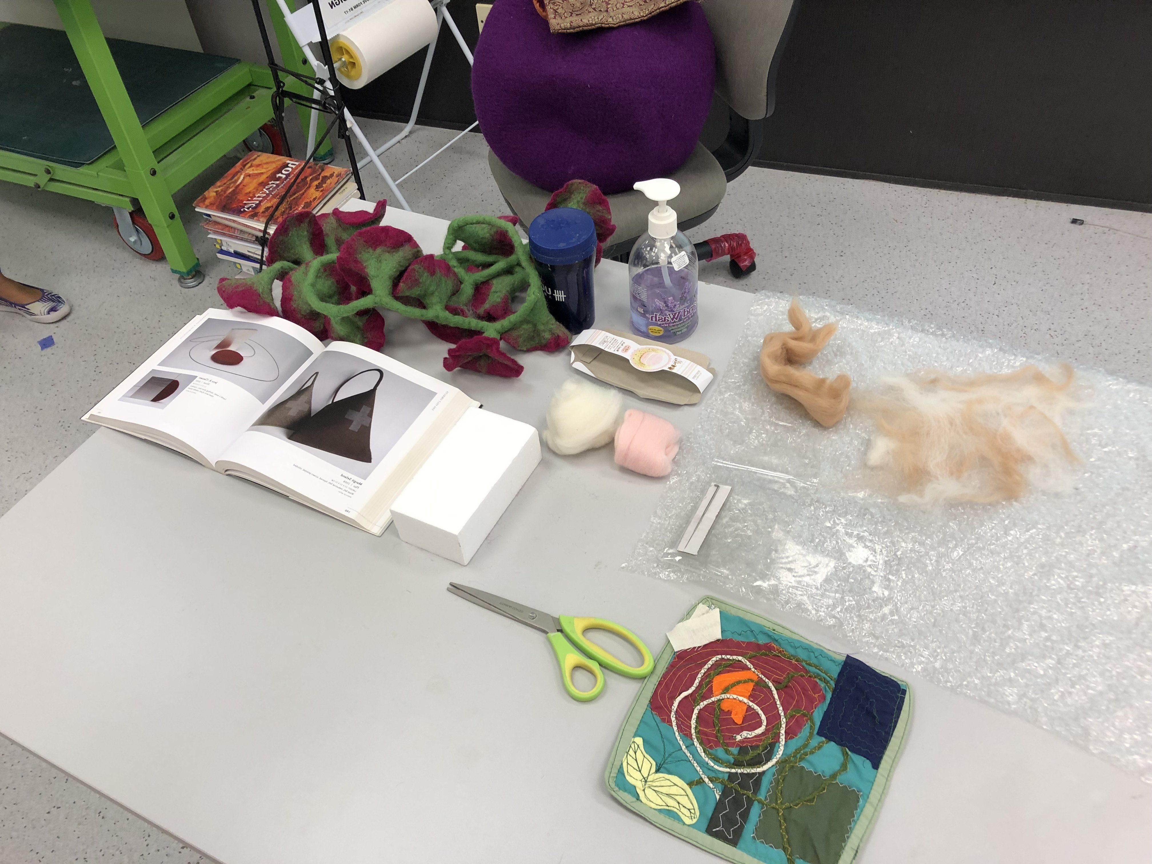
For the needle felting class, we were taught a few techniques of different feltings:

1. Wet Felting
Welt felting is where the natural wool fibres, stimulated by friction and lubricated by moisture (soap water), move at a 90 degree angle towards the friction source and in effect making little “tacking stitches. The wet felting process makes the felt tighter, locking them together to become a stiff and thick wool that resembles a blanket
. Wet felting works by spraying some warm soapy water onto the felt, and you’ll have to “mix” or blend the soapy water with the felt together by rubbing it in. By rubbing the felt onto one another, it creates an effect that makes “tacking” stitches, which helps to tighten and lock the felt together. This will thus create a stiff, and thick wool. 


2. Needle Felting
Needle felting is created dry, without the use of water. The needles are referred to as “barbed” needles which in fact have notches along the shaft of the needle that grab the top layer of fibres and tangle them with the inner layers of fibres as the needle enters the wool. Since the notches faces downwards on the needle, they do .not pull the fibres out as the needle exits the wool, but rather “stitch” the wool together when it’s pressed in. By using a single needle or a small group of needle, fine details can be achieved with this technique. 


3. Nuno Felting
The Japanese word “Nuno” means cloth. The technique bonds loose fibre, usually wool into a sheer fabric such as silk gauze, creating a lightweight felt. The fibres can completely cover the background fabric, or they may be used as a decorative design that allows the backing fabric to show. Nuno felting often incorporates several layers of loose fibres combined to build up colour, texture, or design elements in the finished fabric. The nuno felting process is particularly suitable for creating lightweight fabrics used to make clothing. Fabrics such as nylon or muslin, or other open weaves can be used as the felting background, resulting in a wide range of textural effects and colours. 


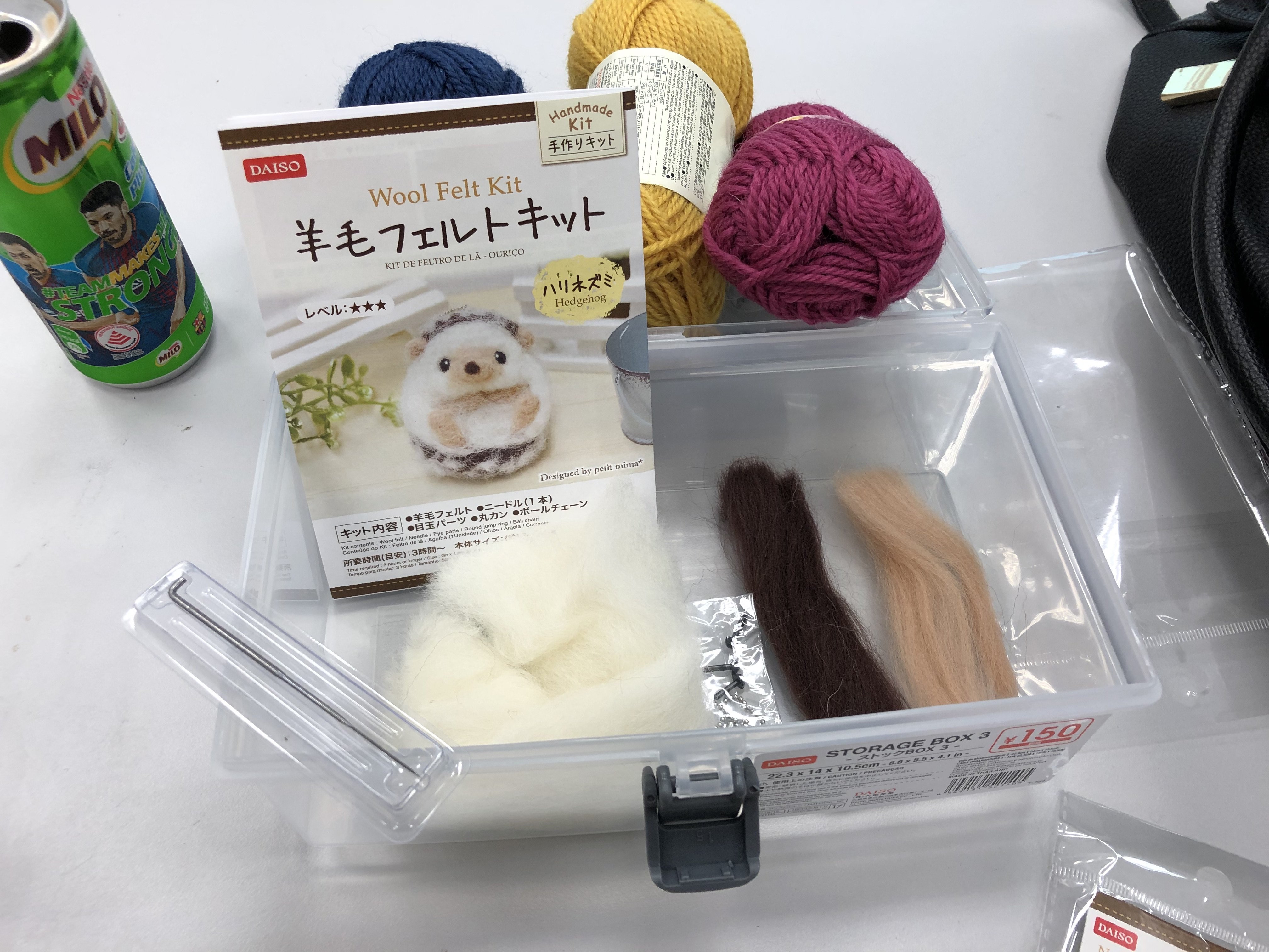
For now, this is the needle felt technique. I bought a really cute hedgehog felt kit from Daiso that I wanted to try! It’s my first time doing needle felting and I was clueless on how it is going to work. I only know that there’s alot of poking involved from all the videos that I’ve seen hahaha. So… lets start it now shall we!

First of foremost, of course you’ll need some: Felt and Felting needle.

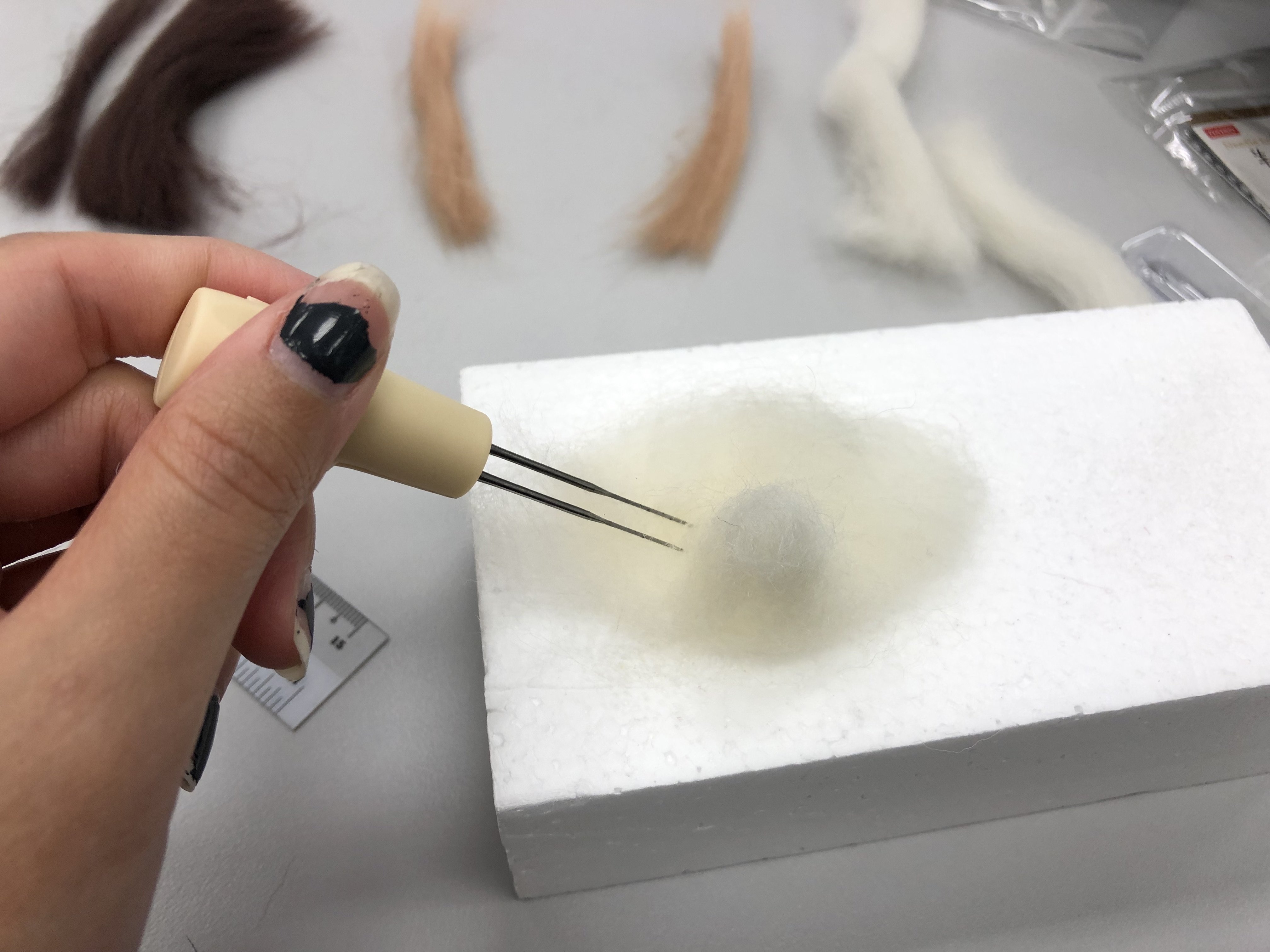
Apparently, felting needle comes in different quantity, there are those that comes in twin needles while the rest are individual needles. I guess for the twin needle, it makes the process faster?

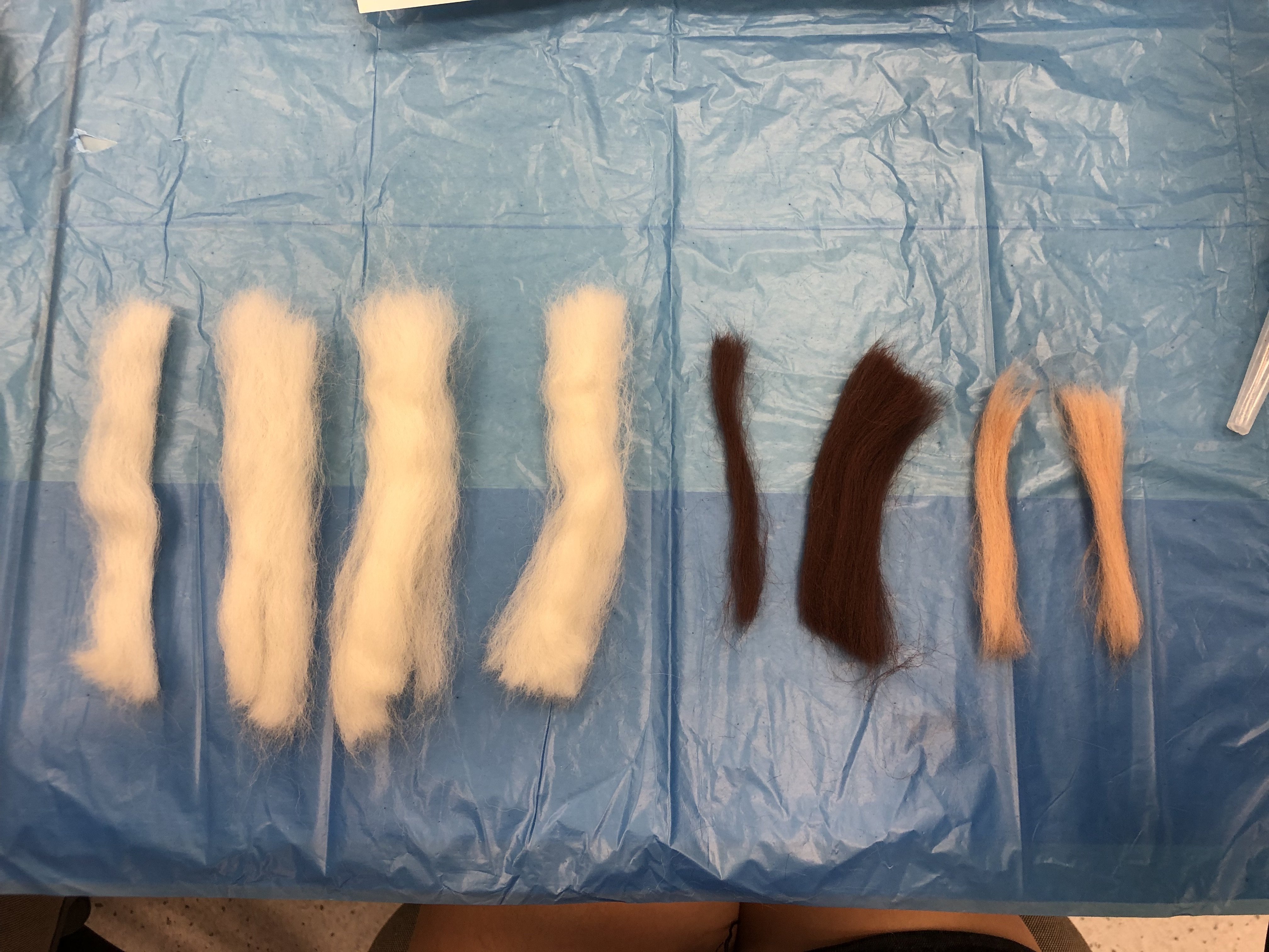
Following the hedgehog guide, I was told to segment the pieces for the various body parts of the animal. 

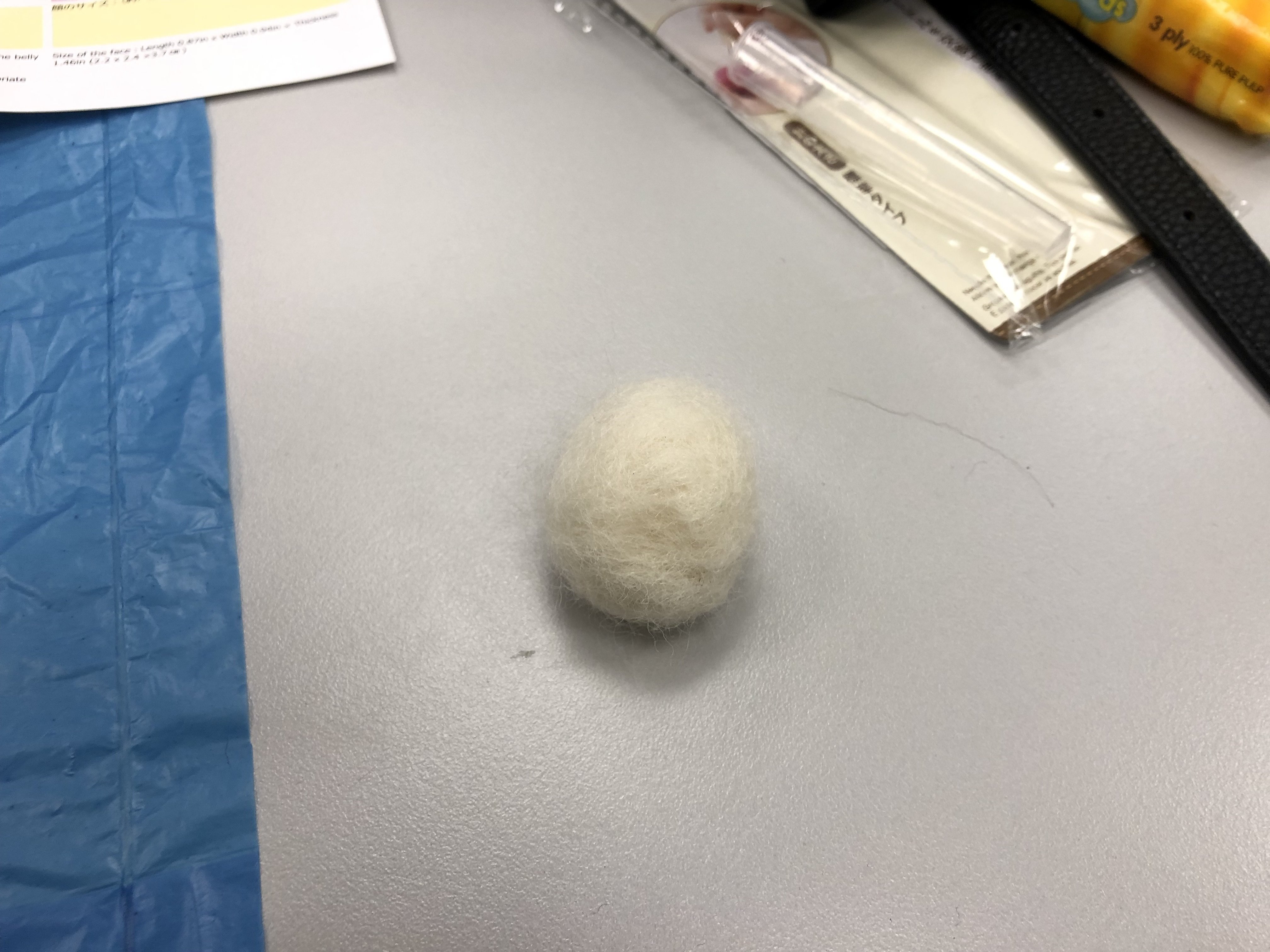
So lets start poking! It took me soooo long to form the ball below, which is the hedgehog body. I never knew it’s gonna take THAT long. Now I know why all the felt crafts are so expensive because it’s so labour extensive. And I kept poking the my finger sigh, and it’s the same exact spot that I kept hurting myself! 

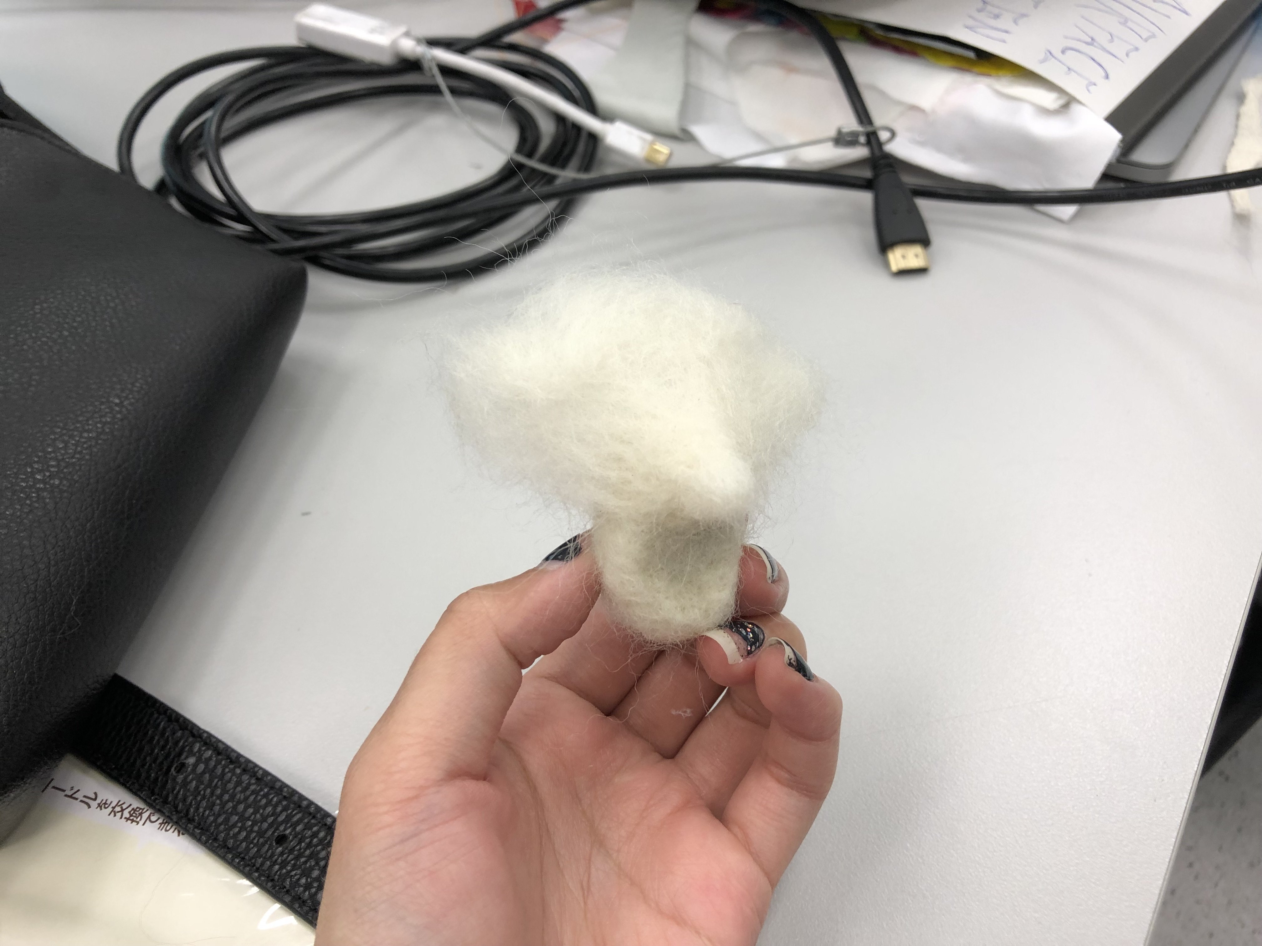
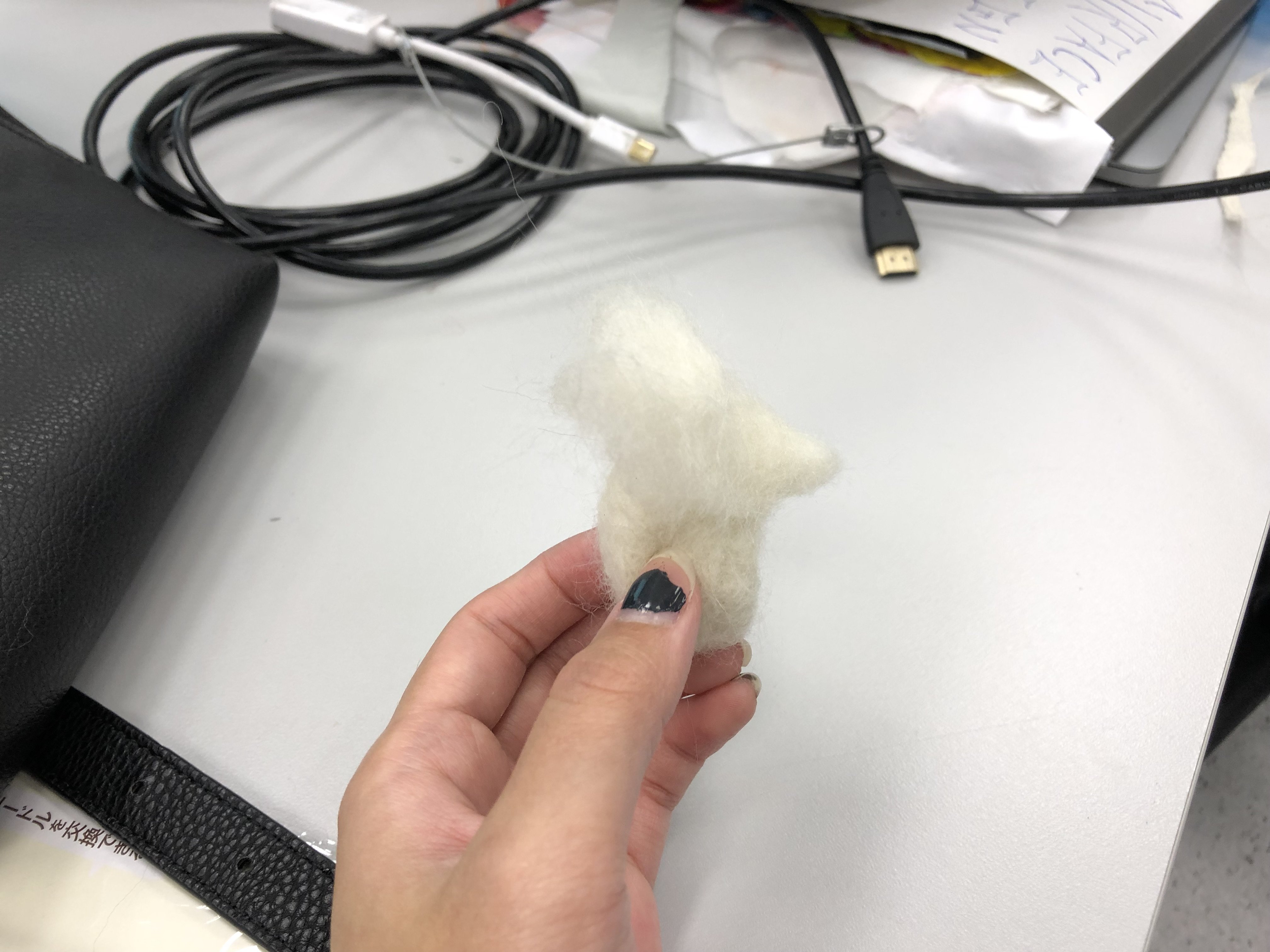
As you can see… I’m trying my very best to form the hedgehog nose. This was already 2 hours into our lesson and I’ve yet to complete a quarter of the hedgehog.

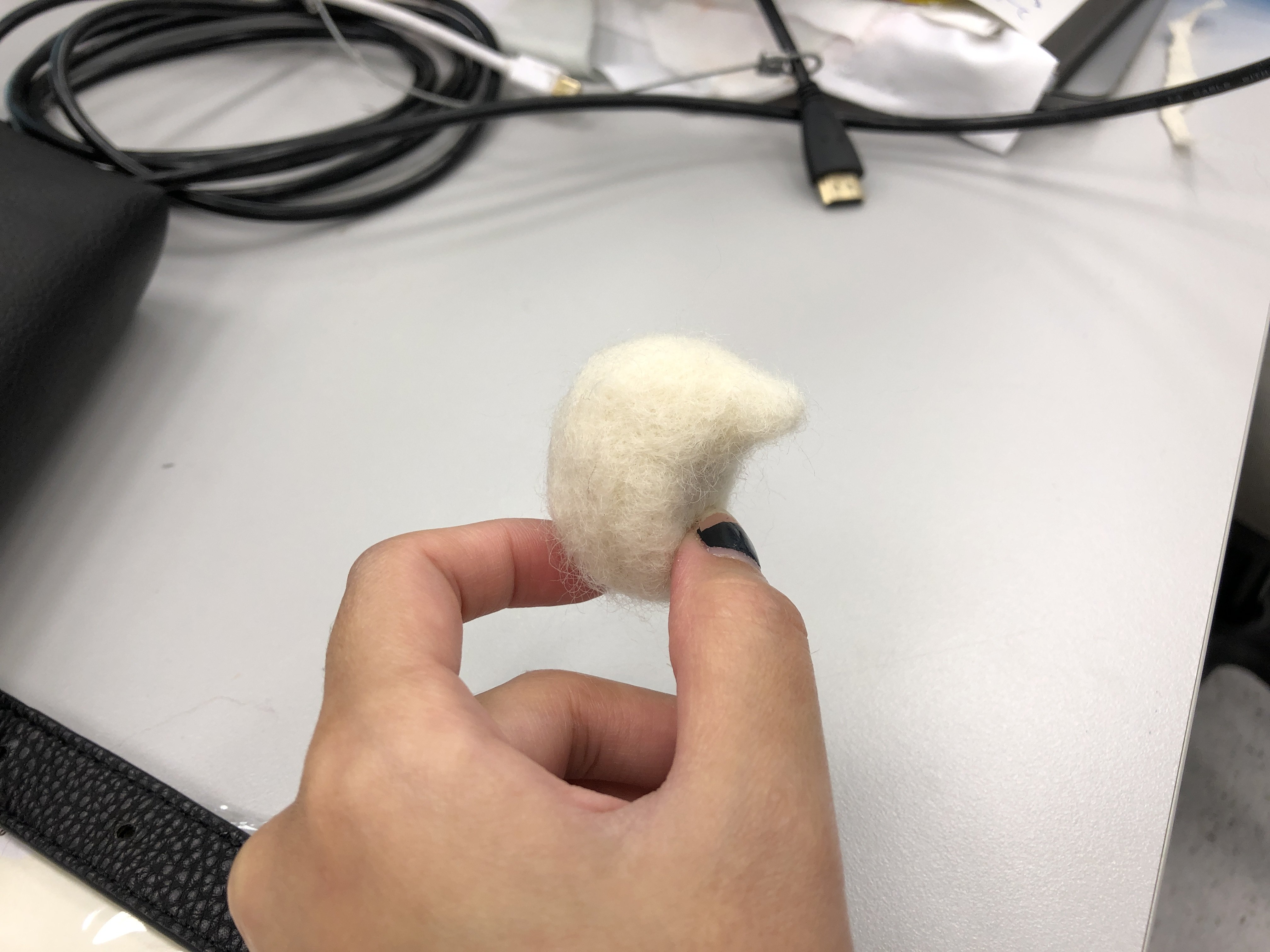
Now I’ll have to attach the nose onto the hedgehog body. Poke poke poke them in. It looks a little crazy now but please believe in me, it will be something.. that looks hedgehog-ish soon. 

TADAH! And here, I present you the hedgehog body with da nose! Ok and this was taken at the end of the lesson. I took me 3 HOURS to make such a small part. I can’t imagine how long it’s gonna take me to complete the rest of the hedgehog. 

DAY 02 of Felt Making.

As you can see in the background of my work, I was binge watching some show while aimlessly poking my felt. And now… I present you 3/4 of my hedgehog, with a pair of new ears and a nose that is a lil too big for him. But hey… everyone has their own imperfections right :’) so lets not put too much pressure on this little guy here shall we?  

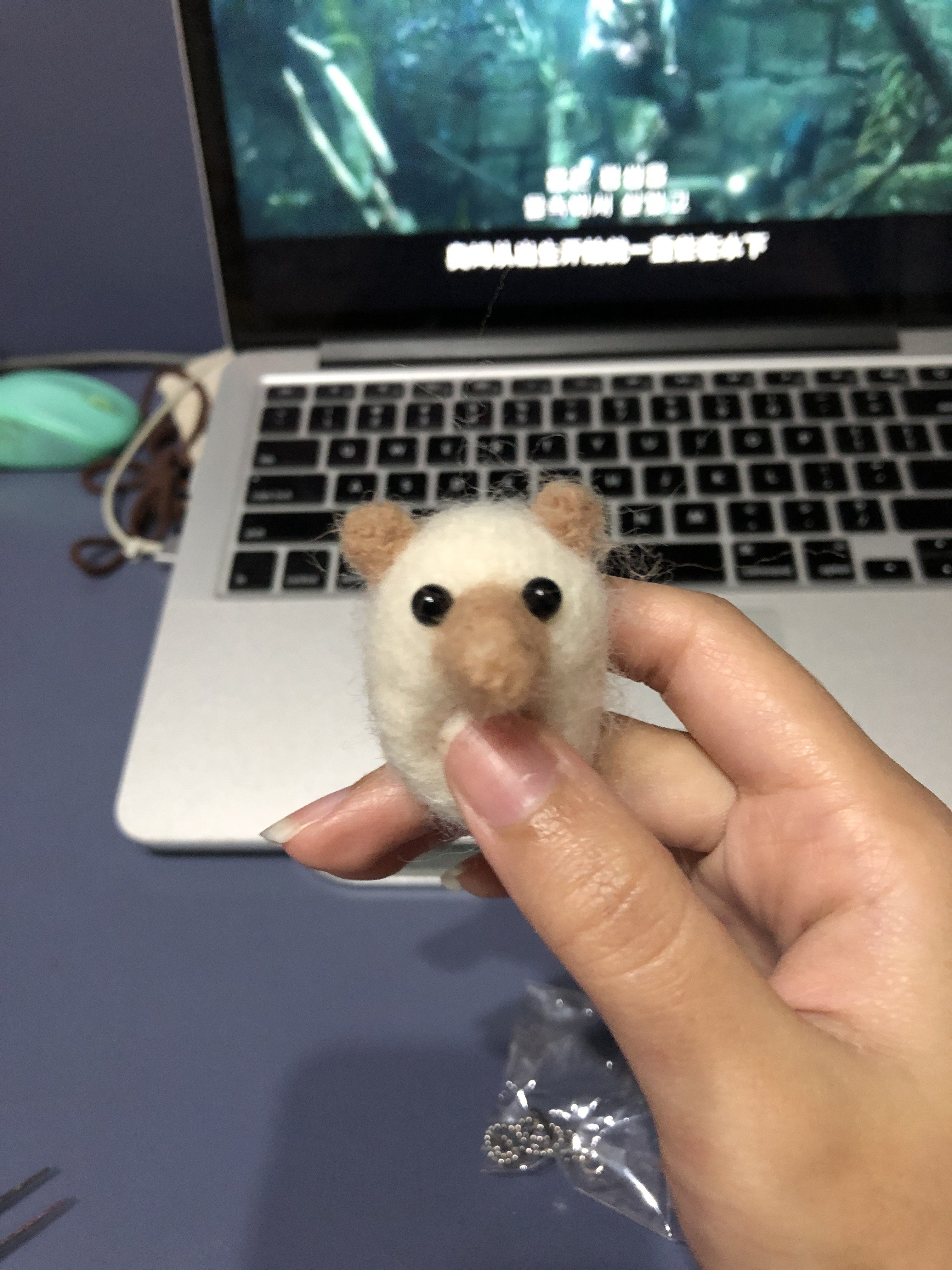
This is not the end of my hedgehog… I will check back again once I’ve finish giving him a cute little hairstyle 😉
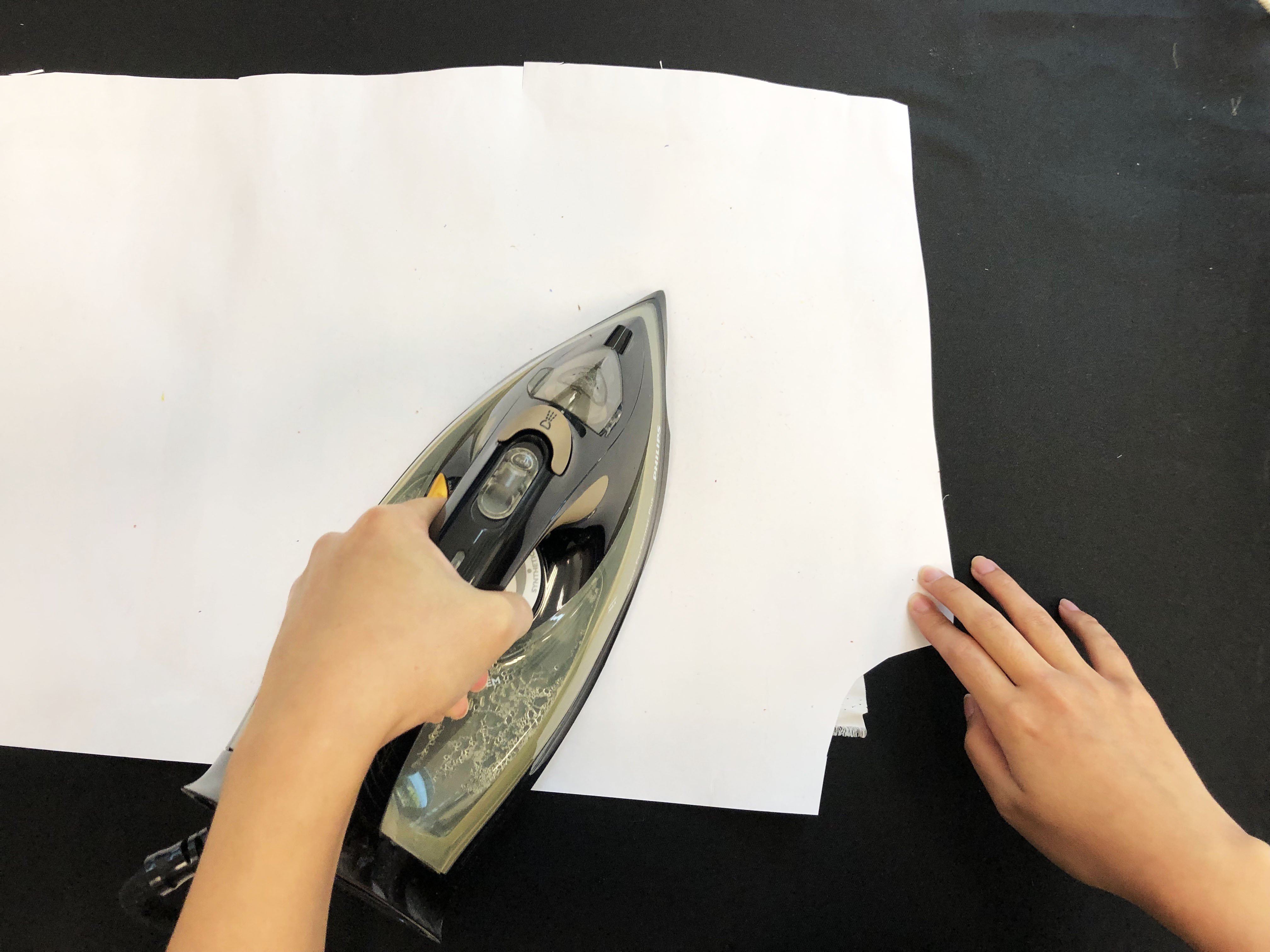

Wet Felting

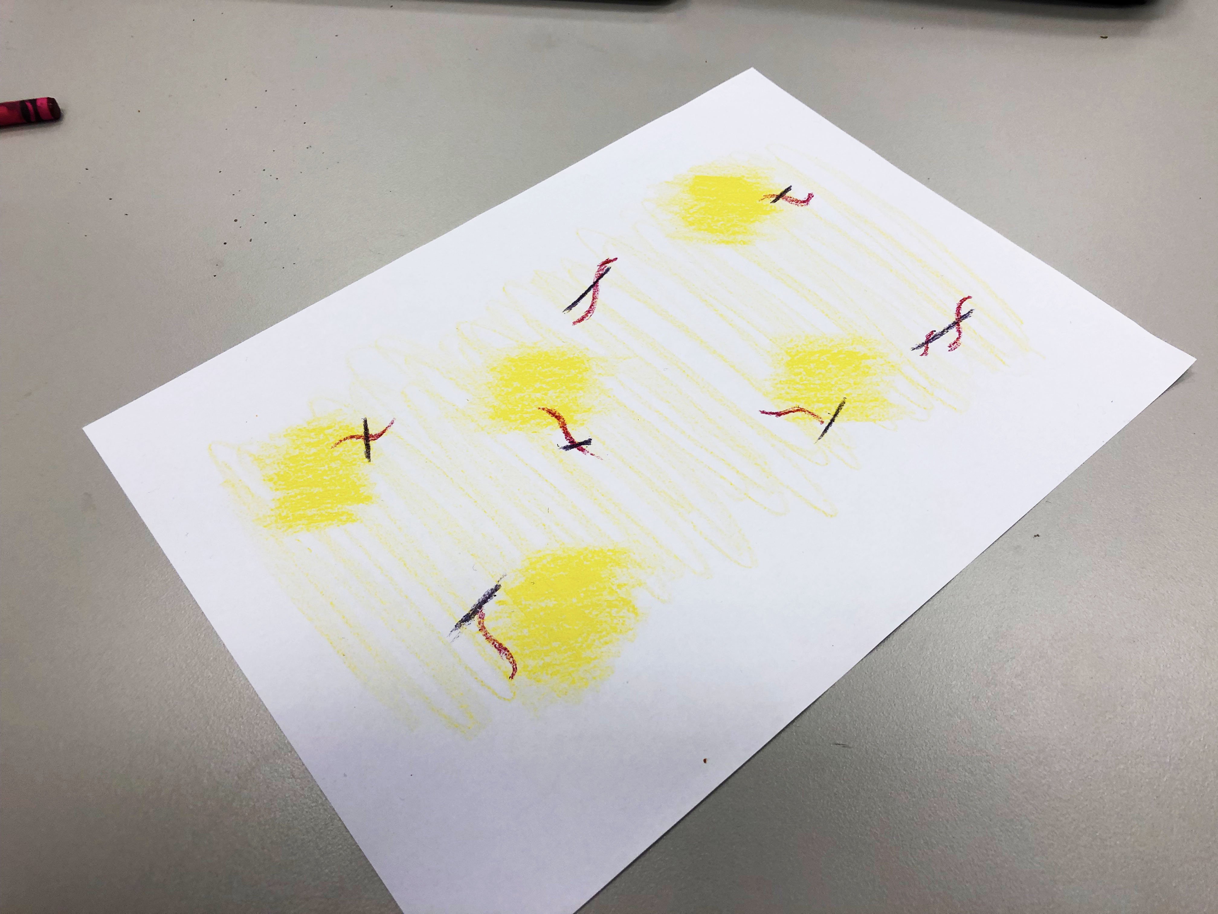
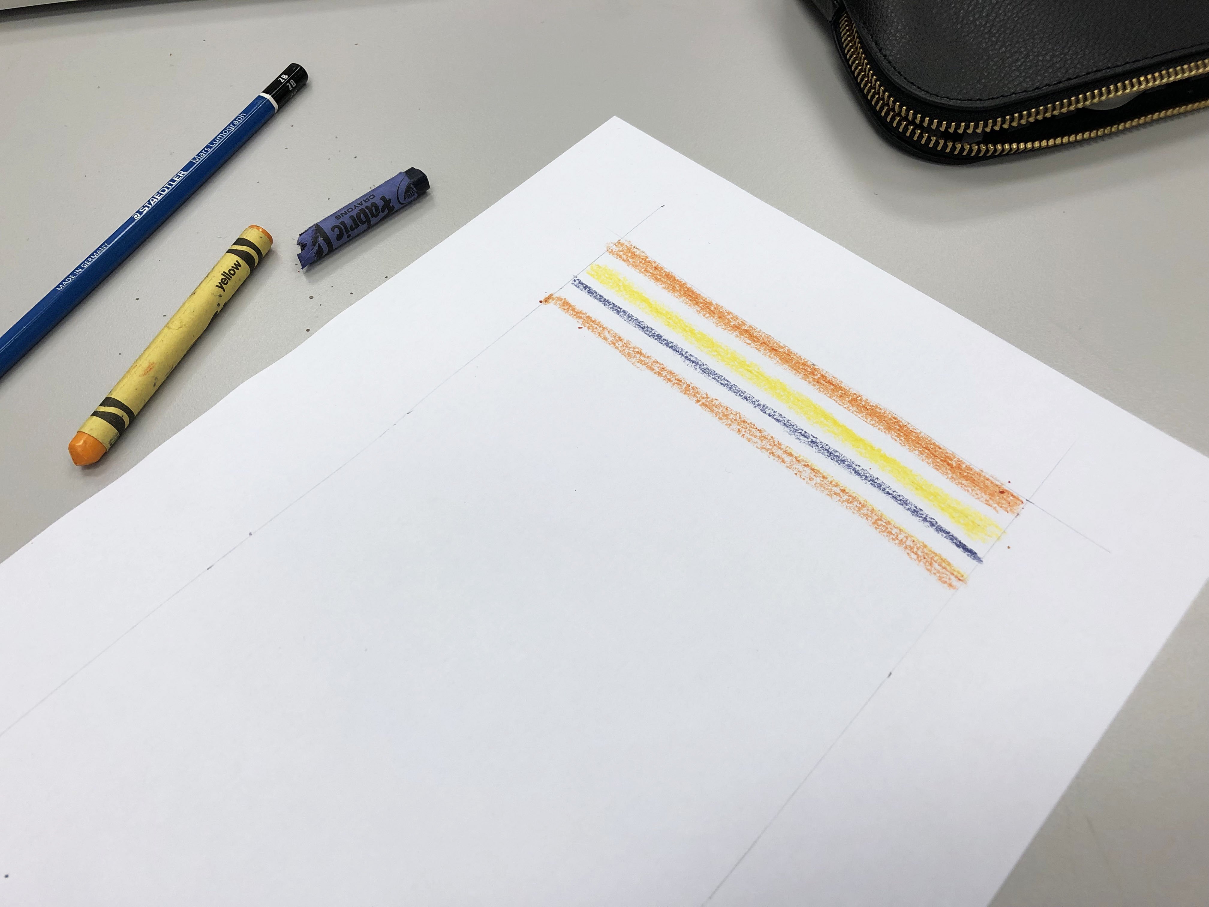
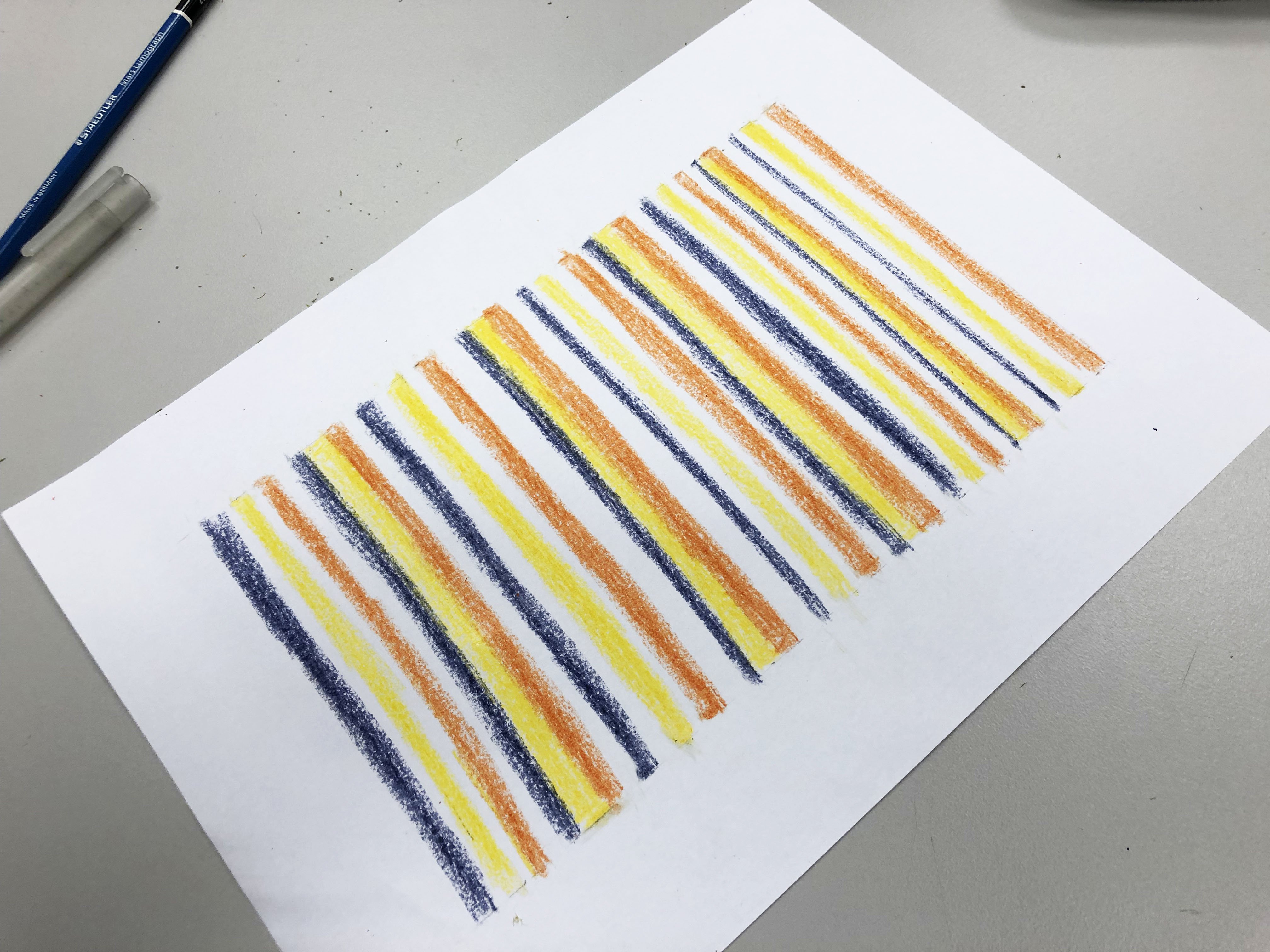
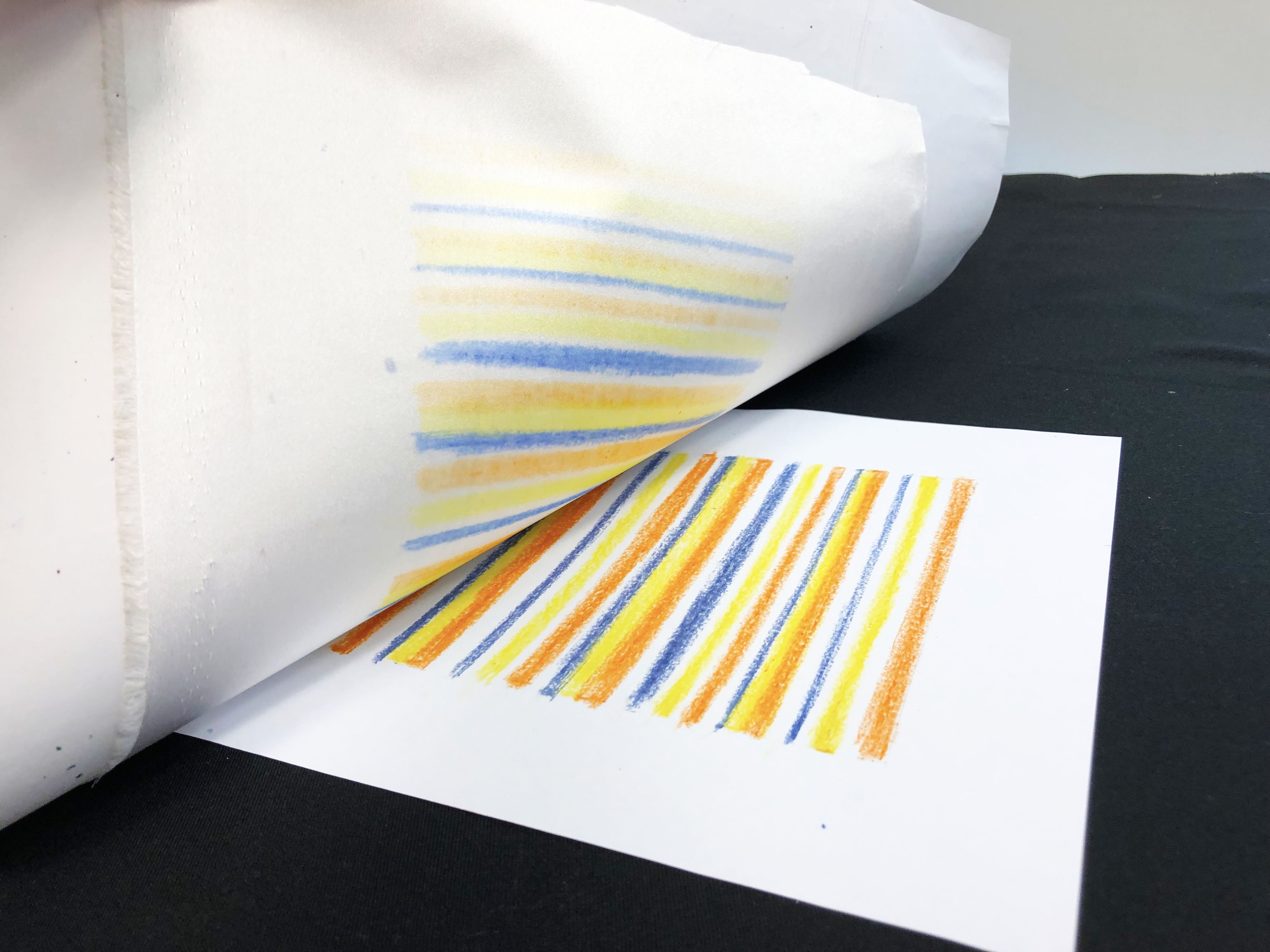
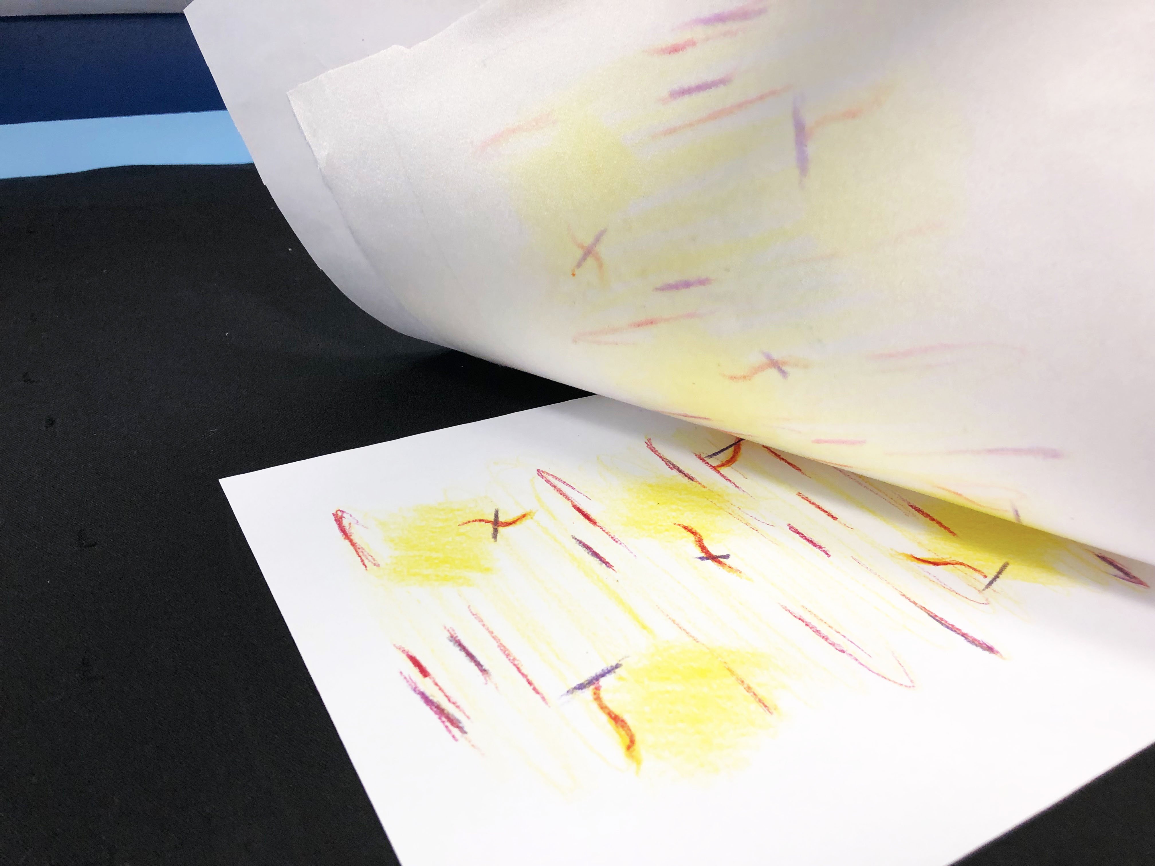
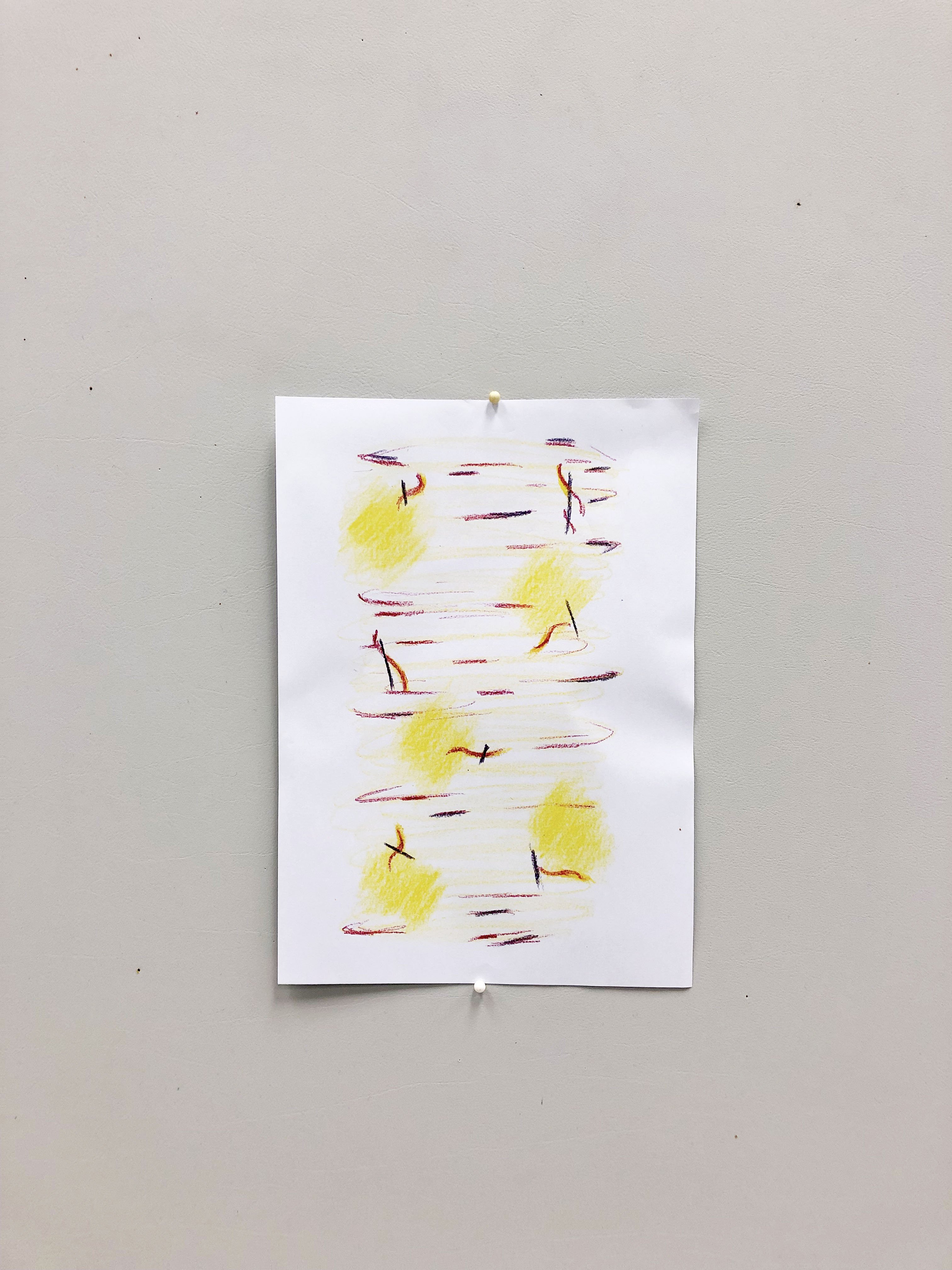
Hi guys! I’m back again. Finally, I’ve the time to proceed with wet felting. I was looking through some wet felting inspiration and saw some of the designs which were really cool! And it made me regret not buying more colours as I could try to achieve the same look haha. So here are some inspos I found! Thought that I should share it here with you guys 🙂

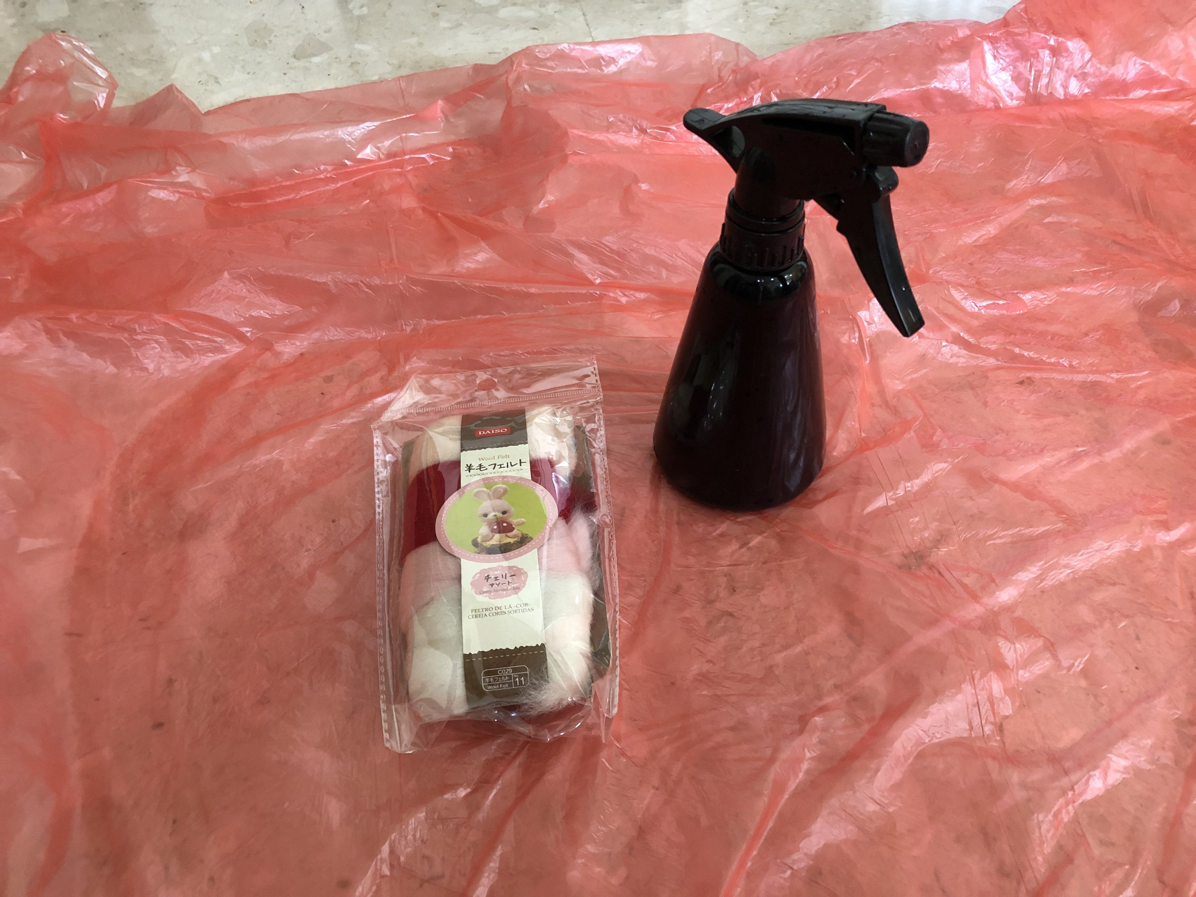
Materials you’ll need:
Felt
Liquid Soap + Warm water
Spray
Plastic covers (as base to rub your felt on)

Steps for Wet Felting:
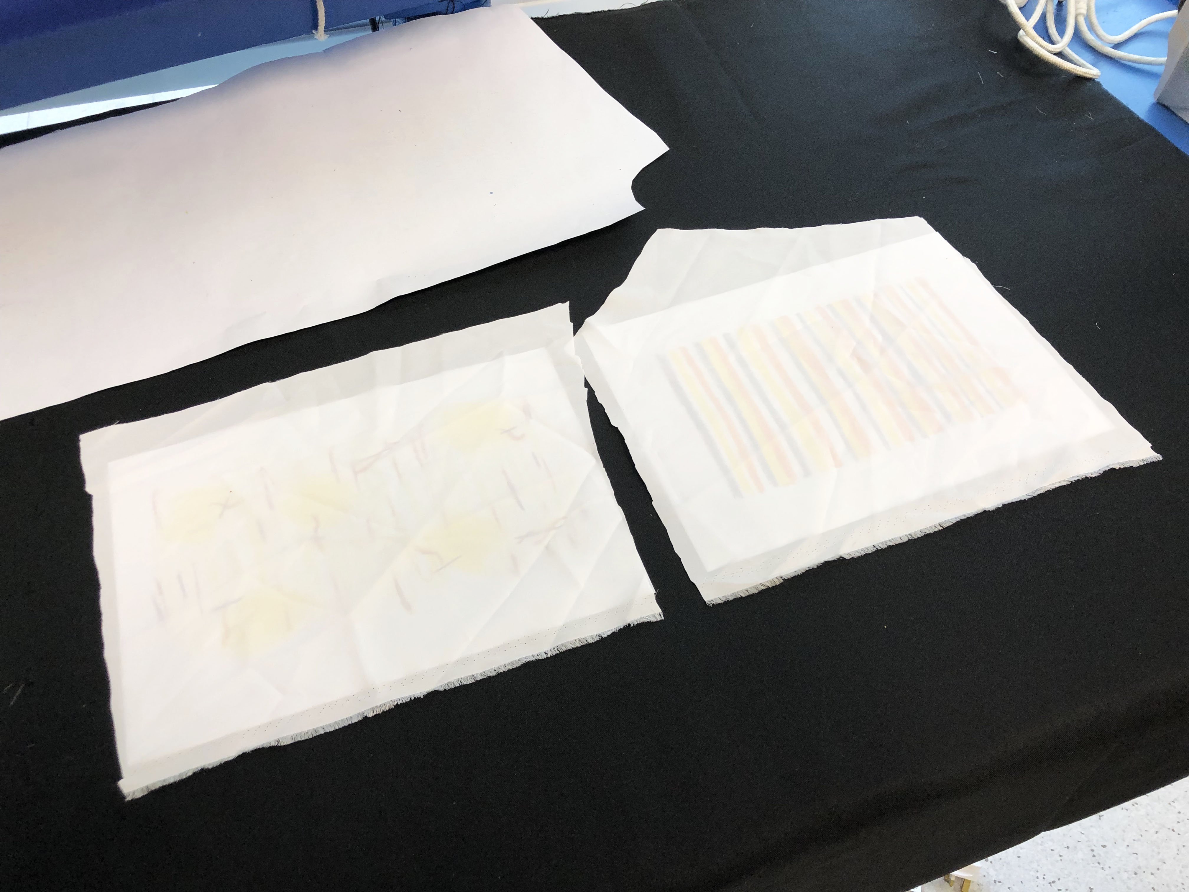
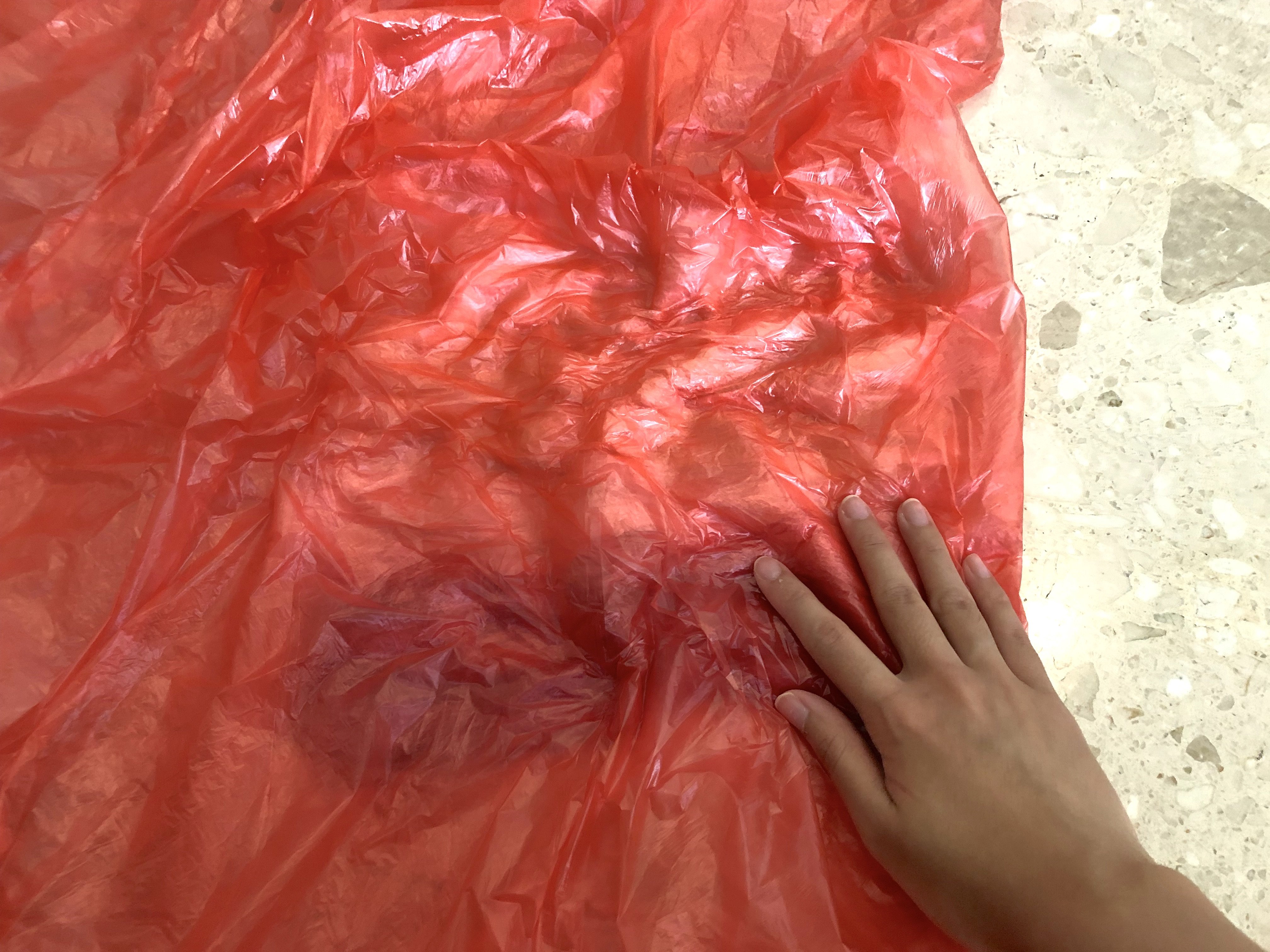
01 Prepare your work station, overlay a huge plastic bag
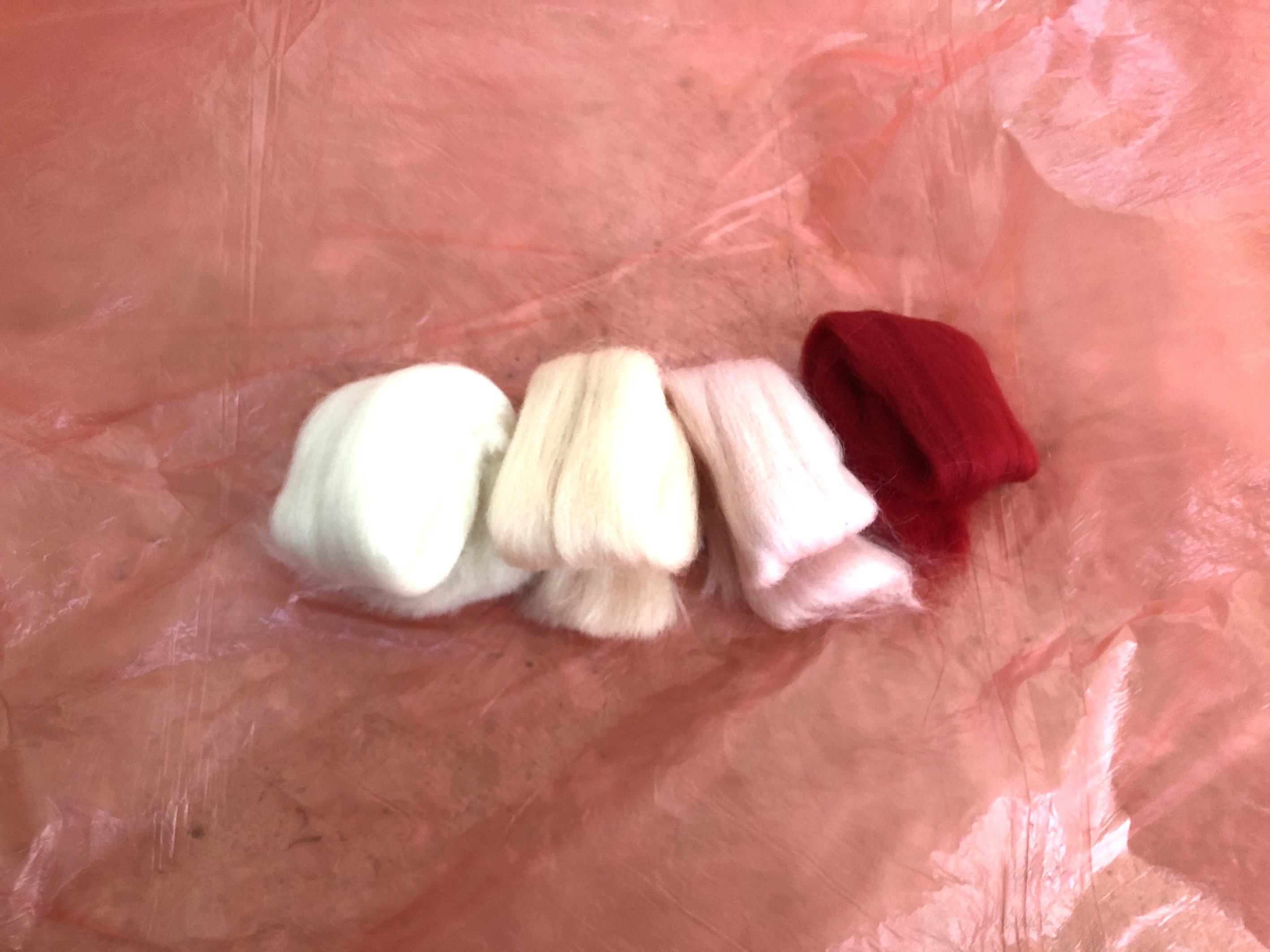
02 Lay your felt accordingly to the pattern you want to achieve
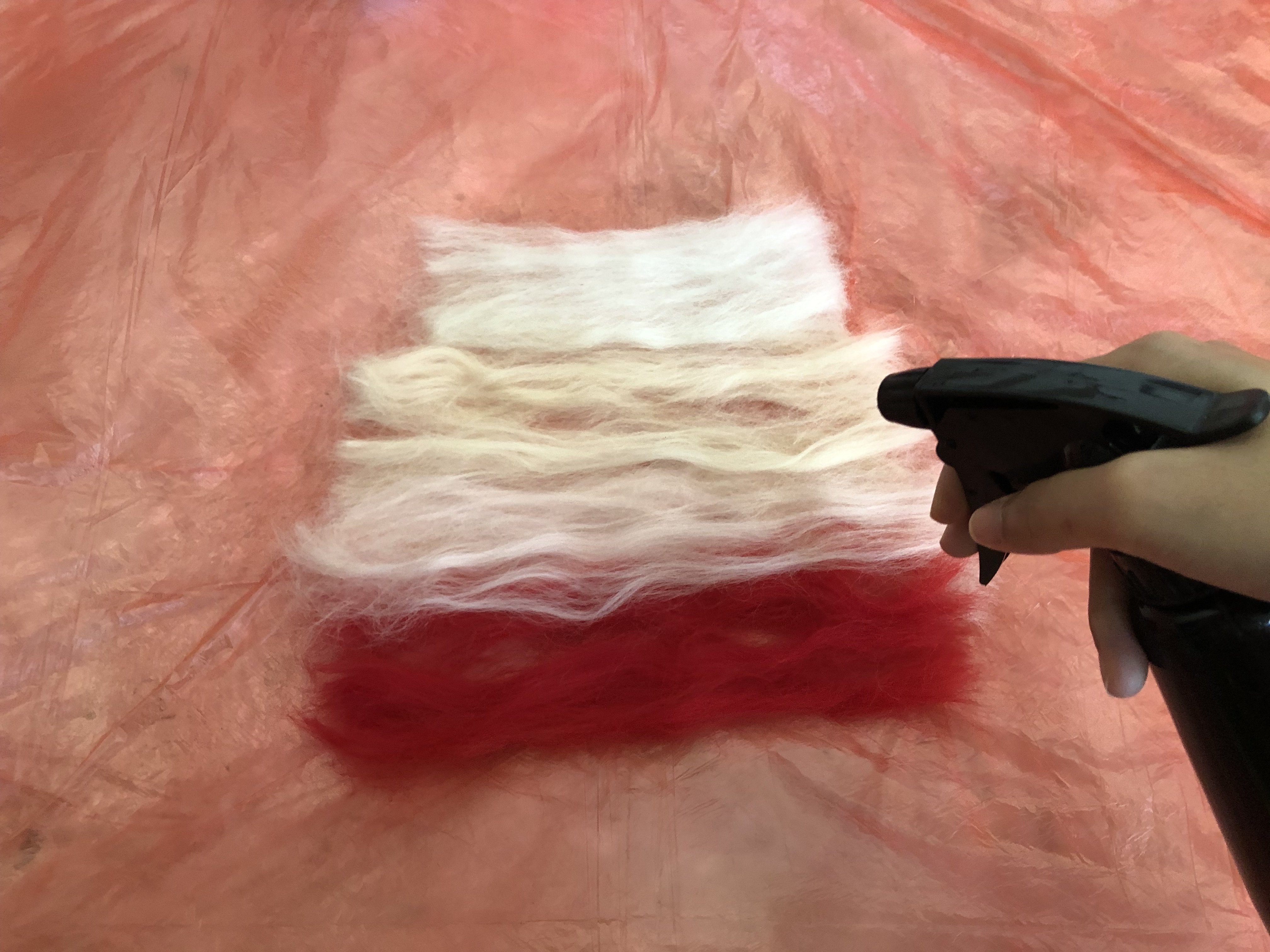
03 Spray the solution of water+soap onto your felt
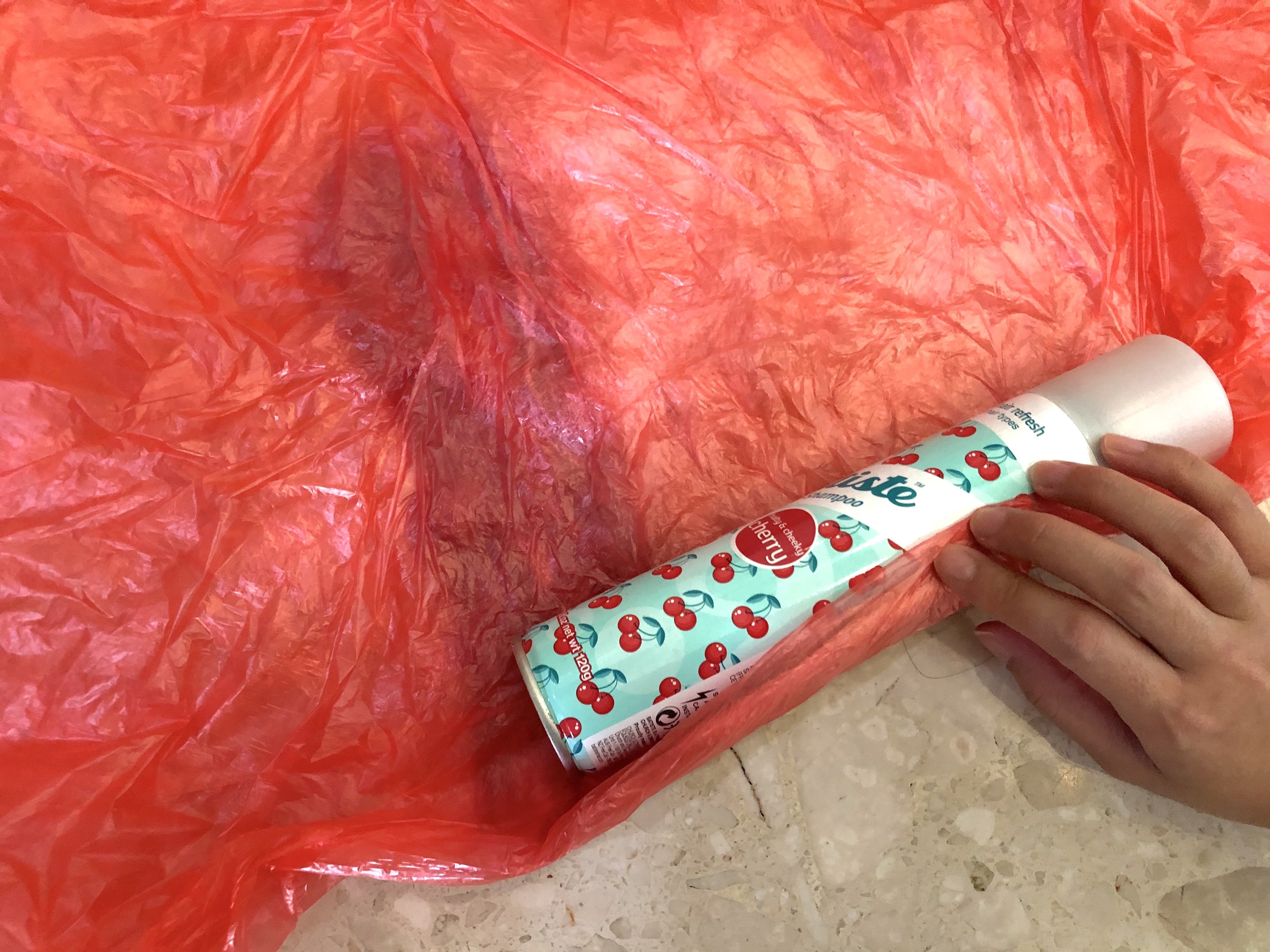
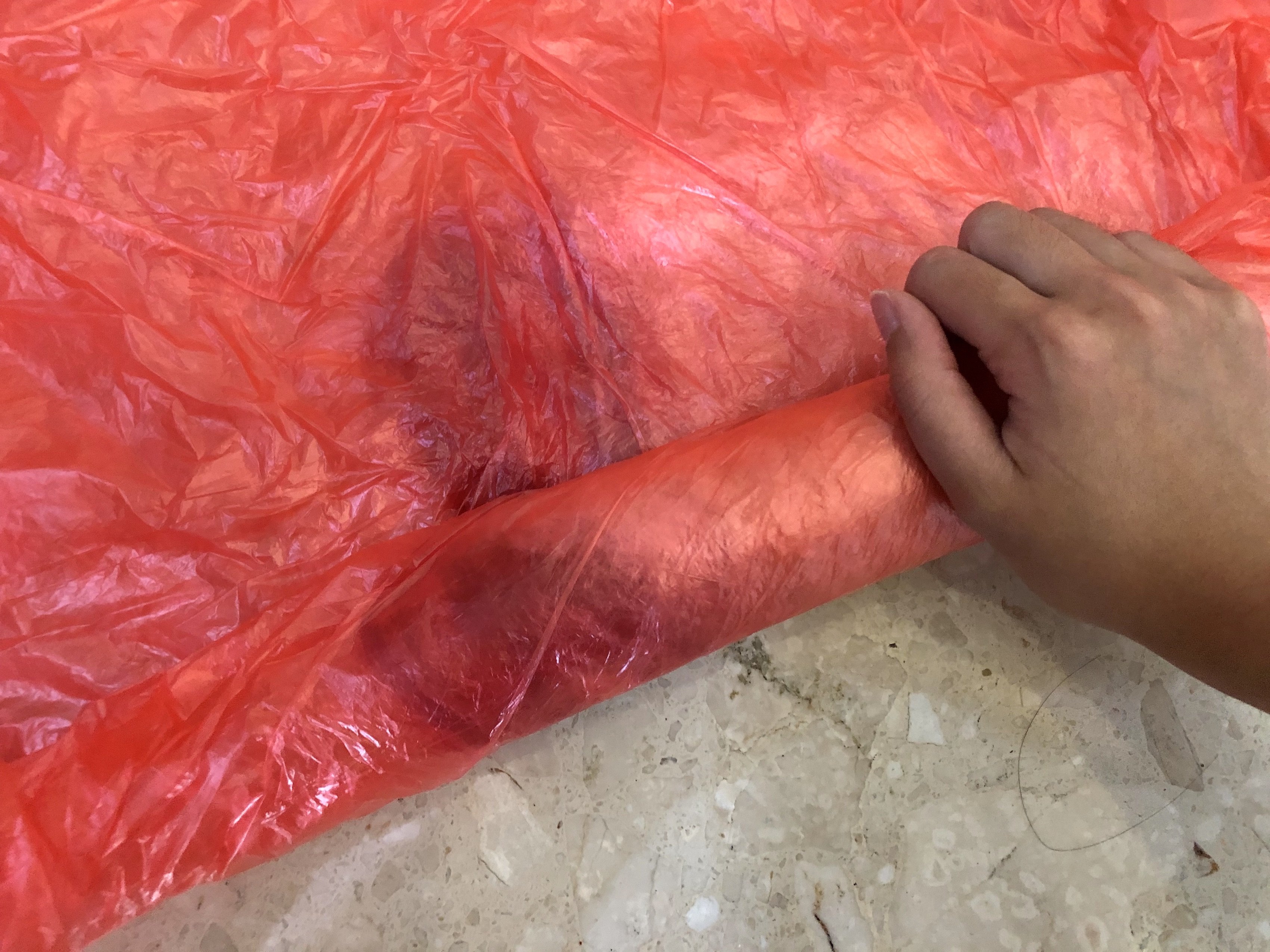
04 Overlay the other end of your plastic onto the felt. Start rubbing the felt so as to intertwine the felt weaves together
05 Use a rolling pin and roll the felt to tighten it even more

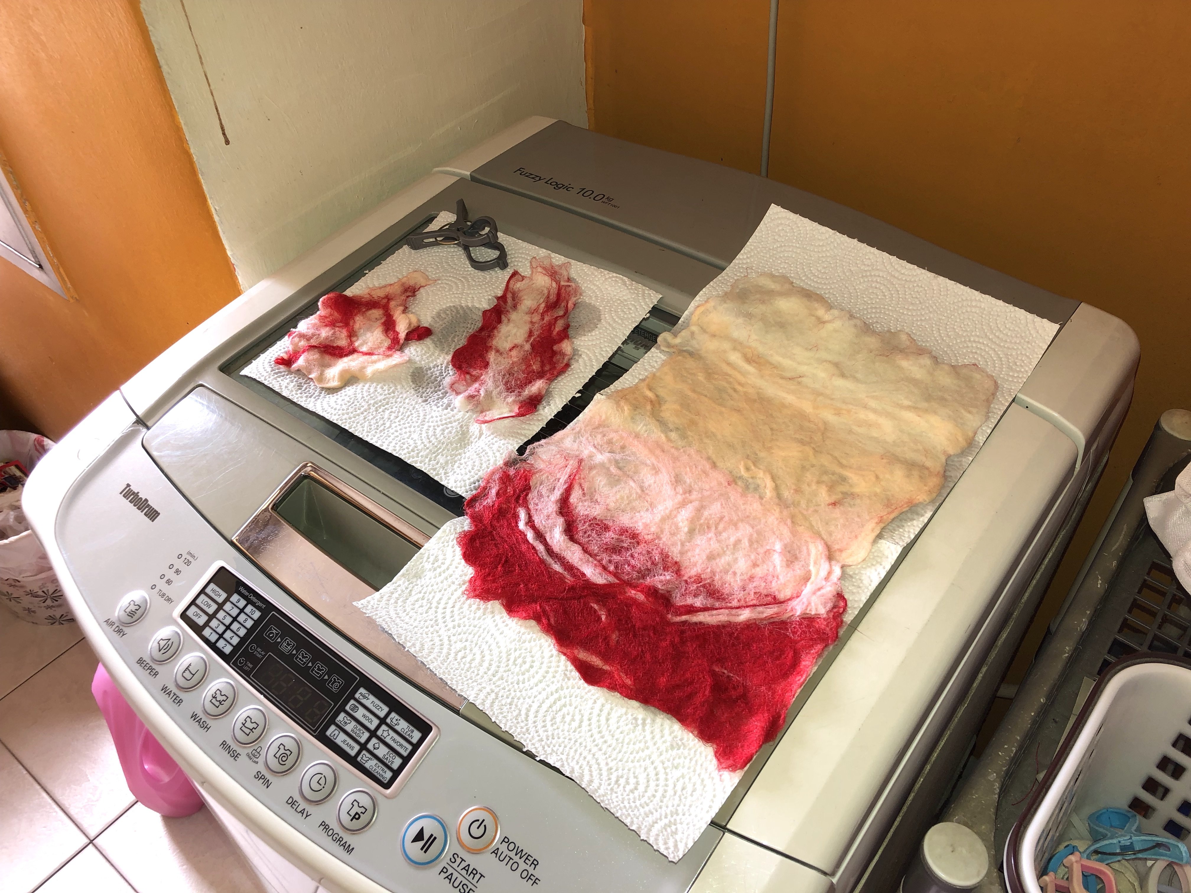
Leaving them to dry before taking a picture of the final product!

(so i got some mixed comments from my dad saying that the mini ones resemble something gross… lets just leave it here for you guys to think alright hahaha)

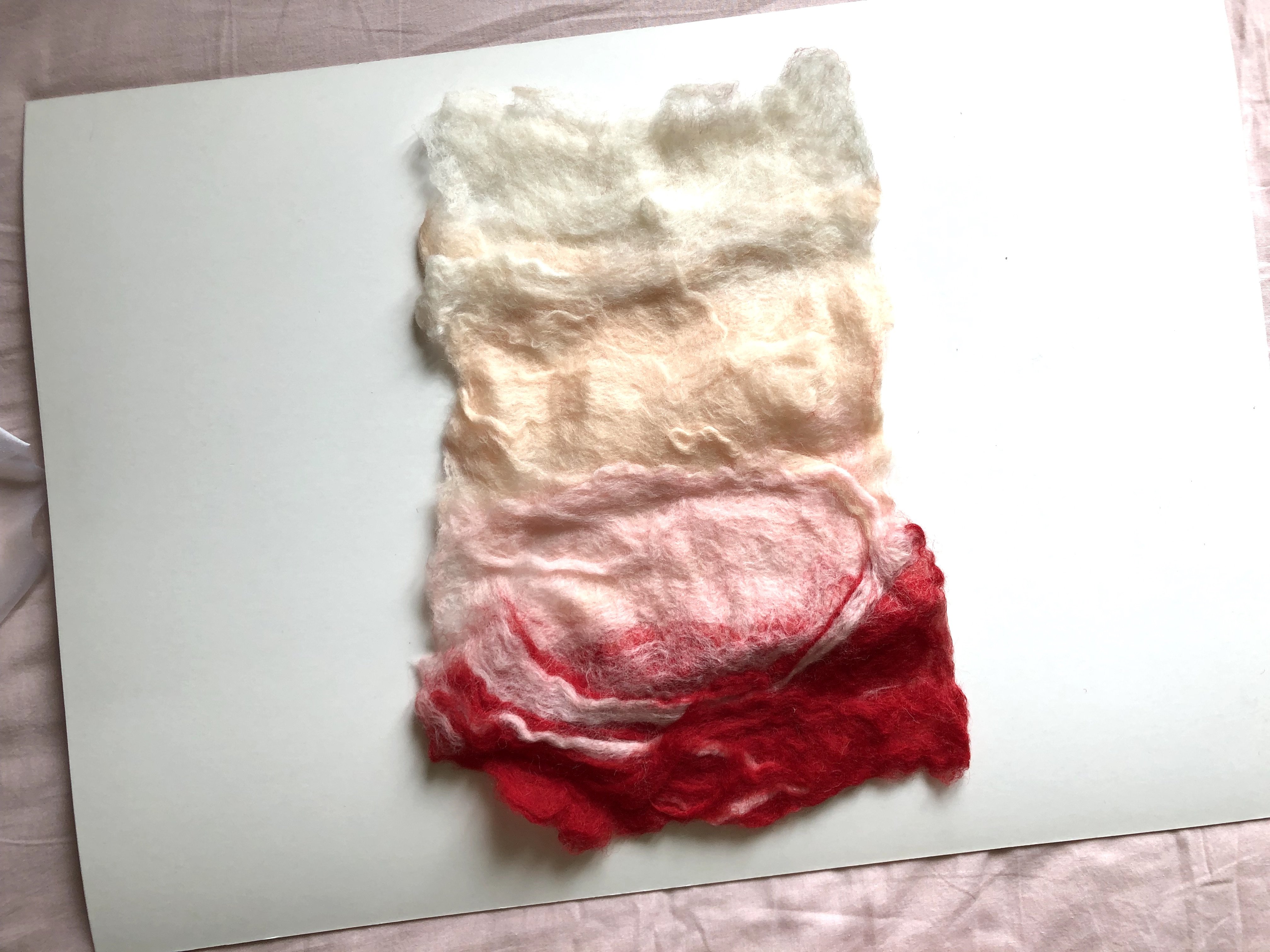
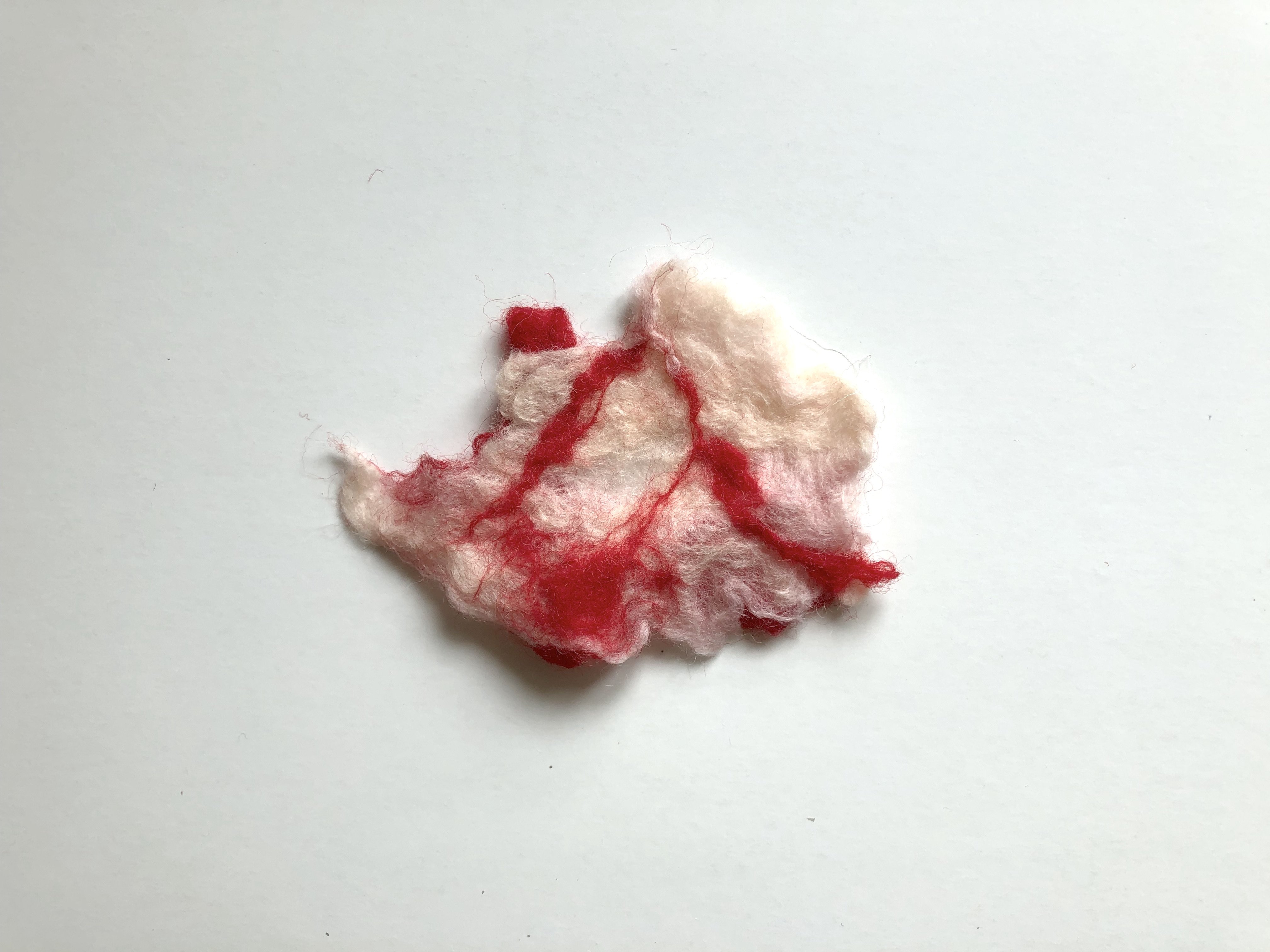
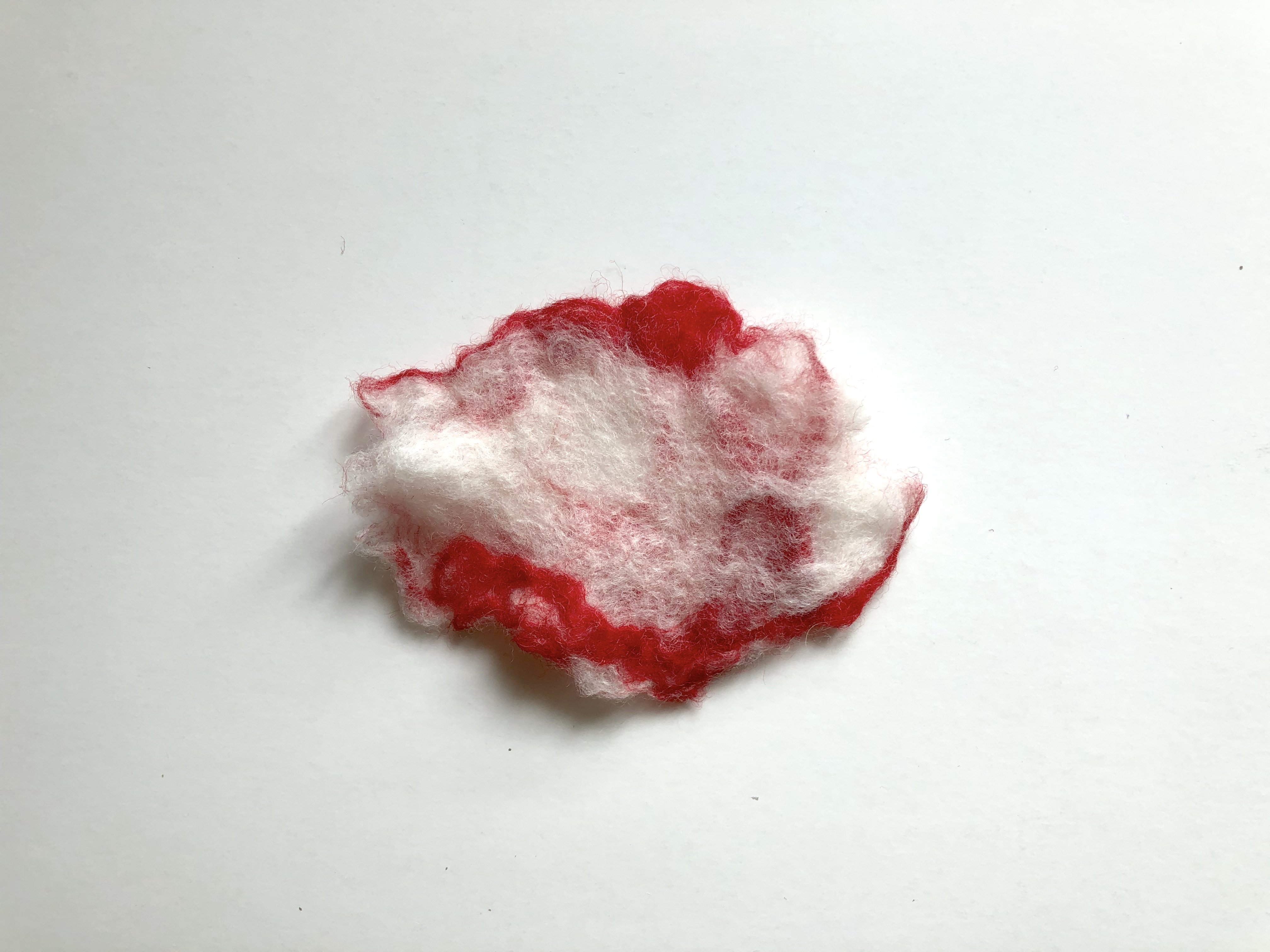
Overall, the making of wet felting is so different from needle felting. And of course, the achieved texture and results are so different as well. It’s interesting how one material such as felt could be made into various outcomes and products simply by differing the techniques used. In addition, what it’s amazing how we can control the density of the felt simply by rubbing them together. Felt, such a soft material could eventually become something tough and dense. That’s really cool! 


A P P L I Q U É

 Originates from the Latin applicō “I apply” and subsequently from the French appliquer “attach”

Appliqué is ornamental needlework in which pieces of fabric in different shapes and patterns are sewn or stuck onto a larger piece to form a picture or pattern. It is commonly used as decoration, especially on garments. The technique is accomplished either by hand or machine. Appliqué is commonly practised with textiles, but the term may be applied to similar techniques used on different materials. In the context of ceramics, for example, an appliqué is a separate piece of clay added to the primary work, generally for the purpose of decoration.

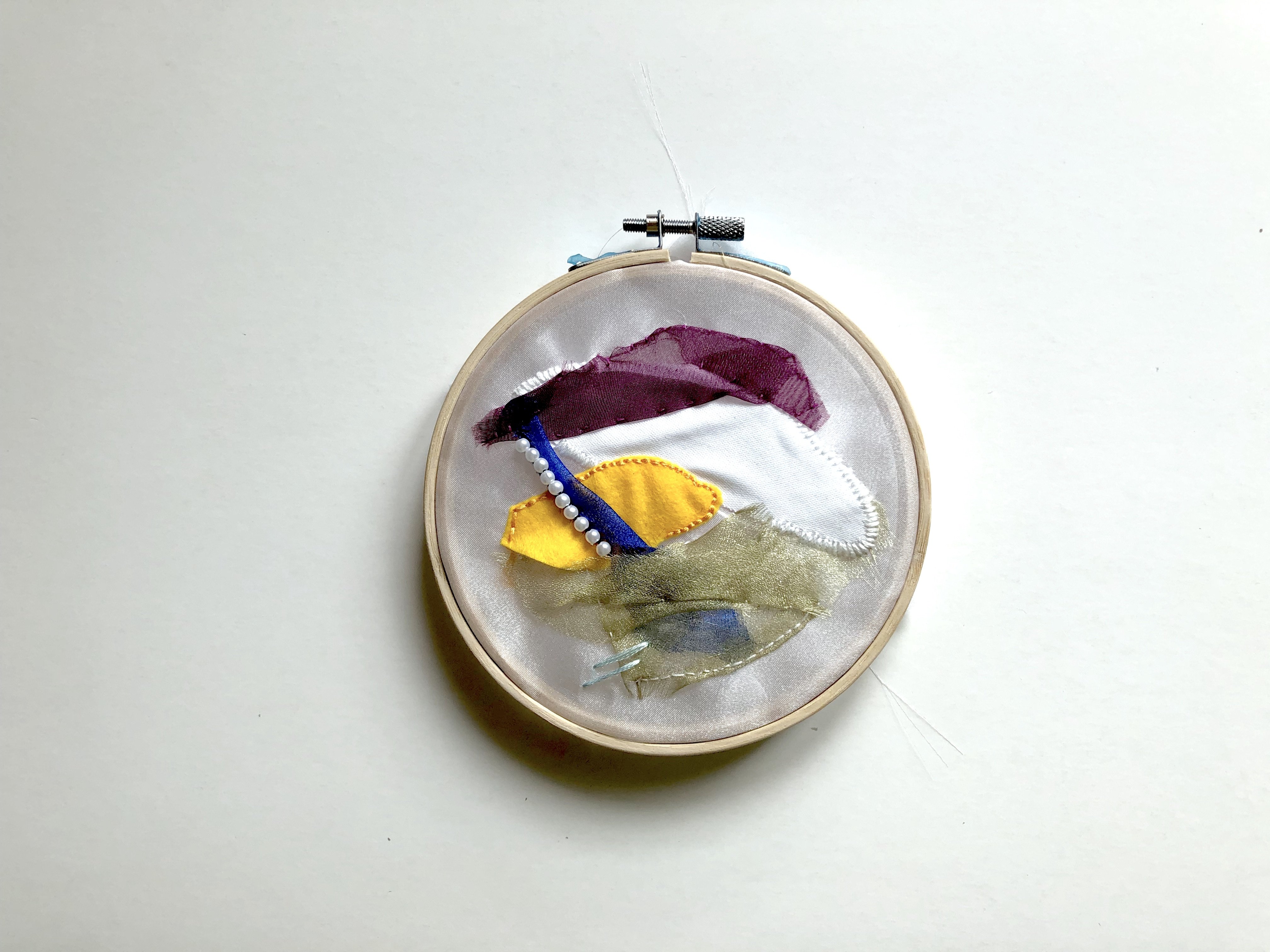
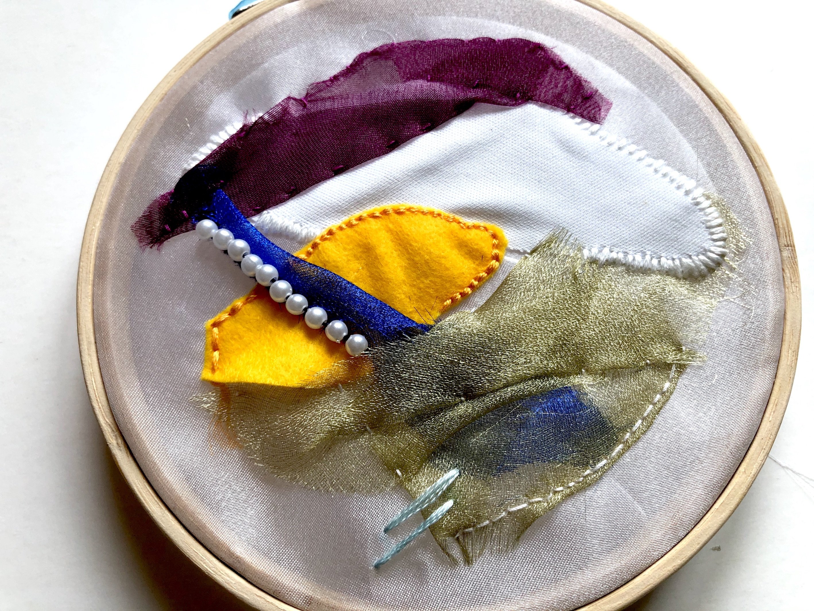
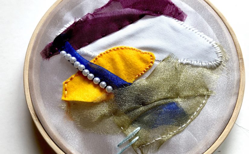
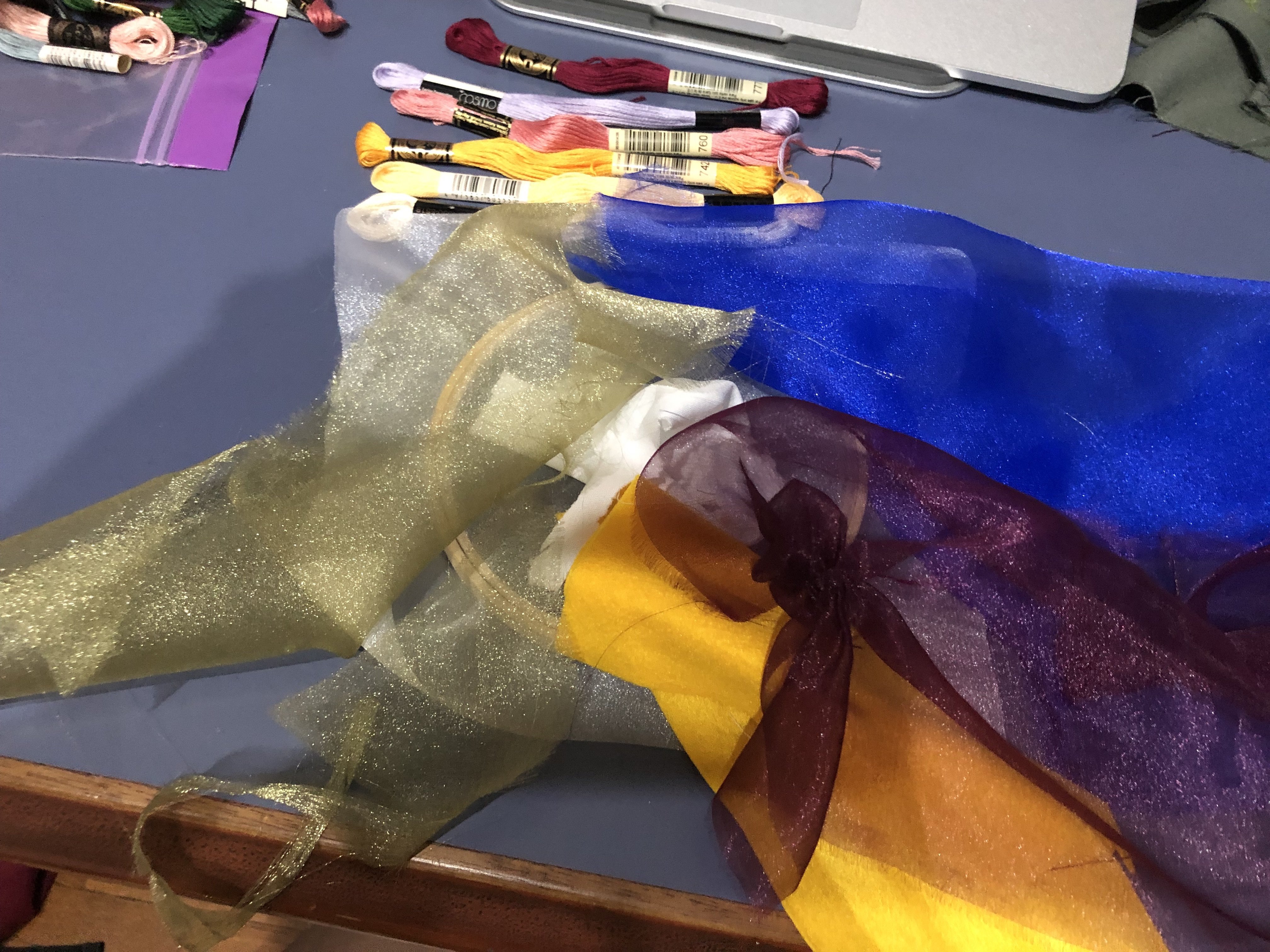
Basically, applique reminds me of those blankets that grandma used to make. Attaching various fabrics together and creating a blanket which looks like a collage of different images and patterns. I was quite stressed as I kept thinking that’s how applique is supposed to be, simply by attaching various fabrics together. Then I was thinking… how do I make it pretty? Hahaha. And then it crossed my mind, why don’t I mix embroidery with applique? That works as well right? As I’ve embroidered before for my past projects, I had tons of threads and thought that it would be really cool and pretty if I were to combine both. 

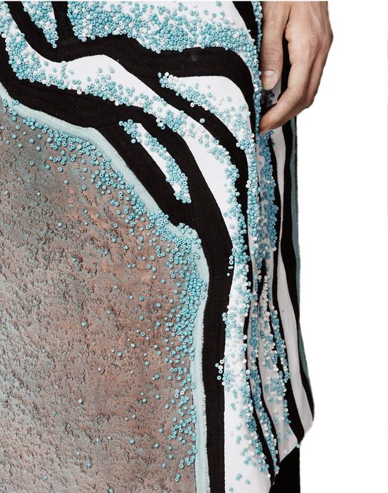
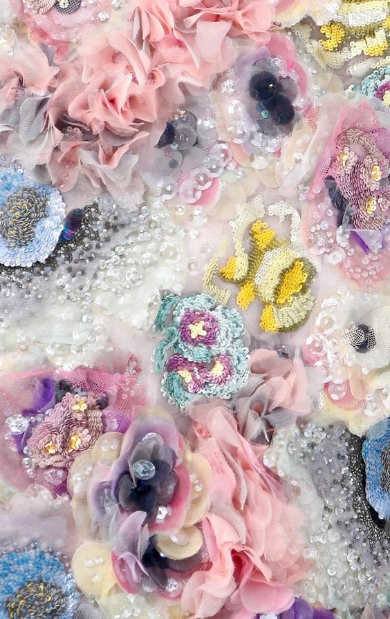
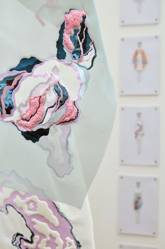
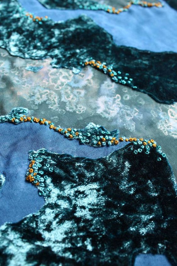
I was then inspired by garments that uses beadings and appliques, here are some examples.

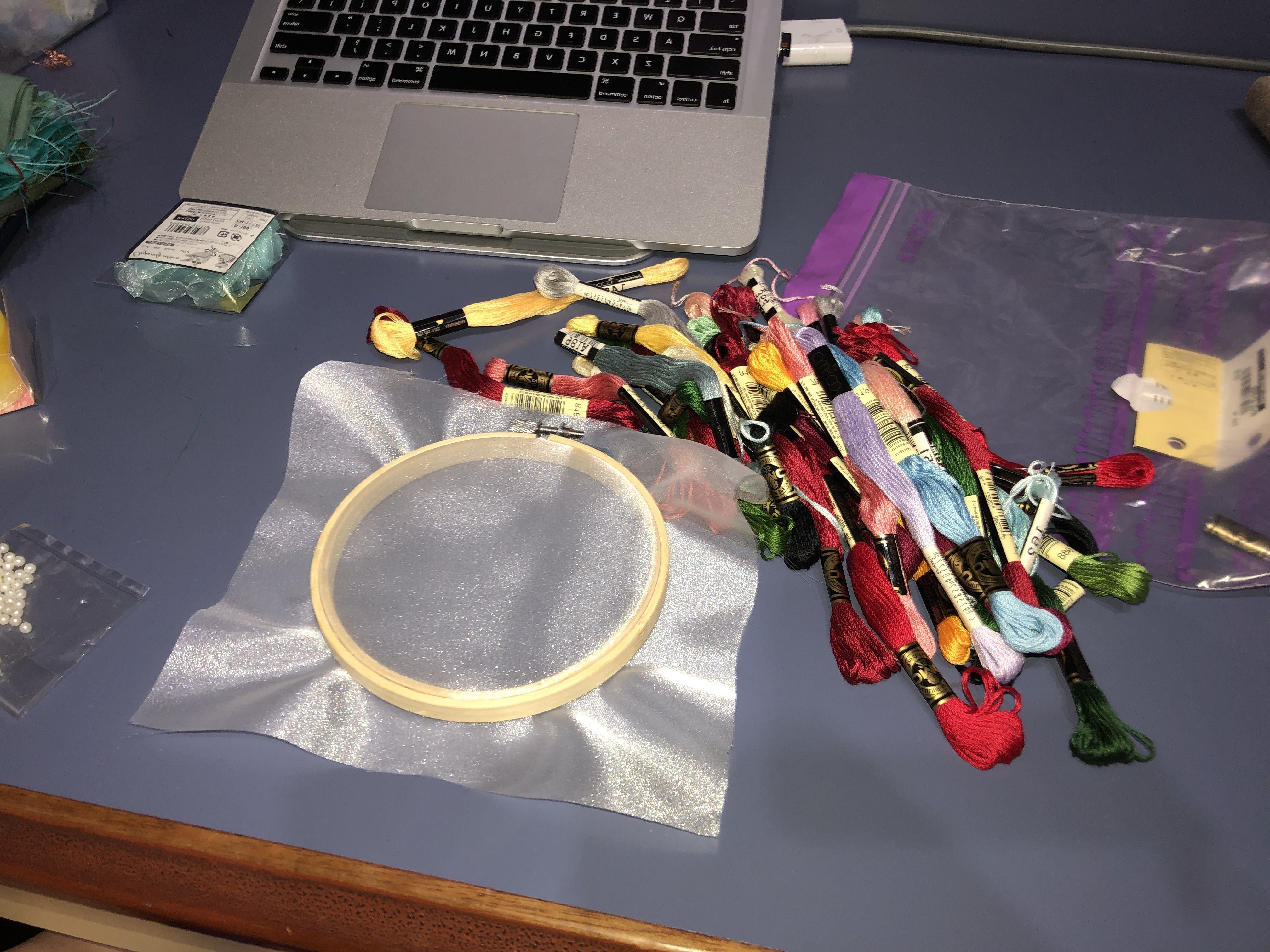
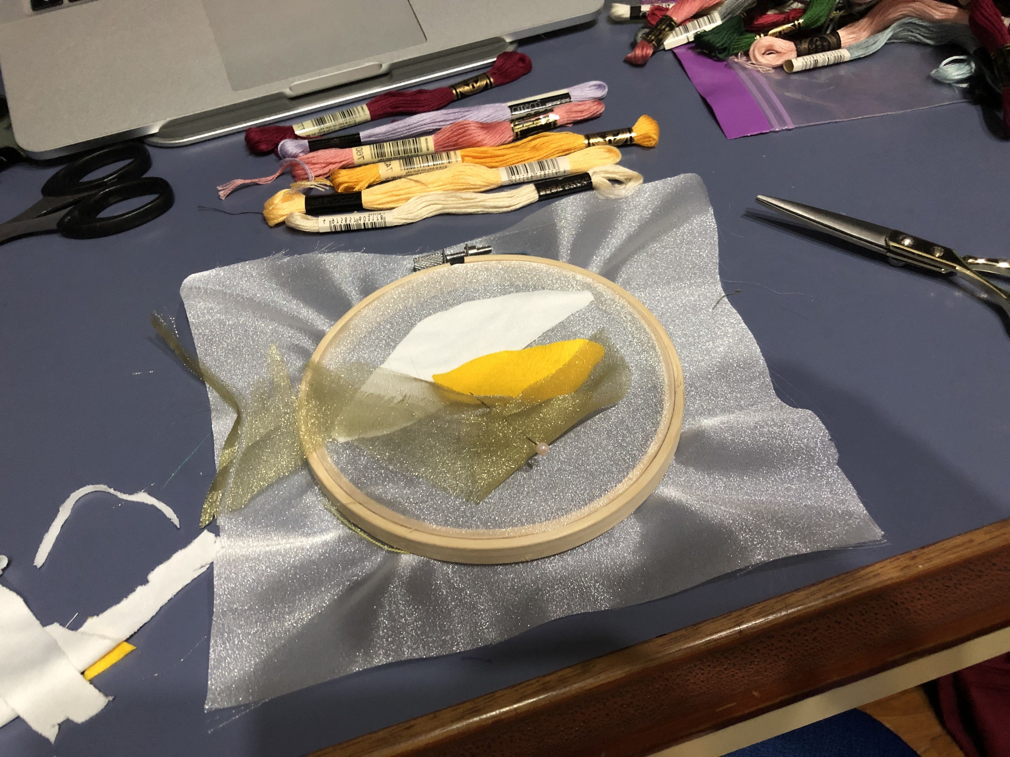
Laying out how I wanted my assemble to look like and pinning them in place before I start sewing!

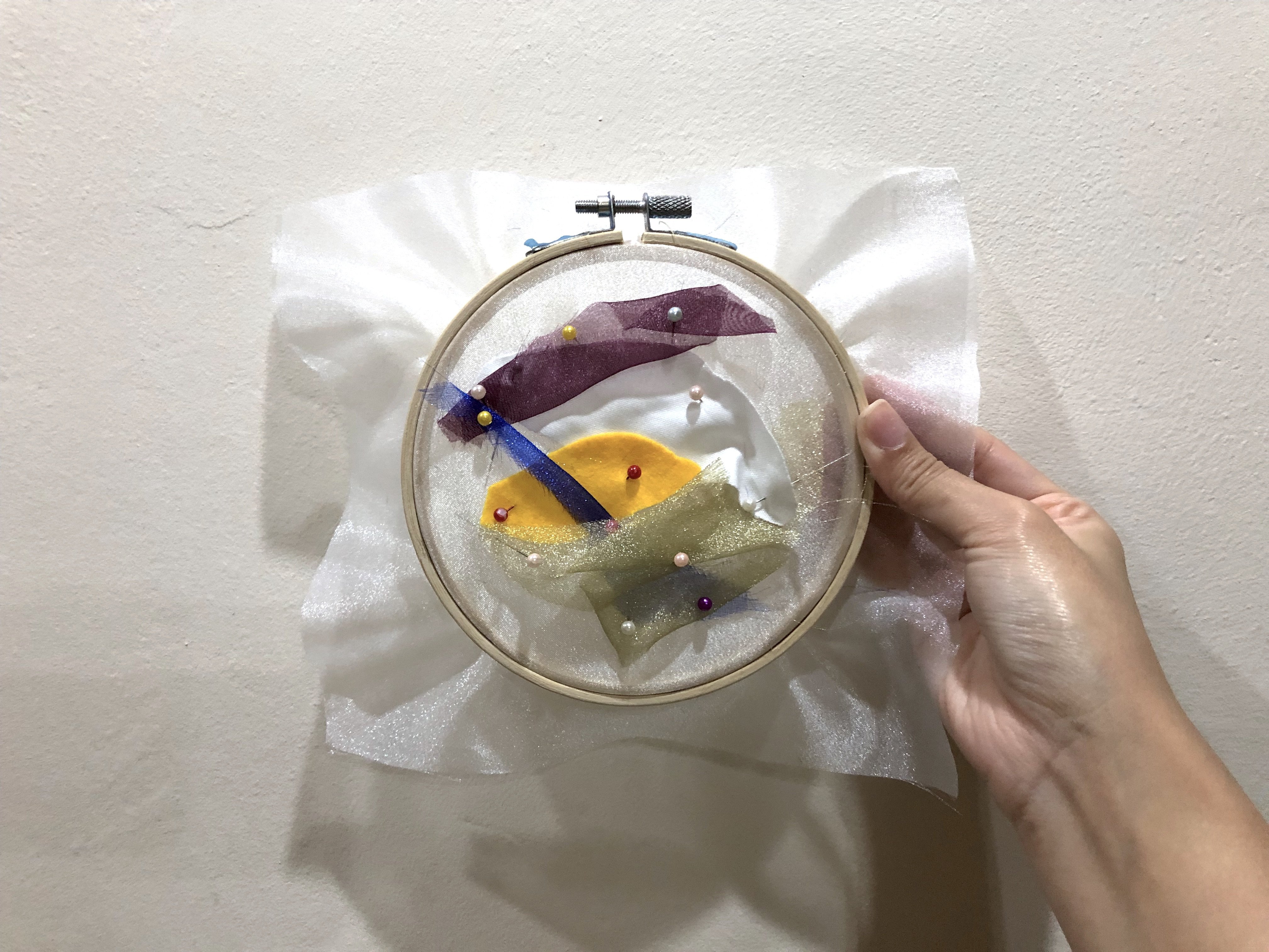
Thought it would be cute if I were to add some white pearls that I had in hand.

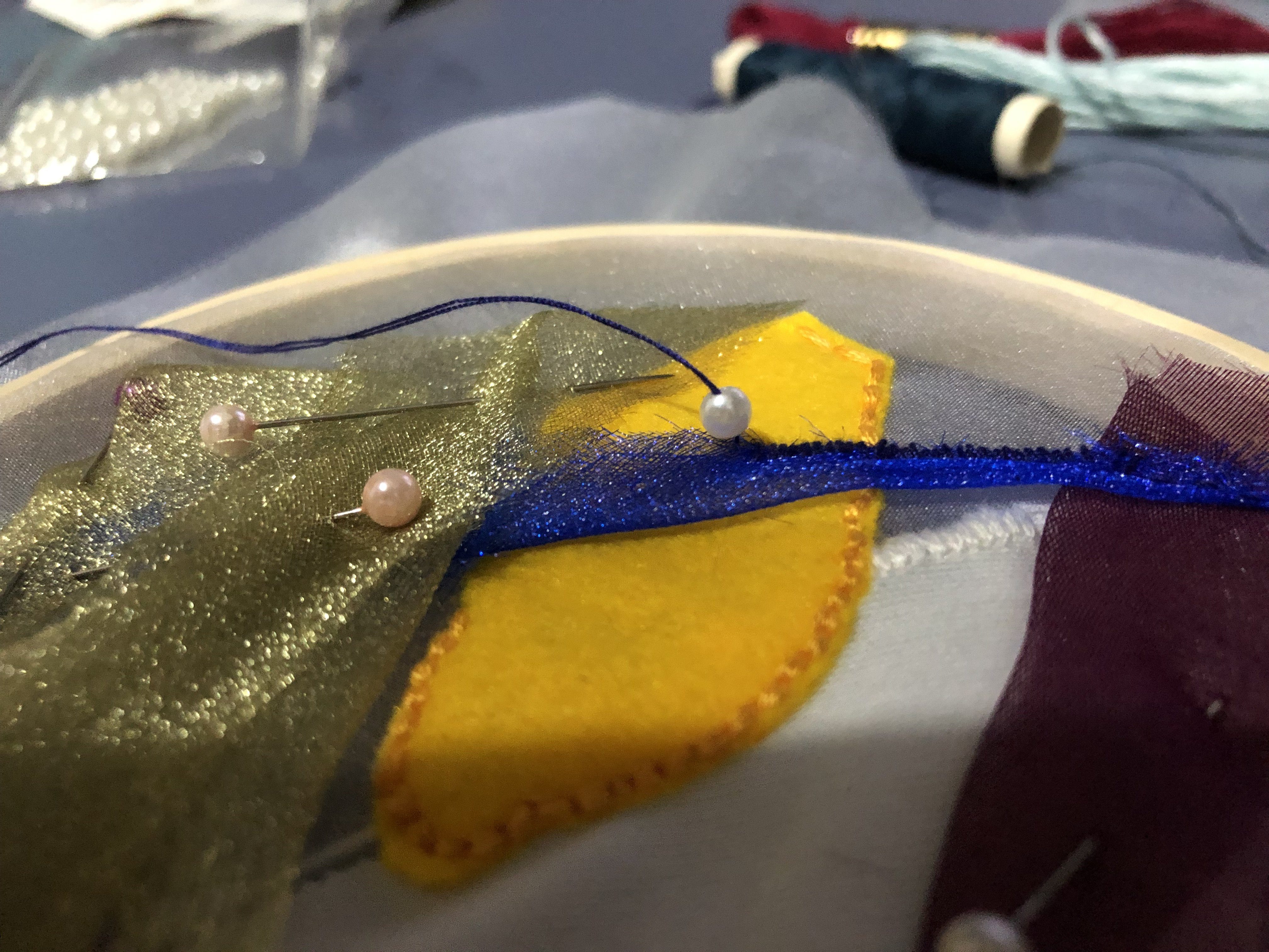
And tadah! Here is the final product of my applique + embroidery. I’m very happy with the outcome but I felt I could add more embroidery details and it would be really pretty if I had some sequins that I could add onto it. Between applique and felting, I definitely enjoyed applique more as I get to try out with different textures and materials. However, felting is still really cool as a simple material like felt could achieve various textures. I’m so glad to be able to try out such techniques that I’m sure would be applicable to me in the future. 

03 Unconventional Fabric using Threads

U N C O N V E N T I O N A L  F A B R I C
Materials: Threads, Water soluble stabiliser, Sewing machine

We will start of the post with an example demonstrated by Galina. I was really surprised by the water soluble “fabric” as it became sticky after it’s dissolved in water. It kinda make sense as it works like a glue to stick the threads together, and it’s amazing how this thin sheet of paper could hold the shape of the mould. 

So now, it’s my turn! And here are the steps that I’ve remembered from the previous class.

 U N C O N V E N T I O N A L  T H R E A D S  T E C H N I Q U E

  • For this technique, you will need: Water soluble stabiliser, threads and a sewing machine.
  • First, lay your threads in between the water soluble stabiliser. Note that your threads need to overlay on one another so that it does not loosen when it’s fixed.
  • Layer as many colours / threads till your desired pattern has been achieved.
  • Place the other end of the water soluble stabiliser over the threads that you’ve made.
  • Pin them together. Make sure that you have pinned your threads as well, hold them in place.
  • Start sewing over the water soluble + threads that you’ve made.
  • Rather than using one consistent colour throughout, I wanted to remain the gradient aesthetic. Thus, I kept switching out the threads to match the colour on each layer, in order to enhance the effect.
  • Make sure that you have sewn over the threads, or else you might risk them loosening.
  • Prepare a bowl of water.
  • Soak the water soluble + threads into the water. The longer you soak it, more of the water soluble stabiliser will be dissolved.
  • Place your washed product onto any mould that you prefer. For me, I wanted to make a little vase so I chose a hairspray of my which has the perfect shape that I wanted.
  • Lay your wet fabric over the mould. You’re done! Now, simply wait for it to dry. 

Tadah! This is my final product. I am very happy with the results, as the colours came out just as I hoped.  I used the same colour scheme as my plastic fusing technique as I wanted to mimic the sky at dusk. Overall, this technique is quite tedious as I had quite a difficult time sewing the threads together, in fear that they would shift while I sew. I am glad it all came out well! This was a fun and interesting technique nonetheless. 


02 Plastic Fusing

P L A S T I C  F U S I N G 
Materials: Wax Paper, Iron, Plastics

 P L A S T I C  F U S I N G  T E C H N I Q U E

  • Choose pieces of plastics that you would like to fuse
  • Place plastics in-between wax paper
  • Start ironing until you’ve reach your desired fusion results.

Trial 01 – Fairprice Mini Bag

At every asian household… you would definitely have loads of plastic bags chuck at the corner of your house. *thanks mom* So, it seems that I only have Fairprice plastic bags and I guess the colour theme that I’m going with would be White, Red and Blue for now?

I was really excited to try the fusing of plastic as I’ve never really done it with an iron before. Previously I had some experience playing with acrylics only, with a hot air gun. And this iron technique gave me quite an unexpected result!

And tadah! The red little handle was actually from the Kopi that I had in the morning. Guess it came in handy eh? It was interesting how the plastic wrinkles as it stays under the heat for longer. And honestly, I was quite taken aback when it started to shrink! I really had no idea the plastic would shrink that much under heat, and it made me realise that I’ve to be more alert while ironing so that my plastics wouldn’t turn into a dried prune hahaha. 


Trial 02 –  Ink Bag 

For this bag, I knew I wanted to make something circular. I tried to do some mix media by drawing some lines on the plastic with permanent marker to see if the heat would melt the ink or something unexpected would happen. I guess the results shows that it didn’t turn out as I expected it to be hmmm. Now it’s just some wrinkly circle bag!

I realise that the thickness of your plastic plays a huge part in the shrinking process. If the plastic is thicker, it doesn’t shrink as much compared to thinner plastics. *we learn new things everyday*


Trial 03 –  Four Leaves & Fairprice Collab

Since I brought a super huge Four Leaves plastic bag… why not try and fuse it to see where it goes? And here I present you, the collaboration between Fairprice and Four Leaves! Alright alright, the part before ironing is always the toughest as I’ve to try to make sure both of the plastic stays together which is really difficult. I tried various methods of folding to make sure it logo and the shape stays exactly where I wanted it to be before ironing. 

And tadah! Ok this is another discovery. Apparently the baking paper has to be changed quite often as some of the ink from the previous plastic has stained the wax paper itself, thus leaving some ink residue on my plastics. *note to self* And the bag didn’t turn out as adorable as I thought it was gonna be like. Though, the branding on both sides are on point! Haha. I tried, I tried. Next, I’m really excited to try some beautiful cellophane papers! I’m sure the colours would look great. 


I finally went to get my cellophane paper and was so excited to try it out!

I knew the colour scheme I wanted to go for, which is Dusk – the colours of twilight and sunset. I tried to mimic the colours of it by buying similar cellophane paper colours. Keyword… I tried. But it’s close enough I guess? 

Maybe the colours I chose seemed closer to this photo instead… Anyhow, here we go! Oh and I had no idea cellophane papers were so expensive!? It’s like $2.20 per roll, damn I thought it was cheaper. 

Again, the tricky part was trying to make sure the cellophane were flat so I could iron it nicely. They just kept rolling! And again, the results weren’t what I expected them to be. I wonder, why they didn’t shrink as much compared to the Fairprice plastic bags? Is it the heat? It can’t be the thickness as this papers are much thinner than the fairprice plastic bags. Or is it because, it has lesser plastic percentage in it? Hmmmm. But yes, I wanted them to blend well together but I just seemed choppy. I guess one way to make it more smooth was to tear the cellophane buy hand, so it doesn’t have precise cut ends which accentuates the borders. And here are some of my test pieces!

Sorry you might be a little giddy as I’ve to flip the image upside down so that it resembles the sky gradient even more. I didn’t realise that I’ve been looking at it the wrong way the entire time haha, now wonder it doesn’t look like how I envisioned it to be. Now it looks better when it’s flipped!

Test 01
This piece was had a transparent plastic as backing, and it’s cut nicely with a pair of scissors. My first ever Dusk that I tried to captured, it’s the most wrinkly and has the most obvious edges.

Test 02
Still, cellophane paper are cut nicely with scissors. This was ironed against white plastic as backing which I thought would give more vibrancy to the colours as it’s against a white background. And yes, I guess it kinda did? I used more cellophane paper to overlay it, in hopes that it will start ‘blending’. Now it just reminds me of the agar agar jelly that I used to it sigh. 

Test 03
My favourite piece of all! Finally I decided to forgo my scissors for this and started tearing the cellophane paper with my hands. And guess what! It sort of gave a smoother flow as the cut is not as precised compared to the others. This is just one layer of cellophane paper, layered against each other without any backings. Oh and I feel that this piece resembles a silhouette of a mountain! Does it? Please tell me it does haha. 

Test 04
I really liked how the torn edges worked out, so I forgo the scissors again. I placed about 2 layers for the lighter colours, which were the yellow and magenta. And guess what! It turned the magenta into orange. I guessed I’ve accidentally overlayed too much on the magenta. Folded the edges at the side because I wanted the end product to look neater, was contemplating if I should cut it into a square?

I’m gonna bring my cellophane papers and try it with a hot air gun when I’m in school. It could probably give me the blended, warp-y, desired effects that I wanted!


/ Update! *

I’m back again! And I’ve finally tried to fuse the plastics together with a hot air gun. The results are so much better as the plastic literally fuses with one another, unlike when it’s ironed, it’s just layers together. As you can see, I really tried to create a wavy texture, hopefully it could mimic the wispy clouds in the sky. 

Overall, I definitely prefer the effects made by a hot air gun as it’s much more natural. But for the cellophane, I can’t simply use hot air to melt it directly as the cellophane paper will separate from one another. I would have to iron first, to stick them together – then use hot air gun to fuse them together. 

Plastic fusing is a really cool technique as I’m able to achieve various effects simply by using different tools such as an iron or a hot airgun 🙂 I’m interested to see how this technique will help me in the making of my final project!

01 Transfer Printing

Transfer Printing Technique

Transfer Printing is the transference of an image to fabric or other materials via a substrate. The image is transferred via heat and pressure. Due to the dyes in the substrate – sublime, it creates an imprint. This technique is thus known as sublimation printing. 

Three types of transfer printing:
Dry transfer, 
wet transfer and digital transfer


D R Y   T R A N S F E R
Materials: Fabric Crayons, Paper, Wax Paper, Fabric & Iron

D R Y   T R A N S F E R   T E C H N I Q U E

  • Use fabric crayons to create your artwork on normal copy paper. You may illustrate or etch it over some patterns and textures.
  • Once your illustration is complete, place a piece of fabric (preferably cotton, silk or polyester) on the coloured side of the paper. 
  • Heat up your iron, make sure it’s heated in the fabric setting.
  • Place a piece of wax paper in between the iron and your fabric to prevent from burning your artwork.
  • Slowly iron your artwork and apply pressure occasionally. The heat will cause the ink to transfer onto the fabric. 
  • Once you’ve ironed it thoroughly, check if print is transferred by lifting the corner of the fabric. 
  • If the colours transferred is up to your satisfaction, you may stop ironing. Otherwise, continue ironing until you’ve reach your desired results.
  • Do note that the more prints you make, the more diluted the original crayon ink will be due to the transfers. 

Original Crayon Prints

Transfer Printing of the Crayon Prints

What I realise:
My crayon transfer printings turned out a little light. I believe it might have been the choice of my colours and the amount of pressure applied when colouring. I believe the transfer printing will fare better if I have applied more pressure or used darker colours in the colouring stage. However, heat and pressure could also be a factor. It might be due to the lack of time or when insufficient pressure is not applied when ironing. Next time, I would colour it darker and apply more pressure! Overall, this was a fun exercise as it has been soooo long since I touched crayons.

*update* Now i understood why my crayon transfers were so light! The cloth is supposed to be at the bottom, and the crayon paper on top that has to be ironed directly. 


W E T   T R A N S F E R
Materials: Fabric Paint, Paper, Wax Paper, Fabric & Iron

WET   T R A N S F E R   T E C H N I Q U E

  • Use fabric paint to create your artwork on normal copy paper. 
  • Once your illustration is complete, place your fabric first, followed by the painted fabric on top of it.
  • Heat up your iron, make sure it’s heated in the fabric setting.
  • Place a piece of wax paper in between the iron and your fabric to prevent from burning your artwork.
  • Slowly iron your artwork and apply pressure occasionally. The heat will cause the ink to transfer onto the fabric. 
  • Once you’ve ironed it thoroughly, check if print is transferred by lifting the corner of the fabric. 
  • If the colours transferred is up to your satisfaction, you may stop ironing. Otherwise, continue ironing until you’ve reach your desired results.


F I N A L  W E T   T R A N S F E R


What I realise: 
I didn’t expect for the colours to turn out brighter than the original painting! The colour that surprised me the most was green. As you can see, the original colour was more of a dark green but after being transferred, it turned out to be bright green! Amazing isn’t it? And previously for my crayon dry transfers, I was wondering why my colours are not saturated enough. What I did wrong was the order of placement of my papers. The right order should be, fabric > paper > wax paper > iron. But previously I did paper > fabric, no wonder the colour weren’t transferred thoroughly! We learn new things everyday :’)

Personally I prefer the wet transfers over the dry ones. It would be the vibrancy of the colours and the usage of medium. What I love about the paint is that, even tiny details like the brush strokes could be transferred over! How cool is that!? Sadly, I’ve yet to try the heat press on the rest of my prints, but I will definitely try it and continue to update this space of mine. I am very excited for the heat press as I saw my classmate’s works and how it transfers literally EVERYTHING. So see you soon little space!!