Hey guys,
Here’s my submission pieces for my 18 emotions! To find out how I managed to achieve this pieces, click here .
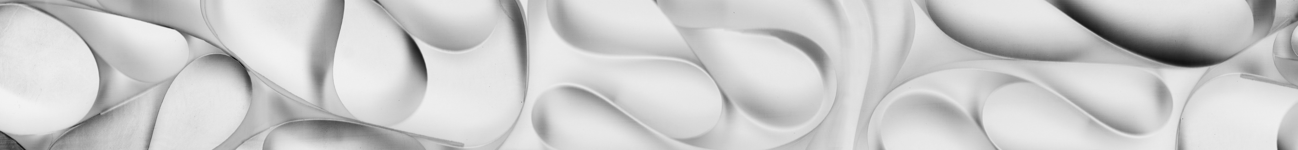
love ; /lʌv/
(n.) the most spectacular,indescribable, deep euphoric feeling for someone
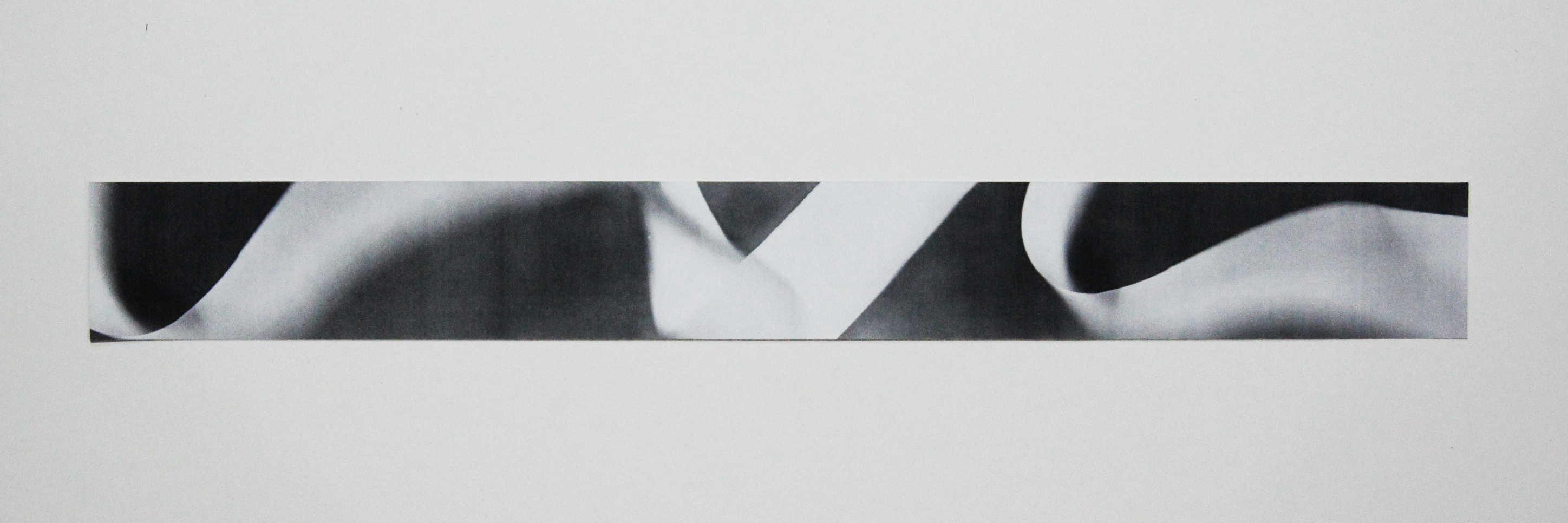
To me, love is something that I can’t really decipher. Love… has different stages, it can be passionate at times, gentle, or even unpredictable. Among all the emotions I felt while thinking about Love, the gentleness and calming feeling stood out the most and it reminded me the depth of the deep blue sea. Love is not just the surface, it slowly seeps deep inside you. Love is not simple, it’s a complex emotion as it brings you onto a journey where there are many turns and twists which often may lead to an unexpected outcome. You can’t really control Love, it controls you.
In order to capture the gentleness of Love, I decided to make use of flowy curves to show the softness and that resembles a ribbon.
Method:
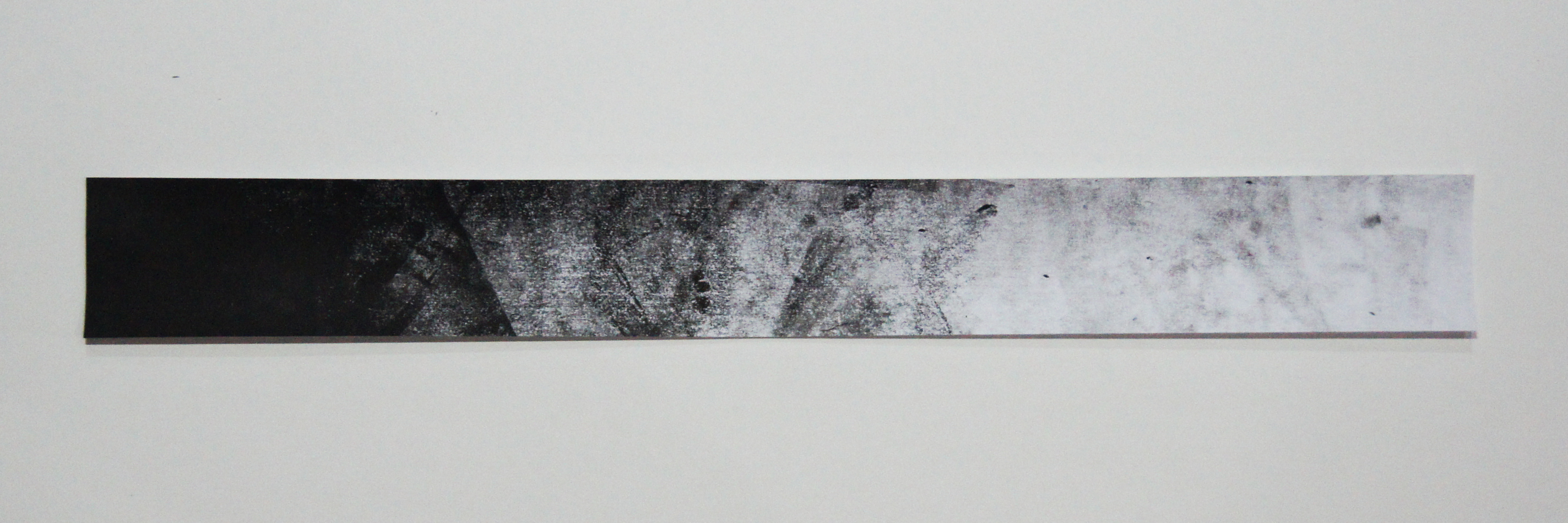
I chose tracing paper as my medium as its has a soft touch due to the opacity of the paper and I feel that it really expresses the softness & gentleness I felt. My initial idea was to do a slight 3D pop up for this piece but I came across difficulties in trying to stick the paper upright as it’s really thin and flimsy. Hence, I tried a new Scanography method which turned out really cool! Basically, I made my artwork in a rectangular box and simply placed it upright onto the open scanner. I fell in LOVE with the method after I saw the outcome. The light from the scanner gave slight shadows to the tracing paper, which then shows the “depth” I wanted as Love is not just touch the surface, it slowly seeps into you.
sensual ; /sɛnsjʊəl,-ʃʊəl/
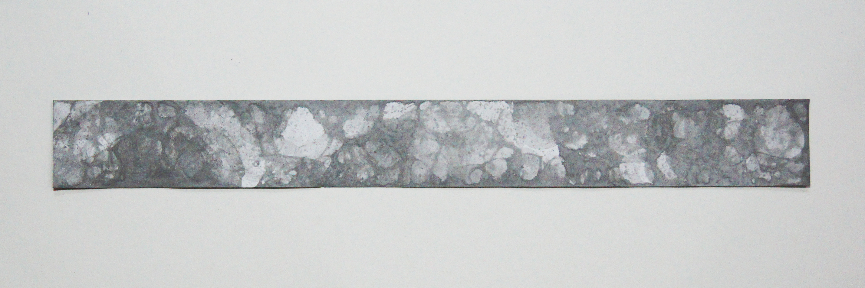
(adj.) arousing gratification of the senses and physical, especially sexual, pleasure
It’s something mysterious, gentle, soft like silk and can be fierce at times. It reminds me of soft, smoky, undefined curvy lines that has different thickness to show the gradual increase of sexual tension or pleasure. It reminded me of the wind, which touches you slightly at different intensities.
Method:
I used a slice of onion and tried creating “waves”, the ink on the onion did not fully transfer onto the paper which I felt gave a mysterious flowy look to this piece, I’m quite happy with the effect as it managed to achieve the smoky look I wanted. This was quite difficult to make because I had to exert and lose control as some parts so that is looks natural and not forced.

lust ; /lʌst/
(n.) an emotion or feeling of intense desire in the body
“From lust to losing your mind”. Lust is a fierce, thirsty, hungry, wild and passionate emotion, that is sometimes uncontrollable but can be gentle at times. Lust makes your mind goes into turmoil, you can’t think as though you’re consumed with hunger.
I simply painted this by solely focusing on the feeling passion as that I how I define Lust. I’m quite happy with the outcome as I feel that this rectangular piece of paper contains so much intensity and passion that is so desperate to get out and it’s “eating me from the inside. “
Method:
I used harsh brush strokes to show the desire and intensity a person is feeling. It’s messy to show a state when your mind goes into turmoil as you’re so consumed with lust. There are different intensities in lust, it passionate yet gentle at times, hence I tried to show a gradual change in intensities by using a gradient.
ecstasy ; /’ɛkstəsi/
(n.) an intense or overwhelming feeling of great happiness or joyful excitement, an emotional or frenzy/trance-like state
Ecstasy suggests an intensification of emotion so powerful as to produce a trance like dissociation from all but the single overpowering feeling. It reminds me of pop art and psychedelic patterns.
Method:
For me, my happy shapes is more towards rounded than angular. Hence, I experimented with rubber bands by using mono-print and it turned out quite unexpected! The amount of pressure applied caused different outcomes of the white space. Ecstasy to me is something messy and fuzzy due to the trance-like state, but there are repeated patterns, it’s like seeing doubles. I feel that the print managed to achieve a fuzzy & repeated look to depict a Ecstasy and circles make me happy!
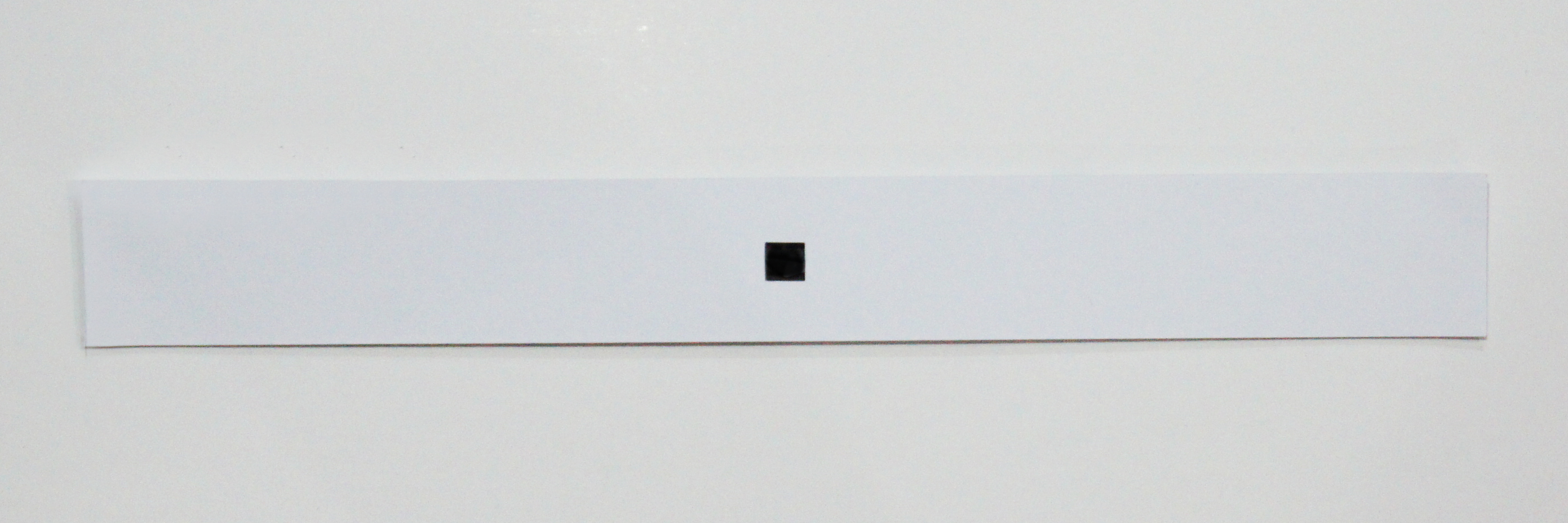
hope ; /həʊp/
(n.) a feeling of expectation and desire for a particular thing to happen
Hope is waiting for something to happen, a miracle. Hope makes me think of a window – an escape, a contrast with the rest of the space, finding something that is unexpected or impossible, like a needle in a haystack. No matter what situation you’re in, there will always be a solution or a way out.
Method:
I cut out a square in the middle of the paper to depict a “window” in the middle of nothingness, to show hope. I decided to leave the background white as I wanted the sole focus to be on the window, the white space also gives a “blank canvas” to the viewers as I did not want to control the situation, I wanted them to immerse themselves into this piece and visualise their own situation on it.
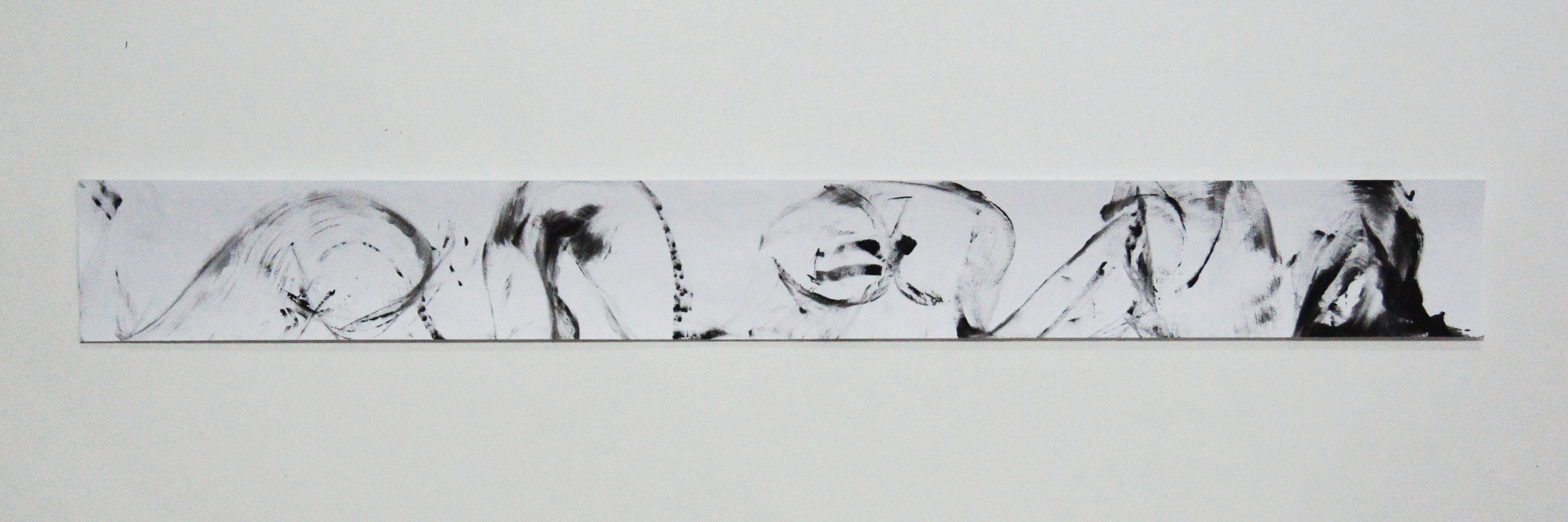
enthrallment ; /ĕn-thrôl′/
(n.) to captivate or charm someone and hold one’s attention.
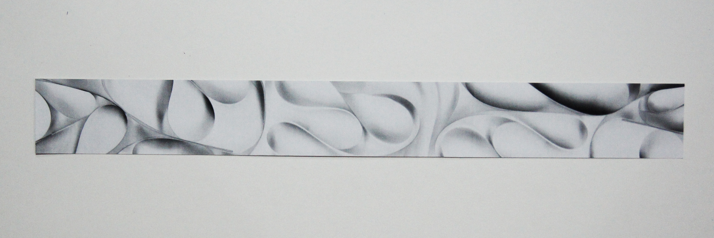
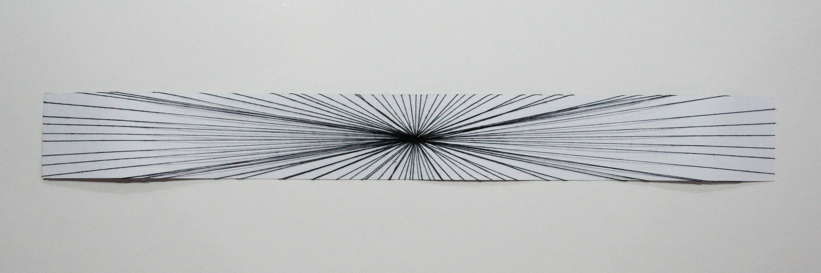
Enthrallment is to capture and hold one’s attention; to fascinate. Enthrallment makes me think graceful, soft and curvy lines that resembles a ballet dancer or a ribbon dance.
Method:
I decided to use the Scanography method again as I felt that the effect it gaves was a blurry, undefined look. I used a strip of tracing paper and made a curve which resembles a flow of a ribbon while it scanned. The reason why I didn’t use a ribbon is because it’s opaque and it wouldn’t be able to achieve a soft look in the midst of scanning.
eagerness ; /ˈi:gənəs/
(n.) enthusiasm to do or to have something; keenness
Eagerness is a characteristic of being excited and prepared to do something. I thought about how I react when I’m eager and excited to do something, and I would start pacing around and wouldn’t keep still!
Method:
I experimented with this toy car and I simply rolled the car in different directions around to show the eagerness of a person. There are both curve and straight lines as I wanted to show the “pacing around”, and there are abrupt curves as well to show a sudden change in direction to show the enthusiasm of a person when he/she is excited.

timid ; /ˈtɪmɪd/
(adj.) showing a lack of courage or confidence; easily frightened
Timid is being overly cautious or fearful. Those who are timid often worry that things will go wrong: it reminds me of thin lines that are soft, not define, faded, and there’s indecisiveness in the movement.
Method:
I get timid, lack confidence when I’m at a unfamiliar place or doing/using things that I’m not familiar with. Therefore, I decided to use a string instead of a brush to paint the line. The reason of using a string is because I do not have a control over it and hence preventing myself to draw a straight, define line. The string moves by itself and the only control I had was the direction, it also does not fully transfer the ink on the paper which gives an undefined, faded line.
surprise ; /səˈprʌɪz/
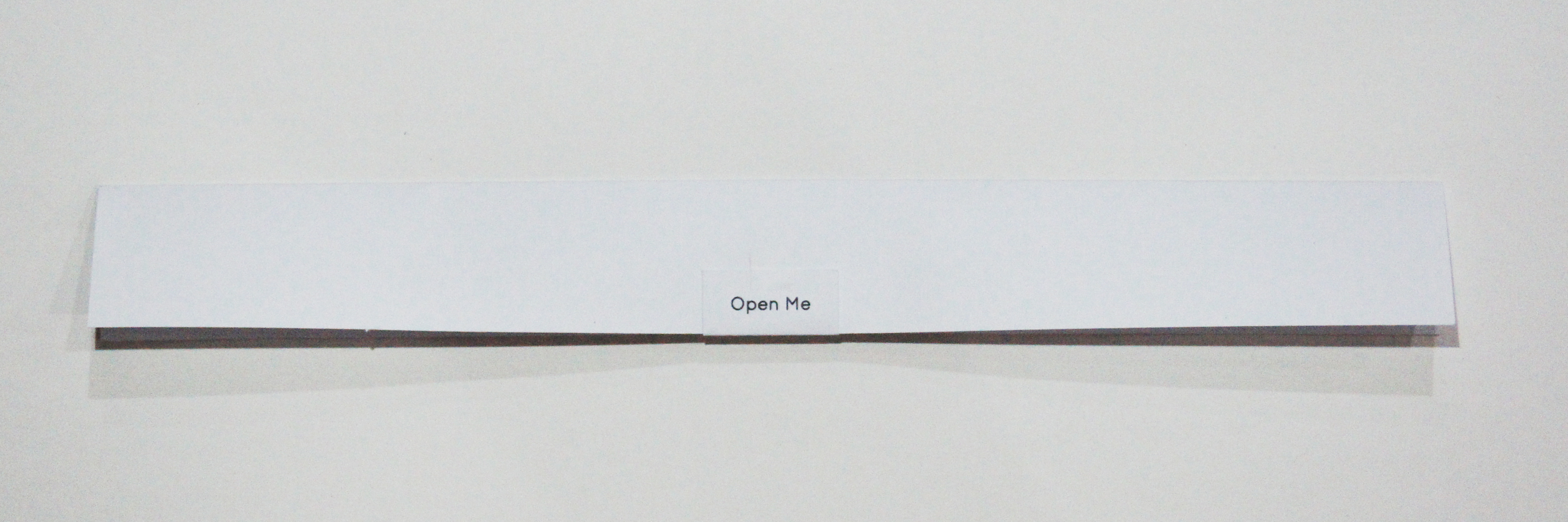
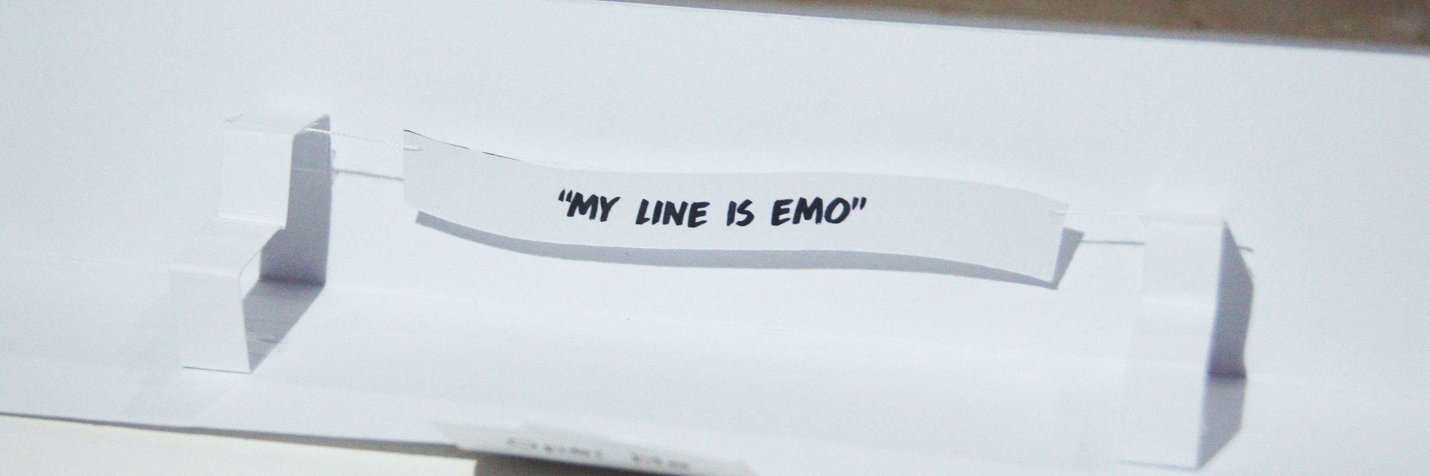
(n.) an unexpected or astonishing event, fact, etc
Surprise is a sudden feeling of wonder or astonishment. Surprise is more can be neutral/moderate, pleasant, unpleasant, positive, or negative. But to me, surprise is more of a positive feeling.
Method:
I wanted the element of surprise in this piece, therefore I decided to use a pop up method. I strategically placed this as the last piece on my board to give a “closure” of the project. The lines in this piece is the two pop up pieces on the side of the banner, it gives a direction of line and directs towards the banner.
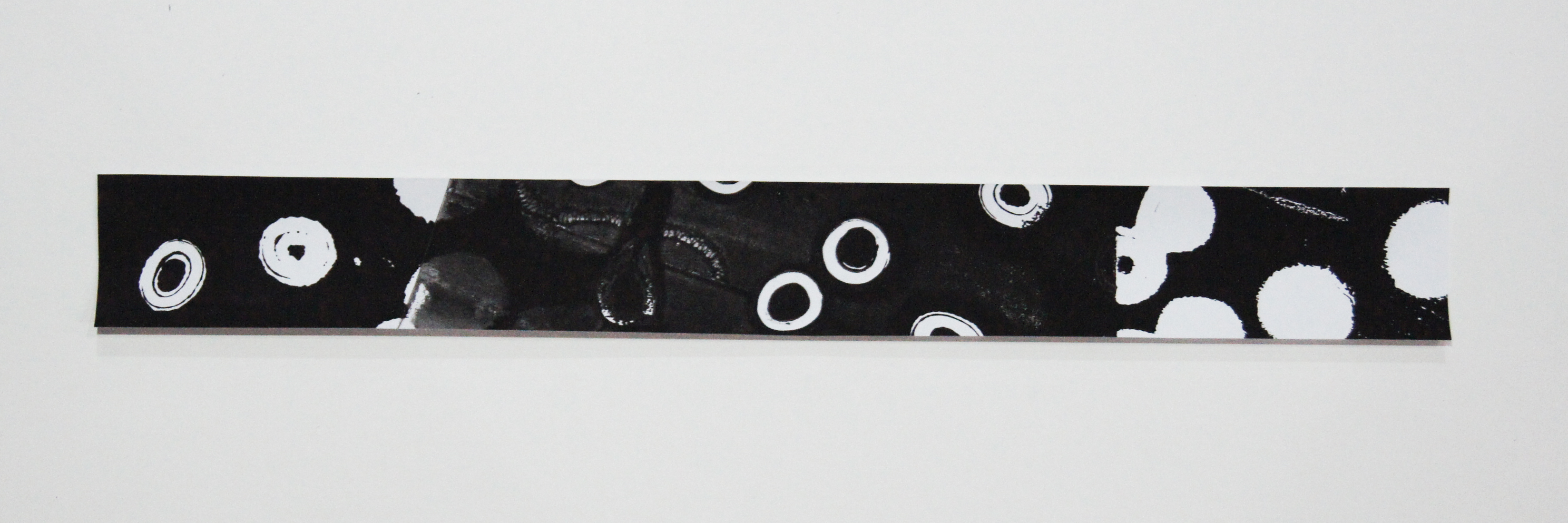
disgust ; /ˈdɪsˈɡʌst/
(n.) a feeling of revulsion or strong disapproval aroused by something unpleasant or offensive.
Disgust is something either makes me feel unpleasant and uneasy. Disgust reminds me of uneven shapes, clusters and trypophobia.
Method:
I decided to experiment with the bubble art technique as I felt that the remains of the bubbles gave a mouldy look to the paper. I tried to form clusters of the circles as to mimic trypophobia. It’s my first time doing the bubble art technique and it was really cool! I was so afraid that I might accidentally drink the soap water while blowing the bubbles…
sadness ; /sadnəs/
(n.) the condition or quality of being sad
Sadness is an emotional pain associated with feelings of disadvantage, loss, despair, helplessness, disappointment and sorrow. Sadness reminds me of darkness, a growing darkness – aura around you. It grows and grows… till you fall deep into the darkness.
Method:
I used a wet sponge to create this artwork. To me, I when I get sad, I will keep brooding on it and hence my negative energy grows. I tried to show the growing of the negative energy by moving the sponge in a circular motion. There’s a gradual change in the gradient to support the growing look. The reason of doing this gradient, is to mimic a growing movement int he paper.
frustration ; /frʌˈstreɪʃn/
(n.) the feeling of being upset or annoyed as a result of being unable to change or achieve something
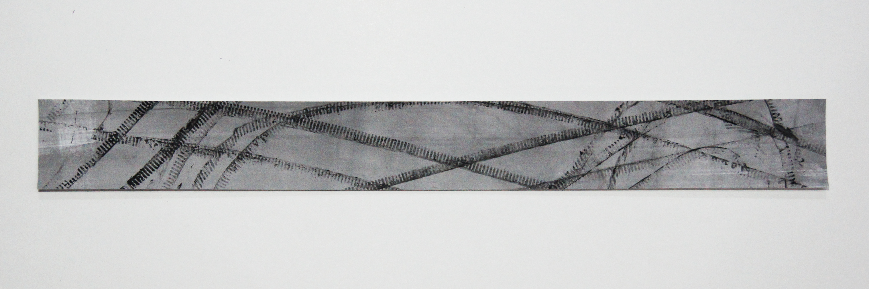
Frustration is a feeling of annoyance that occurs when something doesn’t go as you expect, which may lead to anger. The greater the obstruction, the greater frustration is likely to be. Frustration reminds me of cracks and thin lines that breaks when someone gets more annoyed and angry.
Method:
Black acrylic is painted first, putty is then applied. I decided to use putty as I will be able to carve out the cracks using a penknife to show frustration and anger. A layer of putty – which represents our “facade” that we give the society, which will eventually crack when we’re angry or frustrated.
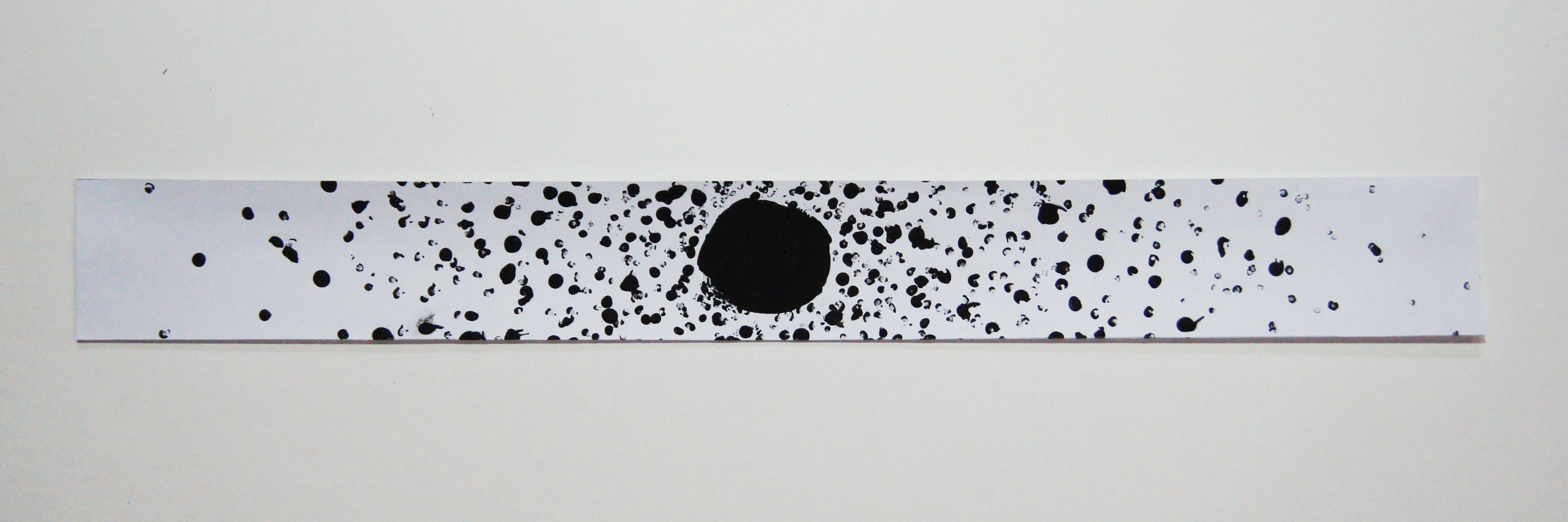
torment ; /ˈtɔːmɛnt/
(n.) to afflict physical or mental suffering, to worry or annoy excessively
Torment to me is a repetitive action or motion that annoys, disturbs, irritates someone which causes an extreme mental and emotional distress. It reminds me of claustrophobic, repeated patterns and stagnant motion which will make the person feel trap. Personally, I get emotional stress when I’m in a crowded place.
Method:
I created this artwork with an idea of a cluster to show torment. The big dot in the center is me, and I used the end of a paintbrush and started dotting the paper which represents the people. Hence, this artwork shows that I’m being crowded by a lot of people which makes me feel claustrophobic and it’s a torment to me.

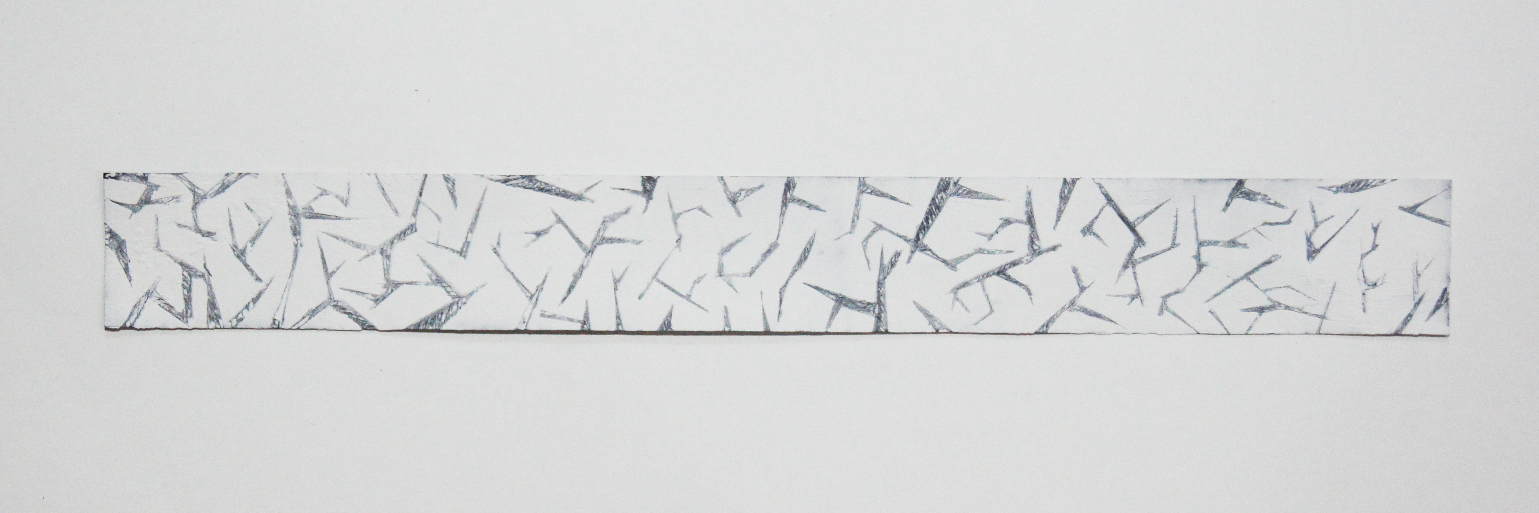
agitation ; /adʒɪˈteɪʃ(ə)n/
(n.) a feeling of aggravation or restlessness brought on by provocation or a medical condition
Agitation is the act of stirring things up, a mental state of extreme disturbance. There’s a thin line between anger and annoyance, which is agitation. When I’m agitated, it feels like tons of needles are poking in my mind and a screeching voice is on an never ending loop at the back of my head. It reminds me of inconsistent, messy, sharp looking shapes, angular lines and high frequency.
Method:
I used harsh brush strokes, and different pressures to show the messy state I feel when I’m agitated. There’s a depth in the lines to show a never-ending cycle of annoyance I feel when I get agitated. The lines are sharp, inconsistent and has different thickness to depict needles.
grief ; /ˈgrēf/
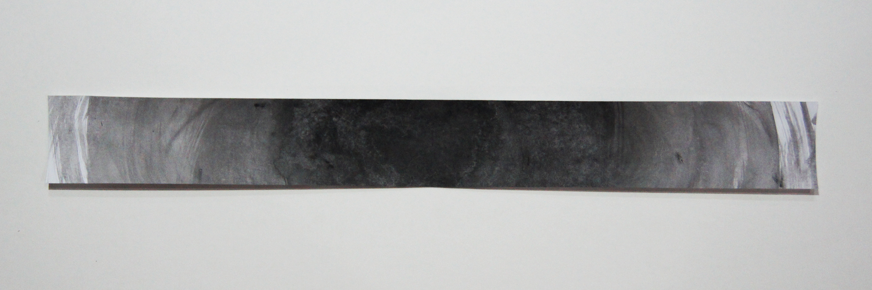
(n.) intense sorrow, especially caused by someone’s death or loss
Grief is a heavy, oppressive sadness. We associate it most often with mourning a loved one’s death, but it can follow any kind of loss. It reminds me of heavy-weight lines or an image that slowly loses it’s shape and fades away.
Method:
I used a paint roller and applied different pressure to show a gradient / change in feelings. Grief, at the beginning, you are so drowned in sorrows that as time passes by, you’re so deep into the sadness, grief that you start to lose yourself.
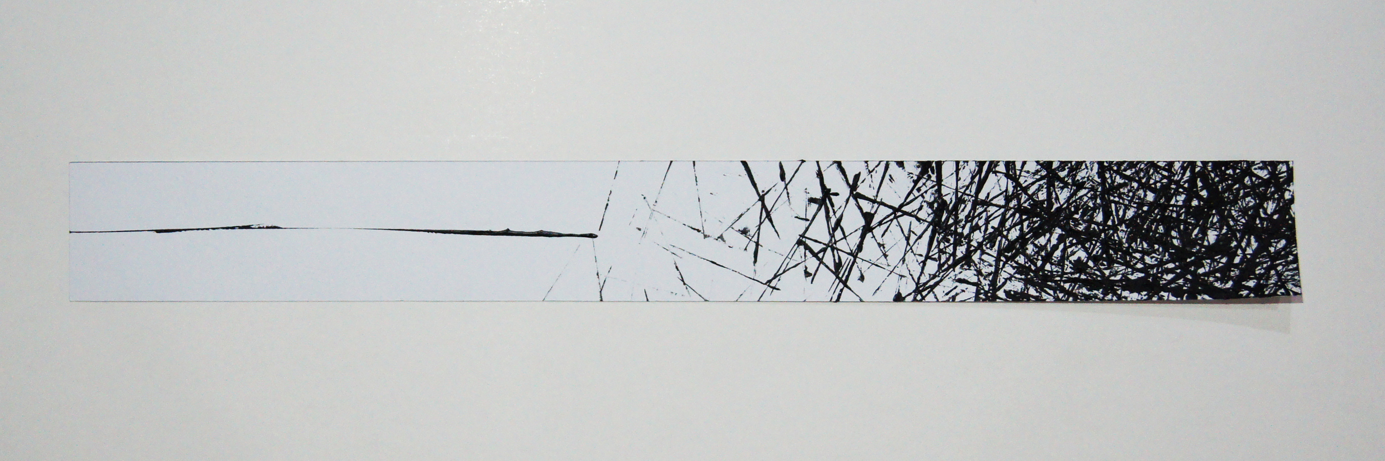
fear ; /fɪə/
(n.) a distressing emotion aroused by impending danger, evil, pain, etc
Fear includes anxiety and can be very emotionally painful. Fear is an anxious concern, to be afraid of something or someone, to expect and worry. The gradual growing of fear can be expressed by the thickness, gradient of lines.
Method:
I decided to use black thread to depict fear as the needles makes me think of the prickly anxiety I felt when I’m scared. The direction of the thread is coming out from the center which resulted in a gradient to show a gradual grow of fear and anxiety.

unease ; /ʌnˈiːz/
(n.) an uneasy state of mind usually over the possibility of an anticipated misfortune or trouble
Unease is feeling anxious, discomfort, apprehensive and lacking a sense of security. Being uneasy is when I’m in a situation without a clear destination.
Method: By adapting the watercolour technique, I applied droplets of water on the paper first and added blobs of black paint. This does not give me any control on which direction I wanted it to go and as someone who needs to make sure everything is in order, I felt so uneasy and uncomfortable… So I just waited and see how the paint spreads ( which is quite therapeutic). The outcome also showed indecisiveness in the flow as the paint has no definite direction.
panic ; /ˈpanɪk/
(n.) sudden uncontrollable fear or anxiety, often causing wildly unthinking behaviour
A sudden overwhelming fear, outbreak, that produces hysterical or irrational behaviour and makes someone unable to act or think normally. Panic, is when my mind is in a mess. It reminds me of messy wild lines that are inconsistent.
I thought of the quote – “The calm before the storm”, before doing this project and I felt that it’s really relatable. Before I panic, everything is so zen and in place but when I realize I forgot to do something or bring an item, I started panicking… like mad. Well I am practically a very panicky person.
Method:
I used a painting knife to create this artwork. For the beginning, a drew a straight line using the knife to show the “calm” before the storm, and onwards, I used harsh strokes to depict the panicky moments which becomes heavier in the end – which is the storm.
Reflection
I had a lot of fun doing this project as the last time I was given a chance to experiment with so many new mediums ( I LOVE MONOPRINT ), was in Polytechnic Year 1.
I feel that this project has a lot of try and error and sometimes the outcome of the experiment is not what I expected or envisioned to be. However, that is when I realise to embrace the unexpectedness and surprise element as I started to see the emotion in the pieces of art. I feel that for this project, you really need to lose control and be bold.
As a person who is quite “minimal” in terms of work, is it quite tough for me to do disorganise and messy lines as my outcome always ended up as neat or structural. This project made me try out lots of things that are out of my comfort zone, which solely means letting things get out of my control and just DO IT.
All in all, this project taught me to be daring, lost control and just experiment with whatever you can find, including an onion. I will definitely apply the techniques that I’ve learnt from this project in the future (eg. scanograhy and monoprinting!!!)
PS: I can’t wait to do the silk-screen printing as I’ve never gotten a chance to do it back in poly!!! But I know it’s gonna be a tough journey.