*swims over* the final lap is hereeeee! Presenting, my final pieces. *cue dramatic music*
– please click to enlarge the image –
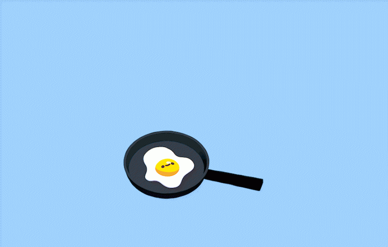
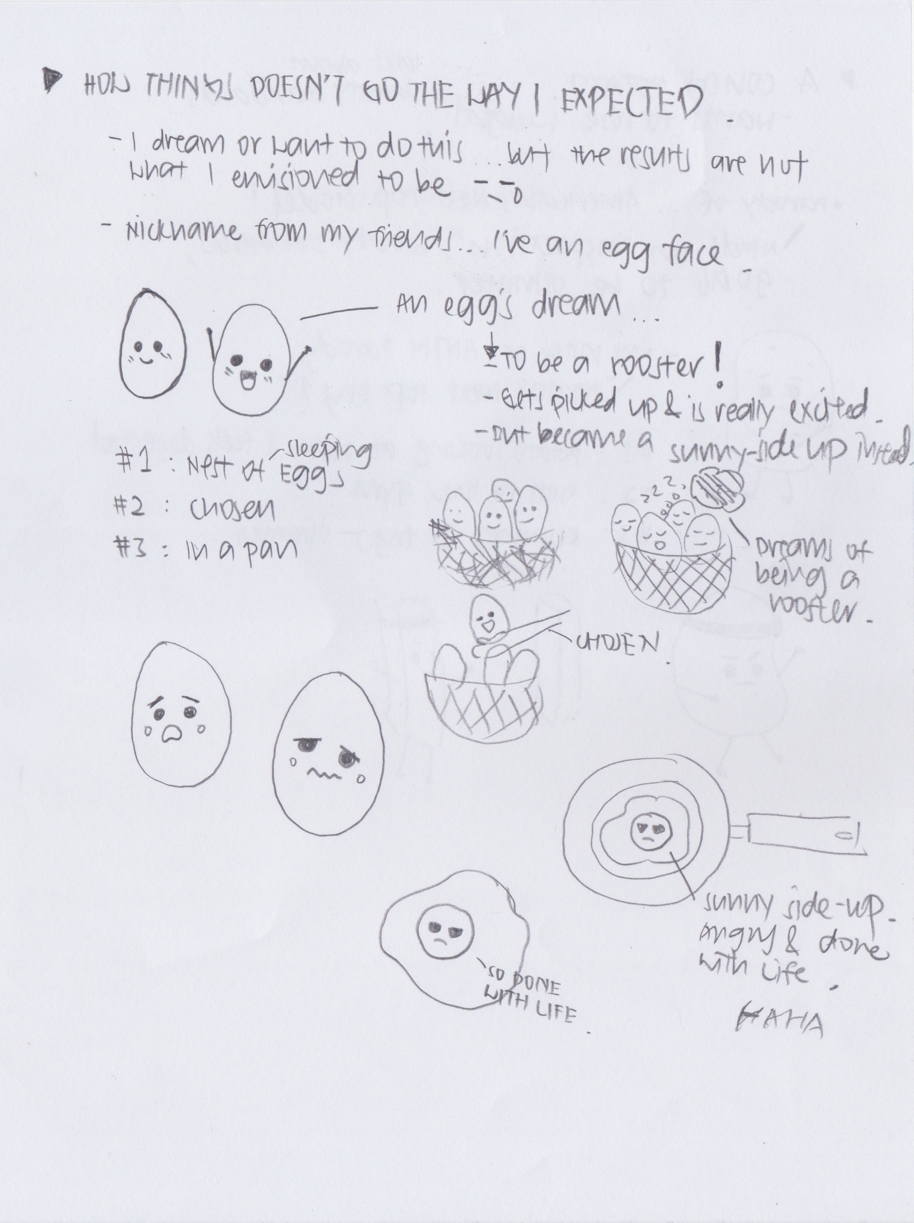
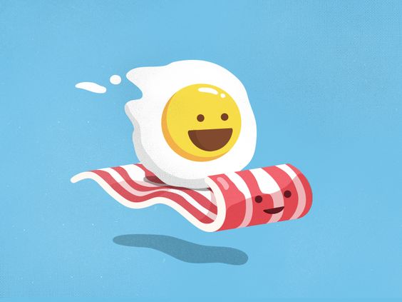
The Egg’s Dream

Colour Harmony: Monochromatic & Analogous Harmony
This piece is a neutral colour palette which consists of mostly browns, beige and grey, with a tinge of bright colours like yellow and white which is to make the sunny side up stand out among the rest. Browns and beige gives a sense of interest and anticipation, and youth.
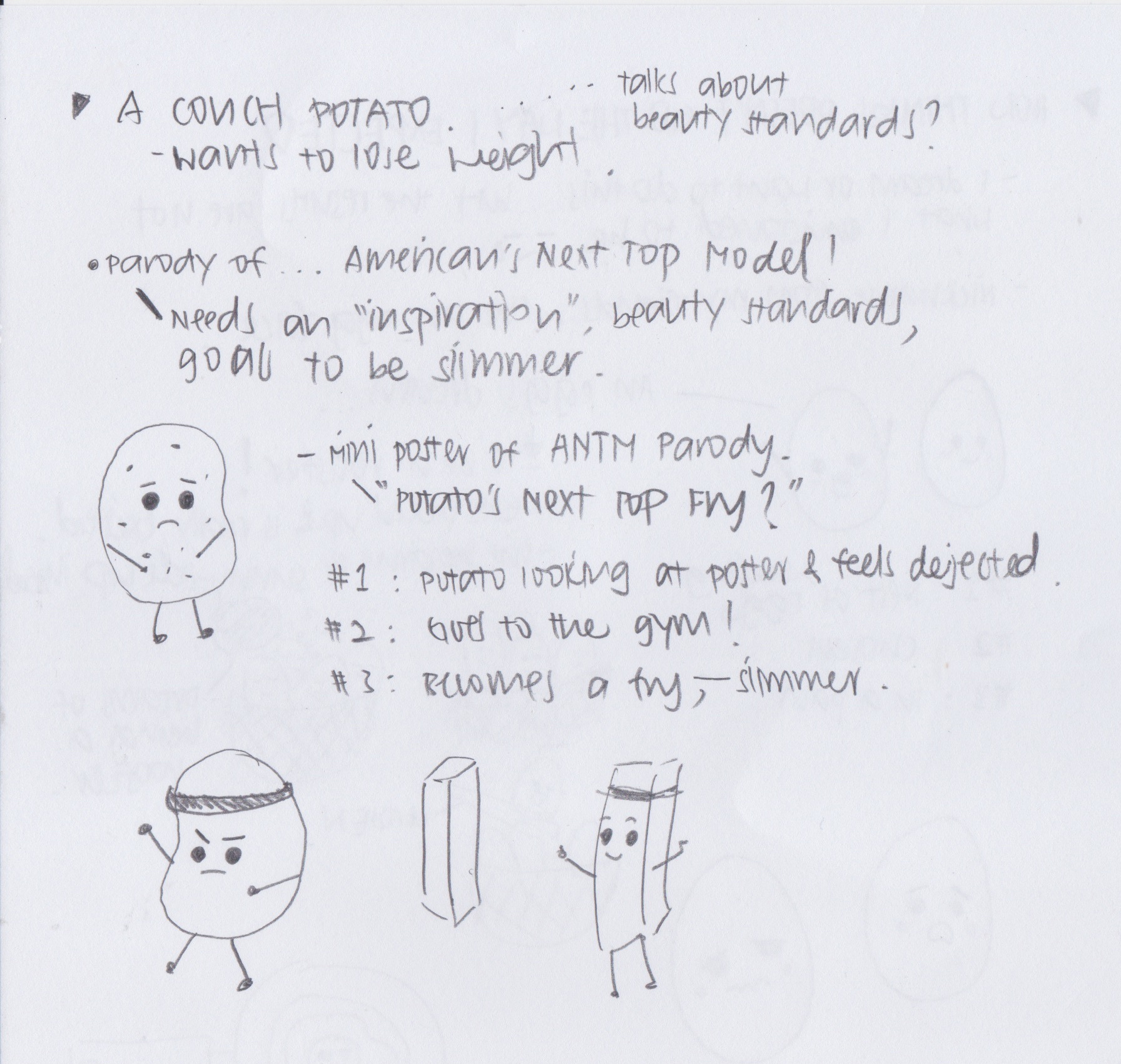
Potato’s Next Top Fry
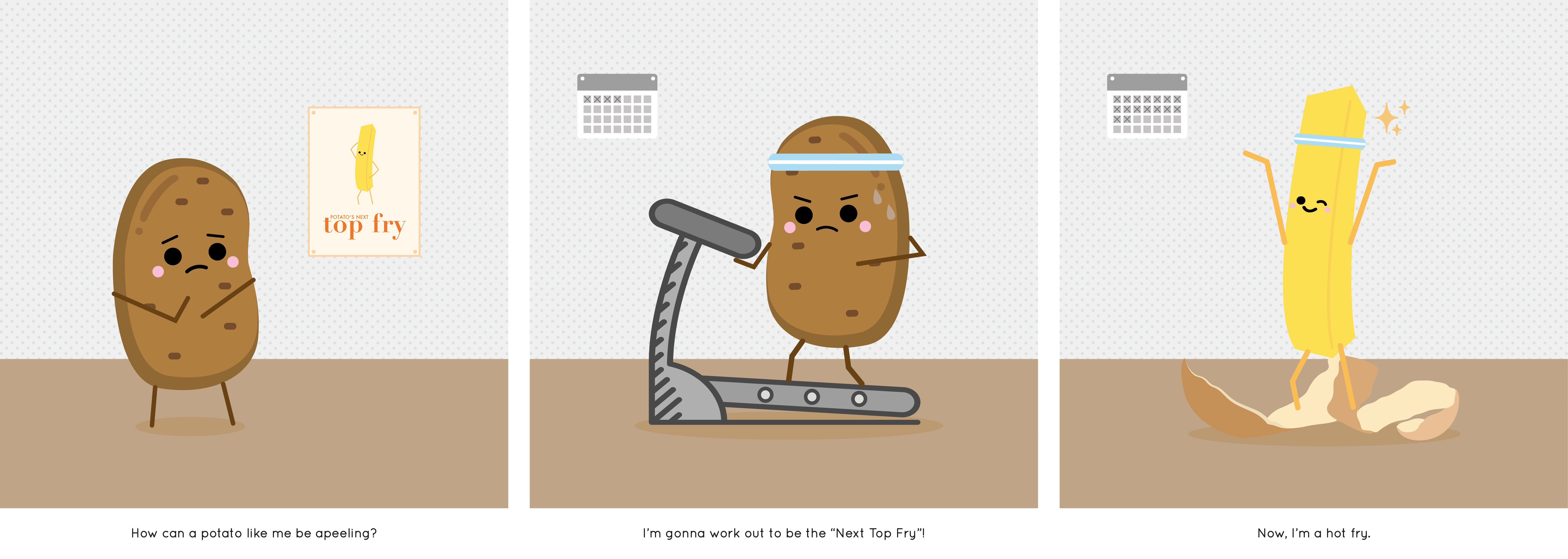
Colour Harmony: Monochromatic & Analogous Harmony, Complementary Hues
This is a neutral colour palette with a bit more fun! Even though neutral colours like brown, grey, beige are used, a pop of bright yellow was added to give an element of fun as it’s a cheeky narrative of a Potato’s journey to become a smokin’ hot Fry.
Anyway guys, please notice the mini poster I did for the Potato. DID U GET IT.
Taco’s Fillings
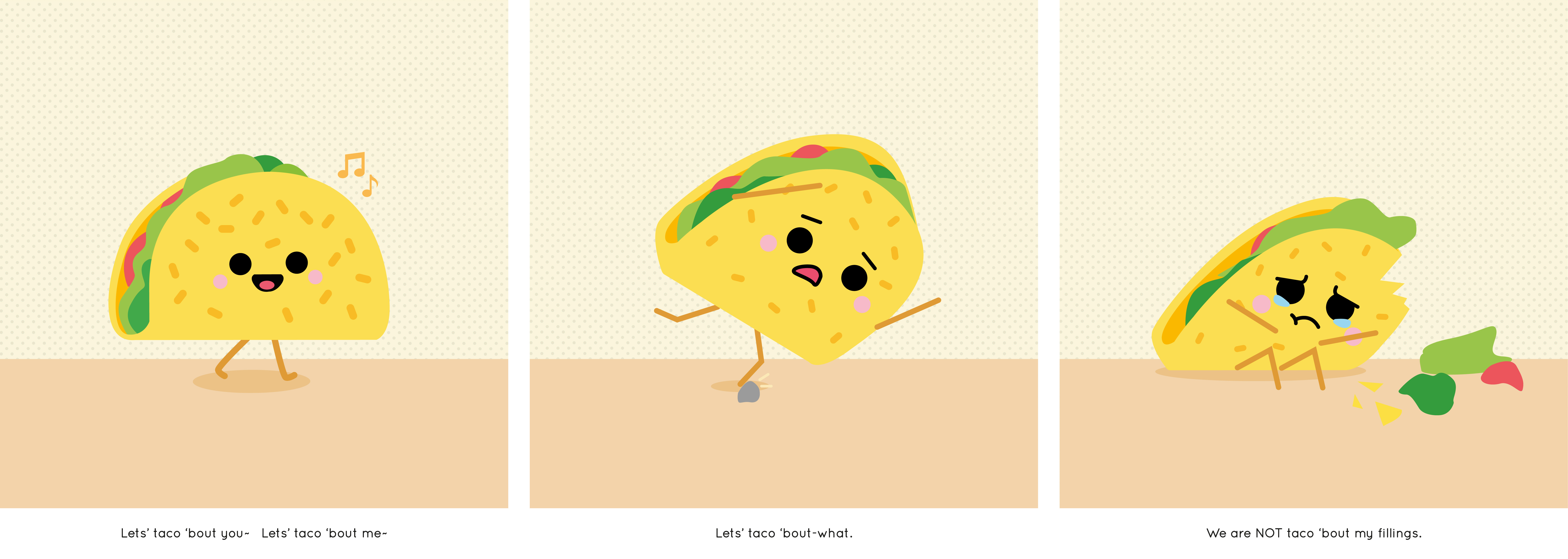
Colour Harmony: Split Complementary Hues
With bright colours being used, this piece has FUN written all over it. I wanted the taco to look as yummy as possible, therefore I used a really bright green, for healthy veggie, a nice yellow as the lovely taco body to stimulate your appetite and a tinge of red to make it more appetizing. This narrative is about a happy-go-lucky yet clumsy Taco who accidentally lost it’s fillings (feelings), get it.
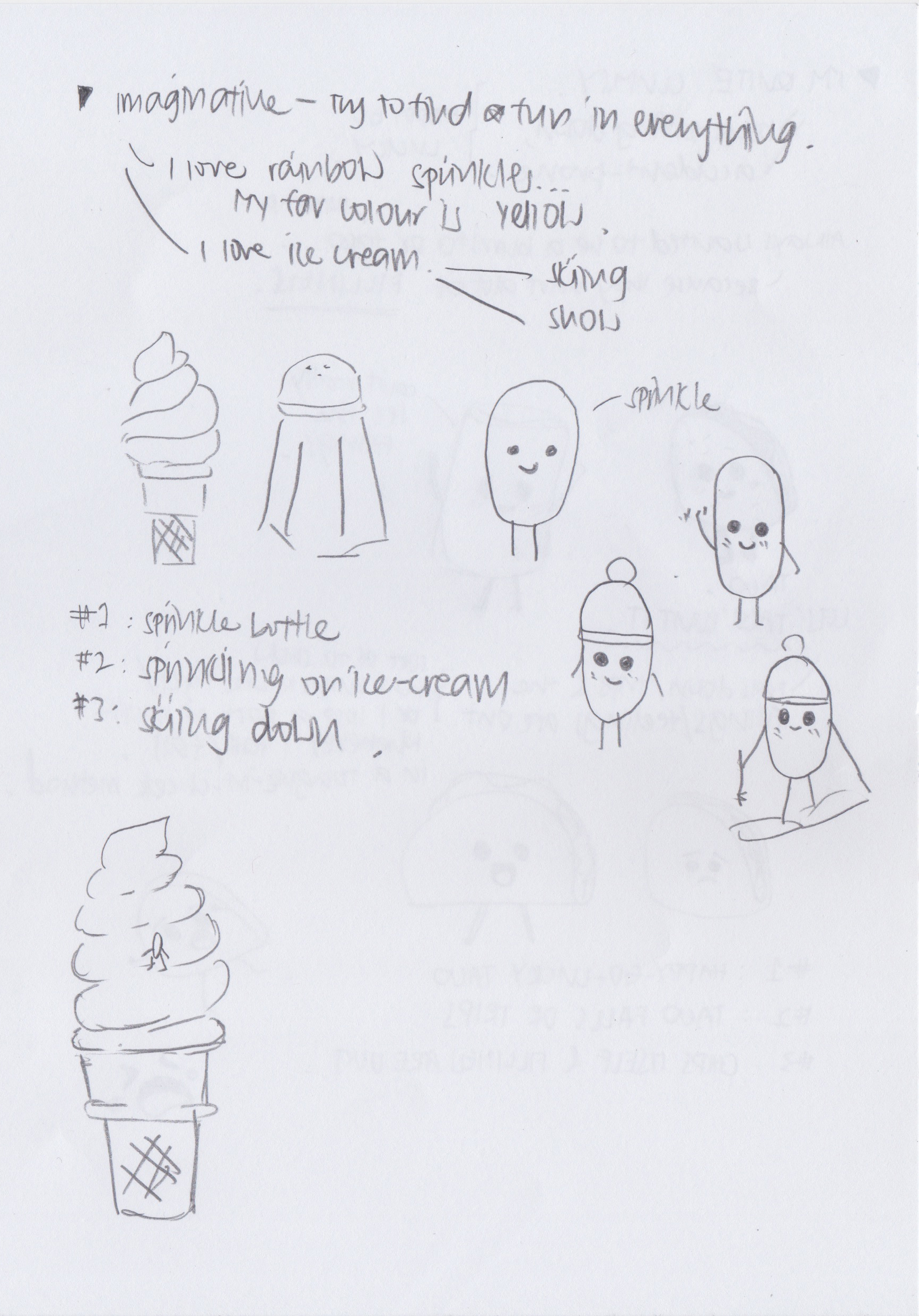
The Yellow Sprinkle
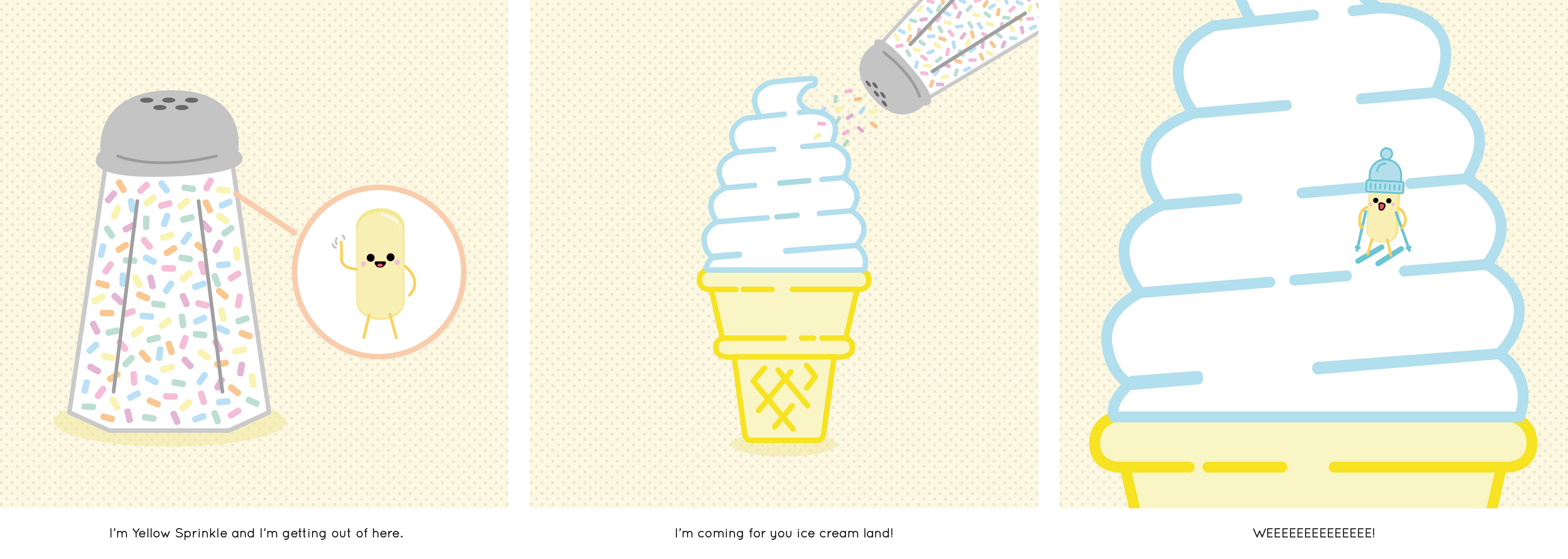
Colour Harmony: Complementary Hues
Pastel bright colours were used to give a cheeky, fresh and fun look. Personally, ice cream is a happy food to me, and yellow is the universal happy colour. A blue hue is to give a certain calmness and to balance the overall composition as yellow is the most prominent in this illustration.
Reflection
Among all the 2D projects, I LOVE this the most as I can finally get back in touch with my colours! I enjoyed the entire process of Project Ego as there are so much that I can do and I had fun brainstorming ideas that are maybe… abit too cheeky and weird for that matter.
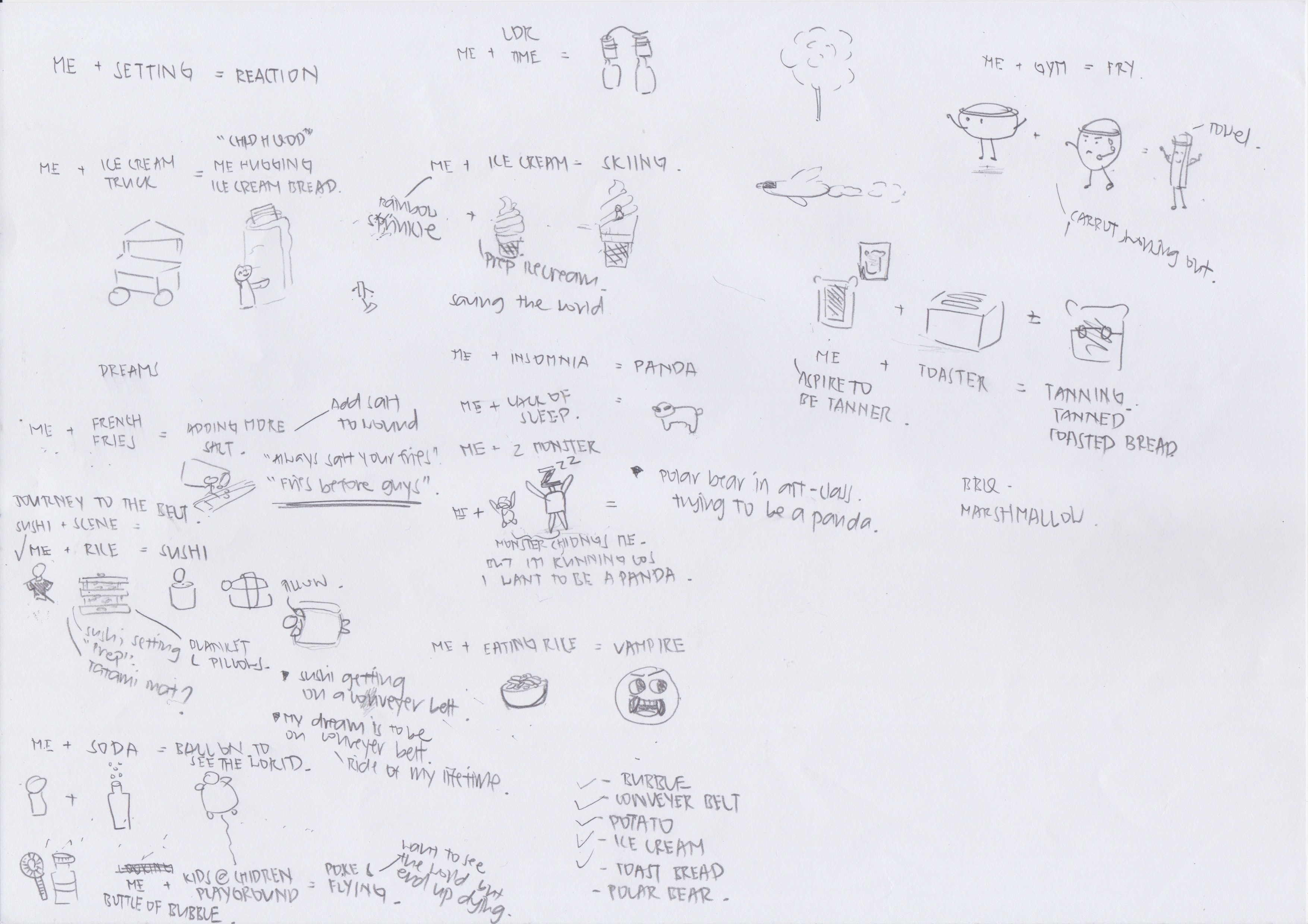
My focus for this Ego project was really – to PUN and FUN as much as I can hahaha. I really wanted to do something fun and cheeky, nothing too serious as I guess this is one of the only chances I get to do what I really want. Or in that case, designing without any worries. And finally get the chance to do illustrations that I always wanted to do but never really got a chance (well more like lazy to do).
As my illustration style is more on the minimal and fun side, the choice of colours used is really important as colours that are too dull might make the entire composition look dead and boring. I didn’t even realise it myself that I’ve used a neutral palette for most of my compositions as it’s easier for me to make the main character of the composition stand out by using a complementary colour.
The difficulty that I faced in this project is that I kept thinking if my illustration is too simple? Is it lacking stuff? It’s really hard for me to kick the habit of “less is more” and the minimalist soul in me is struggling really hard. Even though I’ve studied 3 years of Visual Communication back in Polytechnic, I didn’t do much illustrations back then. This is the first time, I’m seriously sitting down, brainstorming and vectoring every single detail out. I thought I was going to be real fast doing this project, but boy was I wrong! The amount of options, I can do to present my composition is ENDLESS. How I decided to designed the elements in the composition is craaaaaaaaay as I’m really indecisive.
All in all, I’m actually quite happy with my results and thoroughly enjoyed this entire process for Project Ego. I guess that’s all I wanna taco ’bout. AHA sorry gotta sign off with a pun