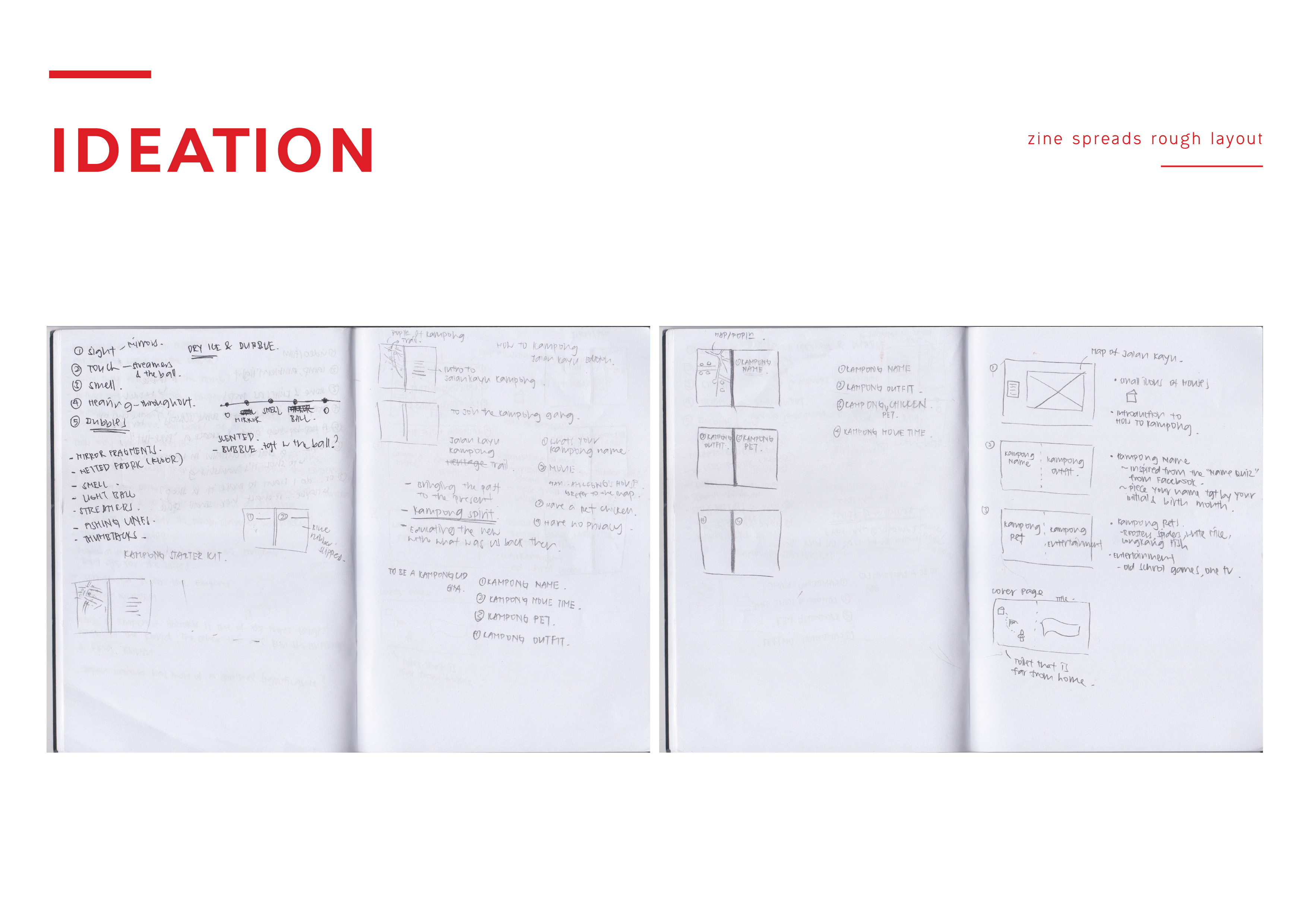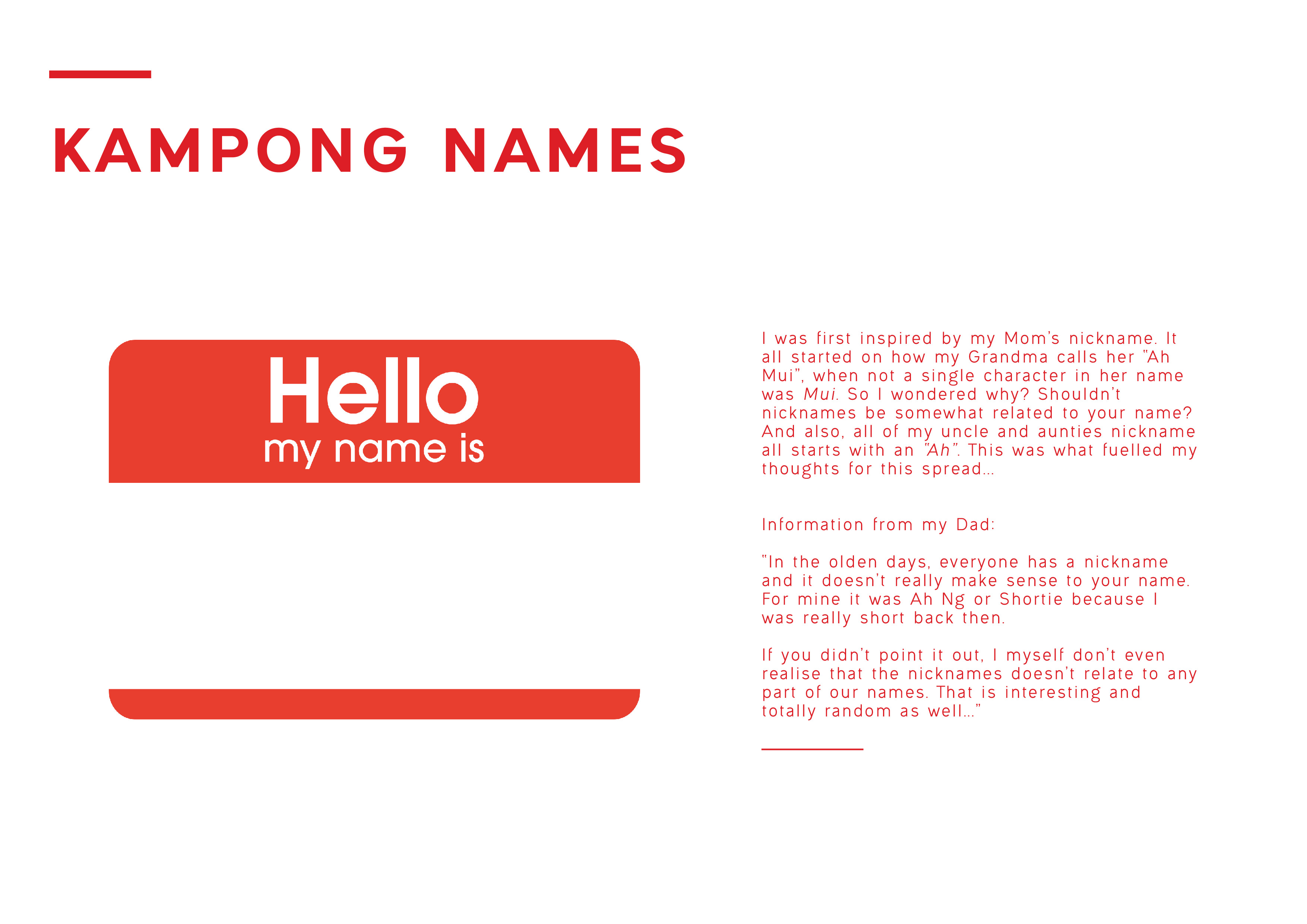
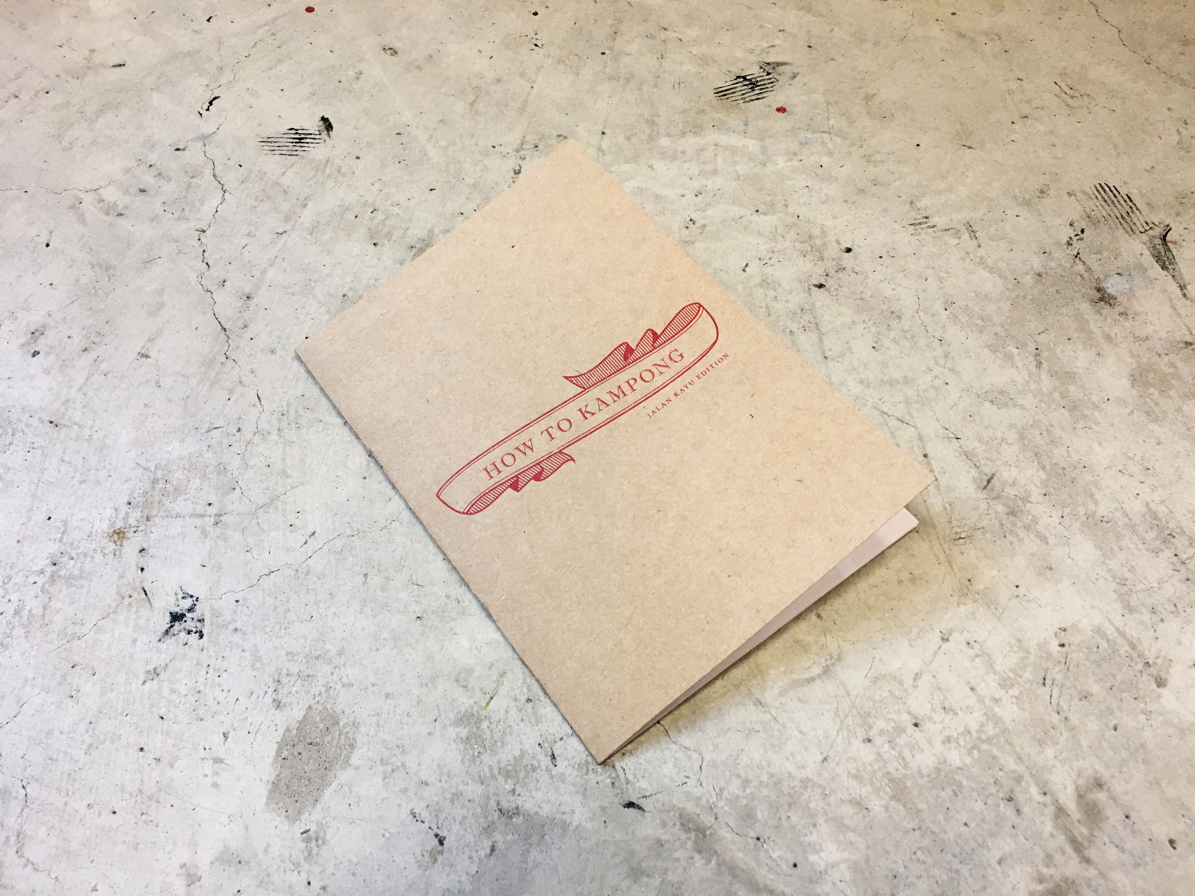
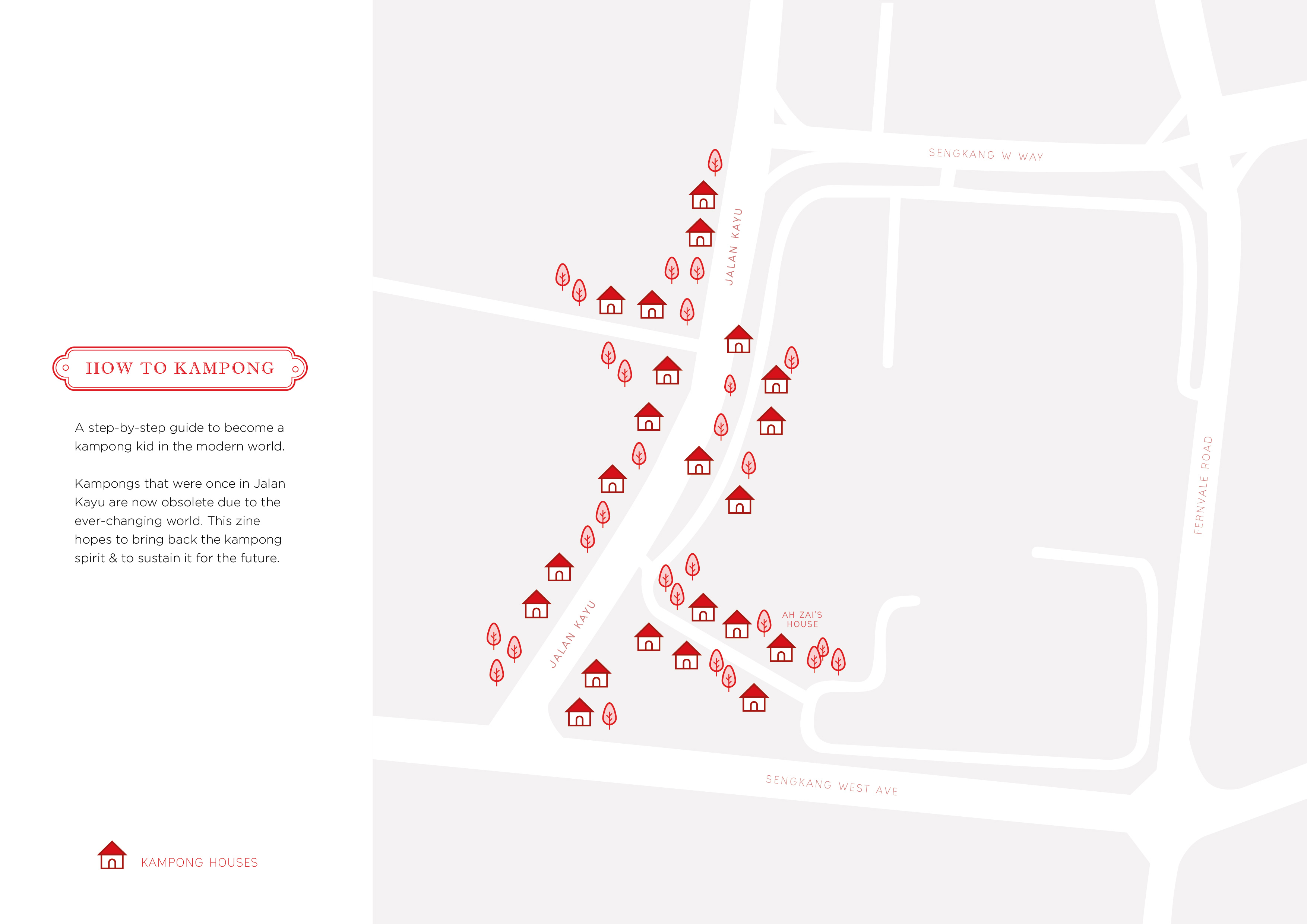
How to Kampong
A step-by-step guide to become a kampong kid in the modern world. Kampongs that were once in Jalan Kayu are now obsolete due to the ever-changing world. This zine hopes to bring back the kampong spirit & to sustain it for the future.


Reflection Time
In the beginning of the project, I thought that 8pp was too little! And I was seriously stressing on how and what I can put in those 8pp that will be “enough”. Little did I know… I was grateful that it was only 8pp hahaha. But anyhow!! I really enjoyed this project because even though I’ve been studying VC for the last 3 years, I didn’t have a chance to do a zine for myself, so this is quite new and exciting for me!!
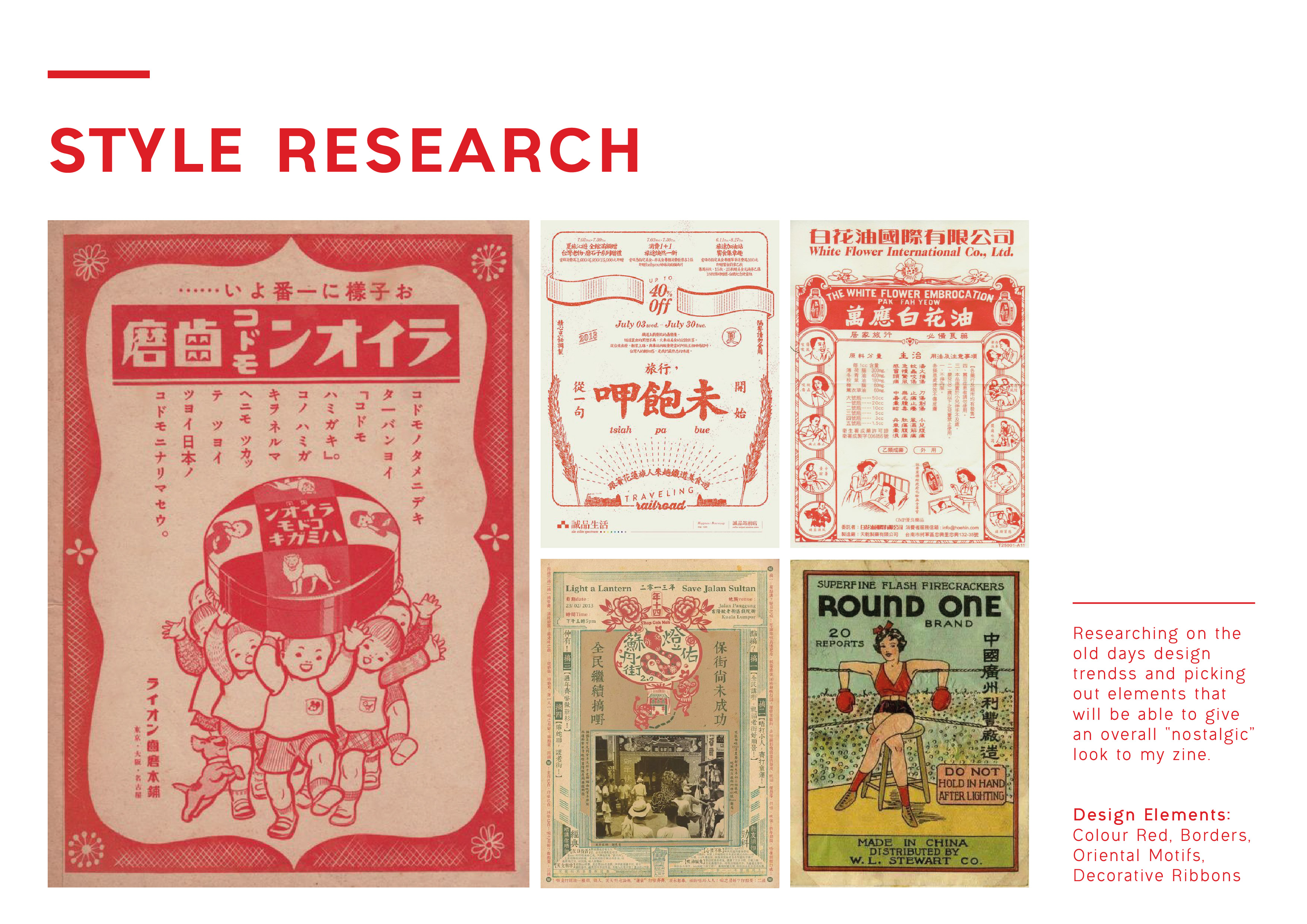
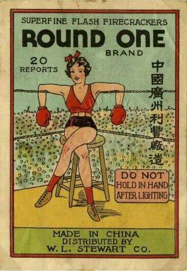
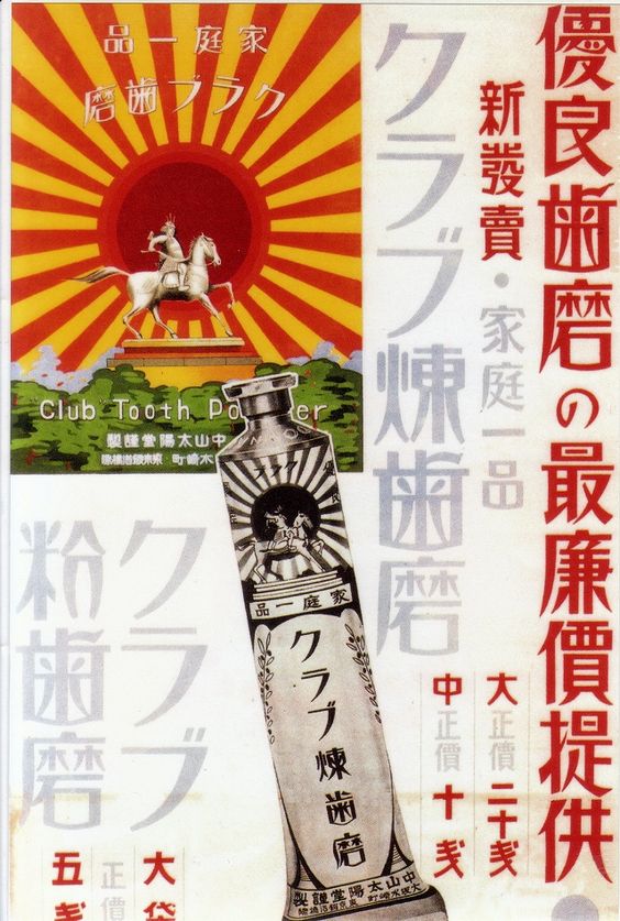
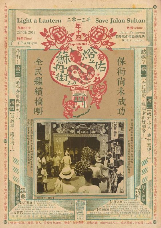
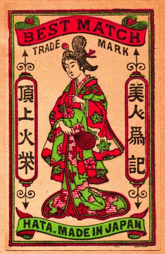
I’ve NEVER tried going all red or oriental for any of my works before and I had fun doing this. But honestly, I tried to venture out the minimal and clean look that I’m used to doing, however, after viewing my final, it seems that… it’s still as clean -_- But! That is not point, the point is, I learnt a new style which is the oriental style wooo! And I love it. Funny how the oriental style is normally jam packed with motifs and yet the simple me love it. I guess I unknowingly “minimalize” the oriental look in some way? But it still holds some essence right…
The challenges I faced was of course going “oriental” and having to vector the stuff abit more chinese looking than what I usually do which is the modern way. As you can see… there’s still a little hints of “modernity” in the work. And I can’t really develop a new style overnight right… 🙁 But, I’m honestly quite happy with the result!! Because I guess it’s a style that I don’t usually go for? You could say this zine is a mixture of modernity + traditional oriental, and I hope it works hahaha.
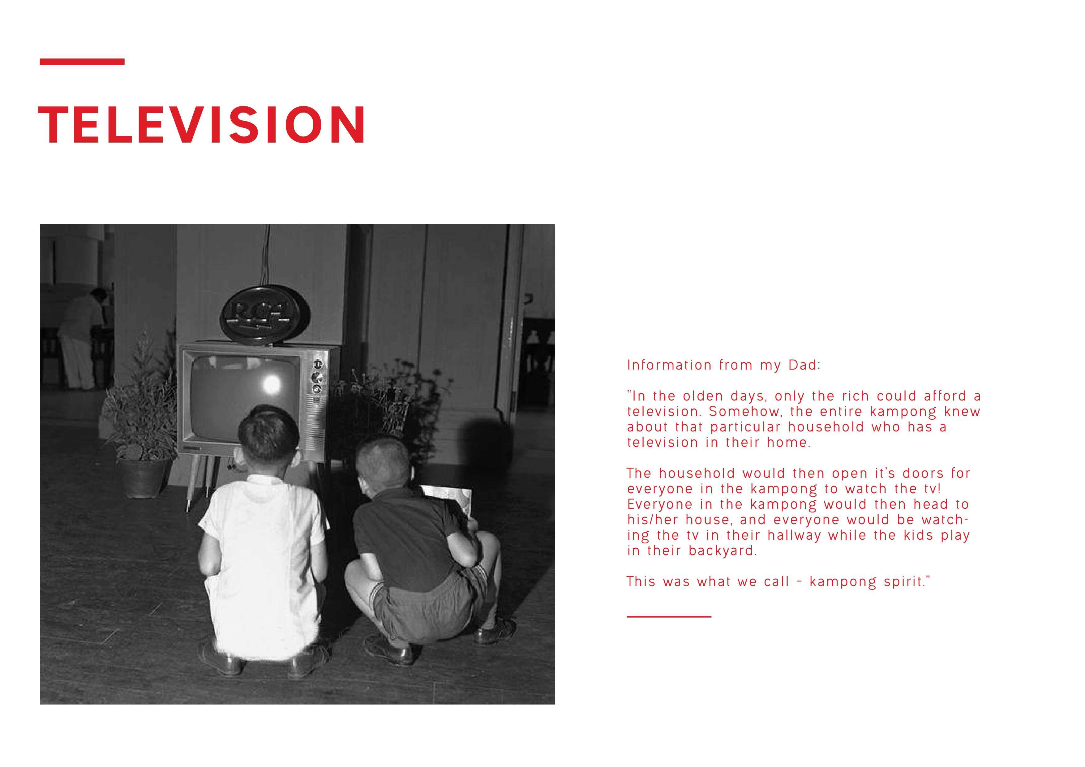
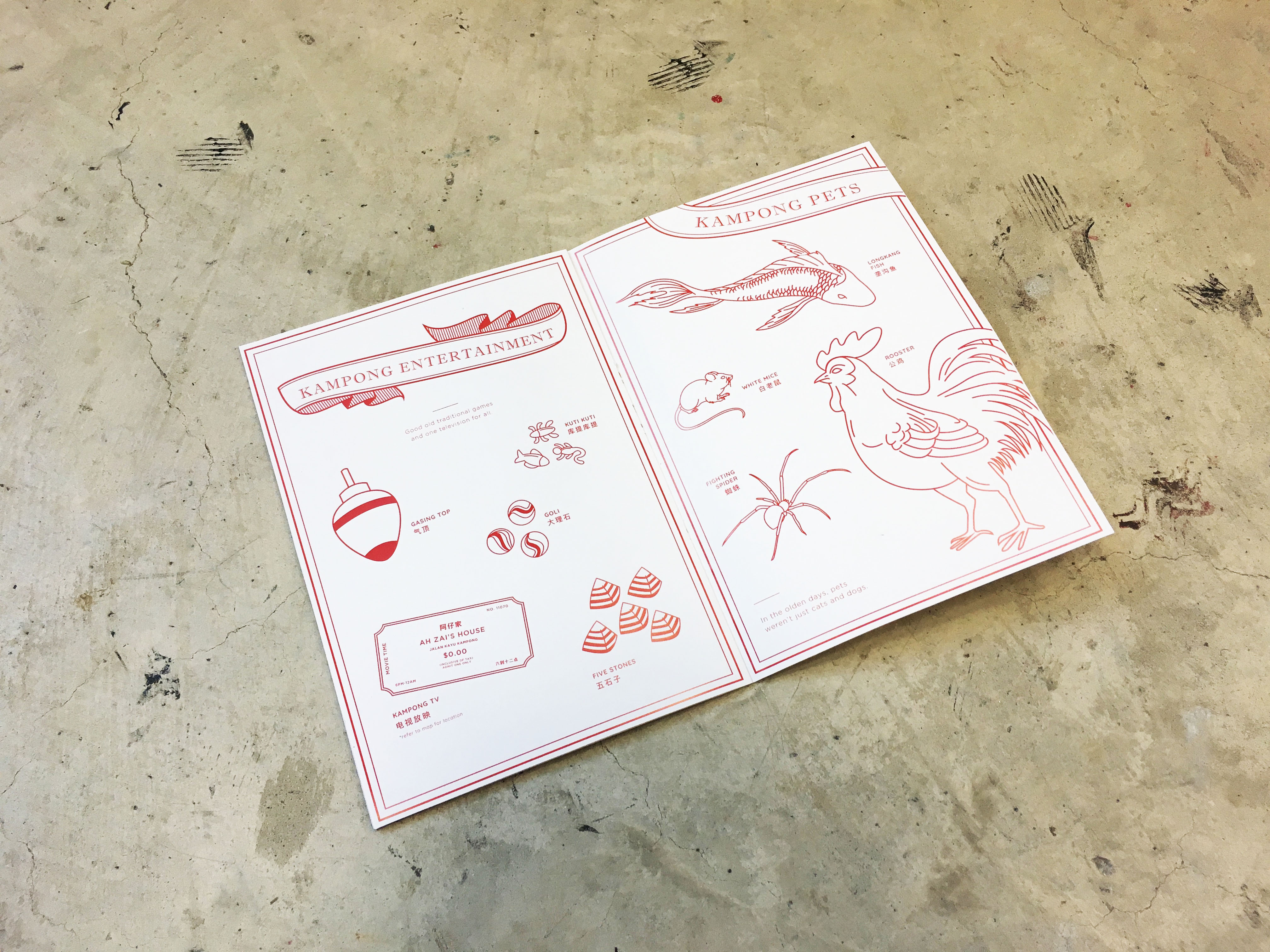
Ok a fun fact time, (source from my Dad), basically only the rich could afford a tv in the kampong days. So somehow the entire kampong KNOWS when someone got a tv and the rich household will open it’s doors to EVERYONE. So everyone will be watching together in the hallway for free while the kids roam freely in the backyard. How cool is that!? I mean honestly imagine random people just walking into your house and watches tv with you now… how weird.
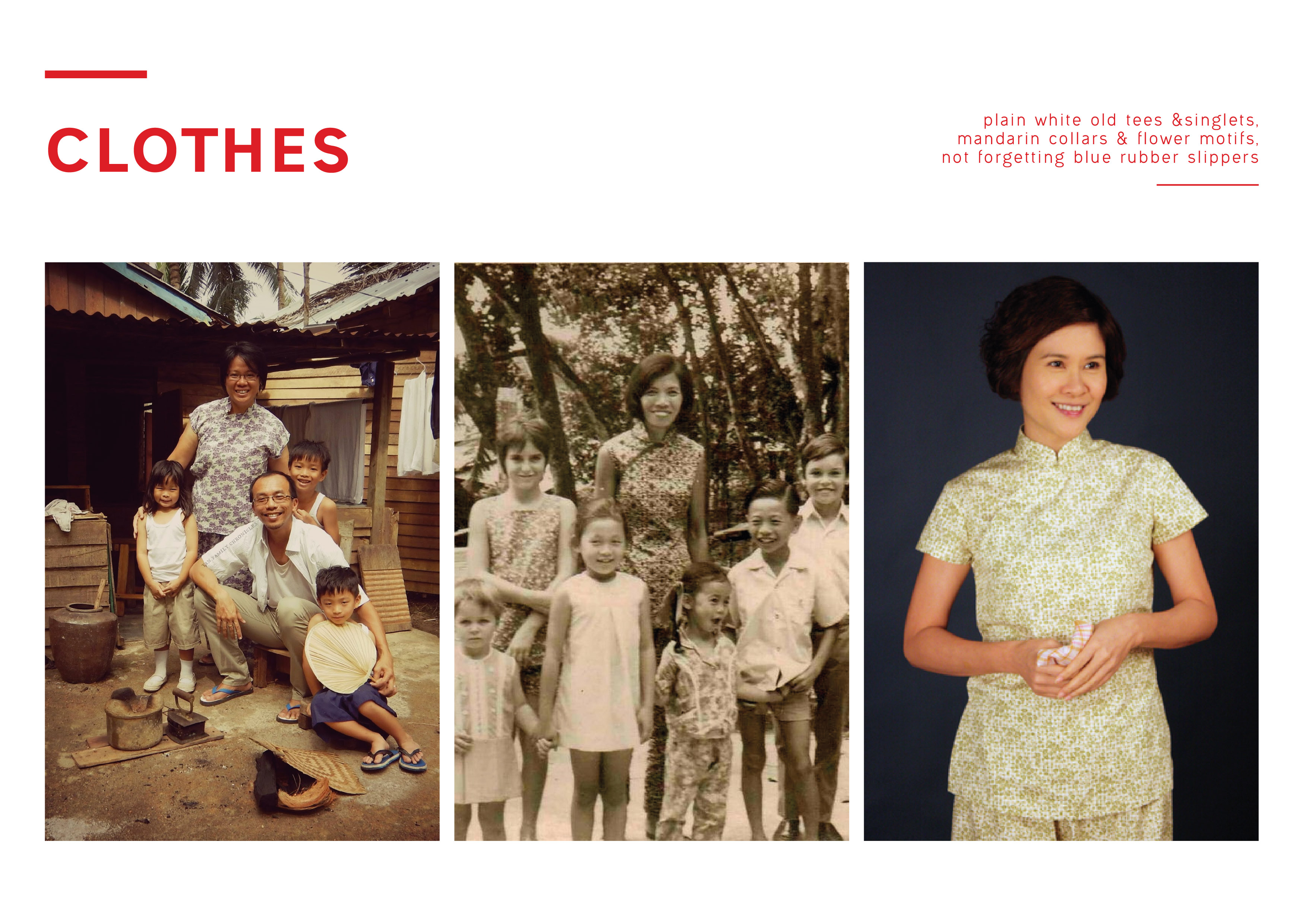
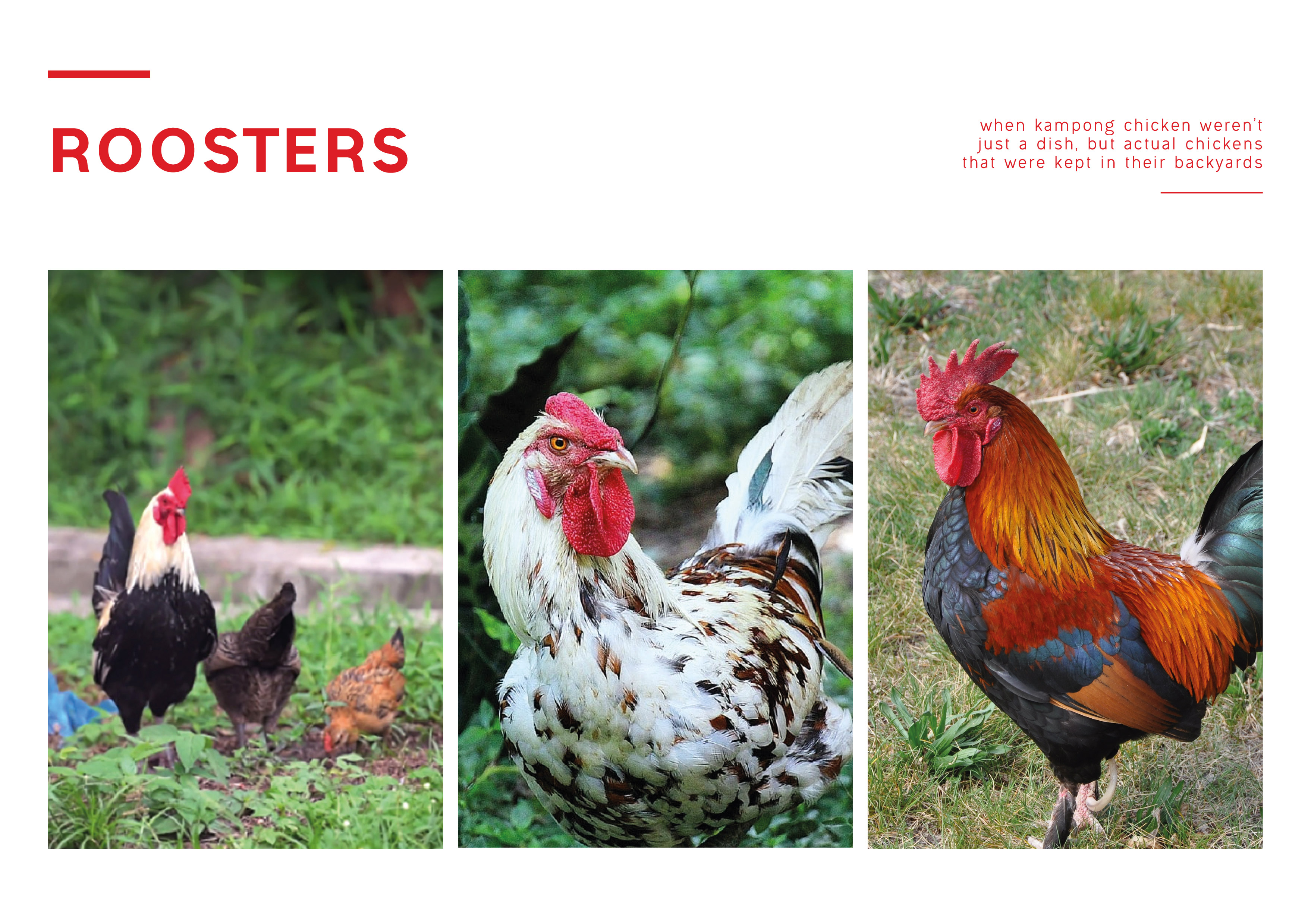
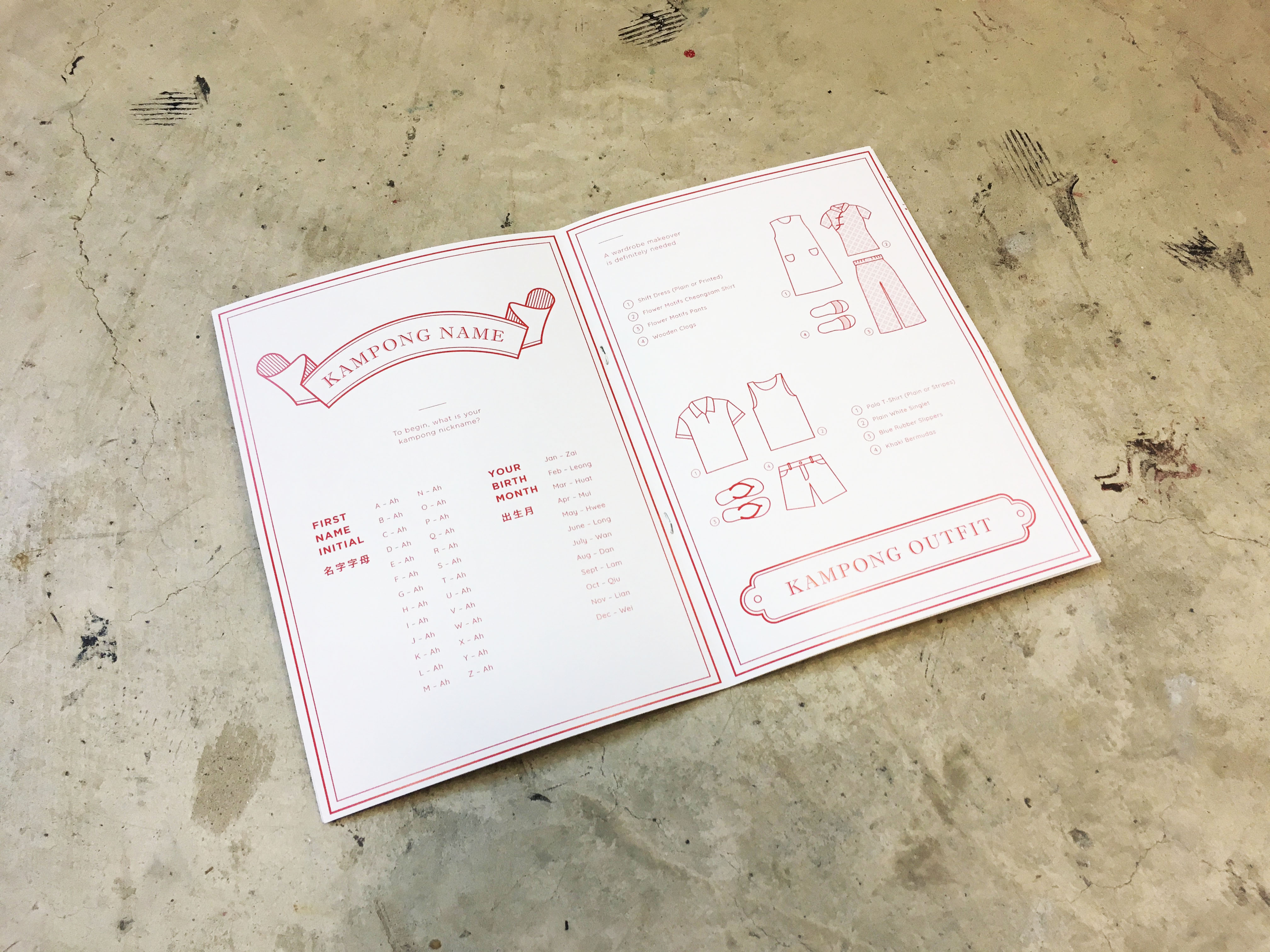
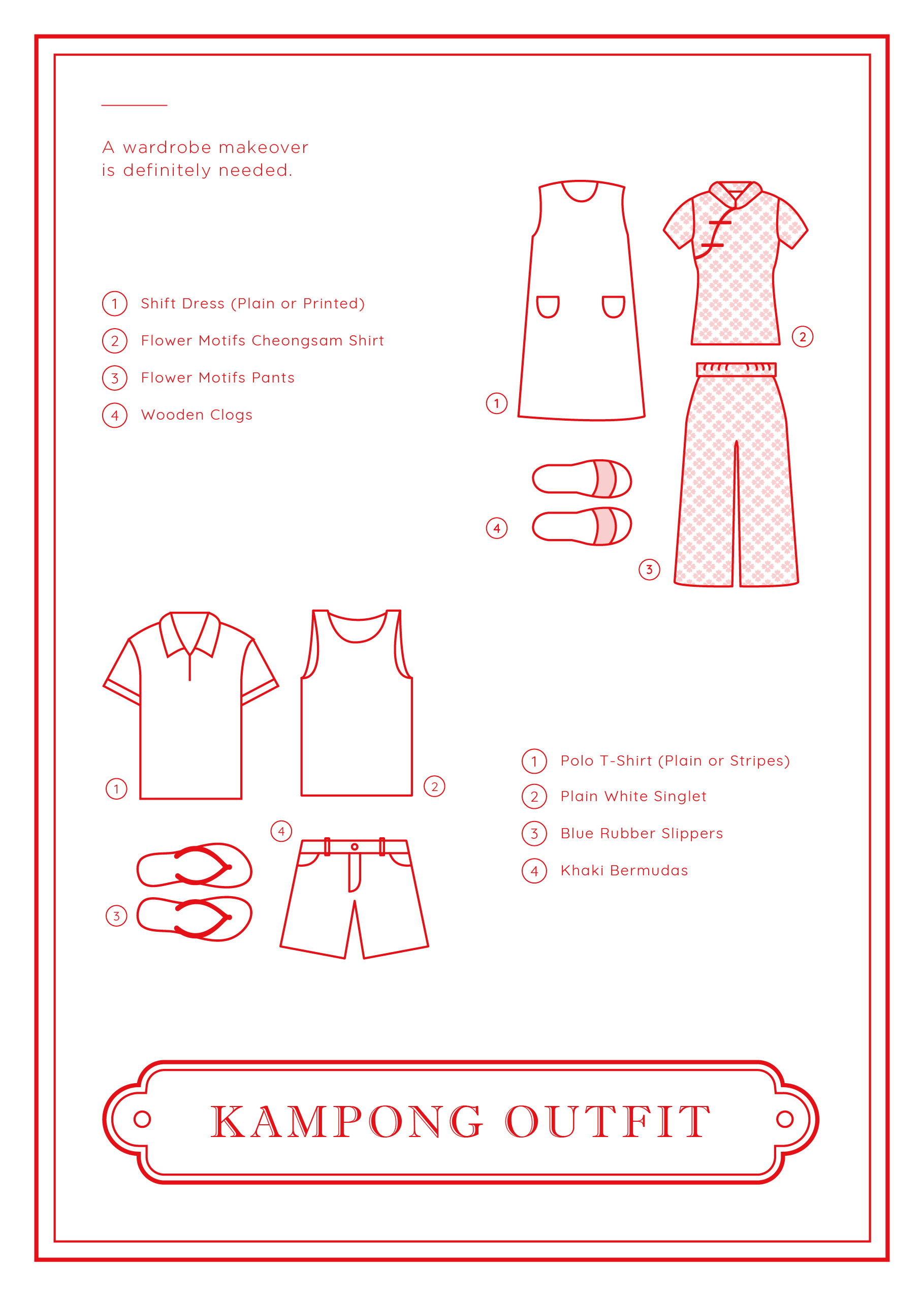
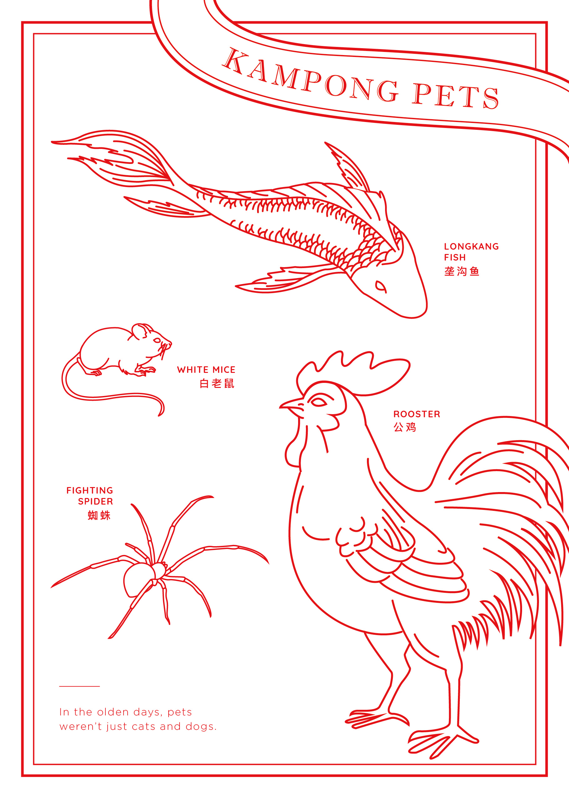
I hope that from this zine, for all you young peeps out there, you’ll be able to take a peek on how our older generation live back then, starting from their random nicknames, singlets and blue rubber shoes, to pet roosters and white mice (my mom keeps them wtf), and last but not least, having to share one television among the WHOLE kampong – that is insane.