


T O A S T Y W A R M
made with 108 toasted bread


D A I L Y B R E A D & B U T T E R
made with 80 toasted bread


Journey of toasting 144 breads
time taken –1 hour 50 mins


Thoughts:
Woke up at 8am on a Wednesday to start toasting a 9 loafs of jumbo bread, a total of 144 bread which took a total of 1 hour and 50 mins.
I started out with the Toasty Warm installation which is by the poolside. I had to ask permission from the security guards there in case they were to chase me away as they are quite angsty lol. It took about… 15 mins for me to set up 108 breads onto the chair. Pretty long especially it was under the morning sun. I’m toast too HAHA. If you guys actually caught onto the pun of Toasty Warm, technically the toast are sun-tanning! The difficulty I had for this was slotting the bread up onto the chair as I wanted to mimic the action of a toaster. The bread was a little squashed so it keeps falling through the gaps of the chair. From the video you could see my several attempts of trying to sit the bread up-right without dropping it.
Next, the letterbox. This installation gave me more anxiety as I’m technically entering a stranger’s space. I was so afraid that someone might come and check on me, that I’ll be leaving lots of bread crumbs in their letterbox and they would get unhappy hahaha. Thus, there’s no video for the letterbox part as I had to quickly lay the breads out and go.
Overall, this experience a little scary for me as i had to do it in the public alone. Of course, I’ve gotten my fair share of weird stares from the people but it was really fun! I did not get any “bad” response from any strangers, more of laughters and smiles as they see me setting up the bread on the chairs. I guess people aren’t that narrow minded after all 🙂
Click here for Elias Pitch.
M O V I N G & S T A T I C I M A G E
01 Static Image
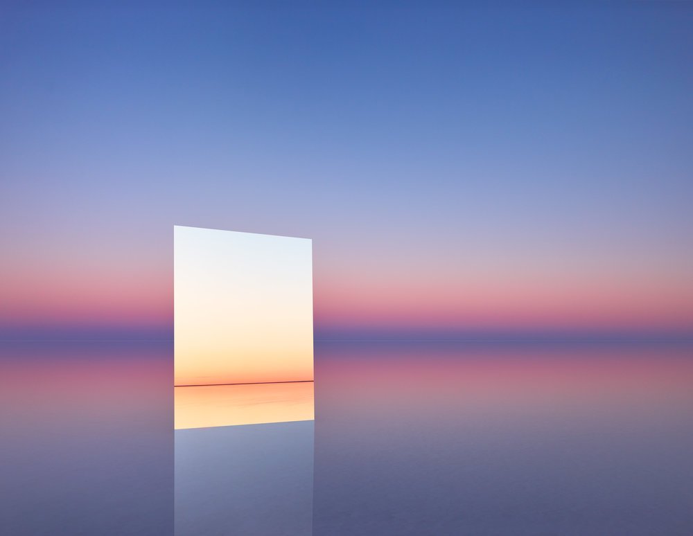
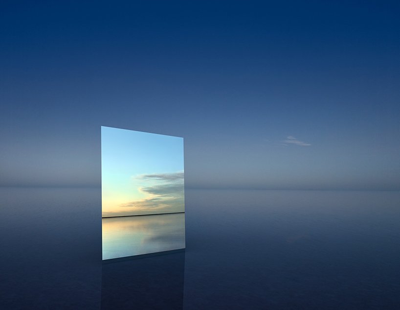
Vanity, 2017 by Murray Fredricks
Murray Fredricks’s Vanity sees the land as the medium, and introduces a mirror to an undisturbed landscape. The photographer journeyed to the middle of the lake, where an inch of salt-laden water reflects the sky. ‘the mirror can be seen as emblematic of our obsession with ourselves, individually, and collectively,’ fredericks says. ‘in the ‘vanity’ series, rather than reflecting our own ‘surface’ image, the mirror is positioned to draw our gaze out and away from ourselves, into the environment, driving us towards an emotional engagement with light, colour and space.’
It’s interesting how he uses the mirror as another “dimension” of space to reflect the current space that he placed it in. It creates this certain distortion yet a seamless blend to it. The resulting images creates this sublimity to it, with infinite variations of color and clouds, sky and light and landscape, all of this comes together in one single frame.
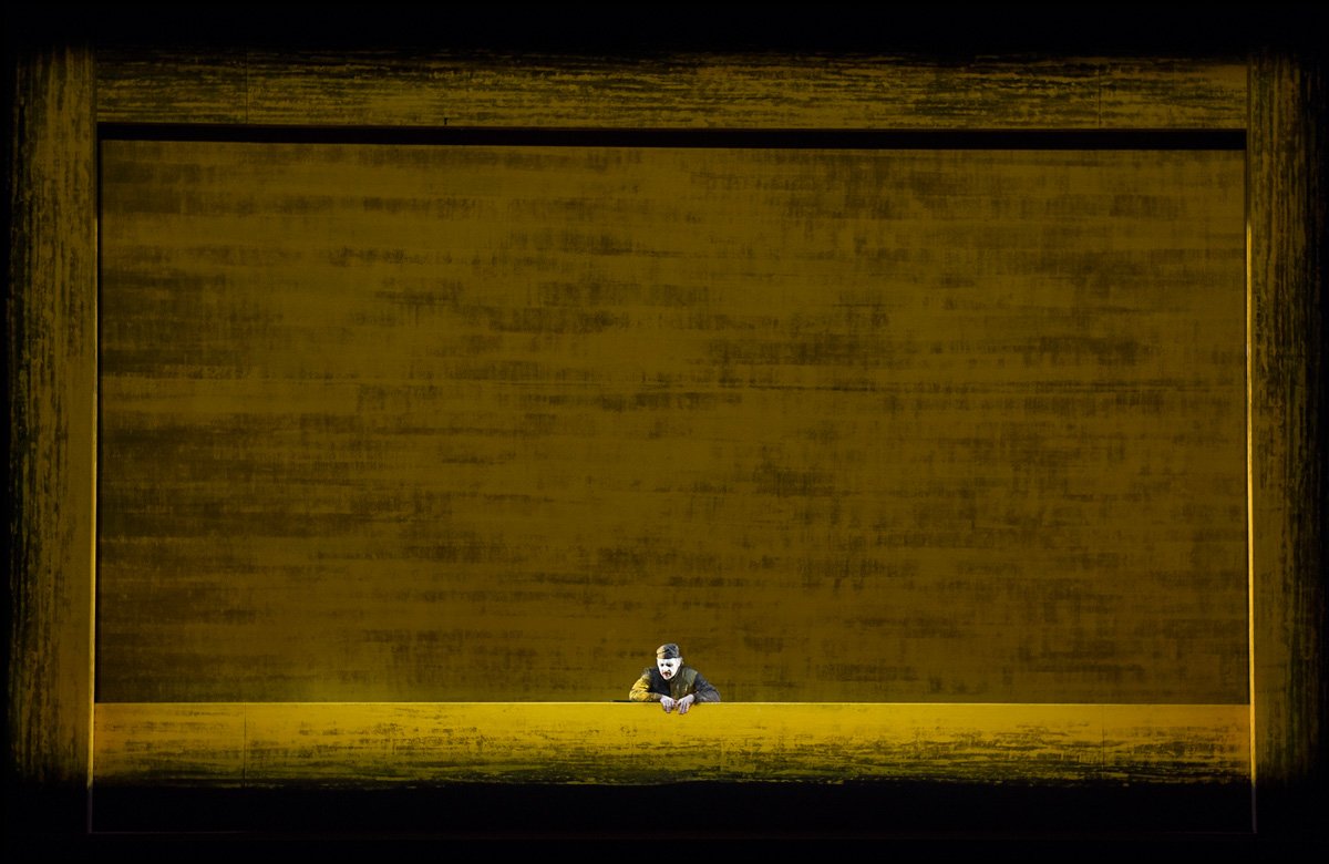
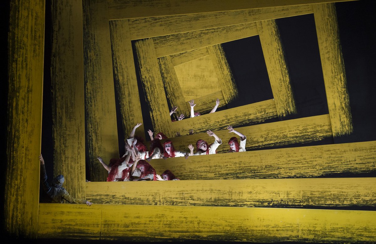
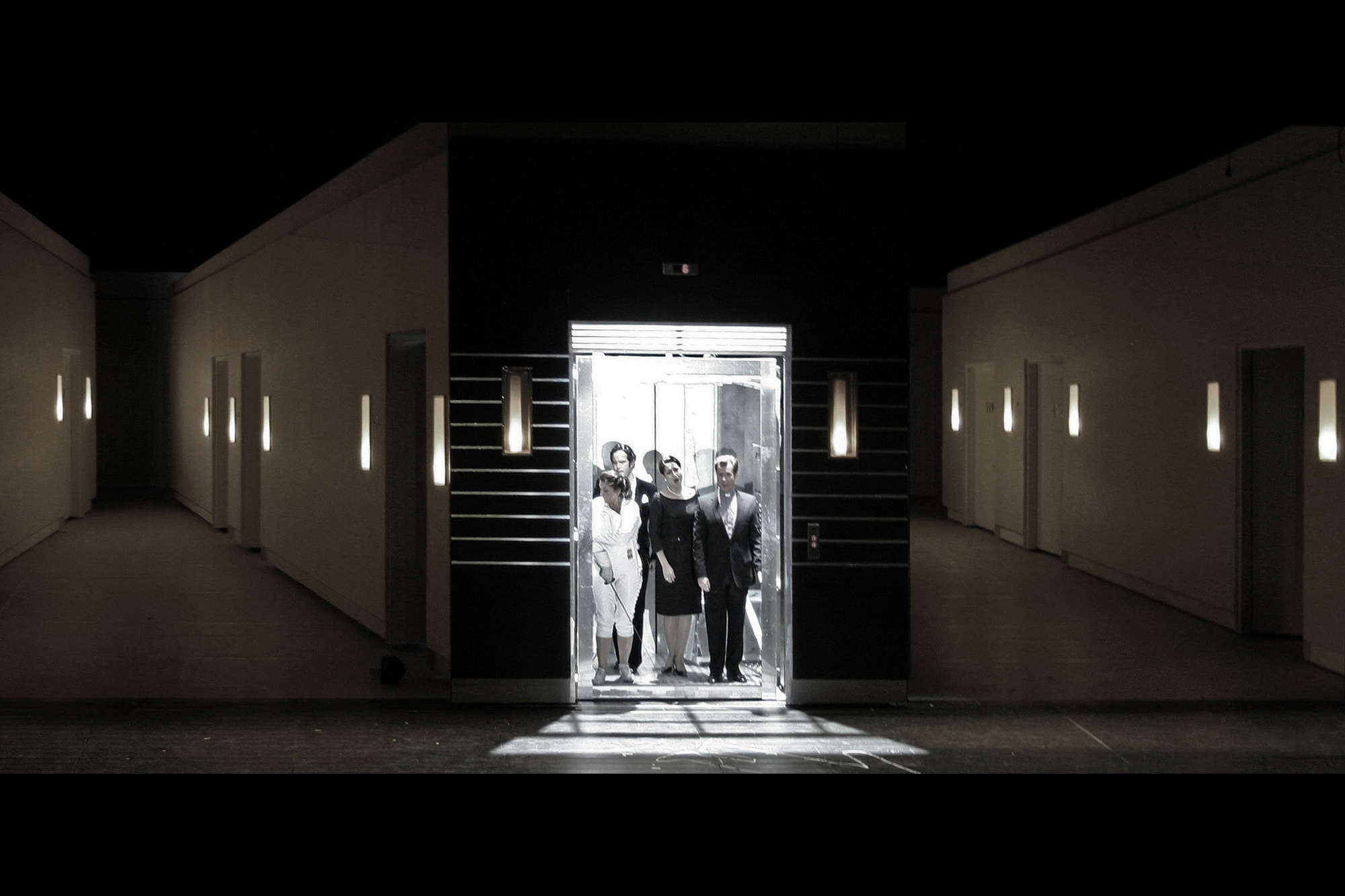
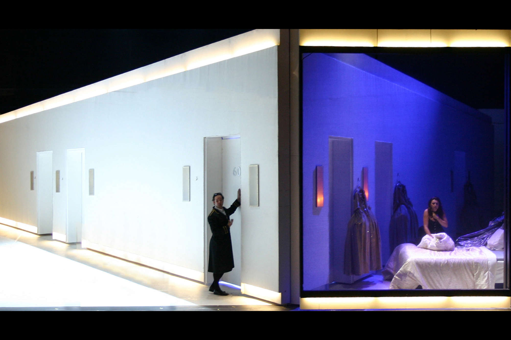
02 Theatre Set Design
Wozzeck, Zurich Opera by Michael Levine
It’s interesting and smart how Michael Levine used perspective and frames to change the viewers’ eyes. At first, it looks like a simple frame that is painted yellow, but as the show goes, more and more frames appear behind the first one, revealing up to six layers. The frames starts moving which creates a sense of depth and movement. Such simple technique of using a frame is able to achieve so much movements and change the space!
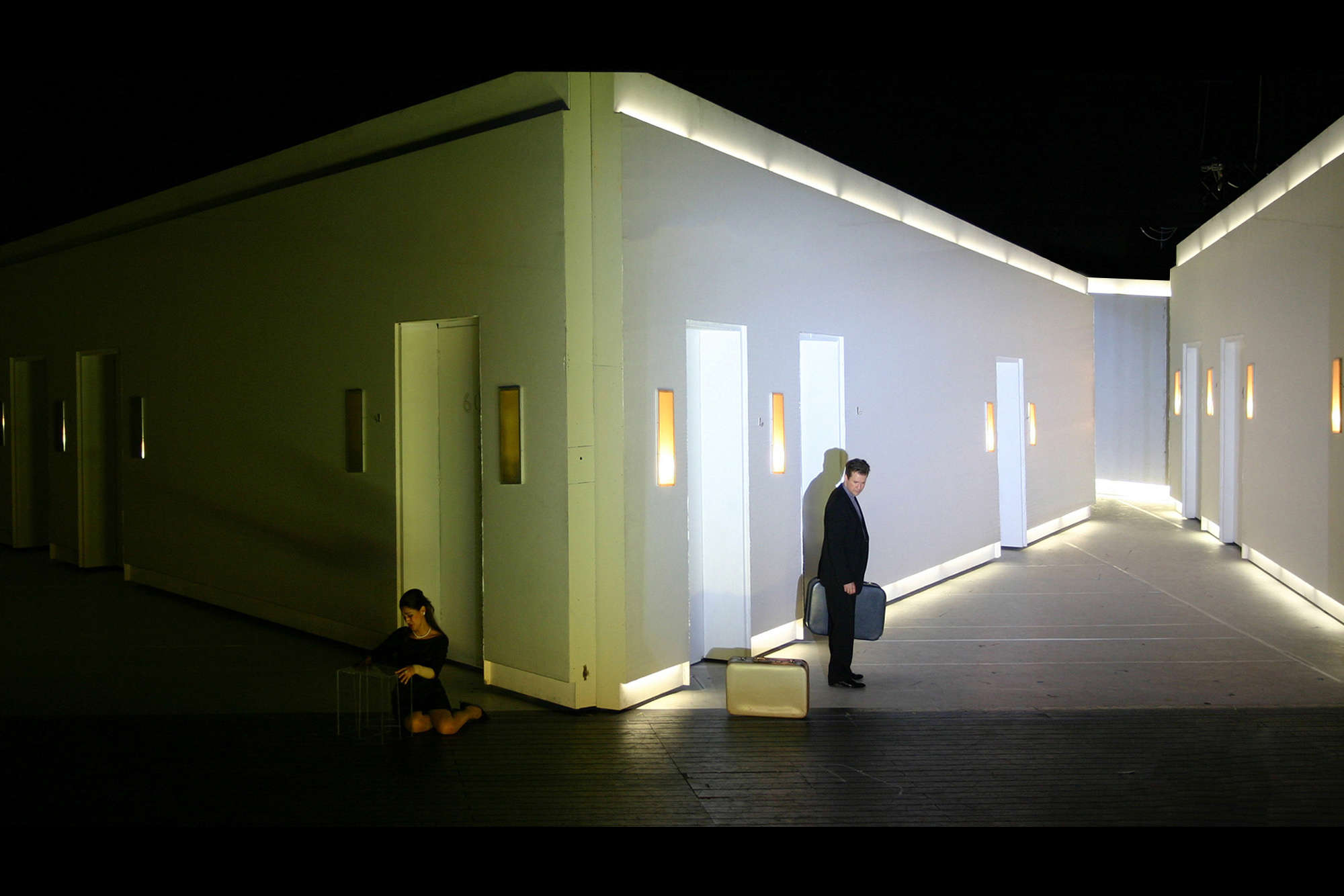
03 Theatre Set Design
Don Giovanni – Vienna, 2006 by Es Devlin
Es Devlin sets looks like it was a film still. It gives me this sense of surrealism which I believe was caused by the perspective used and the colours. It looks like it was edited as no such space could be seen in real life. She was smart to play with different planes and depth, which creates “two sides” during the theatre play. It is as though we are watching a film, with both of the characters pov playing at the same time. Personally, I feel this execution of space is really smart as it gives the play so much more freedom in expressing the narrative simply by changing the planes in the set.
P H Y S I C A L S P A C E
![]()
![]()
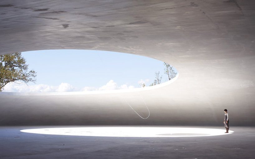
01 Architecture
Teshima Art Museum, Japan by Ryue Nishizawa & Rei Naito
The museum resembles a droplet of water caught in the middle of gliding across the land. two large elliptical openings define and orient the space while letting the interior collect pieces of the elements: pools of water accumulate on the floor and freely shift and migrate according to the breeze’s direction; the sounds from the sea and foliage reverberate through the open space while the ambiance is in constant change according to the sun’s position and time of day.
I love this architecture as though it is a block of concrete, it blends seamlessly with the natural surroundings due to its organic shape. This setting, in which nature, art and architecture come together with such limitless harmony, conjures an infinite array of impressions with the passage of seasons and the flow of time. It is also really smart of the architect to make use of the voids and space in the architecture, to create natural soundscapes that travels through the entire space.
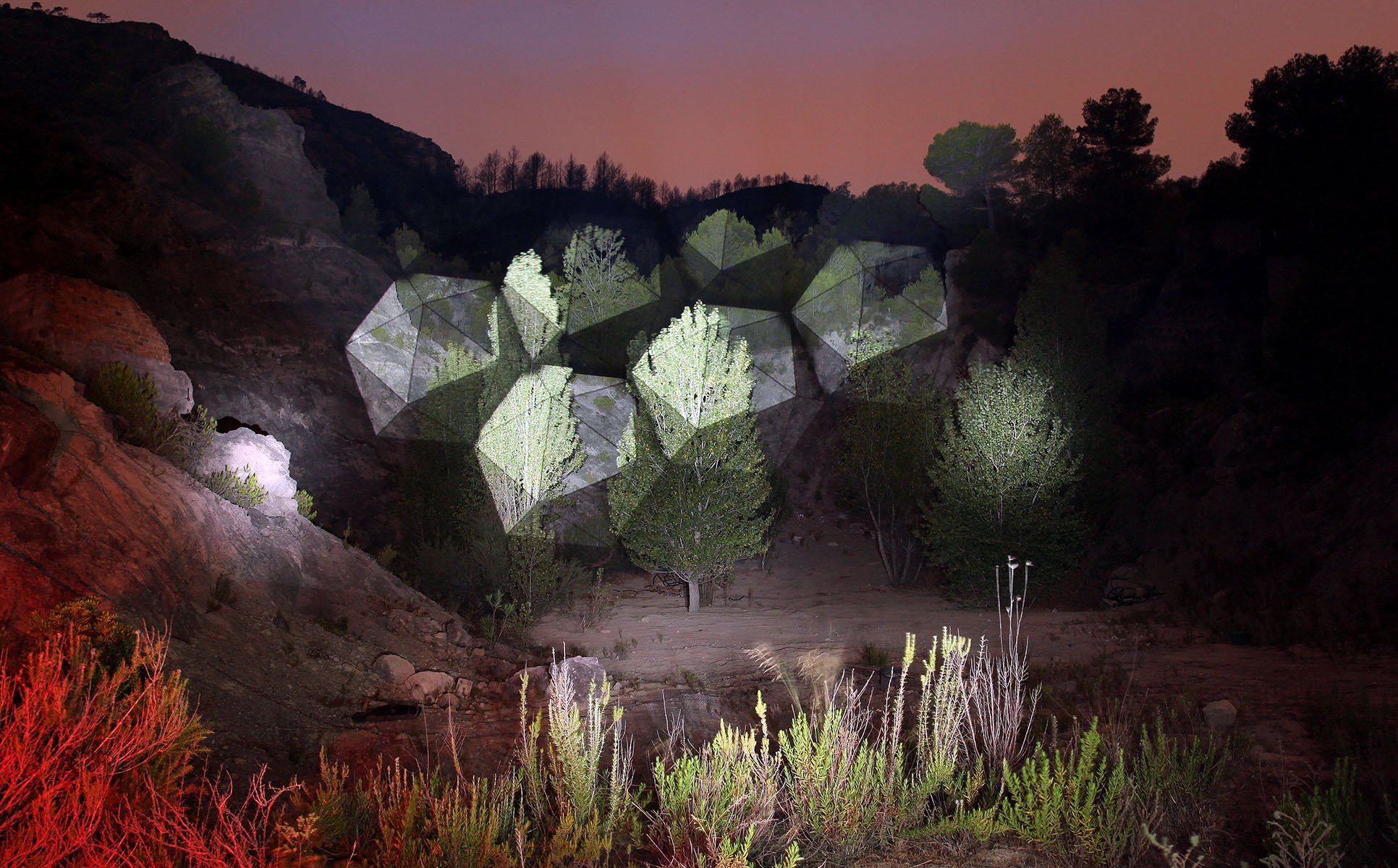
02 Light Installation
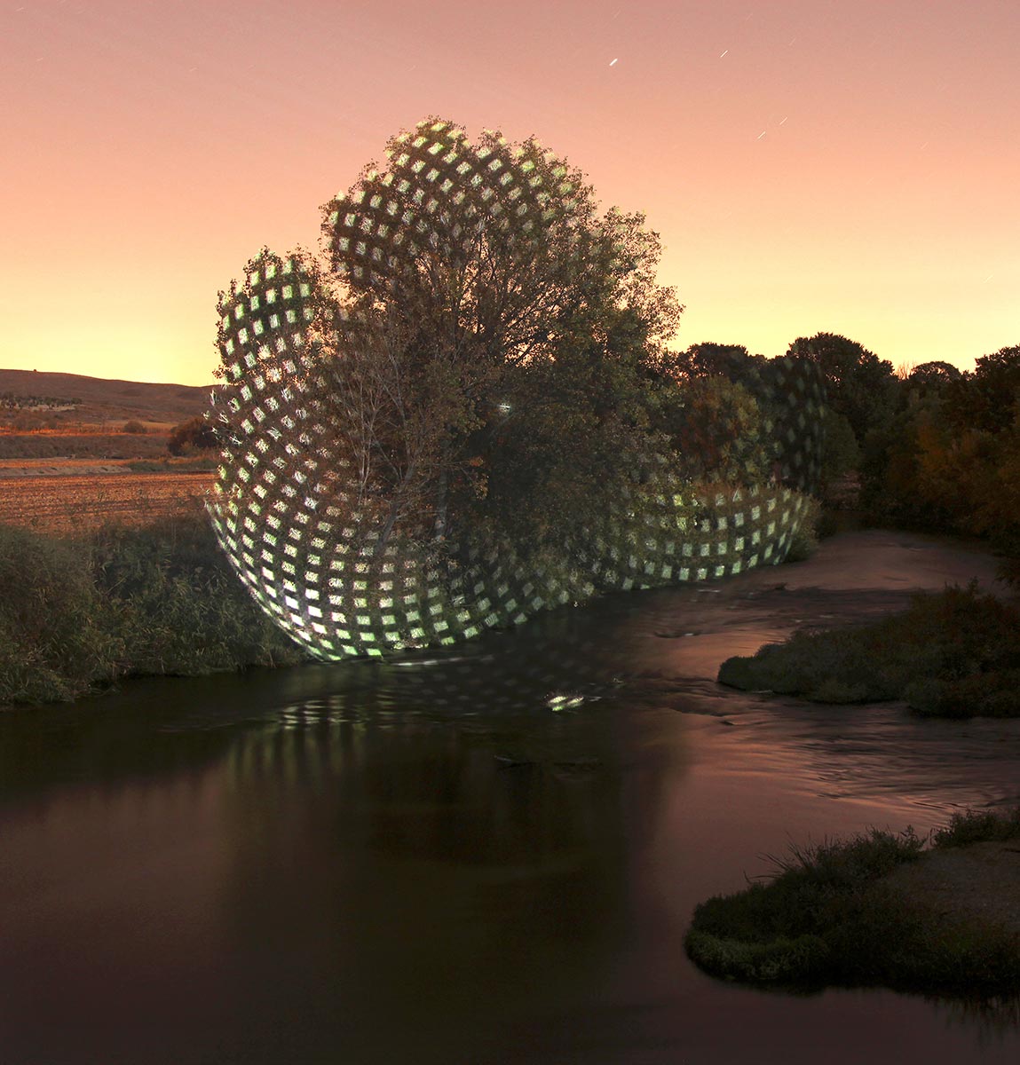
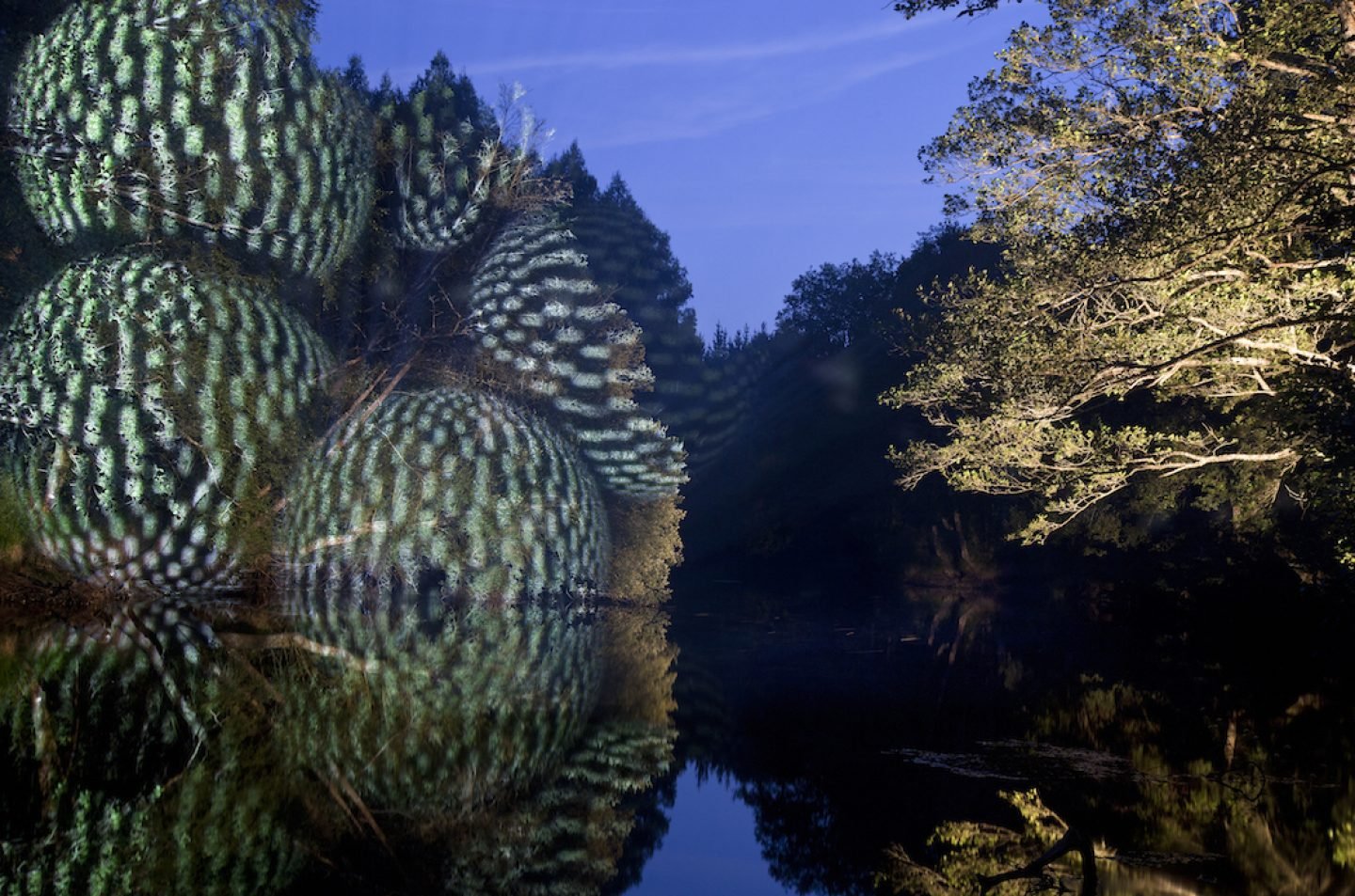
Illuminated Landscapes by Javier Riera
Javier Riera work is interesting as he uses light to creates 3D geometrical shapes onto our landscapes. Simply by using light and projection, he makes the landscape much more playful and interesting without destroying anything. It is amazing how simply by changing something in what we see everyday, by adding 3D geometric shapes on trees, this could change the space.