Ikebana Research and process

I was intrigued when Cheryl presented the next assignment which we would be working on, which was Ikebana.

Ikebana is japanese for floral arrangements. It is an exquisite form of art and requires maticulous handiwork. In addition to this theme, we were tasked to try and incoporate food into our composition to increase the complexity of our compositions.

This addition is exciting as it adds another dimension to our model as the element of taste and smell is introduced.

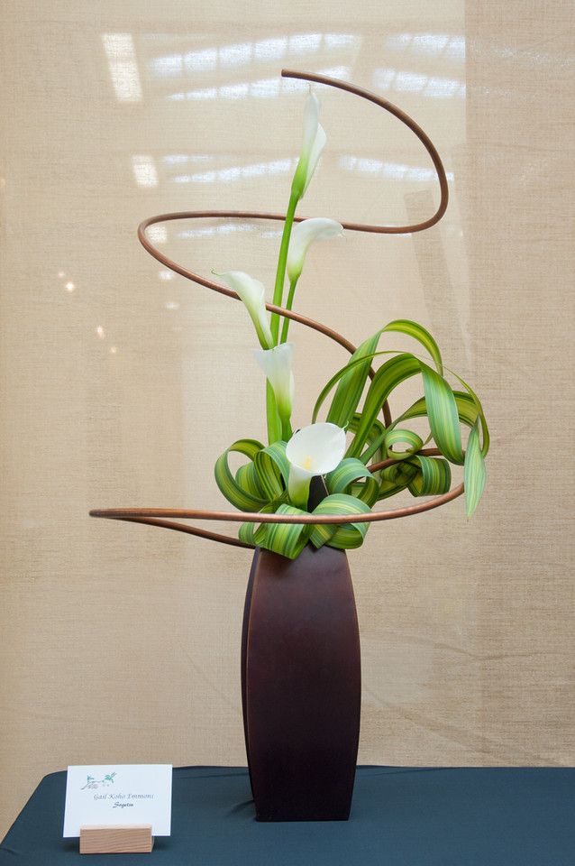
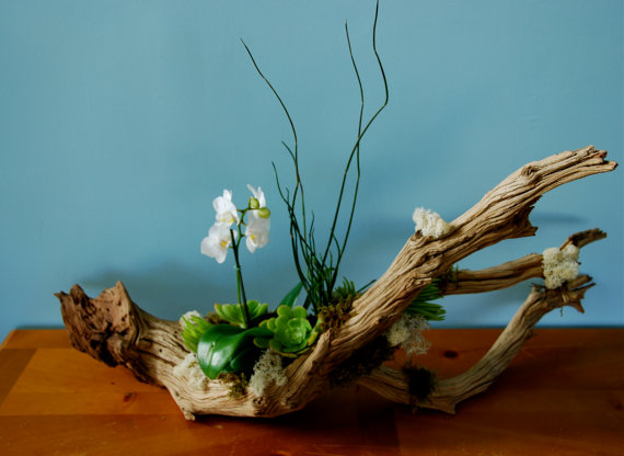
She showed us a variety of different styles of floral layouts and this particular one below caught my eye.

I really liked the composition of this arrangement as it draws your eyes to the center and makes you wonder what plant that is. The ‘floating’ leaf ties the whole composition together and it was something i would want to incorporate into my piece.

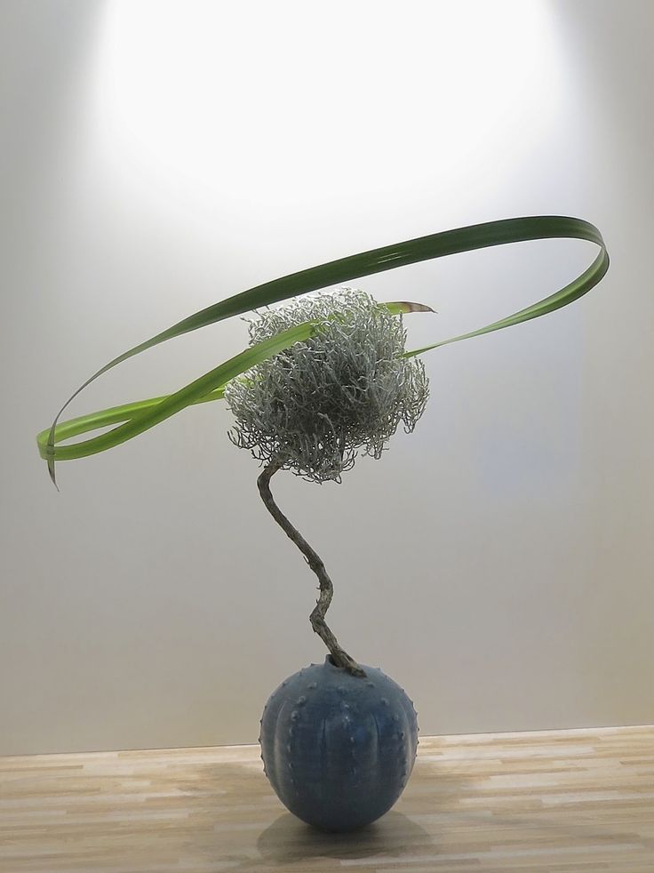
This has composition has the use of a ‘floating’ spiral, however, it draws your attention upwards instead of towards the center.

I started to brainstorm on the things I would relate to summer.

Greenery, sunshine, tall grass, insects, full of life, orange, the sun, heat

Seasonal fruits: Peaches, watermelon, cherries, strawberries

Colours I could consider: Vibrant tones such as orange and green. Even tropical colours such as yellow and pink.

To gain further inspiration, I searched for photos of Japan in Summer to get a better feel of the colour palate I could make use of.

https://www.studyabroad.com/in-japan/summer

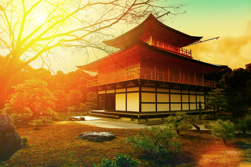
As you can see in the pictures above, there are very warm tones of red and orange, with a hint of pink.

I also looked through my recent trip to Japan for references I could use. Although I went to Japan when it was early spring, there were some photos I could make use of!

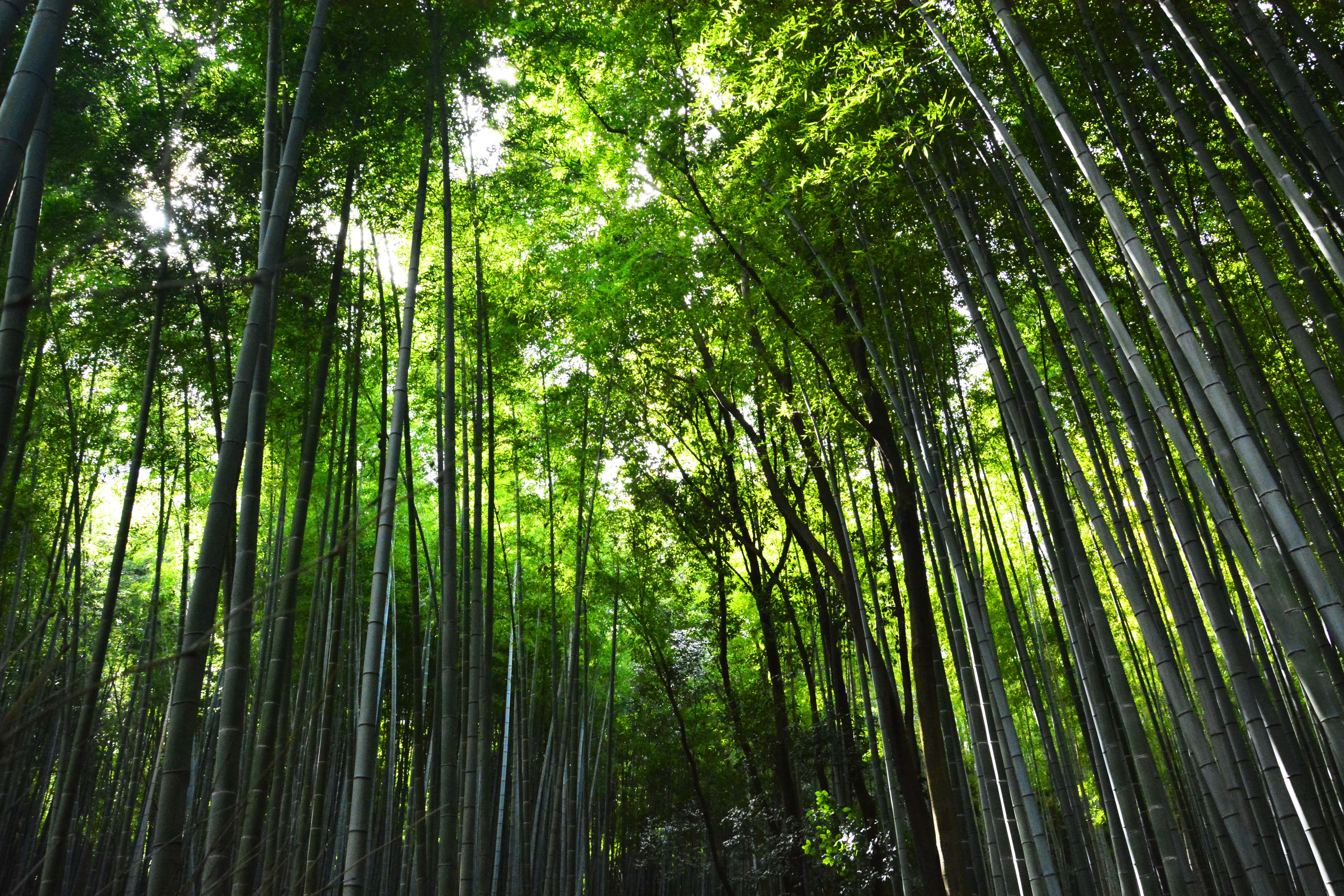
Here we have the bamboo forest located in Arashiyama, Kyoto. The towering bamboo sprouts constantly draws your eyes upwards, where the sky is covered by a canopy of bamboo leaves.

I came across this pillar supporting a tree on one of our hikes. This trail lead to a shrine deep within the hills or mountains located in Arashiyama, dedicated to those lives which were lost while constructing the lake which runs through the town, known as the Katsura River. I liked the shape and look of this particular tree trunk and I wanted to incorporate it into my composition to show life.

If you have time and want to check out my trip to Japan, here’s my travel journal!

 https://www.behance.net/gallery/54059797/Photography-Journal-2017 

I also wanted to explore the usage of drift wood to as a base as it ties into the theme of having life sprouting from it. Drift wood also have many interesting compositions and it is different from every angle which makes it dynamic.


I managed to get a hold of several pieces of driftwood which I have used before in previous projects.
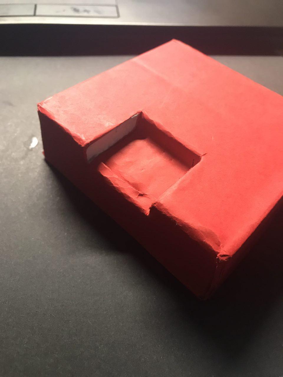
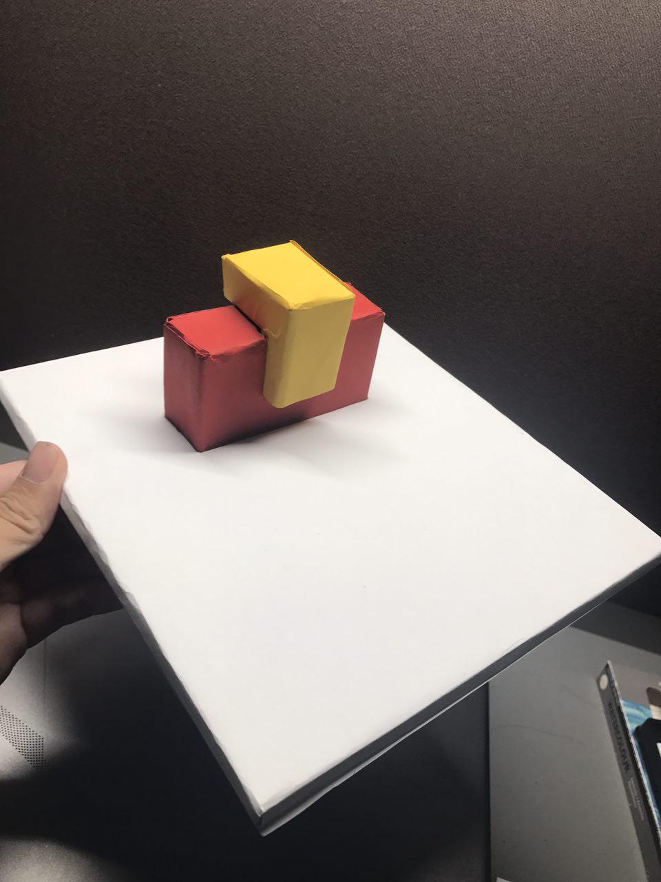
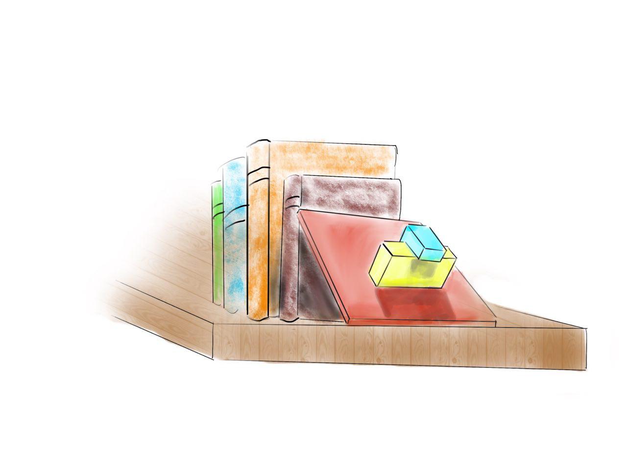
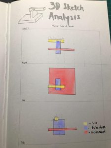
Initial Sketches:

The objects I really wanted to be represented in my composition were: the Sun, peaches to represent summer, drift wood, greenery to represent life. These were my building blocks for my model.

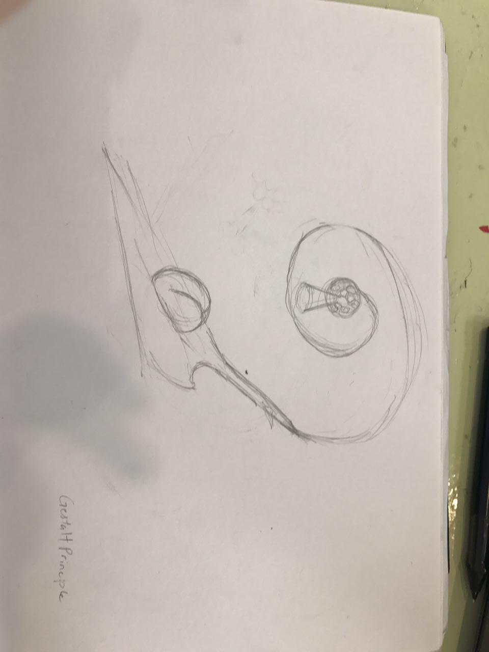
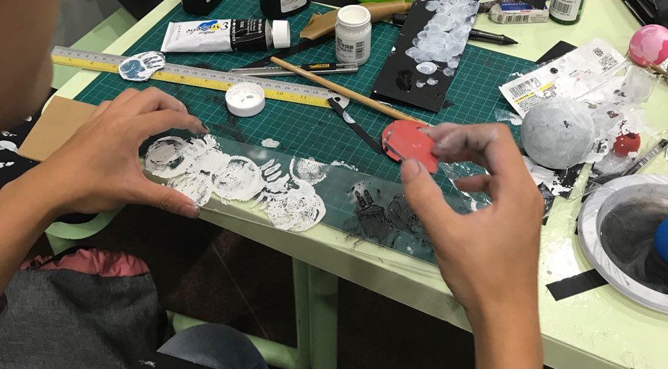
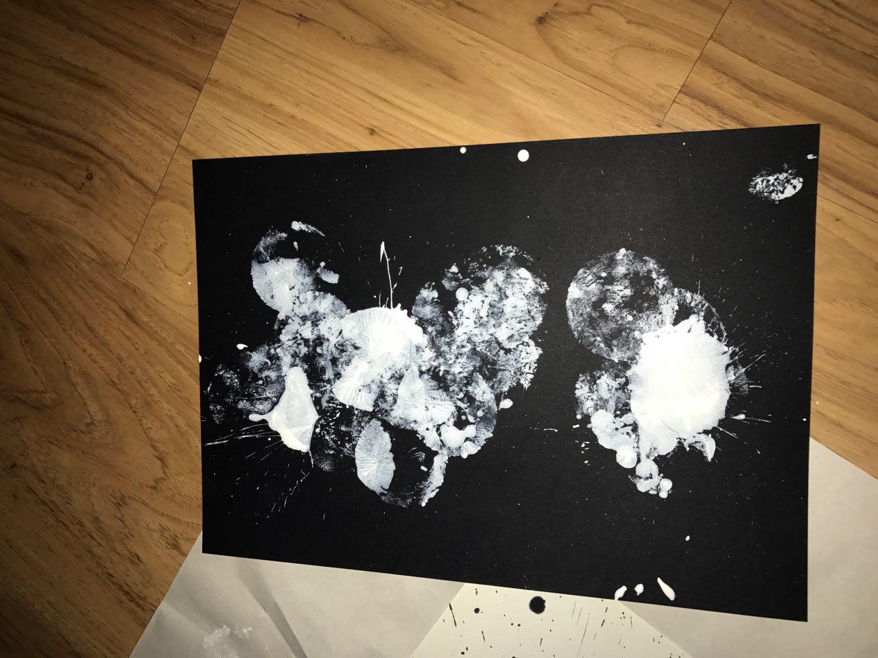
During these Sketches, I was trying to figure out the composition of the leaves and what to place at the end. My idea was to form a sphere out of cones to use as the sun, then I would have a protruding cone to represent a ray of light. However, I realised that it would create a confusing composition as your eyes are not drawn to anywhere in particular. Therefore, I decided to use something simpler such as a painted ping pong ball to represent the sun.

I also had an idea to use the Gestalt in my composition as I wanted to cut up the peach and lay it on the wood to form an implied sphere, where the sum of its parts is less than its presence.

However, it was difficult for me to do that as peaches have a large seed which would be difficult to cut through and I would not have any proper surface to lay the peach slices on. This would be touched on later in my process.

Choosing my dominant:

I decided to choose the first piece (I forgot to take process pictures) as it has a protruding body, which would resemble a cylinder and it has a more elegant shape to it. This piece also had a curvature upwards which helped give the model a certain ‘flow’ to it. The second piece of drift wood was immensely big and I found that many of my elements would be overpowered by it.

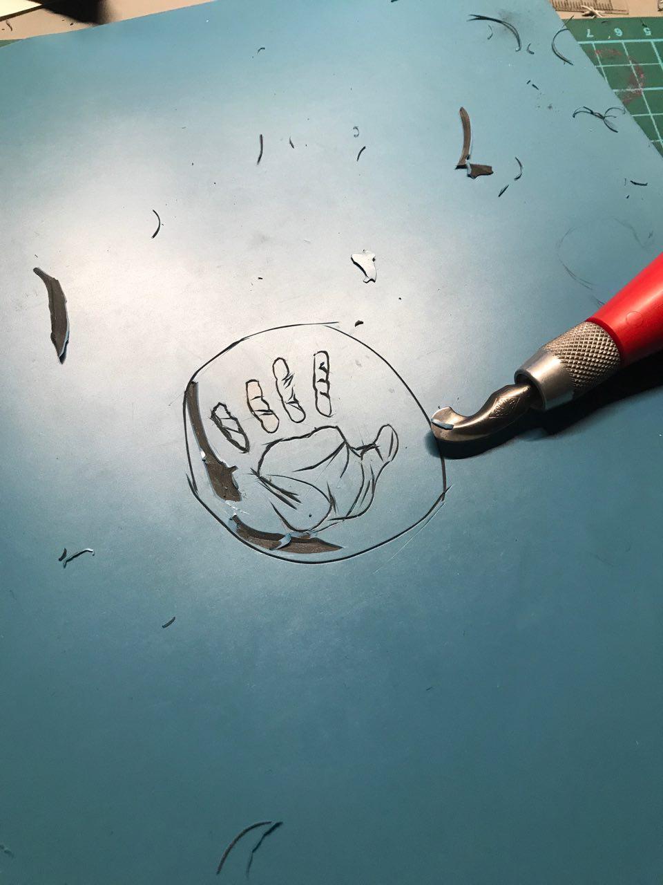
To have the ‘floating’ look, I had to use a spool of thick wire to form the structure. After which, I etched grooves into the drift wood to enable the wire to have some support. I also had to file down the wood as there were a ton of splinters on it.

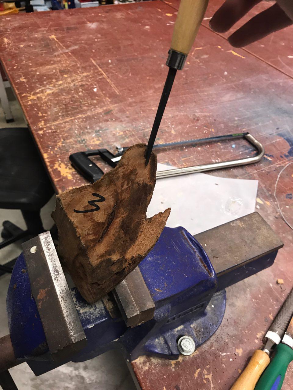
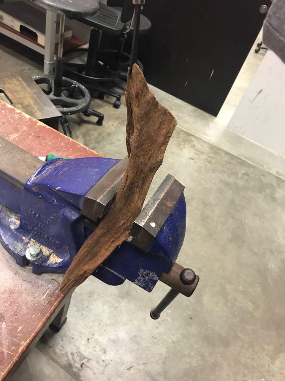
I also sanded down the acrylic board as it initially had very straight and inorganic edges. I wanted it to have a more natural shape which would resemble a tree bark.

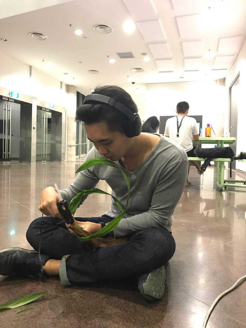
For the next step, I had to glue the leaves around the wire. The initial idea was to roll the leaves around the wire but i realised that the shape would not be as interesting. So i went with gluing the leaves flat.

Going back to the idea of using peaches as my main object of Summer after I realised that it was difficult for me to plate my peach as well as create an attractive SO out of peach slices, I tried to form a flower out of peach slices. This would represent the blossoming life in Summer.

I also experimented with banana peel, however it was too flimsy to be crafted into a flower. As bananas had a strong yellow presence, I felt it would have been a good fruit to represent summer.

Alas! I finally crafted a flower out of a peach! Huraaah!! It took me about 45 minutes to carefully cut the slices and gingerly fold them. However, things were not as rosy as it seemed as the peach started to oxidise and lose its form, turning into this dull mess below.

I looked to my right and lo and behold! My classmate was working with carrots which were also a summer food and it is vibrant orange! Carrots also wouldn’t easily lose its structure and colour if left out for long. I decided to use carrot strips instead and put a peach as a base for the carrot to rest on.

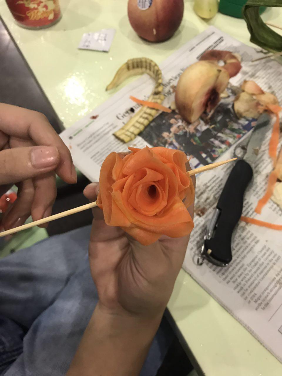
Thank god for supportive classmates! The carrot was much more manageable to work with because it could be bent easily.

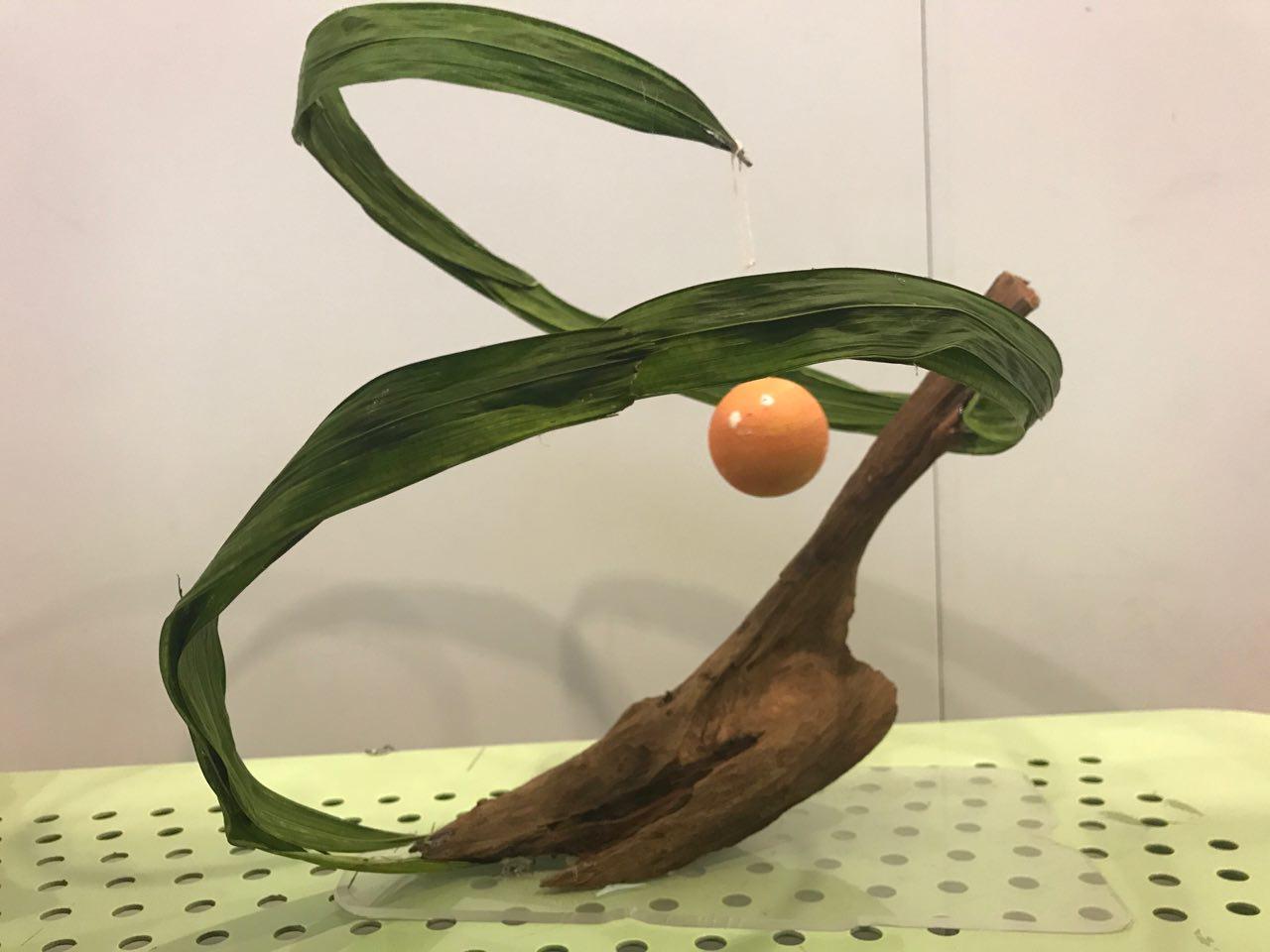
After that, all that was left was to plate the model!

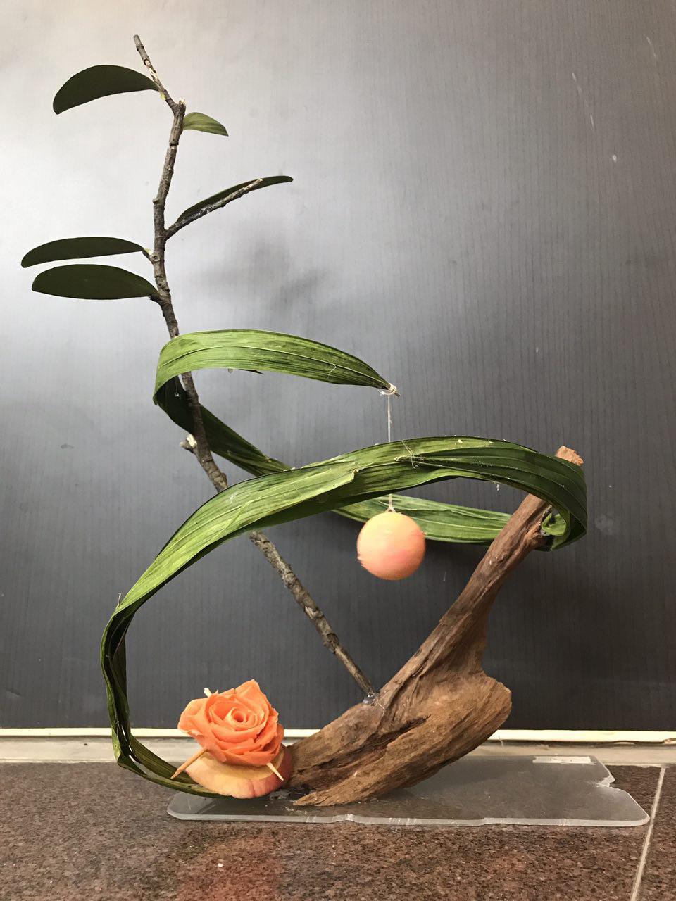
As you can see, the spiral forms an implied cone which draws your eyes towards the branch with leaves. This would show the life of spring and how vibrant it is! After which, you would be drawn to the orange sphere which forms the sun, and after that the flower which is made of carrots, with a hint of peachiness at the bottom.

From the top view, my model forms a peach as well!

Assignment 2: Forrest Gump Research and Quotes

Watching movies often gives me great joy as I am always able to immerse myself in the world which it creates. I prefer movies with deeper meaning to them, rather than ones with mindless action.

These are some of the quotes I got from my favourite movies:

Get busy living or get busy dying. – Shawshank Redemption (1994)

This quote inspired me to make full use of my life as we only have so much time left on this world. I actually made a piece of artwork from this piece several years back.

However, this would be too literal for my assignment. The inspiration I had for this piece was from Banksy. A popular street artist that often creates work based on pop culture. This will be touched on later in my research.


It is not music if you can’t dance to it. – The intouchables (2011)

There is only one word to describe this movie, and the word is Beautiful. It is an inspiring movie of the journey between a caretaker and a disabled man, both from extremely different backgrounds. However, they influence each other in various aspects, driving them to do things they would have never imagined.

Are you not entertained? – Gladiator (2000)

This movie is about an army General which was betrayed and sold as a slave as he uncovered a dirty truth. The movie follows journey back to his family as well as exposing the truth.

Classrooms dull your mind, destroy the potential for authentic creativity. – A Beautiful Mind (2001) 

This is an amazing quote as I feel it is a good representation of most classes I’ve had growing up. Our society is so afraid of failure that we tend to do things which are the ‘safest’ or comfortable with which in turn, limits creativity.


Research

Banksy

http://www.tavernmagazine.com/bansky-the-enigma-2/
http://www.birminghammail.co.uk/news/showbiz-tv/who-banksy-real-name-identity-13224924

https://www.smithsonianmag.com/arts-culture/the-story-behind-banksy-4310304/

Banksy is a renowned street artist which often portrays pop culture and societal issues masterfully in his art. His use of simplified tones and voids to create such works is amazing and very relevant to the assignment on hand.

The use of minimal elements also enable the message to be understood quickly, which is important for street art as the audience may be on a form of transport and would not be able to capture the essence of the design quickly.

Banksy uses colour to give contrast to the composition, drawing the attention of the audience to the crux of the message. However, as we will not be able to use colour, I have to use of hyperbole and semiotics to convey our message across.


Eugenia Loli

Eugena Loli is an American digital artist who juxtaposes retro pictures of advertisements as well as film photos for her compositions. This gives her work a nostalgic feeling as well as a sense of surrealism. The use of space as a backdrop gives it a magical and mysterious tone to the composition.

In the middle image, she makes use of space through what seems to be thin steams of clouds to create implied lines, drawing the audience to the centre of the image.

Mario Wagner

This artist has more uses of lines in his composition. These are to bring about the limitations we face at our current knowledge of mathematics, with the lines to represent a cage. However, I felt that the lines were too distracting and hurt the composition as it made it too complex.

Julien Pacaud

The use of semiotics is prevalent in this artist’s work as he is able to convey messages through his work. My interpretation of the first object would be that the female individual is overcoming the wage gap between females and males. The usage of scales shows it tipping to her favour. All these little details play a part in being able to send a message.

Marco Battaglini –

As one of the movies I picked had a setting in the roman era, I wanted to have a renaissance twist to my composition to keep it in context. I started searching for modern interpretations of renaissance works and I came across this artist.

The composition is filled to the brim with objects which makes it difficult to focus on any one subject at a time. This is is not what I would like for my design, however, I enjoyed the use of a more modern setting to show a contrast between styles.

Techniques 

I researched into methods of getting a more textured looks for my composition. I like how US money had the threshold look, as well as a texture to it. Because of that, I wanted to replicate the effect.

http://www.businessinsider.com/the-comeback-of-the-us-dollar-2013-3/?IR=T

I don’t know if I would get into trouble for searching for something like this but I felt that this texture would really stylize my images. However, as started to develop my ideas and compositions, I felt that this effects would not look nice for my quotes.

My Line is EMO final

Final emotions:

JOY

For my final print, I decided to use an acrylic board as I wanted to replicate how a glass table would look from the bottom if it was stained by food. For this to work, I carved out a pair of hands from a piece of linoleum. To make them realistic, I added grooves in the hands for them to look more lifelike.

I made some adjustments from chinese calligraphy ink to acrylic paint as ink was too diluted, making the details hard to identify. After these changes, the prints turned out well!

I started to work on the acrylic base. Initially, I just wanted to just use hands for this print, however, my lecturer made me realise that the image was too literal and there weren’t enough elements to make it an interesting composition. I decided to put ink on rubber balls and press them against the board to create more shapes on the board. This worked, however, I realised that it was difficult to identify the hands as it blended with the ball. The ball prints could not be black either as the background which I would be pasting the panel would be black as well. To get around this issue,  I used black paint for the hands and the ball prints would remain white.

I also used the bottom of a container jar to make marks as whenever we spill a drink, there would be circular marks on the table.

Final Result:

SURPRISE

I wanted the emotion for surprise to be raw. Something that you would instinctively think of, which is why I decided to use a ball for the medium. When a ball is suddenly thrown at you, in that instant, I would feel a jolt of adrenaline which is similar to an explosion.

To replicate this feeling, I decided to place ink on paper and proceed to hurl a ball at that blotch of ink. Initially, I used white poster paint on black paper, however, I soon realised that the paint was too thick to be splattered which is why i ended up with a very muddy effect which was not what I intended.

I diluted the paint with water and tried again, this time receiving favourable results! I like how explosive the prints look.

Next, I used white paper with chinese calligraphy ink.

I much prefer the composition of this image and I also felt that surprise may not always be an enjoyable thing. Surprise can be brought upon by bad news as well which is why I also went along with black ink instead of white.

Final Result:

FEAR

Fear was an interesting concept to explore because of how relevant it is in our society now as well as how apparent it is in our everyday lives. Fear can drive people crazy; fear can make the strongest man whimper. Even though we are living in civilization’s most peaceful time, the non-stop fear-mongering of news makes us think the opposite. Constant news coverage of terror plots and attacks, accompanied by threats from hostile countries never fail to keep us locked in a state of panic.

This is why I wanted to explore the use of chains or ropes to signify how fear restricts us and prevents us from participating in activities such as travelling.

I decided to use charcoal rubbing technique to capture the details of the rope as well as give it a mysterious smokey aura. I had to vary the pressure of the charcoal to ensure I get the most detail and texture out of the cable I used.

For the background, I did an ink transfer using newspaper to get the dramatic effect of the headlines on the paper. I tried several sprays to try and get the ink from the newspaper to get transferred onto the paper.

Final Result:

SADNESS

Sadness, it comes in waves, it envelopes us and leaves us in its wake. Flooding our senses, drowning out all other emotions. I relate sadness closely to water and liquid. To capture its essence, I decided to use cloth as my medium – how fitting…

what I did was to twist the cloth into a spiral and place ink on adjacent sides of the spiral so that there would be contrasts between the negative and positive space. I decided to use a spiral as I wanted to represent waves as well.

I did a several of these spirals and I then went on to dye them. This was the result of what the cloth looked like after a day.

As the cloth had many different interesting prints to choose from, I had to choose ones which had a composition I liked and it also has to represent the emotion well.


Final Result:

FRUSTRATION

Frustration was an interesting emotion to explore as I am generally on the more reserved side, which made it difficult for me to create something from it. However, I thought of the time which my lung collapsed and I felt utterly betrayed by my body as I have always treated it with care by eating healthily and exercising. I felt that I did not deserve such pain and I was frustrated with the body I had.

I realised that having this frustration was pointless as it did not serve a purpose and all it did was make me feel worse trapped in my own body. I after some self reflection, I channeled this frustration and dissatisfaction into something of more value. I wanted to make everyday count and appreciate things in life, no matter how small they may seem.

To make the effect of a cage breaking, I used the pink foam which is meant to protect soft fruits from being bruised in the process. I first sprayed a coat of spray mount onto the pink foam and i pressed it firmly against the paper. This is to form the black lines as seen in the print.

I then went on to spray another layer of Spray mount to ensure that the flour would stick onto the paper when applied on. I then went on to spray fixative so that the flour would not shift around when a new coat of spray mount is added. I layered this a few times till I was happy with the results.

Final Result:

LONGING

How this effect was made was purely by luck as it happened during the time when I was also experimenting with the emotion of Joy. As I was throwing balls against paper, some of it escaped my grip and rolled around the floor. As there was paint on the ball, it left a trail of paint on my floor!

I then decided to try and see what it would look like when it was on paper. The marks that the ball created seemed to represent fingers which caressed the paper. I felt that this effect was apt to describe the feeling of longing as the feeling lingers.

Final Result:


Techniques Used and exploration

With the seemingly infinite ways of printmaking, I should start off with one of the most basic ones. Stamping using a piece of linoleum. I enjoy the process of etching out designs from linoleum which is why I decided to start with it first.

These are linoleum prints I made during the process of My Line is Emo.

I chose not to use the larger pieces as I felt that they were too flat and they do not evoke the emotions which I want to express. The problem with using a linocut is that sometimes the print may turn out too be too literal or suggestive which is not recommended when working on an abstract piece.

I decided to cut out small hands to make it seem as though a child had made these prints. I wanted to show details of the palm and fingers to make it more lifelike and have that human touch. Similar to what artist Marcus Harvey did during his exhibition called Sensation where he used prints of children’s hands to create a portrait of a serial child murderer.

However, I decided to incorporate more elements into this piece instead of making it just one print as what my lecturer suggested. This in turn, transformed my print into a more dynamic one, showing more emotions and expressions. I juxtaposed black and white paint, while also using different print mediums such as balls to create a contrasting background to give it depth. The acrylic would signify a mess created on a tabletop, similar to how my dining table would look like after I played with my food….

On the topic of using balls, I ventured into the idea of using them more as I feel that balls have the ability to evoke multiple emotions in people! Some find joy and excitement in balls, while others may find fear in it and in certain situations, surprise! For me, depending on the ball, I would mostly feel excitement and joy from balls because I relate it to physical activities and games.

I experimented with balls to see what type of expressions and emotions I would get out of the prints. I found out that the emotion of surprise showed well through my prints. For these prints, I put a couple of drops of paint onto a sheet of paper and threw a ball at the paper, creating a splash effect. My mother wasn’t a fan of this method as it created more of a mess than any other print techniques.

However, I was not able to get such an effect immediately. I initially had trouble getting the ink to splatter because I used paint. This ‘failure’ is more apparent when i used white paint.

I feel that even thought the paint did not splatter, it still created an interesting print. One where you are able to make out the medium and also get a mysterious feeling from it. In some ways, the images look like moons colliding.

Speaking of cleaning up, I used cloth as a medium as well. Using cloth was exciting because I did not know what the results would be like. Cloth is vastly different from paper as it is absorbent and it can be twisted and wrinkled unlike paper which would end up tearing. This made cloth a very resilient material. This allowed me to explore various methods of tie dye.

One method that caught my eye was the Diamond Pattern Folded Tie Dye Technique from http://www.bystephanielynn.com/2015/06/tie-dye-folding-techniques-16-vibrant-tie-dye-patterns-tiedyeyoursummer.html this technique folded cloth similar to how we store plastic bags.

After folding it like a plastic bag, you would then proceed to secure it with rubber bands and apply dye to the shirt at specific corners.

I was pleased with the outcome of the shirt, however, I felt that it was too linear and inorganic for my liking.


I tried other methods of tie dying as well, for another method, began to swirl the cloth and I then proceeded to add ink onto it. The results for this method was hit or miss as some turned out ideal while others look too scattered.

The next technique I used was more straightforward, this method involved just adding ink to cloth and applying water to the cloth so that the ink is able to be smudged. However,  I felt that it did not show enough versatility of paper as I felt that the same thing could be emulated with paper.

To me, cloth is something which is reliable and resilient. I feel that cloth is often used to clean up a mess or tears when someone is sad. Cloth is able to hold emotions well which makes it resilient in times of need. Therefore, I would relate these prints to sadness.

Another absorbent material i experimented with was bread. Bread has become a staple in my diet as I have constantly been eating it for breakfast ever since I entered university as I do not have the luxury of making breakfast in the morning anymore.

Bread was an interesting medium to work with as there were many variations of prints i could get from it. From the crust to the flesh, everything can be used and the results would still amaze me.


In my journal, I showed the various types of prints I was able to get from just using bread!

I started to think of the emotion of Fear and what it does to our minds. Fear is an overwhelming emotion which can rarely be controlled. Fear restricts us and holds us down, preventing us from ever trying certain activities. The main inspiration from which i drew fear from was chains or ropes as they weigh us down. This resulted in me looking for suitable materials to use to emulate the print of chains. I experimented with various types of ropes and strings and found out that cables work the best.

Initially, I placed paint on the cable and tried to imprint it onto the paper. However, I ended up with a very dull and flat print which i did not want to use. I also had to learn how to braid hair to use it on cables! (Time to impress girls!) This helped me get more of the crossing effect of the cables as well as more depth.

After many attempts of using this method, I decided to layer the paper over the cable instead, and use charcoal to rub the paper over the object, similar to coin or stone rubbing.

https://www.crayola.com/lesson-plans/coin-rubbing-pictures-lesson-plan/

I came up with an effect with more depth and detail from this method of printing which excite me.

I had to practice a many more times before i could get such a clean and defined line as this one. (my best one yet)

I was at the supermarket looking for materials which I could further use for mark making which is when i stumbled upon the sponge like material used to protect fruits. I was inspired by artist Tara Donovan as she used common everyday items to create large scale instillation. Her projects also has a certain flow to them which was what I wanted to emulate in my work.

First, I coated the object in ink before pressing it onto a sheet of paper. This was the result:

I layered the material over paper and I sprayed Scotch Spray mount over, followed by sprinkling flour over the paper. I wanted the negative spaces to be filled with flour. It took me several tries to get the outcome I wanted.

First failed attempt:

I realised that the coat of flour was not thick enough, which prompted me to use a combination of fixative as well as spray mount to ensure that the flour particles do not get dislodged during the process.

It turned out well!


Artist References:

Tara Donovan, this artist is famous for layering and joining household items to create large scale instillations.

https://www.pinterest.com/pin/515028907358435038/
https://www.pinterest.com/pin/58757970110046793/

This is her work using disposable cups:

https://denadadesign.com/tara-donovan-transforming-common-objects/


Marcus Harvey, this artist is famously known for his portrait titled Myra as he painted the portrait of a famous serial child killer known as Myra Hindley using prints of children’s hands. This portrait caused an out roar as people deemed it as the glorification of the serial killer.

https://hscvisualartresources.wordpress.com/2012/07/10/marcus-harvey/

Pandora’s Box Assignment Submission

After week 4’s tutorial, I had to source for blocks to form my 2 models. I decided to go with 2 models which parts can be interchangeable and reusable. This was influenced by Lego and also because I didn’t not want to waste my foam blocks. Because the blocks had to be interchangeable, I ensured that certain blocks from different models were of similar dimensions.  The two models revolve around a main block which also happens to be the SD.

I wanted to use acrylic for my blocks which would be closely related to Lego, however, the material would be difficult to carve and be precise without proper tools.

https://www.toysperiod.com/lego-set-reference/

As a replacement, I wrapped my foam blocks in papers of basic colours to give it the representation of Lego as these blocks mostly come in basic colours.

Process

Model 1 

As I wanted to make my pieces interchangeable, I had to precisely measure out the dimensions I wanted the groove to have. I was unable to take the process photos because I was too absorbed into the task at hand! But it all turned out well as the fit is really tight. I had to use a penknife to etch out the foam, little by little till I had a perfect fit. I made sure to remove more foam to make space for the paper when it would be wrapped around the blocks.


A snug fit for both pieces!!! Yay!


Applications for my models: for my first model, as it is not symmetrical, it resembles the USS destroyer with the control tower flushed to the side of the dominant.  For my application however, I would want something less violent.

I sketched out different perspectives of my object.

After pondering for awhile, I realised that my figure could be used as a Book end.

For my larger application, I decided to model it to something similar to the new Mediacorp building. The new Mediacorp campus at Portstown road boasts an elevated plane which has a lush green landscape, below which is a carpark.

This was one of the few images I could find which featured the elevated green field.

For my large scale application, I also placed two ponds and trees to add to the landscape.

This final model is different as compared to my initial model as I decided to reduce the length of the SO so as to make it more distinguishable from the SD. However, the downside to this would be that there would be only 2 objects visible from the bottom view.

Model 2

Model 2 was a little trickier as I did not want a flush fit for my SD so much so that when viewed from the side, it would just be a diagonal line. To tackle this problem, I cut a new piece of foam with access at the top to enable it to be wedged into the D. This would result in more dimensions when looked at from different perspectives. I had issues with my SO as well as it would often be too big which would confuse the viewer from SO and SD. To tackle this, I drastically shortened the SO (with recommendation from Cheryl) and I managed to make it distinguishable.


For the application of my object, I saw use for it in the toilet. It would make for a very fancy faucet. The SO and SD would be made out of polished metal while the D would have a rusted look to compliment the wooden panel behind. I could see this being used in showrooms already!


Pandora’s box 3, Research and references

We were exposed to various architects and their usage of different terms such as void, rule of thirds, harmony and discord. Several of them include:

Sou Fujimoto

http://morewithlessdesign.com/en/sou-fujimoto-%C2%B7-serpentine-pavilion-intervention/

I enjoy the use of voids here to create the bulk of the structure. After looking up on this architect, I decided to search further into the history of the Serpentine Gallery and found a few interesting names which I will be talking about further on.

Kazuyo Sejima

https://theculturetrip.com/asia/japan/articles/kazuyo-sejima-the-japanese-architect-who-won-over-the-world/

I have been to Japan several times and every time I visit, I am constantly in awe of their architecture. I feel that they are able to push the boundaries of modern architecture. When I laid my eyes on Kazuyo Sejima work, I could instantly recognize her style as I recall seeing a structure similar to her use of large circles in her architecture. I visited Kanazawa in Spring of 2016 and I visited the 21st Century Museum of Contemporary Art. The structure of the museum is a large circle, accompanied by tall glass walls and very wide interiors which intrigued me, as the structure did not seem so large from the outside. Unfortunately I did not take many photos of the structure itself, more of the attraction which was the pool which you could go ‘underneath’ of. The structure also consists of these glass walkways which connected different segments of the building together. Needless to say, I am in awe of her work, so much so that it left such a lasting impression in my head.


Kuma Kengo – Chokkura Plaza

https://divisare.com/projects/327184-kengo-kuma-associates-alessio-guarino-chokkura-plaza

Yet another Japanese Architect? This may be one of the reasons why I find Japan so appealing! When I go back to Japan, I will make sure to pay more attention to their buildings and architects now that I have been exposed to several of these masters works. It is amazing how much they are influenced by their culture to create something so majestic.

Bjarke Ingels

http://www.independent.co.uk/arts-entertainment/art/news/serpentine-gallery-pavilion-2016-bjarke-ingels-summer-house-unveiled-a7069446.html

This is the architect which I found during my research on the Serpentine Pavillion. The Serpentine Pavillion is a museum which houses Modern and Contemporary Art. Most recently, I watched this documentary following a Swedish architect by the name of Bjarke Ingels. He was chosen to create the main display at the serpentine gallery in 2016 and his structure consisted of empty boxes which formed a covered walkway to the entrance of the Serpentine Gallery. The usage of such simple and somewhat rigid shape to create something with such motion and form really impressed me and left me in awe. The clever use of hollow rectangles enabled sunlight to pass through, giving the structure its vast interior look. He is known as one of the prodigy architects in Denmark as his architecture has reshaped the landscape of Denmark.


Pandora’s Box 2, Journey towards submission


In this lesson, I learned about different techniques for connecting blocks of different volumes. These techniques include wedging and piercing. These techniques enabled us to be more Creative with our objects and it also adds more depth and dimension to our models.

Wedging is the process of creating grooves to interlock 2 different objects.

Piercing is simply creating a hole through a larger object to insert a smaller one, ensuring that enough of the block is shown, relative to its thickness.

Cradling is the placement of an object inbetween 2 objects. Often, the SO. We have to forsee that the SO may be ‘eaten’ up by the other 2 blocks cradling it.

Another interesting principle we learned was the Gestalt Principle, where the sum of its whole is greater that its parts. This gives the illusion of the object being bigger that it actually is.

We were told to explore different materials for our assignment models. I updated my models to Ensure that the D, SD and SO are distinct and of different volumes. I explored the methods of wedging and piercing in my models as well.

I re-did all of my models, these are the results.

For object 1, I wanted to use a very large but thin base as the dominant as Cheryl (Our lecturer) pointed out that it is not always about the size, but more of the presence the object has. This changed my approach towards the model.

As you can see, the SD is placed a third into the D, utilizing the rule of thirds. I wanted the SO to be protruding further out from the D so that it would be visible from the bottom of the figure. However, this misdirects the viewer as they may assume that the SO would be the SD from the top view which is the second figure.

For my second model, i reused the SD (Blue block) from model one to form the D in model 2 as I wanted to have the theme of re-usability and interchangeability. As you can see, the for this model i followed closely to the rule of thirds which resulted in my object looking symmetrical. I had to make adjustments to the SO as it was confusing with the SD in a front view. This model looks somewhat similar to an army tank or an elephant, especially with the long nozzle.


I experimented with using large blocks in my third model as well to come up with a concept similar to model 1. Initially, i wanted to use the same D as I would for model 1 and 3, however i needed to pierce the piece of foam, which would look unsightly and ‘unfinished’ in model 3. For this model, I wedged the SD on top of the D and i created a small insertion on the SD to fit the SO snugly, all while following the rule of thirds.