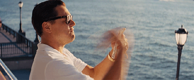
(All videos were edited and produced by Fendi Senpai)
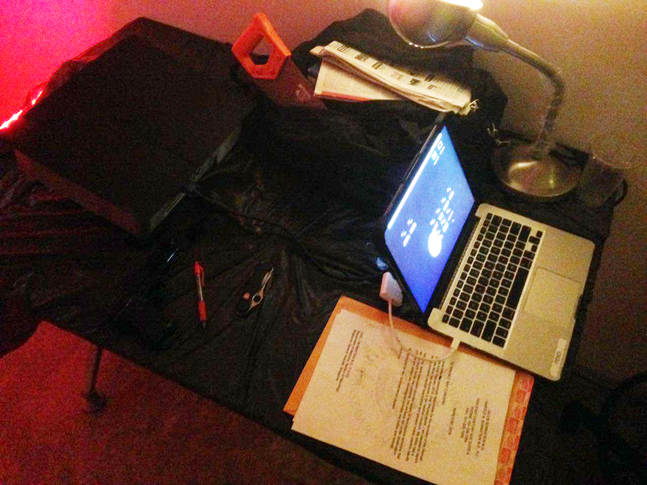
We begin the day with setting up the projector and the board. Mapping the screens was no easy task as Fendi had to accurately frame the videos to be constrained within the two rectangles we had allocated on the board.
This was a tedious process and it was left to Hannah and Fendi, while Hui En and I rummaged through more articles for the board.
After they setup the board, it was our turn to fill the space with the articles.
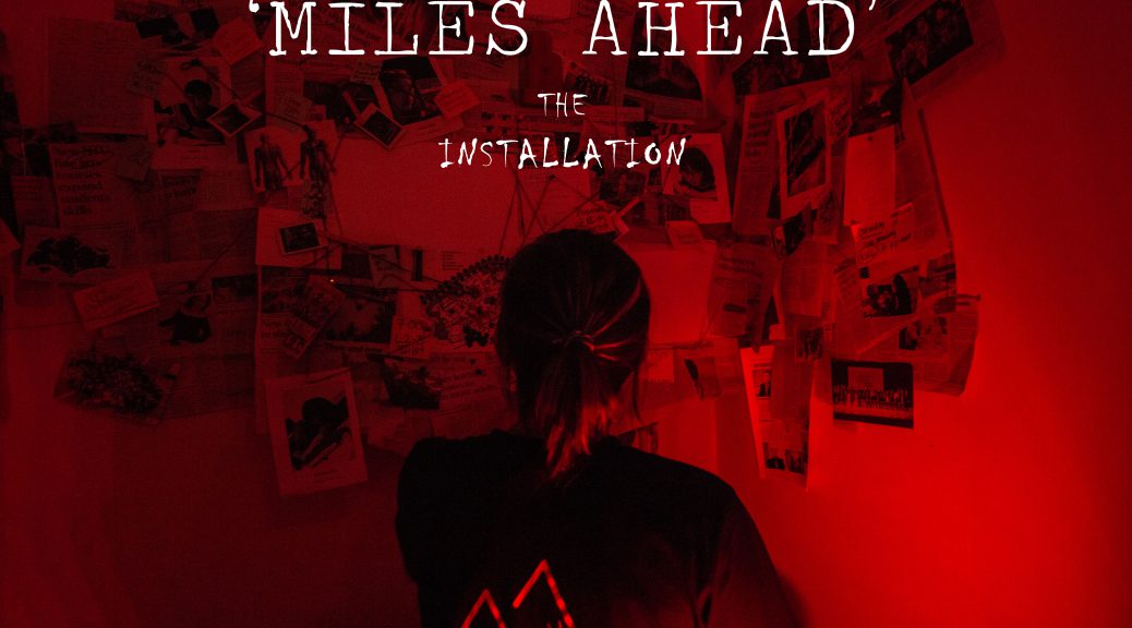
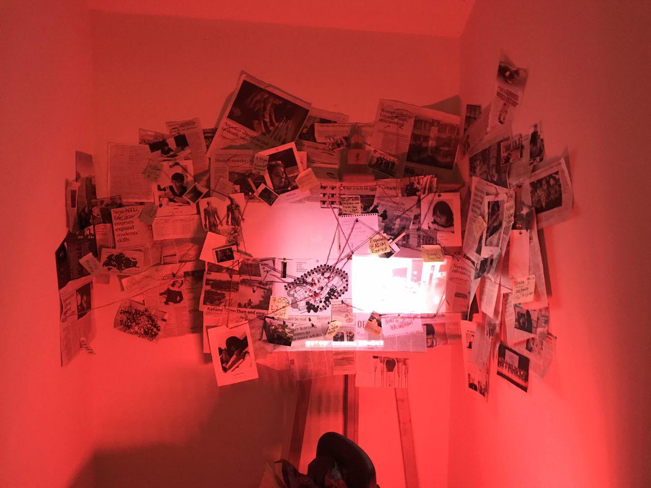
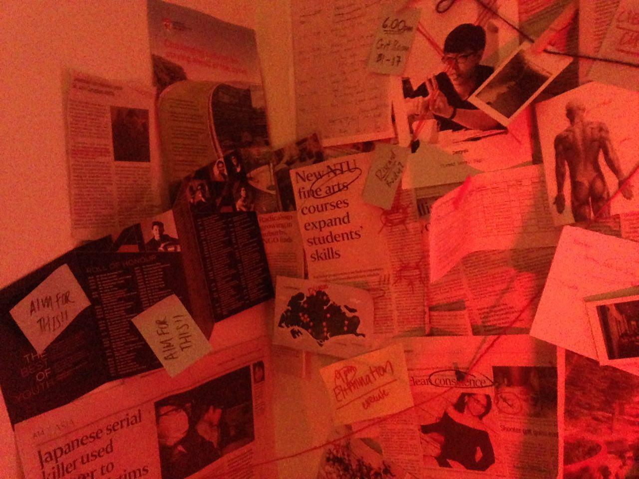
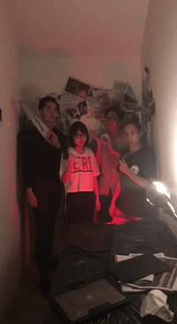
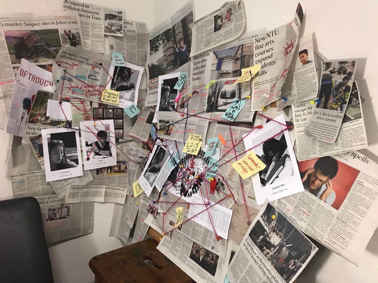
When you step into the installation, the first thing which you will be greeted with is the entire conspiracy board. Intrigued, we expect our audience to step forward to investigate further.
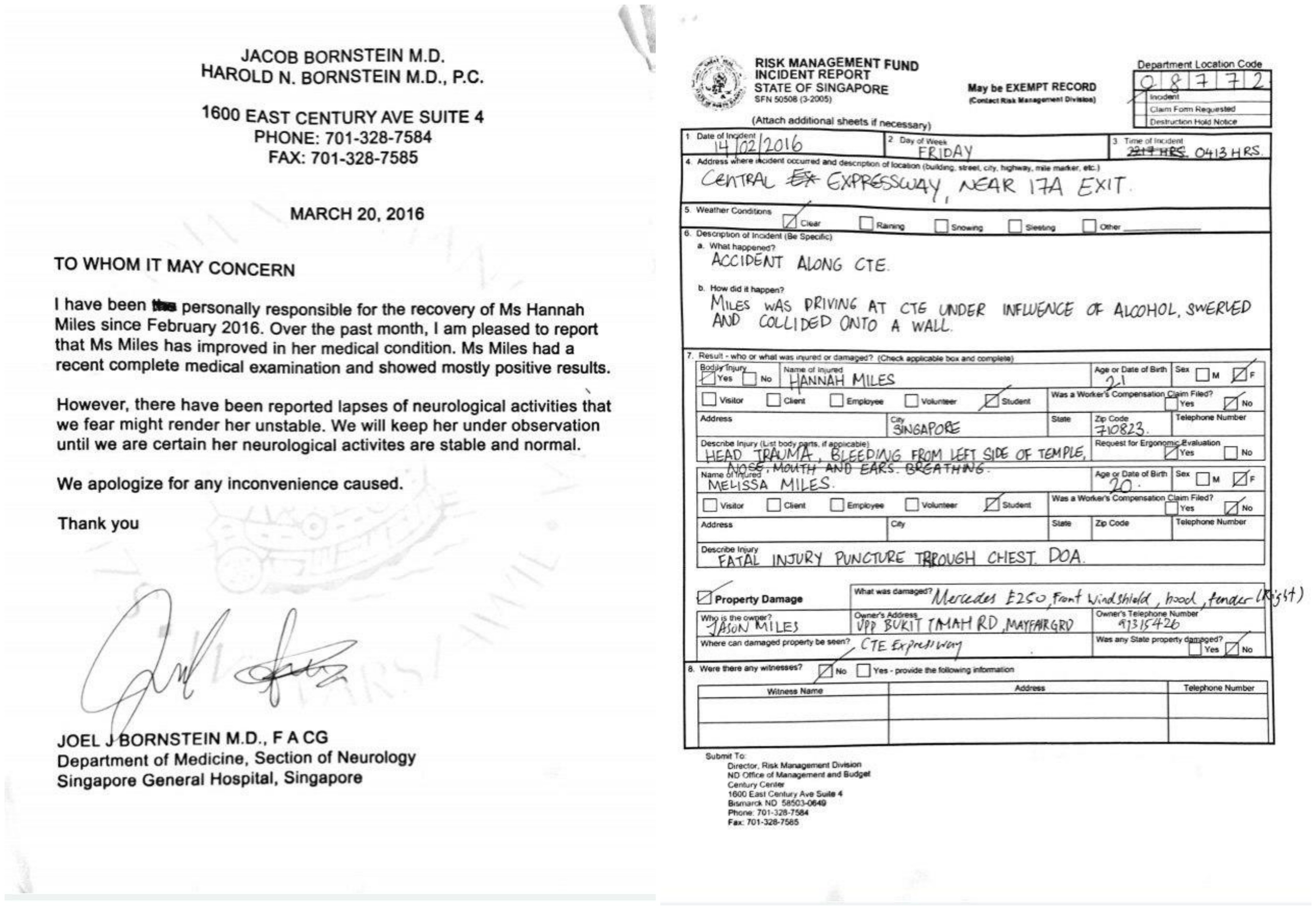
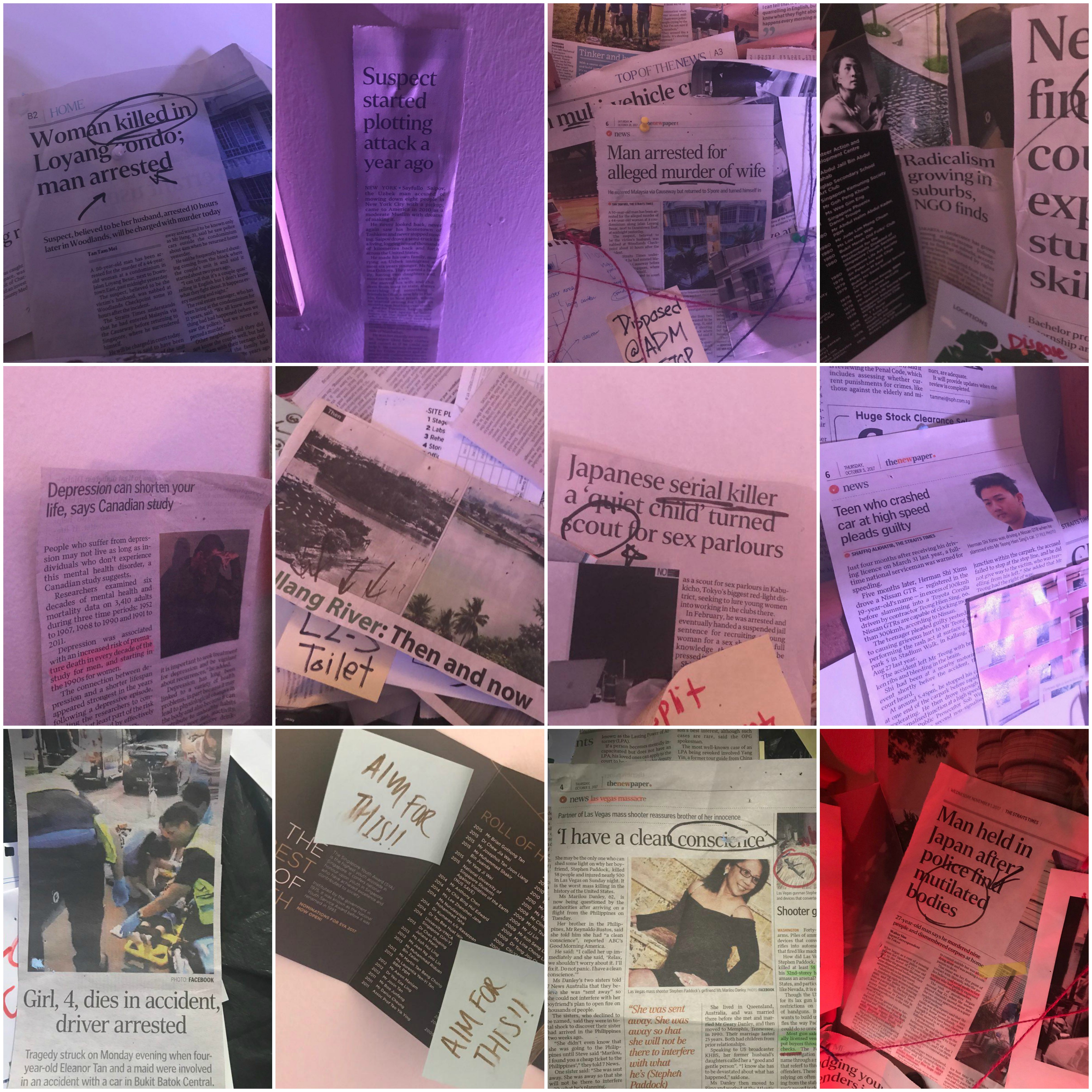
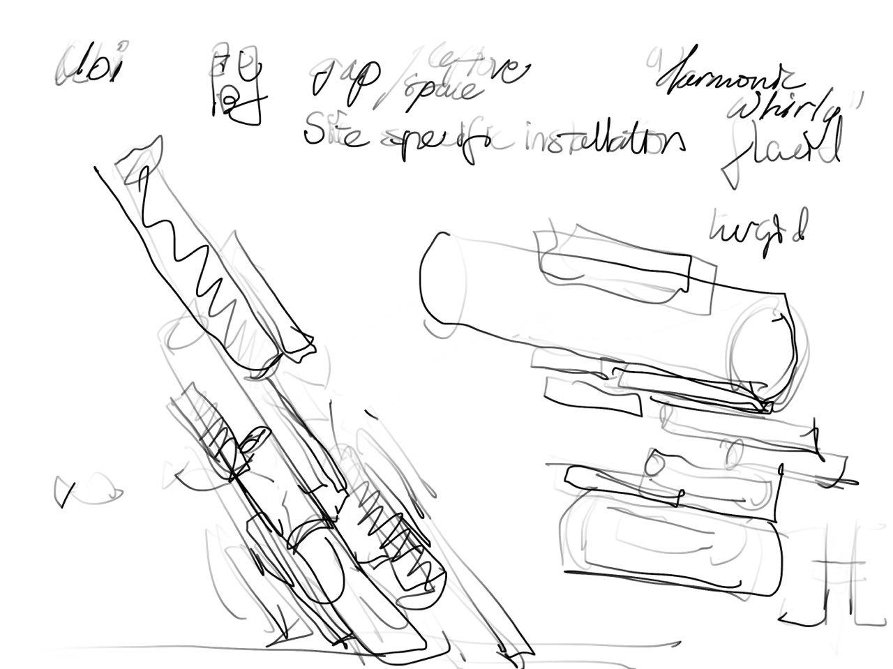
To your right, you will notice that there are murder weapons on the table. A Swiss Army Knife, a saw, a gun (Barely visible) as well as supporting documents which provide a background on our main Character.
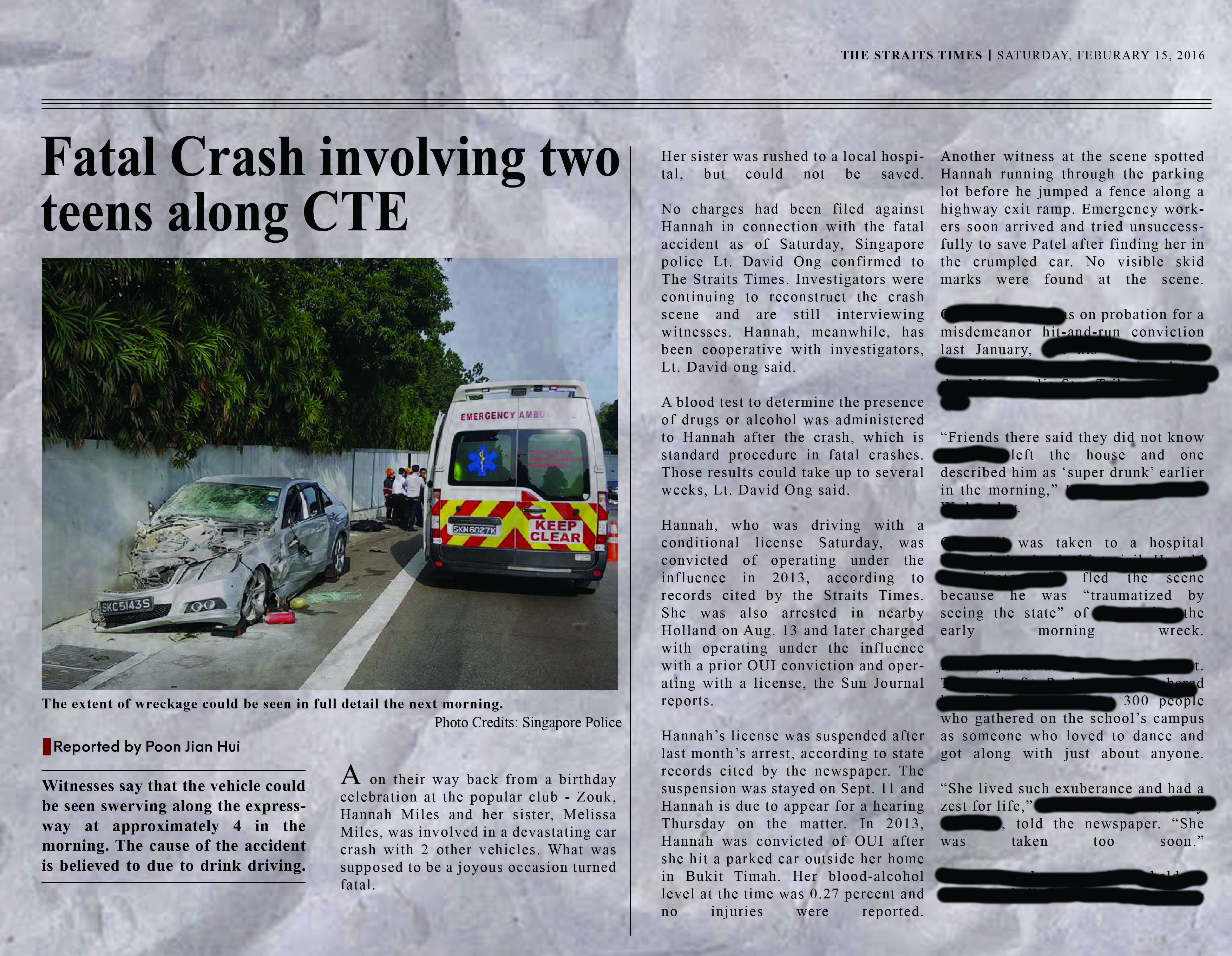
Above the table, you see several photos and a news article.
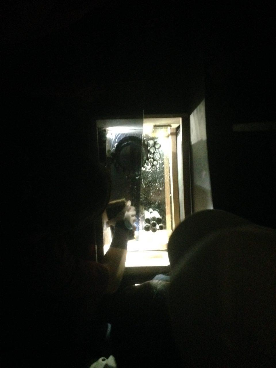
Here is a close up of the article as well as the supporting documents.
After which, your attention would be drawn to the conspiracy board. Audiences would be asked to choose which videos they would want projected onto the board.
By allowing the audience to watch the Vlogs in a non-linear sequence would enable them to form theories of the main character. They would be given the choice whether to sympathize with Hannah, or to condemn her for her actions.
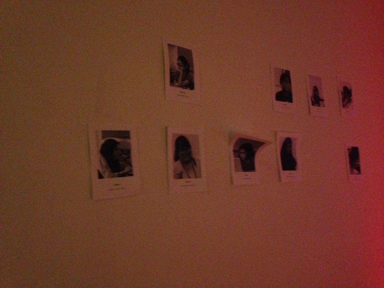
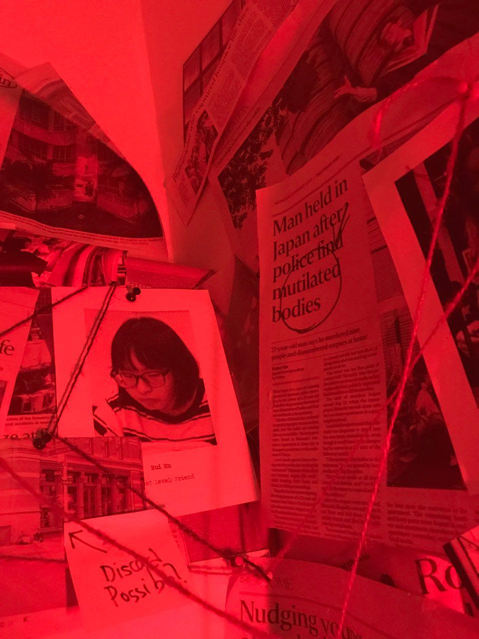
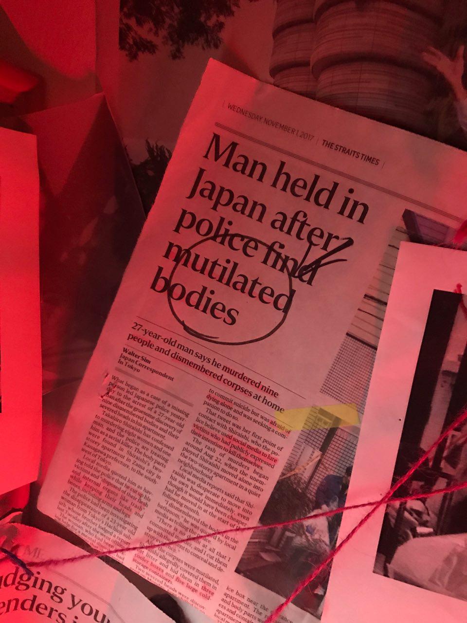
On the other side of the wall, audiences would be exposed to Hannah’s potential victims.
Seeing their own classmates on the wall would give this installation a sense of realism. Our audience would then be compelled to wonder if such a thing could actually exist, similar to how people constantly think their neighbourhood or Singapore is safe… until a crime happens near them.
Close ups of some of the Polaroids:
Ambiance and acoustics, a multi-sensory experience
The space is secluded and dark, which draws reference and similarity to Hannah’s state of mind.
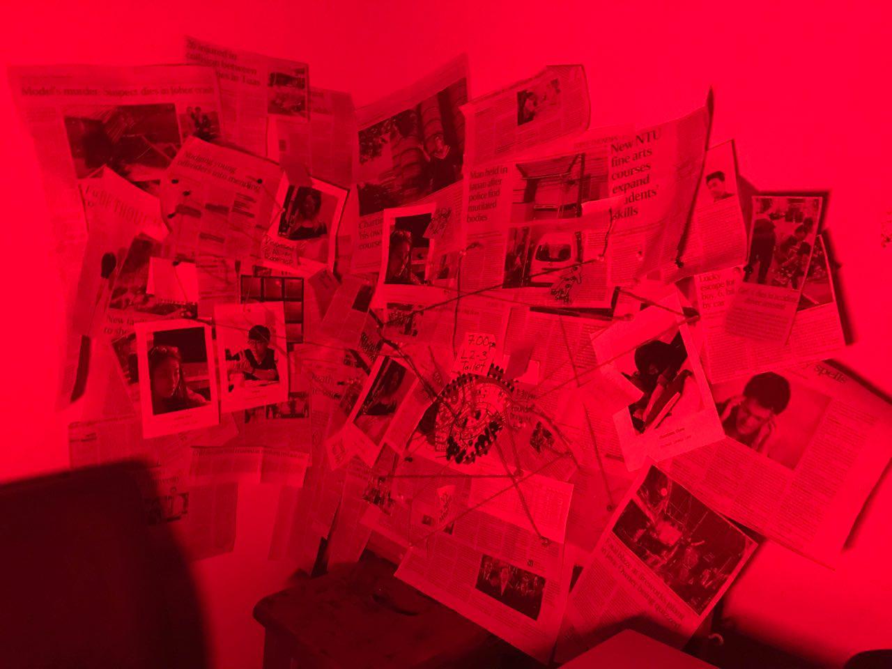
The red lighting adds a sinister tone to the installation, foreshadowing ominous events which were about to be unraveled.
After watching the videos, our audiences are then encouraged to explore the board, to pay attention to the articles which Hannah has put up. This shows development of the character and creates depth. We hope that our audience would be able to envision what it was like being in a mind of a serial killer.
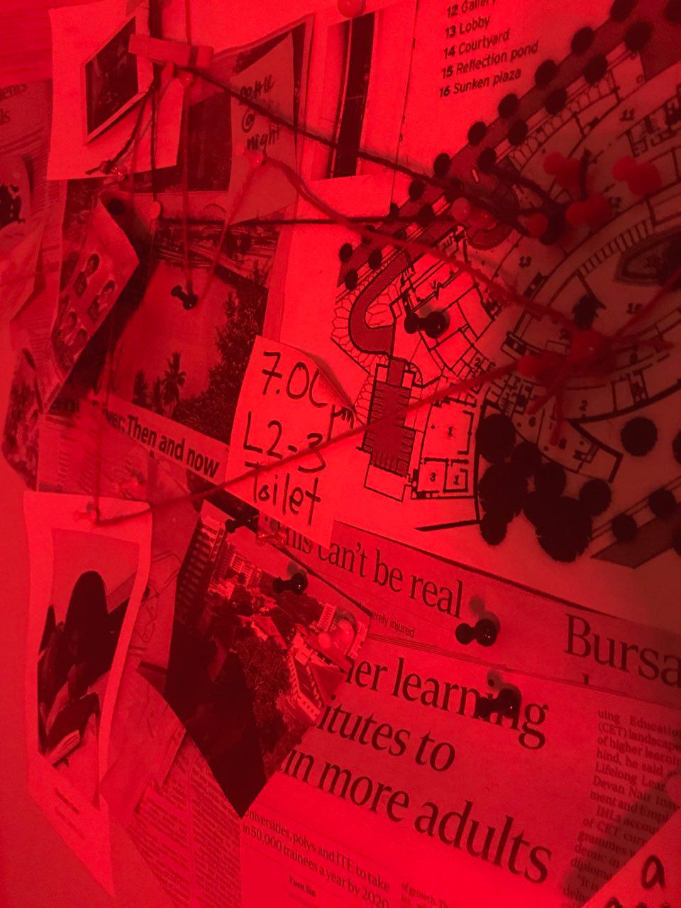
These are some close ups of the conspiracy board.
Thank you team! It has been a blast working with you!! Its such a pity that we only have one sem together. 🙁
Phew, what a journey this has been! I learned so much being involved in this project and I am extremely blessed to have worked with such talented individuals. Constantly pushing one another to strive for the very best.
I would like to thank Director Fendi and Talent Hannah for their film wisdom, guiding me through the shots and helping me with any film woes I had. They never fail to impress me with their knowledge and prowess in this medium.
Hui En, for always caring for the team and offering support when needed! It was amazing seeing the ideas that she came up with which helped define the look and feel of this project.
I am certain that we are all pleased with the outcome of this project as our blood sweat and tears have been materialized to produce this wonderful product.
To Ruyi, thank you for your constant guidance and patience with us! It was eye opening learning what goes on behind every shot and I am certain that I will never watch another film again without analysing every scene, noticing the little details to what makes it so great.
From colour, to perspective and different angles, it has been a fruitful journey for me. Thank you once again and I am sure that I would be able to use these skills in my work for my years to come in ADM.
I was part of the team as the cinematographer, a term I haven’t heard before in my life before this project commenced. I was tasked to curate the styles and the looks of the shots, which meant I had to work closely with Hui En to design the looks of the set.
I also ran through the talent and director what kind of gestures or bodily movements I wanted the talent to show, to convey subtle messages.
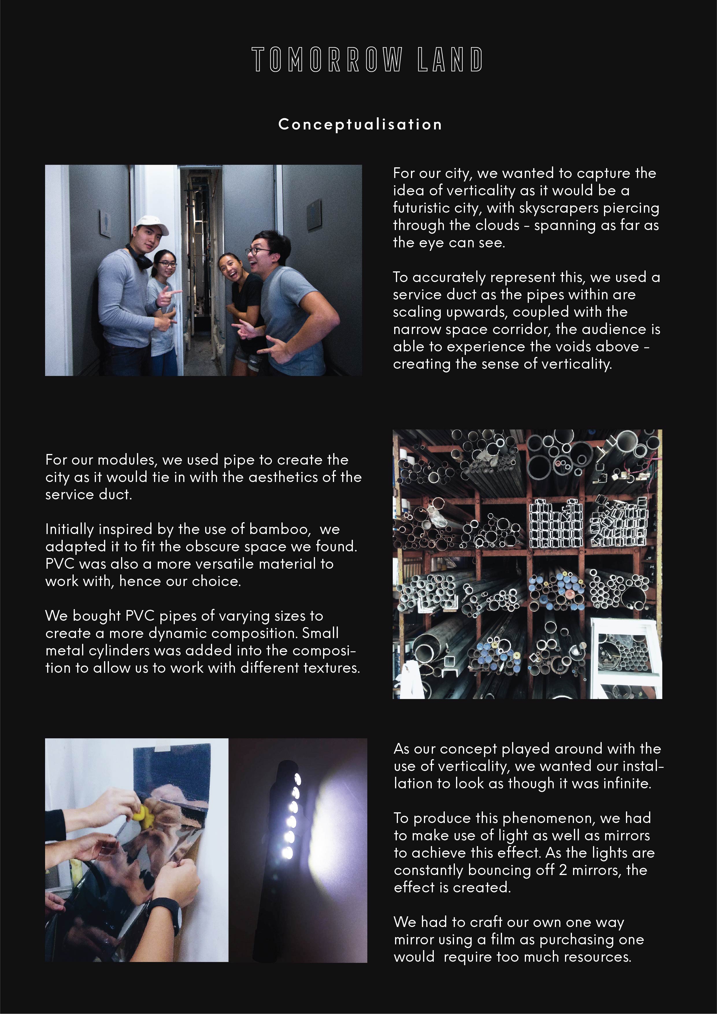
I will begin with the idealisation of the installation, before we go into the execution.
I have inserted several pages from our installation proposal to give you a refresher on our installation.
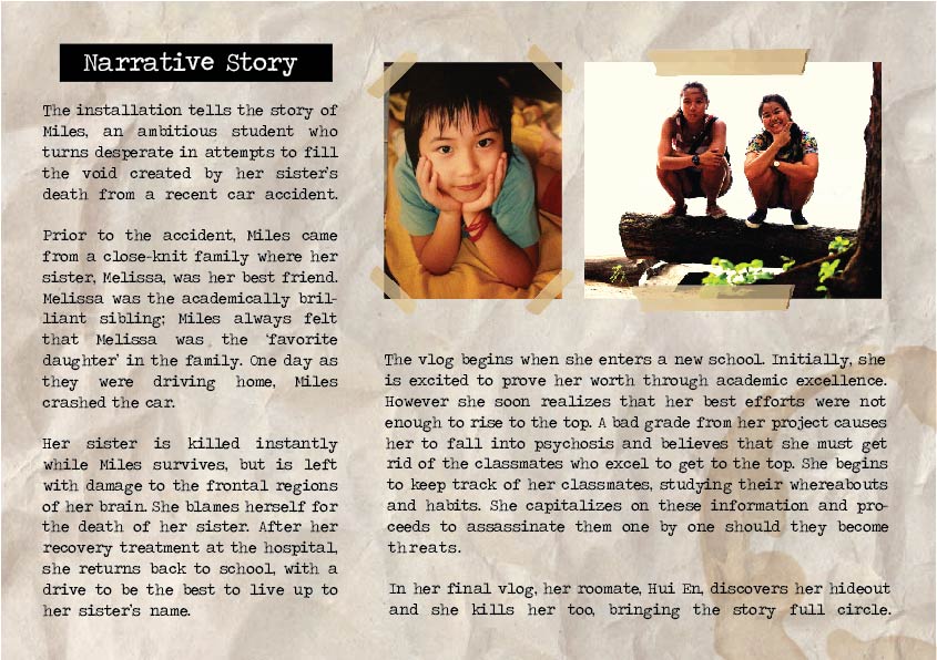
Driven by the concept of being in the mind of a serial killer and their motives, we begin to explore what ways we could make this installation intimate for our audience as well as provide them with a sense of realism.
Character development was left to Hannah, while Hui En and I looked at ways to make the sets more realistic.
CCTV Shots
I started to research on shows which involved serial killers and one of the biggest influences in some of my shots was from Dexter.
Dexter is a show about a serial killer named Dexter who goes around killing other serial killers (funny how that works, huh).
As we had to recreate scenes of Hannah killing her targets, I went to watch scenes of how Dexter hunts for his prey and eventually kills them.
The killing scene happens around the 3 minute mark but in the video you notice how Dexter directly engages his prey in a hostile manner. For our video, we did this in a more subtle manner, luring the target to a more secluded area.
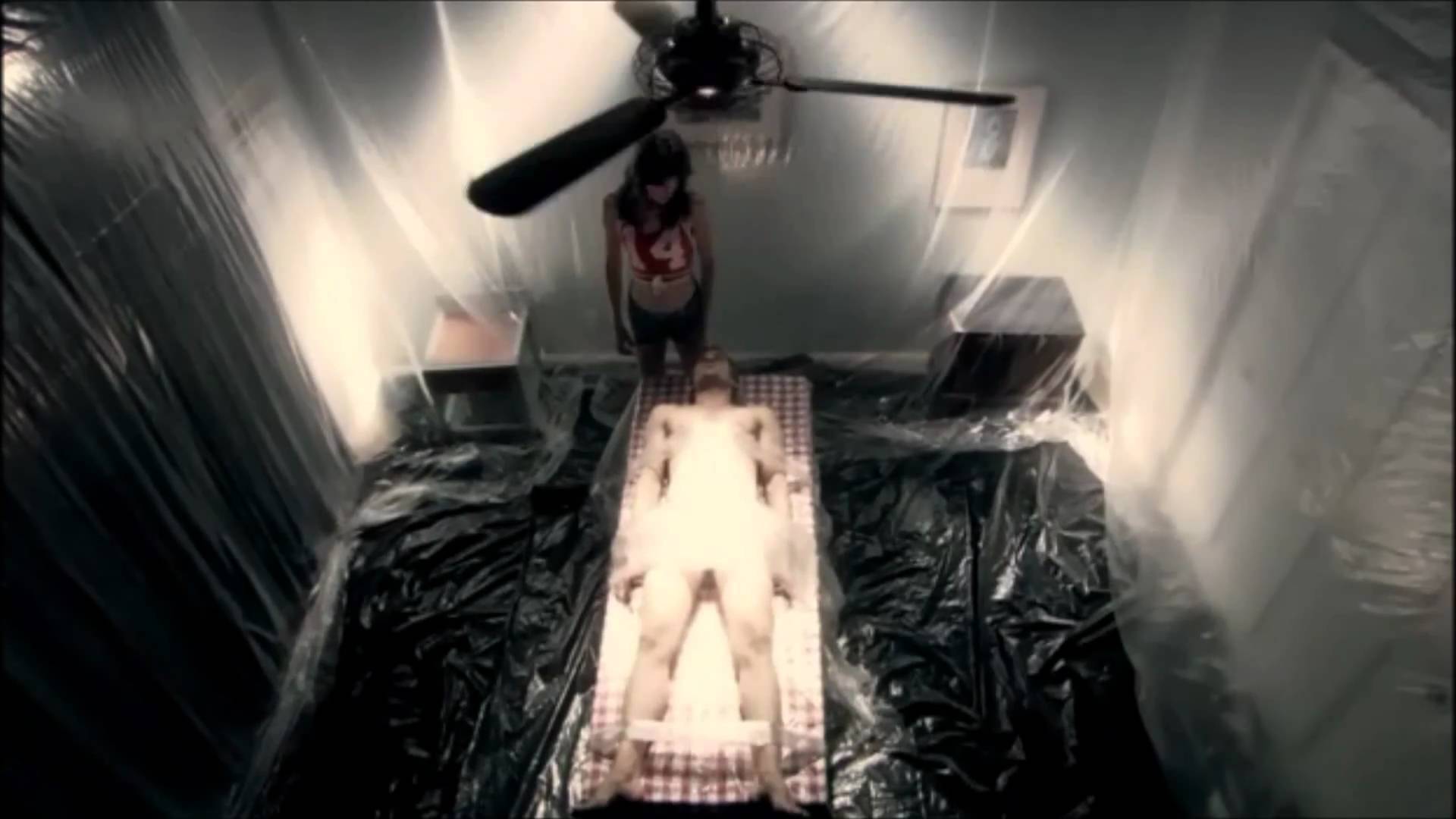
Dexter is iconic for being meticulous in the execution of his victims, planning every step from stalking, to killing and eventually disposing of the body. This is to make sure that he does not get caught. His ‘kill room’ is always lined with plastic to ensure that he does not leave any trace of evidence behind.
In this scene of our installation, Hannah uses a rope to kill her victim, similar to how Dexter did it. However as Hannah is smaller as compared to the victim, she has to put up a considerable amount of fight to take him down.
We also had to make the shot believable, thus, I had to ask Deryck (our prey) to slam Hannah against the wall to show that he tries to put up a fight.
The shots cycle between the room and the corridor to capture the thought of having such a sinister even happening in such close proximity to us.
In the final scene you can also see that I lined the table with plastic, similar to how Dexter does it before he dismembers his victim to dispose of them. Although the amount of plastic we used pales in comparison to what Dexter uses, it shows that Hannah is becoming more proficient and systematic with her killing.
(Second kill scene)
I will now breakdown the first killing scene. This would allow you to identify how much the killing pattern of Hannah has changed.
(First kill Scene)
As you can see, Hannah stabs her victim in this scene which shows her lack of planning as she just used whatever weapon she had which was readily accessible at that point in time.
It was crucial for Hannah to pace back and forth as it shows how nervous she was for this kill, a great contrast from her second kill as she was much more prepared for that.
I also told Hannah to greatly exaggerate the stabbing motion as initially, it was difficult to see that she was holding a knife. I told her to drag her arm out as far as possible to best capture the idea of stabbing.
After killing Shi Min, you can see Hannah frantically peering out the corridor, making sure that no one heard her awful deed. Again, a huge difference from the calm Hannah which walked out of the initial room as though nothing had happened.
The CCTV shots progressively get darker and less dynamic in terms of people as we try to show her state of mind deteriorating from a cheery and outgoing person to one which is more isolated, thus the darker settings.
Vlog Shots
The scenes for the day time vlogs were fairly straightforward as there was adequate lighting in her room.
One thing I wanted Hannah to do was to constantly play with her Swiss Army Knife in the vlogs. This would be a foreshadowing to an event crucial to the story.
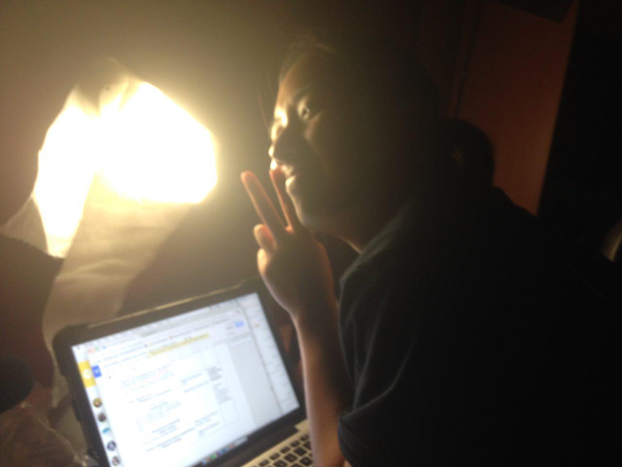
For the night scenes however, I had to recreate the lighting in the room to make it believable. For starters, we placed the table lamp as far back as possible and we used a high quality light diffuser (aka toilet paper) to ensure that Hannah’s face would not be too blown out during the takes.
This is the result:
Canted/dutch angle shots
We wanted to experiment with using canted shots to show her slowly slipping into her disorientated state of mind.
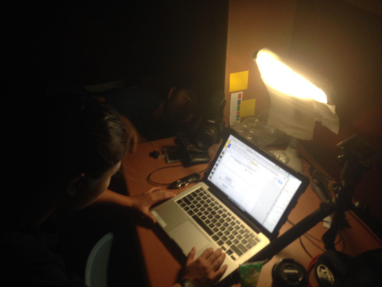
If you look closely, you can see me peaking at the edge of the table trying to get the perfect shot. We used a high quality tripod (aka our wallets) to get the camera in angle for the shot.
This take was a extremely tricky as we had to coordinate many parts.
The sequence was:
Hannah frantically opens the door, whilst holding her camera in one hand.
As Hannah enters the dark room, she walks to the table to put the camera down in a canted angle
Initially, what we did to try and capture the shots was by having Hannah enter the room and hand me the camera to get it in place.
However, we could not coordinate it well as it was an awkward position for me to get into, which would result in the shot becoming shakey.
Therefore, we decided to split the sequence into two parts, cutting the scene as she enters the dark room. This gave us ample time to set up the dutch angle shot without all of the shake and distortion.
As this was a pivotal shot showing her spiral into her new state of mind, we wanted this shot to be intimate, only showing the crucial elements. Thus, the only light source in this shot was from the laptop.
Also, all those fiddling with the Swiss Army Knife is explained as she uses it for her first kill.
This is the final product.
Next, we move on to more complex lighting situations.
To start off, we have the scene where she first finds her new hideout.
I wanted both the light source and the camera to be below Hannah as it would show that she hasn’t moved in any proper furniture to place the light and camera on anything.
I also made sure to have the tint of red lighting as minimal as possible at the start.
Slowly as the vlogs progress, the red tint subtly becomes stronger, giving the audience a glimpse of how she is becoming more and more sinister with her actions.
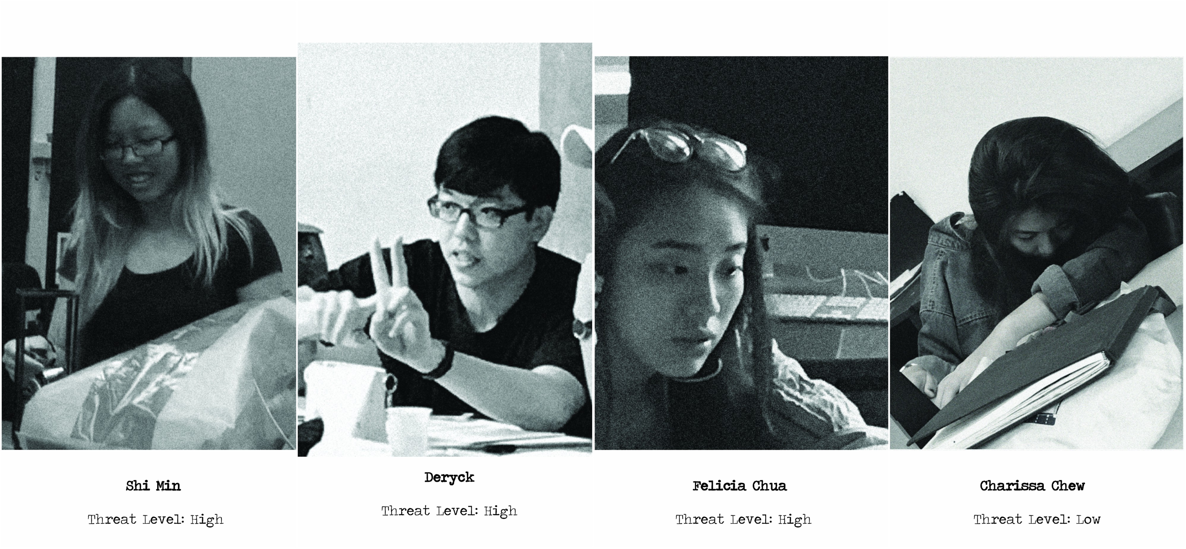
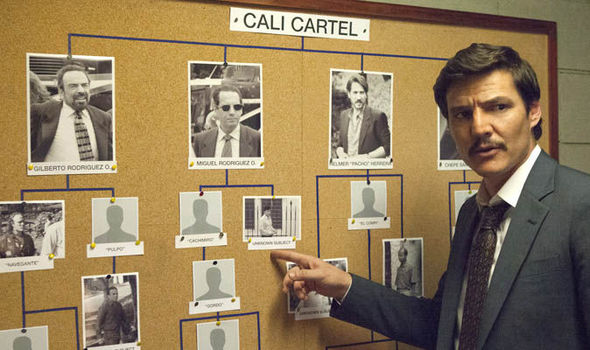
The red lighting was not only use for aesthetics as they served an additional narrative. Within the installation, you can find these images of various classmates on sheets of paper.
Fine tuning the red lighting. This was the final vlog we had to shoot and as you can see, the red light is at its maximum.
This tethers a little into art direction, but the images posted on the wall were made to seem as though they were developed using a film camera, hence the use of red lighting.
I referenced the style used in Narcos as they were profiling individual drug lords. The black and white images gave a stylized look to the board which was what I wanted to convey.
Towards the end of the vlog, just before Hannah goes to murder Hui En, I told Hannah to ensure that the knife blade reflects the light off the screen as it was difficult for the audience to tell that she was holding a blade.
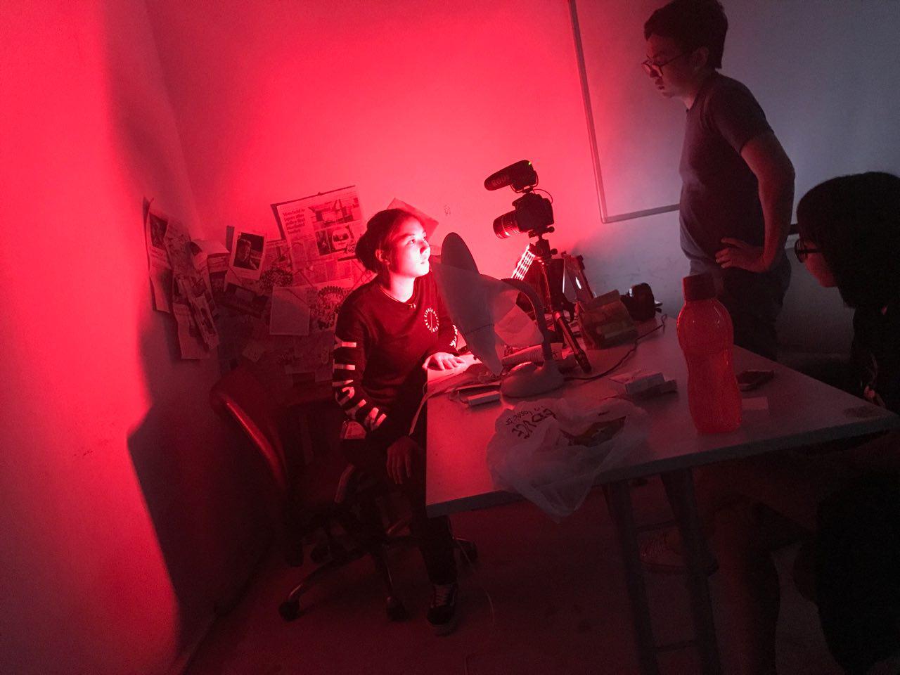
Here, you can see us in action as we play around with the lighting, finding the best way to capture the intended effect!
On Fendi’s OSS, you can see that he actively documents our shots and behind the scenes!
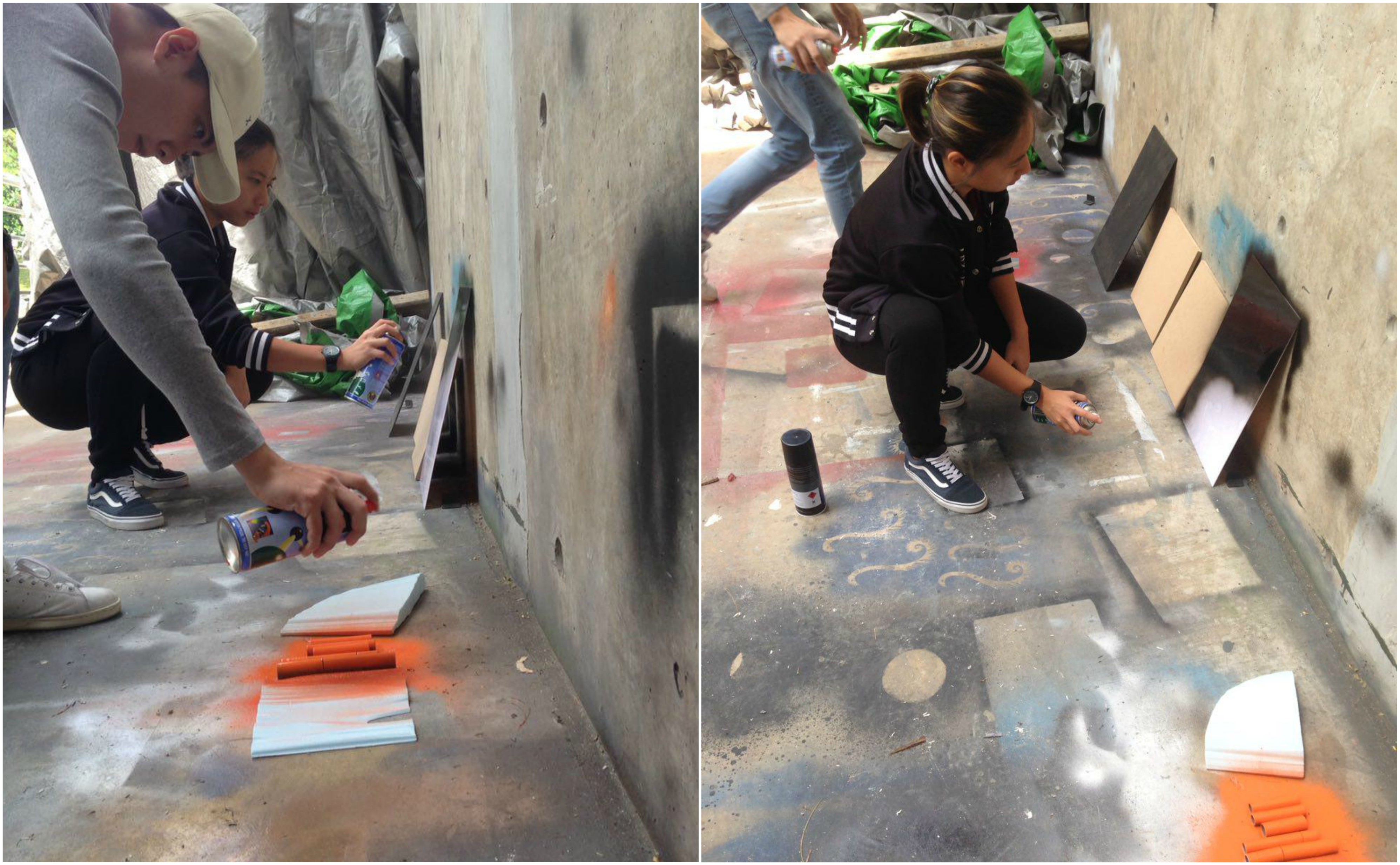
Now let us take a look at what went behind creating the props for all of those shots we took! Hui En and I worked closely to curate look for the conspiracy board!
We began by identifying elements of the mood board we wanted and we started to source for material which helped us with the process.
The materials used can be found on Hui En’s OSS post here:
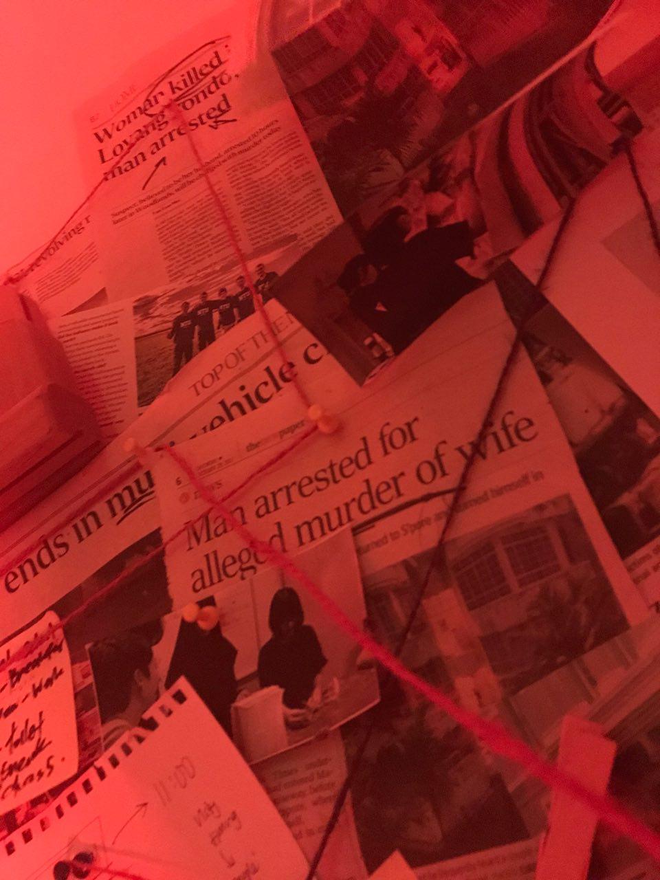
We made sure to have articles pertaining to different topics such as Car accidents, mental health, articles on university scholarships and bursaries, murder and crime (especially serial killers) and photos of locations.
This was to keep everything in line with the theme as we felt that if we just placed random articles on the board, it would not make sense and it would spoil the immersive sensation of the installation.
The articles also had to work well with one another. Meaning that they could be related to one another.
As you can see from a close up below, the two murders are actually linked together. These are some details which people may have missed on the actual day.
We made a total of 2 conspiracy boards, each in different locations. The first conspiracy board was made in one of the computer labs.
Initially we wanted to film the vlogs in the actual stairwell, however, we realised that recording audio there would be difficult as the place is echo’y and would result in a lot of reverb in the audio.
In hindsight, it was a good idea to film at the computer lab as we ended up spending a good 8 hours putting everything together.
I cannot imagine the discomfort we would have faced if we were filming constantly in the stairwell with a lack of ventilation.
The first mood board we created:
How it looks like with ominous red lighting:
On the day before the submission, we set up the final conspiracy board:
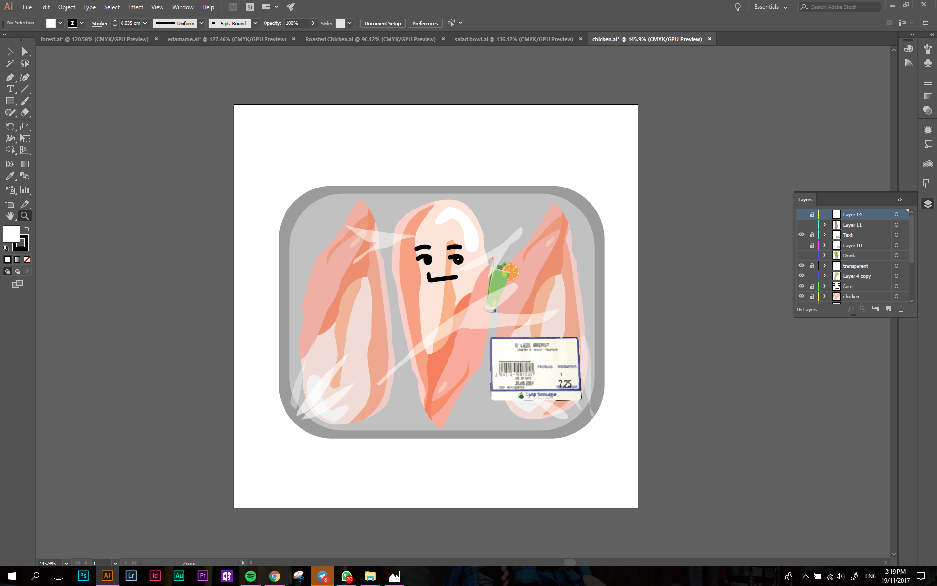
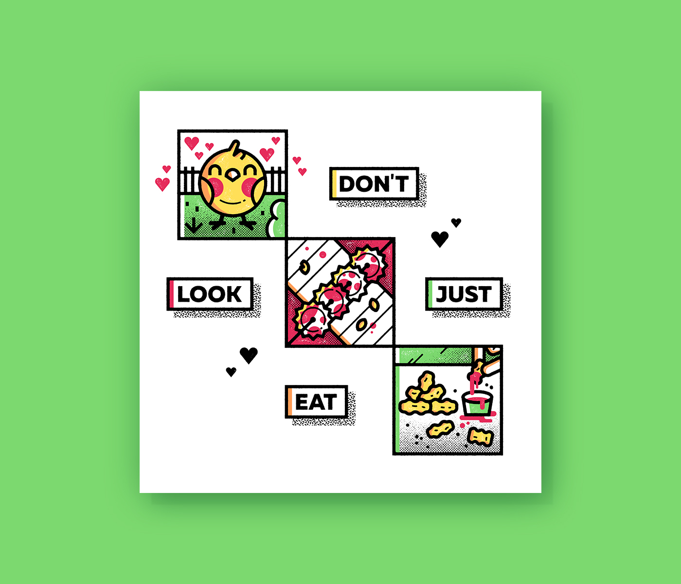
As you can see, my final frames are in the form of a circle as I the food I eat all have organic shapes which is why I did not want them to be bounded by a square!
Overall, I am very pleased with my work and the various stages of development it took to get here!
Thank you to all of my friends who provided me with their valuable insights and how to further improve my designs! Without you I wouldn’t be here!
Finally, thank you Mimi for all your advice and expertise! I have a greater understanding for design concepts now and I have no doubt that these would greatly benefit me during my journey in ADM!
Alas! We start on our process! All of my raw sketches and conceptualisation have been placed in my CPJ! But fret not, because I also have digital sketches to show!
I will summarise my conceptualisation process as most of it is in my CPJ. In essence, as my family raised me up to be cautious of my health, my parents always encouraged me to eat healthily and exercise regularly. This has benefited me in a plethora of ways as I often feel more motivated to accomplish more things and I find myself getting tired less often.
Thus, I wanted the direction of my work to incorporate elements of both food and exercise as it is what makes for a healthy lifestyle.
Before I further explored this concept, I had the idea of personifying myself as a dog as I felt that they were very active creatures and would accurately depict me. This was also inspired by one of the artists I found online!
However, as you flip through my CPJ, you can see that I tried sketching out huskies… But they look terrible and to capture their look accurately, I had to add in a lot more elements which was not what I wanted for my work.
So I decided to scrape that idea and I went on with creating illustrations of myself!
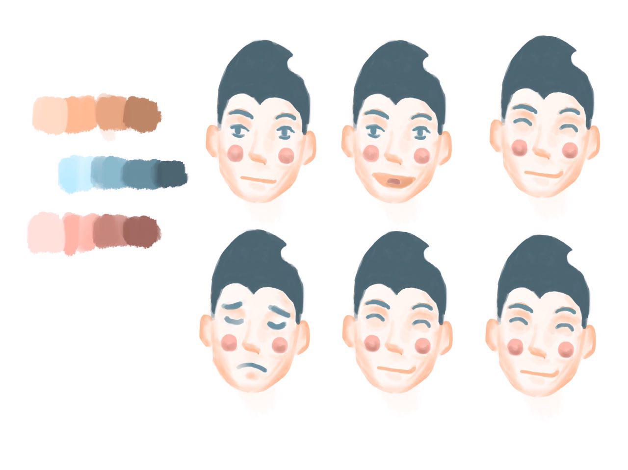
Notably, some of the faces are similar as I was still in the midst of creating my equations and I was unsure of what expressions I should illustrate! Trying to incorporate this idea into my work, I began illustrating my first equation.
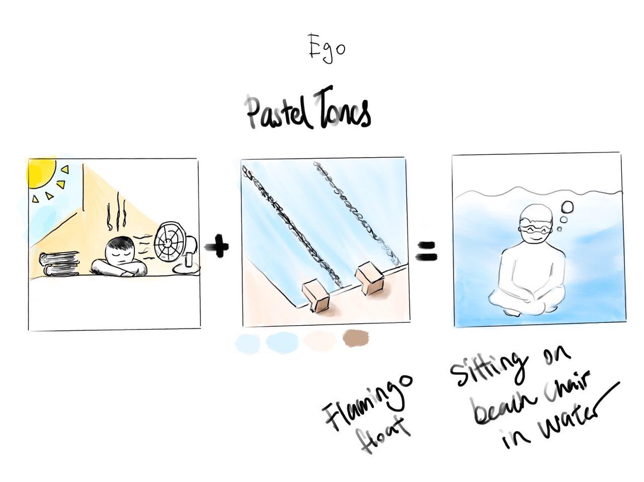
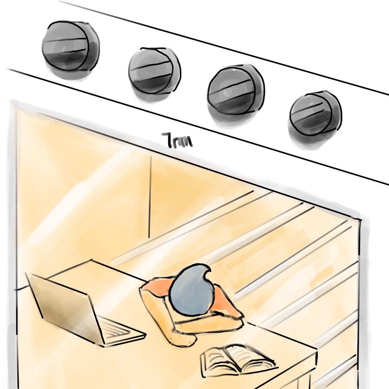
Me Studying in Warm Room + Swimming Pool = Me Cooling Down
This was my first digital sketch of the equation.
At this point in time, I was just trying to come up with the concept and composition for my work, which is why I did not play around with colours just yet.
Slowly, as reflected in my CPJ, I had the idea of incorporating kitchen appliances and food into my equations!
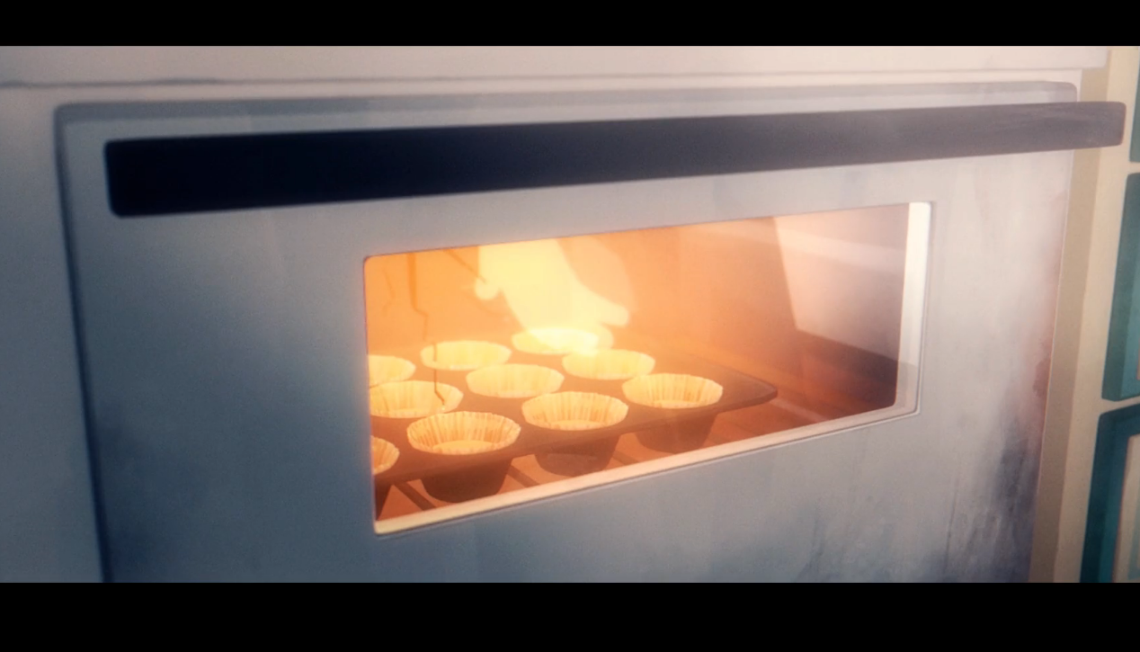
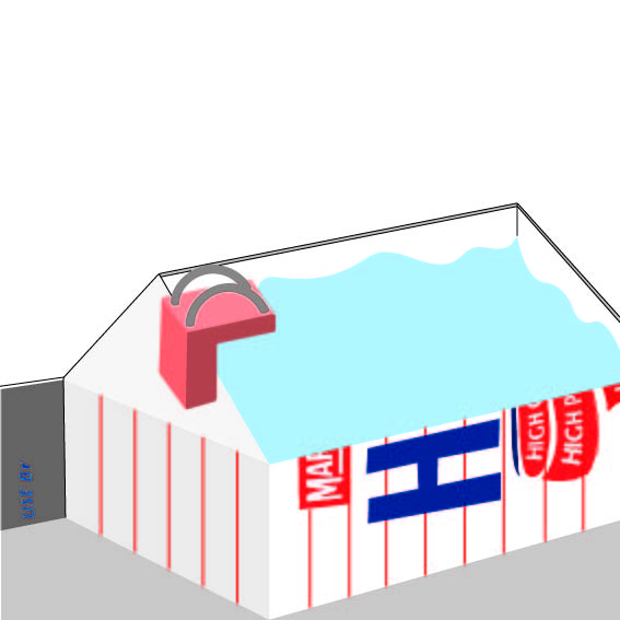
Thus, I had the idea of using an oven to represent a warm room!
This was the initial idea i came up with! I brought this to Mimi and she commented that it was not very clear that it was an oven and that the composition was too tight, making it uneasy for the viewers.
She asked me to look into other ways I could represent an oven in my composition.
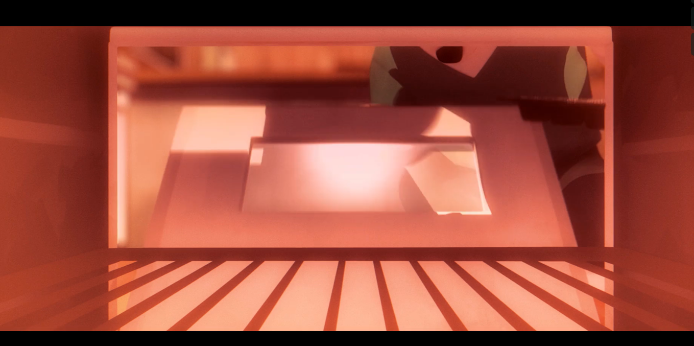
As I was watching a short animated film, I saw this perspective of an oven which I really liked.
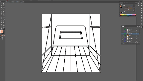
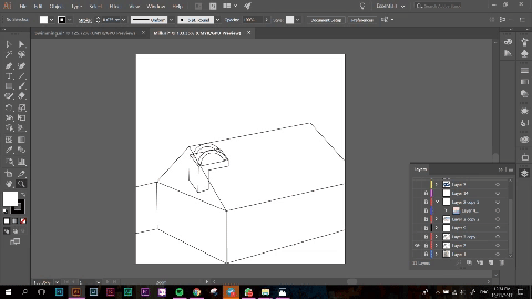
The perspective was from the inside of the oven, as opposed to it being from the outside as seen below. I felt that this created a much better composition and I was able to convey the message of me studying in it much better.
I used darker hues of pink to represent the warmth of the oven. I also made sure to pay attention to the lighting of the oven as I wanted it to be as clear as possible.
I also took Mimi’s suggestion of illustrating the entire frame before cropping it down as it would make sure that I am not limiting myself in any way.
I faced the most difficulty when I was trying to illustrate the oatmeal as it was hard to capture the different textures and tones. I also changed the initial colour of the table from blue to a warmer brown to make it in line with the theme of warmth.
+
Next, we have the pool frame. The composition for this gave me a headache as well as I did not know how to capture the look of a milk carton well to show the idea of a swimming pool. I took several pictures of a half cut milk carton to try and visualise the perspective better!
I also have several inital sketches of my milk carton and how I wanted it to look like.
This perspective would be one whereby the viewer has open the top flaps of the milk carton and is peering into it. This was tricky to capture, and the angles presented would make it difficult for me to frame it well.
I illustrated this and brought it to Mimi on the second consultation and she told me that i should not have filled the frame with the milk carton as it left very little breathing space for the viewer and it would leave them feeling uncomfortable.
I took her advice and i gave the milk carton a lot more breathing space. The new composition also allowed me to play around with more colours, making it more aesthetic.
Some comments from Mimi on the actual submission day was that the perspective could be changed a little as the horizon has to be slightly higher than where it is now.
=
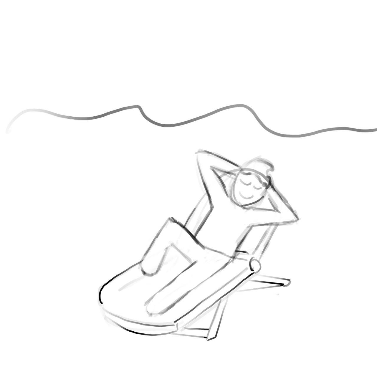
Next we have my final frame. I wanted a dynamic composition for this frame but I found it hard to show it as the milk carton did not give me much room to work with.
I tried using a beach chair to represent relaxation but I felt that it did not fit the theme I was driving across.
Mimi suggested that I could have the oat jumping into the water, however, I felt that it would remove the element of exercise if I did that as it would only look like i was at the pool to have fun. Which is why I decided to go ahead with the conventional pose for swimming which is a freestyle stroke.
Colour scheme I used:
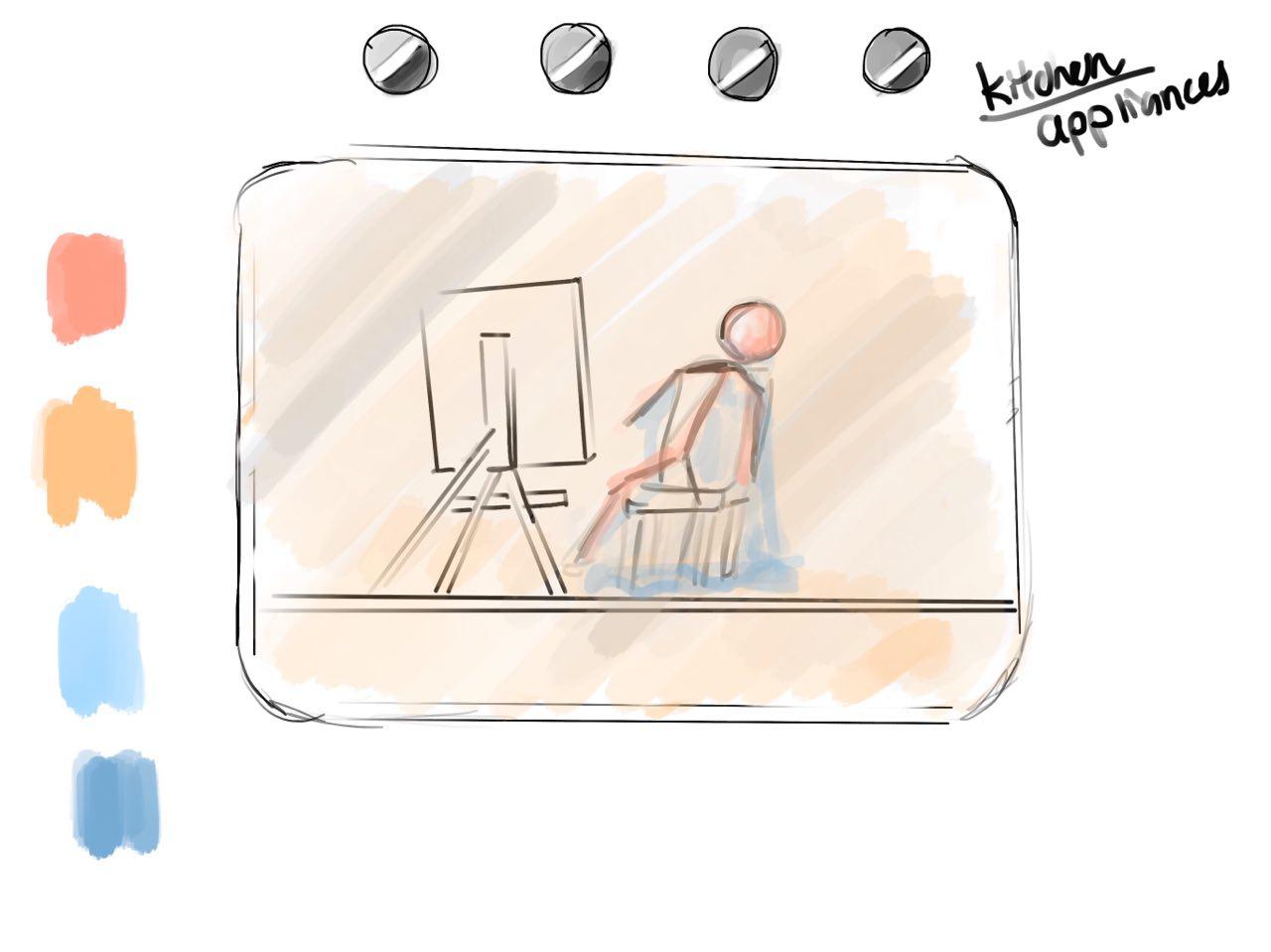
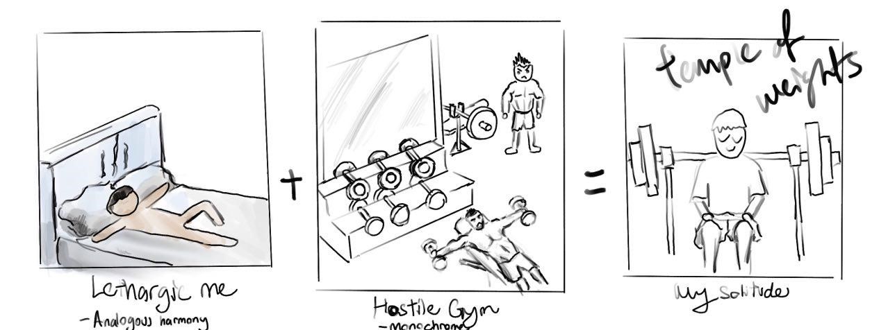
Unrefined Me + Hostile Gym = A Better Me
This is the first sketch I came up with for this equation. I wanted to show how an environment where people may find intimidating, could be somewhere where I sought comfort in. To me, this place was the gym.
After showing Mimi this frame, she told me that the end result was too similar and expected together with my other frames (as you will see).
This was also before I had the idea of incorporating kitchen appliances into my compositions.
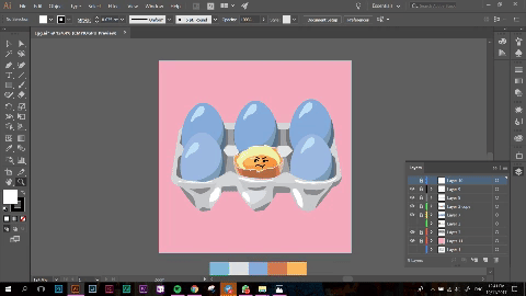
I decided to use an egg to represent me as eggs are high in protein and it is essential for muscle growth! A little fun fact, before I entered university, my breakfast would consist of 3 eggs, a bowl of oats and milk.
I played around with different views for this frame.
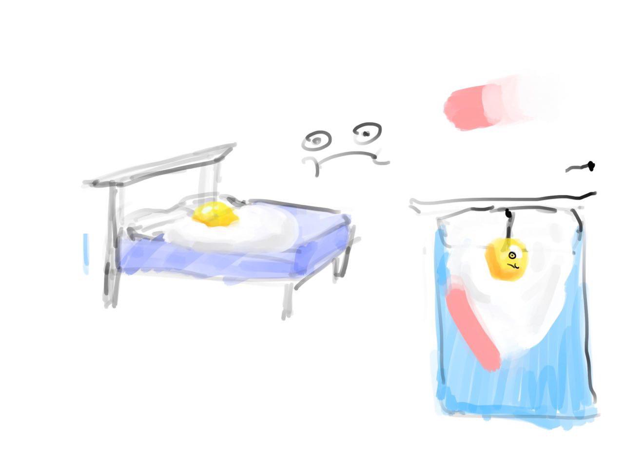
Eventually, as seen in my CPJ, I went with the idea of having the egg in a tray as it would fit the frame better and it would make more sense through the equation as eventually, the uncooked egg becomes hard boiled.
+
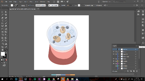
Next, instead of a physical gym, I used the soft boiled egg cooker to represent the gym. As you would have to use boiling water to cook the eggs, it ties in with the whole concept of a hostile environment!
Upon Mimi’s advice, I added in steam and bubbles to further convey the idea of it being a stuffy environment.
=
A better me was represented by me breaking out of the shell and becoming a hard boiled egg! I spent a lot of time trying to draw the egg shells as i wanted to make sure people could understand the composition, similar to how a caterpillar morphs into a butterfly!
I fiddled with the composition further as well as I could not decide which colours I wanted to use.
I felt that yellow and pink would represent the idea of hope and a brand new me better, however it would not be in theme of the colour! Whereas blue and pink would work well with the entire equation but it would not stand out as much.
I also had parts of the weights and shell protruding out of the circle frame, however I felt that if I was not able to constantly use this effect in my other equations or frames, the design would become inconsistent.
Colour scheme used:
Chilled Me + Running Track = Me Dying from Heat
Next, I wanted to show some form of exercise which I did not enjoy! For me, this was running as I hate running because of how sticky and smelly I become afterwards.
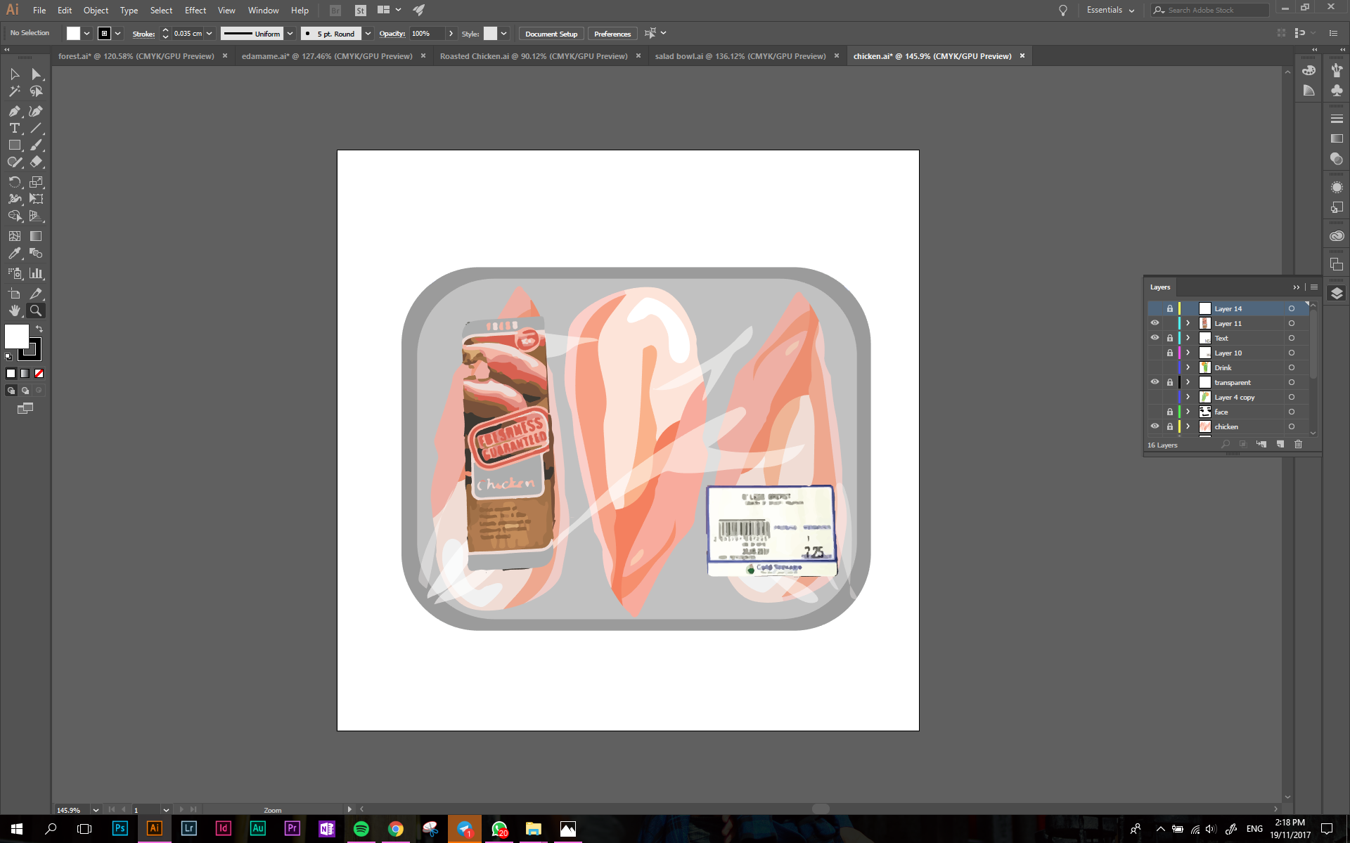
To show this, I personified myself as a piece of chicken breast.
I initially wanted to show myself on a plate in a fridge, showing how relaxed I was. This can be seen from my CPJ. I soon realised that the composition would become too cluttered with objects and that would take the attention away from the main object.
I went with the use of chicken sold in Cold Storage as they are always sold in the refrigerated sections and packaged in a foam box with cling wrap.
I initially added some symbolical elements such as a cold drink along with the chicken breast as well as more food packaging labels. But I realised that it over complicated the design.
In the end, I went with a more simple composition to drive the message across.
+
This frame brought me the most frustration out of everything as I struggled to find a suitable way to depict a running track. The skewed perspective of a running track also proved to be an issue as it was difficult to get it in perspective to look realistic.
I had some trouble with the vectors in illustrator which is why I exported the image onto photoshop to edit the colours.
I used warmer colours to show how the running track would be hot and suffocating.
=
I experimented with different types of chicken breast here, however, when I asked my friends to take a look at my illustrations, they would not get the link between the images as the chicken breast changes. I decided to use the original illustration, but add shades of brown to it so that it looks cooked. I added grill marks to make the effect more apparent.
The finishing touch would be me lying in a puddle of my own sweat. Again, I used rose quarts to depict a warm environment.
Colour Scheme used
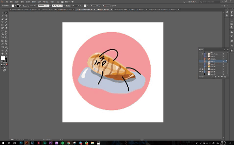
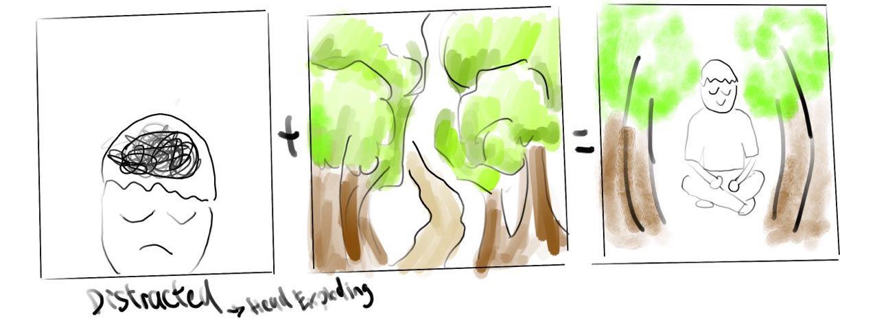
Me Under Pressure + Parks = Me at Ease
This was the first sketch I made of this frame. It was supposed to depict how nature provides me with tranquility and calms me down. As what Mimi said, my initial sketches were very predictable which was why I changed them.
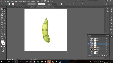
To show this, I used edamame. A type of Japanese bean! When I went to Mimi with this idea, she told me that squeezing the pod is not how people would normally eat this food! I told her that it further adds a comedic element to it as it was exactly how I tried opening the pod the first time I ate it! This external stress would convey well when the pod explodes!
+
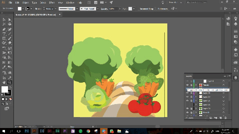
This was a fun composition to come up with and I felt that the colours really tie in well with each other. I wanted to depict a forest using only vegetables I eat to show healthy living. I included tomatoes, broccoli, baby carrots, lettuce and romaine lettuce to the composition.
I had to tone down the reds of the tomato to a more subtle pink as the colour was too strong and not in line with the pastel theme.
=
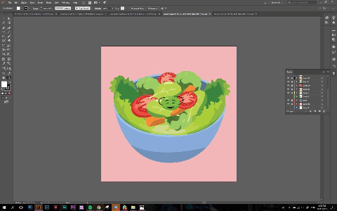
Salad!! Oddly one of my favourite things to eat. My mom always prepares too much salad for my family to finish which is why they always expect me to eat the remaining vegetables left.
For this frame, I used the same vegetables as the ones I used in the park to create a salad bowl.
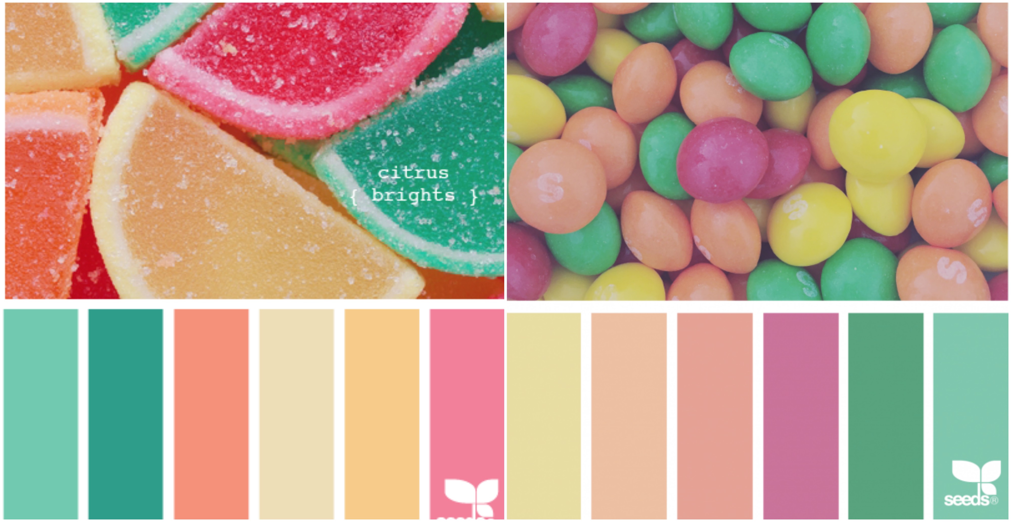
During one of the early consultations I had with Mimi, she suggested that I should look into children’s colour palettes as I told Mimi that I envisioned my work to be one which was cheerful and fun to look at.
Here on begins my research for colour!
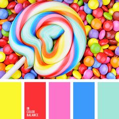
Before this, I never realized how enticing children’s candy looks like. It is amazing how colour is able to speak to the subconscious mind of children, making their parents buy candy for them.
Colour is so strongly ingrained in us from such a tender age which is why it is such a powerful tool when used in marketing.
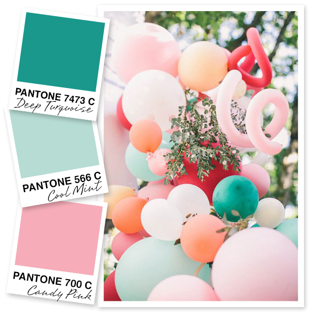
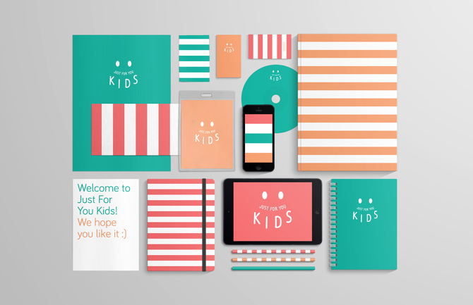
Here are a few other examples of products and banners catered to children.
The hues for this palette were too strong for my liking which is why I did not want to use them in my composition.
The colours from this image makes use of different shades of the Pantone Colours of the year – Rose Quartz and Serenity.
This poster uses triadic colour harmony and it works very well with the idea it was conveying.
A free stationary branding mock up created by Santiago Moreno.
This banner uses a split complimentary colour scheme.
This composition uses Tetradic colour Harmony and it is able to show the ‘kraziness’ of the poster, while creating a composition which is pleasing to look at.
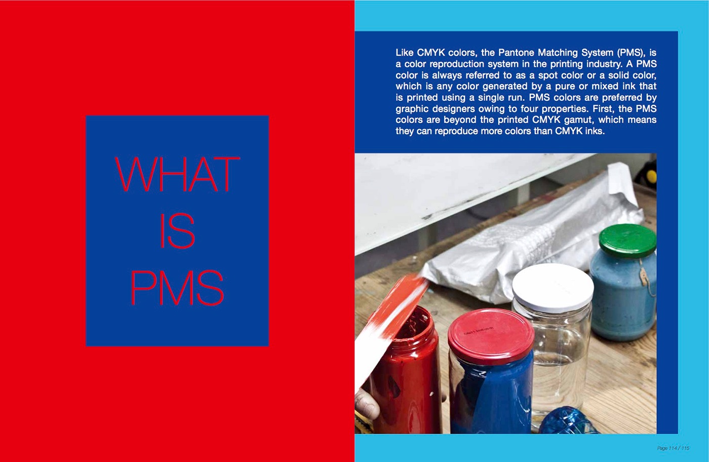
I stumbled upon this book as I was sourcing for inspiration and I thought that it would be great if I could include some of it in my research. This is a book on printing in both CMYK and PMS.
I really liked the colours in this composition and i felt that it would be great if i could incorporate some of the design elements into my work.
Welcome. It is the year 2050, where mankind have found a way to build structures higher than ever before. But before we delve into this futuristic world, let us see what brought them here.
Idealisation
It all began with a sound – a tune. This tune was fabricated by the most masterful musicians the world could find. This would be used as the inspiration for the city.
You cannot help but feel a sense of serenity when as the tune is being played. Composed of different instruments, each brings a new idea and elements to the development of the city.
The team took the best elements from their individual mood boxes and placed them into the group mood box.
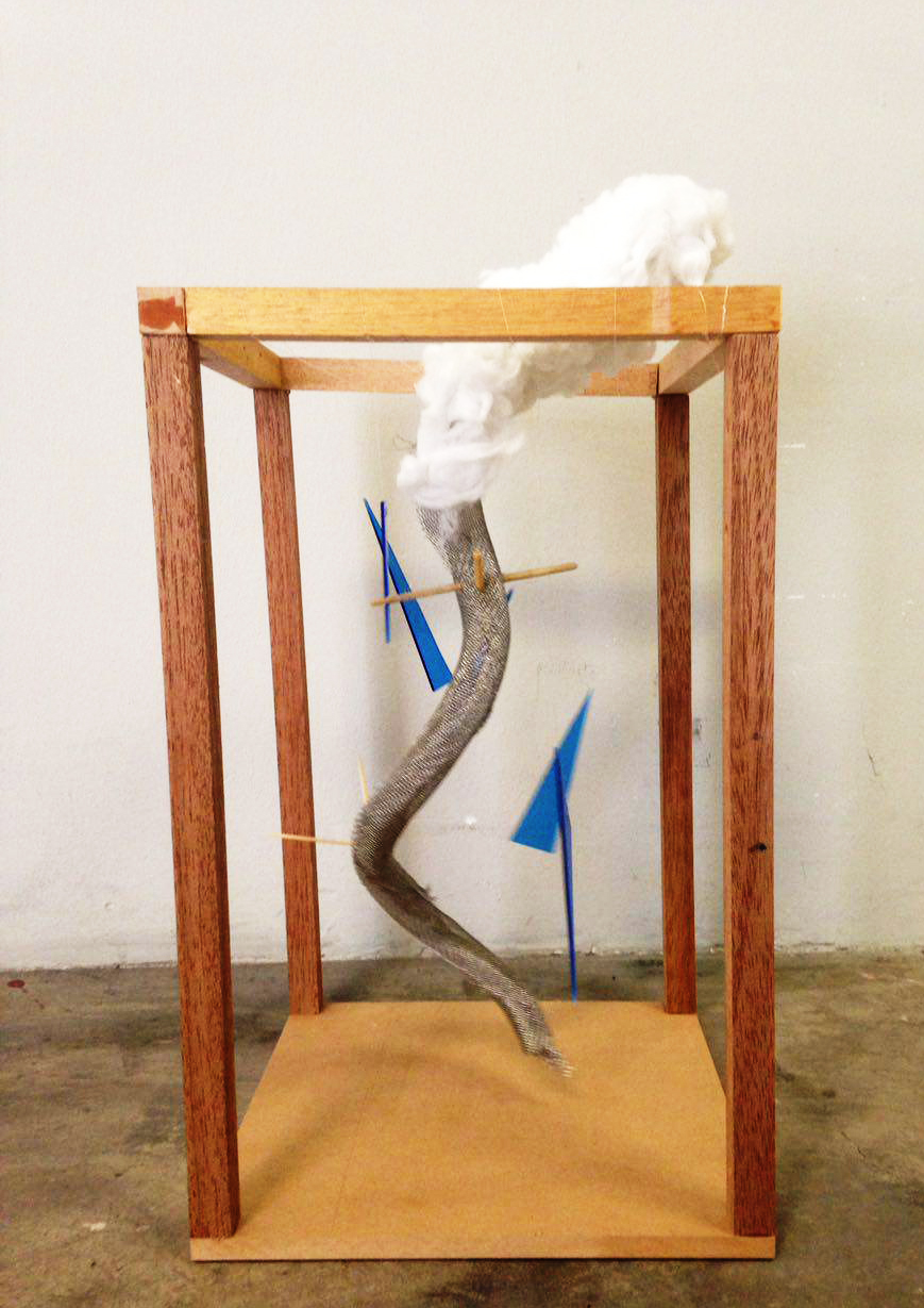
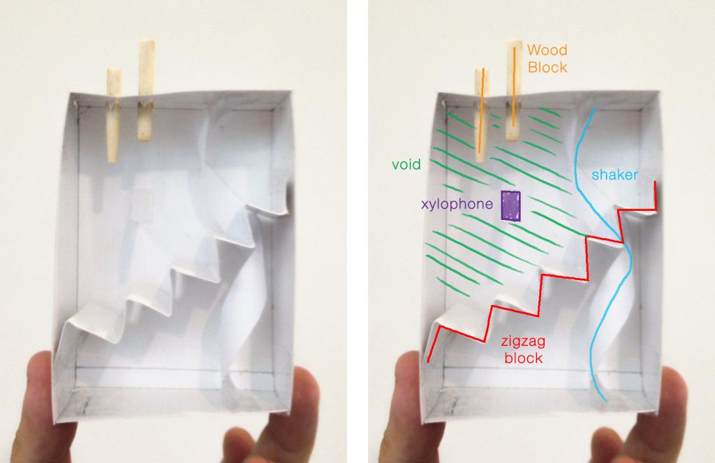
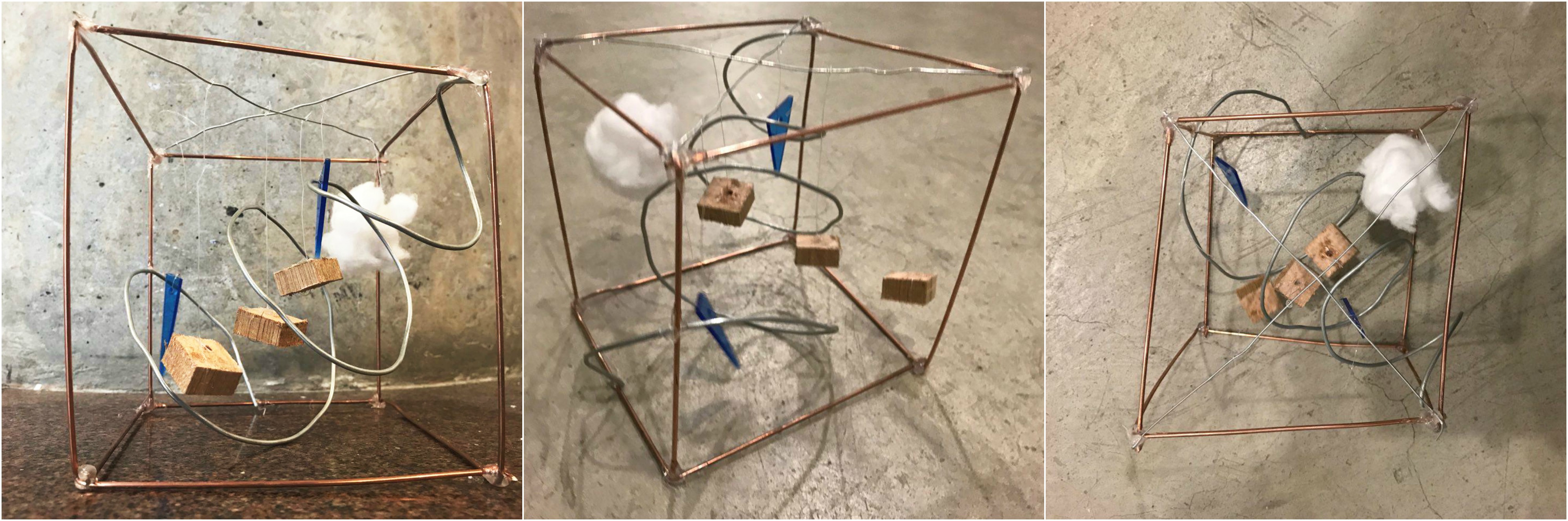
Zig Zag Block – The rough sounds of the zigzag block is consistent throughout the piece. To demonstrate this, we took a hard wire mesh and warped it to form a spiral through the entire frame. The rough and prickly texture was to represent the unevenness of the Zig Zag Block.
Shaker – Like above, the shaker evoked a sense of falling beads or water. To show this, we cut up pieces of blue acrylic in the shape of triangles and hung them off fishing lines to represent rain cutting through the voids.
Wooden Blocks –The wooden blocks appears several times thoughout our composition and it pierces the rhythm of the constant sound the Zig Zag Blocks make. This was represented by the penetration of the wire mesh by the wooden sticks.
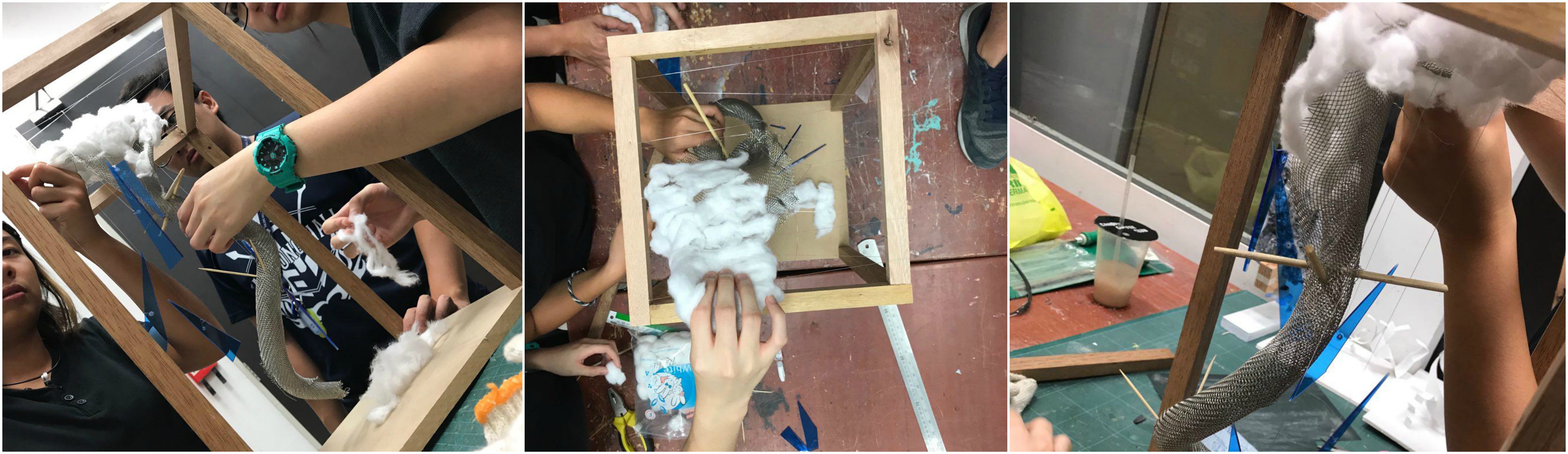
Tone Bars and Void – The tone bar was a final note before silence. The sound seemed to linger in the air before dissipating. To show this, we used cotton wool and we attached it to the top of the wire mesh, outside of the entire frame. It was crucial for the cotton wool to be outside the frame as we wanted to show how it slowly fades into the air.
Moving on to the construction of our city!
The builders had many ideas for how their city would look like. As the builders of this city felt that the sound used for the inspiration had many elements of serenity and tranquility, we wanted to explore that idea.
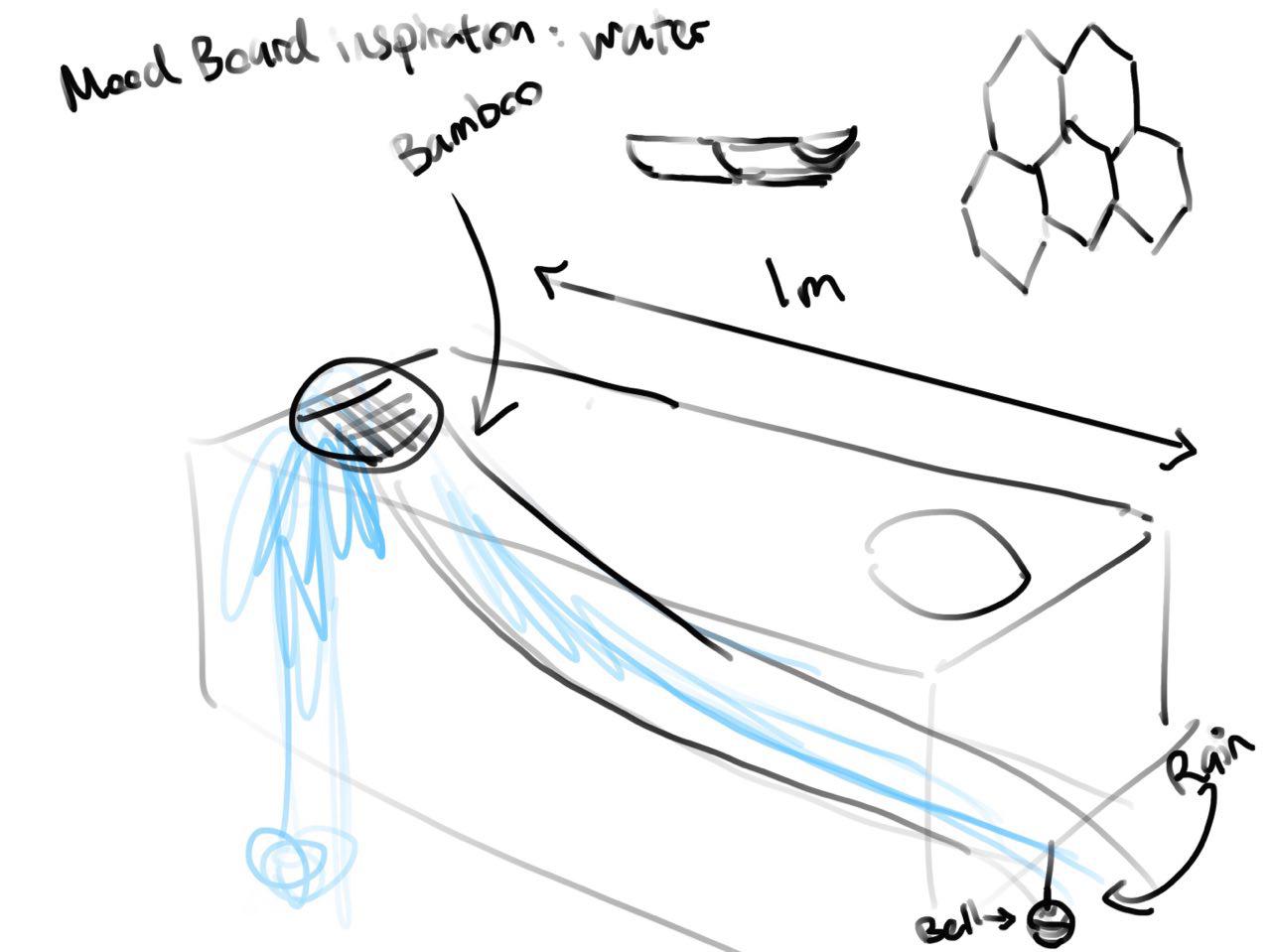
One element that often popped up during discussions was the use of water for our city. By incorporating water into the city, we could use it as a viable means of transport.
We begin with several sketches.
After looking at the sketch, the builders decided to look for what kind of modular structures they could incorporate into their model. What better way to source for inspiration than mother nature herself.
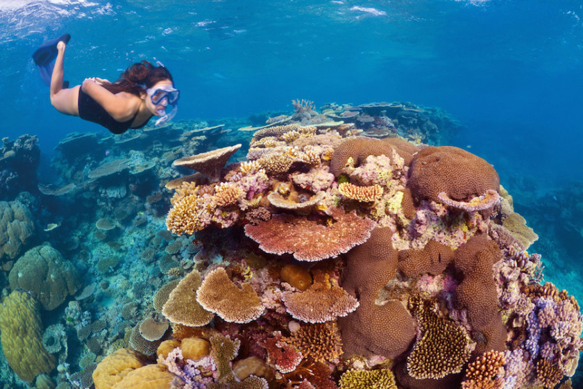
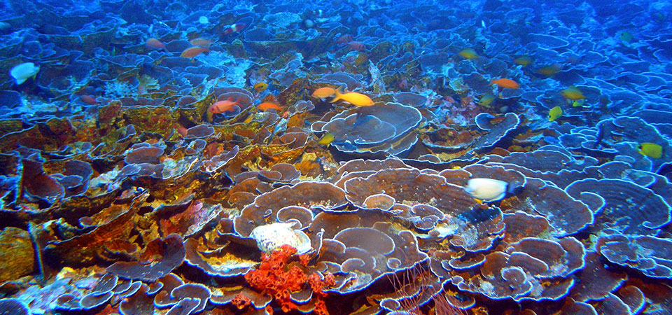
They looked into various habitats in the sea. Coral reefs were one of the biggest inspiration for their ideas. They also looked into sea creatures which live amongst these habitats! Most notably, fishes and turtles. The scales of fishes form a unique over lapping structure which protects them from predators as well as reducing drag underwater.
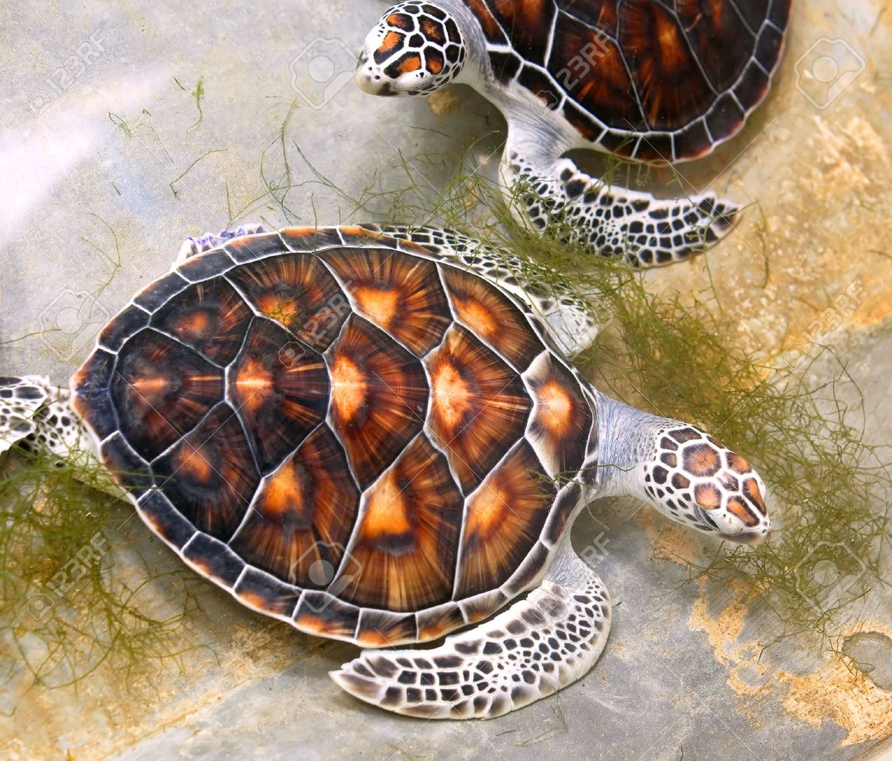
Next, we have turtles! Their shell closely resembles that of fishes as they have a shape similar to a pentagon.
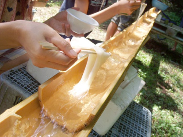
As the brainstorming continued, one of the builders started to get hungry and his mind started drifting off. However, as he was lost in his world, he found a eureka moment! Nagashi Somen (Bamboo noodles) came into his mind for the use of a modular structure.
Bamboo has been widely used for construction in Japan (our builder happens to also be half japanese) and we delved into researching the types of structures we could create using bamboo.
As they initially wanted to incorporate the use of water in the city, bamboo was the perfect choice as it is waterproof as well as light which made it a versatile material to use.
They also incorporated elements of coral reefs into the concept, by using the modular structures of the corals as the habitat.
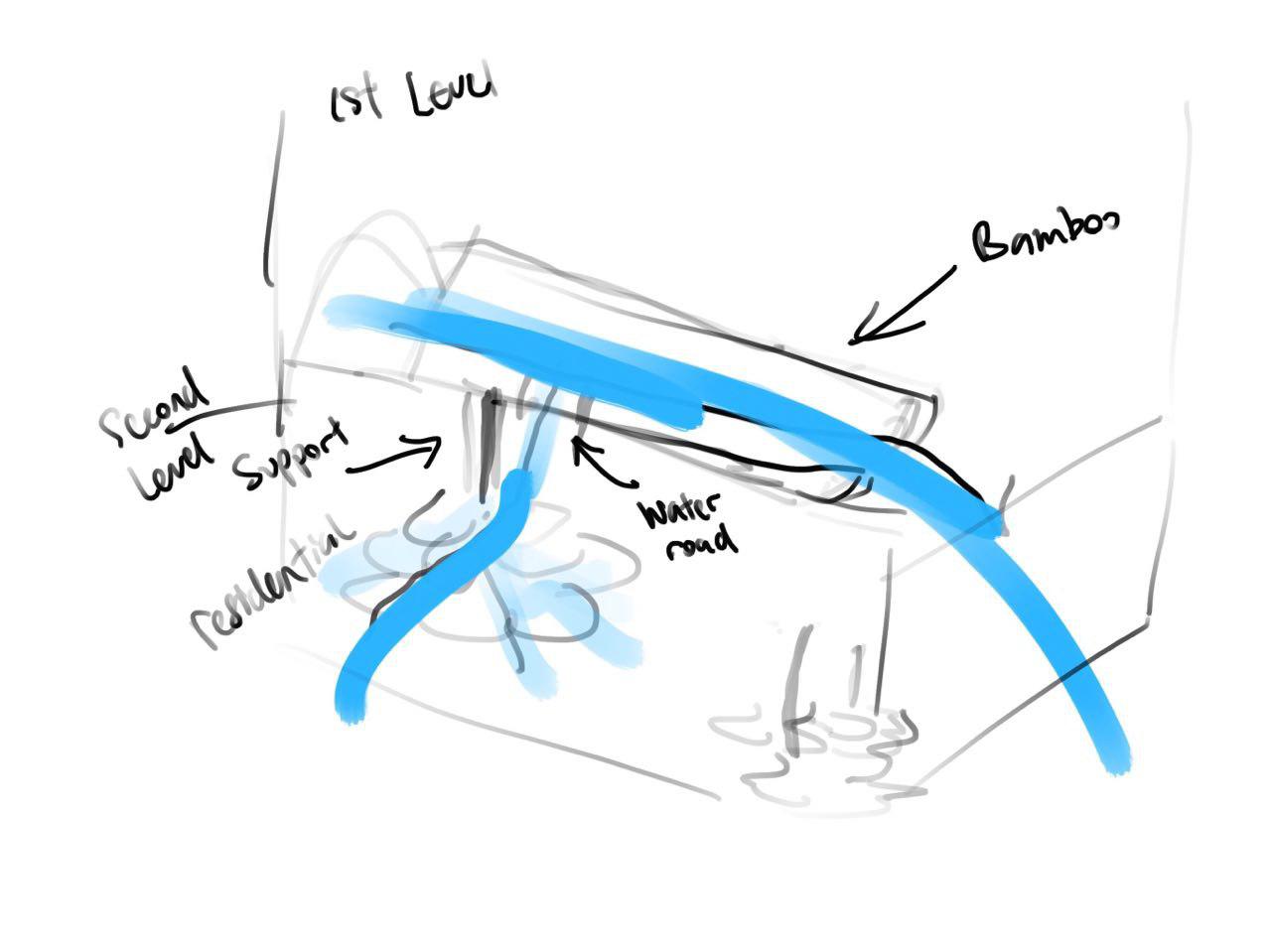
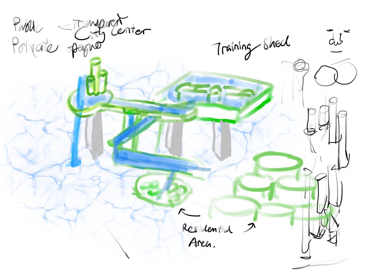
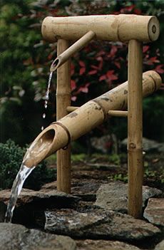
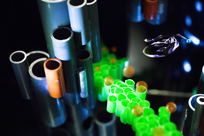
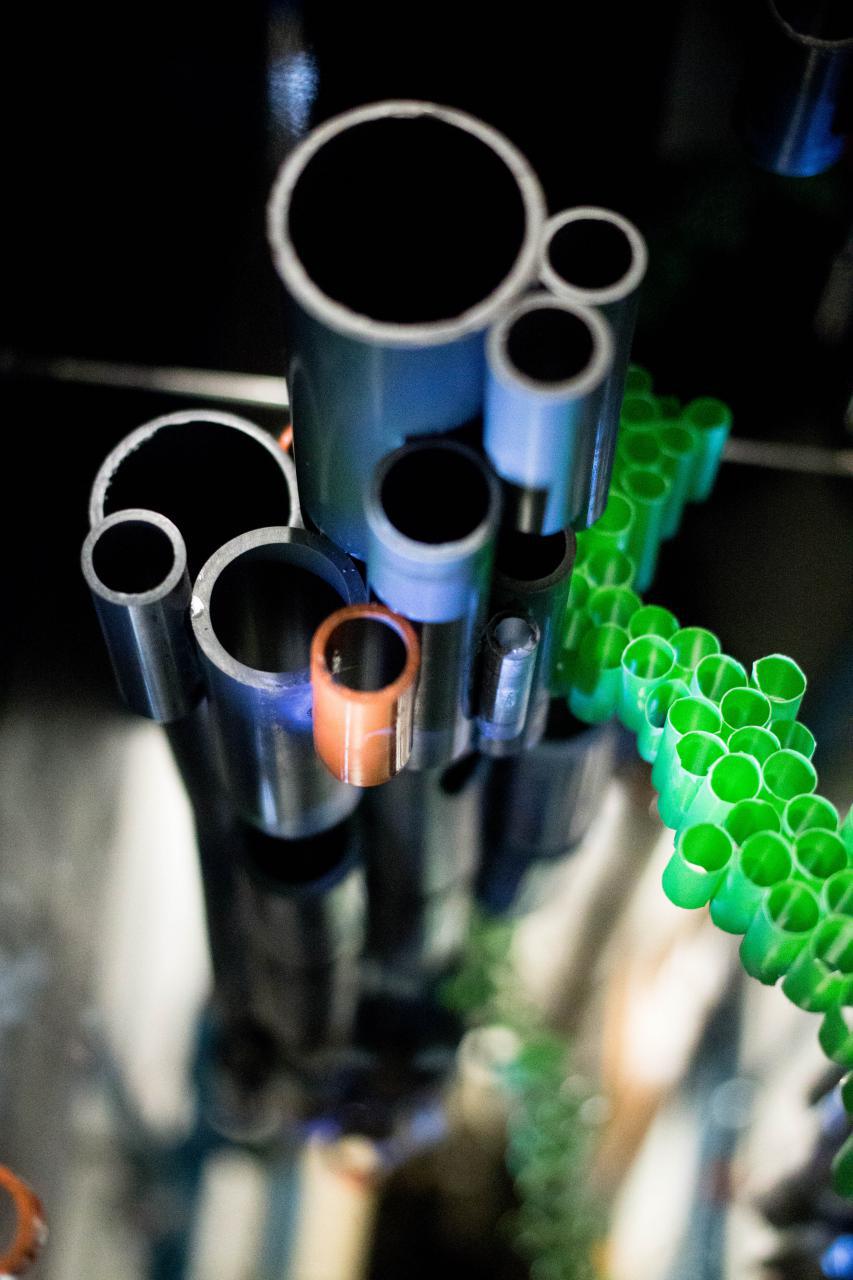
The idea was to have a central canal which would run through the entire city, providing them with a highway for commuting. We would also have different levels to the city, which was inspired by Bamboo fountains.
However, as the builders brought their ideas to the Governor, she warned us that the materials required would be too expensive and it would also be difficult to construct as the material is rigid and difficult to manipulate without proper equipment. The governor generously shared her wisdom with the builders and advised them to use PVC piping instead. This would result in a easier material to work with as well as saving them money.
It was back to the drawing board with their idea as they could not execute the multi-tier city anymore as it would look out of place using bamboo. With the use of PVC piping, it evoked a more futuristic look.
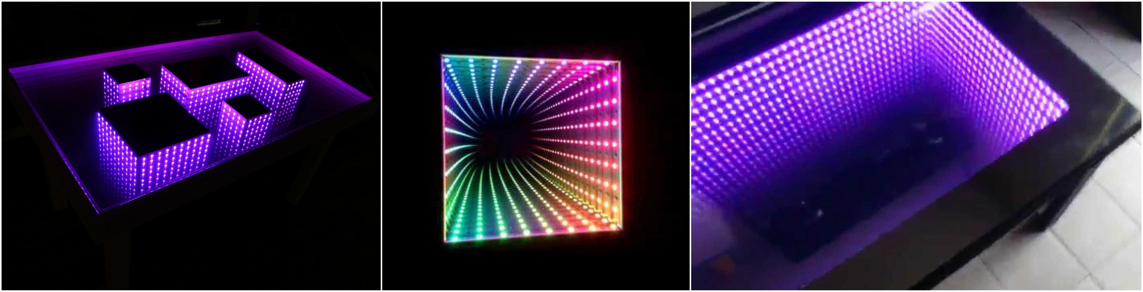
As they re-imagined the city, they started to look for ideas on what would make it look like a futuristic city. When they thought of cities, extremely high-rise buildings comes into mind. This gave them the idea to create the illusion of having a ‘floating’ city with the use of mirrors.
They had many discussions on how to create such a look as there were many elements to consider such as the source for our materials and the execution as none of them have ever attempted something like this before. They came up with more sketches to try and envision how our city would look like.
There was also the problem of lighting. As light was crucial to create the illusion, they had to decide if we wanted the lighting to be on the buildings, or within the buildings.
They then settled for the lighting to be internal as it would have looked too forced if the lighting was from the outside. However, by having the lighting inside the buildings, they had to think of ways to place a strong enough light source within such a small area.
After they decided the look of the city, theystarted to source for inspiration on how our city would look like.
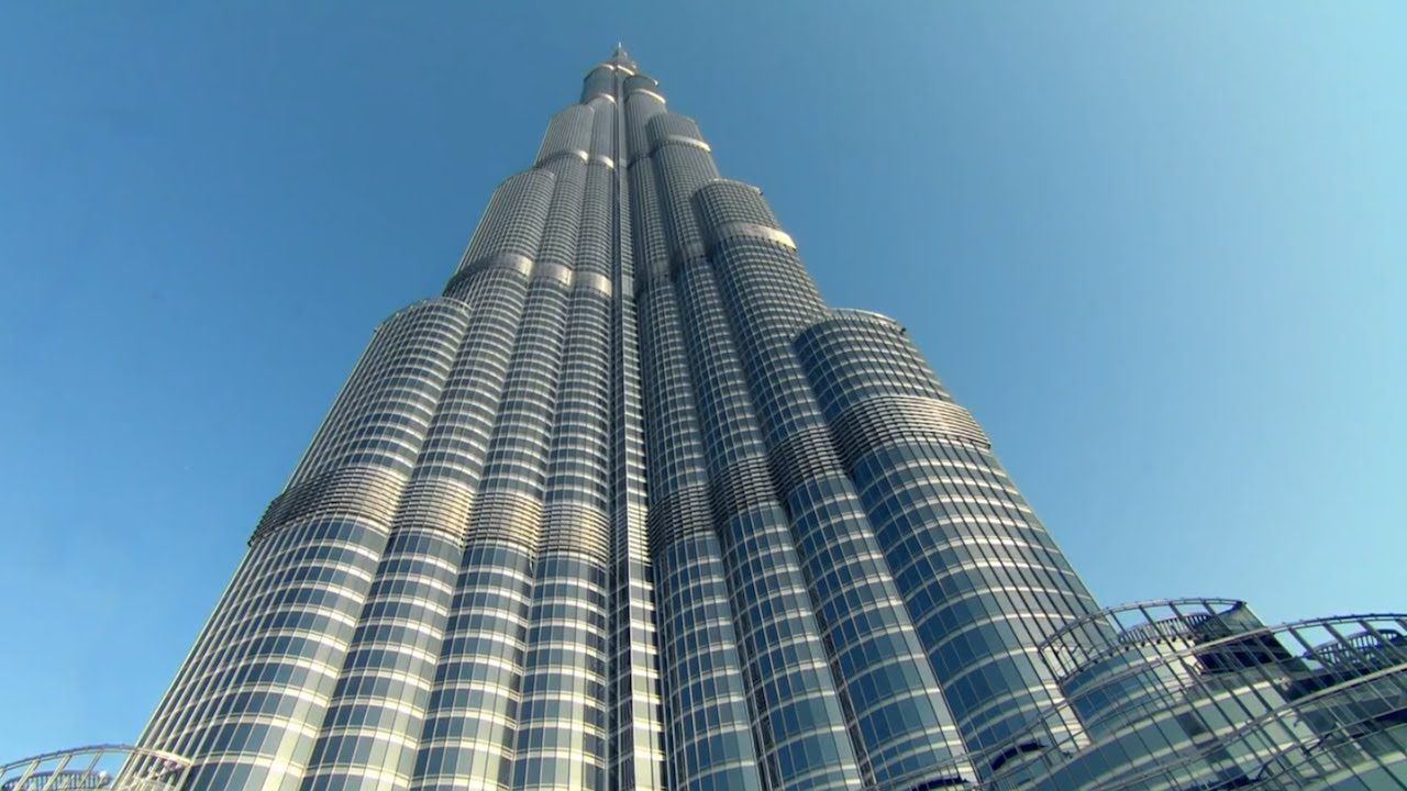
One of the inspirations was the tallest building in the world, the Burj Khalifa in Dubai. This structure has a similar form to PVC piping and is a great place to begin. However, the structure looked too uniform and the builders realized that it would not make for a interesting composition when coupled with mirrors from their installation.
Once again, the builders were back to the drawing board. They decided to turn to nature again to source for their inspiration. Little did they know, that this process of looking to nature for inspiration is called biomimicry design, as explained by this video.
As the builders wanted to evoke the feeling and illusion of verticaility, we turned to structures which seem to be spanning upwards.
DNA’s structure has a spiral form and the spiral implies a direction. This was useful research as the builders could incorporate this into the design of the city to give it the look of ascension.
They also started to source for structures which may have similar qualities.
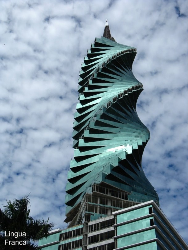
This is the F & F Tower located in the city of Panama. The spiral gives the illusion of the building reaching into the sky.
As the city would be located within a dark area to make full use of the illusion of an infinite building, it had to be located in a dark area. The builders set out to find a suitable location for their city.
They stumbled upon this obscure place, one that has been left untouched for ages… it almost seemed as though there used to be another civilization which lived there…
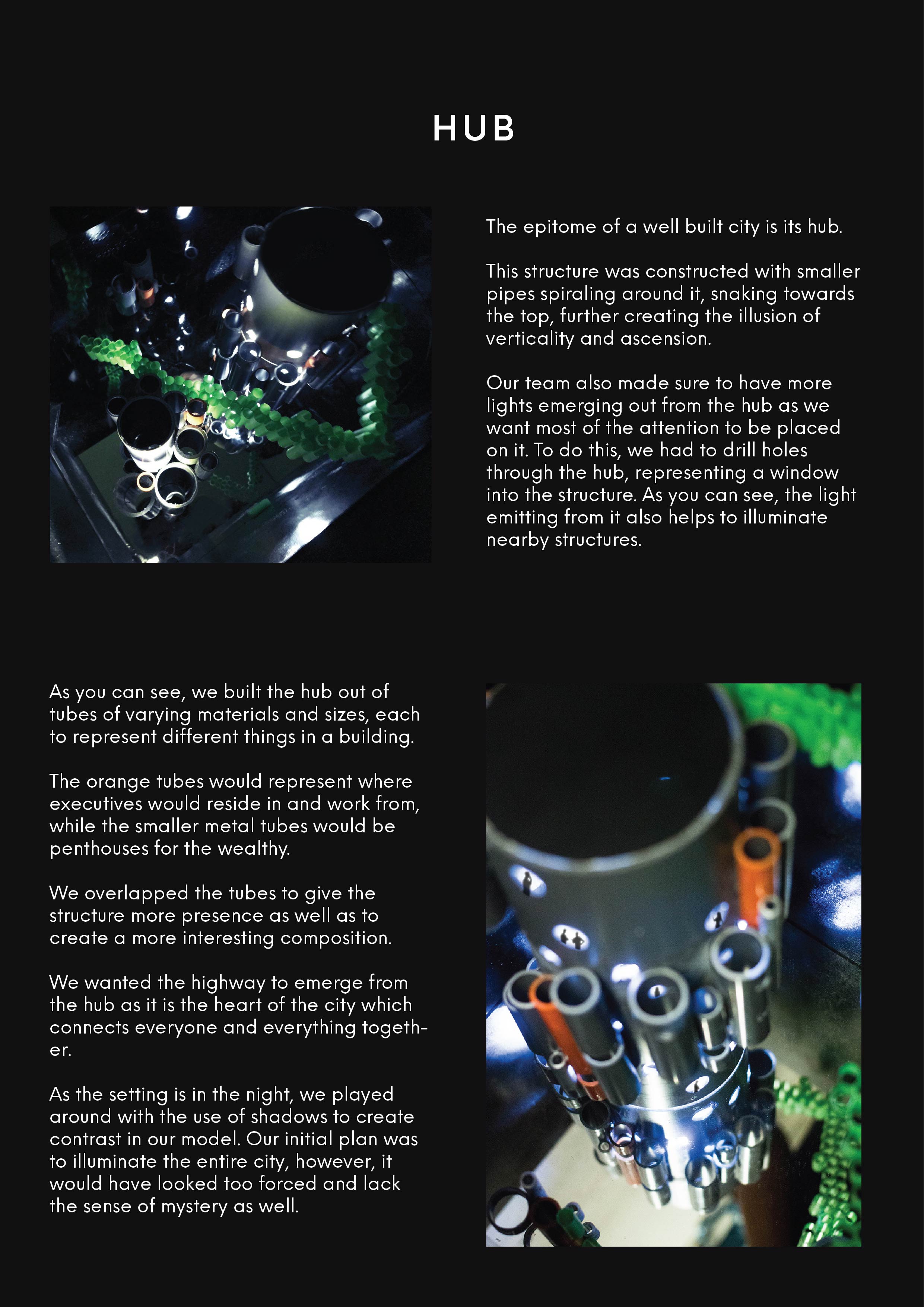
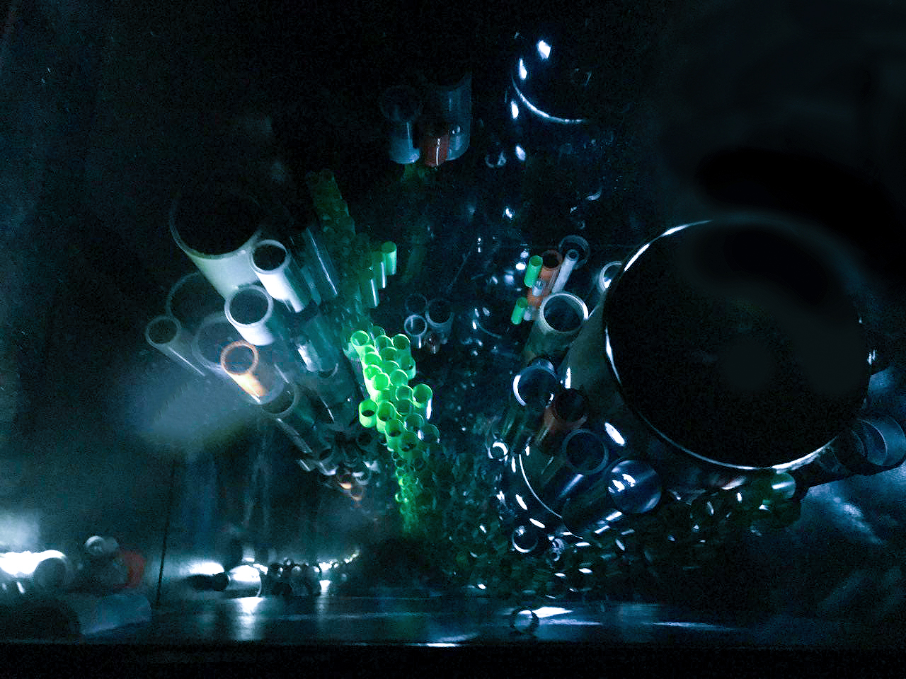
This location seemed to be in line with the theme of verticality as well as their choice of materials which made it a perfect location. The eyes are naturally drawn upwards because of all the lines the pipe creates, giving the sense of voids within the space.
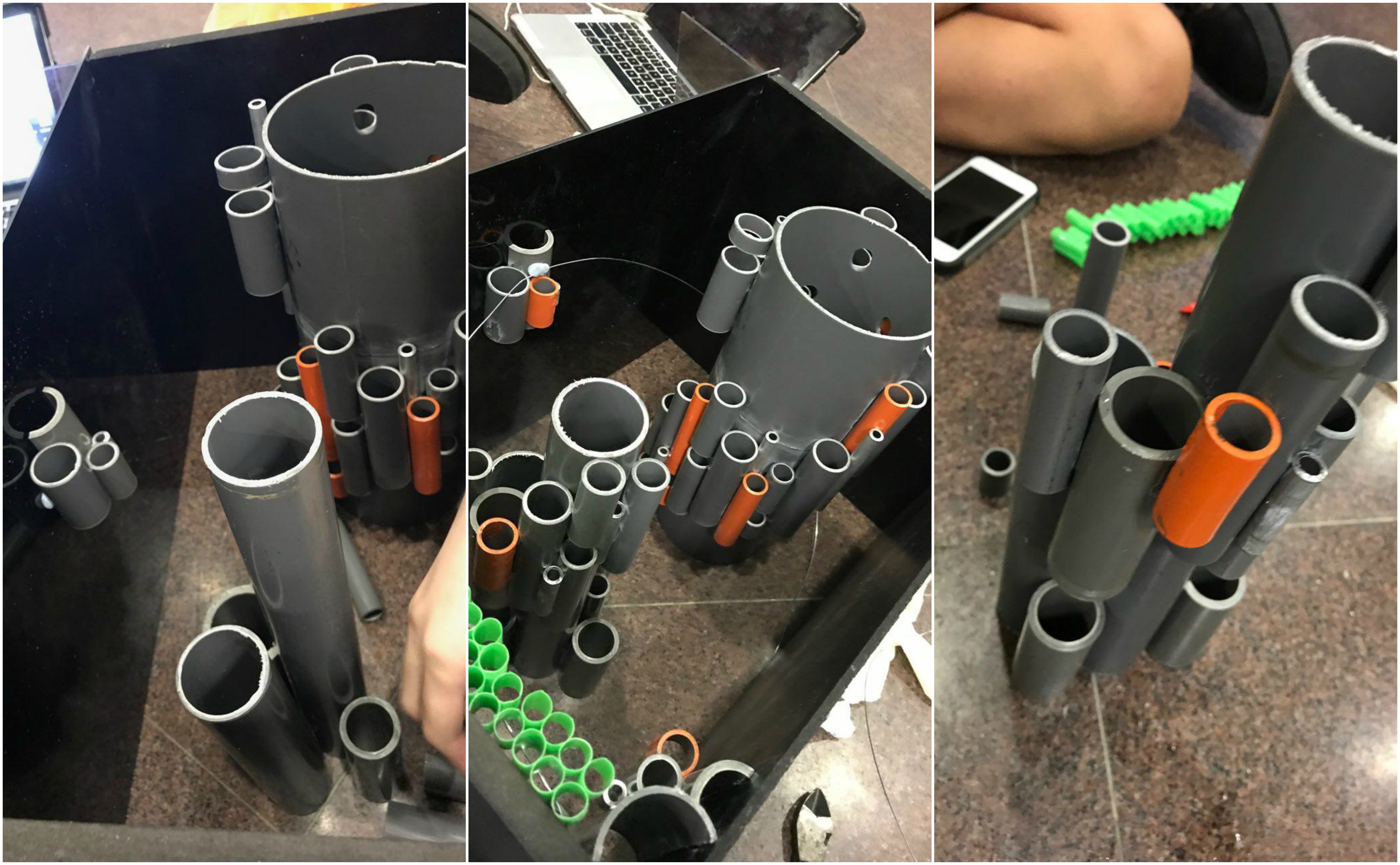
With everything in place, they set forth to build the city!
Prototyping
They began by building a prototype based on the various inspirations which they found.
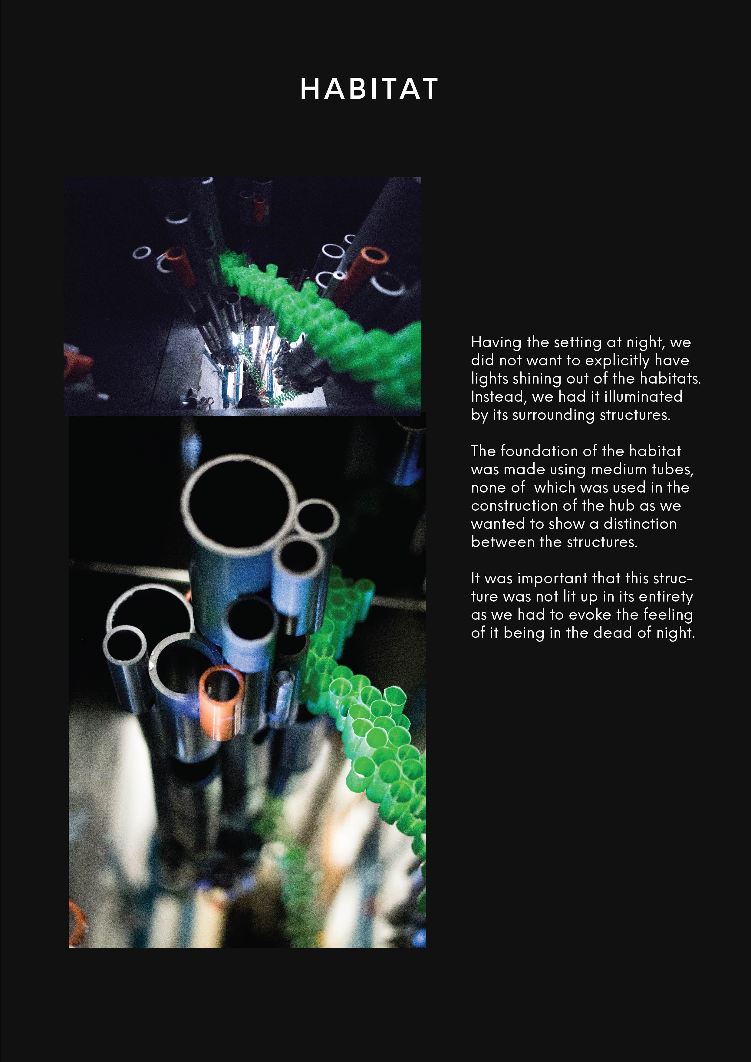
The builders wanted to incorporate the spiral into their composition. They also left holes between each module which represented a window.
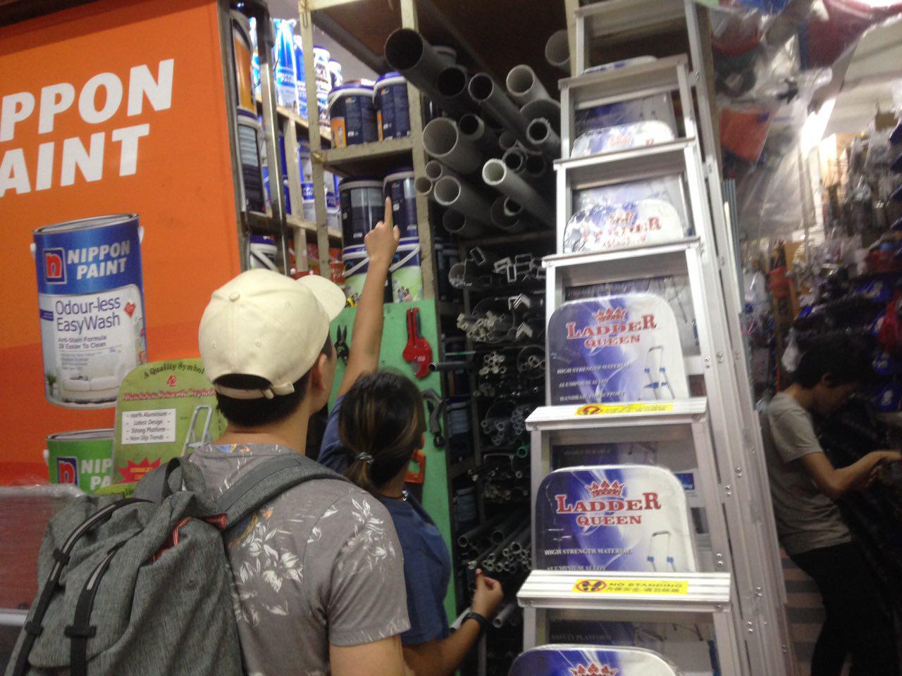
With the structure in mind, they set out to purchase the needed materials to build the structure.
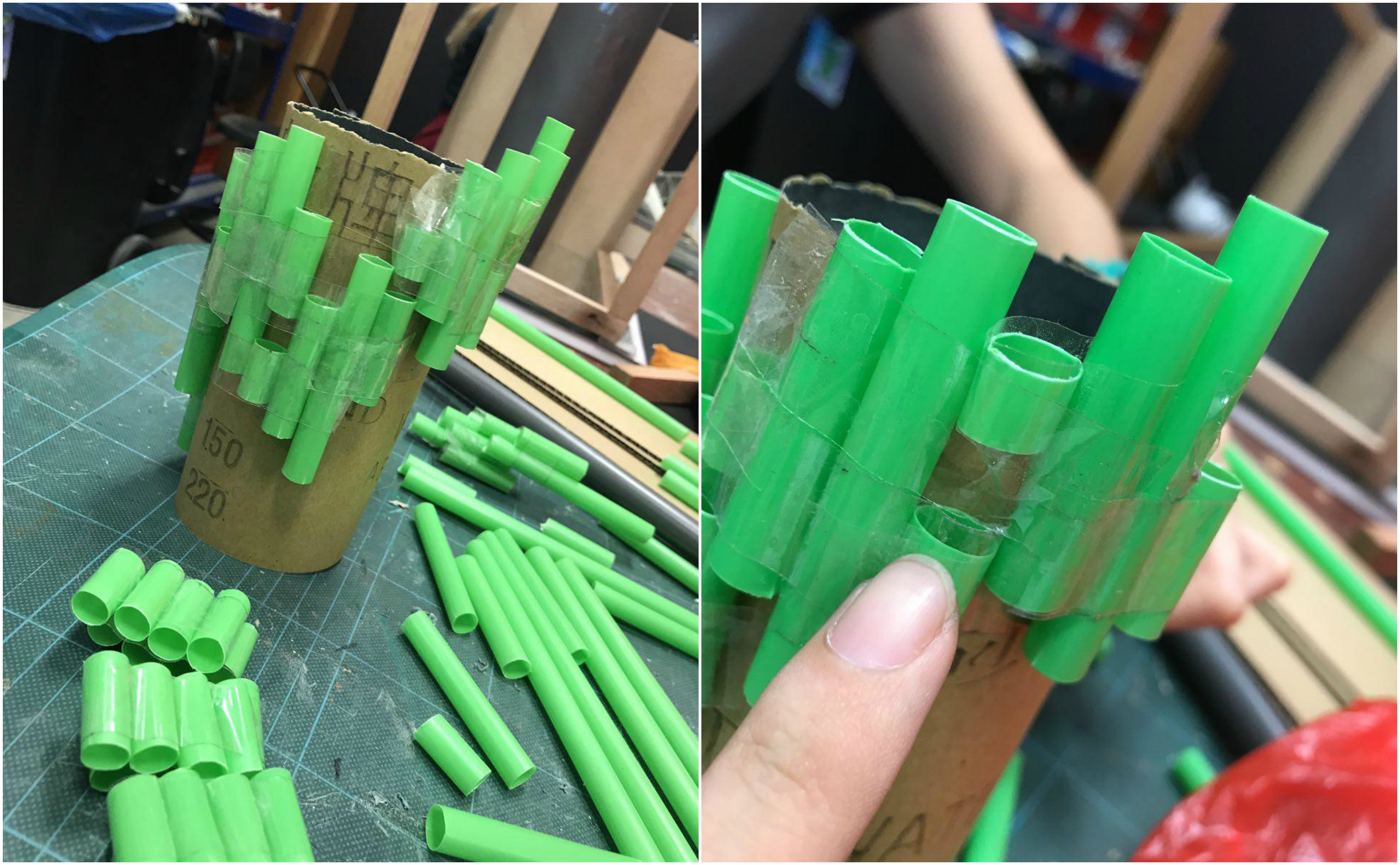
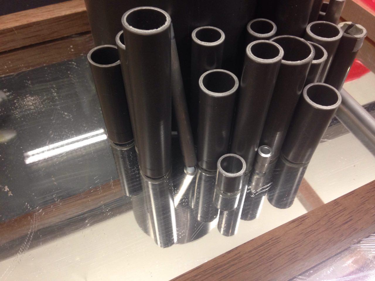
They first began by selecting pipes of different sizes and materials. After which, they proceeded to create the hub.
The pipes were stuck together using Blu-tac initially to ensure that the builders could still change the design if there was any additional feedback.
Slowly, the city was coming together.
One Way Mirror
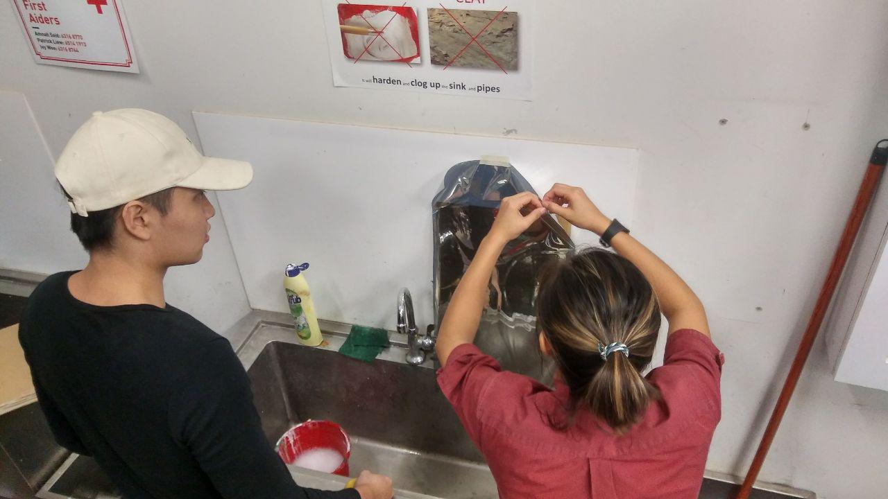
Next, the builders had to source for a one way mirror. As purchasing one would be too expensive for them, they managed to find a seller which offered one way mirror films. This was much less expensive and it allowed us to work with more materials.
The mounting of the film was a tricky process, however, after the first failed attempt, our builders managed to apply the film onto the acrylic board properly, with minimal bubbles.
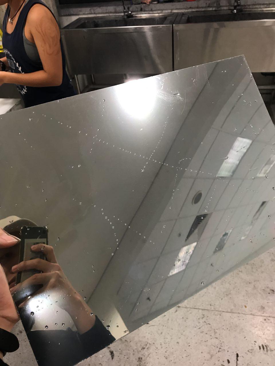
If you look closely at the image below, you can see that small bubbles of impurities have appeared on the surface. The team was not satisfied with this craftsmanship which was why they decided to try again, this time in a more sterile environment.
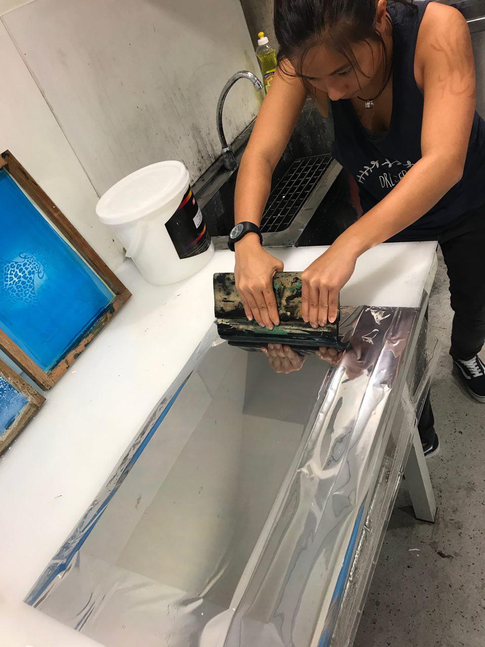
The second attempt was much more successful as we had the proper tools to do the job and we had a smooth surface. As you can see, one of our skilled builders making sure that the impurities were a thing of the past.
The film was applied masterfully thanks to the dexterity of Hannah!
After sorting out the one way mirror, the team moved on to find out what is the best way to light their structure.
Framing
Initially, the team used a wooden frame for their model. However, this distracted the audience from the full experience as the frame could be seen in the mirror.
The team then changed the frame by using flat boards instead of long pieces of wood so that the edges would be flush against each other.
The builders then spray painted the sides to be glossy so as to reflect more light from the city.
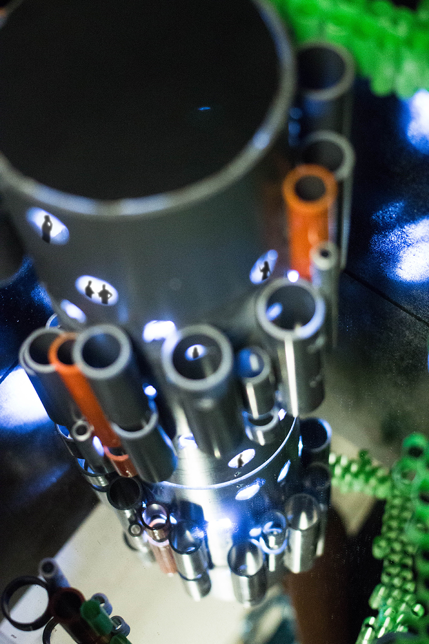
Lighting
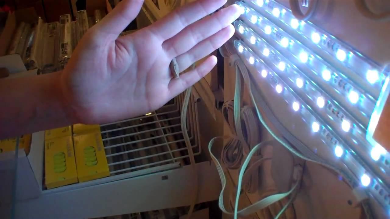
This was the biggest trouble the builders faced as the light source had to be strong enough to produce the full effect. We had a variety of sources of light, however, all of them had to be connected to a socket which was tough because there was no sockets around the obscure location.
These were some of the lights which the team found but could not use.
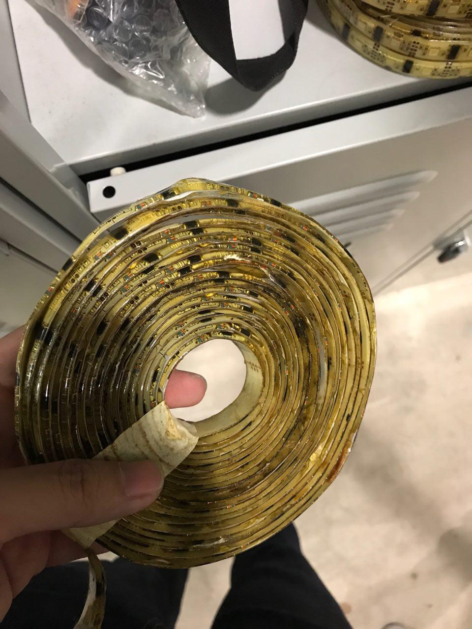
LED Strips from IKEA.
Strip LED lights
We had to source for battery operated lights.
Thankfully, we were able to find strong LED lights used for hiking and biking.
The team attached two of these onto both the top and bottom of the hubs to increase the intensity of the light. For greater measure, the team lined the inside of the pipes to allow the light to bounce off the walls better.
This directional light was God sent as we used it to light the habitats.
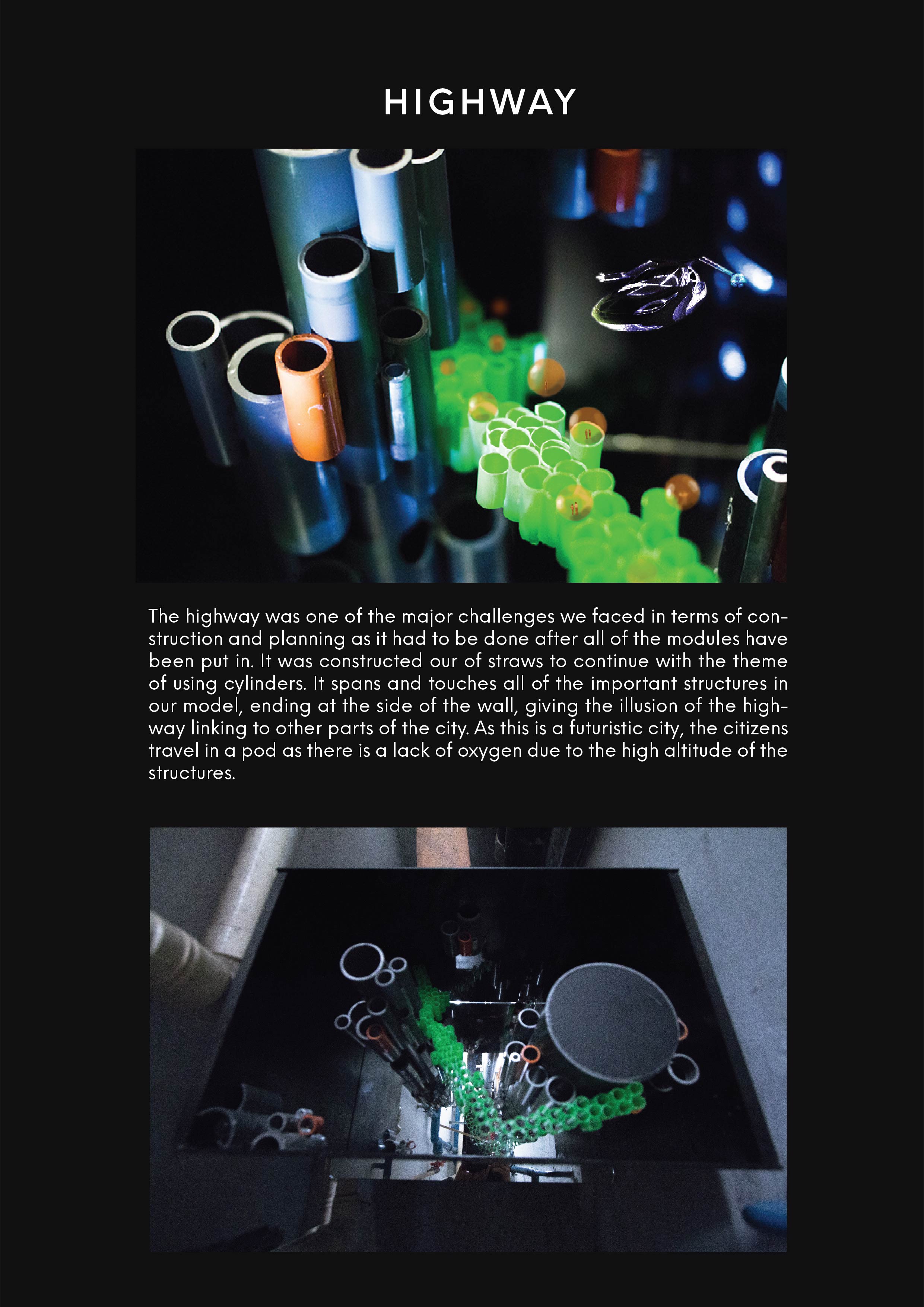
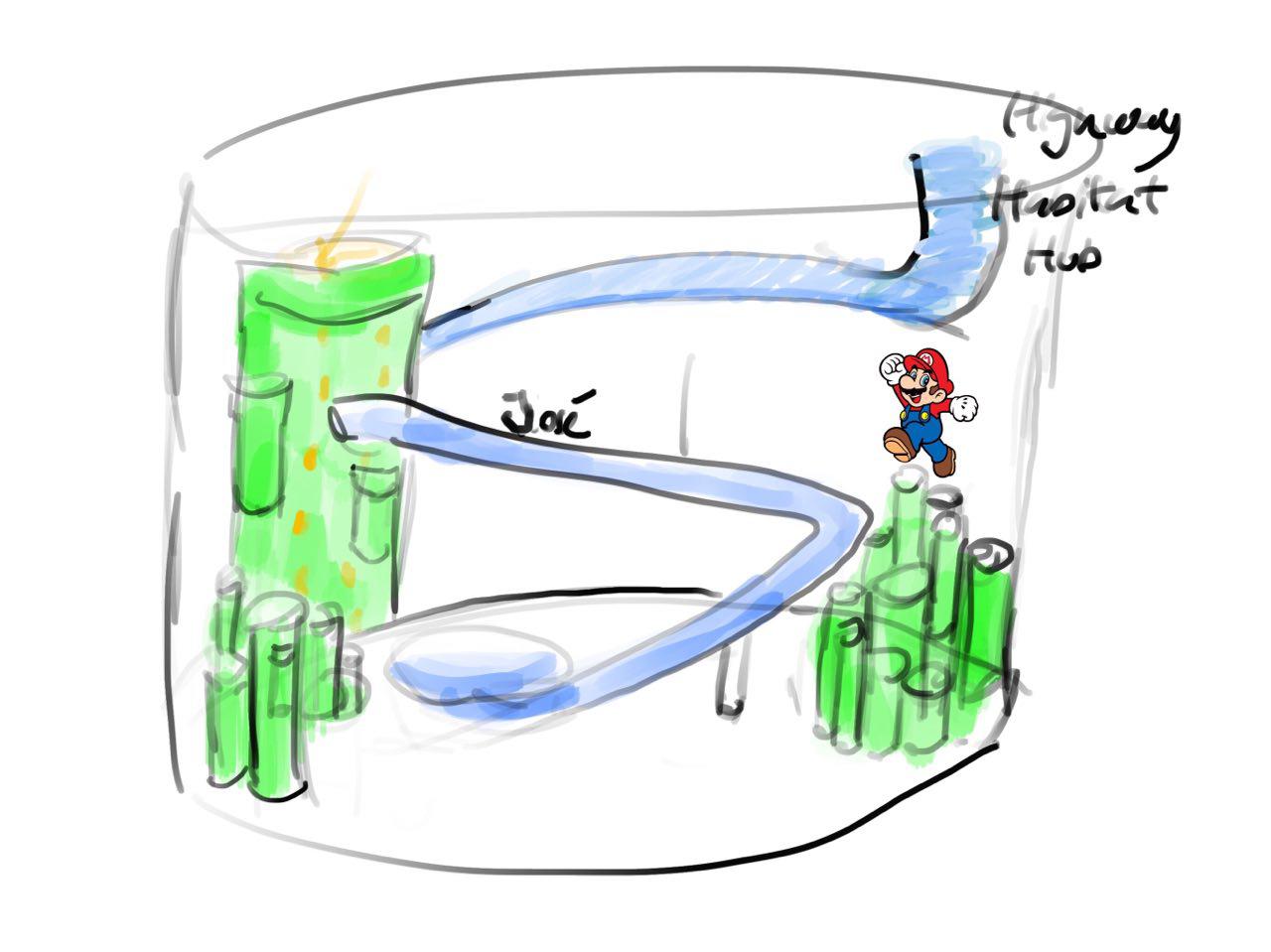
Highway
The highway was put together using straws. The team had them descending as they wanted them to join with the main structures of the city.
Putting the City together
Revealing,
People up working late at night in the hub. Society has found a way to do away with sleep.
Due to the height of these structures, residents are required to travel with an orb as the atmosphere is too thin, resulting in little oxygen in the air.
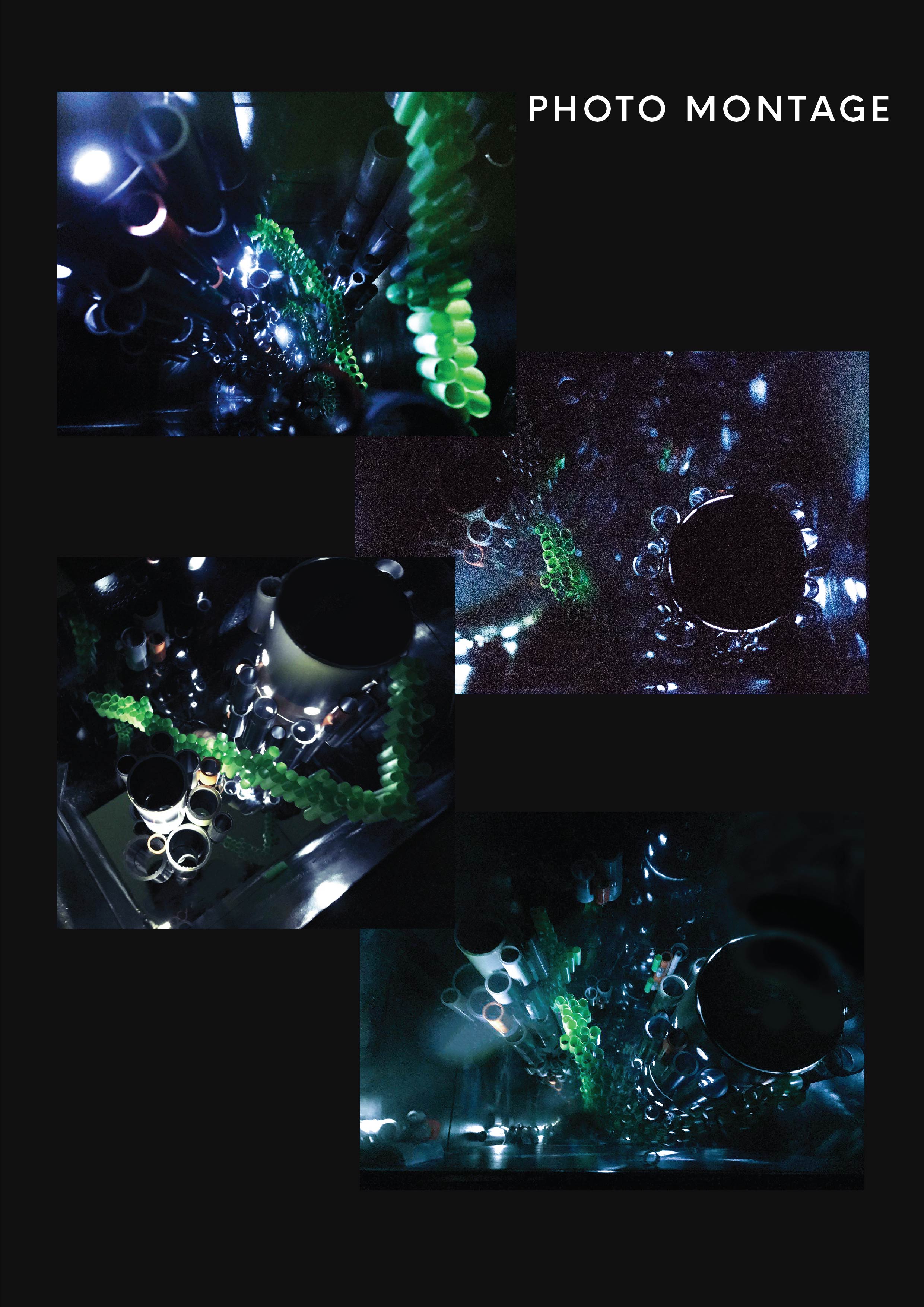
More close ups on the city
Overall, I’ve grown tremendously during this first semester in terms of craftsmanship as well as idealisation. I realised that no one form of art can be compartmentalised and separated from each other as they can all be interwoven with each other.
Despite my confusions at the start of this assignment, I was really glad how it all came together nicely once we took a step back to look at the results. It is amazing how such a seemingly insignificant tune of less than 30 seconds could convey such a strong message when we break it down to its individual components.
I feel that breaking down elements to their dominant, sub dominant and sub ordinate can be applied in all forms of art, design and media as we have progressed through all of the past assignments in this semester.
Thank you Cheryl for being such an inspiration to your students and to me!
After the creation of our individual mood boxes, we now move on to our group mood box.
We had several ideas for how we wanted our group mood box to look like.
Here are some of our initial sketches:
The materials represented in these sketches were ones taken from our individual mood boxes.
Hannah adopted a different approach to the sound. She made use of sharp waves to represent the sound which the Zig Zag blocks make, coupled with the ascending order to build up suspense to the next instrument.
The next instruments were the Tanggu sticks and the shaker. From here, we can see a common trend in using wooden sticks to represent the Tanggu sticks. The shaker is represented using a small piece of acrylic as its presence is less dominating in comparison with the Tanggu sticks.
At the end, we have a sharp drop. This is to represent the sound which the tone bars makes. This sudden contrast in composition would make sense only when the audience has heard of the sound. As you can see, the wire fades into the frame which accurately captures the essence of the sound dissipating into the air.
Ying Hui cleverly represented the dominant by using paper folded into a zig zag pattern as seen from above to create the texture of the sound which was rough.
The sub dominants can be seen from the use of tooth picks as well as the curved paper to represent the Tanggu sticks and the shaker respectively. As you can see, the toothpicks pierce the papers, similar to what Fendi depicted.
At the bottom, there is a subtle hint of the tone bars sound which is represented by the cotton wool.
For Fendi’s mood box, he played around with different compositions of the sounds.
The rough sounds of the zigzag block is consistent throughout the piece, thus it runs across diagonally across the box, creating a sense of dominance.
Like above, the shaker evoked a sense of falling beads or water. Thus he used a gentle curved plane that goes downwards to represent an organic flow.
Fendi felt the wooden blocks were an element that seem to be a hard, short sound that comes out in the distance as a sort of echo. Thus he placed it almost piercing out of the box, as though a man was in a distance, clapping his hands.
The tone bars was a final note before a long silence. He showed this by piercing the void with a piece of acrylic to show how the note seemed to echo in a void space.
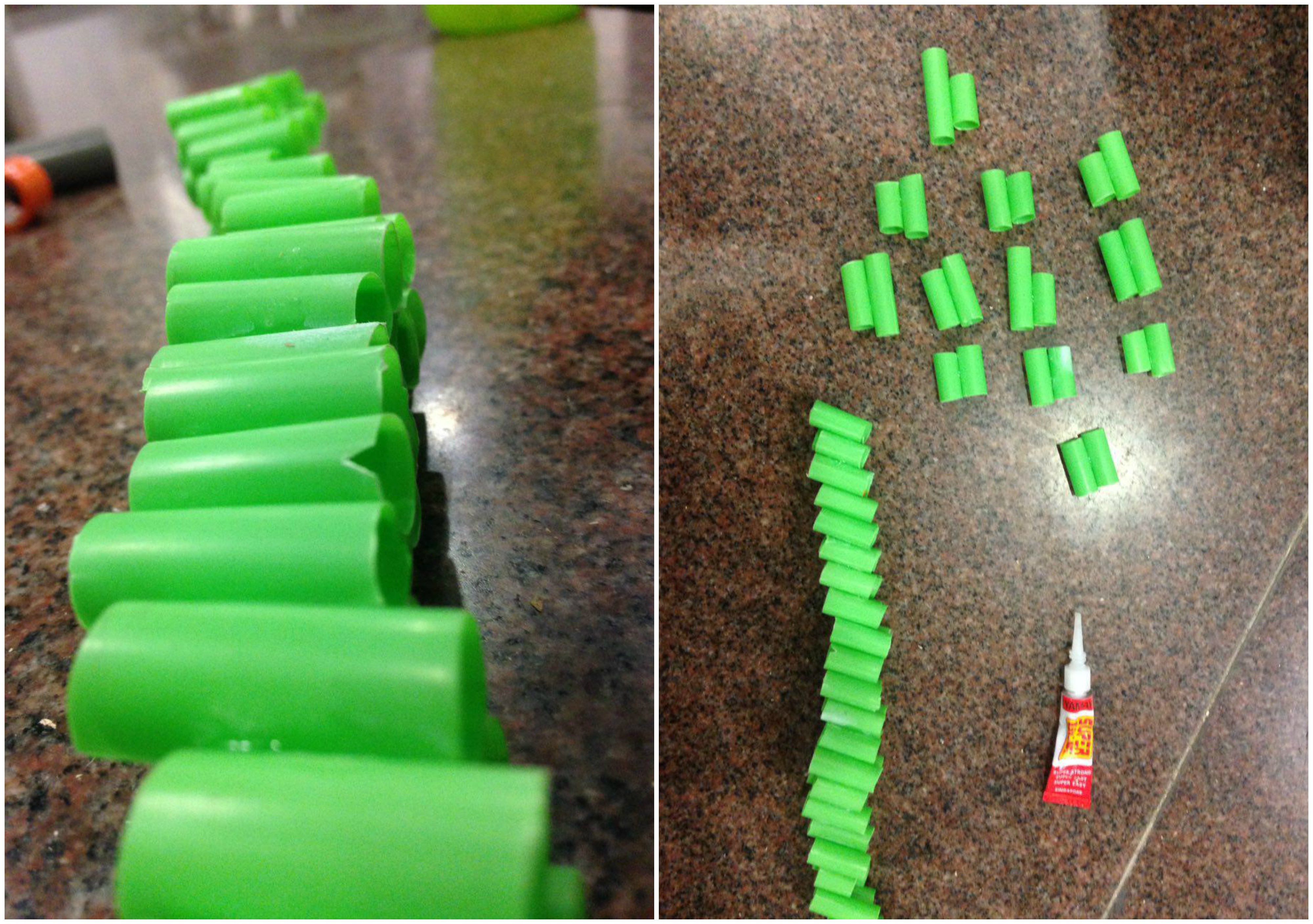
Making the components for the Mood Box!
As you can see, there are some consistencies with what materials we use. These include the wooden sticks to represent the Tanggu’s, cotton wool to represent the tone bar at the end of sound 2 and the Zig Zag pattern for the dominant zig zag blocks.
However, we wanted to try a different approach to the dominant which was the zig zag sound. Instead of using crumpled paper or plastic to represent the rough sounds of the zig zag blocks, we used hard wire mesh instead!
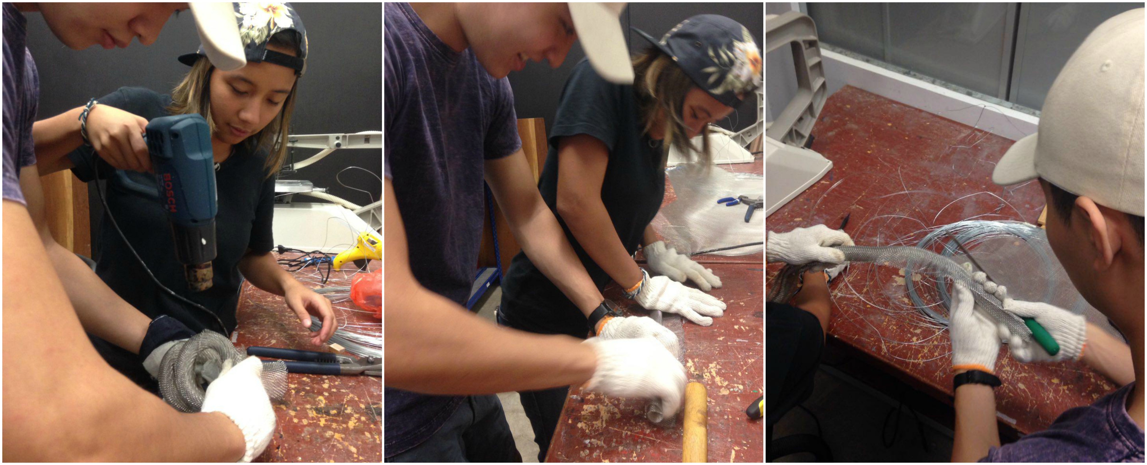
Making of the dominant:
Here you can see Hannah and I struggling to get the wire mesh into the form we wanted. We had to use a heat gun to mold it into shape.
We vaguely look like modern sushi chefs trying to make a maki roll….
Making of the Sub Dominant:
As we agreed that the shaker sound seemed to resemble the idea of a rain drops or water droplets, we went ahead and cut blue acrylic to small triangles, to show it piercing the sound, similar to the Tanggu wooden sticks.
Hannah and I used the soldering rod to pierce holes into the acrylic pieces and the warped wire mesh respectively.
Making of the Sub Ordinate:
The making of the sub ordinate was a tedious process as we had to gingerly fluff up the cotton wool while try and hold it in place with glue at the same time. We spent a tremendous amount of time pulling apart the cotton wool to make it look like a cloud – I really thought it would be easier.
Putting it altogether!
Zig Zag Block – The rough sounds of the zigzag block is consistent
throughout the piece. To demonstrate this, we took a hard wire mesh and warped it to form a spiral through the entire frame. The rough and prickly texture was to represent the unevenness of the Zig Zag Block.
Shaker – Like above, the shaker evoked a sense of falling beads of water. To show this, we cut up pieces of blue acrylic in the shape of triangles and hung them off fishing lines to represent rain cutting through the voids.
Wooden Blocks – We wanted to give the idea of the sound of the sticks piercing through the constant sound of the Zig Zag blocks. The sound also appears twice before the sound of the tone bars which was why we repeated the effect.
Cotton Wool – The group enjoyed the idea of the sound fading into the distance, which is why we wanted the cotton wool to protrude out of the frame, dissipating into thin air. As the cotton wool blends in well with the background we, it was an apt choice of material to encapsulate the idea.
It has come to our final assignment! I am not going to lie, but this was one of the most confusing assignments to work on from the beginning, when Cheryl asked us to make music in class.
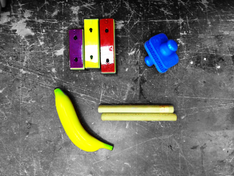
We learned a little about music and its scales, after which, we had to create 2 sounds using a variety of instruments Cheryl brought for us. These were the ones we picked.
The instruments include:
Tone Bars in Dominant 7 Scale
Zig Zag Blocks
A shaker in the shape of a banana
2 wooden sticks used to play the Tanggu Drums
Thankfully, we had 2 musically inclined students, Hannah and Ying Hui to help us compose the various sounds as the dominant 7 Scale is not one which is easy to work with.
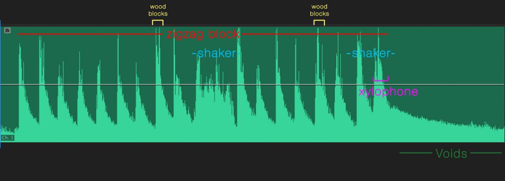
Sound 1:
Dominant: Tanggu Sticks form the beat of the sound, while the
tone bars provided the tune for the sound.
Sub Dominant: The shaker came in after every fourth beat,
making it evenly spread out, making it the sub dominant.
Sub Ordinate: The Zig Zag Blocks made only came in at the
end of the tune which formed the sub ordinate.
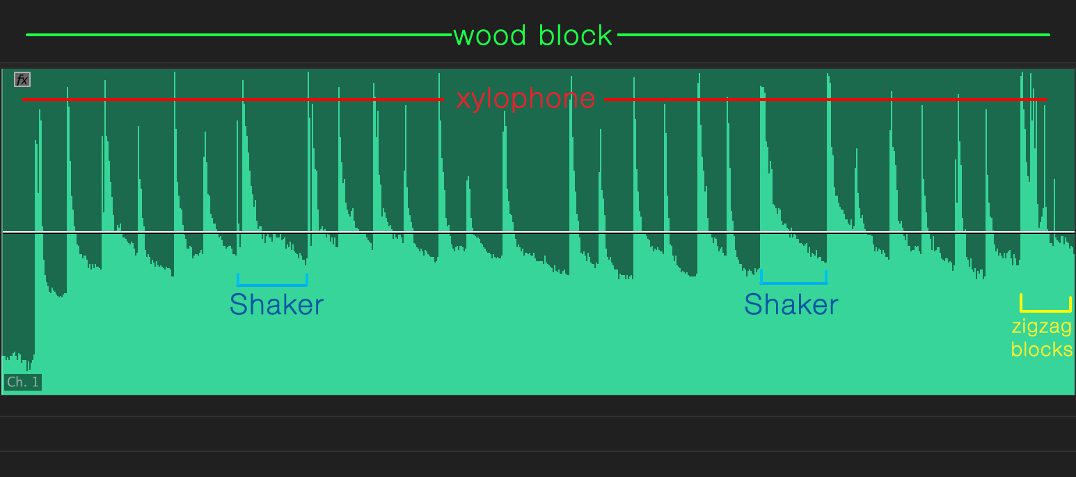
Sound 2:
Dominant: Zig Zag blocks as it formed the rhythm of the sound.
Sub Dominant: Both the shaker as well as the wooden blocks make
up the sub dominant as they came in after every fourth beat.
Sub-Ordinate: The tone bars only comes in right at the end of
the sound when no other instrument is playing, making it the sub-ordinate.
After analyzing the sounds, I proceeded to create my individual mood box based on sound 1.
I went with creating a mood box for sound 1. As the dominant for this sound was the tone bars, I wanted to use metal in most of the composition of this mood box, bringing out the dominant nature of the sound. The wooden blocks acts as steps for the tune to follow, similar to how tunes have to follow the timing of the beat in a song. The silver wire spans through the entire frame as it is constantly playing.
The pieces of blue acrylic depicts the shaker sounds, showing how they pierce the flow of the sound.
We have the sub ordinate which is the cotton wool. This is to represent the nature of the zig zag blocks as the texture and look of cotton wool is non-uniform, and as the sub ordinate, I didn’t want to fill too much of the composition with it.
The elements are floating as I feel that sound does not have a physical presence which is why it should not be resting on anything. If we had an instrument with more bass I may have chose a base for the model to rest on.
To begin sourcing for inspiration, I looked to Behance for artist references. As I decided on illustration to be my medium, I thought it would be an appropriate place to begin as most of the illustrations on Behance was digital.
I found a plethora of references I could use, ranging from colour studies, composition, concepts, as well as character design.
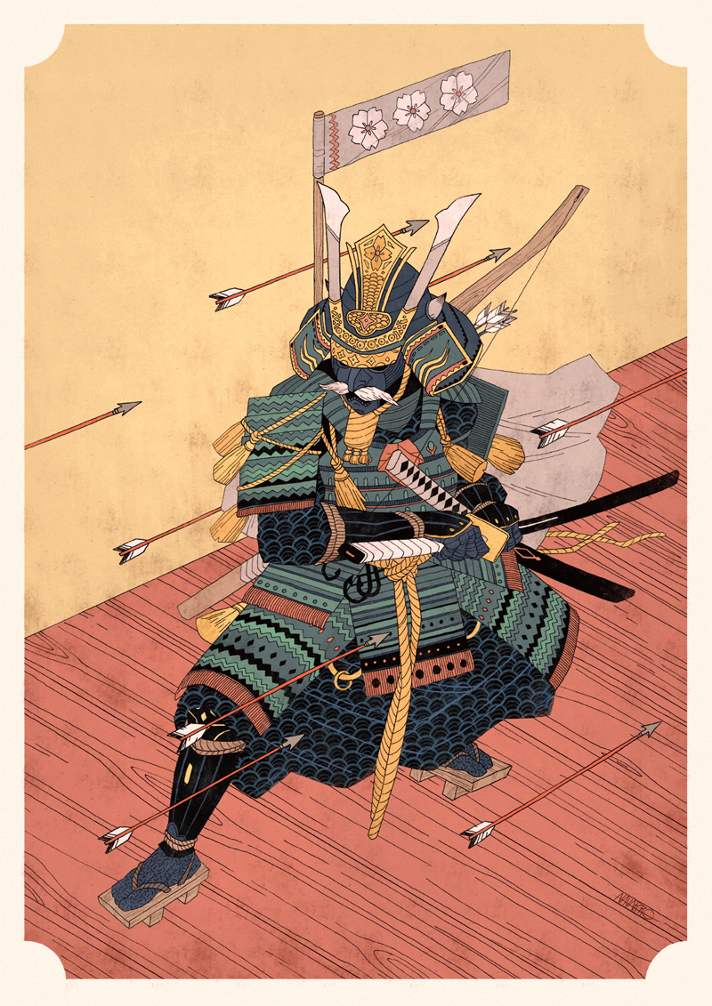
One of the biggest inspiration for this assignment was Bruno Mangyoku. His work features brilliant composition techniques as well as minimal use of colour. Only varying the tones from a limited selection of colour.
The use of the circular spotlight and harsh shadows really draws the audience to the message of the image. The use of red tones to bring out subtle details in the composition ties everything together.
The use of warm colours in this composition, accompanied by the hint of cooler tones to represent foliage sets the mood for this piece. After being exposed to colour theories and harmonies, I am able to appreciate works like these as it takes tremendous amounts of planning to be able to evoke the desired mood with such a limited range of colours. The use of the wooden floor boards to direct the eyes to the man was also an ingenious touch, one which I overlooked initially.
The use of implied lines through the ropes attached to the roman rings makes you wonder what message the image is trying to convey. I would interpret this image as sports bringing 2 opposing parties together, be it business and politics.
This composition features a sort of Yin and Yang composition which creates tension. I also like how their eye lines meet which is a nice touch for the composition.
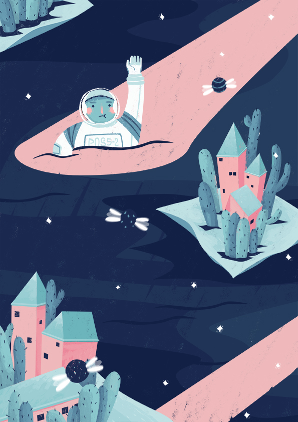
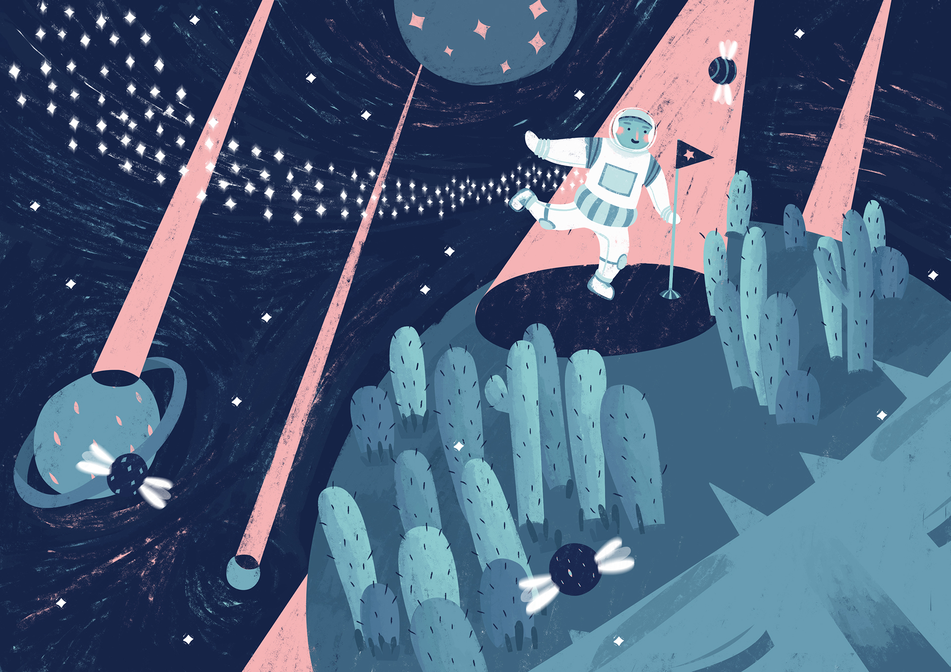
I enjoy the character design by this artist. A surrealistic piece depicting a space man on a planet with cacti? I like the touch of the astronaut having rosy cheeks as it softens the tone of the image and makes it more lighthearted. 🙂
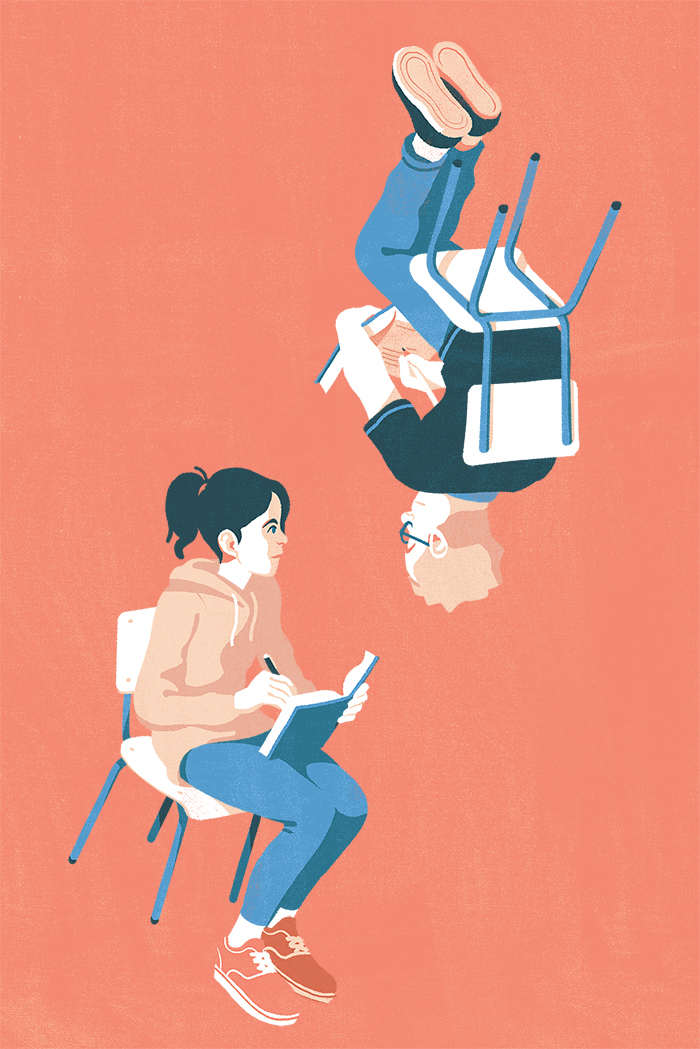
I stumbled upon this piece and it was interesting as the concept closely ties into the project we are currently working on, which only consists of three frames. This artist represents everyday situations in a comical sense, which is what most of us are able to relate to.
The simple flat layout works well for the illustration as it makes the message short and succinct. Texture is also added to give the composition a certain feel of depth.
The frames are so well composed, it does not even need the words to convey the message.
These compositions are slightly more complex in terms of the use of gradual colour tones, as well as the focus of the image protruding from the circular ‘boundary’. This would be an interesting concept to explore in my work as it would make the focus stick out, literally.
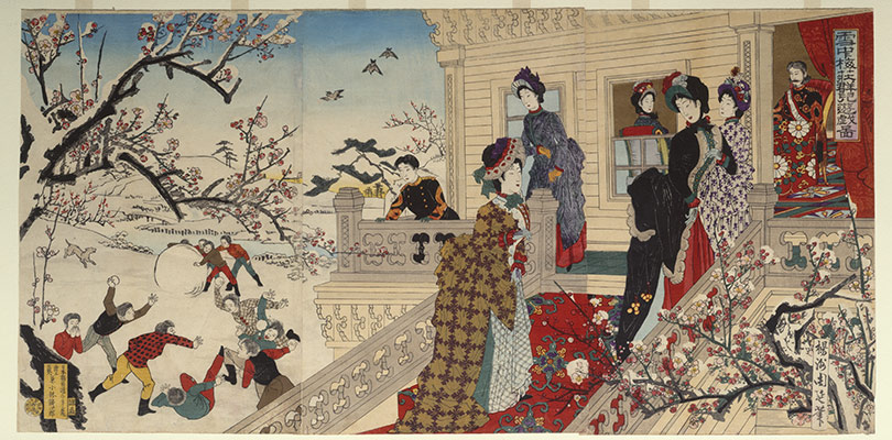
Woodblock Printing
I ventured into traditional illustration techniques to see how I could compose my shots. The clean lines and flat lay of Japanese woodblock printing makes it an ideal study for this assignment. However, the image would look too cluttered if where were so many elements. It would also be difficult to create an interesting composition with a square form.
This artist modernised Japanese woodblock printing and created this complex illustration on Adobe Illustrator. The amount of details this image has is staggering.
I went to look for similar flat lay styles and I found this. The strokes of this image is much more simplistic as compared to the one above. However, to be able to execute the Japanese flat lay style well, I would be required to use a many different colours, which may not be in theme of the assignment.
Character Inspirations
Hyper Potion
I also started to search for ways on how I could depict myself in my work. I stumbled upon this artist while I was listening to music and I fell in love with this illustrations as they were just so adorable. The line work was simplistic which was the style i was going for.
Gudetama
This is one character which most of us are familiar with. The simple expressions have captured the attention and love of many, accompanied by its vibrant colour, it makes it hard for anyone to dislike this character (unless if you are allergic to eggs or are a vegan)
This is another concept I wanted to explore! I really enjoy how the artist is able to make use of good to express such emotions. The artist also uses pastel tones which is pleasing on the eyes and evokes joyous emotions.
Other personification ideas would further be explored during my process post.