


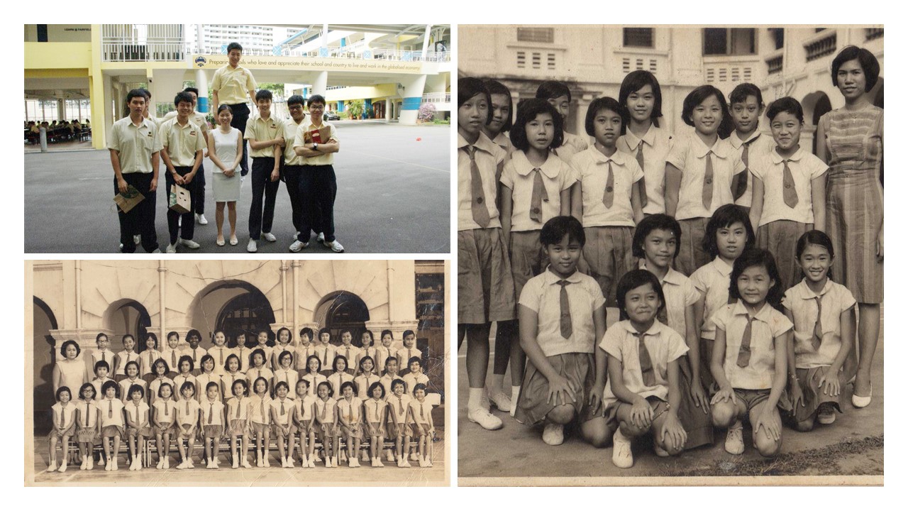

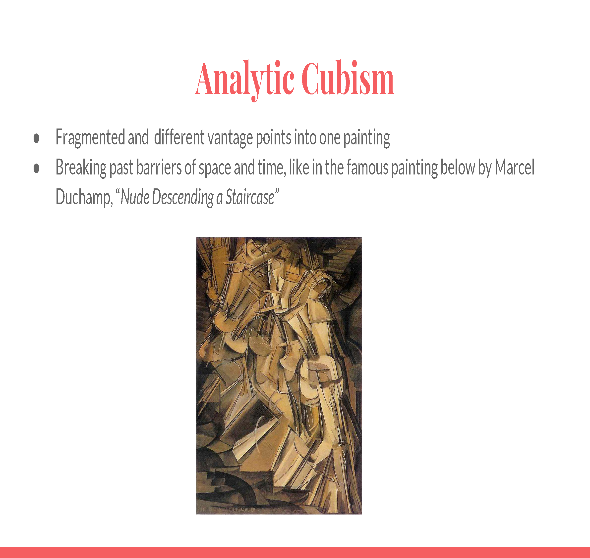
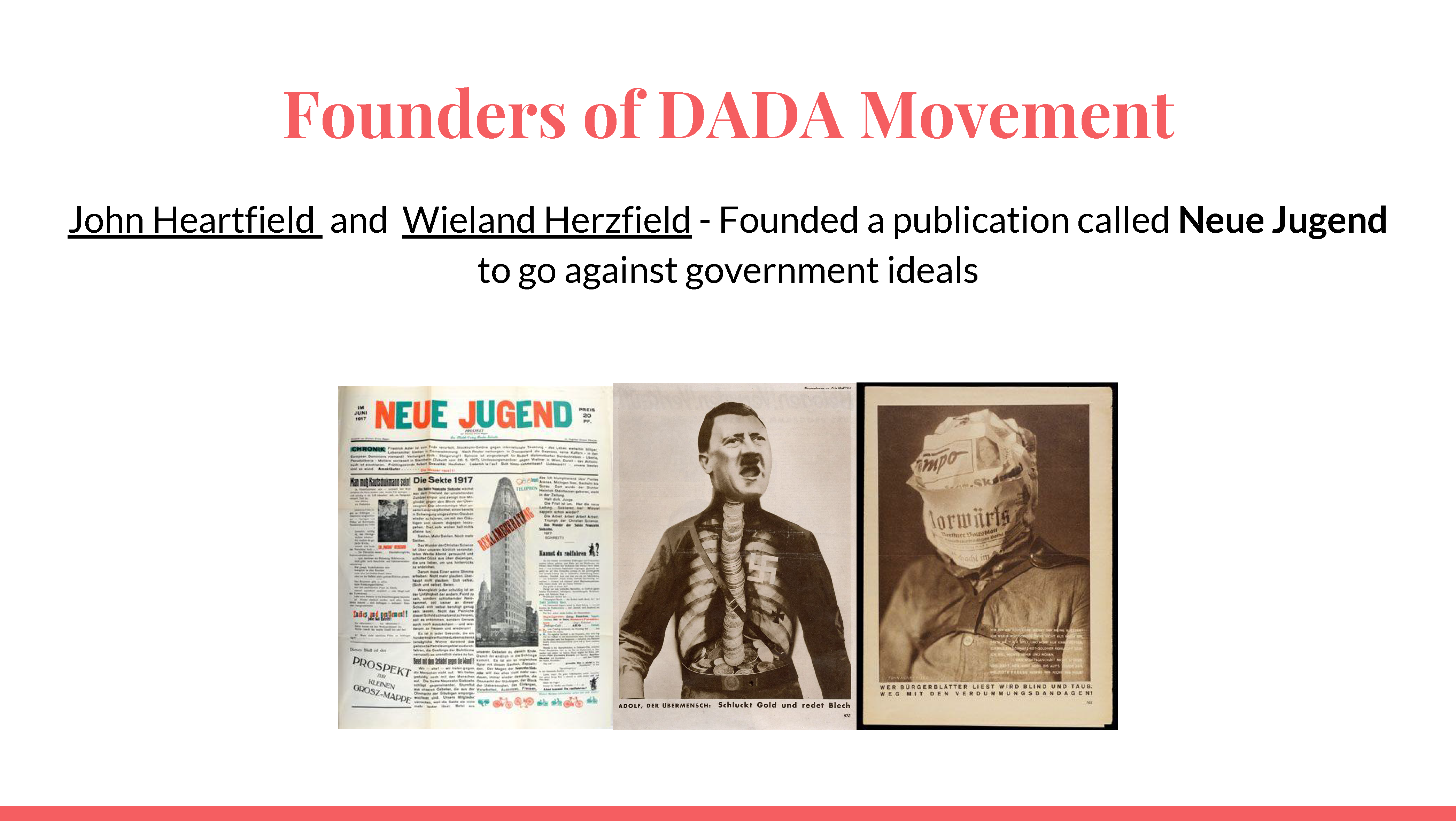
These were the two words Brendan and I picked. It was exciting because these two body parts are vastly different from each other in terms of how they move as well as the small intricacies between parts.
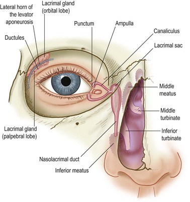
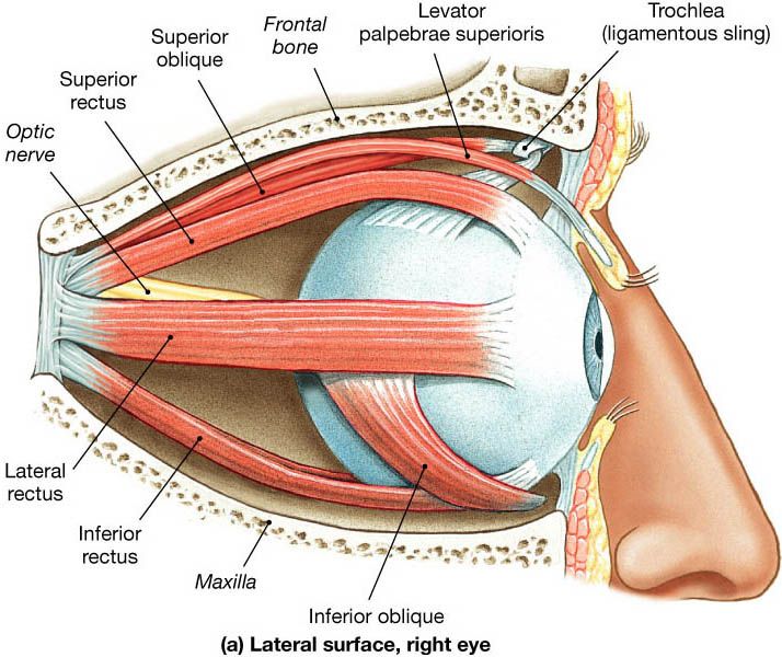
To begin, an eye is one of the most delicate and intricate organsof the body as it is solely responsible for a sense. The eye is made up of both the eye ball as well as the eyelids.
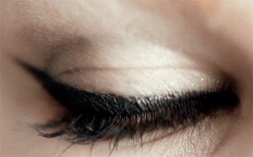
The eyeball itself has a more circular motion, whereas the eyelids has a linear motion, similar to a shutter.
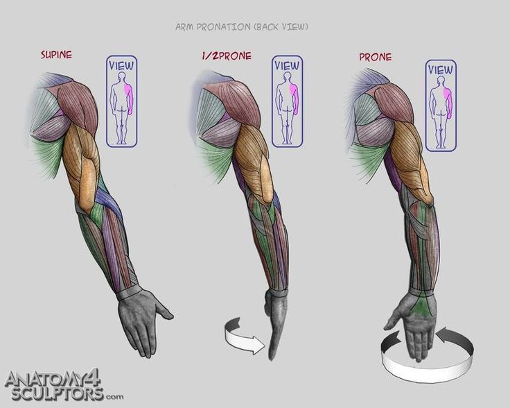
The second body part is more straightforward being an arm. I would say that there are two ways in which we could breakdown the arm, one being pivoting about an axis which would be the elbow, or it could also rotate about the shoulder socket.
We then begin to source for our sounds. Brendan and I decided to work on separate sounds.

My good sound of choice was coins being dispensed from the vending machine.

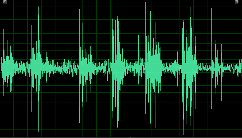
As you can tell, the sound of coins dropping has a distinctive sound which has a pleasant connotation when we hear it. Whenever a coin drops, we immediately look to the ground in search for it.
Due to the nature of coins, they also end up escaping our grasp as they tend to roll across the floor.
The sound is also piercing in nature, and has substantial reverb because the bouncing of coins when they were being dispensed.

My bad sound of choice was the sound of money being rejected from the vending machine, specifically the note dispenser. This is an especially annoying experience which many of us face when the machine refuses to accept our money.
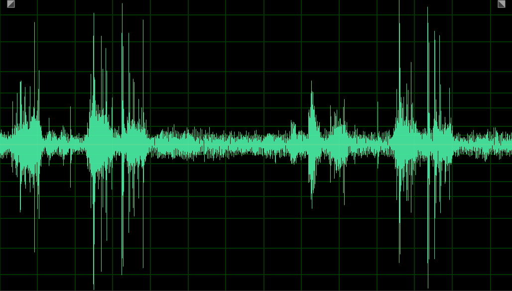
This sound has a distinctive mechanical sound and it seems to mimic an extension and retraction of an arm. This sound would symbolise the pivoting of the arm about the elbow.

I wanted to incorporate the psychological aspects of the various sound samples I had. The psychological aspect of coins falling would be their fleeting presence as we struggle to chase after and reach for our money.
I wanted to capture the essence of movement for each of these sounds.
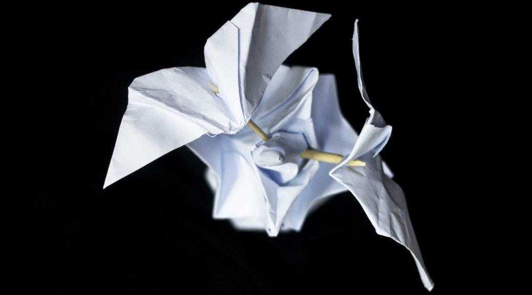
For a fleeting presence, I thought, what better way to represent something fleeting than birds? I thus began to blindly try and fold birds just by trial and error.
The similarities between a bird’s wing as well as batting of eyelids can also be drawn in the case of a hummingbird due to the quick repetition of the flapping of wings.

Because of this resemblance, I felt that it added another level of depth to the use of birds as it linked one of the body parts in as well.
The other keyword I wanted to portray was the reaching or the extension of an arm towards an object. It was difficult to create the illusion of movement with my paper models, however I made sure to have different layers in my paper model to show progress and action.
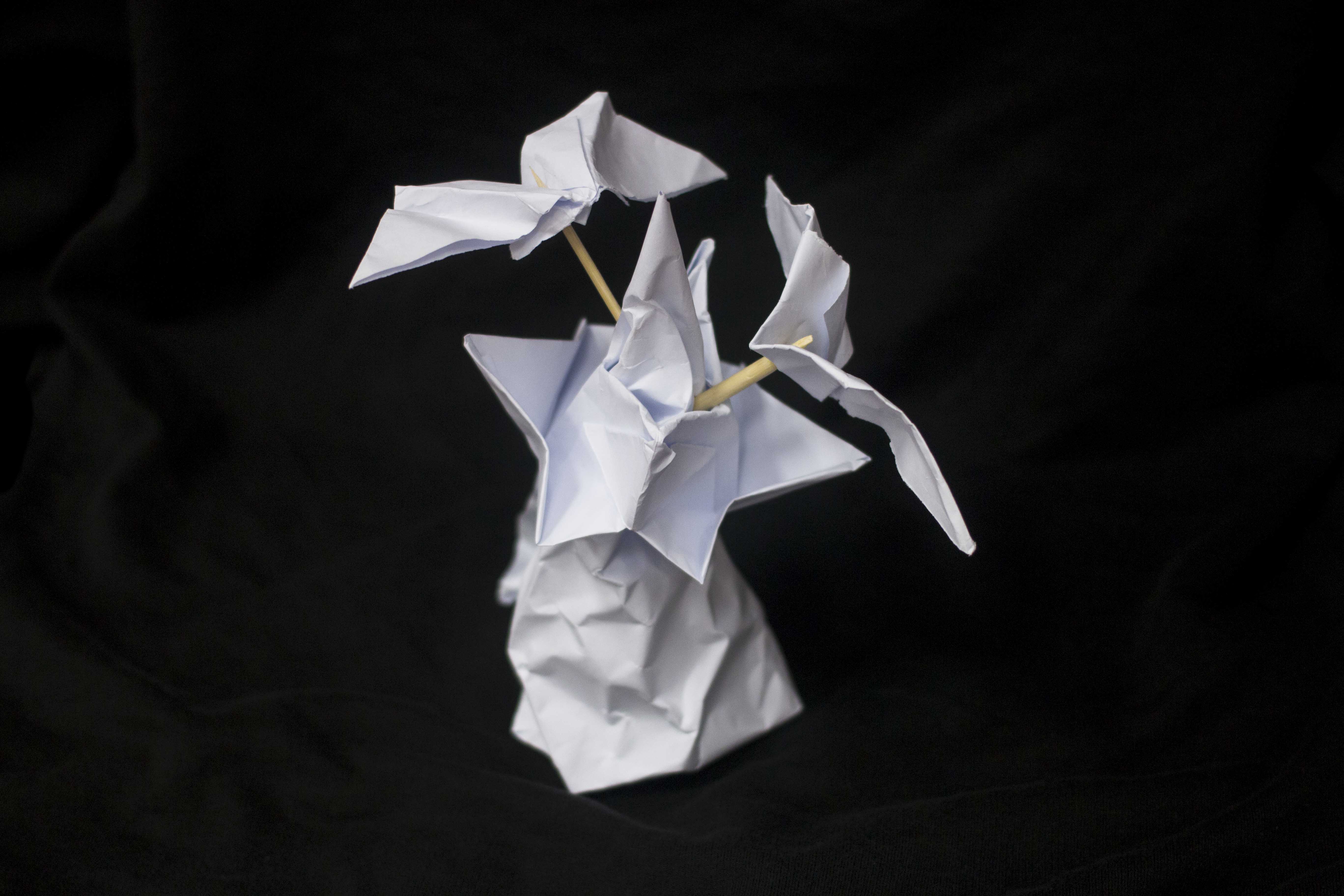
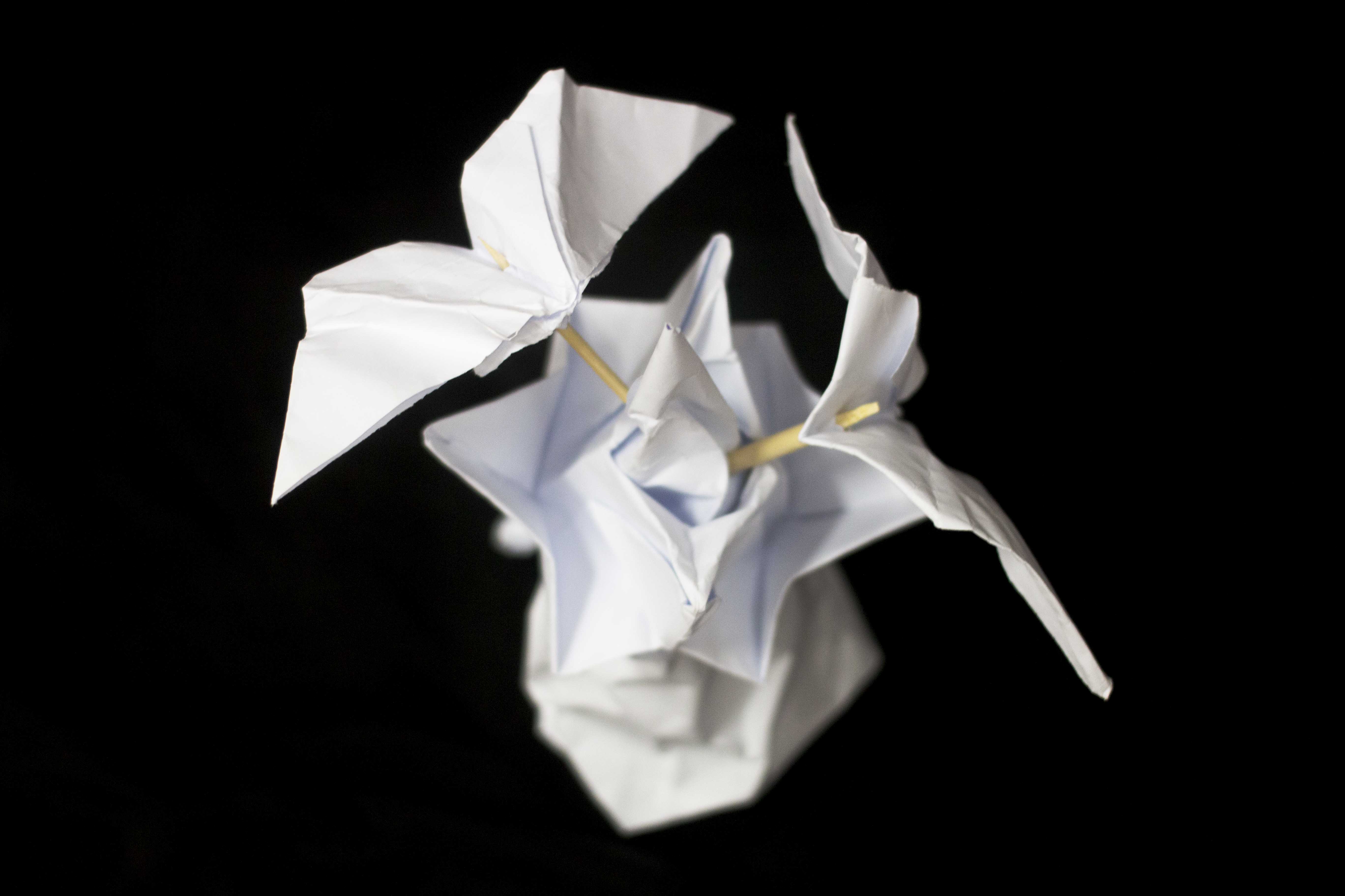
As you can see, the piercing action of the cone portrays the element of reaching, while the birds represent the money fleeting from the grasp. I did not want the cone to be smooth as the sounds created by the vending machines were sharp and piercing.
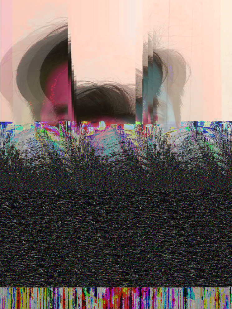
This was edited by me using Photoshop and Audition.
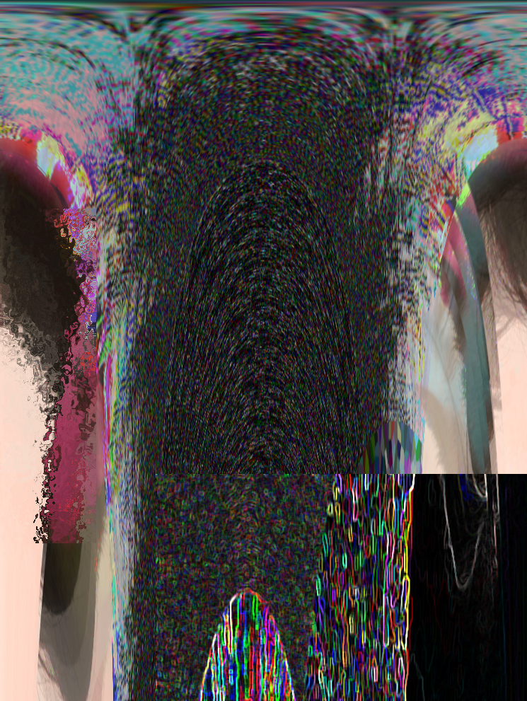
Teri edited this using Photoshop using Filters such as neon lights and Polar coordinates.
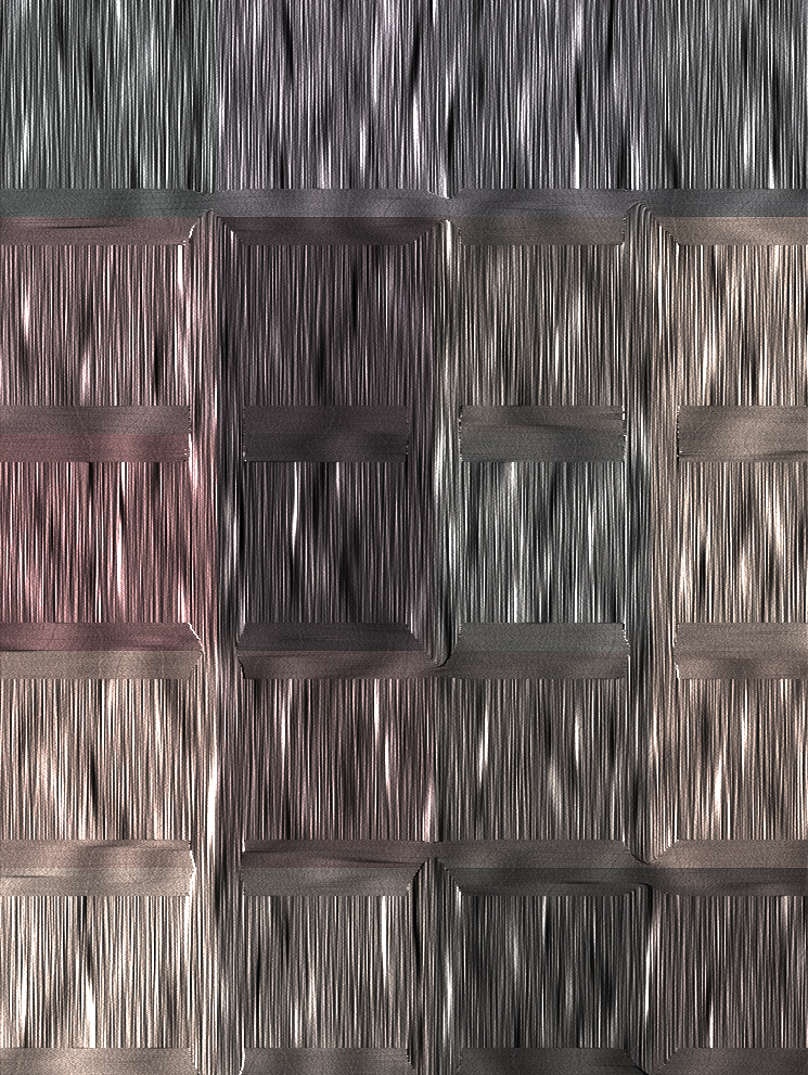
Fred edited this using Photoshop using blur and mosaic filters.
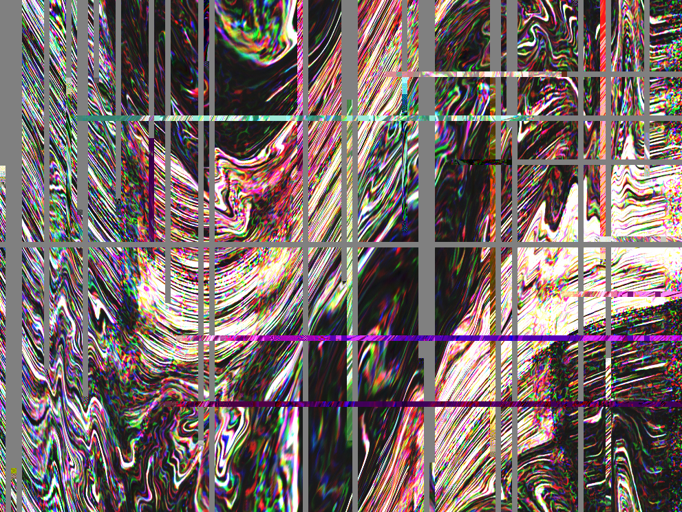
Bryan used Photoshop and text editor to create the defining lines across the image.
The collective effort by my group made the image to become one which is organic, yet contrasting in such a way which shows aggressive lines. Because aesthetics was not in our minds, we were left to our devices to come up with something as absurd and as loud as possible. This freedom allowed us to push the boundaries of image manipulation, adding more striking colours to the image.
The third space exists through communication, primarily with the help of technology. It is the evolution of communication, to create an ever more immersive experience for any and every user.
As the third space is closely compared to the 4th dimension by Randall Packer, one of the biggest boundaries we face is ensuring full immersiveness of the physical consciousness. These can be alleviated with the use of more controlled settings, such as enclosed spaces furnished similarly. The use of other senses such as smell and touch would help envelop the audience in the experience as well.
The installation ‘Telematic dreaming’ by Paul Sermon (1993) is a prime example of using a private space of a bed to create the illusion and the sense of closeness.

Another way we can break the boundaries is with the interaction with more people. An example would be ‘hole-in-space’ by Kit Galloway and Sherrie Rabinowitz (1980) whereby people from different countries could interact with each other through an installation on the street. These busy streets across countries created the illusion of an actual street because of the sheer multitude of people, replicating similar environments.
In our micro Project, several ways we tried to create closeness was through the use of the same objects, or objects which would be correlated with each other. For example, the I was the person withdrawing the money using an ATM card. The usage of semiotics and sounds played a part in creating closeness. Another example would be the use of toilet paper in both settings, allowing for both parties to experience the same feeling of touch when interacting with the object.
Through Facebook live and several rounds of practice, this was made possible. The experience would have been more fluid if the latency was not as high. By anticipating the other party’s actions, we were able to connect with each other through the sense of accomplishment.
Alas! These are my Final compositions!
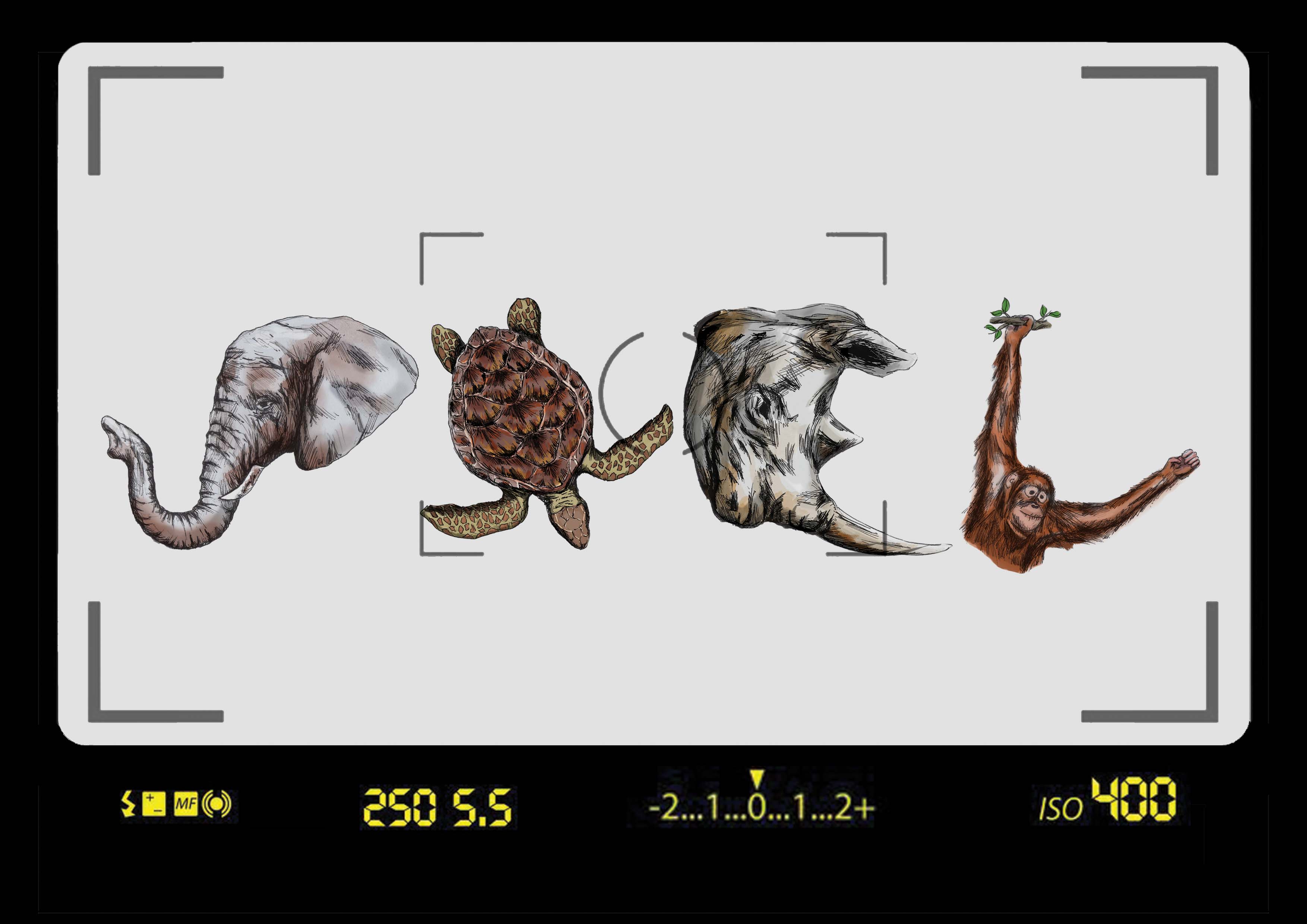
To start off, this is my proudest piece as I had the chance to explore a medium which I was passionate in, which is the use of mixed media such as inks and digital painting.
The animals represented in this piece are critically endangered animals – this brings about a more pressing message that we have to treasure the animals and the environment around us as they are slowly disappearing.
In this composition, I used semiotics such as the camera viewfinder to portray the look of a photographer.
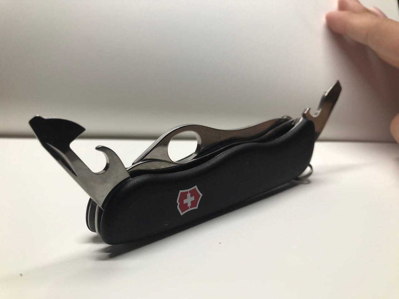
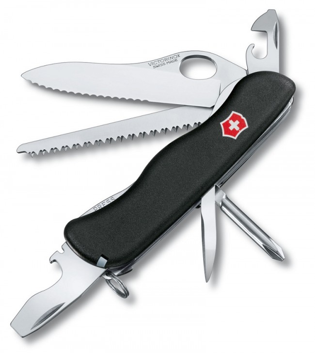
As mentioned during the presentation, I strive to be useful in all situations and to adapt well in new environments. To show this, I used a Swiss Army Knife as it is versatile and readily accessible.
The background is mustard yellow/orange (as some of you may see it) to represent the construction tools and the idea of utility.

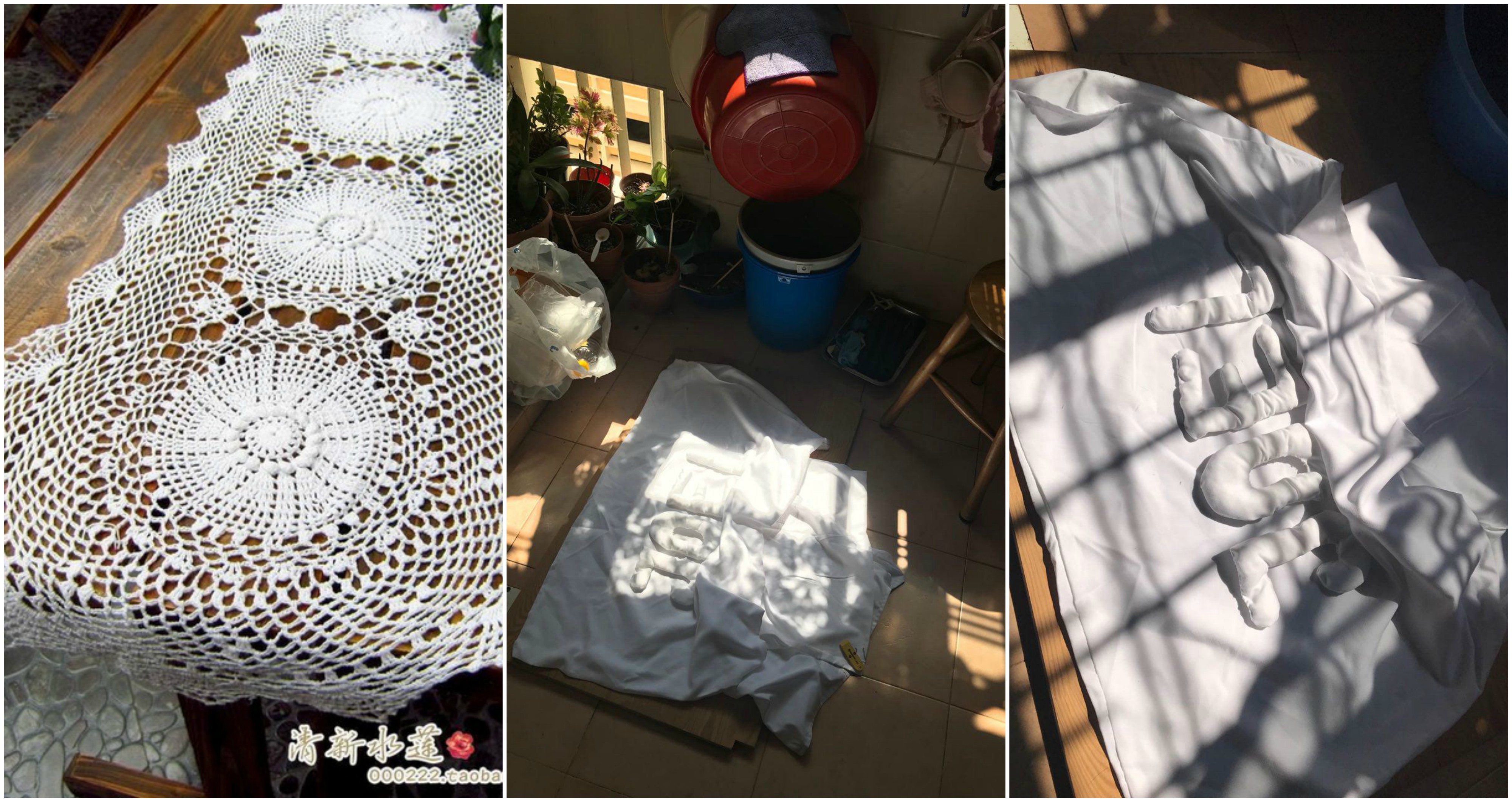
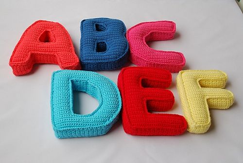
I finally settled upon this composition as it best portrays the amount of time I spend in bed! How I am still able to remain in bed even though the sun is shining into my face.
The warm colours brings about calm and bliss emotions, meant to make the viewer feel at ease. I also wanted to capture the comfort of my bed which is portrayed by the pillow alphabets and soft tones.

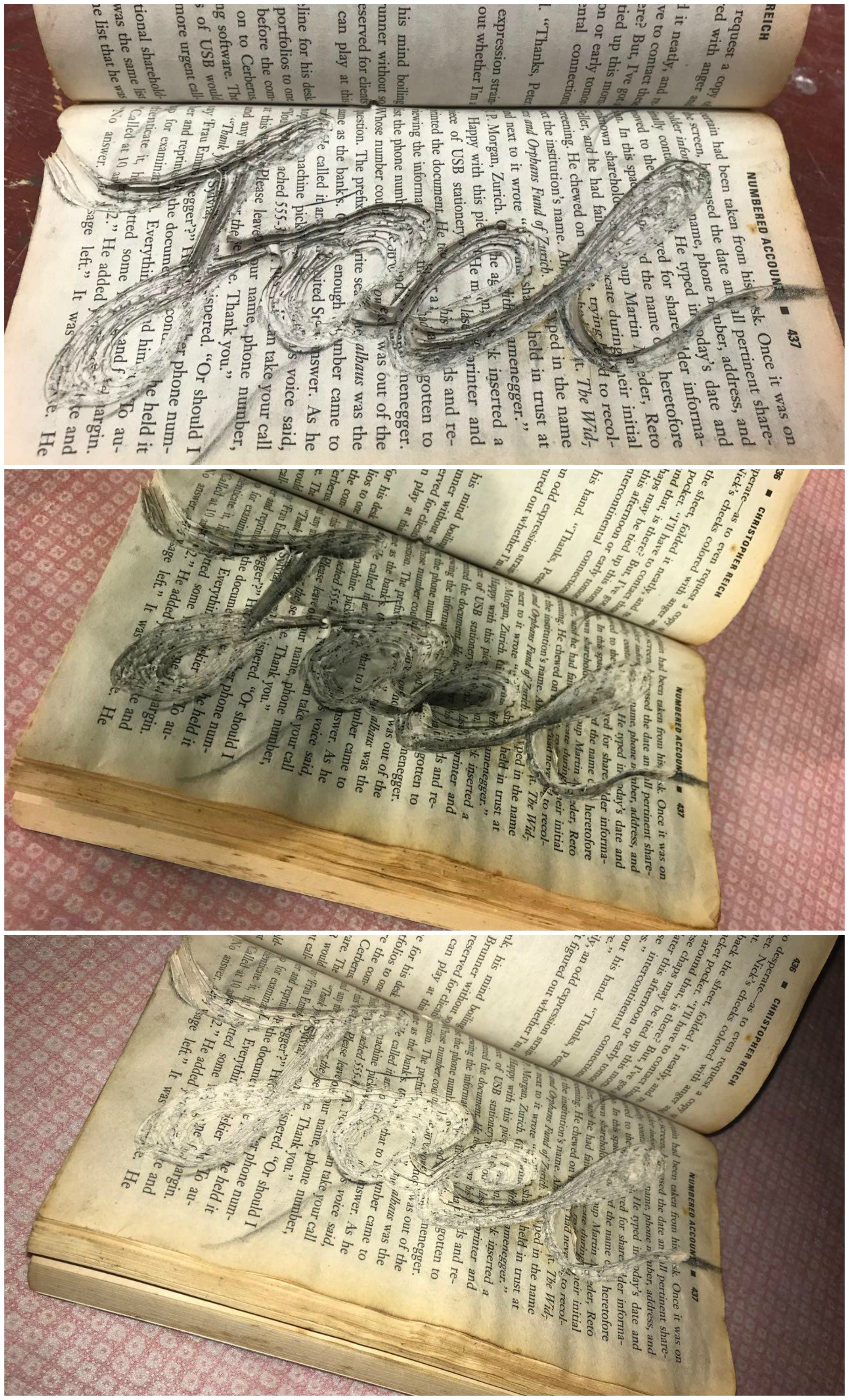
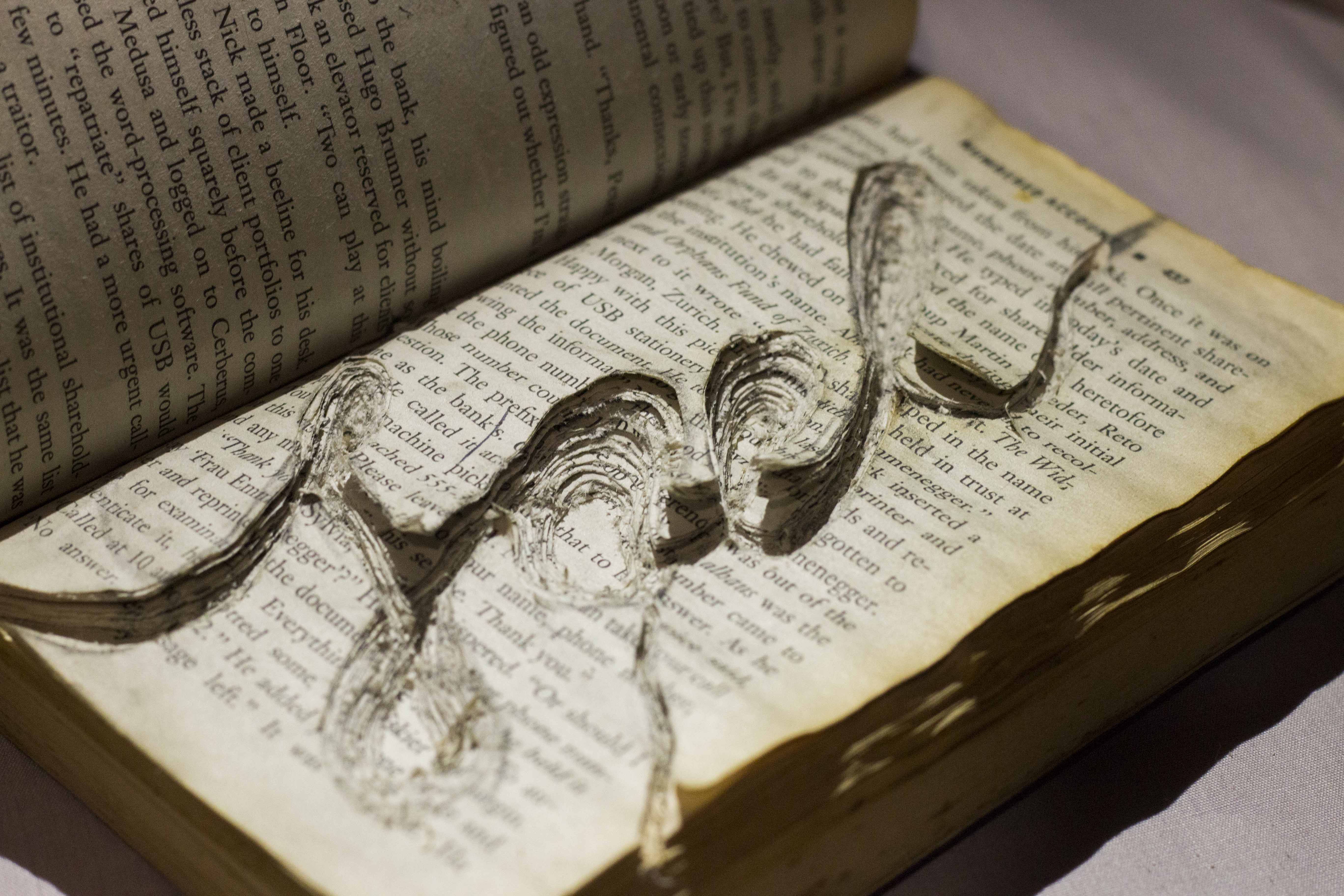
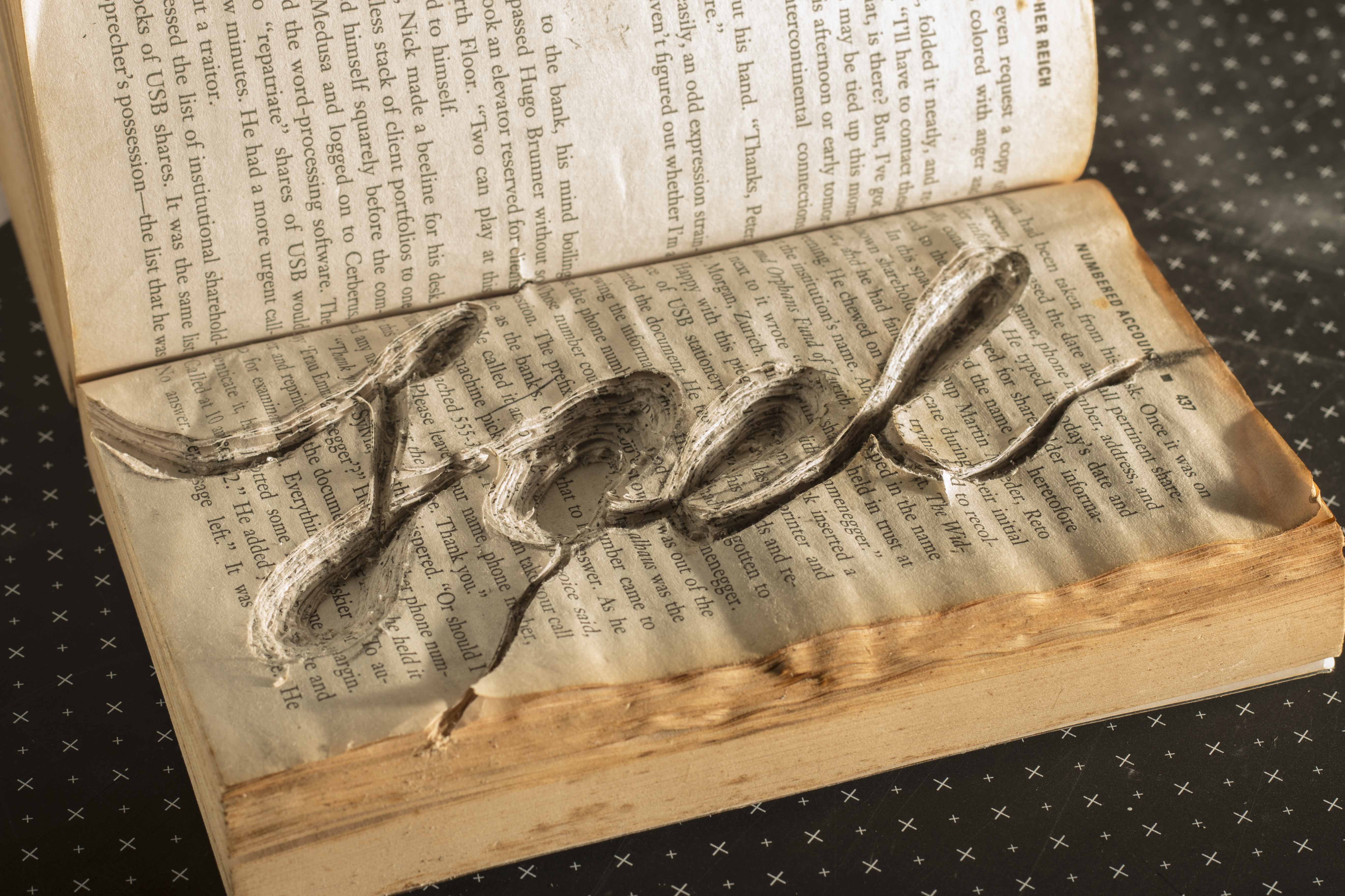
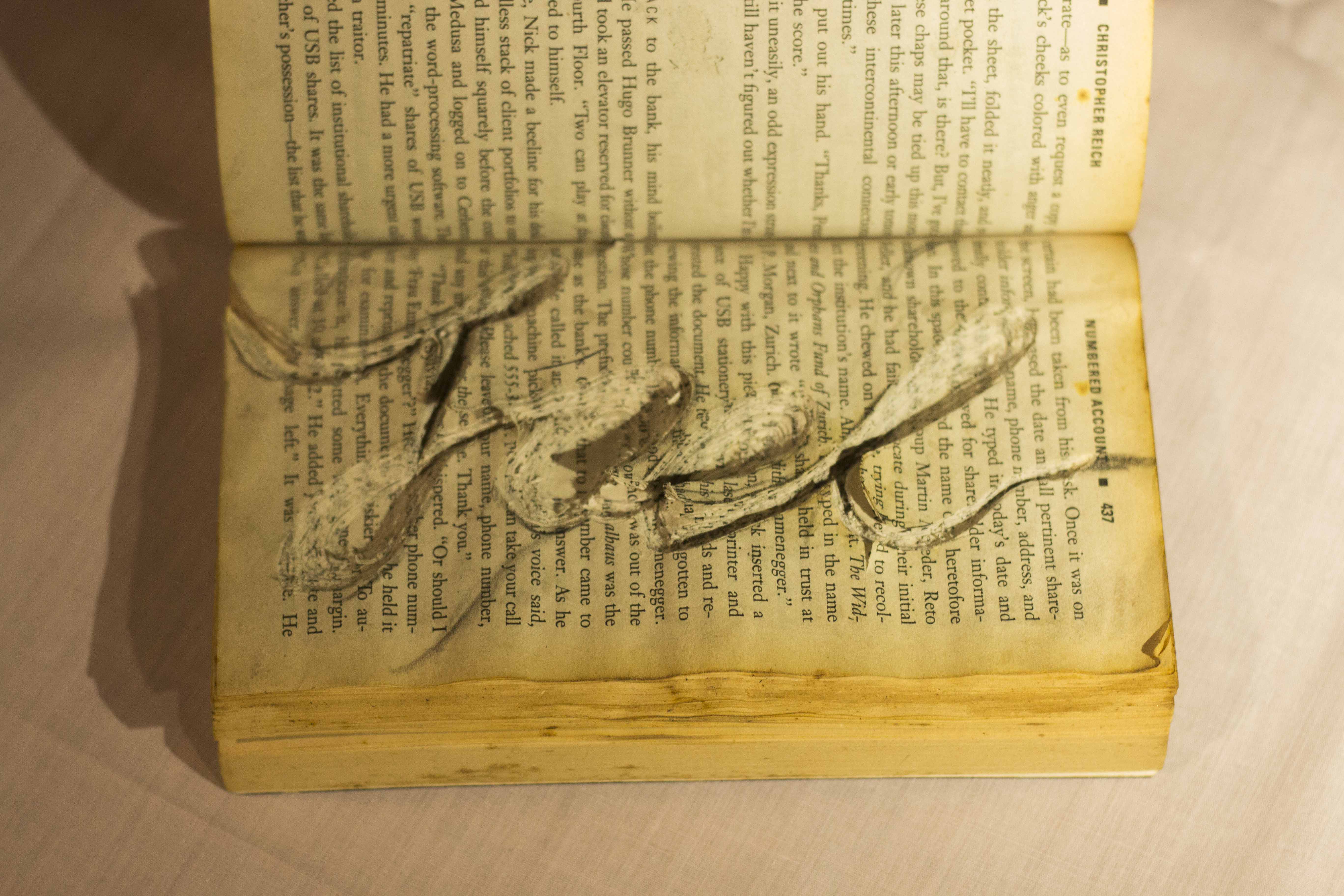
This was the piece which I was most uncertain about, and yet also most pleased with the outcome. I managed to capture the essence of a worm burrowing through a book, similar to how I tend to get so engrossed in novels that I completely lose track of the time.
The worn look of the book also adds the context that this book has been well read.

Overall, I am proud of the outcome of these pieces! I wanted to explore new mediums of art as I wanted to push the limits of my creativity and gain some experience in working with physical objects.

Me with my trusty Swiss Army Knife!
I was thrilled to explore this style as I enjoyed the aesthetics of it and I wanted to see how it would turn out. I was glad that Mimi agreed upon this concept as I am aware that it could come off as too pictorial.
I wanted to have a message behind this piece, other than trying to convey my job. Instead of using any types of animals, I specifically chose animals which are endangered. This would create more meaning behind my work as it brings forward a very pressing issue we face.
I explored the idea of several different animals in my CPJ, but eventually boiled down to using an elephant, Sea Turtle, rhinoceros and an Orangutan.
I would first begin by sketching out the animals, followed by inking them using my pen.
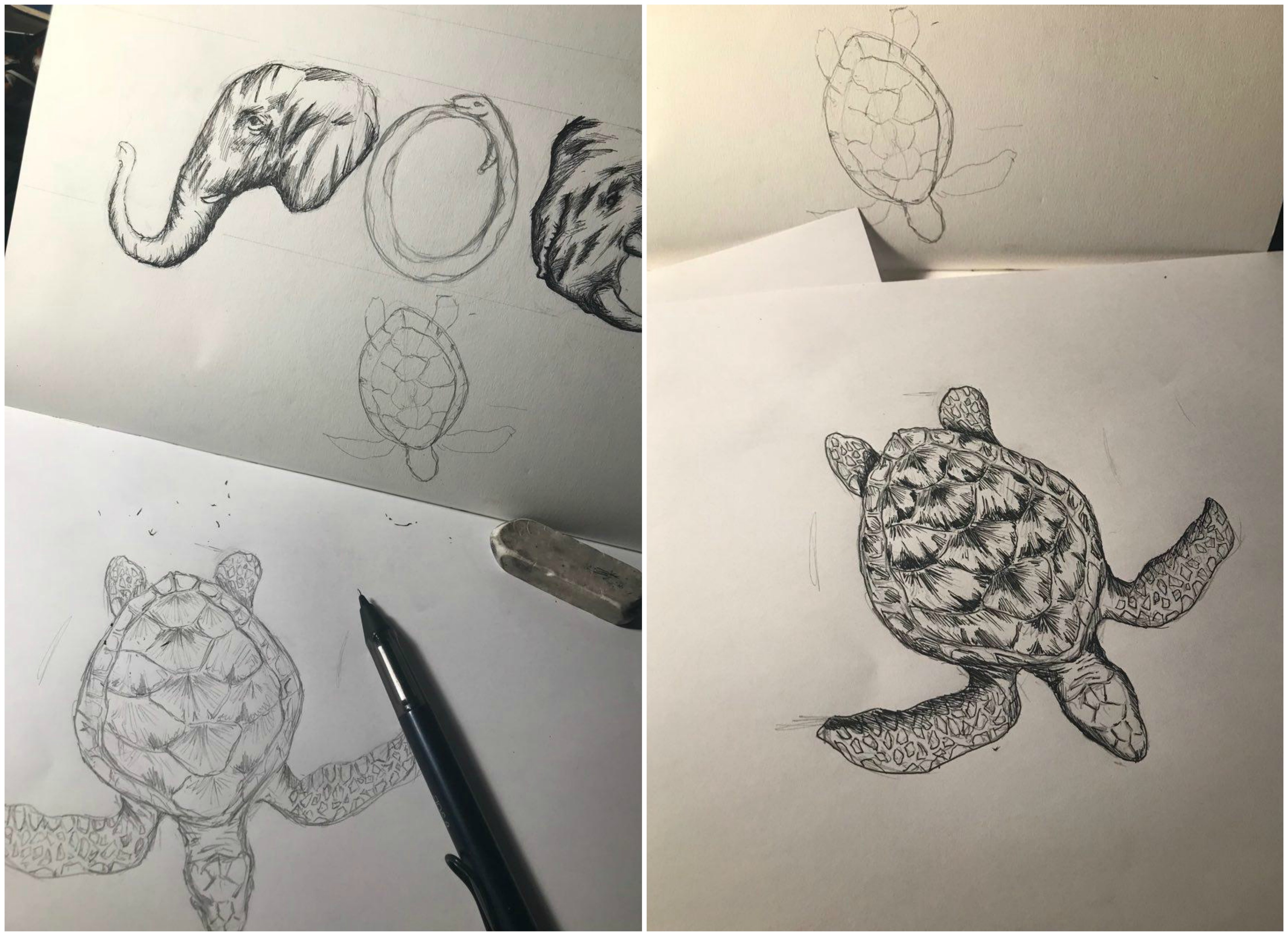
After which, I would scan these drawings into Photoshop for colouring. This is a snippet of my colouring process.

After which, convey the idea of a wildlife photographer, I used the inside of a camera viewfinder to portray this. The viewfinder layout was also yellow which enabled the audience to draw the link to a National Geographic Photographer.
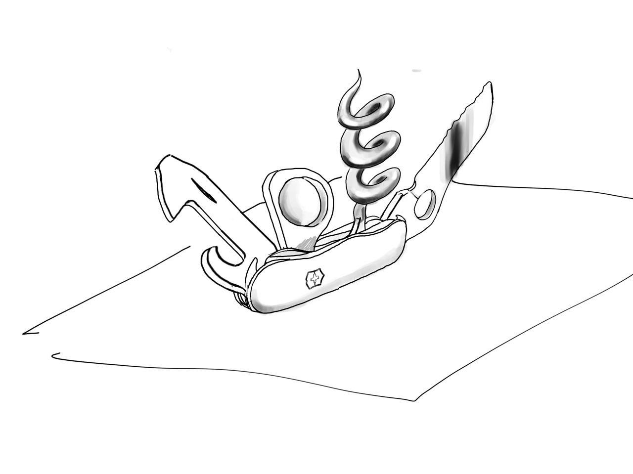
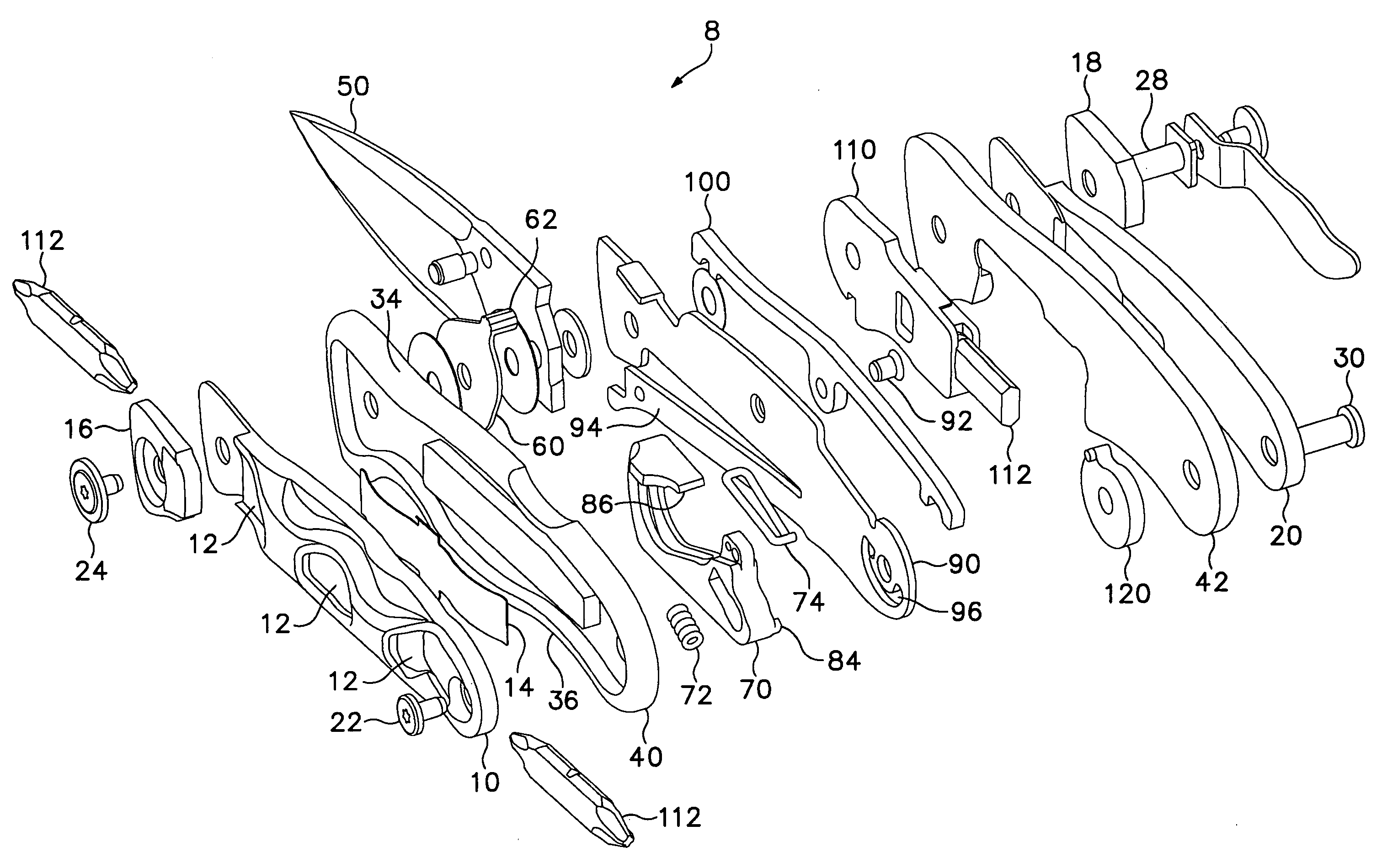
For this occupation, I explored many different perspectives, trying create a composition which would best represent my name using the tools of the Swiss Army Knife.
Thankfully, I had the help of my trusty Swiss Army Knife to help me get a good perspective and to help me visualise the arrangement of the tools.
I chose this perspective as it was much more dynamic than the flat lay which I did on my CPJ.
I then began by tracing the image on my iPad, which I then transferred onto illustrator to create a cleaner graphic.
I used yellow for the backdrop because I wanted to convey the message of utility. I started to look for places which holds tools and I found something in common.
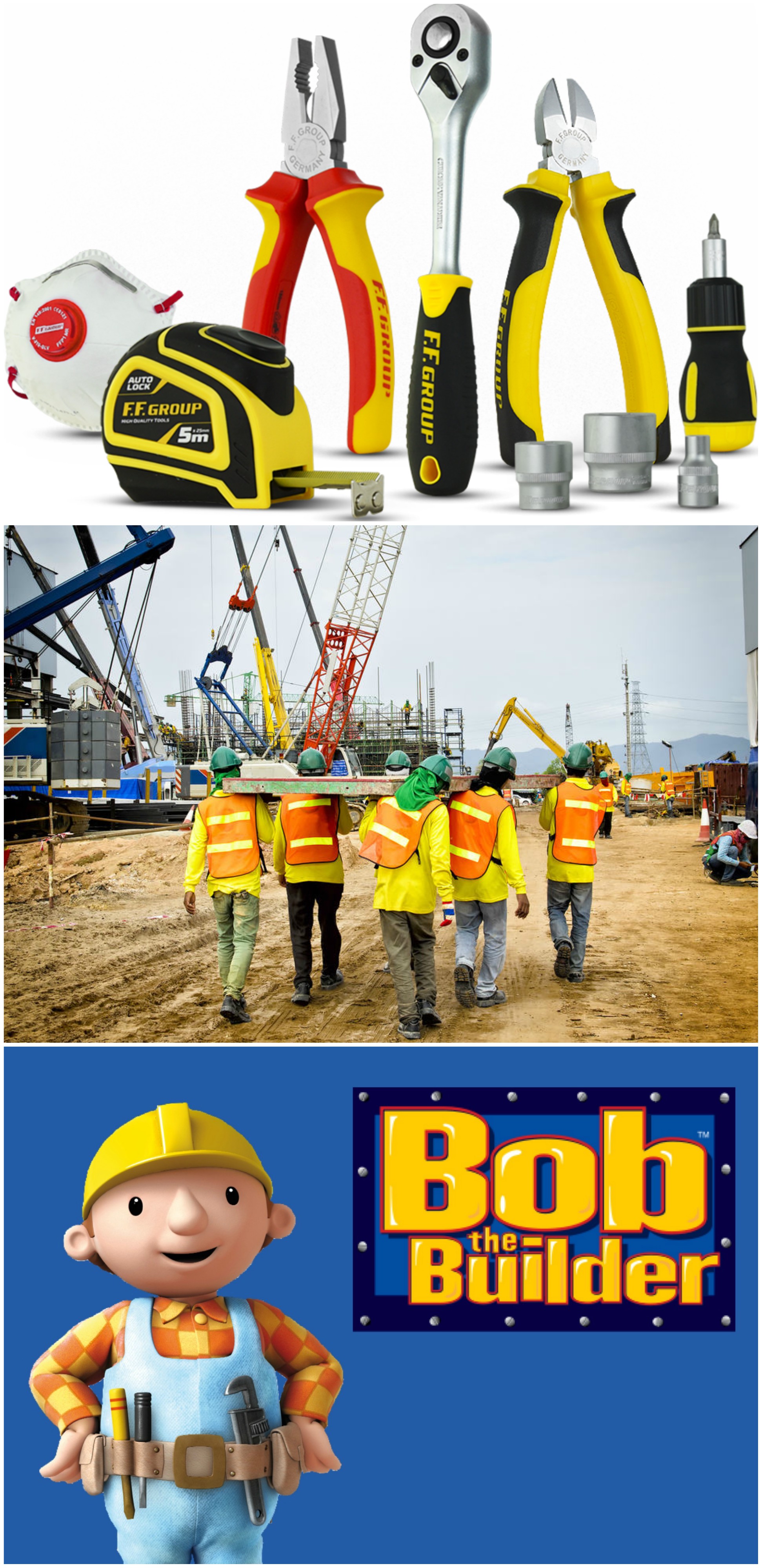
Thus, I felt that yellow tied in well with the theme of this piece and it also brought across my message well.
This is a process of me rendering the object. I added gradients to the blade as I did not want the image to look too flat and unrealistic.
Mimi also told me that some of the elements had to be edited as the composition was a little uncomfortable or out of place. I made the magnifying glass larger to fill in the negative spaces between the tools.

I felt like this was the piece which I had the most challenge making as there was just so much uncertainty surrounding the outcome. I experimented on several books before I managed to get the result i desired.
I first begin by sketching out my name onto the piece of paper. I had to create an illusion that a worm was burrowing through the book. Initially to create such a composition, I used a drill to create the holes in the book.
The result turned out to be very messy, as the swirling drill bit dislodged and frayed the paper in chunks, making it loose and haphazard. I experimented with different sizes of drill bits and i even had to use clamps to hold down the book.
After that failed attempt, I decided to go with the slower and more tedious approach which was to slowly carve out the pages using a penknife. This method proved to be more controlled as well as precise, giving me more confidence in the outcome. I decided not to have my name spread across both sides of the book as the spine prevented the seamless transition I was looking for.
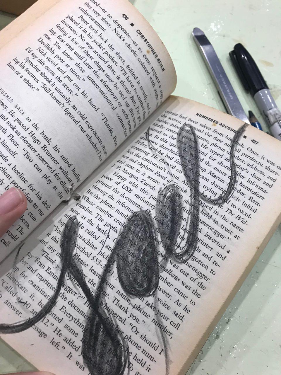
An issue I came across was the paper not staying in place as it was thin and it would shift whenever I attempted to cut it. To solve this, I glued the pages together using an old-school glue stick to ensure that the paper remains intact.
After several arduous of cutting through at least 50 pages, I was finally pleased at the depth and the outcome of the piece! These are some sample shots I took with my phone. I had to experiment with different camera angles as well as lighting angles due to the nature of the composition.
If taken from top down, the image would look too flat as you would not be able to see the layers of the book.
Here are more behind the scenes of my friends helping me to find the correct lighting and angle.

Some of the camera shots:
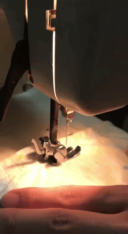
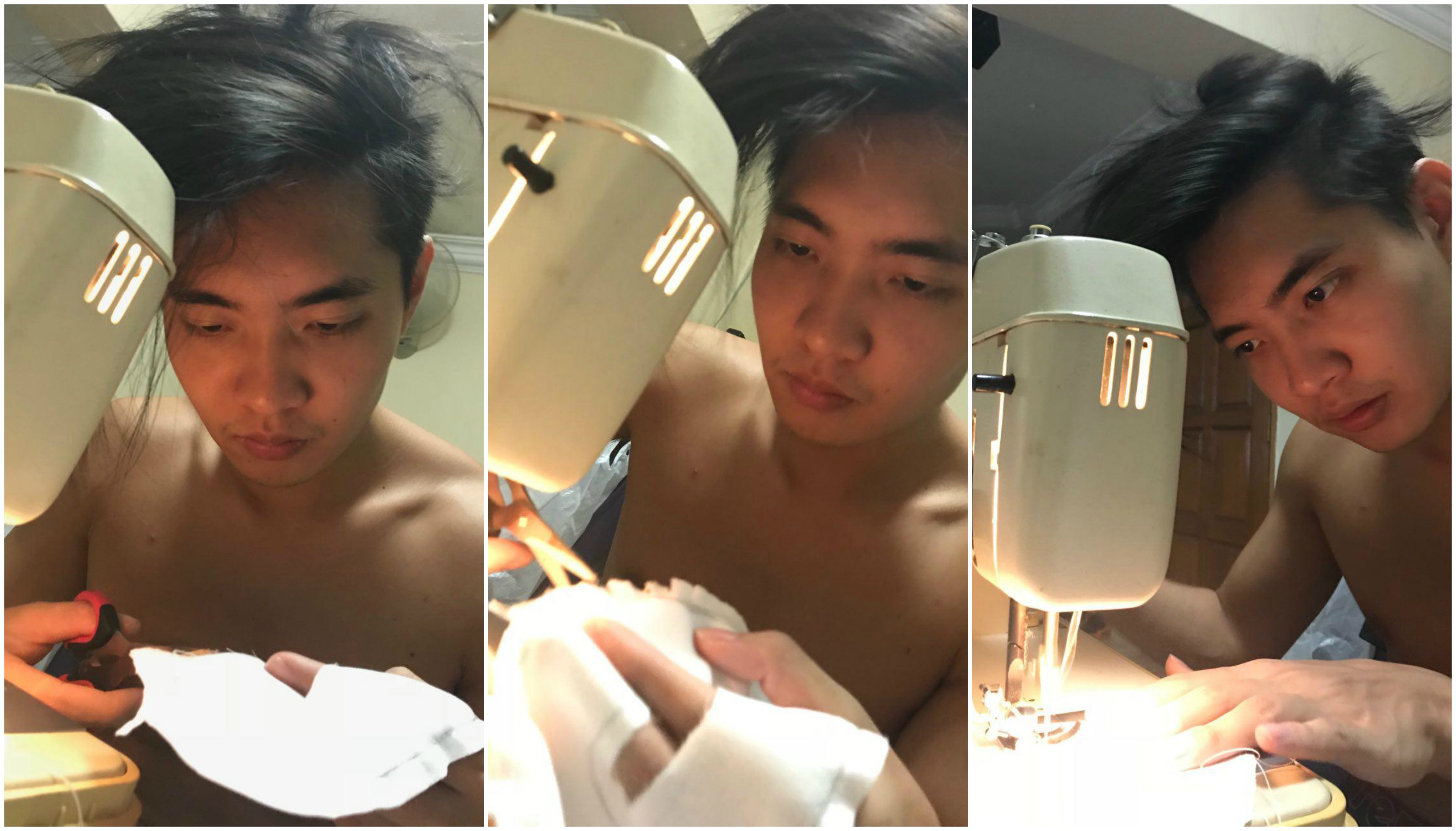
Sewing was a literal pain as I must’ve pricked myself more than 5 times when my mom was teaching me how to sew. It is an incredibly arduous process as I was really slow at the beginning (not any much faster now, but thankfully, I’ve improved)
I cut out paper letters to act as a guide for my cloth, after which I used a pencil to trace the image.
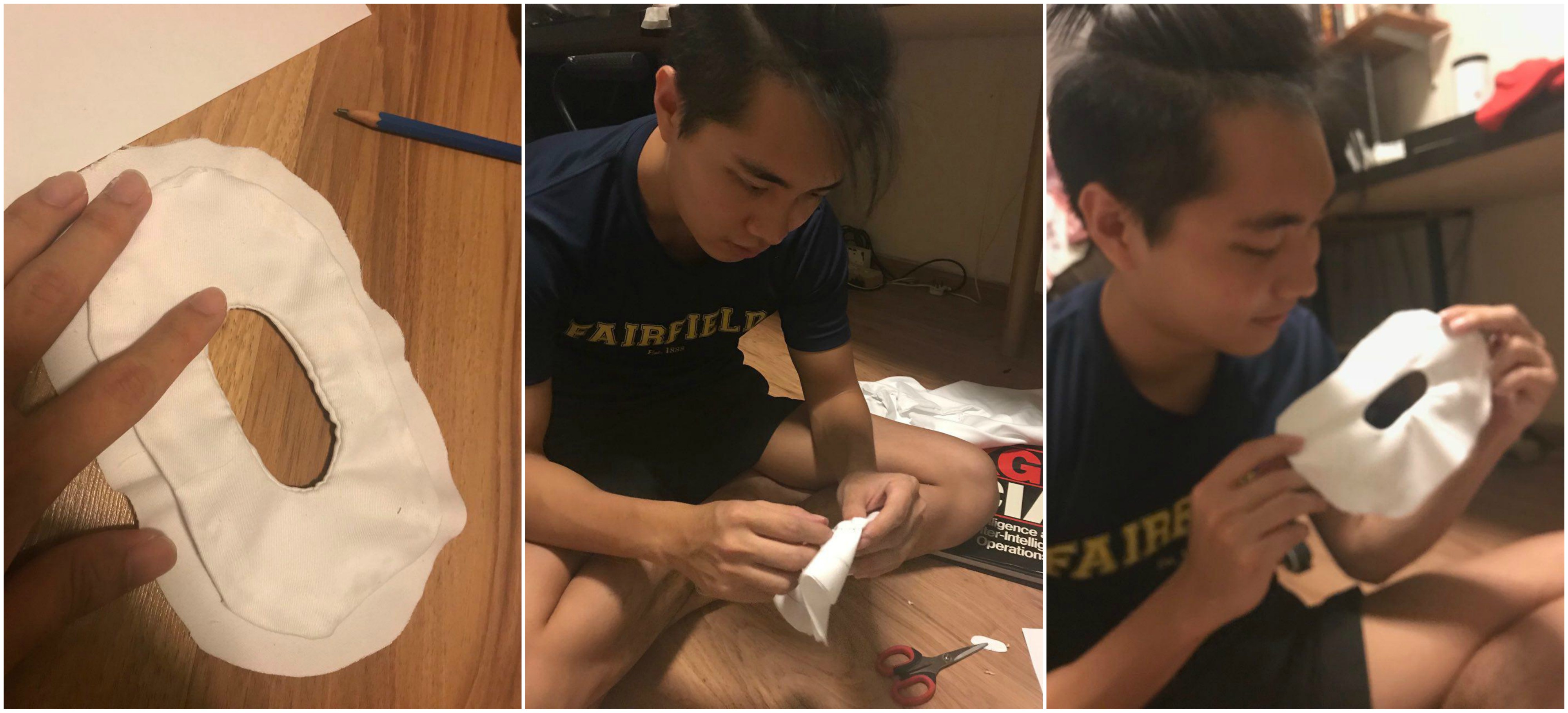
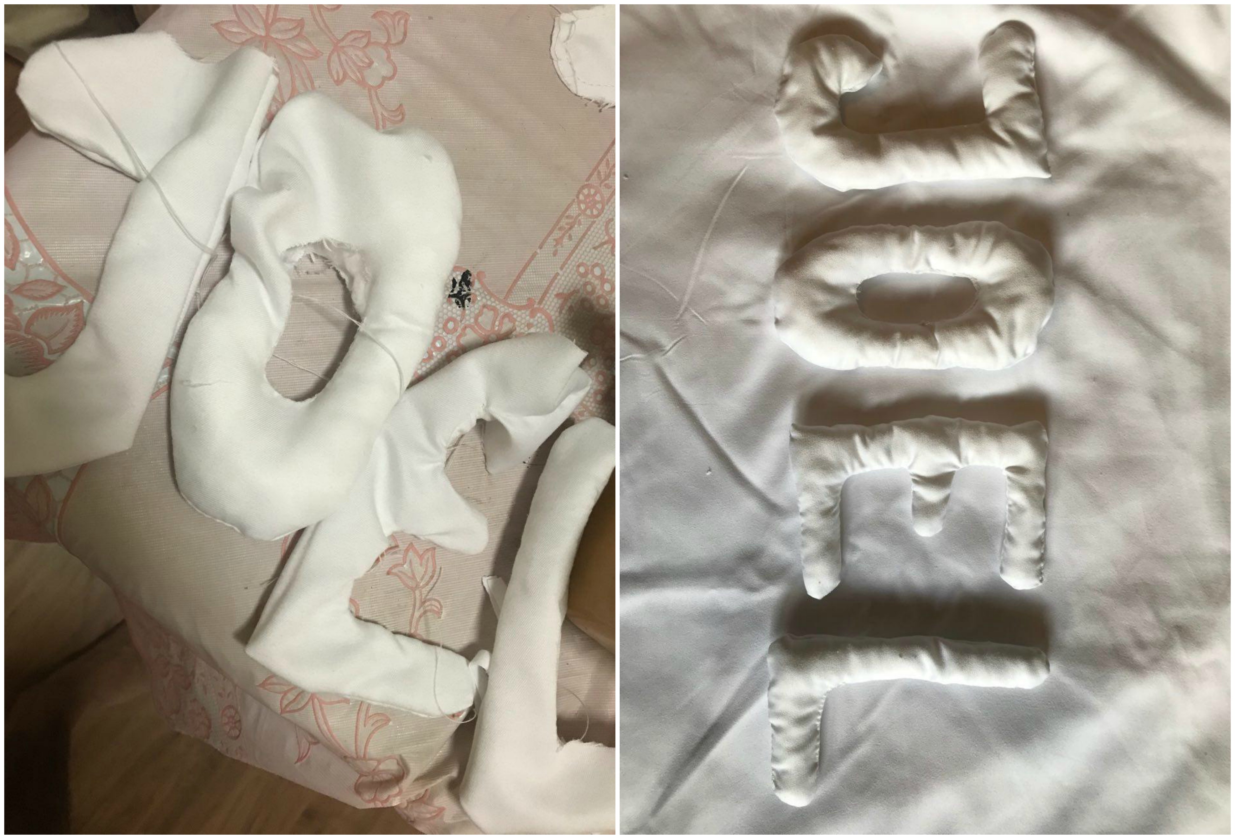
Initially when I sewed this O, I sewed it on the inside first. However, as I had to invert the cloth to stuff the cotton, I realised that it could not be done. Thus, reluctantly, I had to redo the entire O.
Seeing how it took me 2 hours to finish one alphabet, I pleaded with my mom to teach me how to use her sewing machine. As complicated as it is, once it was running, progress was much faster.
This was a test done on scrap cloth!
Here are some shots of me trying my best not to screw up the alphabets as well as my fingers!
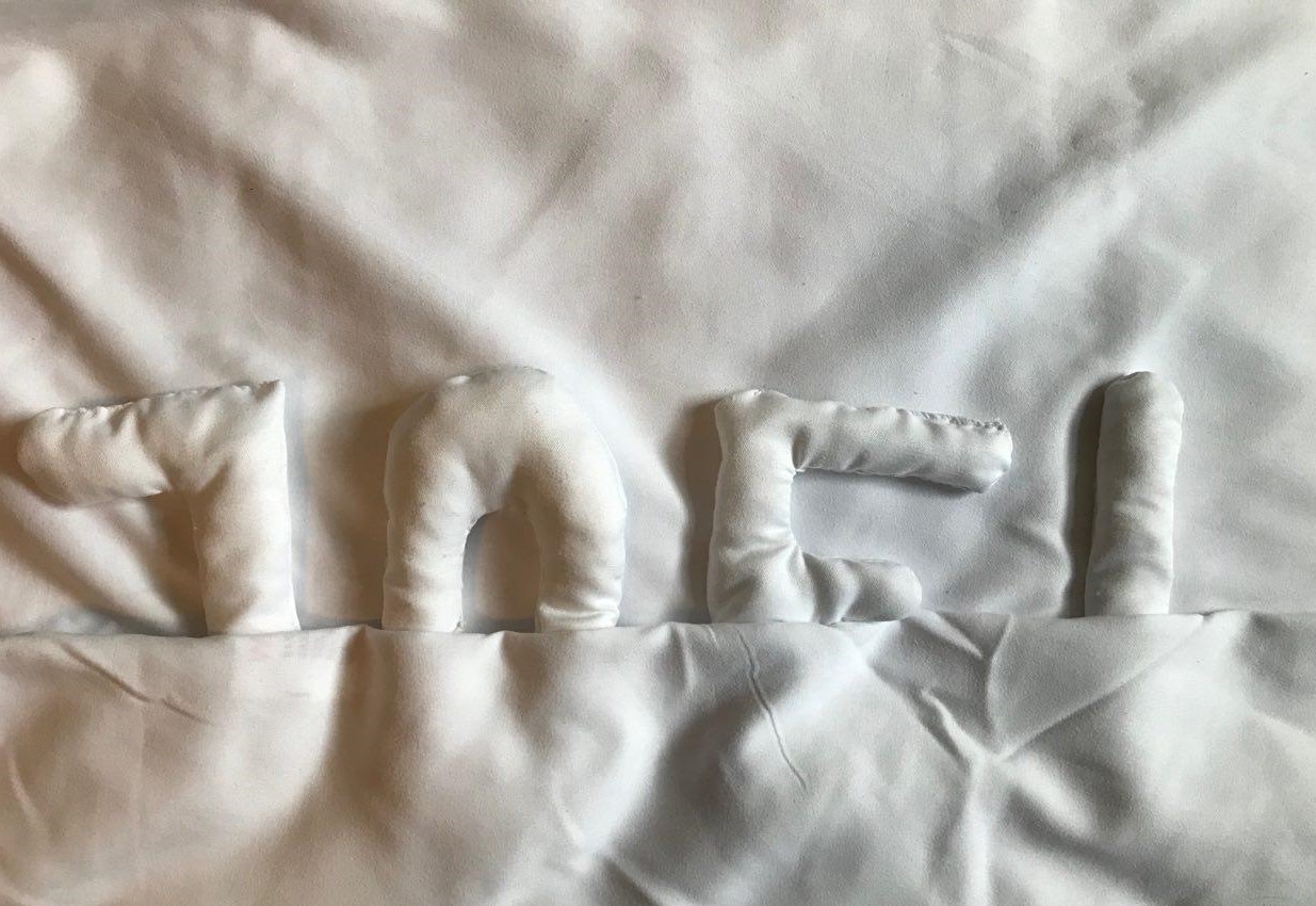
Before and after stuffing with cotton!
Next, I experimented with framing and lighting of the image. Initially, I wanted the letters to look like they were under the duvets.
However, Mimi commented that it made it difficult to see the my name. Thus, I went with a more minimal approach, only making use of lighting to create the mood.
I had several props used to try and recreate the look of a bed room.
I do not have an exact picture of the table cloth I used, but it was similar to this first picture where by it was embroiled with holes.
Here are some of the many experimental shots.
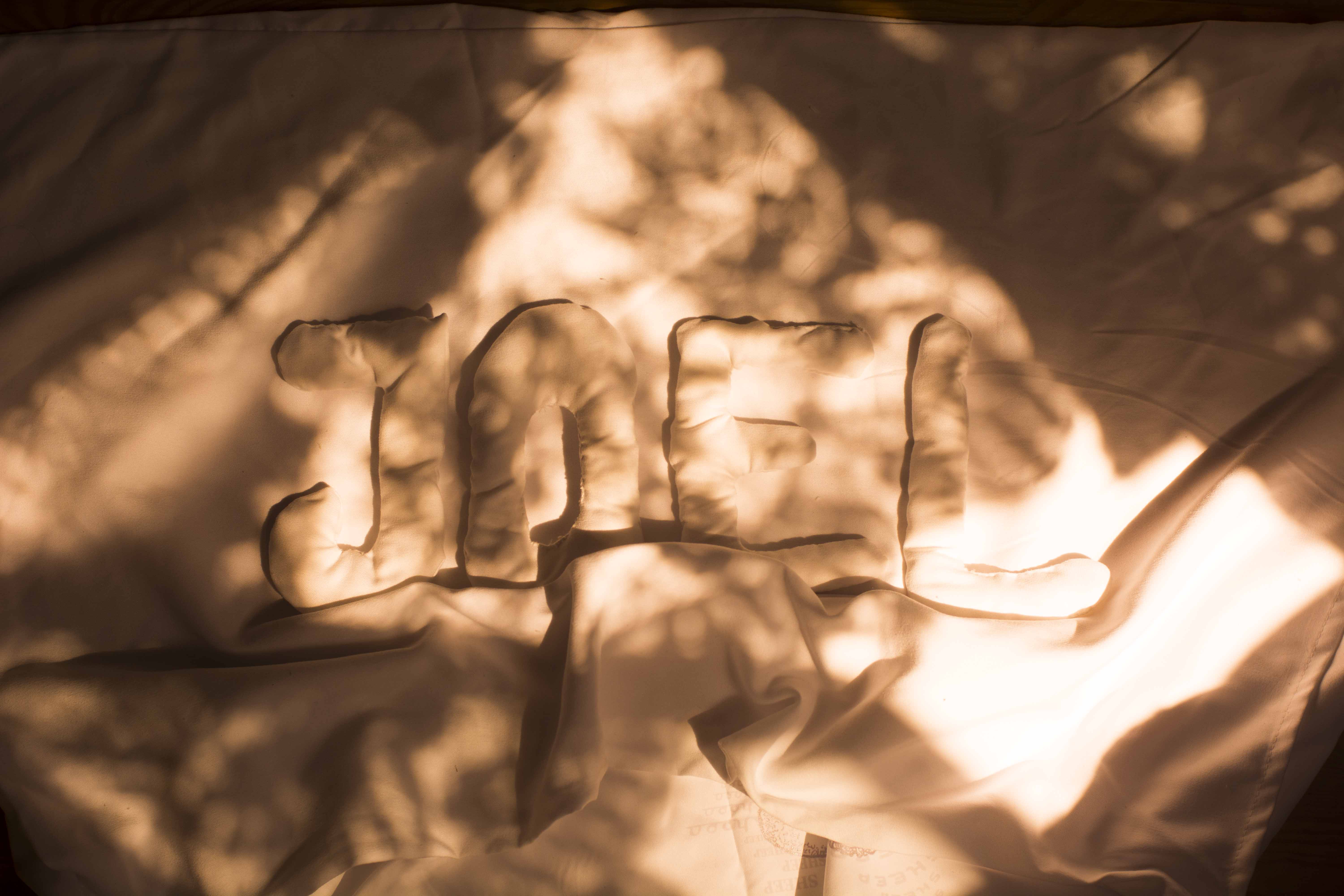


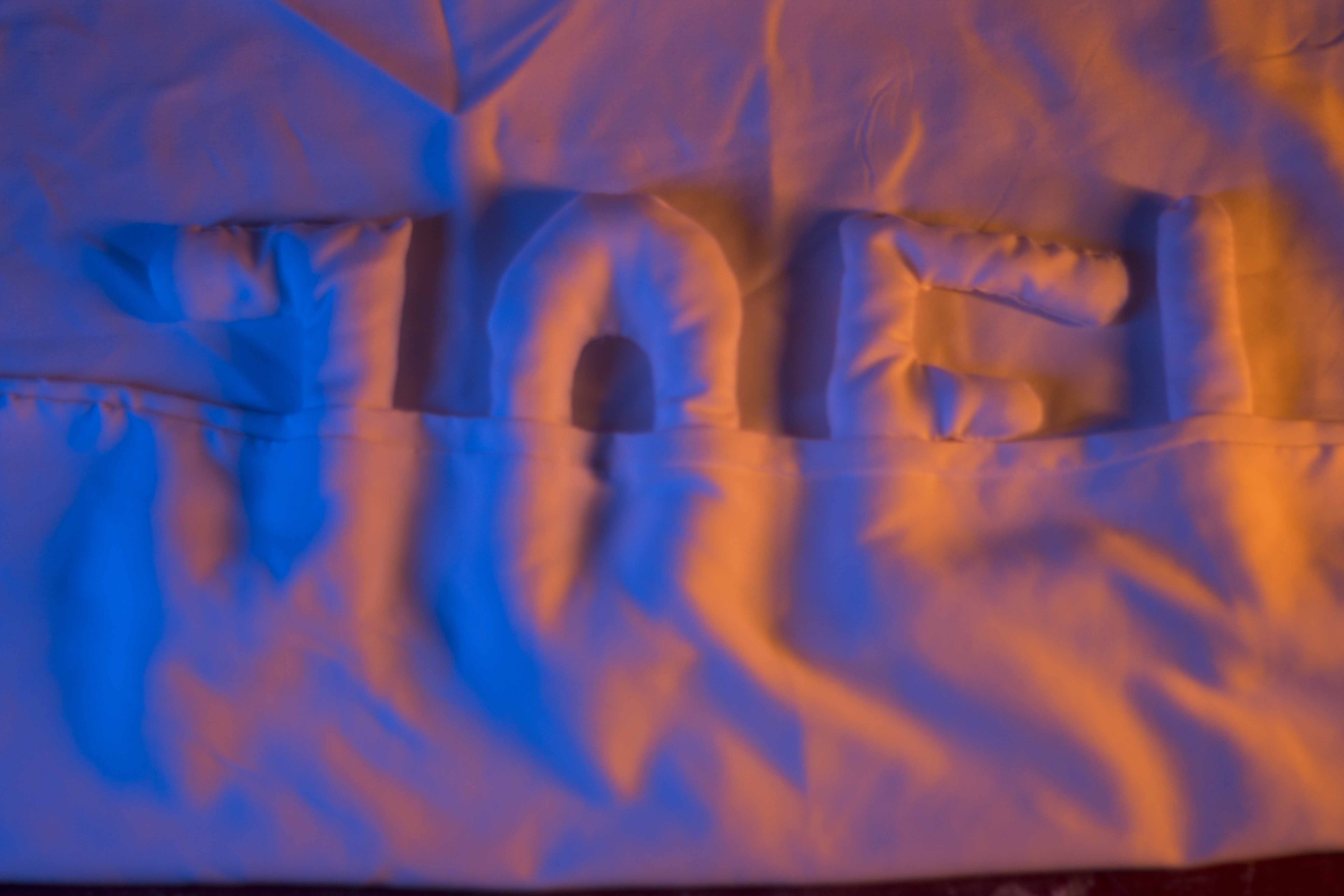

I played around with different camera angles as I wanted to get the feeling of the letters being ‘tucked’ into bed. I also moved the sheets around to try and see which position best captures the look.
Lighting played a crucial part in this composition as it would ultimately set the mood and feeling of the piece. I experimented with warm and cool colours to create a contrast, however, I felt that it was too saturated and it drew attention and focus away from the pillows.
Stay Tuned for the final results!!
I came up with several occupations which were explored in my CPJ.
The jobs that I came up with are ones that I felt would represent me best by my personality, or something which I was passionate about.
I filtered most of it to 5 jobs which i thought would be interesting to explore.
National Geographic Photographer
Sleeping Enthusiast
Handyman
Bookworm
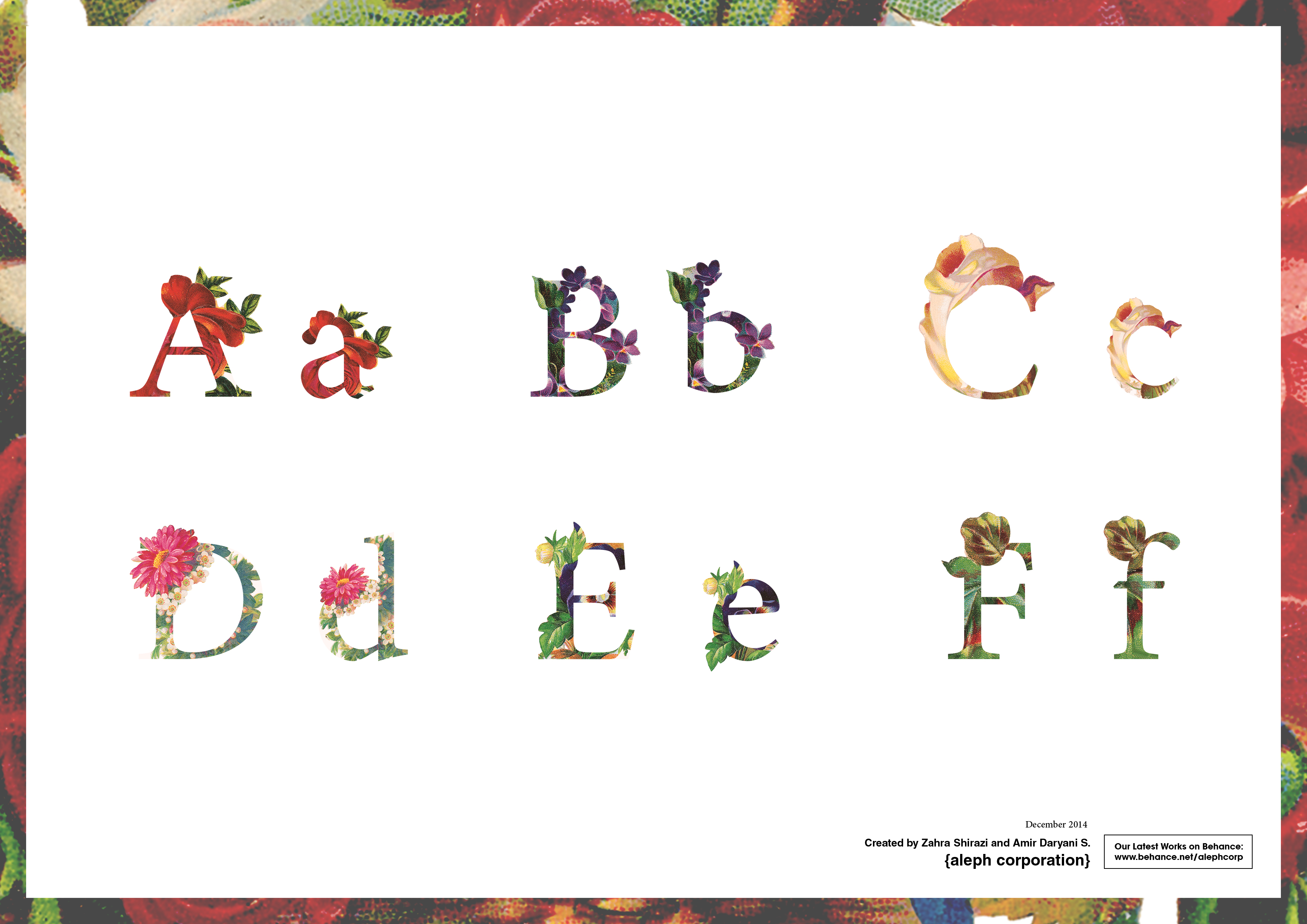
I came across this typeface several years back on behance and I have not forgotten how beautifully crafted the font face is. It juxtaposes floral elements into the Serif typeface in such a stylized way to create a very aesthetically pleasing composition.
I wanted to adopt a similar technique for this occupation as I thought it would be fun to merge animals into the fonts, similar to how flowers are merged here.
Upon consultation with Mimi, I started to look at illustrations on children’s books for alphabets and how animals are portrayed to help children develop.
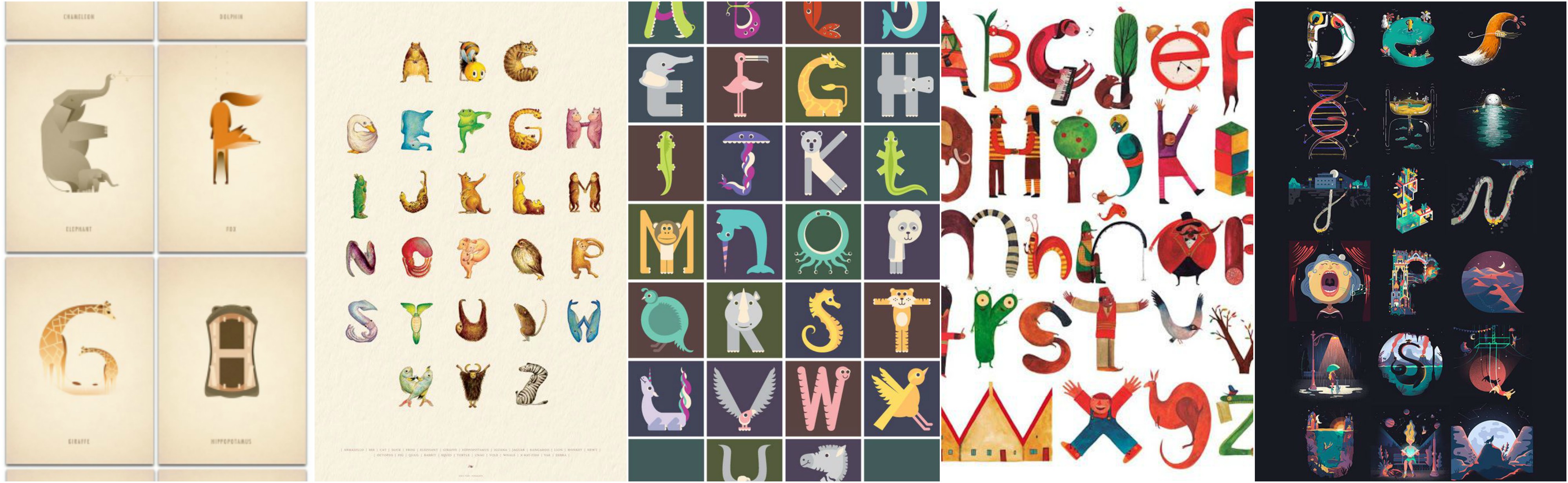
These were creative representations of wildlife, however, I felt that I should give a more realisitic representation of wildlife as I was supposed to be a wildlife photographer.
I then began to look at an art style which I have always had interest in which was inking animals using a hatching shading technique.
I also did something similar for my portfolio submission into ADM.
Thus, I decided to adopt this style into my work.
One thing I pride myself in being is the ability to adapt to my surroundings. Thus, I hope that others would see me as someone who is useful in all situations, similar to a Swiss Army Knife.
It is one thing I often carry around with me as you’ll never know when you will need it.
I started looking at different ways I could portray myself as a Swiss Army Knife.
There were different perspectives and ways to draw and breakdown a Swiss Army Knife, however, none of which caught my interest.
Books form an integral part of my life as I am an avid reader. The smell of books have always delighted me. A book has the ability to transport you to different worlds and similar to a worm, I enjoy digesting all of these details and immersing myself in the book.
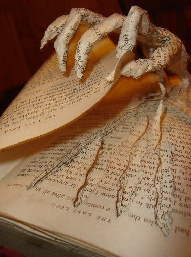
I started to look at how people created art with books.

This concept is extremely fascinating, however, I wanted to take it a step further to incorporate the look of something burrowing through the book.
I also came across this incredible laser cut post it note which originated from Japan.
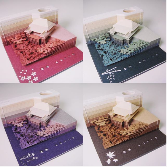
This is not a direction I would like to head in however I found it to be extremely intriguing.
I try, to my best ability, to ensure that I have at least 7 hours of sleep every night to allow my body to recuperate and repair itself. This 7 hour cycle is so deeply ingrained in my habit to the extent that I cannot sleep past 7 hours, no matter how exhausted I was the day before.
As naps are a luxury now that the semester has begun again, I’ve learned to treasure it more. Because of this, I wanted to explore different mediums for which I can represent sleep. What better way to start than a bed?
I had the idea to sew pillows together in my composition to form my name. I started to look for inspiration online.
I wanted a cleaner composition as I feel that the best sleep is often one where there isn’t a single worry or care on your mind, something where you can experience during holidays. The best representation I could think of was a hotel bed.
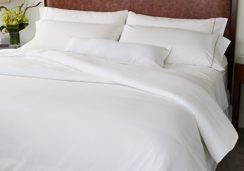
Ahhh, this image just screams comfort. Being tucked under those thick duvets, without a care in the world.
I then begin to explore these ideas, which can be seen in my CPJ as well as my process post.


We begin the semester right from where we left off – Seeing Pandora’s Box
For this assignment, we were tasked to create 3 objects adhering to words which were picked out from Pandora’s Box.
The objective of this assignment was to familiarize ourselves with the concept of making molds by exploring different types of casting techniques. We were also introduced to isometric drawing which provides a more accurate 3D representation of what our model would look like.
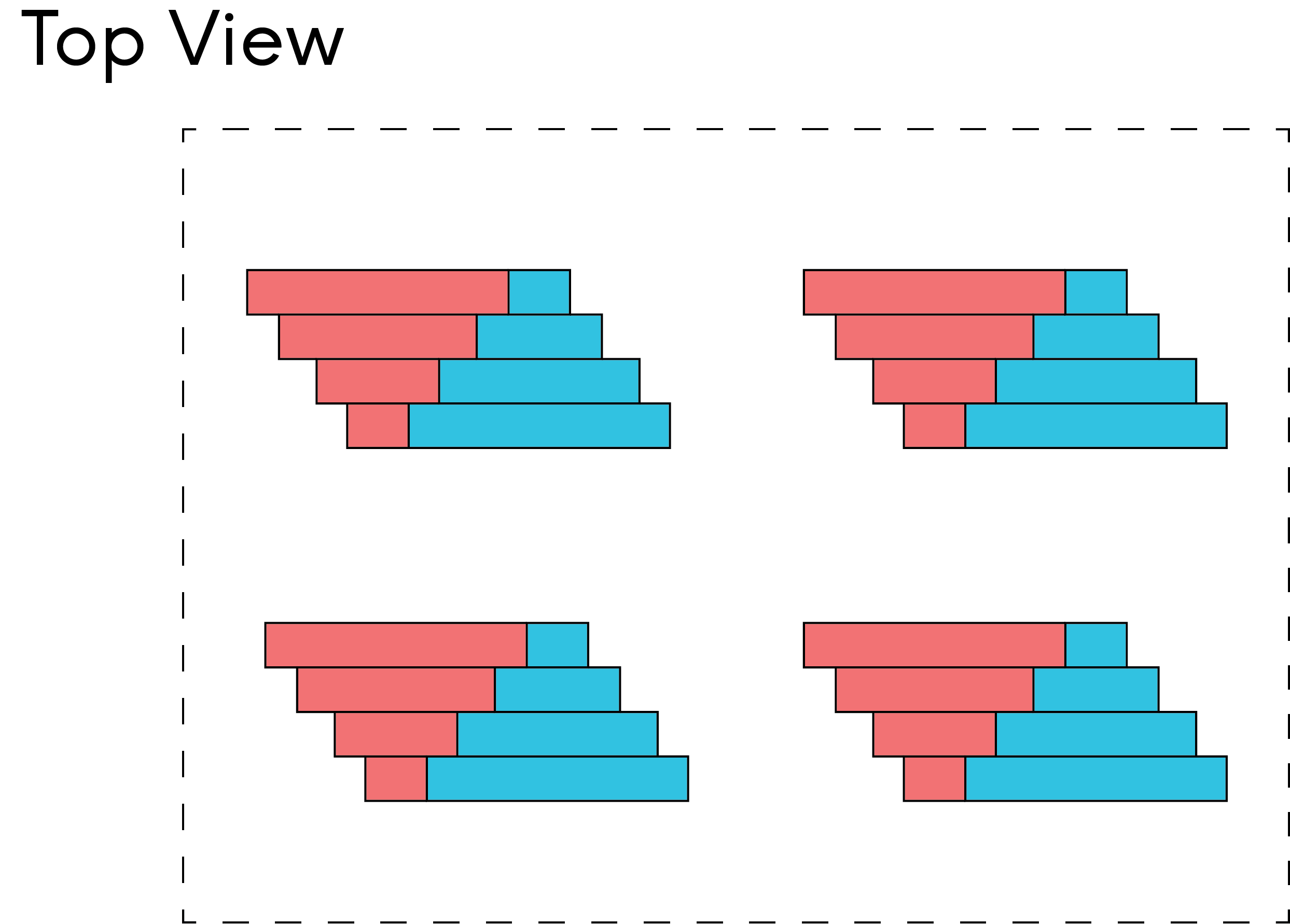
My 3 words were:
Taper, Pack, Offset

My first module was a literal representation of the words.
To breakdown the module, pack came from the arrangement of the balls at the top to give a representation of ‘packing’.
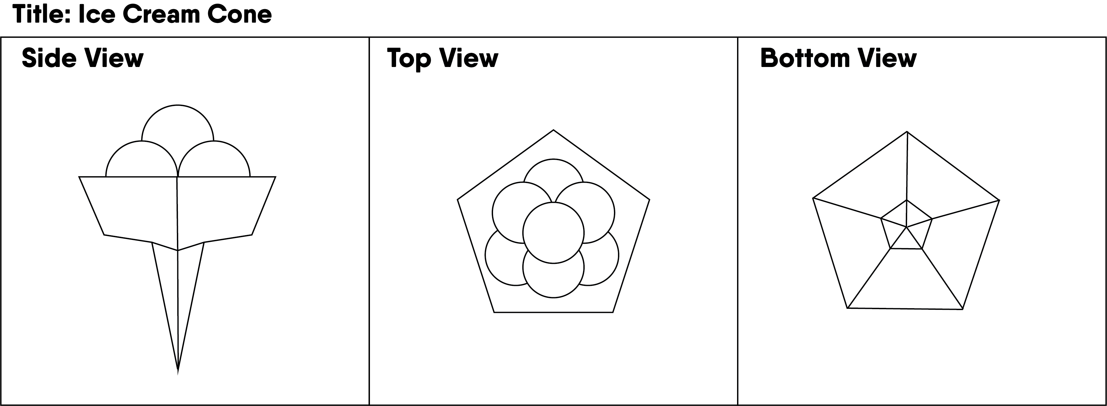
Taper would come from the sharpened tip which would form the cone. I shaped the cone in such a way where it formed a pentagon as well, similar to the ‘cup’ of the cone to represent Offset.
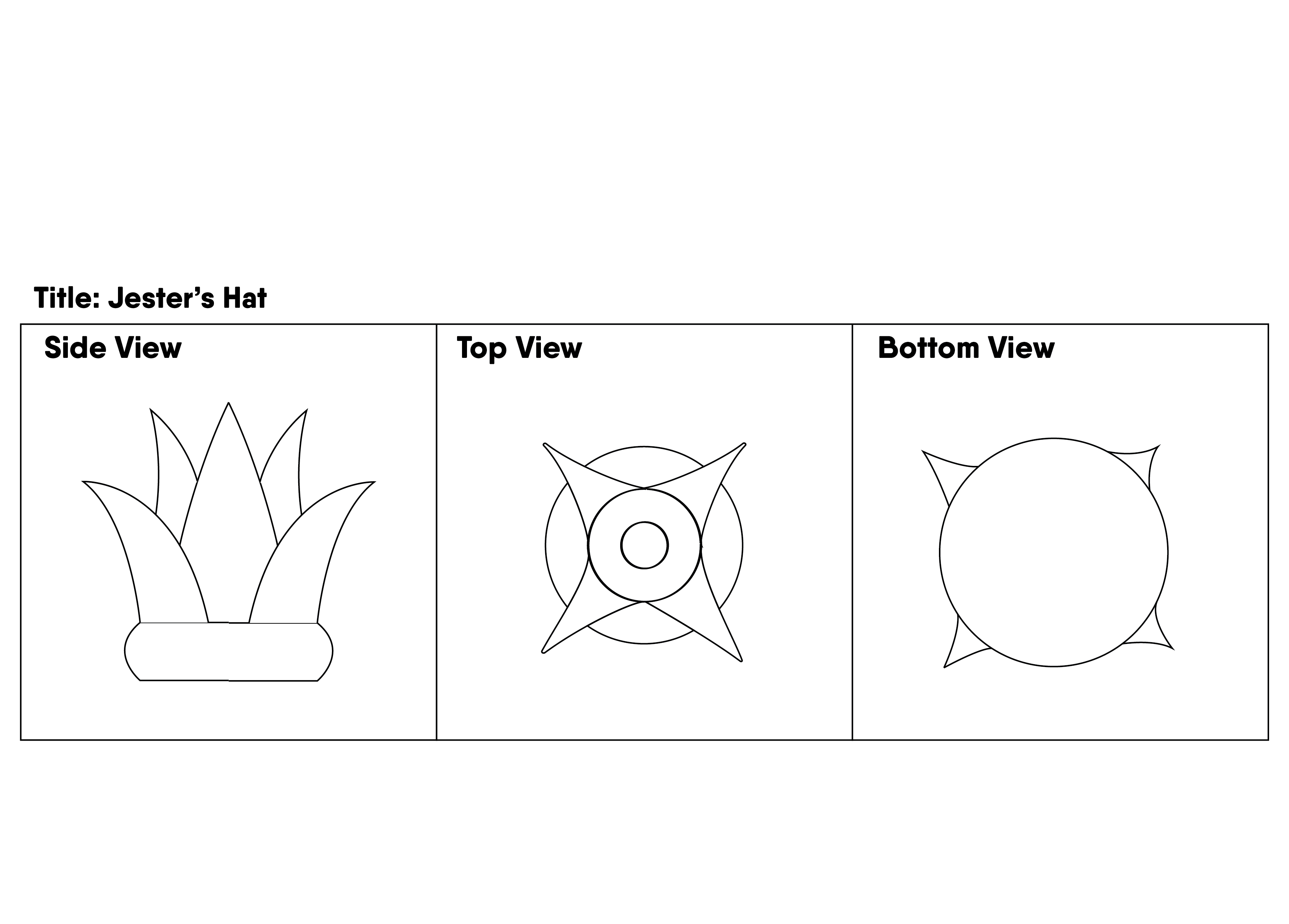
My second module was a more dynamic and abstract piece. I made use of pointed edges to represent taper. How closely the shards were placed together would represent pack. The centre spike/shard would be the representation of Offset as it was placed in the middle.
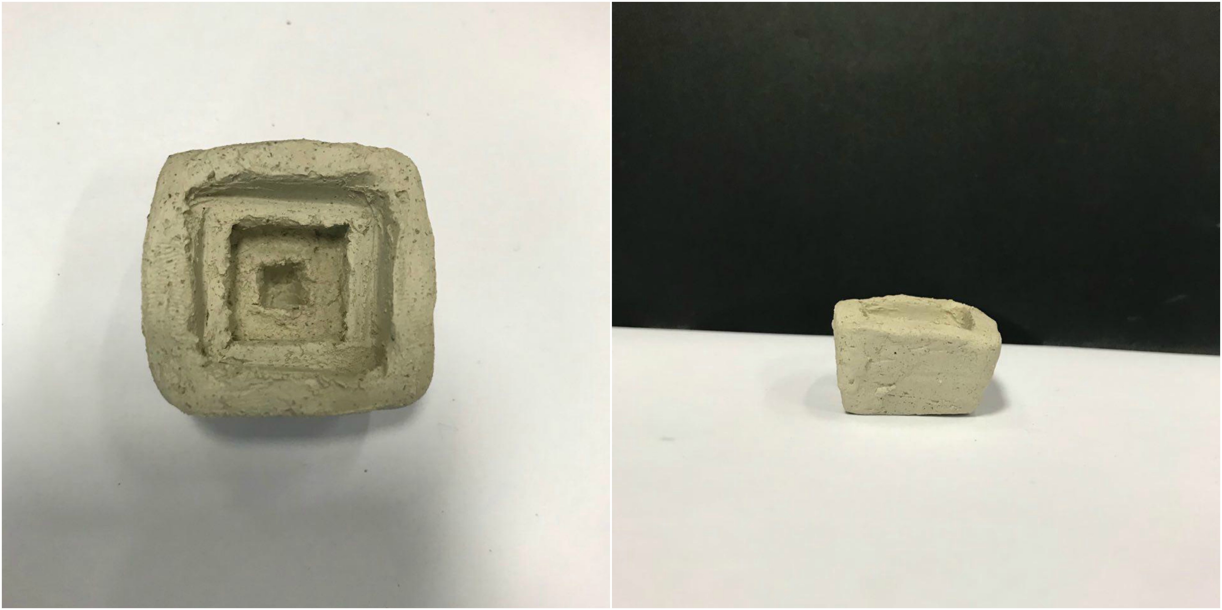
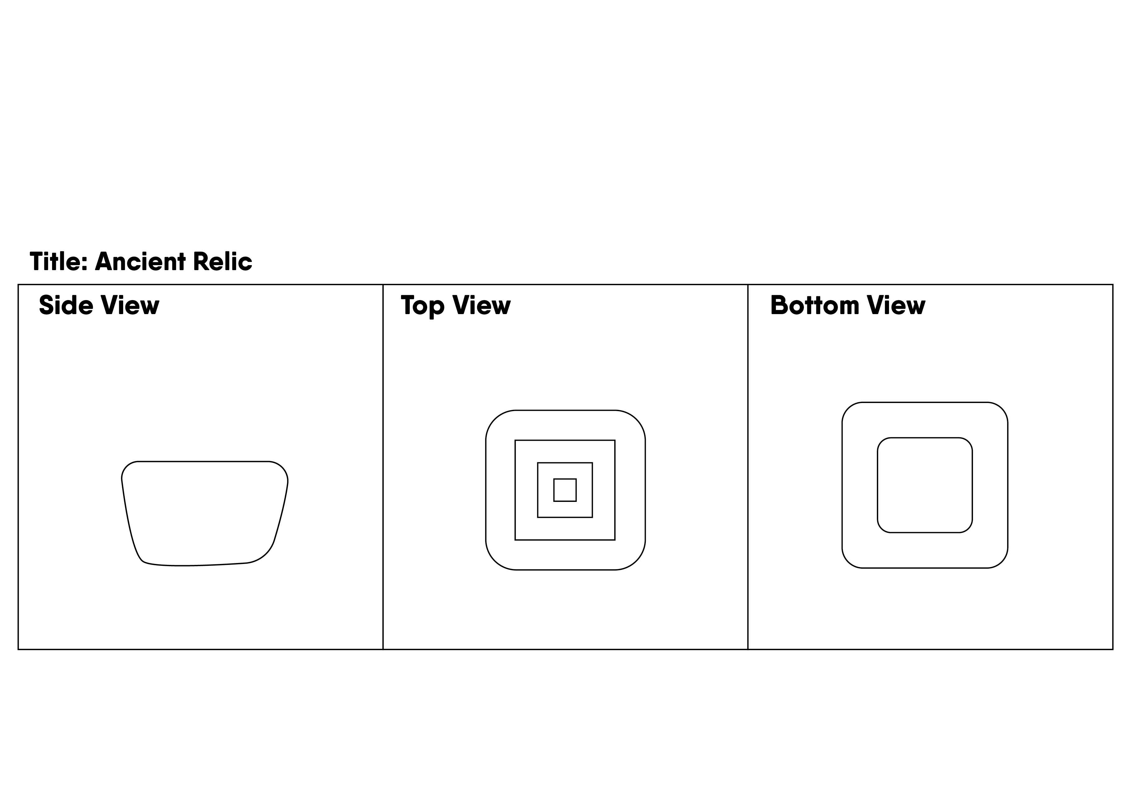
The process of this module was interesting to create. But first, I will explain how I derived at this composition. At one glance, you can tell that I managed to fit the 3 words: Taper, Pack and Offset just from the top view. The squares are packed closely together, overlapping each other, and the differing of sizes gives it the tapered look. Offset was created by the indentations into the clay.
To create this module, I carefully cut out a foam block which I had envisioned the ‘positive’ volume of the module to be.
Afterwards, I imprinted the shape into the soft clay, creating an Ancient Relic.
We move onto the next segment of the assignment, which is the casting of the modules in latex to enable us to replicate the module.
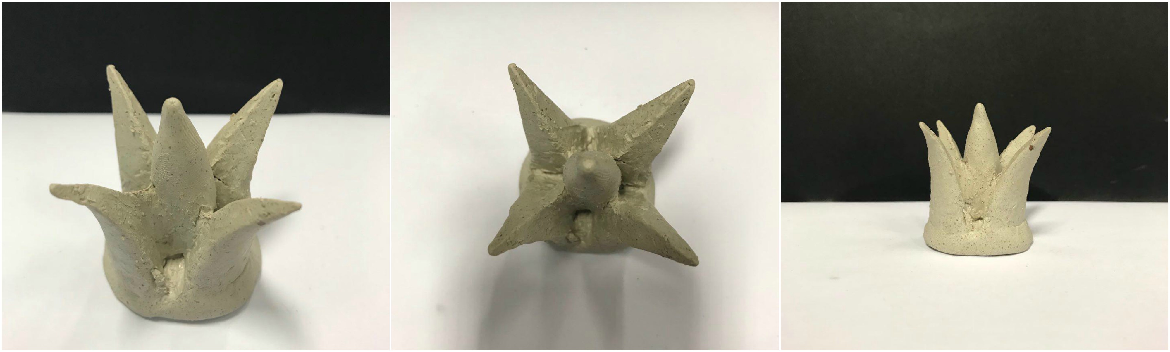
I decided upon casting my Jester’s Hat as the module I would use for the ice tray.
Thus begins the arduous 10 hour journey of coating the module.
Eventually, after 10 coats of latex, my magnificent Jester’s Hat was ‘reduced’ to looking like something out of an 80’s Alien Sci-fi movie.

I then proceeded to cast the structure using plaster.
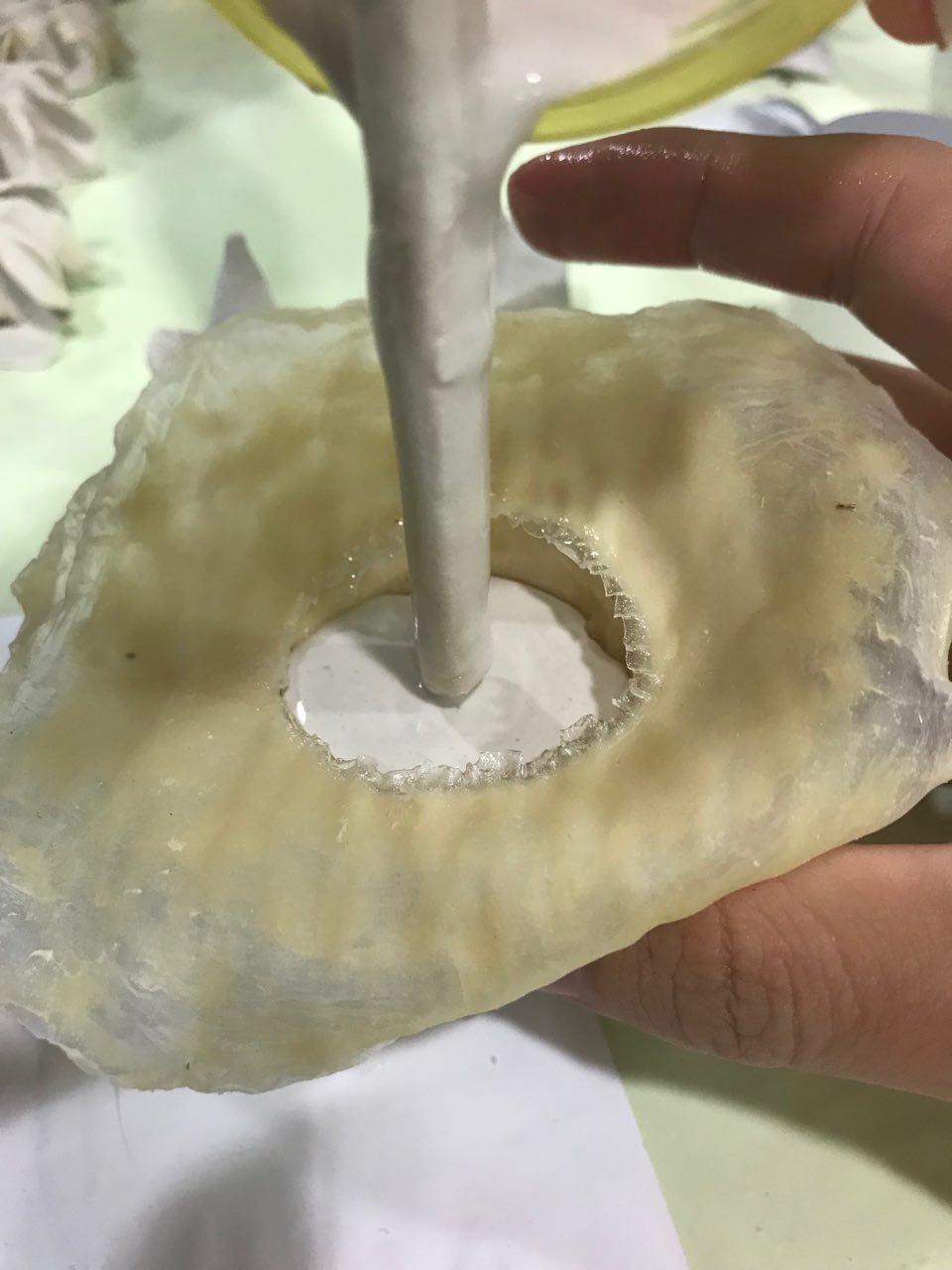
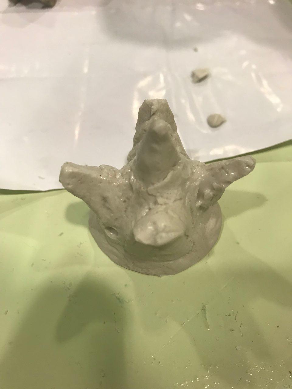
The outcome of my casting was far from optimal as it was difficult to take out the module due to the outward tapering of the shards. This meant that in order for me to remove them, I had to break the tips.
This was the result:
After seeing the outcome of the first few casts, and continuously being dissapointed by the outcome, I decided to cast Ancient Relic instead.
Casting Ancient Relic a much more straightforward process, however, I wanted to change the variation of it to have a more uniform module which could be interlocked.
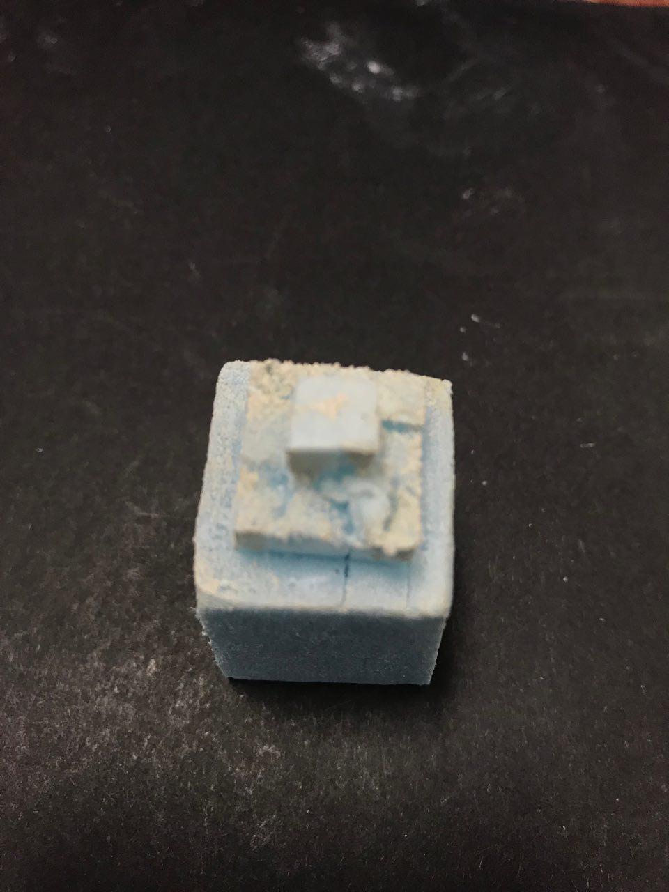
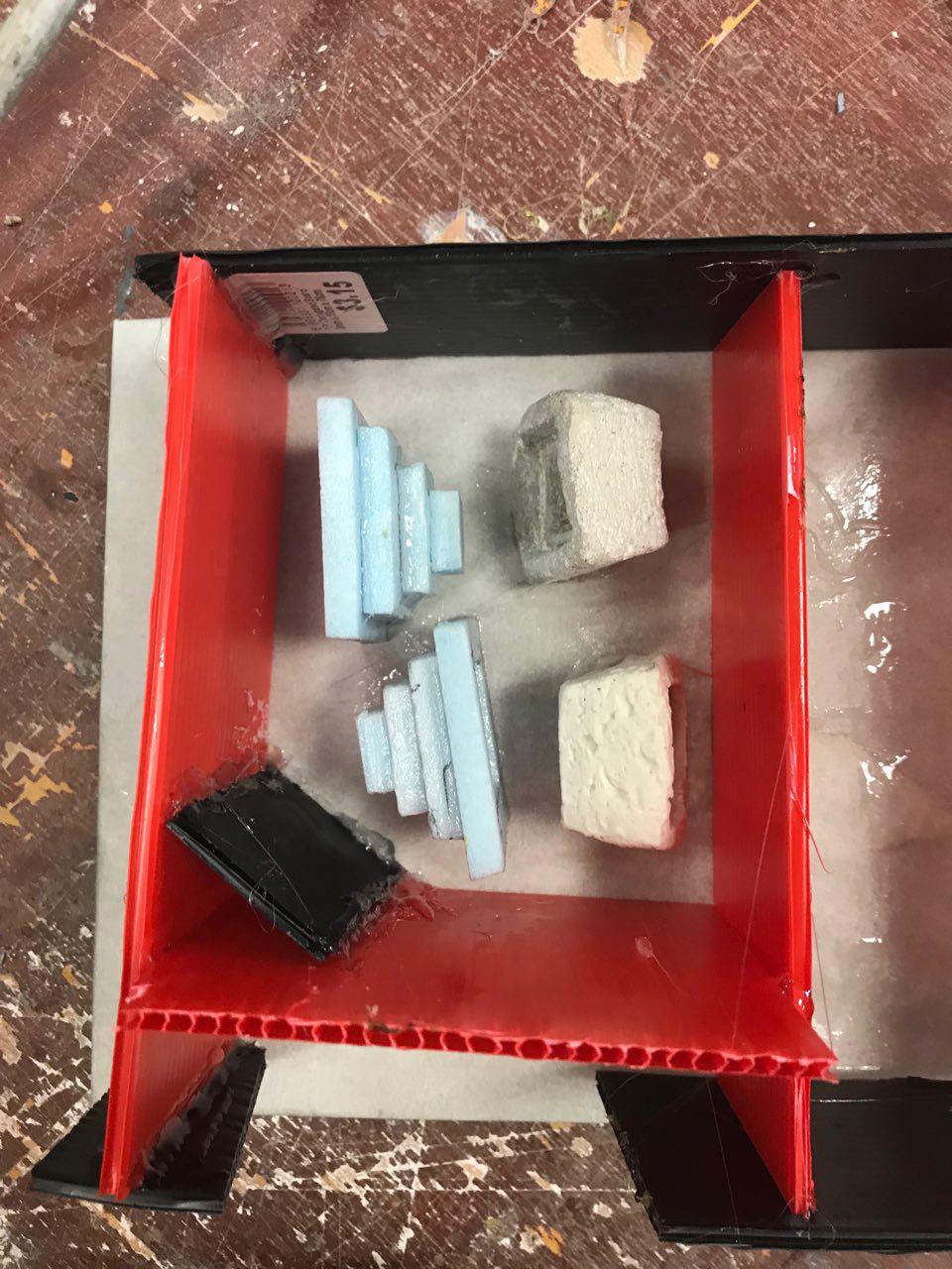
As a result, I made another version of Ancient Relic with foam this time, to be cast in silicon.
This is an isometric drawing of the initial layout of the mold to be cast.


The molding process was an interesting one as it required the efforts of multiple people for it to successfully cast! (A great bonding experience both literally and chemically I must say)
We had to plan how we would like our final products to turn out by adjusting its positions as for modules with notches would get trapped in the silicon.
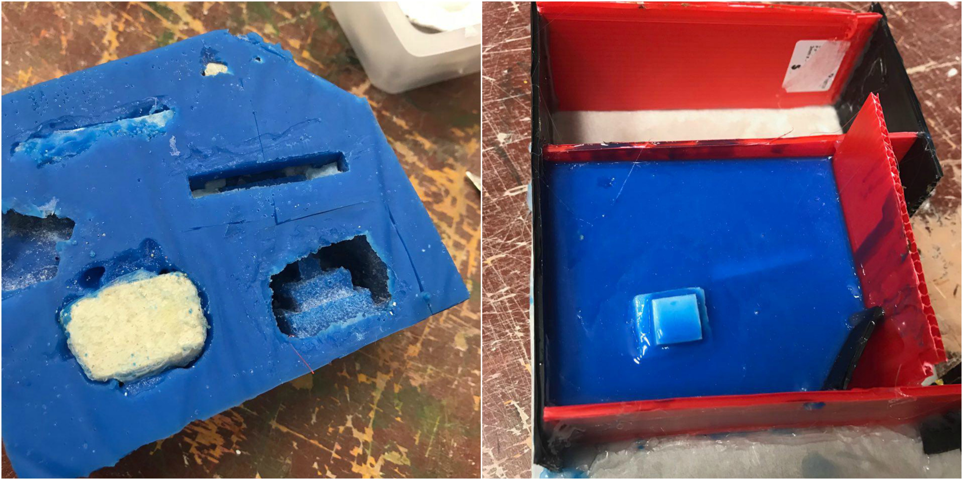
Unfortunately, it was not all smooth sailing through the casting process as one of my foam models floated up, while the silicon around the clay Ancient Relic did not sit well.
Thankfully, the other two modules were perfectly seated in the silicon.
I had trouble prying out the modules from the silicon as silicon tucked into the tapered squares, which resulted in a ‘hook’ of sorts and the only way for me to take out the module was to break it.
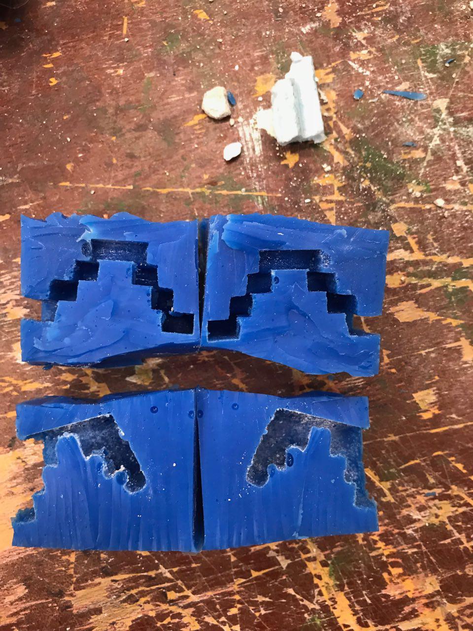
After consultation with Cheryl, I decided to cut out the modules from the silicon and slice them into half. This would make things easier when I would cast them in ice.
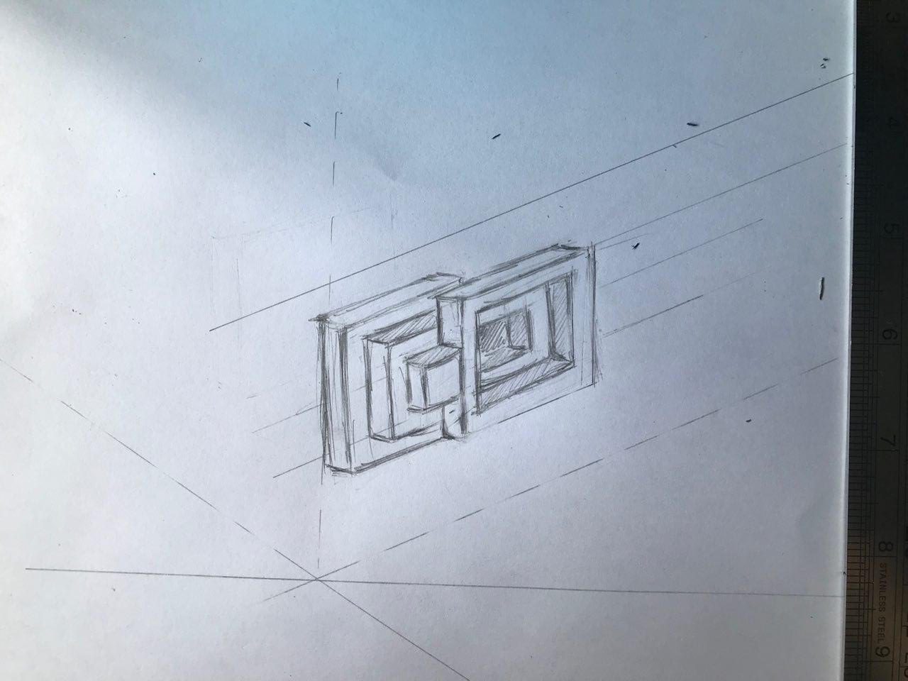
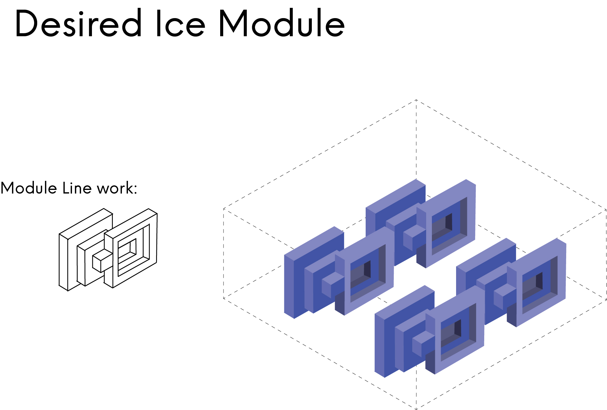
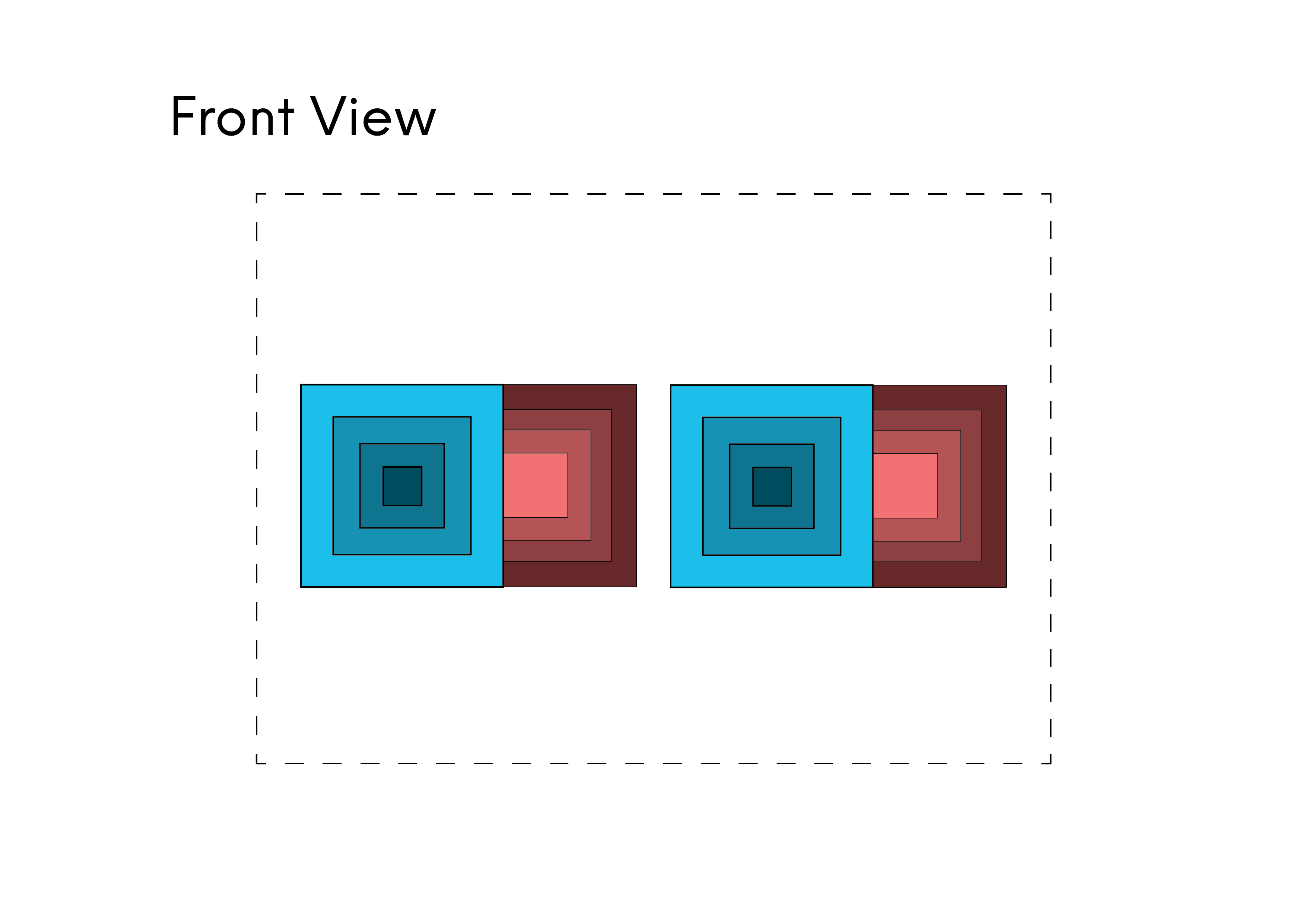
I first started off with a rough sketch of what I wanted my desired module to look like. I had problems visualising what the inside of the module would look like due to its layered nature.
Afterward, I brought my sketch onto Illustrator to refine the dimensions and the angles of the Isometric Drawing.
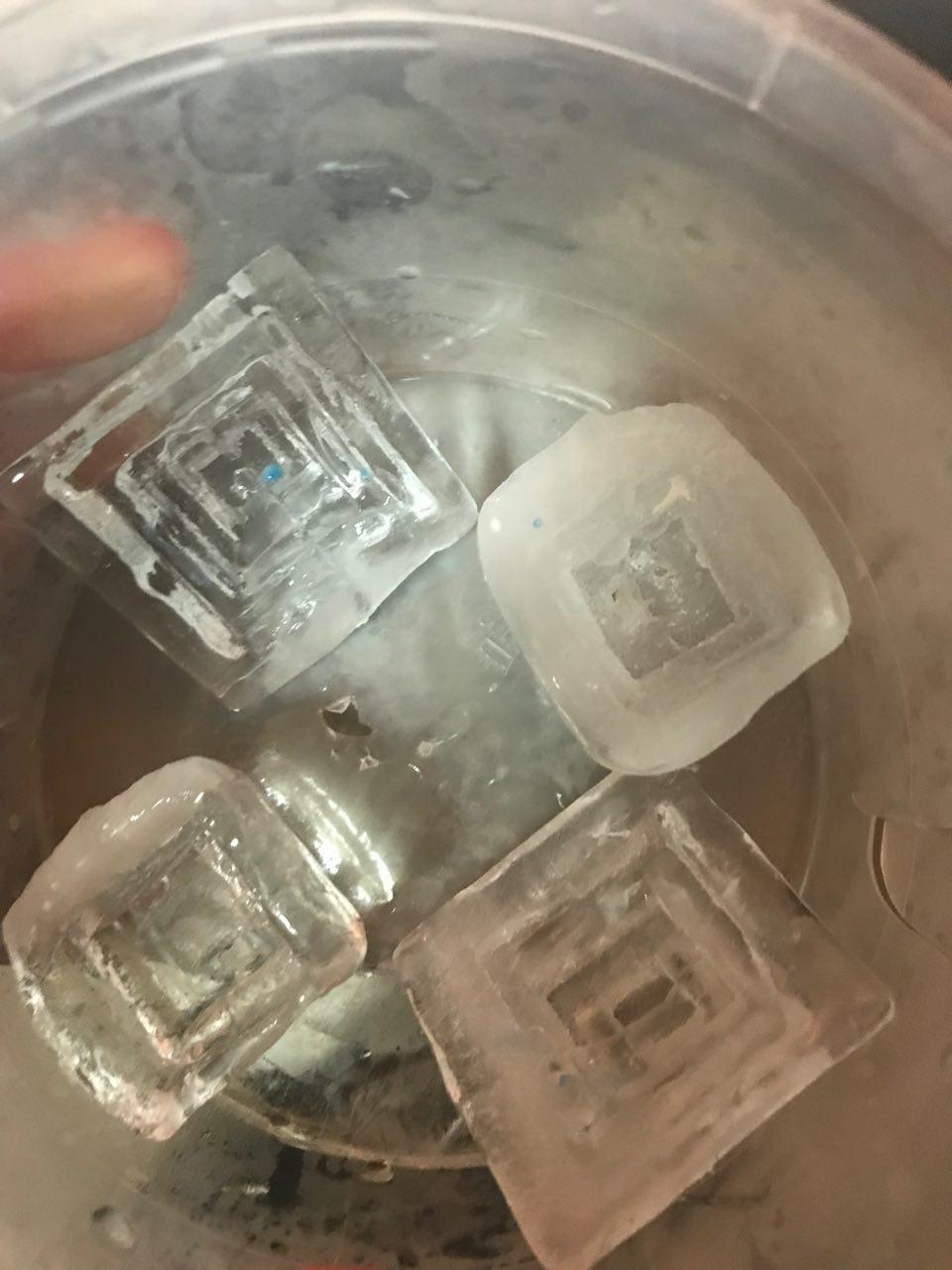
I was very pleased with the result of the ice casting! The risk to cut the module into half paid off as the module was able to come out with much more ease without me having to break it.
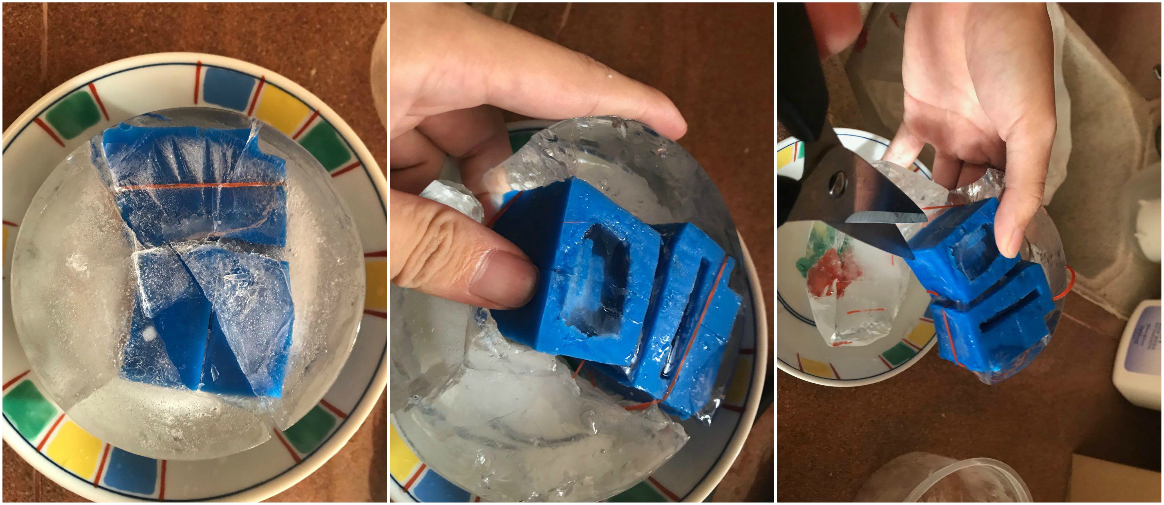

I had to create a makeshift ‘studio’ in my freezer as the ice modules melted too quickly in my hands and in the kitchen!
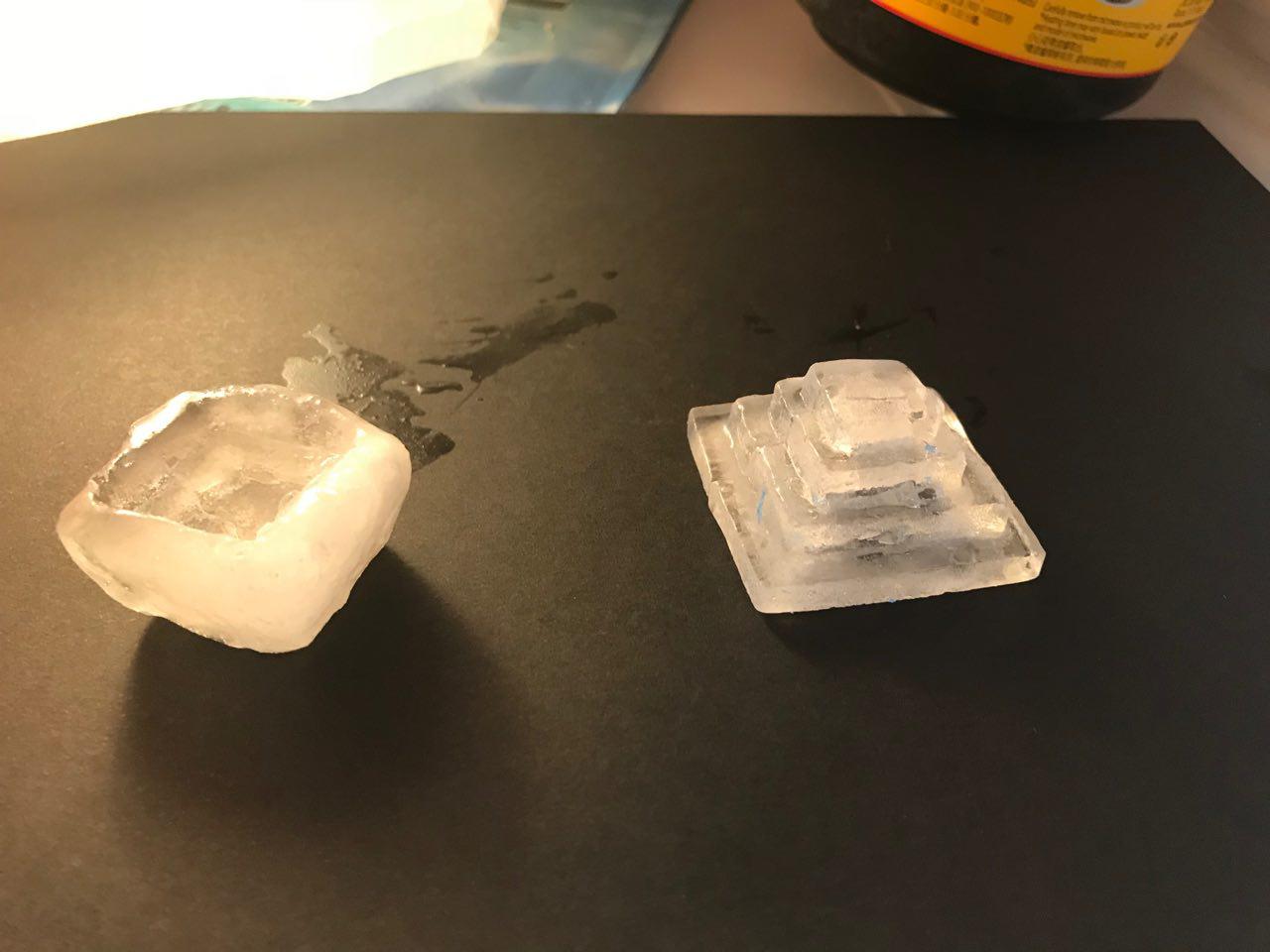
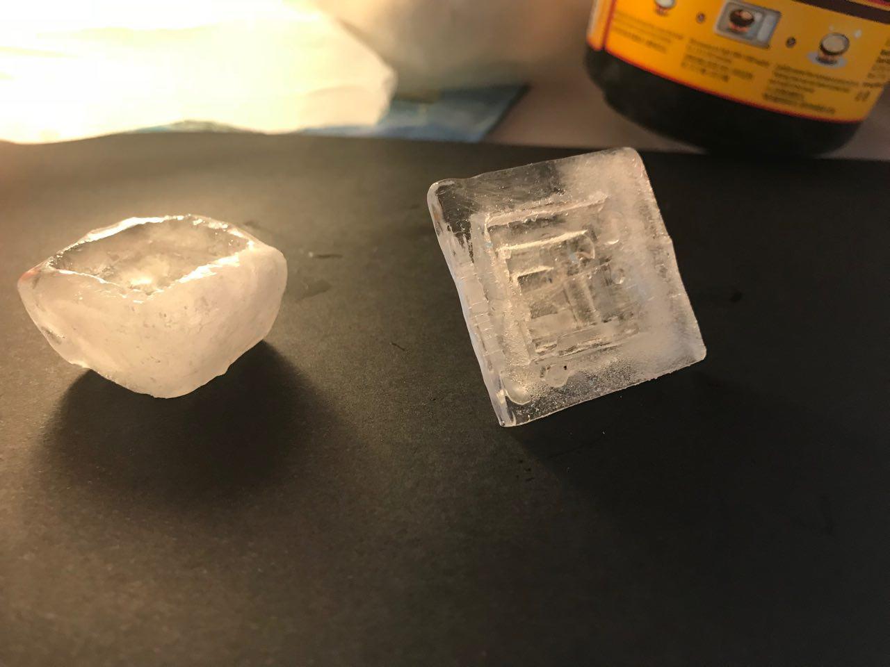
I managed to make a couple more of the ice modules! These would definitely impress my guests if I served it during Chinese Reunion dinners… although they may get a stomach ache after consuming these…
Posted by Joel Lee on Wednesday, 31 January 2018
00:34 – ATM
00:58 – Stairs
1:55 – Paper
Setting: 2D Computer lab and 2D Studio
We tried to create the ‘illusion’ of an ATM, whereby I was withdrawing money and May Thu being the machine.
The second act was to try and pretend that we were in the same space, walking down and going up the same flight of stairs.
The Final act was us throwing an object across the screen, in hopes that it looks as though we were in the same space.
For the ATM act, we had to practice several times to try and get the ‘money’ to dispense seamlessly. We made sure to cover the camera when the money is being dispensed to try and ‘trick’ the audience in thinking that it was the same note.
The second act was more straightforward, but the message was easier to drive across. The main issue we faced was knowing when to come back onto the screen when the other leaves as the final position was the other party squatting.
The last act was the trickiest as it involves us throwing the paper at the correct time. I would say that the receiver of the paper had an additional problem as May Thu had to throw the paper, however, not make it obvious. The poor internet connection also made it difficult to realise when the other party was beginning to throw the paper.