Final Project – Abstract Chef Trial Run (My perspective)

A brief introduction to our Final DIWO Project!

Our team which consists of me, Dion, Brendan and  Bryan, came up with the idea to go against the conventional idea of cooking, whereby the recipe and ingredients used for the dish is not readily available to the cook.

How we would be doing this is by assigning two roles: an Instructor and the Cook.

The Instructor  would have to disseminate the what ingredients as well as the steps for cooking  purely by drawing only, within a time limit.

This is similar to the game: Broken Telephone, whereby a message is shared among a group solely by whispering. The final person to receive the message is supposed to figure out what it means to successfully complete the objective.

The Cook will have to interpret the drawn instructions, by himself and proceed to purchase the ingredients from Giant Supermart and prepare  the ingredients to cook.

All this will be happening in third space through Instagram Live.

We decided to have a test run on the 29th to iron out any potential disruptions or complications which we may face. This reflection would be from my perspective as the Cook. 
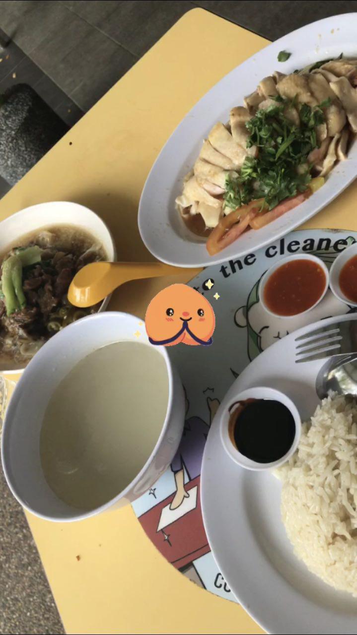
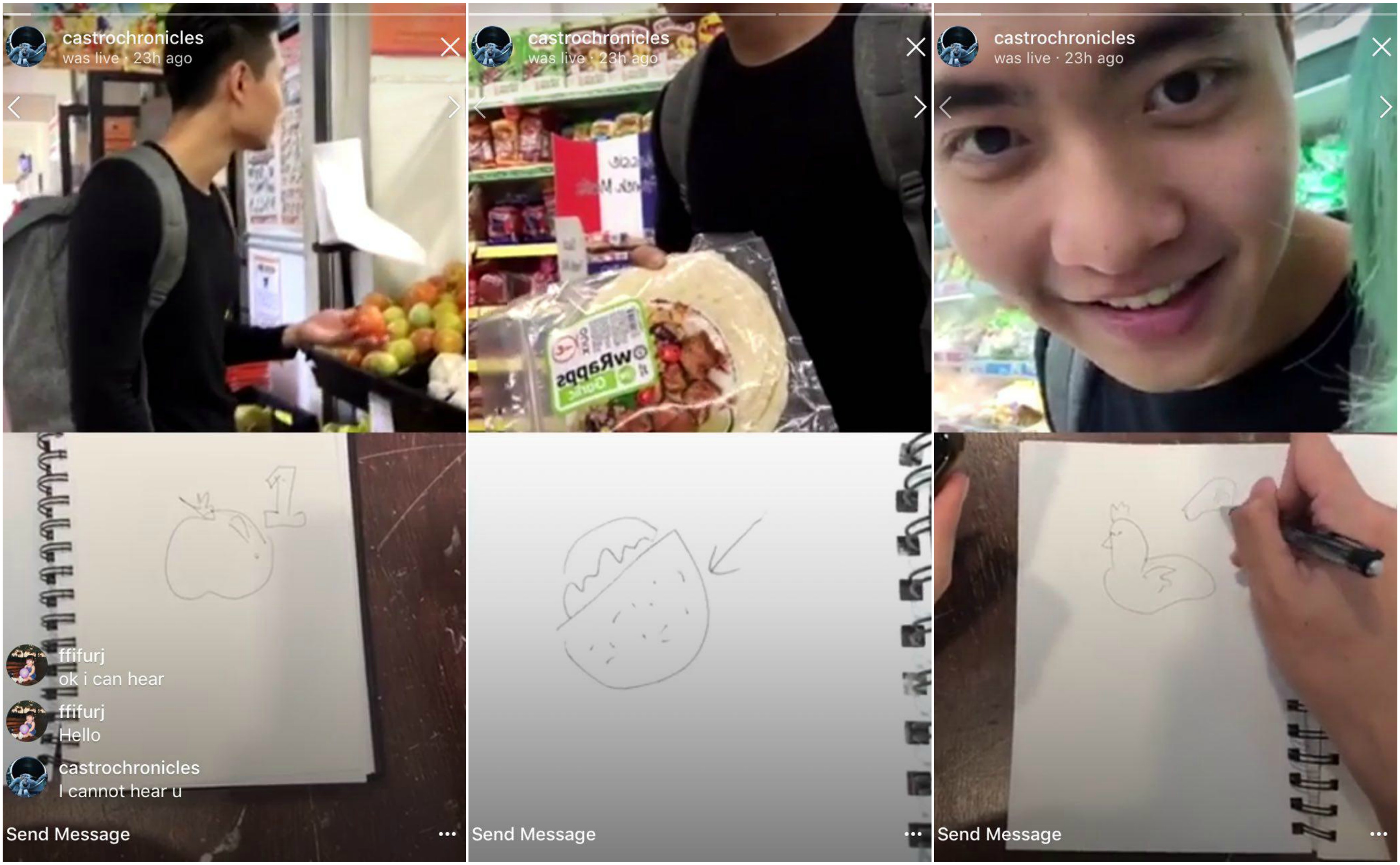
Grocery Phase!

The initial ingredients were relatively easy to decipher, such as the tomato and the onions.

However, then came the more confusing ingredients such as the banana(?), the chicken (I was confused which part of the chicken it was in the drawing, so I just bought a small chicken) and I bought a pack of DUMPLINGS which actually turned out to be macaroni (Brendan threw that in to throw me off). Bryan (the Instructor) also drew a bottle with some shapes on it and left it for my interpretation, and with that, instead of Barbecue Sauce, I ended up buying Tobasco Sauce.

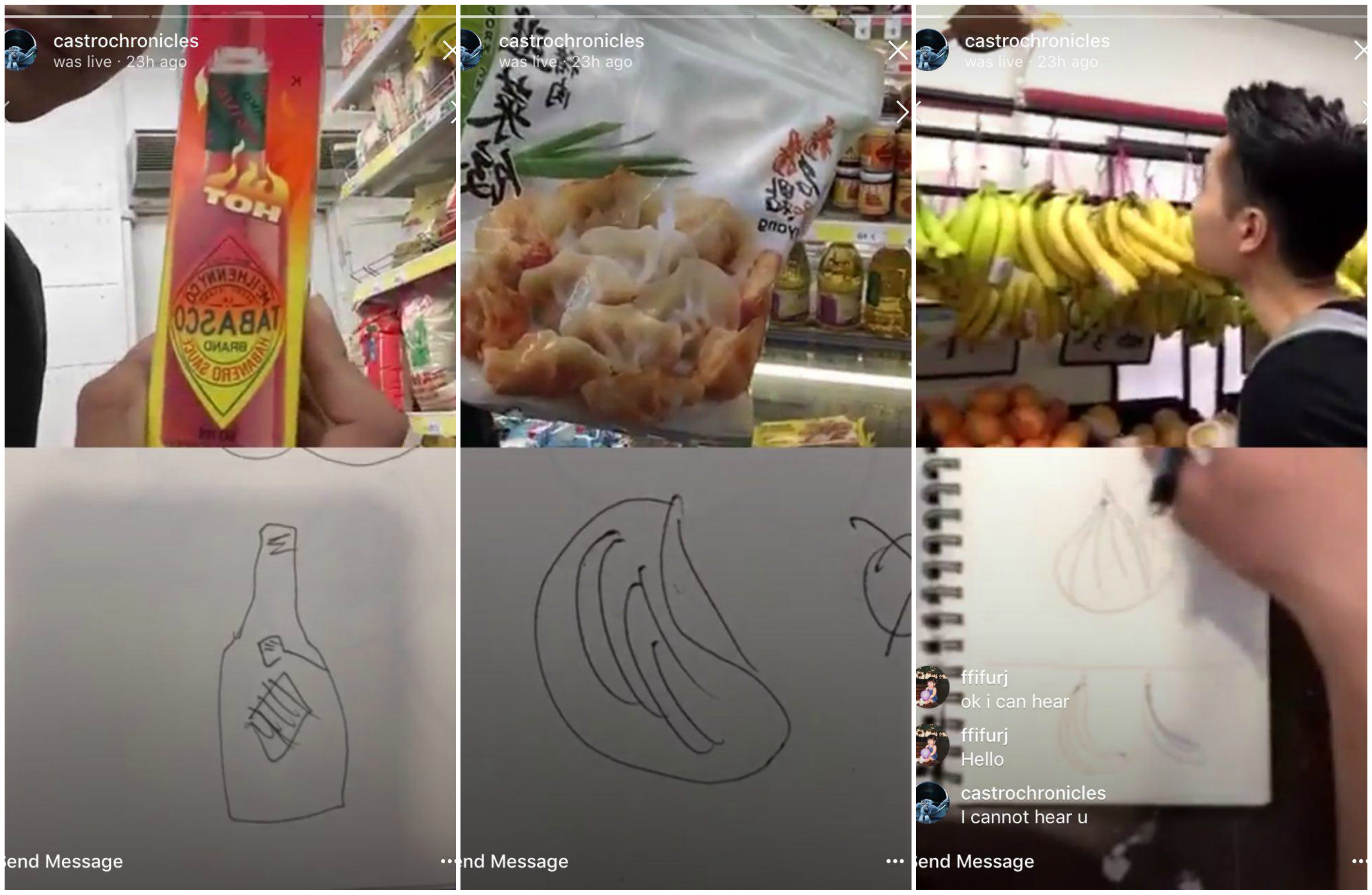
Here are some of the things I got ‘right’, which were slightly tricky to figure out, like the tortila wrap, the chicken and the Shittake Mushrooms (I didn’t get a screen shot of it)
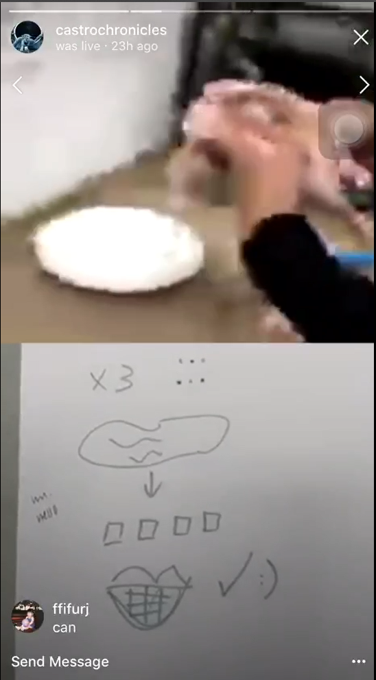
Cooking Phase!

We immediately ran into some complications at the start as we did not prepare enough utensils and crockery to cook the food. The reception at the kitchen was also terrible which really affected the image quality and the smoothness of the trial run.

I also had to wait for the chicken to defrost in the microwave which took up 20 minutes because it was a whole chicken.

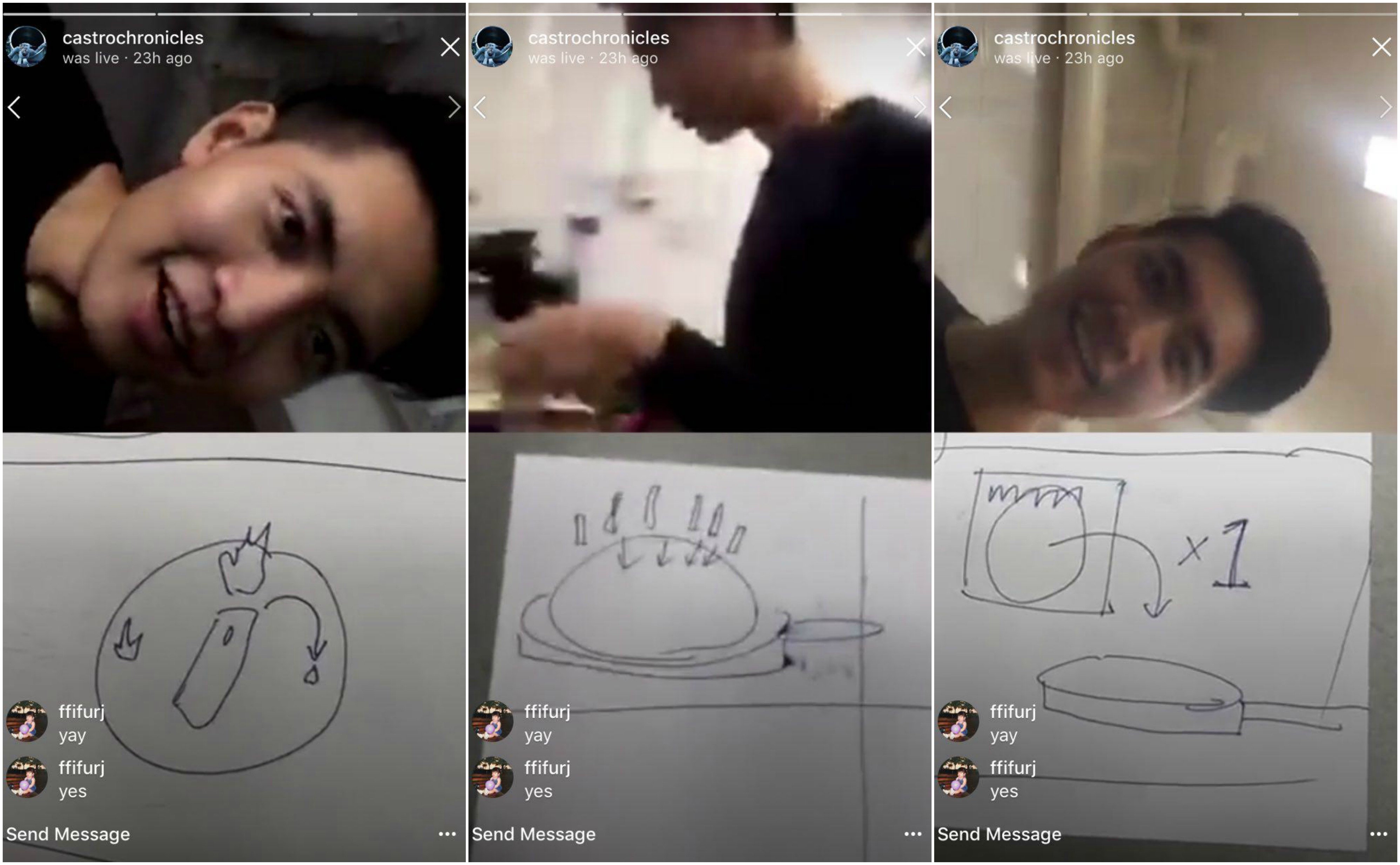
Bryan had to leave halfway so we got Zhen Qi (Our friend) to stand in as the Instructor. I showed her whatever ingredients I purchased before hand to give her a better idea and a frame of reference when she needed to draw out the ingredients.

After Zhen Qi (ZQ) drew out the instructions, we identified a problem as the Instructor did not have anything productive to do while waiting for me to complete the task.

As I was busy butchering the chicken to cut into cubes, Zhen Qi was left clueless as to what to do.

Another unique issue we identified is, what happens if the natural instinct of the Cook comes into play? ZQ illustrated one of the instructions which had ’20s’ on it, and I was doubting the instructions as I interpreted it as: fry for 20 seconds. Which would definitely be too short a time to cook chicken. (Around 6min 20 seconds, the audio got cut off half way 🙁 )

Because of this, I bargained with them to allow me to cook the chicken for more than 20 second, to which they called me a ‘cheat’ for not following the rules!

This begs the question, would the outcome be the same if  we allowed for the natural instinct of the Cook to interfere? How much leeway should we give?

For the most part, I was able to interpret the cooking instructions as I have prior experience in cooking, which made it easy for me to decipher what I should do next.

The other problems we faced were just due to the lack of the proper equipment such as a pot which was able to be used on the induction cooker and I did not prepare enough oil to be used. Thus, as I was attempting to fry the Tortila wrap, it burned because there was not enough oil and it also could not fit into the pan.

These are some screenshots of me trying to decipher what the instructions were. The first frame was interesting as it was actually ZQ telling me to set the heat on low. I was confused initially as the drawing did not look anything like food.

This is Part one of the Cooking Phase!

Part 2!

FINAL OUTCOME!

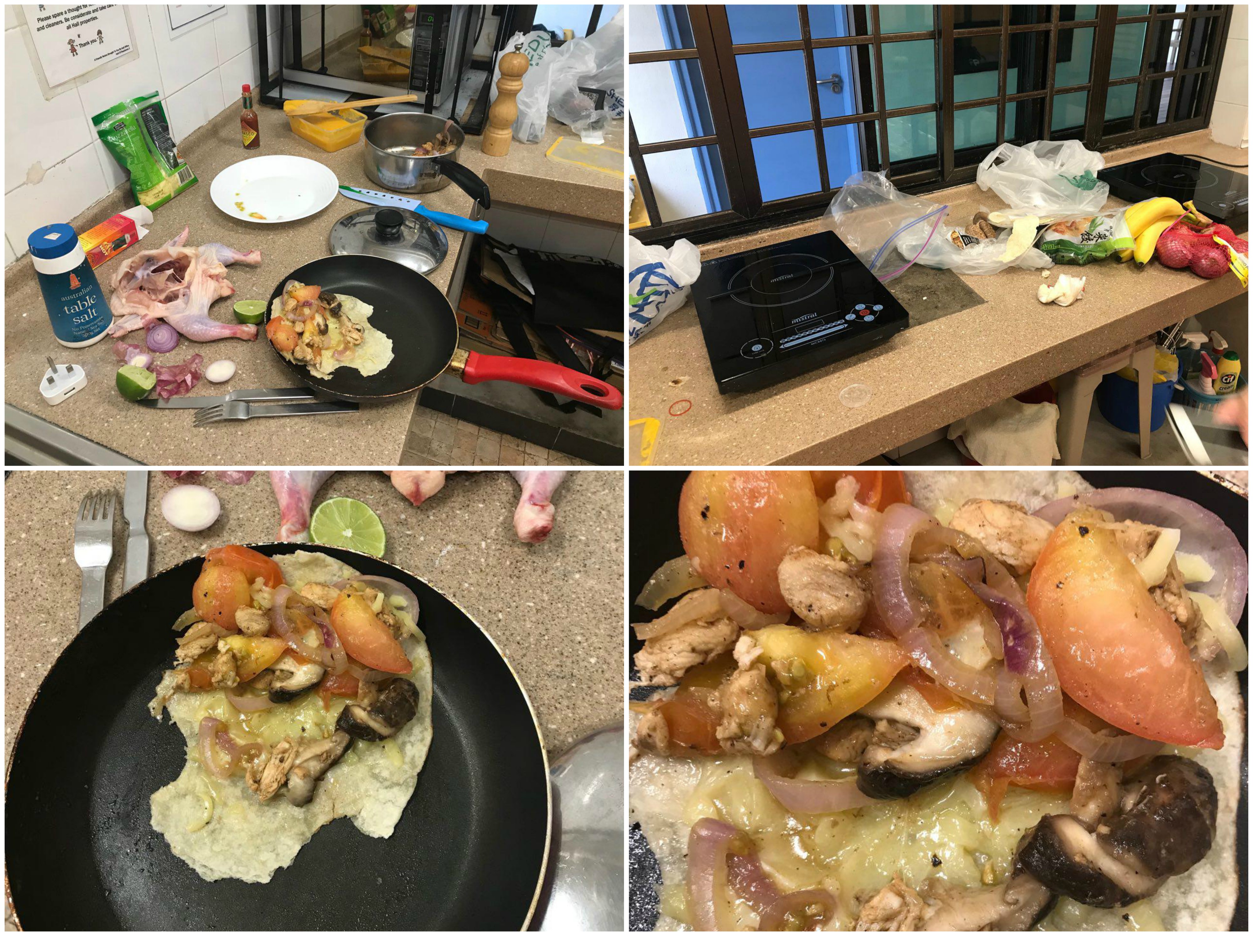
Overall I would say that it was a good run because the outcome was something edible, however, the results may be significantly different if the Cook did not have any experience in cooking.

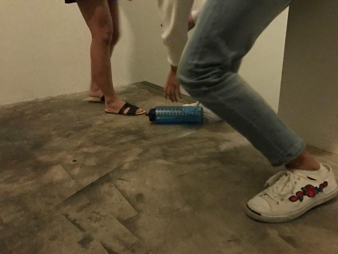
I would also like to draw your attention to this picture to show how unprepared we were for this trial run.

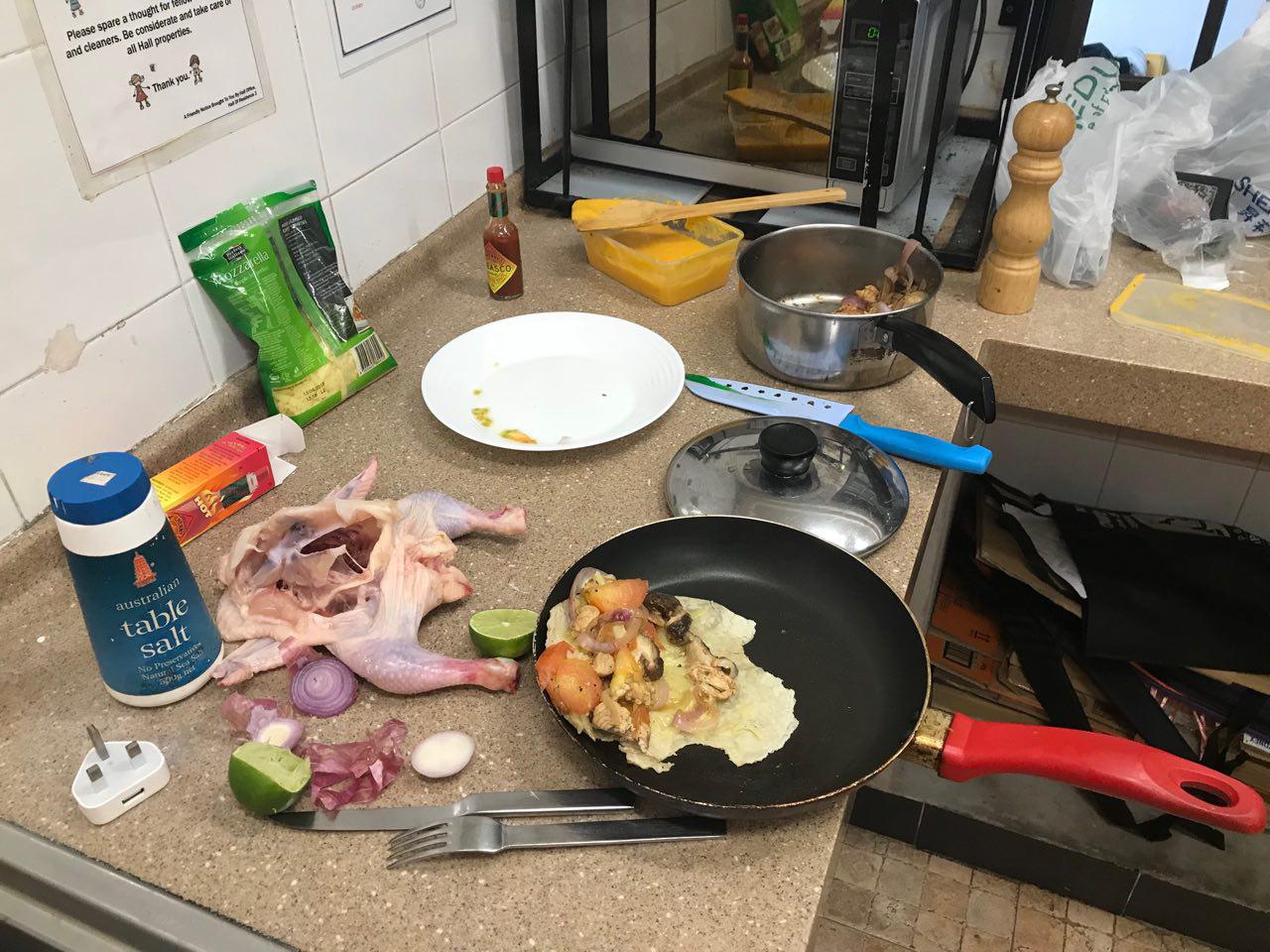
I was cutting up the chicken on the counter top because I assumed the pantry would have a chopping board. And since we didn’t have anywhere else to put the chicken, I just left it on the tabletop.

Do check out what the rest of my group mates have to say through their perspective!!

Super Participation

I was fascinated by the scope of this project, because the concept of sharing our lives online is not unfamiliar to us, however, this assignment pushes the boundaries of sharing to a level which some of us may not be comfortable with sharing.

The whole idea of super participation would be to share as much possible in relation to what is on-going in our lives, no matter how minute.

I enjoy packing my days with errands or tasks to complete so that I do not feel as though I am wasting my time. Thus, we decided to record a day which all 4 of us had something to do.

My day began with having a meal with an old friend of mine. We went to Ghim Moh Market to eat lunch. I tend not to share images of what I’m having for meals because I feel that it is not engaging and it is not a reflection of who I am as a person, because I do not associate myself strongly to food.

After which, I went to the gym to burn off all the excess food I ate during lunch.

Facebook has this interesting feature which allows users to post a 360 degree view of their surrounding. This helps the viewers feel more immersed with the poster.

I also noticed that I was not the only one getting my sweat on! Reuben was at a floorball competition and he was probably working even harder than me because it was his finals. These are the things which I would not have known if we did not have Super Participation.

One interesting thing I noticed was that Brendan, Reuben and I all had photography related errands to run on the same day. I was covering one of my hall events and Brendan and Reuben had to do research for another assignment.

After my shoot, I went to have supper with my friend and I came across this, which I had to share. I just thought that it was so funny and I shared it on facebook because it is the kind of humor I relate to. (I know, I’m pretty lame)

And once again, I shared food, which is not common for me.

I was exhausted by the time I reached home so I did not have anything scheduled for the night. My groupmates, however, were night owls and they continued to stay up and post on the group!

Here’s the link to our FB Group!

https://www.facebook.com/groups/1073658579438522/?ref=bookmarks


Zine Research – Artist Inspirations and Art Direction

In my previous research post, I narrowed down my scope of design, focusing mainly on the spiritual and cultural aspect of Outram Park.

To begin, I started to identify and dissect the elements of design in different religions based on their art as well as structures. This would provide me with a better understanding of their cultures and symbolism.

I will categorize these into their representations and their overall aesthetics which would include colour and design styles.


Buddhist generally features many mythical creatures and imagery of the different gods, including: Buddha, Guan Yin and Guan Gong. Other design elements that accompany these gods would be:

Joss Sticks

Red Lanterns and lights in the shape of a lotus

Gold Embellishments

Aesthetics

Gold, red, orange, yellow tones. Thick stokes to outline their drawings

Similar to Buddhist art, Hindu art offers a myriad of Gods, including Siva and Vishnu. They also have other natural elements such as the bodhi tree, the use of oxen and elephants. Human figures also make up a large part in the overall composition of their temples.

Imagery of Vishnu and oxen

The use of nature, human figures

Aesthetics

Blue, Gold, yellow, green. Mandalas and the use of nature. Hindu illustrations of the Gods do not often have borders, and tend to be more realistic in nature.


I had trouble finding much artistic styles from the pictures which I took on that day. The main symbol I could identify for christian art was Jesus and the cross. I began to look online for more styles and representations of Christianity.

The main symbol of Christ is the cross

Doves

Walking on water

Aesthetics

The image of Christ has always been associated with the colour white as it symbolises purity and gold/yellow to symbolise his glory and magnificence. I started to look for more christian art online and stained glass windows seemed to strike me to have a prominent art style. Characterised by thick outlines, vibrant use of colours and a ‘fragmented’ composition.


I encountered the most trouble finding suitable design styles for Muslim art it is most often recognized through their inscriptions and writings. I consulted Mimi on this and she advised me to look deeper into the structure of other mosques.

  Holy Inscriptions from the Quran

Another distinctive feature was the colour of teal  green

As I searched online for more images of mosques from around the world and Singapore, I noticed the distinctive use of minarets.

More examples of the use of minarets in mosques overseas

Not only did I examine the structure of these Mosques, I also managed to find images of the interior of these majestic monuments. The use of intricately painted tiles in geometric fashion are a unique trait of Muslim art.

Aesthetics

Gold, blue, yellow and teal. Geometric tessellations with white or gold borders.

Common design aesthetics:

I noticed that the use of gold is prominent in all of the artistic styles of the different religions. Gold is often used to portray something in a grand or luxurious fashion, which is understandable why all of these religions would use it.

The concept I had in my mind was to juxtapose everyday life with religion as Outram is teaming with spiritual connections. As I wanted to combine illustration with photography, I sought the help of the internet to help me.

I really resonate with using ink and watercolour in illustrations which is why I want to explore this style in my zine.

This is an interesting concept I came across. These double exposure shots juxtaposed of architecture with humans could be adapted into my illustrations.

I feel like Surrealism would be the most suited to illustrate my ideas as it would be able to incorporate all of the different styles I have identified as the imagery of mythical creatures and Gods are widely used in these religions.

I found some interesting compositions I could explore during the creation of my Zine!

Now, moving onto the process!

Kokopelli’s Sound Shaper Part 1 – Process

Brendan and I began to explore our sounds further and we looked into what the eyes and arms represented.

We incorporated the best elements from each of our sound models which was the representation of the eye as a shutter as well as the relation of my sound to a humming bird.

We also began to explore the macro movements of the arm, pivoting along the shoulders instead of the elbow to create greater movement.

Initially, we thought of creating an umbrella to represent the eyes. The opening of the umbrella would be parallel to a pupil letting light into the eyes.


Because we had to incorporate a form of fabric or paper into our mechanism, we decided to use rice paper!

To include the macro movement of the arm, we thought of creating a flute using the handle of the umbrella as it would be able to create sounds as the umbrella was swung.

We decided to do some research on the construction of a traditional Japanese umbrella but realised that we do not possess the skills and dexterity required to create such an intricate item.

Cheryl also commented that it should be more of a wearable object, rather than an accessory, otherwise it would simply become a musical instrument.

We went back to the drawing board and decided to revisit the idea of incorporating wings into our model, this time using elements from the umbrella.

We really liked the aesthetic of bamboo and paper and it made senses in the context of a bird as their bones are hollow. We got a 3m long bamboo pole and cut it down to my arm’s length as it was going to be attached to me.

The bamboo was a little hard so Brendan suggested that we submerge it in water to allow it to soften. We placed the bamboo into the ADM fountain overnight to see if the theory actually works.

However, despite our optimism, the bamboo just turned out to be a darker shade after taken out of the water and it was also filthy due to the buildup of slime and dirt.

I observed from the umbrella making video that they did not use whole bamboos for the spokes of the umbrella frame. Thus, decided to split the bamboo into quarters to make them more flexible as well as increase the amount of bamboo rods we had.

To do this, I took a wood carver and hammered it perpendicular to the bamboo pole, creating a crevice in the pole. After that, it was a matter of splitting the bamboo into two.

The next step would be attaching the bamboo to the back plate. We drilled holes into the bamboo and threaded a string through it.

The main issue we faced was attaching the paper to the bamboo poles. We experimented with variety of adhesives to stick the rice paper. Initially, we used white glue mixed with water to stick two sheets of paper, unfortunately the result was ugly as pockets of air was trapped within the sheets as it dried unevenly.

In the end, we found out that double sided tape works best for this case as it prevented the paper from crumpling, and it was neat as the tape was not visible after we pasted the paper.

Here are just some pictures of us measuring and ensuring that the paper is of the right dimensions. We used a string to make an outline of the path we had to cut along. We paste double sided tape onto the bamboo as we wanted to capture the structure, especially the curvature.

Prior to comments given to us by Cheryl, we thought it would be a good idea to cover up the back portion of the winged suit to make it more aesthetically pleasing and minimal, thus, we attached a second plate on the back.

We added Styrofoam blocks to ensure that the back plate does not completely fold onto the bamboo structure, crumpling the paper and also preventing the wings from fully closing.

The final touch would be adding the 風! Since our model is based on a bird, and Kokopelli’s instrument is a flute, we thought it would be apt to include it in the overall design!

(End of Part One)

Micro-Project 5

Group Members are: Nikki, Si Qi, Joseph, Joel

Our idea was to record ourselves singing and distort the audio file to a point where it does not resemble anything. The song we chose was ‘Happy Birthday’, and to add a twist, we sang in the stairwell for the most reverb. Reverb is commonly unwanted when people are recording for sounds as it would make it difficult for post editing. We also made it a point to sing out of tune with the song, as well as singing at different timings.

This is to make the song as incoherent as possible, going against every possible taboo of voice recording.

Original Track


Bottle Dropping


Bottle Hitting Railing

Slamming Metal Door

Door Handle Screeching


Final Distorted version