Eyes of the Kinetic Beast – Part 2 (Final)

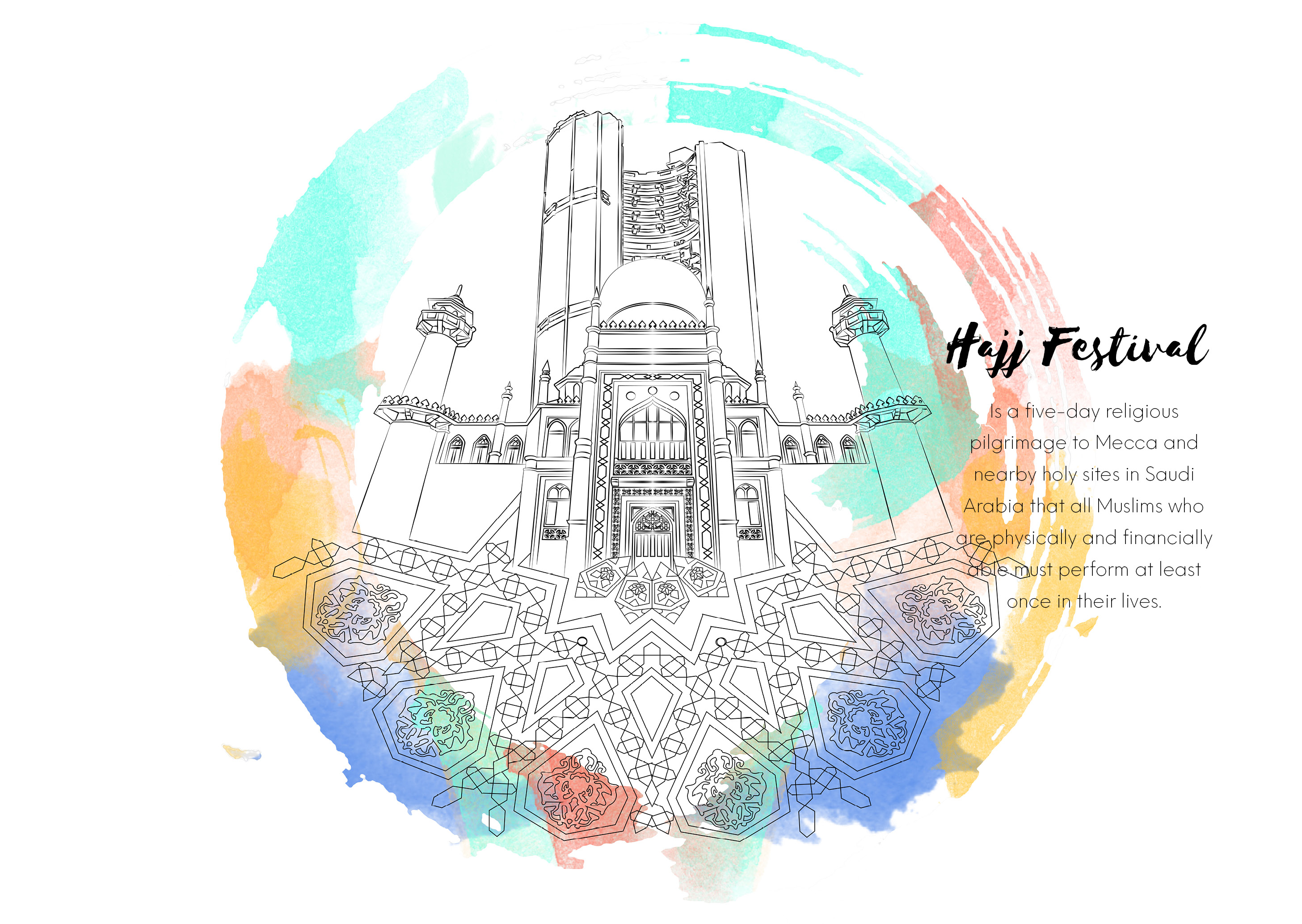
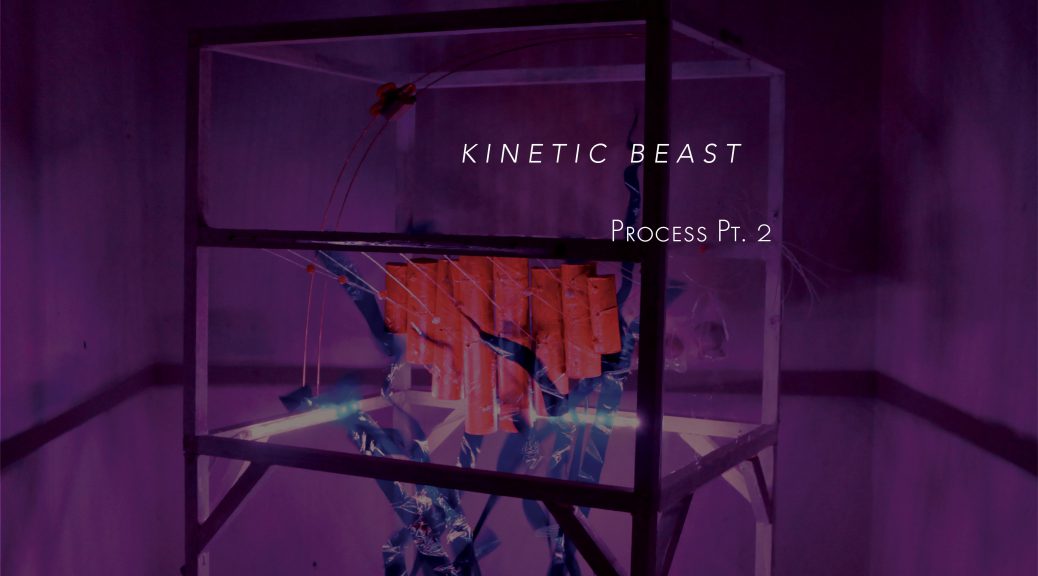
Alas! We’ve reached the final installation for our Kinetic Beast!

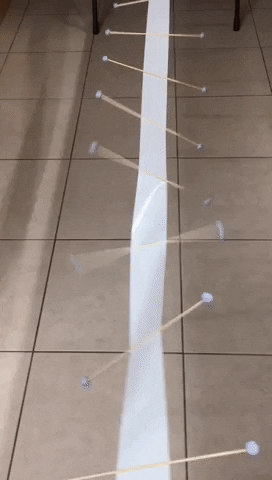
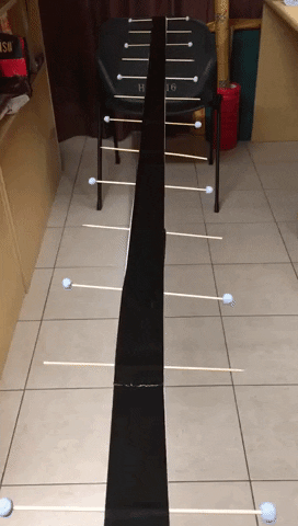
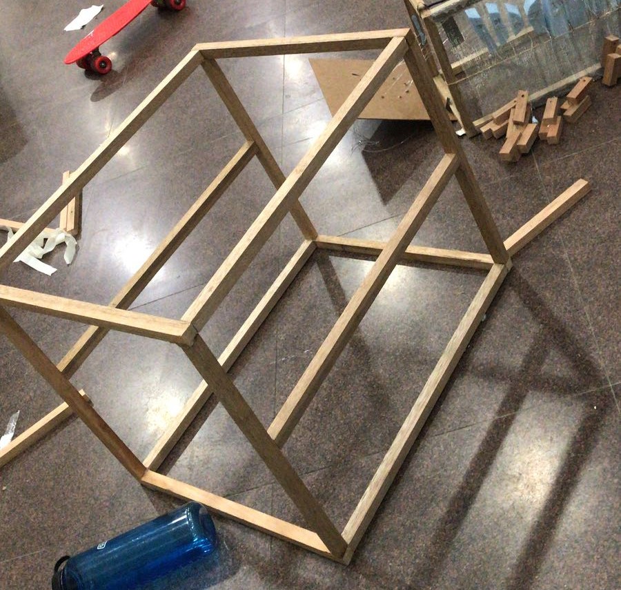
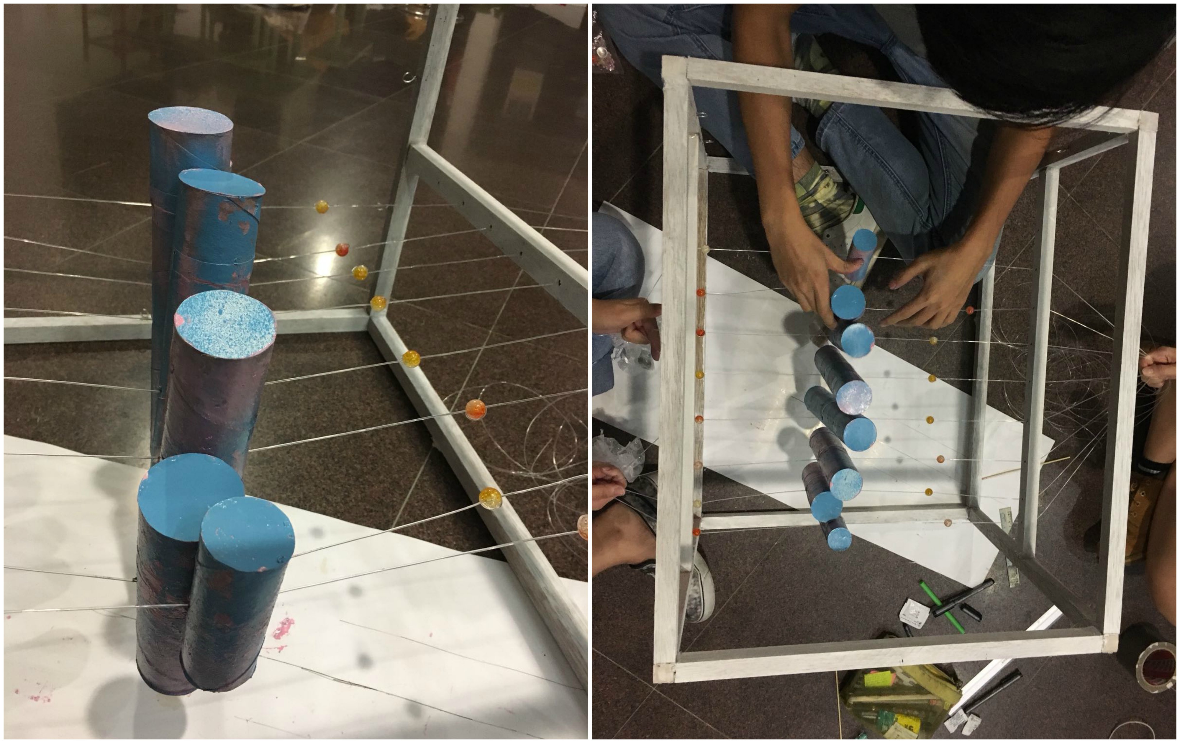
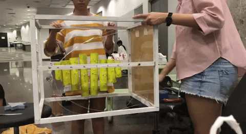
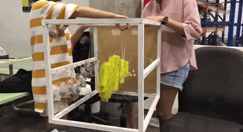
After the final consultation with Cheryl, we decided to scale up our installation to create more space in the enclosure to include the other elements into our composition.

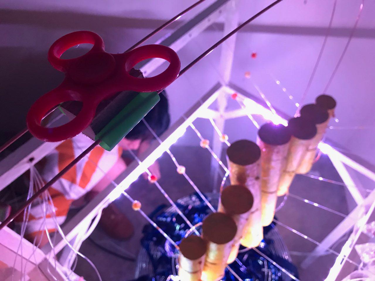
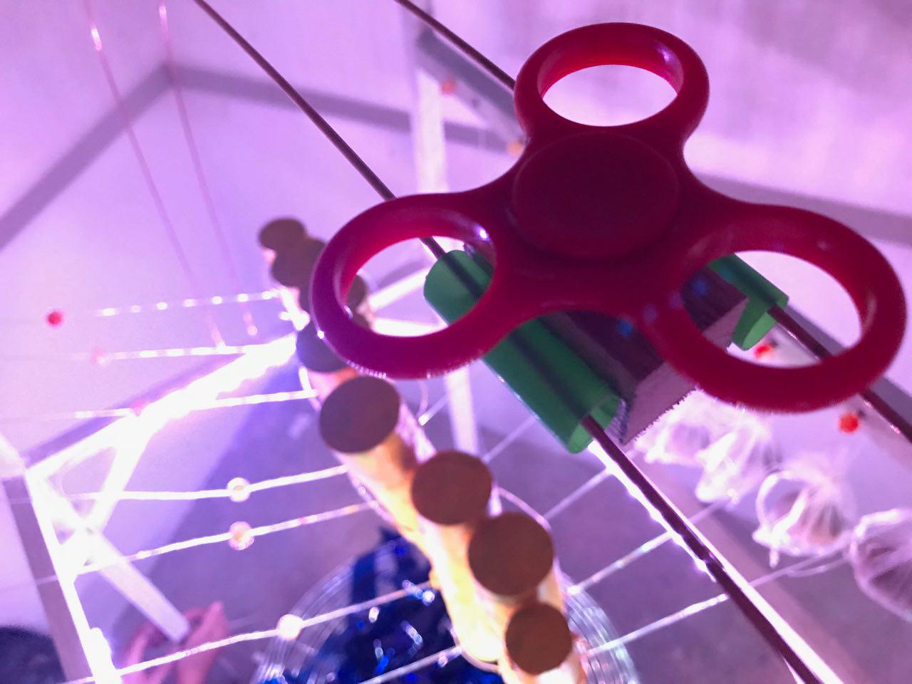
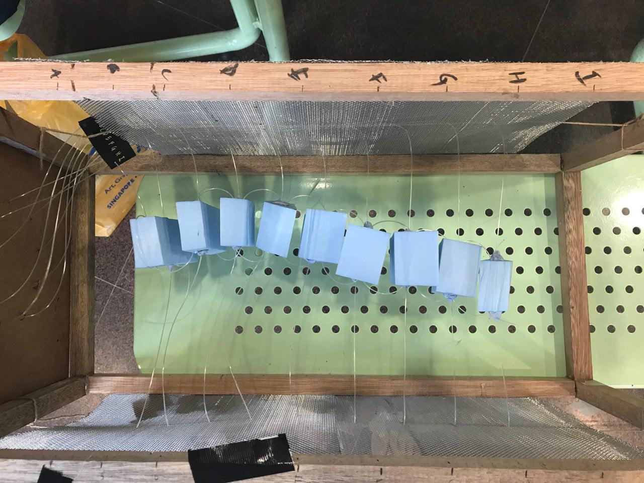
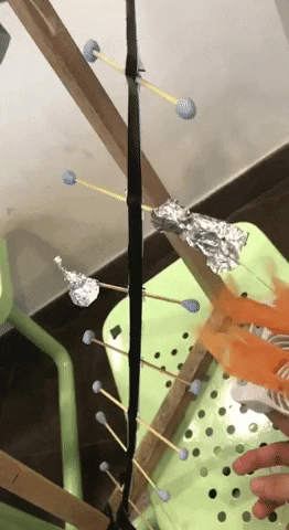
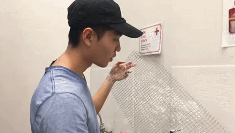
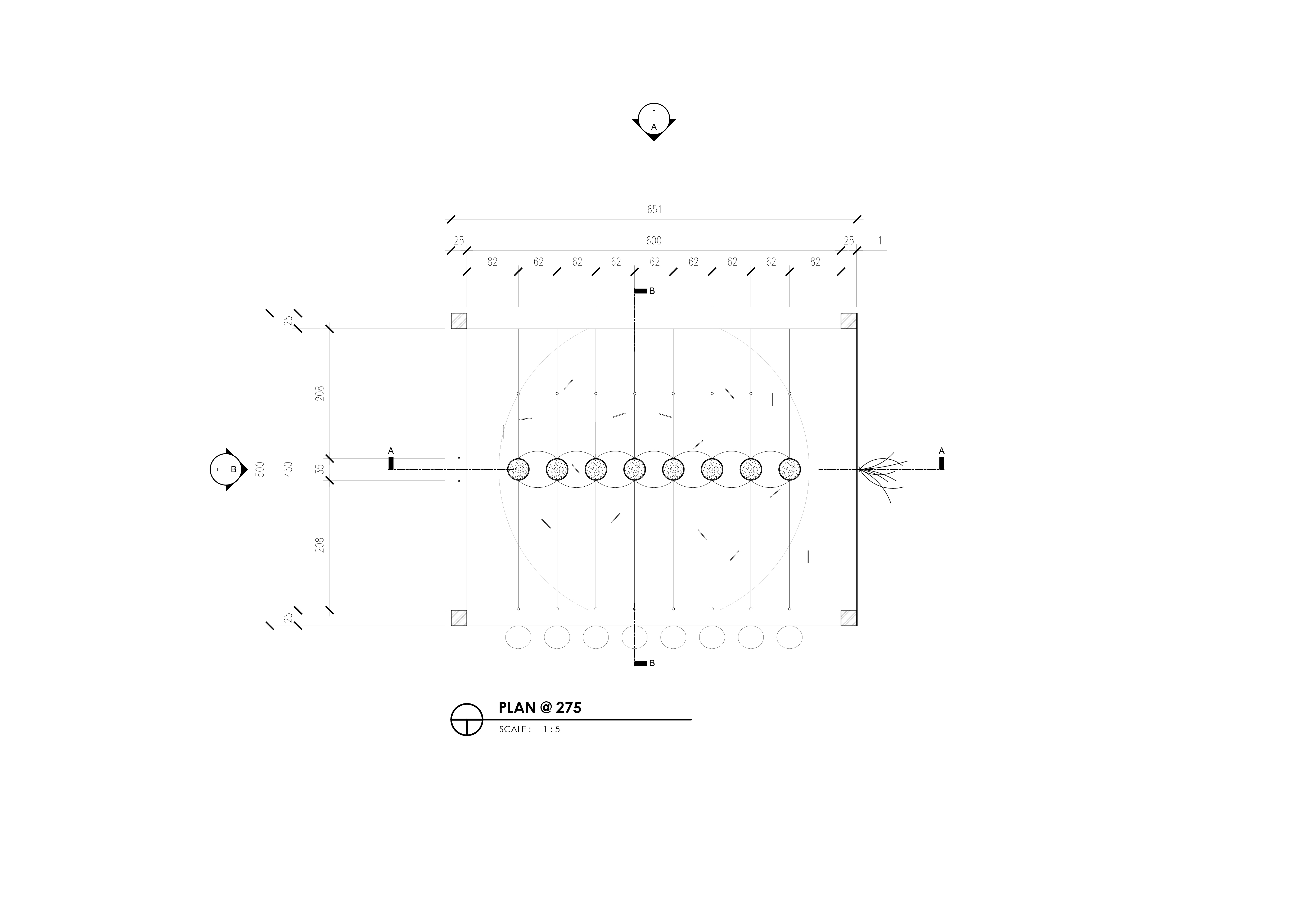
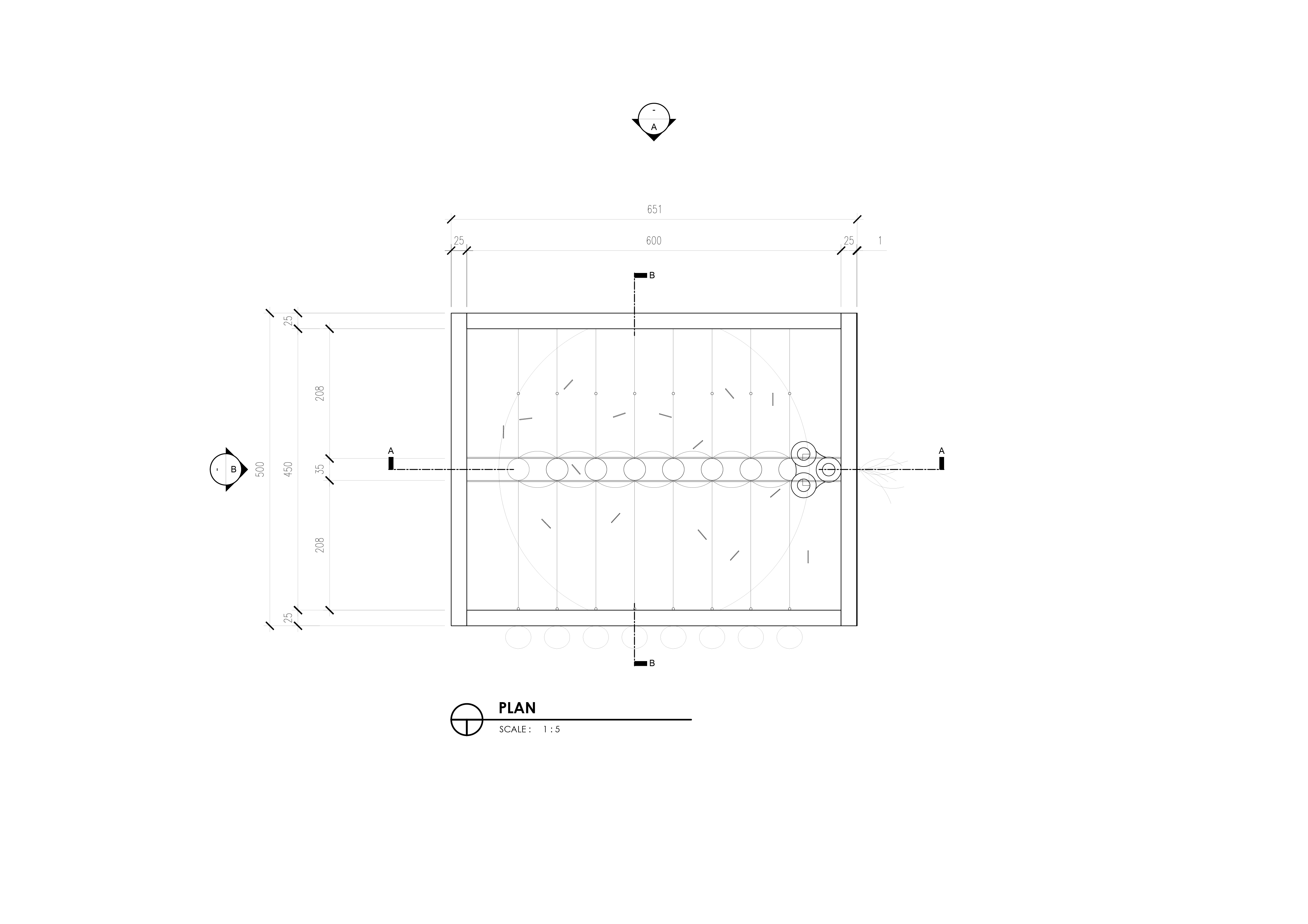
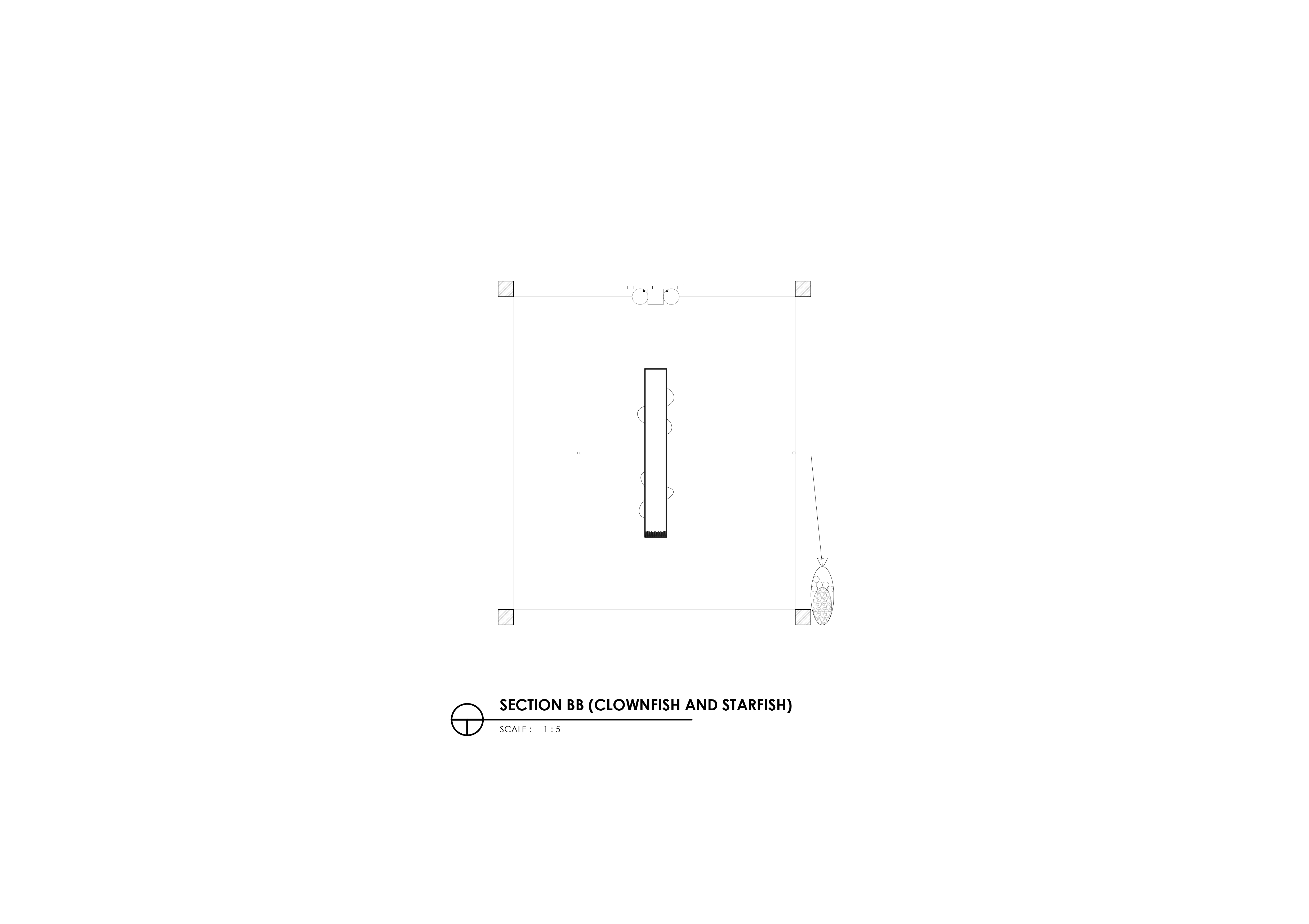
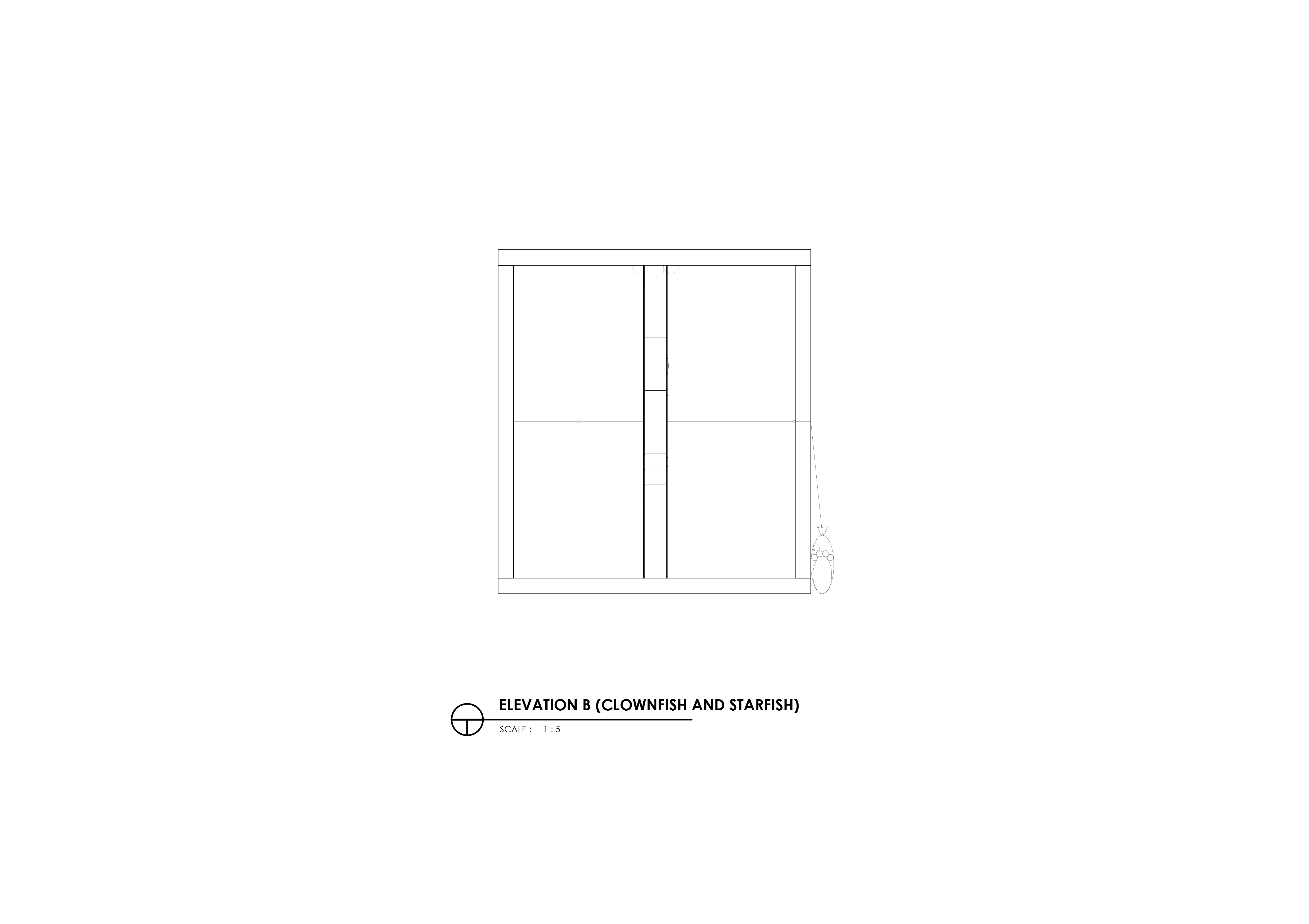
We also identified which were the unnecessary elements which we could shed in order to make the composition of the installation cleaner and more immersive. Instead of using wire mesh again, we opted for 2 wooden rods which would hold the fishing cords.

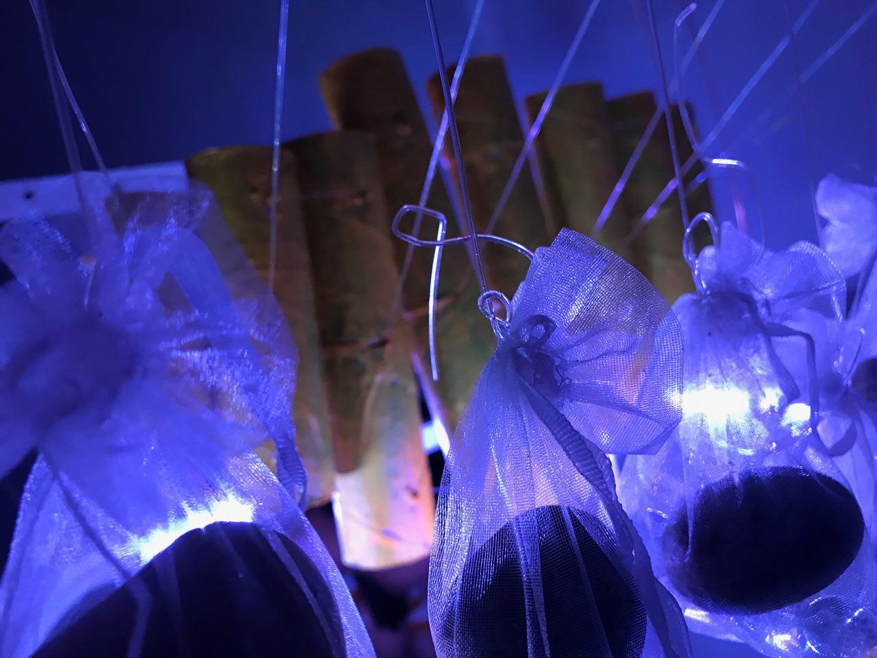
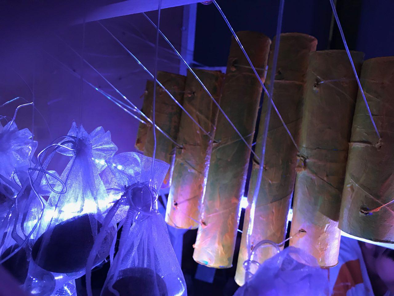
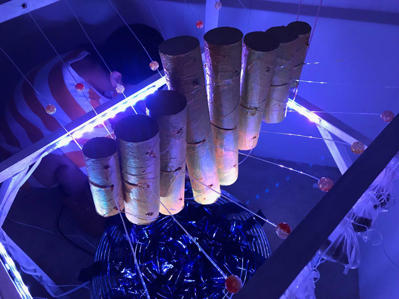
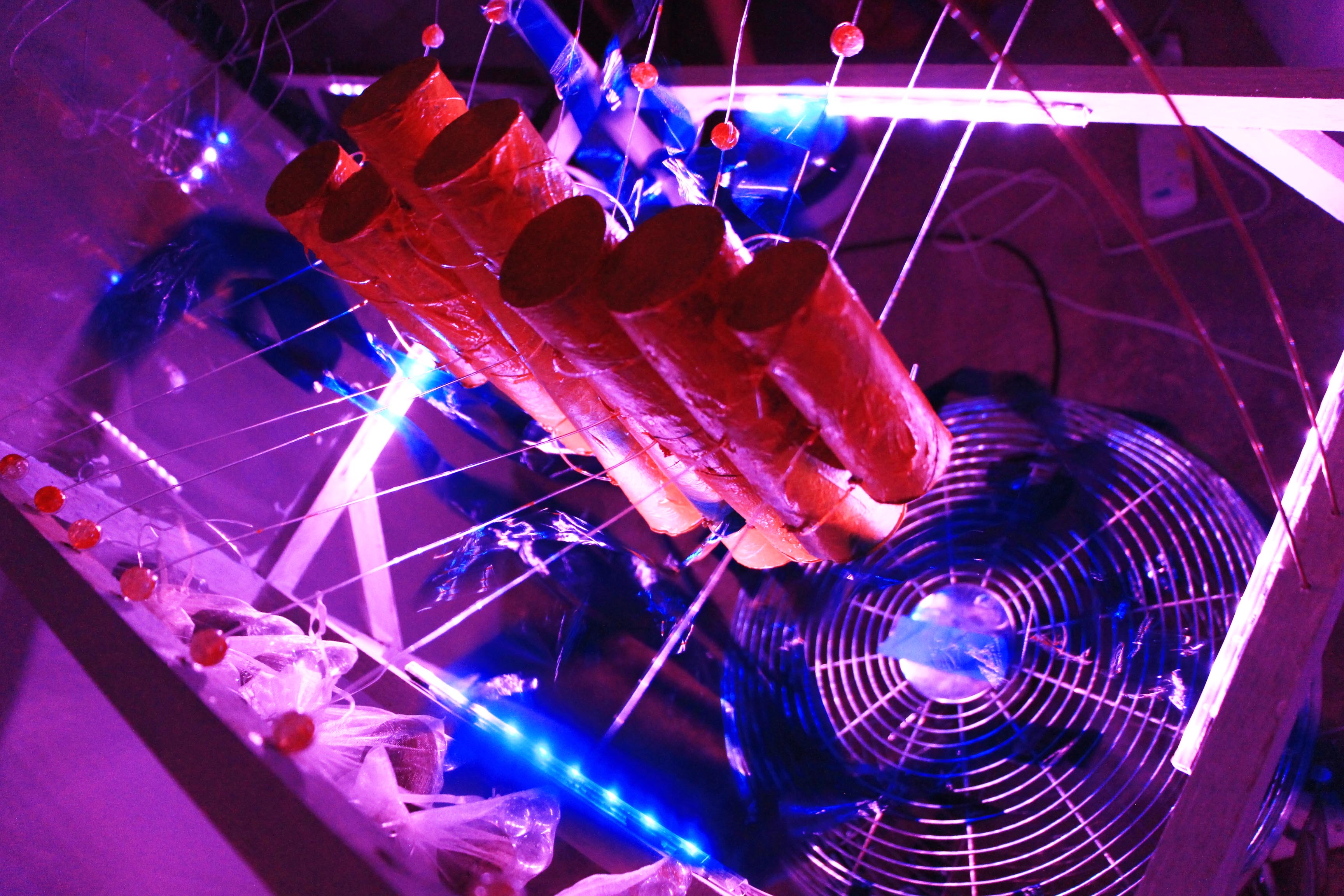
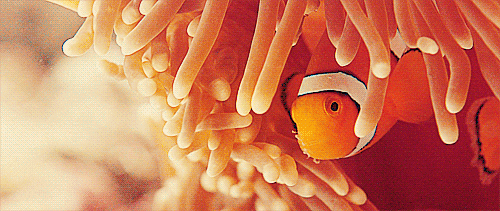
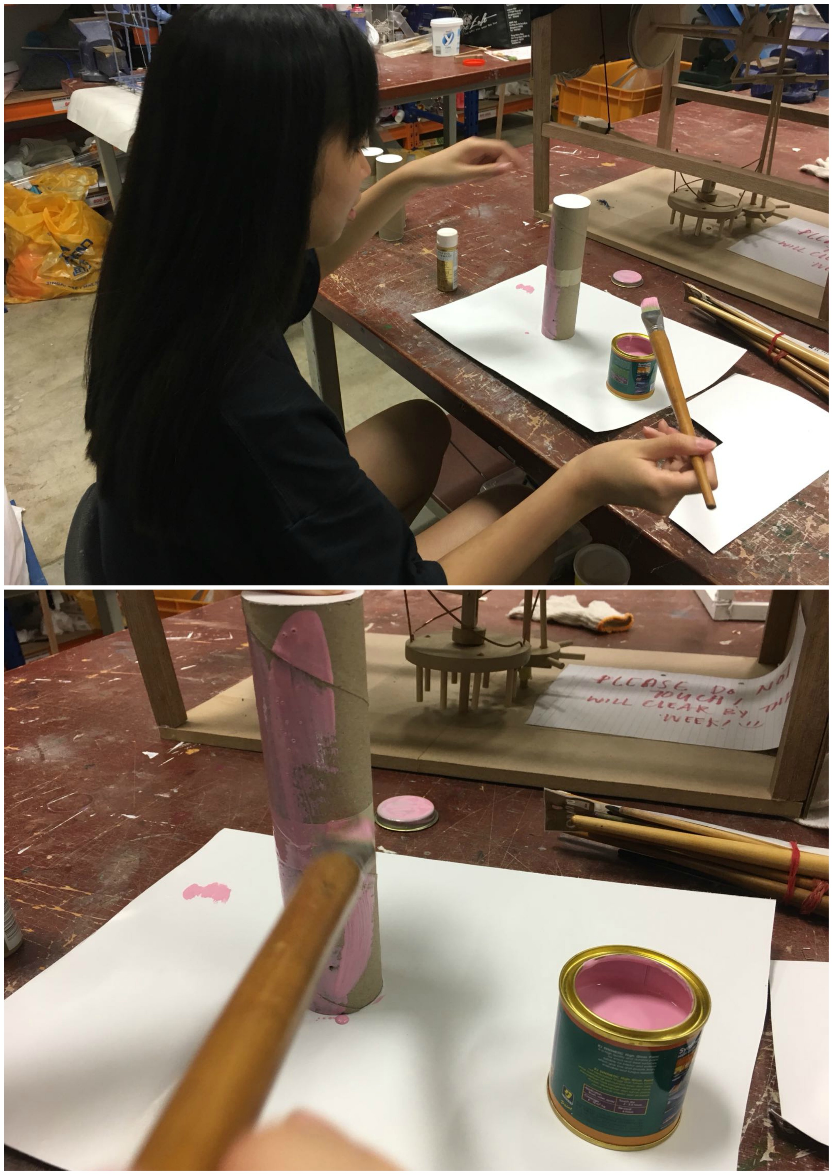
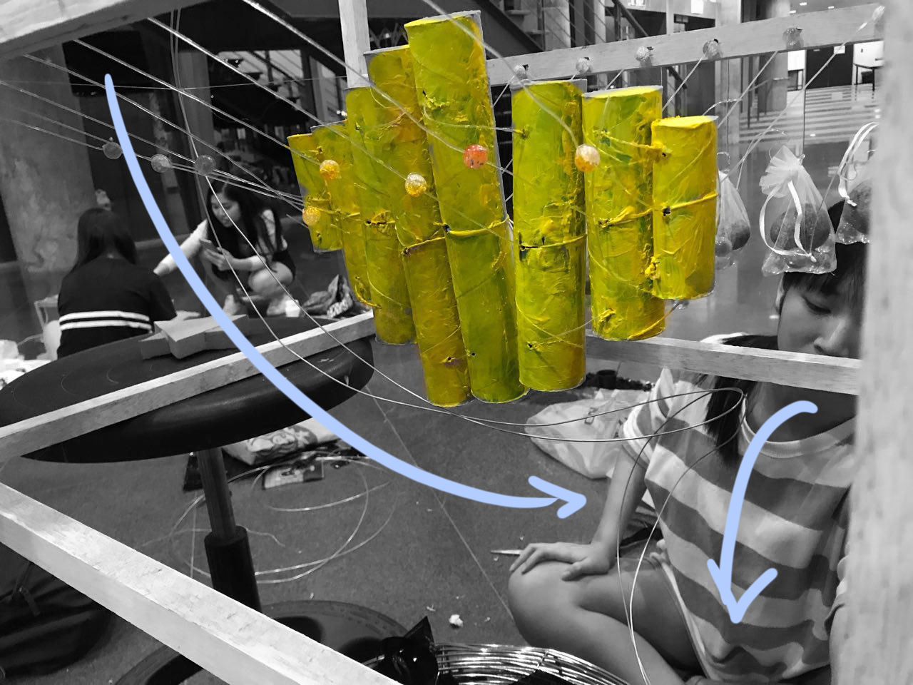
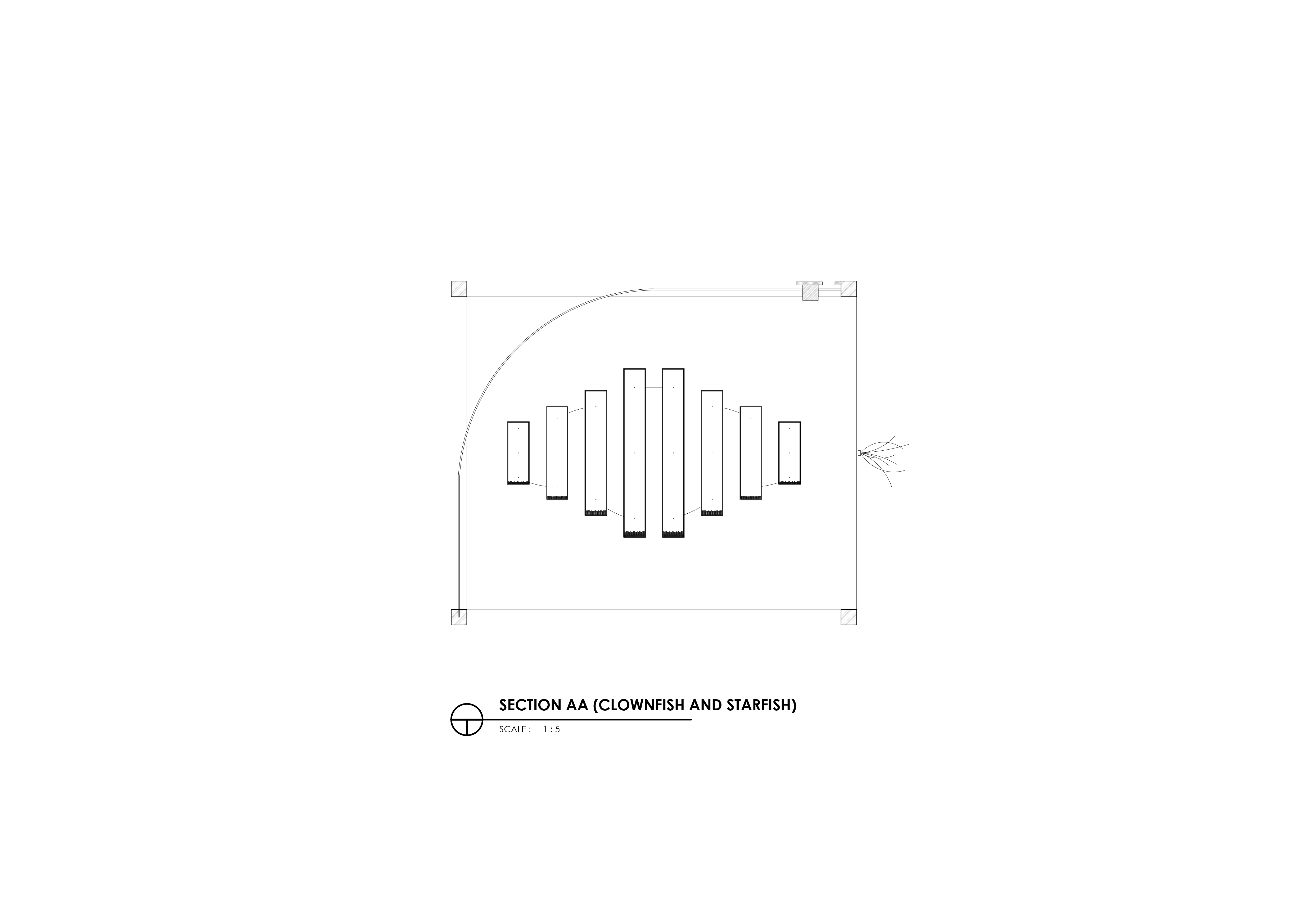
We also changed the materials used for the fish as we did not want it to be too literal, thus, we filled toilet rolls of varying length with sago seeds to include an element of sound into the movement when the strings were being tugged, similar to a musical instrument.

We decided to paint the tubes blue and pink (Pantone’s colour of the year in 2016) as we wanted it to resemble a children’s toy.

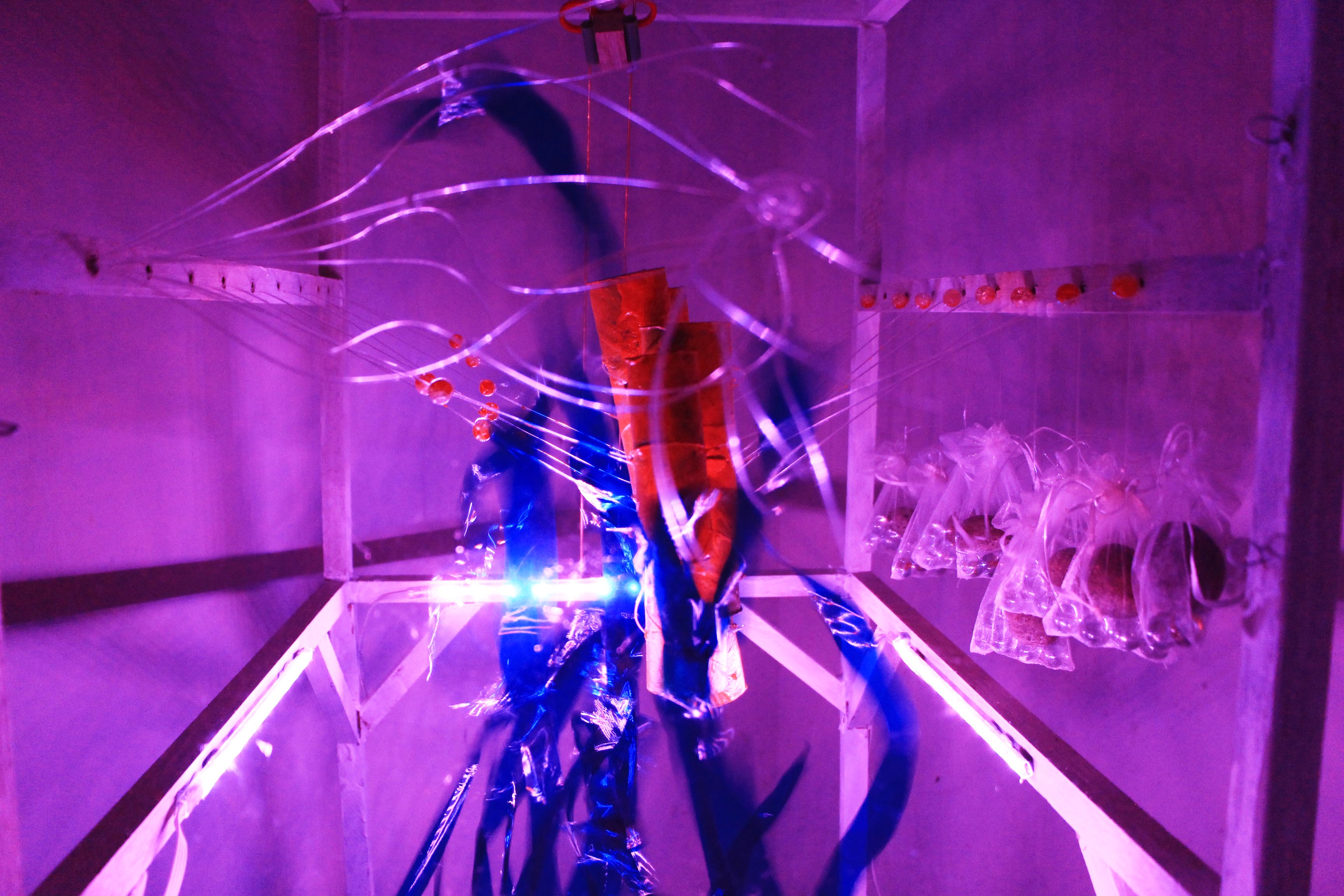
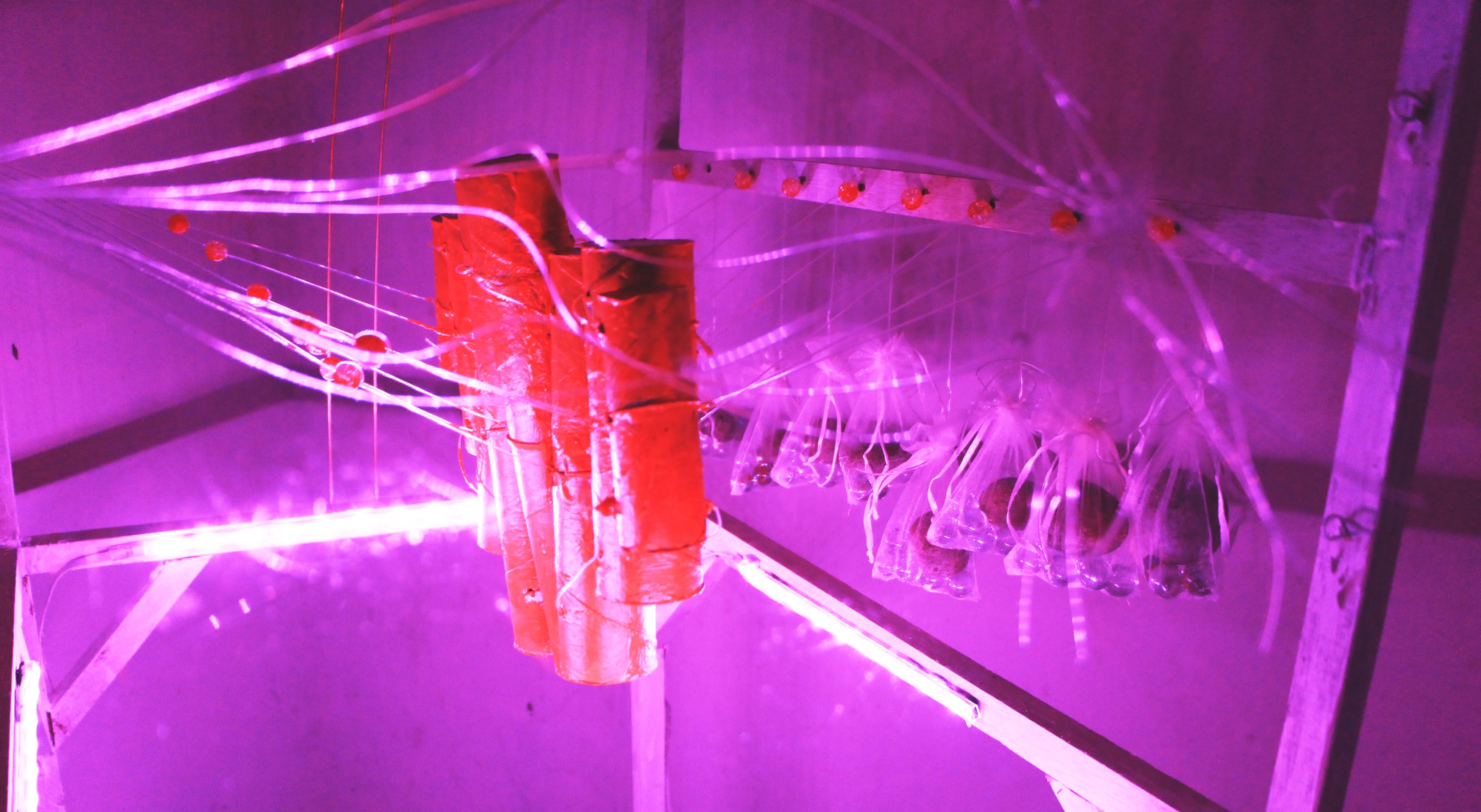
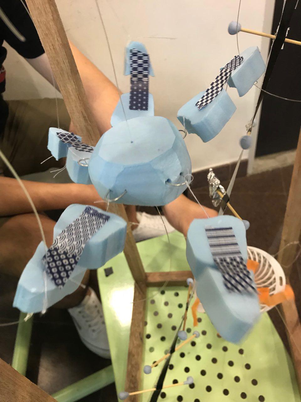
Learning from the previous prototypes, we were able to come up with measures to ensure that the strings have a limit to which they could be pulled! We attached beads to the strings to ensure that the ‘fish’ returns back to its original location after tension is released.

Our beads are yellow and orange because they represent Clown Fish Eggs.

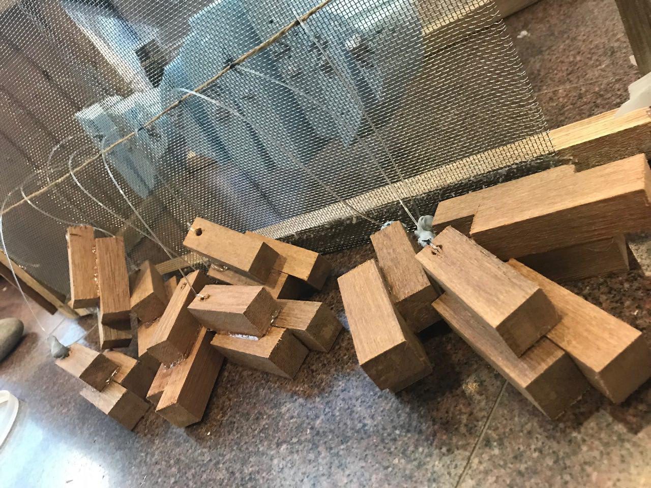
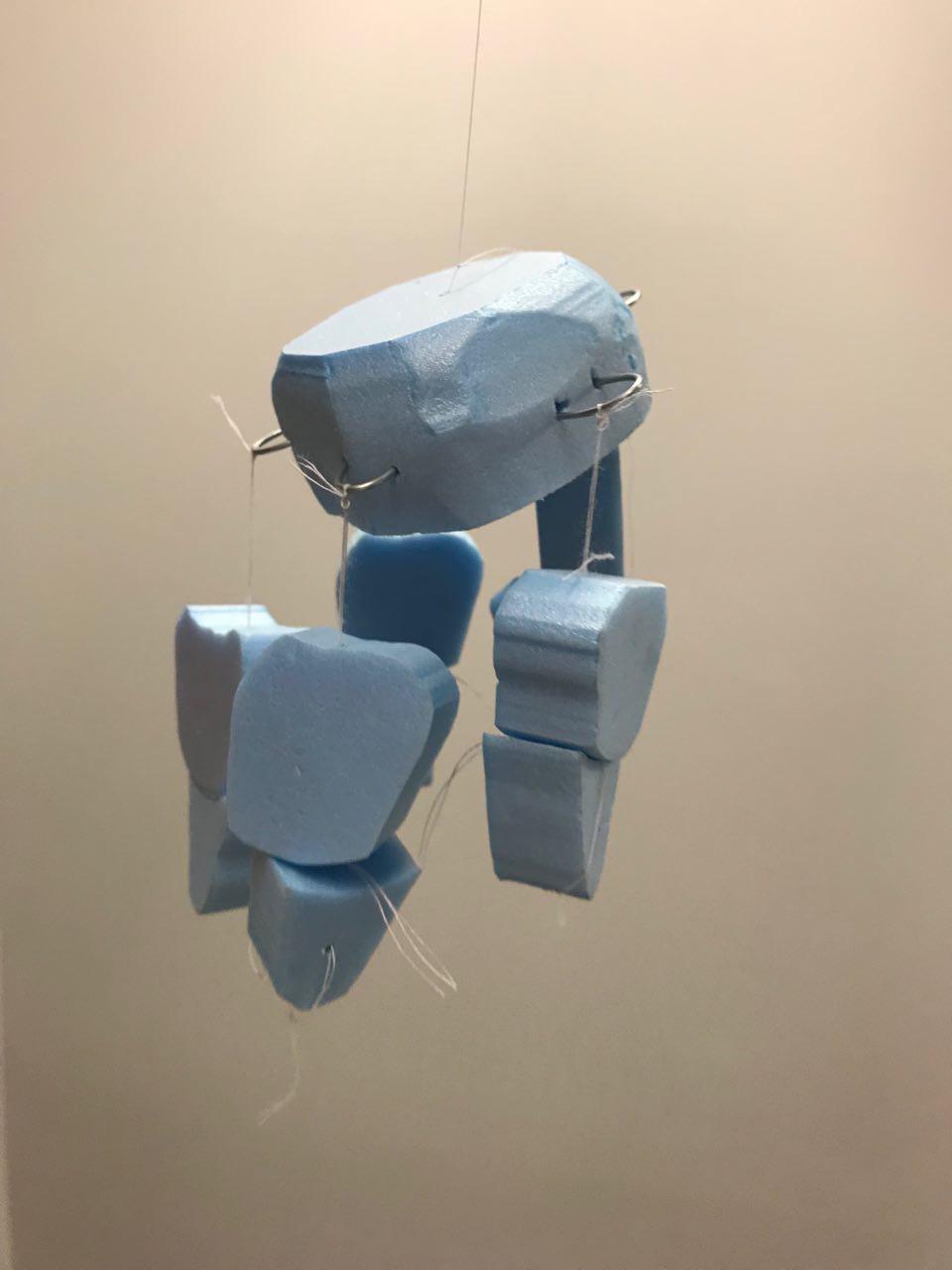
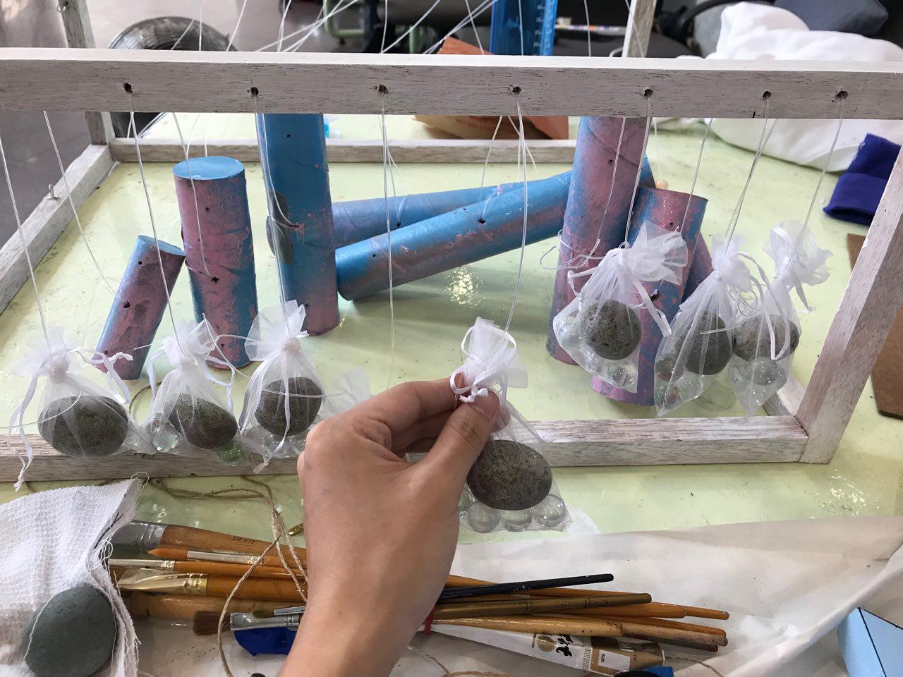
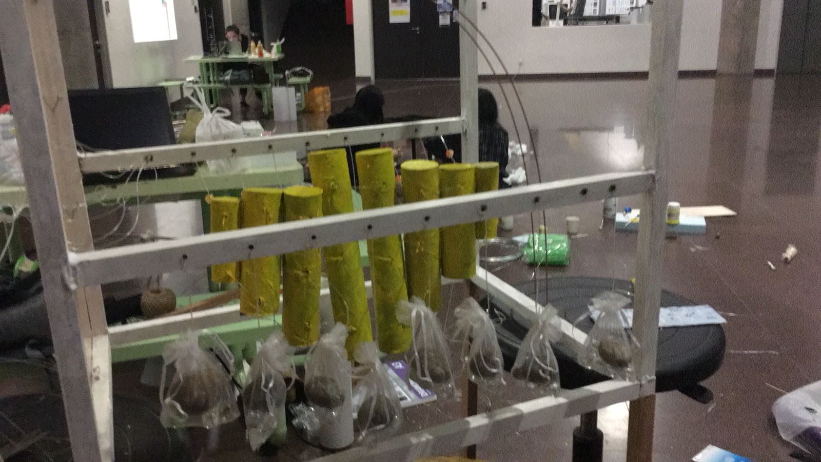
Instead of using wooden blocks as weights, we changed it for marbles and rocks to resemble bubbles underwater, similar to a fish tank. This ensures that the weights to not get caught up between one another, affecting the tension, and it also provides a cleaner composition.

We also eventually changed the colour of the tubes because we felt that having too many different colours would be very distracting. This luminescent yellow was chosen as it worked very well with the colour palette we used, which is primarily yellow and orange. When shone with lights, it has the ability to change shades! (This can be seen later on) We also added Vasaline to the strings to smoothen and increase the effectiveness of our model!

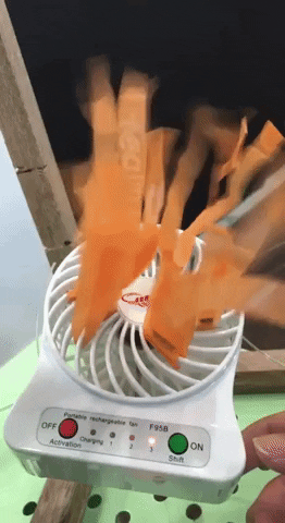
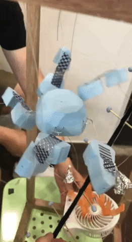
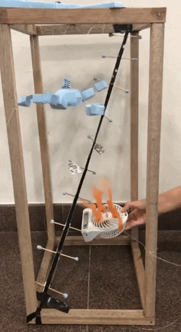
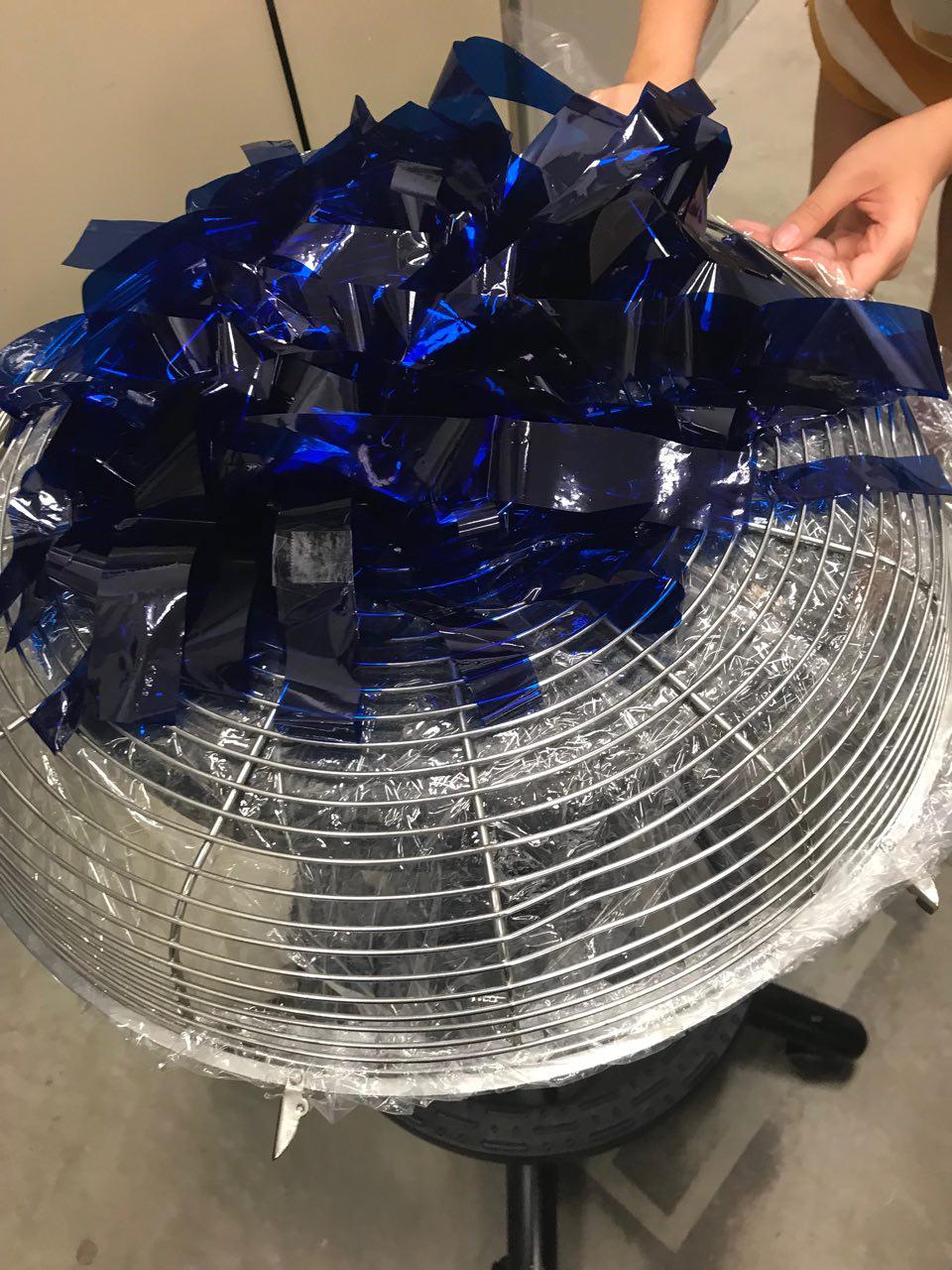
Next, we had to create the Sea Anemone. Due to some technical fault, the standing fan we borrowed only had a single speed, which proved to be too strong for our installation as the sound and power of the fan overshadowed the installation.

We placed cling wrap within the fan cage and poked holes to allow some air to escape, in hopes that it would be strong enough to lift the ‘tentacles’ of the sea anemone, while weak enough not to affect the ‘fish’.
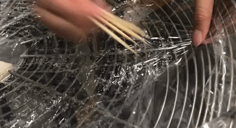
Testing the fan:

The effectiveness of the cling wrap was debatable as it became too weak, despite the holes. We went with another approach, which was to manually switch the fan on and off.

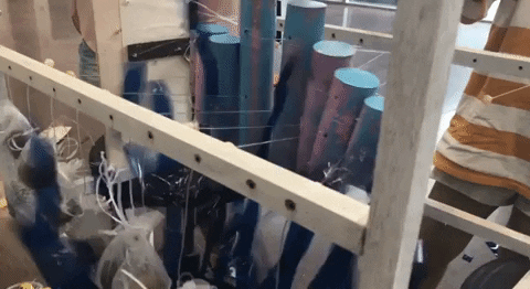
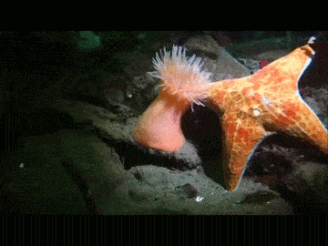
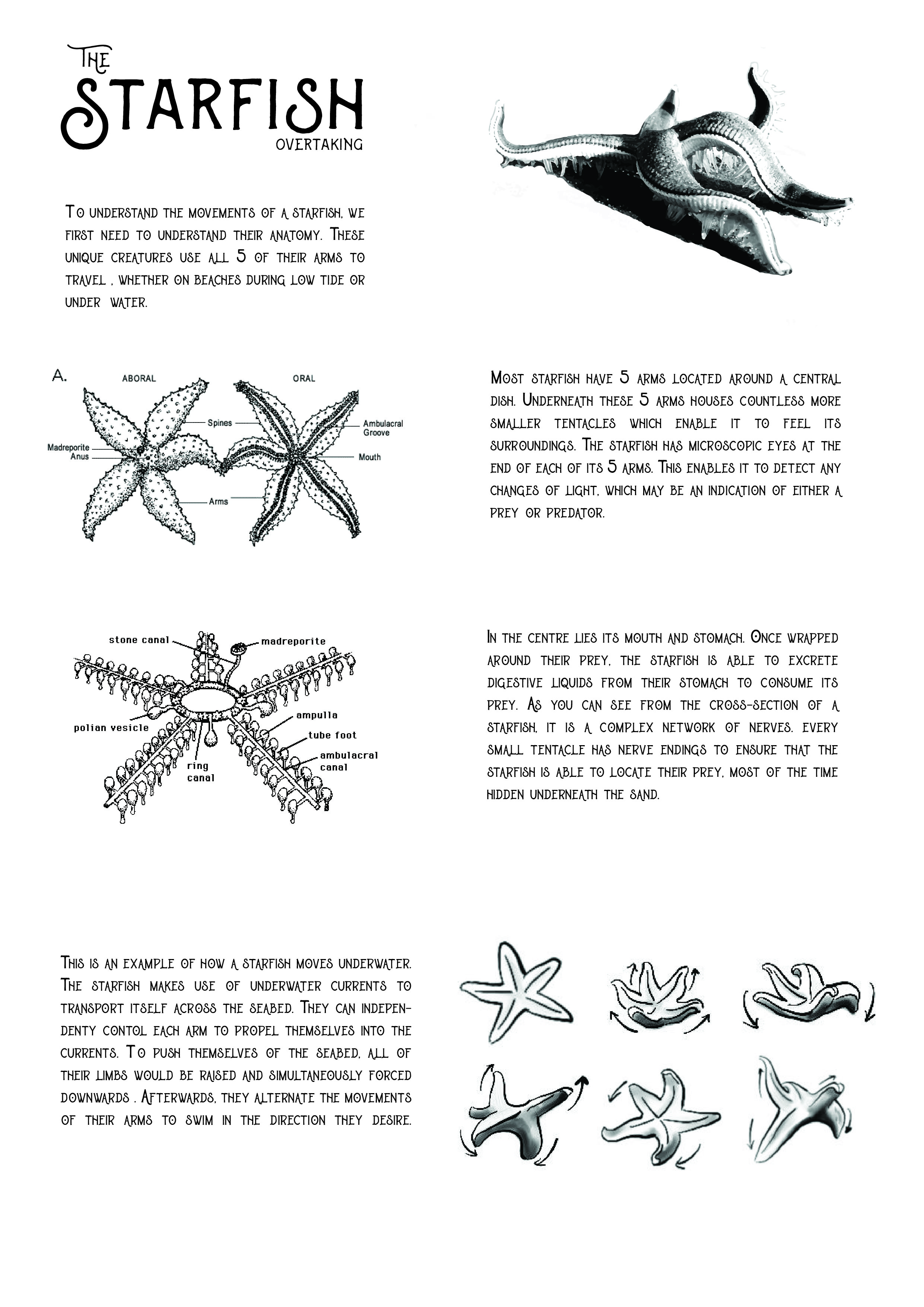
Working on the starfish proved to be the most challenging as we did not know where to place the animal, and how to make the starfish ‘glide’. One idea we explored was the use of tracks and a motor. Similar to a Tamiya car, the starfish would circle around the installation, like a predator hunting its prey.

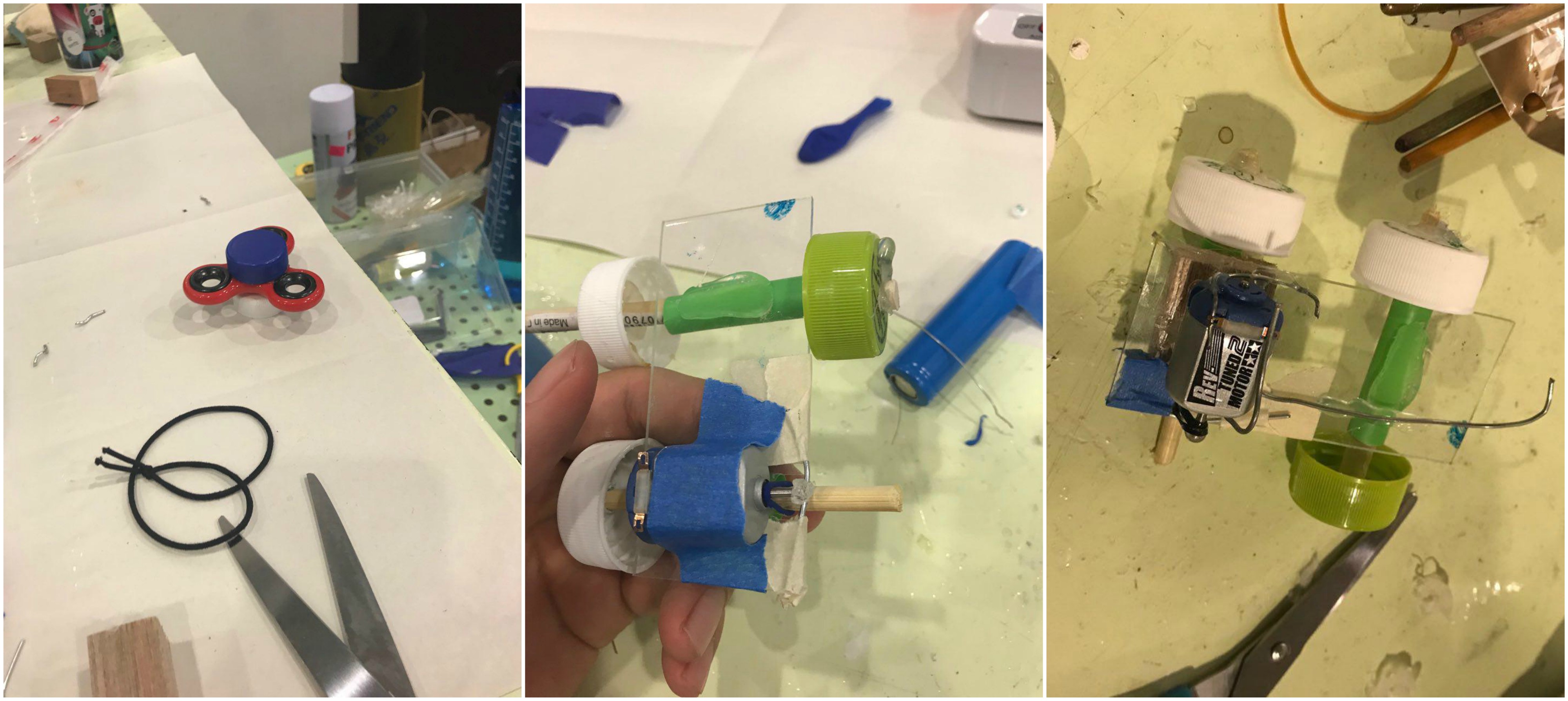
The car proved to be too much of a challenge to create because I did not have the required materials such as an elastic band small and strong enough to withstand the constant torque of the motor. The motor would also overheat after a certain amount of time, to which, the motor would stop running.

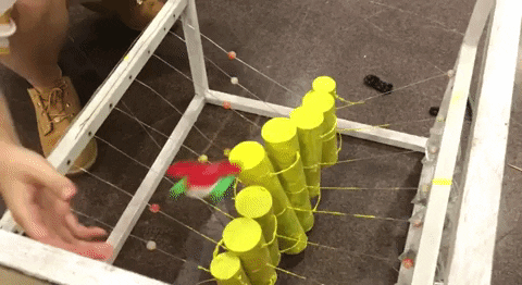
We then shifted our focus to creating something resembling a firefox for the starfish to glide across. This was an interesting direction as it would really begin to resemble a children’s toy or something which you would find at a playground!

We had several ideas for how we wanted our track to look like. A spiraling starfish around the ‘fish’ was something which we thought would look impressive.

You can vaguely see the spiral of the track which we tried so hard to make work. However, the wire was not strong enough to withstand the weight of the starfish as it was passing through, thus we did not have the path spiraling. The path was also unreliable as it did not always yield the results we were looking for.

We decided to go with something less complex, while retaining the aspect of being interactive. We used copper wires instead, which were a lot more rigid and it held its form much better. (This can be seen in the final product!)


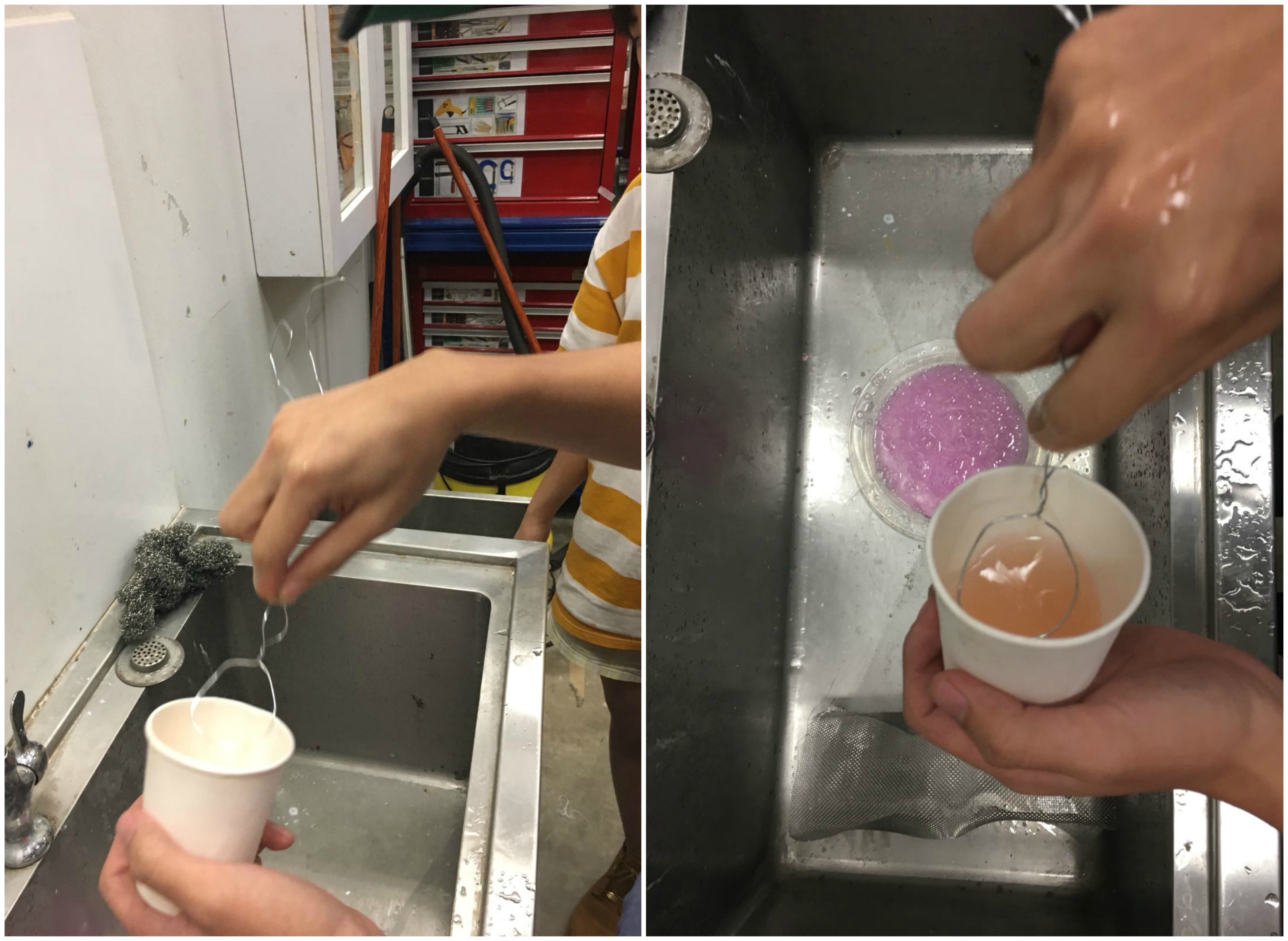
To enhance the immersiveness of the installation, we thought of using bubbles to create the illusion of being underwater. By harnessing the wind from the fan, we hoped that it would be strong enough to create bubbles when the bubble liquid is placed above.

We tried to make our own bubble liquid by mixing hand soap and detergent found in the 3D room! However, things were not in our favour as we did not have the correct fluids to make the perfect bubble water.


These are some of the preliminary shots taken after we set up the installation! We adjusted the lights to see which hue gave us the best results!


Eyes of the Kinetic Beast – Part 1

Welcome back! Herein begins the first part of our journey to the final product!

During our consultation with Cheryl, she pointed out that the hierarchy of our model was messy, thus distracting the viewers from the key elements of the piece.

She also noted that the movement of the fish skeleton did not reflect enough of the animal and also did not work well because of the scale.

So, it was back to the drawing board to come up with a new concept for our clownfish! We wanted it to be the dominant object in the installation because of its relation with the sea anemone and its movement could be further explored.

We started to research on ways which we could better recreate the movement of a fish.

( Start at 7 Minutes)

These were the kinetic sculptures which we were studying. These sculptures seem to easy to make initially, however, they did not represent the movement we wanted to capture as it only  moved vertically instead of horizontally (the movement of a fish).

As we better understood the mechanics, we were able to come up with a working prototype to have a horizontal movement.

This is a breakdown of how our mechanism works. Essentially, instead of the weights being the wooden/metal objects hanging (as seen from the video), the weights are now placed at the side, to provide tension for when the string is being pulled.

In the second image, as the strings are being pulled in a certain direction, some strings are being pulled more than the rest, thus, resulting in different displacements of the block as seen from image 3. This movement can be seen from image 4, when the block is being shifted.

Tension is always needed for the blocks to return back to its original position, so that the cycle can repeat itself again.

Thus, we begin the creation of our prototype!

First, we had to build a frame strong enough to contain the model as we would need heavy weights to act as a tension on the string.

We then attached wire mesh to the side of the frames so that we had something to thread the cords through, as well as suspending the fish structure in air.

As this is only a prototype, we used foam as a representation of the clown fish. We attached fishing line (how apt) to the foam and connected it with the frame.

If you look closely, you can see that the foam has 3 intersecting points where the fishing line has been threaded through. This is to ensure that the foam stays in place and does not flop.

It was also important to get the measurements correct as alignment is crucial in making the model smooth. This can be seen from all of the letters and markings on the wooden frame.

Next, we had to find weights capable of creating tension on the fishing line. We stuck pieces of wood together, incrementally adding blocks till the desired tension is reached.

When dealing with this many cords, it was easy for the cords to get mixed up, which would result in the wrong tension for different segments, or even the entire model not working. Thus, we practiced good cable management by threading the cords though a small segment of perforated board and we labeled each cord that passed. This ensures that when we are adjusting the tension for each of the segments, it would be a lot less hassle and guesswork.

Different materials were considered during the selection of the board to contain the string mechanism (the Brain, as I call it). We tried using thick art card, but the string kept cutting through the board, resulting in a lost of tension! Eventually we used a thick piece of corkboard to ensure that the string does not move about.

This is the result of all our careful planning!

However, the weights kept getting obstructed by the wooden frame, and after using the mechanism for awhile, the fish slowly started to lean towards the left side as there was no limit to how much string could be pulled.

Next, we embarked on the Starfish. This mechanism was a development of my initial idea, which was to have something similar to a puppet. We attached strings onto metal rings of different diameters and hung them above the fish.

This would emulate the ‘jellyfish’ movement, where by all of the limbs are moving and warping in sync.

We brought our new model to Cheryl to get more feedback on what were the things we could further improve. She liked the mechanism, however, she left that the representation was too literal.

The starfish was also a distraction for her as she felt that it could become an SO rather than an SD. She mentioned how the starfish could be gliding across the bottom or the top of the frame, which would make our model more interactive and immersive.

We will be building upon these comments in the next post!

Kinetic Beast Sketch Model OSS

Our animals are: Sea anemone, Starfish and the Clown fish.

To begin, we looked into the relationship between each of our animals to find a correlation between their existence.

The sea anemone shares a symbiotic relationship with the clown fish. The clown fish seeks protection within the sea anemone, while the clown fish protects the sea anemone from potential anemone-eating fishes, the clown fish also eats algae and cleans the sea anemone. The toxins within the tentacles of the sea anemone protects the clown fish from predators.

On the other hand, the Starfish has a  parasitic relationship with the sea anemone, as starfishes feed on sea anemones, among other shellfishes and creatures that live on the ocean floor.

Our initial exploration of our animals focused more on the minimal and incremental movements of the various animals.

From the start, we wanted to explore the ways in which our animals interacted with each other, finding key senses linking them to one another, even though the Starfish and clown fish does not share an immediate relationship.

The common senses each of our animals rely for survival is the sense of smell and touch. The Clown fish uses the sense of touch to develop an immunity towards the toxins produced by the tentacles of the sea anemone. Through our research we also found out that baby clown fishes relies on the sense of smell to find their way back to the sea anemone which they were born from!

Whereas the Starfish uses its sense of touch and smell to locate prey which may be hiding under the sand. We wanted to incorporate these two senses into our installation, which is why we built our sketch model together.

The first movement we explored was the clown fish. The movements of fishes are generally similar in a way which they are able to warp their body into waves, propelling them along with their fins.

We stripped this movement down to its bones (literally) and looked into the possible mechanics we could explore with this movement.

Jing Yi came up with this bone-like structure to represent the warping of the movement of the fish. For this sketch model, it requires an initial touch for the whole structure to come alive, moving like a swimming fish.

She explored different materials, weights as well as dimensions to see which would work best.

This initial prototype was too flimsy and the movement dissipated too quickly, unable to capture enough of an essence of a fish.

By alternating the weights and using a more rigid frame, the movement was sustained for awhile more, even cycling back down the spine. We decided to incorporate this version into our sketch model.

We started to brainstorm on the possible movements we could use to represent a sea anemone. Capturing the essence of the tentacles was the most important feature of the sea anemone.

We had to create something which had movement, and one which ties in with the entire installation.

Because the sea anemone is the common denomination among our animals, we wanted to make it the dominant element in the model, making it the origin of all of our movements.

Immediately, this was the direction we wanted to take when creating the sea anemone.

The eccentric and random movements of these tubes would be able to accurately encapsulate the movements of the tentacles underwater.

To build this, we needed a fan strong enough to push these tubes off whilst having them stay in the air. We also had to vary the length of the plastic strips to ensure that they were not too heavy.

The starfish was a tricky animal to represent due to the complexity of its limbs, telling of the extensive movements it is capable of!

As I wanted to allow each individual limb to move, I cut a piece of foam into many segments and tied them altogether to make them mobile. 

(This is a rather sad looking starfish)

I wanted to fashion something similar to a puppet, whereby each individual limb could be controlled. However, the strings kept getting tangled up among each other, so I discarded that idea.

To make the limbs more rigid and life-like, I attached strings on each end, also placing tape on each of the segments.

Because the sense of smell and touch is prevalent in our model, we wanted our animals to work in harmony, by using these senses to initiate the kinetic movement in our installation.

To achieve this, we suspended the sea anemone at the bottom of the model, as the fan would be able to propel the other elements in the installation. By touching the fan, it directs wind to different parts of the fish skeleton, triggering a movement.

As the wind blows against the starfish, its individual limbs would also be in motion, thus, making the sea anemone the focal element of this sketch model.

Split Chef Final Post

Finally! We begin the actual run of Split Chef!

We managed to highlight and tackle key issues which led to disruption of the flow in the trial run, by setting more concrete rules and choosing a better location. (All these have been covered in the previous post)

For the actual run, I was alongside Dion in ADM taking videos of the various reactions of the Artist, while she was the moderator, briefing the artist on the instructions.

During the days which led up to the actual show, Bryan created a series of banners for us to place on our instagram stories as a form of publicity, informing our followers of the game show which we would be hosting.

First Round!

We begin with the Noobs! Where the skill level of both the Artist and the Chef is low. We wanted to see what were the limits we could push the effects of glitch to.

When the stream started at around 4pm, we had a steady number of audiences, hovering around 10-14 viewers. As these people were engaged from the start, they had a better grasp of what our game show was about.

They were able to participate more actively, potentially influencing the decisions made by the Chef when choosing the ingredients, which is argueably the most critical segment of the game as it determines the eventual outcome and aesthetics of the dish. Audience participation was crucial in keeping our game show interesting as they are able to interact with each other as well as play along, bouncing opinions off each other, creating a third space environment similar to shopping with your friends!

During the selection phase, it was difficult for Dion and I, along with the artist to keep our opinions to ourselves. We would groan or express confusion when the chef picked out a different ingredient which we had in mind. This may have changed the outcome of the dish, but in hindsight, I do not really think I made a difference.

These are some of the main ingredients needed to make our dish – 

What the Chef bought (In order of images):

Mixed Nuts, cucumber, a carton of eggs

What was in the recipe: 

Chicken Breast/filet, Tortilla wrap, Butter

Audience who entered the stream mid way were often lost, resulting in them leaving as they did not know how to participate or what were the rules of the game, making them feel left out. We could have the rules of the game displayed at the side of the screen to facilitate new audiences.

Connection was difficult to maintain within the supermart as the deeper you went in, the less reception there was for the stream, resulting in very choppy video quality.

Because of how differently Tiffany interpreted the ingredients, we decided to give her a chance to see which ingredients she would like the Artist to draw again, in hopes that she could at least get some of the main ingredients correct. To our dismay, she did not want to change anything. (Jacob, the Artist, was profusely apologizing and trying to convince the chef to let him re-draw some of the ingredients because he felt terrible)

Another unforeseen circumstance was the fact that we were not allowed to film within the supermart. Due to the constant reminders by the staff, it added another element of urgency and stress for the Chef as they had to pick out ingredients under pressure!

The numbers started to dwindle as we entered the cooking phase whereby the time given to draw the steps became extended from 7 seconds to 40 seconds. Due to the wait, the audience did not feel as engaged in the game as before. Another glitch faced by the audience and the Chef was the difference in ingredients bought – thus, the envisioned outcome of both parties would be different, which may have resulted in the audience not wanting to participate anymore as the dish would not be of their expectation.

Initially, Dion and I were contemplating changing the recipe to fit the ingredients the Chef bought, however we felt that the full effect of the glitch would be disrupted if we just changed the variables as and when we like. During this phase, our expressions towards Tiffany’s cooking became more exasperated as we only realised how different the outcome was going to be, as Tiffany did not get a single one of the main ingredients correct, coupled with her lack of cooking intuition, it was a concoction of disaster.

I title this art piece :when you mess up but too prideful to admit you’re wrong (Joel, 2018)

It was difficult for me to keep my opinions to myself as it was my frying pan on the line! The sight of my charred pan made me cringe and I begged Bryan to add some oil into the pan, in hopes that it was still salvageable. (All while Dion and Jacob were laughing their heads off)

After the dish was prepared, we went over to the pantry to give the food a taste test. The only ingredient I dared to eat was the hotdog, because it is already pre-cooked.

These are the ingredients which Tiffany bought

Reflection for the first round:

I can safely say that none of us expected the outcome to stray so far way from the original recipe. I would say that the glitch effect compounded itself, accompanied by the lack of cooking experience, it created a dish that ultimately has no resemblance to the initial product.


Second round!

Initially, we wanted to keep the variables almost the same, just tweaking the aspect of familiarity. Instead of comparing between Non-Friends and Friends, we decided to compare between Skilled and Non Skilled.

In the next round, we have Alena as the Skilled Artist, and  Hannah as the Skilled Chef.

The next round was much smoother, albeit the lack of audience which made things a little mundane. My stream lost its appeal as people already knew what to expect from the game. Because of how apt Alena’s drawings were, Hannah was able to identify the ingredients needed really quickly and she was able to form connections to what other ingredients she would have needed.

This was similar to my case when I was shopping for my ingredients during the trial run as I began to decipher what this dish could have been. Naturally, certain ingredients would go together, such as onions, mushroom and tomato.

Hannah initially chose oyster sauce, however, her based on prior ingredients, she realised that it was indeed a western cuisine and getting oyster sauce was out of line, thus switching to barbecue sauce. This was an interesting glitch which we did not foresee as it was very subtle, and it would have been difficult to suppress this insight. The chef was also able to recognize that she needed to find tortilla wraps based on that simple drawing from deduction of the past ingredients she got.

As expected, the Chef managed to execute the cooking steps well, often asking for the steps ahead of time as she could piece together the required steps. At this point, because the process was so smooth, it became less engaging for both the moderators and the audience, which resulted in less than 5 people staying in the stream. Those of us in ADM did not see the need to coach the Chef as she was quite independent in the cooking process, thus we started to chat while the chef was doing her own thing.

The outcome far exceeded our expectations, in comparison to the first round and we were more than pleased to eat the final product.

Reflections

My group was pleased with the outcome as we felt that we were able to engage all of the components of DIWO and glitch, using these two elements to create an interactive installation or game which can accurately depict how these elements are crucial in forming the eventual outcome of our ‘Art’.

Some things which could have been improved would be the audience engagement as we felt that they lost interest too quickly. This could be a simultaneous challenge whereby, if we had 2 teams competing against each other, maybe on different instagram streams, it could be more engaging.

Point that Desmond made was that this could be a standalone game, without the need for moderators. Meaning that it could easily become an installation in the future whereby strangers could participate in this game! We could create a booth open to the public, and they could be the artist as it is less time consuming.

Overall, I really enjoyed this project! From the different ideas to the refining of our product! I felt that I went very smoothly despite the small blunders! (My pan is fine as well!)

Zine Final


Mock Ups


Reflections

Overall, I was pleased with the outcome of my zine! It was definitely a great learning experience seeing how paper can really affect the mood of the entire zine. Having only 8 pages to work with, which is essentially 3 spreads, I had to make every element of my design work.

Of course, there is still a lot I can work on, mainly the exploration of my idea and concepts as I felt I did not step out of my design comfort zone during this assignment.

Looking back, I could have pushed the concept of using buildings as a representation of worship or prayer for a religion, similar to how I used the pearl bank apartments as joss sticks.

The aesthetics of my zine could be more cohesive as my last spread could have included an illustration, similar to the rest of the spreads. The choice of font could be more neutral as my classmates commented that the typeface used is representative for chinese calligraphy, creating confusion for the spreads on Hindu and muslim culture.

Thank you Mimi once again for your patience and guidance through my foundation year! I will definitely apply these skills and knowledge learnt to improve my future projects.

Zine Process

Hello! Now begins the most exciting part of my zine, the creation!

I first began looking into the different religions I wanted to break down. As mentioned in my research, I looked at the different elements which made their art unique. Be it the use of lines, colours or shapes.

I started to sketch out these elements and I looked at the images I took to see what I could use.

I settled for these 4 images to be used.

I began with Hindu art first, after being inspired by our Art History Tutorials and lectures, I wanted to make use of the Hindu Gods in my illustrations to give a glimpse into their religion. During my site visit, I noticed the common use of human figures, animals and various gods in their composition.

This was my initial composition – in the background, you can see the goddess Durga with her many arms and weapons. She fends off evil spirits and Gods with her destructive capabilities and strength.

I wanted to use elephants in my composition as India celebrates Holi, the Festival of Colours. In this festival, the streets of India would be packed with people throwing coloured powder on each other, and elephants would be parading down the streets in their festive costumes during this vibrant festival.

However, I felt that the composition would be spread too far out and  it would be difficult to identify the main focus of the spread. Thus, I decided to choose a different image.

After I showed Mimi this composition, she commented that it was too messy due to all of the colours and the cars in the background. She told me to render down the buildings to their basic elements such as the line strokes.

Thus began the process of vectorizing the image!

Mimi commented that my initial strokes were too thin and it looked too architectural, lacking the artistic aspect. I went to manipulate certain stroke widths to ensure variation, similar to how a watercolour illustration sketch would be.

 This created a more interesting and natural composition, which I was pleased with.

I illustrated several elephants to be used in the composition.

Other than elephants, a distinctive graphic element of Hindu art is the mandala, which is why I wanted to illustrate them as well. I experimented with various line widths to be used in the composition.

Piecing everything together,


Next was Buddhist Art. These are a few graphic elements I picked up during my visits to the various temples along the way.

Key motifs such as the lotus, joss sticks and various lanterns all symbolise worship for Buddhists. I illustrated Guan Gong, the God that chases away evil spirits, in hopes that I would be able to incorporate him into my zine!

I experimented with juxtaposing architecture with buddhism as a religion, looking at ways which I can convey the idea of worship.

I envisioned the Pearl Bank Appartments to resemble Joss Sticks. I felt like it would have created an interesting and controversial visual for the audience. It achieves a surrealism visual, however I felt that it resembled too much like 9/11 and it was also challenging to explore similar visuals for the rest of the religions.

This is a second sketch I made to try and incoporate surrealism into architecture. I made sure to use the graphic style similar to Buddhist art when composing the frame. This would include the clouds, fire and the sun. This is a timelapse of my illustration.

However, I felt that it was not an engaging composition as it did not evoke much sense of surrealism.

This is my third idea – instead of using religions representations, I also thought of using cultural ones such as traditional practices. Thus, I wanted to make it seem as though the lion dancer was jumping across platforms. Similar to my second idea, I made use of the same elements found in buddhist art.

I played around with the composition of the buildings as I did not want a simple flat design, thus I overlapped the buildings to give the composition more depth. I also changed the framing of the composition as it was initially meant to be half a spread. However, I felt that the composition was suffocating, thus I made it a whole spread.

I brought this composition to Mimi, and she told me that there could be further improvements to be made, such as a brief description of what the significance of this spread was, rather than full graphics. The chinese characters means ‘Lion Dance’.


I faced the most challenge when thinking of a composition for Muslim art due to the lack of illustrative visuals, unlike the other religions. I consulted Mimi on the issue, initially wanting to use the Quran Scriptures and text to create graphics, however, she recommended me against it because it may be offensive to manipulate these holy scriptures.

Mosques have distinctive architectural features such as the Moon and the star, minahrets as well as the use of geometric patterns for grand entrances.

I started studying these geometric patterns to try and incorporate it into my design. I started to vectorise these geometric shapes to put them together, segment by segment as they were mostly symmetrical.

Stitching these pieces together:

I had trouble placing the geometric patterns as I wanted it to be of equal focus in the composition. This was the initial design, however i felt that it was really messy.

I decided to have it at the bottom of the mosque to have a radiating effect on the structure.

Now for the colours!

This was my initial composition using colours I found when studying different mosques.

I was not happy with the initial design of this spread as I felt I did not have any symbolism of the religion. I started looking at festivals celebrated by Muslims and I thought of their annual pilgrimage called Hajj.

During this festival, worshipers circle around the Kaaba (the cube-shaped building and the direction of prayer for the Muslims) walking counter-clockwise seven times around. I wanted to incorporate the circular element of this holy ritual into my composition.

I decided to forgo the Moon and Star above the Pearl Apartment buildings as I felt it would disrupt the composition by having 2 circular elements.


I did not want my cover page to reveal everything about my zine as I felt it should be an experience or uncovering a journey. Thus, it should only give a glimpse into the direction of the zine.

The first draft of the cover page shows was minimal, but Mimi commented that the font was too predictable, which does not make the cover stand out.

I played around with the fonts as well as adding some colour into the composition to make it more dynamic. However, I was still not pleased with the overall composition as I felt that it did not depict my zine.


This is my final composition which involves colours which I thought represented each of the following religions, with some colours becoming common amongst religions.

I consulted Mimi on the Idea of using transparencies for my zine and I was excited to explore that option of printing as I was curious to see how the colours would turn out.

I could not incorporate the element of using a transparency into my zine as I did not have enough pages to do so.

I did however, manage to get a couple of test prints to see how the results would turn out. I was surprised how the colours turned out on the transparency as I was more vibrant than I’d expected.

Mimi also suggested that we head over to see what RJ paper had to offer in terms of paper choices. In all honesty, I was skeptical about going all the way to Hou Gang just to buy paper. The papers at the printing shops at Sunshine Plaza seemed to be sufficient for me… till I saw the collection RJ paper had.

Overwhelmed would be an understatement to the choices they had! There were so many variations of papers to the extent that I don’t think I can ever consider using the papers at regular printing shops any more.

I ended up buying at least 5 different types of paper to try on! Needless to say, I would be coming back in the future.

Special Mentions:

I experimented with photo editing to try and achieve different tones and moods from the images. I wanted to mimic the rizograph printing effect using harsh hues of pink.


 Next, the final Product!


Final Project (Split Chef) Week 2 Progress

During the second week, our group aimed to  address the issues we faced during the first run of the assignment.

After our debrief session, we started to list down key issues which we may have overlooked.

We met up on the third space to discuss these shortcomings, taking into account other inputs made by my other members. One thing which we were able to highlight was the need to restrict the chef’s natural instincts, and make them adhere to the rules of the game.

We also had a time limit for the chef to interpret and execute the actions to ensure that the game does not drag too long. Often times, we felt that some of the steps were very time consuming and any potential audiences would lose interest over time. To tackle the issue of audience entertainment, we decided to use our main Instagram accounts to reach out to a larger number of audiences. The comment section generated by active participants in the chat enabled the viewers as well as the players to be entertained.

Audiences were also allowed to comment on what their interpretation of the instructions, and potentially influence the decisions made by the chef.

This is the banner Bryan made for us to publicize the event to garner a larger audience!

Connectivity was also another pressing issue as the pantry we initially used had atrocious reception, which left much of the live stream in low resolution, making it difficult for the audience to discern the on-going game.

We sourced for other halls we could use, which were also in the vicinity to ensure that the players do not lose the momentum or interest in the game.  The other pantry we settled for was within the same hall, but it had significantly much better reception and Wifi, which would make the quality of the videos and experience better.


Stay tuned for the final part where we put together a full show!

Micro Project 7: Video Selfie


In this assignment, I merge two of the most iconic paintings in art history!

Salvador Dali’s, The Persistence of Memory

and Van Gogh’s, The Scream

These paintings have been influential in modern pop art as it is widely referenced and used in all sorts of designs ranging from merchandise and even used on social media through Memes.

I wanted to challenge the concept of a selfie as the main reason for taking one would be to feature your face, however, by having my face melt off, it goes against the notion of being presentable in front of a camera and eventually my face just becomes a blank canvas.

As my features only begin to droop off as I open my mouth to resemble a scream, bearing resemblance to the art work. Our faces are a large part of our identities and when taken away from us, it is only natural to be in discord and disarray, which would lead us to scream.