It’s time for our final submissions already? The focus of this final assignment was archetypes – these are fundamental concepts which are widely used in the realms of corporate branding as each brand needs to have a distinctive character of their own, to appeal to their target audience. There is a myriad of archetypes out there, variations of the initial 12 created by world renown Clinical psychologist,
Carl Jung.
Conceptualization
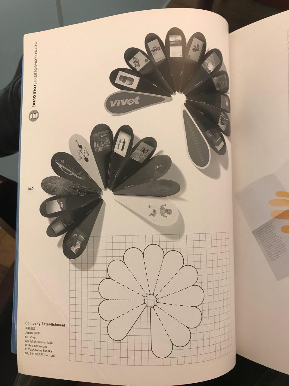
My initial concept was some sort of an accordion fold, and this would give me more than enough space to showcase each archetype, spread across two panels.

However, when i brought this concept to Lisa, she warned me of the difficulties in using such a fold as laying out the content would be challenging because of the shape of each page, thus I would need to find a die-cut template for it. She then suggested I went with a more straight forward, yet stronger approach of using something similar to a swatch booklet.
Based on her comments, I started to adapt my concept to something similar to a swatch booklet, whereby each archetype would be accompanied by a colour palette, reflecting their characteristics.
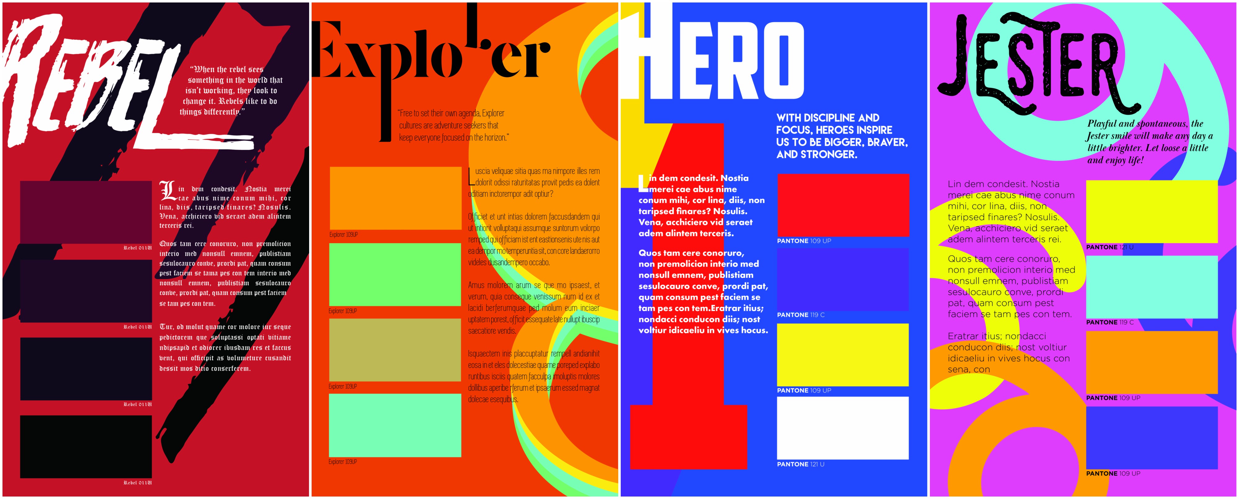
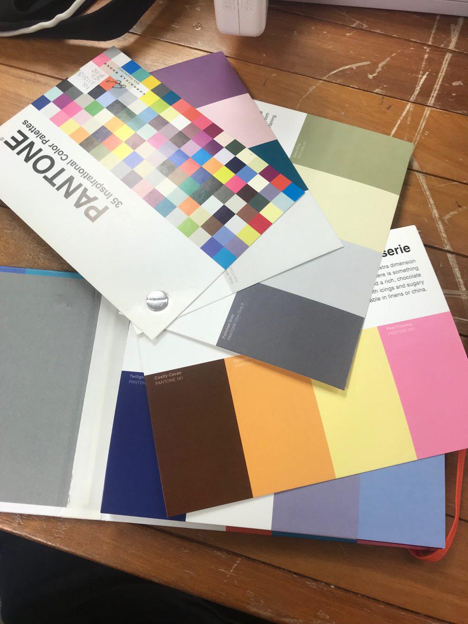
These were the initial layouts of my designs. I had to decide on the title font as well as a font for the body text and caption. As we were not allowed to use images or supporting graphics, I explored manipulating shapes to create more depth and life into my work. Legibility was an issue with my layout, thus I had to restructure my layout as well as tweak a few colours to make it less jarring. I turned to actual Pantone swatches to observe how they laid out their colour palates.


Execution
Once I had a better direction, I tweaked my designs to make it more legible and I compressed my cards so that it could comfortably rest in one’s hand. I made sure the graphics did not interfere with the body text and I gathered the colours so that they looked seamless and more cohesive.
I had to source for various colour palettes to represent each different archetype. I turned to online sources such as Adobe Colour, Colourlovers.com and pinterest. Colours in nature also helped with the selection of colour.

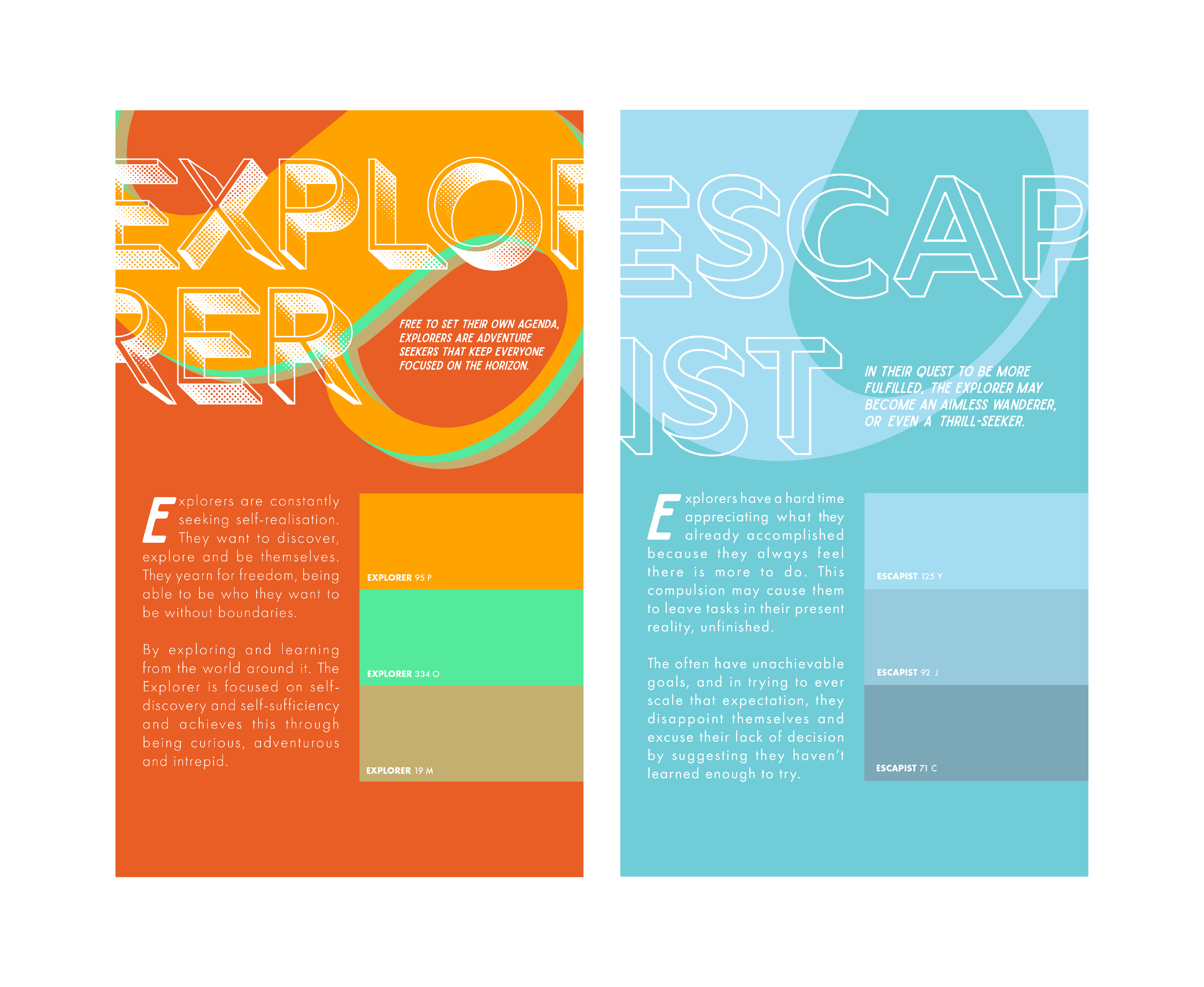
The possibilities for this archetype are endless because of the nature of explorer. An archetype representing someone who is always keen for new experiences, I had to try and convey movement in this composition. After looking at various forms of numbers, I chose the number 8 because it was similar to that of an infinity sign. Explorers are known to be relentless in their pursuit of something new and infinity seems to convey that idea perfectly. However, this drive can also be their downfall.
This leads to their shadow archetype, the Escapist. Explorers are quick to move on to their next adventure, leaving past ones without any sense of responsibility or accountability. People around them tend to suffer from this absence as they have to pick up the pieces these Explorers leave behind. To convey this message, the title font is hollowed out and I used light shades of blue to represent the feeling of absence. I cropped the 8 to make it look like a 0 to show that the archetype is no longer present.

This archetype was something which I initially did not want to do because I felt that I would not be able to explore many ideas with it. However, as I began to play around with the colours and typography, I began to fall in love with it. Caregivers are gentle and nurturing in nature, thus I went for a more rounded script font for the title, and for the body text, I chose a bold and rounded font to make it seem more welcoming and friendly. Pastel colours accurately describe this archetype as the soft hues make it so much more loving and gentle. I used the number 0 due to its soft curvature – the rounded edges brings about a sense of wholeness, just like a nice hug.
However, on the flip side, Caregivers tend to care TOO much for their loved ones and they often get hurt if they refuse to let go or accept the toxic nature of their relationships. For this, I used a palette more representative of skin, and I changed the colours of the 0 to look like scratch marks and blood.

I chose this archetype because I feel it resonates with my character! As I was researching on this archetype I felt a connection. The Jester is a fun loving archetype and I wanted it to be whimsical and a burst of colours. The accents used in the font for the title accurately depict the nature of this archetype by being spontaneous and random! I used the the number 6 as it looks like swirls, making you feel as though you are dizzy from all of the fun you’re having.
On the flip side, jesters can appear to come off as fake (I’m obviously not) as they try their best to be involved in everything, and sometimes they even partake in gossip just to feel included. Their jokes can often be in bad taste if they take it too far, thus reflecting bad on their character. I made use of the number 6 to form something signifying a ear, always listening, searching for the next piece of juicy information to gossip about. The colour yellow was chosen because… yes, yellow is the colour of liars.

Thought to be a visionary and a wise character. This is a bold archetype as they hold so much wisdom and they are able to envision the future. Yet at its core, the magician is a practical and straightforward character. Thus, I used a San Serif font to represent it, one without too much shenanigans. I used the number 5 for this composition and formed it into something resembling a binoculars (visionary) but also because it looks like shackles, a key prop in a magician’s show.
However, magicians are known to be strong headed in their ideas, often taking it too far by investing too much into their vision. If their peers do not see eye to eye with them, magicians can even manipulate people into doing their deeds or making people join them in their futile adventure. Thus, I manipulated the 5 to make it seem like a table counter and I used the colour scheme of green and blue to make it look like a casino.

This archetype is notorious in branding as it appeals to only a handful of people. Rebels can be seen as the outcasts of society as they often go against the flow. However, they can be seen as revolutionaries and instill a sense of vigor in people. I used a grungy typeface for the title and for the body text, I used Blackletter as many trends associate these characters with someone who is rebellious or non-traditional (how ironic). I used the number 7 because I like the bold strokes it makes, representing something very rugged and edgy – it does not try to conform and be liked. The colour palette is also swapped to show that the rebel…
DOES NOT CONFORM TO GRID STRUCTURES.
As you would’ve expect, Rebels can sometimes take it too far, as their ideas may be too extreme for society. This would lead them to become anarchists if their values or believes are not kept in check. This composition shows uprising and destruction of an individual. The black background just empathizes how much negativity this shadow archetype has.

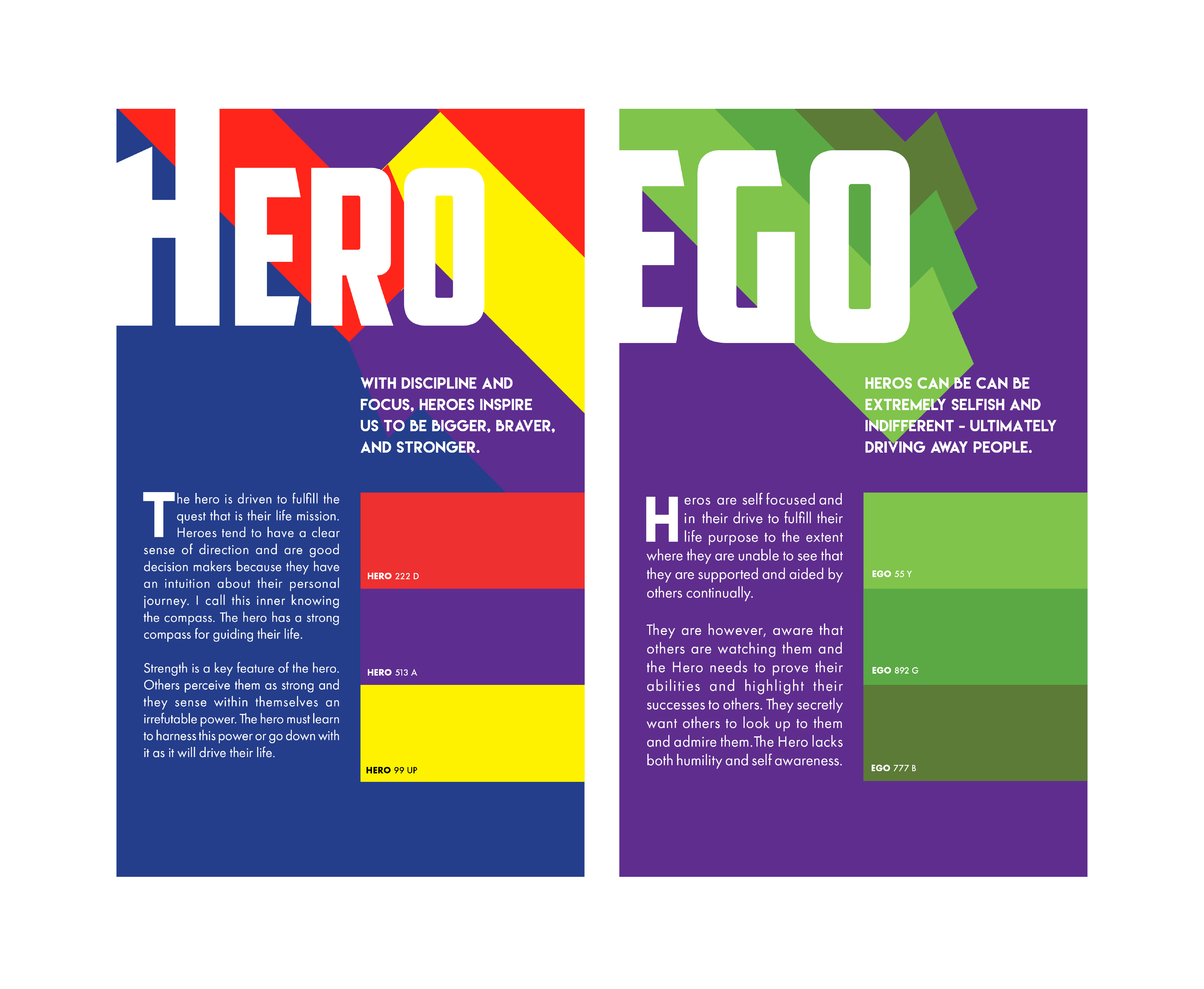
And lastly, we have the Hero. Something most people aspire to be! Who doesn’t like a heartwarming story of a hero saving those in distress? Heroes are bold in their actions and they command respect from their peers. Thus, I chose a heavy font for the title to give it that presence. Undoubtedly, I used the number 1 to represent the Hero. To command that kind of respect, one has to be the best in their field. I depicted the 1 rising above, similar to how superheros would fly! Strong colours are used in this composition to enhance the strength of the composition.
However, as to all the archetypes, Heroes have a weakness which is their ego. They tend to be so headstrong to the point whereby they start to push people away even if they know that the path they are taking is wrong, or not in favour with their peers. I depicted this by tilting the 1 in a downward angle to show its downfall, and the repeated 1’s show the motion of it. Having too much of an ego makes one disgusting and thus, I went with the colour green and purple to represent envy and pride.

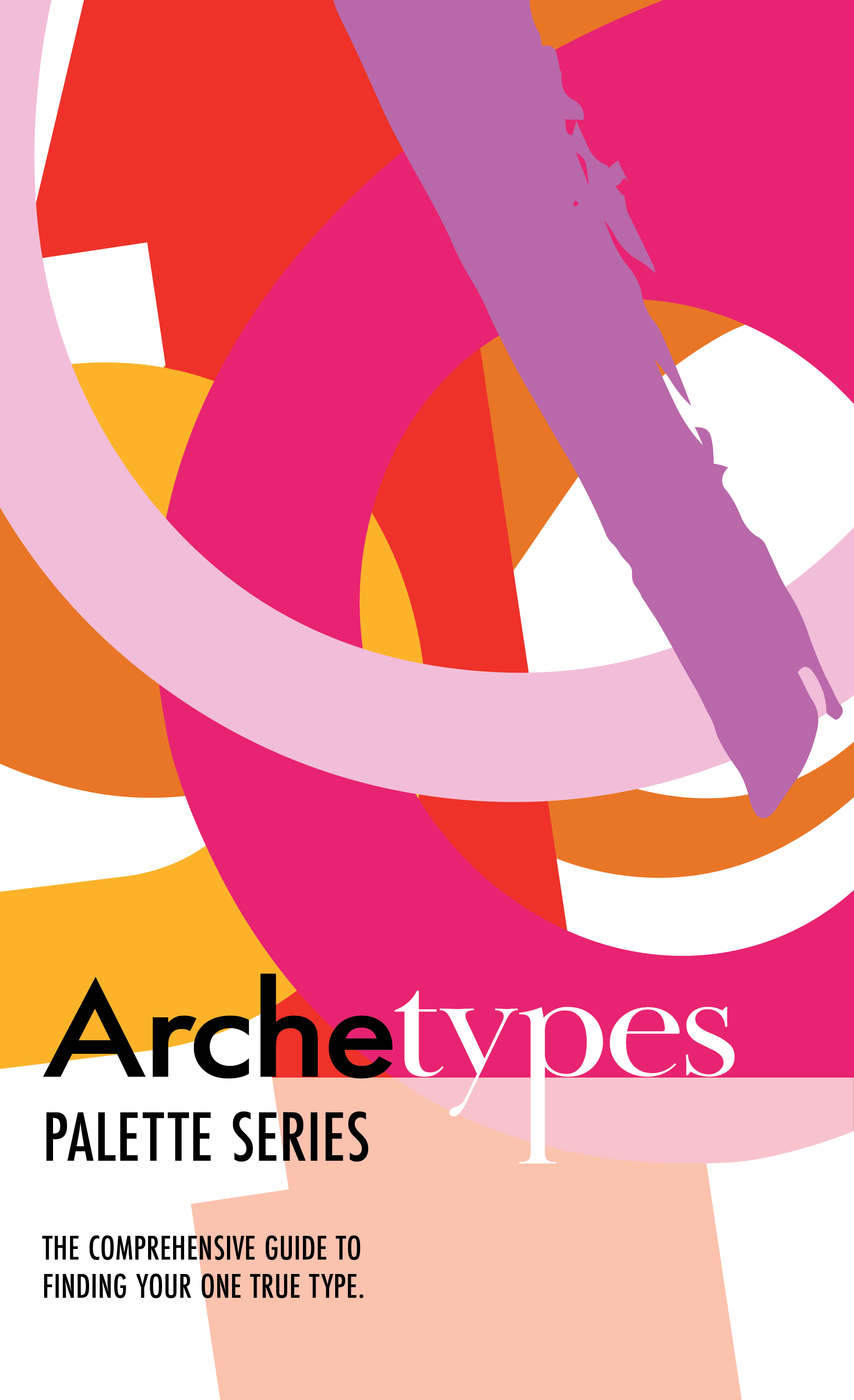
This is the cover page used for my palettes. It features all of the forms used in the various compositions and the San Serif typeface used is futura, which I kept consistent for all of the body texts in the palettes. I decided to change ‘types’ to a serif font to show emphasis on that these palettes would also focus on typography.
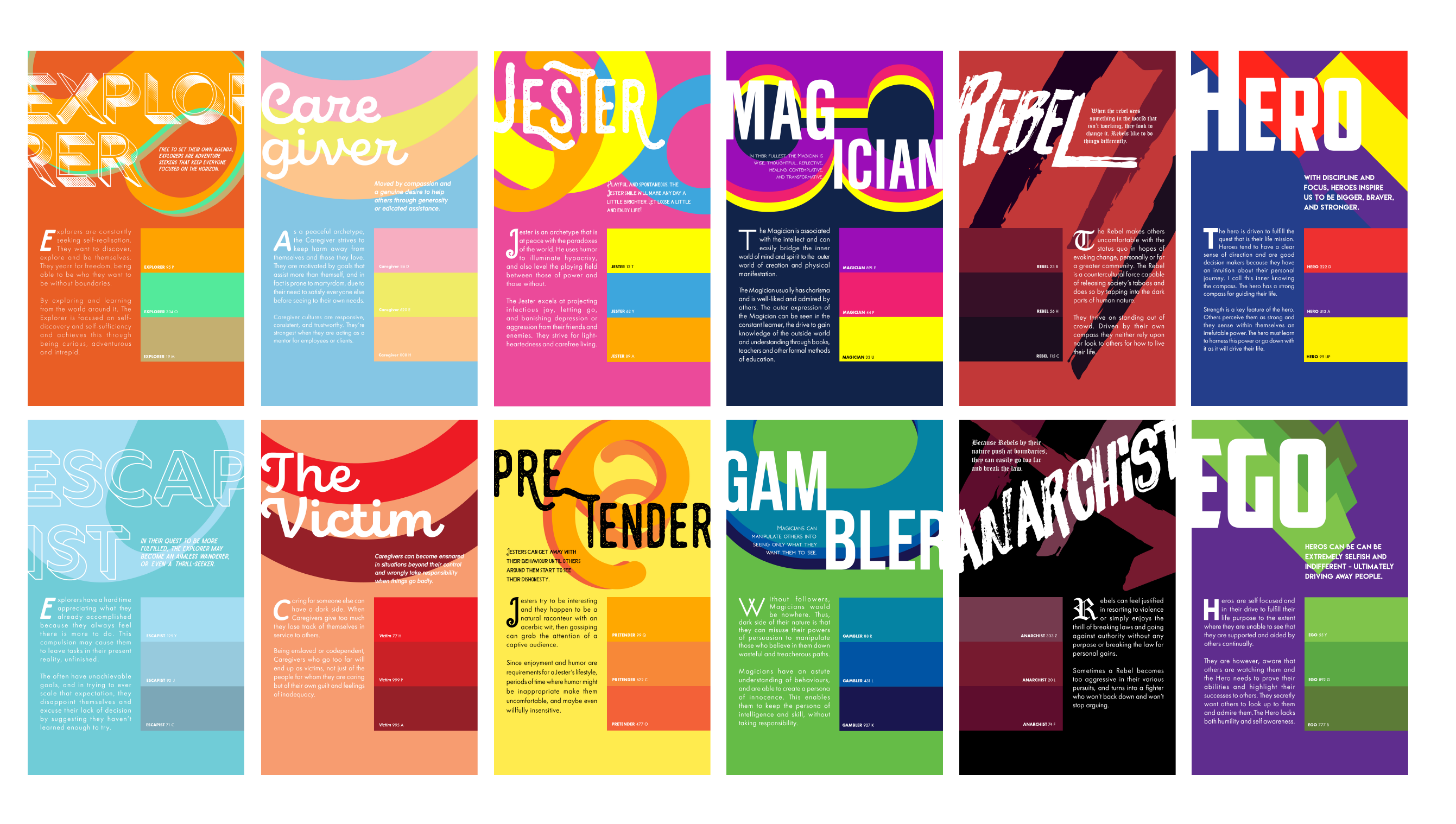
Final cards all laid out!

Honorable mentions

I wanted to try the technique of replicating type to form a structure. However, the composition ended up really messy and it was very distracting, thus I was not able to incorporate it into my design.

