Low and behold! This is the final submission!
Low and behold! This is the final submission!
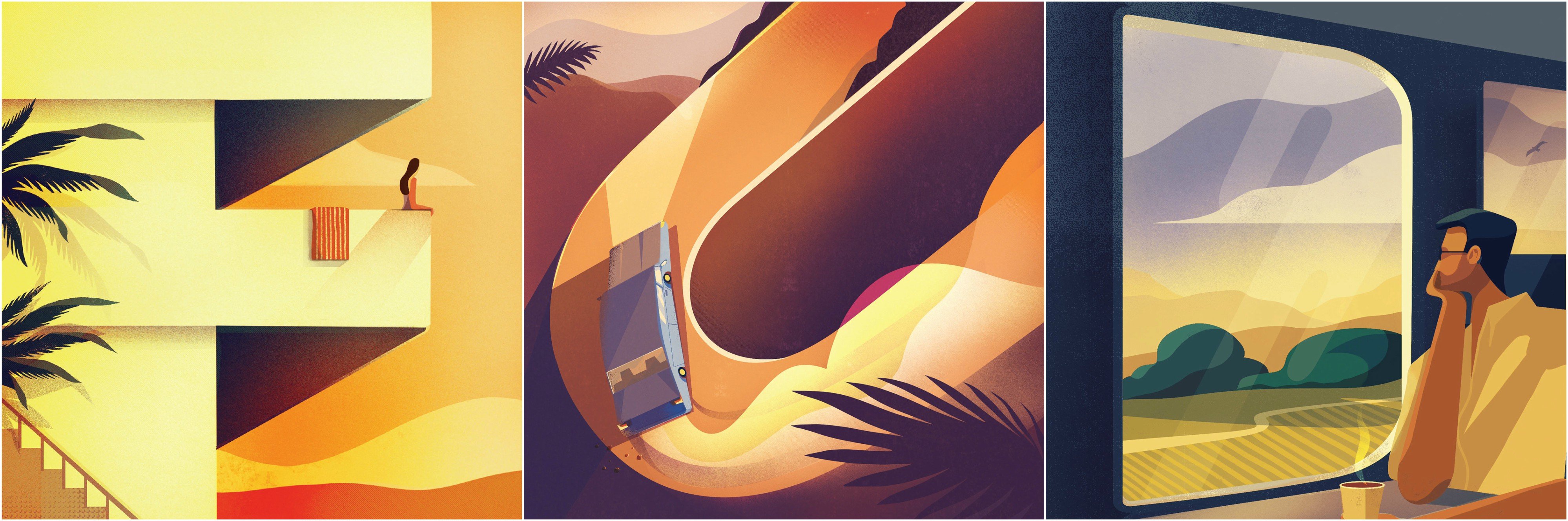
Editorial illustration, this is a style which I am keen to develop my skills in as I have always been inspired by the messages or concepts which these illustrations usually carry. To be able to add little nuances and details, encouraging the viewer to look deeper into the message of the piece.
These little details through the use of symbols are ones which we see in our Everyday lives, and they are so embedded in our consciousness that we can instinctively identify and relate to it.
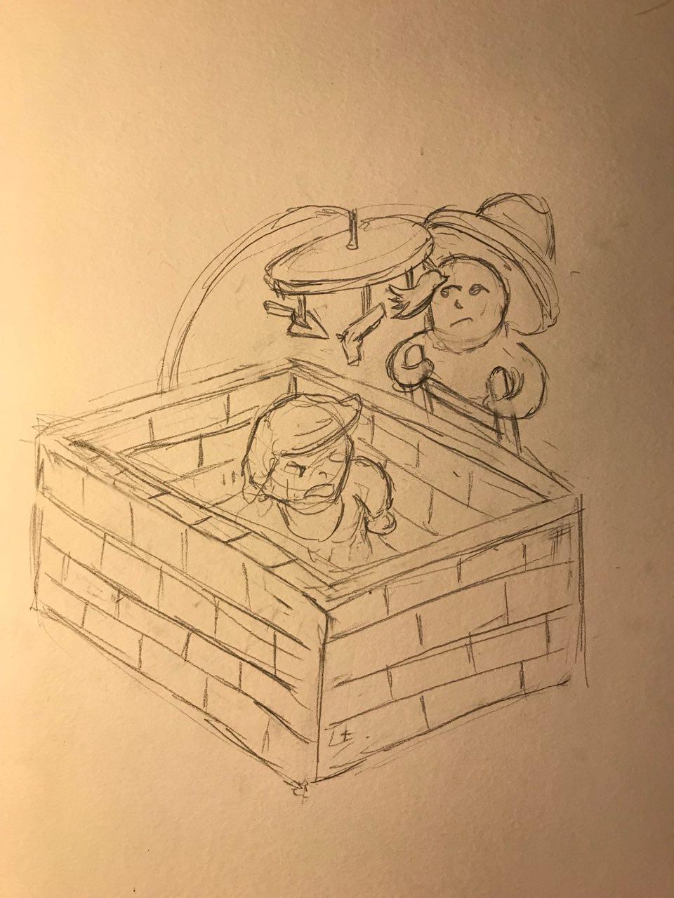
To begin the brainstorming process, Lisa had us sketch out thumbnail designs to explore the feasibility of the concept. As many as 16 sketches were created (not counting the dozens of crumpled post its) and I filtered down my potential designs to these 3 concepts. The topic I selected was Obsession and my idea revolve mostly around the political climate in the United States – I wanted to explore these topics and issues as I wanted to challenge myself, to see if I could compress such complex messages into graphics.The first design is of baby Donald Trump in a cot made up of bricks. This is to illustrate the obsession With his constant need to build a wall along the US-Mexico border. I drew Donald trump as a baby because babies are known to be really persistent with their cries and it also tends to be obnoxiously loud. I would have a Mexican national (very stereotypical illustration I must admit) peering over the walls, as though climbing it required nothing less than a ladder. This is to highlight the ineffectiveness a wall would be in their fight against illegal immigration and drug trafficking.
The next two ideas would be more centred towards gun violence in the United States. It has become such a common occurrence that jokes are being made about it and more worryingly, the government and people are starting to become desensitized towards this issue. There was a recent case of a school shooting not more than a year back, where the students were made to attend school the day after the shooting occurred. PTSD is going to be a big issue amongst US citizens real soon…

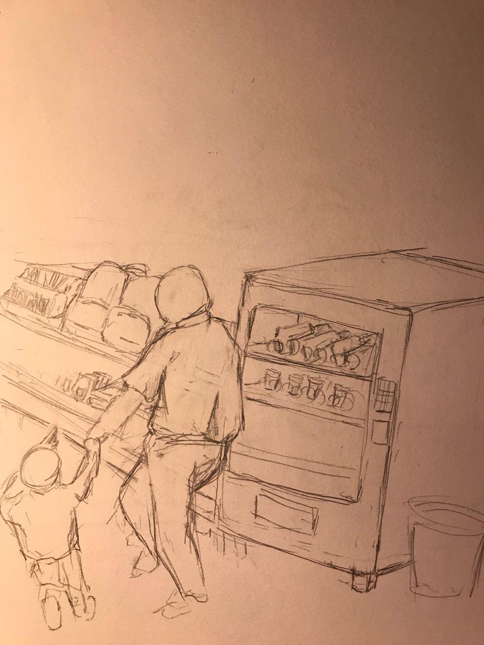
The first idea would be of a Father and Son, walking along a supermarket aisle, looking at Back-to-school supplies where they just causally stroll past a vending machine full of guns. This shows the lackluster of background checks in the system making these weapons accessible to most people and the nonchalant attitude towards school safety.
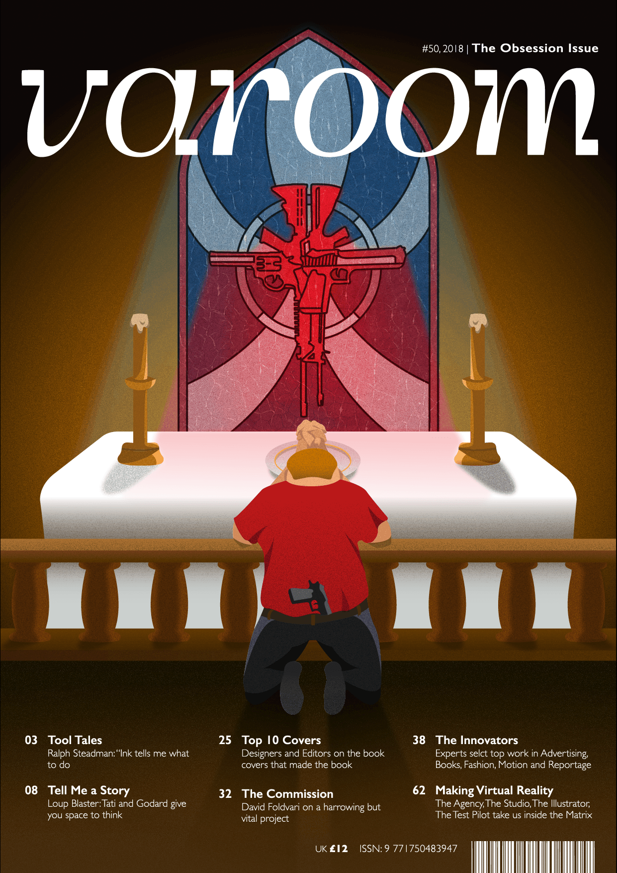
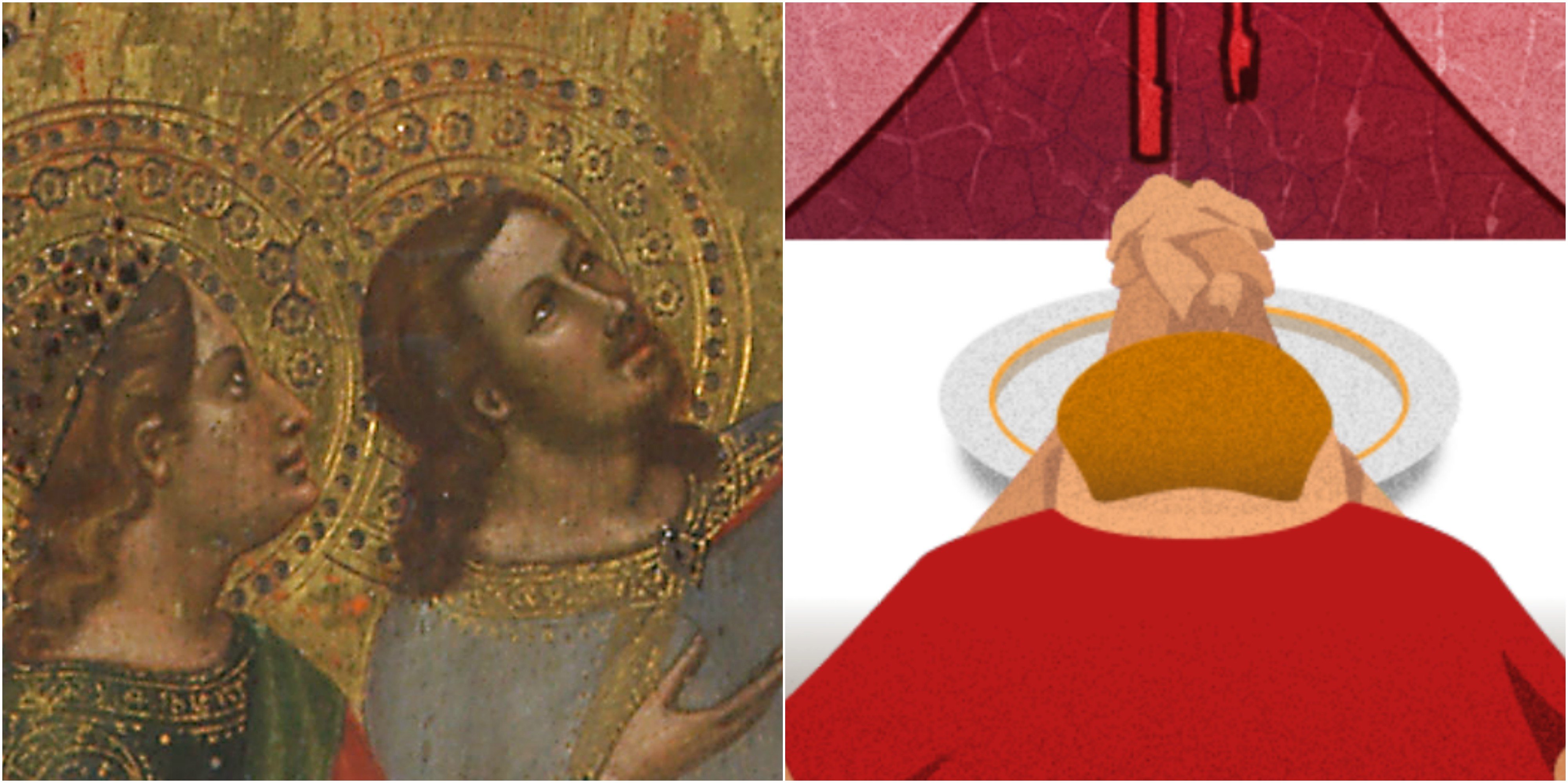
My next concept would be a typical republican voter praying at the altar of a church. The scene of the church would be a solemn one, where it is only lit by a stained glass window depicting a cross made up of guns. The praying position, coupled with the stained class cross would represent their worship and obsession for guns in the country. Republicans can also be regarded as staunch conservative Christians which is depicted by the scene of the church.
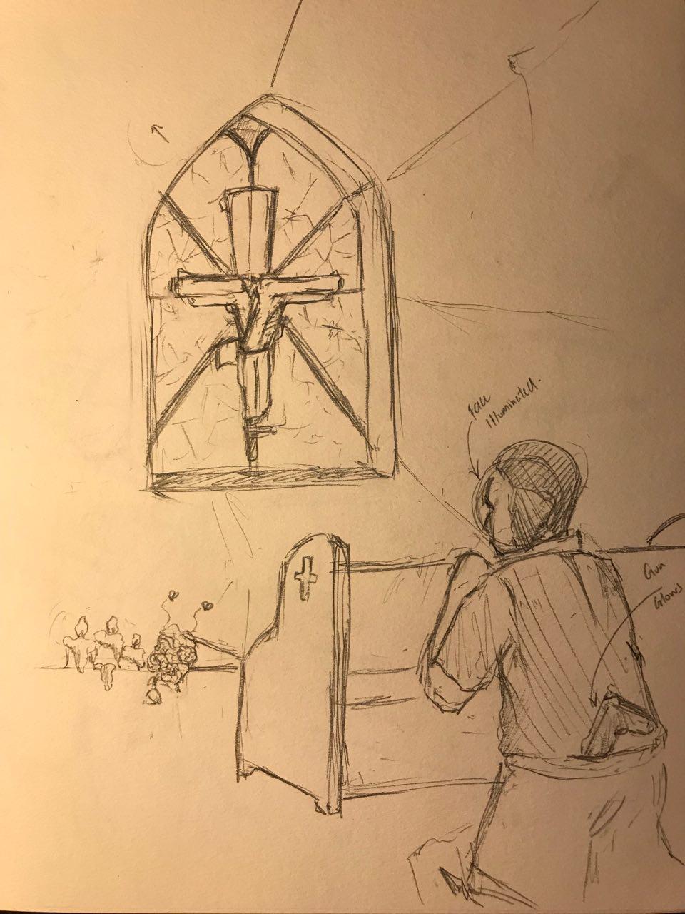
I would have the person at the altar tuck a gun in his jeans to highlight that the individual is also part of the gun problem.
I decided to explore this concept as the message of obsession was stronger and it would be easier to understand from a perspective of not only an American, but also people from other nationalities, as the cross and the praying position are both symbols for Christianity and worship.
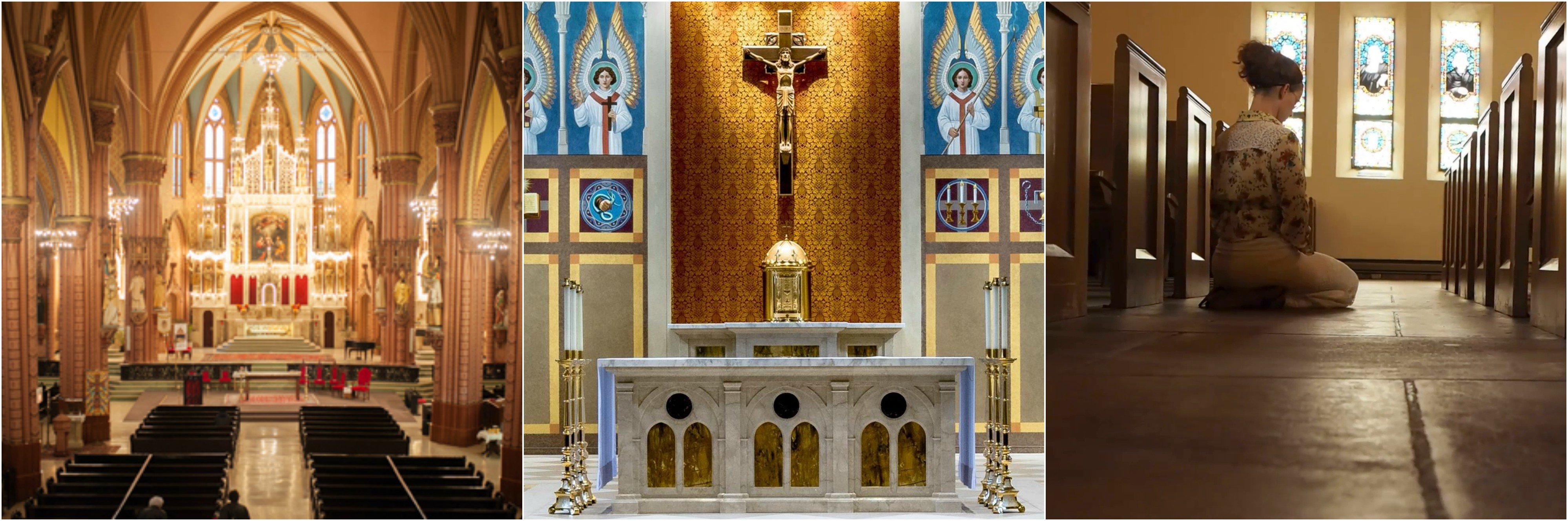
I struggled with the initial perspective of the idea as I could not figure out the body proportions as well as the scale of the cross. I could not find a suitable reference image of anyone kneeling at the alter or pew at such an angle and I even considered taking an image of myself at a church doing that. However, I quickly ran into more problems as the scale of the cross had to be significant enough to see the details for the message to be encapsulated.
This is a video of the different experimentation with the positions of the Republican figure.
Eventually, I went with a two point perspective(?) of the composition as it would be able to show both elements of the cross as well as the republican with equal significance.
Colour treatment was something I had to consider greatly as it had to be representative of the States and a church. The more prominent colours which I used were red, blue and white, colours from the American flag. A warmer brown tone would represent the walls of a church, similar to the marble or sandstone bricks they use in construction. I had the background set to be dark as it would also hint at an ominous or solemn tone.
The style of illustration I would like to adapt would be one which uses a grain texture and realistic shadows. I enjoy this style of illustration as the texture adds depth and sophistication to the piece. The subtle use of gradients also helps with creating an inviting and pleasant composition.
More of the artist here:
https://www.behance.net/gallery/65463325/36-Days-of-Type-2018
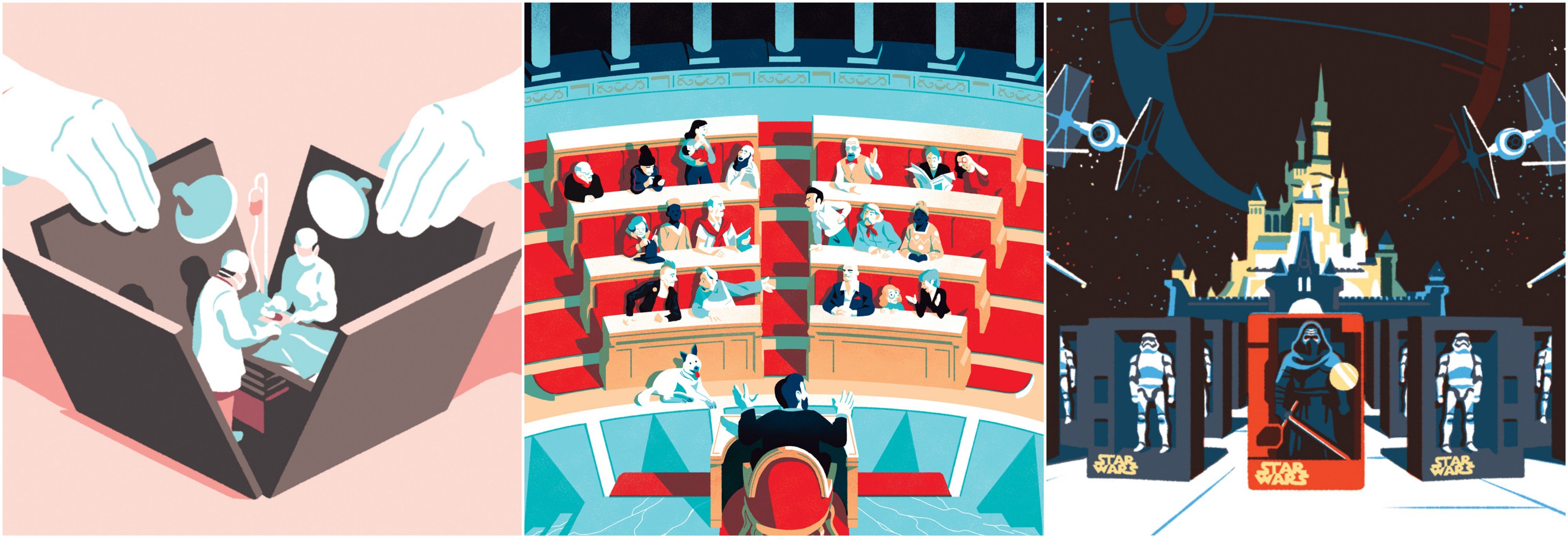
Another artist which I sought reference from was Bruno Mangyoku https://www.behance.net/brunomangyoku
I enjoy his seemingly clean and simplistic use of harsh shadows and bright colours to enhance contrast in his composition.
This the development of the cross made out of guns. I used guns which are commonly found in the United States. I felt like the leading lines of this stained glass composition really created an emphasis towards the object, and the colour helped to bring more contrast to the composition.

Throughout my illustration, I try to add little details to have a stronger religious undertone. Old Christian paintings often depict angels in Halos or Jesus in a crown of thorns. Lisa suggested I try and incorporate this element into my composition and I thought it would be appropriate to use the dish meant to hold offerings during Holy Communion. The Halo would also mean signify that the subject feels as though they are innocent, and their love for guns is justified.
The last struggle I had was trying to replicate the effect of a stained glass window as light passes through it. As light tends to blend into each other, creating the beams of light for the stained glass was incredibly difficult to re-create as it always tend to look unrealistic. I had the beams of light subtly reflect against the top of the table to provide more sense of realism.

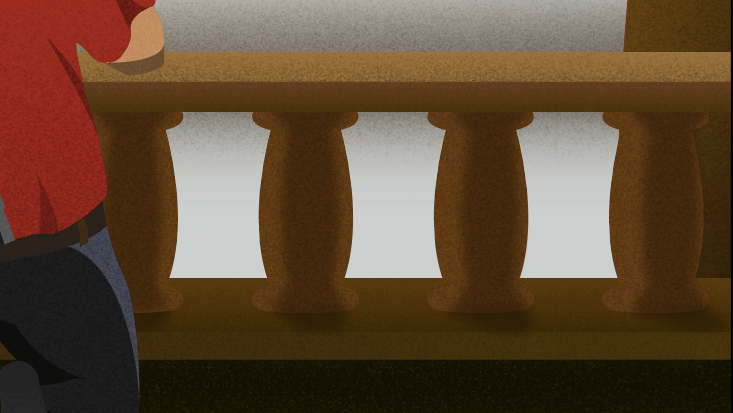
To add to the details, I made sure that the shading of the wooden legs changed according to their position.
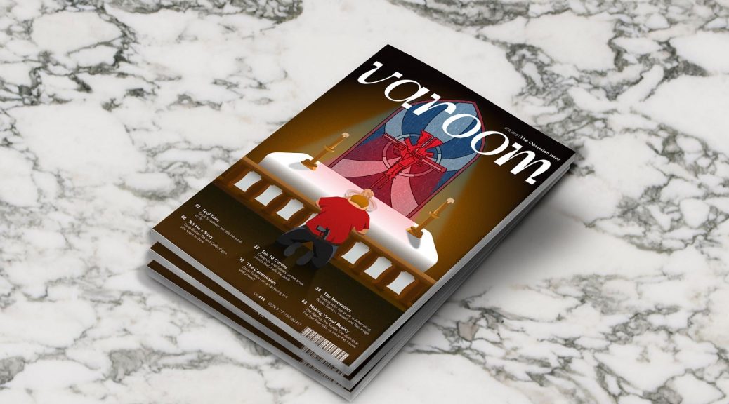
This is the final composition!
We were also tasked with coming up with 2 personas which would read Varoom!