
At last! We delve into the world of colour! To be able to use colour tastefully in our designs, we must first have an understanding of colour theory and the methods of pairing colours together.
To start off, we have the colour wheel.
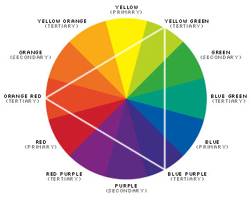
Primary colours, secondary colours and tertiary colours
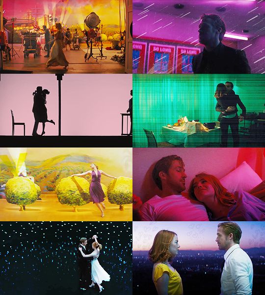
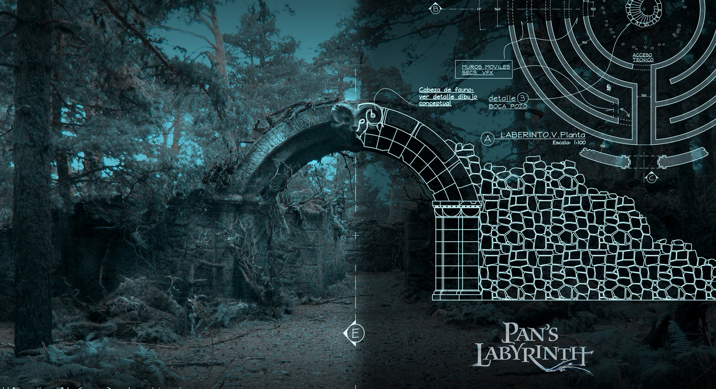
Colour is important in all disciplines of art as it is able to convey different emotions as well as portray different moods which the character may be in.
The usage of colour in set design can also give a context or background of a character.
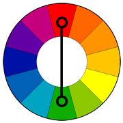
Monochromatic

Monochromatic uses different values of the same colour. This enables the artist to achieve depth and tone to their art work.

Direct Harmony
Direct harmony or Complimentary pairing is the usage of a colour directly opposite each other on the colour wheel. This creates a great contrasts in your composition. However, your colour palette will be mostly limited to 2 colours. This pairing is mostly used in simple graphics with few elements.

Split Commentary
For split commentary, instead of taking the adjacent colour, we would be taking the two beside it. This leaves the composition with a less striking or contrasting composition.

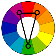
Triadic Harmony

Another variation of Split commentary, this involves colours with equal distance between each other, forming a triangle. As you can see, it forms a very contrasting composition as well.

Analogous Harmony
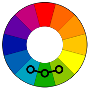
Analogous harmony is the use of the colours next to each other. This creates a pleasing composition on the eye. However, it can be mistaken for a monochromatic composition as it follows a gradient.

Tetradic Harmony
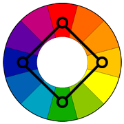
An evolution from This is a more complex form of colour harmony as it involves 4 colours. This is mainly used for designs with many components as well as characters.