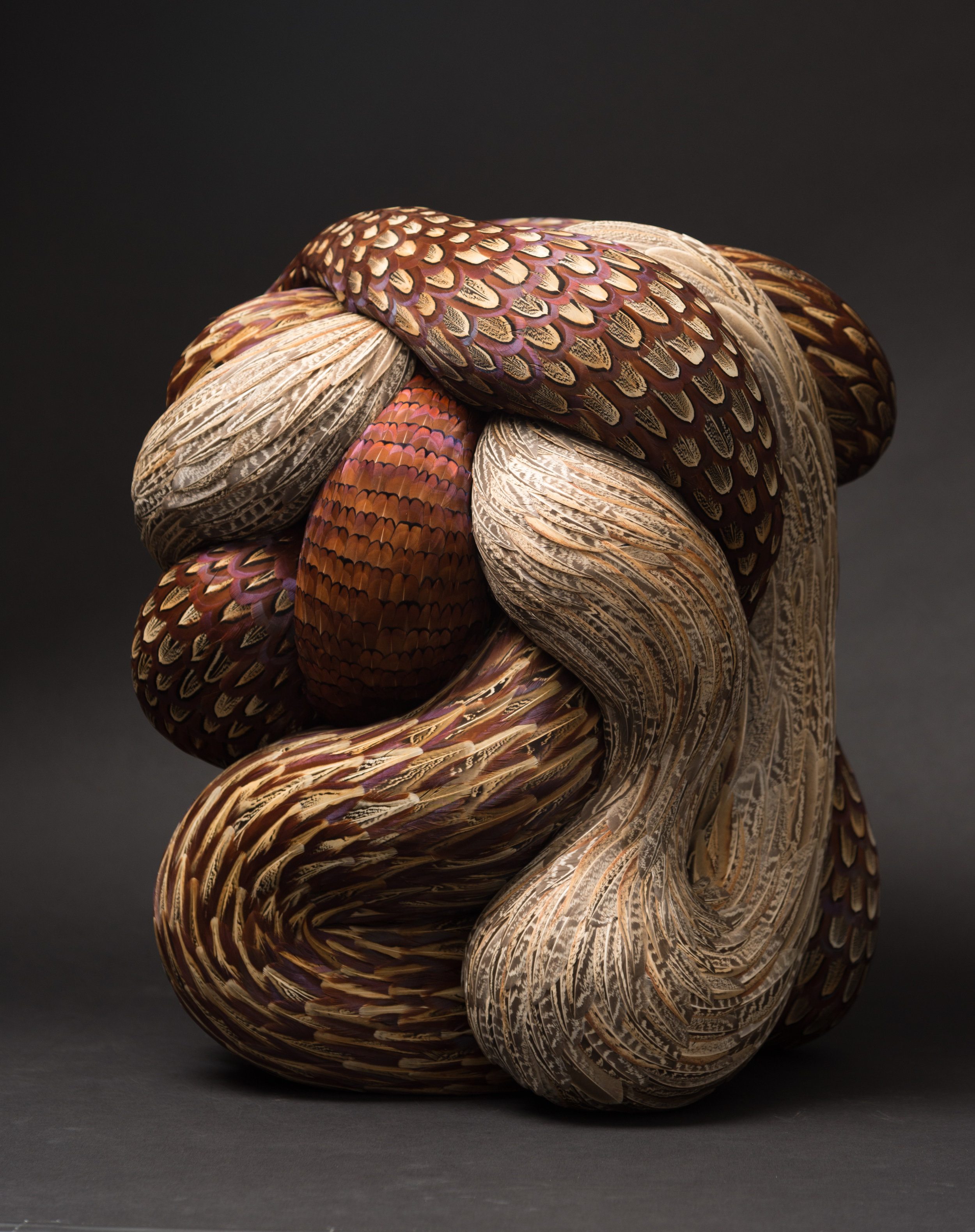
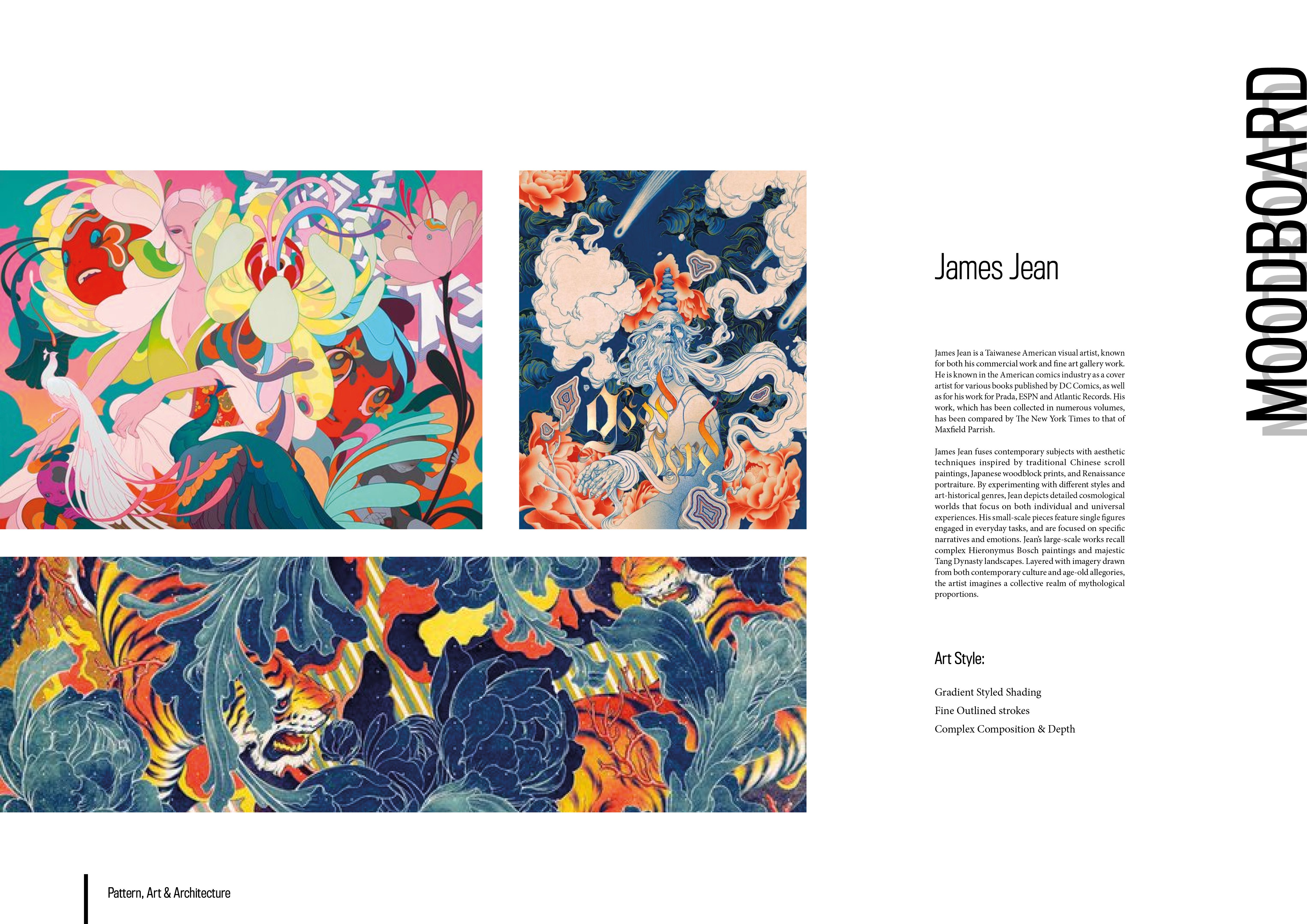
Kate Mccgwire is a distinguished British sculptor from Norfolk, famous for her works specifically using organic materials such as bird feathers – this distinguishes her from other sculptors based on her unique choice of material. Her interest with bird feathers sparked when she was on her way to her studio when she noticed molting feathers on the ground as the season transitioned into spring.
With the use of feathers, Kate Mccgwire is able to create encapsulating works of art which focuses on the forms which are organic yet unsettling and alien to human understanding. Mccgwire aims to stimulate the emotion of discomfort among her audience by creating organic forms which seemingly have no start or end, unlike how we perceive nature. This loop of uncertainty in her work creates both disgust as well as curiosity in her audience.
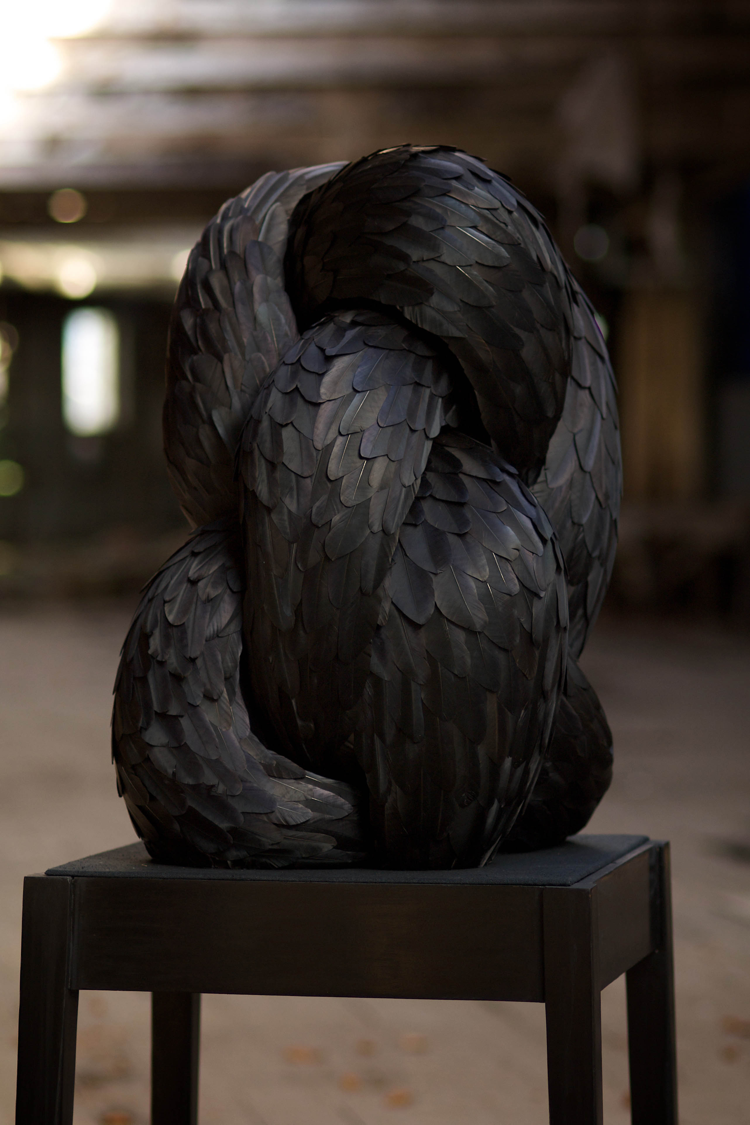
In some of her works, Kate Mccgwire uses crow and raven feathers such as the one in Gag (2009) to change the perception of how ‘societal pests’ can be of value through the use of commonly overlooked materials in the form of art. The use of materials to convey such complex concepts in society elevates the value of her work as it incorporates aesthetics with an intellectual understanding.
The aspect of Mccgwire’s work which intrigues is the use of commonly overlooked objects (waste to a certain extent) to produce aesthetically pleasing works with a strong focus on societal commentary. The phrase “anything can be art” was exceptionally prevalent through her work and it allowed me to humble myself and my perspective of how I view the world. One thing which I learned from Kate Mccgwire is that – art is how we give value to things, and how we want others to perceive it.
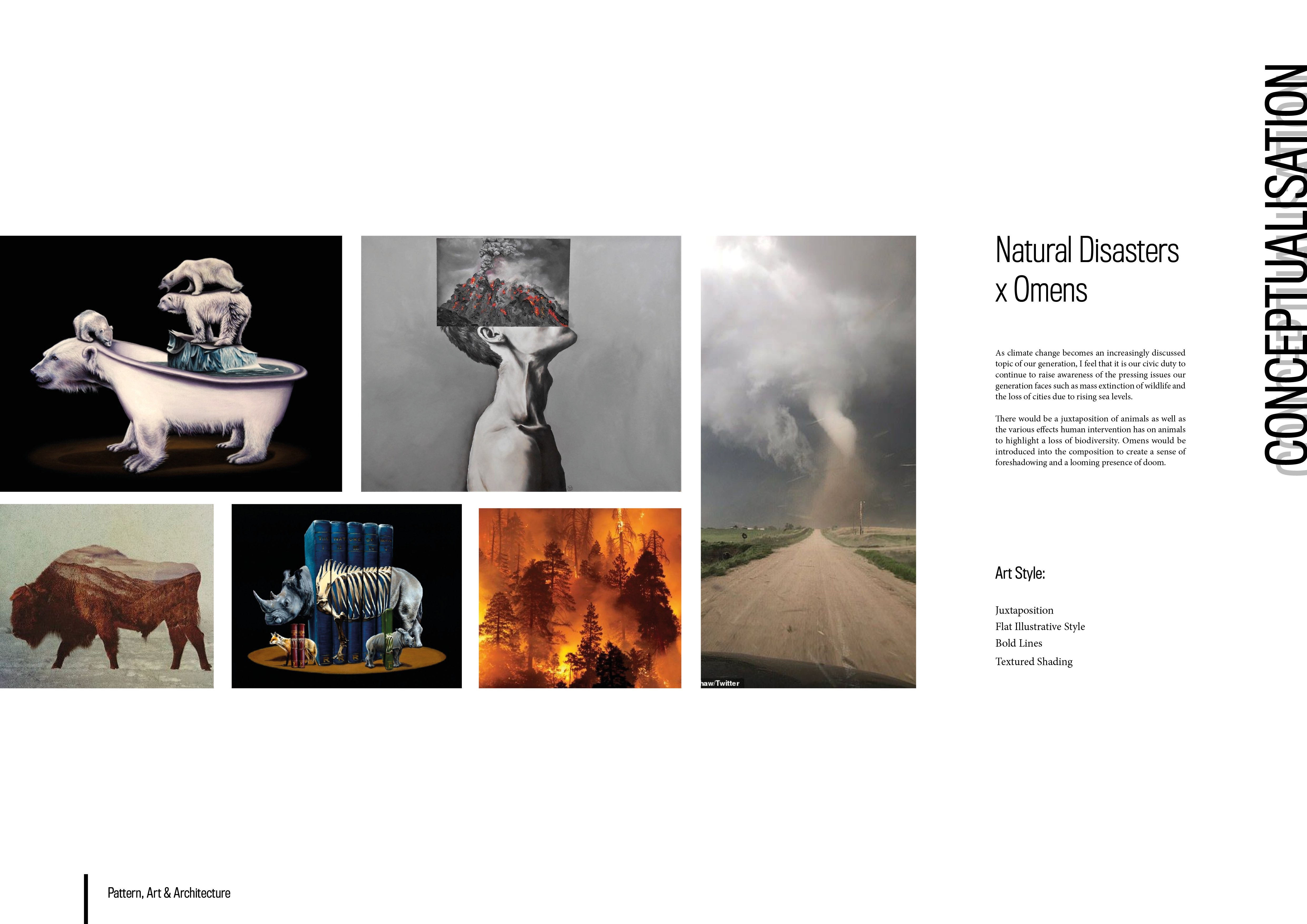
As climate change becomes an increasingly discussed topic of our generation, I feel that it is our civic duty to continue to raise awareness of the pressing issues our generation faces such as mass extinction of wildlife and the loss of cities due to rising sea levels.
There would be a juxtaposition of animals as well as the various effects human intervention has on animals to highlight a loss of biodiversity. Omens would be introduced into the composition to create a sense of foreshadowing and a looming presence of doom.
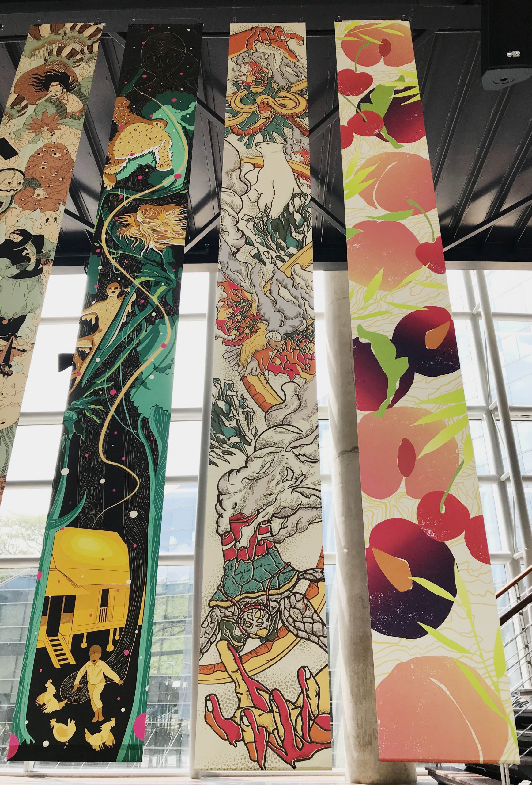
This illustration aims to target these heavy concepts within our society, connecting these events through a single composition.
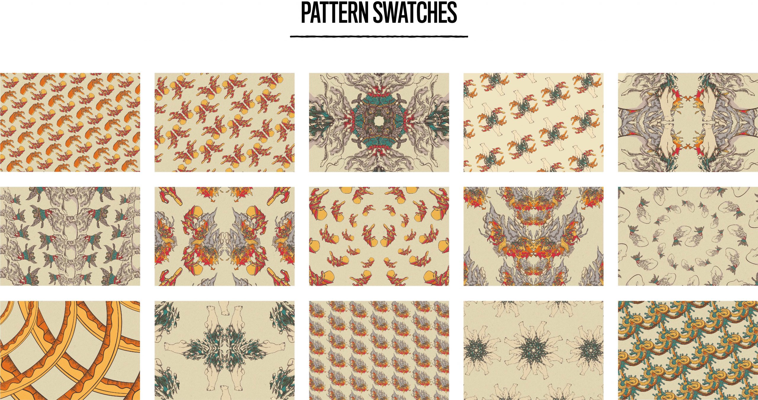
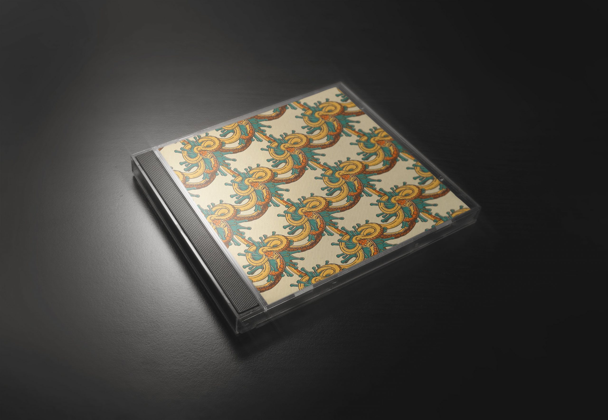
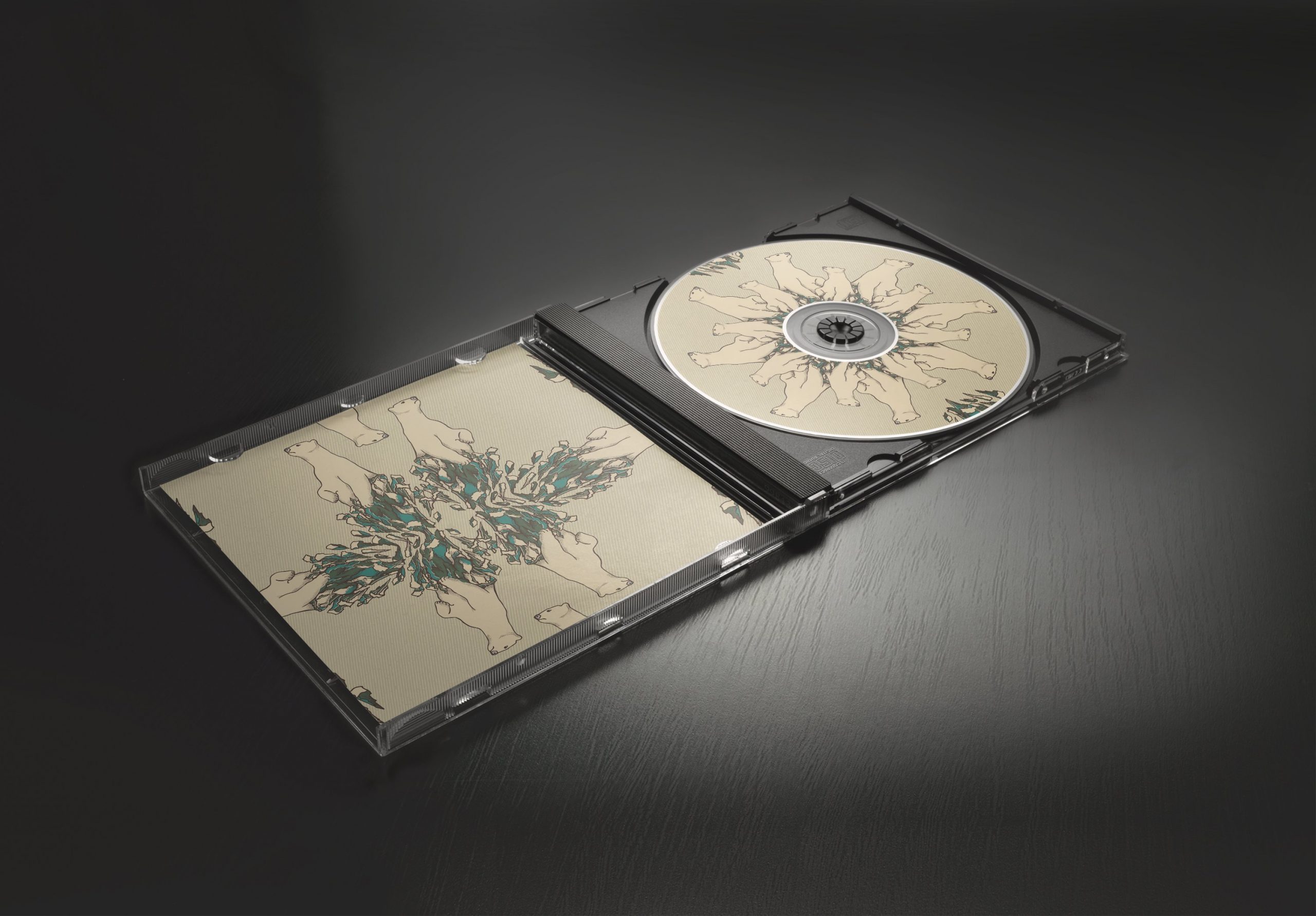
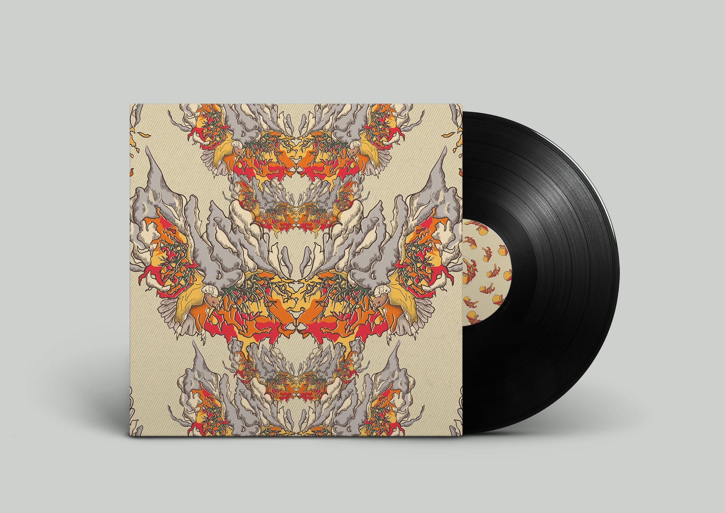
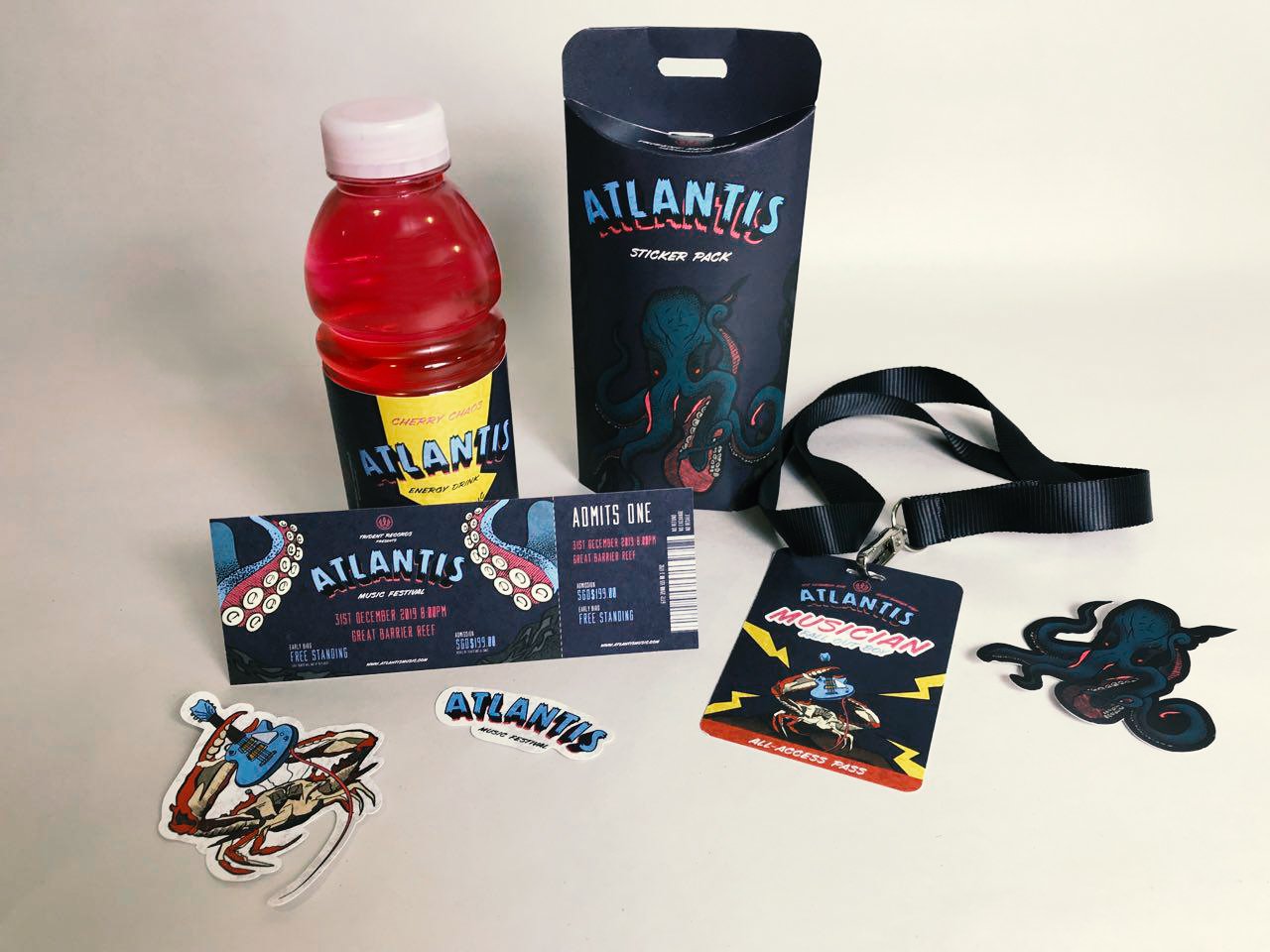
Here are my final deliverables alongside the design files. I thoroughly enjoyed this assignment as I had the liberty to explore illustration methods and styles which are more ‘unconventional’ and ‘playful’! Designing for collateral is not as simple as reusing graphics as I had to think of the mechanics and purpose of each item, which made me design them with more thought.
Greetings! It is the time of the semester when our bodies are mostly running on caffeine and what little sleep we had on the train to school. Welcome to submission period folks!
The brief for our final project for illustration for designers was simple – create a 5 piece collateral featuring the opening of any event. This meant that we could create the wildest ceremonies or events we could dream of, and with that, I began to brainstorm!
My immediate reaction was to search for the most quirky and eccentric types of ceremonies people around the world would celebrate! I came across many different ones including A Cheese Run Festival where grown men literally chase after a wheel of cheese down a hill in the UK. Or, there were bull runs in Spain where they unleash a bull down the street, only to have participants run away from the impending doom of getting impaled by the horns of the bull. (As you can see, it’s clear why men don’t live as long as women do.)
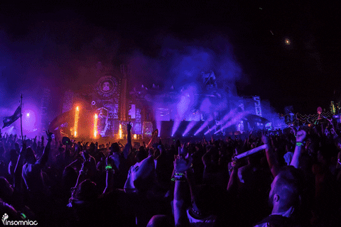
However, I decided to settle on something closer to my heart and something which I have always wanted to design – I went with designing collaterals for a Music Festival.
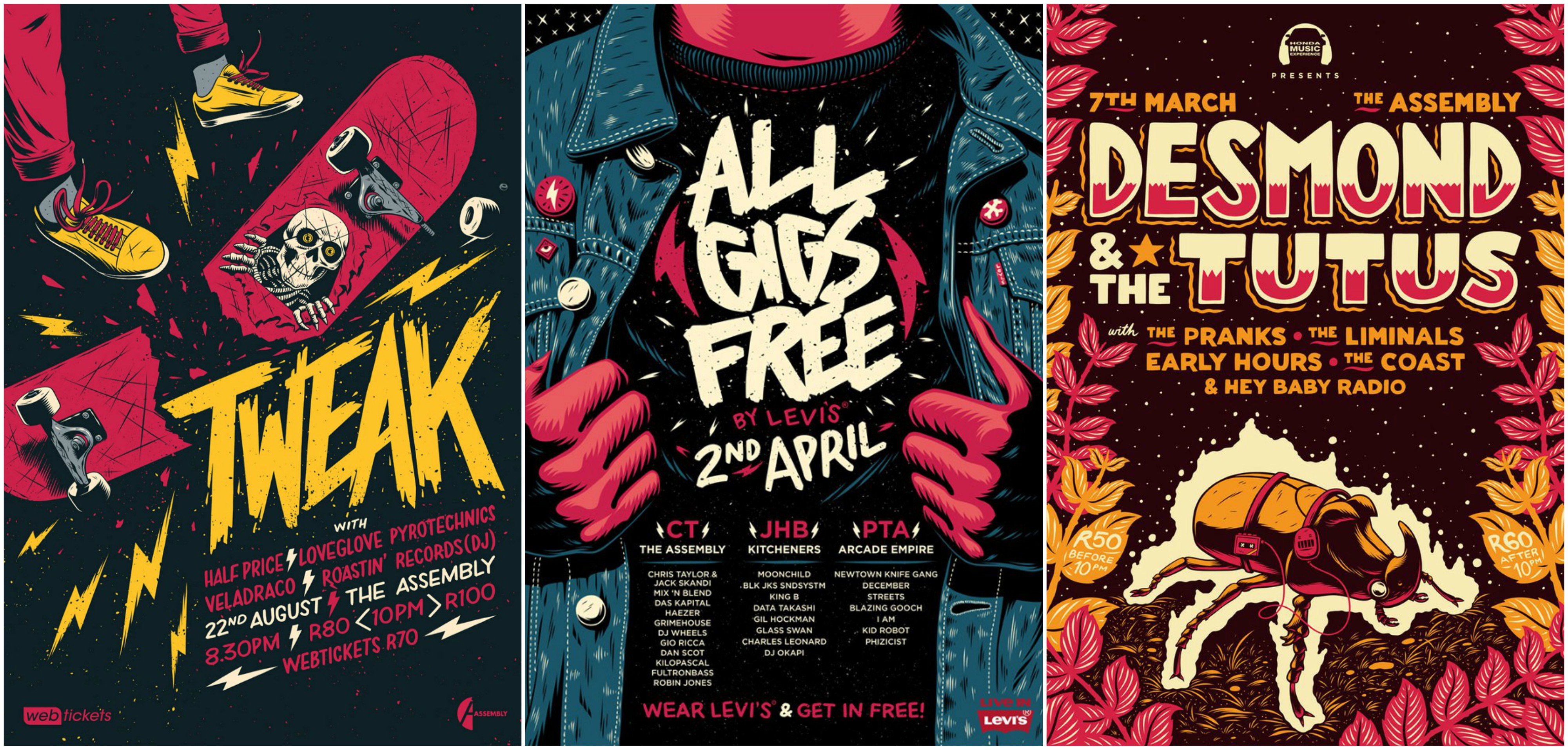
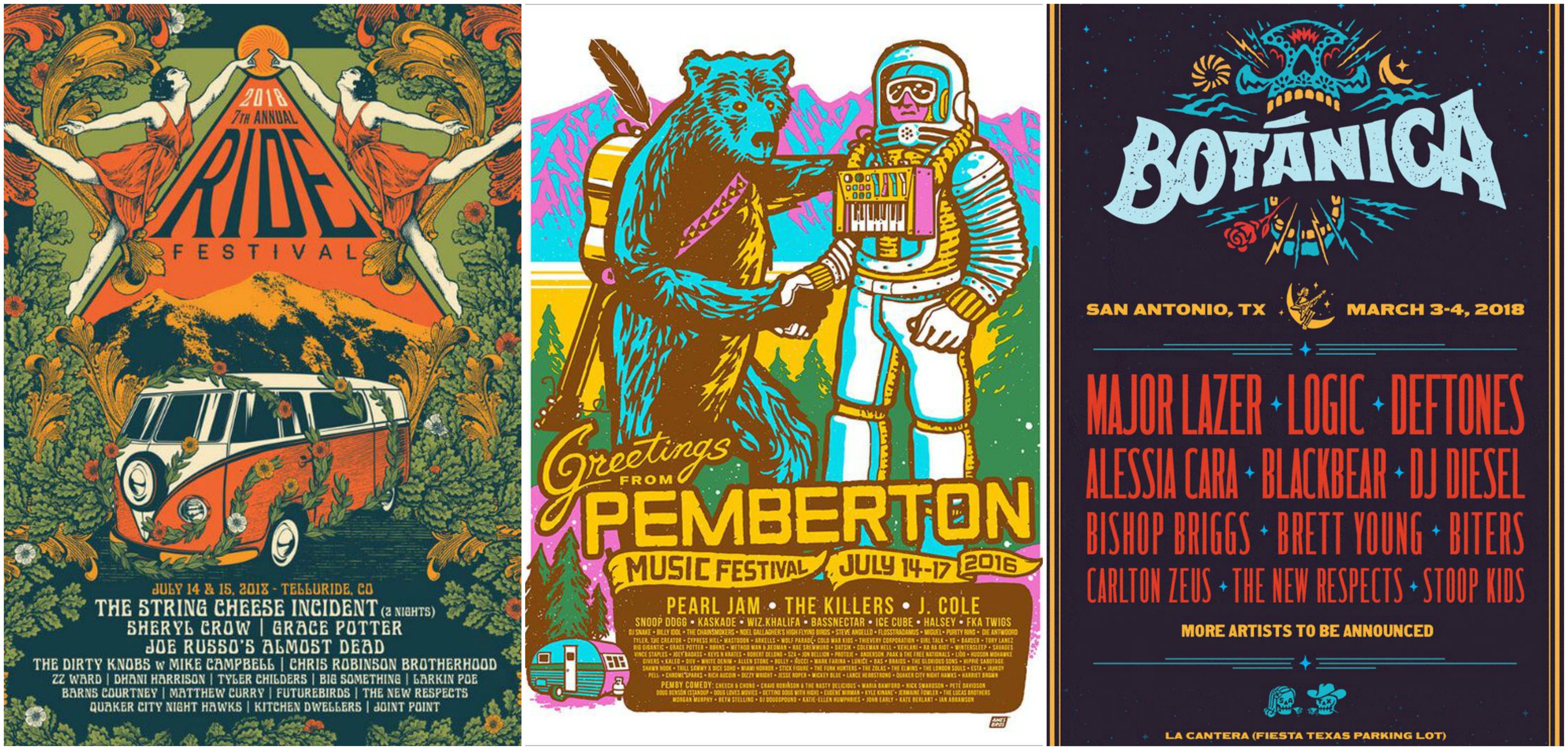
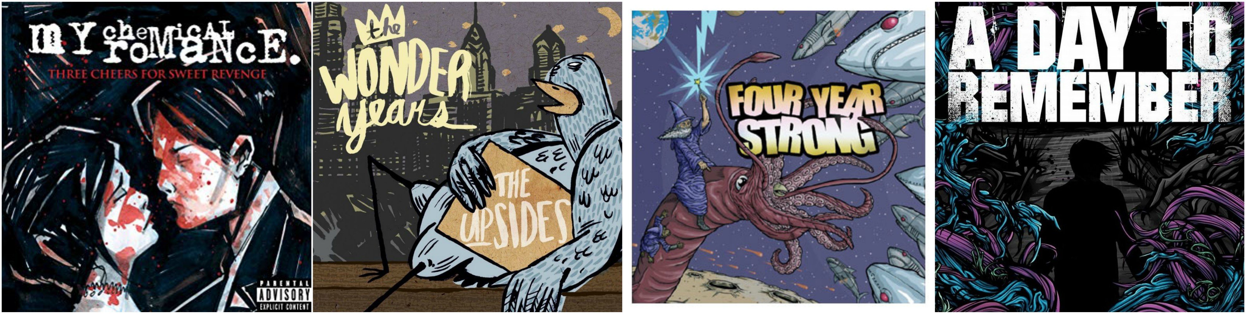
I began searching for moodboards to get a better sense of the aesthetic of designing a successful concert poster. What I enjoyed most about concert posters is the grunge style of illustration and the use of hatched or bold outlines in their work. Another telltale sign of a concert poster would be the use of custom handcrafted typefaces as well as the use of limited colours.
Some of my favourite punk rock bands also use similar illustrative styles for their album covers and I was inspired by the look of it in the creation of this poster. This was a major throwback to the good days where my Ipod would just be filled with these bands.
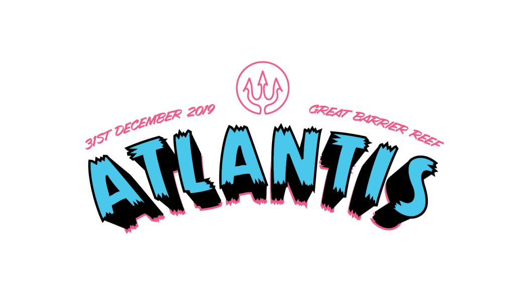
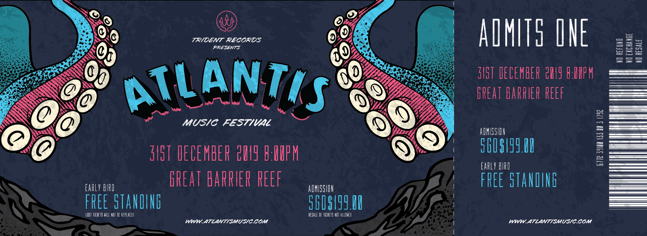
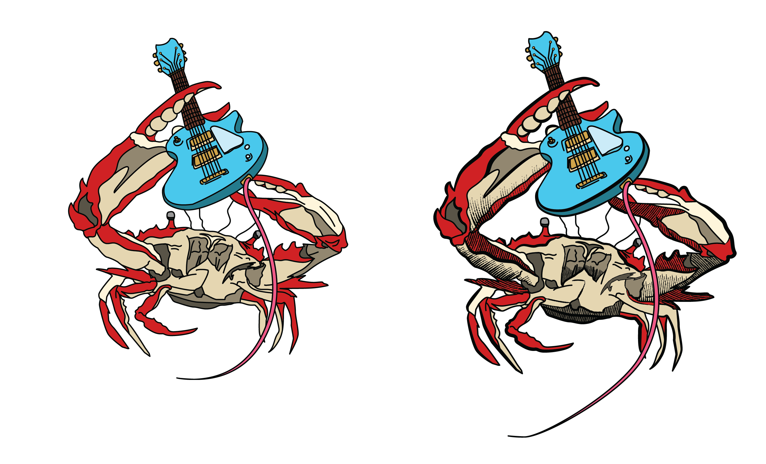
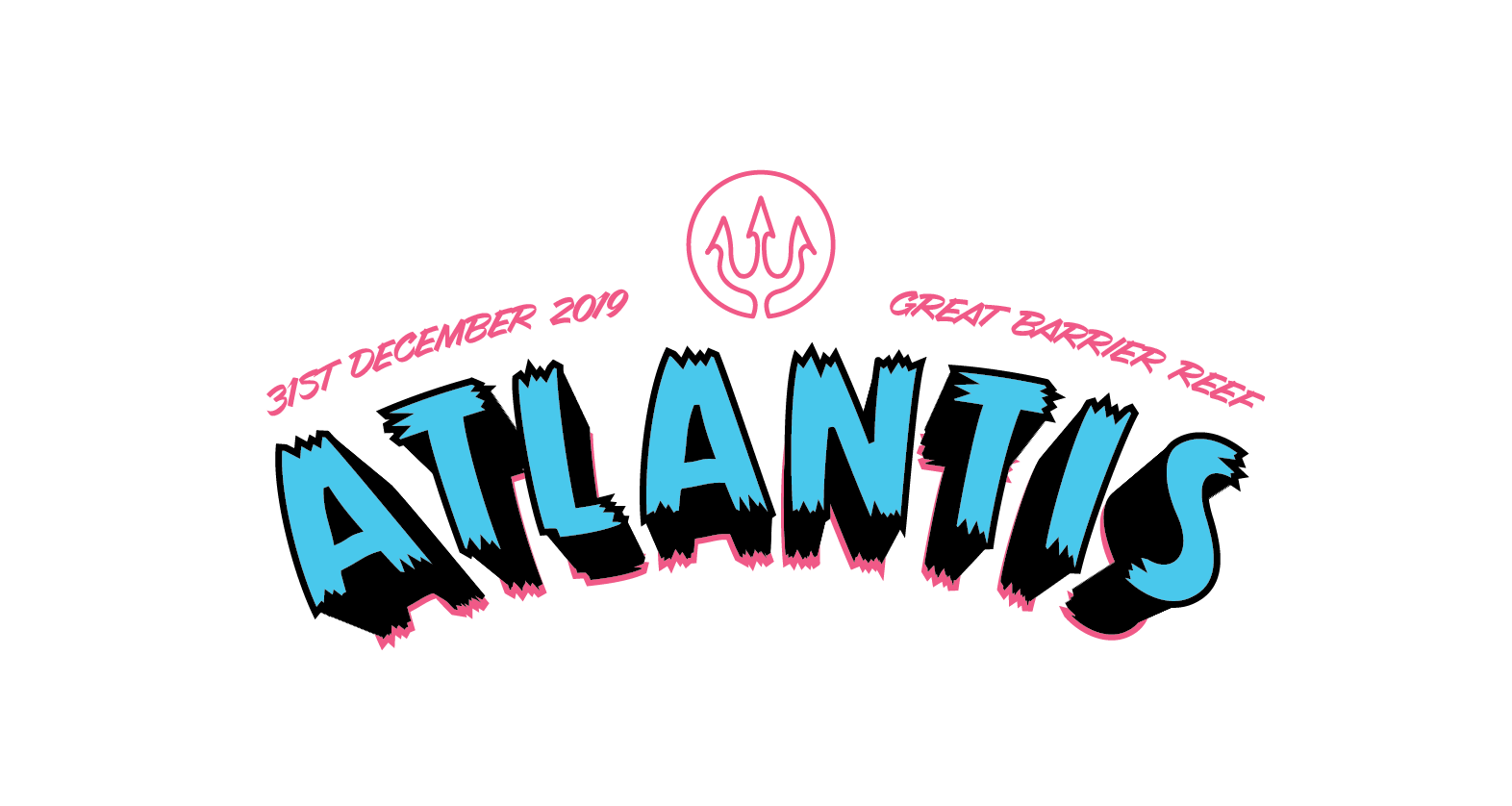
For my poster, I didnt want it to be any regular concert, but rather, with a twist! I decided to have an underwater themed concert, held at the great barrier reef! It would only be apt for it to be held there!
For the stars of my show, I had to think of dynamic sea creatures with limbs as I wanted them to hold conventional rockstar poses in my poster! This would make the poster a lot more dynamic in nature and create a central focus for the elements!
This is my initial layout of the poster.
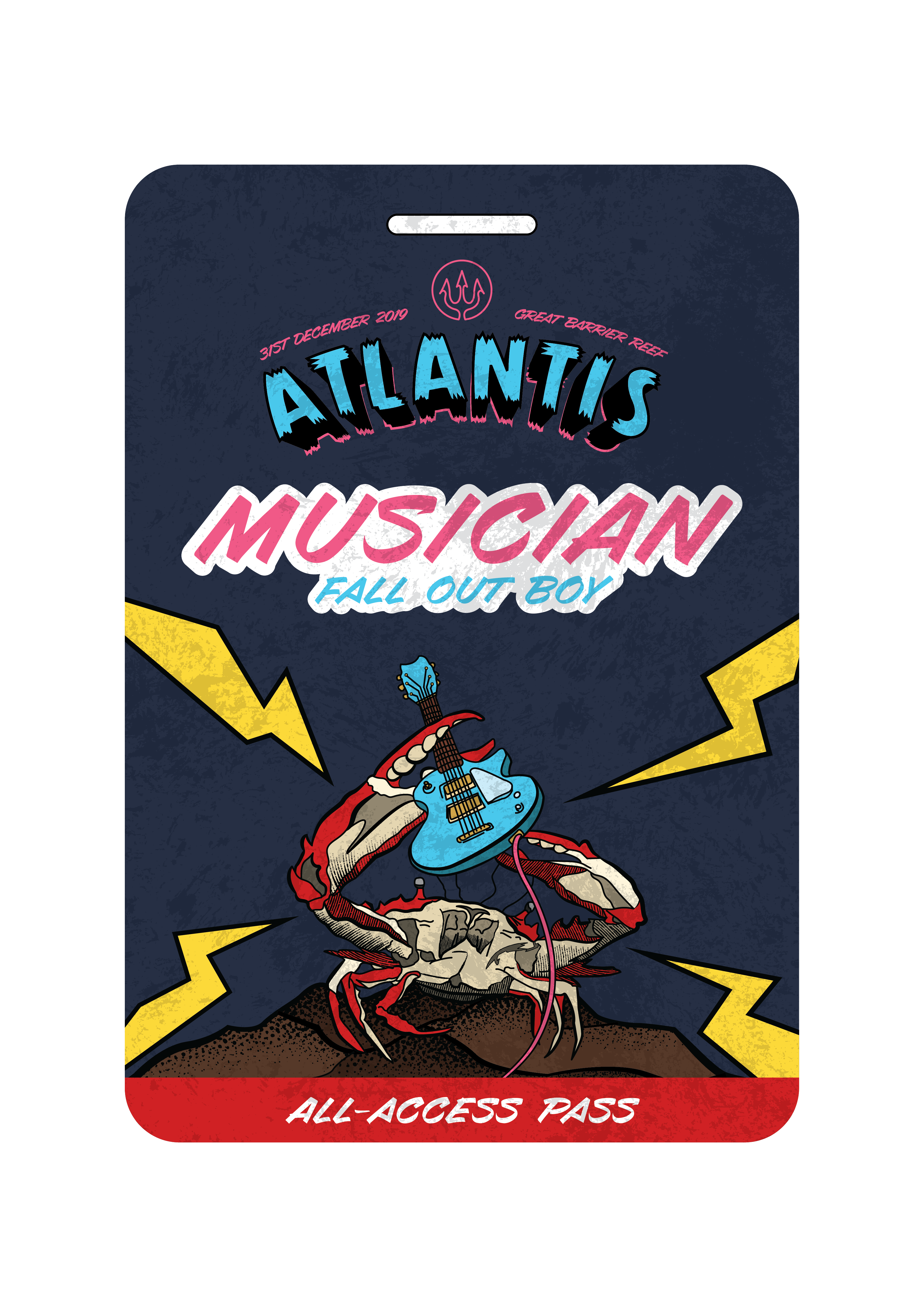
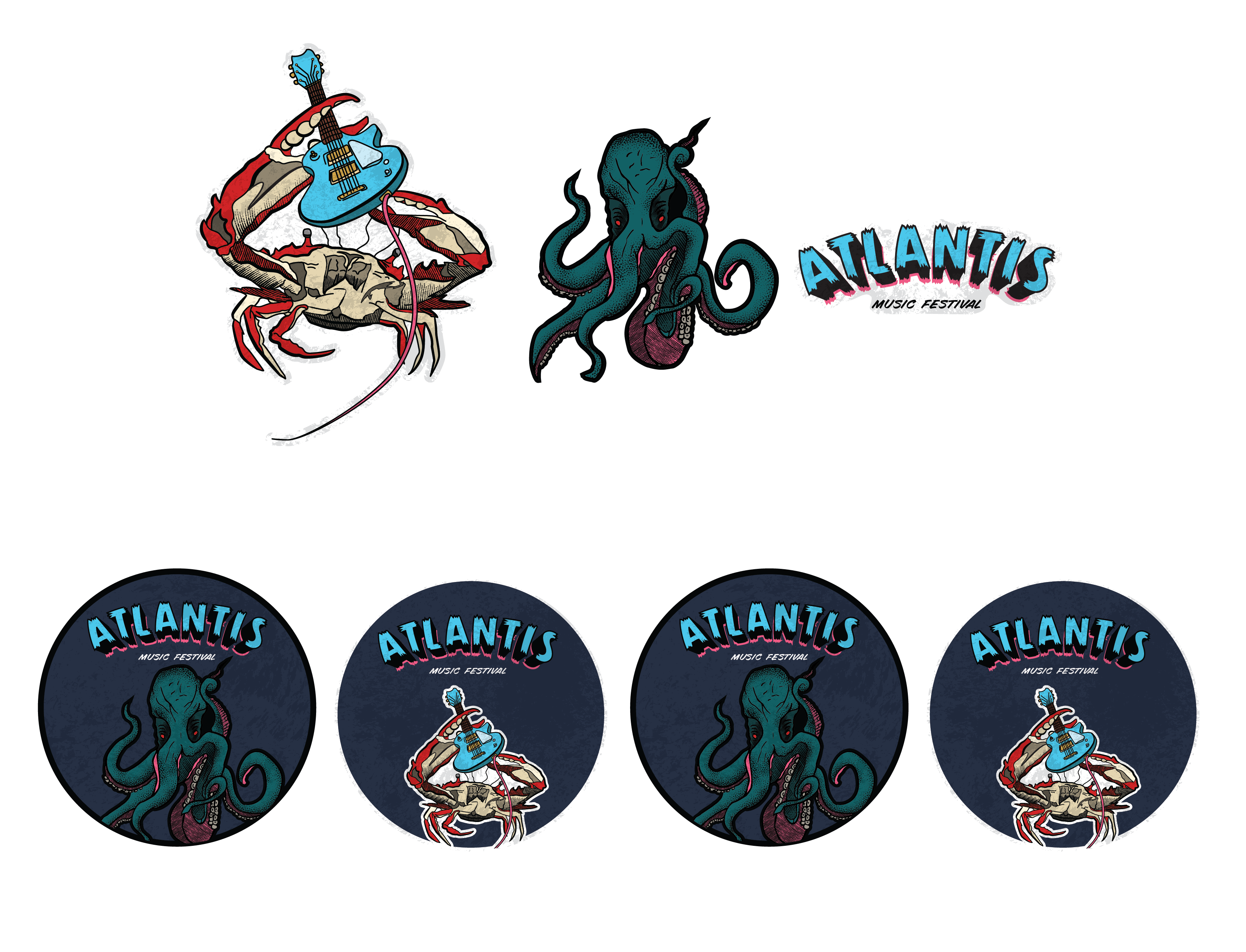
A crab was chosen because I feel like they create a very interesting compositions with their limbs and the details of their shells just screams badass, with spikes and a shiny menacing look! I wanted to have creatures swimming around, looking like they are having a good time, all while a giant octopus is ominously looming in the background. This is to give the piece some depth, as well as a narrative, making the crab a protagonist as he isn’t afraid of the octopus – suck it you killjoy!
I also thought it would be interesting to use the suction cups of the tentacles as speakers to hint more towards the idea of a music festival – one element which is vital in any concert.
This is the quick sketch of the direction I wanted to head towards within my poster. After this, I started to create the elements and necessary characters I would need to bring my poster to life.
The first and most important character was the crab! I had several references and an idea of how he would look like on stage. One thing which I had trouble was getting the angle of the guitar to look realistic. There wasn’t many references of guitarists holding up their guitar from the perspective I wanted, so I made a 3D mock up of it and used the 3D guitar model as a reference.
This is the process I went through to create a rockin’ Crab!
The next element I wanted to create was the large octopus looming in the background. As the tentacles would be placed in the foreground, I decided to work on it first.
The tentacles of an octopus was definitely something I struggled with as it was difficult to make it look realistic especially with all of its squiggly legs. To make things more difficult, the angle of the suction cups proved to be another challenge as some would overlap another. I had to reference many images to create a realistic tentacles!
Initially, when I started to piece the poster together, the left tentacle of the octopus was incredibly distracting, thus i decided to simplify it a little by just having his arms down.
The shading styles I used were a combination of hatched strokes as well as stippled brush effect. The different strokes I used were to push the grunge and worn effect further in my design.
Next, we have the typography of the event. The type treatment of the font would undoubtedly give the poster the signature Punk Rock Music festival vibes.
The logo in the title head was inspired by Aquaman, the ruler of Atlantis in the comics. I felt that the trident would be a good logo for the organisation holding the concert – and I named the organisation as follows.
This is the progression of my poster:
I added more elements into the composition such as the rocks in the background to form the impression of an underwater reef.
After settling the compositions for my poster, I moved on to creating my other collaterals.
Here we have a stage pass meant for the musicians, I used the Signature crab to illustrate them being the hero in the concerts.
This is an energy drink infused with alcohol to give that extra jolt of energy to continue rocking through the night!
The essential ticket stub for entry to the music festival.
Editorial illustration, this is a style which I am keen to develop my skills in as I have always been inspired by the messages or concepts which these illustrations usually carry. To be able to add little nuances and details, encouraging the viewer to look deeper into the message of the piece.
These little details through the use of symbols are ones which we see in our Everyday lives, and they are so embedded in our consciousness that we can instinctively identify and relate to it.
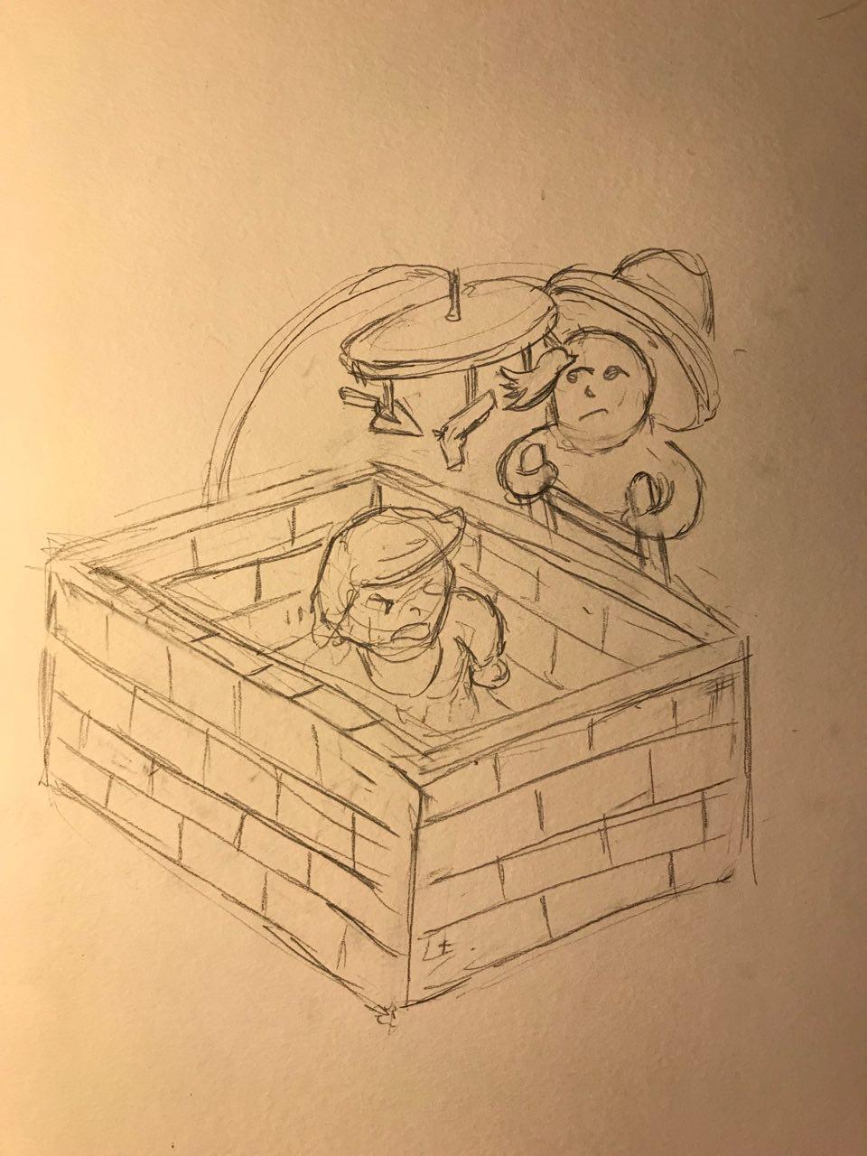
To begin the brainstorming process, Lisa had us sketch out thumbnail designs to explore the feasibility of the concept. As many as 16 sketches were created (not counting the dozens of crumpled post its) and I filtered down my potential designs to these 3 concepts. The topic I selected was Obsession and my idea revolve mostly around the political climate in the United States – I wanted to explore these topics and issues as I wanted to challenge myself, to see if I could compress such complex messages into graphics.The first design is of baby Donald Trump in a cot made up of bricks. This is to illustrate the obsession With his constant need to build a wall along the US-Mexico border. I drew Donald trump as a baby because babies are known to be really persistent with their cries and it also tends to be obnoxiously loud. I would have a Mexican national (very stereotypical illustration I must admit) peering over the walls, as though climbing it required nothing less than a ladder. This is to highlight the ineffectiveness a wall would be in their fight against illegal immigration and drug trafficking.
The next two ideas would be more centred towards gun violence in the United States. It has become such a common occurrence that jokes are being made about it and more worryingly, the government and people are starting to become desensitized towards this issue. There was a recent case of a school shooting not more than a year back, where the students were made to attend school the day after the shooting occurred. PTSD is going to be a big issue amongst US citizens real soon…
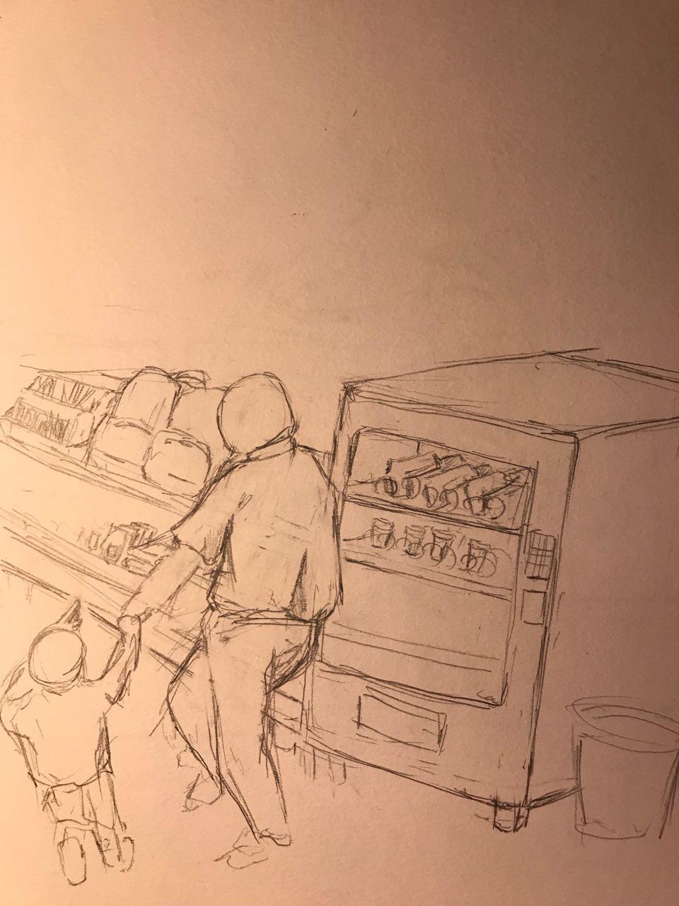
The first idea would be of a Father and Son, walking along a supermarket aisle, looking at Back-to-school supplies where they just causally stroll past a vending machine full of guns. This shows the lackluster of background checks in the system making these weapons accessible to most people and the nonchalant attitude towards school safety.
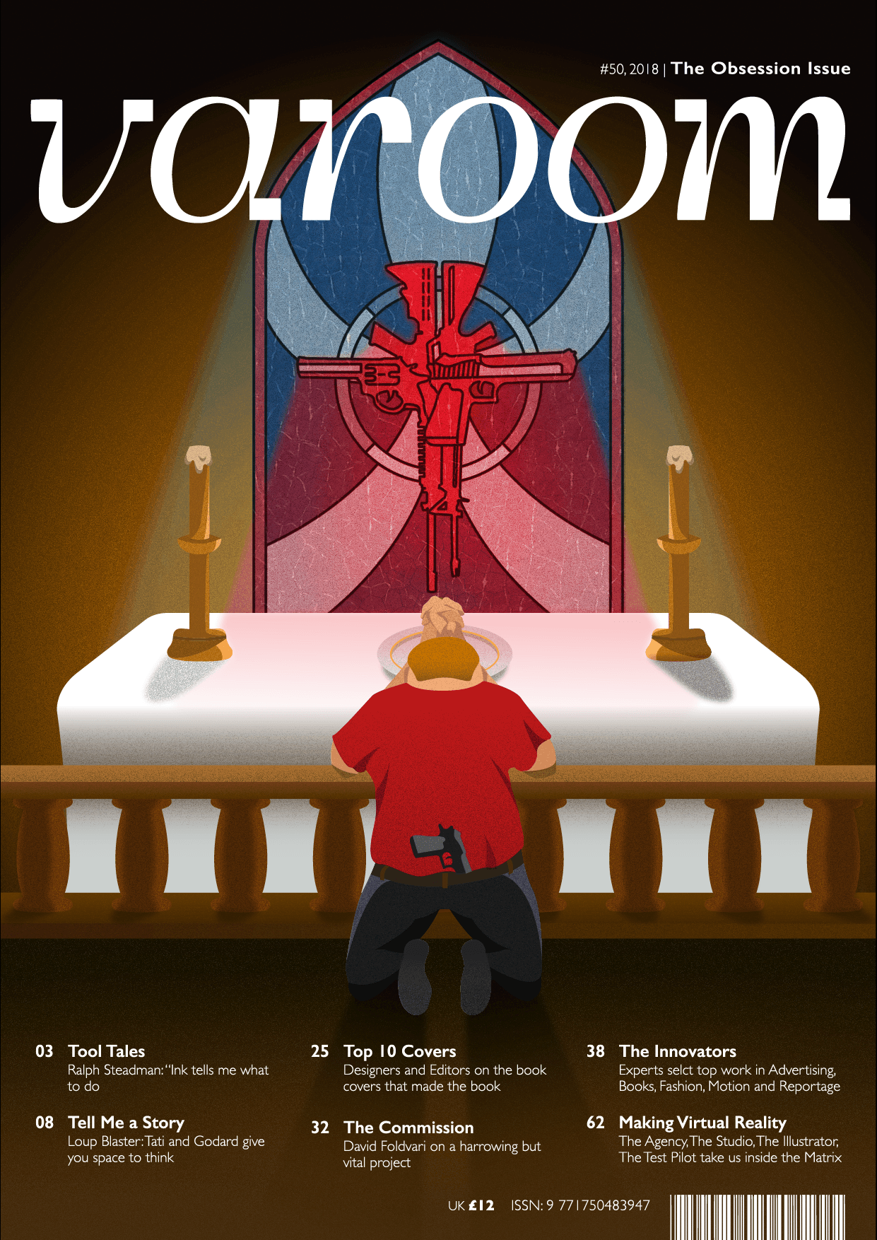
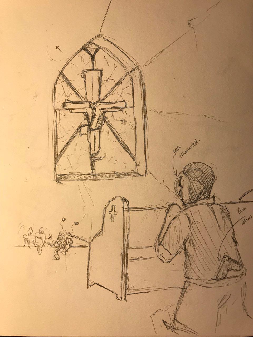
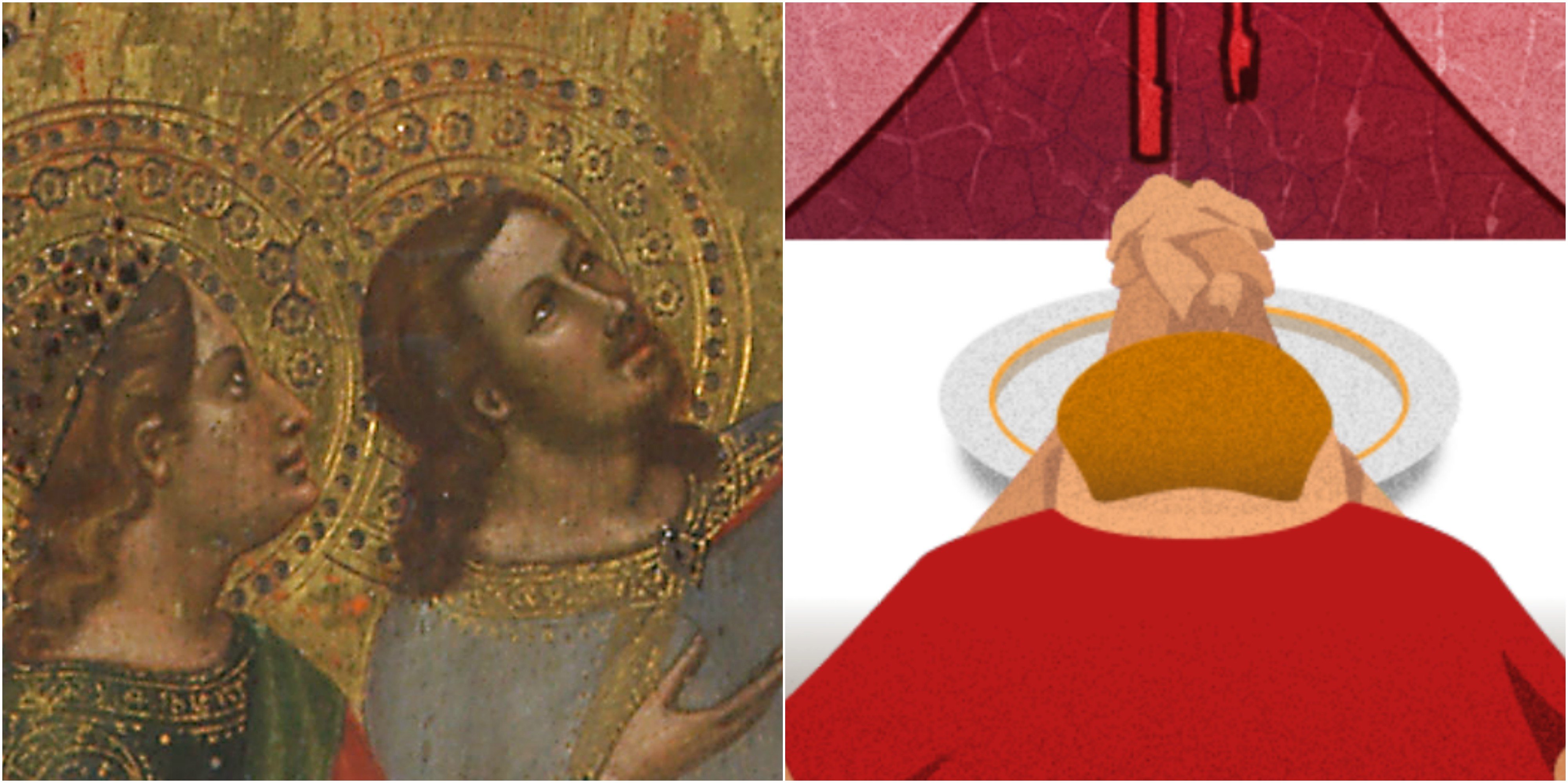
My next concept would be a typical republican voter praying at the altar of a church. The scene of the church would be a solemn one, where it is only lit by a stained glass window depicting a cross made up of guns. The praying position, coupled with the stained class cross would represent their worship and obsession for guns in the country. Republicans can also be regarded as staunch conservative Christians which is depicted by the scene of the church.
I would have the person at the altar tuck a gun in his jeans to highlight that the individual is also part of the gun problem.
I decided to explore this concept as the message of obsession was stronger and it would be easier to understand from a perspective of not only an American, but also people from other nationalities, as the cross and the praying position are both symbols for Christianity and worship.
I struggled with the initial perspective of the idea as I could not figure out the body proportions as well as the scale of the cross. I could not find a suitable reference image of anyone kneeling at the alter or pew at such an angle and I even considered taking an image of myself at a church doing that. However, I quickly ran into more problems as the scale of the cross had to be significant enough to see the details for the message to be encapsulated.
This is a video of the different experimentation with the positions of the Republican figure.
Eventually, I went with a two point perspective(?) of the composition as it would be able to show both elements of the cross as well as the republican with equal significance.
Colour treatment was something I had to consider greatly as it had to be representative of the States and a church. The more prominent colours which I used were red, blue and white, colours from the American flag. A warmer brown tone would represent the walls of a church, similar to the marble or sandstone bricks they use in construction. I had the background set to be dark as it would also hint at an ominous or solemn tone.
The style of illustration I would like to adapt would be one which uses a grain texture and realistic shadows. I enjoy this style of illustration as the texture adds depth and sophistication to the piece. The subtle use of gradients also helps with creating an inviting and pleasant composition.
I enjoy his seemingly clean and simplistic use of harsh shadows and bright colours to enhance contrast in his composition.
This the development of the cross made out of guns. I used guns which are commonly found in the United States. I felt like the leading lines of this stained glass composition really created an emphasis towards the object, and the colour helped to bring more contrast to the composition.
Throughout my illustration, I try to add little details to have a stronger religious undertone. Old Christian paintings often depict angels in Halos or Jesus in a crown of thorns. Lisa suggested I try and incorporate this element into my composition and I thought it would be appropriate to use the dish meant to hold offerings during Holy Communion. The Halo would also mean signify that the subject feels as though they are innocent, and their love for guns is justified.
The last struggle I had was trying to replicate the effect of a stained glass window as light passes through it. As light tends to blend into each other, creating the beams of light for the stained glass was incredibly difficult to re-create as it always tend to look unrealistic. I had the beams of light subtly reflect against the top of the table to provide more sense of realism.
To add to the details, I made sure that the shading of the wooden legs changed according to their position.
This is the final composition!
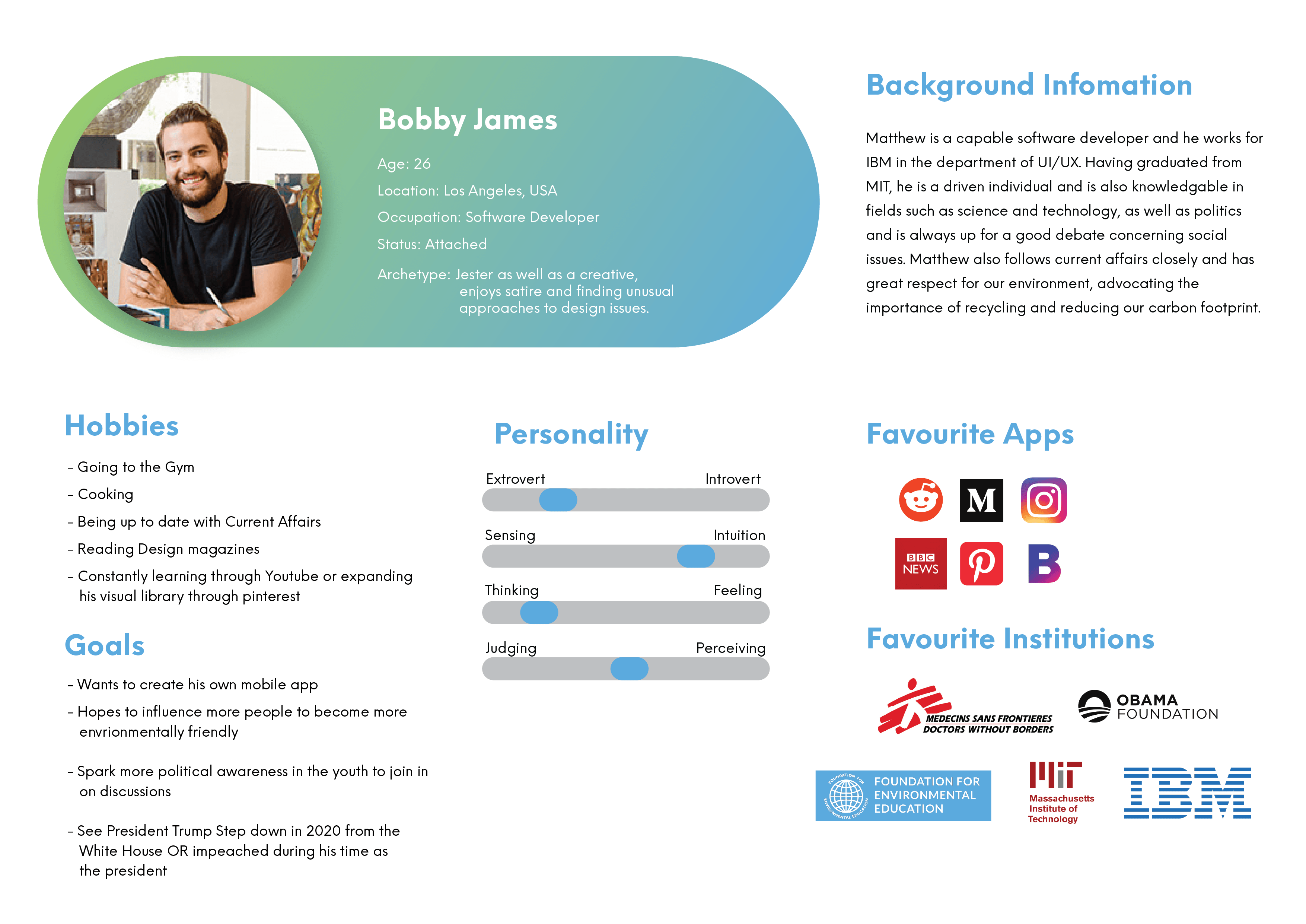
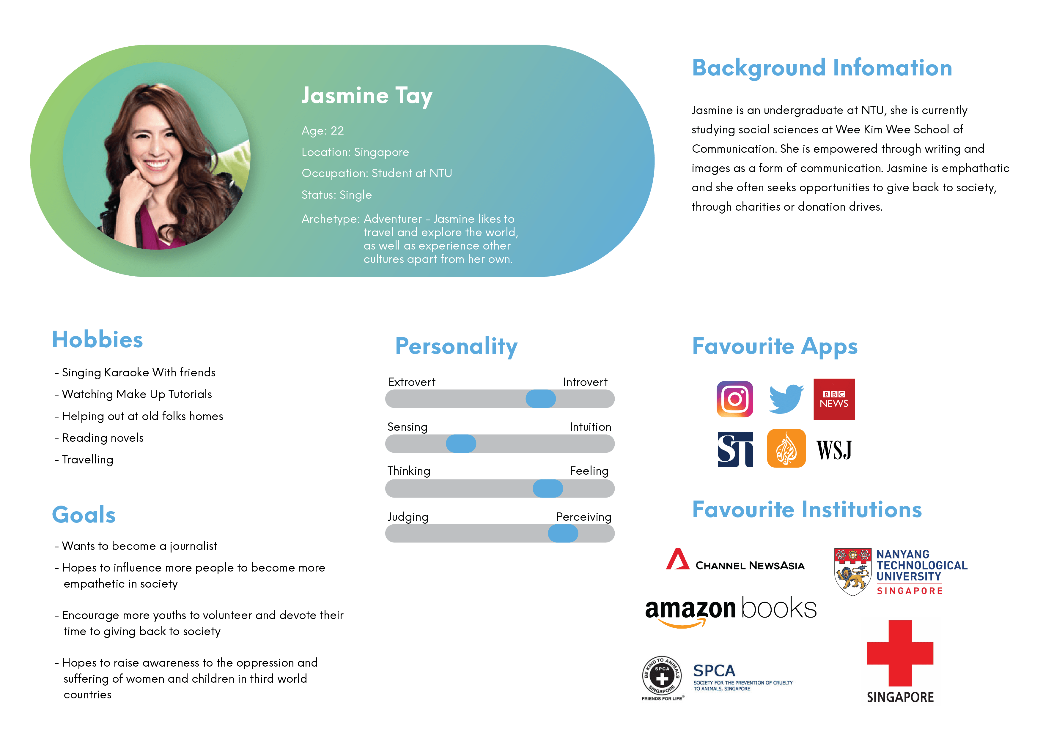
We were also tasked with coming up with 2 personas which would read Varoom!
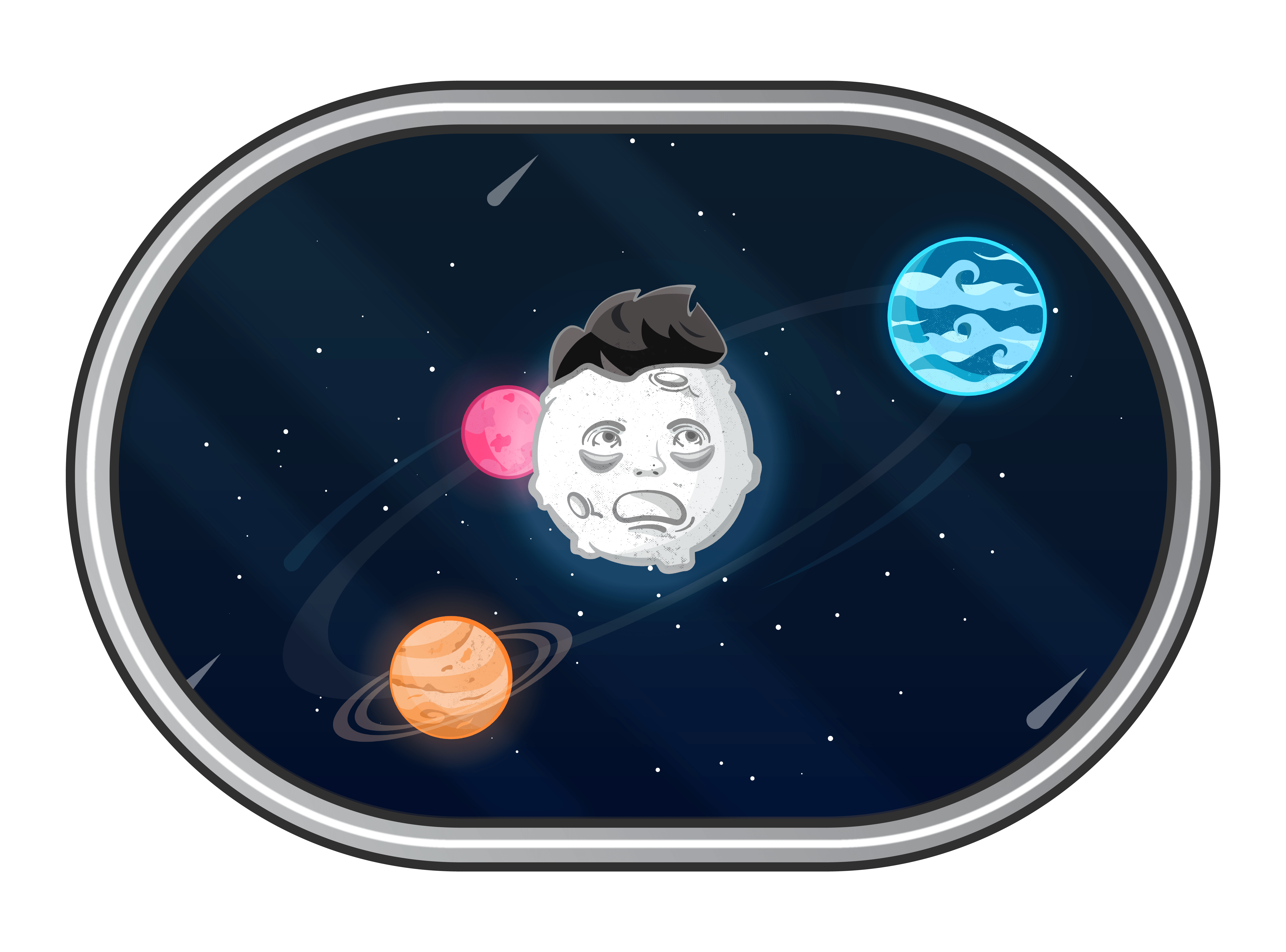
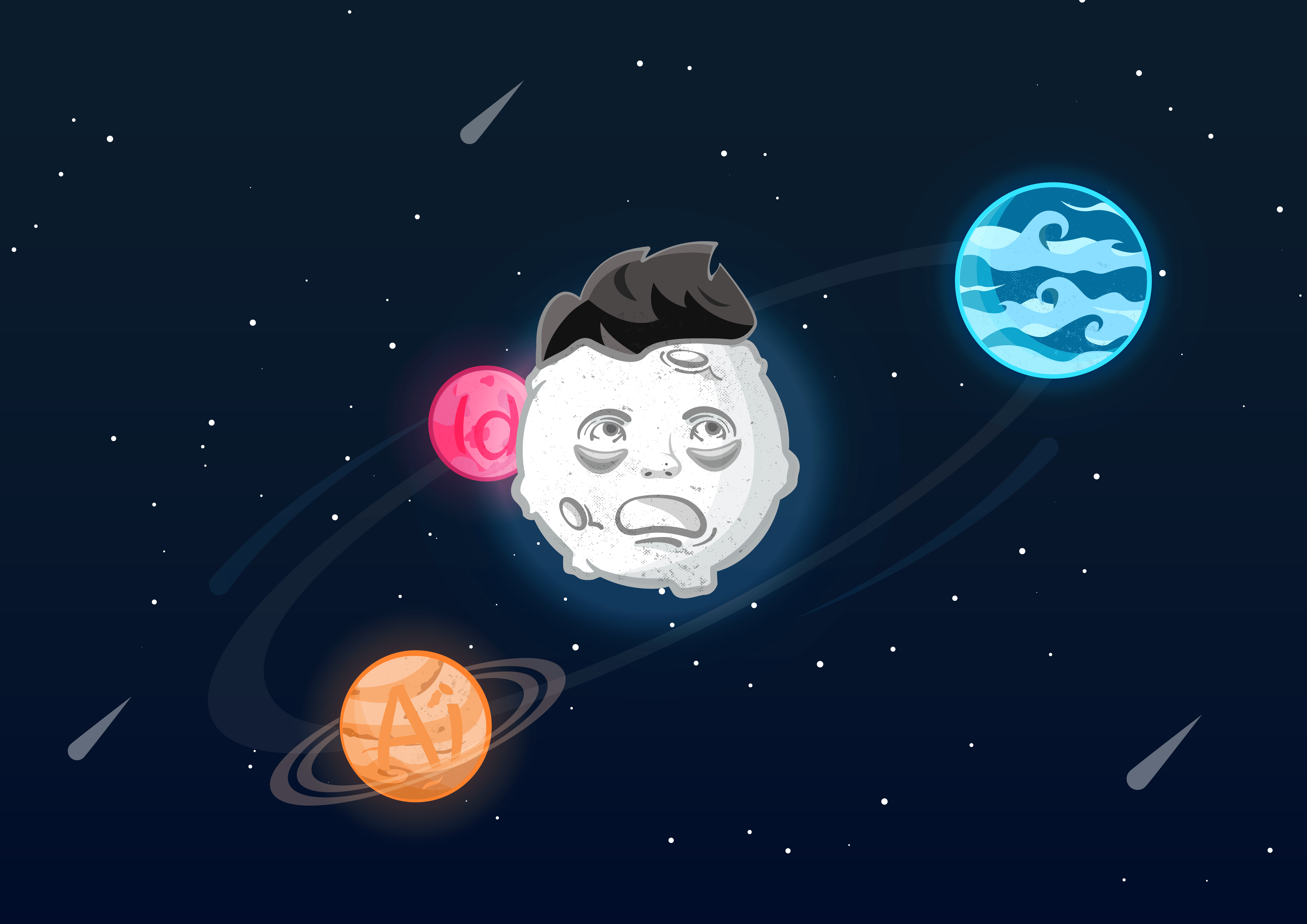
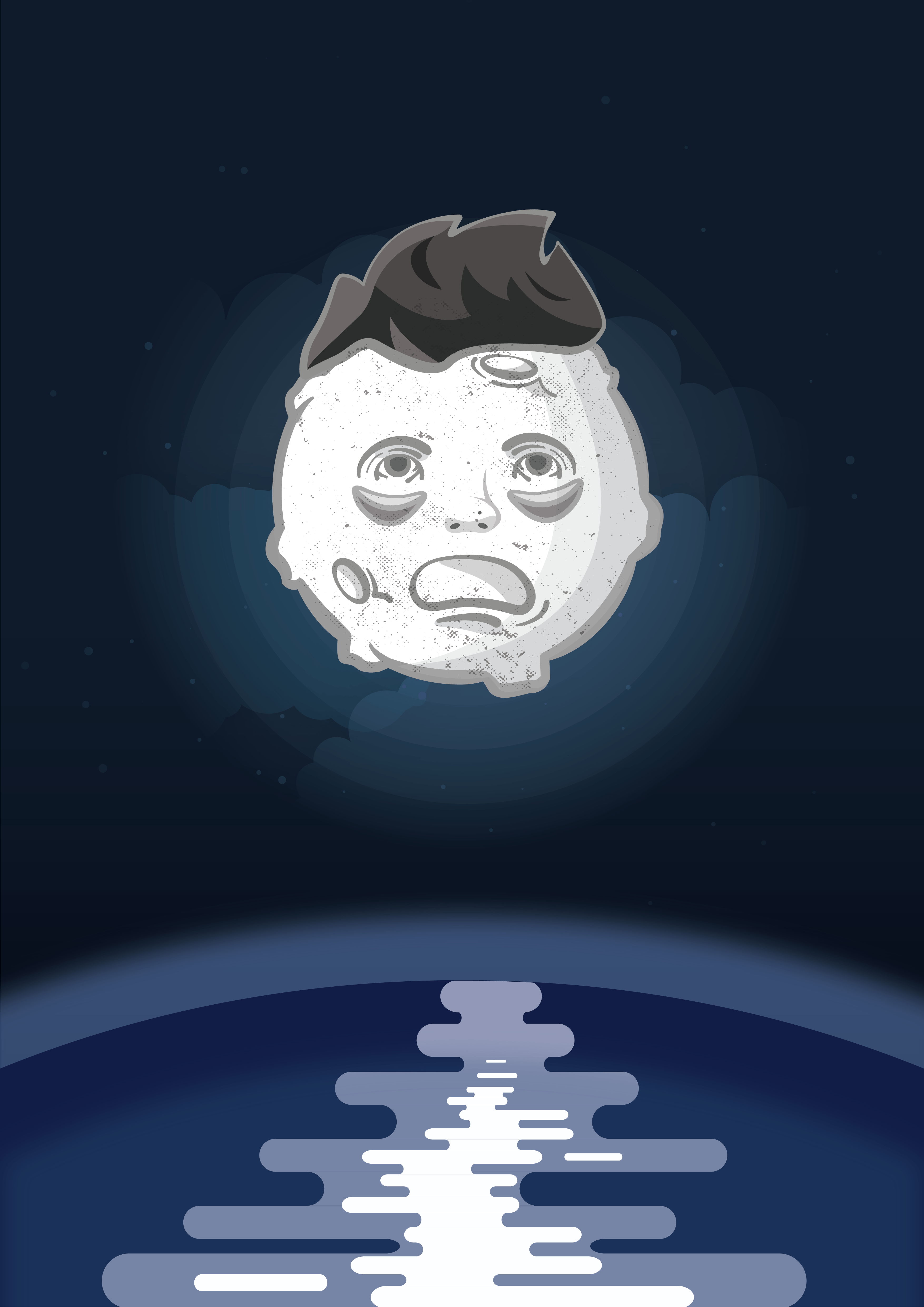
This is the final composition I settled for. I placed the composition within a frame which is supposed to resemble looking through a window of a space ship. I felt like this gave my illustration more depth and I also thought what a fascinating yet puzzling sight it would be to chance upon a distressed moon.
More about this illustration – as you can tell, I manifest myself as the moon in this composition. This stylistic approach incorporates my prominent features such as my hair, my nose, my eye bags and my pale-ish skin. The representation of the moon also depicts me as a late sleeper.
The surrounding planets are circling around me, keeping me up and I have trouble managing my time accordingly. These planets are meant to represent things such as my assignments and the software I use for them. The blue planet resembles swimming, something which I enjoy doing, however, I do not have enough time for that.
I decided to remove the texts on the planets as I felt that they were too representational and somethings are better left unsaid. I also added a little detailed strokes to accentuate the orbiting of the planets, giving the illustration a bit of dynamics.
The first assignment for Illustration for designers was to create a personalised self portrait which should encompass our character! After some of the in-class assignments, I had a better grasp on trying to encapsulate myself in an abstract form.
We had to examine our faces and determine which are the features that make us distinctly, us. Some of the features I wanted to use were my large forehead, my eyebags, my nose as well as my hair. These features are ones which are the most prominent on my face and I’d like to capitalize on that… for once.
Why these body parts? First off, my forehead. Its a myth that it is called forehead cause you can snugly fit 4 fingers within your (four)head. As for me, I am able to fit 5 fingers! While not abnormally large, I still think it is an interesting aspect of my face!
Next would be my eyebags. These designer bags have been with me almost my entire life, dating way back in secondary school. It used to be one of my insecurities as my classmates would always comment on how I always looked sick and did not get enough sleep. One comment which stuck with me all this time was someone calling me a zombie and I was so affected by it! I tried all sorta remedies, like sleeping early, putting cucumbers… etc. But to no avail as they are still as prominent as ever. I have learned to live with it and I am able to accept myself more now because of the fact that everyone in design school has a lack of sleep so its natural to always look tired… cup half full, am I right?
For my nose, I have a particularly large nose, arguably one that doesn’t fit on my face. From the side it looks alright, but when viewed up front, especially when I’m smiling, I find it the largest thing ever! So I thought it would be a good decision to try and use it in my composition.
And last but not least, my hair! I take really good care of my hair and I buy the best products for it. I feel like it is an important part of me and when I was enlisted into the army and had to shave it all off, I couldn’t get used to how I looked because I resembled an egg.
For this assignment, I had two concepts in mind:
Concept 1 –
Using my forehead as a beacon of light because of how big and shiny it is, similar to a lighthouse. I felt like a lighthouse also represented me as I enjoy swimming and I am comfortable in the water, similar to a lighthouse being swept away by the currents.
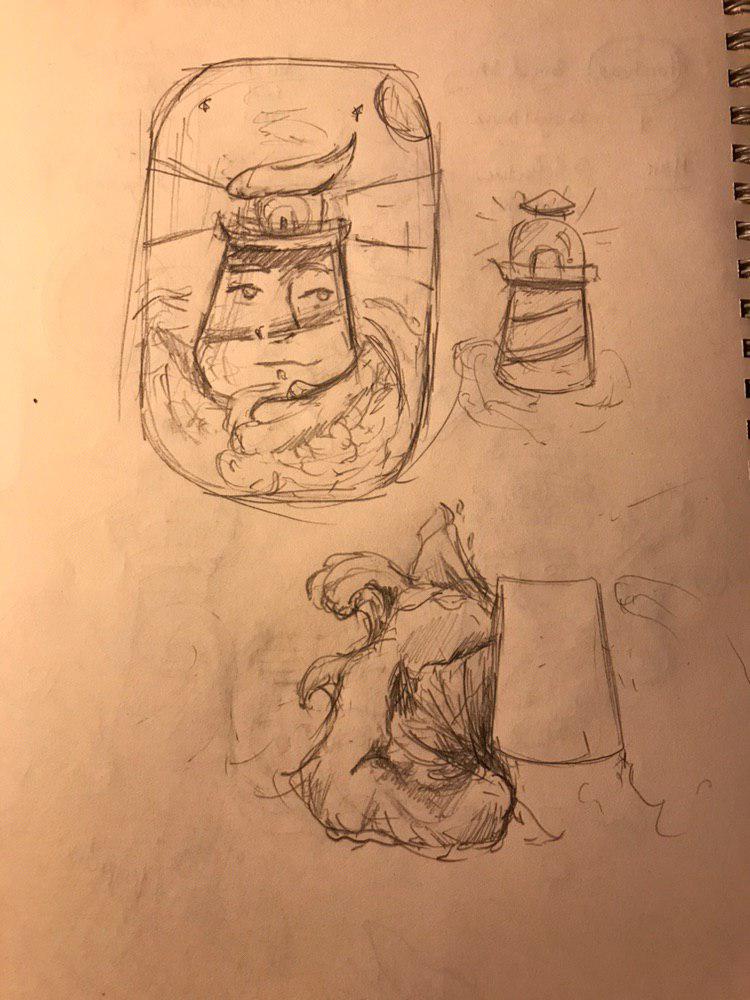
This is my initial sketch of the lighthouse.
From the composition you can see that I try to make sure the waves engulf me, yet I still look calm and composed. Certain elements like my hair and my forehead are incorporated into this composition.
Based on this sketch, I started to digitally illustrate it!
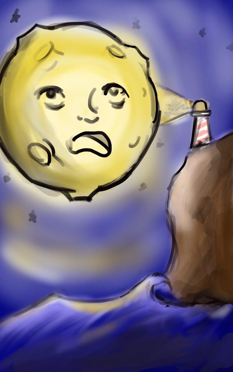
This lighthouse looks a lot more tranquil as I was still experimenting with how the composition would turn out. I wanted to frame it within a window, something resembling one on board a ship! For a sailor encountering a lighthouse, I imagine it to be a sense of relief and comfort for them, coming back onto shore. This is the kind of emotion I would want to evoke in my composition.
However, the style of my illustration did not fit to how I’d imagine it to be. So I decided to play around with using strokes and varying line widths in my next composition.
I felt like this composition would suit my style a lot better, with the thick defined lines. However, I felt that it lacked the aspect of my characters and it would be too abstract a concept for the audience to get. I decided to move onto my second concept!
Concept 2 –
This concept allowed me to play around with the composition a lot more and it enabled me to incorporate more elements of my distinct facial features in, without it looking too fragmented or unrelated. This concept involves representing myself as the moon!
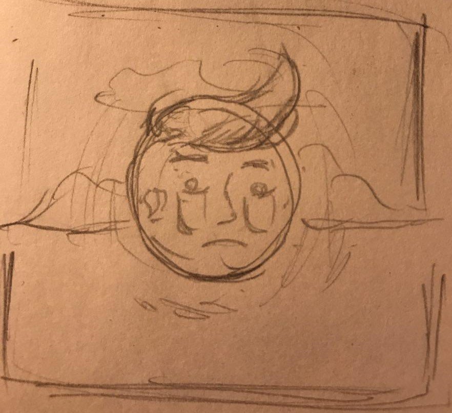
This is the initial sketch of me as the moon. There were key features i wanted to accentuate, such as my eye bags and the fact that I am a late sleeper which would be represented as the moon which stays up all night.
This is the digital version of the sketch. I added in the reflection in the water to act as guiding lines to the moon, but I soon realised that it started to dilute (pun intended) the meaning of the message as the composition is more cluttered now as a result.
To spice up my composition, I reworked the elements I created, even adding the lighthouse from the initial concept, based on Lisa’s comments. I used the golden ratio in this composition to create a more dynamic layout. As I brought this composition to class for a group critique, the feedback I received was that it was even more cluttered and it was difficult to see the relationship of the objects.
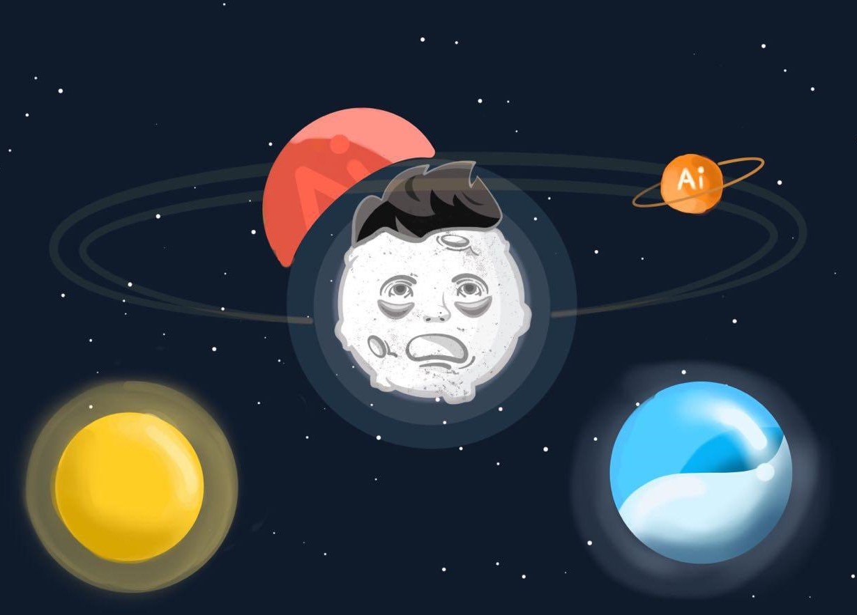
I begun with a new composition, this time adding more characteristics about myself. I wanted to have the moon being orbited by things which are on my mind, keeping me awake. Objects such as my assignments, keeping tabs on my fitness and getting enough sunlight are all important things in my life.
I am quite happy with the result of this new experimentation of layout so I thought it would stick to this for my final submission!
This reading delves into the intricacies which lie when cities plan to redevelop their existing spaces. City planners and government bodies have to carefully evaluate and balance the scale to conduct the redevelopment process. The dilemma comes when they have to choose between heritage and progress. To what extent should they sacrifice each aspect?
In this reading, the author, Annette Miae Kim describes her experience living in Ho Chi Min City and how she and the locals view and interact with sidewalks. As HCMC is a developing country, the traffic infrastructure has not been redesigned to face the influx of vehicles. Street vendors are quintessential in providing the HCMC experience as it is where the spirit of the city lives. People from all walks of life turn to street vendors as the source for their meals and it has been embedded in Vietnamese culture, to the extent where it becomes almost a symbol for Vietnam. Because of this culture, many people depend on sidewalks for their survival, operating their businesses along these streets. As plans and laws roll out in hopes to revamp the streets of HCMC to make way for wider and less congested roads to facilitate smoother traffic, these laws leave the locals who make their living off these streets in disarray as their livelihood is now at stake. Strict laws prevent vendors from operating on busy streets because of spatial concerns and thus, forcing them to leave the trait.
As a result, the essence of Vietnamese culture is slowly disappearing as these vendors are forced to evict from their spaces. Streets are becoming less vibrant and bustling, and locals and tourists alike are greeted with monotonous streets and inaccessible buildings. Locals have adapted to sell their goods through their vehicles, however, this would only benefit a select group of vendors, namely ones selling non-perishable goods.
Reflection
This reading has made me consider the lengths to which our Singapore government has implemented such a strategy. How did we find the balance (if we ever did) and to what extent was it successful? Stories of my parents enjoying food which was along the streets of their old houses, and how locals and store owners would interact with each other to form a personal bond. All these were uniquely Singapore experiences, but how has it changed through the years? For one, the government created a localised venue to house all of the food vendors and owners who were affected by the urbanisation of roads. These localised places are now known as hawker centres and coffee shops. Singapore has not removed all of these places as street vendors still exists at places such as lau pa sat market. I would say that our government managed to strike a good balance in terms of redeveloping our sidewalks as the essence of hawkers can still be felt, while also paving the way for economic development.