All posts by Joel Lee

Open to new experiences.

Diary Of Behaviour

Day 1:

When


To begin the data collection process for Diary Of Behaviour, I had to create a reminder on my phone. It should be evident in showing how much I depend on my phone at this point. Being awoken by my phone in the morning, I instinctively started checking my social media apps as well as reading some news online. I would remain in bed for around 10-15 minutes before I actually get up and begin my day. As I was preparing breakfast and getting ready for the day, I noticed that when I am alone, I began to view my phone as my companion and my source of entertainment, using my device when I was doing mundane & routine tasks such as preparing breakfast, brushing my teeth and even showering. The entertainment I consume using my phone varies from listening to music whilst cooking or showering, to watching videos or listening to podcasts when I am eating or doing household chores.

I had to leave home for a group meeting and during that period, I used my phone to check for bus arrival timings, I notified my group members of my location, opened a music app and began reading the news on my phone. All of these began even BEFORE I stepped out of my house. My dependency on my phone became more and more striking as my day progressed.

Why

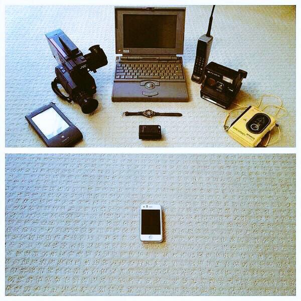
As the functionality of our phone is so diverse, we are able to utilise it in almost any situation. One main reason I use my phone is to alleviate the feeling of boredom, to be able to occupy ourselves with some form of entertainment as and when we like has become  a habit and somewhat of an addiction. I also use my phone to be able to efficiently utilise my time. By predicting when the bus would arrive as well as planning my journey before hand helps me to reduce uncertainty and time wasted on figuring out details on the spot. Communication through mobile apps also reduces uncertainty among our peers as being able to update them on the go ensures punctual arrival.

What

I use my phone mainly as a media consumption device for when I am bored. Other uses would be communication and a medium to save time.

Observation

When I began to notice how much of my time is being invested into my phone, I decided to put it away during my commute back home. It is so rare to see people living  and experiencing life in the current space as many of them have been transported to a third, virtual space which is their phones. It is true when people call us the zombie generation as more often than not, our minds are not in this current space. Boredom is so frowned upon in our society now that we require constant stimulation through our devices in the form of entertainment to feel as though we are not wasting our time.

Day 2:

This challenge of not being able to use our electronic devices is one which is almost impossible for us, as we require our computers for our assignments. With that being said, I did try to ensure that I only used my computer to complete my assignments and nothing else. My phone was left almost untouched on this day to try and replicate the experience of not using an electronic device.

I usually sleep with my curtains shut and I would rely on my phone to wake me up. However, for that night, I drew my curtains hoping that the morning light would act as my ‘alarm’. Sunlight is an important indicator to our bodies that it is time to get up and I am pleased to know that the function still exists for in my body as I was able to get up around 9 AM, without an alarm! Without my phone, I was able to accomplish tasks with less time as I was not as distracted and I focused more on finishing the task quickly. It is ironic because our phones are supposed to help us become more efficient with our time. As I cleared my schedule for this day, I did not need to use any form of messaging to communicate with others.

However, I had to travel out to purchase some materials for my assignment. I turned to books to occupy my time during my commute and I was greeted with curious gazes because it has become so rare to chance upon someone reading a physical book in our day and age. To be honest, I felt a sense of pride, and accomplishment for restricting myself from using my mobile device. Without being constantly enveloped in the virtual world, I was able to observe so much more of my surroundings – an adult making funny faces at a baby, a bus driver holding the door for an elderly woman or even friends having a good laugh. These are the little details which I would have missed if I drowned out my surroundings with music and just focused on my screen.

I did face longer waiting times and I had to stop myself from setting reminders or jotting down notes on my phone, forcing me to rely more on myself for these tasks. I did get bored from time to time, so to overcome this feeling, I started to observe more of my surroundings, noticing things which may be out of place or just studying different individuals in my vicinity – paying attention to their interactions with one another, their behaviours or with an object. Overall, this experiment made me appreciate the capabilities of my phone, but more importantly, it also highlighted how dependent I am on my phone and the amount of time I waste while trying to multi-task with it. Living in the present has become such an outdated concept (how ironic) and as a result, we miss out on so many interesting details of life, making us even more boring and dull.


Archetypes Process

It’s time for our final submissions already? The focus of this final assignment was archetypes – these are fundamental concepts which are widely used in the realms of corporate branding as each brand needs to have a distinctive character of their own, to appeal to their target audience. There is a myriad of archetypes out there, variations of the initial 12 created by world renown Clinical psychologist,
Carl Jung.

Conceptualization

My initial concept was some sort of an accordion fold, and this would give me more than enough space to showcase each archetype, spread across two panels.

However, when i brought this concept to Lisa, she warned me of the difficulties in using such a fold as laying out the content would be challenging because of the shape of each page, thus I would need to find a die-cut template for it. She then suggested I went with a more straight forward, yet stronger approach of using something similar to a swatch booklet.

Based on her comments, I started to adapt my concept to something similar to a swatch booklet, whereby each archetype would be accompanied by a colour palette, reflecting their characteristics.

These were the initial layouts of my designs. I had to decide on the title font as well as a font for the body text and caption. As we were not allowed to use images or supporting graphics, I explored manipulating shapes to create more depth and life into my work. Legibility was an issue with my layout, thus I had to restructure my layout as well as tweak a few colours to make it less jarring. I turned to actual Pantone swatches to observe how they laid out their  colour palates.

Execution

Once I had a better direction, I tweaked my designs to make it more legible and I compressed my cards so that it could comfortably rest in one’s hand. I made sure the graphics did not interfere with the body text and I gathered the colours so that they looked seamless and more cohesive.

I had to source for various colour palettes to represent each different archetype. I turned to online sources such as Adobe Colour, Colourlovers.com and pinterest. Colours in nature also helped with the selection of colour.

The possibilities for this archetype are endless because of the nature of explorer. An archetype representing someone who is always keen for new experiences, I had to try and convey movement in this composition. After looking at various forms of numbers, I chose the number 8 because it was similar to that of an infinity sign. Explorers are known to be relentless in their pursuit of something new and infinity seems to convey that idea perfectly. However, this drive can also be their downfall.

This leads to their shadow archetype, the Escapist. Explorers are quick to move on to their next adventure, leaving past ones without any sense of responsibility or accountability. People around them tend to suffer from this absence as they have to pick up the pieces these Explorers leave behind. To convey this message, the title font is hollowed out and I used light shades of blue to represent the feeling of absence. I cropped the 8 to make it look like a 0 to show that the archetype is no longer present.

This archetype was something which I initially did not want to do because I felt that I would not be able to explore many ideas with it.  However, as I began to play around with the colours and typography, I began to fall in love with it. Caregivers are gentle and nurturing in nature, thus I went for a more rounded script font for the title, and for the body text, I chose a bold and rounded font to make it seem more welcoming and friendly. Pastel colours accurately describe this archetype as the soft hues make it so much more loving and gentle. I used the number 0 due to its soft curvature – the rounded edges brings about a sense of wholeness, just like a nice hug.

However, on the flip side, Caregivers tend to care TOO much for their loved ones and they often get hurt if they refuse to let go or accept the toxic nature of their relationships. For this, I used a palette more representative of skin, and I changed the colours of the 0 to look like scratch marks and blood.

I chose this archetype because I feel it resonates with my character! As I was researching on this archetype I felt a connection. The Jester is a fun loving archetype and I wanted it to be whimsical and a burst of colours. The accents used in the font for the title accurately depict the nature of this archetype by being spontaneous and random! I used the the number 6 as it looks like swirls, making you feel as though you are dizzy from all of the fun you’re having.

On the flip side, jesters can appear to come off as fake (I’m obviously not) as they try their best to be involved in everything, and sometimes they even partake in gossip just to feel included. Their jokes can often be in bad taste if they take it too far, thus reflecting bad on their character.  I made use of the number 6 to form something signifying a ear, always listening, searching for the next piece of juicy information to gossip about. The colour yellow was chosen because… yes, yellow is the colour of liars.

Thought to be a visionary and a wise character. This is a bold archetype as they hold so much wisdom and they are able to envision the future. Yet at its core, the magician is a practical and straightforward character. Thus, I used a San Serif font to represent it, one without too much shenanigans. I used the number 5 for this composition and formed it into something resembling a binoculars (visionary) but also because it looks like shackles, a key prop in a magician’s show.

However, magicians are known to be strong headed in their ideas, often taking it too far by investing too much into their vision. If their peers do not see eye to eye with them, magicians can even manipulate people into doing their deeds or making people join them in their futile adventure.  Thus, I manipulated the 5 to make it seem like a table counter and I used the colour scheme of green and blue to make it look like a casino.

This archetype is notorious in branding as it appeals to only a handful of people. Rebels can be seen as the outcasts of society as they often go against the flow. However, they can be seen as revolutionaries and instill a sense of vigor in people. I used a grungy typeface for the title and for the body text, I used Blackletter as many trends associate these characters with someone who is rebellious or non-traditional (how ironic). I used the number 7  because I like the bold strokes it makes, representing something very rugged and edgy – it does not try to conform and be liked. The colour palette is also swapped to show that the rebel…

DOES NOT CONFORM TO GRID STRUCTURES.

As you would’ve expect, Rebels can sometimes take it too far, as their ideas may be too extreme for society. This would lead them to become anarchists if their values or believes are not kept in check. This composition shows uprising and destruction of an individual. The black background just empathizes how much negativity this shadow archetype has.

And lastly, we have the Hero. Something most people aspire to be! Who doesn’t like a heartwarming story of a hero saving those in distress? Heroes are bold in their actions and they command respect from their peers. Thus, I chose a heavy font for the title to give it that presence. Undoubtedly, I used the number 1 to represent the Hero. To command that kind of respect, one has to be the best in their field. I depicted the 1 rising above, similar to how superheros would fly! Strong colours are used in this composition to enhance the strength of the composition.

However, as to all the archetypes, Heroes have a weakness which is their ego. They tend to be so headstrong to the point whereby they start to push people away even if they know that the path they are taking is wrong, or not in favour with their peers. I depicted this by tilting the 1 in a downward angle to show its downfall, and the repeated 1’s show the motion of it. Having too much of an ego makes one disgusting and thus, I went with the colour green and purple to represent envy and pride.


This is the cover page used for my palettes. It features all of the forms used in the various compositions and the San Serif typeface used is futura, which I kept consistent for all of the body texts in the palettes. I decided to change ‘types’ to a serif font to show emphasis on that these palettes would also focus on typography.

Final cards all laid out!


Honorable mentions


I wanted to try the technique of replicating type to form a structure. However, the composition ended up really messy and it was very distracting, thus I was not able to incorporate it into my design.

The Design of Everyday Things – Reading Response

I view this book as the gateway into the world of User Experience and design. It gives us – budding designers a glimpse of the problems which consumers face when dealing with day to day interactions. Be it physical objects and apparatus, or using software or complex hardware, we as designers have to ensure that what we create has to be as intuitive and as easy to use, much like how we would use it.

This reading encapsulates human centered design as it covers the main components which make up a good user experience. A user’s experience can range from the sense of touch, sight, smell and sound, which would be covered with more depth along the reading.

“Good design is actually a lot harder to notice than poor design, in part because good designs fit our needs so well that the design is invisible, serving us without drawing attention to itself. Bad design, on the other hand, screams out its inadequacies, making itself very noticeable.”

We begin with breaking down the elements which make a good design and user experience.

Firstly, affordance – it refers to the relationship between a physical
object and a person.  Affordance is the immediate response an individual receives when they first interact with an object. The user may intuitively be able to use the object based on interactions with similar objects in the past. These can be as simple as a bottle cap, a door handle or a light switch. However, as the design of these simple mechanisms can change, and when that happens, it disrupts any form of perception the user may have of the product.

A good example of this disruption would be bottle caps used on containers which store medication. These caps require the user to push down on the lid before applying the twisting motion to open the container. This disruption is especially useful when it comes to preventing children and toddlers from accessing the contents of the container. However, an additional signifier would be required to inform the users of the additional feature which this cap contains.

Other example would be sliding or folding doors. These can often disrupt the user as they would be unsure what direction would be needed to operate the door. This is especially confusing if the hinges of the door is not visible, thus the user would not be able to deduce the direction needed to open the door.  In many of these cases, when there is a deviation from conventional design, and additional signifier would be required.


Signifiers – they are there to fill up the gaps where affordances may lack. They provide additional information to the user on how to operate a product or mechanism. This would often come in the form of texts or images, targeting the confusion users may face. Signifiers can also be incorporated into the design by considering the size or colour of different segments of the object.

For example, colours can be used to draw attention to a specific part of an object. Whether or not it is to deter users from accessing or interacting with that area, or it could encourage users to interact with it depends on the choice of colour and it would also be subjective to the object.

This water hose is an example of colours and shapes being used as signifiers for the usability of an object. The red would highlight the importance of that handle, while the cut out of the device would signify that it could accommodate a hand.

Mapping & feedback are especially important when it comes to designing complex systems such as control consoles or a website. Mapping refers to the linking of a control or adjustment feature to an object. This could be light switches or the buttons on a steering wheel – whereby, due to the various number of potential outcomes which could happen in an event of pushing these buttons, it is important that the user is able to identify the result of pushing any of these buttons.

Feedback is often overlooked in designing these systems as it signifies to the user that the interaction is successful. It completes the experience for the user and leaves them with a peace of mind that the task is complete. More often than not, when we do not receive any feedback from an interaction, it is common for us to continue interacting with the object till some form of acknowledgement can be seen. Feedback can be in the form of sounds such as a beep. Sight, which could include information displayed on screen or a small LED lighting up. The sense of touch can also be used through vibrations. Companies are starting to better utilise the vibration motors in phones introducing the feature of haptic feedback for interactions such as, typing on the keyboard or sending a text message.

Overall, I find myself becoming more critical and analytical to my surroundings. These skills can be transferable from the physical world to digital when it comes to designing an interactive site or application as these minute details would further enhance the experience of the user when they interact with the page. I must understand that when I design a system, I must ensure that despite it being usable to me, it may not hold true for others as functionality and affordance can differ from people.


Typographic Designer of the Week – Herb Lubalin

Scrolling through Herb Lubalin’s extensive portfolio page, I can see where he gains his reputation as Art Director of the year in 1962 because of his absolutely phenomenal and iconic work. From the film, The Sound of Music, to the classic Avant Garde logo, his work has definitely shaped the aesthetics of the late 19 century. Yet, his designs remain timeless and they could seamlessly fit into the design landscape of today.  He was bold enough to shed the popular swiss modernist styles which were highly popular in the 1960s for more expressive typography which definitely suited the vibrant and changing landscape of America.

I dare say, his work is the one which I have most enjoyed amongst the past few typographers of the week. This is due to how stunning the graphics look. A simple tweak in a font, the change of a kerning and weight can transform an existing font into something so decorative and timeless… and I am probably rambling on. I was so intrigued by his work that I even looked for his book online but it was sold out!

“If a word was a beautiful word, it wasn’t the sound of the word that intrigued me but the look of the word. I saw each letterform as a piece of design.”

Paula Scher takes a similar approach to creating beautiful graphics using type as these two artists treat letter forms as a brush stroke or element, to design their graphics. They are also not afraid to manipulate these forms to fit the look of their graphics.

With the amount of stature Herb Lublin deserves, he fundamentally designs for the people and often keeps the community in mind. In the article written by Ellen Shaprio, she stated that Herb would often hire women as well as minority groups such as the blacks in the rougher parts of the states to give them a chance to hone their abilities in the creative field. His designs became the voice of the minority and as a progressive, he was doing his part to change the views on these minority groups.

Upping your Type Game – Reading response

Reading through this article, I find myself guilty of committing the crime of sticking to one font for most of my designs, especially when it comes to choosing a font for the body text. The analogy Jessica Hische gave was thinking of fonts as clothes. Sure, you can use a single font for your entire website, however, it would look too overpowering and dull. She highlights the importance of choosing a font family as well as a family with different weights would offer you much more flexibility when it comes to designing a cohesive page. I’ve only recently discovered font super families and despite how different their styles are, they work seamlessly and can fit many different situations.

Choosing font families which offer different widths such as narrow, condensed, regular, extended would give you more flexibility in designing body texts as these can be used interchangeably whether you have too little or too much space to work with.

Amongst the many considerations when selecting a typeface, she also pointed out the x-height. Initially, I was skeptical as to how this minute detail could affect the overall aesthetics of the layout, however, when placed in comparison to a font with a much shorter X-height, the difference becomes apparent as it makes your content look a lot smaller.

“We read best what we read most.” 

Our countless texts through our years of existence has made some fonts more legible than others and it is crucial that we use this to our advantage. By using serif fonts as body texts and sans serif fonts as headers, it would significantly help with the digestion of information, as well as to exhibit hierarchy in the design.

Undoubtedly, the most important and frankly, the one I have most issues with is font pairing. I read those paragraphs with eager eyes, with hopes of some wise words of wisdom. And deliver did she! I have attained more skills under my belt when it comes to selecting font pairs as some of the techniques I can use include: Using fonts from a Super Family, Fonts designed by the same typographer, fonts which have similar characteristics – more specifically the skeleton, meat and clothes. While using fonts from the same typographer is situational, all of the other advice given are extremely useful!

I have to keep in mind that all of this process is just choosing typefaces! What a monumental task and if only more people could appreciate the thought process gone behind choosing the characters on their screen. I myself have a long way to go in terms of researching for the appropriate font choice as I tend to skip this entire process, only to mindlessly scroll through my font library to find something which would fit my design. This is a bad habit as if anyone asks for the rationale behind my font choice, I barely have anything to offer, other than, “oh because it looks nice.”