Category Archives: Foundation 2D 1 – G6

Ego – Final Outcome

As you can see, my final frames are in the form of a circle as I the food I eat all have organic shapes which is why I did not want them to be bounded by a square!


Overall, I am very pleased with my work and the various stages of development it took to get here!

Thank you to all of my friends who provided me with their valuable insights and how to further improve my designs! Without you I wouldn’t be here!

Finally, thank you Mimi for all your advice and expertise! I have a greater understanding for design concepts now and I have no doubt that these would greatly benefit me during my journey in ADM!

EGO – Process

Alas! We start on our process! All of my raw sketches and conceptualisation have been placed in my CPJ! But fret not, because I also have digital sketches to show!

I will summarise my conceptualisation process as most of it is in my CPJ. In essence, as my family raised me up to be cautious of my health, my parents always encouraged me to eat healthily and exercise regularly. This has benefited me in a plethora of ways as I often feel more motivated to accomplish more things and I find myself getting tired less often.

Thus, I wanted the direction of my work to incorporate elements of both food and exercise as it is what makes for a healthy lifestyle.

Before I further explored this concept, I had the idea of personifying myself as a dog as I felt that they were very active creatures and would accurately depict me. This was also inspired by one of the artists I found online!

However, as you flip through my CPJ, you can see that I tried sketching out huskies… But they look terrible and to capture their look accurately, I had to add in a lot more elements which was not what I wanted for my work.

So I decided to scrape that idea and I went on with creating illustrations of myself!

Notably, some of the faces are similar as I was still in the midst of creating my equations and I was unsure of what expressions I should illustrate! Trying to incorporate this idea into my work, I began illustrating my first equation.

Me Studying in Warm Room + Swimming Pool = Me Cooling Down

This was my first digital sketch of the equation.

At this point in time, I was just trying to come up with the concept and composition for my work, which is why I did not play around with colours just yet.

Slowly, as reflected in my CPJ, I had the idea of incorporating kitchen appliances and food into my equations!

Thus, I had the idea of using an oven to represent a warm room!

This was the initial idea i came up with! I brought this to Mimi and she commented that it was not very clear that it was an oven and that the composition was too tight, making it uneasy for the viewers.

She asked me to look into other ways I could represent an oven in my composition.

As I was watching a short animated film, I saw this perspective of an oven which I really liked. 

The perspective was from the inside of the oven, as opposed to it being from the outside as seen below. I felt that this created a much better composition and I was able to convey the message of me studying in it much better.


I used darker hues of pink to represent the warmth of the oven. I also made sure to pay attention to the lighting of the oven as I wanted it to be as clear as possible.

I also took Mimi’s suggestion of illustrating the entire frame before cropping it down as it would make sure that I am not limiting myself in any way.

I faced the most difficulty when I was trying to illustrate the oatmeal as it was hard to capture the different textures and tones. I also changed the initial colour of the table from blue to a warmer brown to make it in line with the theme of warmth.


+

Next, we have the pool frame. The composition for this gave me a headache as well as I did not know how to capture the look of a milk carton well to show the idea of a swimming pool. I took several pictures of a half cut milk carton to try and visualise the perspective better!

I also have several inital sketches of my milk carton and how I wanted it to look like.

This perspective would be one whereby the viewer has open the top flaps of the milk carton and is peering into it. This was tricky to capture, and the angles presented would make it difficult for me to frame it well.

I illustrated this and brought it to Mimi on the second consultation and she told me that i should not have filled the frame with the milk carton as it left very little breathing space for the viewer and it would leave them feeling uncomfortable.

I took her advice and i gave the milk carton a lot more breathing space. The new composition also allowed me to play around with more colours, making it more aesthetic.

Some comments from Mimi on the actual submission day was that the perspective could be changed a little as the horizon has to be slightly higher than where it is now.

=

Next we have my final frame. I wanted a dynamic composition for this frame but I found it hard to show it as the milk carton did not give me much room to work with.

I tried using a beach chair to represent relaxation but I felt that it did not fit the theme I was driving across.

Mimi suggested that I could have the oat jumping into the water, however, I felt that it would remove the element of exercise if I did that as it would only look like i was at the pool to have fun. Which is why I decided to go ahead with the conventional pose for swimming which is a freestyle stroke.


Colour scheme I used:

Unrefined Me + Hostile Gym = A Better Me


This is the first sketch I came up with for this equation. I wanted to show how an environment where people may find intimidating, could be somewhere where I sought comfort in. To me, this place was the gym.

After showing Mimi this frame, she told me that the end result was too similar and expected together with my other frames (as you will see).

This was also before I had the idea of incorporating kitchen appliances into my compositions.

I decided to use an egg to represent me as eggs are high in protein and it is essential for muscle growth! A little fun fact, before I entered university, my breakfast would consist of 3 eggs, a bowl of oats and milk.

I played around with different views for this frame.

Eventually, as seen in my CPJ, I went with the idea of having the egg in a tray as it would fit the frame better and it would make more sense through the equation as eventually, the uncooked egg becomes hard boiled.


+

Next, instead of a physical gym, I used the soft boiled egg cooker to represent the gym. As you would have to use boiling water to cook the eggs, it ties in with the whole concept of a hostile environment!

Upon Mimi’s advice, I added in steam and bubbles to further convey the idea of it being a stuffy environment.


=

A better me was represented by me breaking out of the shell and becoming a hard boiled egg! I spent a lot of time trying to  draw the egg shells as i wanted to make sure people could understand the composition, similar to how a caterpillar morphs into a butterfly!

I fiddled with the composition further as well as I could not decide which colours I wanted to use.

I felt that yellow and pink would represent the idea of hope and a brand new me better, however it would not be in theme of the colour! Whereas blue and pink would work well with the entire equation but it would not stand out as much.

I also had parts of the weights and shell protruding out of the circle frame, however I felt that if I was not able to constantly use this effect in my other equations or frames, the design would become inconsistent.


Colour scheme used:

Chilled Me + Running Track = Me Dying from Heat


Next, I wanted to show some form of exercise which I did not enjoy! For me, this was running as I hate running because of how sticky and smelly I become afterwards.

To show this, I personified myself as a piece of chicken breast.

I initially wanted to show myself on a plate in a fridge, showing how relaxed I was. This can be seen from my CPJ. I soon realised that the composition would become too cluttered with objects and that would take the attention away from the main object.

I went with the use of chicken sold in Cold Storage as they are always sold in the refrigerated sections and packaged in a foam box with cling wrap.

I initially added some symbolical elements such as a cold drink along with the chicken breast as well as more food packaging labels. But I realised that it over complicated the design.

In the end, I went with a more simple composition to drive the message across.

+

This frame brought me the most frustration out of everything as I struggled to find a suitable way to depict a running track. The skewed perspective of a running track also proved to be an issue as it was difficult to get it in perspective to look realistic.

I had some trouble with the vectors in illustrator which is why I exported the image onto photoshop to edit the colours.

I used warmer colours to show how the running track would be hot and suffocating.

=

I experimented with different types of chicken breast here, however, when I asked my friends to take a look at my illustrations, they would not get the link between the images as the chicken breast changes. I decided to use the original illustration, but add shades of brown to it so that it looks cooked. I added grill marks to make the effect more apparent.

The finishing touch would be me lying in a puddle of my own sweat. Again, I used rose quarts to depict a warm environment.


Colour Scheme used


Me Under Pressure + Parks = Me at Ease


This was the first sketch I made of this frame. It was supposed to depict how nature provides me with tranquility and calms me down. As what Mimi said, my initial sketches were very predictable which was why I changed them.

To show this, I used edamame. A type of Japanese bean! When I went to Mimi with this idea, she told me that squeezing the pod is not how people would normally eat this food! I told her that it further adds a comedic element to it as it was exactly how I tried opening the pod the first time I ate it!  This external stress would convey well when the pod explodes!

+

This was a fun composition to come up with and I felt that the colours really tie in well with each other. I wanted to depict a forest using only vegetables I eat to show healthy living. I included tomatoes, broccoli, baby carrots, lettuce and romaine lettuce to the composition.

I had to tone down the reds of the tomato to a more subtle pink as the colour was too strong and not in line with the pastel theme.

=

Salad!! Oddly one of my favourite things to eat. My mom always prepares too much salad for my family to finish which is why they always expect me to eat the remaining vegetables left.

For this frame, I used the same vegetables as the ones I used in the park to create a salad bowl.

Colour Scheme I used:


Now for my final submission!

EGO – Research II

During one of the early consultations I had with Mimi, she suggested that I should look into children’s colour palettes as I told Mimi that I envisioned my work to be one which was cheerful and fun to look at.

Here on begins my research for colour!

Before this, I never realized how enticing children’s candy looks like. It is amazing how colour is able to speak to the subconscious mind of children, making their parents buy candy for them.

Colour is so strongly ingrained in us from such a tender age which is why it is such a powerful tool when used in marketing.

Here are a few other examples of products and banners catered to children.

The hues for this palette were too strong for my liking which is why I did not want to use them in my composition.

The colours from this image makes use of different shades of the Pantone Colours of the year – Rose Quartz and Serenity.

This poster uses triadic colour harmony and it works very well with the idea it was conveying.

A free stationary branding mock up created by Santiago Moreno.

This banner uses a split complimentary colour scheme.

This composition uses Tetradic colour Harmony and it is able to show the ‘kraziness’ of the poster, while creating a composition which is pleasing to look at.

I stumbled upon this book as I was sourcing for inspiration and I thought that it would be great if I could include some of it in my research. This is a book on printing in both CMYK and PMS.

I really liked the colours in this composition and i felt that it would be great if i could incorporate some of the design elements into my work.

https://www.behance.net/gallery/52312515/Printing-Colors-in-Graphic-DesignCMYK-PMS 


Assignment 3 – Ego Research

To begin sourcing for inspiration, I looked to Behance for artist references. As I decided on illustration to be my medium, I thought it would be an appropriate place to begin as most of the illustrations on Behance was digital.

I found a plethora of references I could use, ranging from colour studies, composition, concepts, as well as character design.

Bruno Mangyoku

One of the biggest inspiration for this assignment was Bruno Mangyoku. His work features brilliant composition techniques as well as minimal use of colour. Only varying the tones from a limited selection of colour.

The use of the circular spotlight and harsh shadows really draws the audience to the message of the image. The use of red tones to bring out subtle details in the composition ties everything together.


The use of warm colours in this composition, accompanied by the hint of cooler tones to represent foliage sets the mood for this piece. After being exposed to colour theories and harmonies, I am able to appreciate works like these as it takes tremendous amounts of planning to be able to evoke the desired mood with such a limited range of colours. The use of the wooden floor boards to direct the eyes to the man was also an ingenious touch, one which I overlooked initially.

The use of implied lines through the ropes attached to the roman rings makes you wonder what message the image is trying to convey. I would interpret this image as sports bringing 2 opposing parties together, be it business and politics.

This composition features a sort of Yin and Yang composition which creates tension. I also like how their eye lines meet which is a nice touch for the composition.


kongkong wu

I enjoy the character design by this artist. A surrealistic piece depicting a space man on a planet with cacti? I like the touch of the astronaut having rosy cheeks as it softens the tone of the image and makes it more lighthearted. 🙂


Szu-Yu Lin

I stumbled upon this piece and it was interesting as the concept closely ties into the project we are currently working on, which only consists of three frames. This artist represents everyday situations in a comical sense, which is what most of us are able to relate to.

The simple flat layout works well for the illustration as it makes the message short and succinct. Texture is also added to give the composition a certain feel of depth.

The frames are so well composed, it does not even need the words to convey the message.


MEGAFON

These compositions are slightly more complex in terms of the use of gradual colour tones, as well as the focus of the image protruding from the circular ‘boundary’. This would be an interesting concept to explore in my work as it would make the focus stick out, literally.

Woodblock Printing

I ventured into traditional illustration techniques to see how I could compose my shots. The clean lines and flat lay of Japanese woodblock printing makes  it an ideal study for this assignment. However, the image would look too cluttered if where were so many elements. It would also be difficult to create an interesting composition with a square form.

Coke Navarro

This artist modernised Japanese woodblock printing and created this complex illustration on Adobe Illustrator. The amount of details this image has is staggering.


Andrew Archer

I went to look for similar flat lay styles and I found this. The strokes of this image is much more simplistic as compared to the one above. However, to be able to execute the Japanese flat lay style well, I would be required to use a many different colours, which may not be in theme of the assignment.


Character Inspirations

Hyper Potion

I also started to search for ways on how I could depict myself in my work.  I stumbled upon this artist while I was listening to music and I fell in love with this illustrations as they were just so adorable. The line work was simplistic which was the style i was going for.

Gudetama

This is one character which most of us are familiar with. The simple expressions have captured the attention and love of many, accompanied by its vibrant colour, it makes it hard for anyone to dislike this character (unless if you are allergic to eggs or are a vegan)


This is another concept I wanted to explore! I really enjoy how the artist is able to make use of good to express such emotions. The artist also uses pastel tones which is pleasing on the eyes and evokes joyous emotions.

Other personification ideas would further be explored during my process post.

Assignment 3 – Ego, Research on Colour Theory

At last! We delve into the world of colour! To be able to use colour tastefully in our designs, we must first have an understanding of colour theory and the methods of pairing colours together.

To start off, we have the colour wheel.

Primary colours, secondary colours and tertiary colours


Colour is important in all disciplines of art as it is able to convey different emotions as well as portray different moods which the character may be in.

The usage of colour in set design can also give a context or background of a character.

Monochromatic

Monochromatic uses different values of the same colour. This enables the artist to achieve depth and tone to their art work.


Direct Harmony 

Direct harmony or Complimentary pairing is the usage of a colour directly opposite each other on the colour wheel. This creates a great contrasts in your composition. However, your colour palette will be mostly limited to 2 colours. This pairing is mostly used in simple graphics with few elements.

Split Commentary

For split commentary, instead of taking the adjacent colour, we would be taking the two beside it. This leaves the composition with a less striking or contrasting composition.

Triadic Harmony

Another variation of Split commentary, this involves colours with equal distance between each other, forming a triangle. As you can see, it forms a very contrasting composition as well.

Analogous Harmony

Analogous harmony is the use of the colours next to each other. This creates a pleasing composition on the eye. However, it can be mistaken for a monochromatic composition as it follows a gradient.


Tetradic Harmony

An evolution from This is a more complex form of colour harmony as it involves 4 colours. This is mainly used for designs with many components as well as characters.

Forrest Gump – Final Outcomes


Overall, I am very pleased with how everything turned out in the end! I really enjoyed this assignment as I got to experience a traditional print medium which was screen printing!! (Spoiler alert: It is really tough and I have so much respect for people who used to do it)

Here are some of the shots of my process of silkscreening my classmates kindly helped me take.


This is a comparison between my first screen and my final screen! I noticed the loss of details in the first print which is why I refined the second one to add in more details.

The details really brought a lot more out of my composition and it looked great on my bag!


Thank you everyone for your help!!

(Special mention to this song for setting the mood when I was about to print onto my tote bag)


Forrest Gump – Process

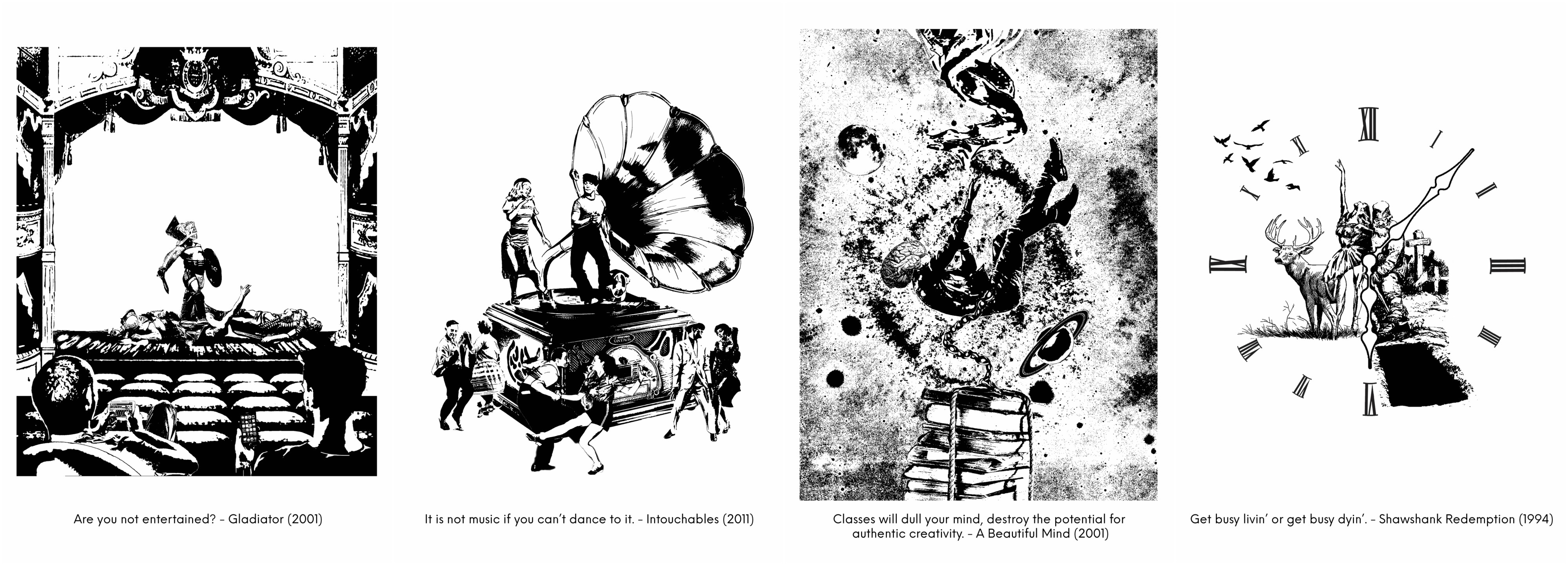
“Classes dull your mind, destroys the potential for authentic creativity.”  – A Beautiful Mind (2001)

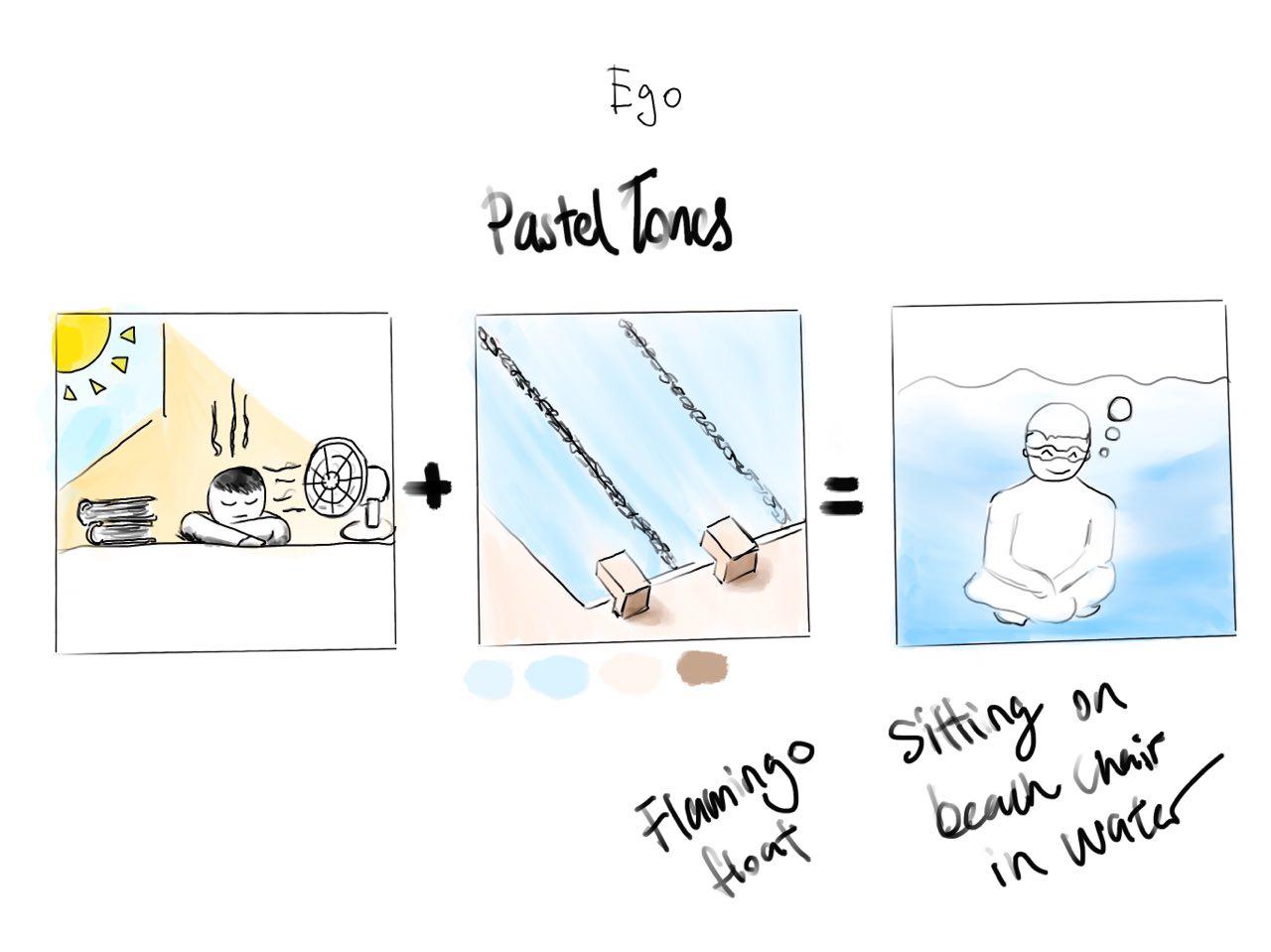
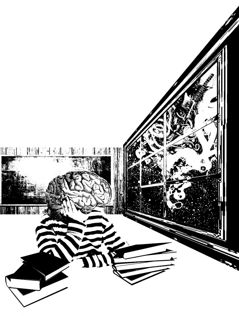
The first concept I had for this quote was to have a child looking out of a classroom window. This would show the mind being trapped in an environment which it is longing to escape from.

I filled the window with a variety of things to represent different expressions and forms of creativity, such as musical instruments and intertwining vines to have a vibrant composition, showing a stark contrast between the monotonous life in a classroom, versus what life could be.

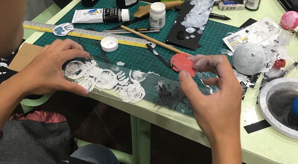
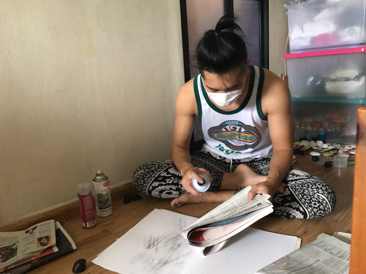
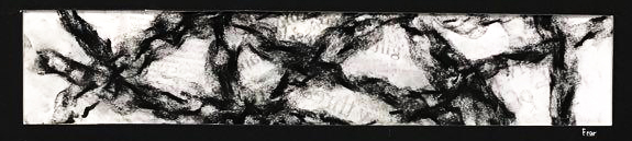
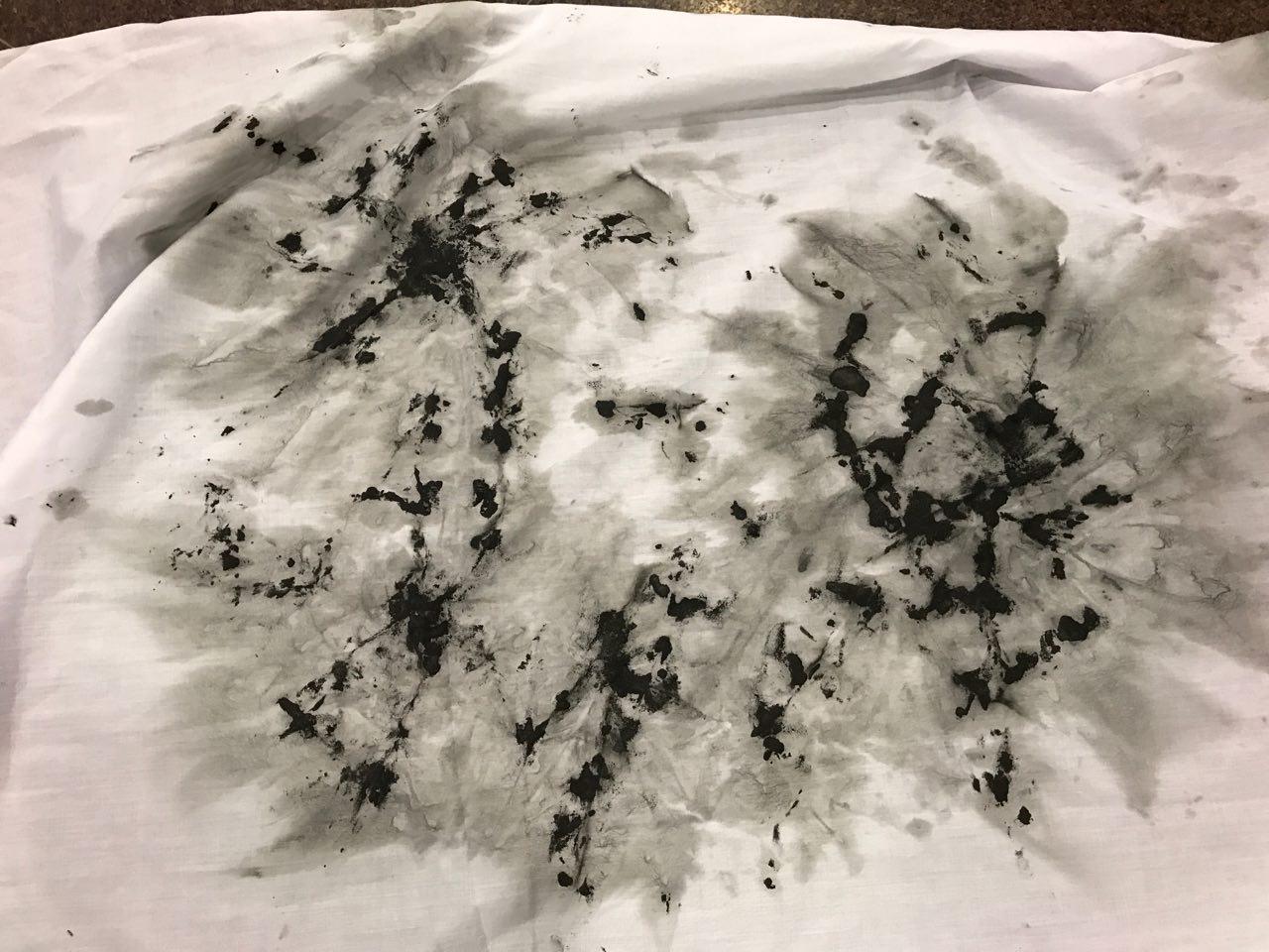
This is a summary of the steps I took to complete the first composition.

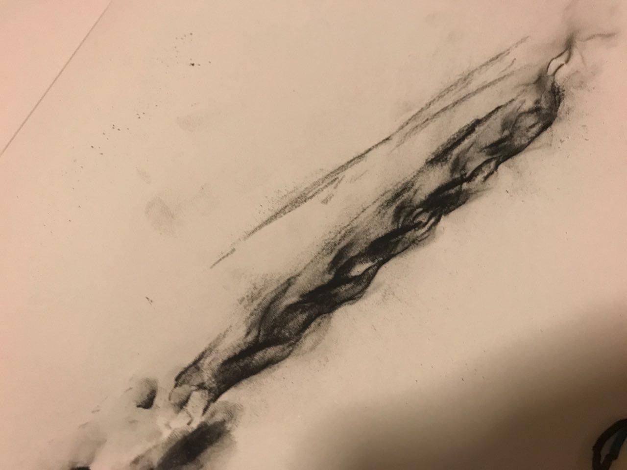
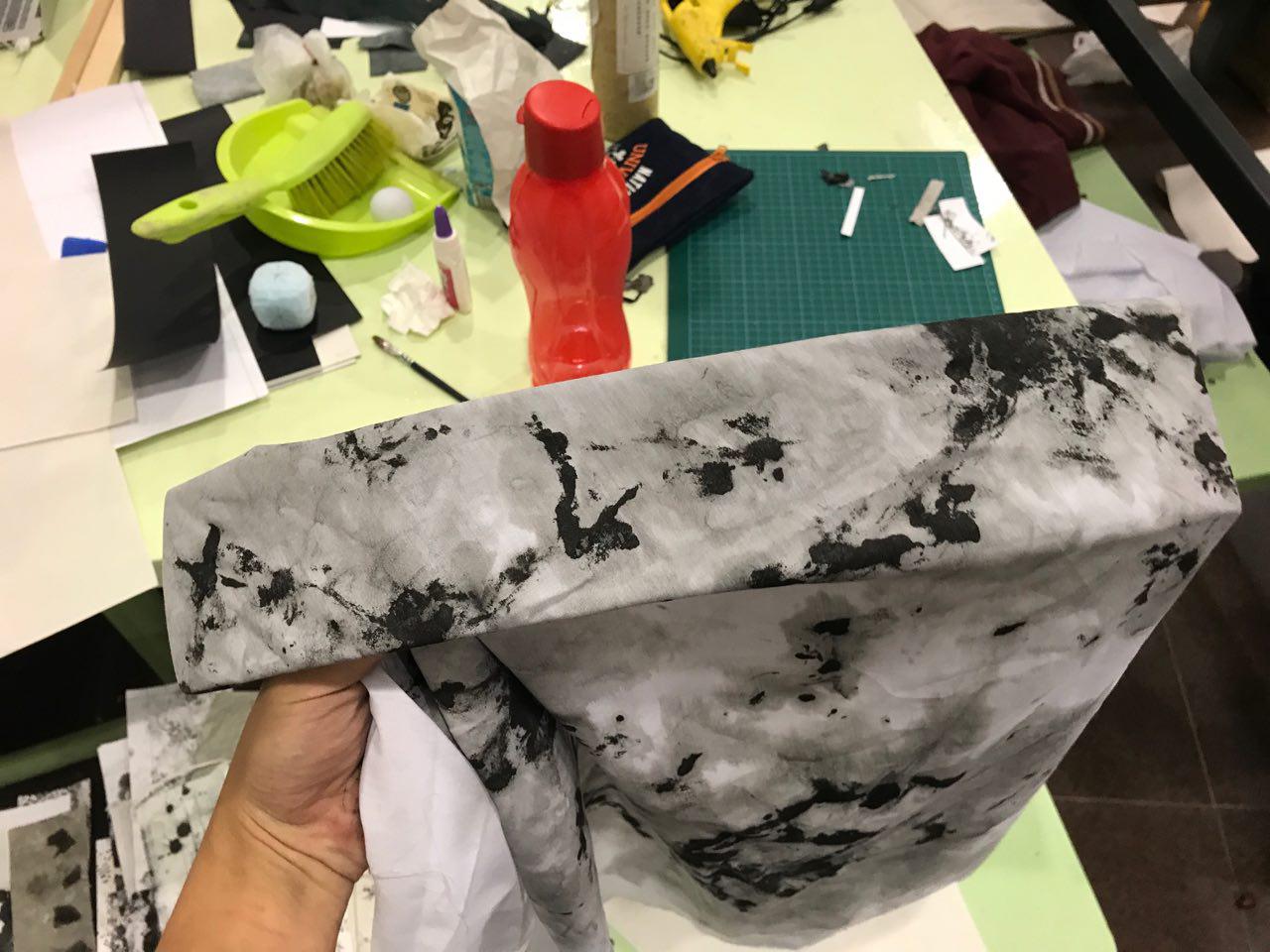
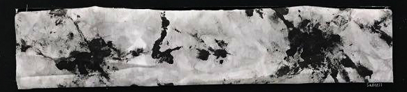
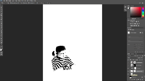
I faced much difficulty in trying to make the objects in the window visible to accurately represent the objects. As the initial image was with colour, it be came washed out once I applied the threshold filter.


Some of the comments Mimi gave me were:

  • Too literal representation of a class
  • Not an interesting composition to look at
  • Objects in the window hard to visualise

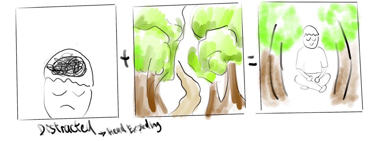
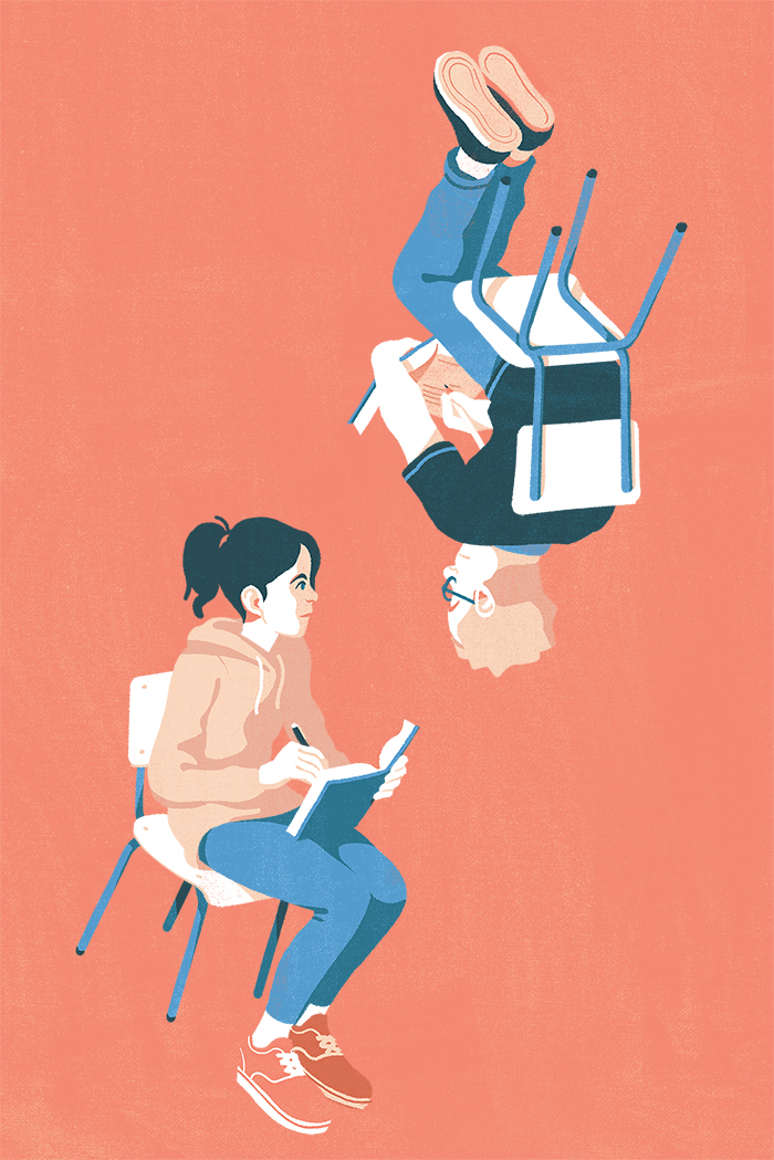
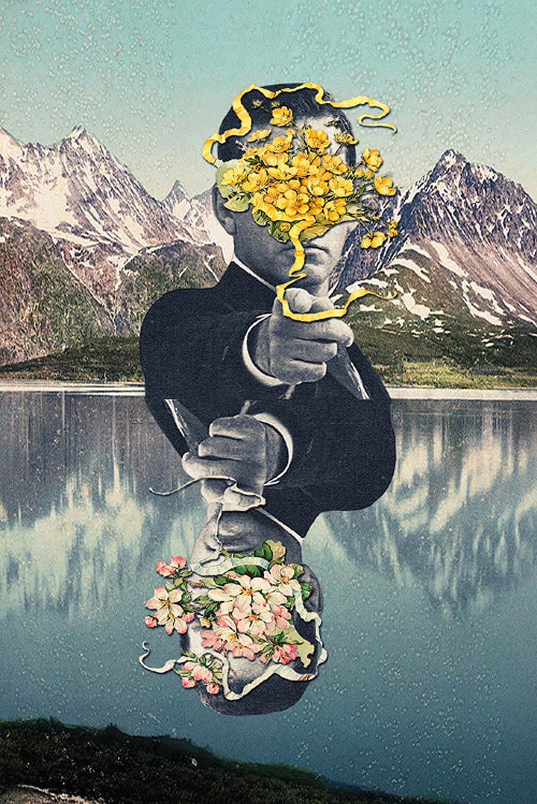
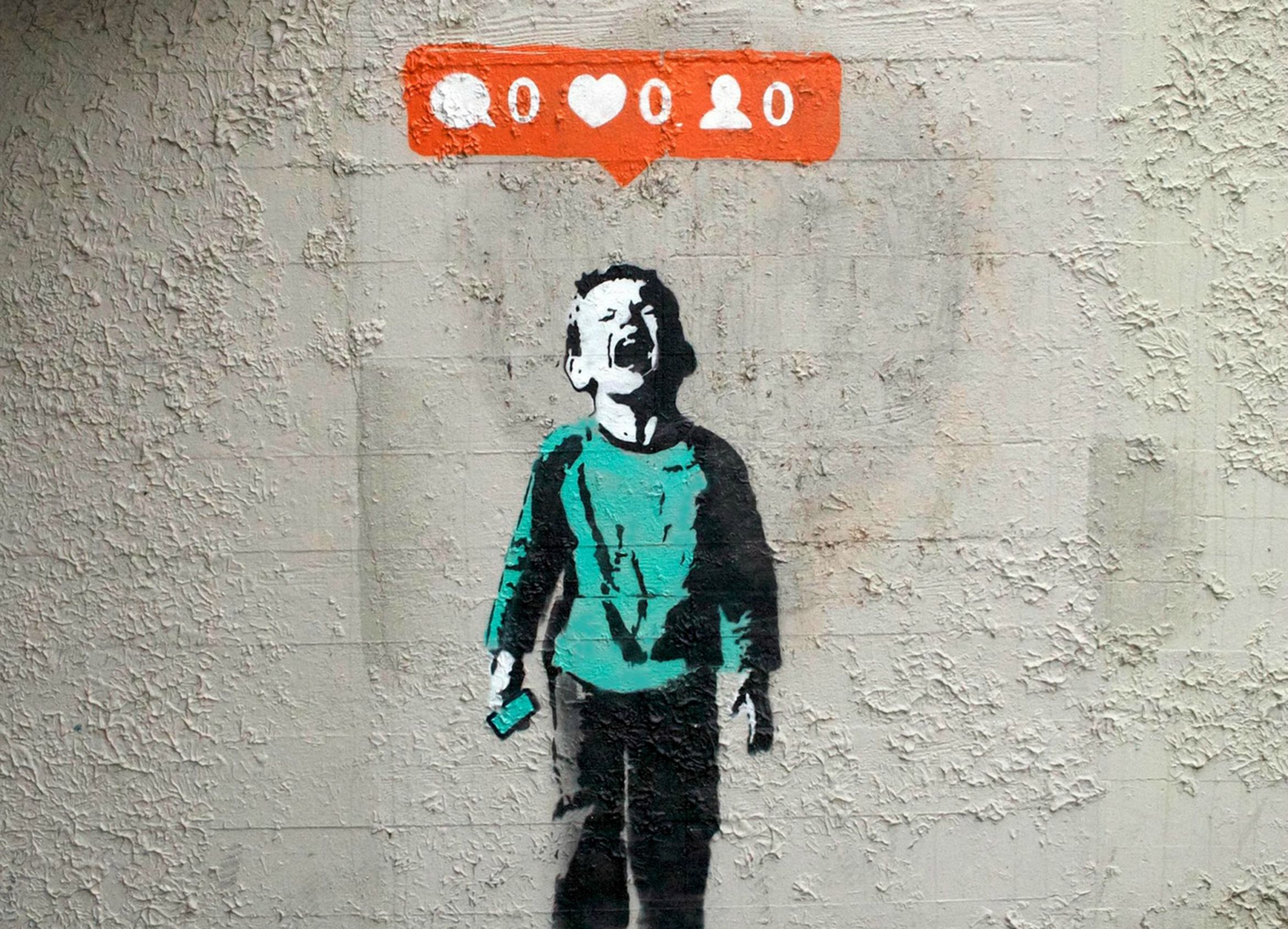
I started to think of how else I could make my composition more interesting. I also wanted to convey the idea of creativity fleeing away from the mind, being unattainable.

To do this, I wanted to have people being dragged/weighed down by something, as though they were downing, to evoke the message of being restricted and limited.

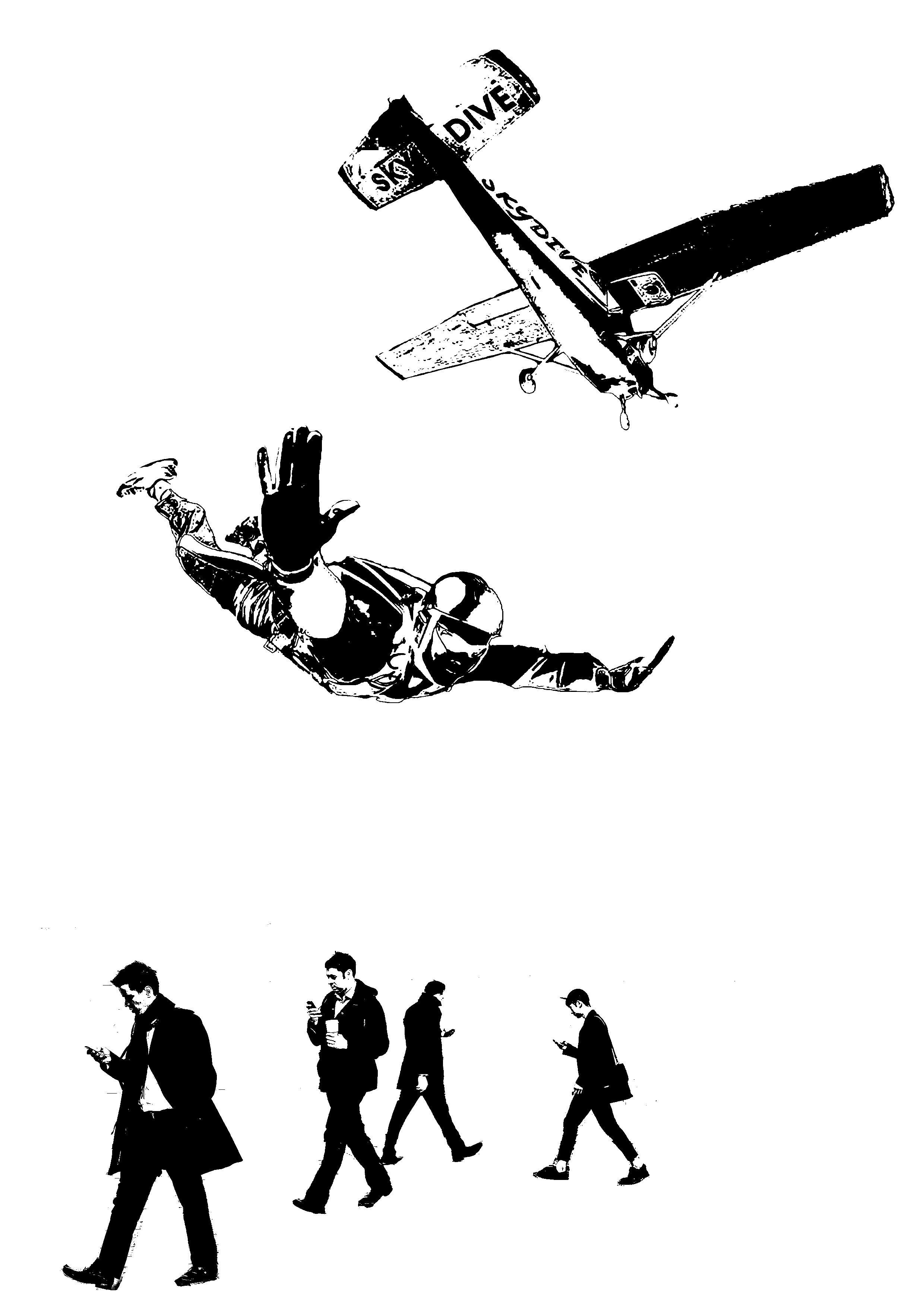
These are several images I found of people falling. Next, I had to show an object dragging him down. To do this, I used books as a semiotic to represent the idea of education.

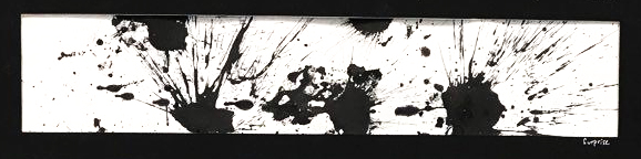
For the idea of creativity, I went with paint splashes to give a vibrant yet simple composition. This is much simpler than the previous object I used to represent creativity.

You can see that the hands of the subject never touches creativity. This subtle touch was to give tension  and suspense to the composition. It also meant that until you let go of this stigma which education presents, creativity will always be a struggle to reach.

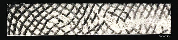
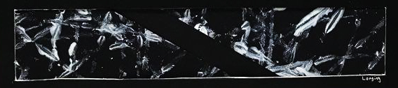
I chose the back drop to be space as it would be dragging the subject into the abyss of monotony. The backdrop would also add implied lines to allow the audience to focus on the subject. However, looking back at the composition, I could use a little less of the stars as it distracts the audience.

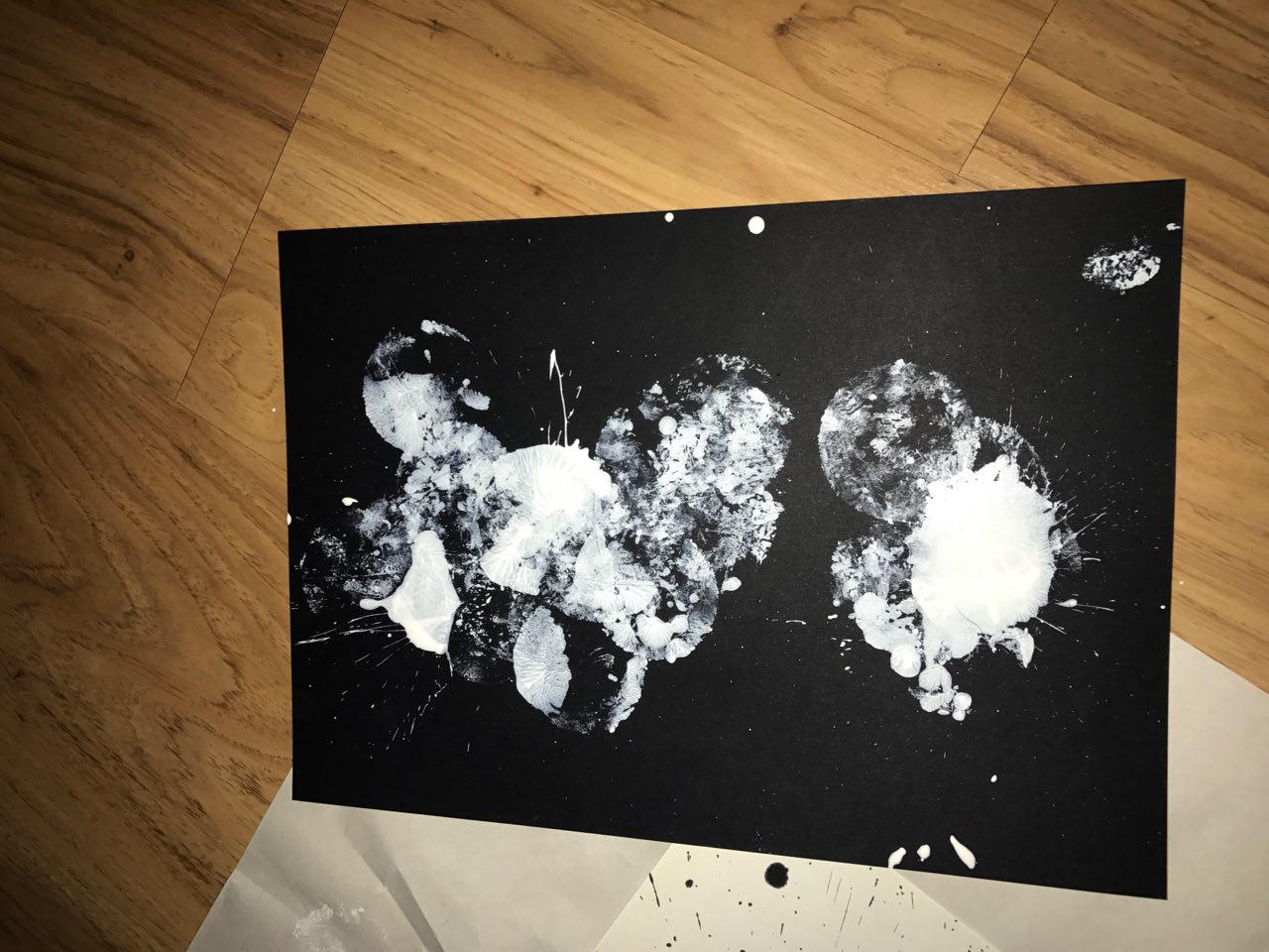
These are the final 2 compositions I came up with. I went with the white one instead of the black as I felt that the subject was too drowned out in the darkness.


“It’s not music if you can’t dance to it.” – Intouchables (2007)


This composition was a joy to work on. In the movie, this was one of the most cheerful scenes and it never fails to bring a smile to my face. I wanted to capture the essence of both dancing as well as the pleasure I get from listening to music.

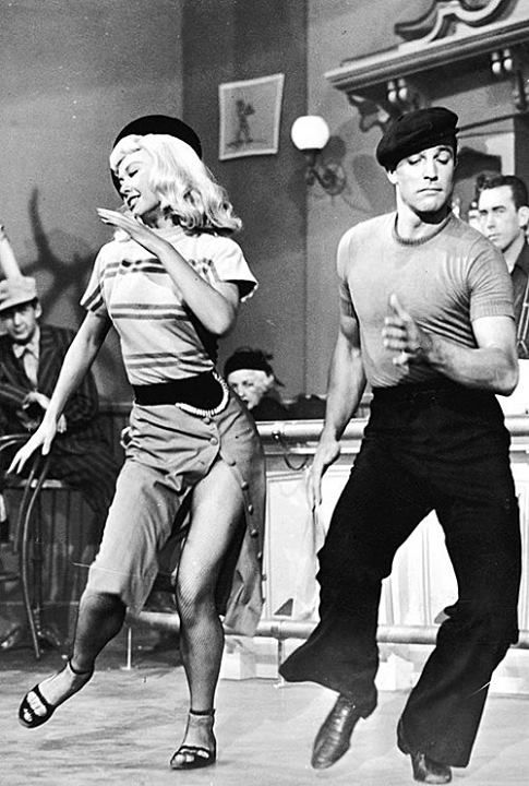
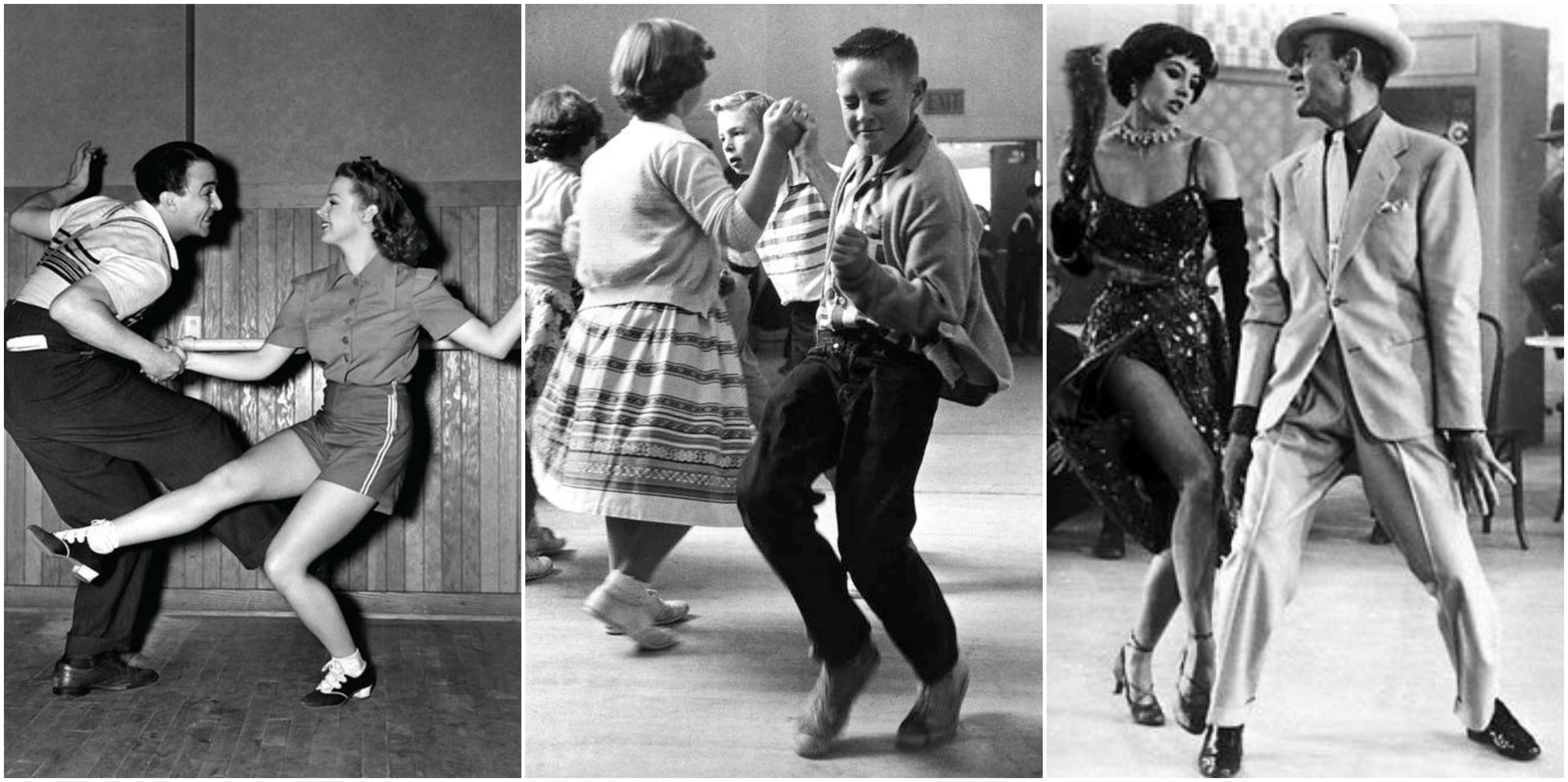
The subjects in my composition also had to look like they were having a good time as well! It was not easy to find this image as most of the images I found of dancing was more modern than retro, most of the time it was break dancing or hip hop. I stumbled upon this image as I was looking for disco and ballroom dancing. I really loved the expression on their faces as you can tell that they have completely transcended into their world of music and dance.

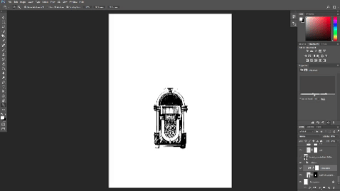
In the movie, the main character used a Bluetooth speaker to play his music. I felt that it wouldn’t make for an interesting composition which is why I changed it to a jukebox. However, this would look like any regular dance floor and it would not be able to convey the joy and beauty of music.

This was the first draft I came up with.

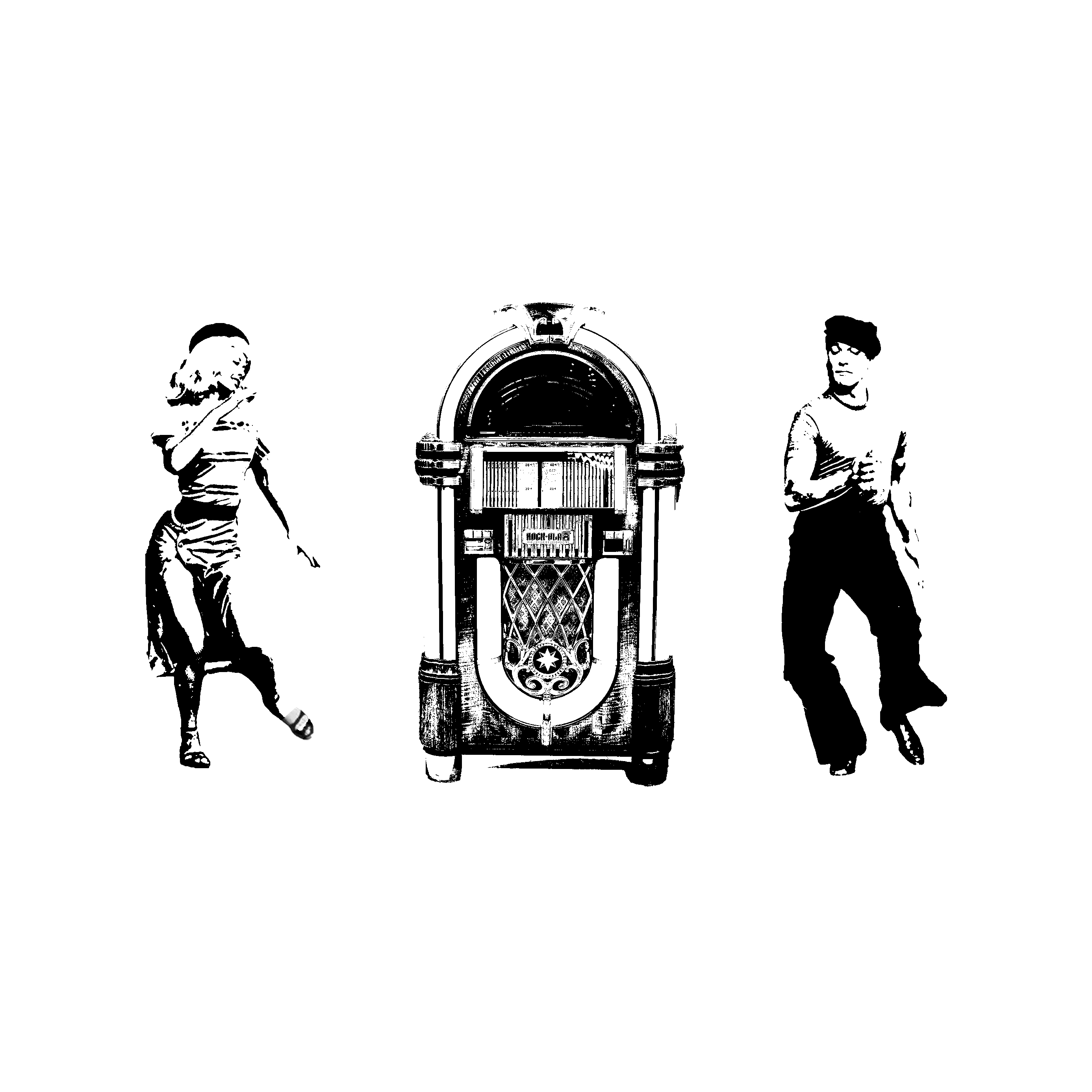
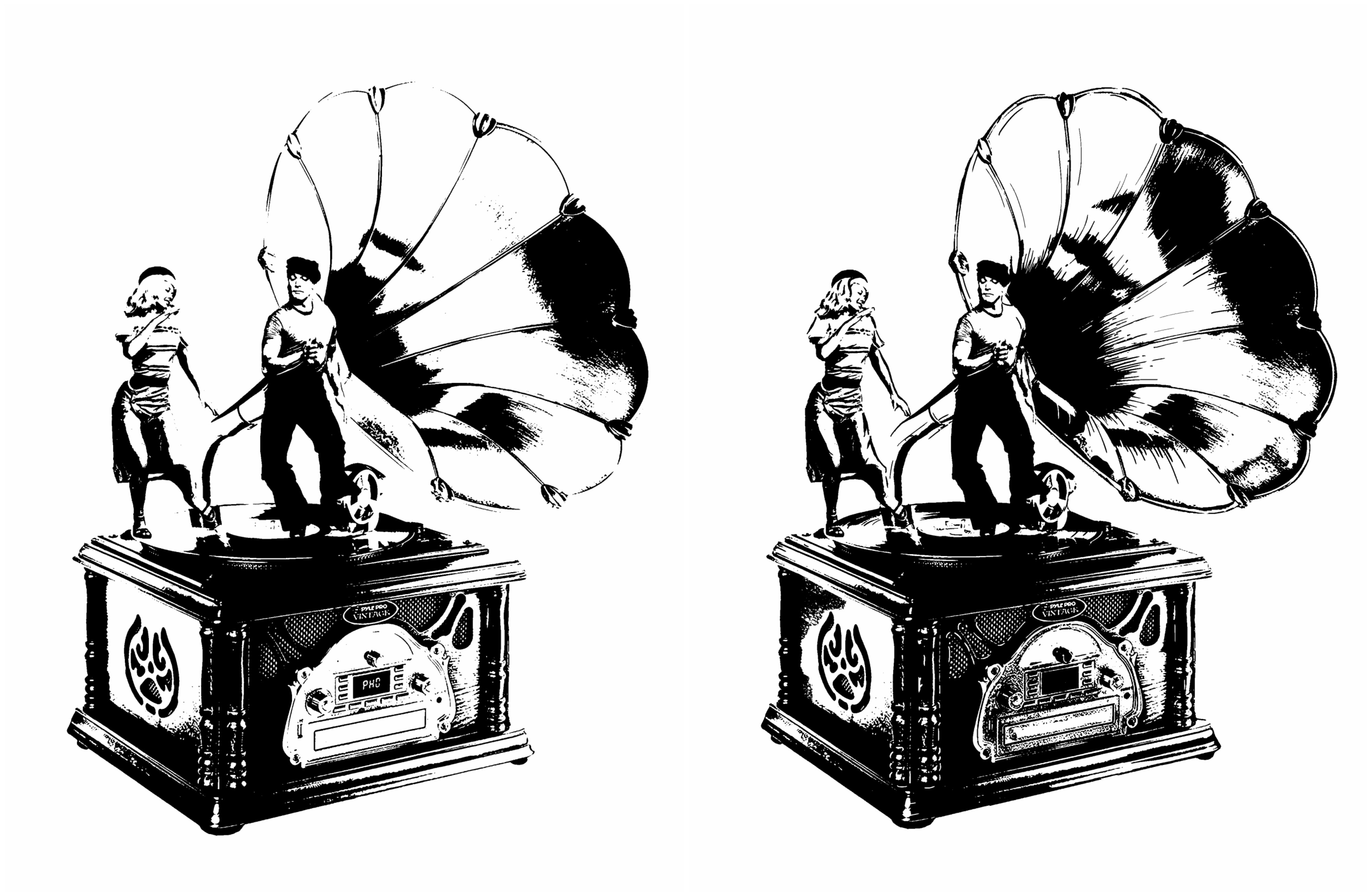
Subsequently, I thought of using a gramophone to show the beauty of music. I wanted to have the subjects dance on the vinyl record as it would mimic a dance floor! I really liked this composition as you can feel the joy the subjects are experiencing.

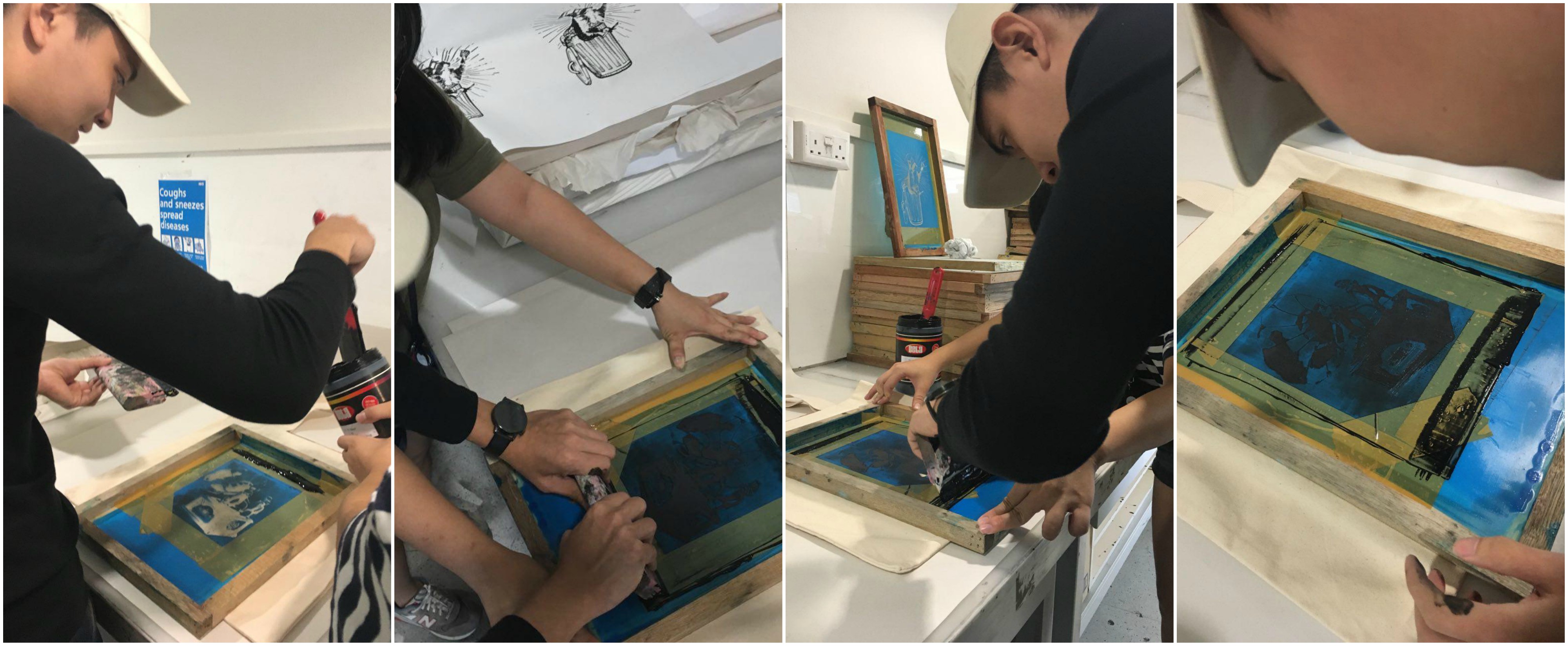
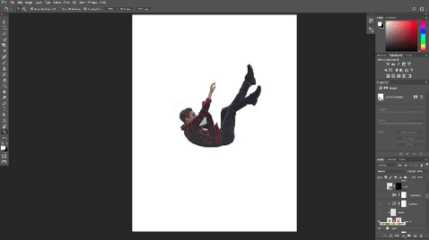
Initially, I used the composition on the left. However, after screen printing, I realised that not only did I lose a lot of detail, the composition was also too small. I went back and played around with curves and the threshold layer to try and maximise the amount of detail I could get out from the image. After that, I used my brush tool to fill in more details in the gramophone.

Needless to say, I was pleased with the final product.

I consulted Mimi on my composition but she felt that there was still a lot more lacking in it. I had the idea to include more people to make the image more vibrant and lively! I made sure to use people of all ages to show how music has no limits.

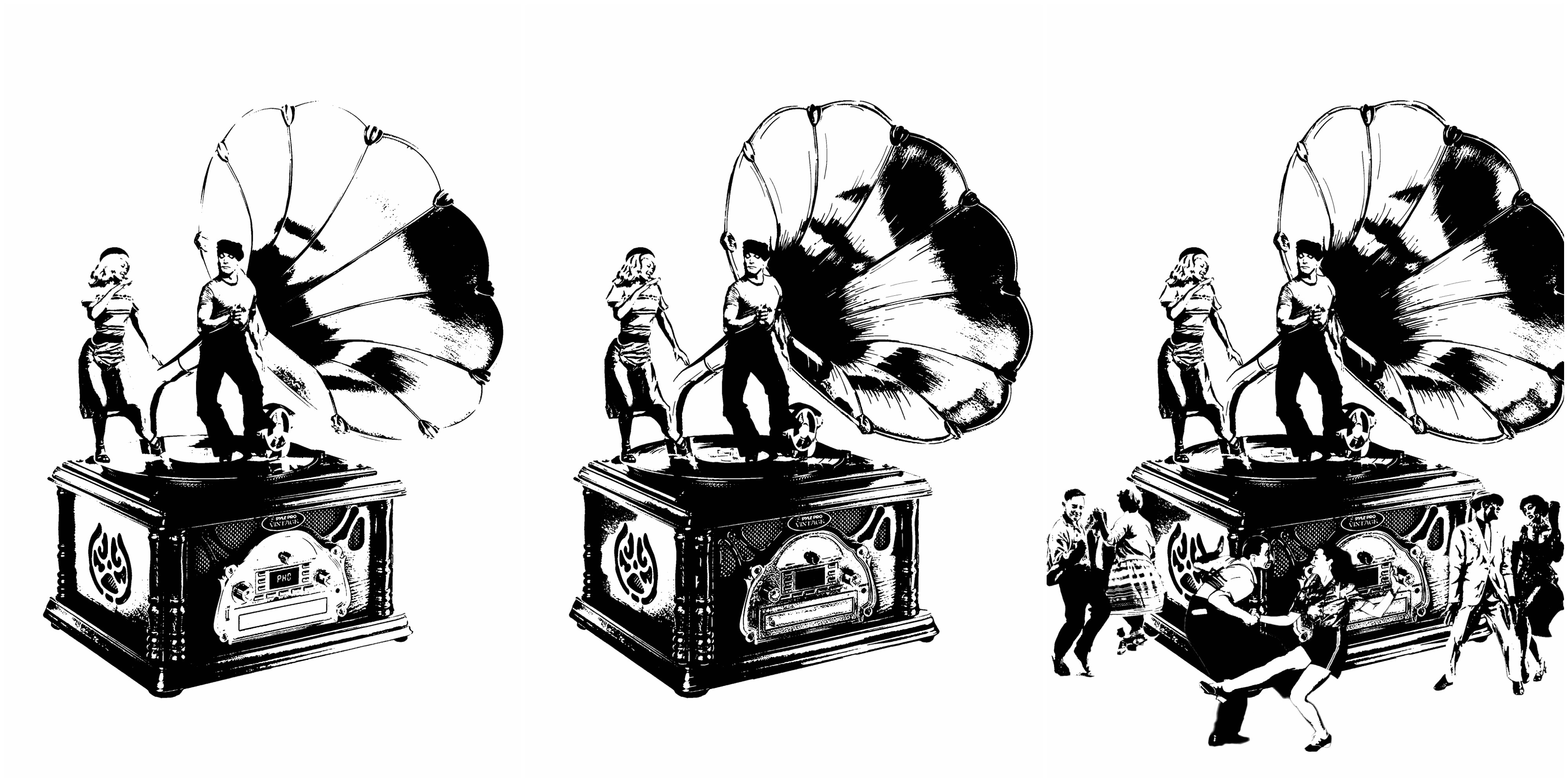
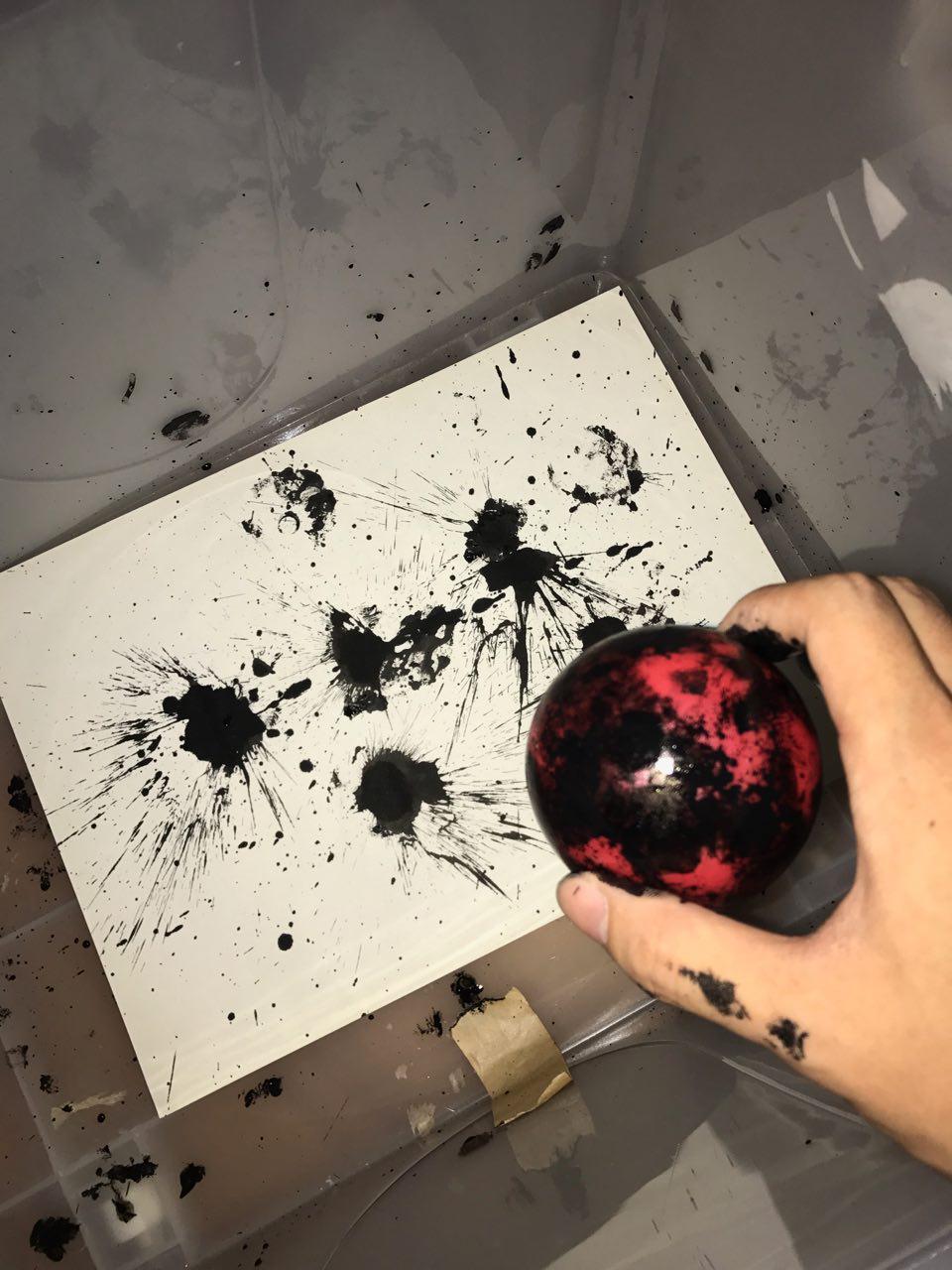
This is a little snippet of what I created after hours of refining the design.


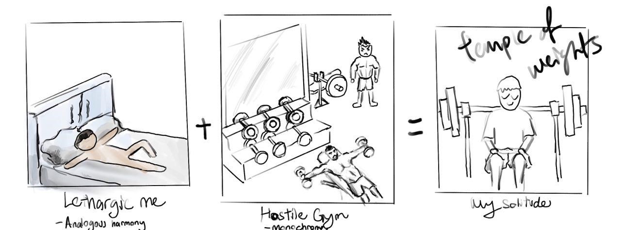
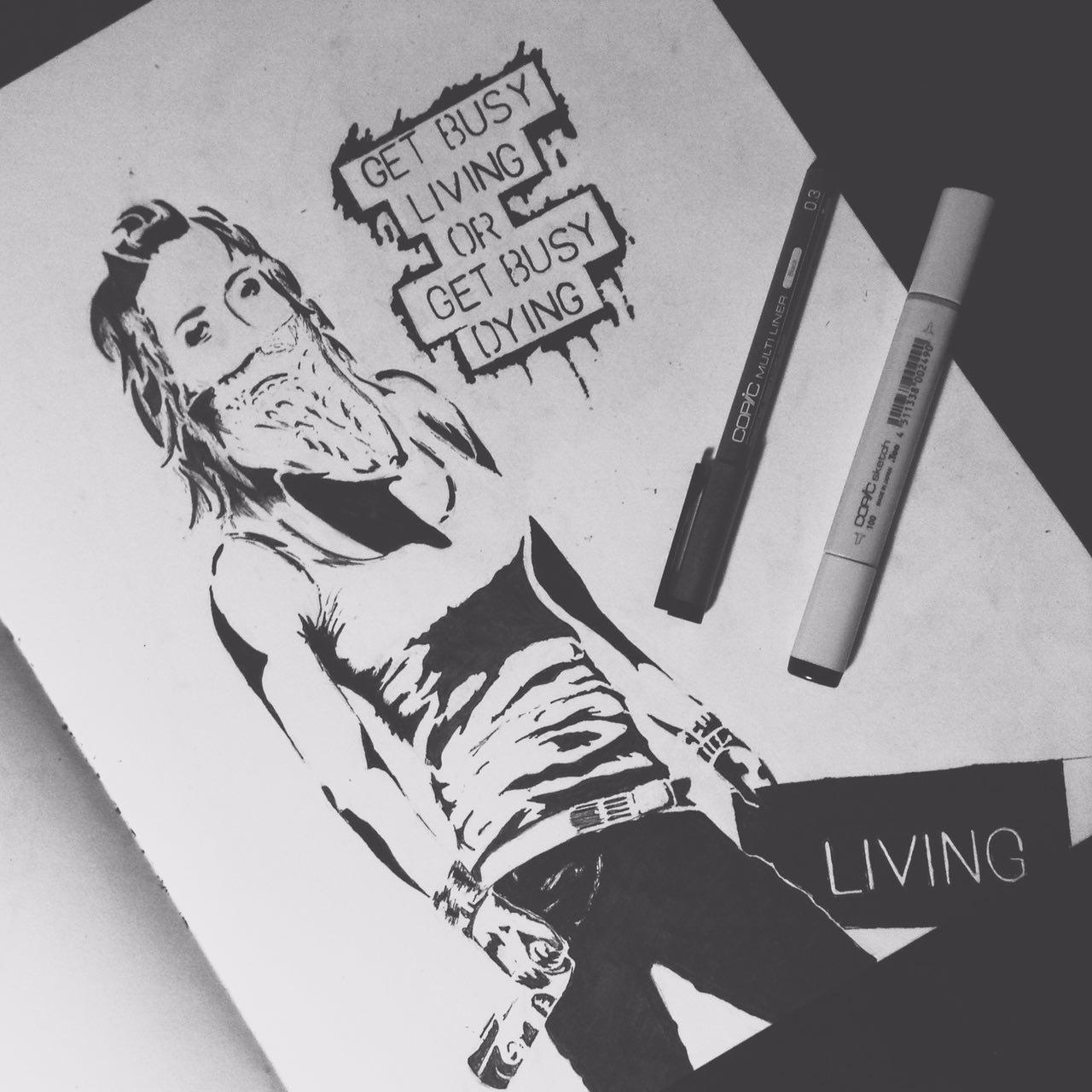
“Get busy livin’ or get busy dyin’.” – Shawshank Redemption (1987)

This is a movie based on using our lives to its fullest. I had to break down what it means to be ‘Living’ and ‘Dying’.


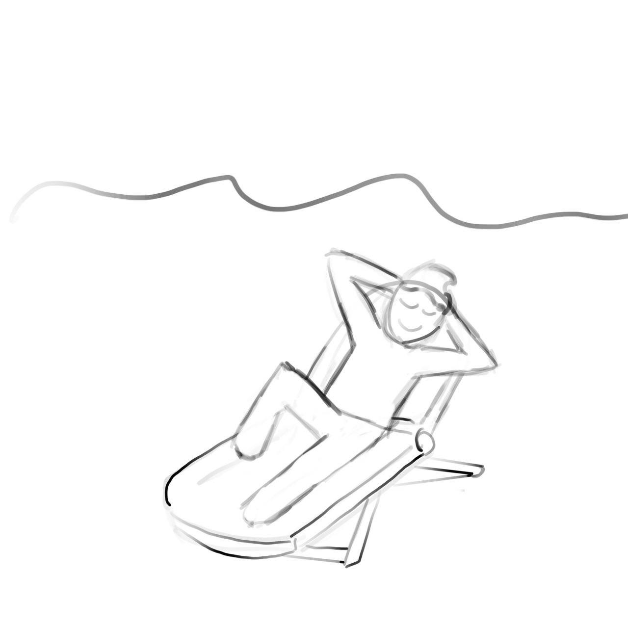
My interpretation of Living would be doing something thrilling. This action has to make the character feel ‘alive’, happy and full of passion. I started to search for extreme sports to represent living life to its fullest.

However, most extreme sports require a form of machinery which I was unwilling to put in my composition as it would not be organic forms.


To represent Dying I wanted to use figures which show little to no dynamic movements. I used people in regular business attire, being engrossed in their phones to show the lack of life.

I also had the idea to use zombies in business suits to represent the dead. However, I felt that it was too literal and cliche.

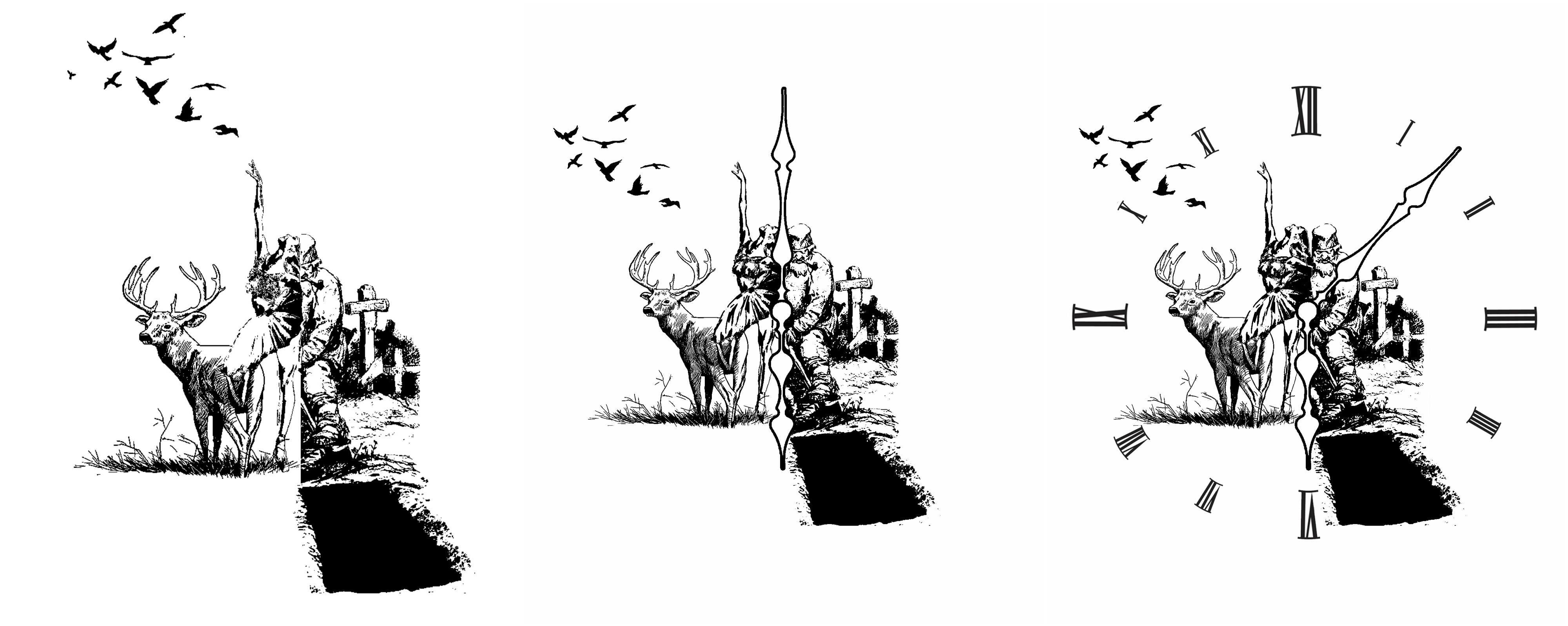
Another concept that came into my head to show contrast between living and dying was to have a split image of the two.

This time, I began with DyingFor this word, I wanted to have the subject literally digging his own grave. This would represent procrastinating and wasting our lives away.

The setting was a graveyard which proved to have a ominous setting, fitting for someone who is wasting their lives away as it would be melancholic.

For Living,  I contrasted it with someone who is dancing – full of passion and life, in a thriving environment. What better way to express living than to place animals in the composition?

Animals would represent mother nature, a raw form of life, also adding a surreal feel to the composition.

I had several consultations with Mimi on this composition.

During the first consultation, she pointed out that it was:

1) Difficult to tell the two characters from each other.

2) Did not reflect the idea of wasting life away.

3) Dancer’s form could not be seen clearly.

I went back to work on the composition, this time paying more attention to detail and driving the message across. To represent time, as well as to show a distinction between the two characters, I placed clock hands in between them.

During the second consultation, the pointers were:

1)  The clock hands were too static and forced. It did little to help with the composition.

2) The use of a clock face would be able to tie the entire composition together as the current composition did not have any limits or boundaries.

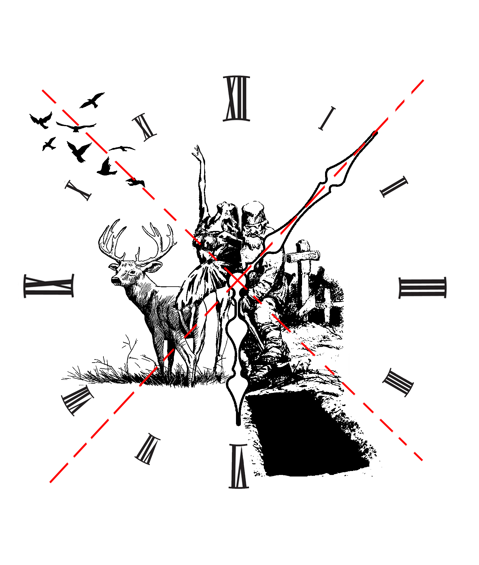
With these comments, I set out to tweak some elements of my composition. I made the minute hand a reflection of the birds on the left, as well as adding the clock face to give my composition boundaries in the form of an implied circle.

This is a snippet of how I ended up with my final image.


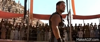
“Are you not entertained?” – Gladiator (2001)

I had the most trouble with this piece. I had to convey the idea of entertainment in the context of this movie as it is such a short quote.

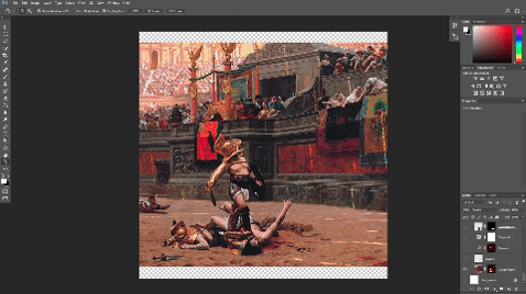
To do so, I went back to the settings of this movie, which was in the Roman era, where gladiators fought for the pleasure of the audience. I went to search for images of roman Colosseum fights I could use.

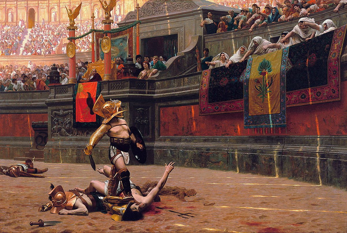
I felt like this image was already able to convey the quote in mind as the audience can be seen as upset or unsatisfied with the performance of this gladiator.  However, I wanted to add a modern twist to it.

To represent the lack of entertainment or focus, I wanted to have people on their phones, completely disengaged with the gladiator.

I started off with using children on their phones, sitting on the balcony which peers over the battle ground.

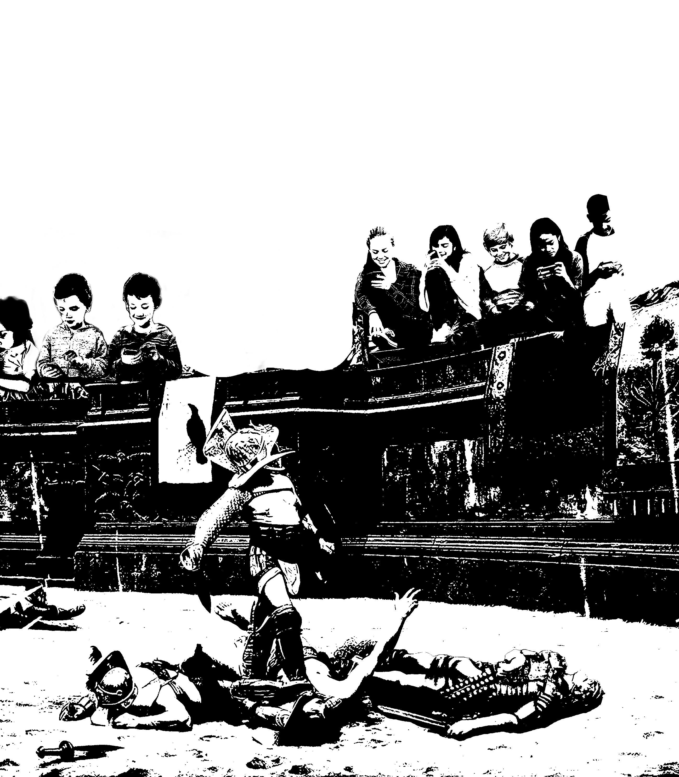
I showed this composition to Mimi and these are some of the comments she made:

1) It was difficult to see what the children were doing

2) It was hard to tell that the gladiator was engaged in combat

3) The balcony became very distracting and it was hard to focus on an object or area

Mimi suggested that I change the setting of the gladiator, one which could eliminate the unnecessary elements.

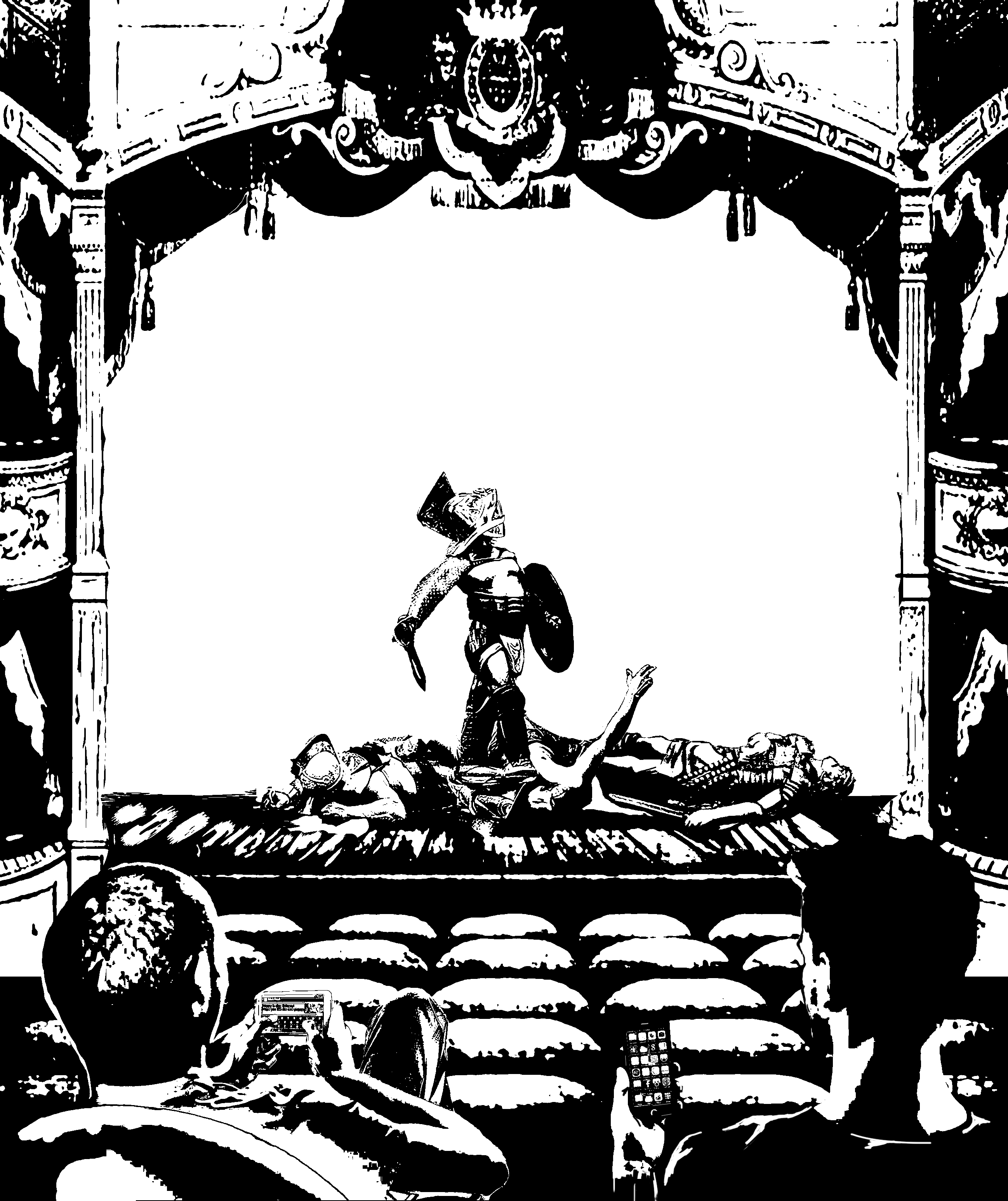
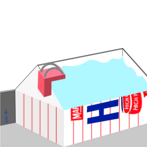
I decided to completely change the setting of the composition, getting rid of the uninterested children as well as the Colosseum. I experimented with different types of stages, from circus settings to a more sophisticated theater style.

I then decided to adapt the theater look from an image I found which showed a retro theatre.

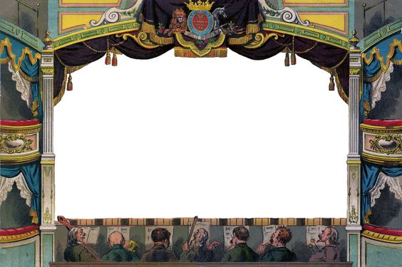
The audience in this image are too close to the stage, which does not give me the sense of depth which I was looking for. I also wanted the subjects to be large enough, but not covering the stage.

I inserted empty cinema seats into the composition to make the theatre more spacious. The empty seats also adds another element to show the unwillingness of people to watch such a performance. Almost like an outdated practice.

Next, I had to find uninterested audiences. I began searching for people using their phones on the couch while watching television.

It was difficult to find people in this pose as most of the images I could find was of people using their phones facing towards the camera.

Then came the next challenge, was to be able to threshold these images as well as retain the most detail.

I had to colour in whites to show distinction between the characters as well as the seats as they were wearing dark colours. I also made sure to add more details to the phone as it had to be visible in the composition.

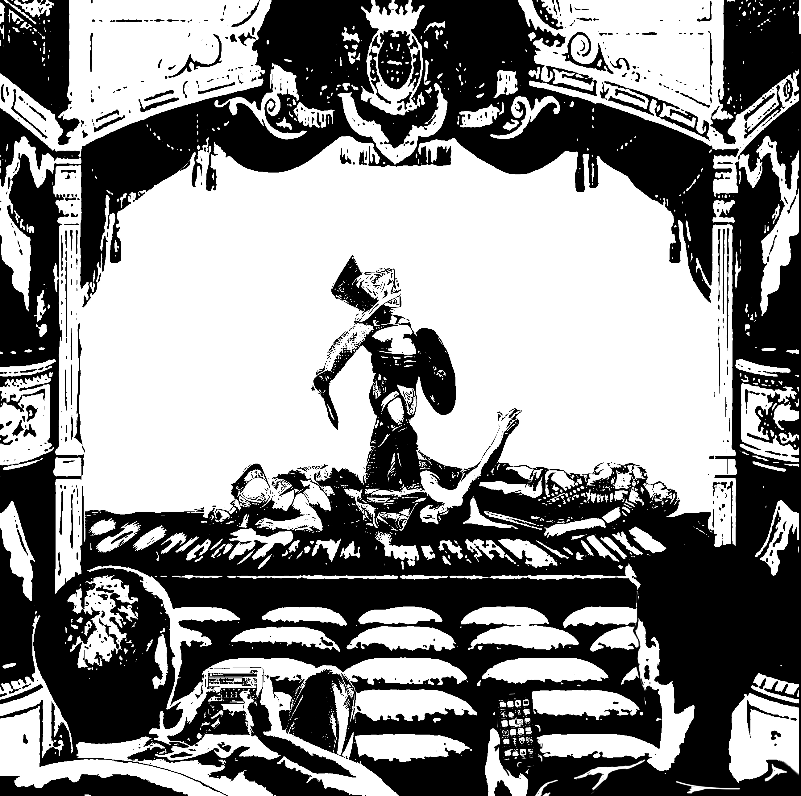
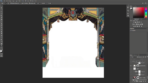
I initially wanted to submit this, however, I felt that as a square, this composition was too cramped, had a lack of depth and breathing space. To fix this, I raised the stage ceiling. This would also direct the attention of the viewer to the top of the theatre.

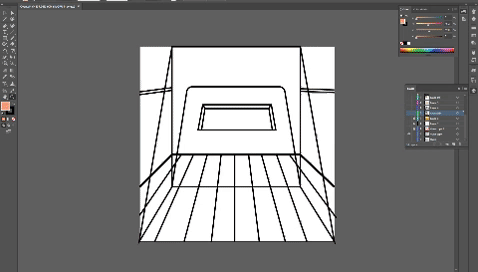
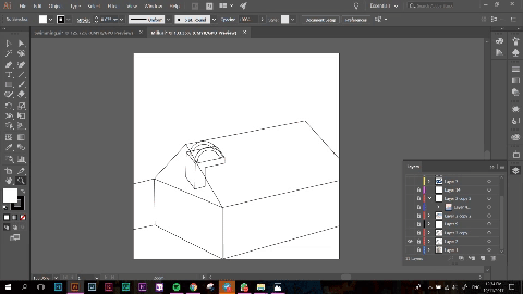
This is a snippet of my process while making this piece.

Assignment 2: Forrest Gump Research and Quotes

Watching movies often gives me great joy as I am always able to immerse myself in the world which it creates. I prefer movies with deeper meaning to them, rather than ones with mindless action.

These are some of the quotes I got from my favourite movies:

Get busy living or get busy dying. – Shawshank Redemption (1994)

This quote inspired me to make full use of my life as we only have so much time left on this world. I actually made a piece of artwork from this piece several years back.

However, this would be too literal for my assignment. The inspiration I had for this piece was from Banksy. A popular street artist that often creates work based on pop culture. This will be touched on later in my research.


It is not music if you can’t dance to it. – The intouchables (2011)

There is only one word to describe this movie, and the word is Beautiful. It is an inspiring movie of the journey between a caretaker and a disabled man, both from extremely different backgrounds. However, they influence each other in various aspects, driving them to do things they would have never imagined.

Are you not entertained? – Gladiator (2000)

This movie is about an army General which was betrayed and sold as a slave as he uncovered a dirty truth. The movie follows journey back to his family as well as exposing the truth.

Classrooms dull your mind, destroy the potential for authentic creativity. – A Beautiful Mind (2001) 

This is an amazing quote as I feel it is a good representation of most classes I’ve had growing up. Our society is so afraid of failure that we tend to do things which are the ‘safest’ or comfortable with which in turn, limits creativity.


Research

Banksy

http://www.tavernmagazine.com/bansky-the-enigma-2/
http://www.birminghammail.co.uk/news/showbiz-tv/who-banksy-real-name-identity-13224924

https://www.smithsonianmag.com/arts-culture/the-story-behind-banksy-4310304/

Banksy is a renowned street artist which often portrays pop culture and societal issues masterfully in his art. His use of simplified tones and voids to create such works is amazing and very relevant to the assignment on hand.

The use of minimal elements also enable the message to be understood quickly, which is important for street art as the audience may be on a form of transport and would not be able to capture the essence of the design quickly.

Banksy uses colour to give contrast to the composition, drawing the attention of the audience to the crux of the message. However, as we will not be able to use colour, I have to use of hyperbole and semiotics to convey our message across.


Eugenia Loli

Eugena Loli is an American digital artist who juxtaposes retro pictures of advertisements as well as film photos for her compositions. This gives her work a nostalgic feeling as well as a sense of surrealism. The use of space as a backdrop gives it a magical and mysterious tone to the composition.

In the middle image, she makes use of space through what seems to be thin steams of clouds to create implied lines, drawing the audience to the centre of the image.

Mario Wagner

This artist has more uses of lines in his composition. These are to bring about the limitations we face at our current knowledge of mathematics, with the lines to represent a cage. However, I felt that the lines were too distracting and hurt the composition as it made it too complex.

Julien Pacaud

The use of semiotics is prevalent in this artist’s work as he is able to convey messages through his work. My interpretation of the first object would be that the female individual is overcoming the wage gap between females and males. The usage of scales shows it tipping to her favour. All these little details play a part in being able to send a message.

Marco Battaglini –

As one of the movies I picked had a setting in the roman era, I wanted to have a renaissance twist to my composition to keep it in context. I started searching for modern interpretations of renaissance works and I came across this artist.

The composition is filled to the brim with objects which makes it difficult to focus on any one subject at a time. This is is not what I would like for my design, however, I enjoyed the use of a more modern setting to show a contrast between styles.

Techniques 

I researched into methods of getting a more textured looks for my composition. I like how US money had the threshold look, as well as a texture to it. Because of that, I wanted to replicate the effect.

http://www.businessinsider.com/the-comeback-of-the-us-dollar-2013-3/?IR=T

I don’t know if I would get into trouble for searching for something like this but I felt that this texture would really stylize my images. However, as started to develop my ideas and compositions, I felt that this effects would not look nice for my quotes.

My Line is EMO final

Final emotions:

JOY

For my final print, I decided to use an acrylic board as I wanted to replicate how a glass table would look from the bottom if it was stained by food. For this to work, I carved out a pair of hands from a piece of linoleum. To make them realistic, I added grooves in the hands for them to look more lifelike.

I made some adjustments from chinese calligraphy ink to acrylic paint as ink was too diluted, making the details hard to identify. After these changes, the prints turned out well!

I started to work on the acrylic base. Initially, I just wanted to just use hands for this print, however, my lecturer made me realise that the image was too literal and there weren’t enough elements to make it an interesting composition. I decided to put ink on rubber balls and press them against the board to create more shapes on the board. This worked, however, I realised that it was difficult to identify the hands as it blended with the ball. The ball prints could not be black either as the background which I would be pasting the panel would be black as well. To get around this issue,  I used black paint for the hands and the ball prints would remain white.

I also used the bottom of a container jar to make marks as whenever we spill a drink, there would be circular marks on the table.

Final Result:

SURPRISE

I wanted the emotion for surprise to be raw. Something that you would instinctively think of, which is why I decided to use a ball for the medium. When a ball is suddenly thrown at you, in that instant, I would feel a jolt of adrenaline which is similar to an explosion.

To replicate this feeling, I decided to place ink on paper and proceed to hurl a ball at that blotch of ink. Initially, I used white poster paint on black paper, however, I soon realised that the paint was too thick to be splattered which is why i ended up with a very muddy effect which was not what I intended.

I diluted the paint with water and tried again, this time receiving favourable results! I like how explosive the prints look.

Next, I used white paper with chinese calligraphy ink.

I much prefer the composition of this image and I also felt that surprise may not always be an enjoyable thing. Surprise can be brought upon by bad news as well which is why I also went along with black ink instead of white.

Final Result:

FEAR

Fear was an interesting concept to explore because of how relevant it is in our society now as well as how apparent it is in our everyday lives. Fear can drive people crazy; fear can make the strongest man whimper. Even though we are living in civilization’s most peaceful time, the non-stop fear-mongering of news makes us think the opposite. Constant news coverage of terror plots and attacks, accompanied by threats from hostile countries never fail to keep us locked in a state of panic.

This is why I wanted to explore the use of chains or ropes to signify how fear restricts us and prevents us from participating in activities such as travelling.

I decided to use charcoal rubbing technique to capture the details of the rope as well as give it a mysterious smokey aura. I had to vary the pressure of the charcoal to ensure I get the most detail and texture out of the cable I used.

For the background, I did an ink transfer using newspaper to get the dramatic effect of the headlines on the paper. I tried several sprays to try and get the ink from the newspaper to get transferred onto the paper.

Final Result:

SADNESS

Sadness, it comes in waves, it envelopes us and leaves us in its wake. Flooding our senses, drowning out all other emotions. I relate sadness closely to water and liquid. To capture its essence, I decided to use cloth as my medium – how fitting…

what I did was to twist the cloth into a spiral and place ink on adjacent sides of the spiral so that there would be contrasts between the negative and positive space. I decided to use a spiral as I wanted to represent waves as well.

I did a several of these spirals and I then went on to dye them. This was the result of what the cloth looked like after a day.

As the cloth had many different interesting prints to choose from, I had to choose ones which had a composition I liked and it also has to represent the emotion well.


Final Result:

FRUSTRATION

Frustration was an interesting emotion to explore as I am generally on the more reserved side, which made it difficult for me to create something from it. However, I thought of the time which my lung collapsed and I felt utterly betrayed by my body as I have always treated it with care by eating healthily and exercising. I felt that I did not deserve such pain and I was frustrated with the body I had.

I realised that having this frustration was pointless as it did not serve a purpose and all it did was make me feel worse trapped in my own body. I after some self reflection, I channeled this frustration and dissatisfaction into something of more value. I wanted to make everyday count and appreciate things in life, no matter how small they may seem.

To make the effect of a cage breaking, I used the pink foam which is meant to protect soft fruits from being bruised in the process. I first sprayed a coat of spray mount onto the pink foam and i pressed it firmly against the paper. This is to form the black lines as seen in the print.

I then went on to spray another layer of Spray mount to ensure that the flour would stick onto the paper when applied on. I then went on to spray fixative so that the flour would not shift around when a new coat of spray mount is added. I layered this a few times till I was happy with the results.

Final Result:

LONGING

How this effect was made was purely by luck as it happened during the time when I was also experimenting with the emotion of Joy. As I was throwing balls against paper, some of it escaped my grip and rolled around the floor. As there was paint on the ball, it left a trail of paint on my floor!

I then decided to try and see what it would look like when it was on paper. The marks that the ball created seemed to represent fingers which caressed the paper. I felt that this effect was apt to describe the feeling of longing as the feeling lingers.

Final Result: