Final emotions:
JOY
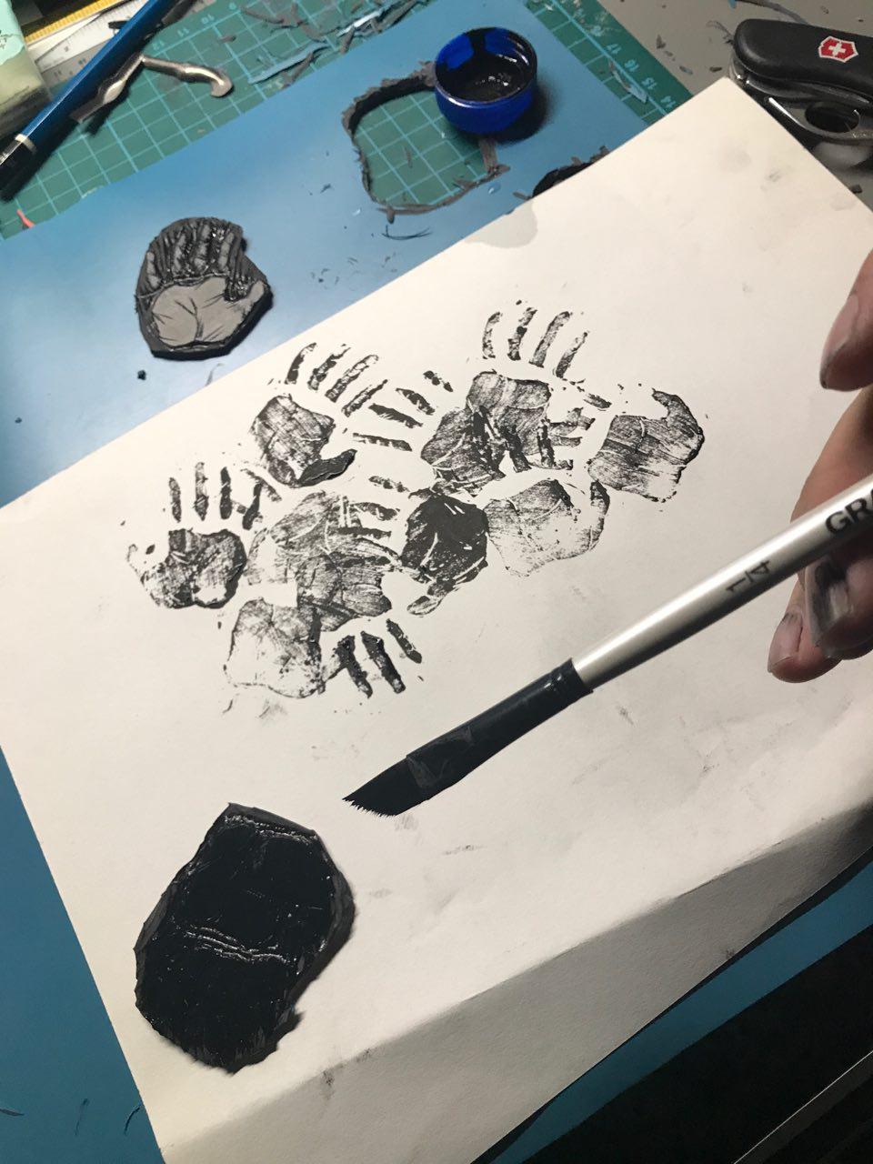
For my final print, I decided to use an acrylic board as I wanted to replicate how a glass table would look from the bottom if it was stained by food. For this to work, I carved out a pair of hands from a piece of linoleum. To make them realistic, I added grooves in the hands for them to look more lifelike.
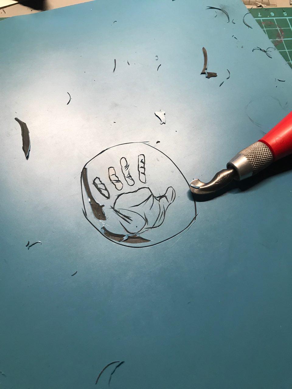
I made some adjustments from chinese calligraphy ink to acrylic paint as ink was too diluted, making the details hard to identify. After these changes, the prints turned out well!

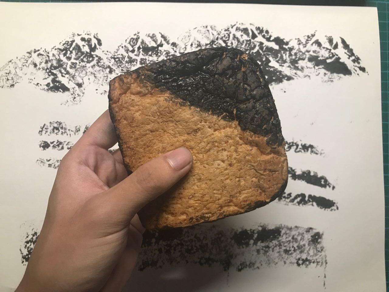
I started to work on the acrylic base. Initially, I just wanted to just use hands for this print, however, my lecturer made me realise that the image was too literal and there weren’t enough elements to make it an interesting composition. I decided to put ink on rubber balls and press them against the board to create more shapes on the board. This worked, however, I realised that it was difficult to identify the hands as it blended with the ball. The ball prints could not be black either as the background which I would be pasting the panel would be black as well. To get around this issue, I used black paint for the hands and the ball prints would remain white.
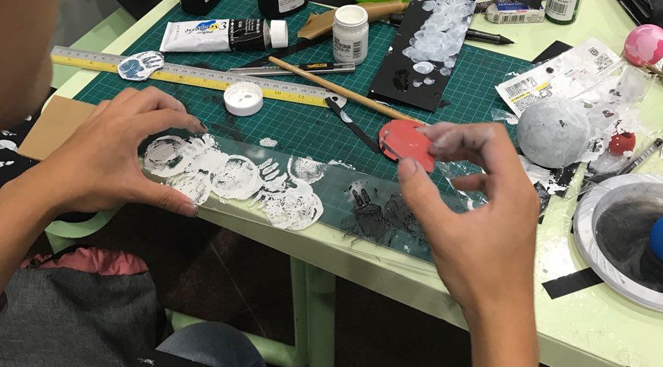
I also used the bottom of a container jar to make marks as whenever we spill a drink, there would be circular marks on the table.

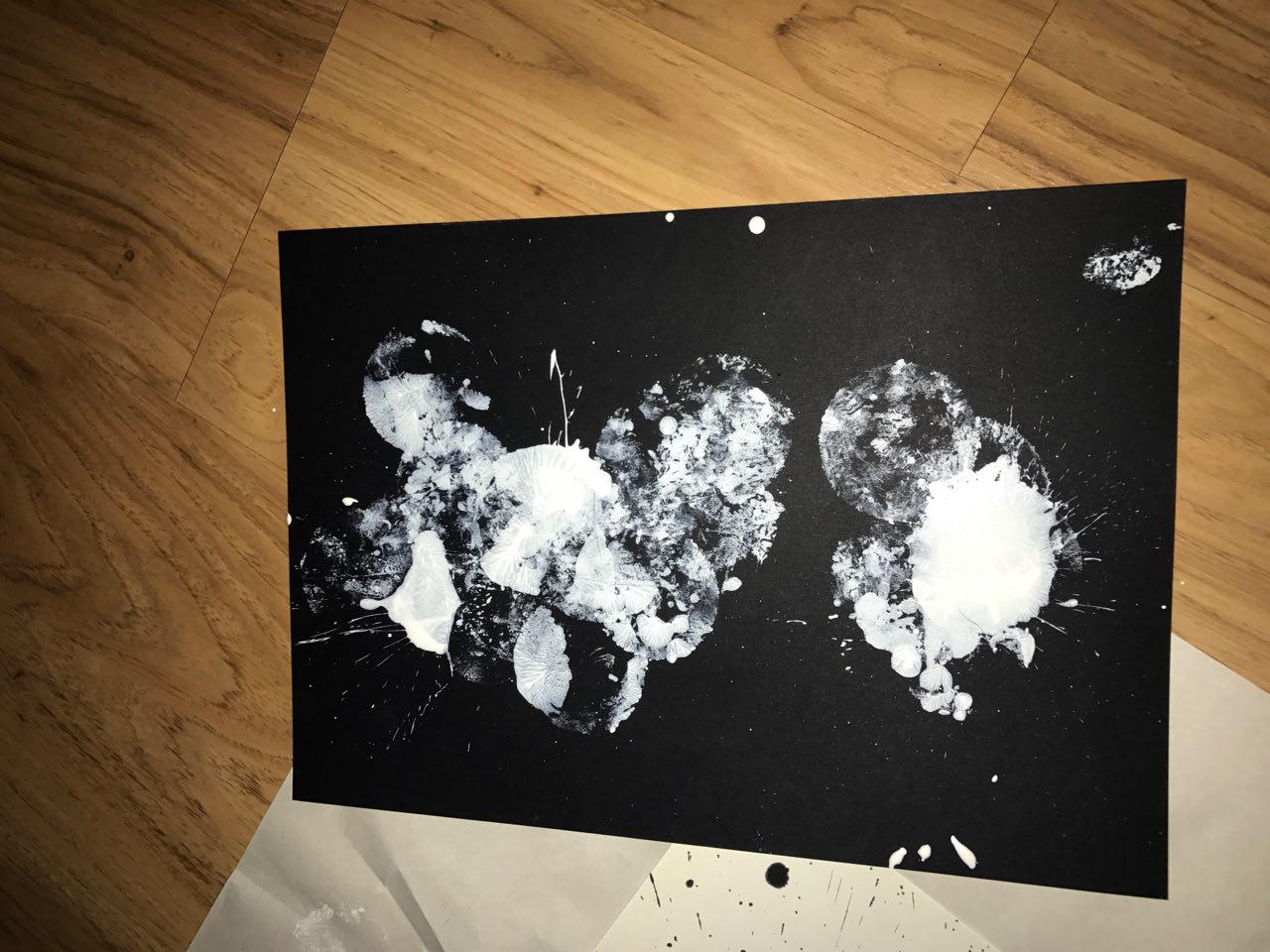
Final Result:

SURPRISE
I wanted the emotion for surprise to be raw. Something that you would instinctively think of, which is why I decided to use a ball for the medium. When a ball is suddenly thrown at you, in that instant, I would feel a jolt of adrenaline which is similar to an explosion.
To replicate this feeling, I decided to place ink on paper and proceed to hurl a ball at that blotch of ink. Initially, I used white poster paint on black paper, however, I soon realised that the paint was too thick to be splattered which is why i ended up with a very muddy effect which was not what I intended.
I diluted the paint with water and tried again, this time receiving favourable results! I like how explosive the prints look.

Next, I used white paper with chinese calligraphy ink.
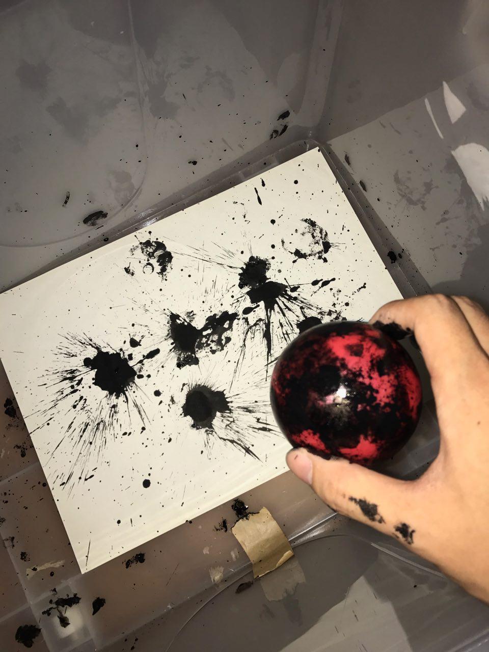
I much prefer the composition of this image and I also felt that surprise may not always be an enjoyable thing. Surprise can be brought upon by bad news as well which is why I also went along with black ink instead of white.
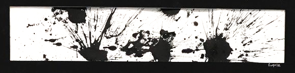
Final Result:
FEAR
Fear was an interesting concept to explore because of how relevant it is in our society now as well as how apparent it is in our everyday lives. Fear can drive people crazy; fear can make the strongest man whimper. Even though we are living in civilization’s most peaceful time, the non-stop fear-mongering of news makes us think the opposite. Constant news coverage of terror plots and attacks, accompanied by threats from hostile countries never fail to keep us locked in a state of panic.
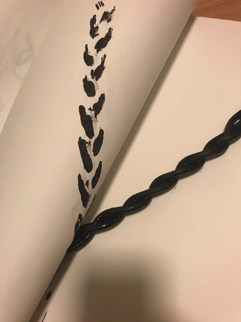
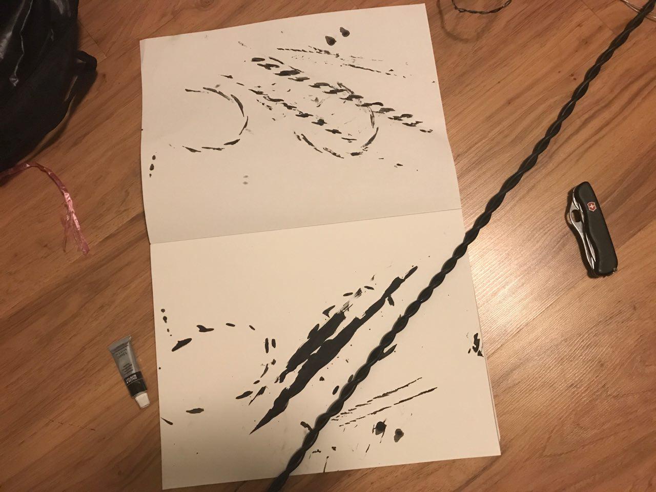
This is why I wanted to explore the use of chains or ropes to signify how fear restricts us and prevents us from participating in activities such as travelling.
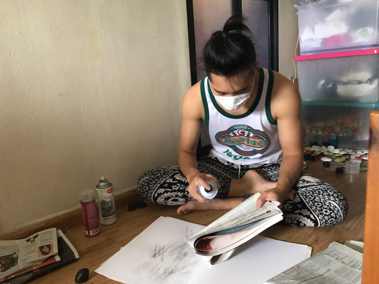
I decided to use charcoal rubbing technique to capture the details of the rope as well as give it a mysterious smokey aura. I had to vary the pressure of the charcoal to ensure I get the most detail and texture out of the cable I used.
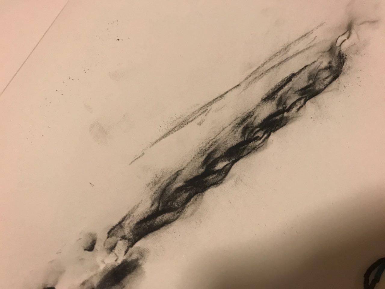
For the background, I did an ink transfer using newspaper to get the dramatic effect of the headlines on the paper. I tried several sprays to try and get the ink from the newspaper to get transferred onto the paper.
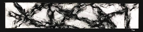
Final Result:
SADNESS
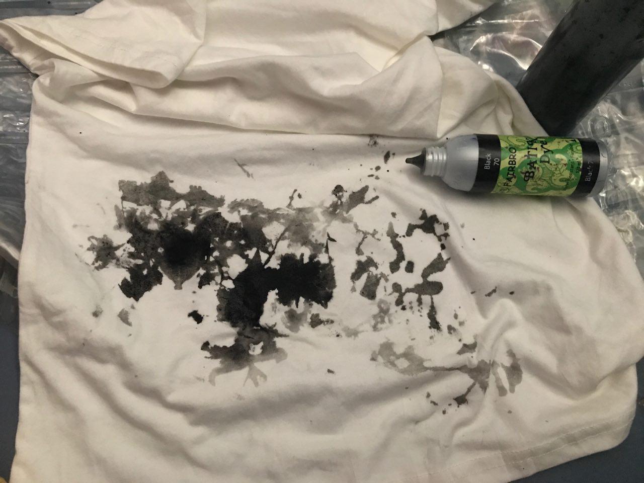
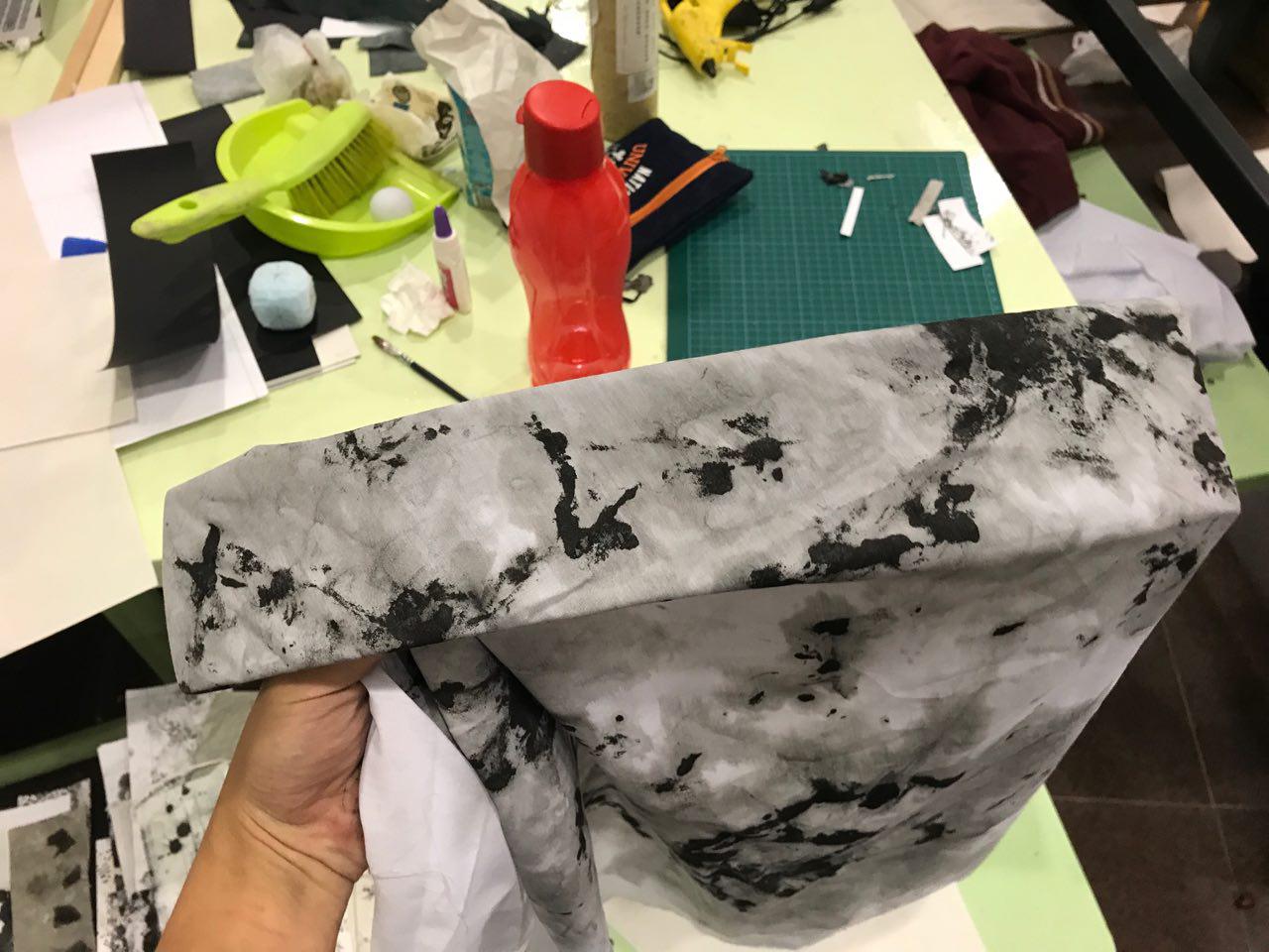
Sadness, it comes in waves, it envelopes us and leaves us in its wake. Flooding our senses, drowning out all other emotions. I relate sadness closely to water and liquid. To capture its essence, I decided to use cloth as my medium – how fitting…
what I did was to twist the cloth into a spiral and place ink on adjacent sides of the spiral so that there would be contrasts between the negative and positive space. I decided to use a spiral as I wanted to represent waves as well.

I did a several of these spirals and I then went on to dye them. This was the result of what the cloth looked like after a day.
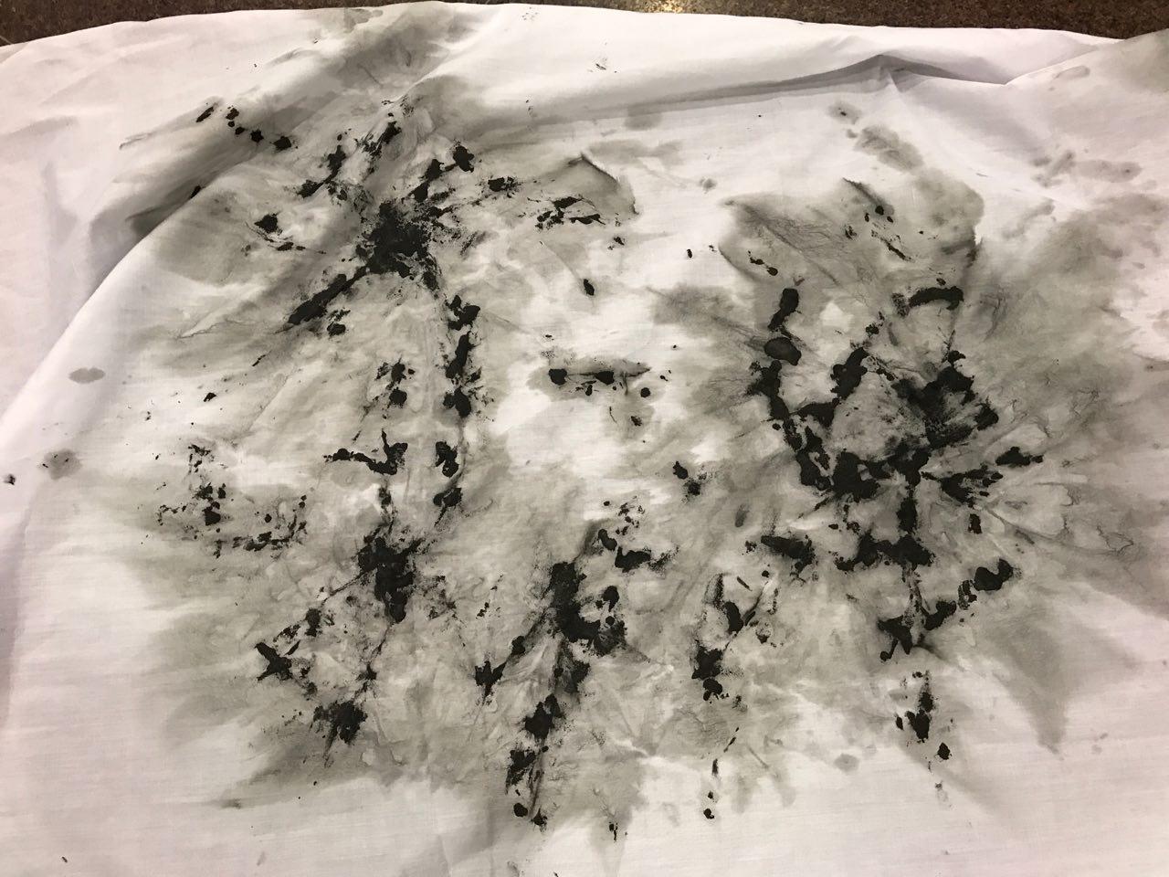
As the cloth had many different interesting prints to choose from, I had to choose ones which had a composition I liked and it also has to represent the emotion well.
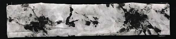
Final Result:
FRUSTRATION
Frustration was an interesting emotion to explore as I am generally on the more reserved side, which made it difficult for me to create something from it. However, I thought of the time which my lung collapsed and I felt utterly betrayed by my body as I have always treated it with care by eating healthily and exercising. I felt that I did not deserve such pain and I was frustrated with the body I had.
I realised that having this frustration was pointless as it did not serve a purpose and all it did was make me feel worse trapped in my own body. I after some self reflection, I channeled this frustration and dissatisfaction into something of more value. I wanted to make everyday count and appreciate things in life, no matter how small they may seem.
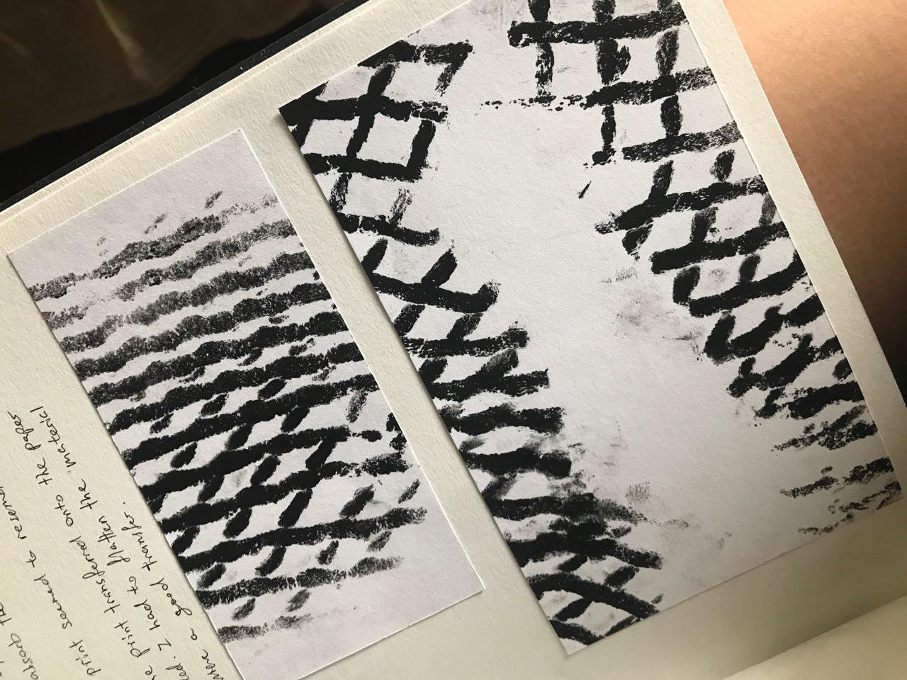
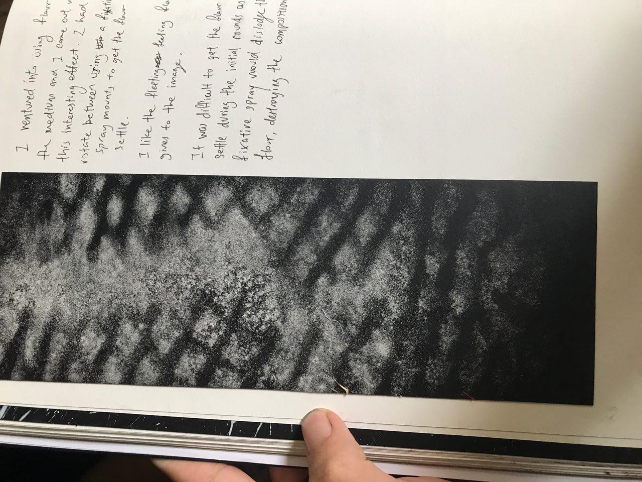
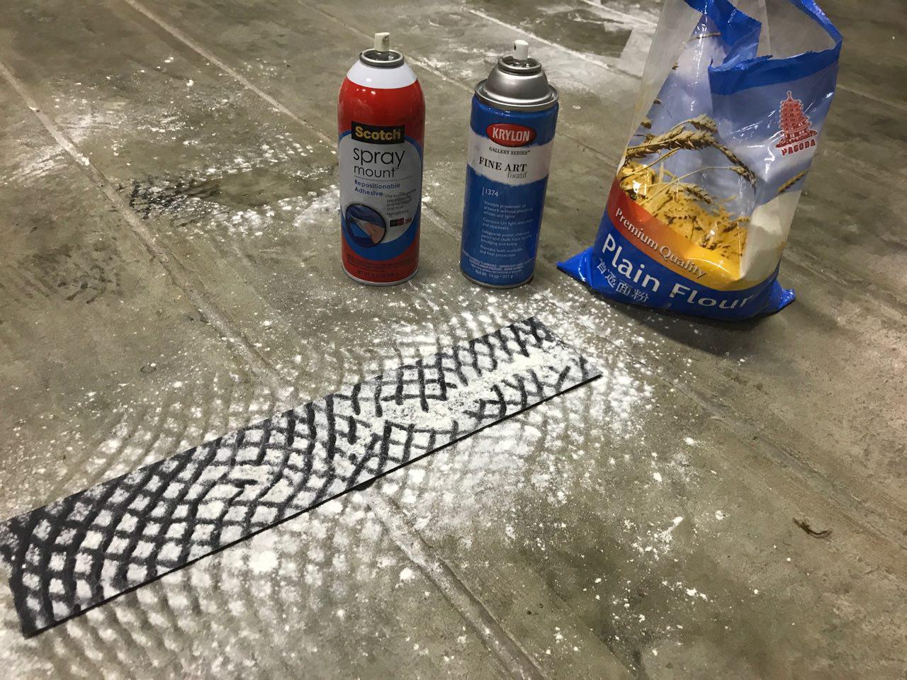
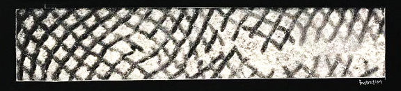
To make the effect of a cage breaking, I used the pink foam which is meant to protect soft fruits from being bruised in the process. I first sprayed a coat of spray mount onto the pink foam and i pressed it firmly against the paper. This is to form the black lines as seen in the print.
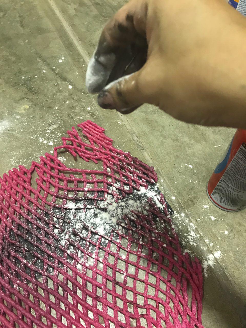
I then went on to spray another layer of Spray mount to ensure that the flour would stick onto the paper when applied on. I then went on to spray fixative so that the flour would not shift around when a new coat of spray mount is added. I layered this a few times till I was happy with the results.
Final Result:
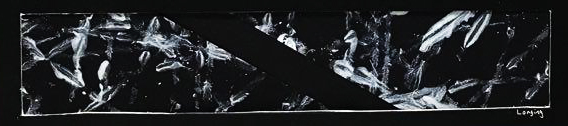
LONGING
How this effect was made was purely by luck as it happened during the time when I was also experimenting with the emotion of Joy. As I was throwing balls against paper, some of it escaped my grip and rolled around the floor. As there was paint on the ball, it left a trail of paint on my floor!
I then decided to try and see what it would look like when it was on paper. The marks that the ball created seemed to represent fingers which caressed the paper. I felt that this effect was apt to describe the feeling of longing as the feeling lingers.
Final Result: