
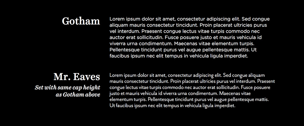
One of my go to typefaces: Neue Einstellung
This typeface has a wide variety of weights, but it is a pity because it does not have an italicized version.
One of my go to typefaces: Neue Einstellung
This typeface has a wide variety of weights, but it is a pity because it does not have an italicized version.
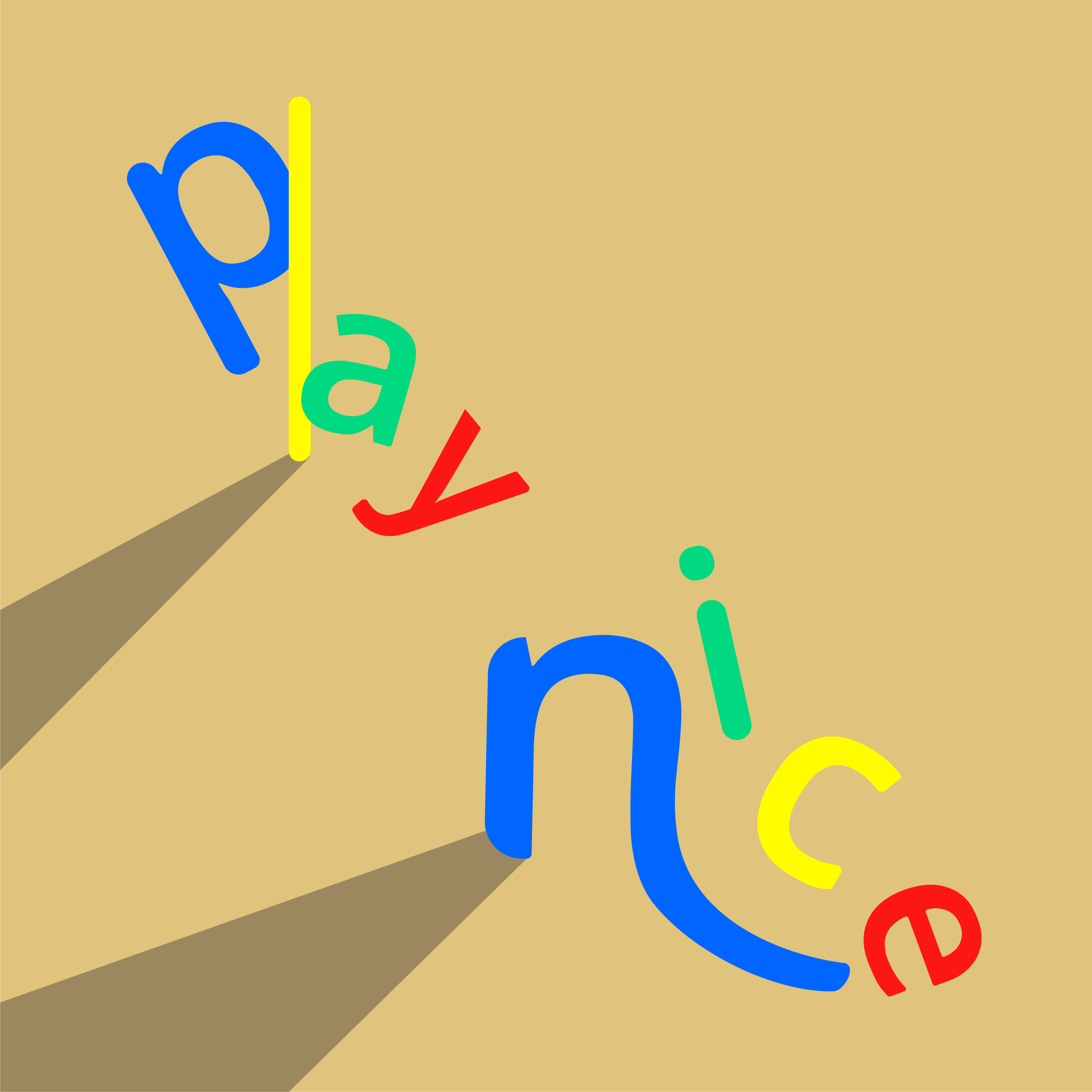
I wanted to replicate the feeling of playing at a playground, where kids are bound to fall to the ground or get hurt. The colours I chose are representational of a playground and I made sure to have some dynamism in my composition.
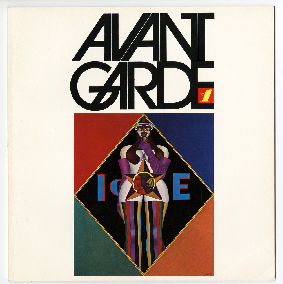
Scrolling through Herb Lubalin’s extensive portfolio page, I can see where he gains his reputation as Art Director of the year in 1962 because of his absolutely phenomenal and iconic work. From the film, The Sound of Music, to the classic Avant Garde logo, his work has definitely shaped the aesthetics of the late 19 century. Yet, his designs remain timeless and they could seamlessly fit into the design landscape of today. He was bold enough to shed the popular swiss modernist styles which were highly popular in the 1960s for more expressive typography which definitely suited the vibrant and changing landscape of America.

I dare say, his work is the one which I have most enjoyed amongst the past few typographers of the week. This is due to how stunning the graphics look. A simple tweak in a font, the change of a kerning and weight can transform an existing font into something so decorative and timeless… and I am probably rambling on. I was so intrigued by his work that I even looked for his book online but it was sold out!
“If a word was a beautiful word, it wasn’t the sound of the word that intrigued me but the look of the word. I saw each letterform as a piece of design.”

Paula Scher takes a similar approach to creating beautiful graphics using type as these two artists treat letter forms as a brush stroke or element, to design their graphics. They are also not afraid to manipulate these forms to fit the look of their graphics.
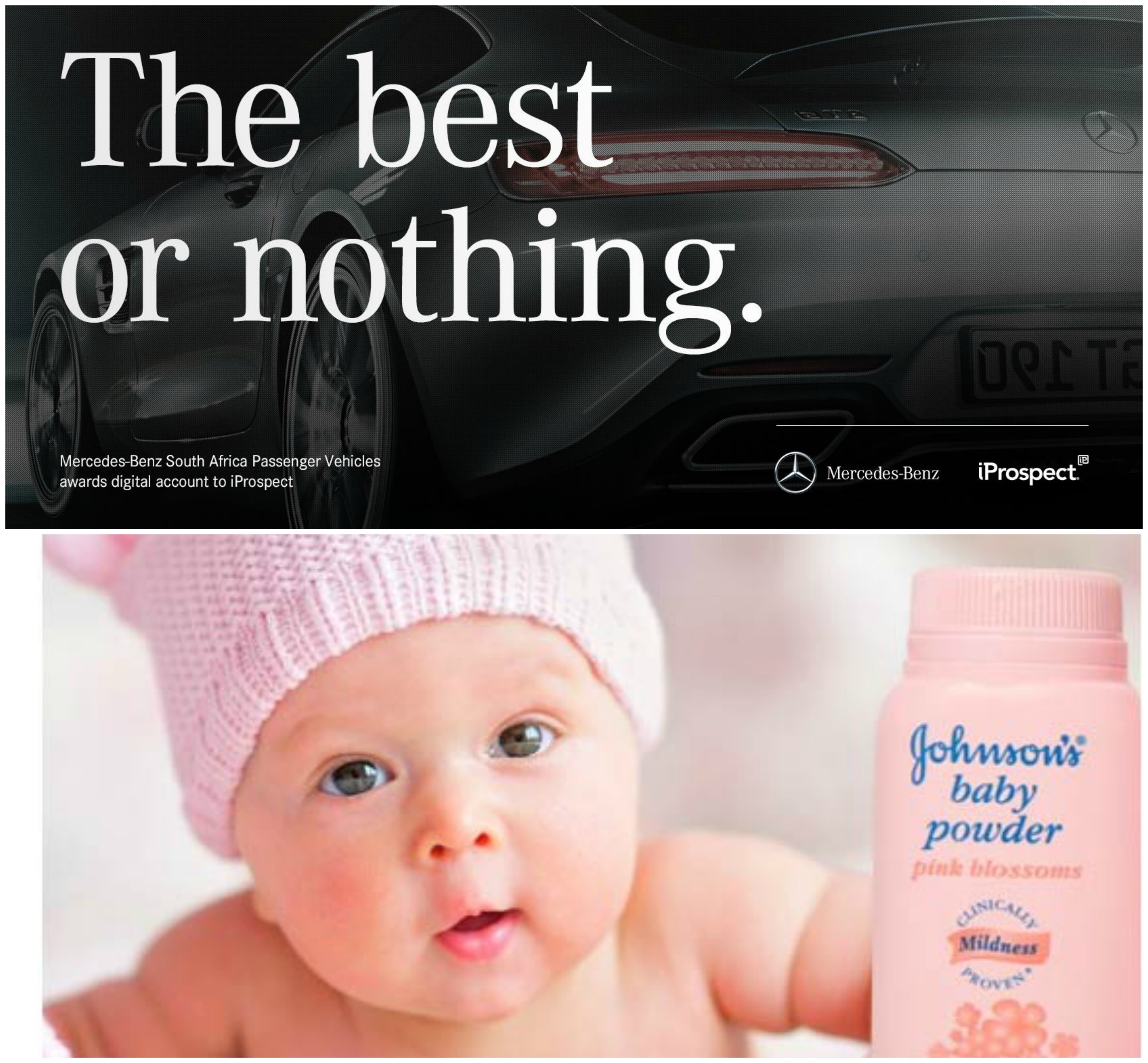
With the amount of stature Herb Lublin deserves, he fundamentally designs for the people and often keeps the community in mind. In the article written by Ellen Shaprio, she stated that Herb would often hire women as well as minority groups such as the blacks in the rougher parts of the states to give them a chance to hone their abilities in the creative field. His designs became the voice of the minority and as a progressive, he was doing his part to change the views on these minority groups.
Reading through this article, I find myself guilty of committing the crime of sticking to one font for most of my designs, especially when it comes to choosing a font for the body text. The analogy Jessica Hische gave was thinking of fonts as clothes. Sure, you can use a single font for your entire website, however, it would look too overpowering and dull. She highlights the importance of choosing a font family as well as a family with different weights would offer you much more flexibility when it comes to designing a cohesive page. I’ve only recently discovered font super families and despite how different their styles are, they work seamlessly and can fit many different situations.
Choosing font families which offer different widths such as narrow, condensed, regular, extended would give you more flexibility in designing body texts as these can be used interchangeably whether you have too little or too much space to work with.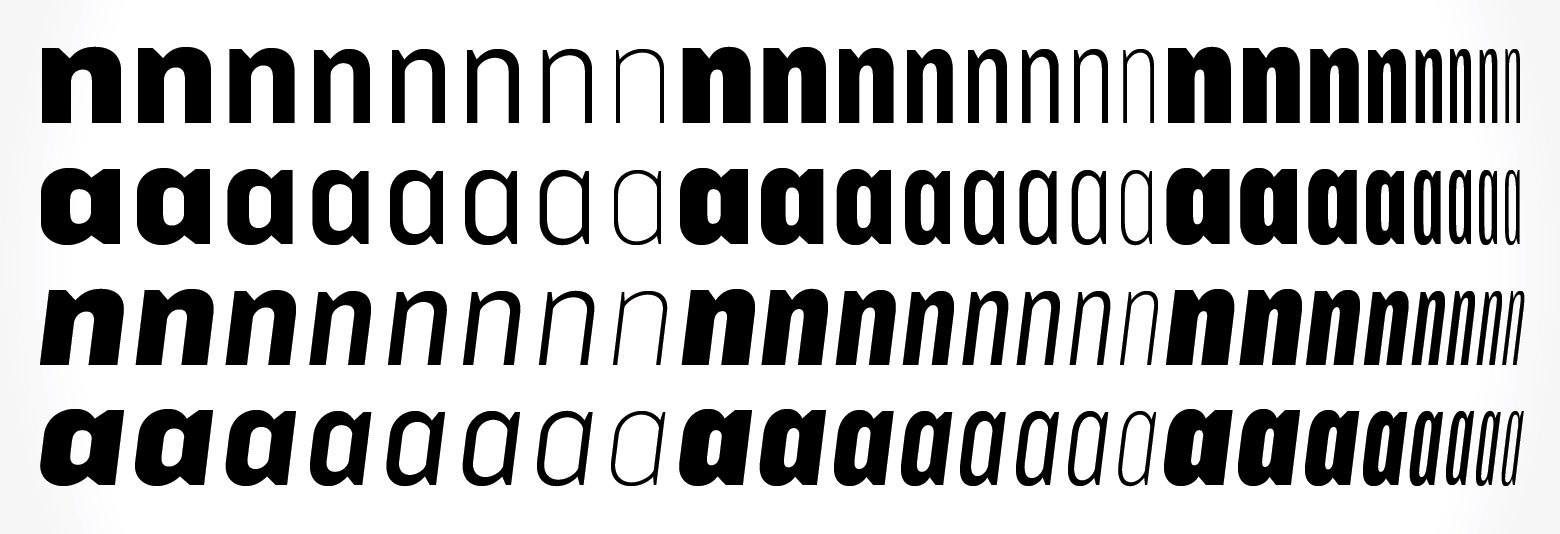
Amongst the many considerations when selecting a typeface, she also pointed out the x-height. Initially, I was skeptical as to how this minute detail could affect the overall aesthetics of the layout, however, when placed in comparison to a font with a much shorter X-height, the difference becomes apparent as it makes your content look a lot smaller.
“We read best what we read most.”
Our countless texts through our years of existence has made some fonts more legible than others and it is crucial that we use this to our advantage. By using serif fonts as body texts and sans serif fonts as headers, it would significantly help with the digestion of information, as well as to exhibit hierarchy in the design.
Undoubtedly, the most important and frankly, the one I have most issues with is font pairing. I read those paragraphs with eager eyes, with hopes of some wise words of wisdom. And deliver did she! I have attained more skills under my belt when it comes to selecting font pairs as some of the techniques I can use include: Using fonts from a Super Family, Fonts designed by the same typographer, fonts which have similar characteristics – more specifically the skeleton, meat and clothes. While using fonts from the same typographer is situational, all of the other advice given are extremely useful!

I have to keep in mind that all of this process is just choosing typefaces! What a monumental task and if only more people could appreciate the thought process gone behind choosing the characters on their screen. I myself have a long way to go in terms of researching for the appropriate font choice as I tend to skip this entire process, only to mindlessly scroll through my font library to find something which would fit my design. This is a bad habit as if anyone asks for the rationale behind my font choice, I barely have anything to offer, other than, “oh because it looks nice.”
Sometimes I am just baffled by the amount of detail which goes through branding and I start to question myself, how much of the subconscious is tapped in whenever we view an advertisement or come across a product?
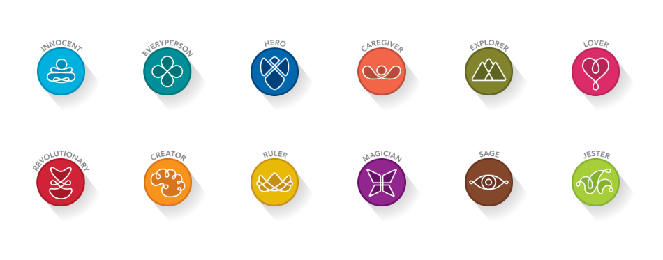
The use of archetypes in branding is no doubt, one of the strongest tool a designer can use to create influence in their work. The ability to reach into the sub conscious of people, enticing them into your product – it could be mistaken for a super power.
However, designing a strategy based on archetypes is no small feat as it requires heavy research into the characteristics of your demographic and it also forces you to think of how your product would be useful for your audience – specific to their lives. A brand has to have a consistent archetype strategy as deviating away from the chosen archetype can reflect as a company not being sure of their personality and character.
The use of symbols and colours also play a large role in designing an archetypal identity for a brand. With more curved and smooth corners, coupled with a pastel colour scheme would signify a calmer and more approachable brand, whereas a brand with sharp edges and cool or intense tones would signify an aggressive brand, destined to rise to the top.
I would say, the selection of typography also attributes to the characteristics of an archetype. For example, a script font may be used to represent a creative or caregiving archetype because of the elegance and fluidity, whereas a BOLD San serif font could be used to represent the Ruler or Hero Archetype because of the intensity and strength of the fonts.
After reading this article, I find myself slowly categorizing fonts and also identifying various brands and what might be the archetypes they might be representing.
My first impression of Erik Spikermann came from the movie on the study of the typeface – Helvetica. His views towards this typeface was far from conventional as he outright criticized the over-usage of the font to the extent where it became boring and lacking of any real character. He has every right to make such a bold statement as he has crafted countless numbers of popular fonts over the course of his career as a typographer.
His most notable fonts include:
FF Meta

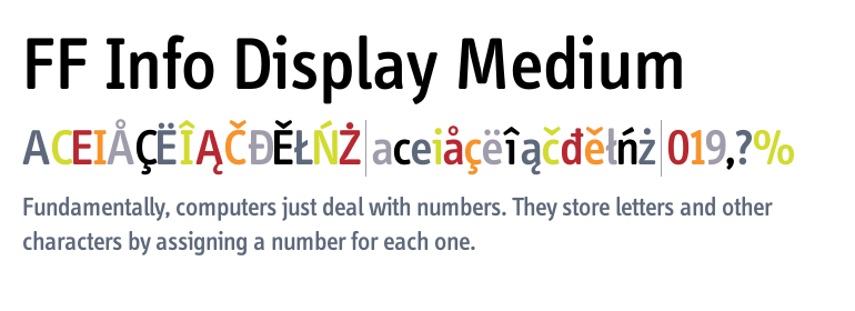
FF Info Display
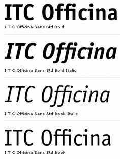
ITC Officina Sans
And my personal favourite,
HWT Artz
He runs one of the world’s most influential design and branding companies called MetaDesign and I hope that one day I would be able to work in such a prestigious firm. Most of his company’s branding work is focused on using photography and mainly typography to convey the message. Having crafted marketing campaigns for multi-national companies such as Volksvagen and New York Philharmonic, Spikermann hopes to challenge assumptions, by design.
As I was doing more research on Erik Spikermann, I came across an article he published on Medium.com, commenting on how UX (User experience) has become such a hot button topic to talk about and he is baffled by the ignorance of the market as they deem this denomination of design is something new.
Erik claims that typographers have been doing since the dawn of editorial design, making sure the content is legible and has a coherent flow to enable the audience to smoothly consume the media as succinctly as possible. As I aspire to study more about User experience and design, I found this stand particularly intriguing as I never viewed typography in this manner. Using the various methods of presenting our typography such as hierarchy, scale, weight, etc… we are essentially subtly telling the readers the steps to consume the media or design which we created.
This is the article:
I found this technique to be fascinating as I have always been attracted to the aesthetics of mandalas and their symbolism. I find it extremely pleasing to design mandalas and before I knew about this technique, I have always been designing them on my iPad.
I adapted this graphic into something which would resemble constellations as these forms look extra terrestrial and could represent the orbiting of planets.


Here are some of the designs which I’ve done in my free time exploring this technique. If I could collate all of the doodles I done during my awful lectures in school, I could probably create a graphic book of sorts! With this in my arsenal, I definitely look forward to more ways which I can apply this technique!
Jonathan Barnbrook is a designer and a typographer. He is a distinguished designer and he feels as though design has the ability to shape and mold the thoughts of society. Two of his most well known typefaces are Exocet and Mason, and they both have a similar essence in relation to one another.

The typeface Mason has a medieval/greek feel given the essence of the serifs as well as the accents to letters such as N, M and H to make them look as though they are columns or arches.
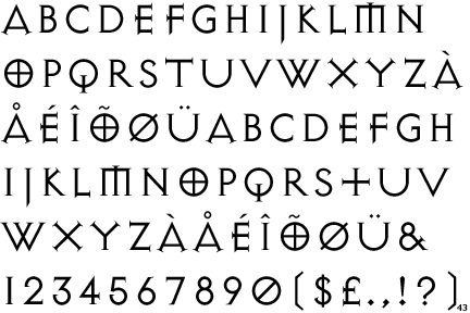
The typeface Exocet is used in the famous online game of Diablo, and this font is more ornamental as it does not have forms common to regular print fonts because of special characters such as O which differentiate itself from the other fonts.
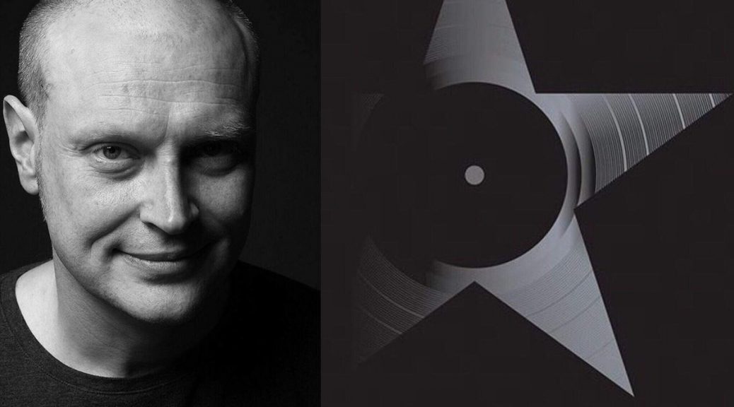
Other than his famous typefaces, Jonathan Barnsbrook also designed two of David Bowie’s album covers, including his latest one before his passing, titled Blackstar and it features David Bowie’s name in a stylised fashion on the cover of the album.

Fans also found out that his stylised initials held a secret image of a starfield when the cutout was placed against light. These incorporation of unique elements and forms into his work makes Jonathan who he is today. An influential, unique and distinguished designer.
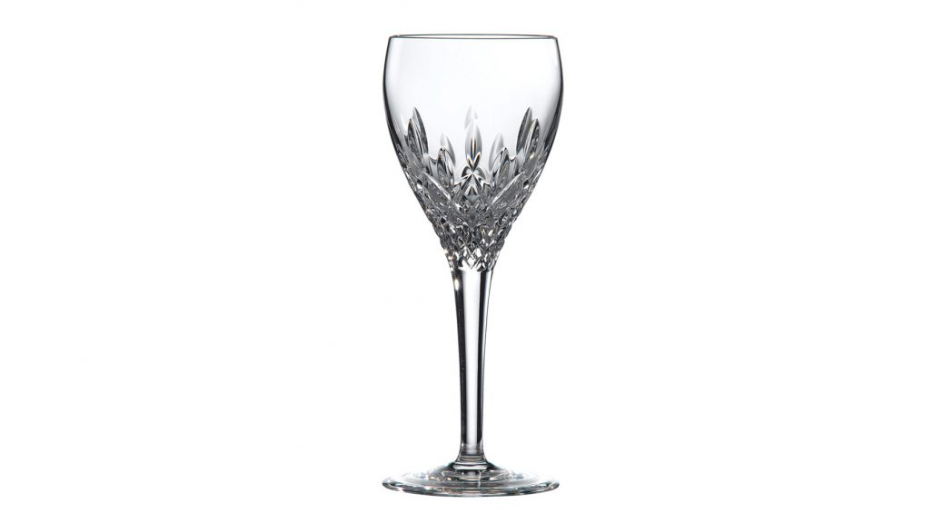
This is a controversial view on the importance of typography in design. The crux of her argument revolves around the point whereby typography should only play a supporting role in any design, as it is meant to be invisible. Using the analogy of a crystal goblet, typography serves as a mere vessel, only to serve its functional purpose of communicating information, rather than stealing attention away from the content.
This point of view has been met with a barrage of criticism over the years with people on both sides of the spectrum. It is important to take her stand with a pinch of salt as it is not absolute. Her stand would hold true in examples such as journal publications, newspapers – where the function is generally to provide information rather than attract attention. These documents would not require any flamboyant use of typography as the importance would lie within the content, rather than the design.
On the flip side, the same cannot hold true when the context is changed to focus on more artistic and stylised documents, such as editorials, marketing campaigns and product packaging. These require a different set of aesthetics one which would be focused more on design first, then content. It is important to treat typography as part of the design, rather than an entity of its own. These two fundamental elements work hand in hand to be able to drive attention to the subject or design.
I would oppose Beatrice’s view as it is evident in our society that good design does not necessarily have to follow good content. They can exist independently. This mindset of form follows function is rigid and should be more flexible to accommodate the changes in the design industry. If we were to stand by Beatrice’s mantra, we would not have famous typographers and designers such as Paula Scher, Neville Brody, Massimo Vignelli, etc as everyone’s style would remain stagnant and non-evolving.