Category Archives: Research

Review on the elements of Typographic style

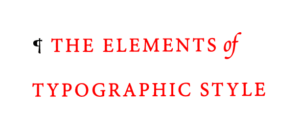
“The first task of the typographer is therefore to read and
understand the text; the second task is to analyze and map it.
Only then can typographic interpretation begin.”

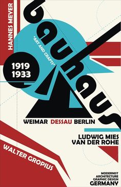
This sentence cast a light on me as I never really do analyse the the contents of my project before starting. In this excerpt, the author empahised how the design has to be parallel to the content, if it fails, the message of the content would not be conveyed properly and thus losing the attention as well as respect from the audience. The author also elaborated on how typographers have the ability to enhance the emotions portrayed in a text, as elements such as weight, scale, kerning, spacing, etc. come into play, allowing the typography have a voice and a life.

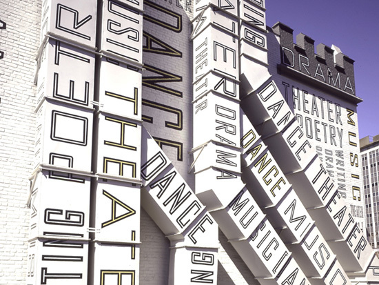
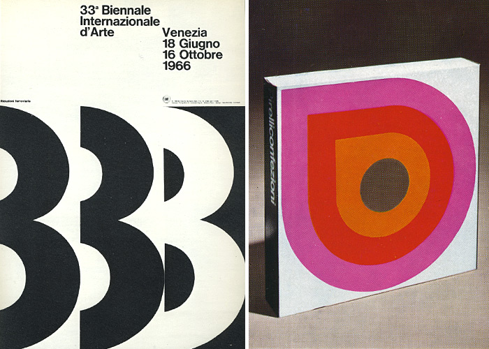
A design or message which consists of inappropriate typography tends to stick out like a sore thumb, and it attracts more attention as much as one would like to ignore. This is similar to the mantra preached by Beatrice Warde in The Crystal Goblet, or Printing Should Be Invisible. Whereby she argues that good design should be invisible and would go unrecognized, similar to a crystal goblet which holds luscious red wine.

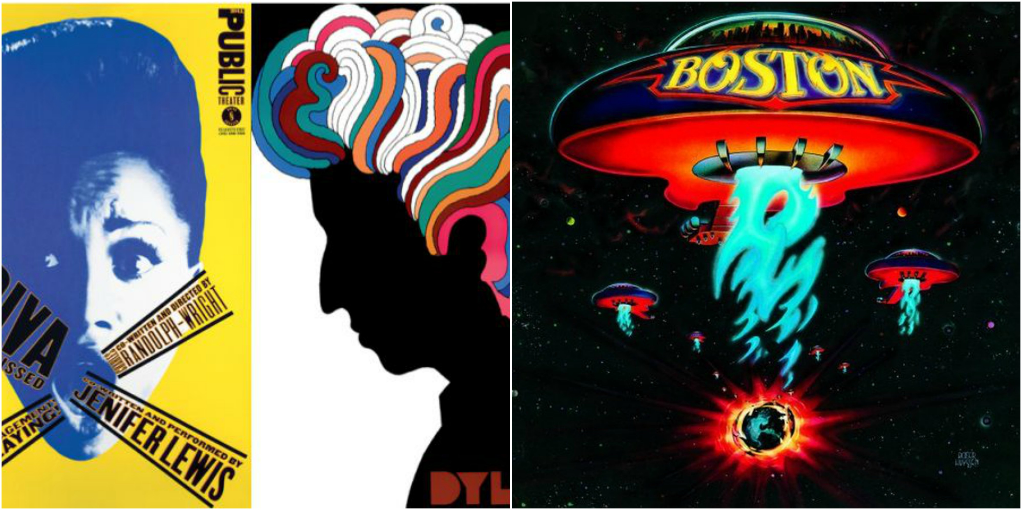
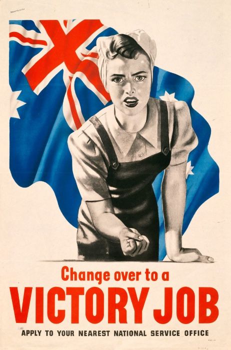
Typography is primarily a tool for communication, and similar to images, it is a double edged sword. What can be used to evoke hope and trust, can also be used to deceive or manipulate. One prominent example would be the use of typography in propaganda posters during the World Wars. These posters were capable of instilling a form of patriotism, compelling citizens to engage in war.

“Letterforms have tone, timbre, character, just as words and
sentences do. The moment a text and a typeface are chosen, two
streams of thought, two rhythmical systems, two sets of habits, or
if you like, two personalities, intersect. They need not live together
contentedly forever, but they must not as a rule collide.”


Haiku In Class


This is an interesting Haiku which I generated using a handy software.

The Haiku goes:

Violet Mountain

The lazy panda tumbles

Below the bamboo

I felt that there were many things which i could play with, including the colour violet, tumbles as well as bamboo.

Typographer of the week: Paula Scher

Paula Scher was one of the first typographers I was exposed to by this TV Series on Netfilx called Abstract. From there, I was able to see typography from a different perspective. As Scher mentioned, one of the mantras she has was to ‘Illustrate with type’. Undoubtedly, I am struggling with using typefaces to my advantage which makes my designs look flat and stagnant. By using different typefaces as my brush strokes, it reinvents the way I look at designing my posters.

Paula Scher illustrated this map of the United States using demographic information about the region and she is using typography as her paintbrush.

Paula Scher is also highly against the use of the Helvetica typeface as she terms it to ‘neturalise feeling’ and she also blames it for causing the Vietnam war in another interview in the movie Helvetica. Typefaces have a personality of their own and we should use that to our advantage when designing.

From her humble roots as a album cover designer, she was able to create many different album covers using custom typefaces which made her designs standout amongst the sea of generic album covers and typefaces.


Typographer of the week: Massimo Vignell


“From the spoon to the city” this is the quote that resonated with me as I was watching the interview with Massimo Vignell. Architect cum designer, Form precedes every one of his designs as he strives to instill meaning and purpose into his designs. Many of us tend to get lost in the aesthetics, aiming to please visually but more often than not, it lacks substance and functionality. The ideal of form follows function is a strong mantra to abide by as it could be argued that your design would always be relevant as functionality does not change but aesthetic trends can.

As what Massimo Vignelli said, “the most effective design is positioned in the centre between progressiveness and conservatism.” Timeless designs are a perfect harmony of function and aesthetics which is what makes them, to me – the epitome of what a designer can achieve. A good example would be an instruction booklet filled with pure text. It is completely functional, however, the lackluster of aesthetics just makes it unbearable to consume. Something purely aesthetic could be a Jackson pollock painting, whereby it is pleasing to look at, but does not serve any functions, and sooner or later, another trend of painting comes along. I start to study Massimo’s work on the New York subway and despite it being designed in the 1950s, the design is still highly relevant today and it does not lose one bit of function.

Commercial design is becoming increasingly diluted and this is a reflection of the extremely wasteful and consumeristic characteristics of our current society. Design trends follow suit as well and it is constantly changing to suit the demands and the needs of the market. While it makes the design landscape more exciting, there is a deeper underlying issue with having zero historical value as they are so fleeting, these trends are not impressionable. However, if we turn back the clock, we realize that the approach  towards design during the period of modernism such as bauhaus is still extremely relevant and widely used today.

Overall, I am humbled by how Massimo Vignelli views himself as he does not come across as a celebrity designer, but instead, he is more of a passionate teacher. One that is concerned for the direction in which design is heading towards. Towards the end of the interview, Massimo Vignelli shared one of his experiences with fans approaching him for an autograph and his genuine attitude towards his fans is heartwarming as he said it would’ve been something he would do in his past.

Typographer of the week: Neville Brody

My initial impression of Neville Brody’s work was that it heavily resembled works from the period of Dada, whereby there is exensive usage of clipped graphics, shapes and even fonts. I can see why his designs were unconventional to the point whereby he was continuously failed in art school.

His work effectively tethers on the line of breaking the rules of typography and creating something revolutionary. I agree with his statements given on his lecture of how as commercialism continues to grow, the essence of our designs have to be reduced down to the point whereby its primary functions would be to attract attention and convey a message.

In this design, Neville aimed to create depth through layering and using a 2D space. The abstract strokes in this layout is definitely striking and resembles post modern design, whereby there are many sharp edges and striking colour to capture the readers attention.

This poster is able to highlight the dynamism of using nike shoes, in an extremely unconventional way whereby there is the use of a variety of kernings and leadings which may give of an unpleasant aesthetic.

In hindsight, to become a revolutionary, the unconventional and bold has to be done – ones that are not afraid to lose what they have. Which is why there are so little of these brilliant people around as they have the ability to revolutionize and change the landscape of graphic design as we know it.