
Alas! We start on our process! All of my raw sketches and conceptualisation have been placed in my CPJ! But fret not, because I also have digital sketches to show!
I will summarise my conceptualisation process as most of it is in my CPJ. In essence, as my family raised me up to be cautious of my health, my parents always encouraged me to eat healthily and exercise regularly. This has benefited me in a plethora of ways as I often feel more motivated to accomplish more things and I find myself getting tired less often.
Thus, I wanted the direction of my work to incorporate elements of both food and exercise as it is what makes for a healthy lifestyle.
Before I further explored this concept, I had the idea of personifying myself as a dog as I felt that they were very active creatures and would accurately depict me. This was also inspired by one of the artists I found online!
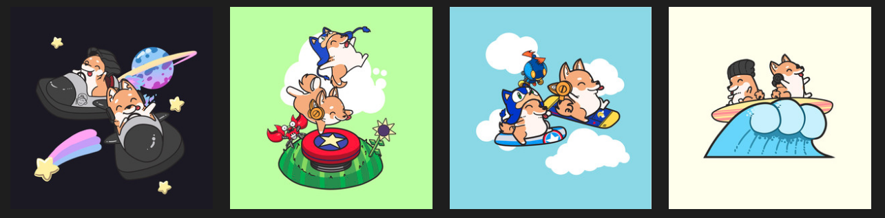
However, as you flip through my CPJ, you can see that I tried sketching out huskies… But they look terrible and to capture their look accurately, I had to add in a lot more elements which was not what I wanted for my work.
So I decided to scrape that idea and I went on with creating illustrations of myself!
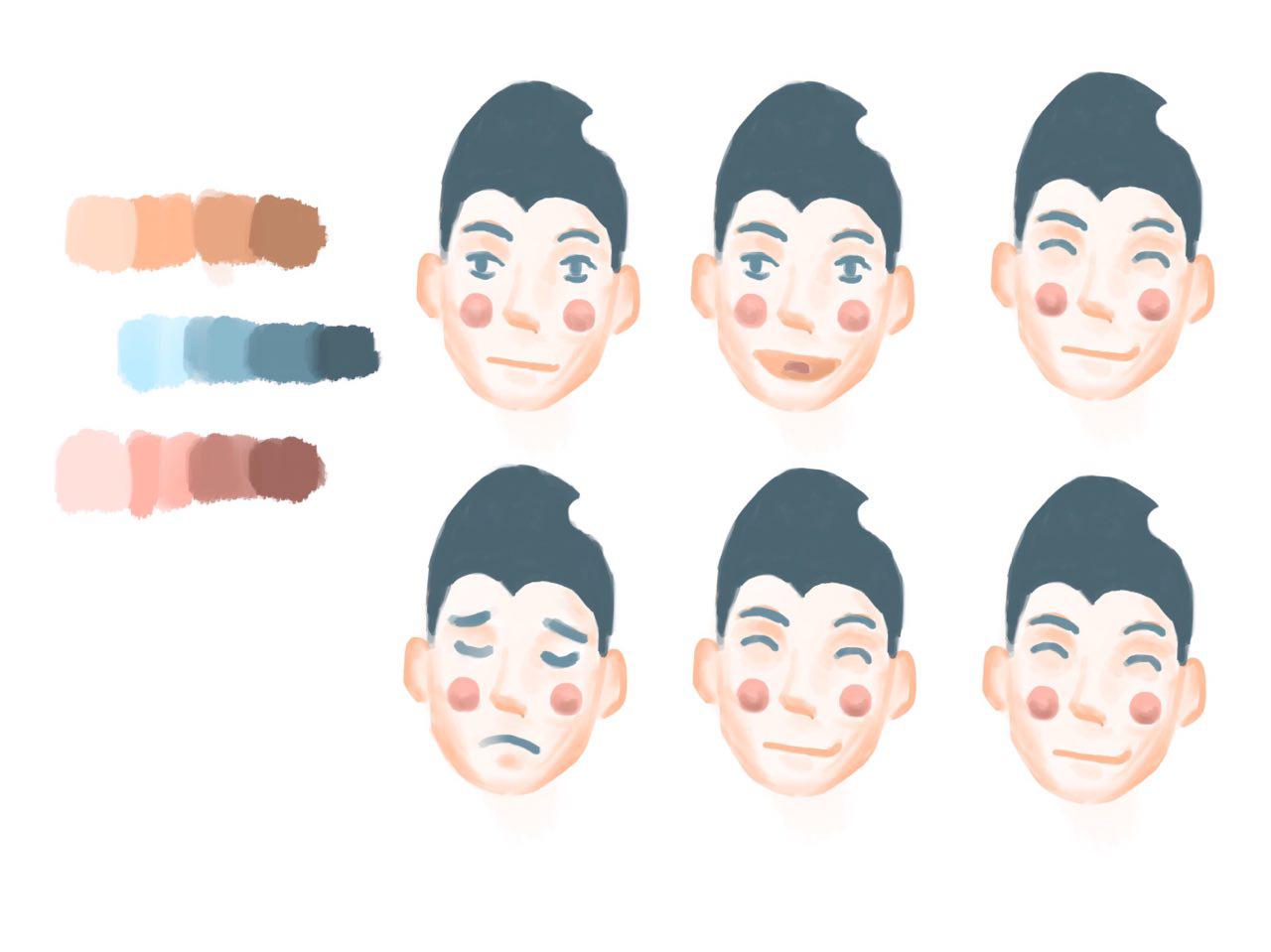
Notably, some of the faces are similar as I was still in the midst of creating my equations and I was unsure of what expressions I should illustrate! Trying to incorporate this idea into my work, I began illustrating my first equation.
Me Studying in Warm Room + Swimming Pool = Me Cooling Down
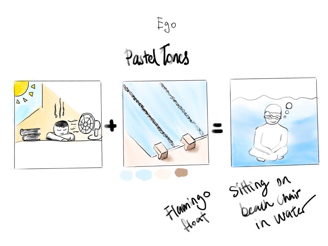
This was my first digital sketch of the equation.
At this point in time, I was just trying to come up with the concept and composition for my work, which is why I did not play around with colours just yet.
Slowly, as reflected in my CPJ, I had the idea of incorporating kitchen appliances and food into my equations!
Thus, I had the idea of using an oven to represent a warm room!
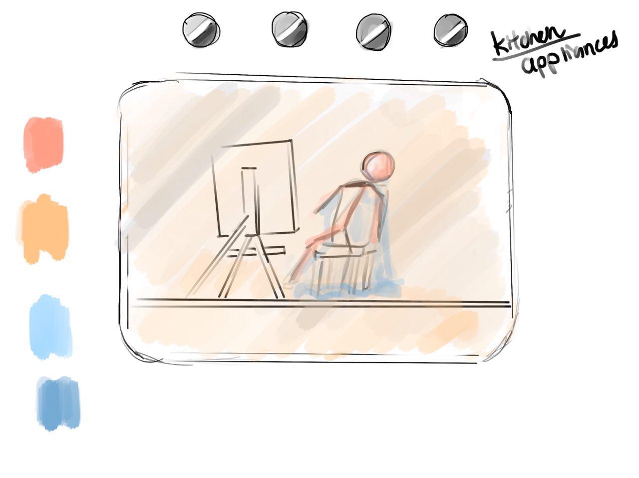
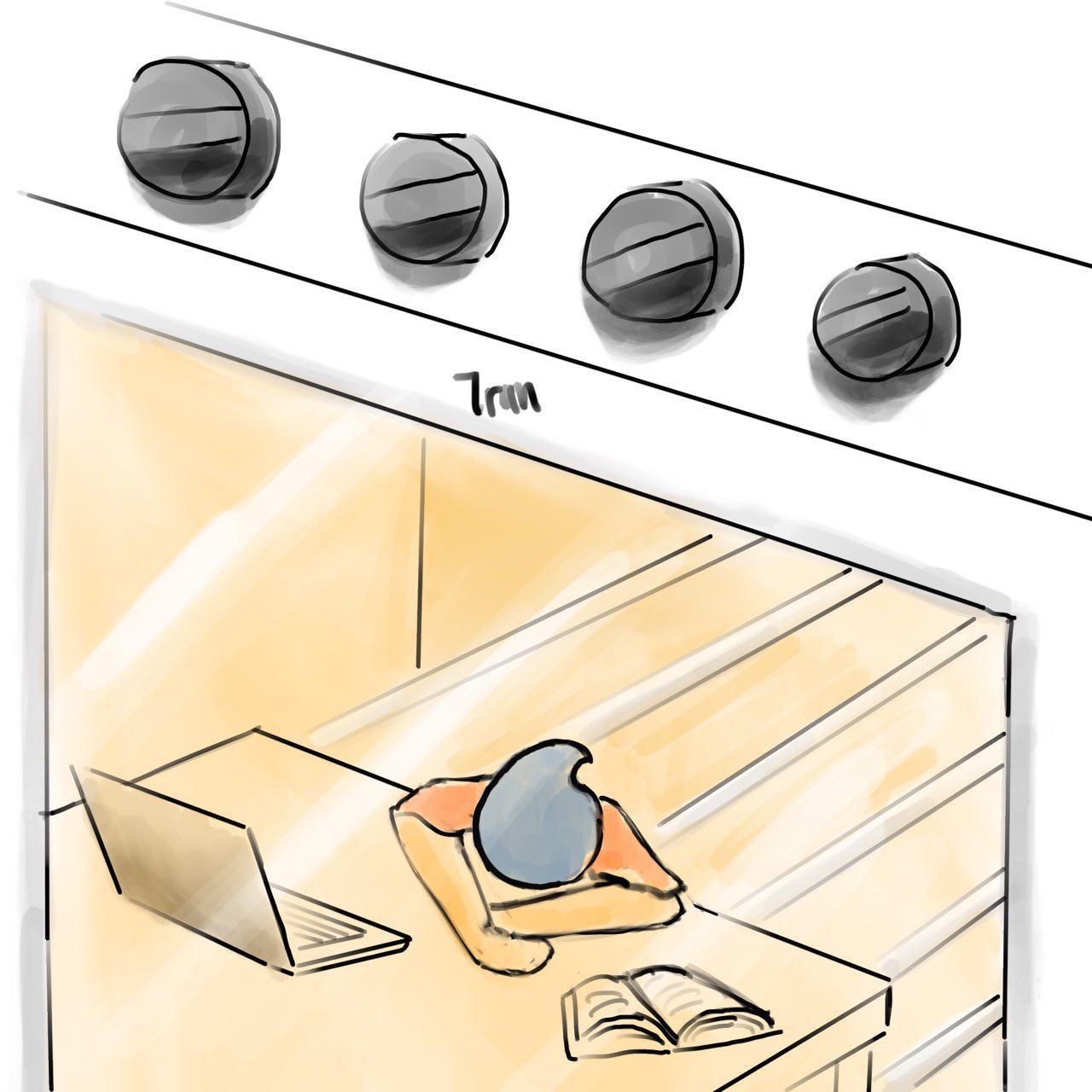
This was the initial idea i came up with! I brought this to Mimi and she commented that it was not very clear that it was an oven and that the composition was too tight, making it uneasy for the viewers.
She asked me to look into other ways I could represent an oven in my composition.
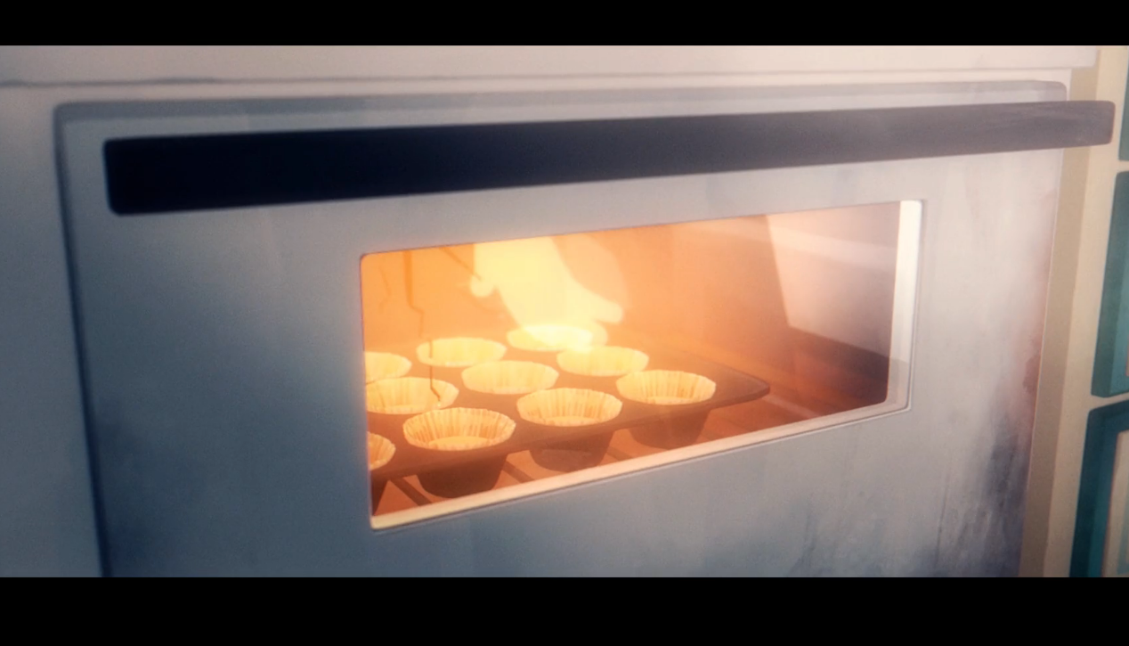
As I was watching a short animated film, I saw this perspective of an oven which I really liked. 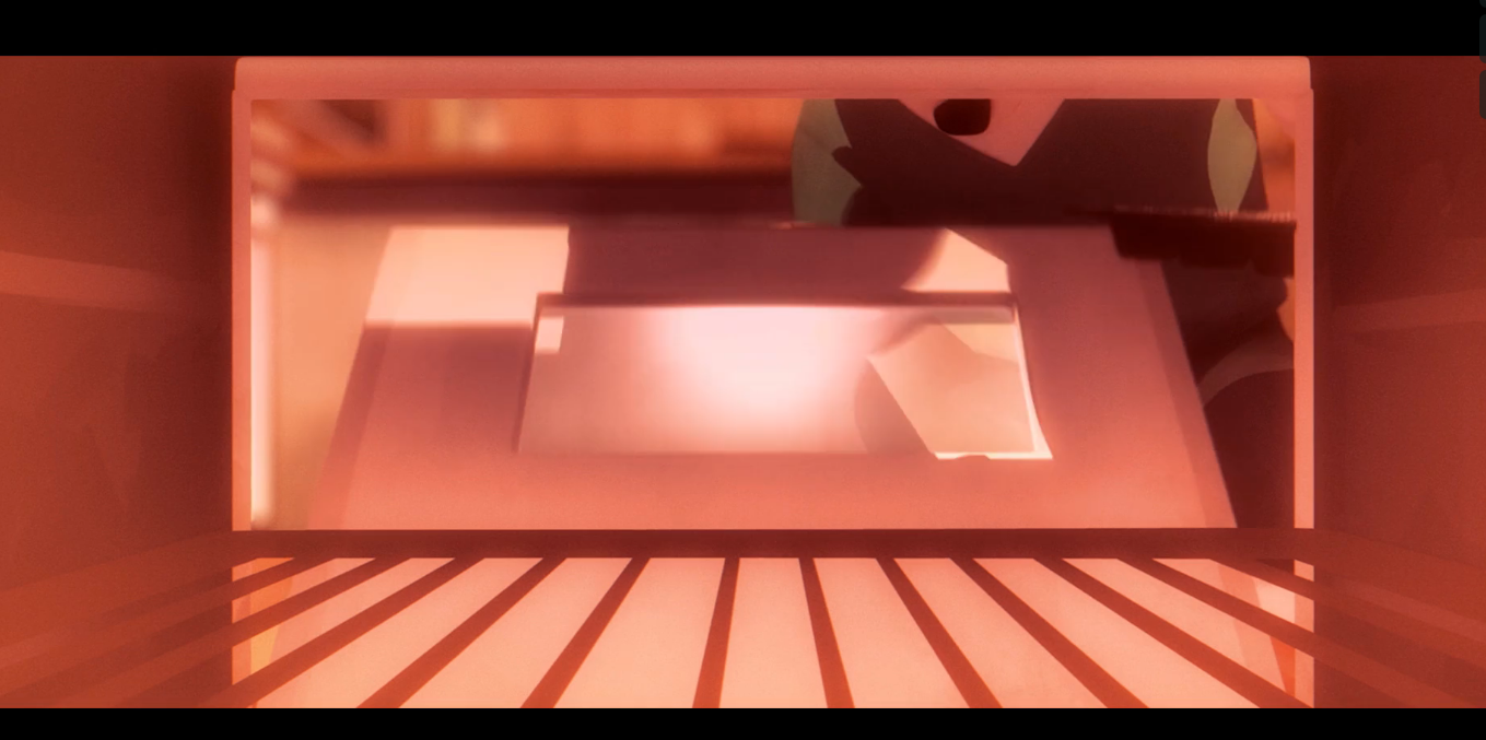
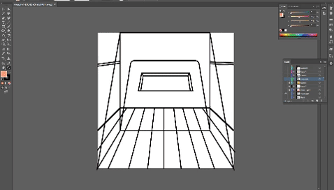
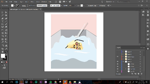
The perspective was from the inside of the oven, as opposed to it being from the outside as seen below. I felt that this created a much better composition and I was able to convey the message of me studying in it much better.
I used darker hues of pink to represent the warmth of the oven. I also made sure to pay attention to the lighting of the oven as I wanted it to be as clear as possible.
I also took Mimi’s suggestion of illustrating the entire frame before cropping it down as it would make sure that I am not limiting myself in any way.
I faced the most difficulty when I was trying to illustrate the oatmeal as it was hard to capture the different textures and tones. I also changed the initial colour of the table from blue to a warmer brown to make it in line with the theme of warmth.
+
Next, we have the pool frame. The composition for this gave me a headache as well as I did not know how to capture the look of a milk carton well to show the idea of a swimming pool. I took several pictures of a half cut milk carton to try and visualise the perspective better!

I also have several inital sketches of my milk carton and how I wanted it to look like.

This perspective would be one whereby the viewer has open the top flaps of the milk carton and is peering into it. This was tricky to capture, and the angles presented would make it difficult for me to frame it well.
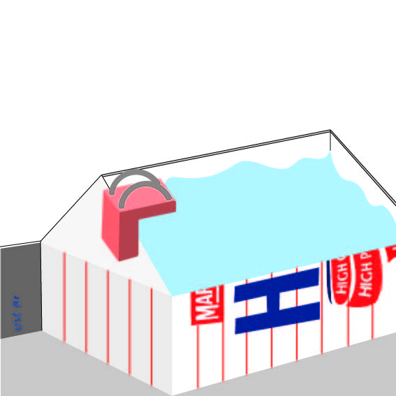
I illustrated this and brought it to Mimi on the second consultation and she told me that i should not have filled the frame with the milk carton as it left very little breathing space for the viewer and it would leave them feeling uncomfortable.
I took her advice and i gave the milk carton a lot more breathing space. The new composition also allowed me to play around with more colours, making it more aesthetic.
Some comments from Mimi on the actual submission day was that the perspective could be changed a little as the horizon has to be slightly higher than where it is now.
=
Next we have my final frame. I wanted a dynamic composition for this frame but I found it hard to show it as the milk carton did not give me much room to work with.
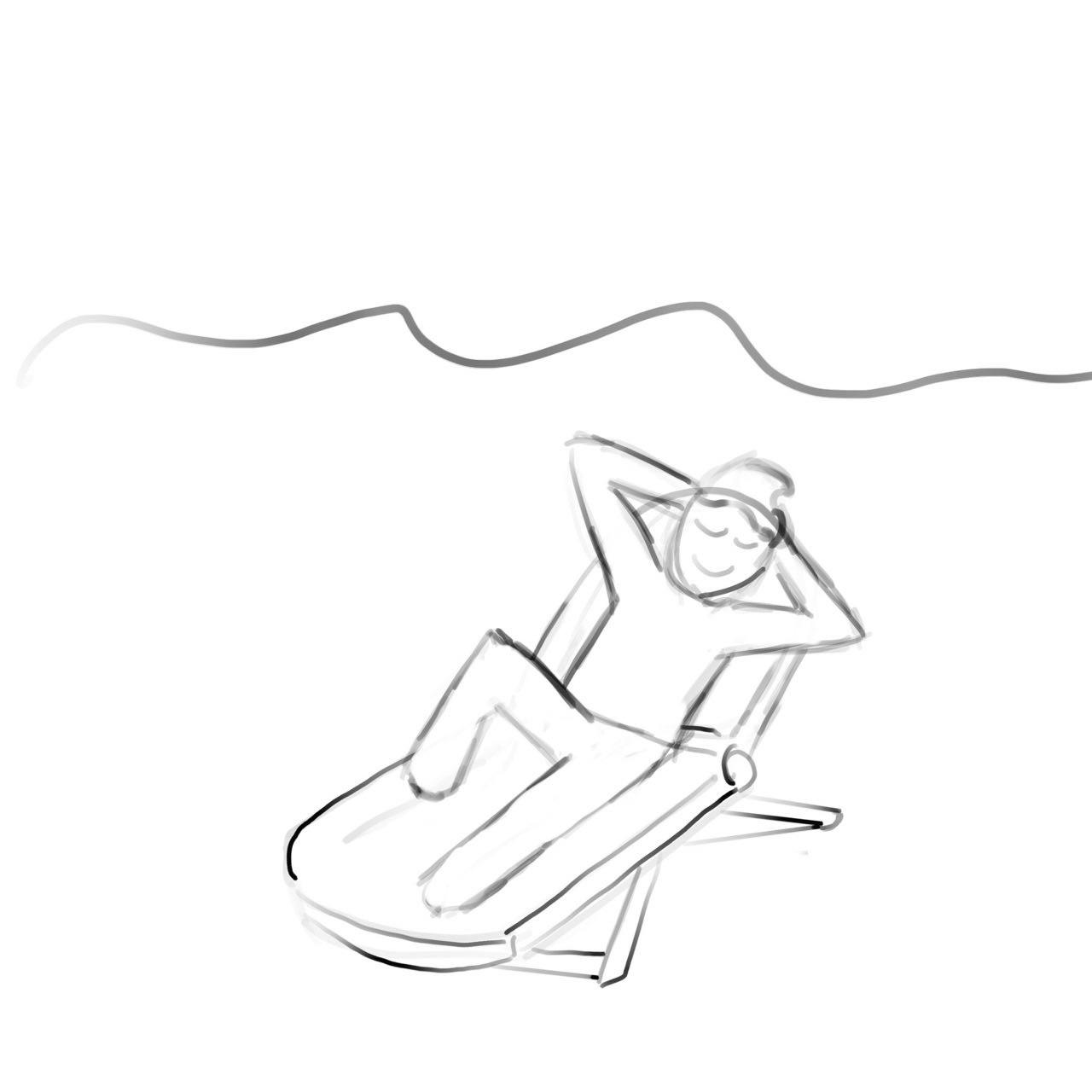
I tried using a beach chair to represent relaxation but I felt that it did not fit the theme I was driving across.
Mimi suggested that I could have the oat jumping into the water, however, I felt that it would remove the element of exercise if I did that as it would only look like i was at the pool to have fun. Which is why I decided to go ahead with the conventional pose for swimming which is a freestyle stroke.
Colour scheme I used:

Unrefined Me + Hostile Gym = A Better Me
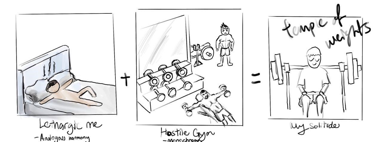
This is the first sketch I came up with for this equation. I wanted to show how an environment where people may find intimidating, could be somewhere where I sought comfort in. To me, this place was the gym.
After showing Mimi this frame, she told me that the end result was too similar and expected together with my other frames (as you will see).
This was also before I had the idea of incorporating kitchen appliances into my compositions.
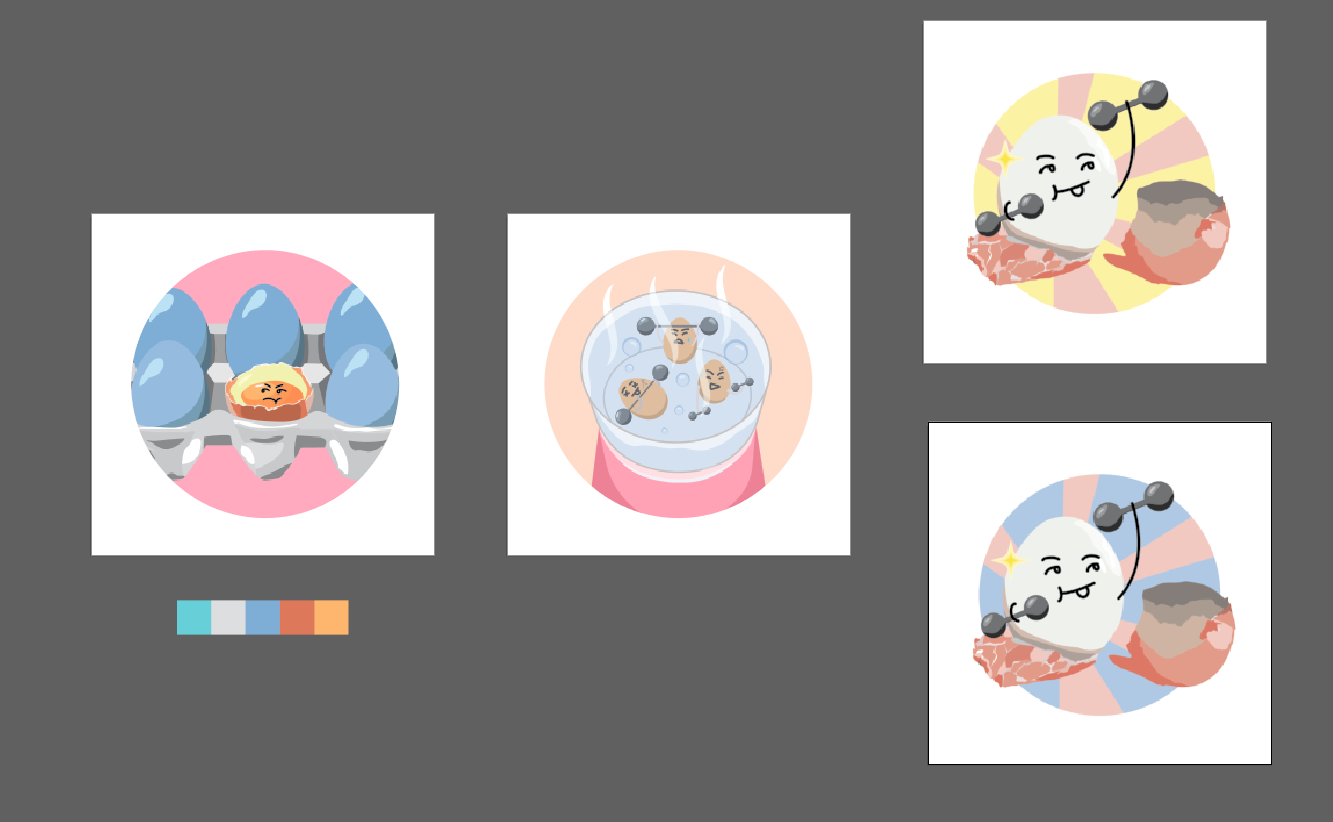
I decided to use an egg to represent me as eggs are high in protein and it is essential for muscle growth! A little fun fact, before I entered university, my breakfast would consist of 3 eggs, a bowl of oats and milk.
I played around with different views for this frame.
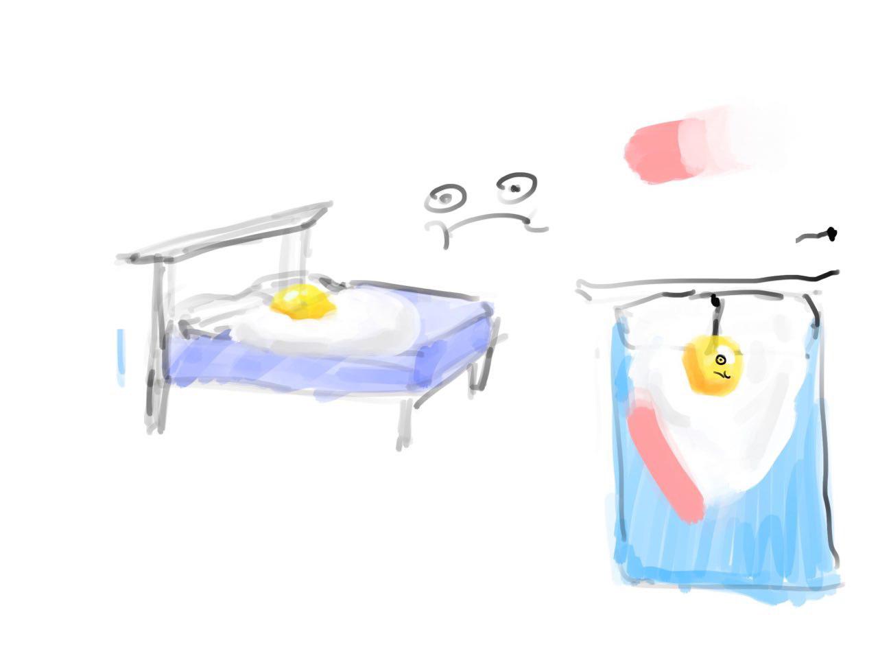
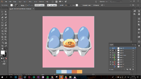
Eventually, as seen in my CPJ, I went with the idea of having the egg in a tray as it would fit the frame better and it would make more sense through the equation as eventually, the uncooked egg becomes hard boiled.
+
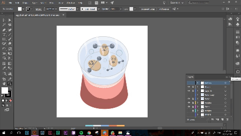
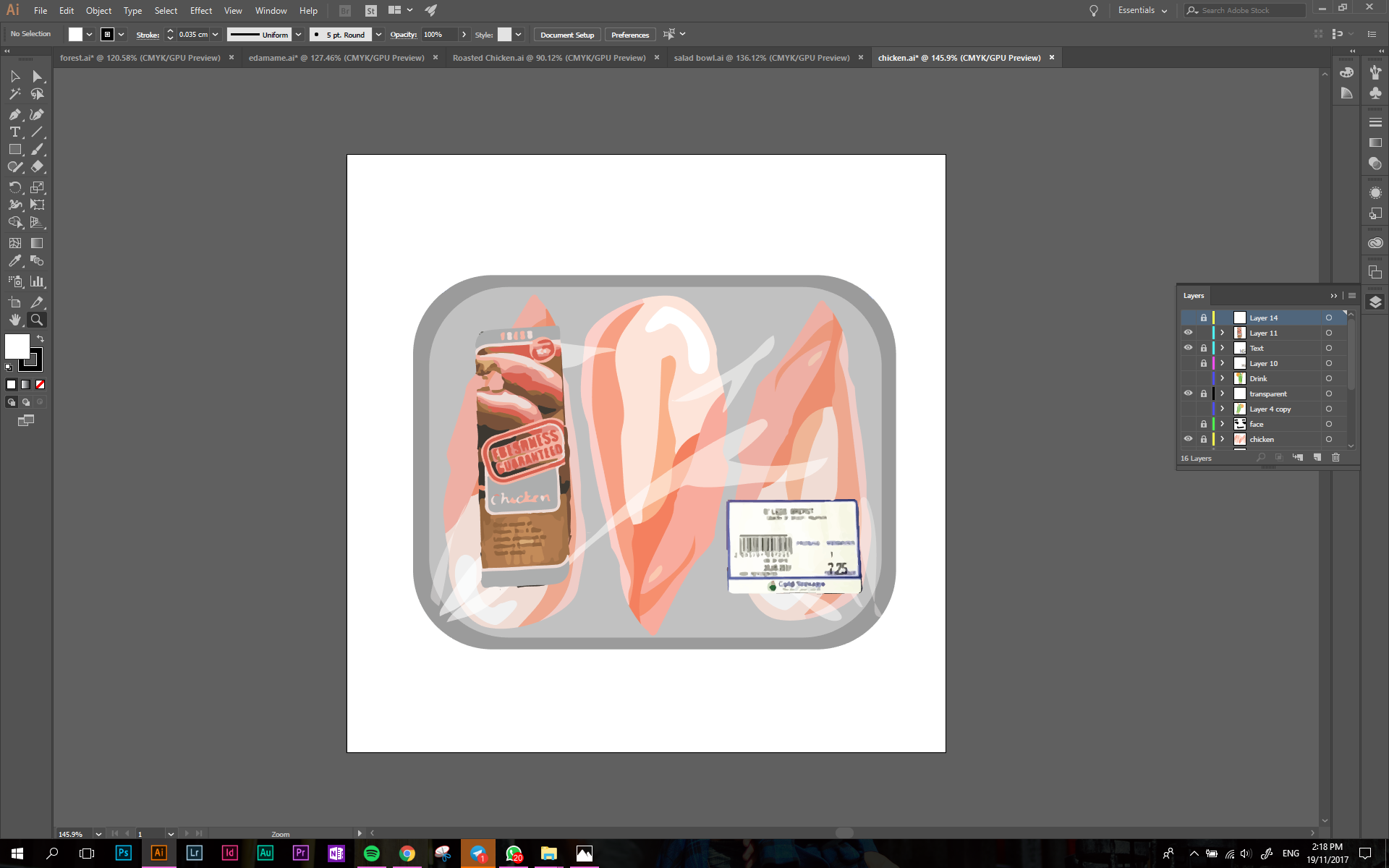
Next, instead of a physical gym, I used the soft boiled egg cooker to represent the gym. As you would have to use boiling water to cook the eggs, it ties in with the whole concept of a hostile environment!
Upon Mimi’s advice, I added in steam and bubbles to further convey the idea of it being a stuffy environment.
=
A better me was represented by me breaking out of the shell and becoming a hard boiled egg! I spent a lot of time trying to draw the egg shells as i wanted to make sure people could understand the composition, similar to how a caterpillar morphs into a butterfly!
I fiddled with the composition further as well as I could not decide which colours I wanted to use.
I felt that yellow and pink would represent the idea of hope and a brand new me better, however it would not be in theme of the colour! Whereas blue and pink would work well with the entire equation but it would not stand out as much.
I also had parts of the weights and shell protruding out of the circle frame, however I felt that if I was not able to constantly use this effect in my other equations or frames, the design would become inconsistent.

Colour scheme used:

Chilled Me + Running Track = Me Dying from Heat
Next, I wanted to show some form of exercise which I did not enjoy! For me, this was running as I hate running because of how sticky and smelly I become afterwards.
To show this, I personified myself as a piece of chicken breast.
I initially wanted to show myself on a plate in a fridge, showing how relaxed I was. This can be seen from my CPJ. I soon realised that the composition would become too cluttered with objects and that would take the attention away from the main object.
I went with the use of chicken sold in Cold Storage as they are always sold in the refrigerated sections and packaged in a foam box with cling wrap.
I initially added some symbolical elements such as a cold drink along with the chicken breast as well as more food packaging labels. But I realised that it over complicated the design.
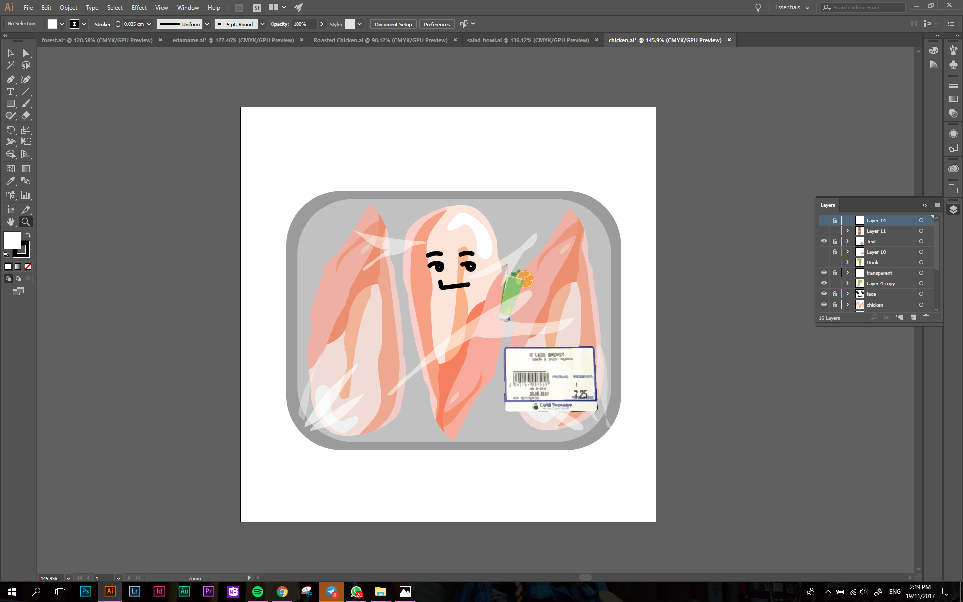
In the end, I went with a more simple composition to drive the message across.
+
This frame brought me the most frustration out of everything as I struggled to find a suitable way to depict a running track. The skewed perspective of a running track also proved to be an issue as it was difficult to get it in perspective to look realistic.
I had some trouble with the vectors in illustrator which is why I exported the image onto photoshop to edit the colours.

I used warmer colours to show how the running track would be hot and suffocating.
=
I experimented with different types of chicken breast here, however, when I asked my friends to take a look at my illustrations, they would not get the link between the images as the chicken breast changes. I decided to use the original illustration, but add shades of brown to it so that it looks cooked. I added grill marks to make the effect more apparent.
The finishing touch would be me lying in a puddle of my own sweat. Again, I used rose quarts to depict a warm environment.
Colour Scheme used

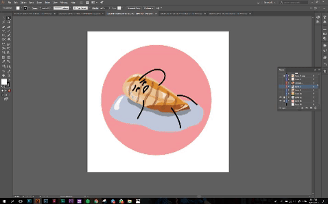
Me Under Pressure + Parks = Me at Ease
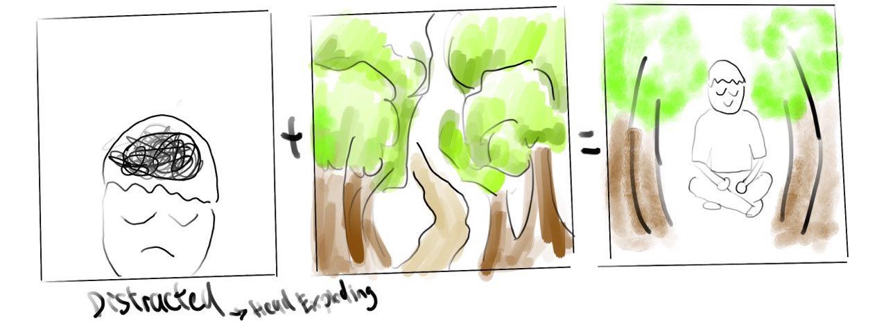
This was the first sketch I made of this frame. It was supposed to depict how nature provides me with tranquility and calms me down. As what Mimi said, my initial sketches were very predictable which was why I changed them.
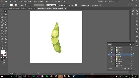
To show this, I used edamame. A type of Japanese bean! When I went to Mimi with this idea, she told me that squeezing the pod is not how people would normally eat this food! I told her that it further adds a comedic element to it as it was exactly how I tried opening the pod the first time I ate it! This external stress would convey well when the pod explodes!
+
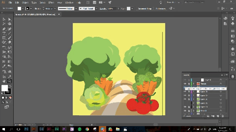
This was a fun composition to come up with and I felt that the colours really tie in well with each other. I wanted to depict a forest using only vegetables I eat to show healthy living. I included tomatoes, broccoli, baby carrots, lettuce and romaine lettuce to the composition.
I had to tone down the reds of the tomato to a more subtle pink as the colour was too strong and not in line with the pastel theme.
=
Salad!! Oddly one of my favourite things to eat. My mom always prepares too much salad for my family to finish which is why they always expect me to eat the remaining vegetables left.
For this frame, I used the same vegetables as the ones I used in the park to create a salad bowl.
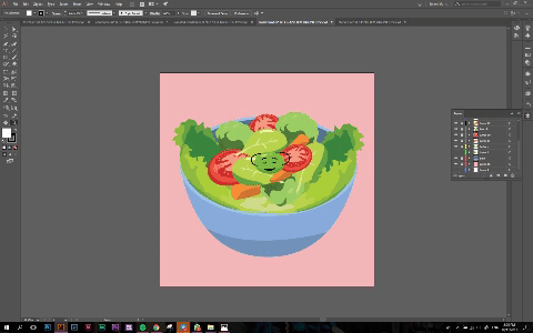
Colour Scheme I used:

Now for my final submission!

Lol!