
During one of the early consultations I had with Mimi, she suggested that I should look into children’s colour palettes as I told Mimi that I envisioned my work to be one which was cheerful and fun to look at.
Here on begins my research for colour!

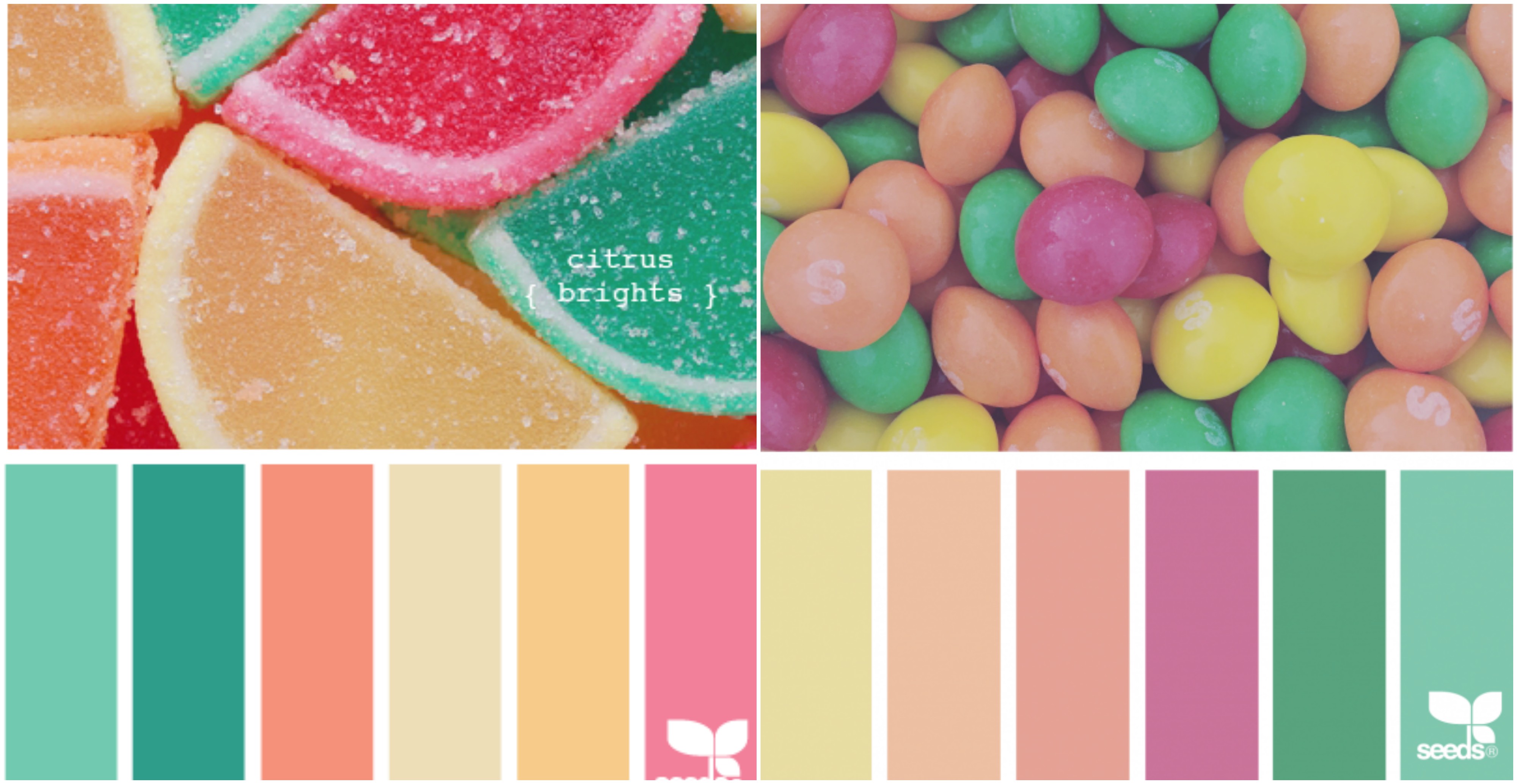
Before this, I never realized how enticing children’s candy looks like. It is amazing how colour is able to speak to the subconscious mind of children, making their parents buy candy for them.
Colour is so strongly ingrained in us from such a tender age which is why it is such a powerful tool when used in marketing.
Here are a few other examples of products and banners catered to children.
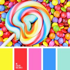
The hues for this palette were too strong for my liking which is why I did not want to use them in my composition.
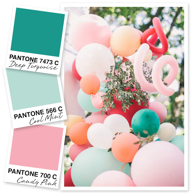
The colours from this image makes use of different shades of the Pantone Colours of the year – Rose Quartz and Serenity.

This poster uses triadic colour harmony and it works very well with the idea it was conveying.
This banner uses a split complimentary colour scheme.
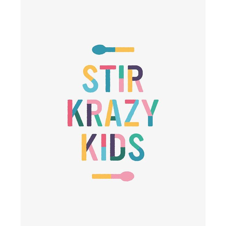
This composition uses Tetradic colour Harmony and it is able to show the ‘kraziness’ of the poster, while creating a composition which is pleasing to look at.
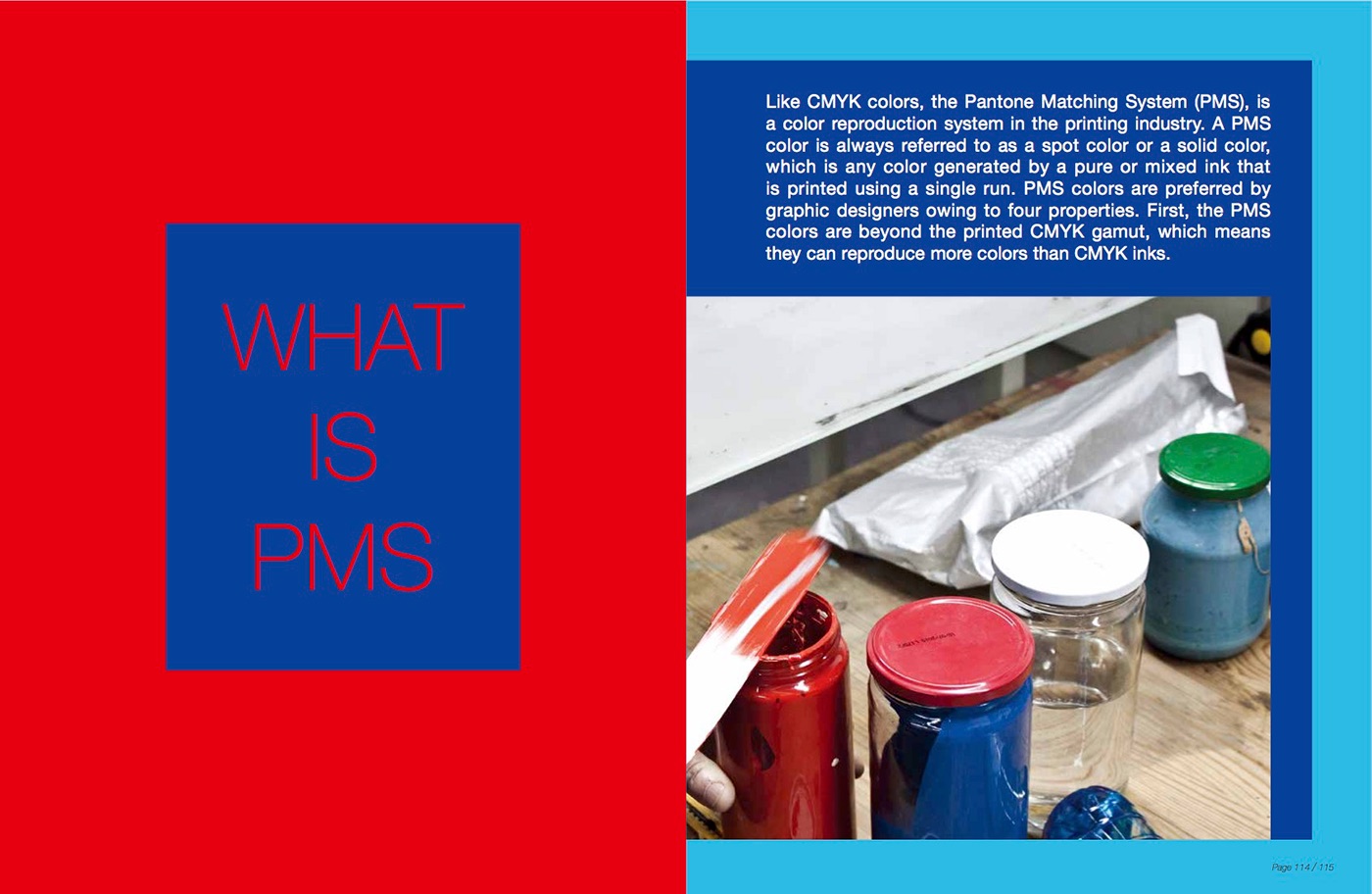
I stumbled upon this book as I was sourcing for inspiration and I thought that it would be great if I could include some of it in my research. This is a book on printing in both CMYK and PMS.


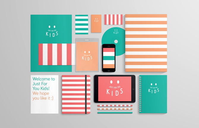
I really liked the colours in this composition and i felt that it would be great if i could incorporate some of the design elements into my work.
https://www.behance.net/gallery/52312515/Printing-Colors-in-Graphic-DesignCMYK-PMS