After week 4’s tutorial, I had to source for blocks to form my 2 models. I decided to go with 2 models which parts can be interchangeable and reusable. This was influenced by Lego and also because I didn’t not want to waste my foam blocks. Because the blocks had to be interchangeable, I ensured that certain blocks from different models were of similar dimensions. The two models revolve around a main block which also happens to be the SD.
I wanted to use acrylic for my blocks which would be closely related to Lego, however, the material would be difficult to carve and be precise without proper tools.
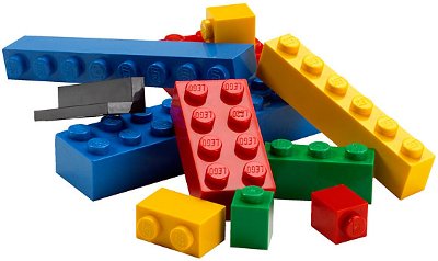
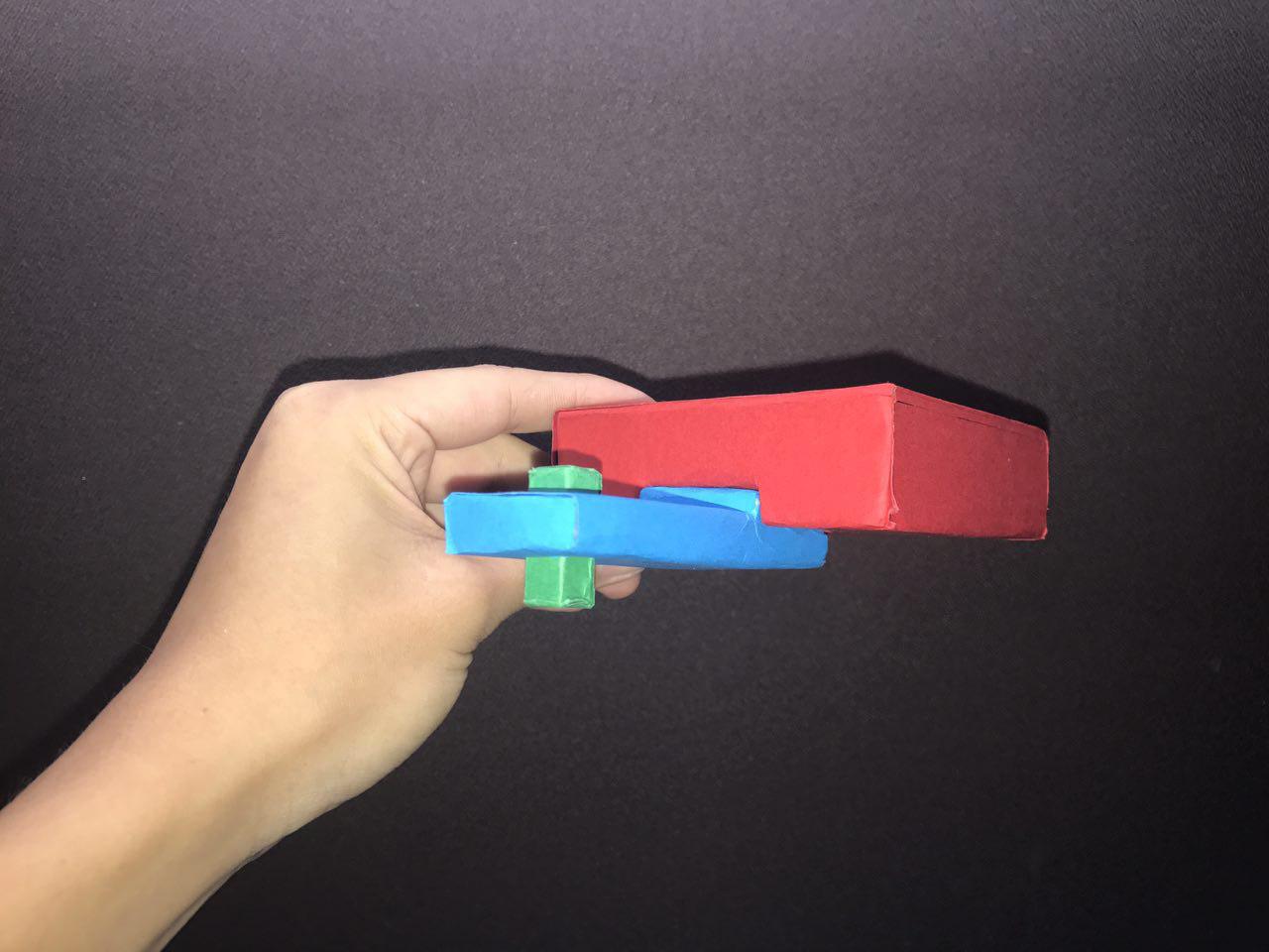
As a replacement, I wrapped my foam blocks in papers of basic colours to give it the representation of Lego as these blocks mostly come in basic colours.
Process
Model 1
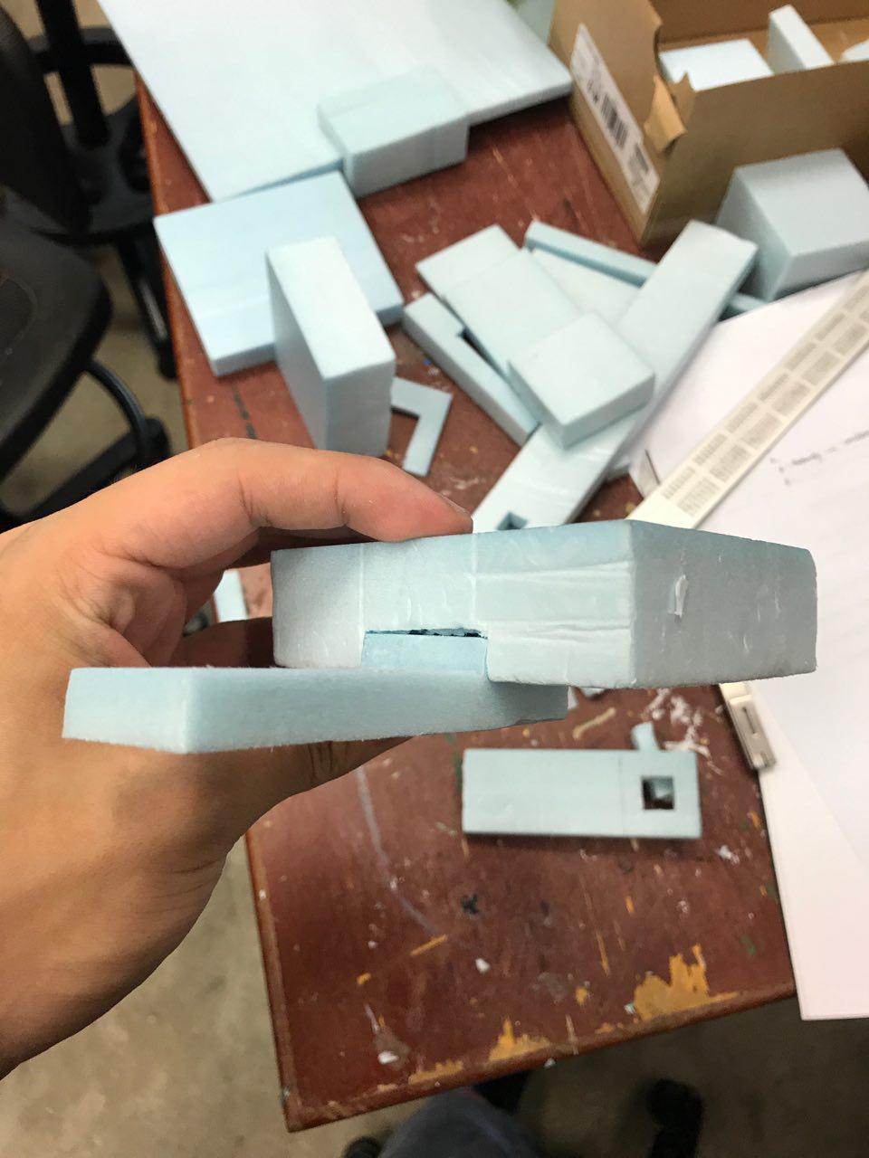
As I wanted to make my pieces interchangeable, I had to precisely measure out the dimensions I wanted the groove to have. I was unable to take the process photos because I was too absorbed into the task at hand! But it all turned out well as the fit is really tight. I had to use a penknife to etch out the foam, little by little till I had a perfect fit. I made sure to remove more foam to make space for the paper when it would be wrapped around the blocks.
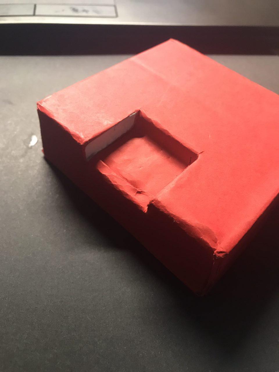
A snug fit for both pieces!!! Yay!

Applications for my models: for my first model, as it is not symmetrical, it resembles the USS destroyer with the control tower flushed to the side of the dominant. For my application however, I would want something less violent.
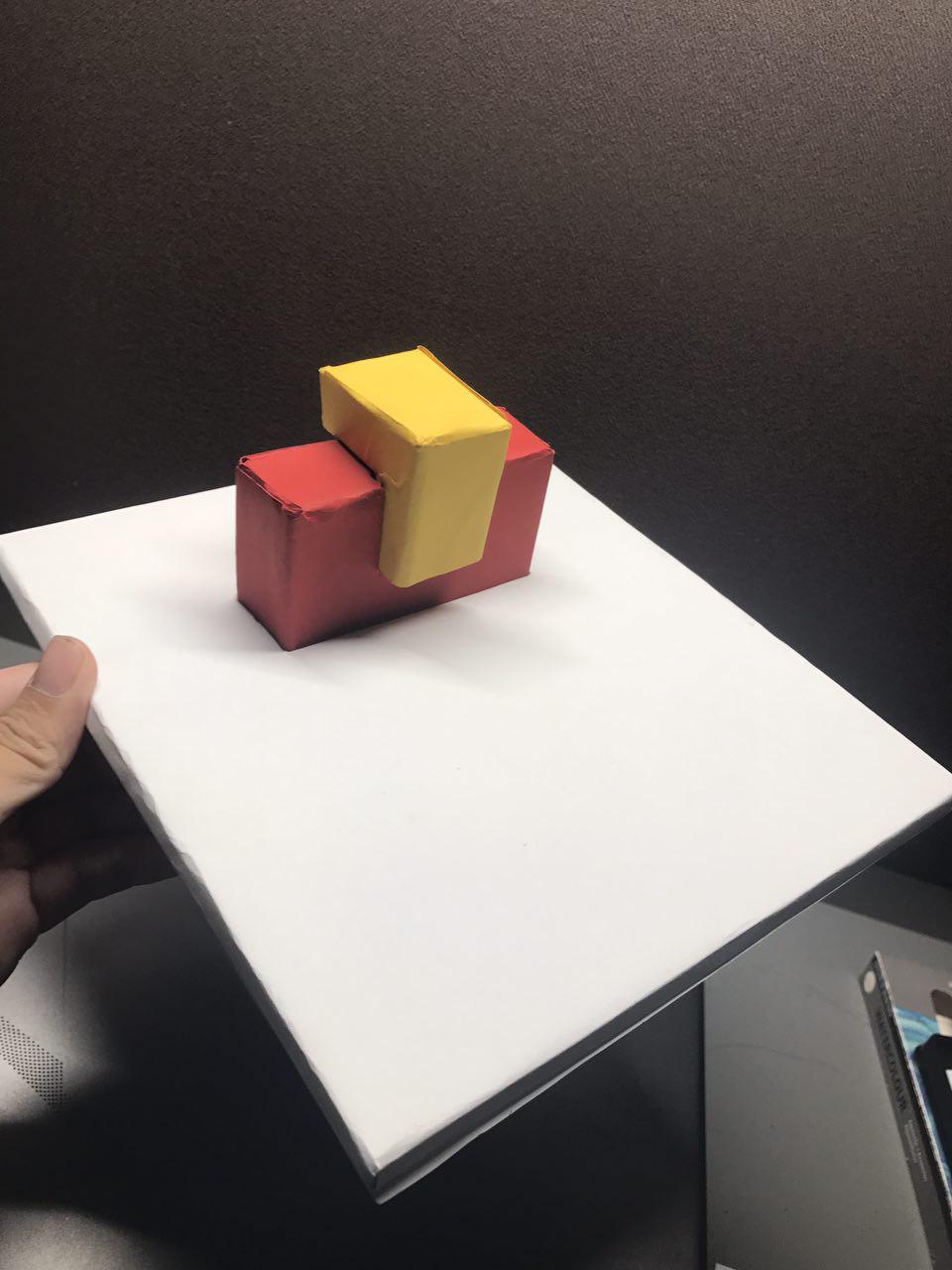

I sketched out different perspectives of my object.
After pondering for awhile, I realised that my figure could be used as a Book end.
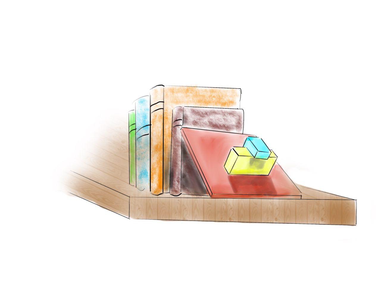
For my larger application, I decided to model it to something similar to the new Mediacorp building. The new Mediacorp campus at Portstown road boasts an elevated plane which has a lush green landscape, below which is a carpark.
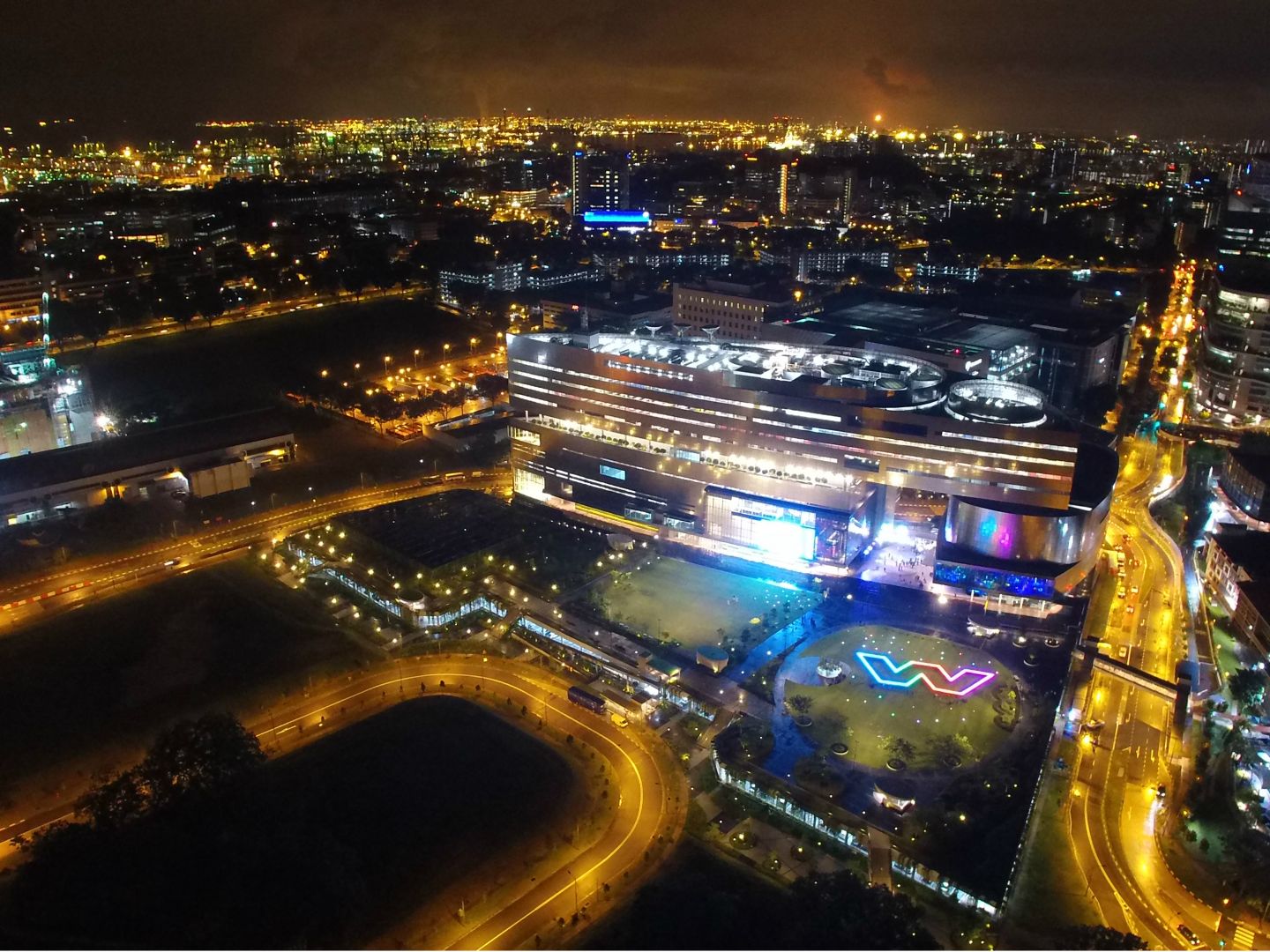
This was one of the few images I could find which featured the elevated green field.
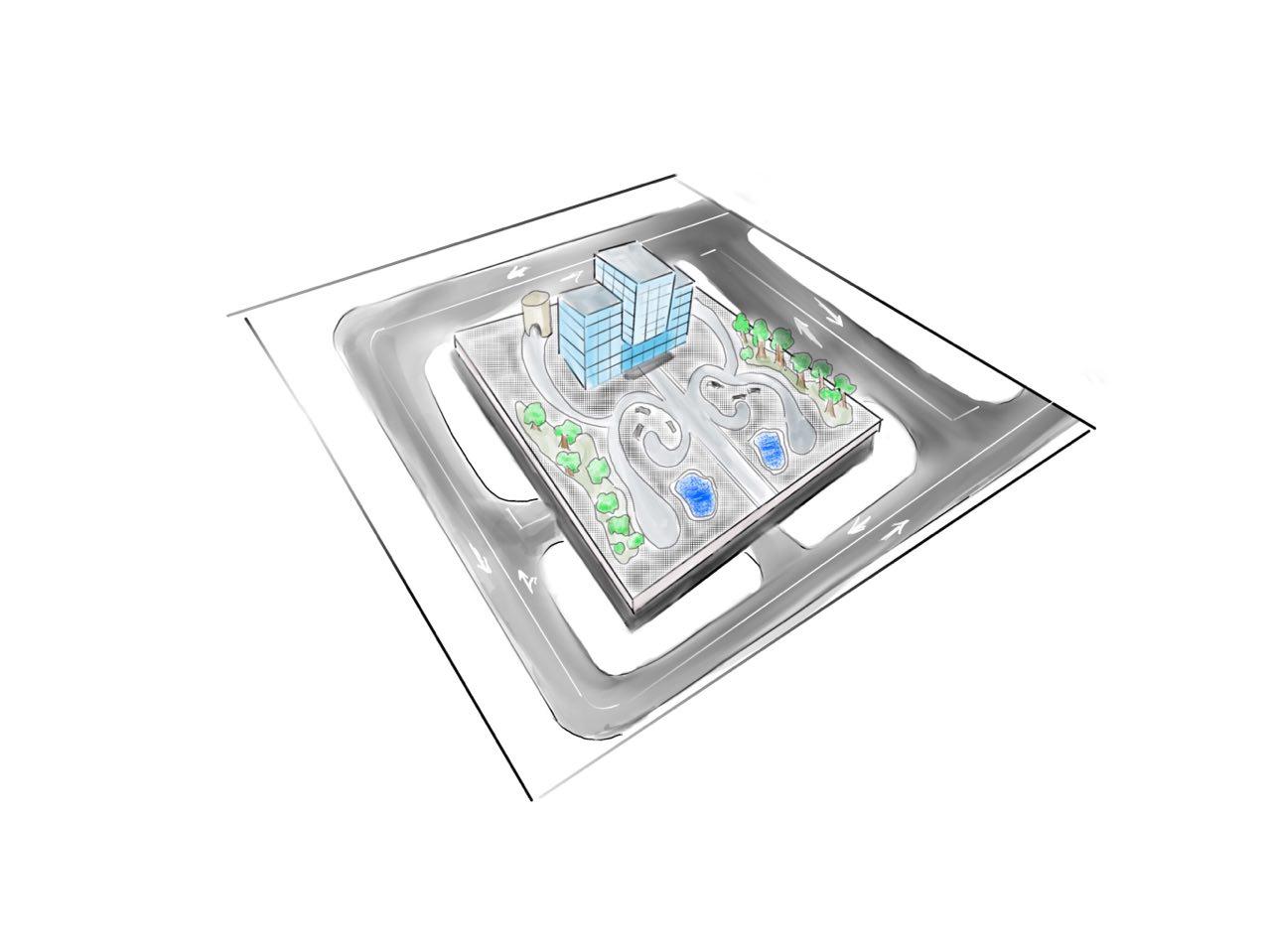
For my large scale application, I also placed two ponds and trees to add to the landscape.
This final model is different as compared to my initial model as I decided to reduce the length of the SO so as to make it more distinguishable from the SD. However, the downside to this would be that there would be only 2 objects visible from the bottom view.
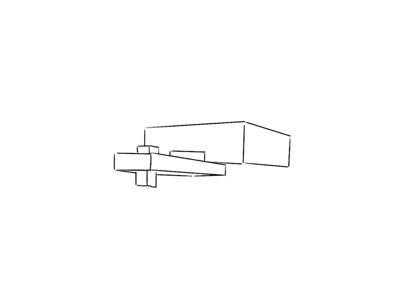
Model 2
Model 2 was a little trickier as I did not want a flush fit for my SD so much so that when viewed from the side, it would just be a diagonal line. To tackle this problem, I cut a new piece of foam with access at the top to enable it to be wedged into the D. This would result in more dimensions when looked at from different perspectives. I had issues with my SO as well as it would often be too big which would confuse the viewer from SO and SD. To tackle this, I drastically shortened the SO (with recommendation from Cheryl) and I managed to make it distinguishable.
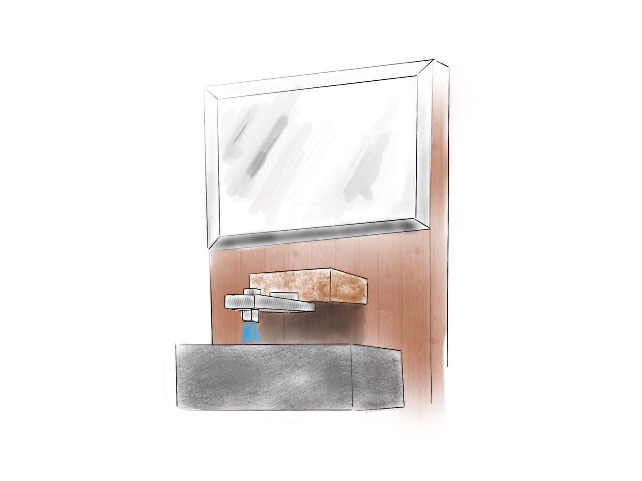
For the application of my object, I saw use for it in the toilet. It would make for a very fancy faucet. The SO and SD would be made out of polished metal while the D would have a rusted look to compliment the wooden panel behind. I could see this being used in showrooms already!
Cool concept of ” plug-in” Rule-of-Third parts & good effort in execution Joel! 🙂 Innovative choice of applications too. Although you’re kinda lacking a larger application…
Aside from drawing inspiration from LEGO, do look up Rietveld Shroder House & compare how this was in turn inspired by Mondrian’s square compositions. I think it would have been more interesting if you had kept to the LEGO colour palette for your application choices too.
In addition take a look at Hansgrohe Axor series for bathroom sanitary fittings… 😉