
The first assignment for Illustration for designers was to create a personalised self portrait which should encompass our character! After some of the in-class assignments, I had a better grasp on trying to encapsulate myself in an abstract form.
We had to examine our faces and determine which are the features that make us distinctly, us. Some of the features I wanted to use were my large forehead, my eyebags, my nose as well as my hair. These features are ones which are the most prominent on my face and I’d like to capitalize on that… for once.
Why these body parts? First off, my forehead. Its a myth that it is called forehead cause you can snugly fit 4 fingers within your (four)head. As for me, I am able to fit 5 fingers! While not abnormally large, I still think it is an interesting aspect of my face!
Next would be my eyebags. These designer bags have been with me almost my entire life, dating way back in secondary school. It used to be one of my insecurities as my classmates would always comment on how I always looked sick and did not get enough sleep. One comment which stuck with me all this time was someone calling me a zombie and I was so affected by it! I tried all sorta remedies, like sleeping early, putting cucumbers… etc. But to no avail as they are still as prominent as ever. I have learned to live with it and I am able to accept myself more now because of the fact that everyone in design school has a lack of sleep so its natural to always look tired… cup half full, am I right?
For my nose, I have a particularly large nose, arguably one that doesn’t fit on my face. From the side it looks alright, but when viewed up front, especially when I’m smiling, I find it the largest thing ever! So I thought it would be a good decision to try and use it in my composition.
And last but not least, my hair! I take really good care of my hair and I buy the best products for it. I feel like it is an important part of me and when I was enlisted into the army and had to shave it all off, I couldn’t get used to how I looked because I resembled an egg.
For this assignment, I had two concepts in mind:
Concept 1 –
Using my forehead as a beacon of light because of how big and shiny it is, similar to a lighthouse. I felt like a lighthouse also represented me as I enjoy swimming and I am comfortable in the water, similar to a lighthouse being swept away by the currents.
This is my initial sketch of the lighthouse.
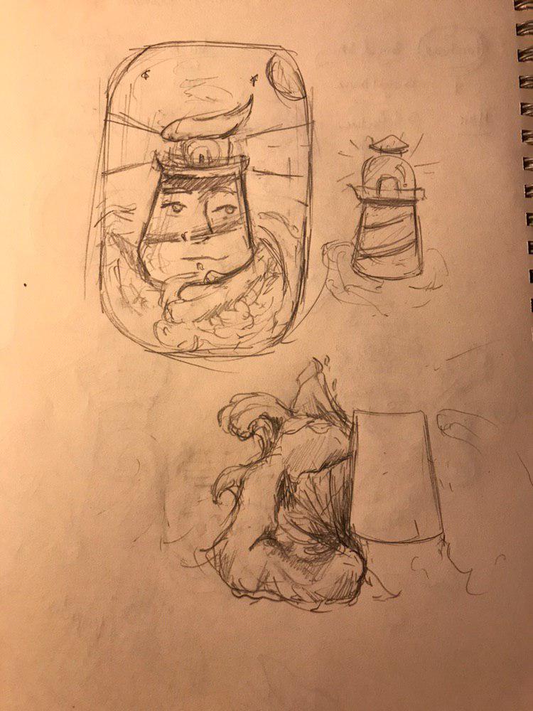
From the composition you can see that I try to make sure the waves engulf me, yet I still look calm and composed. Certain elements like my hair and my forehead are incorporated into this composition.
Based on this sketch, I started to digitally illustrate it!

This lighthouse looks a lot more tranquil as I was still experimenting with how the composition would turn out. I wanted to frame it within a window, something resembling one on board a ship! For a sailor encountering a lighthouse, I imagine it to be a sense of relief and comfort for them, coming back onto shore. This is the kind of emotion I would want to evoke in my composition.
However, the style of my illustration did not fit to how I’d imagine it to be. So I decided to play around with using strokes and varying line widths in my next composition.

I felt like this composition would suit my style a lot better, with the thick defined lines. However, I felt that it lacked the aspect of my characters and it would be too abstract a concept for the audience to get. I decided to move onto my second concept!
Concept 2 –
This concept allowed me to play around with the composition a lot more and it enabled me to incorporate more elements of my distinct facial features in, without it looking too fragmented or unrelated. This concept involves representing myself as the moon!
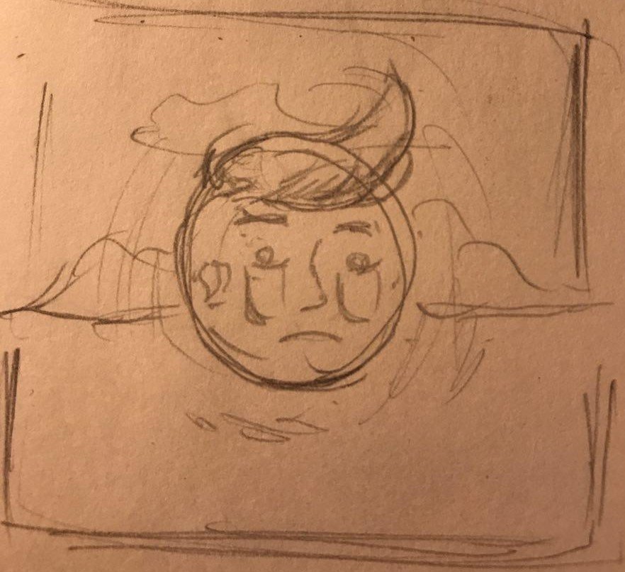
This is the initial sketch of me as the moon. There were key features i wanted to accentuate, such as my eye bags and the fact that I am a late sleeper which would be represented as the moon which stays up all night.
This is the digital version of the sketch. I added in the reflection in the water to act as guiding lines to the moon, but I soon realised that it started to dilute (pun intended) the meaning of the message as the composition is more cluttered now as a result.
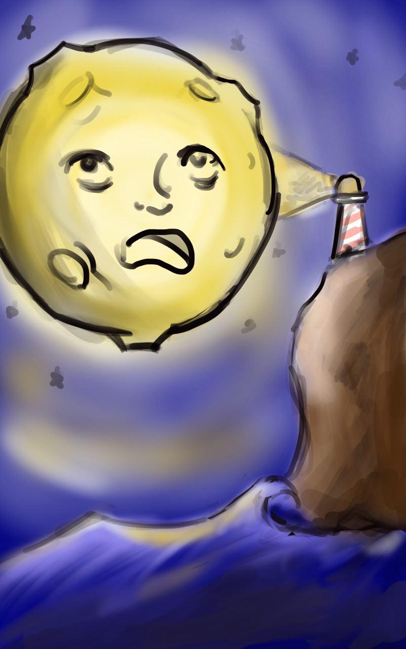
To spice up my composition, I reworked the elements I created, even adding the lighthouse from the initial concept, based on Lisa’s comments. I used the golden ratio in this composition to create a more dynamic layout. As I brought this composition to class for a group critique, the feedback I received was that it was even more cluttered and it was difficult to see the relationship of the objects.
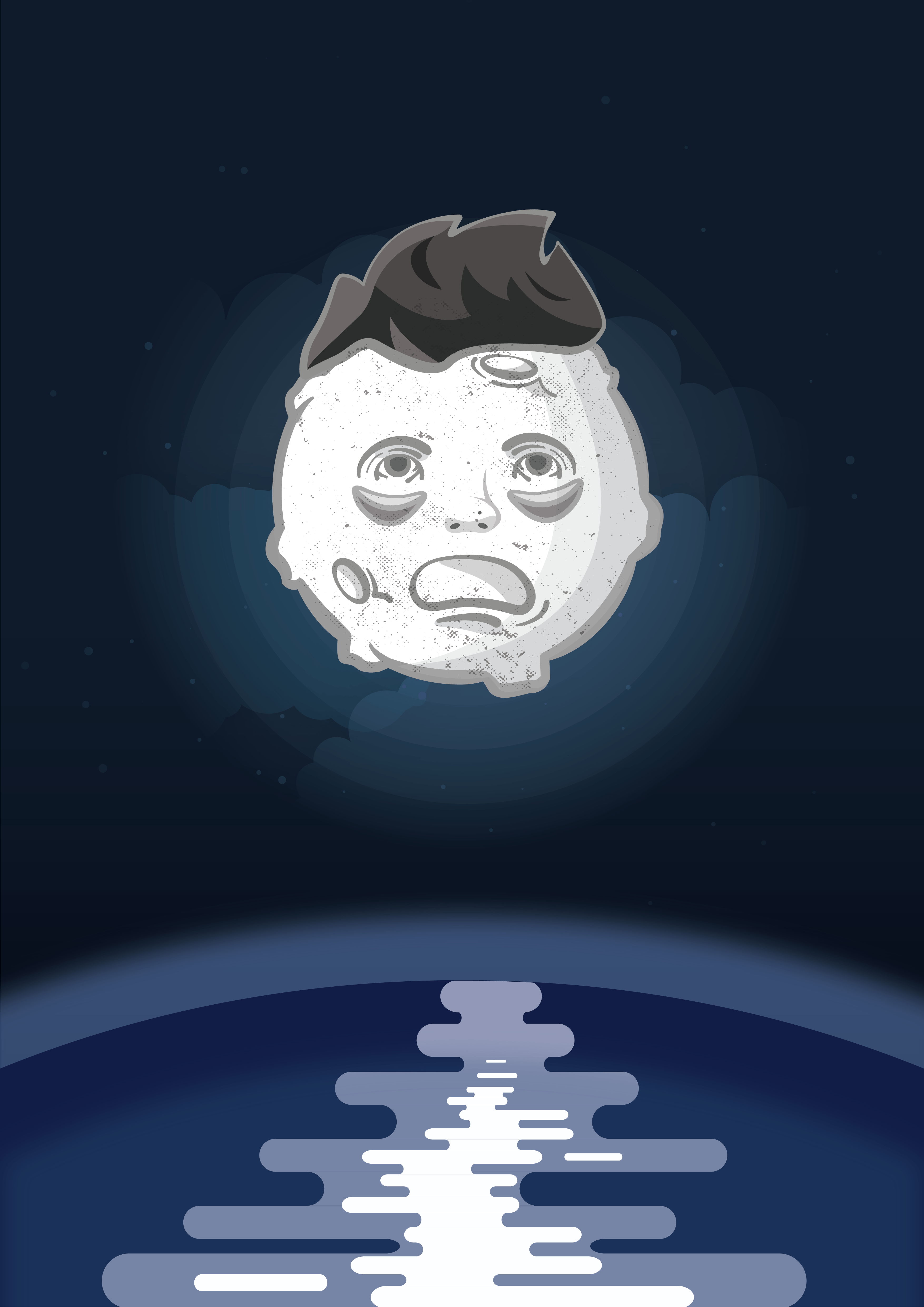
I begun with a new composition, this time adding more characteristics about myself. I wanted to have the moon being orbited by things which are on my mind, keeping me awake. Objects such as my assignments, keeping tabs on my fitness and getting enough sunlight are all important things in my life.
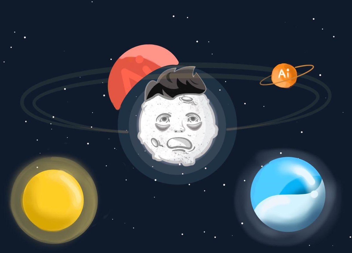
I am quite happy with the result of this new experimentation of layout so I thought it would stick to this for my final submission!