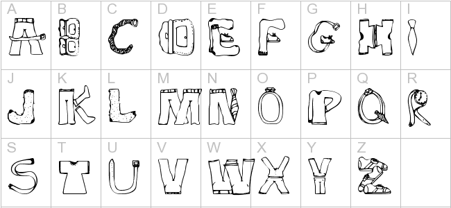
Reading through this article, I find myself guilty of committing the crime of sticking to one font for most of my designs, especially when it comes to choosing a font for the body text. The analogy Jessica Hische gave was thinking of fonts as clothes. Sure, you can use a single font for your entire website, however, it would look too overpowering and dull. She highlights the importance of choosing a font family as well as a family with different weights would offer you much more flexibility when it comes to designing a cohesive page. I’ve only recently discovered font super families and despite how different their styles are, they work seamlessly and can fit many different situations.
Choosing font families which offer different widths such as narrow, condensed, regular, extended would give you more flexibility in designing body texts as these can be used interchangeably whether you have too little or too much space to work with.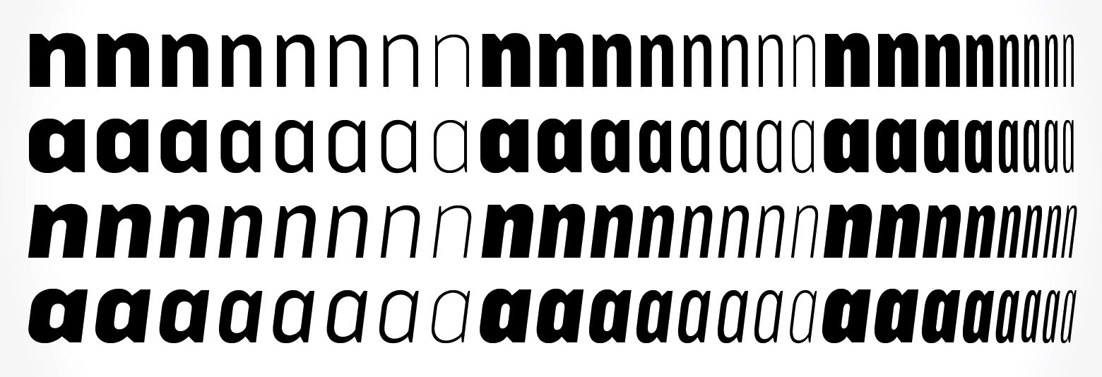
Amongst the many considerations when selecting a typeface, she also pointed out the x-height. Initially, I was skeptical as to how this minute detail could affect the overall aesthetics of the layout, however, when placed in comparison to a font with a much shorter X-height, the difference becomes apparent as it makes your content look a lot smaller.
“We read best what we read most.”
Our countless texts through our years of existence has made some fonts more legible than others and it is crucial that we use this to our advantage. By using serif fonts as body texts and sans serif fonts as headers, it would significantly help with the digestion of information, as well as to exhibit hierarchy in the design.
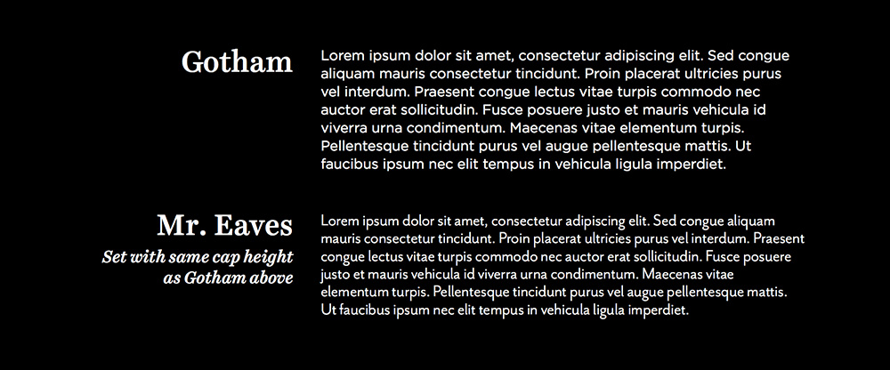
Undoubtedly, the most important and frankly, the one I have most issues with is font pairing. I read those paragraphs with eager eyes, with hopes of some wise words of wisdom. And deliver did she! I have attained more skills under my belt when it comes to selecting font pairs as some of the techniques I can use include: Using fonts from a Super Family, Fonts designed by the same typographer, fonts which have similar characteristics – more specifically the skeleton, meat and clothes. While using fonts from the same typographer is situational, all of the other advice given are extremely useful!

I have to keep in mind that all of this process is just choosing typefaces! What a monumental task and if only more people could appreciate the thought process gone behind choosing the characters on their screen. I myself have a long way to go in terms of researching for the appropriate font choice as I tend to skip this entire process, only to mindlessly scroll through my font library to find something which would fit my design. This is a bad habit as if anyone asks for the rationale behind my font choice, I barely have anything to offer, other than, “oh because it looks nice.”