
Hello! Now begins the most exciting part of my zine, the creation!

I first began looking into the different religions I wanted to break down. As mentioned in my research, I looked at the different elements which made their art unique. Be it the use of lines, colours or shapes.
I started to sketch out these elements and I looked at the images I took to see what I could use.
I settled for these 4 images to be used.
I began with Hindu art first, after being inspired by our Art History Tutorials and lectures, I wanted to make use of the Hindu Gods in my illustrations to give a glimpse into their religion. During my site visit, I noticed the common use of human figures, animals and various gods in their composition.
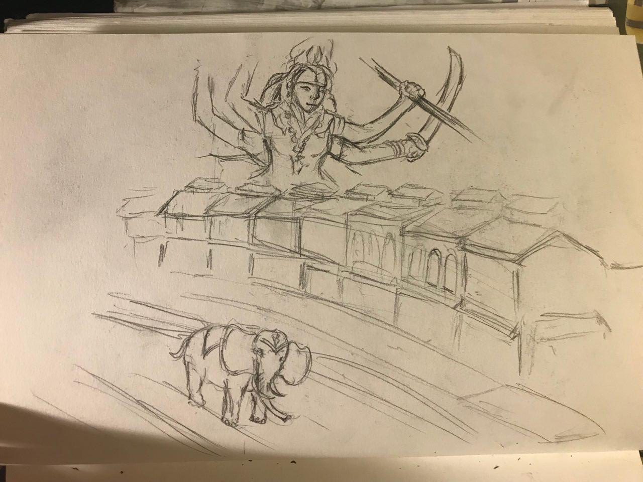
This was my initial composition – in the background, you can see the goddess Durga with her many arms and weapons. She fends off evil spirits and Gods with her destructive capabilities and strength.
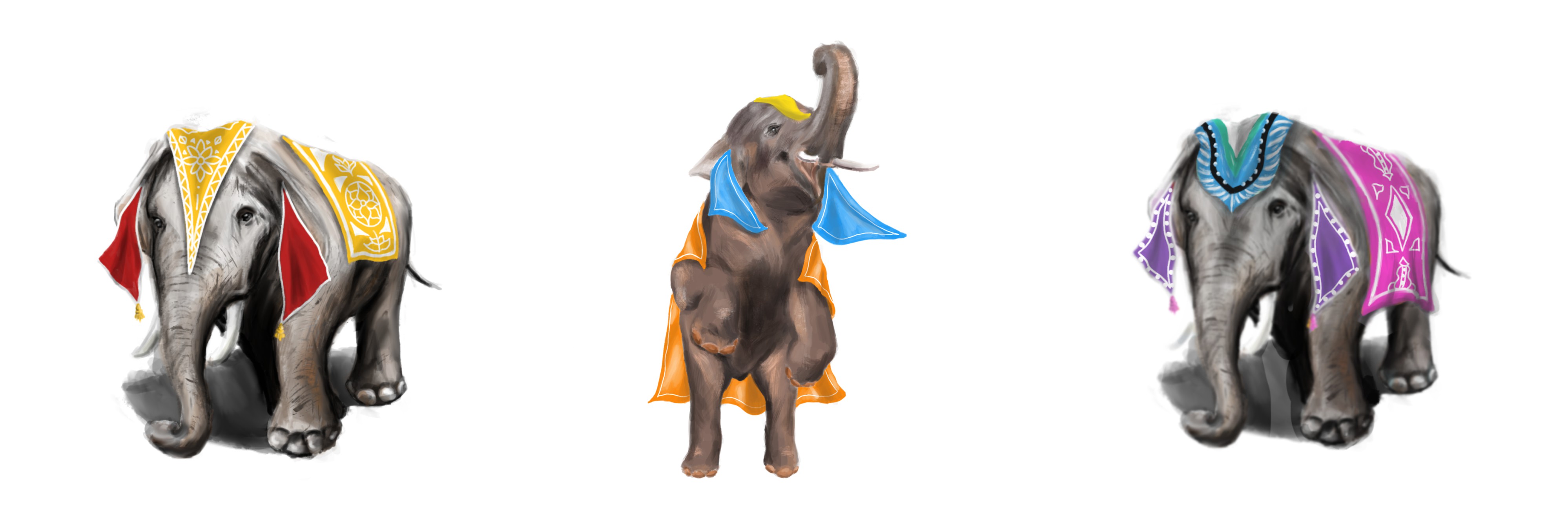
I wanted to use elephants in my composition as India celebrates Holi, the Festival of Colours. In this festival, the streets of India would be packed with people throwing coloured powder on each other, and elephants would be parading down the streets in their festive costumes during this vibrant festival.
However, I felt that the composition would be spread too far out and it would be difficult to identify the main focus of the spread. Thus, I decided to choose a different image.
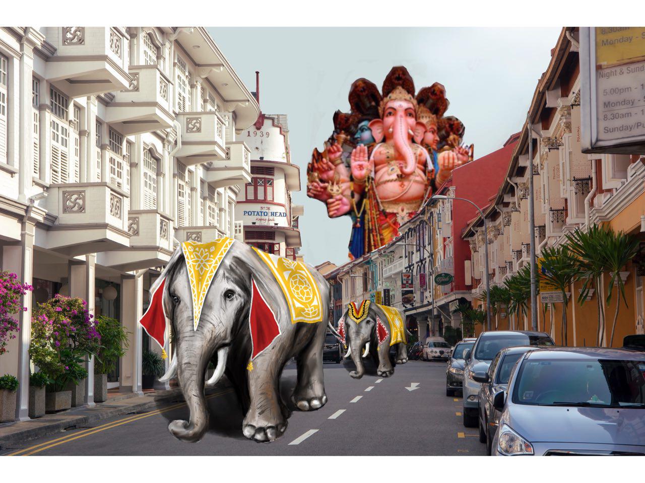
After I showed Mimi this composition, she commented that it was too messy due to all of the colours and the cars in the background. She told me to render down the buildings to their basic elements such as the line strokes.
Thus began the process of vectorizing the image!
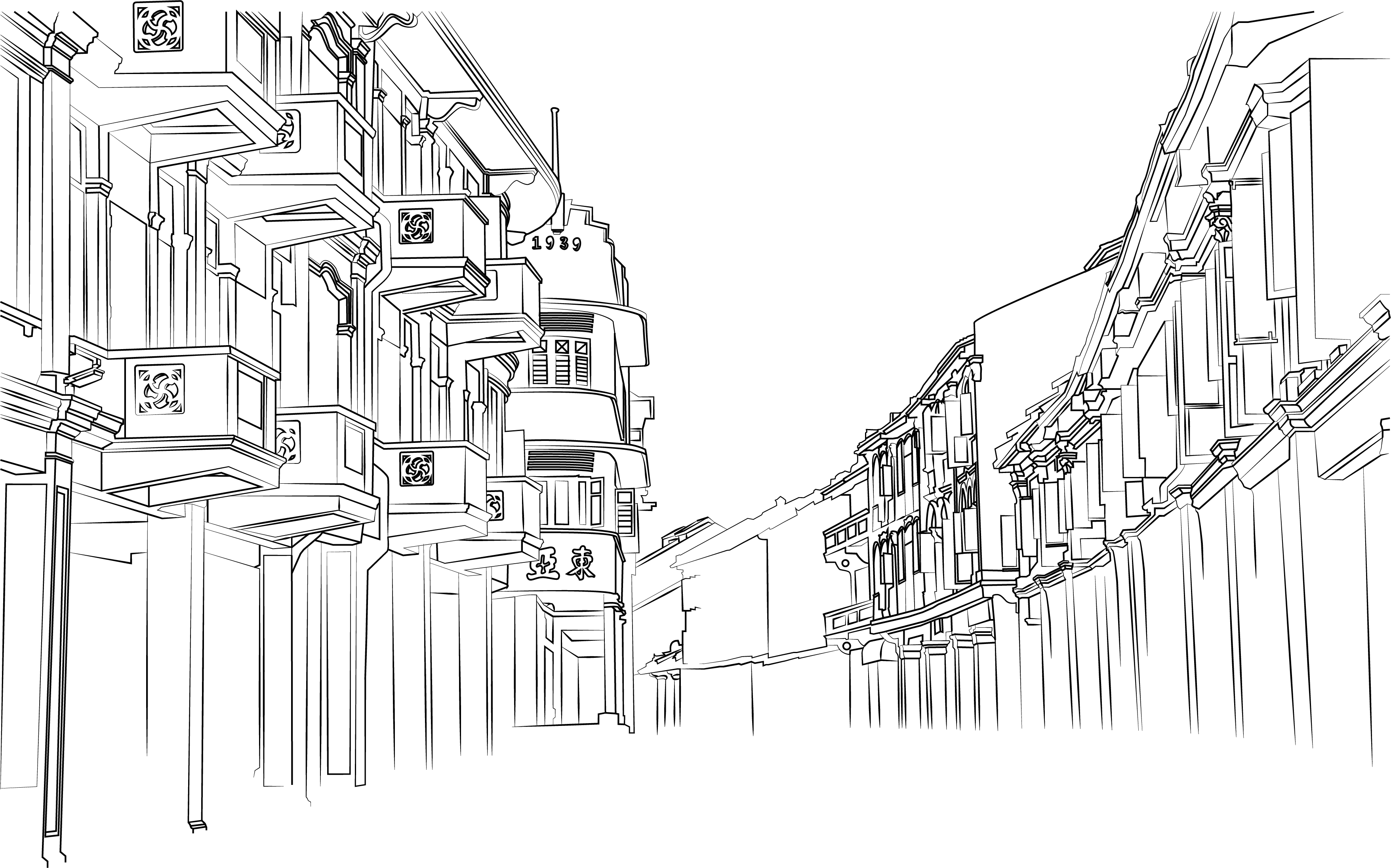
Mimi commented that my initial strokes were too thin and it looked too architectural, lacking the artistic aspect. I went to manipulate certain stroke widths to ensure variation, similar to how a watercolour illustration sketch would be.
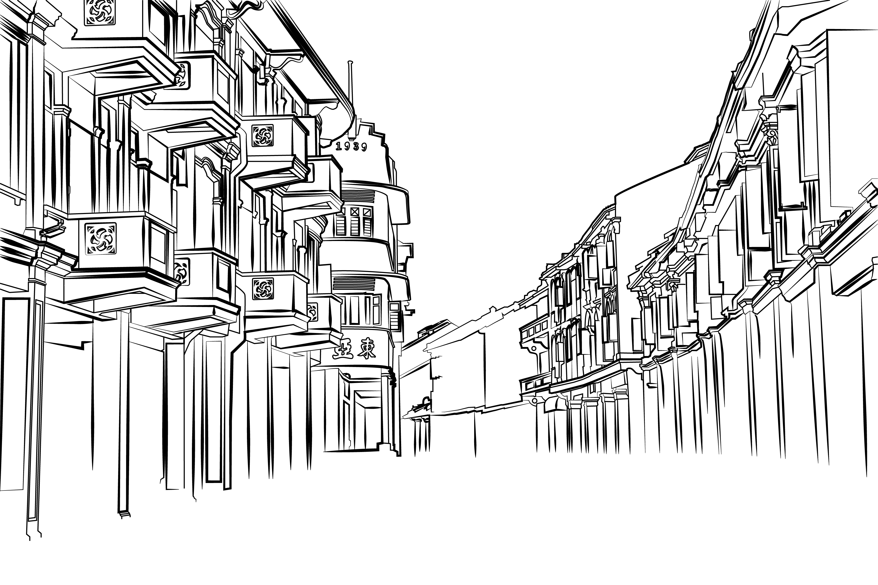 This created a more interesting and natural composition, which I was pleased with.
I illustrated several elephants to be used in the composition.
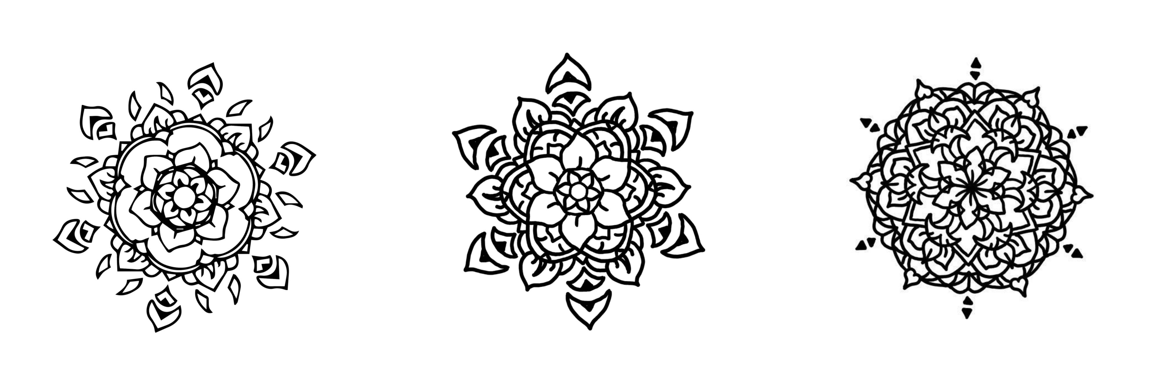
Other than elephants, a distinctive graphic element of Hindu art is the mandala, which is why I wanted to illustrate them as well. I experimented with various line widths to be used in the composition.
Piecing everything together,

Next was Buddhist Art. These are a few graphic elements I picked up during my visits to the various temples along the way.
Key motifs such as the lotus, joss sticks and various lanterns all symbolise worship for Buddhists. I illustrated Guan Gong, the God that chases away evil spirits, in hopes that I would be able to incorporate him into my zine!

I experimented with juxtaposing architecture with buddhism as a religion, looking at ways which I can convey the idea of worship.

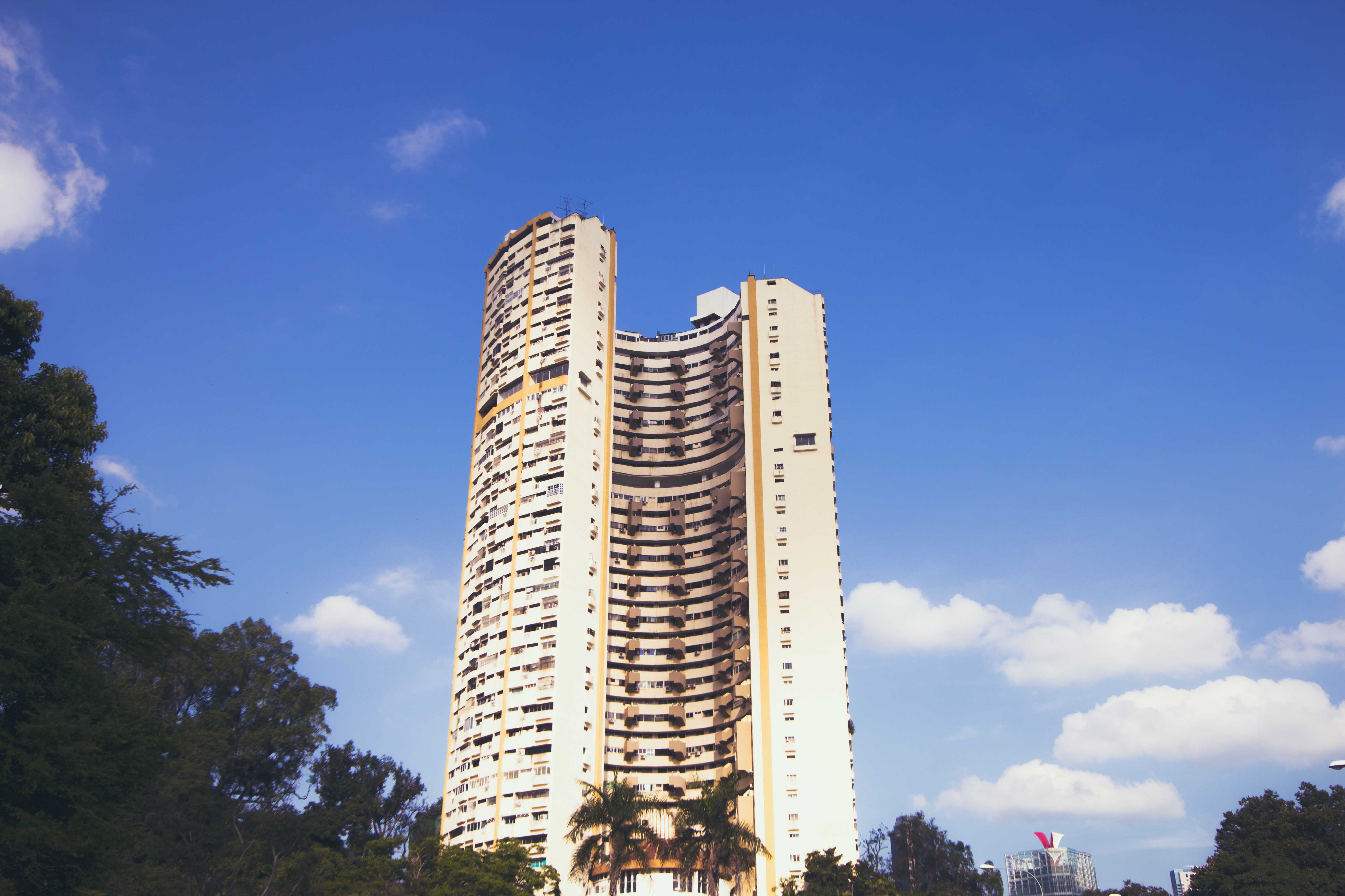
I envisioned the Pearl Bank Appartments to resemble Joss Sticks. I felt like it would have created an interesting and controversial visual for the audience. It achieves a surrealism visual, however I felt that it resembled too much like 9/11 and it was also challenging to explore similar visuals for the rest of the religions.

This is a second sketch I made to try and incoporate surrealism into architecture. I made sure to use the graphic style similar to Buddhist art when composing the frame. This would include the clouds, fire and the sun. This is a timelapse of my illustration.
However, I felt that it was not an engaging composition as it did not evoke much sense of surrealism.
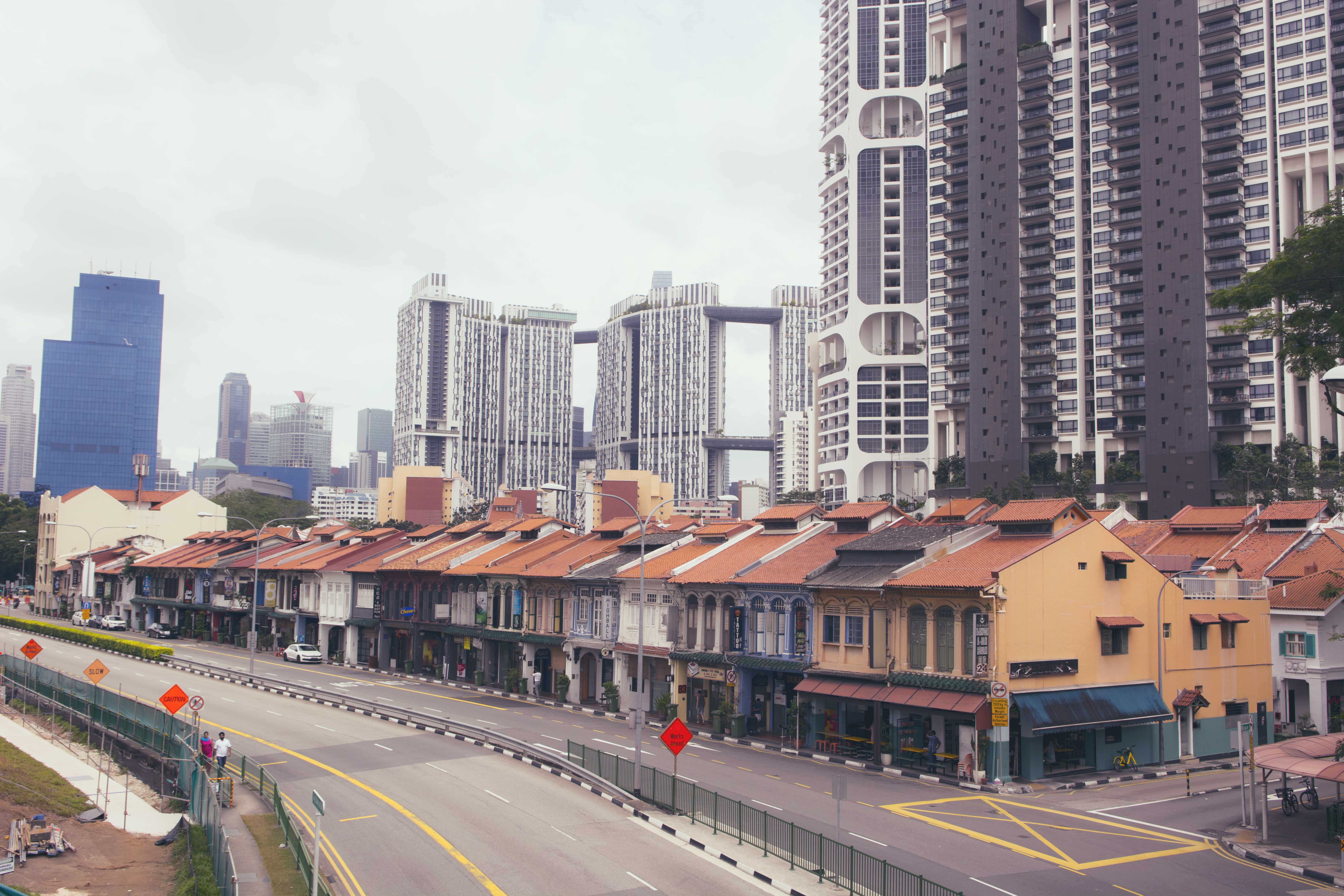
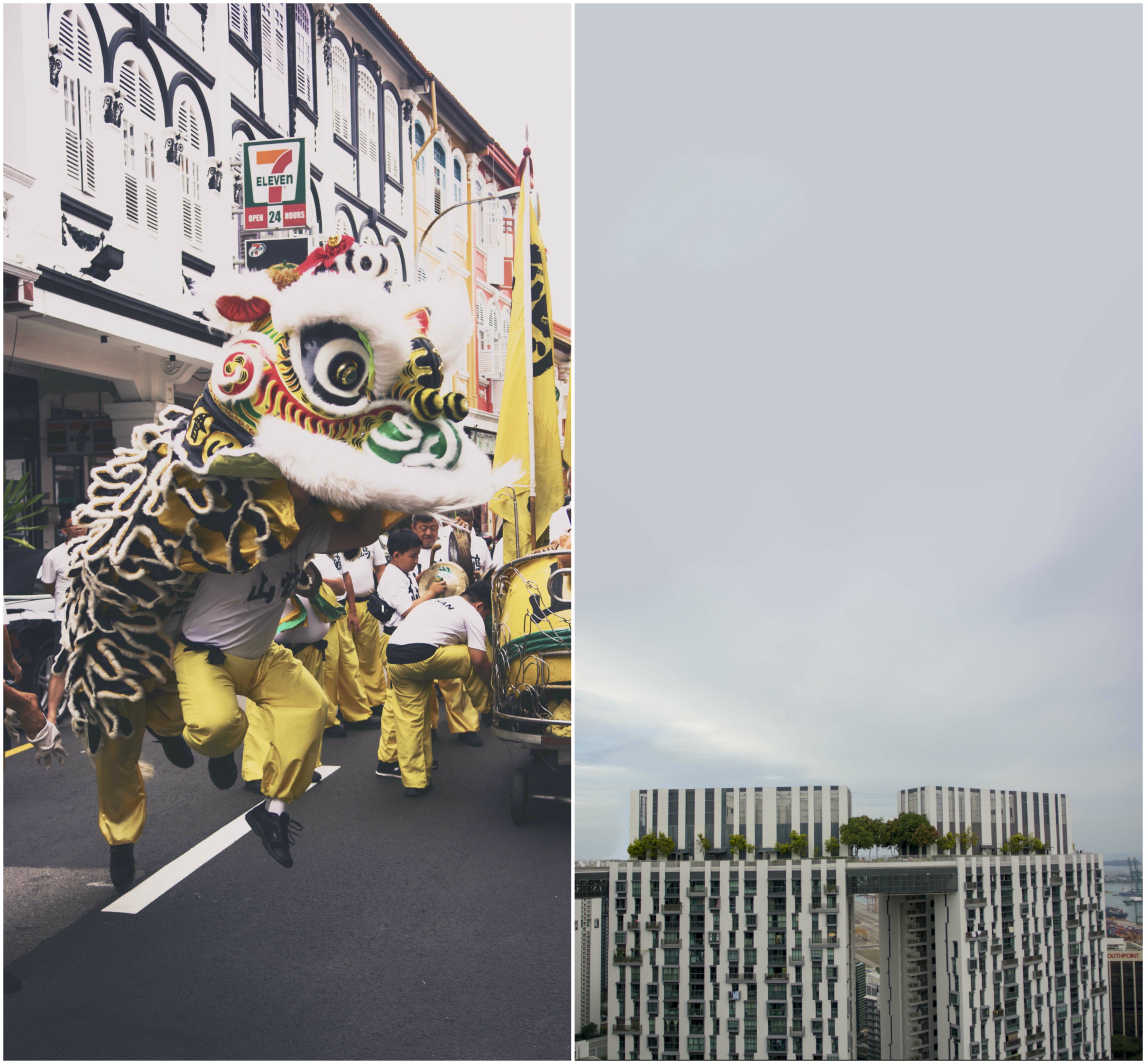
This is my third idea – instead of using religions representations, I also thought of using cultural ones such as traditional practices. Thus, I wanted to make it seem as though the lion dancer was jumping across platforms. Similar to my second idea, I made use of the same elements found in buddhist art.
I played around with the composition of the buildings as I did not want a simple flat design, thus I overlapped the buildings to give the composition more depth. I also changed the framing of the composition as it was initially meant to be half a spread. However, I felt that the composition was suffocating, thus I made it a whole spread.
I brought this composition to Mimi, and she told me that there could be further improvements to be made, such as a brief description of what the significance of this spread was, rather than full graphics. The chinese characters means ‘Lion Dance’.

I faced the most challenge when thinking of a composition for Muslim art due to the lack of illustrative visuals, unlike the other religions. I consulted Mimi on the issue, initially wanting to use the Quran Scriptures and text to create graphics, however, she recommended me against it because it may be offensive to manipulate these holy scriptures.
Mosques have distinctive architectural features such as the Moon and the star, minahrets as well as the use of geometric patterns for grand entrances.
I started studying these geometric patterns to try and incorporate it into my design. I started to vectorise these geometric shapes to put them together, segment by segment as they were mostly symmetrical.
Stitching these pieces together:
I had trouble placing the geometric patterns as I wanted it to be of equal focus in the composition. This was the initial design, however i felt that it was really messy.
I decided to have it at the bottom of the mosque to have a radiating effect on the structure.
Now for the colours!
This was my initial composition using colours I found when studying different mosques.
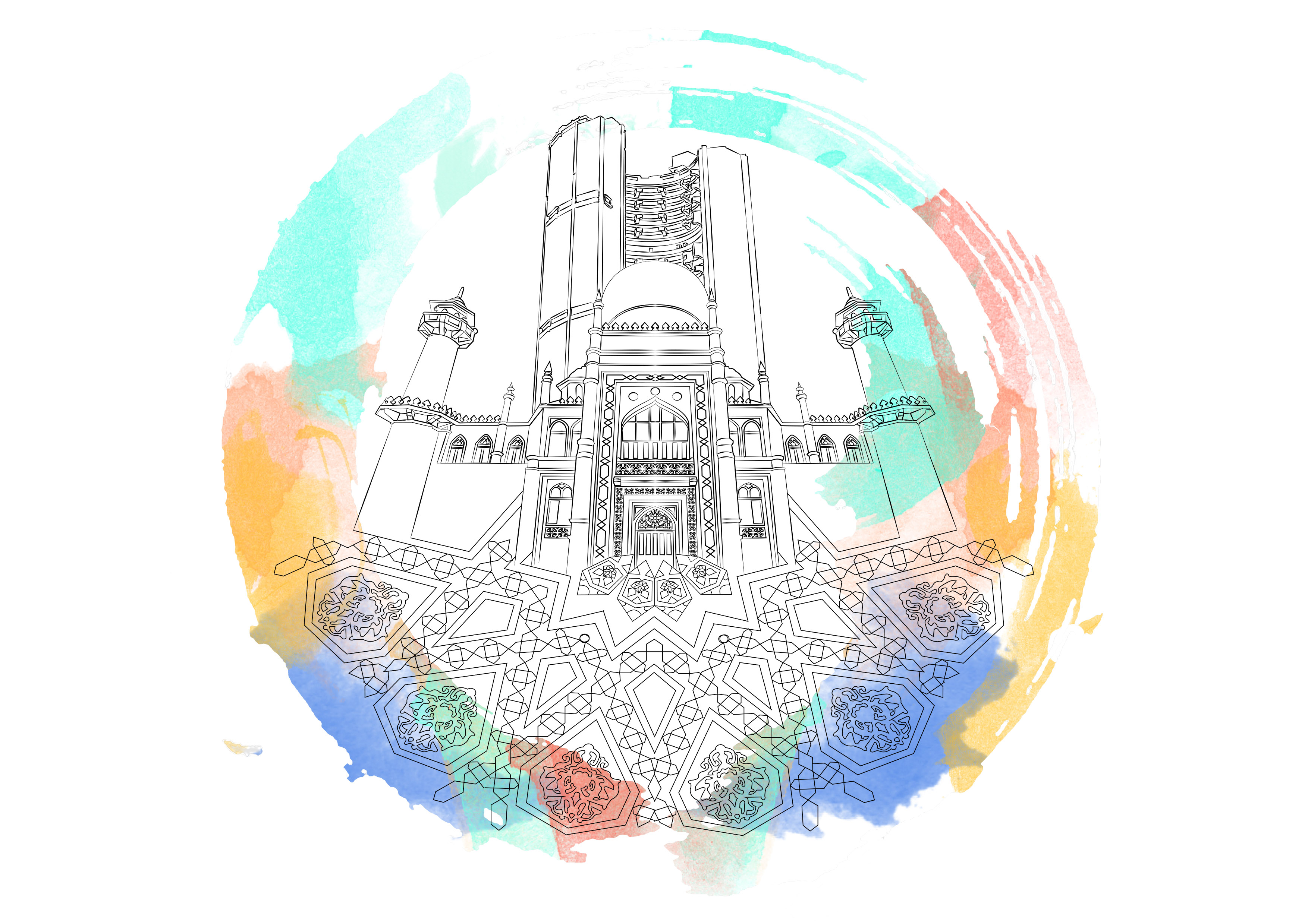
I was not happy with the initial design of this spread as I felt I did not have any symbolism of the religion. I started looking at festivals celebrated by Muslims and I thought of their annual pilgrimage called Hajj.
During this festival, worshipers circle around the Kaaba (the cube-shaped building and the direction of prayer for the Muslims) walking counter-clockwise seven times around. I wanted to incorporate the circular element of this holy ritual into my composition.
I decided to forgo the Moon and Star above the Pearl Apartment buildings as I felt it would disrupt the composition by having 2 circular elements.
I did not want my cover page to reveal everything about my zine as I felt it should be an experience or uncovering a journey. Thus, it should only give a glimpse into the direction of the zine.
The first draft of the cover page shows was minimal, but Mimi commented that the font was too predictable, which does not make the cover stand out.
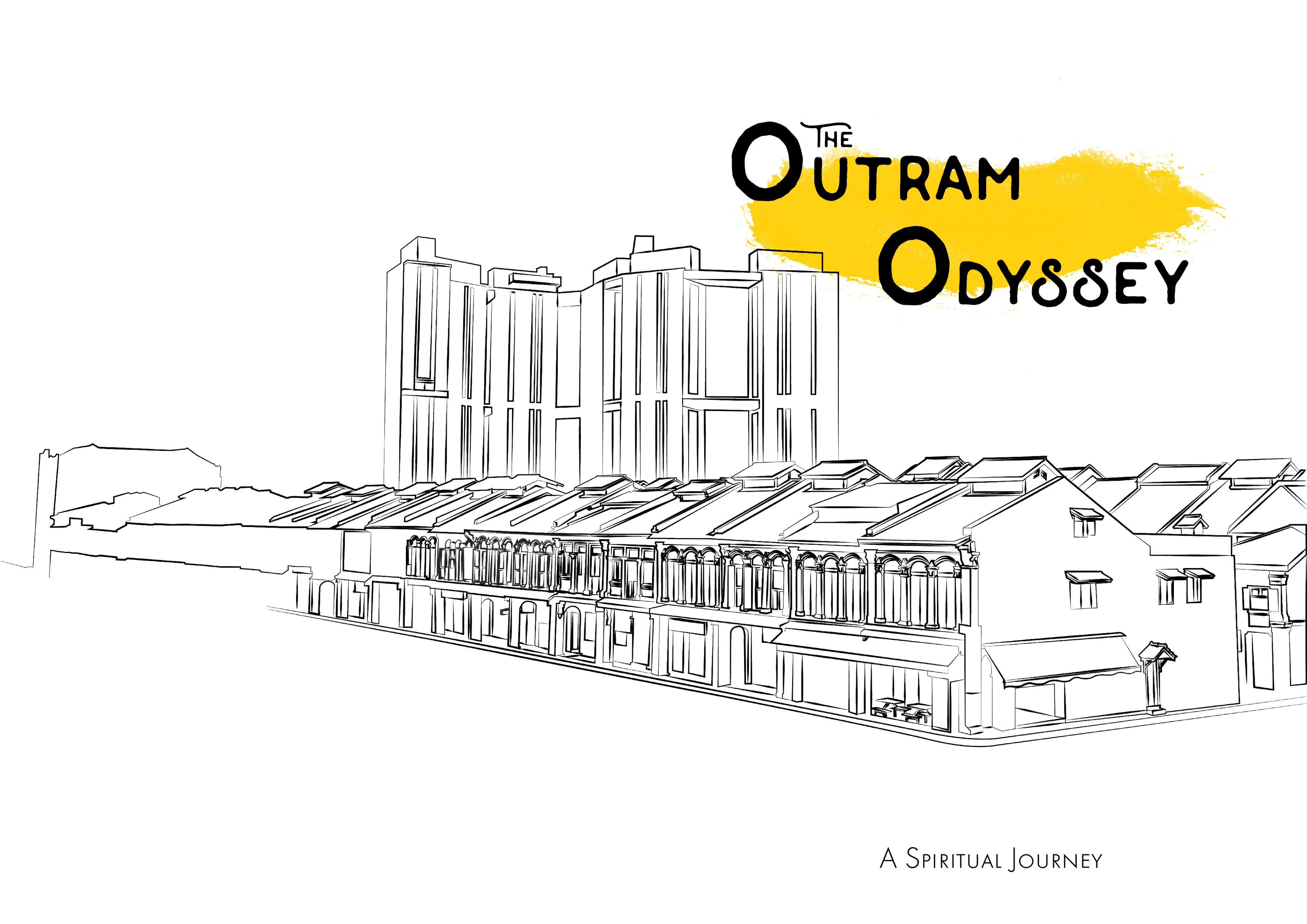
I played around with the fonts as well as adding some colour into the composition to make it more dynamic. However, I was still not pleased with the overall composition as I felt that it did not depict my zine.
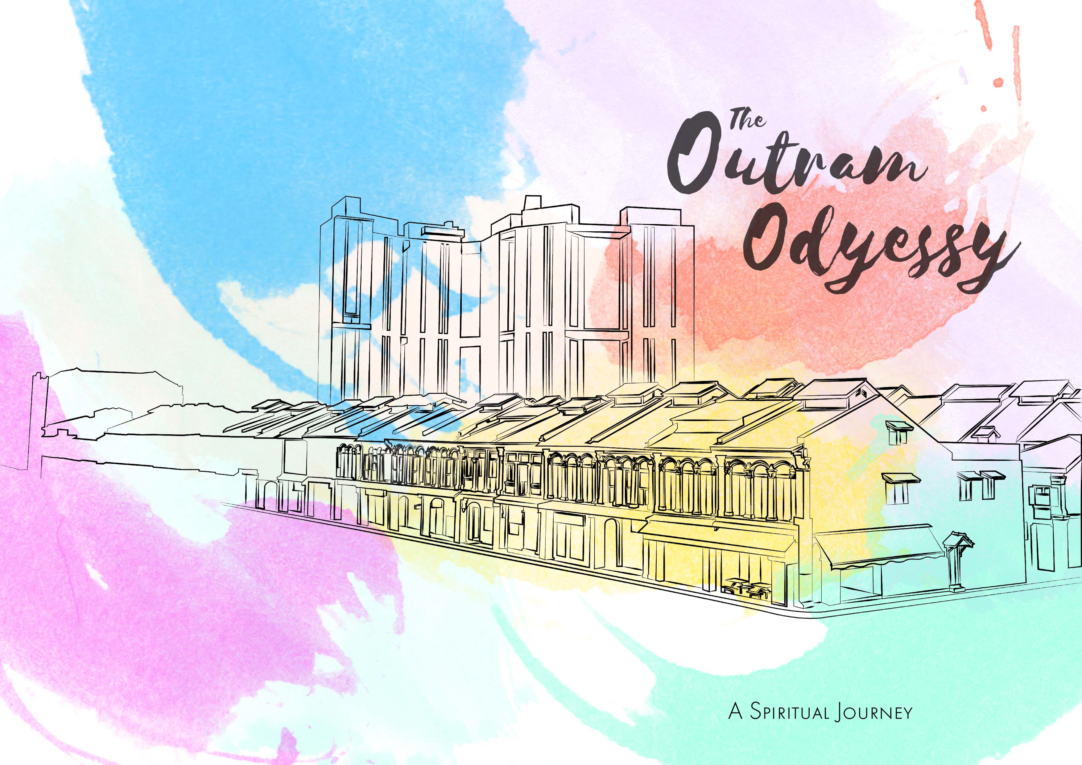
This is my final composition which involves colours which I thought represented each of the following religions, with some colours becoming common amongst religions.
I consulted Mimi on the Idea of using transparencies for my zine and I was excited to explore that option of printing as I was curious to see how the colours would turn out.
I could not incorporate the element of using a transparency into my zine as I did not have enough pages to do so.
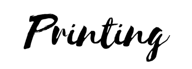
I did however, manage to get a couple of test prints to see how the results would turn out. I was surprised how the colours turned out on the transparency as I was more vibrant than I’d expected.
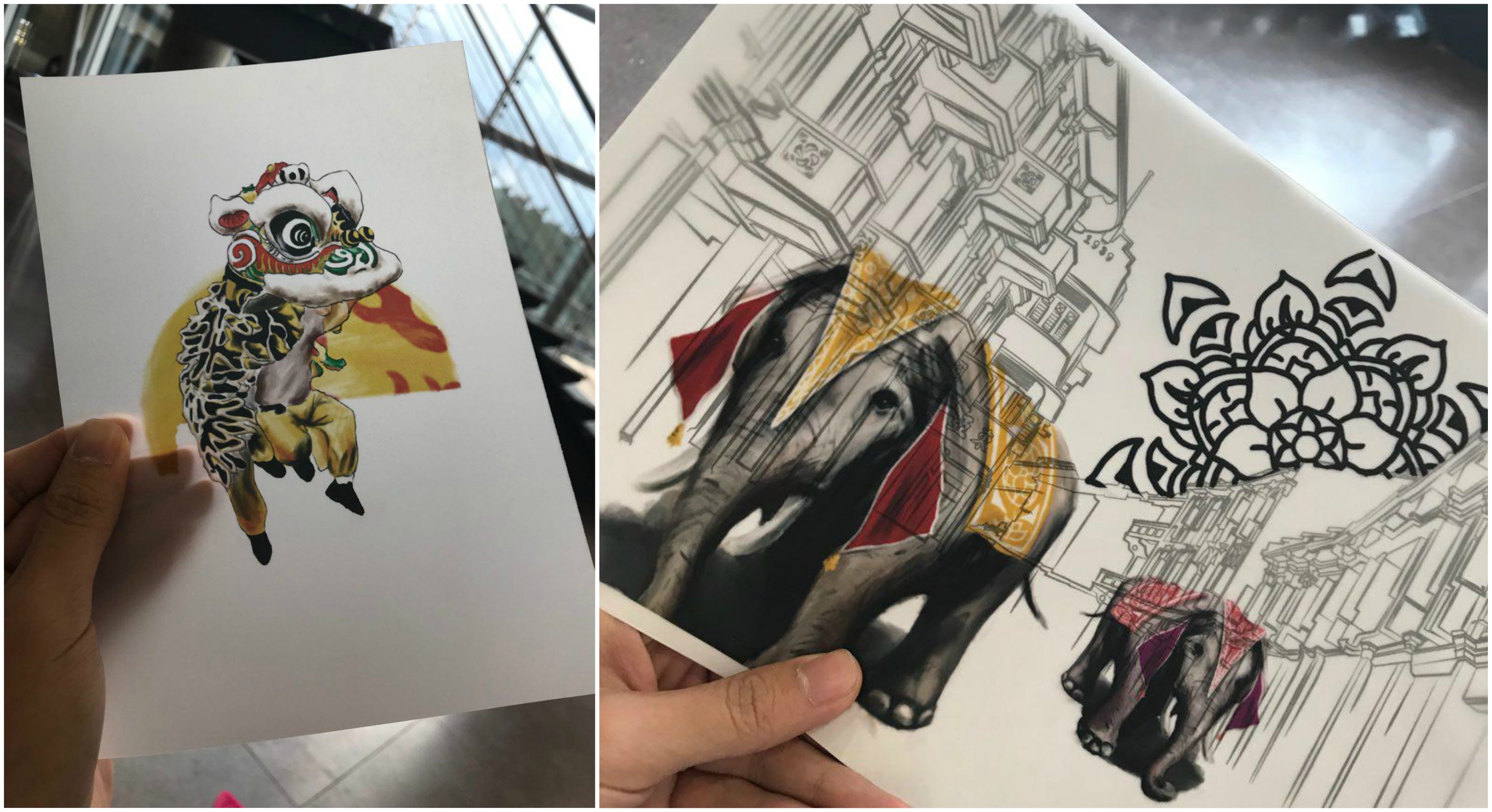
Mimi also suggested that we head over to see what RJ paper had to offer in terms of paper choices. In all honesty, I was skeptical about going all the way to Hou Gang just to buy paper. The papers at the printing shops at Sunshine Plaza seemed to be sufficient for me… till I saw the collection RJ paper had.
Overwhelmed would be an understatement to the choices they had! There were so many variations of papers to the extent that I don’t think I can ever consider using the papers at regular printing shops any more.
I ended up buying at least 5 different types of paper to try on! Needless to say, I would be coming back in the future.
Special Mentions:
I experimented with photo editing to try and achieve different tones and moods from the images. I wanted to mimic the rizograph printing effect using harsh hues of pink.


Next, the final Product!