The internet is a wonderfully large, strange, shared space for all of us. Each one of us maintains an online presence in some form – whether it be through social media, forums, media sharing, or online portfolio sites, we all have at least some sort of virtual footprint. Most people give a ton of their data away online, willingly – posting when they leave their homes (not safe), where they go on vacation, what they eat, their opinions on certain events, etc. While for the most part, these are individual experiences and postings, the online platform gives us the opportunity to connect these individuals together.
As previously explored in our past lesson, data visualization gives us an opportunity to explore connections, and create meaning out of it – or use it to create something else entirely. I turn to Lev Manovich’s outlook on the use of data visualization:
If Romantic artists thought of certain phenomena and effects as
un-represantable, as something which goes beyond the limits of human senses
and reason, data visualization artists aim at precisely the opposite: to map such
phenomena into a representation whose scale is comparable to the scales of
human perception and cognition.
-Lev Manovich
Data visualization gives us the opportunity to encompass the vast amount of connections and commonalities we share into something tangible and readable. I feel that it would be a great way to feature something more than what most data visualization tools do, which usually highlight friend connections and common school institutions.

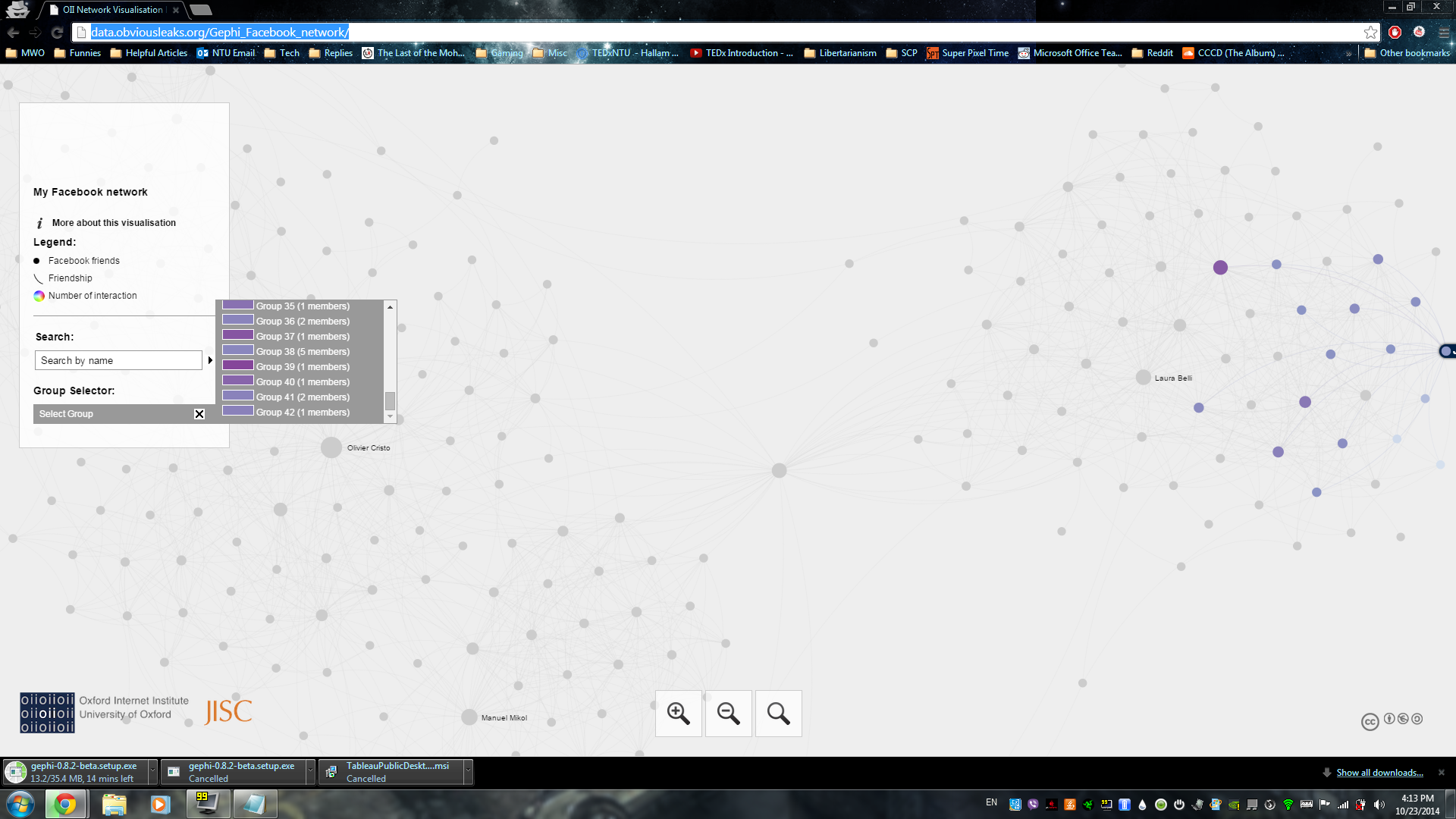
Data visualization of my social network, generated by TouchGraph
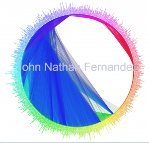
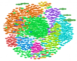
Friend connections generated by FriendWheel
With all the data we make available, I feel that it is possible to collate them together visually and hold a discussion on how we are linked together, individually. Perhaps somehow linking to Instagram, and showing who in your networks post under certain hashtags, or a geo-map showing where you and your friends have been, linking the pictures together over a map. We could also collate Facebook posts based on content (quite ambitious, perhaps) and connect friends based on the type of content they post.

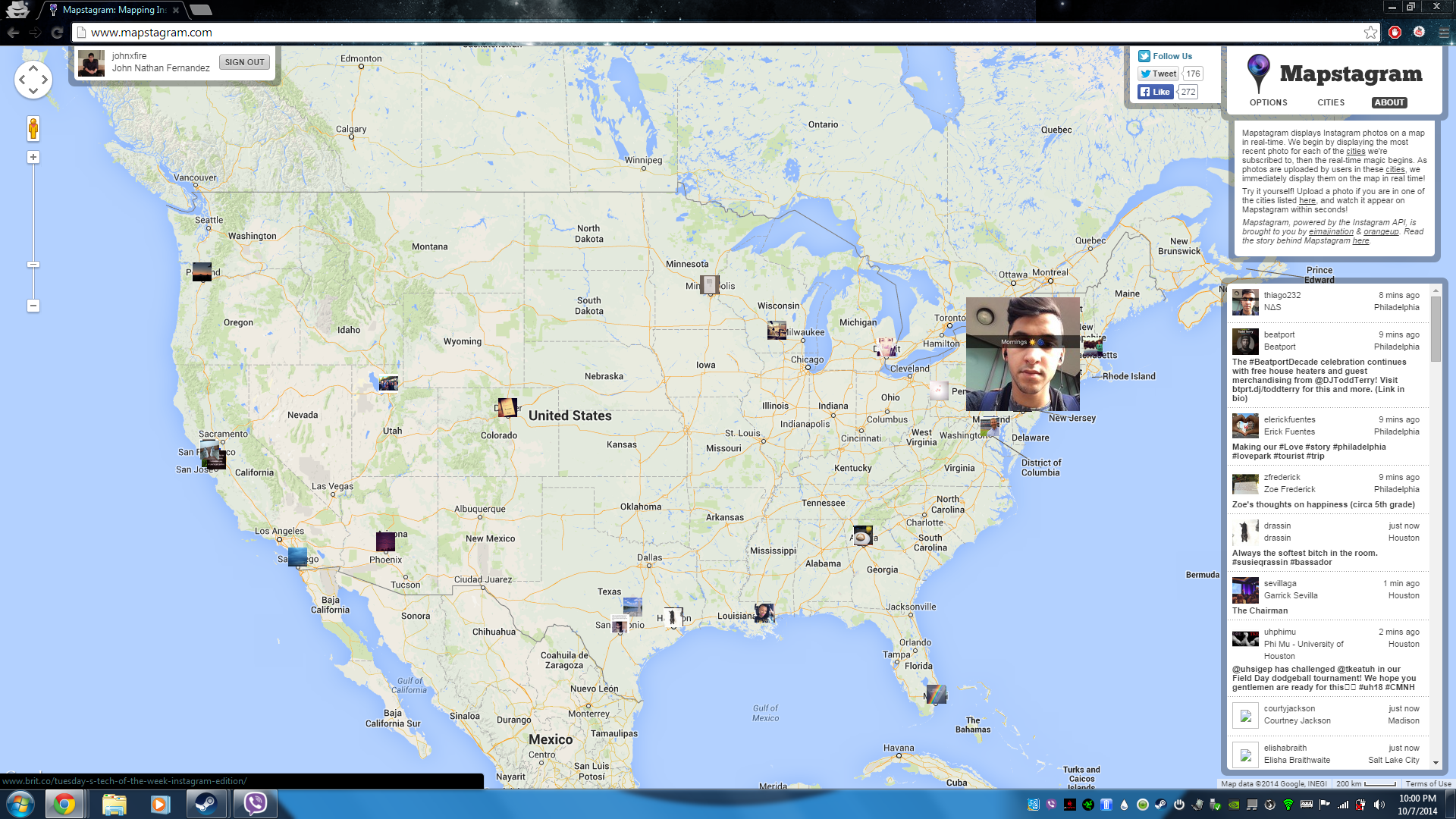
Mapstagram, which tracks new posts tagged in limited cities across the US
Whilst the data to be visualized is subject to our interest, I feel that data visualization is a great point for us to consider, as it explores the intertwining of our lives while at the same time emphasizing the isolatory and individualistic nature of social media (since they are all “me-centric” rather than “we-centric”.)