–
Full res photos here
–
Selected Poses:
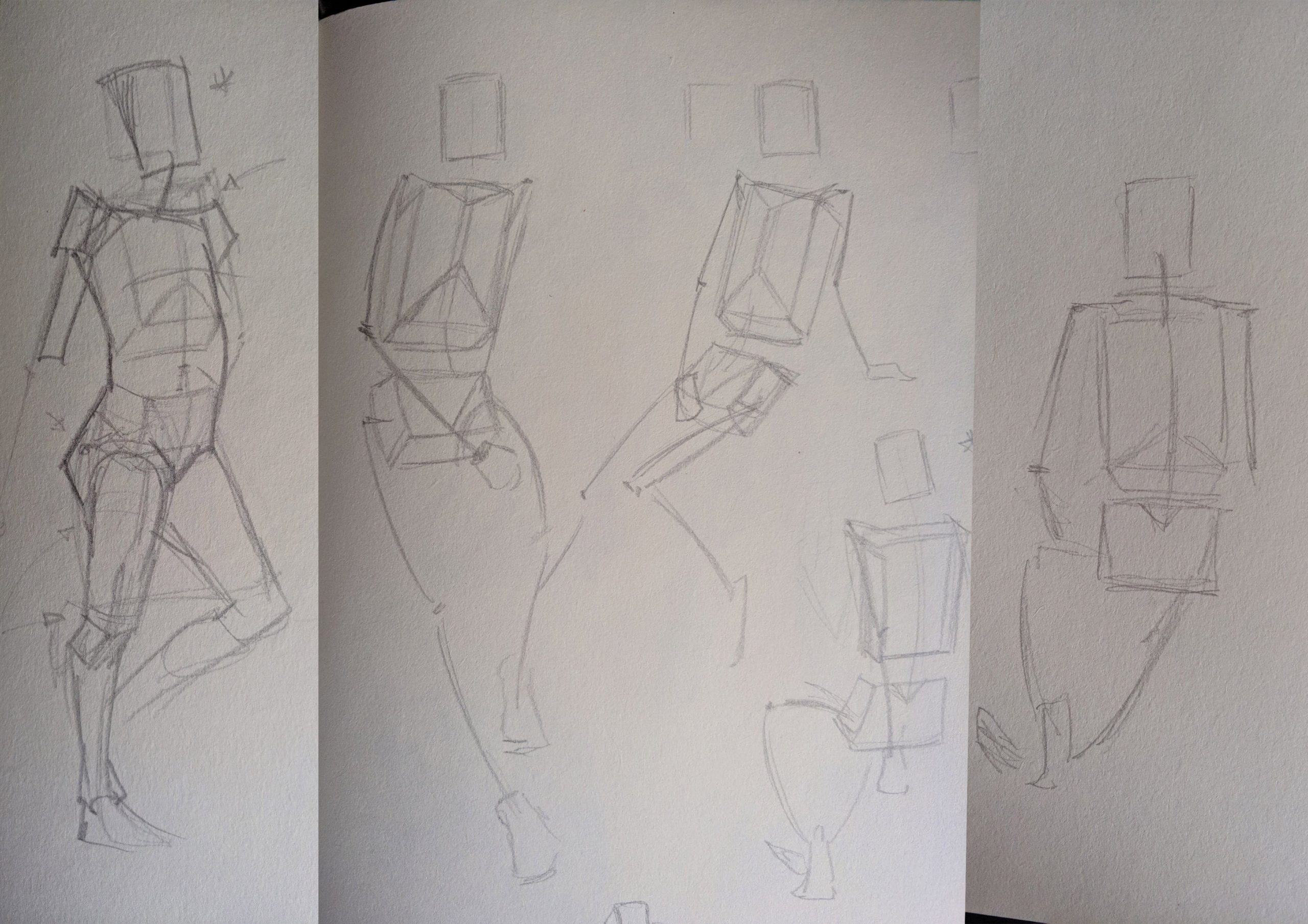
These are the poses I picked for the final assignment. I intentionally picked unfinished poses or poses I had issues with as references to take the opportunity to finish them as well as rectify them.
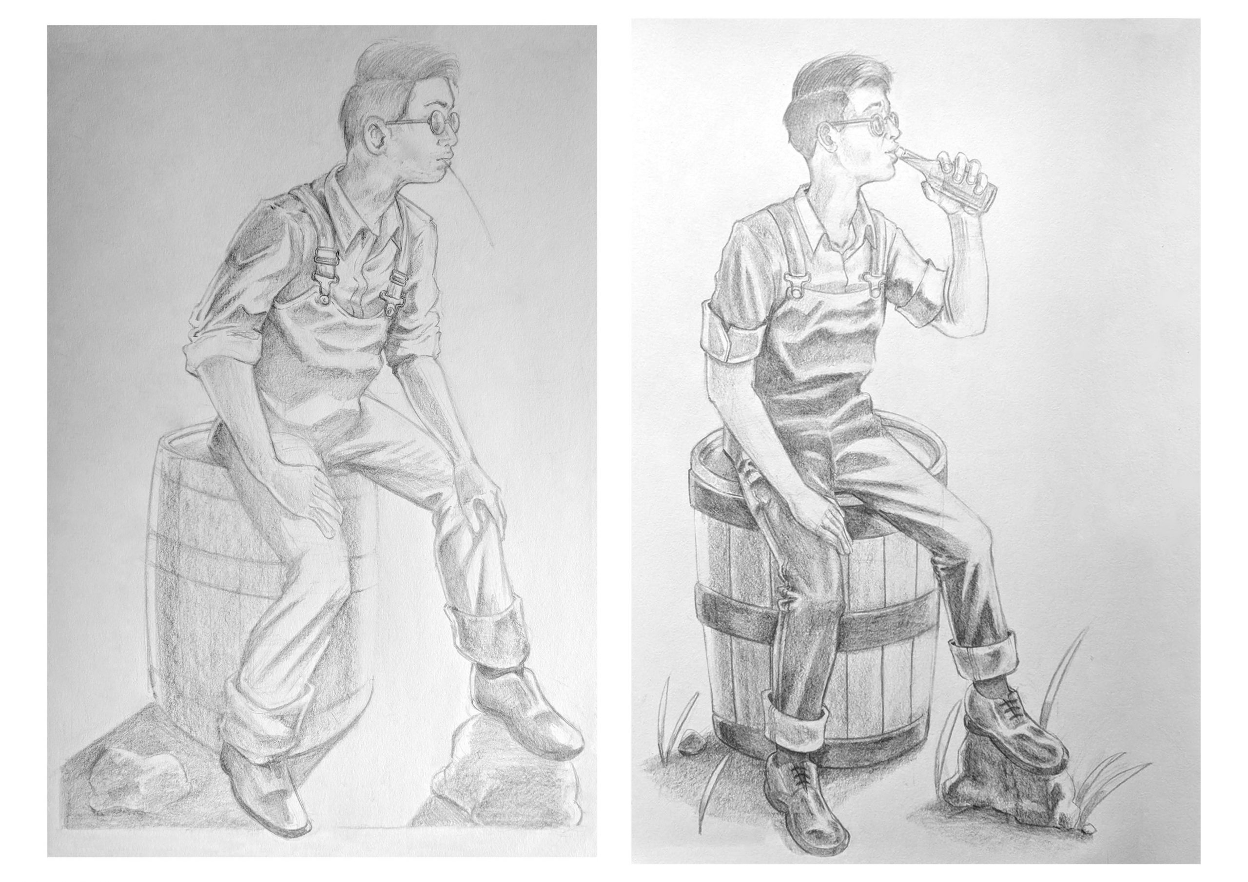
Initially the plan use the drawing I did for figure transformation as one of the panels but I realized it would have looked lazy on my part, so I decided to redraw it with a slightly different pose. I also took the opportunity to fix whatever problems I felt the original drawing had. Like how he kind of looks uncomfortable in the original, the barrel bands (as pointed out by Prof Jesse) didn’t ellipse properly and giving the hand a more 3 dimensional form (as Prof Jesse also pointed out during our class conference call).
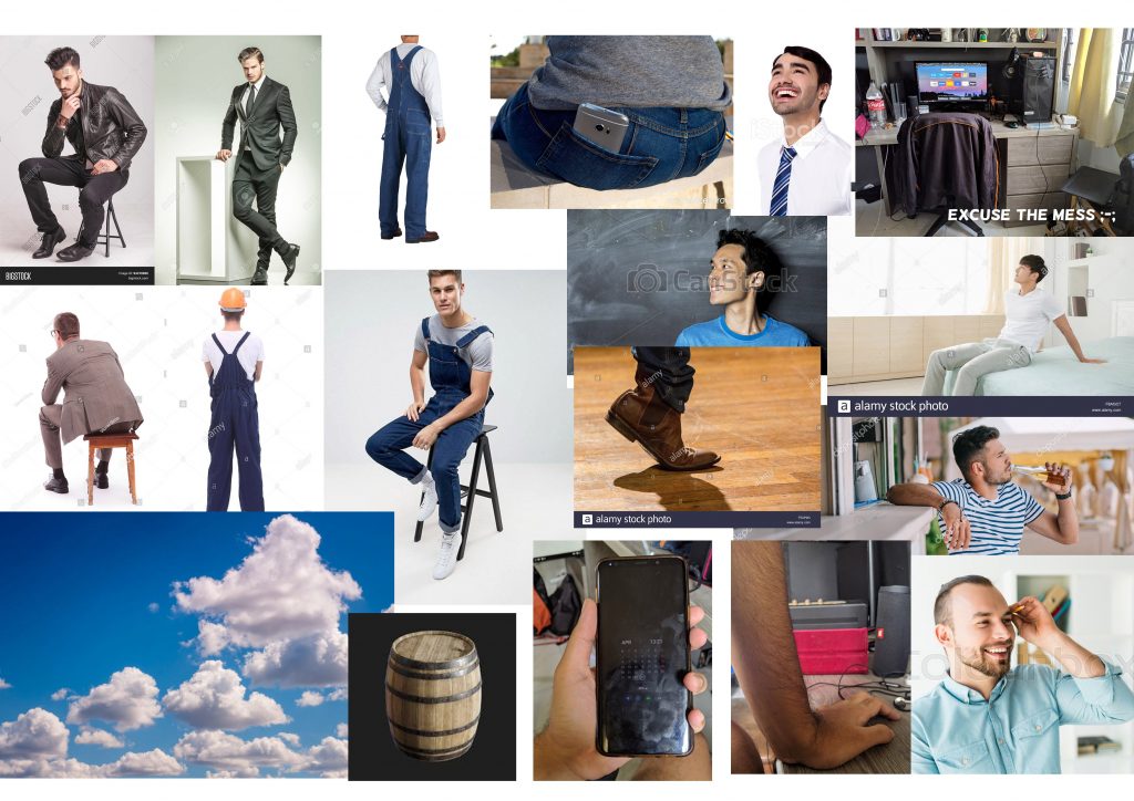
References:
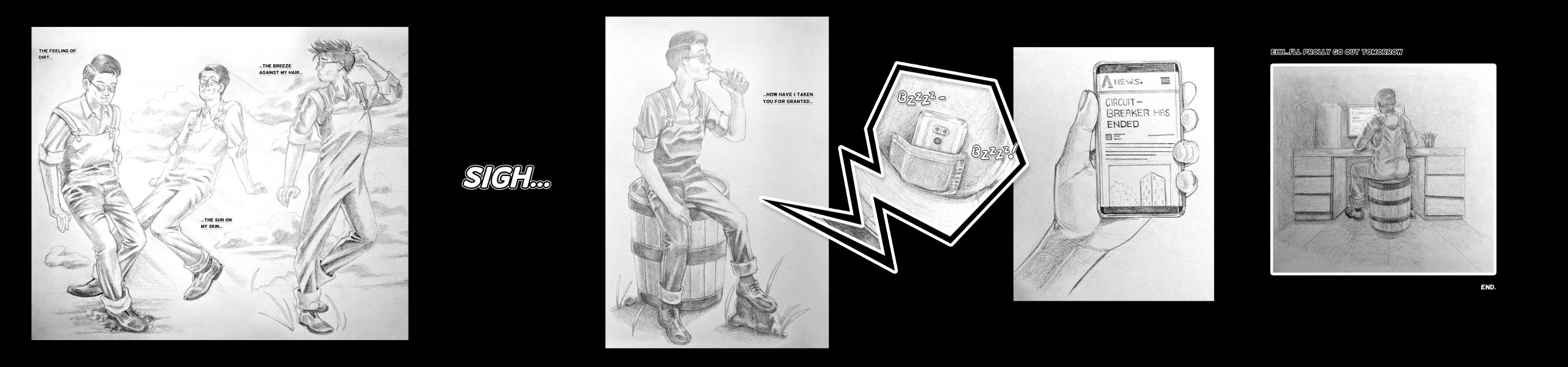
Final:
*My scanner wouldn’t connect so I took photos for the finals.
For my final layout, I went a little experimental. I’m not as familiar with the rules of comic layouts but I wanted to find a way to control the flow of the comic and use the space to emphasis each panels. I ended up going for single panels that moves in a horizontal direction that in a way, looks like a widescreen format you’d see in films. Since my designs are fairly realistic, I thought it would be fitting to put them in this format.
Areas of improvement:
While I feel that I’ve gotten a little better with cloth, although some areas still looks a little wonky (like the third pose from the left).
I’m also not really feeling the first panel as a whole (left) with how it looks composition-wise. Initially I wanted to make all the panels seamless, to make it look more dreamlike, but because my scanner refuses to cooperate, I couldn’t do it properly, hence I decided to be a little “creative” with the borders. Which explains why I drew an overlap in the first panel to create this seamless effect.
Reflection:
Coming into this cause, I had an objective to improve on my anatomy drawings as much as possible, as up till that point, I’ve had difficulties identifying my problems whenever I attempt to draw the human form. So I’m glad that these issues were addressed during the lessons as well as consultations.
Although I still have lots more to learn, I’m pretty pleased with the improvements I’ve made throughout the semester as well as finally getting myself to sketch quicker!
Hi Josh, Good work here and good story. I like the simple message, all backed up by a solid lay out and a good effort in drawing. First thing I notice is how much darker the black of the background is compared to the black in your drawings though its not such a big deal and might have as much to do with the way your captured the images of your drawing as the drawing itself, it makes the drawings feel a bit faded. Maybe that suits the overall nostalgic message in the narrative, but I definitely feel that could be addressed and emphasized if that was your intention. for sure some strategic blacks could be useful throughout. I’m seeing a lot of improvements here in your fabric and the structure in your drawings. still a little awkward with the tough parts like hands, but that will go away soon enough with some practice. the shoes are lookoing better and better and really root your figures in the space, and the attempt of drawing lighting effects in the last panel really nicely contrasts the air-yness of the first panel. good work overall and shows a lot of promise to develop quite well with more practice!
Hi Jessie! Yeah the shading appears that way because of my phone camera, I tried restoring it by adjusting the levels in Photoshop but it didn’t work as well as I’d hope. Perhaps I should’ve went for a white boarder instead! But yeah the dream like effect is intentional, especially the first panel (which was why I included the clouds). Anyways, thanks for the feedback!