So for this project, I had to pull myself out of my comfort zone of doing the familiar things, and pull myself back into my secondary school self who used to do markmaking in class.
The six emotions- Happiness, sadness, anger, surprise, fear and love. I relate this to my journey towards coming to ADM.
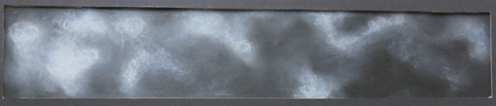
Love: Longing – Final
I first fell in LOVE with ADM when I first came here for the Grad Show 2013 when I was in Secondary Four, and set my eyes on coming here in the future. (Later on I did want to go to schools in the UK ie. Goldsmiths but ADM is still the most feasible choice for me because of financial and other constraints.) It wasn’t the most straight forward choice because my parents were not the most supportive when it came to my artistic endeavours, but over the years from 2013 to early 2017, ADM remained one of the higher ranked choices in my books. (I debated between Early Childhood Education in SUSS, NTU-NIE, SUTD Architecture.) The final choice for me for LOVE is a piece made with conté on black paper, which gives a smokey effect, getting clearer towards the left end. If you observe properly, you will notice the fainter scribblings in the white parts, which gives the effect of the internal struggle that I personally went through to get the peace of truly loving my choice of coming into ADM. From having to hide my love of art from my parents, to making it clear that I love it and want to pursue it (but still struggling to come to terms with it personally), I think the final work manages to capture the essence of it.
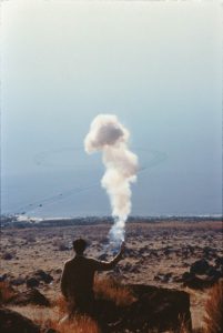
Cai Guo-Qiang The Century with Mushroom Clouds: Project for the Twentieth Century (Salt Lake) 1996
For this work I was inspired by Cai Guo Qiang’s Century with Mushroom Clouds. Even though it is not one of his signature gunpowder works, I was interested in the ethereal quality of the ‘mushroom clouds’, and how it was able to capture the moment. Similarly, I want to capture my longing for my pursuing art as a subject at uni. It was a stage of my life that I don’t think I will ever have to face again, thus capturing the moment was important to me. You can never recreate the same smoke pattern with a fire, and this slow clarity of my passion for art can never be recreated in the future.
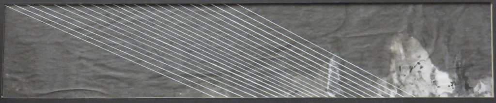
Surprise: Astonishment – Final
the letter that brought me to tears from the shock/astonishment
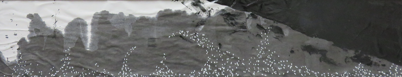
After my ‘A’ Levels, I didn’t want to think about my results and therefore my university choices. I struggled through my ‘A’ Levels because I had two family members pass away during the same period of time, and I knew I wasn’t coping very well with the loss. In the end my results were not as bad as I anticipated, but in the eyes of others I knew it was quite terrible, especially coming from the school I was from. I applied for the schools like all my peers, and clearly didn’t do well enough to get immediate replied from the universities. I went about my life, going to my job everyday, pouring my energy to my job and church activities so I didn’t have to think about the imminent future. I got an email from NTU in early June (most of my peers got their letters in April/May) which brought me to shock. I had already accepted Early Childhood Education in SUSS, but ADM had been my first choice. Being accepted into NTU had shaken my otherwise monotonous world of going to work to see my kids everyday (I worked in a student care, thus the kids.) The white lines running diagonally across the strip represents my very boring life, and the negative space created by the ink represents the gleamer of hope the acceptance letter gave me, and the astonishment that it caused me. (I was bringing my kiddos to the school library after lunch when the email came in. It literally disrupted my day ahhahah not that I’m complaining.)
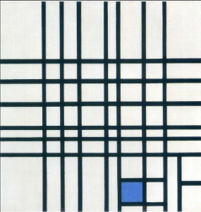
Composition II with Blue- Piet Mondrian 1936-1942
For this work I was inspired by Piet Mondrian’s Composition II with Blue. Mondrian made the number of lines running vertically and horizontally roughly the same, but somehow makes it so that the vertical lines lead towards the blue square and your eyes automatically run there. I wanted my lines to bring the viewers’ eyes across the strip, towards the negative space on the bottom right. The blue square in his painting also disrupts the monotony of the painting, much like how I made my negative space disrupt the monotony of the strip.
Fear: Anxiety- Final
After I accepted the NTU offer to ADM, fear started to set in. I was afraid of not being good enough. (After all, it is art school where people who are good in art and design come into. I was and still am a small fish in the sea.) I used newprint and rolled it up horizontally and soaked it in diluted chinese ink, then drew white dots in a pattern to signify the joy I was experiencing. The dark patch of acrylic on the top right corner slowly creeps into the strip, claiming the territory of the joy. I purposely made the acrylic very shiny and somehow trash bag looking/ oil spill looking. That is how fear (more specifically anxiety) feels like to me, suffocating and strangling. I do experience anxiety as a disorder, which onsets when I’m in a stressful situation. I’ve explained to counsellors that anxiety feels like a trash bag put over your head when you are halfway through a happy alley. (This one is pretty personal, so I didn’t/wasn’t able to find a reference point for this third one!)
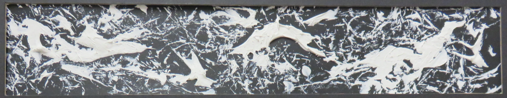
Anger: Frustration – Final
Upon entering ADM during orientation, I realised that it wasn’t what I had expected it to be. Somehow, the facade that all my seniors had painted for ADM was not what I experienced? I immediately grew to be frustrated with myself for getting myself into this rubbish, for fighting for it when it wasn’t actually what I wanted. (Backstory: I have a lot of seniors who are/were in ADM, including my own JC teachers who graduated from the pioneer batch of ADM.) One bad habit I have is to use a rubber band to hurt (?) myself when I’m frustrated with myself. (This is linked to my anxiety problem, and it’s supposed to be a form of self harm, however subtle it may be.) I decided to use the object that I use during frustration, and dragged it over texture paste on black paper. The texture paste gives the very icky feeling, like you would want it to get off your skin kinda feeling, and it portrays the kind of feeling I need it to give for frustration. The texture created with the rubber band was interesting, as it does reflect the mental infliction of frustration (?).

Convergence- Jackson Pollock
Of course, the artist reference for this emotion has to be Jackson Pollock. I personally love looking at his works, as he is one of the first abstract painters I learned about in school apart from Willem De Kooning. I love his weaving of the paints, and making use of the texture. YEAH just love it ahahahha the all over focus, and in this particular work, he made it so that the cream/white lines are prominent, and your eyes land on the whites. I took inspiration from this, and made mine so that there is an all over focus, yet still have places for the eyes to rest on.
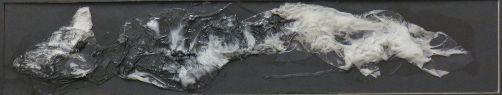
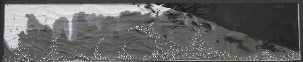
Sadness: Disappointment – Final
Disappointment set in when I realised there isn’t a way out from ADM, and I wasn’t going to exactly love my journey in ADM. I didn’t fit into the culture, I wasn’t good enough to be part of the people with CGPA 5.0, I wasn’t ever going to be able to reach the standards people put up. In a way, I just wanted to blend into the background. I was already a Hall Phantom (someone who doesn’t participate in hall activities), was I going to be an ADM Phantom too…? The paper I used is part of the black board backing we are using, so that the texture blends in with the board. The texture I got it from torn facial tissues mixed with very diluted black ink and white glue, and black ink dripped over certain parts of the tissue, mostly on the left portion. The black ink makes the tissue blend into the paper, and makes the line unclear. (When I’m disappointed I just want to disappear and not deal with the situation, thus all the blending into the background.)

Figure 1o – Fiona Rae 2015
Fiona Rae’s more recent works I relate to a lot more than her earlier works. Her lines are a lot more defined, and have a certain oriental style to them. I took inspiration from this particular one as she blended the middle figure into the background, but there is still a suggestion of the figure. The mysterious feeling that the painting gives is something I wanted to achieve, and I hope I have.
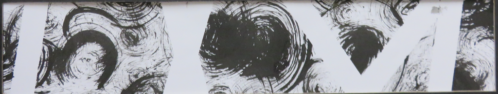
Happiness: Relief – Final

The view from my pillow
I find comfort in the simple things. After the disappointments and everything, when I get back to hall, the first thing I do after kicking off my shoes is to lay on my bed. (I know, ew, haven’t showered or anything and you just lay on your bed??? ITS MY BED!!!) My room in hall is my safe haven, where no one else can enter, and is my own personal space. When I lay down, the ceiling fan is what is directly above my head. The soft spinning sound is what I fall asleep to every night, and what I wake up to every morning. Unless I use my Spotify or go on Youtube, it is the only sound that I hear every day without fail. I stare at it while I fall asleep, it’s an escape from the reality I have to face in school everyday. In a way it’s a calmness that takes me away from all the stress in the world. The vertical lines, the spinning circular motion is what accompanies me every night, and that’s what I decided to depict in my Happiness strip. I used tissue tape to create the vertical negative spaces, and a rough sponge to create the circular motif.
YAY I guess I’m sort of done.
Thoughts: This has been a heck of a journey, with sooooo many failed pieces (currently as I type, flying around my room. They try to escape every time I open my door.) I realise I loved being a child again, except that when you were a child you didn’t need to clean up. When you are 20 years old and have your own room, that means you need to clean up after yourself. which isn’t fun. I also learnt that chinese ink doesn’t get off grout, so it has been fun trying to run away from my mom trying to scream at me for dirtying the toilet. Oh well. All part of being an art student, right?


