Hello! This marks the beginning of the journey in Surface Design.
At the start of the lesson, as Galina was talking about using a theme to guide your creative direction in this class, I quickly decided on using ~SUSHI~ as my theme, or rather, salmon sushi as my direction. I liked the different textures that come in salmon sushi, the different layers of flavours that assault your taste buds when you bite into it.
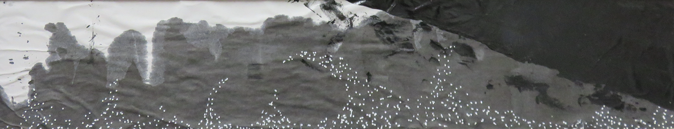
The combination of colours I used was close to the colours of salmon sushi: yellow, orange, green, black, white. I want this set of colours to be continuous through my range of works in this project/module.
Dry/Wet Heat Transfer || Technique
1| for the dry technique, using Fabric Crayola, draw on white paper. Or for the wet technique, use the heat transferrable paints on white paper
2| cut out the preferred shape
3| iron on the paper, sandwiching the cloth and the paper with fresh baking paper.
4| allow the iron to sit on the cloth for a longer period of time, to let the colour seep into the cloth properly.
The trial and error nature of this medium allowed me to test out the difference between the dry and wet techniques, and the difference between using the iron versus the heat press.
The iron allowed for us to control the heat more easily by shifting the dial on the iron, and we could test out the heat tolerance of the colours. The heat press is easier to use, faster and more effective, and leave less to chance.