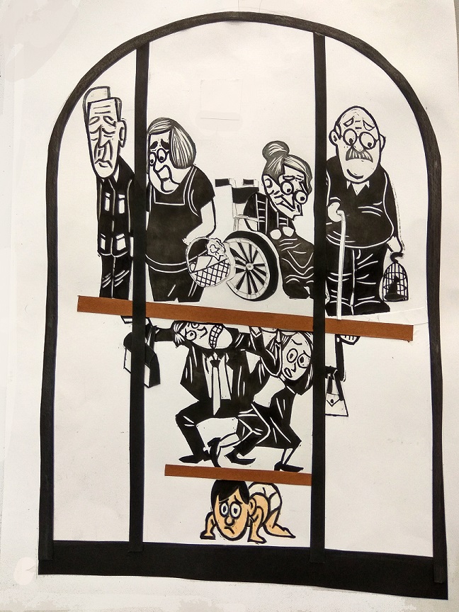
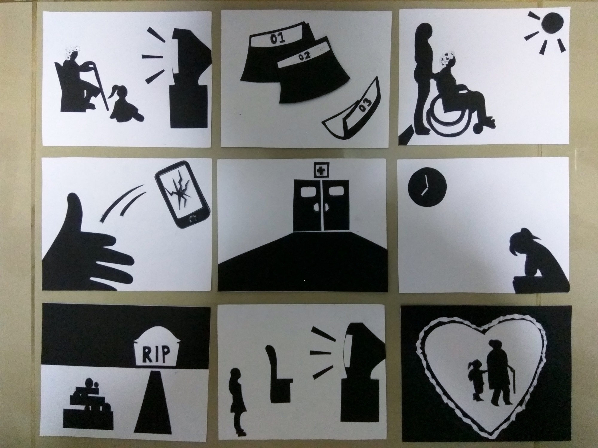
The theme of my art piece is ageing population. The current old-age support ratio is 5.4, which means 1 young adult in Singapore has to support about 6 elderly. This ratio is really high to be honest. Imagine the younger generation have to support not only their parents, but also the grandparents. So I wanted to show how bad the situation is in Singapore. Not saying that I am encouraging every couple to have more children, but rather to tell the younger generations that they really have a huge responsibility to bear in the future. This also applies to us, and it will only get worse in the future.
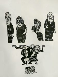
I used the 1:6 ratio in my art piece (there can’t be 5.4 humans), with a baby representing the current generation, a working couple to represent the parent generation, and of course 4 grandmas and grandpas to represent the elder generation. The baby has to support 2 generations of people, and is squashed to the bottom of the inverted pyramid. This inverted pyramid of old-age support is locked up inside a cage, portraying the fact that this phenomenon is a never ending cycle that Singapore faces (the pyramid will only get bigger).
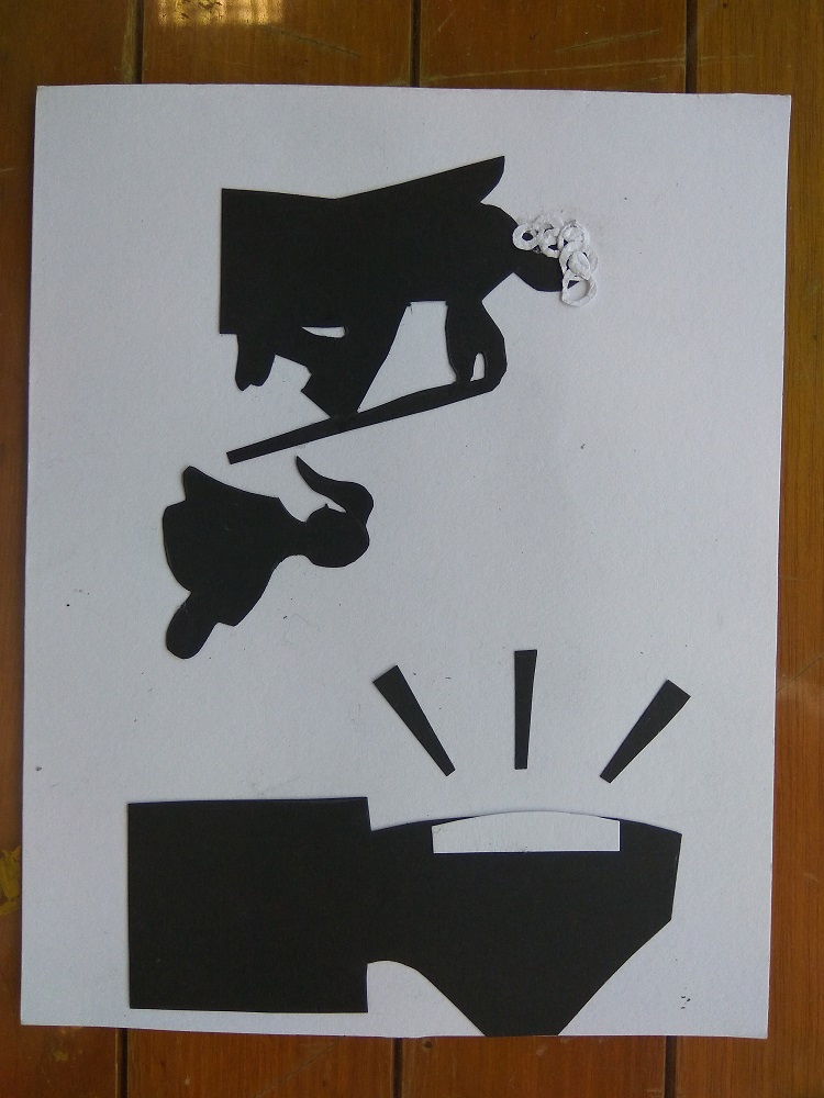
At first, when I was brainstorming and drafting, I only thought of using a 2 level inverted pyramid to show the ratio. However, I realised that the elderly will be floating around on the top layer of the pyramid and thus I scraped that idea and modified to what I currently have now.
The colour scheme of my work piece is basically monochromatic, black, white and some grey. except for the baby, which I gave it some colour to show that the baby represents the current generation of Singaporeans. The basic composition is an inverted pyramid that I placed in a one-third ratio, with the ageing at 2/3 of the space to emphasise the heavy weight of them resting on the baby. Also, to show that this is a heavy responsibility weighing on the younger generations, the emotions of the characters are more emo with their body squashed. The small elements that the characters are carrying (holding) are actually representations of what the current generation have to support the aged for. The wheelchair and walking stick represents medical support, the grocery basket represents the day to day allowance, and the bird cage to represents hobbies of the ageing that the younger generation have to help to sustain.
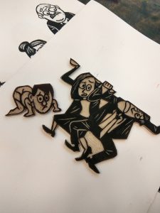
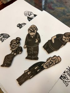
I basically used lino-cut and paper-cut to complete this art piece. The different characters are done using lino-cut. I carved out the lino pad into the shape of the characters, just like a stamp, after doing the details of the character. I put in some textures for the hair to show the difference in hair for the elderly and the working generation, and also on clothes to show the creases. The other small elements like the wheelchair, the groceries basket, bird cage etc, are made using paper cuts.
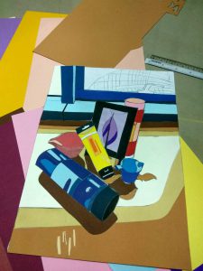
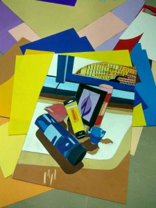
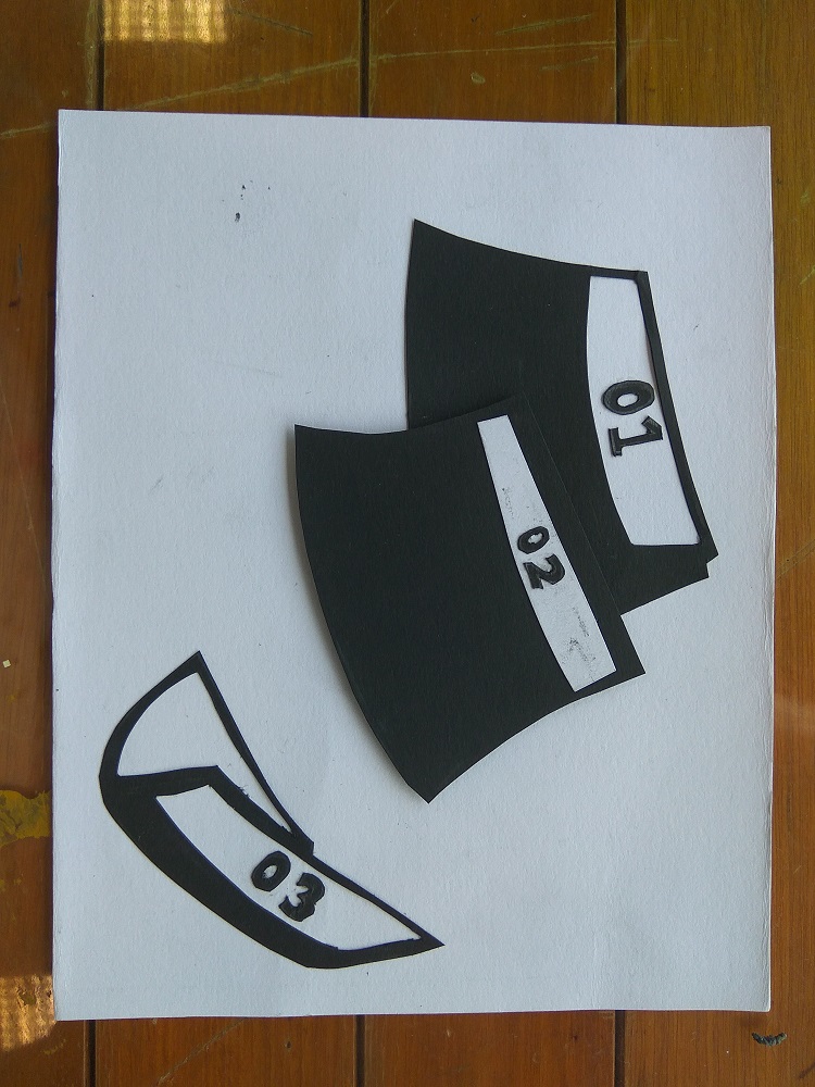
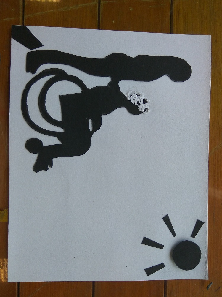
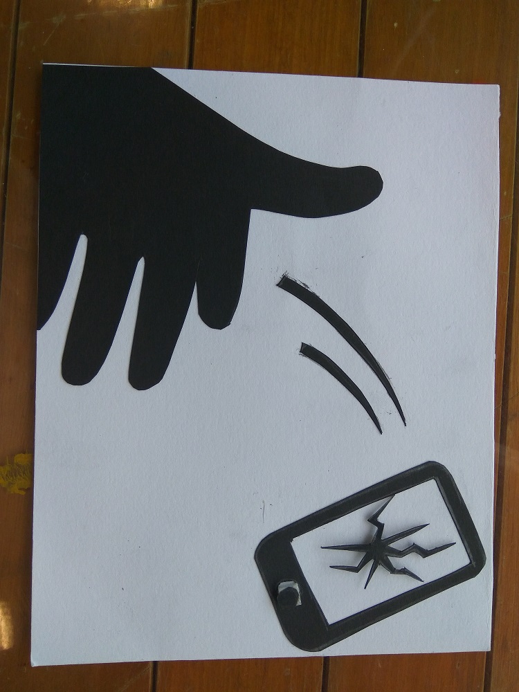
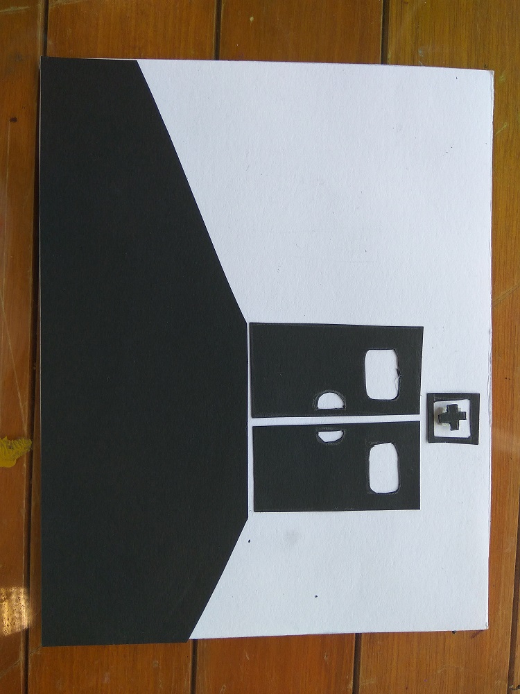
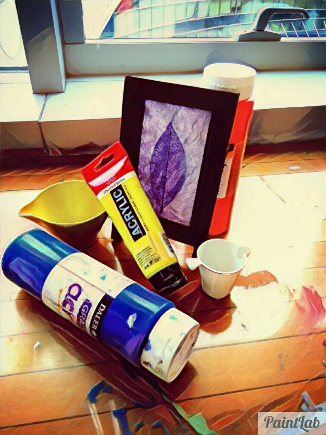
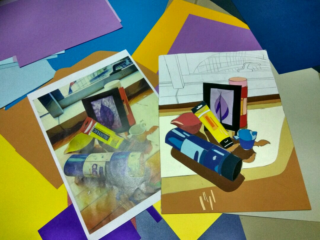
Some progress shots:


