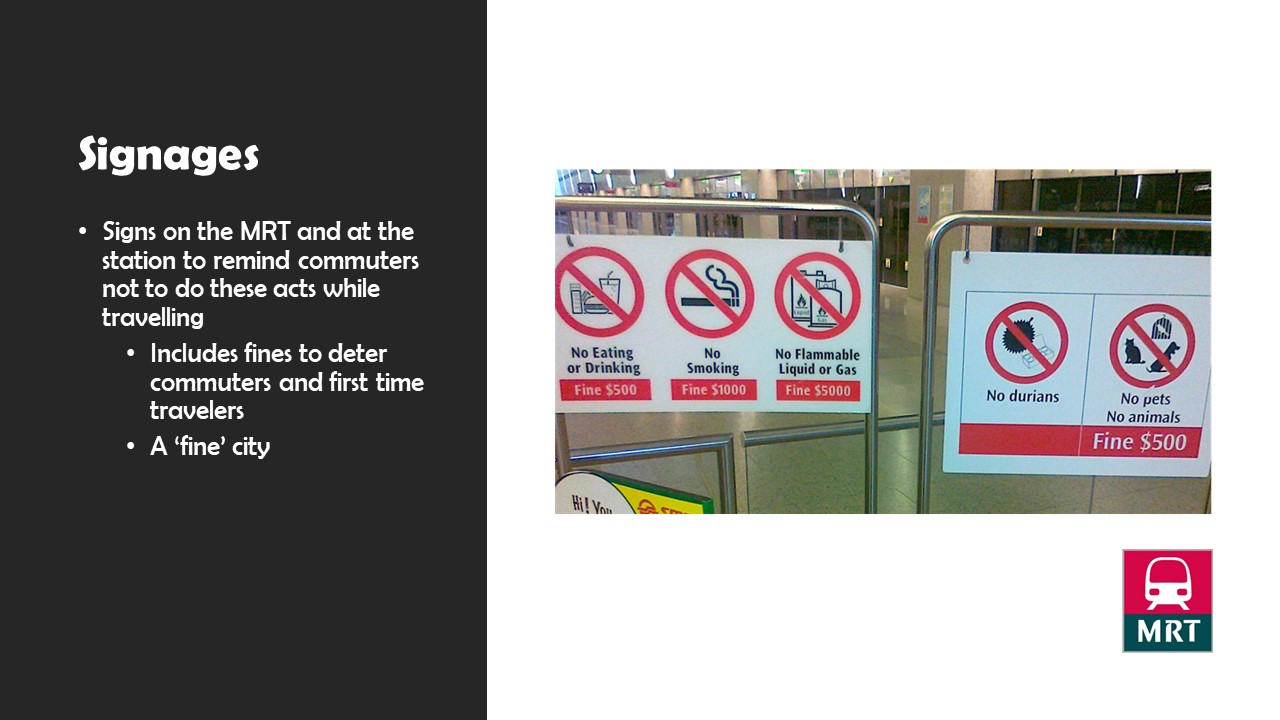
Overall, TeamLab’s exhibit at the Art Science Museum was really an eye-opener. It was my first time at the exhibit, and I was really impressed by it. My first impression of the exhibit was futuristic. It really gave viewers space for imagination. We could see our design and drawings turn “alive” through technology. Our drawings were incorporated into a futuristic world shown on the screen, where it would move and live in the world. It really encourages viewers to use their imagination, and that nothing is deemed unfeasible. It really felt like a reminder that we have lost our creativity and imagination while growing up, and we shouldn’t let reality undermine these valuable creativity thoughts we had as a kid.
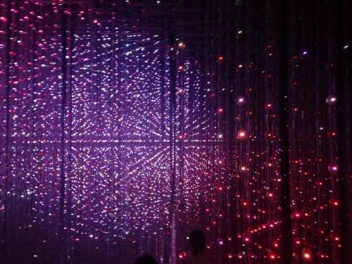
The next exhibit that amazed me was the Crystal Universe. It was an installation where we could walk through the ‘universe’ and experience all the different variations of the light display. It was really an inspiration for iLight. The installation gave a first-hand experience to view the lights and allowed us to create our own universe. Through a web application, we could decide the type of light display we wanted for the Crystal Universe. As an engineering student, I was amazed by the interaction provided to viewers through the web app and how they incorporated art and technology together to create such an interactive display.
Chipchase once again talked about the 3 important things we need to have with us: phone, keys, and money. In this chapter, he further analyses the psychological reasons behind them. A few concepts he brought up: range of distribution, center of gravity, point of reflection and ‘strings of the networking yo-yo’.
It is interesting how the range of distribution can vary among countries, which is essentially the range of distance people are comfortable to let their belongings stay unattended or unsafe. In his example, Chipchase brought up an example of a girl in Shanghai. She wouldn’t let go of her purse for a second, as she has generated this habit through the fears of being robbed. However, in other countries like the UK, people would feel free to leave their bags unzipped, but there are still certain circumstances when they feel protective of their belongings.
Center of gravity is a place where most of the important things people carry around would gravitate to. Phones, wallet, keys are usually placed on a visible and easily accessible table. these places are the first place we would look for if we are finding anything.
Point of reflection, definitely what I do every day before I leave home. Patting my pockets and ticking the list I have in my head to check if I brought everything out. It is a plus if the certain product has the function to allow users to check back on what they have in a more accessible and effective manner. A good point to consider when designing products.
From what I understand, the concept of a networking yo-yo is similar to that of range of distribution. It shows the threshold level of a user on certain products, especially when he loses it or have it left somewhere far from him. Depending on the function of the product, the threshold level of the yo-yo string (how reliable the user is on this product) has to be adjusted.
I very much agree with the points Chipchase mentioned in the video. three important things we bring out: keys, phones, and money. Mobile phones have become such an important part of our lives that many would say they can’t function without mobile phones. If we didn’t bring keys out, we can always wait for others to open the doors for us, or worst case scenario spent the night at other people’s places. Of course, there will be scenarios that you forgot to bring the keys out and left an important item in the house. The mobile phone will then come in to contact your family for help.
Money is an important aspect of our lives too because without money one can’t really survive. We need money for food, purchases, and other basic living necessity, so no doubt that your wallet is one key thing to bring out, especially if you are overseas. If you forget to bring your wallet, the first thing most people would think of is to contact someone to bring it out for you. Actually, in most cases, we would just Whatsapp someone to say they forgot to bring their wallet out and seek assistance from there. Or maybe share about it in social media.
From the above, mobile phones are actually the most important item that people most rely on, especially this generation with the world being increasingly more connected. Apple Pay, Android Pay are functions that actually replaces money, so a wallet isn’t actually important in the future. And that was one thing Chipchase overlooked, the impact of advances in technology have on people.
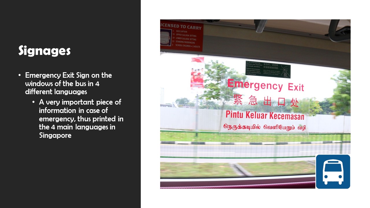
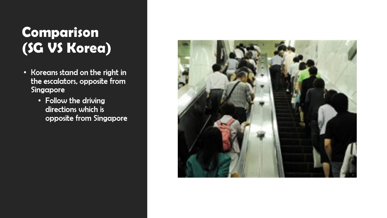
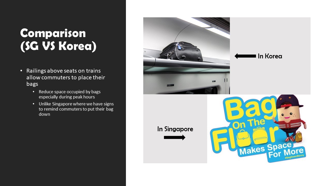
Chipchase has an interesting way of looking at how cultural differences can affect the little details of a person’s everyday life, like signs and commute style. Observing how the different cultural exchanges for each country, or for each race and religion place an important role in how products and consumables are designed for the specific group of people. I have recently visited Korea, and I realized that it was inconvenient to find your way in the station itself. Firstly, for some stations, train tracks are placed in the middle of the whole station unlike Singapore, and it really brings inconvenience to tourists especially when they tap into the platform for the wrong direction. There were a few occasions that we have to tap out (wasted money) and tap in again to get to the correct side of the platform. It was something different and of a different cultural experience as well. Thus, designers when designing a product for a certain market, the product must be culture calibrated otherwise it might not have the desired impact of the designer.
Korea’s Sanggye Station (From Google)
Questions:
Is cultural research done better in a team of different backgrounds or those of similar background?
Chipchase says there must be a balance during calibration. How do you define the thin line of balance?
Response:
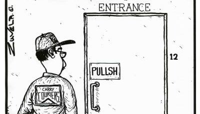
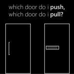
Designers should really take into consideration the user’s point of view when creating a product. Be it a door, a refrigerator or a technological product, the user experience is important when comes to creating a user-friendly product. In Don Norman’s book, he analysed that designers should incorporate principles of interactive design as much as possible when creating a product. Affordance, signifiers, constraints, mapping and feedback are the various aspects of design that the designers should consider when taking into consideration the user’s point of view. I feel that signifiers are the most important aspect that the designer should consider, as it is important to ‘signal’ to the user how to use the product, so that it becomes intuitive. The famous Norman door problem can easily be solved if the designers considered the signifier aspect when comes to creating a door that can be intuitive when to push or pull.
Questions:
1. What are the psychological constraints that affect the design of intuitive products?
2. Is there a standardised model where designers can follow when creating user-centred design?
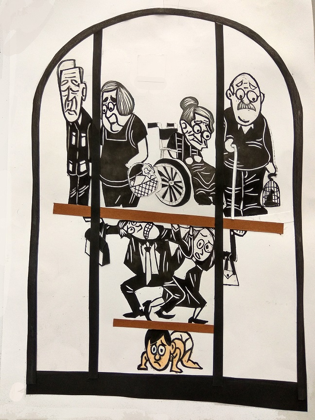
The theme of my art piece is ageing population. The current old-age support ratio is 5.4, which means 1 young adult in Singapore has to support about 6 elderly. This ratio is really high to be honest. Imagine the younger generation have to support not only their parents, but also the grandparents. So I wanted to show how bad the situation is in Singapore. Not saying that I am encouraging every couple to have more children, but rather to tell the younger generations that they really have a huge responsibility to bear in the future. This also applies to us, and it will only get worse in the future.
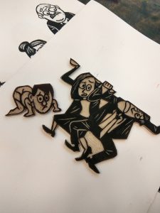
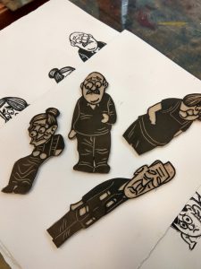
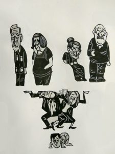
I used the 1:6 ratio in my art piece (there can’t be 5.4 humans), with a baby representing the current generation, a working couple to represent the parent generation, and of course 4 grandmas and grandpas to represent the elder generation. The baby has to support 2 generations of people, and is squashed to the bottom of the inverted pyramid. This inverted pyramid of old-age support is locked up inside a cage, portraying the fact that this phenomenon is a never ending cycle that Singapore faces (the pyramid will only get bigger).
At first, when I was brainstorming and drafting, I only thought of using a 2 level inverted pyramid to show the ratio. However, I realised that the elderly will be floating around on the top layer of the pyramid and thus I scraped that idea and modified to what I currently have now.
The colour scheme of my work piece is basically monochromatic, black, white and some grey. except for the baby, which I gave it some colour to show that the baby represents the current generation of Singaporeans. The basic composition is an inverted pyramid that I placed in a one-third ratio, with the ageing at 2/3 of the space to emphasise the heavy weight of them resting on the baby. Also, to show that this is a heavy responsibility weighing on the younger generations, the emotions of the characters are more emo with their body squashed. The small elements that the characters are carrying (holding) are actually representations of what the current generation have to support the aged for. The wheelchair and walking stick represents medical support, the grocery basket represents the day to day allowance, and the bird cage to represents hobbies of the ageing that the younger generation have to help to sustain.
I basically used lino-cut and paper-cut to complete this art piece. The different characters are done using lino-cut. I carved out the lino pad into the shape of the characters, just like a stamp, after doing the details of the character. I put in some textures for the hair to show the difference in hair for the elderly and the working generation, and also on clothes to show the creases. The other small elements like the wheelchair, the groceries basket, bird cage etc, are made using paper cuts.
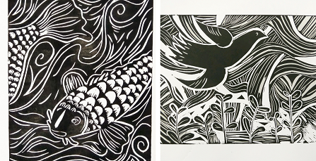
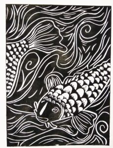
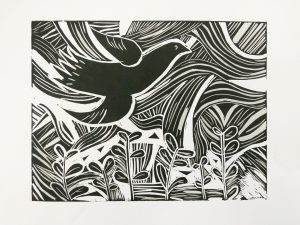
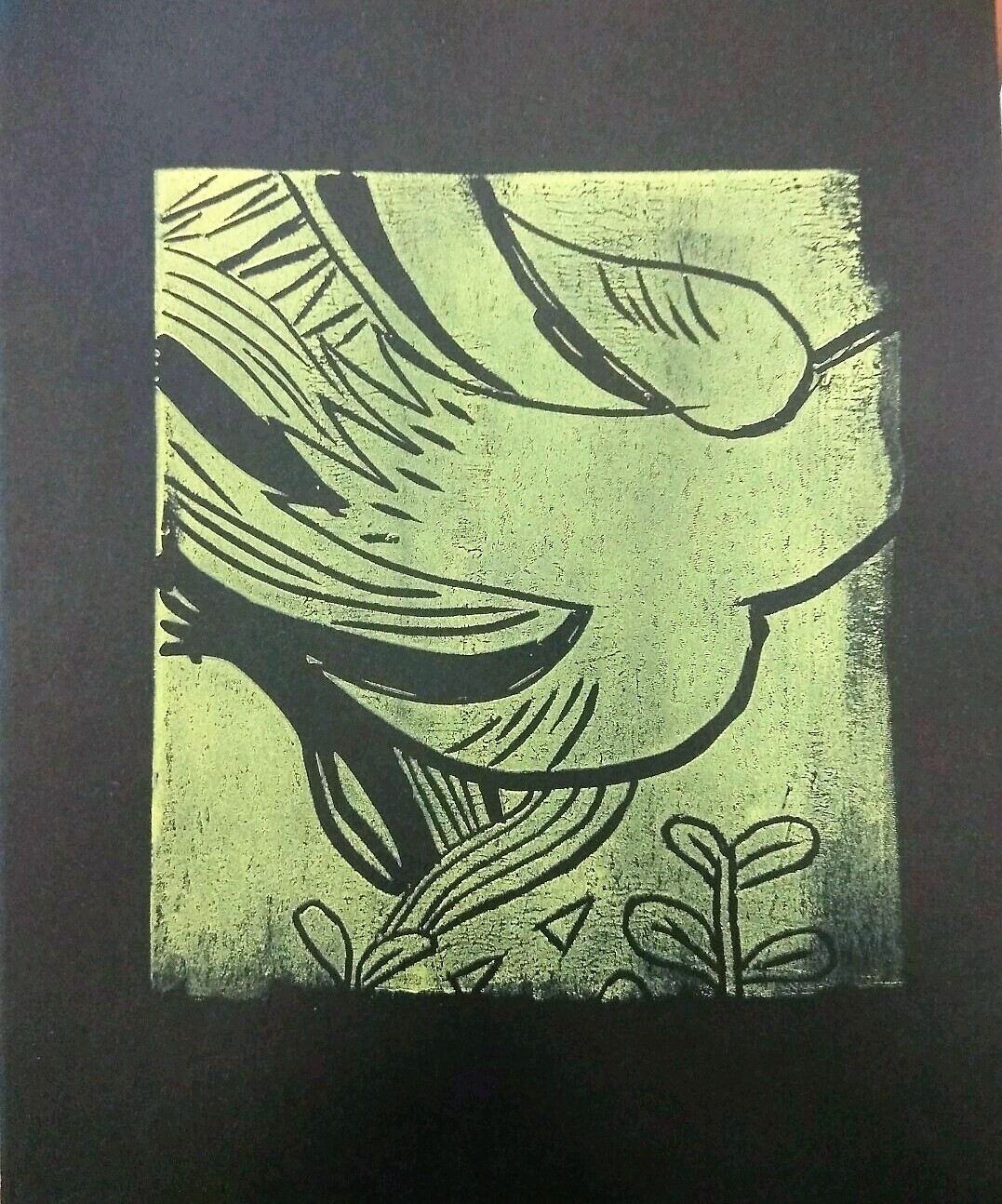
My story is about a beautiful fish living in a pond where she can see the birds in the sky flying freely. There is always this bird that flies pass the pond everyday, and it didn’t take long for this beautiful fish to admire the bird. She fell in love with the bird, and as the bird noticed her admiration towards him, he started to talk to her. The fish was elated, but she didn’t know that the bird had other intentions. One day, the bird lured his admirer to the shallower part of the pond and gobbled up the poor fish before flying away, feeling satisfied with his meal.
Planning
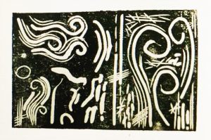
It was the first time I tried lino cutting, using the different cutting knives to carve on rubber pads. To explore with different textures the lino cutter can bring, I tried out the various cutting knives available. There were actually only 2 kinds of cutter that was easier to use. the small V shape cutter helps with small details and creates nice straight textures. It is the most easy to control cutter. The second is the small U shape cutter, which gives very pleasant curve textures to it. It is these 2 cutters that I find relevant for my art piece I have in mind (to create the wind and water textures).
Frame One
This frame shows the fish swimming in the pond. I wanted the background to be white at first, and the fish white too, but I made a mistake in the cutting of the lino pad. I tested it out and realised that the inverted looks good as well. I positioned the fish to be in a circle, as water ripples of the pond is curved, thus it will be better for the fish to be positioned in a circle rather than a fish swimming straight. I played with the different textures for the fish and the background.
Firstly, the fish’s textures. The scales were meant to be emptied out and be white, but I thought maybe leaving some stray marks on the scales would have an unintended textures. Luckily, it turned out well. I also added some textures on the tail and the fins of the fish, to show the fishtail marks.
As for the background, I use the V-shaped and U-shaped cutters to do the ripples of the water. Nearer to the fish, there will be more intense ripples (more curvy), and further away the ripples are straighter. All these help to create textures of the pond water.
Frame Two
This frame shows the bird flying away happily after eating the poor fish. During planning I already wanted to make the texture of the air (the wind), and thus I figured that I shouldn’t add much details to the bird otherwise the whole frame will be very messy. That’s why I left the bird black. I used the one-third rule for this composition. The grass occupied one-third of the plane and the bird occupying the rest of it so as to put the emphasis on the bird. Similarly, I used the V-shaped and U-shaped cutters to portray how the bird is soaring in the wind.
Takeaway
I realised that certain mistakes can actually give unexpected results. It is good to make do with what we have, even if there are mistakes. Imperfection may just be the perfect touch to the piece.
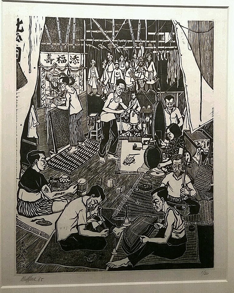
Lim Mu Hue. Chinese Puppet Theatre. 1966. Woodblock print on paper.
Initial Response
I was amazed by how detailed the woodcut was, with so many characters in the frame and detailed defined so clearly. I was intrigued by how the theatre performance was so different in the past as compared to today.
Analysis
What is the painting about?
This painting shows the backstage of a Chinese Puppet Theatre, with the puppet actors performing at the back and the musicians playing in front of the stage. It showcases many different Chinese instruments and how the theatres were like back in the 1960s in Singapore.
Techniques applied
The artist made use of different types of lines in wood carving to show the different textures. Especially for the floor mats, the artist used systematic lines to create the woven mat texture. The contrast between the characters and the background were also shown using black and white lines from wood carving.
Composition
Elements of this art piece were generally organised in an anti-clockwise direction. The artist also divided the picture using a one-third rule, with the puppet performers performing in the background with one-third space, and the musicians performing in the foreground with two-third space.
Artist’s Background
Lim Mu Hue was trained in Singapore’s Nanyang Academy of Fine Arts where he was greatly influenced by the Woodcut Movement from China. His woodcuts often show the socio-political themes that represent the daily life of Chinese men. He often incorporates Singapore’s lifestyle and Chinese cultures in his works. Similarly, in this woodcut, he portrayed the culture of Chinese music and theatre performance that were rather common in Singapore back then.
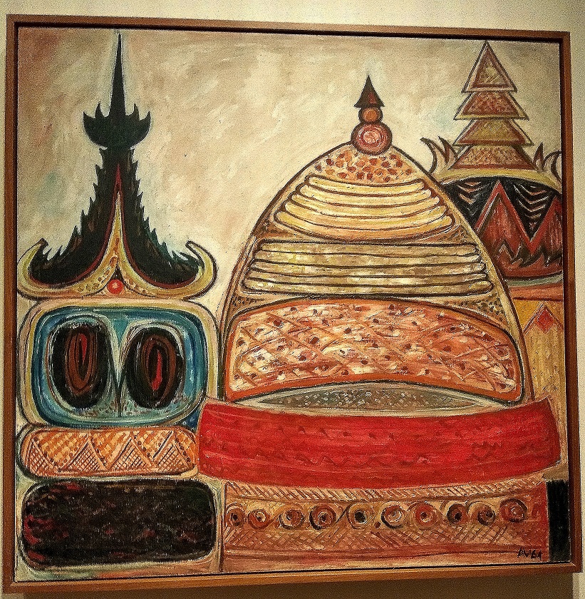
Latiff Mohidin. Pagodas II (Pago-Pago Series). 1964. Oil on Canvas.
Initial Response
I found this painting oddly satisfying due to the structure and colours of it. It gives me a very warm vibe that attracted me to it.
Analysis
What is the painting about?
This painting depicts 3 distinct pagoda roofs, with various designs and textures for each of them. It shows the architecture used in the historical Hindu-Buddhist culture of Southeast Asia in a more abstract way.
Techniques applied
Different colours and lines were used to portray different the different textures of the pagoda roof. By using warm and cool colours to show contrast, the artist managed to make viewers look more closely at the different textures. Through simple lines and shapes and dots, he managed to bring out the different designs and textures of the pagoda roofs in an abstract manner. All these were done using oil on canvas.
Composition
The painting was divided using the one-third rule, with the first pagoda on the left occupying one-third of the space. Negative space was also used to show the sky, and upon looking closely to the sky, the negative space actually has texture to it, showing the clouds I presume.
Artist’s Background
The Malaysian painter, Latiff Mohidin, grew up in the countryside and thus his works were usually inspired by the nature and culture of Southeast Asia. Similarly, in this painting of the pagodas, he depicted the Hindu-Buddhism culture of Southeast Asia, and also the architecture design that was distinctly Southeast Asian.
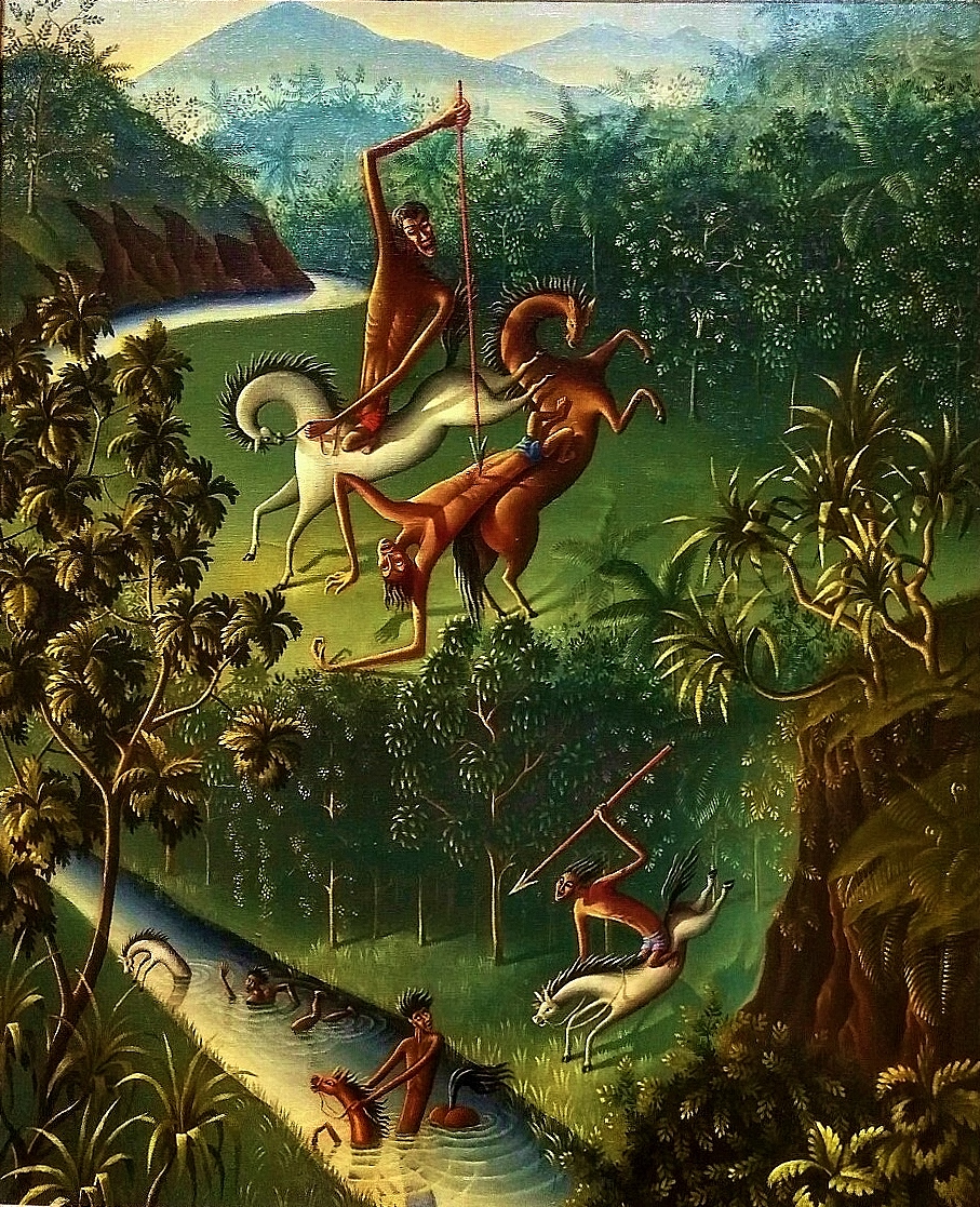
Walter Spies. Balinese Legend. 1929. Oil on canvas.
Initial Response
I was attracted by this painting due to the unique painting of humans and animals in a fight. What the artist drew was not something of the norm. This painting gave me a very mysterious vibe, attracting me to want to know more.
Analysis
What is the painting about?
This painting depicts a fight ongoing between 2 groups of people. Those on the white horses were hunting those on the brown horses in the forest with spears. The exact folk legend is not known, but the distinctive characters and the Balinese landscape clearly shows the scene of a Balinese legend.
Techniques applied
Analogous shades of green and brown were used for the forest setting. With the different shades of colours, a 3D painting of the forest can be portrayed clearly. The painting even shows the detailed highlights of the leaves where light shines on them. This can be shown by the lake in the painting as well. For the characters, the artist did not use the normal way of portraying humans. Instead, he made use abstract shapes to create his own form of humans and animals. Together with the colours, he brought the characters into life.
Composition
The painting was divided into half, with the main focus on the background instead. This can be shown by the artist portraying the background characters in a larger scale as compared to the foreground characters.
Artist’s Background
The Russian painter, Walter Spies, spent most of his life in Bali, where he travelled to many villages in Bali to learn more about Balinese culture. It was during that period of time when he learnt about the legend and painted it according to how he imagined them to be. As he lived in Bali for some time, he usually infuses the Western technique and Balinese technique of art together in this painting. In this painting, he observed how Balinese puppets portray humans and used those gestures and figures in this painting to portray the characters to suit the Balinese culture.
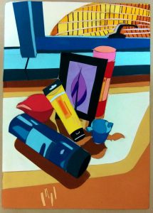
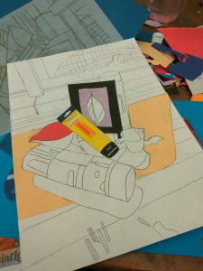
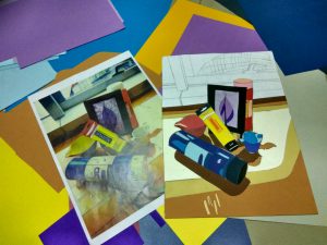
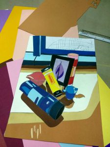
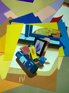
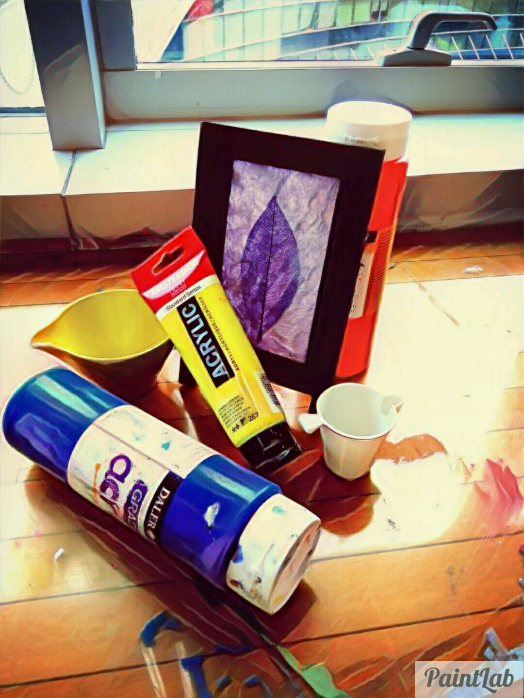
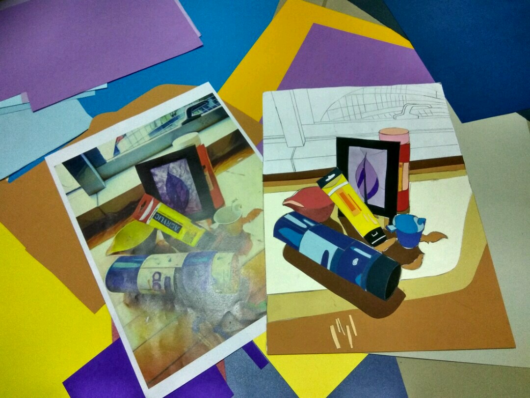
We were tasked to create a composition cut out using colours by recreating a still-life. We had to bring out the 3D objects, the shadows and the highlights using different colour concepts we learnt.
Idea
I used mainly triadic harmonic colours (red, blue and yellow) and a pair of complimentary colours (purple and yellow) in this composition. To recreate the 3D effect, the highlights and shadows of the still-life, I used analogous colours (of the main colours) to recreate those effects.
Process
I used tracing paper to replicate the photo onto an A4 paper, with details of which part is the shadow and which part is the highlights, etc.
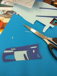
In order to create the 3D effects of the tubes of paint like the one below, I made use of analogous shades of blue to create the highlights. At the spot where the light hits the tube the most, I used the lightest shade of blue to create the effect. Similarly, at the side of the tube where there is light reflecting but not as bright, I used a shade of blue that it in the middle. These helped to make the tubes of paint 3D from a 2D picture.
As for the photo frame, I crumpled the light purple paper before cutting it into the shape needed so as to create the texture as shown in the photo. The reflection of light on the table was also recreated by the same method, using analogous shades of brown. I used different shades of brown to portray the different shades of shadows made by the light coming from the window.
I positioned the window and the table in a one-third position, using a warmer colour (analogous shades of yellow) to bring out the scenery. The window panes are in analogous shades of blue, a cooler colour, but outside the window, I used yellow as light is coming from the outside and those should use a warmer tone. To show the light reflection off the glass panel of the ADM building outside the window, different shades of yellow are used.


