After a couple of days of re-evaluating everything that I thought I knew about 3D, I came up with 2 entirely new models while improving on with the “spray bottle” model.
Model 1:
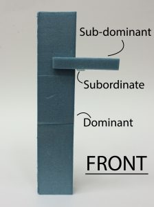
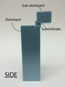
I thought it was interesting to see the D floating above ground from the SD as seen in the FRONT and SIDE view. That said, the SO piece is way too long and needs to be shaved off by so much more. I should also increase the thickness of the D and reduce the thickness of SD just slightly.
Model 2:
The SO can hardly be seen from the front side. Currently it looks like there is one D and two SO. I have to increase the presence of the SD. It might also work better if I Increased the presence of the SO.
Model 3:
I have improved on this model from the last time, adding more presence to the SD. The SO can now be seen from the top too.
I will post the 2D sketch analyses of the models to improve on them in the future.
I thought that it would have been interesting if the SD and SO cradled the D. However, the result was multiple elements with similar thickness. Other than adjusting the thickness of the pieces, I adjust the SD so that it does not run parallel to the D.
Model 2
In this model, I wanted to have a larger SD piece and instead making use of voids to give the D more presence. To make this work, I would still have to make the D bigger. Just like in model 1, the SD run parallel to D. This time, the SD is around the halfway mark of the D. It might look more interesting if it was smaller and was closer to 1/3 of D.
Model 3:
I feel that model 3 is the most interesting because it works and it floats and the SD brings balance to the model. I could improve this by creating a bigger emphasis of the SD because the height looks similar to the SO. The SO cannot be seen from the top view so I could make it a little wider so that it can be see from being wedged in the D.
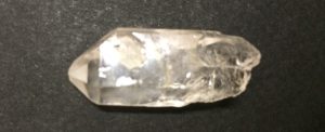
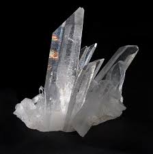
I brought a quartz to class for 3D object analysis and right now I’m regretting it because it’s just so tiny- unlike the ones in the Van Cleef & Arpels exhibit.
The principle axis runs down the quartz from the tip. The Dominant, sub-dominant and subordinate elements are harder to spot as the quartz is a singular item. Here is my educated guess:
The Dominant element is the asymmetrical shape of the gem.
The sub-dominant element is the difference in 2-dimensional shape of both the top and bottom of the quartz.
Lastly the subordinate element is the texture of the quartz. It is smooth at the apex of the quartz while progressively getting rougher at the bottom.
TopBottomTexture
Though an interesting 3D object, it is not the most ideal 3D object for analysis of D, SD, SO. It might not be completely symmetrical but the entire object builds around one principle axis which leaves a lot of room for ways to make it more interesting. For example, there could have been another tiny quartz sticking out from one side and that would have given the quartz a little something extra; something more eye-catching that texture.
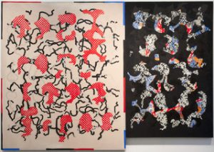
As interesting as Yves Klein is as an artist, I’ll be keeping this as closely related to 2D mark making as possible. With that in mind, let’s dive in to the deep blue.
As I lay stretched upon the beach of Nice, I began to feel hatred for birds which flew back and forth across my blue sky, cloudless sky, because they tried to bore holes in my greatest and most beautiful work.
-Yves Klein
Klein’s feelings towards the birds were in response to a spiritual activity that he was engaged in with his friends, who were also artists. They were to divide up the world between themselves. Klein got the sky and he was to “sign” his name on it- but then came the birds.
Yves Klein is most well known for his use of a single colour: International Klein blue (IKB).
In a way, Klein’s approach to art is translated in the boldness of IKB. Klein was high controversial for his time for his critique of the accepted understanding of abstract art. In the 1950s, abstract art had been accepted as a means for the artist to communicate with viewers through abstraction. Klein rebutted this notion with this monochrome blue paintings much like the one above.
He insisted that there was no motif, only “the void”.
“Blue…is beyond dimensions, whereas the other colors are not. All colours arouse specific ideas, while blue suggests at most the sea and the sky; and they, after all, are in actual, visible nature what is most abstract.”
-Yves Klein
Klein was a pioneer in developing performance art and currently, I stay in Pioneer hall. Coincidence? I think not.
Bad jokes aside, here’s a video showing the performance of two pieces of work.
With performance art, Klein wanted to put an emphasis on the immediate experience of the art itself.
Anthropometry of the Blue Period (1960)People Begin to Fly (1961)
Gaining access to one of France’s major destructive testing laboratories, he made use of “flamethrowers” to create fire paintings as shown in the video. Much like Anthropometry of the Blue Period, got his models to make prints on the canvas but covered them in fire retardant instead. He then used the “flamethrower” to create his fire paintings.
I feel that it becomes harder to feel for the kind of marks being made when you are unaware of the performance that went behind it. There is meaning in the action of using nude models and IKB. There is meaning in using fire against the fire retardant marks of the nude models.
If there is any take away from Klein, it’s that if you want getting the kind of feeling or message to come across clearly , you need to put in careful thought not just into what kind of marks you make but also how you go about making your marks.
Then again, he was also big on the idea of voids so maybe the take away is that once the performance of art is over, what is left is the remains of art; and there is an element of emptiness to the product of performance art.
2 fairly contrasting take aways for you to decide what you want to do with.
Prior to research on the 18 emotions, I tried my hand at mark making these emotions to see what would come out. Some worked and some didn’t.
And because some didn’t. It’s back to the drawing board. So with that I present to you- my chosen 18 emotions w/ visual references. The visual references are not just inspiration for what to draw but also for me to get into the headspace of the emotion.
Dread: To face whatever lies ahead with great apprehension and reluctance. I am dreading having to deal with the next 17 emotions.
Affection: A gentle feeling of fondness; the kind of love without expectations.
Exhilaration: A heart thumping, exciting, ride. No bet
Nervous: Shaking with a sort of fear that everything will go wrong very soon. Usually goes away after the item which we are nervous about has passed.
Patience: Calm and collected; unburdened. Enjoying the journey
Impatience: Burdened by purpose. Rushing to get to the destination.
Paranoia: Delusions of persecution and a general distrust of others; a form of illogical fear.
Infatuation: Butterflies in your stomach; an overwhelming sensation in your chest.
Ignore the ‘play’ sign
Indifferent: The absence of emotion.
Annoyed: Agitated and spiteful. Muted as compared to anger
Calm: Peaceful; floating in the wind; one with nature.
Dejected: Heartbroken, sad, feeling down and blue.
Anxiety: Uncontrollably jittery panic; like your heart is crumbling and the walls are closing in around you.
Lonely: Isolation from everything else.
Sorrow: Losing willpower; sinking and drowning.
Hopeless: Trying but, overwhelmed by everything, giving up. Consumed by despair.
Rage: Wild, violent and usually short bursts of anger.
For the past couple of days, I have been struggling with the seemingly impossible task of presenting qualia. I’ve sent an email to a company to get a quote on the prints but have not gotten back from them. I doubt that it will be affordable. Still, I was committed to the idea of using lenticular printing for project 1 to present qualia. At the back of my head though, I was thinking of coming up with a back up.
Cut to 27 August 2016, where I went to a hobby shop in Chinatown to get Balsa wood for Foundation 3D. The interior was filled with handcrafted helicopters hanging from the ceiling in this nook of a shop in the old and grey Fook Hai Building.
I approached the well-spoken old man running the shop for Balsa wood and got what I asked for before he went off to talk to another customer. The man’s wife approached me so I thought to ask how long they have been doing this. She told me that they have been running the shop since the 1960s and that her husband has always loved making crafts. That’s when all the dots were connected for me. The old man reminded me my grandfather and seeing how happy he was to be doing what he loved made me realise that I have been approaching this project completely wrong. Art does not have to be a struggle. It can be enjoyable and damn it all if I don’t enjoy doing this.
My grandfather loved making things. He’s been doing so since the 1970s. I want to showcase the things that he has done with him telling a story about why he made them during those times. I’m hoping to gain a deeper insight into the person that he was and the person he has become. In a way, this would be a follow up to his memoirs which I edited with friends last year for his birthday.
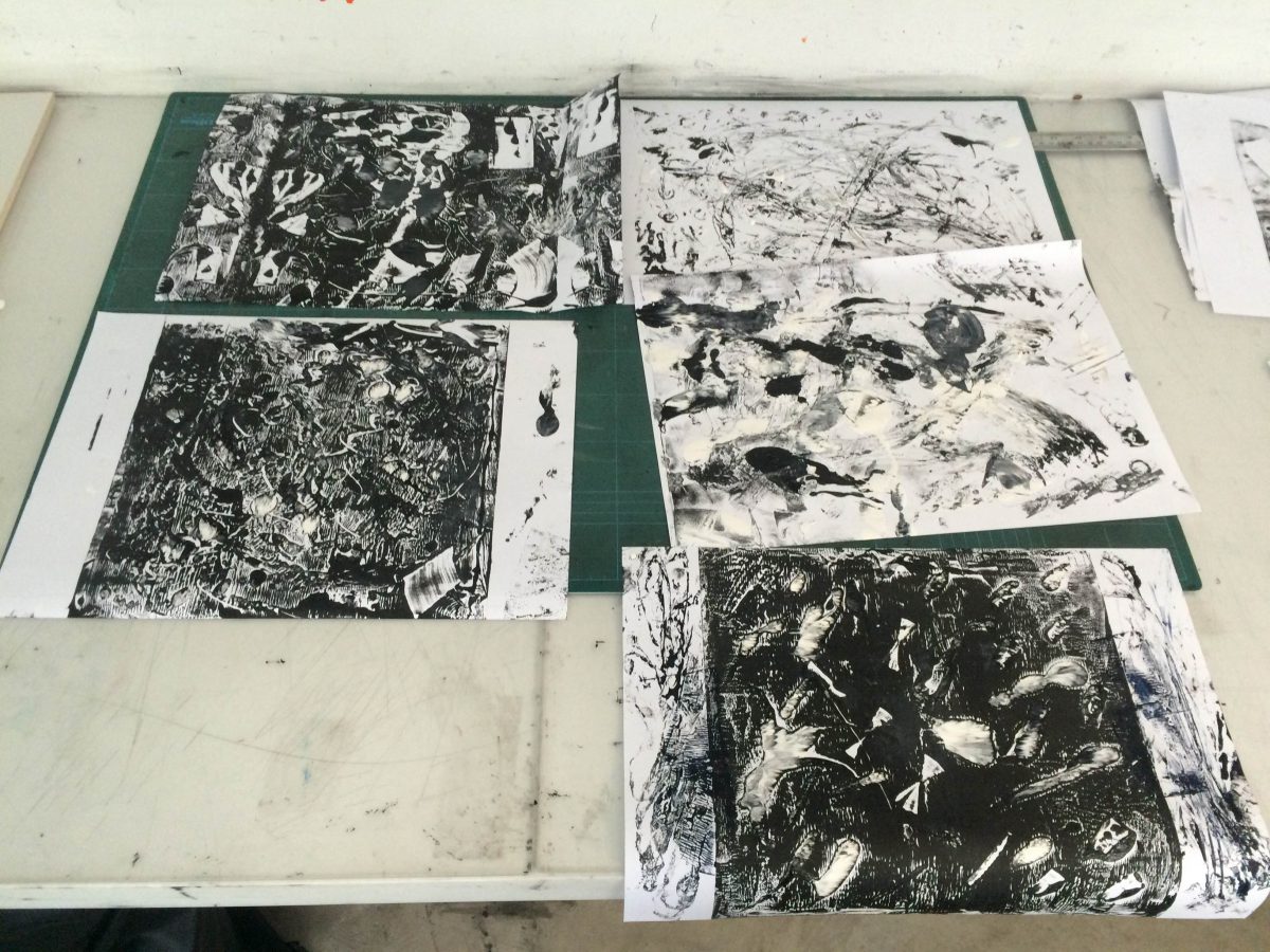
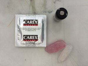
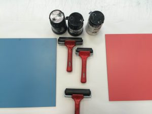
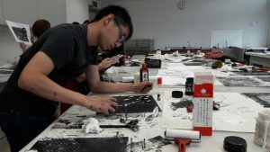
For week 2’s mark making exercise, I came in with my tools and left all wits behind me.
Always use protectionAs neat as it gets
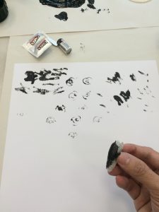
Getting off the ground, I experimented with the tools that I had to see what kind of marks they made. Following that, I just let my feelings guide my hand to create the following:
I feel that this piece has a lot of energy in it. Being the first piece that I worked on, I feel that it really shows.I feel that this piece made too much use of whites on the white background. It feels lacking.
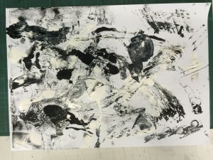
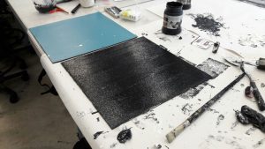
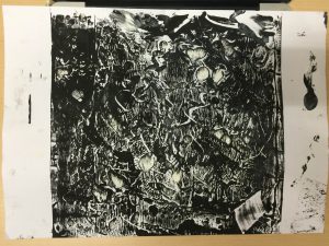
After my first two tries at mark making, I decided to try the linoleum board.
First adding a layer of black paintMuch focus, such paintExperimenting with both the use of white and negative space
Again, with the first piece, there was a lot more of feeling than thoughtful actions. This is the result.
I don’t know why but there is something about this piece is so interesting to me. This is by far my favourite.
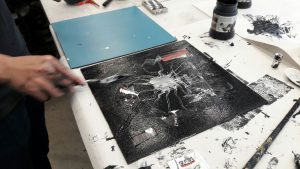
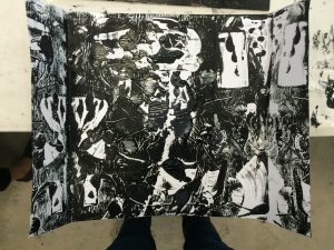
With my second try at the linoleum board, I tried to give this piece symmetry on the side while being completely asymmetrical in the middle. This is the result.
Looking back, I think there is something to this technique but the overall quality of the print on the linoleum board was lacking a point of interest. This could have been a lot better.
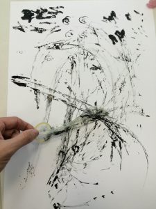
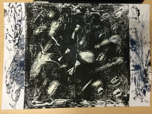
For my last piece, I did some more experimenting with ways to use my tools.
This one is a lot more controlled that the other pieces.
There is some order to this piece; more so than the rest. It feels strong and confident, with just a hint of a wild side. The process was insightful and I thought this turned out pretty decent.
To recap, always wear protection- because it’s gonna get messy.
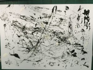
The pieces that I loved the most were the ones where I just let myself go wild. I’m going to think about what kind of emotions my pieces convey. I believe that some of them will convey more than just one emotion to me. For next week, I will definitely need to bring in more mark making tools that what I have brought. Here’s a sneak peak:
The abstract concept of consciousness has been puzzling me for the past couple of years ever since I watched the movie Waking Life. In it, a man slips in and out of lucid dreaming and experiences bizarre dreams filled with philosophical elements.
The movie title itself comes from a quote by George Santayana, ‘Sanity is madness put to good uses, waking life is a dream controlled.’
I wanted to be able to show that feeling of experiencing life as a dream. Upon further assessment, however, I realised that there was not much to that for me other than being able to express that. I wanted to go deeper.
While reading up on Consciousness, I chanced upon the word ‘Qualia‘. In Quining Qualia by Daniel Dennett, Qualia is defined as “the way things seems to us”. As an exaggerated example, how I am seeing the blue of the sky is different from how you are seeing the blue of the sky. I like to entertain the idea that Qualia is a defining aspect of consciousness; that without qualia, we are no different from robots.
While the existence of qualia is hotly debated in philosophy circles, I am not attempting to give my opinion on the matter. What I am truly interested in is the idea that everyone is experiencing entirely different things while physically going through the same thing; as per the example given. The problem that I have is that qualia is just what it is. We all experience something when we eat a fruit. we can label these experiences the same way; i.e. lemons taste ‘sour’. But we could be having different qualia; i.e. the sourness tastes different to us.
I thought about photoshopping an object to several different colours in different photos but that would be an oversimplification of qualia and completely uninspired.
Oh god, what have I gotten myself into.
With that in mind, I came up with potential ideas for Project 1:
Since it is impossible to show that we have different qualia based on the same ‘label’ (e.g. the colour ‘blue’), I want to present it in the complete opposite manner (although slightly simplified). Different fruits with the same taste (lemons, limes, grapefruits) – sour. The taste is the same but the medium of experiencing the taste is different. Conversely, for qualia, the medium is the same but the ‘taste’ is different, i.e. the medium is a lemon but what it is like to taste the lemon is different for each individual.
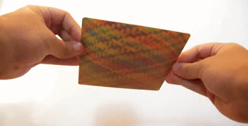
A series of colour-focused photographs that have the effect of changing in colour depending on the angle you see the photo – Lenticular printing. For example, a picture of the colour blue from straight on that turns to turquoise or teal when viewed from the side.
Class Activity 1: In which we walk around NTU to take photos that we feel express or communicate certain thoughts we have regarding the given titles.
Something that is not “NTU” at all
Having interacted with the people of NTU so far, as well as the facilities, I’ve concluded that NTU is not “waste” at all.
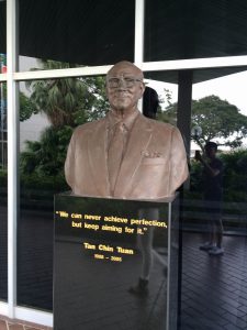
Someone not studying in NTU
This is a straight forward image of a person not studying in NTU for the simple fact that he is not with us. RIP. However, I find it interesting how his words are immortalised to inspire those who are studying here.
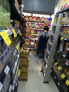
Someone studying in NTU
Not in the commonly used sense of the word, though still very literal, this woman is studying the nuts and taking stock.
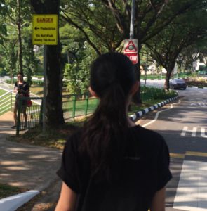
Useless image you see
This image features a sign that says “Do not walk along the road” as well as my subject’s clear disregard for the sign; myself included. I find this humorous and ironic.
Useful image you see
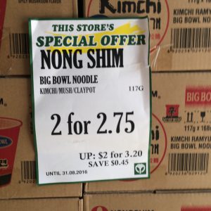
Deals, being a huge part of Singapore Culture, makes this image all the more relevant its usefulness.
Nature
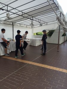
The communication and interaction between two people is a intrinsic aspect of human.
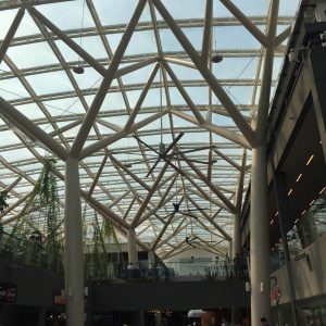
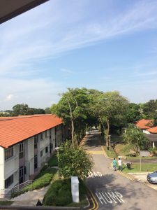
Urban Nature
Making use of nature as inspiration, the design of this building is made to look like the canopy of a forest.
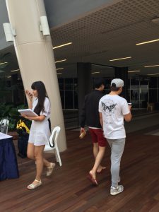
Urban
It is ironic that the phones are used for communication but as a result, ruins live interaction and communication. This is a stark contrast from nature.
Singapore
National Service and Singapore (to me) are synonymous. Everything we did, we did for the country. Through the pains and struggle, we form bonds and become family.
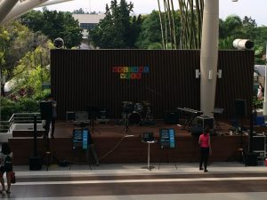
A place where art is shown
Quite literally, this is a stage where art is performed in various mediums.
A place where art is made
My attempt at being clever by saying that art is made in my mind.
A photograph with a faculty
Taken from just opposite Faculty Avenue, this avenue of its own runs along a row of houses where several faculty of NTU stay.
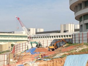
What the Earth Observatory of Singapore may be about
EOS is about the researching of climate change, earthquakes, volcanic eruptions and tsunamis – represented by the ongoing construction, colours and strong shadows caused by sunlight.