
Mr. Hercules
Artist’s statement:
My Kong Kong is Mr. Hercules.
Mr. Hercules
Artist’s statement:
My Kong Kong is Mr. Hercules.
This one ends with a special thanks to Kong Kong before the audio fades out.
I also try to do the putting in another photo so that the trophy photo doesn’t stay on for too long. Maybe it’s okay, maybe it’s not. I’ll ask around for opinions.
Artist’s Statement process.
Okay, not really. This was all done digitally but handwriting shows thought process so- there we go.
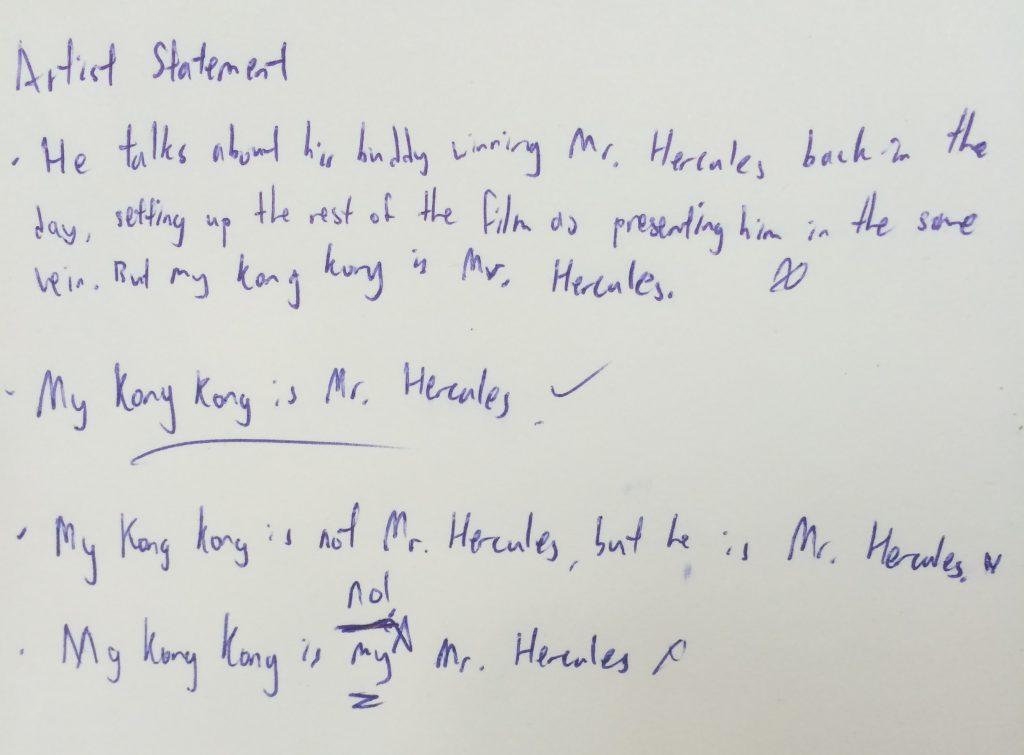
I really did not want to include “my” as can be see in the last sample sentence. It just feels so needlessly manipulative of emotions. I want it to be understated. I am going to go with My Kong Kong is Mr. Hercules.
This first one is one of the final edits but with the title as Josiah Tan’s Mr Hercules. In the intro, he talks so passionately about his friend being Mr. Hercules that I thought it was a good set up for the rest of the film, hopefully, being me passionately presenting him as my “Mr. Hercules”.
Using Josiah Tan’s Mr. Hercules was a little quirky so I tried to just put Mr. Hercules. The idea is for people to form the connection themselves. Hopefully this one works.
I tried shifting the timings for the title and credits, but I think I will stick to the first one. It also feels like the ending is abrupt. I need something to end the film. I am really hesitant to do a film dissolve- I’ll try to find some other way around it.
I am considering putting in a shot of my grandparents with my father and his siblings during the part where he talks about his family going to see him at the competition. Will draft it out and see how it goes from there.
And a new beginning.
This film is entitled Josiah Tan’s Mr. Universe with the idea that he is my Mr. Universe. (Yeah it’s cheesy, let’s move on) He was my hero growing up because he was so strong. Mr. Universe is a title given to a bodybuilder who has won the the Mr. Universe Bodybuilding competition. Hence- connect the dots.
From the interview, I had him talk about his bodybuilding “career” from a couple of photos. In all honesty, I chose not to use footage of the interview because I had to hold the camera up (refer to the previous 4D post). I feel that the way the interview was done gave off the atmosphere that I wanted and it transitions well to the final scene.
Okay this is in the same post, but I came up with this version (the proper version). There was a soundbite of him talking about one of his gym buddies posing together near the old Cathay building. He talked about how his gym buddy won the the Mr. Hercules competition during the release of Hercules (1958 film). After listening to that, I decided to include that soundbite into the start of the film before introducing him as my Mr. Hercules. Because I show his face towards the end of that one scene, it allows the audience to see him as a regular person before seeing him as I see him.
Maybe this is the last version?
Who am I kidding. I have one more day. Post-production never ends until the deadline.
I decided to change the shots and feel of the film. It felt too much like I was working around with a found audio and that did not mesh with with the visuals. The damn laughter was disrupting the feel of the scene.
I interviewed my grandfather in hopes that something good will come out of it.
I faced many challenges in that it is not possible to get him to repeat lines in the way that certain documentary/corporate videos do. If I don’t have the camera already on him, I would miss certain soundbites that I just won’t ever get again. He does this thing where he talks as if he is narrating to someone instead of talking to me. It messes things up for me as I am trying to make this feel personal.
In my attempt to get the most natural soundbites, I have to face him; actually having a conversation with him. As a result, I can’t focus on the camerawork. Furthermore I don’t have a tripod and to add on, he keeps moving around. I have to hold the camera.
I might just use the audio from the footage which I feel was of decent quality, I feel.
In the post-production stage, I will having him talking over images/photos from his bodybuilding days ( I might cut to show him looking more plump and regular before cutting to him flexing his muscles in the garden).
I hope things work out.
A Heartland Christmas


This was the first composition that I worked on and the beginning of my struggles. Up until now, I still think that I have a lot to learn about colours but this was a good start to have.
Colour Palette Choice & Meaning
I wanted to make use of traditional Christmas colours. I also foolishly attempted to use split complimentary colours on my first 3 frames. I made composed each frame in this set before adding the colours. I also made use of monochromatic colours to create shadows.
Other than the obvious relation that Red and Green have to Christmas-
Red was used to evoke a sense of passion and enthusiasm for the arrival of Santa Claus and the celebrations of Christmas. A deeper red was used to represent my mother for “a mother’s love”.
The colour green was used to compliment the colour red. The green used here is also meant to evoke a sense of life. Green was used to represent my father as he is the down-to-earth one. In this way, my parents compliment each other.
Blue was used to create a sense of quiet in the each frame. While the feelings about Xmas are quite lively and energetic, we spend time together in comfortable silence. This is especially true because we all sleep early. We treasure sleep very much.
Cream? Very light Yellow?: I thought about using white because it is commonly associated with Xmas, but Singapore does not experience a white Xmas. Instead, I opted for something different. I used this “cream” colour to give the composition a little warmth to contrast with the cool night sky and the cool living room.
The gold of the bells and baubles are such because that’s the colours that they normally come in. Also, the use of different colours gives off the sense of celebration and cheer.
David vs. Goliath (Bullies)


Colour Palette Choice & Meaning
For this set, I wanted to make use of triadic colours. The most dominant colour is red and it is used to represent the danger in the first two frames as well as aggression in all the frames. I had the blue which is used to represent uniformity and sadness. The yellow and blue were mostly used in tribute to my own primary school which uses the same colours. Yellow often represents cheerfulness but in this, it represents youthfulness. Next to the blue and red, it represents the sadness and pains of growing up.
Sesame Street


Colour Palette Choice & Meaning
For this set, I used mostly monochromatic colours with a a little use of analogous colours. Monochromatic colours of grey-ish green was used to bring out a sense of bleakness and depression. The analogous yellow was used to evoke a sense of hope, which was why it was used so sparingly. In addition, Oscar’s colour is in a particular shade of green, which represent trash and dirt.
The Perfect Pair


For this set, I used mostly monochromatic colours. I find monochromatic colours to be generally more harmonious to work with. To make other elements stand out, namely the character of me, the significant other, and the priest (and also sock Jesus), I made strong use of vibrant, bright colours for me and my significant other. Because the priest is part of the church, I used blue to make him not completely pop out in the frame; blue also represents faith and devotion. Sock Jesus happens to be white to represent holiness and purity.
After completing this assignment, I feel more keen to experiment with colours because I have still so much to learn. This was a good kickstarter and I hope that I will be more conscious in colour decisions. In film, colour grading plays a big part in setting the tone. I need to get better at this.
Things that I have learnt:
Live paint (Illustrator) is pretty amazing – Thanks Kim for teaching me how to use this.
Paletteon.com is great.
Shortcuts with pen tool. (I have become more proficient with Ai.
Good job, Highsock. Maybe you didn’t score, but at least you failed and you learnt. You learnt something and that is the point of school.
You have to break a few eggs.
And break a some eggs, I did.
I wish that I had taken screenshots of my first try at working on the compositions, but I was really just trying out the pen tool in Illustrator.
As you can expect, it didn’t work out so well.
I worked on the Xmas composition first, thinking that because of the usual Xmas colours (Red, Green, White), I would not have to think about the colours so much. How Rong was I? I was so wrong.

There was something about it that just looked bad. I could tell, but I just didn’t know what. I approached The Kim Nguyen of G2 for advice.

She brought to my attention the use of colours as tones – something that we had learnt in Foundation Drawing while working with pastels.
She also showed me a couple of illustrations that she was inspired by and that got me thinking about illustrations that I liked – namely Steven Universe (A cartoon show). I chanced upon the artwork of one of the art directors of Steven Universe, Elle Michalka.


With this newly acquired knowledge, I started working on the compositions, proper.


This project is the one that I dread the most because I have huge difficulty working with colours. I just don’t feel that strongly for the effects of colours when I am using them. I can recognise good use of colours some times, but most times I just don’t feel that strongly for that one type of red over the other type of red. Woe is me.
For this project, my main objective is to be able to create harmonious compositions in terms of use of colours.
I will be using illustrator because that is the only medium I know where you can cmd+z.
To start off, I based all depictions of characters off my instagram name: Highsock. (A name that people in G2 have come to associate me with)

From there, I did mindmap of potential ideas; some more dark than others.


After this, I decided on my final four equations.
After consulting friends, I have crafted the next draft.
First of all, I tried to place the titles with the shot instead of on a black screen. I am considering removing the titles either at the front or the end.
Next, I cleaned up the editing just a little to make the jump cuts a little smoother. Although the jump cuts are jarring, it still has flow.
I changed the font of the thank you to be “handwritten”. This feels more personal. I might try actually handwriting the text out.
I played with the use of black screen to give off the feel of quiet. It flows better, in my opinion. I am still hesitant about using the black screen as it, technically, does not add anything. It does, however, gives the audience time to breathe.
Hopefully this will be the 2nd last draft. Sorry for posting so much.


