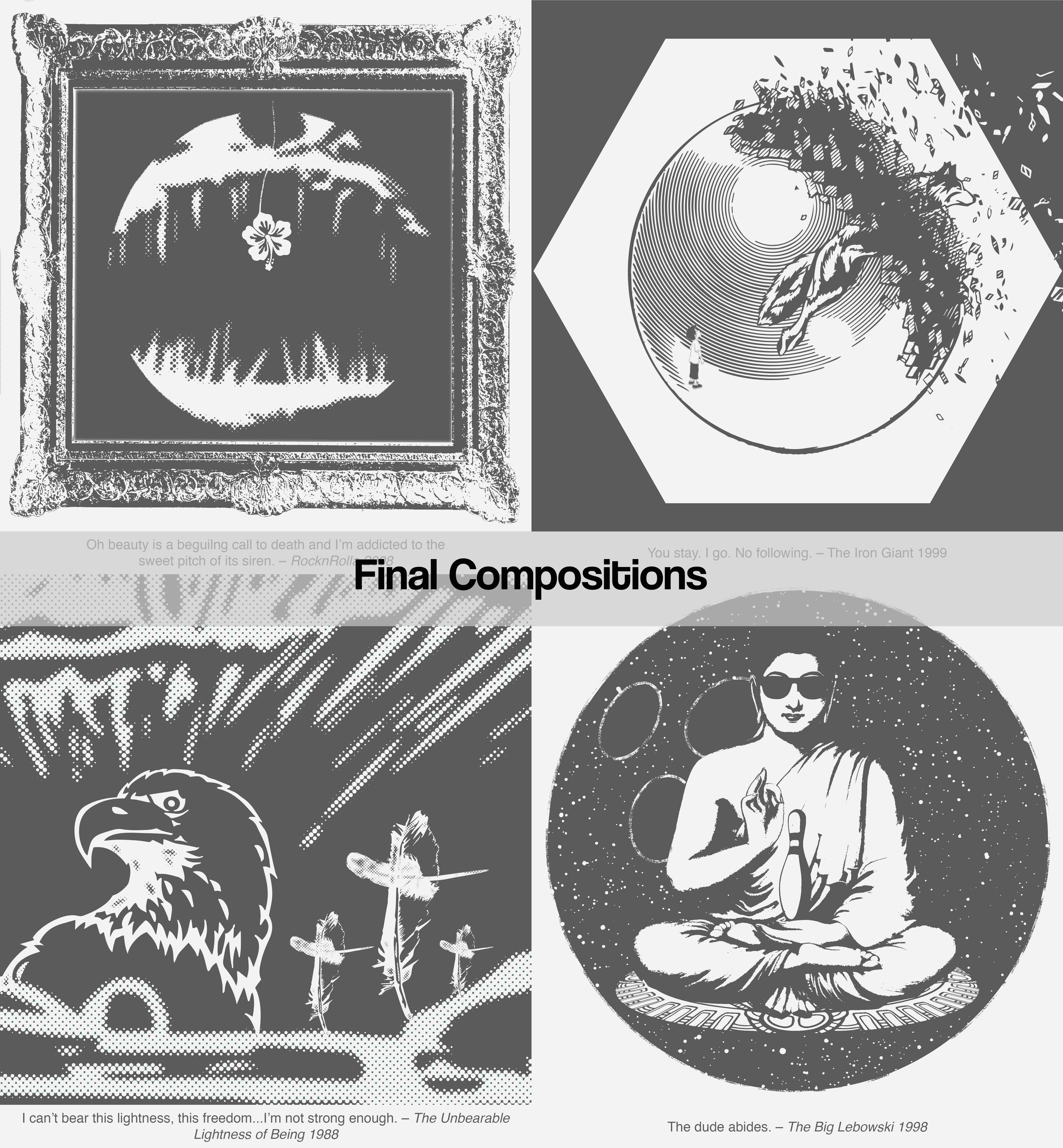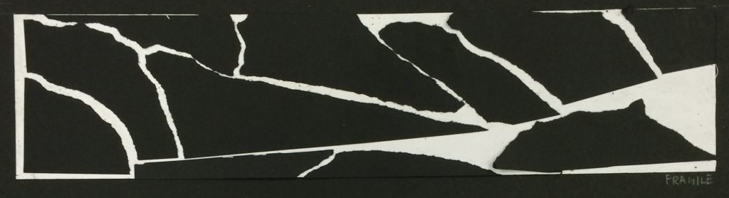
1. Fragile –
Delicate and vulnerable; easily broken.
Technique: Tearing pieces of black paper and piecing them back together, slightly further apart.
The lines of the broken paper give off the tense feeling of everything about to break apart. The sharp and jagged edges accentuates the need to be gentle and careful towards vulnerability.
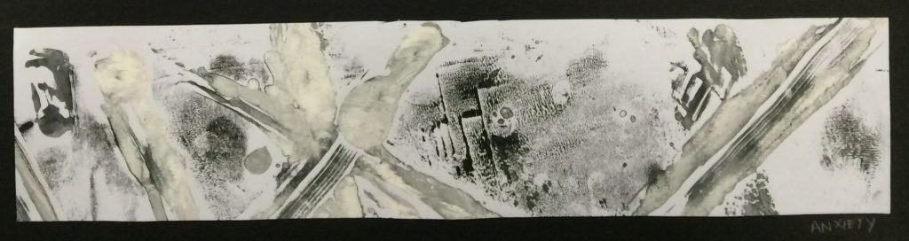
2. Anxiety –
A feeling of worry, nervousness, or unease. Walls closing in around you; like being pierced by the very air around you.
Technique: Monoprinting with white and black paint.
The sharp and heavy white lines cut across the paper – like the piercing sensation in your lungs when you have difficulty breathing. The grey spots almost seem to creep out from the paper, giving the feeling of unease. The layers and layers of black paint slanting walls close in – suffocating.
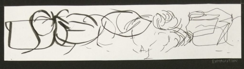
3. Exhaustion –
Fatigued; low on energy. “Shag, cannot think” – Every Singaporean son.
Technique: Different sized marker pens and blind drawing.
The lines make little sense and also progressively get fainter. Strokes get shorter and more half-hearted. The short strokes also occasionally sink lower, getting fatigued. This creates the effect of feeling exhausted.
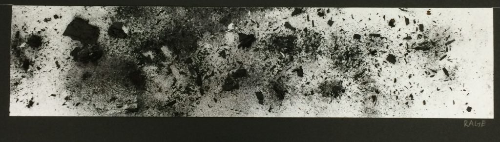
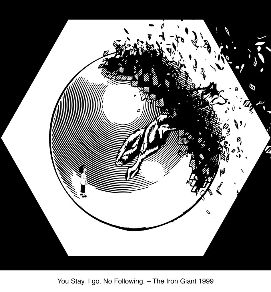
4. Rage –
Violent, uncontrollable anger. Expressive and explosive negative energy.
Technique: Crushed charcoal glued on paper.
The marks made look almost like an explosion from a point the causes debris to fly in all directions. The debris even bounces off the left side of the paper, ricocheting back. It seems to start off centre to accentuate movement. Similarly rage is erratic, uncontrollable, and explosive.
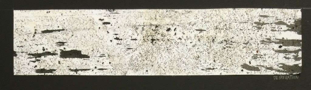
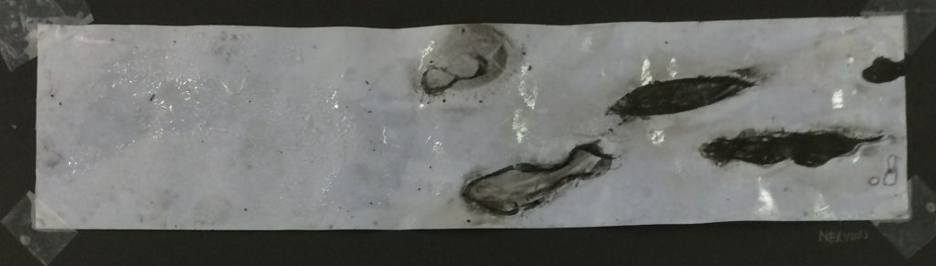
5. Desperation –
A state of fear that results in rash or extreme behaviour; potentially losing one’s sense of self in the process.
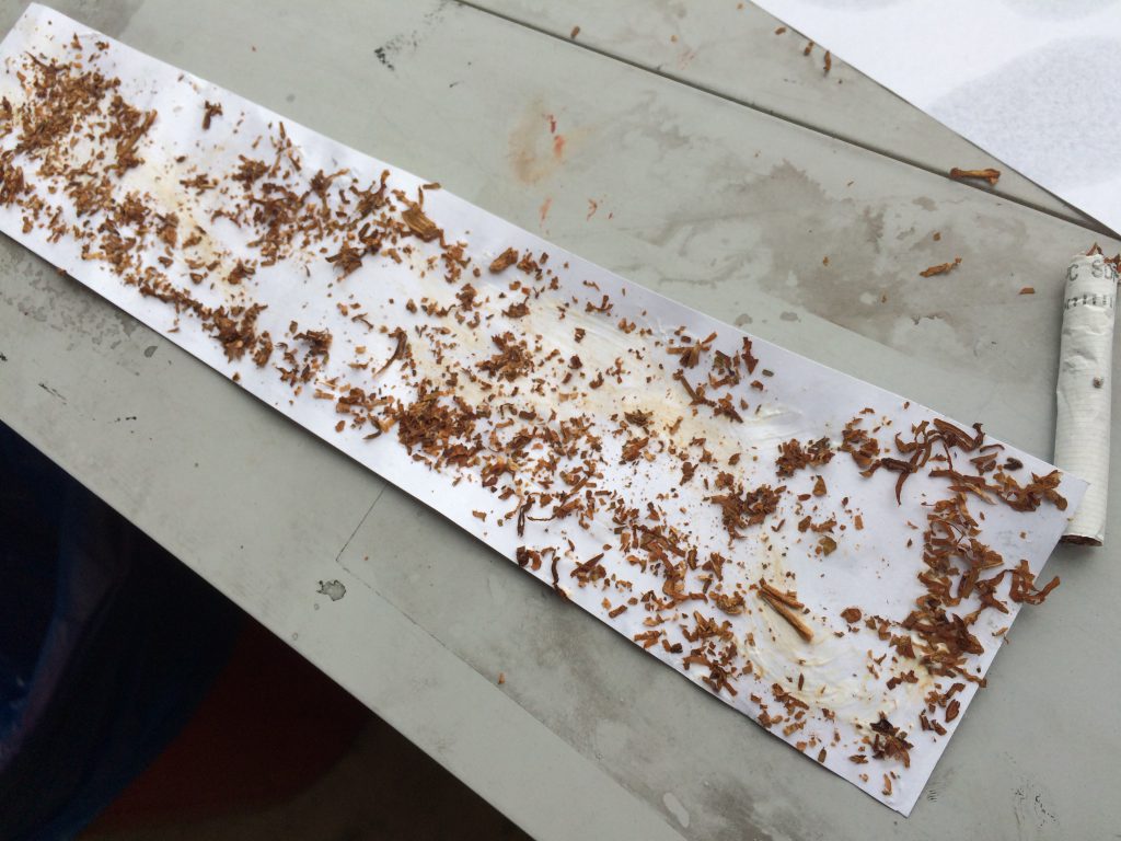
Technique: Sand glued on paper.
The ink blotches loses its sense of self as it is dragged backwards while trying desperately to stay ahead. In the process of doing so, it gets ripped apart. The tiny black sand gives the sense of chaos that is tearing the ink blotches.
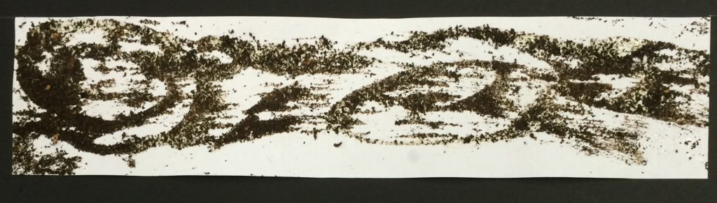
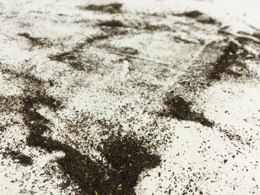
6. Turbulent –
Confusion, disorder, and disorienting.
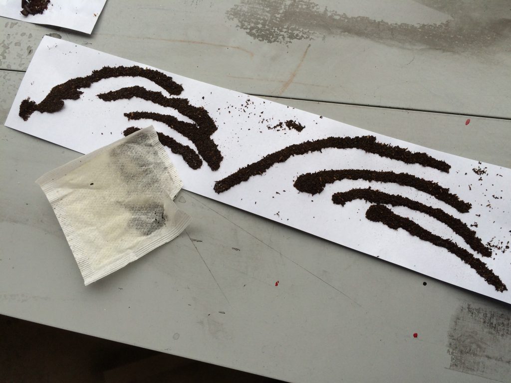
Technique: Tea leaves glued on paper.
The tea leaves start off as dark swirls of confusion that become lighter as it gets dragged by the forces around it. It starts off at the bottom of the paper before immediately being swept off the ground, unable to land for even a moment.
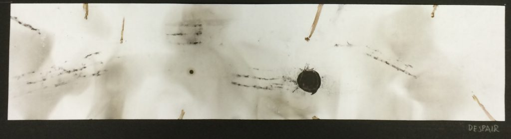
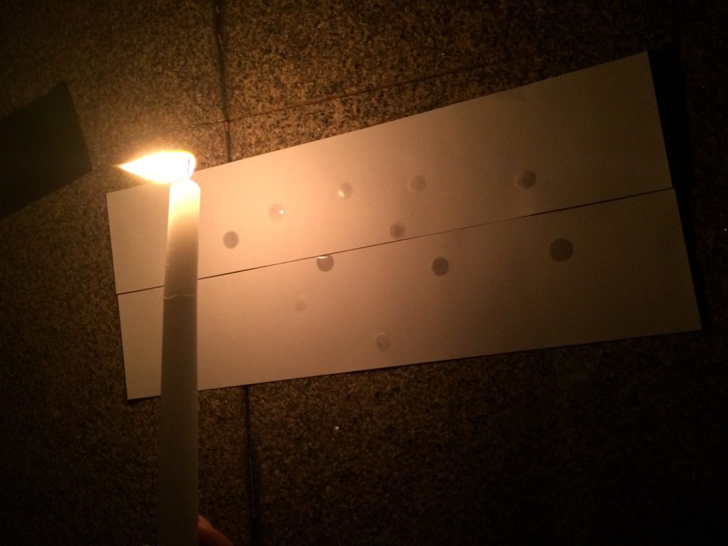
7. Despair –
The complete absence of hope, like being stalked by the abyss.
Technique: Letting flame from candle lick the paper.
The lone black dot is stalked by the burnt marks and brown lines of the abyss – the unknown darkness. Just being there in a form of stasis, there is no hope.
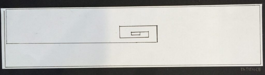
8. Patience –
The absence of annoyance and anxiety; inner peace and calm. Tolerant.
Technique: Marker pen and ruler
The straight continuous line moves along with no quarrel to its destination. The white space gives off the feeling on lightness and inner peace of the black line.
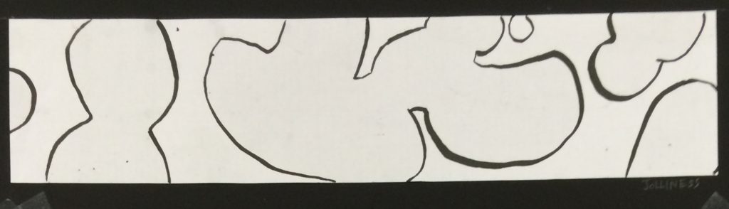
9. Jolliness –
Happy and cheerful.
Technique: Dripping Citronella oil on paper, then tracing with marker pen.
The bubbly, bold blobs are just floating around in space, having the time of their lives, doing what they please.The variations in thickness of the lines give a 3 dimensional feel to it, making it look at though the blobs are floating around.
10. Nervousness –
Sweating at the thought of your worries, typically about an imminent event or something with an uncertain outcome.
Technique: Rolling gel wax on paper to form a layer on the paper, then applying a flame to certain areas to remove the wax. Lastly using a marker pen to colour over the exposed area.
The paper is reflective, looking like it is sweating at the impending dark, unknown, unfamiliar blocks that look like they are approaching fast. The empty space is a metaphor for being at a loss for words like the mind blanking out at the thought of the imminent event. The dark blobs get lighter as it approaches the white space, showing that the worries are less scary that we imagine them to be.
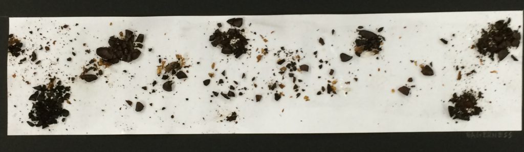
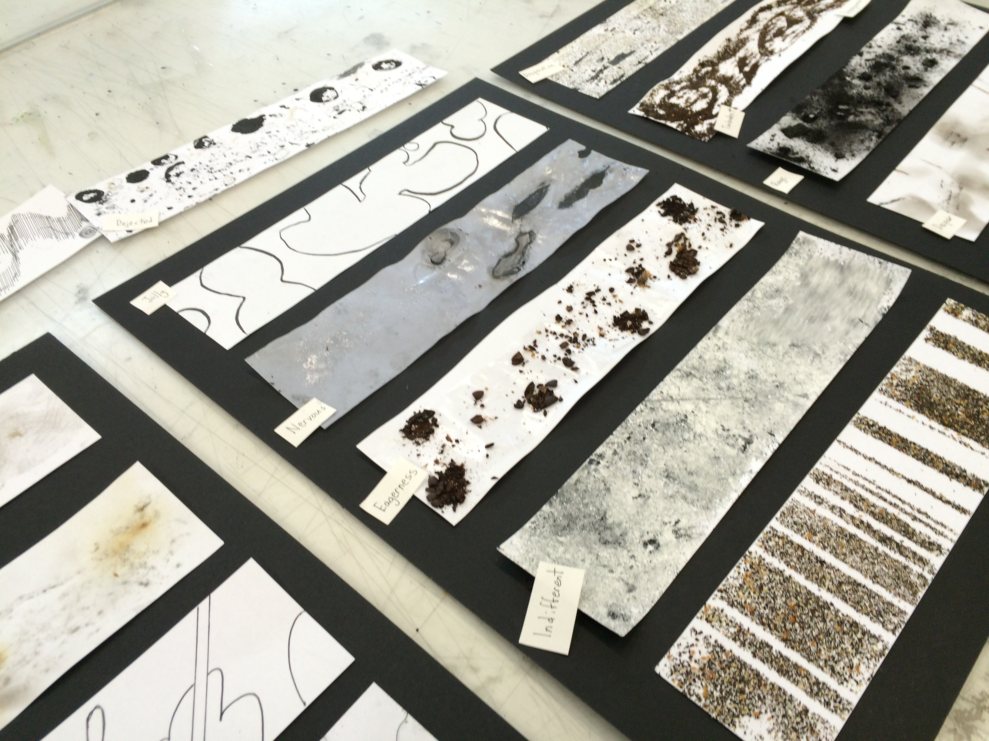
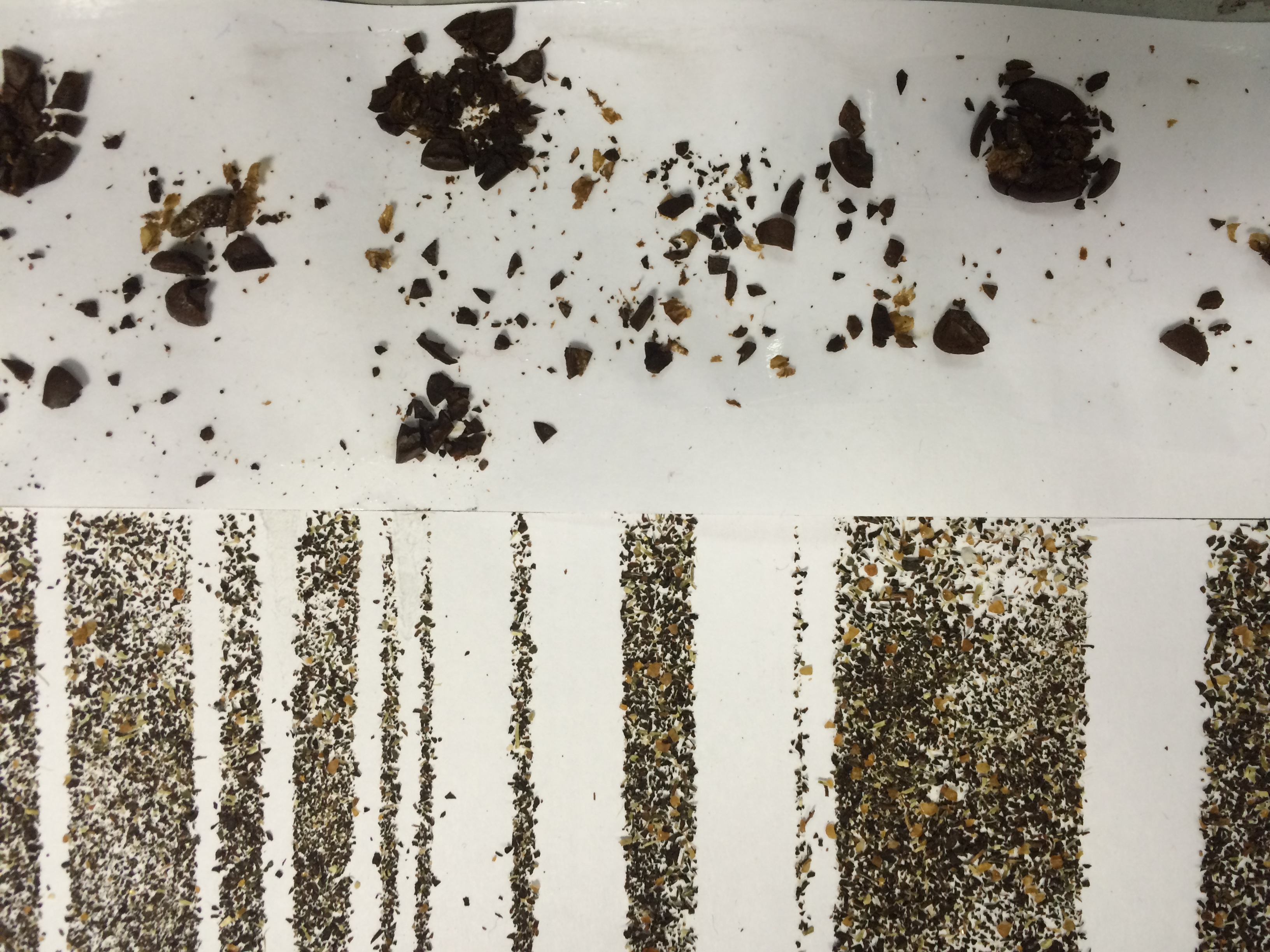
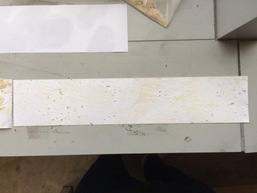
11. Eagerness –
Keen interest and excitement; sparks of high energy.
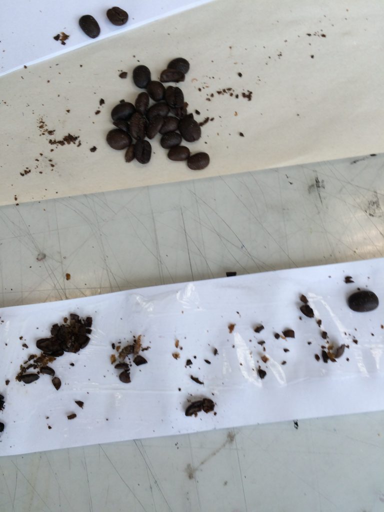
Technique: Coffee glued on paper.
The mini explosions are trying to contain itself but alas, eagerness gets the better of them and they burst out into smaller bits. The small bits look like a wave flowing through the mini explosions, like being carried by the excitement.
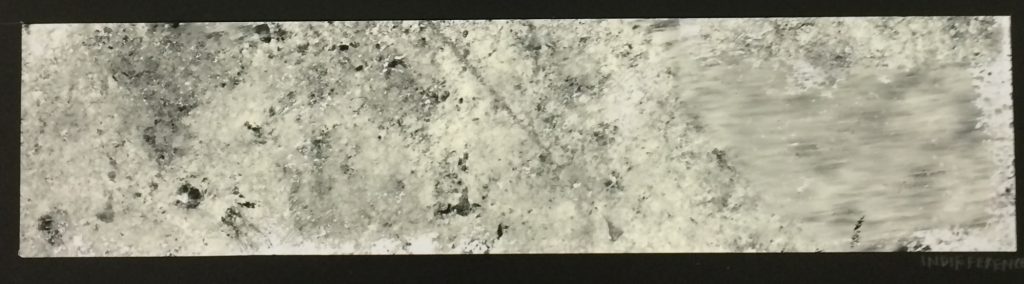
12. Indifferent –
The absence of emotion.
Technique: Monoprinting with linoleum board.
The paint marks have no beginning, middle or end, just the paint of uniformity and towards the right side, wiping itself off of having any emotions.
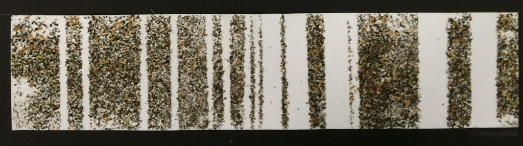
13. Contentment –
Being in a state of tranquil happiness; satisfied.
Technique: Tea leaves glued on paper with masking tape, which was later removed.
The bars of the tea leaves and the white space may vary. There might be discomfort within the bars, shown in “noise” of the tea leaves, but the bars of tea leaves still remain vertical, tranquil, and happy.
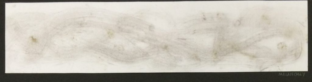
14. Melancholy –
A feeling of pensive sadness, typically with no obvious cause.
Technique: Charcoal on paper.
The faint lines thrash in the pain of sadness, seemingly being attacked by the darker marks. The lines seem to have no beginning, it just exists and it experiences the pain.
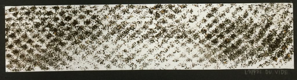
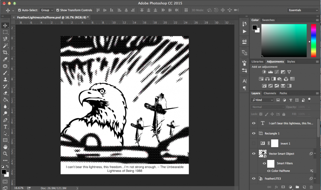
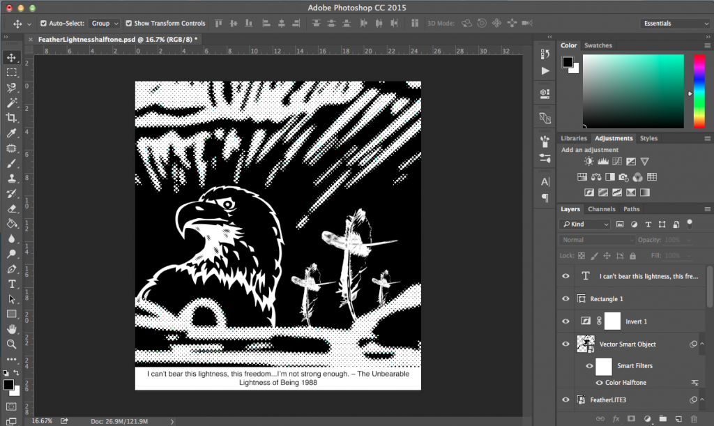
15. L’appel du vide –
The feeling you get when you, for example, see a car driving by and have the sudden urge to jump in front of it. “Anyone whose goal is ‘something higher’ must expect someday to suffer vertigo. What is vertigo? Fear of falling? No, Vertigo is something other than fear of falling. It is the voice of the emptiness below us which tempts and lures us, it is the desire to fall, against which, terrified, we defend ourselves.” – Milan Kundera, The unbearable lightness of being
Technique: Using the foam netting used to wrap apples in, stretching it out and spraying spray mount onto the paper, before pasting tea leaves onto it. As a result, only certain areas of the paper has tea leaves stick to the paper.
The white space in the centre is being lured into the hypnotic lattice of the void. The white space is turtled up in defence but the call of the void is strong and has begun penetrating the white space.
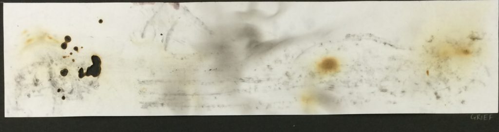
16. Grief –
Deep sorrow, especially as a result of the loss of someone’s life.
Technique: Letting flame from candle lick the paper – even burning it a little.
A hole is burnt with the loss of someone. What follows is the deep, dark, shadowy embrace of sorrow – calling out to the scars left by grief. Eventually, grief passes and wounds heal, but the scars remain – represented by the grey marks and the burn marks without holes.
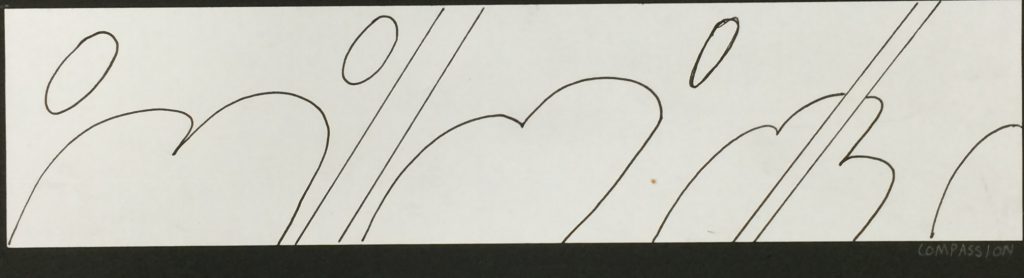
17. Compassion –
A gentle feeling of fondness; the kind of love without expectations.
Technique: Marker Pen on paper.
The pillowy embrace of the curved elements endures through the cutting pains of loving,
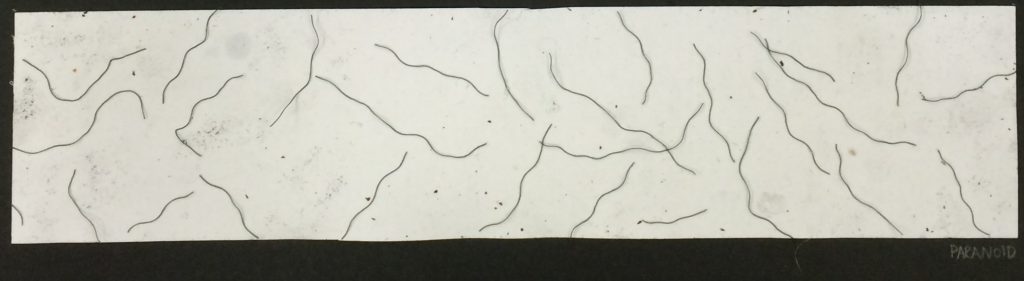
18. Paranoid –
Delusions of persecution and a general distrust of others; a form of illogical fear.
Technique: String glued on paper, with dirt loosely scattered on.
The wormy lines of the string give goosebumps on the paper; overwhelming it even. The strings are harmless but it still gives off a sense of unease. The “dirt” on the paper, complimented by the wormy lines, give off the feeling of being buried alive.
Honourable mentions
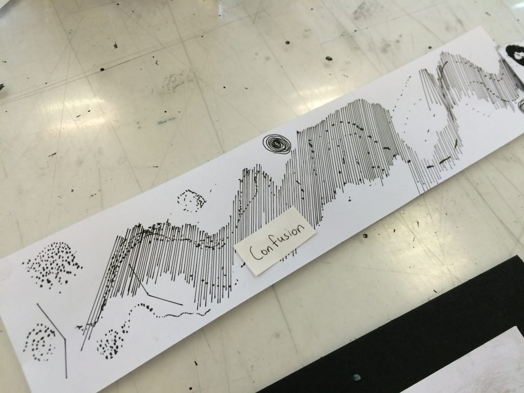
Confusion
Feeling as if you can’t think clearly. Disoriented and having difficulty focusing. Incoherence of thought.
Technique: Pen on paper.
Random styles including dots and lines and swirls make it difficult to focus. There is a lack of coherence in the overall make up of the lines and marks – coming off as disorienting.
Depaysement
Being without a country. Exhilarating and disorienting swirls of giddiness from being an outsider.
Technique: Tea leaves glued on paper.
The swirls give rising up spinning around, like a roller coaster, but being swept to the side in the midst of it.
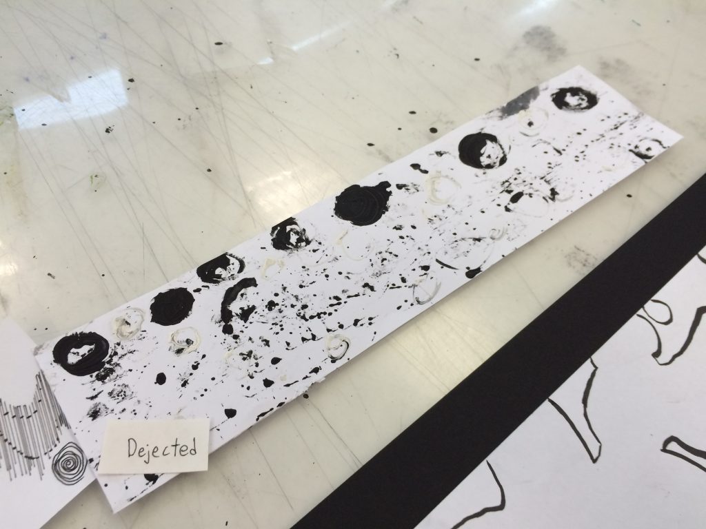
Dejection
Heartbroken and feeling down.
Technique: Monoprinting with paint on lithium ion batteries.
The balls of black get heartbroken and it feels like a hole in their chest. They get broken and sink to the bottom of the paper as nothing more than dots of black.
So, you could say Dejection got dejected. How poetic.