Josiah – Ego

A Heartland Christmas

ego_rgb_xmas-setting ego_rgb_xmas-meego_rgb_xmas-result

This was the first composition that I worked on and the beginning of my struggles. Up until now, I still think that I have a lot to learn about colours but this was a good start to have.

Colour Palette Choice & Meaning

I wanted to make use of traditional Christmas colours. I also foolishly attempted to use split complimentary colours on my first 3 frames. I made composed each frame in this set before adding the colours. I also made use of monochromatic colours to create shadows.

Other than the obvious relation that Red and Green have to Christmas-

Red was used to evoke a sense of passion and enthusiasm for the arrival of Santa Claus and the celebrations of Christmas. A deeper red was used to represent my mother for “a mother’s love”.

The colour green was used to compliment the colour red. The green used here is also meant to evoke a sense of life. Green was used to represent my father as he is the down-to-earth one. In this way, my parents compliment each other.

Blue was used to create a sense of quiet in the each frame. While the feelings about Xmas are quite lively and energetic, we spend time together in comfortable silence. This is especially true because we all sleep early. We treasure sleep very much.

Cream? Very light Yellow?: I thought about using white because it is commonly associated with Xmas, but Singapore does not experience a white Xmas. Instead, I opted for something different. I used this “cream” colour to give the composition a little warmth to contrast with the cool night sky and the cool living room.

The gold of the bells and baubles are such because that’s the colours that they normally come in. Also, the use of different colours gives off the sense of celebration and cheer.


David vs. Goliath (Bullies)

schoolme_school-me

ego_rgb_school-setting ego_rgb_school-result

Colour Palette Choice & Meaning

For this set, I wanted to make use of triadic colours. The most dominant colour is red and it is used to represent the danger in the first two frames as well as aggression in all the frames. I had the blue which is used to represent uniformity and sadness. The yellow and blue were mostly used in tribute to my own primary school which uses the same colours. Yellow often represents cheerfulness but in this, it represents youthfulness. Next to the blue and red, it represents the sadness and pains of growing up.


Sesame Street

ego_rgb_sesamest-meego_rgb_sesamest-setting ego_rgb_sesamest-result

Colour Palette Choice & Meaning

For this set, I used mostly monochromatic colours with a a little use of analogous colours. Monochromatic colours of grey-ish green was used to bring out a sense of bleakness and depression. The analogous yellow was used to evoke a sense of hope, which was why it was used so sparingly. In addition, Oscar’s colour is in a particular shade of green, which represent trash and dirt.


The Perfect Pair

ego_rgb_marriage-me

ego_rgb_marriage-setting ego_rgb_marriage-result

For this set, I used mostly monochromatic colours. I find monochromatic colours to be generally more harmonious to work with. To make other elements stand out, namely the character of me, the significant other, and the priest (and also sock Jesus), I made strong use of vibrant, bright colours for me and my significant other. Because the priest is part of the church, I used blue to make him not completely pop out in the frame; blue also represents faith and devotion. Sock Jesus happens to be white to represent holiness and purity.


After completing this assignment, I feel more keen to experiment with colours because I have still so much to learn. This was a good kickstarter and I hope that I will be more conscious in colour decisions. In film, colour grading plays a big part in setting the tone. I need to get better at this.


Things that I have learnt:

Live paint (Illustrator) is pretty amazing – Thanks Kim for teaching me how to use this.

Paletteon.com is great.

Shortcuts with pen tool. (I have become more proficient with Ai.


Good job, Highsock. Maybe you didn’t score, but at least you failed and you learnt. You learnt something and that is the point of school.

Josiah – Forrest Gump

1.

rocknrolla2

Visual Elements:

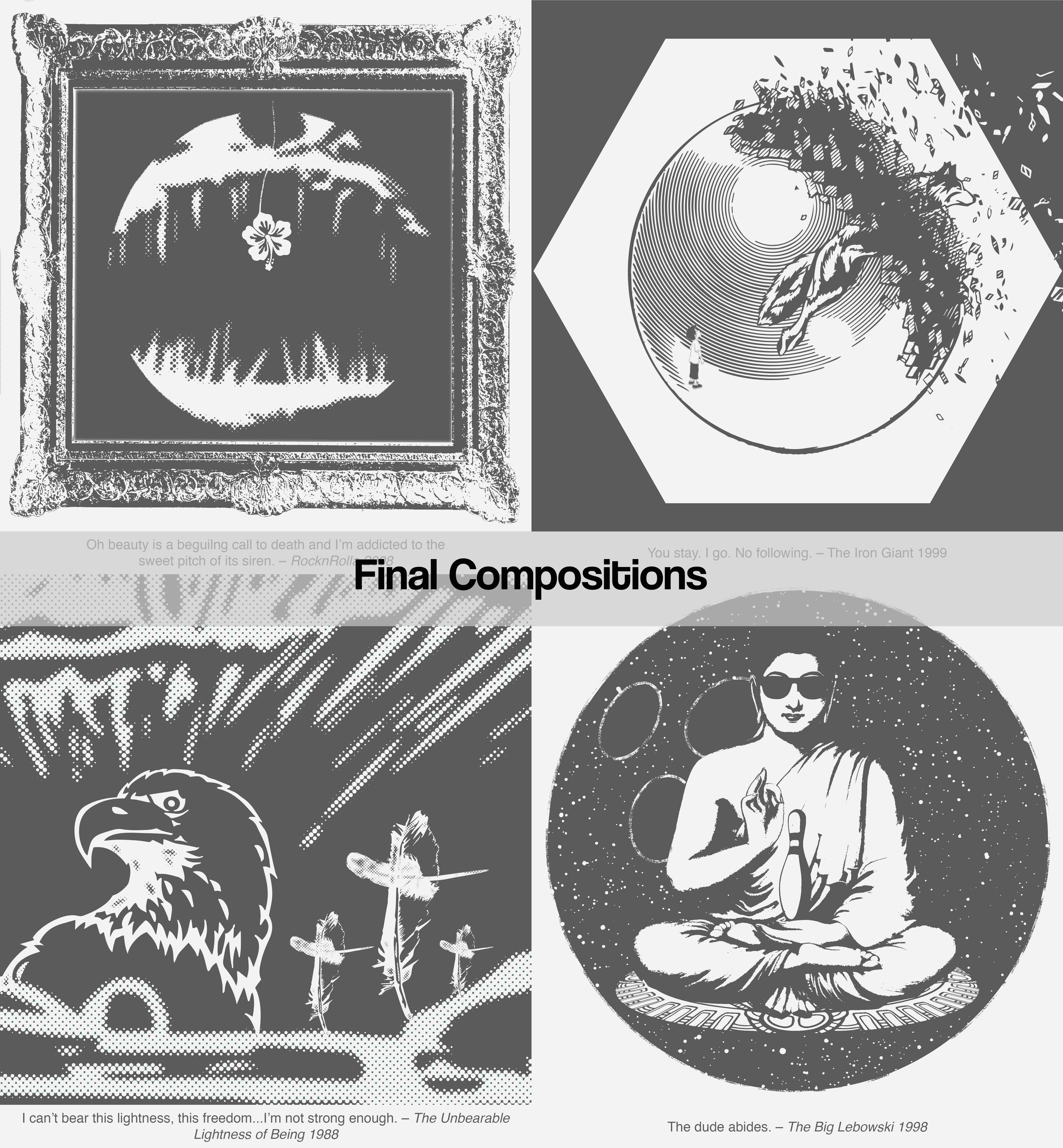
The quote means that beauty is a lure to death. The angler fish is frightening and also a representation of that lure to death and the lure of the angler fish is a flower, which is the representation of beauty. I used a hibiscus flower as it represented acknowledging beauty in Victorian times. The pistil of the hibiscus is a line that draws your attention towards the flower itself – just like a lure.The halftone of the angler fish gives it a level of depth as it looks like it is in the shadows. This is in contrast to the flower that is clear as day. The painting frame is a nod to the film, where a character says the above quote in response to not wanting to give up a painting. Coincidentally, a painting is also a symbol of beauty. The frame gives depth to the image within which enhances the feeling of being lured into the void that is death, hence the use of a black ‘canvas’.

Design Principles:

Unity/Harmony – Perspective is used to show depth or distance between the frame, the angler fish and its lure.

Symmetry – The symmetrical balance of the composition gives off the feeling of calm and patience; like being stalked by a predator. “It’s quiet…too quiet.”

Similarity/Contrast – Contrast of the negative space and the angler fish make the subject pop out, like from the shadows.

Dominance/Emphasis/ – The flower is at the centre of the frame and the halftone of the angler fish makes it recede into the back. This makes the flower the centre of attention.

Hierarchy – The frame and lines leading you into the elements within it. The angler fish has the subject of the flower within it. Each of these things lead your eye to the flower in the centre.

Scale/Proportion – The flower is a lot smaller than the angler fish. This is to make the angler fish seem larger and therefore increase the sense of danger and tension.


2.

iron-giant

Visual Elements:

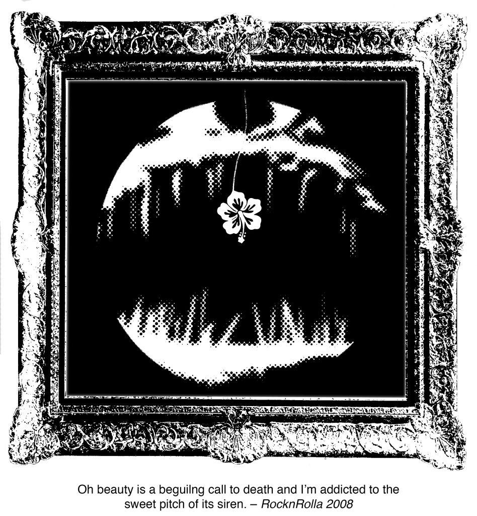
The quote is about sacrifice and letting go. I started out with the image of a nut, used to hold all the elements within. The wolf is a representation of the Iron Giant. It is leaping out of the sphere that is breaking apart. It leaps to the void to protect the innocent boy. The boy looks on at the wolf. The way the boy looks at the wolf feels like a farewell. The sphere at the centre of the composition is a representation of the world. The sphere is breaking apart. It is literally about the world that is about to be destroyed, leaving the Iron Giant to protect it. It is also about how the boy’s world is about to be shattered because the Iron Giant is about to leave to sacrifice itself.

Design Principles:

Symmetry/Asymmetry – While the composition looks almost flat and symmetrical, the breaking of the sphere breaks the symmetry. This adds to the feeling of unease at the loss of something precious. It also makes the composition more dynamic.

Hierarchy/Scale/Proportion – Apart from the broken bits of the sphere directing your attention to the wolf, the size of the wolf is much bigger is also leaping out. The lines of the principle axis of the wolf leads you to the boy who is looking towards the wolf, forming an imaginary line.


3.

lightnessofbeing2

Visual Elements:

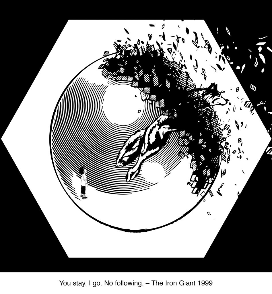
The composition is almost all in pixelated halftone. This makes it feel as though freedom is a blurry mess and it disorientates. The American Bald Eagle is a representation of freedom and it looks down on us and makes us feel small. The sunset brings about a sense of freedom but the sharp lines cut through the cloud, pointing towards the eagle almost as if to say that freedom is painful. Lastly, we have the feather which are shaped like crosses, implying that freedom is a burden.

Composition:

Unity/Harmony – The repeated use of the feather cross gives a sense of unity. The different sizes of the feather crosses gives a sense of perspective and depth to the composition.

Scale/Proportion – The size of the eagle makes it the first thing you see.

Similarity/Contrast – The different sizes of the feather crosses. Most of the images look clearly halftoned except the feathers and maybe the eagle.

Balance – While the composition is hardly symmetrical, there is a sort of balance in elements in the composition that gives a sort of symmetry to it.


4.

buddhaeditfinal

Visual Elements:

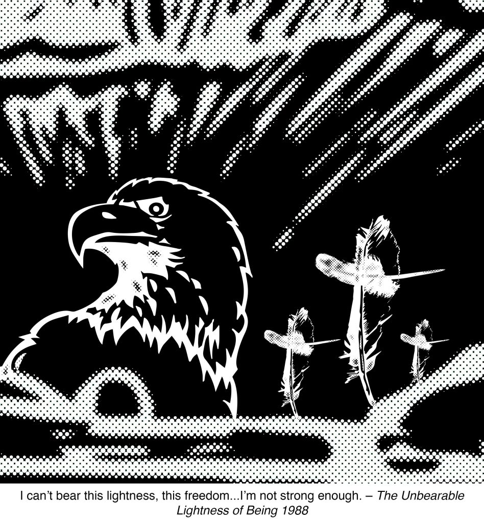
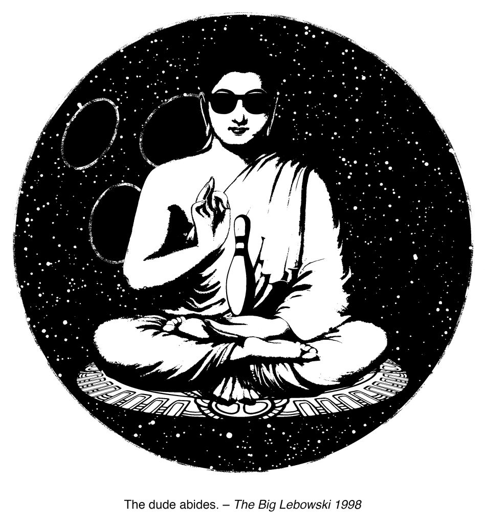
The quote is about ‘taking it easy’; very much like inner peace hence Buddha being in the centre. Buddha is seating on mandala ‘carpet’ – a subtle reference to the film where the Dude’s rug is ruined. The mandala is a spiritual symbol in Indian religions for the universe. In a way, the worldly issues of the world are beneath the Dude. The roundness of the bowling ball and the balanced composition gives off the feeling of peace; there is no tension or turmoil. The textures of the ball gives off a hippy, psychedelic feel. This is to set the mood of the composition as being very spacey (as in the Dude being spaced out). The three holes in the bowling ball are meant to represent the 3 marks of existence – Impermanence, Unsatisfactoriness or Suffering, and Non-self. The marks of existence are all behind Buddha. In a way, this says that the Dude is not bothered by these things. The shades on buddha makes it much more obvious to see that there are no worries.

Design Principles:

Balance – The composition feels balanced even though the three holes of the bowling ball give it a little bit of asymmetry. At the centre of it, Buddha. This is very similar to Early Christian/Romanesque Christian art where the Christ is at the centre of attention.

Hierarchy/Scale/Proportion – Buddha is the most prominent element in the piece because it is huge and in the centre. Behind Buddha is the bowling ball and the in Buddha’s palm is the bowling pin.

Similarity/Contrast – It feels like two main elements. The bowling pin and the sunglasses seem to add to Buddha and not stand out from it. This is because these elements are representative of the character (they are of the character). The bowling ball is the external and therefore is contrasted with Buddha.

Unity/Harmony – The mandala is done in perspective to give a sense of depth to Buddha. This also creates a slightly unnatural and surreal effect because the bowling ball is supposed to be flat. So while it creates distance, it feels surreal.


Josiah – Emo

file_0082
1. Fragile –

Delicate and vulnerable; easily broken.

Technique: Tearing pieces of black paper and piecing them back together, slightly further apart.

The lines of the broken paper give off the tense feeling of everything about to break apart. The sharp and jagged edges accentuates the need to be gentle and careful towards vulnerability.


file_0082
2. Anxiety –

A feeling of worry, nervousness, or unease. Walls closing in around you; like being pierced by the very air around you.

Technique: Monoprinting with white and black paint.

The sharp and heavy white lines cut across the paper – like the piercing sensation in your lungs when you have difficulty breathing. The grey spots almost seem to creep out from the paper, giving the feeling of unease. The layers and layers of black paint slanting walls close in – suffocating.


file_0082
3. Exhaustion –

Fatigued; low on energy. “Shag, cannot think” – Every Singaporean son.

Technique: Different sized marker pens and blind drawing.

The lines make little sense and also progressively get fainter. Strokes get shorter and more half-hearted. The short strokes also occasionally sink lower, getting fatigued. This creates the effect of feeling exhausted.


file_0091
4. Rage –

Violent, uncontrollable anger. Expressive and explosive negative energy.

Technique: Crushed charcoal glued on paper.

The marks made look almost like an explosion from a point the causes debris to fly in all directions. The debris even bounces off the left side of the paper, ricocheting back. It seems to start off centre to accentuate movement. Similarly rage is erratic, uncontrollable, and explosive.


file_0091
5. Desperation –

A state of fear that results in rash or extreme behaviour; potentially losing one’s sense of self in the process.

Technique: Sand glued on paper.

The ink blotches loses its sense of self as it is dragged backwards while trying desperately to stay ahead. In the process of doing so, it gets ripped apart. The tiny black sand gives the sense of chaos that is tearing the ink blotches.


file_0091
6. Turbulent –

Confusion, disorder, and disorienting.

Technique: Tea leaves glued on paper.

The tea leaves  start off as dark swirls of confusion that become lighter as it gets dragged by the forces around it. It starts off at the bottom of the paper before immediately being swept off the ground, unable to land for even a moment.


file_0091

7. Despair –

The complete absence of hope, like being stalked by the abyss.

Technique: Letting flame from candle lick the paper.

The lone black dot is stalked by the burnt marks and brown lines of the abyss – the unknown darkness. Just being there in a form of stasis, there is no hope.


file_000

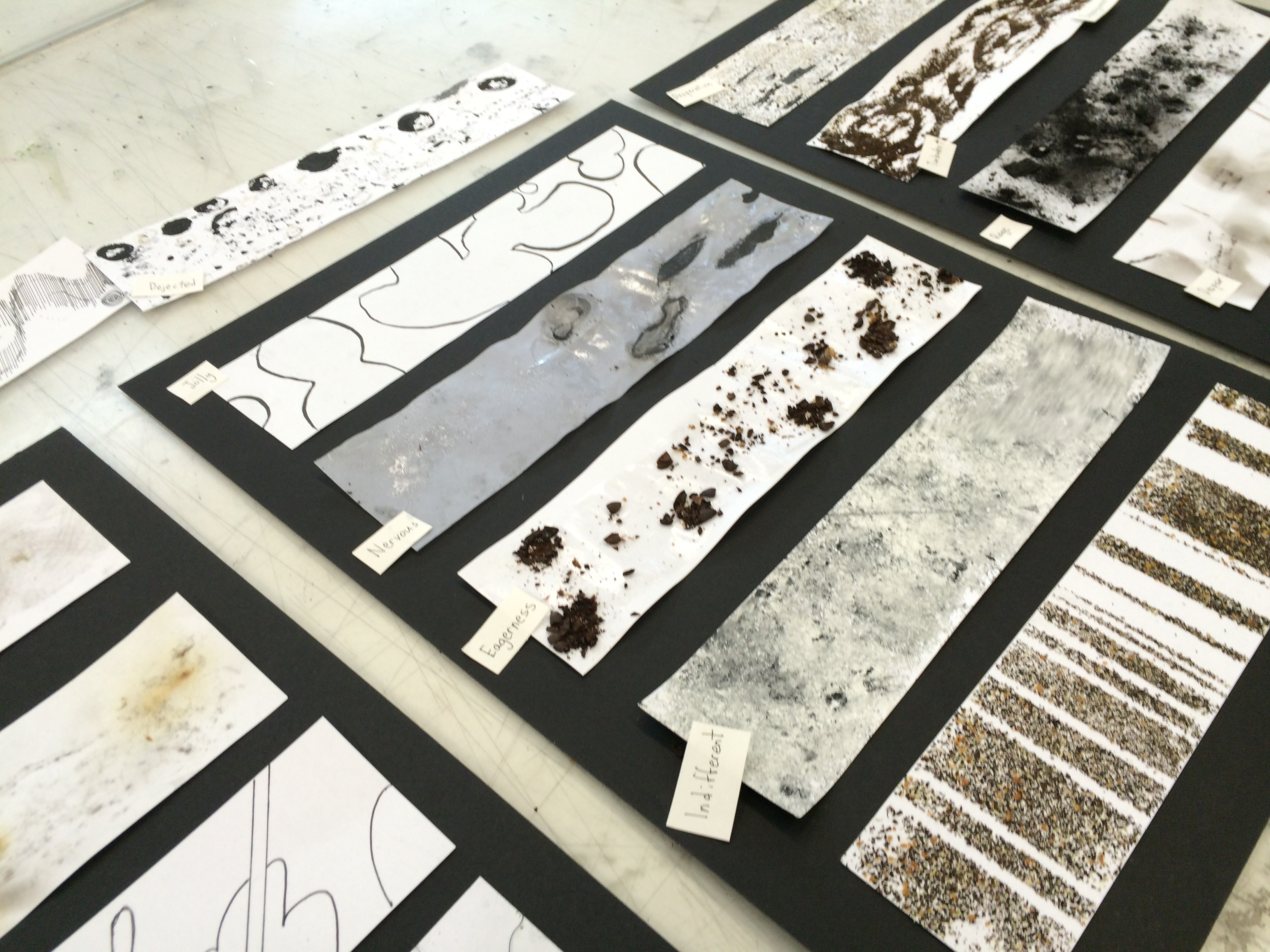
8. Patience –

The absence of annoyance and anxiety; inner peace and calm. Tolerant.

Technique: Marker pen and ruler

The straight continuous line moves along with no quarrel to its destination. The white space gives off the feeling on lightness and inner peace of the black line.


file_0062

9. Jolliness –

Happy and cheerful.

Technique: Dripping Citronella oil on paper, then tracing with marker pen.

The bubbly, bold blobs are just floating around in space, having the time of their lives, doing what they please.The variations in thickness of the lines give a 3 dimensional feel to it, making it look at though the blobs are floating around.


file_0062

10. Nervousness –

Sweating at the thought of your worries, typically about an imminent event or something with an uncertain outcome.

Technique: Rolling gel wax on paper to form a layer on the paper, then applying a flame to certain areas to remove the wax. Lastly using a marker pen to colour over the exposed area.

The paper is reflective, looking like it is sweating at the impending dark, unknown, unfamiliar blocks that look like they are approaching fast. The empty space is a metaphor for being at a loss for words like the mind blanking out at the thought of the imminent event. The dark blobs get lighter as it approaches the white space, showing that the worries are less scary that we imagine them to be.


file_0062

11. Eagerness –

Keen interest and excitement; sparks of high energy.

Technique: Coffee glued on paper.

The mini explosions are trying to contain itself but alas, eagerness gets the better of them and they burst out into smaller bits. The small bits look like a wave flowing through the mini explosions, like being carried by the excitement.


file_0062

12. Indifferent –

The absence of emotion.

Technique: Monoprinting with linoleum board.

The paint marks have no beginning, middle or end, just the paint of uniformity and towards the right side, wiping itself off of having any emotions.


file_0062

13. Contentment –
Being in a state of tranquil happiness; satisfied.

Technique: Tea leaves glued on paper with masking tape, which was later removed.

The bars of the tea leaves and the white space may vary. There might be discomfort within the bars, shown in “noise” of the tea leaves, but the bars of tea leaves still remain vertical, tranquil, and happy.


file_0072
14. Melancholy –

A feeling of pensive sadness, typically with no obvious cause.

Technique: Charcoal on paper.

The faint lines thrash in the pain of sadness, seemingly being attacked by the darker marks. The lines seem to have no beginning, it just exists and it experiences the pain.


file_0082

15. L’appel du vide –

The feeling you get when you, for example, see a car driving by and have the sudden urge to jump in front of it. “Anyone whose goal is ‘something higher’ must expect someday to suffer vertigo. What is vertigo? Fear of falling? No, Vertigo is something other than fear of falling. It is the voice of the emptiness below us which tempts and lures us, it is the desire to fall, against which, terrified, we defend ourselves.” – Milan Kundera, The unbearable lightness of being

Technique: Using the foam netting used to wrap apples in, stretching it out and spraying spray mount onto the paper, before pasting tea leaves onto it. As a result, only certain areas of the paper has tea leaves stick to the paper.

The white space in the centre is being lured into the hypnotic lattice of the void. The white space is turtled up in defence but the call of the void is strong and has begun penetrating the white space.


file_0072
16. Grief –

Deep sorrow, especially as a result of the loss of someone’s life.

Technique: Letting flame from candle lick the paper – even burning it a little.

A hole is burnt with the loss of someone. What follows is the deep, dark, shadowy embrace of sorrow – calling out to the scars left by grief. Eventually, grief passes and wounds heal, but the scars remain – represented by the grey marks and the burn marks without holes.


file_0072
17. Compassion –

A gentle feeling of fondness; the kind of love without expectations.

Technique: Marker Pen on paper.

The pillowy embrace of the curved elements endures through the cutting pains of loving,


file_0072
18. Paranoid –

Delusions of persecution and a general distrust of others; a form of illogical fear.

Technique: String glued on paper, with dirt loosely scattered on.

The wormy lines of the string give goosebumps on the paper; overwhelming it even. The strings are harmless but it still gives off a sense of unease. The “dirt” on the paper, complimented by the wormy lines, give off the feeling of being buried alive.


Honourable mentions
file_000

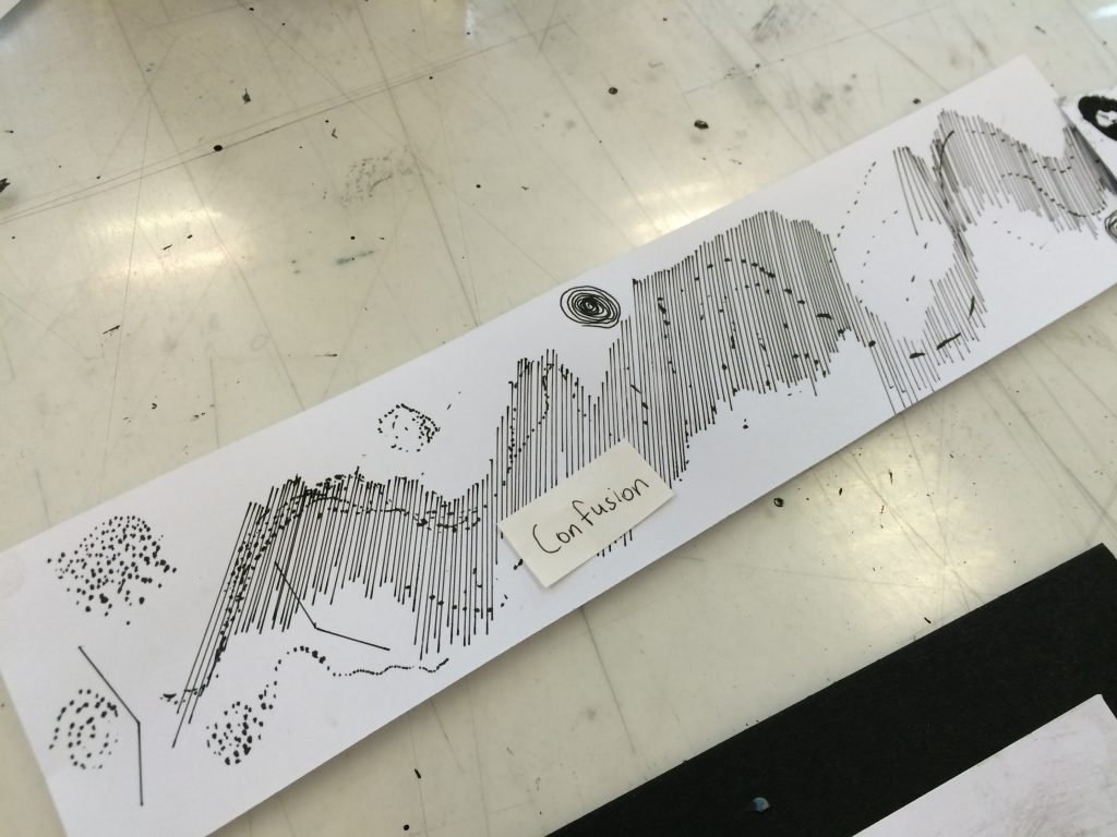
Confusion
Feeling as if you can’t think clearly. Disoriented and having difficulty focusing. Incoherence of thought.

Technique: Pen on paper.

Random styles including dots and lines and swirls make it difficult to focus. There is a lack of coherence in the overall make up of the lines and marks – coming off as disorienting.


file_0091

Depaysement

Being without a country. Exhilarating and disorienting swirls of giddiness from being an outsider.

Technique: Tea leaves glued on paper.

The swirls give rising up spinning around, like a roller coaster, but being swept to the side in the midst of it.

file_0013

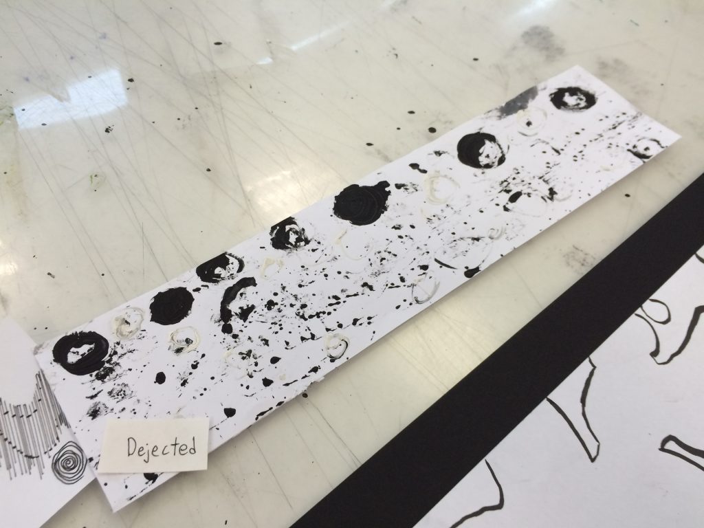
Dejection
Heartbroken and feeling down.

Technique: Monoprinting with paint on lithium ion batteries.

The balls of black get heartbroken and it feels like a hole in their chest. They get broken and sink to the bottom of the paper as nothing more than dots of black.

So, you could say Dejection got dejected. How poetic.